Publication date
05/01/2023
Update date
06/06/2025

Description
In this post we have described step-by-step a data science exercise in which we try to train a deep learning model with a view to automatically classifying medical images of healthy and sick people.
Diagnostic imaging has been around for many years in the hospitals of developed countries; however, there has always been a strong dependence on highly specialised personnel. From the technician who operates the instruments to the radiologist who interprets the images. With our current analytical capabilities, we are able to extract numerical measures such as volume, dimension, shape and growth rate (inter alia) from image analysis. Throughout this post we will try to explain, through a simple example, the power of artificial intelligence models to expand human capabilities in the field of medicine.
This post explains the practical exercise (Action section) associated with the report “Emerging technologies and open data: introduction to data science applied to image analysis”. Said report introduces the fundamental concepts that allow us to understand how image analysis works, detailing the main application cases in various sectors and highlighting the role of open data in their implementation.
Previous projects
However, we could not have prepared this exercise without the prior work and effort of other data science lovers. Below we have provided you with a short note and the references to these previous works.
- This exercise is an adaptation of the original project by Michael Blum on the STOIC2021 - disease-19 AI challenge. Michael's original project was based on a set of images of patients with Covid-19 pathology, along with other healthy patients to serve as a comparison.
- In a second approach, Olivier Gimenez used a data set similar to that of the original project published in a competition of Kaggle. This new dataset (250 MB) was considerably more manageable than the original one (280GB). The new dataset contained just over 1,000 images of healthy and sick patients. Olivier's project code can be found at the following repository.
Datasets
In our case, inspired by these two amazing previous projects, we have built an educational exercise based on a series of tools that facilitate the execution of the code and the possibility of examining the results in a simple way. The original data set (chest x-ray) comprises 112,120 x-ray images (front view) from 30,805 unique patients. The images are accompanied by the associated labels of fourteen diseases (where each image can have multiple labels), extracted from associated radiological reports using natural language processing (NLP). From the original set of medical images we have extracted (using some scripts) a smaller, delimited sample (only healthy people compared with people with just one pathology) to facilitate this exercise. In particular, the chosen pathology is pneumothorax.
If you want further information about the field of natural language processing, you can consult the following report which we already published at the time. Also, in the post 10 public data repositories related to health and wellness the NIH is referred to as an example of a source of quality health data. In particular, our data set is publicly available here.
Tools
To carry out the prior processing of the data (work environment, programming and drafting thereof), R (version 4.1.2) and RStudio (2022-02-3) was used. The small scripts to help download and sort files have been written in Python 3.
Accompanying this post, we have created a Jupyter notebook with which to experiment interactively through the different code snippets that our example develops. The purpose of this exercise is to train an algorithm to be able to automatically classify a chest X-ray image into two categories (sick person vs. non-sick person). To facilitate the carrying out of the exercise by readers who so wish, we have prepared the Jupyter notebook in the Google Colab environment which contains all the necessary elements to reproduce the exercise step-by-step. Google Colab or Collaboratory is a free Google tool that allows you to programme and run code on python (and also in R) without the need to install any additional software. It is an online service and to use it you only need to have a Google account.
Logical flow of data analysis
Our Jupyter Notebook carries out the following differentiated activities which you can follow in the interactive document itself when you run it on Google Colab.
- Installing and loading dependencies.
- Setting up the work environment
- Downloading, uploading and pre-processing of the necessary data (medical images) in the work environment.
- Pre-visualisation of the loaded images.
- Data preparation for algorithm training.
- Model training and results.
- Conclusions of the exercise.
Then we carry out didactic review of the exercise, focusing our explanations on those activities that are most relevant to the data analysis exercise:
- Description of data analysis and model training
- Modelling: creating the set of training images and model training
- Analysis of the training result
- Conclusions
Description of data analysis and model training
The first steps that we will find going through the Jupyter notebook are the activities prior to the image analysis itself. As in all data analysis processes, it is necessary to prepare the work environment and load the necessary libraries (dependencies) to execute the different analysis functions. The most representative R package of this set of dependencies is Keras. In this article we have already commented on the use of Keras as a Deep Learning framework. Additionally, the following packages are also required: htr; tidyverse; reshape2; patchwork.
Then we have to download to our environment the set of images (data) we are going to work with. As we have previously commented, the images are in remote storage and we only download them to Colab at the time we analyse them. After executing the code sections that download and unzip the work files containing the medical images, we will find two folders (No-finding and Pneumothorax) that contain the work data.

Once we have the work data in Colab, we must load them into the memory of the execution environment. To this end, we have created a function that you will see in the notebook called process_pix(). This function will search for the images in the previous folders and load them into the memory, in addition to converting them to grayscale and normalising them all to a size of 100x100 pixels. In order not to exceed the resources that Google Colab provides us with for free, we limit the number of images that we load into memory to 1000 units. In other words, the algorithm will be trained with 1000 images, including those that it will use for training and those that it will use for subsequent validation.
Once we have the images perfectly classified, formatted and loaded into memory, we carry out a quick visualisation to verify that they are correct. We obtain the following results:

Self-evidently, in the eyes of a non-expert observer, there are no significant differences that allow us to draw any conclusions. In the steps below we will see how the artificial intelligence model actually has a better clinical eye than we do.
Modelling
Creating the training image set
As we mentioned in the previous steps, we have a set of 1000 starting images loaded in the work environment. Until now, we have had classified (by an x-ray specialist) those images of patients with signs of pneumothorax (on the path "./data/Pneumothorax") and those patients who are healthy (on the path "./data/No -Finding")
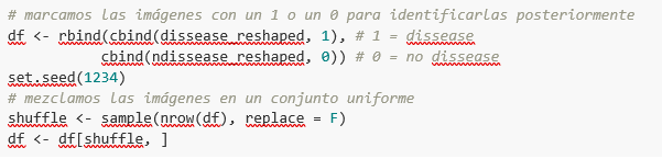
The aim of this exercise is precisely to demonstrate the capacity of an algorithm to assist the specialist in the classification (or detection of signs of disease in the x-ray image). With this in mind, we have to mix the images to achieve a homogeneous set that the algorithm will have to analyse and classify using only their characteristics. The following code snippet associates an identifier (1 for sick people and 0 for healthy people) so that, later, after the algorithm's classification process, it is possible to verify those that the model has classified correctly or incorrectly.
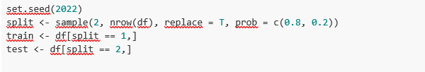
So, now we have a uniform “df” set of 1000 images mixed with healthy and sick patients. Next, we split this original set into two. We are going to use 80% of the original set to train the model. In other words, the algorithm will use the characteristics of the images to create a model that allows us to conclude whether an image matches the identifier 1 or 0. On the other hand, we are going to use the remaining 20% of the homogeneous mixture to check whether the model, once trained, is capable of taking any image and assigning it 1 or 0 (sick, not sick).
Model training
Right, now all we have left to do is to configure the model and train with the previous data set.
Before training, you will see some code snippets which are used to configure the model that we are going to train. The model we are going to train is of the binary classifier type. This means that it is a model that is capable of classifying the data (in our case, images) into two categories (in our case, healthy or sick). The model selected is called CNN or Convolutional Neural Network. Its very name already tells us that it is a neural networks model and thus falls under the Deep Learning discipline. These models are based on layers of data features that get deeper as the complexity of the model increases. We would remind you that the term deep refers precisely to the depth of the number of layers through which these models learn.
Note: the following code snippets are the most technical in the post. Introductory documentation can be found here, whilst all the technical documentation on the model's functions is accessible here.
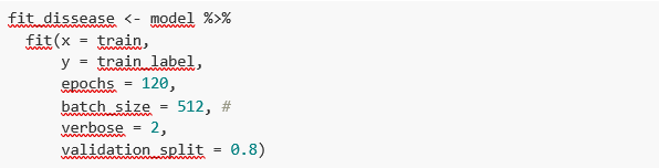
Finally, after configuring the model, we are ready to train the model. As we mentioned, we train with 80% of the images and validate the result with the remaining 20%.
Training result
Well, now we have trained our model. So what's next? The graphs below provide us with a quick visualisation of how the model behaves on the images that we have reserved for validation. Basically, these figures actually represent (the one in the lower panel) the capability of the model to predict the presence (identifier 1) or absence (identifier 0) of disease (in our case pneumothorax). The conclusion is that when the model trained with the training images (those for which the result 1 or 0 is known) is applied to 20% of the images for which the result is not known, the model is correct approximately 85% (0.87309) of times.

Indeed, when we request the evaluation of the model to know how well it classifies diseases, the result indicates the capability of our newly trained model to correctly classify 0.87309 of the validation images.
Now let’s make some predictions about patient images. In other words, once the model has been trained and validated, we wonder how it is going to classify the images that we are going to give it now. As we know "the truth" (what is called the ground truth) about the images, we compare the result of the prediction with the truth. To check the results of the prediction (which will vary depending on the number of images used in the training) we use that which in data science is called the confusion matrix. The confusion matrix:
- Places in position (1,1) the cases that DID have disease and the model classifies as "with disease"
- Places in position (2,2), the cases that did NOT have disease and the model classifies as "without disease"
In other words, these are the positions in which the model "hits" its classification.
In the opposite positions, in other words, (1,2) and (2,1) are the positions in which the model is "wrong". So, position (1,2) are the results that the model classifies as WITH disease and the reality is that they were healthy patients. Position (2,1), the very opposite.
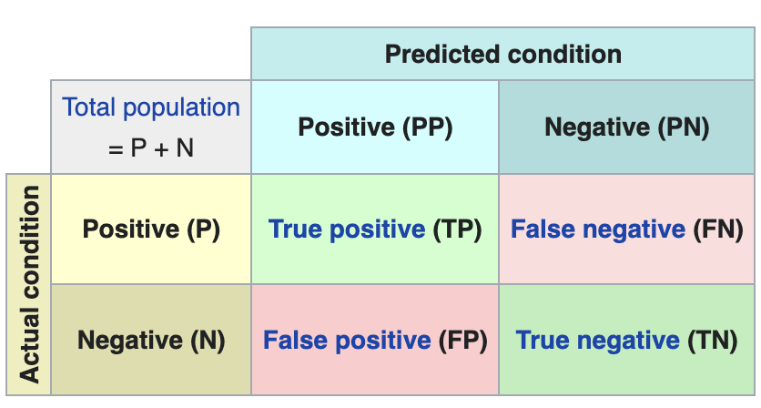
Explanatory example of how the confusion matrix works. Source: Wikipedia https://en.wikipedia.org/wiki/Confusion_matrix
In our exercise, the model gives us the following results:
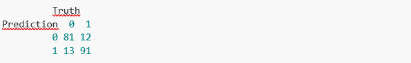
In other words, 81 patients had this disease and the model classifies them correctly. Similarly, 91 patients were healthy and the model also classifies them correctly. However, the model classifies as sick 13 patients who were healthy. Conversely, the model classifies 12 patients who were actually sick as healthy. When we add the hits of the 81+91 model and divide it by the total validation sample, we obtain 87% accuracy of the model.
Conclusions
In this post we have guided you through a didactic exercise consisting of training an artificial intelligence model to carry out chest x-ray imaging classifications with the aim of determining automatically whether someone is sick or healthy. For the sake of simplicity, we have chosen healthy patients and patients with pneumothorax (only two categories) previously diagnosed by a doctor. The journey we have taken gives us an insight into the activities and technologies involved in automated image analysis using artificial intelligence. The result of the training affords us a reasonable classification system for automatic screening with 87% accuracy in its results. Algorithms and advanced image analysis technologies are, and will increasingly be, an indispensable complement in multiple fields and sectors, such as medicine. In the coming years, we will see the consolidation of systems which naturally combine the skills of humans and machines in expensive, complex or dangerous processes. Doctors and other workers will see their capabilities increased and strengthened thanks to artificial intelligence. The joining of forces between machines and humans will allow us to reach levels of precision and efficiency never seen before. We hope that through this exercise we have helped you to understand a little more about how these technologies work. Don't forget to complete your learning with the rest of the materials that accompany this post.
Content prepared by Alejandro Alija, an expert in Digital Transformation.The contents and points of view reflected in this publication are the sole responsibility of its author.