How to improve data visualisation: the example of the European drugs report


Fecha de la noticia: 26-07-2024
The European Drug Report provides a current overview of the drug situation in the region, analysing the main trends and emerging threats. It is a valuable publication, with a high number of downloads, which is quoted in many media outlets.
The report is produced annually by the European Union Drugs Agency (EUDA), the current name of the former European Monitoring Centre for Drugs and Drug Addiction. It collects and analyses data from EU Member States, together with other partner countries such as Turkey and Norway, to provide a comprehensive picture of drug use and supply, drug harms and harm reduction interventions. The report contains comprehensive datasets on these issues disaggregated at the national level, and even, in some cases, at the city level (such as Barcelona or Palma de Mallorca).
This study has been carried out since 1993 and translated into more than 20 official languages of the European Union. However, in the last two years it has introduced a new feature: a change in internal processes to improve the visualisation of the data obtained. A process they explained in the recent webinar "The European Drug Report: using an open data approach to improve data visualisation", organised by the European Open Data Portal (data.europa.eu) on 25 June. The following is a summary of what the Observatory's representatives had to say at this event.
The need for change
The Observatory has always worked with open data, but there were inefficiencies in the process. Until now, the European Drug Report has always been published in PDF format, with the focus on achieving a visually appealing product. The internal process leading up to the publication of the report consisted of several stages involving various teams:
- A team from the Observatory checked the format of the data received from the supplier and, if necessary, adapted it.
- A specialised data analysis team created visualisations from the data.
- A specialised drafting team drafted the report. The team that had created the visualisations could collaborate in this phase.
- An internal team validated the content of the report.
- The data provider checked that the Observatory had interpreted the data correctly.
Despite the good reception of the report and its format, in 2022 the Observatory decided to completely change the publication format for the following reasons:
- Once the various steps of the publication process had been initiated, the data were formatted and were no longer machine-readable. This reduced the accessibility of the data, e.g. for screen readers, and limited its reusability.
- If errors were detected in the different steps of the process, they were corrected directly on the format of the data in this step. In other words, if an error was detected in a chart during the revision phase, it was corrected directly on that chart. This procedure could cause errors and dull the traceability of data, limiting efficiency: the same static graph could be present several times in the document and each mention had to be corrected individually.
- At the end of the process, the format of the source data had to be adjusted due to changes in the publication procedure.
- Many of the users who consulted the report did so from a mobile device, for which the PDF format was not always suitable.
- Because they are neither accessible nor mobile-friendly, PDF documents did not usually appear as the first result in search engines. This point is important for the Observatory, as many users find the report through search engines.
A responsive web format was needed, which automatically adjusts a website to the size and layout of its users' devices. The aim was to:
- Improved accessibility.
- A more streamlined process for creating visualisations.
- An easier translation process.
- An increase in visitors from search engines.
- Greater modularity.
The process behind the new report
In order to completely transform the publication format of the report, an ad hoc visualisation process has been carried out, summarised in the following image:
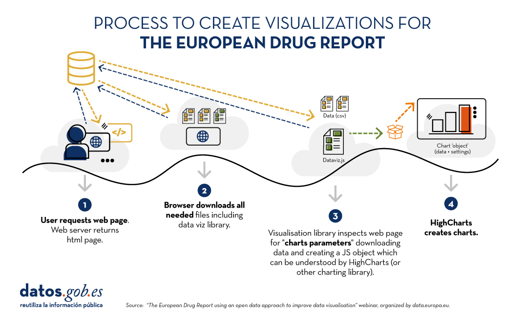
Figure 1. Process for creating visualizations for the European Drug Report. Source EN: Webinar “The European Drug Report using an open data approach to improve data visualisation”, organized by data.europa.eu.
The main new feature is that visualisations are created dynamically from the source data. In this way, if something is changed in these data, it is automatically changed in all visualisations that feed on it. Using the Drupal content management system, on which much of the site is based, administrators can register changes that will automatically be reflected in the HTML and therefore in the displays. In addition, site administrators have a visualisation generator which, based on data and indications - equivalent to simple instructions such as "sort from highest to lowest" expressed in HTML - creates visualisations without the need to touch code.
The same dynamic update procedure applies to the PDF that the user can download. If there are changes in the data, in the visualisations or if typographical errors are corrected, the PDF is generated again through a compilation process that the Observatory has created specifically for this task.
The report after the change
The report is currently published in HTML version, with the possibility to download chapters or the full report in PDF format. It is structured by thematic modules and also allows the consultation of annexes.
Furthermore, the data are always published in CSV format and the licensing conditions of the data (CC-BY-4.0) are indicated on the same page. The reference to the source of the data is always made available to the reader on the same page as a visualisation.
With this change in procedure and format, benefits for all have been achieved. From the readers' point of view, the user experience has been improved. For the organisation, the publication process has been streamlined.
In terms of open data, this new approach allows for greater traceability, as the data can be consulted at any time in its current format. Moreover, according to the Observatory speakers, this new format of the report, together with the fact that the data and visualisations are always up-to-date, has increased the accessibility of the data for the media.
You can access the webinar materials here: