Data visualization: definition, technologies and tools


Fecha del documento: 24-11-2016
There is increasingly more information, to such extent that the current society lives surrounded by data. Nevertheless, one of the most common criticisms of this mass of information is its lack of usability. It is not only a matter of publishing data on the web, but we should focus on their treatment, re-use and consumption by the end user. Only when we approach them and apply an interpretation they make sense and become knowledge.
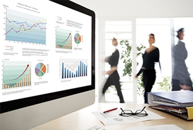
In this technological context, data exploitation has evolved in the last decades to design interpretation mechanisms that are increasingly robust and affordable. And among these exploitation mechanisms, the most important is data visualization.
In this framework, Iniciativa Aporta has elaborated the report “Data visualization: definition, technologies and tools”, a handbook based on the analysis on two distinct but complementary aspects. On one hand, the visualization technologies are explained in detail as frameworks and coding libraries that allow the construction of applications and data based services; including exclusively the cutting-edge web technology and especially that which is built on standards, such as HTML5 (Canvas), SVG and WebGL.
On the other hand, this documents takes a journey through the available visualization platforms, analysing the applications that allow the construction of dashboards and comprehensive interactive visualizations. Those platforms that are more web-oriented and can be applied to the exploitation of open data, those coming from the world of BI and data analysis, are presented in detail: Tableau Soft, Qlik and Tabulae. Or, failing this, open data publishing tools that incorporate certain features of visualization: CKAN and Socrata.
Currently the number of tools and platforms for data visualization that can be accessed is very extensive. Thus, this report includes together with these instruments a set of real examples, some of them more closely linked to the data analysis and visualizations, whereas others provide support to data publication, which add to their functionality capabilities of graphic representation of data for their consumption.
In order to help in the treatment of such information and transformation into more readable formats, the report includes seven examples of data visualizations, from public sector and independent entities both national and international. It concludes analysing future trends on data treatment: Visualization and large volumes of data, visualizations that can be built by the end user and the development of 3D visualization technologies.
Nowadays, visualization is a powerful tool to discover and understand the logic behind a dataset, open or not, and to share this interpretation with others from an objective point of view. For this reason, this report is an opportunity to show to stakeholders of the national open data community the way to treat and transform the raw material into a useful resource for any purpose.