Blog
For more than a decade, open data platforms have measured their impact through relatively stable indicators: number of downloads, web visits, documented reuses, applications or services created based on them, etc. These indicators worked well in an ecosystem where users – companies, journalists, developers, anonymous citizens, etc. – directly accessed the original sources to query, download and process the data.
However, the panorama has changed radically. The emergence of generative artificial intelligence models has transformed the way people access information. These systems generate responses without the need for the user to visit the original source, which is causing a global drop in web traffic in media, blogs and knowledge portals.
In this new context, measuring the impact of an open data platform requires rethinking traditional indicators to incorporate new ones to the metrics already used that also capture the visibility and influence of data in an ecosystem where human interaction is changing.
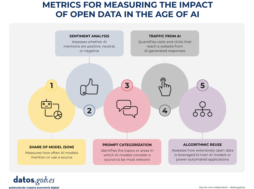
Figure 1. Metrics for measuring the impact of open data in the age of AI.
A structural change: from click to indirect consultation
The web ecosystem is undergoing a profound transformation driven by the rise of large language models (LLMs). More and more people are asking their questions directly to systems such as ChatGPT, Copilot, Gemini or Perplexity, obtaining immediate and contextualized answers without the need to resort to a traditional search engine.
At the same time, those who continue to use search engines such as Google or Bing are also experiencing relevant changes derived from the integration of artificial intelligence on these platforms. Google, for example, has incorporated features such as AI Overviews, which offers automatically generated summaries at the top of the results, or AI Mode, a conversational interface that allows you to drill down into a query without browsing links. This generates a phenomenon known as Zero-Click: the user performs a search on an engine such as Google and gets the answer directly on the results page itself. As a result, you don't need to click on any external links, which limits visits to the original sources from which the information is extracted.
All this implies a key consequence: web traffic is no longer a reliable indicator of impact. A website can be extremely influential in generating knowledge without this translating into visits.
New metrics to measure impact
Faced with this situation, open data platforms need new metrics that capture their presence in this new ecosystem. Some of them are listed below.
-
Share of Model (SOM): Presence in AI models
Inspired by digital marketing metrics, the Share of Model measures how often AI models mention, cite, or use data from a particular source. In this way, the SOM helps to see which specific data sets (employment, climate, transport, budgets, etc.) are used by the models to answer real questions from users, revealing which data has the greatest impact.
This metric is especially valuable because it acts as an indicator of algorithmic trust: when a model mentions a web page, it is recognizing its reliability as a source. In addition, it helps to increase indirect visibility, since the name of the website appears in the response even when the user does not click.
-
Sentiment analysis: tone of mentions in AI
Sentiment analysis allows you to go a step beyond the Share of Model, as it not only identifies if an AI model mentions a brand or domain, but how it does so. Typically, this metric classifies the tone of the mention into three main categories: positive, neutral, and negative.
Applied to the field of open data, this analysis helps to understand the algorithmic perception of a platform or dataset. For example, it allows detecting whether a model uses a source as an example of good practice, if it mentions it neutrally as part of an informative response, or if it associates it with problems, errors, or outdated data.
This information can be useful to identify opportunities for improvement, strengthen digital reputation, or detect potential biases in AI models that affect the visibility of an open data platform.
-
Categorization of prompts: in which topics a brand stands out
Analyzing the questions that users ask allows you to identify what types of queries a brand appears most frequently in. This metric helps to understand in which thematic areas – such as economy, health, transport, education or climate – the models consider a source most relevant.
For open data platforms, this information reveals which datasets are being used to answer real user questions and in which domains there is greater visibility or growth potential. It also allows you to spot opportunities: if an open data initiative wants to position itself in new areas, it can assess what kind of content is missing or what datasets could be strengthened to increase its presence in those categories.
-
Traffic from AI: clicks from digests generated
Many models already include links to the original sources. While many users don't click on such links, some do. Therefore, platforms can start measuring:
- Visits from AI platforms (when these include links).
- Clicks from rich summaries in AI-integrated search engines.
This means a change in the distribution of traffic that reaches websites from the different channels. While organic traffic—traffic from traditional search engines—is declining, traffic referred from language models is starting to grow.
This traffic will be smaller in quantity than traditional traffic, but more qualified, since those who click from an AI usually have a clear intention to go deeper.
It is important that these aspects are taken into account when setting growth objectives on an open data platform.
-
Algorithmic Reuse: Using Data in Models and Applications
Open data powers AI models, predictive systems, and automated applications. Knowing which sources have been used for their training would also be a way to know their impact. However, few solutions directly provide this information. The European Union is working to promote transparency in this field, with measures such as the template for documenting training data for general-purpose models, but its implementation – and the existence of exceptions to its compliance – mean that knowledge is still limited.
Measuring the increase in access to data through APIs could give an idea of its use in applications to power intelligent systems. However, the greatest potential in this field lies in collaboration with companies, universities and developers immersed in these projects, so that they offer a more realistic view of the impact.
Conclusion: Measure what matters, not just what's easy to measure
A drop in web traffic doesn't mean a drop in impact. It means a change in the way information circulates. Open data platforms must evolve towards metrics that reflect algorithmic visibility, automated reuse, and integration into AI models.
This doesn't mean that traditional metrics should disappear. Knowing the accesses to the website, the most visited or the most downloaded datasets continues to be invaluable information to know the impact of the data provided through open platforms. And it is also essential to monitor the use of data when generating or enriching products and services, including artificial intelligence systems. In the age of AI, success is no longer measured only by how many users visit a platform, but also by how many intelligent systems depend on its information and the visibility that this provides.
Therefore, integrating these new metrics alongside traditional indicators through a web analytics and SEO strategy * allows for a more complete view of the real impact of open data. This way we will be able to know how our information circulates, how it is reused and what role it plays in the digital ecosystem that shapes society today.
*SEO (Search Engine Optimization) is the set of techniques and strategies aimed at improving the visibility of a website in search engines.
Blog
Public administrations and international organisations are increasingly using new, more practical and creative approaches to problem solving, focusing on real data and how to better understand people's needs. This will enable them to propose solutions that meet those needs more directly and effectively, rather than designing policies or products in isolation and independently, and then trying to make the recipients conform to them.
A good example of this trend is the growing popularity of people-centred design methodologies - such as design thinking - among legislators, public service designers and policy innovators. Thus, we can see how institutions such as the United Nations or governments such as those of Australia or Hong Kong have been exploring the opportunities and advantages that user-centred design offers them for some time now.
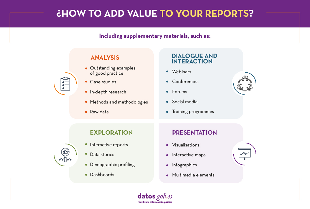
This change of mentality also means that the way in which the analysis and results of these public policies have traditionally been presented through macro-reports is also evolving to adapt to the new needs of participatory and collaborative development. Here are three current examples of how this change in philosophy is already being put into practice.
World Bank Global Development Report
About a year ago we shared the first draft of the World Bank's Development Report and already then it was striking that they had prepared a series of public consultations through which they sought to answer the main questions presented in that initial draft. Now that the rounds of consultations are over and a few months after the publication and presentation of the final version of the report, it is also pleasing to note that the World Bank is once again going a step further in presenting the results and offering us a range of options, including the following:
- Highlighted examples: A series of thematic case studies showing how data can be used to drive development in areas as diverse as road safety, environment, gender-based violence, public debt management, and weather forecasting.
- Data and analysis tools: Providing access to and the ability to explore and download all the data underpinning the report. This includes a number of time-series indicators for more than 170 countries, data on laws and regulations affecting data governance in 80 countries, and indicators on the maturity of countries' data governance practices.
- In-depth research: Provides a series of research articles that delve into some of the more detailed aspects of the issues covered in the report, such as the factors limiting internet adoption in West Africa and the cost to countries of enforcing and implementing personal data regulation.
- Case studies: where the World Bank will be incorporating real cases where it is working with countries to facilitate the implementation of appropriate data governance systems, although at the moment it only has a single case study on the data ecosystem in Jordan.
On the other hand, we can also see how this trend towards collaborative design and development not only seems to be consolidated, but also reinforced and extended through a series of online seminars in which the World Bank has been collaborating with other entities and organisations such as the G20, the OECD, the United Nations, Paris21, the Internet Society, the Open Institute or Data2X to continue analysing the results of the study from different points of view.
United Nations Sustainable Development Goals
Another good example of this trend can be seen in the ambitious Sustainable Development Goals project promoted by the United Nations, which, due to its size and complexity, needs to be supported by a variety of other tools beyond the traditional global reports on sustainable development that they also continue to publish on a regular basis. This is why they offer us a huge amount of additional documentation that includes detailed information on each of the 17 development goals, summaries of each goal through infographics and detailed information on their goals and actions, as well as hundreds of publications related to each goal in particular.
But that's not all: they also have a multitude of conferences, events and webinars so that anyone who wants to learn more about the goals or become more actively involved in their development and implementation can have an opportunity to do so. There are also specific high-level forums for the direct participation of member countries ultimately responsible for implementing the goals, as well as specific training and capacity building programmes for them. And, of course, they have their own social media presence through Facebook and Twitter, where they regularly report on all developments and news of possible interest to the general public.
Finally, in addition to all of the above, the UN also provides a range of resources for the scrupulous monitoring of member countries' conversations and dialogues around the goals, as well as the extent to which the goals are being met at any given moment. These monitoring tools include data explorers, interactive maps, country profiles, and stories told through data - which offer a variety of information and visualisations, whether promoted directly by the agency itself or by the community, or carried out by other institutions specialising in more specific issues such as energy or agriculture.
ITU Digital Development Indicators
Finally, a third good example of how to go a step beyond the traditional report can be seen in the statistics that the International Telecommunication Union (ITU) publishes regularly through its digital development measurement reports, which are not limited again to the publication of traditional reports, They offer a whole range of complementary alternatives including interactive reports, a complete multimedia kit to help us disseminate the main findings of the report and a whole series of events through which we can go deeper into different aspects of the results, ranging from international symposia, online seminars, expert group meetings or courses.
In addition, the ITU has created a series of interactive websites through which you can access the main digital development indicators and check their evolution over the last few years in the different countries, or review some more specific indicators such as those related to the cost of digital services, again including historical series and comparisons between different countries. Finally, they also offer us a complete data portal dedicated to collecting all the historical data of the main statistics and indicators available to the institution. And of course, we still have the option of accessing the raw data - including several specific time series and secondary indicators - to do our own analysis.
The above examples show how this shift in thinking about high-impact policy beyond reporting puts a whole new range of tools and methods at our disposal. These in turn will help us to breathe new life into the data we work with, moving from one-way procedures and reporting to increasingly collaborative processes in which data will flow between all participants at different stages of the process, from generating evidence about the problem we want to solve, building partnerships to find solutions, collaboratively developing those solutions, and finally channelling the actions needed to put them into practice.
Content prepared by Carlos Iglesias, Open data Researcher and consultan, World Wide Web Foundation.
Contents and points of view expressed in this publication are the exclusive responsibility of its author.