
Images
Information
Description
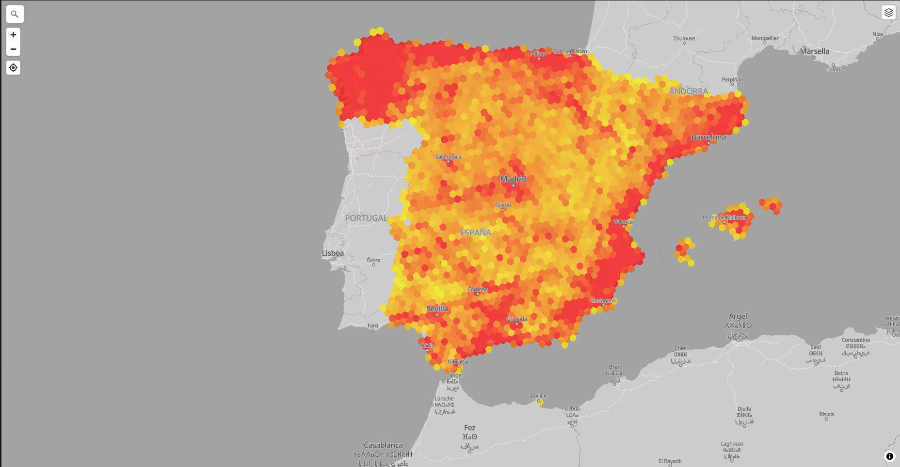
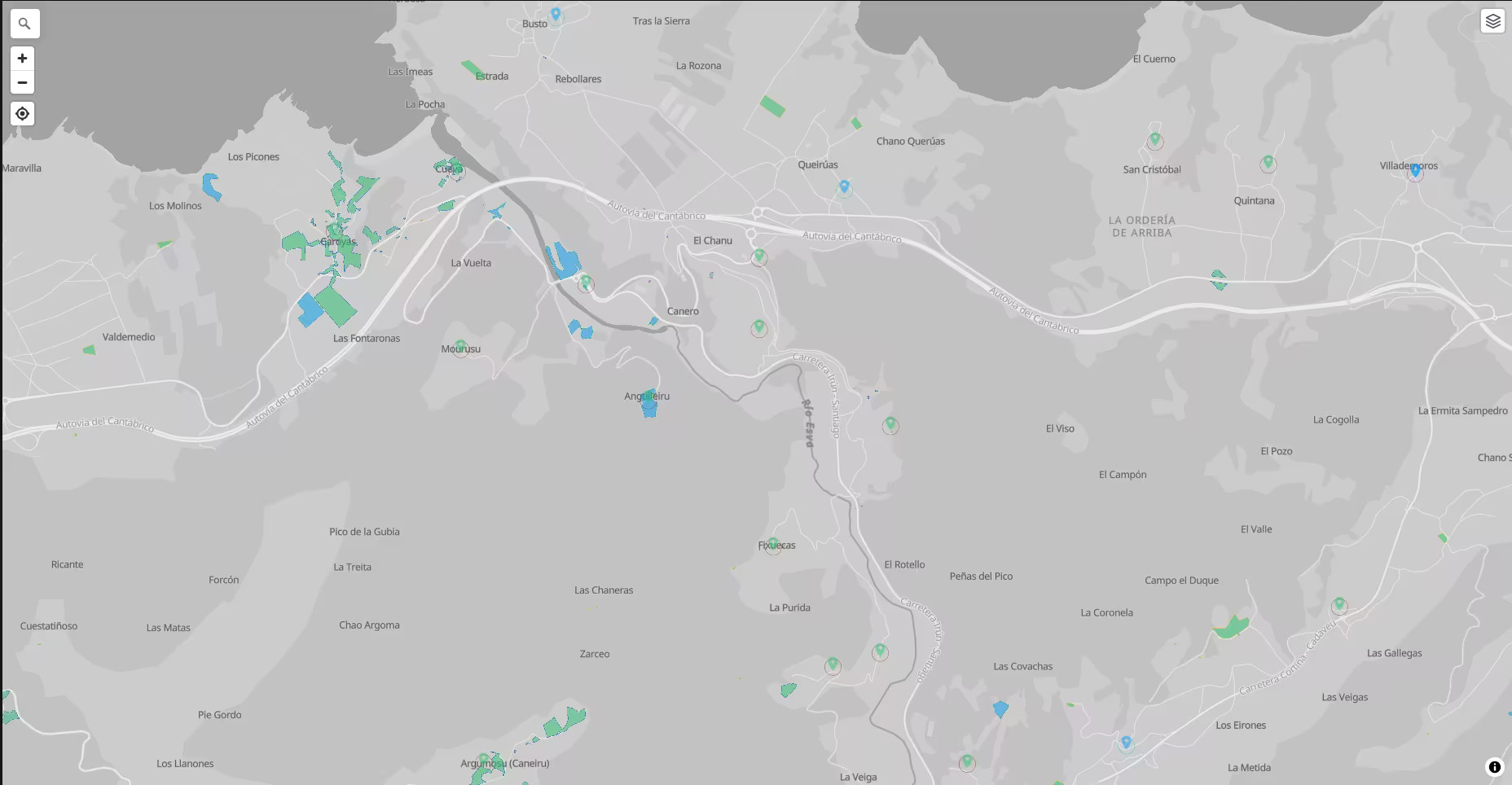
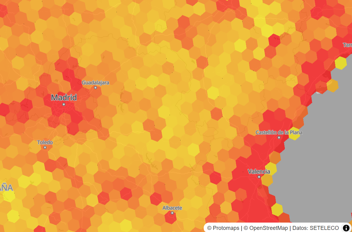
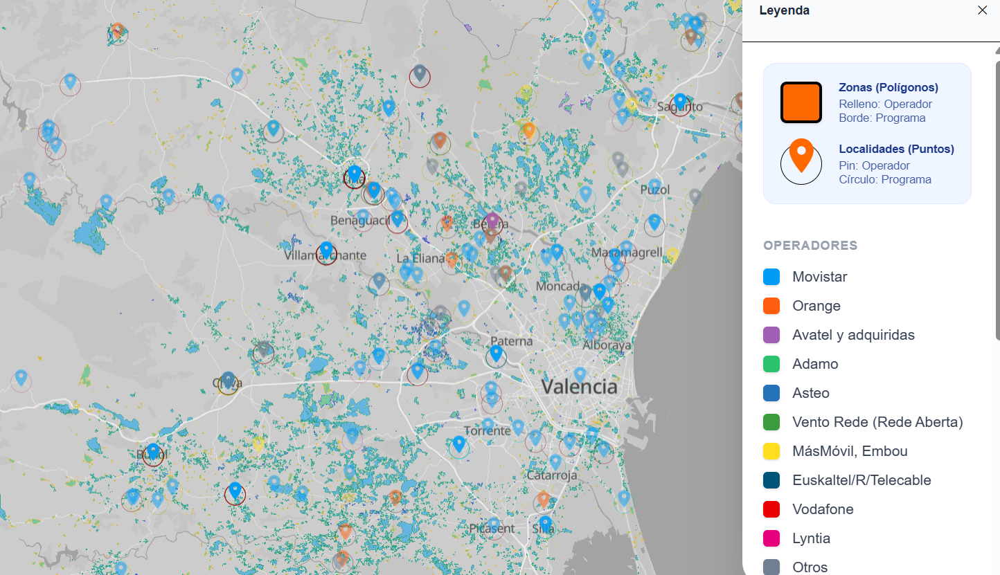
Web viewer that displays the fiber deployments of all PEBA and UNICO programs on a single map, based on publicly available data. Each area has the background color of the awarded operator, and the border is a different color for each program. In the case of the 2013-2019 PEBA plan, as deployments are assigned to individual population entities, a marker is shown with the location obtained from the CNIG. In addition, when the map is not zoomed in, a heat map is displayed showing the distribution of deployments by area.
This visualization avoids having to compare different map viewers if what we are interested in is seeing which operators reach which areas or simply having an overview of which deployments are pending in my area. It also allows us to consult aspects such as the updated completion date, which were previously only available in the different Excel files for each program. I also think it could be useful for analyzing how the areas are distributed among the different programs (for example, if an area covered in UNICO 2021 then has nearby areas in UNICO 2022 covered by another operator, for example), or even possible overlaps (for example, due to areas that were not executed in previous programs).