Application
Atlas AGE is a web-based platform for consulting and visualizing public data on jobs and mobility within the General State Administration. It integrates information from the Job Classification Lists (RPT in Spanish) and the Official State Gazette (BOE), facilitating territorial and organizational analysis of positions, vacancies, competitive exams, and open recruitment calls.
Through a map-based visualization, users can access information broken down by autonomous community. For each community, they can view vacant positions and determine which are civil service positions and which are contract positions, as well as the agency to which they belong. In the mobility section, users can view competitive exams and open positions by area.
A news section is also available, featuring the latest calls for applications and decisions.
Application
Licigator is a technological solution conceived as an advanced search engine for Spanish public tenders, aimed at optimising the processes of locating, analysing and monitoring public sector contracts for companies and professionals.
The platform is based on the reuse of the OpenPLASCP open dataset, published by the Sub-Directorate General for the Coordination of Electronic Procurement. Based on this data, Licigator offers an optimized interface and a structured filtering system that simplifies the workflow of users, facilitating access to the information of the open data project of the Government of Spain.
In addition to agile consultation, the tool allows the generation of customized reports on competition, sector trends and strategic analyses derived from the tenders published daily.
Tender Information Structure
Licigator centralises and structures the key information of each procurement procedure into three fundamental blocks:
1. Information from the contracting agency
- Full identification: name, address and contact details of the contracting authority.
- Institutional traceability: direct links to the agency's website and to the original tender on the Public Sector Procurement Platform (PLACSP).
2. Key data of the file
- Unique identification: file number to ensure exact traceability.
- Executive summary: description of the object of the contract.
- Economic aspects: base tender budget (maximum amount allocated to the contract).
- Standardized classification: CPV (Common Vocabulary of Public Contracts) codes for the precise categorization of economic activities.
- Associated documentation: access to the Technical Specifications and Administrative Clauses (available depending on the subscription modality).
3. Status and follow-up of the procedure
- Deadline management: deadline for submission of bids highlighted on a preferential basis.
- Processing history: date of the last update and current administrative status of the tender.
- Resolution: information on successful bidders and access to the official award document (available depending on the subscription modality).
Application
Snowy is a comprehensive meteorological platform that consolidates, processes, and visualizes open data from multiple public and scientific organizations. Its main objective is to provide meteorological, environmental, and geological information in an accessible, rigorous, and non-sensationalist manner.
The platform stands out for its technical yet accessible approach, allowing users to:
- View detailed forecasts at the municipal level.
- View real-time data from weather stations and compare the main global numerical weather prediction models (ECMWF, GFS, ICON, ARPEGE, GEM).
- Monitor the status of water resources (reservoirs and watersheds) and air quality/pollen levels.
- Track national and international seismic activity.
- Use advanced meteorological calculation tools (dew point, wind chill, snow line).
Technological innovation: it features a real-time, multi-layered interactive map; a meteorological encyclopedia with over 725 terms to promote scientific literacy; and an AI-powered conversational assistant to provide personalized answers to questions.
Blog
Opening up public data is just the first step on a much more ambitious path. The true success of open data policies is not measured in the number of datasets published or in the volume of gigabytes downloaded, but in the real impact that this data generates on society, the economy and innovation. That is, in its reuse to generate value-added services, support strategic decision-making, etc.
However, due to the anonymity that usually prevails in downloading data, open data initiatives are often unaware of who is using the information and for what. Implementing an active methodology for capturing use cases is essential to break this barrier and know the value of data.
Next, we’ll examine why this practice is crucial, what criteria to follow when selecting cases to consider, and what key information we should gather.
Why is it important to capture and publish examples of reuse?
The capture and analysis of use cases is one of the mechanisms that open data publishers have to measure the impact of their open data initiatives. In this area, we understand a use case as any business model, application, platform, service, analytics, etc. developed by an entity (whether a company, startup, NGO or the citizens themselves) that generates tangible value through the reuse of public data. In other words, we focus on processes that transform abstract data into practical solutions that solve a real problem, improve decision-making or create a new business opportunity in the market. Open data platforms usually have a section where they publish localized use cases, either through catalogs or repositories where companies with business models based on open data, applications, services or success stories are collected through specific articles or reports. It is a showcase that benefits all actors in the data ecosystem:
- For reuse companies: it works as a free high-visibility institutional showcase. Appearing on official portals, whether international, national, regional or local, endorses its reputation, its technological capacity and its business model in the eyes of potential customers and investors.
-
For society: it acts as an inspirational element that can trigger a "pull effect". Showing real and tangible solutions fosters a culture of data and stimulates entrepreneurs, researchers and developers to create new services.
For the Public Administration: it allows us to know which datasets are the most in demand and what aspects they have in common (quality, formats, frequency of updating, etc.), which gives clues as to which issues should be promoted or improved in the publication exercise. In addition, knowledge about the use of data is very useful to justify the investment of resources in opening data and demonstrate the social return on investment (SROI).
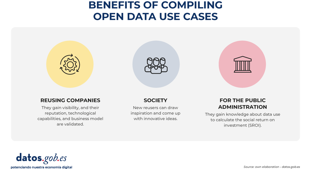
Figure 1. Benefits of compiling open data use cases. Source: own elaboration - datos.gob.es.
Three ways to nurture the repository continuously
Locating companies with open data-driven business models and specific use cases may seem like a complicated task at first, but the secret lies in combining automation with presence in the right forums. To keep the catalog constantly updated, it is recommended to activate three complementary ways:
- Proactive listening: it consists of constantly monitoring social networks, the technological media, the lists of companies from associations in the sector (such as ASEDIE), as well as the winners of hackathons and innovation awards.
- Reactive channels: in parallel to the proactive search, it is necessary to maintain a permanent and visible communication channel on the web portal. It is usual to have a simple form so that the companies themselves can apply autonomously. Disseminating this communication channel through the various means of the initiative (such as social networks, periodic newsletters, etc.) is essential to guarantee the growth of the catalog of use cases.
- Ecosystem alliances: another good option is to collaborate closely with business associations, universities, startup incubators and technology parks, which are usually the main dynamizers and birthplaces of these reuse companies.
How to choose the companies and cases to categorize?
In order for the collection of use cases to be a reference tool and maintain a high standard of quality, it is necessary to apply objective filtering criteria. It is recommended to prioritize projects under the following premises:
- Significant use of public data: the business model or solution must be based totally or partially on the reuse of datasets of public origin (local, regional, national or European), with a positive emphasis on the hybridization of different data sources (data mashup).
- Social or economic impact and relevance: priority will be given to those companies and solutions that solve real problems of citizens or the productive sectors (for example, optimisation of urban mobility, health diagnostic tools, energy efficiency or financial transparency).
- Maturity and viability: companies that offer applications, platforms or services that are already operational in the market or, at least, that have a tested and functional Minimum Viable Product (MVP) should be considered. It is advisable to avoid ideas or projects in a purely conceptual phase. These initial solutions can be showcased in the data competitions organised by various bodies, such as the Junta de Castilla y León or the Cabildo de Tenerife, among others.
- Quality and functionality: technological solutions must have a correct design and technical operation, with an optimal user experience. The goal is to ensure that the reuse of the data translates into a truly efficient and robust service for your target audience.
- Sectoral diversity: it is important to seek a thematic balance to demonstrate that open data is transversal. The repository or catalogue should reflect cases in sectors as diverse as agriculture, tourism, culture or education.
What information should be included about each use case?
In order for the use case sheets to be homogeneous, comparable and useful for portal users, the collection of information must be structured in a homogeneous way. Some of the basic pillars to include are:
- Reuser profile: name of the company, organization or person that has implemented the business model or developed the solution. In the case of companies, you can include their year of foundation, size, sector of activity, link to their corporate website, etc.
- Description of the business model/solution: name of the products or services, problems it solves, description of its functionality, target audience to which it is directed, etc.
- Open data sources used: explicit detail of the datasets consumed, including their source of origin (e.g. "Meteorological data from the State Meteorological Agency - AEMET"). This directly helps connect supply with demand for data.
- Impact obtained: Quantitative or qualitative indicators of the benefit generated for both the company and the reuser (time savings, emission reduction, turnover, jobs created, etc.).
Examples of use case catalogs
To inspire the design of your own repository or to understand how these methodologies are reflected in the real environment, it is useful to analyse how different public administrations are implementing them.
In the case of datos.gob.es, we have two different sections, one for companies and the other for applications. Both sections allow you to filter by sector of activity or tags, and also include a free text search engine, so that users can more easily find the use cases that correspond to their needs.
At the regional and local level, there are also many bodies that have decided to include a specific section on their platforms that shows the potential use of the published datasets. This is the case of the Junta de Andalucía, the Basque Government or the Madrid City Council.
If we look at Europe, our neighbours also have this functionality in their open data platforms. National initiatives such as those of France or Lithuania, which occupy the top positions in open data maturity according to Open Data Maturity 2025, also have this type of showcase.
Conclusion: moving from published data to shared value
Measuring the impact of open data is critical to ensuring the long-term sustainability of open data initiatives. Without a clear methodology for capturing and structuring success stories, portals risk becoming mere warehouses of inert digital files.
By making real examples of the usefulness of open data available to the public, the Administration not only justifies public investment in this area, but also gives back to society the knowledge necessary to continue innovating.
Application
Embals.es displays the status of reservoir water levels in Spain in near real time: fill percentage, capacity, and trends for more than 380 reservoirs, aggregated by province, autonomous community, and river basin, on an interactive map.
The application reuses official open data from MITECO’s Weekly Hydrological Bulletin (historical series dating back to 1988) and the SAIH systems of the river basin authorities (Duero, Ebro, Guadalquivir, Júcar, Segura, and Cantabrian) for real-time readings, the reservoir dataset for the internal river basins from the Catalan Water Agency, and precipitation forecasts from AEMET OpenData.
It includes a reservoir comparison tool, historical trend graphs compared to the average of the last 10 years, individual fact sheets for each reservoir, and summary images for sharing.
Web access is free and requires no registration.
Translated with DeepL.com (free version)
Application
“Save on Electricity” is a simple, user-friendly app that displays the price per kilowatt-hour under the PVPC (Voluntary Price for Small Consumers) rate. This is Spain’s regulated electricity rate, with prices that vary hourly based on the wholesale market and intended for households and small businesses with a contracted power capacity of up to 10 kW.
With this free information, users can plan ahead and manage their use of the most energy-intensive appliances to save on their next bill. Therefore, in addition to providing electricity price information, it helps raise awareness among users about responsible energy use.
The app has been available for over 12 years and has been downloaded by nearly 2 million users in Spain. It is compatible with Android devices.
Application
Madriwa is an interactive web application designed to help people find the most suitable neighbourhood to live in Madrid by analysing urban data, nearby services and personal preferences.
The platform collects and processes information from more than 100 data sources, many of them from the Madrid City Council's open data, and updates this information regularly through automatic data analysis processes. With this data, it generates personalized profiles and recommendations on different areas of the city.
Through the application, the user can enter their interests or profile (for example, student, family or couple) and the tool analyzes which neighborhoods best fit those preferences. It also allows you to indicate important places such as work, university or the gym, to calculate distances and travel times.
Madriwa's key features include:
- Classification of neighborhoods in Madrid according to user preferences.
- Display on an interactive map with information on nearby services and facilities.
- Analysis of travel and isochronous times from different locations.
- Consultation of urban indicators such as average income, safety, population density or presence of facilities (schools, hospitals, public transport, etc.).
The app uses data analytics technologies, geographic information systems, and mapping visualization to transform large volumes of urban information into understandable recommendations for those looking for housing in the city.
Application
Embarriados Atlas of the new urban and social vulnerability in Spain is a research project by the company 300,000 km/s and the COTEC Foundation that seeks to provide new knowledge about the relationship between city, mobility and urban inequality to support the formulation of public policies and avoid the potential risks of social segregation resulting from decarbonization.
Embarriados is based on the idea that the new urban models of low mobility promote health and social well-being, but at the same time entail a risk of greater segregation of the population due to the new spatial dynamics that reduce the interaction between different social groups. Its objective is to provide evidence to design more inclusive cities and anticipate segregation risks in the transition to decarbonized urban models.
The research is based on the analysis of massive data that allows describing the socioeconomic level of the population, urban fabrics and their uses, and daily movements from mobile telephony, integrating these layers to build territorial metrics and indicators. The project publishes replicable methodology and the data model for reuse.
The portal includes a section with the final data model that includes the indicators and the clustering is shared so that it can be used.
Application
The application is a tourist mobility analytics platform that integrates overnight stay data from the INE's experimental statistics with its own spatial estimation algorithms, capable of identifying the attraction of tourists at the 100-metre grid level. This approach allows working with a high granularity, facilitating a precise understanding of how tourist flows are distributed and concentrated in the territory.
On this basis, the solution incorporates advanced models for the processing of mobility matrices, aimed at detecting patterns, recurrences and relevant dynamics in the movements of tourists. Based on this data, an automated system of insights generation is activated that identifies high-value events, that is, significant findings that emerge from large volumes of complex, redundant or apparently obvious information, and that are transformed into useful and actionable knowledge.
All this analytical capacity is presented through a conversational interface based on generative artificial intelligence (GenAI/LLM), which allows non-technical users to interact with the system using natural language. In this way, the exploration, understanding and interpretation of data is facilitated, reducing technical complexity and favoring informed decision-making in areas such as tourism planning, destination management and the optimization of strategies within the sector.
Application
This app is designed to help users find low-cost gas stations. The goal is to enable users to choose and pay as little as possible for each fill-up by finding the cheapest gas station near their location or along their route. It includes gas stations in Spain, France, Portugal, and Italy.
Users can browse the interactive map, or enter a city or town in the search bar, and the app will show them which gas stations are near their location and the real-time prices of different types of fuel. They can also enter their route to see the best refueling options along the way.
The app also provides information on the average price of different fuels, as well as how prices have changed over the past year. It includes data by country, brand, autonomous community, or province.