Description
Data visualization is a fundamental practice to democratize access to public information. However, creating effective graphics goes far beyond choosing attractive colors or using the latest technological tools. As Alberto Cairo, an expert in data visualization and professor at the academy of the European Open Data Portal (data.europa.eu), points out, "every design decision must be deliberate: inevitably subjective, but never arbitrary." Through a series of three webinars that you can watch again here, the expert offered innovative tips to be at the forefront of data visualization.
When working with data visualization, especially in the context of public information, it is crucial to debunk some myths ingrained in our professional culture. Phrases like "data speaks for itself," "a picture is worth a thousand words," or "show, don't count" sound good, but they hide an uncomfortable truth: charts don't always communicate automatically.
The reality is more complex. A design professional may want to communicate something specific, but readers may interpret something completely different. How can you bridge the gap between intent and perception in data visualization? In this post, we offer some keys to the training series.
A structured framework for designing with purpose
Rather than following rigid "rules" or applying predefined templates, the course proposes a framework of thinking based on five interrelated components:
- Content: the nature, origin, and limitations of the data
- People: The audience we are targeting
- Intention: The Purposes We Define
- Constraints: The Constraints We Face
- Results: how the graph is received
This holistic approach forces us to constantly ask ourselves: what do our readers really need to know? For example, when communicating information about hurricane or health emergency risks, is it more important to show exact trajectories or communicate potential impacts? The correct answer depends on the context and, above all, on the information needs of citizens.
The danger of over-aggregation
Even without losing sight of the purpose, it is important not to fall into adding too much information or presenting only averages. Imagine, for example, a dataset on citizen security at the national level: an average may hide the fact that most localities are very safe, while a few with extremely high rates distort the national indicator.
As Claus O. Wilke explains in his book "Fundamentals of Data Visualization," this practice can hide crucial patterns, outliers, and paradoxes that are precisely the most relevant to decision-making. To avoid this risk, the training proposes to visualize a graph as a system of layers that we must carefully build from the base:
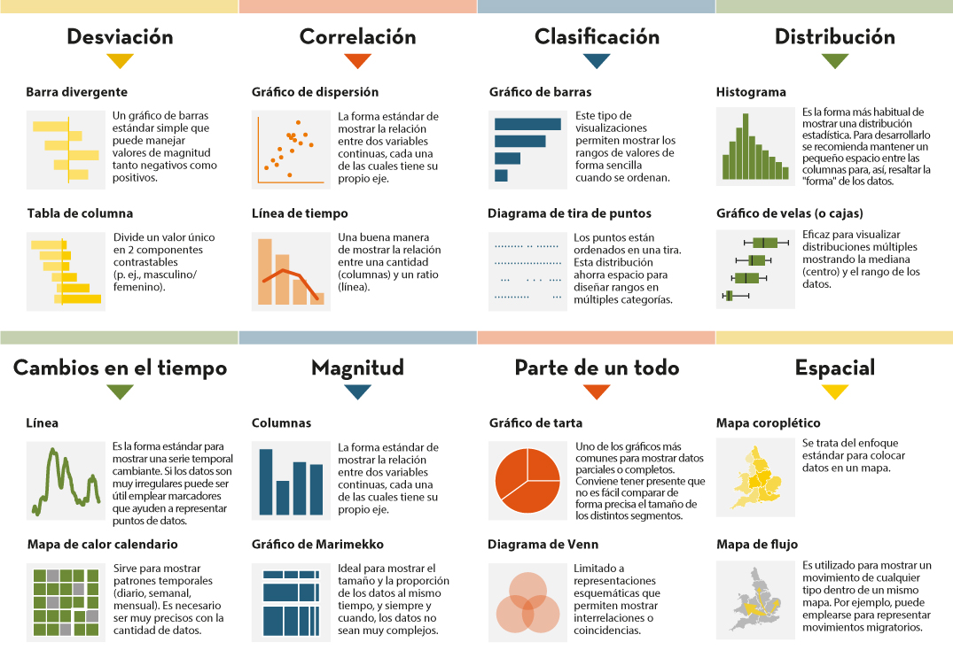
1. Encoding
- It's the foundation of everything: how we translate data into visual attributes. Research in visual perception shows us that not all "visual channels" are equally effective. The hierarchy would be:
- Most effective: position, length and height
- Moderately effective: angle, area and slope
- Less effective: color, saturation, and shape
How do we put this into practice? For example, for accurate comparisons, a bar chart will almost always be a better choice than a pie chart. However, as nuanced in the training materials, "effective" does not always mean "appropriate". A pie chart can be perfect when we want to express the idea of a "whole and its parts", even if accurate comparisons are more difficult.
2. Arrangement
- The positioning, ordering, and grouping of elements profoundly affects perception. Do we want the reader to compare between categories within a group, or between groups? The answer will determine whether we organize our visualization with grouped or stacked bars, with multiple panels, or in a single integrated view.
3. Scaffolding
Titles, introductions, annotations, scales and legends are fundamental. In datos.gob.es we've seen how interactive visualizations can condense complex information, but without proper scaffolding, interactivity can confuse rather than clarify.
The value of a correct scale
One of the most delicate – and often most manipulable – technical aspects of a visualization is the choice of scale. A simple modification in the Y-axis can completely change the reader's interpretation: a mild trend may seem like a sudden crisis, or sustained growth may go unnoticed.
As mentioned in the second webinar in the series, scales are not a minor detail: they are a narrative component. Deciding where an axis begins, what intervals are used, or how time periods are represented involves making choices that directly affect one's perception of reality. For example, if an employment graph starts the Y-axis at 90% instead of 0%, the decline may seem dramatic, even if it's actually minimal.
Therefore, scales must be honest with the data. Being "honest" doesn't mean giving up on design decisions, but rather clearly showing what decisions were made and why. If there is a valid reason for starting the Y-axis at a non-zero value, it should be explicitly explained in the graph or in its footnote. Transparency must prevail over drama.
Visual integrity not only protects the reader from misleading interpretations, but also reinforces the credibility of the communicator. In the field of public data, this honesty is not optional: it is an ethical commitment to the truth and to citizen trust.
Accessibility: Visualize for everyone
On the other hand, one of the aspects often forgotten is accessibility. About 8% of men and 0.5% of women have some form of color blindness. Tools like Color Oracle allow you to simulate what our visualizations look like for people with different types of color perception impairments.
In addition, the webinar mentioned the Chartability project, a methodology to evaluate the accessibility of data visualizations. In the Spanish public sector, where web accessibility is a legal requirement, this is not optional: it is a democratic obligation. Under this premise, the Spanish Federation of Municipalities and Provinces published a Data Visualization Guide for Local Entities.
Visual Storytelling: When Data Tells Stories
Once the technical issues have been resolved, we can address the narrative aspect that is increasingly important to communicate correctly. In this sense, the course proposes a simple but powerful method:
- Write a long sentence that summarizes the points you want to communicate.
- Break that phrase down into components, taking advantage of natural pauses.
- Transform those components into sections of your infographic.
This narrative approach is especially effective for projects like the ones we found in data.europa.eu, where visualizations are combined with contextual explanations to communicate the value of high-value datasets or in datos.gob.es's data science and visualization exercises.
The future of data visualization also includes more creative and user-centric approaches. Projects that incorporate personalized elements, that allow readers to place themselves at the center of information, or that use narrative techniques to generate empathy, are redefining what we understand by "data communication".
Alternative forms of "data sensification" are even emerging: physicalization (creating three-dimensional objects with data) and sonification (translating data into sound) open up new possibilities for making information more tangible and accessible. The Spanish company Tangible Data, which we echo in datos.gob.es because it reuses open datasets, is proof of this.

Figure 1. Examples of data sensification. Source: https://data.europa.eu/sites/default/files/course/webinar-data-visualisation-episode-3-slides.pdf
By way of conclusion, we can emphasize that integrity in design is not a luxury: it is an ethical requirement. Every graph we publish on official platforms influences how citizens perceive reality and make decisions. That is why mastering technical tools such as libraries and visualization APIs, which are discussed in other articles on the portal, is so relevant.
The next time you create a visualization with open data, don't just ask yourself "what tool do I use?" or "Which graphic looks best?". Ask yourself: what does my audience really need to know? Does this visualization respect data integrity? Is it accessible to everyone? The answers to these questions are what transform a beautiful graphic into a truly effective communication tool.