Publication date
04/06/2021
Update date
20/06/2024

Description
A couple of weeks ago, we commented in this article the importance of data analysis tools to generate representations that allow a better understanding of the information and make better decisions. In this article we divide these tools into 2 categories: generic data visualization tools - such as Kibana, Tableau Public, SpagoBI (now Knowage) and Grafana - and visualization libraries and APIs. We are going to dedicate this new post to the latter.
Libraries and visualization APIs are more versatile than generic visualization tools, but in order to work with them it is necessary for the user to know the programming language where the library is implemented.
There is a wide range of libraries and APIs for different programming languages or platforms, which implement functionalities related to data visualization. Next, we will show you a selection taking as a fundamental criterion the popularity that the User Community grants them.
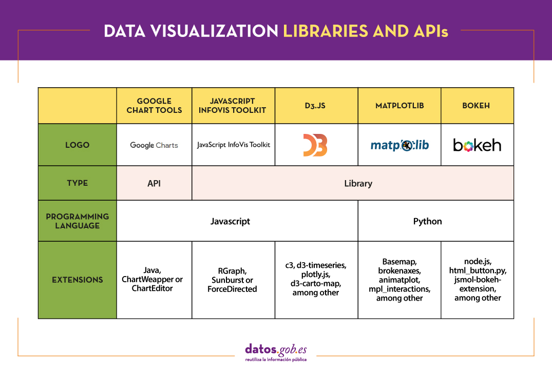
Google Chart Tools
Functionality:
Google Chart Tools is Google's API for creating interactive visualizations. It allows the creation of dashboards using different types of widgets, such as category selectors, time ranges or autocompleters, among others.
Main advantages:
It is a very easy-to-use and intuitive tool that allows interaction with data in real time. Furthermore, the generated visualizations can be integrated into web portals using HTML5 / SVG technology.
Do you want to know more?
- Support materials: On Youtube we find various tutorials made by API users.
- Repository: On Github we can access a common library for graphics packages, as well as know the supported chart types and examples of how to customize the components of each graphic, among others.
- User community: Users of Google Chart Tools can raise their questions in the Google community, in the space enabled for it.
JavaScript InfoVis Toolkit
Functionality:
JavaScript InfoVis Toolkit is the JavaScript library that provides functions for creating multiple interactive visualizations such as maps, hierarchical trees or line graphs.
Main advantages:
It is efficient in handling complex data structures and has a wide variety of display options, so it adapts to any developer need.
Do you want to know more?
- Support materials: East user manual explains the main display options and how to work with the library. Also available demos for creating different types of graphics.
- Repository: Users must download the project from http://thejit.org, although they also have available a repository on Github where, among other things, they can download extras.
- User community: Both in the Google user community like in Stackoverflow We found spaces dedicated to JavaScript InfoVis Tookit for users to share doubts and experiences.
Data-Driven Documents (D3.js)
Functionality:
Data-Driven Documents (D3.js) is the Javascript library that allows the creation of interactive graphics and complex visualizations. Thanks to it, data-based documents can be manipulated using open web standards (HTML, SVG and CSS), so that browsers can interpret them to create visualizations independently of proprietary software.
Main advantages:
This library allows the manipulation of a DOM (Object Model for Document Representation) by applying the necessary transformations to the structure based on the data linked to an HTML or XML document. This provides virtually unlimited versatility.
Do you want to know more?
- Support materials: On Github You can find numerous tutorials, although mainly dedicated to the old versions (they are currently in the process of updating this section of the wiki and writing new tutorials on version 4.0 of D3).
- Repository: Also on Github we find up to 53 repositories, which cover different materials to manage thousands of simultaneous animations, group two-dimensional points in hexagonal trays or work with the d3-color module, among others. In this Gallery you can see some of the work done.
- User community:There are spaces for discussion about D3 in the Community of Google,Stackoverflow, Gitter Y Slack.
- Social media: On the Twitter account @ d3js_org experiences, news and use cases are shared. There is also a group in LinkedIn.
Matplotlib
Functionality:
Matplotlib is one of the most popular libraries in Python for creating high-quality graphics and visualizations. It is characterized by presenting a hierarchical organization that goes from the most general level, such as the outline of a 2D matrix, to a very specific level, such as coloring a certain pixel.
Main advantages:
Matplotlib supports text and labels in LaTeX format. In addition, users can customize its functionality through packages designed by third parties (Cartopy, Ridge Map, holoviews, among others).
Do you want to know more?
- Support materials: On its own website we find a user's GuideIt includes information on the installation and use of the various functionalities. Also available tutorials for both beginners, intermediate or advanced users.
- Repository: In this repository Github are the materials you need for installation. On the web you can see a Gallery with examples of works for your inspiration.
- User community: The official website has a community section, although you can also find user groups to help you with your questions in Stackoverflow and Gitter.
- Social media: On Twitter profile @matplotlib Examples of user work and visualizations are also shared, as well as information on the latest news in the tool.
Bokeh
Functionality:
Bokeh is the Python library oriented to the creation of interactive graphs based on HTML / JS. It has the ability to generate interactive visualizations with features such as floating text, zoom, filters or selections, among others.
Main advantages:
Its main advantage is simplicity in implementation: complex interactive visualizations can be created with just a few lines of code. In addition, it allows embedding JavaScript code to implement specific functionalities.
Do you want to know more?
- Support materials: This User's guide provides detailed descriptions and examples that describe many common tasks that can be performed with Bokeh. On the Bokeh website we also find this tutorial and application examples built with this tool.
- Repository: In this repository Github There are the materials and instructions for its installation, as well as examples of use. Examples are also available in this Gallery.
- User community: The official community can be found on the website of Bokeh, although the users of this tool also meet in Stackoverflow.
- Social media:To keep up to date with news, you can follow the Twitter account @bokeh or your profile in LinkedIn.
The following table shows a summary of the tools mentioned above:
Are you agree with our selection? We invite you to share your experience with these or other tools in the comments section.
If you are looking for tools to help you in data processing, from datos.gob.es we put at your disposal the report "Data processing and visualization tools”, Recently updated, as well as the following monographic articles:
- The most popular data conversion and data cleaning tools
- The most popular data analysis tools
- The most popular data visualisation tools
- The most popular geospatial visualisation tools
- The most popular network analysis tools
Content elaborated by datos.gob.es team.
Comments