
Description
Data is a fundamental pillar in business decision making. Before making any decision, it is necessary to analyze the situation to understand the context and envision possible alternatives. And for this it is necessary to present the data in a clear and understandable way.
Data analysis is useless if we cannot get the result to be understood. And the best way to understand the data is to visualize it.
What is data visualization?
Data visualization is a task linked to data analysis whose objective is the graphical representation of the underlying information of the data. For this, basic graphic elements are used, such as line graphs, scatter graphs or heat maps, to complex visualizations configured on a dashboard or control panel.Data visualization allows you to detect patterns, trends or anomalous data, project predictions or communicate inferences derived froml data analysis, among other issues.
Thanks to these representations, people without advanced analytics knowledge can interpret and understand data more easily and make decisions based on them in fields as diverse as marketing, health, science, economics, journalism or even art.
We can divide the data visualization tools into two categories. On the one hand, the generic visualization tools and, on the other, the libraries and visualization APIs, which are more versatile, but require the use of programming languages.In this article we are going to focus on the former.
Top examples of generic data visualization tools
Kibana
Functionality:
Kibana is an open source software that is part of the product package Elastic Stack. Provides indexed data exploration and visualization capabilities on top of the analytics engine Elasticsearch.
Main advantages:
Its main advantage is that it presents the information visually through customizable dashboards, through the integration of faceted filters by ranges, information categories, geospatial coverage or time intervals, among others. In addition, it has a catalog of development tools (Dev Tools) to interact with the data stored in Elasticsearch.
Do you want to know more?
- Support materials: On Elastic's own website we find this user manualIt includes basic concepts to configure Kibana, how to create and customize dashboards, how to interact with Kibana APIs, among others. Elastic also offers short videos on its channel Youtube and organizes, periodically, webinars where various aspects and use cases are explained on Kibana.
- Repository: In this Github you have different resources for its configuration, including plugins, tests and examples.
- User community: There is an official user community in their Web page, although you can also find discussion groups at Stackoverflow.
- Social media: You can follow the Twitter account @elastic to stay up-to-date with Kibana news and discover user experiences, or join their group of LinkedIn.
Tableau Public
Functionality:
Tableau Public is a tool designed to carry out visualizations combining a graphical interface with common elements of the Business Integillence tools, such as the variable organization model through the use of dimensions and the connection with databases or datasets.
Main advantages:
It stands out for its graphic, efficient and fast interface, and for its simple integration of databases or spreadsheets of any size. In addition, it allows the combination of various data sources in a single view.
As a negative point, in order to use the free version, both the data and the views must be published on your website in a public way, eliminating the confidentiality of the information.
Do you want to know more?
- Support materials: Tableau offers a manual with 8 stepsto get started with Tableau Desktop, including everything from connecting to your data to sharing your findings. You can also find on the Tableau website tutorials, a visualization gallery, resources for users (such as podcasts or contests) and a Blog with related articles.
- User community: In the official forum From Tableau you can find more than 450 user groups and answers to more than 195,000 questions.
- Social media: On the Twitter account @tableaupublic Examples of visualizations, experiences, and news information are included. Also available is a group of LinkedIn.
SpagoBI (Knowage)
Functionality:
Grafana allows you to create interactive and dynamic visualizations. Originally started as a component of Kibana, today they are completely independent tools.
Main advantages:
SpagoBI allows you to create customizable and exportable reports in different formats (HTML, PDF, XLS, XML, TXT, CSV and RTF) that can contain tables, cross tables, interactive graphics and text.
Do you want to know more?
- Support materials: On this document you can find an installation manual, an administration manual, a user guide and information about the different functionalities. On his channelYoutubeYou can find different playlists with success stories, examples of visualizations, tutorials on different functionalities or webinars, among others. In the case of webinars, you can also access them fromtheir website, where the agenda with the next appointments is included.
- Repository: On Github there are different repositories with material of interest to SpagoBI users.
- User community: You can find different questions posed by users -and their answers- in Stackoverflow.
- Social media: The user community also has at its disposal a group of LinkedIn. On Twitter, channels coexist @SpagoBI and @knowage_suite, that inform about the news and show examples of work carried out with this tool.
Grafana
Functionality:
Grafana allows you to create interactive and dynamic visualizations. Originally started as a component of Kibana, today they are completely independent tools.
Main advantages:
This tool allows users to interact, exchanging data or dashboards. In addition, it integrates different databases such as: PostgreSQL, MySQL and Elasticsearch, from which you can obtain metrics, filter data or make annotations in real time.
Do you want to know more?
- Support materials: In the Grafana websitethere is multiple information on how to install this tool, create a dashboard or manage alerts. They also have a Blog as well as with webinars and videos, also available in your Youtube channel.
- Repository: From this GitHub you can download packages and resources, like plugins.
- User community: As in some of the previous cases, we found an official community in the own Grafana website, and informal communities in Gitter and Stackoverflow.
- Social media: Twitter account @grafana shows examples of use and helps spread the news highlighted on the blog. Users can also join their group of LinkedIn.
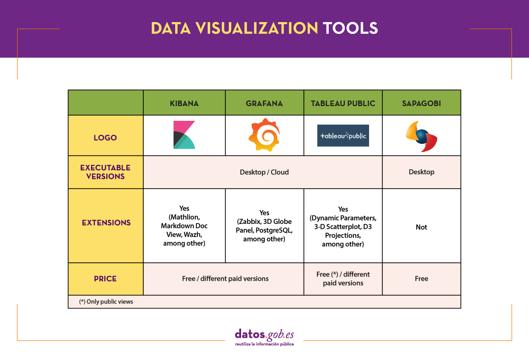
The following table shows a summary of the tools mentioned above:
These are just 4 examples of popular tools fromdata visualization. Soon we will put at your disposal an article with examples of libraries and visualization APIs. We invite you to share your experience with these or other tools in the comments.
If you want to know more about the different phases of data processing, you can see the full report "Data processing and visualization tools", recently updated. In addition, you have at your disposal the following monographic articles:
- The most popular data conversion and data cleaning tools
- The most popular data analysis tools
- The most popular data visualisation libraries and APIs
- The most popular geospatial visualisation tools
- The most popular network analysis tools
Content prepared by the datos.gob.es team.
Comments