A statistical graph is a visual representation designed to contain a series of data whose objective is to highlight a specific part of the reality. However, organising a set of data in an informative way is not an easy task, especially, if we want to capture the viewer’s attention and to present the information in an accurate format.
In order to facilitate comparisons between data it is required a minimum of statistical knowledge to highlight trends, to avoid misleading visualisation and to illustrate the message to be conveyed. Therefore, depending on the type of interrelation that exists between the data that we are trying to illustrate, we must choose one type of visualisation or another. In other words, representing a numerical classification is not the same as representing the degree of correlation between the two variables.
In order to precisely choose the most appropriate graphs according to the information, we have selected down the most recommended graphs for each type of association between numerical variablesv. During the process of preparing this content, we have taken as a reference the Data Visualisation Guide for local entities recently published by the FEMP's RED de Entidades Locales por la Transparencia y Participación Ciudadana, as well as this infography prepared by the Financial Times.

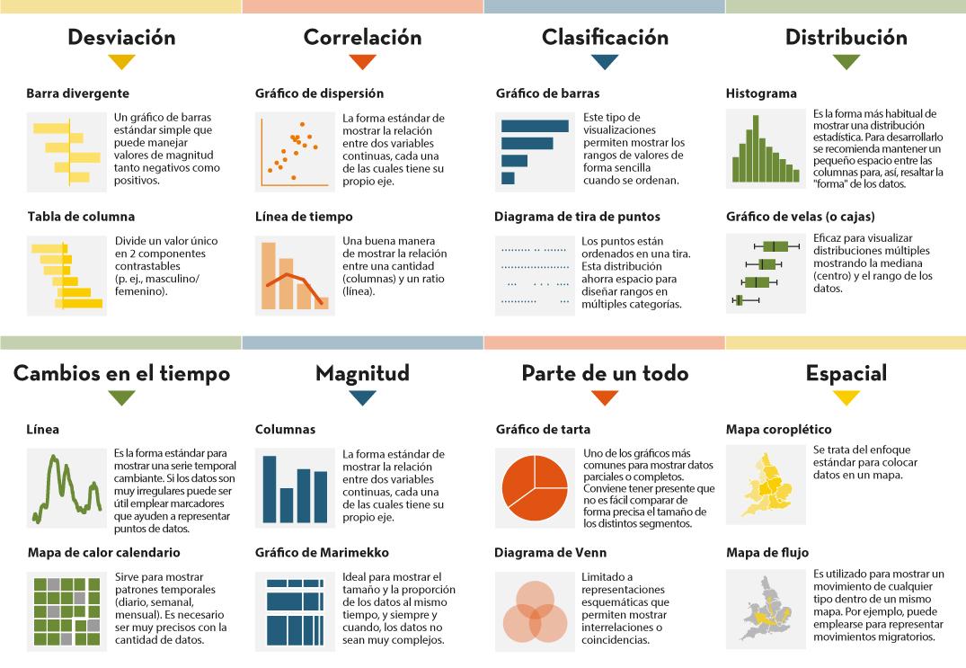
Deviation
It is used to highlight numerical variations from a fixed reference point. Usually, the reference point is zero, but it can also be a target or a long-term average. In addition, this type of graph is useful to show sentiments (positive, neutral or negative). The most common charts are:
- Diverging bar: A simple standard bar chart that can handle both negative and positive magnitude values.
- Column chart: Divides a single value into 2 contrasting components (e.g. male/female).
Correlation
Useful to show the relationship between two or more variables. Note that unless you tell them otherwise, many readers will assume that the relationships you show them are causal. Here are some of the graphs.
- Scatter plot: The standard way of showing the relationship between two continuous variables, each of which has its own axis.
- Timeline: A good way to show the relationship between a quantity (columns) and a ratio (line).
Sorting
Sorting numerical variables is necessary when the position of an item in an ordered list is more important than its absolute or relative value. The following graphs can be used to highlight points of interest.
- Bar chart: These types of visualisations allow ranges of values to be displayed in a simple way when they are sorted.
- Dot-strip chart: The values are arranged in a strip. This layout saves space for designing ranges in multiple categories.
Distribution
This type of graph seeks to highlight a series of values within a data set and represent how often they occur. That is, they are used to show how variables are distributed over time, which helps to identify outliers and trends.
The shape itself of a distribution can be an interesting way to highlight non-uniformity or equality in the data. The most recommended visualisations to represent, for example, are age or gender distribution are as follows:
- Histogram: This is the most common way of showing a statistical distribution. To develop it, it is recommended to keep a small space between the columns in order to highlight the "shape" of the data.
- Box plot: Effective for visualising multiple distributions by showing the median (centre) and range of the data.
- Population pyramid: Known for showing the distribution of the population by sex. In fact, it is a combination of two horizontal bar charts sharing the vertical axis.
Changes over time
Through this combination of numerical variables it is possible to emphasise changing trends. These can be short movements or extended series spanning decades or centuries. Choosing the right time period to represent is key to providing context for the reader.
- Line graph: This is the standard way to show a changing time series. If the data is very irregular it can be useful to use markers to help represent data points.
- Calendar heat map: Used to show temporal patterns (daily, weekly, monthly). It is necessary to be very precise with the amount of data.
Magnitude
It is useful for visualising size comparisons. These can be relative (simply being able to see bigger/larger) or absolute (requires seeing more specific differences). They usually show variables that can be counted (e.g. barrels, dollars or people), rather than a calculated rate or percentage.
- Column chart: One of the most common ways to compare the size of things. The axis should always start at 0.
- Marimekko chart: Ideal for showing the size and proportion of data at the same time, and as long as the data is not too complex.
Part of a whole
These types of numerical combinations are useful to show how an entity itself can be broken down into its constituent elements. For example, it is common to use part of a whole to represent the allocation of budgets or election results.
- Pie chart: One of the most common charts to show partial or complete data. Keep in mind that it is not easy to accurately compare the size of different segments.
- Stacked Venn: Limited to schematic representations to show interrelationships or coincidences.
Spatial
This type of graph is used when precise locations or geographic patterns in the data are more important to the reader than anything else. Some of the most commonly used are:
- Choropleth map: This is the standard approach to placing data on a map.
- Flow map: This is used to show movement of any kind within a single map. For example, it can be used to represent migratory movements.
By knowing the different statistical representation options, it helps to create more accurate data visualisations, which in turn to allow a more clearly conceived reality. Thus, in a context where visual information is becoming increasingly important, it is essential to develop the necessary tools so that the information contained in the data reaches the public and contributes to improving society.


