Description
Introduction
Every year there are tens of thousands of accidents in Spain, in which thousands of people are injured of varying degrees, and which occur in very different circumstances, both in terms of the type of road and the type of accident.
Many of the statistics related to these parameters are collected in the databases of the Directorate General of Traffic (DGT) and some of them in the catalogue hosted in datos.gob.es.
In this exercise, you will examine the content of the DGT accident database for the year 2024 in order to make a series of basic visualizations that allow us to quickly and intuitively see which are the facts to highlight regarding the incidence of accidents and their consequences in that year.
To do this, we are going to develop Python code that allows us to read and calculate basic metrics regarding the total number of victims, the particularities of the infrastructures as well as the different cases of accidents. And once we have this data available, we will visualize it using the Javascript D3.js library, which allows us both to represent data in its most traditional form and in more contemporary designs, common in the press, thus favoring a narrative that is fluid in style and coherent in content.
In the Python environment we will use commonly and frequently used libraries such as Numpy, for basic calculation - sums, maximums and minimums, and Pandas, to structure the data intuitively, facilitating both its organization and its transformation. We will also work with Datetime, both for the formatting of the input data in standard date types within the world of Python programming, and to add the data in an easy and intuitive way. In this way we will learn how to open any type of data file in . CSV, to structure it in an orderly way and to carry out basic transformations and operations in a simple way.
In the Javascript environment we will develop notebooks in D3.js thanks to the use of Observable, an open and free initiative, to be able to execute Javascript code directly in a web interface, and without having to resort to local servers or complex installations. In different notebooks we will create classic visualizations -such as time series on
Cartesian axes or maps- along with other proposals such as bubble distributions or elements stacked by categories.
In Figure 1 you can see the main stages of this exercise, from the reading of the data within the DGT file, to the operations and output variables in JSON format, which will in turn serve us in a Javascript environment to be able to develop the visualizations in D3.js.
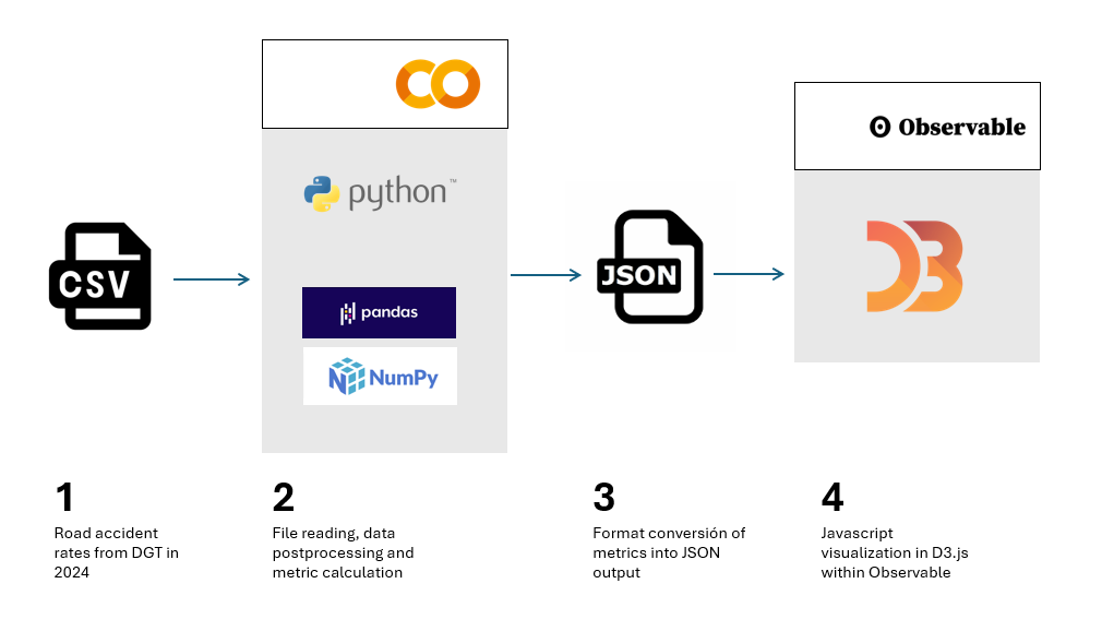
Figure 1. Steps to be followed when performing this exercise, from reading the input CSV file, postprocessing the data with Python, creating an output in JSON format and ultimately displaying the information in D3.js
Access to the Github repositories, GoogleColab notebook and Observable notebooks is done via:
Access to the Github repository
Access to GoogleColab notebook
Access to Observable notebooks
Development Process
1. Reading the data file
The first step will be to read the DGT file containing all the accident records for the year 2024. This step will allow us to identify the fields of interest and especially in what format they are. We will be able to identify if any transformation is required, especially in the information of the date, as it is structured in the original file.
We will also see how to translate the codes of many of the categories offered by the DGT, so that we can make a real interpretation beyond the numbers of categories such as type of accident, type of road or ownership of the road.
Once we understand the structure and content of the data, we can start operating with it.
2. Calculating Metrics
The Pandas Python library allows us to operate with the different columns of data and perform basic calculations that will be representative enough to minimally understand the casuistry of accidents on Spanish roads.
In this section, three types of calculations will be made.
- The first of these will be the calculation of the total number of victims per hour of the day for each of the days of the week. The DGT database is structured by day of the week, so we will also use this time scale to represent the data in a series. It should be noted that avictim is considered to be any person who has died or who is diagnosed as seriously or lightly injured.
- The second calculation will be the sum of the total of accidents for different categories, such as road ownership, type of accident or type of road. This will allow us to see which are the conditions in which accidents are most frequent.
- The third calculation will be the number of accidents per municipality. In this case we will carry out the calculation restricted to the province of Valencia as an example, and which would be applicable to any province or municipality of our interest. In this case we will observe the differences between urban and non-urban centers, as well as those municipalities through which the main communication routes pass.
3. Visualization Design
Once we have calculated the metrics of interest, we will develop four visualization exercises in D3.js. To do this, we will export the result of the metrics in JSON format and create notebooks in Observable. Specifically, we made the following visualizations:
- Time series with the total number of casualties in each hour and day of the week, with an interactive drop-down menu to select the day of the week of interest. In addition to the curve that describes the number of victims, we will draw the uncertainty of all the days of the week on the background of the graph, so that the daily time series is framed in the context of the whole week as a reference.
- Map of the province of Valencia with the total number of accidents by municipality.
- Bubble diagram, with the different magnitudes of the different types of accidents with the total number of accidents in each case written in detail.
- Stacked dot diagram, where we accumulate circles or any other geometric shape for the different road ownership and its total number of accidents within the framework of each ownership.
- Mountain ridge diagram, where the height of each mountain represents the total number of victims on a logarithmic scale.
Viewing metrics
The result of this exercise can be seen graphically and explicitly in the form of visualizations made for the web format and accessible from a web interface, both for its development and for its subsequent publication. These visualizations are gathered as Observable notebooks here:
Access to Observable notebooks
In Figure 2 we have the result of the time series of the total number of victims with respect to the time of day for different days of the week. The time series is framed within the uncertainty of the total number of days of the week, to give an idea of the margin of variability that we can have depending on the time of day.
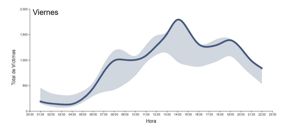
Figure 2. Time series of total accident casualties by time of day for all days of the week in 2024. The light blue background indicates the uncertainty associated with all the days of the week as context, with a drop-down menu to select the day of the week.
In Figure 3 we can see the map of the province of Valencia with a colour intensity proportional to the number of accidents in each municipality. Those municipalities in which no accidents have been recorded appear in white. Intuitively you can guess the layout of the main roads that cross the province, both the road to the east of the city of Valencia in the direction of Madrid and the inland road to the south of the city in the direction of Alicante
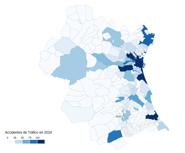
Figure 3. Map of the number of accidents by municipality in the province of Valencia in 2024.
In Figure 4 we see a geometric shape, the circle, associated with the types of accidents, with the detail of the number of accidents associated with each category. In this type of visualization, the most frequent accidents around the center of the diagram naturally emerge, while those that are minority or residual occupy the perimeter of the diagram to also give a round shape to the set of shapes
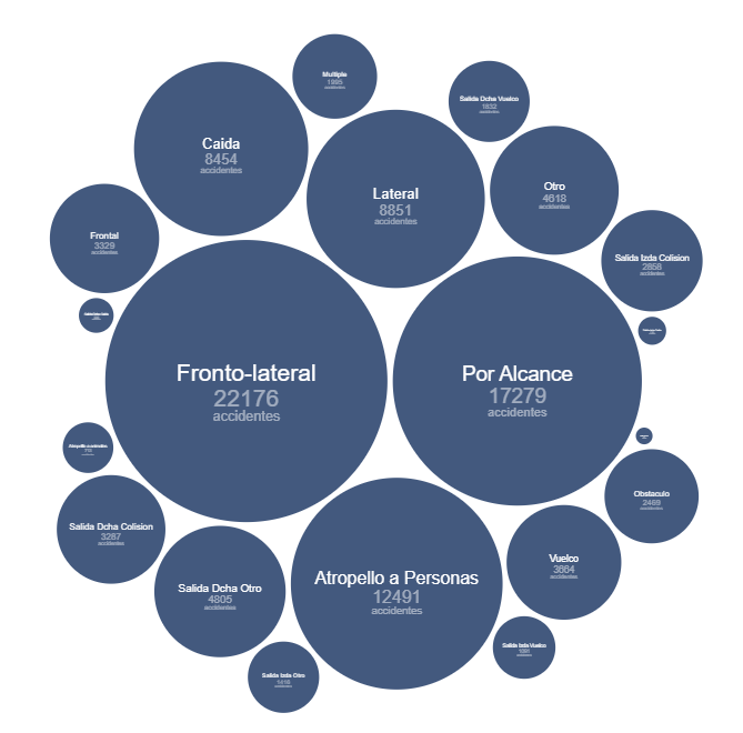
Figure 4. Bubble diagram of the number of accidents by accident type in 2024.
Figure 5 shows the traditional bar diagram, but this time broken down into smaller units, to refine the number of accidents associated with the ownership of the road where they have occurred. This type of diagram allows us to discern small differences between similar quantities, preserving the general message that we obtain from a calculation of these characteristics.
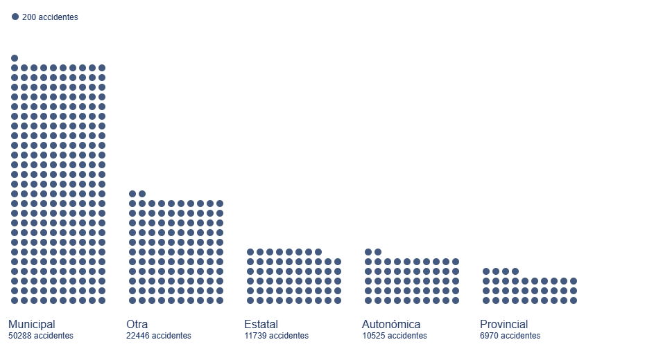
Figure 5. Bar diagram with dot discretization for the number of accidents by road ownership in 2024
Figure 6 shows the total number of victims on a logarithmic scale based on the height of each mountain for each type of road.
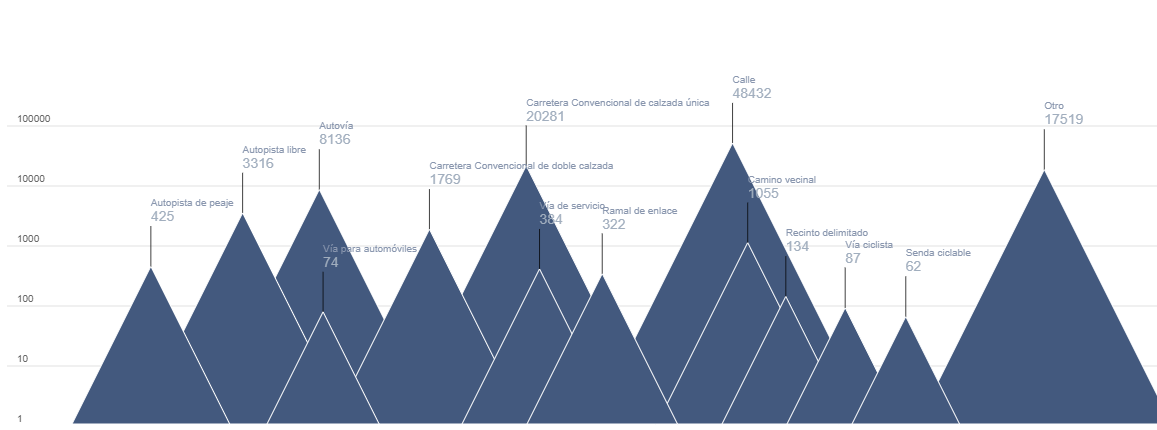
Figure 6. Mountain ridge diagram, displaying the total number of victims by each type of road in 2024.
Lessons learned
Through these steps we will learn a whole series of transversal skills that allow us to work with those datasets that are presented to us in CSV format in columns, a very popular format for which we can perform both their analysis and their visualization. These lessons are specifically:
- Universality of reading and structuring data: the use of tools such as Python, with its Numpy and Pandas libraries, allows access to data in detail and structured in an orderly and intuitive way with a few lines of code.
- Simple calculations in Pandas: the Python library itself allows simple but essential calculations for the preliminary interpretation of results.
- Datetime format: through this Python library we can become familiar with the standard date format, and thus perform all kinds of transformations, filters and selections that interest us the most in any time interval.
- JSON format: once we decide to give space to our visualizations on the web, learning the structure and use of the JSON format is very useful given its wide use in all types of applications and web architectures.
- Spectrum of D3.js possibilities: this Javascript library allows us to explore from the most traditional and conservative to the most creative thanks to its principles based on the most basic shapes, without templates, templates or predefined diagrams.
Conclusions and next steps
We have learned to read and structure data according to the standards of the most widely used formats in the world of analysis and visualization. This exercise also serves as an introductory module to the world of D3.js, a very versatile, current and popular tool within the world of storytelling and data visualization at all levels.
In order to move forward in this exercise, it is recommended:
- For analysts and developers, it is possible to dispense with the Pandas library and structure the data with more elementary Python objects such as arrays and matrices, looking for which functions and which operators allow the same tasks that Pandas does to be performed but in a more fundamental way, especially if we think of production environments for which we need the fewest possible libraries to lighten the application.
- For the creators of visualizations, information on municipalities can also be projected onto existing cartographic databases such as OpenStreetMap and thus link the incidence of accidents to orographic features or infrastructures already reflected in these cartographic databases. For the magnitudes of the accident numbers, you can explore Treemap diagrams or Voronoi diagrams and see if they convey the same message as the ones presented in this exercise.
Areas of application
Los pasos descritos en este ejercicio pueden pasar a formar parte de cualquier caja de herramientas de uso habitual para los siguientes perfiles:
- Data analysts: here are the basic steps for the description of a data file in CSV format and the basic calculations to be carried out both in the date field and operations between variables of different columns. These tools can be used to introduce you to the world of data analysis and help in those first steps when facing a dataset.
- Scientists and research staff: the universality of the tools described here apply to a wide variety of data sources, such as that experienced in experimental sciences and observations or measurements of all kinds. These tools allow for a quick and rigorous analysis regardless of the field of knowledge in which you work.
- Web developers: the export of data in JSON format as well as the Javascript code offered in Observable notebooks are easily integrated into all types of environments (Svelte, React, Angular, Vue) and allow the creation of visualizations on a website in a simple and intuitive way.
- Journalists: covering the entire life process of a data file, from its reading to its visualization, gives the journalist or researcher independence when it comes to evaluating and interpreting the data by himself without depending on external technical resources. The creation of the map by municipalities opens the door to using any other similar data, such as electoral processes, with the same output format to show geographical variability with respect to any type of magnitude.
- Graphic Designers: Handling visualization tools with a wide degree of freedom allows designers to cultivate all their creativity within the rigor and accuracy that data requires.
Comments