Evento
Just a few months after the success of its first award, the Madrid City Council has opened the call for the second edition of the Open Data Reuse Awards. It is an initiative that seeks to recognize and promote innovative projects that use the datasets published on the datos.madrid.es portal. With a total endowment of 15,000 euros, these awards consolidate the municipal commitment to data culture, transparency and the creation of social and economic value from public information.
In this article we tell you some of the keys you must take into account to participate.
Two award categories to consider
The call establishes two categories, each with several prizes:
1) Web services, applications and visualizations: rewards projects that generate services, visualizations or web or mobile applications.
- First prize: €4,000
- Second prize: €3,000
- Third prize: €1,500
- Student prize: €1,500
2) Studies, research and ideas: focuses on research projects, analysis or description of ideas to create services, studies, visualizations, web or mobile applications. This category is also open to university end-of-degree and end-of-master's projects (TFG-TFM).
- First prize: €2,500
- Second prize: €1,500
- Third prize: €1,000
- Projects already awarded, subsidized or contracted by the Madrid City Council.
- Projects that do not use any datasets from the municipal portal.
In both categories, it is necessary that at least one set of data from the municipal portal is used, and can be combined with public or private sources from any territorial area. Projects can be recent or have been completed in the two years prior to the closing of the call.
Awards may be declared void if the minimum quality is not reached. In this case, the remaining amounts will be redistributed proportionally among the rest of the winners.
Requirements to participate
The call is open to natural and legal persons who are the authors of the projects or initiatives. The aim is for any person or entity with an interest in the reuse of data to be able to submit their proposal, regardless of their technical level. Therefore, both professionals and companies, researchers, journalists and developers, as well as amateurs and amateurs interested in data analysis and visualization can participate.
In the case of the student prize, only those individuals enrolled in official courses 2023/24, 2024/25 or 2025/26 may participate.
On the other hand, the following are excluded from all categories:
Process Phases
The municipal portal details the phases of the call, which include:
- Publication of the call. On March 3, the regulatory bases were published in the Official Gazette of the Madrid City Council.
- Submission of nominations. The deadline for submitting applications is from March 4 to May 4 (both included). They can be submitted online or in person, as explained below.
-
Analysis and correction. Until June 3, the review of the documentation submitted will be carried out. If necessary, applicants will be contacted to correct errors.
-
Assessment and deliberation. A jury will evaluate all the admitted projects, according to the criteria established in the rules of the call. Their usefulness, economic value, social value and contribution to transparency will be taken into account; their degree of innovation and creativity; the variety of datasets used from the Madrid Open Data Portal; and its technical quality. This phase will run until September 15.
-
Resolution. In the months of September and October , the proposal for the granting and official publication of the resolution will be carried out.
-
Awards ceremony. The awards will be presented at a public event, estimated for the month of November.
The official website will update dates and documentation as the process progresses.
How applications are submitted
As mentioned above, applications can be submitted electronically or in person:
- Online, through the electronic headquarters of the Madrid City Council. Identification and electronic signature are required for this.
- In person, at the registration assistance offices of the Madrid City Council, as well as at the registries of other public administrations.
Individuals may submit the application in both ways, while legal persons may only submit the application electronically.
In both cases, nominations must include:
- Official application form, to be downloaded from the Madrid City Council's electronic headquarters.
- Project report, based on a model to be downloaded from the aforementioned electronic office. This document will include the title, authorship and a detailed description, as well as the list of datasets used, the objectives, the target audience, the expected impact, the degree of innovation and the technology used.
- Responsible declaration.
- Collaboration agreement, in the case of presenting itself as a group.
Get inspired by the winning projects of the first edition
The second edition of the Open Data Reuse Awards comes on the heels of the success of the previous edition. In 2025, the Madrid City Council held the first edition of these awards, which brought together 65 nominations of great quality and diversity. Among them, proposals promoted by university students, startups, multidisciplinary teams and citizens committed to the intelligent use of public data stood out.
The award-winning projects demonstrated that open data can become real tools to improve urban life, boost transparency and generate useful knowledge for the city. In this article we summarize what these projects consisted of.
In summary, the II Open Data Reuse Awards 2026 are an opportunity to demonstrate how public data can be turned into real innovation. An invitation to develop projects that promote a smarter, more transparent and participatory Madrid.
Application
This interactive data visualisation allows users to consult and compare in detail the 2025 budget items per inhabitant and their breakdown for local authorities in Spain, i.e. town councils.
These are budget figures; the final accounts for their implementation will be published at the end of 2026.
Blog
Data visualization is not a recent discipline. For centuries, people have used graphs , maps, and diagrams to represent complex information. Classic examples such as the statistical maps of the nineteenth century or the graphs used in the press show that the need to "see" the data in order to understand it has always existed.
For a long time, creating visualizations required specialized knowledge and access to professional tools, which limited their production to very specific profiles. However, the digital and technological revolution has profoundly transformed this landscape. Today, anyone with access to a computer and data can create visualizations. Tools have been democratized, many of them are free or open source, and visualization work has extended beyond design to integrate into areas such as statistics, data science, academic research, public administration, or education.
Today, data visualization is a transversal competence that allows citizens to explore public information, institutions to better communicate their policies, and reusers to generate new services and knowledge from open data. In this post we present some of the most accessible and used options in data visualization.
A broad and diverse ecosystem of tools
The ecosystem of data visualization tools is broad and diverse, both in functionalities and levels of complexity. There are options designed for a first exploration of the data, others aimed at in-depth analysis and some designed to create interactive visualizations or complex digital narratives.
This variety allows you to tailor the visualization to different contexts and goals—from understanding a dataset in advance to publishing interactive charts, dashboards, or maps on the web.
The Data Visualization Society's annual survey reflects this diversity and shows how the use of certain tools evolves over time, consolidating some widely known options and giving way to new solutions that respond to emerging needs. These are some of the tools mentioned in the survey, ordered according to usage profiles.
The following criteria have been taken into account for the preparation of this list:
- Degree of use and maturity of the tool.
- Free access, free or with open versions.
- Useful for projects related to public data.
- Priority to open tools or with free versions.
Simple tools to get started
These tools are characterized by visual interfaces, a low learning curve, and the ability to create basic charts quickly. They are especially useful for getting started exploring open datasets or for outreach activities.
- Excel: it is one of the most widespread and well-known tools. It allows basic graphs and first data scans to be carried out in a simple way. While not specifically designed for advanced visualization, it is still a common gateway to working with data and its graphical representation.
- Google Sheets: works as a free and collaborative alternative to Excel. Its main advantage is the ability to work in a shared way and publish simple graphics online, which facilitates the dissemination of basic visualizations.
- Datawrapper: widely used in public communication and data journalism. It allows you to create clear graphs, maps, and interactive tables without the need for technical knowledge. It is particularly suitable for explaining data in a way that is understandable to a wide audience.
- RAWGraphs: free software tool aimed at visual exploration. It allows you to experiment with less common types of charts and discover new ways to represent data. It is especially useful in exploratory phases.
- Canva: While its approach is more informative than analytical, it can be useful for creating simple visual pieces that integrate basic graphics with design elements. It is suitable for visual communication of results, not so much for data analysis.
Data exploration and analysis tools
This group of tools is geared towards profiles that want to go beyond basic charts and perform more structured analysis. Many of them are open and widely consolidated in the field of data analysis.
- A: Free programming language widely used in statistics and data analysis. It has a wide ecosystem of packages that allow you to work with public data in a reproducible and transparent way.
- Ggplot2: R language display library. It is one of the most powerful tools for creating rigorous and well-structured graphs, both for analysis and for communicating results.
- Python (Matplotlib and Plotly): Python is one of the most widely used languages in data analysis. Matplotlib allows you to create customizable static charts, while Plotly makes it easy to create interactive visualizations. Together they offer a good balance between power and flexibility.
- Apache Superset: Open source platform for data analysis and dashboard creation. It has a more institutional and scalable approach, making it suitable for organizations that work with large volumes of public data.
This block is especially relevant for open data reusers and intermediate technical profiles who seek to combine analysis and visualization in a systematic way.
Tools for interactive and web visualization
These tools allow you to create advanced visualizations for publication in web environments. Although they require greater technical knowledge, they offer great flexibility and expressive possibilities.
- D3.js: it is one of the benchmarks in web visualization. It is based on open standards and allows full control over the visual representation of data. Its flexibility is very high, although so is its complexity.
In this practical exercise you can see how to use this library
- Vega and Vega-Lite: declarative languages for visualization that simplify the use of D3. They allow you to define graphics in a structured and reproducible way, offering a good balance between power and simplicity.
- Observable: interactive environment closely linked to D3 and Vega. It's especially useful for creating educational examples, prototypes, and exploratory visualizations that combine code, text, and graphics.
- Three.js and WebGL: technologies aimed at advanced and three-dimensional visualizations. Its use is more experimental and is usually linked to dissemination projects or visual research.
In this section, it should be noted that, although the technical barriers are greater, these tools allow for the creation of rich interactive experiences that can be very effective in communicating complex public data.
Geospatial data and mapping tools
Geographic visualization is especially relevant in the field of open data, since a large part of public information has a territorial dimension. In this field, free software has a prominent weight and is closely aligned with use in public administrations.
- QGIS: a benchmark in free software for geographic information systems (GIS). It is widely used in public administrations and allows spatial data to be analysed and visualised in great detail.
- ArcGIS: very widespread in the institutional field. Although it is not free software, its use is well established and is part of the regular ecosystem of many public organizations.
- Mapbox: platform aimed at creating interactive web maps. It is widely used in online visualization projects and allows geographic data to be integrated into web applications.
- Leaflet: A popular open-source library for creating interactive maps on the web. It is lightweight, flexible, and widely used in geographic open data reuse projects.
This toolkit facilitates the territorial representation of data and its reuse in local, regional or national contexts.
In conclusion, the choice of a visualization tool depends largely on the goal being pursued. Learning and experimenting is not the same as analyzing data in depth or communicating results to a wide audience. Therefore, it is useful to reflect beforehand on the type of data available, the audience to which the visualization is aimed and the message you want to convey.
Betting on accessible and open tools allows more people to explore, interpret and communicate public data. In this sense, visualising data is also a way of bringing information closer to citizens and encouraging its reuse.
Blog
Data visualizations act as bridges between complex information and human understanding. A well-designed graph can communicate in seconds data that would take minutes or even hours to decipher in tabular format. What's more, interactive visualizations allow each user to explore data from their own perspective, filtering, comparing, and uncovering personalized insights.
To achieve these ends there are multiple tools, some of which we have addressed on previous occasions. Today we are approaching a new example: the free bookstore D3.js. In this post, we explain how it allows you to generate useful and attractive data visualizations together with the open source tool Observable.
What is D3?
D3.js (Data-Driven Documents) is a JavaScript library that allows you to create custom data visualizations in web browsers. Unlike tools that offer predefined charts, D3.js provides the fundamental elements to build virtually any type of visualization imaginable.
The library is completely free and open source, published under a BSD license, which means that any person or organization can use, modify, and distribute it without restrictions. This feature has contributed to its widespread adoption: international media such as The New York Times, The Guardian, Financial Times, and local media such as El País or ABC use D3.js to create journalistic visualizations that help tell stories with data.
D3.js works by manipulating the browser's DOM (Document Object Model). In practical terms, this means that it takes information (e.g., a CSV file with population data) and transforms it into visual elements (circles, bars, lines) that the browser can display. The power of D3.js lies in its flexibility: it doesn't impose a specific way to visualize data, but rather provides the tools to create exactly what is needed.
What is Observable?
Observable is a web-based platform for creating and sharing code, specially designed to work with data and visualizations. Although it offers a freemium service with some free and some paid features, it maintains an open-source philosophy that is particularly relevant for working with public data.
The distinguishing feature of Observable is its "notebook" format. Similar to tools like Jupyter Notebooks in Python, an Observable notebook combines code, visualizations, and explanatory text into a single interactive document. Each cell in the notebook can contain JavaScript code that runs immediately, displaying results instantly. This creates an ideal experimentation environment for exploring data.
You can see it in practice in this data science exercise that we have published in datos.gob.es
Observable integrates naturally with D3.js and other display libraries. In fact, the creator of D3.js is also one of the founders of Observable, so both tools work together in a fluid way. Observable notebooks can be shared publicly, allowing other users to view both the code and the results, fork them to create their own versions, or integrate them into their own projects.
Advantages of the tool to work with all types of data
Both D3.js and Observable have features that can be useful for working with data, including open data:
- Transparency and reproducibility: by publishing a visualization created with these tools, it is possible to share both the final result and the entire data transformation process. Anyone can inspect the code, verify the calculations, and reproduce the results. This transparency is essential when working with public information, where trust and verifiability are essential.
- No licensing costs: Both D3.js and the free version of Observable allow you to create and publish visualizations without the need to purchase software licenses. This removes economic barriers for organizations, journalists, researchers, or citizens who want to work with open data.
- Standard web formats: The created visualizations work directly in web browsers without the need for plugins or additional software. This makes it easy to integrate them into institutional websites, newspaper articles or digital reports, making them accessible from any device.
- Community and resources: There is a large community of users who share examples, tutorials, and solutions to common problems. Observable, in particular, houses thousands of public notebooks that serve as examples and reusable templates.
- Technical flexibility: Unlike tools with predefined options, these libraries allow you to create completely customized visualizations that are exactly tailored to the specific needs of each dataset or story you want to tell.
It is important to note that these tools require programming knowledge, specifically JavaScript. For people with no programming experience, there is a learning curve that can be steep initially. Other tools such as spreadsheets or visualization software with graphical interfaces may be more appropriate for users looking for quick results without writing code.
For those looking for open source alternatives with a smooth learning curve, there are visual interface-based tools that don't require programming. For example, RawGraphs allows you to create complex visualizations by simply dragging and dropping files, while Datawrapper is an excellent and very intuitive option for generating ready-to-publish charts and maps.
In addition, there are numerous open source and commercial alternatives for visualizing data: Python with libraries such as Matplotlib or Plotly, R with ggplot2, Tableau Public, Power BI, among many others. In the didactic section of visualization and data science exercises of datos.gob.es you can find practical examples of how to use some of them.
In summary, the choice of tools should always be based on an assessment of specific requirements, available resources, and project objectives. The important thing is that open data is transformed into accessible knowledge, and there are multiple ways to achieve this goal. D3.js and Observable offer one of these paths, particularly suited to those looking to combine technical flexibility with principles of openness and transparency. If you know of any other tool or would like us to delve into another topic, please send it to us through our social networks or in the contact form.
Documentación
Introduction
Every year there are tens of thousands of accidents in Spain, in which thousands of people are injured of varying degrees, and which occur in very different circumstances, both in terms of the type of road and the type of accident.
Many of the statistics related to these parameters are collected in the databases of the Directorate General of Traffic (DGT) and some of them in the catalogue hosted in datos.gob.es.
In this exercise, you will examine the content of the DGT accident database for the year 2024 in order to make a series of basic visualizations that allow us to quickly and intuitively see which are the facts to highlight regarding the incidence of accidents and their consequences in that year.
To do this, we are going to develop Python code that allows us to read and calculate basic metrics regarding the total number of victims, the particularities of the infrastructures as well as the different cases of accidents. And once we have this data available, we will visualize it using the Javascript D3.js library, which allows us both to represent data in its most traditional form and in more contemporary designs, common in the press, thus favoring a narrative that is fluid in style and coherent in content.
In the Python environment we will use commonly and frequently used libraries such as Numpy, for basic calculation - sums, maximums and minimums, and Pandas, to structure the data intuitively, facilitating both its organization and its transformation. We will also work with Datetime, both for the formatting of the input data in standard date types within the world of Python programming, and to add the data in an easy and intuitive way. In this way we will learn how to open any type of data file in . CSV, to structure it in an orderly way and to carry out basic transformations and operations in a simple way.
In the Javascript environment we will develop notebooks in D3.js thanks to the use of Observable, an open and free initiative, to be able to execute Javascript code directly in a web interface, and without having to resort to local servers or complex installations. In different notebooks we will create classic visualizations -such as time series on
Cartesian axes or maps- along with other proposals such as bubble distributions or elements stacked by categories.
In Figure 1 you can see the main stages of this exercise, from the reading of the data within the DGT file, to the operations and output variables in JSON format, which will in turn serve us in a Javascript environment to be able to develop the visualizations in D3.js.
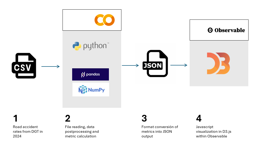
Figure 1. Steps to be followed when performing this exercise, from reading the input CSV file, postprocessing the data with Python, creating an output in JSON format and ultimately displaying the information in D3.js
Access to the Github repositories, GoogleColab notebook and Observable notebooks is done via:
Access to the Github repository
Access to GoogleColab notebook
Access to Observable notebooks
Development Process
1. Reading the data file
The first step will be to read the DGT file containing all the accident records for the year 2024. This step will allow us to identify the fields of interest and especially in what format they are. We will be able to identify if any transformation is required, especially in the information of the date, as it is structured in the original file.
We will also see how to translate the codes of many of the categories offered by the DGT, so that we can make a real interpretation beyond the numbers of categories such as type of accident, type of road or ownership of the road.
Once we understand the structure and content of the data, we can start operating with it.
2. Calculating Metrics
The Pandas Python library allows us to operate with the different columns of data and perform basic calculations that will be representative enough to minimally understand the casuistry of accidents on Spanish roads.
In this section, three types of calculations will be made.
- The first of these will be the calculation of the total number of victims per hour of the day for each of the days of the week. The DGT database is structured by day of the week, so we will also use this time scale to represent the data in a series. It should be noted that avictim is considered to be any person who has died or who is diagnosed as seriously or lightly injured.
- The second calculation will be the sum of the total of accidents for different categories, such as road ownership, type of accident or type of road. This will allow us to see which are the conditions in which accidents are most frequent.
- The third calculation will be the number of accidents per municipality. In this case we will carry out the calculation restricted to the province of Valencia as an example, and which would be applicable to any province or municipality of our interest. In this case we will observe the differences between urban and non-urban centers, as well as those municipalities through which the main communication routes pass.
3. Visualization Design
Once we have calculated the metrics of interest, we will develop four visualization exercises in D3.js. To do this, we will export the result of the metrics in JSON format and create notebooks in Observable. Specifically, we made the following visualizations:
- Time series with the total number of casualties in each hour and day of the week, with an interactive drop-down menu to select the day of the week of interest. In addition to the curve that describes the number of victims, we will draw the uncertainty of all the days of the week on the background of the graph, so that the daily time series is framed in the context of the whole week as a reference.
- Map of the province of Valencia with the total number of accidents by municipality.
- Bubble diagram, with the different magnitudes of the different types of accidents with the total number of accidents in each case written in detail.
- Stacked dot diagram, where we accumulate circles or any other geometric shape for the different road ownership and its total number of accidents within the framework of each ownership.
- Mountain ridge diagram, where the height of each mountain represents the total number of victims on a logarithmic scale.
Viewing metrics
The result of this exercise can be seen graphically and explicitly in the form of visualizations made for the web format and accessible from a web interface, both for its development and for its subsequent publication. These visualizations are gathered as Observable notebooks here:
Access to Observable notebooks
In Figure 2 we have the result of the time series of the total number of victims with respect to the time of day for different days of the week. The time series is framed within the uncertainty of the total number of days of the week, to give an idea of the margin of variability that we can have depending on the time of day.
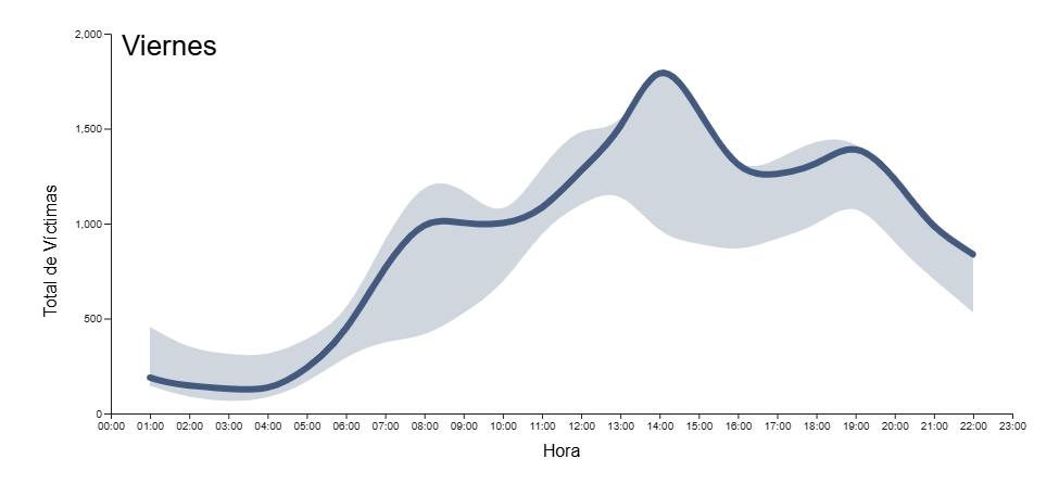
Figure 2. Time series of total accident casualties by time of day for all days of the week in 2024. The light blue background indicates the uncertainty associated with all the days of the week as context, with a drop-down menu to select the day of the week.
In Figure 3 we can see the map of the province of Valencia with a colour intensity proportional to the number of accidents in each municipality. Those municipalities in which no accidents have been recorded appear in white. Intuitively you can guess the layout of the main roads that cross the province, both the road to the east of the city of Valencia in the direction of Madrid and the inland road to the south of the city in the direction of Alicante
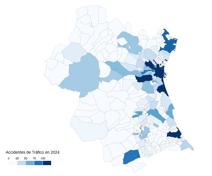
Figure 3. Map of the number of accidents by municipality in the province of Valencia in 2024.
In Figure 4 we see a geometric shape, the circle, associated with the types of accidents, with the detail of the number of accidents associated with each category. In this type of visualization, the most frequent accidents around the center of the diagram naturally emerge, while those that are minority or residual occupy the perimeter of the diagram to also give a round shape to the set of shapes
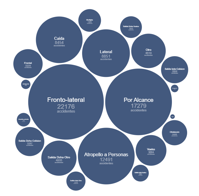
Figure 4. Bubble diagram of the number of accidents by accident type in 2024.
Figure 5 shows the traditional bar diagram, but this time broken down into smaller units, to refine the number of accidents associated with the ownership of the road where they have occurred. This type of diagram allows us to discern small differences between similar quantities, preserving the general message that we obtain from a calculation of these characteristics.
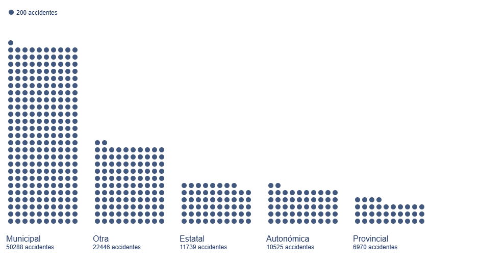
Figure 5. Bar diagram with dot discretization for the number of accidents by road ownership in 2024
Figure 6 shows the total number of victims on a logarithmic scale based on the height of each mountain for each type of road.
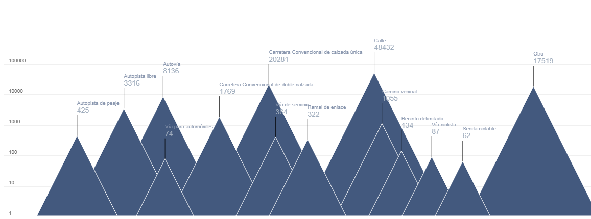
Figure 6. Mountain ridge diagram, displaying the total number of victims by each type of road in 2024.
Lessons learned
Through these steps we will learn a whole series of transversal skills that allow us to work with those datasets that are presented to us in CSV format in columns, a very popular format for which we can perform both their analysis and their visualization. These lessons are specifically:
- Universality of reading and structuring data: the use of tools such as Python, with its Numpy and Pandas libraries, allows access to data in detail and structured in an orderly and intuitive way with a few lines of code.
- Simple calculations in Pandas: the Python library itself allows simple but essential calculations for the preliminary interpretation of results.
- Datetime format: through this Python library we can become familiar with the standard date format, and thus perform all kinds of transformations, filters and selections that interest us the most in any time interval.
- JSON format: once we decide to give space to our visualizations on the web, learning the structure and use of the JSON format is very useful given its wide use in all types of applications and web architectures.
- Spectrum of D3.js possibilities: this Javascript library allows us to explore from the most traditional and conservative to the most creative thanks to its principles based on the most basic shapes, without templates, templates or predefined diagrams.
Conclusions and next steps
We have learned to read and structure data according to the standards of the most widely used formats in the world of analysis and visualization. This exercise also serves as an introductory module to the world of D3.js, a very versatile, current and popular tool within the world of storytelling and data visualization at all levels.
In order to move forward in this exercise, it is recommended:
- For analysts and developers, it is possible to dispense with the Pandas library and structure the data with more elementary Python objects such as arrays and matrices, looking for which functions and which operators allow the same tasks that Pandas does to be performed but in a more fundamental way, especially if we think of production environments for which we need the fewest possible libraries to lighten the application.
- For the creators of visualizations, information on municipalities can also be projected onto existing cartographic databases such as OpenStreetMap and thus link the incidence of accidents to orographic features or infrastructures already reflected in these cartographic databases. For the magnitudes of the accident numbers, you can explore Treemap diagrams or Voronoi diagrams and see if they convey the same message as the ones presented in this exercise.
Areas of application
Los pasos descritos en este ejercicio pueden pasar a formar parte de cualquier caja de herramientas de uso habitual para los siguientes perfiles:
- Data analysts: here are the basic steps for the description of a data file in CSV format and the basic calculations to be carried out both in the date field and operations between variables of different columns. These tools can be used to introduce you to the world of data analysis and help in those first steps when facing a dataset.
- Scientists and research staff: the universality of the tools described here apply to a wide variety of data sources, such as that experienced in experimental sciences and observations or measurements of all kinds. These tools allow for a quick and rigorous analysis regardless of the field of knowledge in which you work.
- Web developers: the export of data in JSON format as well as the Javascript code offered in Observable notebooks are easily integrated into all types of environments (Svelte, React, Angular, Vue) and allow the creation of visualizations on a website in a simple and intuitive way.
- Journalists: covering the entire life process of a data file, from its reading to its visualization, gives the journalist or researcher independence when it comes to evaluating and interpreting the data by himself without depending on external technical resources. The creation of the map by municipalities opens the door to using any other similar data, such as electoral processes, with the same output format to show geographical variability with respect to any type of magnitude.
- Graphic Designers: Handling visualization tools with a wide degree of freedom allows designers to cultivate all their creativity within the rigor and accuracy that data requires.
Blog
Data visualization is a fundamental practice to democratize access to public information. However, creating effective graphics goes far beyond choosing attractive colors or using the latest technological tools. As Alberto Cairo, an expert in data visualization and professor at the academy of the European Open Data Portal (data.europa.eu), points out, "every design decision must be deliberate: inevitably subjective, but never arbitrary." Through a series of three webinars that you can watch again here, the expert offered innovative tips to be at the forefront of data visualization.
When working with data visualization, especially in the context of public information, it is crucial to debunk some myths ingrained in our professional culture. Phrases like "data speaks for itself," "a picture is worth a thousand words," or "show, don't count" sound good, but they hide an uncomfortable truth: charts don't always communicate automatically.
The reality is more complex. A design professional may want to communicate something specific, but readers may interpret something completely different. How can you bridge the gap between intent and perception in data visualization? In this post, we offer some keys to the training series.
A structured framework for designing with purpose
Rather than following rigid "rules" or applying predefined templates, the course proposes a framework of thinking based on five interrelated components:
- Content: the nature, origin, and limitations of the data
- People: The audience we are targeting
- Intention: The Purposes We Define
- Constraints: The Constraints We Face
- Results: how the graph is received
This holistic approach forces us to constantly ask ourselves: what do our readers really need to know? For example, when communicating information about hurricane or health emergency risks, is it more important to show exact trajectories or communicate potential impacts? The correct answer depends on the context and, above all, on the information needs of citizens.
The danger of over-aggregation
Even without losing sight of the purpose, it is important not to fall into adding too much information or presenting only averages. Imagine, for example, a dataset on citizen security at the national level: an average may hide the fact that most localities are very safe, while a few with extremely high rates distort the national indicator.
As Claus O. Wilke explains in his book "Fundamentals of Data Visualization," this practice can hide crucial patterns, outliers, and paradoxes that are precisely the most relevant to decision-making. To avoid this risk, the training proposes to visualize a graph as a system of layers that we must carefully build from the base:
1. Encoding
- It's the foundation of everything: how we translate data into visual attributes. Research in visual perception shows us that not all "visual channels" are equally effective. The hierarchy would be:
- Most effective: position, length and height
- Moderately effective: angle, area and slope
- Less effective: color, saturation, and shape
How do we put this into practice? For example, for accurate comparisons, a bar chart will almost always be a better choice than a pie chart. However, as nuanced in the training materials, "effective" does not always mean "appropriate". A pie chart can be perfect when we want to express the idea of a "whole and its parts", even if accurate comparisons are more difficult.
2. Arrangement
- The positioning, ordering, and grouping of elements profoundly affects perception. Do we want the reader to compare between categories within a group, or between groups? The answer will determine whether we organize our visualization with grouped or stacked bars, with multiple panels, or in a single integrated view.
3. Scaffolding
Titles, introductions, annotations, scales and legends are fundamental. In datos.gob.es we've seen how interactive visualizations can condense complex information, but without proper scaffolding, interactivity can confuse rather than clarify.
The value of a correct scale
One of the most delicate – and often most manipulable – technical aspects of a visualization is the choice of scale. A simple modification in the Y-axis can completely change the reader's interpretation: a mild trend may seem like a sudden crisis, or sustained growth may go unnoticed.
As mentioned in the second webinar in the series, scales are not a minor detail: they are a narrative component. Deciding where an axis begins, what intervals are used, or how time periods are represented involves making choices that directly affect one's perception of reality. For example, if an employment graph starts the Y-axis at 90% instead of 0%, the decline may seem dramatic, even if it's actually minimal.
Therefore, scales must be honest with the data. Being "honest" doesn't mean giving up on design decisions, but rather clearly showing what decisions were made and why. If there is a valid reason for starting the Y-axis at a non-zero value, it should be explicitly explained in the graph or in its footnote. Transparency must prevail over drama.
Visual integrity not only protects the reader from misleading interpretations, but also reinforces the credibility of the communicator. In the field of public data, this honesty is not optional: it is an ethical commitment to the truth and to citizen trust.
Accessibility: Visualize for everyone
On the other hand, one of the aspects often forgotten is accessibility. About 8% of men and 0.5% of women have some form of color blindness. Tools like Color Oracle allow you to simulate what our visualizations look like for people with different types of color perception impairments.
In addition, the webinar mentioned the Chartability project, a methodology to evaluate the accessibility of data visualizations. In the Spanish public sector, where web accessibility is a legal requirement, this is not optional: it is a democratic obligation. Under this premise, the Spanish Federation of Municipalities and Provinces published a Data Visualization Guide for Local Entities.
Visual Storytelling: When Data Tells Stories
Once the technical issues have been resolved, we can address the narrative aspect that is increasingly important to communicate correctly. In this sense, the course proposes a simple but powerful method:
- Write a long sentence that summarizes the points you want to communicate.
- Break that phrase down into components, taking advantage of natural pauses.
- Transform those components into sections of your infographic.
This narrative approach is especially effective for projects like the ones we found in data.europa.eu, where visualizations are combined with contextual explanations to communicate the value of high-value datasets or in datos.gob.es's data science and visualization exercises.
The future of data visualization also includes more creative and user-centric approaches. Projects that incorporate personalized elements, that allow readers to place themselves at the center of information, or that use narrative techniques to generate empathy, are redefining what we understand by "data communication".
Alternative forms of "data sensification" are even emerging: physicalization (creating three-dimensional objects with data) and sonification (translating data into sound) open up new possibilities for making information more tangible and accessible. The Spanish company Tangible Data, which we echo in datos.gob.es because it reuses open datasets, is proof of this.

Figure 1. Examples of data sensification. Source: https://data.europa.eu/sites/default/files/course/webinar-data-visualisation-episode-3-slides.pdf
By way of conclusion, we can emphasize that integrity in design is not a luxury: it is an ethical requirement. Every graph we publish on official platforms influences how citizens perceive reality and make decisions. That is why mastering technical tools such as libraries and visualization APIs, which are discussed in other articles on the portal, is so relevant.
The next time you create a visualization with open data, don't just ask yourself "what tool do I use?" or "Which graphic looks best?". Ask yourself: what does my audience really need to know? Does this visualization respect data integrity? Is it accessible to everyone? The answers to these questions are what transform a beautiful graphic into a truly effective communication tool.
Blog
Imagine you want to know how many terraces there are in your neighbourhood, how the pollen levels in the air you breathe every day are evolving or whether recycling in your city is working well. All this information exists in your municipality's databases, but it sits in spreadsheets and technical documents that only experts know how to interpret.
This is where open data visualisation initiativescome in: they transform those seemingly cold numbers into stories that anyone can understand at a glance. A colourful graph showing the evolution of traffic on your street, an interactive map showing the green areas of your city, or an infographic explaining how the municipal budget is spent. These tools make public information accessible, useful and, moreover, comprehensible to all citizens.
Moreover, the advantages of this type of solution are not only for the citizens, but also benefit the Administration that carries out the exercise, because it allows:
- Detect and correct data errors.
- Add new sets to the portal.
- Reduce the number of questions from citizens.
- Generate more trust on the part of society.
Therefore, visualising open data brings government closer to citizens, facilitates informed decision-making, helps public administrations to improve their open data offer and creates a more participatory society where we can all better understand how the public sector works. In this post, we present some examples of open data visualisation initiatives in regional and municipal open data portals.
Visualiza Madrid: bringing data closer to the public
Madrid City Council's open data portal has developed the initiative "Visualiza Madrid", a project born with the specific objective of making open data and its potential reach the general public , transcending specialised technical profiles. As Ascensión Hidalgo Bellota, Deputy Director General for Transparency of Madrid City Council, explained during the IV National Meeting on Open Data, "this initiative responds to the need to democratise access to public information".
Visualiza Madrid currently has 29 visualisations that cover different topics of interest to citizens, from information on hotel and restaurant terraces to waste management and urban traffic analysis. This thematic diversity demonstrates the versatility of visualisations as a tool for communicating information from very diverse sectors of public administration.
In addition, the initiative has received external recognition this year through the Audaz 2,025 Awards, an initiative of the Spanish chapter of the Open Government Academic Network (RAGA Spain).The initiative has also received external recognition through the Audaz 2,025 Awards.
Castilla y León: comprehensive analysis of regional data
The Junta de Castilla y León has also developed a portal specialised in analysis and visualisations that stands out for its comprehensive approach to the presentation of regional data. Its visualisation platform offers a systematic approach to the analysis of regional information, allowing users to explore different dimensions of the reality of Castilla y Leónthrough interactive and dynamic tools.
This initiative allows complex information to be presented in a structured and understandable way, facilitating both academic analysis and citizen use of the data. The platform integrates different sources of regional information, creating a coherent ecosystem of visualisations that provides a panoramic view of different aspects of regional management. Among the topics it offers are data on tourism, the labour market and budget execution. All the visualisations are made with open data sets from the regional portal of Castilla y León .
The Castilla y León approach demonstrates how visualisations can serve as a tool for territorial analysis, providing valuable insights on economic, social and demographic dynamics that are fundamental for the planning and evaluation of regional public policies.
Canary Islands: technological integration with interactive widgets .
On the other hand, the Government of the Canary Islands has opted for an innovative strategy through the implementation of widgets that allow the integration of open data visualisations of the Instituto Canario de Estadística (ISTAC) in different platforms and contexts. This technological approach represents a qualitative leap in the distribution and reuse of public data visualisations.
The widgets developed by the Canary Islands make it easier for third parties to embed official visualisations in their own applications, websites or analyses, exponentially expanding the scope and usefulness of Canary Islands open data. This strategy not only multiplies the points of access to public information, but also fosters the creation of a collaborative ecosystem where different actors can benefit from and contribute to the value of open data.
The Canarian initiative illustrates how technology can be used to create scalable and flexible solutions that maximise the impact of investments in open data visualisation, establishing a replicable model for other administrations seeking to amplify the reach of their transparency initiatives.
Lessons learned and best practices
By way of example, the cases analysed reveal common patterns that can serve as a guide for future initiatives. The orientation towards the general public, beyond specialised technical users, emerges as an opportunity factor for the success of these platforms. To maintain the interest and relevance of the visualisations, it is important to offer thematic diversity and to update the data regularly.
Technological integration and interoperability, as demonstrated in the case of the Canary Islands, open up new possibilities to maximise the impact of public investments in data visualisation. Likewise, external recognition and participation in professional networks, as evidenced in the case of Madrid, contribute to continuous improvement and the exchange of best practices between administrations.
In general terms, open data visualisation initiatives represent a very valuable opportunity in the transparency and open government strategy of Spanish public administrations. The cases of Madrid, Castilla y León, as well as the Canary Islands, are examples of the enormous potential for transforming public data into tools for citizen empowerment and improved public management.
The success of these initiatives lies in their ability to connect government information with the real needs of citizens, creating bridges of understanding that strengthen the relationship between administration and society. As these experiences mature and consolidate, it will be crucial to keep the focus on the usability, accessibility and relevance of visualisations, ensuring that open data truly delivers on its promise to contribute to a more informed, participatory and democratic society.
Open data visualisation is not just a technical issue, but a strategic opportunity to redefine public communication and strengthen the foundations of a truly open and transparent administration.
Blog
The European Drug Report provides a current overview of the drug situation in the region, analysing the main trends and emerging threats. It is a valuable publication, with a high number of downloads, which is quoted in many media outlets.
The report is produced annually by the European Union Drugs Agency (EUDA), the current name of the former European Monitoring Centre for Drugs and Drug Addiction. It collects and analyses data from EU Member States, together with other partner countries such as Turkey and Norway, to provide a comprehensive picture of drug use and supply, drug harms and harm reduction interventions. The report contains comprehensive datasets on these issues disaggregated at the national level, and even, in some cases, at the city level (such as Barcelona or Palma de Mallorca).
This study has been carried out since 1993 and translated into more than 20 official languages of the European Union. However, in the last two years it has introduced a new feature: a change in internal processes to improve the visualisation of the data obtained. A process they explained in the recent webinar "The European Drug Report: using an open data approach to improve data visualisation", organised by the European Open Data Portal (data.europa.eu) on 25 June. The following is a summary of what the Observatory's representatives had to say at this event.
The need for change
The Observatory has always worked with open data, but there were inefficiencies in the process. Until now, the European Drug Report has always been published in PDF format, with the focus on achieving a visually appealing product. The internal process leading up to the publication of the report consisted of several stages involving various teams:
- A team from the Observatory checked the format of the data received from the supplier and, if necessary, adapted it.
- A specialised data analysis team created visualisations from the data.
- A specialised drafting team drafted the report. The team that had created the visualisations could collaborate in this phase.
- An internal team validated the content of the report.
- The data provider checked that the Observatory had interpreted the data correctly.
Despite the good reception of the report and its format, in 2022 the Observatory decided to completely change the publication format for the following reasons:
- Once the various steps of the publication process had been initiated, the data were formatted and were no longer machine-readable. This reduced the accessibility of the data, e.g. for screen readers, and limited its reusability.
- If errors were detected in the different steps of the process, they were corrected directly on the format of the data in this step. In other words, if an error was detected in a chart during the revision phase, it was corrected directly on that chart. This procedure could cause errors and dull the traceability of data, limiting efficiency: the same static graph could be present several times in the document and each mention had to be corrected individually.
- At the end of the process, the format of the source data had to be adjusted due to changes in the publication procedure.
- Many of the users who consulted the report did so from a mobile device, for which the PDF format was not always suitable.
- Because they are neither accessible nor mobile-friendly, PDF documents did not usually appear as the first result in search engines. This point is important for the Observatory, as many users find the report through search engines.
A responsive web format was needed, which automatically adjusts a website to the size and layout of its users' devices. The aim was to:
- Improved accessibility.
- A more streamlined process for creating visualisations.
- An easier translation process.
- An increase in visitors from search engines.
- Greater modularity.
The process behind the new report
In order to completely transform the publication format of the report, an ad hoc visualisation process has been carried out, summarised in the following image:
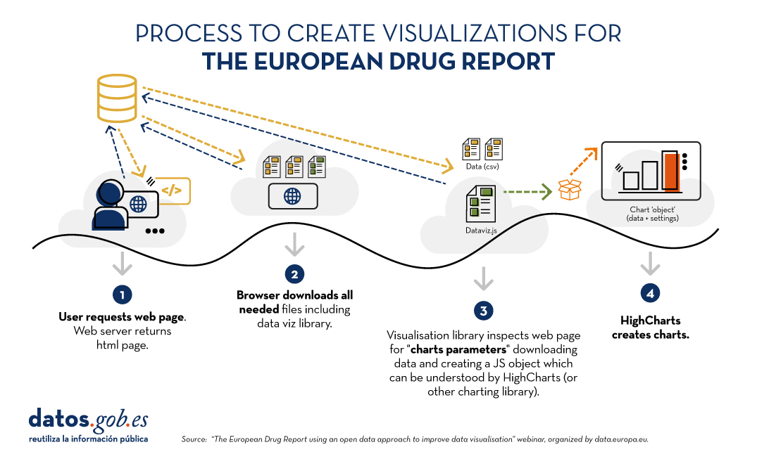
Figure 1. Process for creating visualizations for the European Drug Report. Source EN: Webinar “The European Drug Report using an open data approach to improve data visualisation”, organized by data.europa.eu.
The main new feature is that visualisations are created dynamically from the source data. In this way, if something is changed in these data, it is automatically changed in all visualisations that feed on it. Using the Drupal content management system, on which much of the site is based, administrators can register changes that will automatically be reflected in the HTML and therefore in the displays. In addition, site administrators have a visualisation generator which, based on data and indications - equivalent to simple instructions such as "sort from highest to lowest" expressed in HTML - creates visualisations without the need to touch code.
The same dynamic update procedure applies to the PDF that the user can download. If there are changes in the data, in the visualisations or if typographical errors are corrected, the PDF is generated again through a compilation process that the Observatory has created specifically for this task.
The report after the change
The report is currently published in HTML version, with the possibility to download chapters or the full report in PDF format. It is structured by thematic modules and also allows the consultation of annexes.
Furthermore, the data are always published in CSV format and the licensing conditions of the data (CC-BY-4.0) are indicated on the same page. The reference to the source of the data is always made available to the reader on the same page as a visualisation.
With this change in procedure and format, benefits for all have been achieved. From the readers' point of view, the user experience has been improved. For the organisation, the publication process has been streamlined.
In terms of open data, this new approach allows for greater traceability, as the data can be consulted at any time in its current format. Moreover, according to the Observatory speakers, this new format of the report, together with the fact that the data and visualisations are always up-to-date, has increased the accessibility of the data for the media.
You can access the webinar materials here:
Documentación
1. Introduction
In the information age, artificial intelligence has proven to be an invaluable tool for a variety of applications. One of the most incredible manifestations of this technology is GPT (Generative Pre-trained Transformer), developed by OpenAI. GPT is a natural language model that can understand and generate text, providing coherent and contextually relevant responses. With the recent introduction of Chat GPT-4, the capabilities of this model have been further expanded, allowing for greater customisation and adaptability to different themes.
In this post, we will show you how to set up and customise a specialised critical minerals wizard using GPT-4 and open data sources. As we have shown in previous publications critical minerals are fundamental to numerous industries, including technology, energy and defence, due to their unique properties and strategic importance. However, information on these materials can be complex and scattered, making a specialised assistant particularly useful.
The aim of this post is to guide you step by step from the initial configuration to the implementation of a GPT wizard that can help you to solve doubts and provide valuable information about critical minerals in your day to day life. In addition, we will explore how to customise aspects of the assistant, such as the tone and style of responses, to perfectly suit your needs. At the end of this journey, you will have a powerful, customised tool that will transform the way you access and use critical open mineral information.
Access the data lab repository on Github.
2. Context
The transition to a sustainable future involves not only changes in energy sources, but also in the material resources we use. The success of sectors such as energy storage batteries, wind turbines, solar panels, electrolysers, drones, robots, data transmission networks, electronic devices or space satellites depends heavily on access to the raw materials critical to their development. We understand that a mineral is critical when the following factors are met:
- Its global reserves are scarce
- There are no alternative materials that can perform their function (their properties are unique or very unique)
- They are indispensable materials for key economic sectors of the future, and/or their supply chain is high risk
You can learn more about critical minerals in the post mentioned above.
3. Target
This exercise focuses on showing the reader how to customise a specialised GPT model for a specific use case. We will adopt a "learning-by-doing" approach, so that the reader can understand how to set up and adjust the model to solve a real and relevant problem, such as critical mineral expert advice. This hands-on approach not only improves understanding of language model customisation techniques, but also prepares readers to apply this knowledge to real-world problem solving, providing a rich learning experience directly applicable to their own projects.
The GPT assistant specialised in critical minerals will be designed to become an essential tool for professionals, researchers and students. Its main objective will be to facilitate access to accurate and up-to-date information on these materials, to support strategic decision-making and to promote education in this field. The following are the specific objectives we seek to achieve with this assistant:
- Provide accurate and up-to-date information:
- The assistant should provide detailed and accurate information on various critical minerals, including their composition, properties, industrial uses and availability.
- Keep up to date with the latest research and market trends in the field of critical minerals.
- Assist in decision-making:
- To provide data and analysis that can assist strategic decision making in industry and critical minerals research.
- Provide comparisons and evaluations of different minerals in terms of performance, cost and availability.
- Promote education and awareness of the issue:
- Act as an educational tool for students, researchers and practitioners, helping to improve their knowledge of critical minerals.
- Raise awareness of the importance of these materials and the challenges related to their supply and sustainability.
4. Resources
To configure and customise our GPT wizard specialising in critical minerals, it is essential to have a number of resources to facilitate implementation and ensure the accuracy and relevance of the model''s responses. In this section, we will detail the necessary resources that include both the technological tools and the sources of information that will be integrated into the assistant''s knowledge base.
Tools and Technologies
The key tools and technologies to develop this exercise are:
- OpenAI account: required to access the platform and use the GPT-4 model. In this post, we will use ChatGPT''s Plus subscription to show you how to create and publish a custom GPT. However, you can develop this exercise in a similar way by using a free OpenAI account and performing the same set of instructions through a standard ChatGPT conversation.
- Microsoft Excel: we have designed this exercise so that anyone without technical knowledge can work through it from start to finish. We will only use office tools such as Microsoft Excel to make some adjustments to the downloaded data.
In a complementary way, we will use another set of tools that will allow us to automate some actions without their use being strictly necessary:
- Google Colab: is a Python Notebooks environment that runs in the cloud, allowing users to write and run Python code directly in the browser. Google Colab is particularly useful for machine learning, data analysis and experimentation with language models, offering free access to powerful computational resources and facilitating collaboration and project sharing.
- Markmap: is a tool that visualises Markdown mind maps in real time. Users write ideas in Markdown and the tool renders them as an interactive mind map in the browser. Markmap is useful for project planning, note taking and organising complex information visually. It facilitates understanding and the exchange of ideas in teams and presentations.
Sources of information
- Raw Materials Information System (RMIS): raw materials information system maintained by the Joint Research Center of the European Union. It provides detailed and up-to-date data on the availability, production and consumption of raw materials in Europe.
- International Energy Agency (IEA) Catalogue of Reports and Data: the International Energy Agency (IEA) offers a comprehensive catalogue of energy-related reports and data, including statistics on production, consumption and reserves of energy and critical minerals.
- Mineral Database of the Spanish Geological and Mining Institute (BDMIN in its acronym in Spanish): contains detailed information on minerals and mineral deposits in Spain, useful to obtain specific data on the production and reserves of critical minerals in the country.
With these resources, you will be well equipped to develop a specialised GPT assistant that can provide accurate and relevant answers on critical minerals, facilitating informed decision-making in the field.
5. Development of the exercise
5.1. Building the knowledge base
For our specialised critical minerals GPT assistant to be truly useful and accurate, it is essential to build a solid and structured knowledge base. This knowledge base will be the set of data and information that the assistant will use to answer queries. The quality and relevance of this information will determine the effectiveness of the assistant in providing accurate and useful answers.
Search for Data Sources
We start with the collection of information sources that will feed our knowledge base. Not all sources of information are equally reliable. It is essential to assess the quality of the sources identified, ensuring that:
- Information is up to date: the relevance of data can change rapidly, especially in dynamic fields such as critical minerals.
- The source is reliable and recognised: it is necessary to use sources from recognised and respected academic and professional institutions.
- Data is complete and accessible: it is crucial that data is detailed and accessible for integration into our wizard.
In our case, we developed an online search in different platforms and information repositories trying to select information belonging to different recognised entities:
- Research centres and universities:
- They publish detailed studies and reports on the research and development of critical minerals.
- Example: RMIS of the Joint Research Center of the European Union.
- Governmental institutions and international organisations:
- These entities usually provide comprehensive and up-to-date data on the availability and use of critical minerals.
- Example: International Energy Agency (IEA).
- Specialised databases:
- They contain technical and specific data on deposits and production of critical minerals.
- Example: Minerals Database of the Spanish Geological and Mining Institute (BDMIN).
Selection and preparation of information
We will now focus on the selection and preparation of existing information from these sources to ensure that our GPT assistant can access accurate and useful data.
RMIS of the Joint Research Center of the European Union:
- Selected information:
We selected the report "Supply chain analysis and material demand forecast in strategic technologies and sectors in the EU - A foresight study". This is an analysis of the supply chain and demand for minerals in strategic technologies and sectors in the EU. It presents a detailed study of the supply chains of critical raw materials and forecasts the demand for minerals up to 2050.
- Necessary preparation:
The format of the document, PDF, allows the direct ingestion of the information by our assistant. However, as can be seen in Figure 1, there is a particularly relevant table on pages 238-240 which analyses, for each mineral, its supply risk, typology (strategic, critical or non-critical) and the key technologies that employ it. We therefore decided to extract this table into a structured format (CSV), so that we have two pieces of information that will become part of our knowledge base.

Figure 1: Table of minerals contained in the JRC PDF
To programmatically extract the data contained in this table and transform it into a more easily processable format, such as CSV(comma separated values), we will use a Python script that we can use through the platform Google Colab platform (Figure 2).

Figure 2: Script Python para la extracción de datos del PDF de JRC desarrollado en plataforma Google Colab.
To summarise, this script:
- It is based on the open source library PyPDF2capable of interpreting information contained in PDF files.
- First, it extracts in text format (string) the content of the pages of the PDF where the mineral table is located, removing all the content that does not correspond to the table itself.
- It then goes through the string line by line, converting the values into columns of a data table. We will know that a mineral is used in a key technology if in the corresponding column of that mineral we find a number 1 (otherwise it will contain a 0).
- Finally, it exports the table to a CSV file for further use.
International Energy Agency (IEA):
- Selected information:
We selected the report "Global Critical Minerals Outlook 2024". It provides an overview of industrial developments in 2023 and early 2024, and offers medium- and long-term prospects for the demand and supply of key minerals for the energy transition. It also assesses risks to the reliability, sustainability and diversity of critical mineral supply chains.
- Necessary preparation:
The format of the document, PDF, allows us to ingest the information directly by our virtual assistant. In this case, we will not make any adjustments to the selected information.
Spanish Geological and Mining Institute''s Minerals Database (BDMIN)
- Selected information:
In this case, we use the form to select the existing data in this database for indications and deposits in the field of metallogeny, in particular those with lithium content.
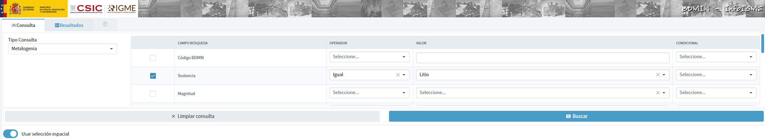
Figure 3: Dataset selection in BDMIN.
- Necessary preparation:
We note how the web tool allows online visualisation and also the export of this data in various formats. Select all the data to be exported and click on this option to download an Excel file with the desired information.

Figure 4: Visualization and download tool in BDMIN

Figure 5: BDMIN Downloaded Data.
All the files that make up our knowledge base can be found at GitHub, so that the reader can skip the downloading and preparation phase of the information.
5.2. GPT configuration and customisation for critical minerals
When we talk about "creating a GPT," we are actually referring to the configuration and customisation of a GPT (Generative Pre-trained Transformer) based language model to suit a specific use case. In this context, we are not creating the model from scratch, but adjusting how the pre-existing model (such as OpenAI''s GPT-4) interacts and responds within a specific domain, in this case, on critical minerals.
First of all, we access the application through our browser and, if we do not have an account, we follow the registration and login process on the ChatGPT platform. As mentioned above, in order to create a GPT step-by-step, you will need to have a Plus account. However, readers who do not have such an account can work with a free account by interacting with ChatGPT through a standard conversation.
Figure 6: ChatGPT login and registration page.
Once logged in, select the "Explore GPT" option, and then click on "Create" to begin the process of creating your GPT.

Figure 7: Creation of new GPT.
The screen will display the split screen for creating a new GPT: on the left, we will be able to talk to the system to indicate the characteristics that our GPT should have, while on the left we will be able to interact with our GPT to validate that its behaviour is adequate as we go through the configuration process.

Figure 8: Screen of creating new GPT.
In the GitHub of this project, we can find all the prompts or instructions that we will use to configure and customise our GPT and that we will have to introduce sequentially in the "Create" tab, located on the left tab of our screens, to complete the steps detailed below.
The steps we will follow for the creation of the GPT are as follows:
- First, we will outline the purpose and basic considerations for our GPT so that you can understand how to use it.
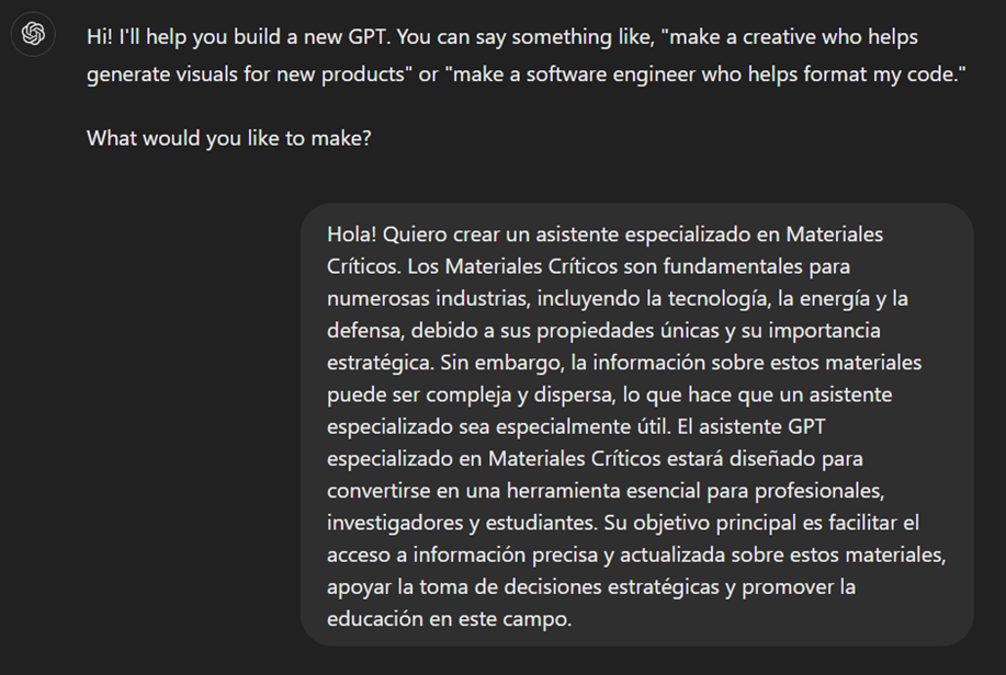
Figure 9: Basic instructions for new GPT.
2. We will then create a name and an image to represent our GPT and make it easily identifiable. In our case, we will call it MateriaGuru.

Figure 10: Name selection for new GPT.

Figure 11: Image creation for GPT.
3.We will then build the knowledge base from the information previously selected and prepared to feed the knowledge of our GPT.


Figure 12: Uploading of information to the new GPT knowledge base.
4. Now, we can customise conversational aspects such as their tone, the level of technical complexity of their response or whether we expect brief or elaborate answers.
5. Lastly, from the "Configure" tab, we can indicate the conversation starters desired so that users interacting with our GPT have some ideas to start the conversation in a predefined way.

Figure 13: Configure GPT tab.
In Figure 13 we can also see the final result of our training, where key elements such as their image, name, instructions, conversation starters or documents that are part of their knowledge base appear.
5.3. Validation and publication of GPT
Before we sign off our new GPT-based assistant, we will proceed with a brief validation of its correct configuration and learning with respect to the subject matter around which we have trained it. For this purpose, we prepared a battery of questions that we will ask MateriaGuru to check that it responds appropriately to a real scenario of use.
| # | Question | Answer |
|---|---|---|
| 1 | Which critical minerals have experienced a significant drop in prices in 2023? | Battery mineral prices saw particularly large drops with lithium prices falling by 75% and cobalt, nickel and graphite prices falling by between 30% and 45%. |
| 2 | What percentage of global solar photovoltaic (PV) capacity was added by China in 2023? | China accounted for 62% of the increase in global solar PV capacity in 2023. |
| 3 | What is the scenario that projects electric car (EV) sales to reach 65% by 2030? | The Net Zero Emissions (NZE) scenario for 2050 projects that electric car sales will reach 65% by 2030. |
| 4 | What was the growth in lithium demand in 2023? | Lithium demand increased by 30% in 2023. |
| 5 | Which country was the largest electric car market in 2023? | China was the largest electric car market in 2023 with 8.1 million electric car sales representing 60% of the global total. |
| 6 | What is the main risk associated with market concentration in the battery graphite supply chain? | More than 90% of battery-grade graphite and 77% of refined rare earths in 2030 originate in China, posing a significant risk to market concentration. |
| 7 | What proportion of global battery cell production capacity was in China in 2023? | China owned 85% of battery cell production capacity in 2023. |
| 8 | How much did investment in critical minerals mining increase in 2023? | Investment in critical minerals mining grew by 10% in 2023. |
| 9 | What percentage of battery storage capacity in 2023 was composed of lithium iron phosphate (LFP) batteries? | By 2023, LFP batteries would constitute approximately 80% of the total battery storage market. |
| 10 | What is the forecast for copper demand in a net zero emissions (NZE) scenario for 2040? | In the net zero emissions (NZE) scenario for 2040, copper demand is expected to have the largest increase in terms of production volume. |
Figure 14: Table with battery of questions for the validation of our GPT.
Using the preview section on the right-hand side of our screens, we launch the battery of questions and validate that the answers correspond to those expected.
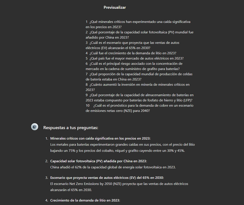
Figure 15: Validation of GPT responses.
Finally, click on the "Create" button to finalise the process. We will be able to select between different alternatives to restrict its use by other users.

Figure 16: Publication of our GPT.
6. Scenarios of use
In this section we show several scenarios in which we can take advantage of MateriaGuru in our daily life. On the GitHub of the project you can find the prompts used to replicate each of them.
6.1. Consultation of critical minerals information
The most typical scenario for the use of this type of GPTs is assistance in resolving doubts related to the topic in question, in this case, critical minerals. As an example, we have prepared a set of questions that the reader can pose to the GPT created to understand in more detail the relevance and current status of a critical material such as graphite from the reports provided to our GPT.

Figure 17: Resolution of critical mineral queries.
We can also ask you specific questions about the tabulated information provided on existing sites and evidence on Spanish territory.
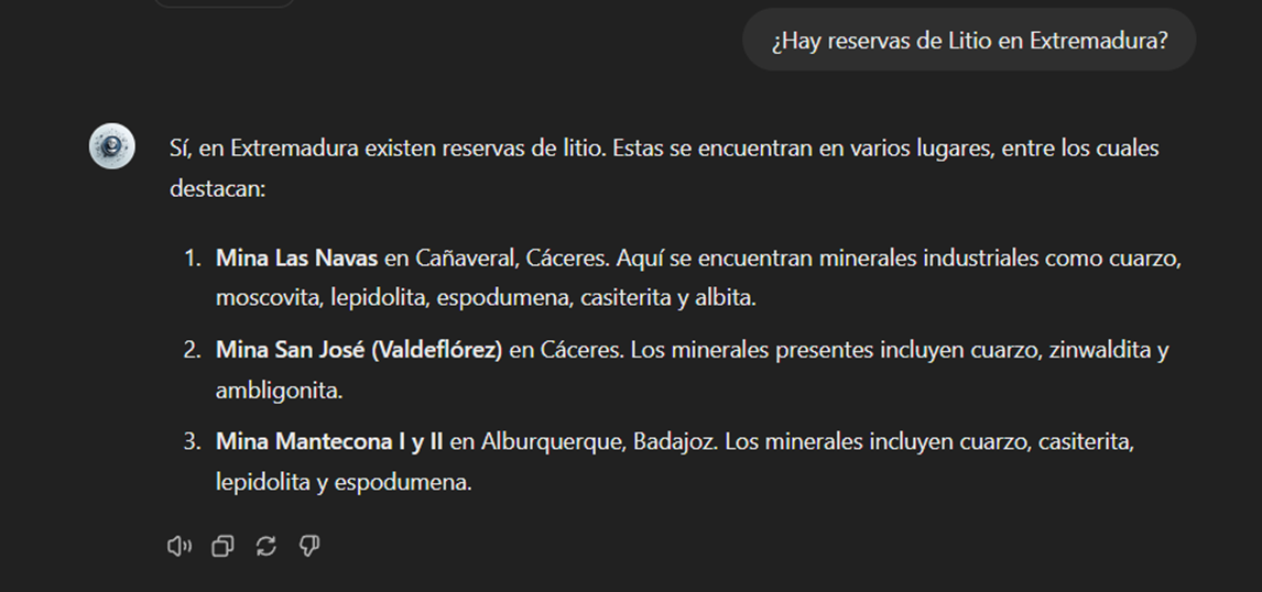
Figure 18: Lithium reserves in Extremadura.
6.2. Representation of quantitative data visualisations
Another common scenario is the need to consult quantitative information and make visual representations for better understanding. In this scenario, we can see how MateriaGuru is able to generate an interactive visualisation of graphite production in tonnes for the main producing countries.

Figure 19: Interactive visualisation generation with our GPT.
6.3. Generating mind maps to facilitate understanding
Finally, in line with the search for alternatives for a better access and understanding of the existing knowledge in our GPT, we will propose to MateriaGuru the construction of a mind map that allows us to understand in a visual way key concepts of critical minerals. For this purpose, we use the open Markmap notation (Markdown Mindmap), which allows us to define mind maps using markdown notation.

Figure 20: Generation of mind maps from our GPT
We will need to copy the generated code and enter it in a markmapviewer in order to generate the desired mind map. We facilitate here a version of this code generated by MateriaGuru.

Figure 21: Visualisation of mind maps.
7. Results and conclusions
In the exercise of building an expert assistant using GPT-4, we have succeeded in creating a specialised model for critical minerals. This wizard provides detailed and up-to-date information on critical minerals, supporting strategic decision making and promoting education in this field. We first gathered information from reliable sources such as the RMIS, the International Energy Agency (IEA), and the Spanish Geological and Mining Institute (BDMIN). We then process and structure the data appropriately for integration into the model. Validations showed that the wizard accurately answers domain-relevant questions, facilitating access to your information.
In this way, the development of the specialised critical minerals assistant has proven to be an effective solution for centralising and facilitating access to complex and dispersed information.
The use of tools such as Google Colab and Markmap has enabled better organisation and visualisation of data, increasing efficiency in knowledge management. This approach not only improves the understanding and use of critical mineral information, but also prepares users to apply this knowledge in real-world contexts.
The practical experience gained in this exercise is directly applicable to other projects that require customisation of language models for specific use cases.
8. Do you want to do the exercise?
If you want to replicate this exercise, access this this repository where you will find more information (the prompts used, the code generated by MateriaGuru, etc.)
Also, remember that you have at your disposal more exercises in the section "Step-by-step visualisations".
Content elaborated by Juan Benavente, industrial engineer and expert in technologies linked to the data economy. The contents and points of view reflected in this publication are the sole responsibility of the author.
Blog
In the vast technological landscape, few tools have made as deep a mark as Google Maps. Since its inception, this application has become the standard for finding and navigating points of interest on maps. But what happens when we look for options beyond the ubiquitous map application? In this post we review possible alternatives to the well-known Google application.
Introduction
At the beginning of 2005, Google's official blog published a brief press release in which they presented their latest creation: Google Maps. To get an idea of what 2005 was like, technologically speaking, it is enough to look at the most groundbreaking mobile terminals that year:

Imagen credits: Cinco móviles que marcaron el año 2005
Some of us still remember what the experience (or lack of experience) of running apps on these terminals was like. Well, in that year the first version of Google Maps was launched, allowing us to search for restaurants, hotels and other elements near our location, as well as to find out the best route to go from point A to point B on a digital version of a map of our city. In addition, that same year, Google Earth was also launched, which represented a real technological milestone by providing access to satellite images for almost all citizens of the world.
Since then, Google's digital mapping and navigation ecosystem, with its intuitive interface and innovative augmented reality features, has been a beacon guiding millions of users on their daily journeys.
But what if we are looking for something different? What alternatives are there for those who want to explore new horizons? Join us on this journey as we venture into the fascinating world of your competitors. From more specialized options to those that prioritize privacy, we will discover together the various routes we can take in the vast landscape of digital navigation.
Alternatives to Google Maps
Almost certainly some of you readers have seen or used some of the open source alternatives to Google Maps, although you may not know it. Just to mention some of the most popular alternatives:
-
OpenStreetMap (OSM): OpenStreetMap is a collaborative project that creates a community-editable map of the world. It offers free and open geospatial data that can be used for a variety of applications, from navigation to urban analysis.
-
uMap: uMap is an online tool that allows users to create custom maps with OpenStreetMap layers. It is easy to use and offers customization options, making it a popular choice for quick creation of interactive maps.
-
GraphHopper: GraphHopper is an open source routing solution that uses OpenStreetMap data. It stands out for its ability to calculate efficient routes for vehicles, bicycles and pedestrians, and can be used as part of custom applications.
-
Leaflet: Leaflet is an open source JavaScript library for interactive maps compatible with mobile devices. It is probably the most widespread library because of its low KB weight and because it includes all the mapping functions that most developers might need.
-
Overture Maps: While the previous four solutions are already widely established in the market, Overture Maps is a new player. It is a collaborative project to create interoperable open maps.
Of all of them, we are going to focus on OpenStreetMap (OSM) and Overture Maps.
Open Street Maps: an open and collaborative tool
Of the aforementioned solutions, probably the most widespread and well-known is Open Street Maps.
OpenStreetMap (OSM) stands out as one of the best open source alternatives to Google Maps for several reasons:
-
First, the fundamental characteristic of OpenStreetMap lies in its collaborative and open nature, where a global community contributes to the creation and constant updating of geospatial data.
-
In addition, OpenStreetMap provides free and accessible data that can be used flexibly in a wide range of applications and projects. To quote verbatim from their website: OpenStreetMap is open data: you are free to use it for any purpose as long as you credit OpenStreetMap and its contributors. If you modify or build upon the data in certain ways, you may distribute the result only under the same license. See the Copyright and License page for more details.
-
The ability to customize maps and the flexibility of OpenStreetMap integration are also outstanding features. Developers can easily tailor maps to the specific needs of their applications by leveraging the OpenStreetMap API. This is the key to the development of an ecosystem of applications around OSM such as uMap, Leaflet or GraphHopper, among many others.
Overture Maps. A unique competitor
Perhaps, one of the most promising projects to have recently appeared on the global technology scene is Overture Maps. As indicated (last July of this year) by its foundation (OMF Overture Maps Foundation), it has released its first open dataset, marking a significant milestone in the collaborative effort to create interoperable open map products. The first Overture release includes four unique data layers:
-
Places of Interest (POIs)
-
Buildings
-
Transportation Network
-
Administrative Boundaries

Example coverage of public places worldwide identified in the initial project dataset. The first version of the overture maps dataset contains, among others, 59 million records of points of interest, 780 million buildings, transport networks and national and regional administrative boundaries worldwide.
These layers, which merge various open map data sources, have been validated and contrasted through quality checks and are released under the Overture Maps data schema, made public in June 2023. Specifically, the Places of Interest layer includes data on more than 59 million places worldwide. This dataset is presented as a fundamental building block for navigation, local search and for various location-based applications. The other three layers include detailed building information (with more than 780 million building footprints worldwide), a global transportation network derived from the OpenStreetMap project, and worldwide administrative boundaries with regional names translated into more than 40 languages.
Perhaps one of the most significant pieces of information in this announcement is the number of collaborators that have come together to realize this project. The Overture collaboration, founded in December 2022 by Amazon Web Services (AWS), Meta, Microsoft and TomTom, now boasts more than a dozen geospatial and technology companies, including new members such as Esri, Cyient, InfraMappa, Nomoko, Precisely, PTV Group, SafeGraph, Sanborn and Sparkgeo. The central premise of this collaboration is the need to share map data as a common asset to support future applications.
As a good open source project, the Overture Foundation has made available to the development community a Github repository where they can contribute to the project.
In short, digital maps, their corresponding geospatial data layers, navigation and photo-geolocation capabilities are vital and strategic assets for social and technological organizations around the world. Now, with the 20th anniversary of the birth of Google Maps just around the corner, there are good open source alternatives and the big players in the international technology landscape are coming together to generate even more valuable spatial assets. Who will win this new race? We don't know, but we will keep a close eye on the current news on this topic.