Publication date
22/02/2023
Update date
06/06/2025
Description
Data is a valuable source of knowledge for society. Public commitment to achieving data openness, public-private collaboration on data, and the development of applications with open data are actions that are part of the data economy, which seeks the innovative, ethical, and practical use of data to improve social and economic development.
It is as important to achieve public access and use of data as it is to properly convey that valuable information. To choose the best chart for each type of data, it is necessary to identify the type of variables and the relationship between them.
When comparing data, we must ensure that the variables are of the same nature, i.e., quantitative or qualitative variables, in the same unit of measurement, and that their content is comparable.
We present below different visualizations, their usage rules, and the most appropriate situations to use each type. We address a series of examples, from the simplest ones like bar charts to less well-known charts like heat maps or stacked comparisons.
Bar charts
A visualization that represents data using two axes: one that collects qualitative or time data and another that shows quantitative values. It is also used to analyze trends because one of the axes can show temporal data. If the axes are flipped, a column chart is obtained.
Best practices:
- Display the axis value labels and reserve labels as tooltips for secondary data.
- Use it to represent less than 10 value points. When visualizing more value points, a line chart may be more appropriate.
- Clearly differentiate real data from estimates.
- Combine with a line chart to show trends or averages.
- Place the one with longer descriptions on the vertical axis, when no variable is temporal.
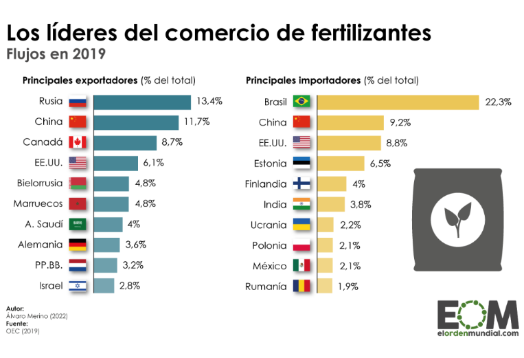
Source: El Orden Mundial https://elordenmundial.com/mapas-y-graficos/comercio-fertilizantes-mundo/
Clustered bar charts
A type of bar chart in which each data category is further divided into two or more subcategories. Therefore, the comparative scenario encompasses more factors.
Best practices
- Limit the number of categories to avoid showing too much information on the chart.
- Introduce a maximum of three or four subcategories within each category. In case more groupings need to be shown, the use of stacked bars or a set of charts can be considered.
- Choose contrasting colors to differentiate the bars of each subcategory.
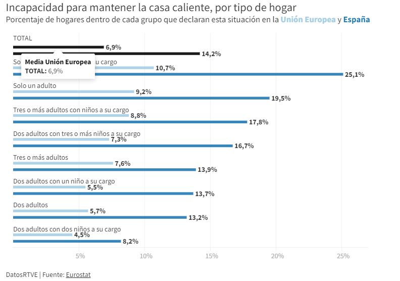
Source: RTVE https://www.rtve.es/noticias/20230126/pobreza-energetica-espana/2417050.shtml
Cumulative comparison charts
These charts display the composition of a category in a cumulative manner. In addition to providing a comparison between variables, these charts can show the segmentation of each category. They can be either stacked bar charts or cumulative area charts.
Best practices
- Avoid using stacked bar charts when comparing segments of each category to each other. In that case, it is better to use multiple charts.
- Limit the number of subcategories in stacked bar charts or segments in area charts.
- Apply contrast in colors between categories and adhere to accessibility principles.
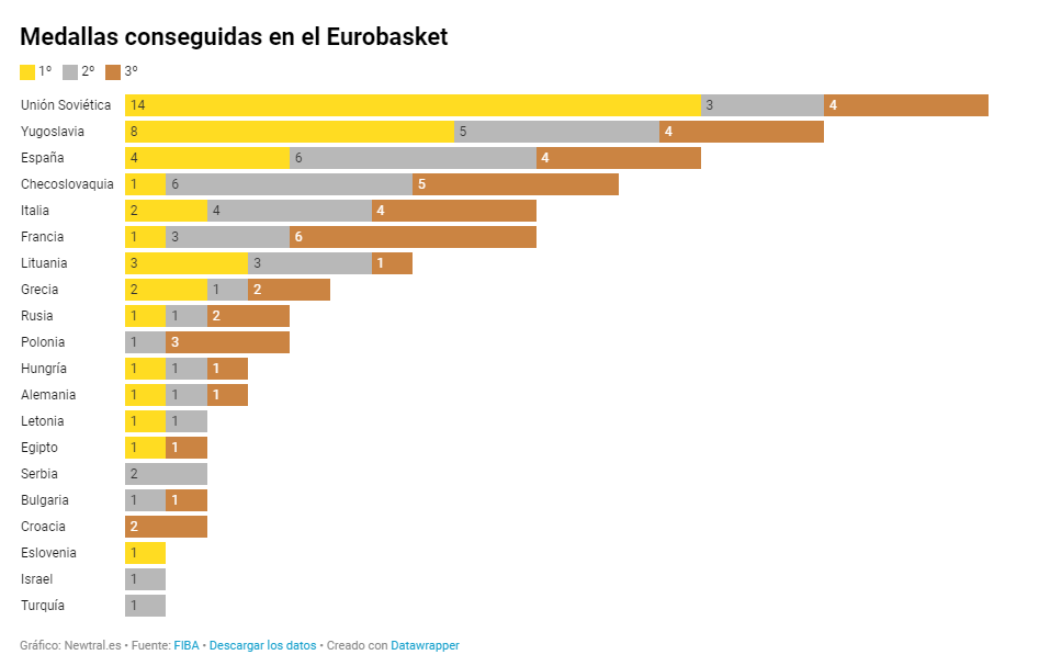
Source: Newtral https://www.newtral.es/medallas-espana-eurobasket/20220917/
Population pyramid
A combination of two horizontal bar charts that share a vertical axis representing the initial value and display two values that grow symmetrically on either side.
Best practices
- Define a common ordering criterion such as age.
- Represent the data in absolute numbers or percentages to take into account that the sum of the two values being compared represents the total.
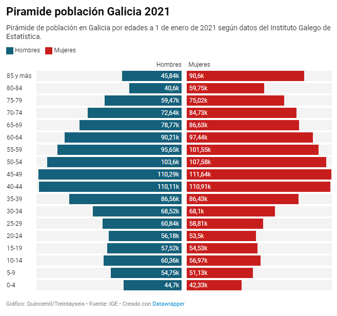
Source: El Español https://www.elespanol.com/quincemil/articulos/actualidad/asi-es-la-alarmante-piramide-de-poblacion-de-galicia-en-2021
Radar chart
Circular visualization formed by polar axes that are used to represent measurements with categories that are part of the same theme. From each category, radial axes converge at the central point of the chart.
Good practices:
- Keep numerical data within the same range of values to avoid distorting a chart.
- Limit the number of categories in data series. An appropriate number could be between four and seven categories.
- Group categories that are related or share a common hierarchy in one sector of the radar chart.
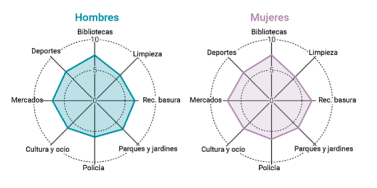
Source: Guía de visualización de datos para Entidades Locales https://redtransparenciayparticipacion.es/download/guia-de-visualizacion-de-datos-para-entidades-locales/
Heatmap
A graphical representation in table format that allows for the evaluation of two different dimensions differentiated by degrees of color intensity or traffic light codes.
Good practices:
- Indicate the value in each cell because color is only an indicative attribute. In interactive graphics, values can be identified with a pop-up label.
- Include a scheme or legend in the graphic to explain the meaning of the color scale.
- Use accessible colors for everyone and with recognizable semantics such as gradients, hot-cold, or traffic light colors.
- Limit or reduce the represented information as much as posible.

Source: eldiario.es https://www.eldiario.es/sociedad/clave-saturacion-primaria-ratios-mitad-medicos-asignados-1-500-pacientes_1_9879407.html
Bubble chart
A variation of the scatter plot that, in addition, represents an additional dimension through the size of the bubble. In this type of chart, it is possible to assign different colors to associate groups or separate categories. Besides being used to compare variables, the bubble chart is also useful for analyzing frequency distributions. This type of visualization is commonly found in infographics when it is not as important to know the exact data as it is to highlight the differences in the intensity of values.
Good practices:
- Avoid overlapping bubbles so that the information is clear.
- Display value labels whenever possible and the number of bubbles allows for it.
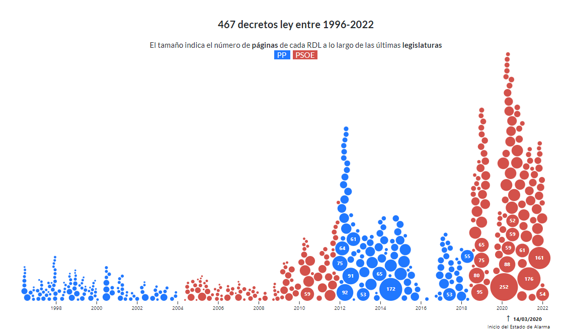
Source: Civio https://civio.es/el-boe-nuestro-de-cada-dia/2022/07/07/decretos-ley-desde-1996/
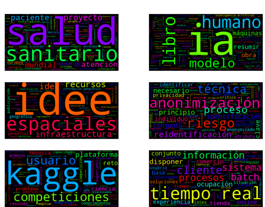
Word cloud
A visual graphic that displays words in varying sizes based on their frequency in a dataset. To develop this type of visualization, natural language processing (NLP) is used, which is a field of artificial intelligence that uses machine learning to interpret text and data.
Good practices:
- It is recommended to use this resource in infographics where showing the exact figure is not relevant but a visual approximation is.
- Try to make the length of the words similar to avoid affecting perception.
- Make it easier to read by showing the words horizontally.
- Present the words in a single color to maintain a neutral representation.
This graphic visualization, which we published in a step-by-step article, is a word cloud of several texts from datos.gob.es.
So far, we have explained the most common types of comparison charts, highlighting examples in media and reference sources. However, we can find more visualization models for comparing data in the Data Visualization Guide for Local Entities, which has served as a reference for creating this post and others that we will publish soon. This article is part of a series of posts on how to create different types of visualizations based on the relationship of the data and the objective of each exercise.
As the popular mantra goes, "a picture is worth a thousand words," which could be adapted to say that "a chart is worth a thousand numbers." Data visualization serves to make information understandable that, a priori, could be complex.
Hola,
Y que programas serian los más aptos para el análisis de datos y su posterior visualización?
Gracias
Estimado, Sergio
En este caso, depende del volumen de los datos. Normalmente se utiliza Excel para filtrar un conjunto de datos y prepararlo para su posterior visualización. Respecto a los programas, existen diferentes opciones para representar gráficamente conjuntos de datos, algunos de los más usados y con versión gratuita son Datawrapper, Flourish, Tableau o Power BI.
Esperamos haber resuelto su duda.
Un cordial saludo,
datos.gob.es
No os olvidéis de R. Saludos.