Blog
A couple of weeks ago, we commented in this article the importance of data analysis tools to generate representations that allow a better understanding of the information and make better decisions. In this article we divide these tools into 2 categories: generic data visualization tools - such as Kibana, Tableau Public, SpagoBI (now Knowage) and Grafana - and visualization libraries and APIs. We are going to dedicate this new post to the latter.
Libraries and visualization APIs are more versatile than generic visualization tools, but in order to work with them it is necessary for the user to know the programming language where the library is implemented.
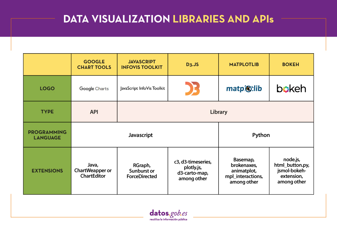
There is a wide range of libraries and APIs for different programming languages or platforms, which implement functionalities related to data visualization. Next, we will show you a selection taking as a fundamental criterion the popularity that the User Community grants them.
Google Chart Tools
Functionality:
Google Chart Tools is Google's API for creating interactive visualizations. It allows the creation of dashboards using different types of widgets, such as category selectors, time ranges or autocompleters, among others.
Main advantages:
It is a very easy-to-use and intuitive tool that allows interaction with data in real time. Furthermore, the generated visualizations can be integrated into web portals using HTML5 / SVG technology.
Do you want to know more?
- Support materials: On Youtube we find various tutorials made by API users.
- Repository: On Github we can access a common library for graphics packages, as well as know the supported chart types and examples of how to customize the components of each graphic, among others.
- User community: Users of Google Chart Tools can raise their questions in the Google community, in the space enabled for it.
JavaScript InfoVis Toolkit
Functionality:
JavaScript InfoVis Toolkit is the JavaScript library that provides functions for creating multiple interactive visualizations such as maps, hierarchical trees or line graphs.
Main advantages:
It is efficient in handling complex data structures and has a wide variety of display options, so it adapts to any developer need.
Do you want to know more?
- Support materials: East user manual explains the main display options and how to work with the library. Also available demos for creating different types of graphics.
- Repository: Users must download the project from http://thejit.org, although they also have available a repository on Github where, among other things, they can download extras.
- User community: Both in the Google user community like in Stackoverflow We found spaces dedicated to JavaScript InfoVis Tookit for users to share doubts and experiences.
Data-Driven Documents (D3.js)
Functionality:
Data-Driven Documents (D3.js) is the Javascript library that allows the creation of interactive graphics and complex visualizations. Thanks to it, data-based documents can be manipulated using open web standards (HTML, SVG and CSS), so that browsers can interpret them to create visualizations independently of proprietary software.
Main advantages:
This library allows the manipulation of a DOM (Object Model for Document Representation) by applying the necessary transformations to the structure based on the data linked to an HTML or XML document. This provides virtually unlimited versatility.
Do you want to know more?
- Support materials: On Github You can find numerous tutorials, although mainly dedicated to the old versions (they are currently in the process of updating this section of the wiki and writing new tutorials on version 4.0 of D3).
- Repository: Also on Github we find up to 53 repositories, which cover different materials to manage thousands of simultaneous animations, group two-dimensional points in hexagonal trays or work with the d3-color module, among others. In this Gallery you can see some of the work done.
- User community:There are spaces for discussion about D3 in the Community of Google,Stackoverflow, Gitter Y Slack.
- Social media: On the Twitter account @ d3js_org experiences, news and use cases are shared. There is also a group in LinkedIn.
Matplotlib
Functionality:
Matplotlib is one of the most popular libraries in Python for creating high-quality graphics and visualizations. It is characterized by presenting a hierarchical organization that goes from the most general level, such as the outline of a 2D matrix, to a very specific level, such as coloring a certain pixel.
Main advantages:
Matplotlib supports text and labels in LaTeX format. In addition, users can customize its functionality through packages designed by third parties (Cartopy, Ridge Map, holoviews, among others).
Do you want to know more?
- Support materials: On its own website we find a user's GuideIt includes information on the installation and use of the various functionalities. Also available tutorials for both beginners, intermediate or advanced users.
- Repository: In this repository Github are the materials you need for installation. On the web you can see a Gallery with examples of works for your inspiration.
- User community: The official website has a community section, although you can also find user groups to help you with your questions in Stackoverflow and Gitter.
- Social media: On Twitter profile @matplotlib Examples of user work and visualizations are also shared, as well as information on the latest news in the tool.
Bokeh
Functionality:
Bokeh is the Python library oriented to the creation of interactive graphs based on HTML / JS. It has the ability to generate interactive visualizations with features such as floating text, zoom, filters or selections, among others.
Main advantages:
Its main advantage is simplicity in implementation: complex interactive visualizations can be created with just a few lines of code. In addition, it allows embedding JavaScript code to implement specific functionalities.
Do you want to know more?
- Support materials: This User's guide provides detailed descriptions and examples that describe many common tasks that can be performed with Bokeh. On the Bokeh website we also find this tutorial and application examples built with this tool.
- Repository: In this repository Github There are the materials and instructions for its installation, as well as examples of use. Examples are also available in this Gallery.
- User community: The official community can be found on the website of Bokeh, although the users of this tool also meet in Stackoverflow.
- Social media:To keep up to date with news, you can follow the Twitter account @bokeh or your profile in LinkedIn.
The following table shows a summary of the tools mentioned above:
Are you agree with our selection? We invite you to share your experience with these or other tools in the comments section.
If you are looking for tools to help you in data processing, from datos.gob.es we put at your disposal the report "Data processing and visualization tools”, Recently updated, as well as the following monographic articles:
- The most popular data conversion and data cleaning tools
- The most popular data analysis tools
- The most popular data visualisation tools
- The most popular geospatial visualisation tools
- The most popular network analysis tools
Content elaborated by datos.gob.es team.
Blog
Data is a fundamental pillar in business decision making. Before making any decision, it is necessary to analyze the situation to understand the context and envision possible alternatives. And for this it is necessary to present the data in a clear and understandable way.
Data analysis is useless if we cannot get the result to be understood. And the best way to understand the data is to visualize it.
What is data visualization?
Data visualization is a task linked to data analysis whose objective is the graphical representation of the underlying information of the data. For this, basic graphic elements are used, such as line graphs, scatter graphs or heat maps, to complex visualizations configured on a dashboard or control panel.Data visualization allows you to detect patterns, trends or anomalous data, project predictions or communicate inferences derived froml data analysis, among other issues.
Thanks to these representations, people without advanced analytics knowledge can interpret and understand data more easily and make decisions based on them in fields as diverse as marketing, health, science, economics, journalism or even art.
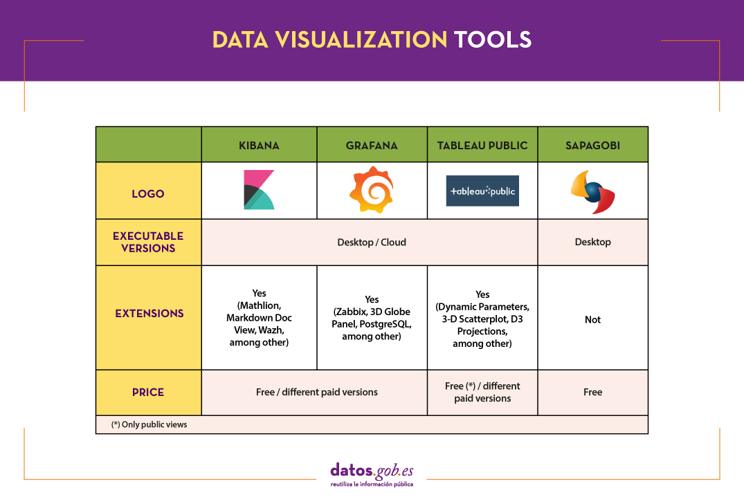
We can divide the data visualization tools into two categories. On the one hand, the generic visualization tools and, on the other, the libraries and visualization APIs, which are more versatile, but require the use of programming languages.In this article we are going to focus on the former.
Top examples of generic data visualization tools
Kibana
Functionality:
Kibana is an open source software that is part of the product package Elastic Stack. Provides indexed data exploration and visualization capabilities on top of the analytics engine Elasticsearch.
Main advantages:
Its main advantage is that it presents the information visually through customizable dashboards, through the integration of faceted filters by ranges, information categories, geospatial coverage or time intervals, among others. In addition, it has a catalog of development tools (Dev Tools) to interact with the data stored in Elasticsearch.
Do you want to know more?
- Support materials: On Elastic's own website we find this user manualIt includes basic concepts to configure Kibana, how to create and customize dashboards, how to interact with Kibana APIs, among others. Elastic also offers short videos on its channel Youtube and organizes, periodically, webinars where various aspects and use cases are explained on Kibana.
- Repository: In this Github you have different resources for its configuration, including plugins, tests and examples.
- User community: There is an official user community in their Web page, although you can also find discussion groups at Stackoverflow.
- Social media: You can follow the Twitter account @elastic to stay up-to-date with Kibana news and discover user experiences, or join their group of LinkedIn.
Tableau Public
Functionality:
Tableau Public is a tool designed to carry out visualizations combining a graphical interface with common elements of the Business Integillence tools, such as the variable organization model through the use of dimensions and the connection with databases or datasets.
Main advantages:
It stands out for its graphic, efficient and fast interface, and for its simple integration of databases or spreadsheets of any size. In addition, it allows the combination of various data sources in a single view.
As a negative point, in order to use the free version, both the data and the views must be published on your website in a public way, eliminating the confidentiality of the information.
Do you want to know more?
- Support materials: Tableau offers a manual with 8 stepsto get started with Tableau Desktop, including everything from connecting to your data to sharing your findings. You can also find on the Tableau website tutorials, a visualization gallery, resources for users (such as podcasts or contests) and a Blog with related articles.
- User community: In the official forum From Tableau you can find more than 450 user groups and answers to more than 195,000 questions.
- Social media: On the Twitter account @tableaupublic Examples of visualizations, experiences, and news information are included. Also available is a group of LinkedIn.
SpagoBI (Knowage)
Functionality:
Grafana allows you to create interactive and dynamic visualizations. Originally started as a component of Kibana, today they are completely independent tools.
Main advantages:
SpagoBI allows you to create customizable and exportable reports in different formats (HTML, PDF, XLS, XML, TXT, CSV and RTF) that can contain tables, cross tables, interactive graphics and text.
Do you want to know more?
- Support materials: On this document you can find an installation manual, an administration manual, a user guide and information about the different functionalities. On his channelYoutubeYou can find different playlists with success stories, examples of visualizations, tutorials on different functionalities or webinars, among others. In the case of webinars, you can also access them fromtheir website, where the agenda with the next appointments is included.
- Repository: On Github there are different repositories with material of interest to SpagoBI users.
- User community: You can find different questions posed by users -and their answers- in Stackoverflow.
- Social media: The user community also has at its disposal a group of LinkedIn. On Twitter, channels coexist @SpagoBI and @knowage_suite, that inform about the news and show examples of work carried out with this tool.
Grafana
Functionality:
Grafana allows you to create interactive and dynamic visualizations. Originally started as a component of Kibana, today they are completely independent tools.
Main advantages:
This tool allows users to interact, exchanging data or dashboards. In addition, it integrates different databases such as: PostgreSQL, MySQL and Elasticsearch, from which you can obtain metrics, filter data or make annotations in real time.
Do you want to know more?
- Support materials: In the Grafana websitethere is multiple information on how to install this tool, create a dashboard or manage alerts. They also have a Blog as well as with webinars and videos, also available in your Youtube channel.
- Repository: From this GitHub you can download packages and resources, like plugins.
- User community: As in some of the previous cases, we found an official community in the own Grafana website, and informal communities in Gitter and Stackoverflow.
- Social media: Twitter account @grafana shows examples of use and helps spread the news highlighted on the blog. Users can also join their group of LinkedIn.
The following table shows a summary of the tools mentioned above:
These are just 4 examples of popular tools fromdata visualization. Soon we will put at your disposal an article with examples of libraries and visualization APIs. We invite you to share your experience with these or other tools in the comments.
If you want to know more about the different phases of data processing, you can see the full report "Data processing and visualization tools", recently updated. In addition, you have at your disposal the following monographic articles:
- The most popular data conversion and data cleaning tools
- The most popular data analysis tools
- The most popular data visualisation libraries and APIs
- The most popular geospatial visualisation tools
- The most popular network analysis tools
Content prepared by the datos.gob.es team.
Blog
Data analysis is a process that allows us to obtain knowledge of the underlying information of the data, with the purpose of drawing conclusions that allow us to make informed decisions. Without data analytics, companies and organizations are limited in examining their results and determining the direction to take to have the best chance of success.
Types of analytics
Within the field of analytics we find different processes that try to respond to the past, present and future of our activities:
- Exploratory analysis, which subjects the data to statistical treatment, to determine why a certain event has occurred.
- Descriptive analysis, which explores the data from different perspectives to find out what happened.
- Predictive analytics, which allows predicting future values of the variables of interest to know what will happen.
- Prescriptive analysis, that offers recommendations when testing the environment variables and suggesting those with the highest probability of generating a positive result.
This article contains a selection of popular data analysis tools that will allow you to perform these tasks, divided based on two target audiences:
- Tools that perform simple analysis and do not involve programming tasks, aimed at users without advanced technical knowledge.
- Tools that present greater versatility, but require the use of programming languages, so they are aimed at users with mathematical and computer knowledge.
It is convenient to remember that before carrying out any analysis of this type it is necessary to transform the data that we use so that they have the same structure and format, free of errors, something that we already saw in the article Data conversion and debugging tools.
Data analysis tools for non-programmers
WEKA
Functionality:
WEKA is a cross-platform machine learning and data mining software. Its functionalities can be accessed through a graphical interface, a command line or a Java API.
Main advantages:
One of its main advantages is that it contains a large number of built-in tools for standard machine learning tasks and allows access to other tools such as scikit-learn, R and Deeplearning4j.
Do you want to know more?
- Support materials: As an appendix to the book Data Mining: Practical Machine Learning: tools and techniques, we found this WEKA manual that brings us closer to its panels and functionalities. It includes methods for the main data mining problems: regression, classification, clustering, association rules, and attribute selection. We also have at our disposal on the net this manual and these tutorials prepared by the University of Waikato, a body that has also launched a Blog on matter.
- Repository: The official WEKA source code is available at this url. You can also access it from this repository Github, as well as different packages or tools.
- User community: You can find user groups in Stackoverflow.
KNIME
Functionality:
KNIME is a data mining software that allows data analysis and visualizations through a graphical interface.
Main advantages:
The graphical interface on which the data analysis flows are modeled uses nodes, which represent the different algorithms and arrows that show the flow of data in the processing pipeline. In addition, it allows incorporating code developed in R and Python, as well as interaction with WEKA.
Do you want to know more?
- Support materials: On KNIME's own website you can find different help documents, that guide you in its installation, the creation of workflows or the use of nodes. In addition, on his channe lYoutube you can find multiple videos, including playlists with basic aspects for users who are facing this tool for the first time.
- Repository: On GitHub Tools are provided to configure the KNIME SDK (Software Development Kit), so that you can work with the source code of the extensions or develop your own.
- User community: KNIME users have groups at their disposal to answer questions in Gitter Y Stackoverflow, as well as a discussion forum on the website of Knime.
- Social media: You can follow the Twitter account @knime and his profile of LinkedIn to keep up to date with KNIME news and related events or talks.
ORANGE
Functionality:
Orange is open machine learning and data mining software, similar to Knime.
Main advantages:
Orange creates the analysis and data visualizations using the drag and drop paradigm from awidget catalog representing different tasks. Also, it can be installed as a Python library.
Do you want to know more?
- Support materials: In this case we highlight two books. First, Introduction to data mining with Orange, which collects the workflows and visualizations of the course on Introduction to Data Mining from Orange himself. Second, Orange Data Mining LibraryDocumentation, a brief introduction to scripting in Orange. You can also find video tutorials on the YouTube channel Orange Data Mining.
- Repository: From this GitHub you can download the necessary resources for its installation.
- User Community: In Gitter, StackExchange and Stackoverflow users have created spaces where they can ask questions and share experiences.
- Social media: On twitter profile@OrangeDataMiner and his LinkedIn account reports, events, use cases and news related to this tool are collected.
Data analysis tools for non-programmers
R (The R Project for statistical computing)
Functionality:
R is an interpreted object-oriented programming language, initially created for statistical computing and the creation of graphical representations.
Main advantages:
R is one of the most used languages in scientific research and this is due to its many advantages:
- It has a programming environment, R-Studio.
- It consists of a set of functions that can be easily expanded by installing libraries or defining custom functions.
- It is permanently updated due to its extensive community of users and programmers, who since its inception contribute to the development of new functions, libraries and updates available to all users freely and for free.
Do you want to know more?
- support materials: Due to its popularity, there are a large number of helpful materials. As an example we highlight the books R for Data Science and R manual. You can also find guides in the web space The R Manuals and the webinars that from the own R Studio they organize.
- User community: There is a discussion space in Stackoverflow. In addition, in Spain, we find two groups that carry out different activities (hackathons, conferences, courses ...) to promote the use of R: R-Hispanic community and R-Ladies. You can know more about them in this article.
- Social media: R has a LinkedIn group with almost 150,000 members.
Python
Funcionalidad:
Python is a dynamic, multi-platform, multi-paradigm interpreted programming language, partially supporting object-oriented programming, structured programming, imperative programming, and functional programming.
Main advantages:
It is a simple programming language. Its philosophy emphasizes providing human-readable, easy-to-use, and easy-to-learn code syntax. In addition, it allows the integration of libraries such as Matplotlib, Bokeh, Numpy, Pandas or spaCy, to implement functions that enable complex interactive graphing and statistical analysis.
Do you want to know more?
- Support materials: As with R, being a very popular language, we find a lot of materials and help on the net, such as tutorials The Python Tutorial Y LearnPython.org, or the portal with videos Pyvideo, where you can find various webinars.
- Repository: In Github you can find different repositories related to the Python programming language.
- Community of users: Those uruaries with questions can seek the help of people in the same situation in Stackoverflow or Gitter. On Python's own website you can also find a large number of communities Worldwide.
- Social media: The official twitter profile of the Python Software Foundation is @ThePSF. There is also group in Linkedin.
GNU Octave
Functionality:
GNU Octave is a programming language designed primarily to solve computational algebra tasks. It is the best known alternative to the commercial MATLAB solution, but free and open. Also, it does not have a graphical interface.
Main advantages:
GNU Octave has powerful built-in mathematical functions (differential equations, linear algebra, matrix calculus) and can be extended with the addition of libraries, such as Scientific Library, Dionysus or Bc. It also has a index package with numerous extensions that enrich the functionality of the tool.
Do you want to know more?
- Support materials: In this link You have the notes of the GNU Octave course from the Complutense University of Madrid. On the GNU Octave website you can also find manuals and on your youtube profile, video tutorials.
- Repository: The GNU Octave developer community has a variety of repositories on Github with materials of interest.
- User Community: In Stackoverflow and in the GNU Octave website there is a space for users to share opinions and experience.
- Social media: You can follow the news related to this tool on the Twitter account @GnuOctave and this group of LinkedIn.
The following table shows a summary of the tools mentioned above:

This is just a selection of data analysis tools, but there are many more. We invite you to share your experience with these or other solutions in the comments.
For those who want to know more about these tools and others that can help us during the different phases of data processing, at datos.gob.es we offer you the recently updated report "Data processing and visualization tools". You can see the full report here.
You can see more tools related to this field in the following monographs:
- The most popular data conversion and data cleaning tools
- The most popular data visualisation tools
- The most popular data visualisation libraries and APIs
- The most popular geospatial visualisation tools
- The most popular network analysis tools
Content prepared by the datos.gob.es team.
Blog
When carrying out a data analysis project, it is usual to work with different sources, which in many cases include datasets with Heterogeneous formats and structures that do not always share the same quality. Therefore, one of the first phases in any data analysis process is known as data cleaning.
What is data cleaning?
When we talk about data cleaning, we refer to the set of processes necessary for the preparation and transformation of data from different sources for analysis. As a result of these processes, a homogeneous structure is generated, free of errors and in the appropriate format, which will be actionable in the subsequent stages of analysis. This resulting data set is known as a data mining view.
Cleannig is essential in data processing, as it standardizes and formats it before entering it into the target system, so that we can work with it appropriately.
Among the different processes that make up the data purification phase, the conversion of the data is included, which involves the transformation of the data to a specific format. In this way they can be used by tools that only accept certain formats.
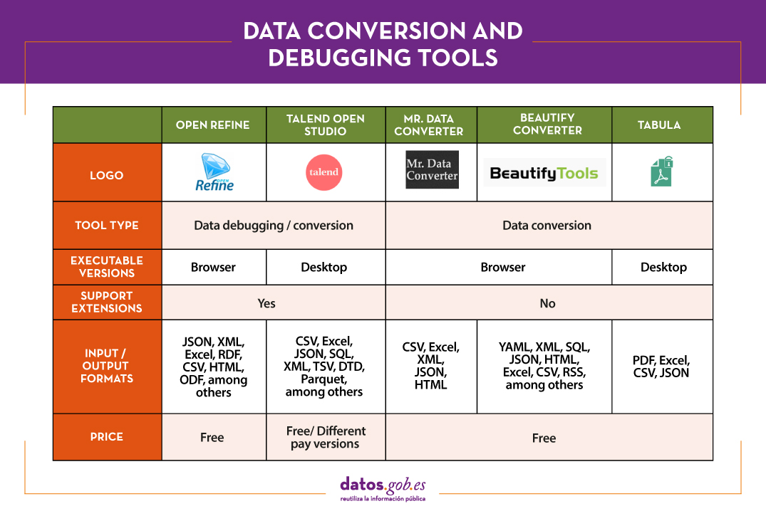
In the market we find many data cleaning tools that also convert them to other formats, although there are also tools that perform each of these tasks exclusively. Here are some examples selected in phase of their popularity, although we invite you to leave in comments any mention of other tools that may be of interest to you.
Top examples of data cleaning tools
Two of the most used tools in the field of data cleaning are Open Refine and Talend Open Studio.
OpenRefine
Functionality:
OpenRefine is a free tool that seeks to improve the quality and structure of the data by correcting common errors such as data duplication, incomplete data or inconsistencies. Thanks to it, users can organize, clean, apply transformations, convert to different formats, and enrich data by using web services and other external data sources.
Main advantages:
One of its main advantages is that it uses the language GREL (Google Refine Expression Language), which allows you to perform advanced debugging tasks by applying a large number of functions using regular expressions. In addition, it allows incorporating additional extensions by accessing functions to georeference information, link data from the DBpedia or other sources, generating data linked in RDF.
Do you want to know more?
- Support materials: In this user manual all aspects of configuring and using Open Refine 3.4.1 are covered, including all functions and features of the interface and this youtube account different video-tutorials.
- Repository: In this GitHub there are the necessary resources so that you can operate OpenRefine from Mac OS, Linux and Windows.
- User community:OpenRefine users can find discussion groups atGoogle, and Stackoverflow.
- Social media:On the Twitter account of @OpenRefine You can find videos, guides, information about the latest news or upcoming events related to OpenRefine.
Talend Open Studio
Functionality:
Talend Open Studio is an open source solution that integrates a set of ETL (Extract, Transform and Load) tools designed to extract, debug and transform data sets for further analysis. As a result, it generates standardized code in Perl and Java that can be reused in different projects.
Main advantages:
This tool stands out for its intuitive interface based on component programming, a technique that consists of concatenating processes with various functionalities through input and output flows.
Do you want to know more?
- Support materials: On Talend's own website you can find different user manuals Y tutorials to discover Talend Studio and its interface, and create a project, along with simple sample jobs.
- Repository: This GitHub contains the Talend Open Studio source files, which files should be used in conjunction with the common code contained in tcommon-studio-se
- User community: OnStackoverflow There are channels where users share their experience and ask different questions.
- Social media: Talend Open Studio has a page of LinkedIn and the perfil@Talend on Twitter, where they share news, experiences and use cases, among others.
Top Examples of Data Conversion Tools
In the case of data conversion, Mr Data Converter, Beautify Converters and Tabula stand out for their popularity.
Mr Data Converter
Functionality:
Mr Data Converter is a web application that allows you to easily convert data found in CSV or Excel to other formats such as CSV, JSON, HTML and XML.
Main advantages:
One of its strengths is that the data is incorporated by copying and pasting on the application interface, without the need to upload any files. The same happens when exporting, where it is enough to copy and paste the generated code. On the negative side of the scale, we find a limitation in the maximum size of the data, which should not exceed 300 MB.
Do you want to know more?
- Repository: You can find information about the license and different materials in this GitHub.
Beautify Converters
Functionality:
Beautify Converters a web application that allows you to convert data to JSON, SQL, CSV or Excel formats, among others. It belongs to the Beautify Tools collection of free online tools.
Main advantages:
As with Mr Data Converter, the user can incorporate the data by copying and pasting on the application interface. You can also do this by uploading the file from a local computer. Unlike the previous tool, it supports a significantly higher number of formats, SQL, YAML or RSS.
Do you want to know more?
- Repository: In this repository GitHub You have information about the license and the rest of the tools in the Beautify Tools collection.
Tabula
Functionality:
Tabula allows you to extract tables from PDF reports -except for those that are only image-, in formats reusable by data analysis and visualization tools.
Main advantages:
Its main advantage is a very simple interface. It will only be necessary to upload the PDF, select the tables that we want to extract and finally select the desired format, Excel, CSV or JSON.
Do you want to know more?
- Support materials: The Junta de Andalucía has developed thistutorialwhere it tells how to upload a PDF file to Tabula and extract the tabular data in CSV format, ready for use in spreadsheets. The process is exemplified with the data setSanitary quality of bathing water.
- Repository: You can download the materials from this link or GitHub.
- Social media: Twitter. Account @TabulaPDF Although it is not very up-to-date, it offers, among others, information on bug fixes and maintenance, guides and comments from users who use this tool.
The following table shows a summary of the tools mentioned above:
The adaptation and conversion of the data can consume a great amount of resources, economic and temporary, of any project. These types of tools help to carry out these activities with agility and efficiency, freeing up data scientists to focus on other activities.
For those who want to know more about these tools and others that can help us during the different phases of data processing, at datos.gob.es we offer you the recently updated report "Data processing and visualization tools". You can see the full report here.
You can see more tools related to this field in the following monographs:
- The most popular data analysis tools
- The most popular data visualisation tools
- The most popular data visualisation libraries and APIs
- The most popular geospatial visualisation tools
- The most popular network analysis tools
Content prepared by the datos.gob.es team.
Documentación
Visualization is critical for data analysis. It provides a first line of attack, revealing intricate structures in data that cannot be absorbed otherwise. We discover unimaginable effects and question those that have been imagined."
William S. Cleveland (de Visualizing Data, Hobart Press)
Over the years an enormous amount of public information has been generated and stored. This information, if viewed in a linear fashion, consists of a large number of disjointed numbers and facts that, out of context, lack any meaning. For this reason, visualization is presented as an easy solution towards understanding and interpreting information.
To obtain good visualizations, it is necessary to work with data that meets two characteristics:
- It has to be quality data. They need to be accurate, complete, reliable, current and relevant.
- They have to be well treated. That is, conveniently identified, correctly extracted, in a structured way, etc.
Therefore, it is important to properly process the information before its graphic treatment. The treatment of the data and its visualization form an attractive tandem for the user who demands, more and more, to be able to interpret data in an agile and fast way.
There are a large number of tools for this purpose. The report "Data processing and visualization tools" offers us a list of different tools that help us in data processing, from obtaining them to creating a visualization that allows us to interpret them in a simple way.
What can you find in the report?
The guide includes a collection of tools for:
- Web scraping
- Data debugging
- Data conversion
- Data analysis for programmers and non-programmers
- Generic visualization services, geospatial and libraries and APIs.
- Network analysis
All the tools present in the guide have a freely available version so that any user can access them.
New edition 2021: incorporation of new tools
The first version of this report was published in 2016. Five years later it has been updated. The news and changes made are:
- New currently popular data visualization and processing tools such as Talend Open Studio, Python, Kibana or Knime have been incorporated.
- Some outdated tools have been removed.
- The layout has been updated.
If you know of any additional tools, not currently included in the guide, we invite you to share the information in the comments.
In addition, we have prepared a series of posts where the different types of tools that can be found in the report are explained:
Documentación
The saying "a picture is worth a thousand words" is a clear example of popular wisdom based on science. 90% of the information we process is visual, thanks to a million nerve fibers that link the eye to the brain and more than 20,000 million neurons that perform the processing of the impulses received at high speed. That is why we are able to remember 80% of the images we see, while in the case of text and sound the percentages are reduced to 20% and 10%, respectively.
These data explain the importance of data visualization in any sector of activity. It is not the same to tell how an indicator evolves, as to see it through visual elements, such as graphs or maps. Data visualization helps us understand complex concepts and is an accessible way to detect and understand trends and patterns in the data.
Data Visualization and Smart Cities
In the case of Smart Cities, where so much information is generated and captured, data visualization is fundamental. Throughout the length and breadth of a smart city, there are a large number of sensors and smart devices, with different detection capabilities, which generate a large amount of raw data. To give an example, only the city of Barcelona has more than 18,000 sensors spread throughout the city that capture millions of data. This data allows from real time monitoring of the environment to informed decision making or accountability. Visualizing this data through visual dashboards speeds up all these processes.
To help Smart Cities in this task, from the Open Cities project, led by Red.es and four city councils (A Coruña, Madrid, Santiago de Compostela and Zaragoza), a series of visualization tools have been selected and an extension has been developed for CKAN similar to the functionality "Open With Apps", initially designed for the Data.gov portal, which facilitates the integration with this type of tools.
The integration method inspired by "Open with Apps"
The idea behind "Open With Apps" is to allow integration with some third party services, for some formats published in the open data portals, such as CSV or XLS, without the need to download and upload data manually, through the APIs or URIs of the external service.
But not all display systems allow this functionality. Therefore, since the Open Cities project they have analyzed several platforms and online tools for creating visualizations and data analysis, and have selected 3 that meet the necessary characteristics for the described operation:
- The integration is done through links to websites without the need to download any software.
- In the invocation it is only necessary to pass as a parameter the download URL of the data file.
The result of this analysis has given rise to the report "Analysis and definition of specifications for integration with external visualization systems", where 3 tools that comply with these functionalities are highlighted.
3 simple data visualization and analysis tools
According to the aforementioned report, the 3 platforms that meet the necessary characteristics to achieve such operation are:
- Plotly: facilitates the creation of interactive data visualizations and control panels to share online with the audience. More advanced users can process data with any custom function, as well as create simulations with Python scripts. Supported formats are CSV, TSV, XLS and XLSX.
- Carto: formerly known as CartoDB, it generates interactive maps from geospatial data. The maps are automatically created and the user can filter and refine the data for more information. It accepts files in CSV, XLS, XLSX, KML (Google Earth), KMZ, GeoJSON and SHP formats.
- Geojson.io: allows to visualize and edit geographic data in GeoJSON format, as well as to export to a large number of formats.
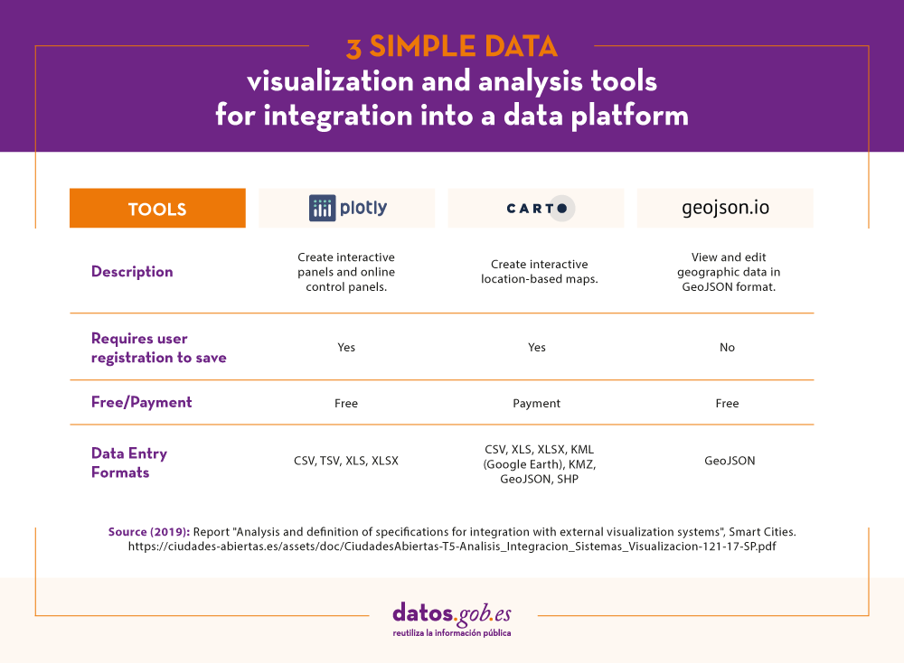
For each of these tools the report includes a description of its requirements and limitations, its mode of use, a generic call and specific examples of calls along with the result obtained.
The "Open with" extension
As mentioned above, within the project a CKAN extension called "Open with" has also been developed. This extension allows to visualize the data files using the external visualization systems described above. It can be accessed through the project's GitHub account.
The report explains how to carry out its installation in a simple way, although if any doubt arises about its operation, users can contact Open Cities through the e-mail contacto@ciudadesabiertas.es.
Those interested in other CKAN extensions related to data visualization have at their disposal the report Analysis of the Visualization Extensions for CKAN, carried out within the framework of the same initiative. In the Gighub account, it is expected that examples of visualizations made will be published.
In short, data visualization is a fundamental leg of Smart Cities, and thanks to the work of the Open Cities team it will now be easier for any initiative to integrate simple data visualization solutions into their information management platforms.
Blog
Introduction
In this new post we introduce an important topic in the data analysis sector and that, however, tends to go unnoticed by most of the non-specialist audience. When we talk about advanced data analytics, we tend to think of sophisticated tools and advanced knowledge in machine learning and artificial intelligence. Without detracting from these skills so demanded today, there are much more basic aspects of data analysis that have a much greater impact on the end user or consumer of results. This time we talk about the communication of data analysis. Good communication of the results and process of a data analysis can make the difference between the success or failure of a data analytics project.
Communication. An integrated process
We could think that the communication of data analysis is a subsequent process and decoupled from the technical analysis itself. Ultimately, it is something that is left for last. This is a very common mistake among analysts and data scientists. Communication must be integrated with the analysis process. From the more tactical perspective of the code documentation and the analysis process, to the communication to the final public (in the form of presentations and / or reports). Everything must be an integrated process. In the same way that the DevOps philosophy has prevailed in the world of software development, in the data analysis space the DataOps philosophy must prevail. In both cases, the goal is continuous and agile delivery of value in the form of software and data.
Gartner defines DataOps as \"a collaborative data management practice focused on improving communication, integration and automation of data flows between data managers and consumers in an enterprise.\"
Innovation Insight for DataOps
Benefits of using an integrated data analysis and communication methodology.
- A single controlled and governed process. When we adopt DataOps we can be sure that all stages of data analysis are under control, governed and highly automated. This results in control and security of the data pipeline.
- Reproducible data science. When we communicate results and / or part of the data analysis process, it is common for other collaborators to start from your work to try to improve or modify the results. Sometimes they will just try to reproduce your same results. If the final communication has been part of the process in an integrated and automated way, your collaborators will have no problem reproducing those same results themselves. Otherwise, if the communication was done at the end of the process and decoupled (both in time and in the use of different tools) from the analysis, there is a high probability that the replay attempt will fail. Software development processes, whether they include data or not, are highly iterative. That is, hundreds if not thousands of code changes are made before obtaining the desired results. If these iterative changes, no matter how small, are decoupled from the final communication, surely, the result obtained will have obviated changes that will make their direct reproduction impossible.
- Continuous delivery of value. On many occasions I have experienced situations in which the preparation of results is left as the last phase of a project or data analysis process. Most of the efforts are focused on data analysis development and algorithm development (where applicable). This fact has a clear consequence. The last task is to prepare the communication and therefore it is the one that ends up concentrating less focus. All team efforts have been spent in previous phases. We are exhausted and the documentation and communication is what separates us from the delivery of the project. As a consequence, project documentation will be insufficient and communication poor. However, when we present the results to our clients, we will desperately try to convince that an excellent job of analysis has been done (and it will be) but our weapon is the communication that we have prepared and it is predictably much better.
- Improvement in the quality of communication. When we integrate development and communication, we are monitoring at all times what our clients are going to consume. In this way, during the analysis process, we have the agility to modify the results that we are producing (in the form of graphs, tables, etc.) in analysis time. On multiple occasions I have seen how after closing the analysis phase and reviewing the results produced, we realize that something is not well understood or can be improved in terms of communication. They can be simple things like the colors in a legend or the decimal digits in a table. However, if the analysis has been carried out with very different tools and decoupled from the production of results (for example, a presentation), the very idea of rerunning the analysis project to modify small details will set you off alarms at any time. analyst or data scientist. With the DataOps methodology and the right tools, we just have to rerun the data pipeline with the corresponding changes and everything will be re-created automatically.
Integrated communication tools
We have talked about the methodology and its benefits, but we must know that the tools to correctly implement the strategy play an important role. Without going any further, this post has been made entirely with a data pipeline that in the same process integrates: (1) the writing of this post, (2) the creation of a website for publication, (3) the versioning of the code and (4) the data analysis, although in this case, it is not relevant, as it only serves to illustrate that it is one more part of the process.
Without going into too many technical details, in the same work environment (and programming and document writing) RStudio and using the Markdown and Blogdown plugins we can create a complete website where we can publish our posts, in this case about analysis of data. The detailed explanation about the creation of the website that will host the following content posts will be left for another time. At this time we are going to focus on the generation of this content post in which we will show an example of data analysis.
To illustrate the process we are going to use this dataset available at datos.gob.es. It is a set of data that collects the uses of the citizen card of the Gijón City Council, during 2019 in the different services available in the city.
As we can see, at this point, we are already integrating the communication of a data analysis with your own analysis. The first thing we are going to do is load the dataset and see a preview of it.
file <- \"http://opendata.gijon.es/descargar.php?id=590&tipo=EXCEL\"\r\n Citicard <- read_csv2(file, col_names = TRUE)\r\n head(Citicard)| Date | Service | Instalation | Uses |
|---|---|---|---|
| 2019-01-01 | Public toilets | Avda Carlos Marx | 642 |
| 2019-01-01 | Public toilets | Avda del Llano | 594 |
| 2019-01-01 | Public toilets | C/ Puerto el Pontón | 139 |
| 2019-01-01 | Public toilets | Cerro Santa Catalina | 146 |
| 2019-01-01 | Public toilets | Donato Argüelles | 1095 |
| 2019-01-01 | Public toilets | El Rinconín | 604 |
Next we are going to generate an obvious and simple analysis in any exploratory phase (EDA - Exploratory Data Analysis) of a new data set. We are going to add the data set by Date and Services, thus obtaining the sum of card uses by date and type of service.
Citi_agg <- Citicard %>%\r\n group_by(Fecha, Servicio) %>%\r\n summarise(Usos = sum(Usos)) \r\n \r\n head(Citi_agg)| Date | Services | Uses |
|---|---|---|
| 2019-01-01 | Public toilets | 17251 |
| 2019-01-01 | Library loans | 15369 |
| 2019-01-01 | Transport | 1201471 |
| 2019-02-01 | Public toilets | 18186 |
| 2019-02-01 | Library loans | 14716 |
| 2019-02-01 | Transport | 1158109 |
We graph the result and observe how the majority use of the citizen card is the payment of public transport. Since we have generated an interactive graph, we can select in the Autoscale controls and click on the legend to remove the transport column and analyze in detail the differences between the use of Public Toilets and Library Loans.
Citi_fig <- ggplot(Citi_agg, aes(x=Fecha, y=Usos/1000, fill=Servicio)) +\r\n geom_bar(stat=\"identity\", colour=\"white\") + labs(x = \"Servicio\", y = \"Uso Tarjeta (en miles)\") + \r\n theme(\r\n axis.title.x = element_text(color = \"black\", size = 14, face = \"bold\"),\r\n axis.title.y = element_text(color = \"black\", size = 10, face = \"bold\")\r\n ) \r\n \r\n ggplotly(Citi_fig)When we discard for a moment the use of the card as a means of payment in public transport, we observe the greater use of the card for access to public toilets and to a lesser extent for the loan of means in public libraries. In the same way, the use of the zoom allows us to see with greater comfort and detail these differences in specific months.
If we ask ourselves what is the distribution of the total use of the Citizen Card throughout 2019, we can generate the following visualization and verify the evident result that the use in public transport represents 97%.
Tot_2019_uses <- sum(Citi_agg$Usos)\r\n Citi_agg_tot <- Citicard %>%\r\n group_by(Servicio) %>%\r\n summarise(Usos = 100*sum(Usos)/Tot_2019_uses) %>%\r\n arrange(desc(Usos))\r\n \r\n knitr::kable(Citi_agg_tot, \"pipe\", digits=0, col.names=(c(\"Servicio Usado\", \"Uso Tarjeta en %\")))| Used Service | Card Use in% |
|---|---|
| Transport | 97 |
| Public toilets | 2 |
| Library loans | 1 |
ggplot(Citi_agg_tot,aes(x=Servicio, y=Usos, fill=Servicio)) + \r\n geom_bar(stat=\"identity\", colour=\"white\") + labs(x = \"Servicio\", y = \"Uso en %\") + \r\n theme(\r\n axis.title.x = element_text(color = \"black\", size = 14, face = \"bold\"),\r\n axis.title.y = element_text(color = \"black\", size = 14, face = \"bold\")\r\n ) -> Citi_fig2\r\n \r\n \r\n ggplotly(Citi_fig2)Finished. In this post, we have seen how an integrated communication strategy allows us to integrate our technical analysis with the generation of consumable results in the form of tables and graphs ready for the end user. In the same process we integrate the calculations (aggregations, normalizations, etc.) with the production of quality results and with a format adapted to the non-specialist reader. In a non-integrated communication strategy, we would have post-processed the results of the technical analysis at a later point in time, and probably in a different tool. This would have made us less productive while losing track of the steps we have followed to generate the final result.
Conclusions
Communication is a fundamental aspect of data analysis. Poor communication can ruin excellent data analysis work, no matter how sophisticated it is. To carry out good communication it is necessary to implement an integrated communication strategy. This happens by adopting the DataOps philosophy to develop excellent, reproducible and automated work of data flows. We hope you liked the topic of this post and we will return later with content on DataOps and data communication. See you soon!
Content elaborated by Alejandro Alija, expert in Digital Transformation and Innovation.
Contents and points of view expressed in this publication are the exclusive responsibility of its author.
Blog
Within this technological maelstrom in which we are constantly immersed, every day that passes, humanity is creating a great amount of information that, in many cases, we are unable to deal with.
Public administrations also generate large volumes of information, which they make available to citizens so that we can reuse it from open data portals, but how can we take advantage of this data?
On many occasions, we think that only experts can analyse these large amounts of information, but this is not the case. In this article we are going to see what opportunities open data presents for users without technical knowledge or experience in data analysis and visualisation.
Generating knowledge in 4 simple steps with a use case
Within the Spanish Government's open data platform, we can find a multitude of data at our disposal. These data are grouped by category, subject, administration that publishes the data, format or with other tags that label us its content.
We can load this data into informational analysis applications, such as PowerBI, Qlik, Tableau, Tipco, Excel, etc., which will help us to create our own graphs and tables with hardly any computer knowledge. The use of these tools will allow us to develop our own informational analysis product, with which we can create filters or unplanned queries. All this without having other computer elements such as databases or ETL tools (Abbreviation of data Extraction, Transformation and Load).
Next we will see how we can build a first dashboard in a very simple way.
1.- Data selection
Before we start collecting meaningless data, the first thing we must decide is for what purpose we will use the data. The datos.gob.es catalogue is very extensive and it is very easy to get lost in this sea of data, so we must focus on the subject matter we are looking for and the administration that publishes it, if we know it. With this simple action we will greatly reduce the scope of our search.
Once we know what to look for, we must focus on the format of the data:
- If we want to collect the information directly to write our doctoral thesis, write an article for a media outlet with statistical data, or simply acquire new knowledge for our own interest, we will focus on taking information that is already prepared and worked on. We should then use data formats such as pdf, html, jpg, docx, etc. These formats will allow us to gather that knowledge without the need for additional technological tools, since the information is served in visual formats, the so-called unstructured formats.
- If we want to work on the information applying different calculation metrics and cross them with other data in our possession, in that case we must use structured information, that is, XLS, CSV, JSON, XML formats.
As an example, let's imagine that we want to analyse the population of each of the districts of the city of Madrid. In this case the dataset we need is the census of the Madrid City Council.
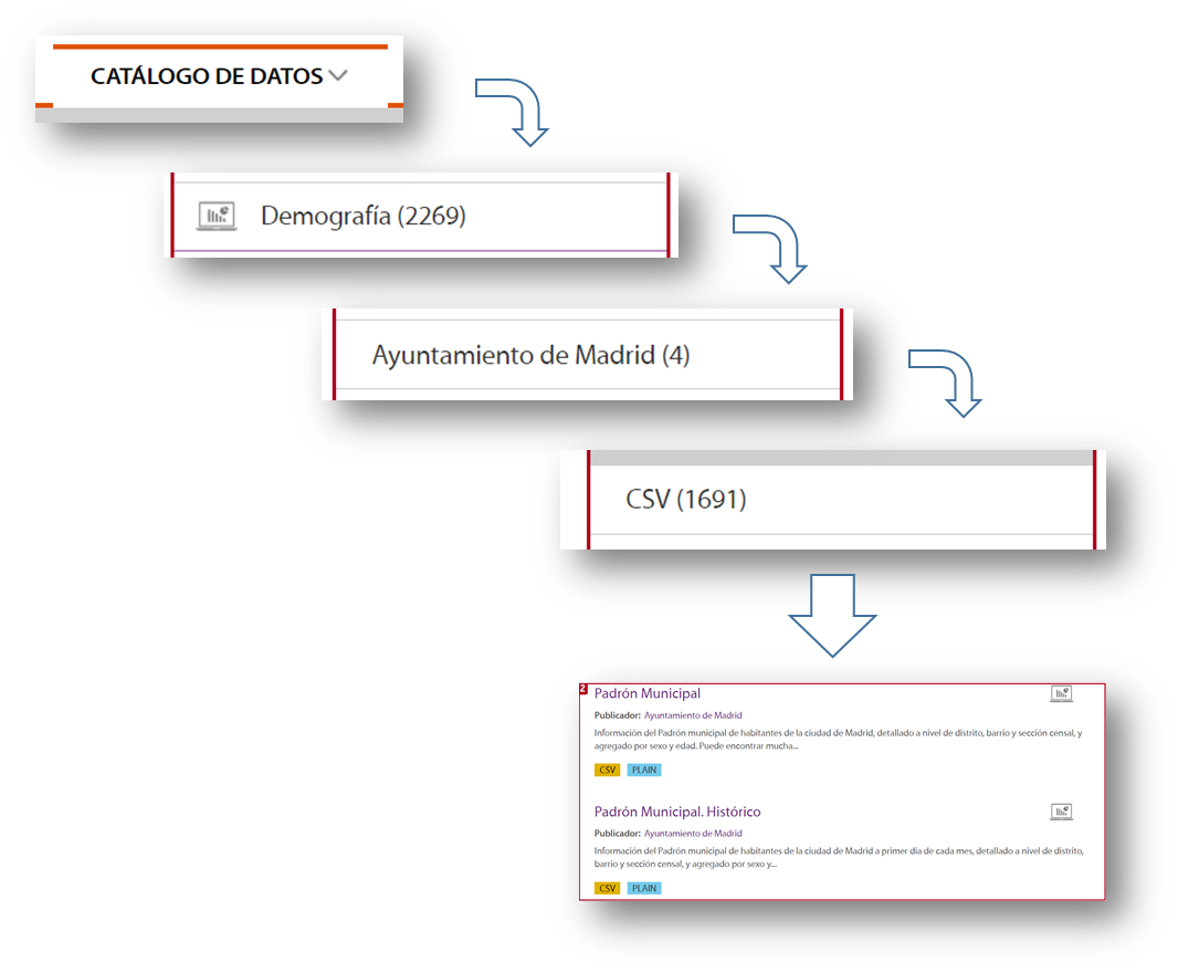
To locate this set of data, we selected Data Catalogue, Demography category, the City Council of Madrid as publisher, the CSV format and I already have the information I need on the right side of the screen. Another simple and complementary way to locate the information is to use the search engine included in the platform and type in "Padrón "+"Madrid".
With this search, the platform offers, among others, two sets of data: the historical census and the census of the last month published. For this example we will take the document corresponding to the August 2020 update.
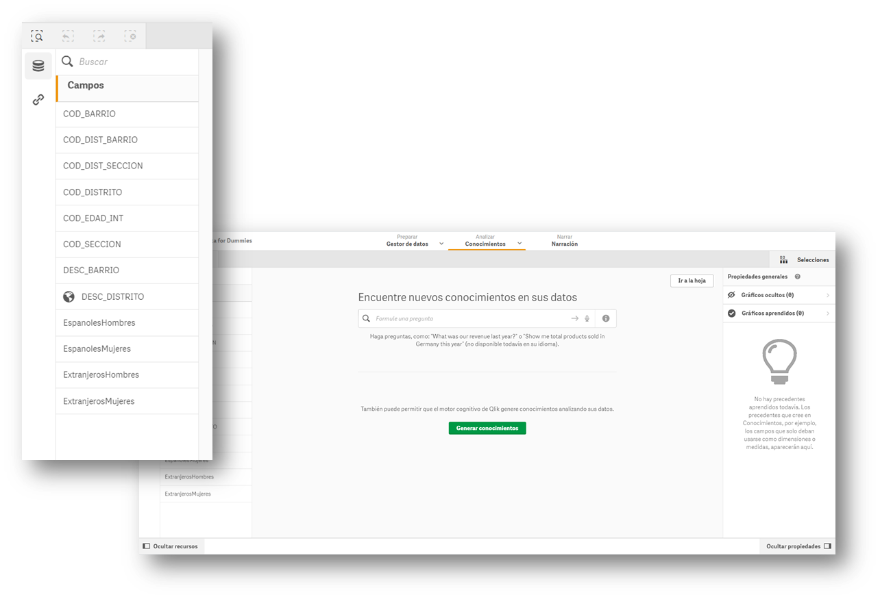
2.- Loading the information into an information display tool
Many of the information visualisation tools usually have built-in wizards to collect data that can be downloaded from an open data portal. The images in this article are from the Business version of QlikSense (which has a free 30-day trial), but any of the tools mentioned above work in a similar way. With a simple "drag and drop", you will already have the information inside the tool, to start creating indicators and thus generate knowledge.

Most of these tools directly interpret the content of the fields and propose a use for these values, differentiating them by data that can be used as filters, geographical data and data to formulate.
3.- Creation of the first graph or indicator
Now all that remains is to drag the fields on which we want to generate knowledge and create the first indicator on our dashboard. We will drag the field DESC_DISTRITO, which contains the description of the district, to see what happens.
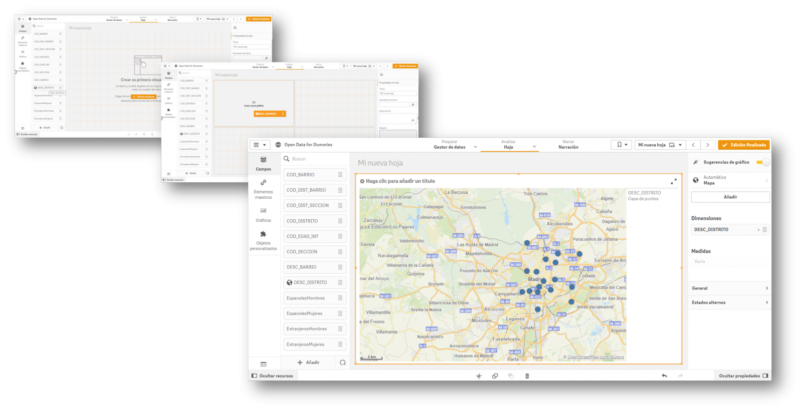
Once the action has been carried out, we see that it has geo-positioned all the districts of Madrid on a map, although at first we do not have any information to analyse. In this first automatic visualization it shows us a point in the centre of the district, but it does not provide us with any other type of additional information.
4.- Creating value in our indicator
Once we have the points on the map, we need to know what we want to see within those points. We will continue with the "Drag and Drop" to count the men and women of Spanish nationality. Let's see what happens...
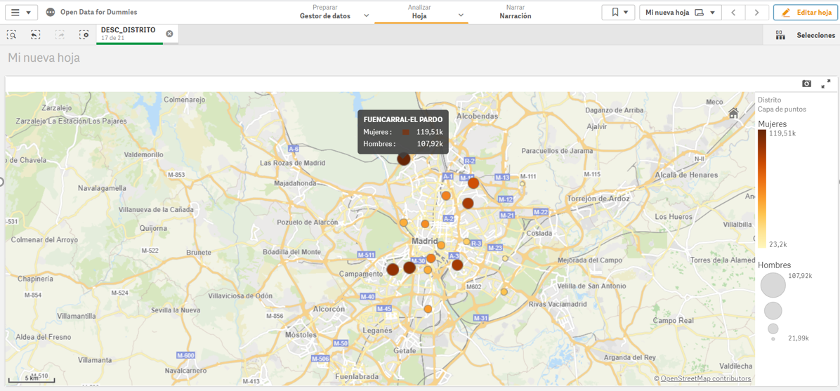
We see that, for each of the points, the tool has added the citizens by sex in each of the districts where they are registered.
In short, with four simple steps in which we have only selected the set of data and we have dragged and dropped the file into a visualisation tool, we have created the first indicator on our dashboard, where we can continue to generate knowledge.
If we continue to go deeper into the use of these tools, we will be able to create new graphics, such as dynamic tables, pie charts or interactive visualisations.
The interesting thing about this type of analysis is that it allows us to incorporate new sets of open data, such as the number of pharmacies in a district or the number and type of accidents in a particular area. By crossing the different data, we will be able to acquire more knowledge about the city and make informed decisions, such as which is the best area to set up a new pharmacy according to the population or to install a new traffic light.
Content elaborated by David Puig, Graduate in Information and Documentation and responsible for the Master Data and Reference Group at DAMA ESPAÑA
Contents and points of view expressed in this publication are the exclusive responsibility of its author.
Blog
The visual representation of data helps our brain to digest large amounts of information quickly and easily. Interactive visualizations make it easier for non-experts to analyze complex situations represented as data.
As we introduced in our last post on this topic, graphical data visualization is a whole discipline within the universe of data science. In this new post we want to put the focus on interactive data visualizations. Dynamic visualizations allow the user to interact with data and transform it into graphs, tables and indicators that have the ability to display different information according to the filters set by the user. To a certain extent, interactive visualizations are an evolution of classic visualizations, allowing us to condense much more information in a space similar to the usual reports and presentations.
The evolution of digital technologies has shifted the focus of visual data analytics to the web and mobile environments. The tools and libraries that allow the generation and conversion of classic or static visualizations into dynamic or interactive ones are countless. However, despite the new formats of representation and generation of visualizations, sometimes there is a risk of forgetting the good practices of design and composition, which must always be present. The ease to condense large amounts of information into interactive visualisations can means that, on many occasions, users try to include a lot of information in a single graph and make even the simplest of reports unreadable. But, let's go back to the positive side of interactive visualizations and analyse some of their most significant advantages.
Benefits of interactive displays
The benefits of interactive data displays are several:
- Web and mobile technologies mainly. Interactive visualizations are designed to be consumed from modern software applications, many of them 100% web and mobile oriented. This makes them easy to read from any device.
- More information in the same space. The interactive displays show different information depending on the filters applied by the user. Thus, if we want to show the monthly evolution of the sales of a company according to the geography, in a classic visualization, we would use a bar chart (months in the horizontal axis and sales in the vertical axis) for each geography. On the contrary, in an interactive visualization, we use a single bar chart with a filter next to it, where we select the geography we want to visualize at each moment.
- Customizations. With interactive visualizations, the same report or dashboard can be customized for each user or groups of users. In this way, using filters as a menu, we can select some data or others, depending on the type and level of the user-consumer.
- Self-service. There are very simple interactive visualization technologies, which allow users to configure their own graphics and panels on demand by simply having the source data accessible. In this way, a non-expert user in visualization, can configure his own report with only dragging and dropping the fields he wants to represent.
Practical example
To illustrate with a practical example the above reasoning we will select a data se available in datos.gob.es data catalogue. In particular, we have chosen the air quality data of the Madrid City Council for the year 2020. This dataset contains the measurements (hourly granularity) of pollutants collected by the air quality network of the City of Madrid. In this dataset, we have the hourly time series for each pollutant in each measurement station of the Madrid City Council, from January to May 2020. For the interpretation of the dataset, it is also necessary to obtain the interpretation file in pdf format. Both files can be downloaded from the following website (It is also available through datos.gob.es).
Interactive data visualization tools
Thanks to the use of modern data visualization tools (in this case Microsoft Power BI, a free and easily accessible tool) we have been able to download the air quality data for 2020 (approximately half a million records) in just 30 minutes and create an interactive report. In this report, the end user can choose the measuring station, either by using the filter on the left or by selecting the station on the map below. In addition, the user can choose the pollutant he/she is interested in and a range of dates. In this static capture of the report, we have represented all the stations and all the pollutants. The objective is to see the significant reduction of pollution in all pollutants (except ozone due to the suppression of nitrogen oxides) due to the situation of sudden confinement caused by the Covid-19 pandemic since mid-March. To carry out this exercise we could have used other tools such as MS Excel, Qlik, Tableau or interactive visualization packages on programming environments such as R or Python. These tools are perfect for communicating data without the need for programming or coding skills.
In conclusion, the discipline of data visualization (Visual Analytics) is a huge field that is becoming very relevant today thanks to the proliferation of web and mobile interfaces wherever we look. Interactive visualizations empower the end user and democratize access to data analysis with codeless tools, improving transparency and rigor in communication in any aspect of life and society, such as science, politics and education.
Content elaborated by Alejandro Alija, expert in Digital Transformation and Innovation.
Contents and points of view expressed in this publication are the exclusive responsibility of its author.
Blog
"The simple graph has brought more information to the data analyst’s mind than any other device.” — John Tukey
The graphic visualization of data constitutes a discipline within data science universe. This practice has become important milestones throughout history in data analytics. In this post we help you discover and understand its importance and impact in an enjoyable and practical way.
But, let's start the story at the beginning. In 1975, a 33-year-old man began to teach a course in statistics at Princeton University, laying the foundations of the future discipline of visual analytics. That young man, named Edward Tufte, is considered the Leonardo da Vinci of the data. Currently, Tufte is a professor emeritus of political science, statistics and computer science at Yale University. Between 2001 and 2006, Professor Tufte wrote a series of 4 books - considered already classic - on the graphic visualization of data. Some central ideas of Tufte's thesis refer to the elimination of useless and non-informative elements in the graphs. Tufte stand for the elimination of non-quantitative and decorative elements from the visualizations, arguing that these elements distract attention from the elements that are really explanatory and valuable.
From the simplest graph to the most complex and refined one (figure 1), all graphs offer high value both to the analyst, during his data science process, and to the end user, to whom we are communicating a data-based story.
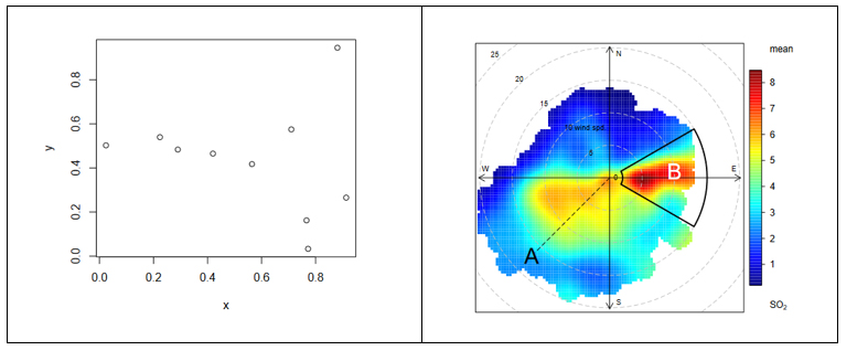
Figure 1. The figure shows the difference between two graphical visualizations of data. On the left, an example of the simplest data visualization that can be performed. Point representation in Cartesian coordinates x | y. On the right, an example of a complex data visualization in which the distribution of a pollutant (SO2) is represented in polar coordinates. The axes represent the wind directions N | S E | W (in degrees) while the radius of the distribution represents the wind speed according to the direction in m / s. The colour scale represents the average concentration of SO2 (in ppb) for those directions and wind speeds. With this type of visualization we can represent graphically three variables (wind direction, wind speed and concentration of pollutants) in a "flat" graph with two dimensions (2D). 2D visualization is very convenient because it is easier to interpret for the human brain.
Why is graphic visualization of data so important?
In data science there are many different types of data to analyze. One way of classifying data is according to their level of logical structure. For example, it is understood that data in spreadsheet-like formats - those data that are structured in the form of rows and columns - are data with a well-defined structure - or structured data. However, those data such as the 140 characters of a twitter feed are considered data without structure - or unstructured data. In the middle of these two extremes is a whole range of greys, from files delimited by special characters (commas, periods and commas, spaces, etc.) to images or videos on YouTube. It is evident that images and videos only make sense for humans once they are visually represented. It would be useless (for a human) to represent an image as a matrix integrated by numbers that represent a combination of RGB colors (Red, Green, Blue).
In the case of structured data, its graphic representation is necessary for all stages of the analysis process, from the exploratory stage to the final presentation of results. Let's see an example:
In 1963, the American airline company Pam Am used the graphic representation (time series 1949-1960) applied to the monthly number of international passengers in order to forecast the future demand for aircraft and place a purchase order. In the example, we see the difference between the matrix representation of the data and its graphic representation. The advantage of graphically representing the data is obvious with the example of Figure 2.
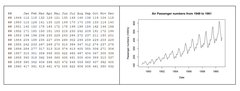
Figure 2. Difference between the tabular representation of the data and the graphic representation or visualization.
The graphic visualization of the data plays a fundamental role in all stages of data analysis. There are multiple approaches on how to perform a data analysis process correctly and completely. According to Garrett Grolemund and Hadley Wickham in their recent book R for Data Science, a standard process in data analysis would be as follows (figure 3):
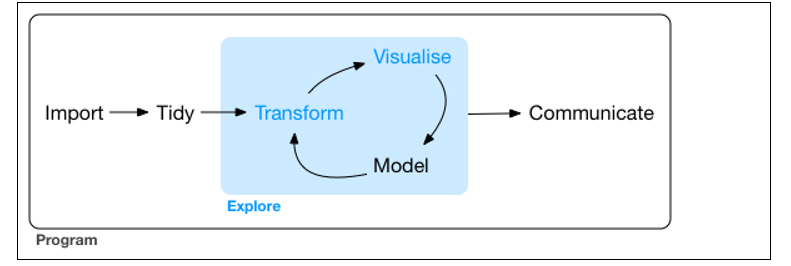
Figure 3. Representation of a standard process using advanced data analytics.
Data visualization is at the core of the process. It is a basic tool for data analyst or data scientist who, through an iterative process, is transforming and composing a logical model with data. Based on the visualization, the analyst discovers the secrets buried in the data. The visualization allows quickly:
- Discard unrepresentative or erroneous data.
- Identify those variables that depend on each other and, therefore, contain redundant information
- Cut the data to be able to observe them from different perspectives.
- Finally, check that those models, trends, predictions and groups that we have applied to the data give us back the expected result.
Tools for visual data analysis
So important is the graphic visualization of data in all areas of science, engineering, business, banking, environment, etc. that there are many tools to design, develop and communicate the graphic visualization of the data.
These tools cover a broad spectrum of the target audience, from software developers, to data scientists, journalists or communication professionals.
- For software developers, there are hundreds of libraries and software packages containing thousands of types of visualizations. The developers just have to load these libraries in their respective programming frameworks and parameterize the type of graphic they wish to generate. The developer only has to indicate the data source that he wants to represent, the type of graph (lines, bars, etc.) and the parameterization of that graph (scales, colors, labels, etc.). In the last few years, web visualization has been in fashion, and the most popular libraries are based on JavaScript frameworks (most open source). Perhaps one of the most popular, according to its power, is D3.JS, although there are many more.
- The data scientist is accustomed to working with a concrete analysis framework that normally includes all the components, such as the visual analysis engine of the data, among others. Currently, the most popular environments for data science are R and Python, and both include native libraries for visual analytics. Perhaps the most popular and powerful library in R is ggplot2, while, matplotlib and Plotly are among the most popular in Python.
- For professional communicators or non-technical personnel from the different business areas (Marketing, Human Resources, Production, etc.) that need to make decisions based on data, there are tools - which are not only visual analytics tools - with functionalities to generate graphic representations of the data. Modern self-service Business Intelligence tools such as MS Excel, MS Power BI, Qlik, Tableau, etc. are great tools to communicate data without the need of programming or coding skills.
In conclusion, the visualization tools allow all these professionals to access to data in a more agile and simple way. In a universe where the amount of useful data to be analysed is continuously growing, this type of tools are becoming more and more necessary. This tools facilitate the creation of value from the data and, with this, improve decisions making regarding the present and the future of our business or activity.
If you want to know more about data visualization tools, we recommend the report Data visualization: definition, technologies and tools, as well as the training material Use of basic data processing tools.
Content prepared by Alejandro Alija, expert in Digital Transformation and innovation.
Contents and points of view expressed in this publication are the exclusive responsibility of its author.