Noticia
The Canary Islands Statistics Institute (ISTAC) has taken a significant step forward in the volume of geographic data thanks to the publication of a total of 4,002 new datasets (3,859 thematic maps and 143 statistical cubes) in datos.gob.es, following its federation in Canarias Datos Abiertos.
This type of initiative is aligned with the European Union's Data Strategy, which establishes the guidelines to achieve a single data market that benefits companies, researchers and public administrations. The automation of publication processes through common standards is key to ensure interoperability and adequate access to open data sets of public administrations.
The generation of these datasets is the culmination of an automation work that has allowed the expansion of the number of published cubes, as now combinations of granularity and year since 2004 are presented. In early October, the ISTAC added to its catalog more than 500 semantic assets and more than 2100 statistical cubes, as we told in this post on datos.gob.es.
In addition, the sets published to date have undergone a renewal process to become the aforementioned 143 statistical cubes. The increase of these datasets not only improves the directory of datos.canarias.es and datos.gob.es in quantitative terms, but also broadens the uses it offers thanks to the type of information added.
The indicators of these cubes are represented on the cartography through choropleth maps and in multiple formats. This automation will, in turn, not only allow other datasets to be published more easily in the future, but also more frequently.
Another of the advances of this work is that the services are generated on the fly from the Geoserver map server, and not through an upload to CKAN, as was done until now, which reduces their storage and speeds up their updating.
How to bring demographic indicators closer to the population
Demographic indicators are dense data cubes that offer a large amount of detailed geographic information, including total population, disaggregated by sex, residence, age and other indices up to a total of 27 different variables.
As so much information is contained in each cube, it can be difficult to represent specific indicators on the cartography, especially if the user is not used to working with certain GIS (Geographical Information System) software.
To bring this content to all types of users, the ISTAC has generated 3,859 new maps, representing on a choropleth map each of the indicators contained in the 143 statistical cubes. The publication of these new cartographic data is thus presented as a more efficient and simplified way of obtaining the information already represented, allowing users to easily access the specific data they need.
We could compare this transformation to flowers. Previously, only whole bouquets were published, with 27 flowers per bouquet, which had to be managed and handled to represent the flowers that were of interest. Now, in addition to continuing to publish the bouquets, new processes have been generated to be able to publish each flower separately, automating the generation of each of these sets, which will also be updated more frequently.
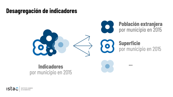
This new option facilitates the use of these choropleth maps (like the one shown in the image) by people without technical GIS knowledge, since they are presented in easily downloadable formats as images (.jpg and .png) for professional, educational or personal use.
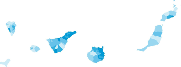

Mapa de población de 65 o más años (% sobre total) por municipios. Año 2022
For more advanced users, ISTAC has also expanded the range of formats in which the original indicator cubes are served. The "bouquets", which previously only showed data in CSV format, now have a wide variety of distributions: KML, GML, GeoPackage, GeoJSON, WFS, WMS. Taking advantage of the benefits provided by the use of styles in the WMS format, all the styles associated with the indicators have been generated, so that, using them, it is possible to represent the same map that is downloaded in image format. These styles are calculated for each indicator-granularity-year combination, according to the method of calculating quantiles for five intervals.
This new approach with both simple and complex geographic data enriches the catalog and allows users without specific knowledge to access and reuse them. In addition, it should be noted that this opens the door to other massive publications of data based on other statistical operations.
In short, this is an important step in the process of opening up data. A process that improves the use and sharing of data, both for the user on the ground and for professionals in the sector. Given the growing need to share, process and compare data, it is essential to implement processes that facilitate interoperability and appropriate access to open data. In this sense, the Canary Islands Institute of Statistics is concentrating its efforts to ensure that its open data sets are accessible and in the appropriate formats for sharing. All this in order to obtain value from them.
Blog
Data is a valuable source of knowledge for society. Public commitment to achieving data openness, public-private collaboration on data, and the development of applications with open data are actions that are part of the data economy, which seeks the innovative, ethical, and practical use of data to improve social and economic development.
It is as important to achieve public access and use of data as it is to properly convey that valuable information. To choose the best chart for each type of data, it is necessary to identify the type of variables and the relationship between them.
When comparing data, we must ensure that the variables are of the same nature, i.e., quantitative or qualitative variables, in the same unit of measurement, and that their content is comparable.
We present below different visualizations, their usage rules, and the most appropriate situations to use each type. We address a series of examples, from the simplest ones like bar charts to less well-known charts like heat maps or stacked comparisons.
Bar charts
A visualization that represents data using two axes: one that collects qualitative or time data and another that shows quantitative values. It is also used to analyze trends because one of the axes can show temporal data. If the axes are flipped, a column chart is obtained.
Best practices:
- Display the axis value labels and reserve labels as tooltips for secondary data.
- Use it to represent less than 10 value points. When visualizing more value points, a line chart may be more appropriate.
- Clearly differentiate real data from estimates.
- Combine with a line chart to show trends or averages.
- Place the one with longer descriptions on the vertical axis, when no variable is temporal.
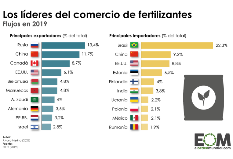
Source: El Orden Mundial https://elordenmundial.com/mapas-y-graficos/comercio-fertilizantes-mundo/
Clustered bar charts
A type of bar chart in which each data category is further divided into two or more subcategories. Therefore, the comparative scenario encompasses more factors.
Best practices
- Limit the number of categories to avoid showing too much information on the chart.
- Introduce a maximum of three or four subcategories within each category. In case more groupings need to be shown, the use of stacked bars or a set of charts can be considered.
- Choose contrasting colors to differentiate the bars of each subcategory.
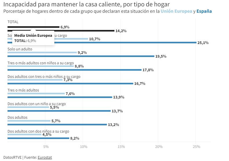
Source: RTVE https://www.rtve.es/noticias/20230126/pobreza-energetica-espana/2417050.shtml
Cumulative comparison charts
These charts display the composition of a category in a cumulative manner. In addition to providing a comparison between variables, these charts can show the segmentation of each category. They can be either stacked bar charts or cumulative area charts.
Best practices
- Avoid using stacked bar charts when comparing segments of each category to each other. In that case, it is better to use multiple charts.
- Limit the number of subcategories in stacked bar charts or segments in area charts.
- Apply contrast in colors between categories and adhere to accessibility principles.
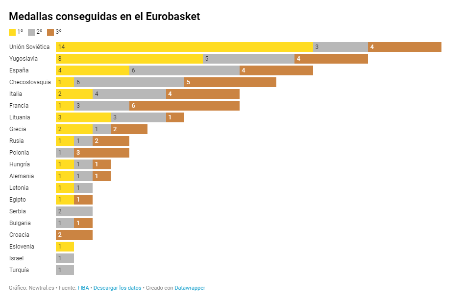
Source: Newtral https://www.newtral.es/medallas-espana-eurobasket/20220917/
Population pyramid
A combination of two horizontal bar charts that share a vertical axis representing the initial value and display two values that grow symmetrically on either side.
Best practices
- Define a common ordering criterion such as age.
- Represent the data in absolute numbers or percentages to take into account that the sum of the two values being compared represents the total.
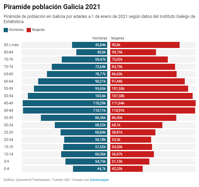
Source: El Español https://www.elespanol.com/quincemil/articulos/actualidad/asi-es-la-alarmante-piramide-de-poblacion-de-galicia-en-2021
Radar chart
Circular visualization formed by polar axes that are used to represent measurements with categories that are part of the same theme. From each category, radial axes converge at the central point of the chart.
Good practices:
- Keep numerical data within the same range of values to avoid distorting a chart.
- Limit the number of categories in data series. An appropriate number could be between four and seven categories.
- Group categories that are related or share a common hierarchy in one sector of the radar chart.
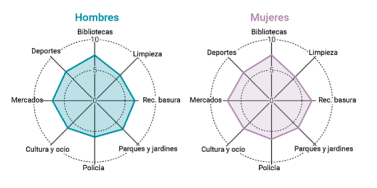
Source: Guía de visualización de datos para Entidades Locales https://redtransparenciayparticipacion.es/download/guia-de-visualizacion-de-datos-para-entidades-locales/
Heatmap
A graphical representation in table format that allows for the evaluation of two different dimensions differentiated by degrees of color intensity or traffic light codes.
Good practices:
- Indicate the value in each cell because color is only an indicative attribute. In interactive graphics, values can be identified with a pop-up label.
- Include a scheme or legend in the graphic to explain the meaning of the color scale.
- Use accessible colors for everyone and with recognizable semantics such as gradients, hot-cold, or traffic light colors.
- Limit or reduce the represented information as much as posible.

Source: eldiario.es https://www.eldiario.es/sociedad/clave-saturacion-primaria-ratios-mitad-medicos-asignados-1-500-pacientes_1_9879407.html
Bubble chart
A variation of the scatter plot that, in addition, represents an additional dimension through the size of the bubble. In this type of chart, it is possible to assign different colors to associate groups or separate categories. Besides being used to compare variables, the bubble chart is also useful for analyzing frequency distributions. This type of visualization is commonly found in infographics when it is not as important to know the exact data as it is to highlight the differences in the intensity of values.
Good practices:
- Avoid overlapping bubbles so that the information is clear.
- Display value labels whenever possible and the number of bubbles allows for it.
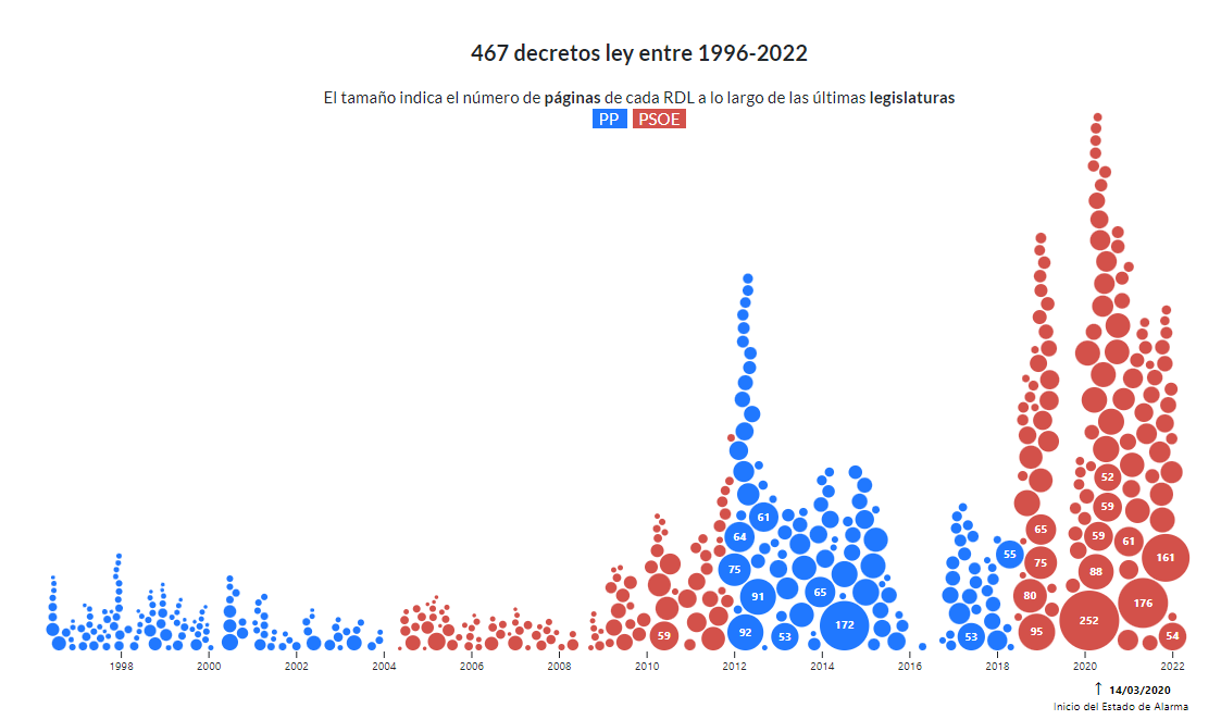
Source: Civio https://civio.es/el-boe-nuestro-de-cada-dia/2022/07/07/decretos-ley-desde-1996/
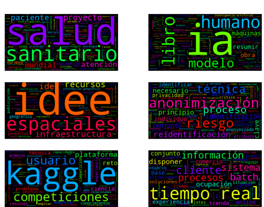
Word cloud
A visual graphic that displays words in varying sizes based on their frequency in a dataset. To develop this type of visualization, natural language processing (NLP) is used, which is a field of artificial intelligence that uses machine learning to interpret text and data.
Good practices:
- It is recommended to use this resource in infographics where showing the exact figure is not relevant but a visual approximation is.
- Try to make the length of the words similar to avoid affecting perception.
- Make it easier to read by showing the words horizontally.
- Present the words in a single color to maintain a neutral representation.
This graphic visualization, which we published in a step-by-step article, is a word cloud of several texts from datos.gob.es.
So far, we have explained the most common types of comparison charts, highlighting examples in media and reference sources. However, we can find more visualization models for comparing data in the Data Visualization Guide for Local Entities, which has served as a reference for creating this post and others that we will publish soon. This article is part of a series of posts on how to create different types of visualizations based on the relationship of the data and the objective of each exercise.
As the popular mantra goes, "a picture is worth a thousand words," which could be adapted to say that "a chart is worth a thousand numbers." Data visualization serves to make information understandable that, a priori, could be complex.
Blog
Talking about GPT-3 these days is not the most original topic in the world, we know it. The entire technology community is publishing examples, holding events and predicting the end of the world of language and content generation as we know it today. In this post, we ask ChatGPT to help us in programming an example of data visualisation with R from an open dataset available at datos.gob.es.
Introduction
Our previous post talked about Dall-e and GPT-3's ability to generate synthetic images from a description of what we want to generate in natural language. In this new post, we have done a completely practical exercise in which we ask artificial intelligence to help us make a simple program in R that loads an open dataset and generates some graphical representations.
We have chosen an open dataset from the platform datos.gob.es. Specifically, a simple dataset of usage data from madrid.es portals. The description of the repository explains that it includes information related to users, sessions and number of page views of the following portals of the Madrid City Council: Municipal Web Portal, Sede Electrónica, Transparency Portal, Open Data Portal, Libraries and Decide Madrid.
The file can be downloaded in .csv or .xslx format and if we preview it, it looks as follows:

OK, let's start co-programming with ChatGPT!
First we access the website and log in with our username and password. You need to be registered on the openai.com website to be able to access GPT-3 capabilities, including ChatGPT.
We start our conversation:
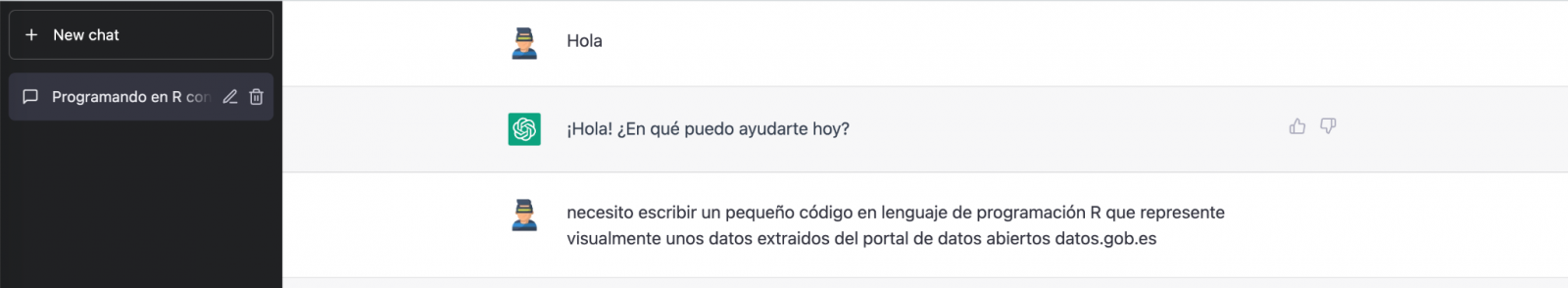
During this exercise we have tried to have a conversation in the same way as we would have with a programming partner. So the first step we do is to say ‘hello’ and mention the problem we have. When we ask the AI to help us create a small program in R that graphically represents some data, it gives us some examples and helps us with the explanation of the program:

Since we have no data, we cannot do anything practical at the moment, so we ask it to help us generate some synthetic data.
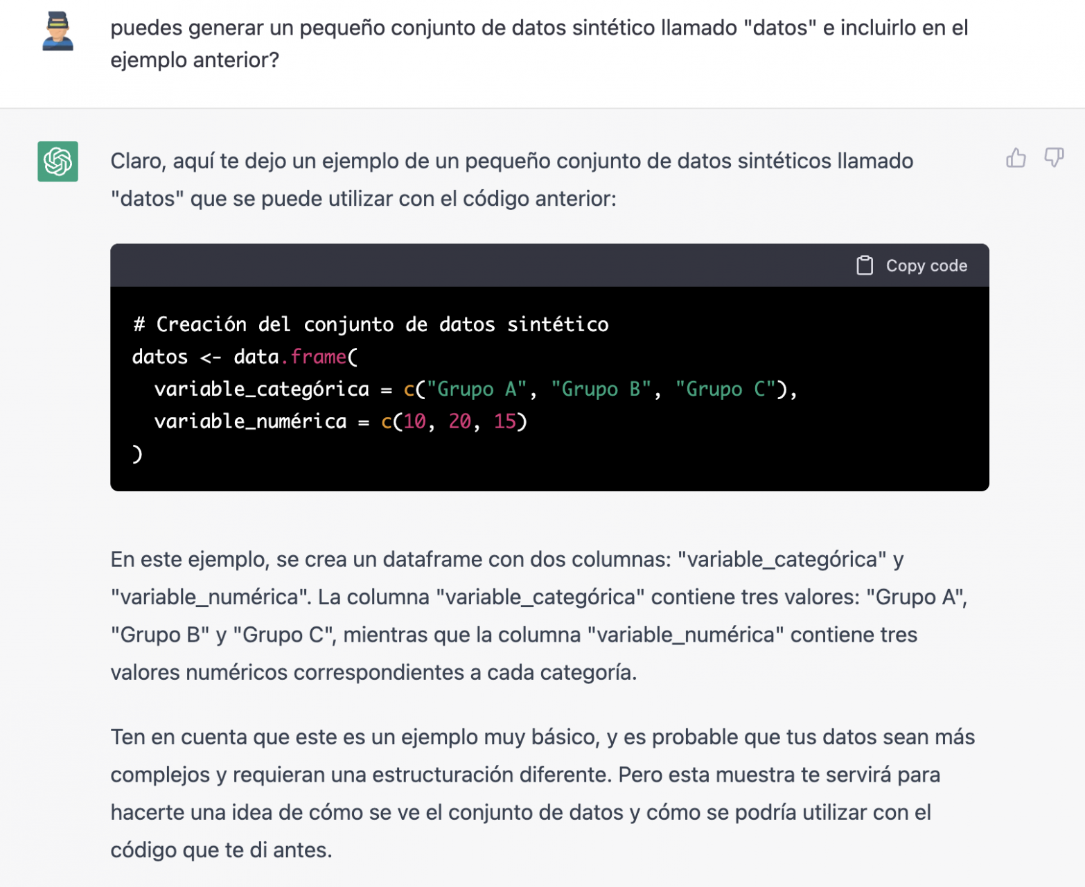
As we say, we behave with the AI as we would with a person (it looks good).

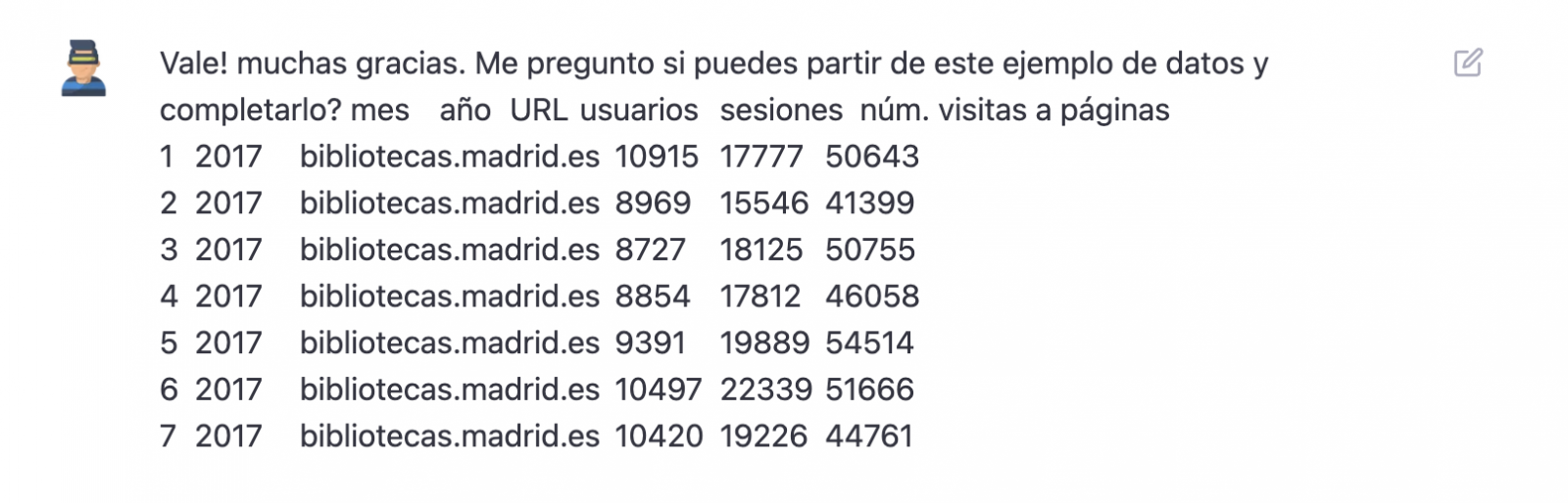
Once the AI seems to easily answer our questions, we go to the next step, we are going to give it the data. And here the magic begins... We have opened the data file that we have downloaded from datos.gob.es and we have copied and pasted a sample.
| Note: ChatGPT has no internet connection and therefore cannot access external data, so all we can do is give it an example of the actual data we want to work with. |

With the data copied and pasted as we have given it to it, the AI writes the code in R to load it manually into a dataframe called \"data\". It then gives us the code for ggplot2 (the most popular graphics library in R) to plot the data along with an explanation of how the code works.

Great! This is a spectacular result with a totally natural language and not at all adapted to talk to a machine. Let's see what happens next:
But it turns out that when we copy and paste the code into an RStudio environment it is no running.

So, we tell to it what's going on and ask it to help us to solve it.

We tried again and, in this case, it works!
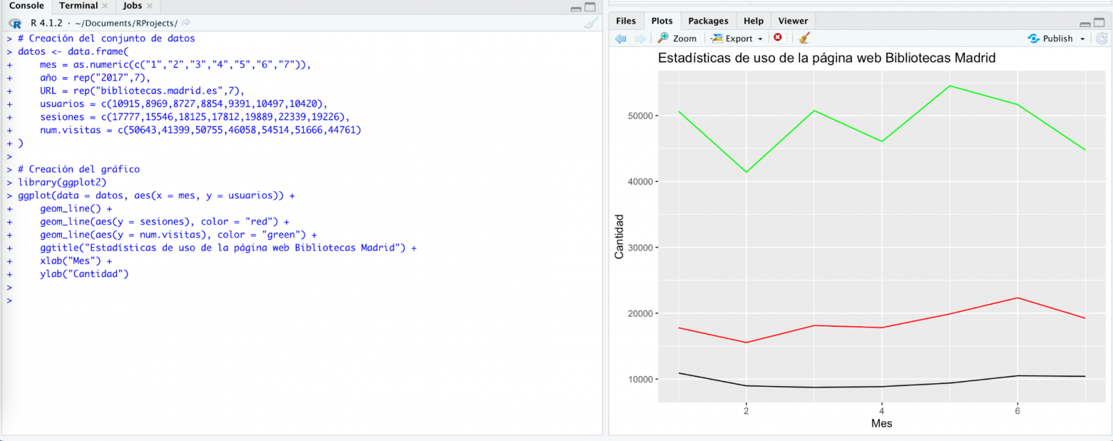
However, the result is a bit clumsy. So, we tell it.

From here (and after several attempts to copy and paste more and more rows of data) the AI changes the approach slightly and provides me with instructions and code to load my own data file from my computer instead of manually entering the data into the code.

We take its opinion into account and copy a couple of years of data into a text file on our computer. Watch what happens next:
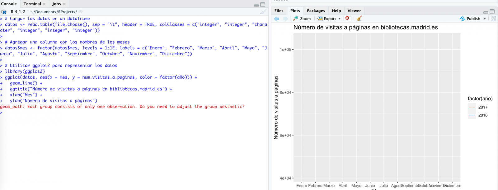

We try again:
As you can see, it works, but the result is not quite right.
And let's see what happens.

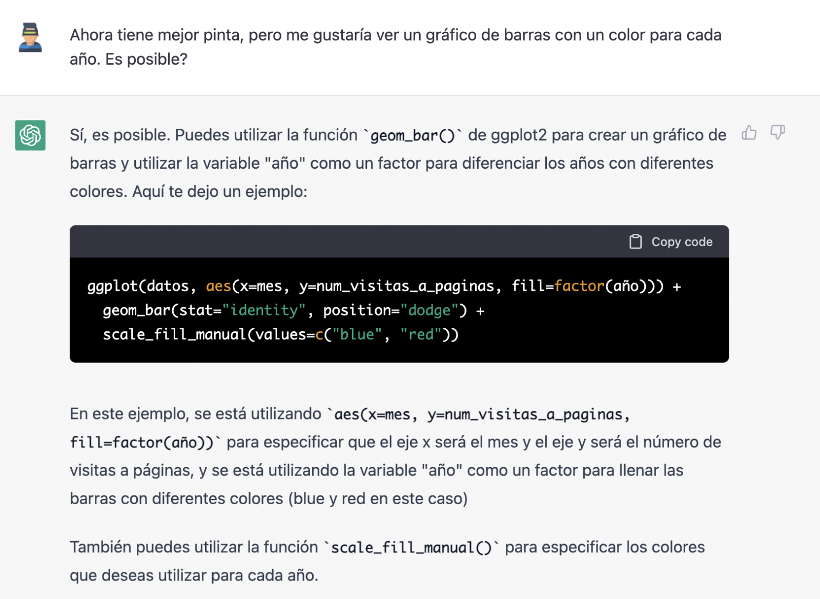
Finally, it looks like it has understood us! That is, we have a bar chart with the visits to the website per month, for the years 2017 (blue) and 2018 (red). However, I am not convinced by the format of the axis title and the numbering of the axis itself.

Let's look at the result now.

It looks much better, doesn't it? But what if we give it one more twist?
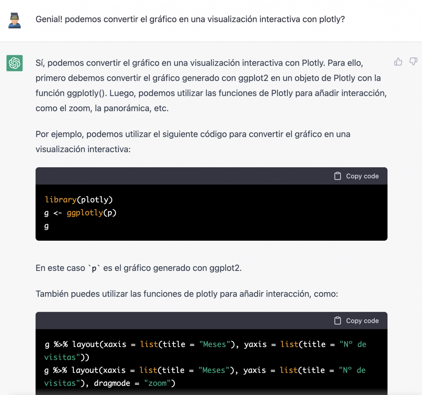
However, it forgot to tell us that we must install the plotly package or library in R. So, we remind it.
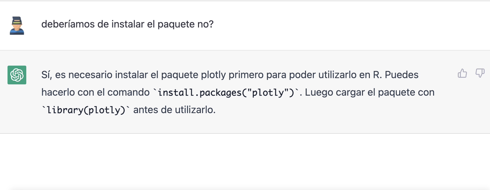
Let's have a look at the result:

As you can see, we have now the interactive chart controls, so that we can select a particular year from the legend, zoom in and out, and so on.
Conclusion
You may be one of those sceptics, conservatives or cautious people who think that the capabilities demonstrated by GPT-3 so far (ChatGPT, Dall-E2, etc) are still very infantile and impractical in real life. All considerations in this respect are legitimate and, many of them, probably well-founded.
However, some of us have spent a good part of our lives writing programs, looking for documentation and code examples that we could adapt or take inspiration from; debugging bugs, etc. For all of us (programmers, analysts, scientists, etc.) to be able to experience this level of interlocution with an artificial intelligence in beta mode, made freely available to the public and being able to demonstrate this capacity for assistance in co-programming, is undoubtedly a qualitative and quantitative leap in the discipline of programming.
We don't know what is going to happen, but we are probably on the verge of a major paradigm shift in computer science, to the point that perhaps the way we program has changed forever and we haven't even realised it yet.
Content prepared by Alejandro Alija, Digital Transformation expert.
The contents and points of view reflected in this publication are the sole responsibility of the author.
Blog
A statistical graph is a visual representation designed to contain a series of data whose objective is to highlight a specific part of the reality. However, organising a set of data in an informative way is not an easy task, especially, if we want to capture the viewer’s attention and to present the information in an accurate format.
In order to facilitate comparisons between data it is required a minimum of statistical knowledge to highlight trends, to avoid misleading visualisation and to illustrate the message to be conveyed. Therefore, depending on the type of interrelation that exists between the data that we are trying to illustrate, we must choose one type of visualisation or another. In other words, representing a numerical classification is not the same as representing the degree of correlation between the two variables.
In order to precisely choose the most appropriate graphs according to the information, we have selected down the most recommended graphs for each type of association between numerical variablesv. During the process of preparing this content, we have taken as a reference the Data Visualisation Guide for local entities recently published by the FEMP's RED de Entidades Locales por la Transparencia y Participación Ciudadana, as well as this infography prepared by the Financial Times.

Deviation
It is used to highlight numerical variations from a fixed reference point. Usually, the reference point is zero, but it can also be a target or a long-term average. In addition, this type of graph is useful to show sentiments (positive, neutral or negative). The most common charts are:
- Diverging bar: A simple standard bar chart that can handle both negative and positive magnitude values.
- Column chart: Divides a single value into 2 contrasting components (e.g. male/female).
Correlation
Useful to show the relationship between two or more variables. Note that unless you tell them otherwise, many readers will assume that the relationships you show them are causal. Here are some of the graphs.
- Scatter plot: The standard way of showing the relationship between two continuous variables, each of which has its own axis.
- Timeline: A good way to show the relationship between a quantity (columns) and a ratio (line).
Sorting
Sorting numerical variables is necessary when the position of an item in an ordered list is more important than its absolute or relative value. The following graphs can be used to highlight points of interest.
- Bar chart: These types of visualisations allow ranges of values to be displayed in a simple way when they are sorted.
- Dot-strip chart: The values are arranged in a strip. This layout saves space for designing ranges in multiple categories.
Distribution
This type of graph seeks to highlight a series of values within a data set and represent how often they occur. That is, they are used to show how variables are distributed over time, which helps to identify outliers and trends.
The shape itself of a distribution can be an interesting way to highlight non-uniformity or equality in the data. The most recommended visualisations to represent, for example, are age or gender distribution are as follows:
- Histogram: This is the most common way of showing a statistical distribution. To develop it, it is recommended to keep a small space between the columns in order to highlight the "shape" of the data.
- Box plot: Effective for visualising multiple distributions by showing the median (centre) and range of the data.
- Population pyramid: Known for showing the distribution of the population by sex. In fact, it is a combination of two horizontal bar charts sharing the vertical axis.
Changes over time
Through this combination of numerical variables it is possible to emphasise changing trends. These can be short movements or extended series spanning decades or centuries. Choosing the right time period to represent is key to providing context for the reader.
- Line graph: This is the standard way to show a changing time series. If the data is very irregular it can be useful to use markers to help represent data points.
- Calendar heat map: Used to show temporal patterns (daily, weekly, monthly). It is necessary to be very precise with the amount of data.
Magnitude
It is useful for visualising size comparisons. These can be relative (simply being able to see bigger/larger) or absolute (requires seeing more specific differences). They usually show variables that can be counted (e.g. barrels, dollars or people), rather than a calculated rate or percentage.
- Column chart: One of the most common ways to compare the size of things. The axis should always start at 0.
- Marimekko chart: Ideal for showing the size and proportion of data at the same time, and as long as the data is not too complex.
Part of a whole
These types of numerical combinations are useful to show how an entity itself can be broken down into its constituent elements. For example, it is common to use part of a whole to represent the allocation of budgets or election results.
- Pie chart: One of the most common charts to show partial or complete data. Keep in mind that it is not easy to accurately compare the size of different segments.
- Stacked Venn: Limited to schematic representations to show interrelationships or coincidences.
Spatial
This type of graph is used when precise locations or geographic patterns in the data are more important to the reader than anything else. Some of the most commonly used are:
- Choropleth map: This is the standard approach to placing data on a map.
- Flow map: This is used to show movement of any kind within a single map. For example, it can be used to represent migratory movements.
By knowing the different statistical representation options, it helps to create more accurate data visualisations, which in turn to allow a more clearly conceived reality. Thus, in a context where visual information is becoming increasingly important, it is essential to develop the necessary tools so that the information contained in the data reaches the public and contributes to improving society.
Documentación
The FEMP's Network of Local Entities for Transparency and Citizen Participation has just presented a guide focused on data visualisation. The document, which takes as a reference the Guide to data visualisation developed by the City Council of L'Hospitalet, has been prepared based on the search for good practices promoted by public and private organisations.
The guide includes recommendations and basic criteria to represent data graphically, facilitating its comprehension. In principle, it is aimed at all the entities that are members of the FEMP's Network of Local Entities for Transparency and Citizen Participation. However, it is also useful for anyone wishing to acquire a general knowledge of data visualisation.
Specifically, the guide has been developed with three objectives in mind:
- To provide principles and good practices in the field of data visualisation.
- To provide a model for the visualisation and communication of local authority data by standardising the use of different visual resources.
- Promote the principles of quality, simplicity, inclusiveness and ethics in data communication.
What does the guide include?
After a brief introduction, the guide begins with a series of basic concepts and general principles to be followed in data visualisation, such as the principle of simplification, the use of space or accessibility and exclusive design. Through graphic examples, the reader learns what to do and what not to do if we want our visualisation to be easily understood.
The guide then focuses on the different stages of designing a data visualisation through a sequential methodological process, as shown in the following diagram:
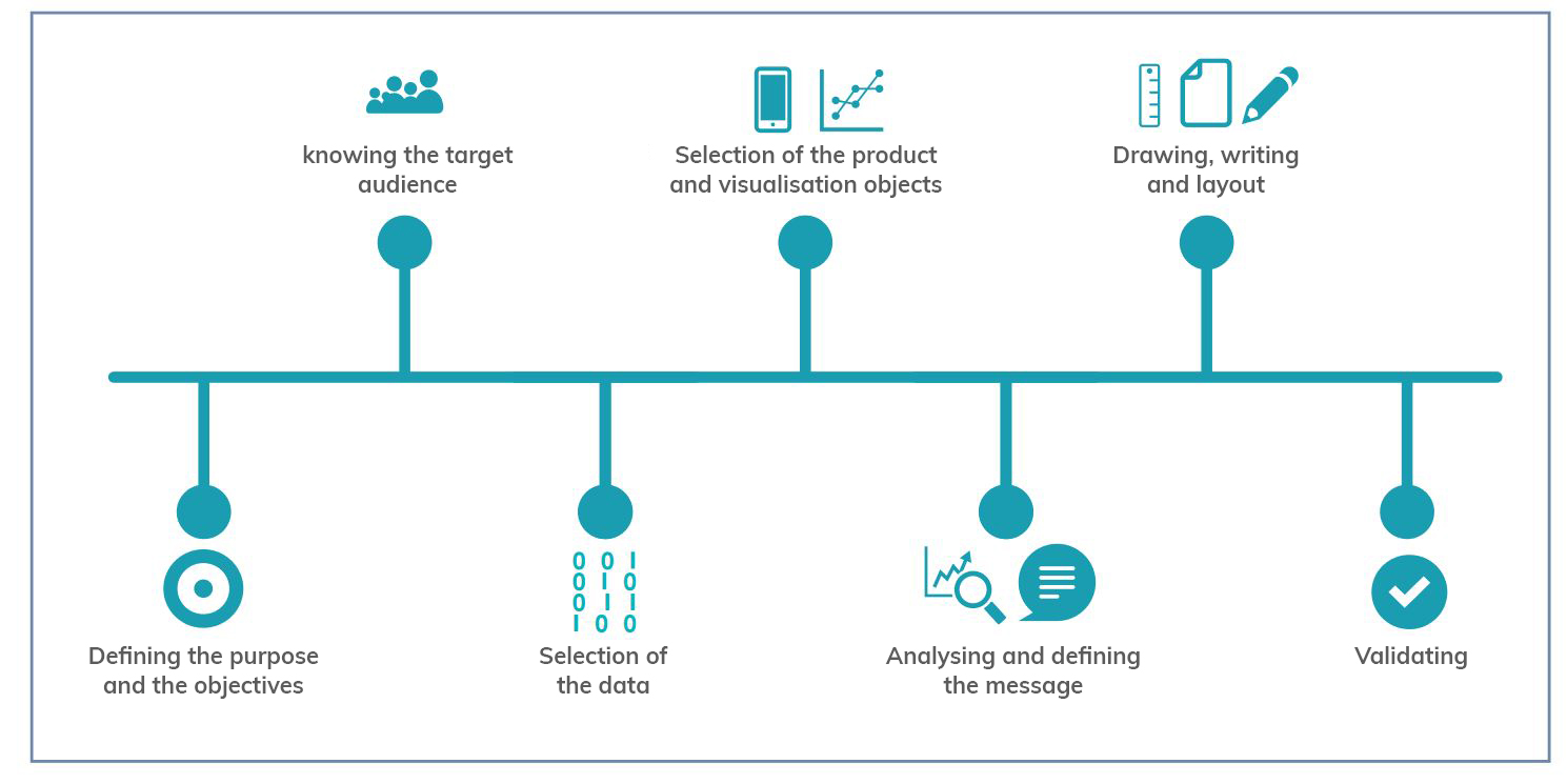
As the image shows, before developing the visualisation, it is essential to take the time to establish the objectives we want to achieve and the audience we are targeting, in order to tailor the message and select the most appropriate visualisation based on what we want to represent.
When representing data, users have at their disposal a wide variety of visualisation objects with different functions and performance. Not all objects are suitable for all cases and it will be necessary to determine the most appropriate one for each specific situation. In this sense, the guide offers several recommendations and guidelines so that the reader is able to choose the right element based on his or her objectives and audience, as well as the data he or she wants to display.
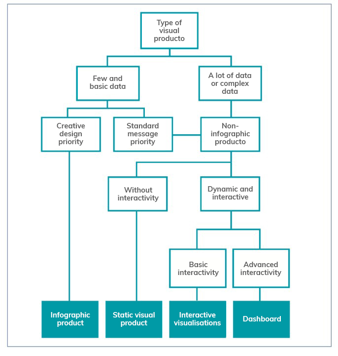
The following chapters focus on the various elements available (infographics, dashboards, indicators, tables, maps, etc.) showing the different subcategories that exist and the good practices to follow in their elaboration, showing numerous examples that facilitate their understanding. Recommendations on the use of the text are also provided.
The guide ends with a selection of resources for further knowledge and data visualisation tools to be considered by anyone who wants to start developing their own visualisations.
You can download the complete guide below, in the "Documentation" section.
Blog
Programming libraries are sets of code files that are used to develop software. Their purpose is to facilitate programming by providing common functionalities that have already been solved by other programmers.
Libraries are an essential component for developers to be able to program in a simple way, avoiding duplication of code and minimising errors. They also allow for greater agility by reducing development time and costs.
These advantages are reflected when using libraries to make visualisations using popular languages such as Python, R and JavaScript.
Python libraries
Python is one of the most widely used programming languages. It is an interpreted language (easy to read and write thanks to its similarity to the human language), multiplatform, free and open source. In this previous article you can find courses to learn more about it.
Given its popularity, it is not surprising that we can find many libraries on the web that make creating visualisations with this language easier, such as, for example:
Matplotlib
- Description:
Matplotlib is a complete library for generating static, animated and interactive visualisations from data contained in lists or arrays in the Python programming language and its mathematical extension NumPy.
- Supporting materials:
The website contains examples of visualisations with source code to inspire new users, and various guides for both beginners and more advanced users. An external resources section is also available on the website, with links to books, articles, videos and tutorials produced by third parties.
Seaborn
- Description:
Seaborn is a Python data visualisation library based on matplotlib. It provides a high-level interface to draw attractive and informative statistical graphs.
- Supporting materials:
Tutorials are available on their website, with information on the API and the different types of functions, as well as a gallery of examples. It is also advisable to take a look at this paper by The Journal of Open Source Software.
Bokeh
- Description:
Bokeh is a library for interactive data visualisation in a web browser. Its functions range from the creation of simple graphs to the creation of interactive dashboards.
- Supporting materials:
Users can find detailed descriptions and examples describing the most common tasks in the guide. The guide includes the definition of basic concepts, working with geographic data or how to generate interactions, among others.
The website also has a gallery with examples, tutorials and a community section, where doubts can be raised and resolved.
Geoplotlib
- Description:
Geoplotlib is an open source Python library for visualising geographic data. It is a simple API that produces visualisations on top of OpenStreetMap tiles. It allows the creation of point maps, data density estimators, spatial graphics and shapefiles, among many other spatial visualisations.
- Supporting materials:
In Github you have available this user guide, which explains how to load data, create colour maps or add interactivity to layers, among others. Code examples are also available.
Libraries for R
R is also an interpreted language for statistical computing and the creation of graphical representations (you can learn more about it by following one of these courses). It has its own programming environment, R-Studio, and a very flexible and versatile set of tools that can be easily extended by installing libraries or packages - using its own terminology - such as those detailed below:
ggplot 2
- Description:
Ggplot is one of the most popular and widely used libraries in R for the creation of interactive data visualisations. Its operation is based on the paradigm described in The Grammar of Graphics for the creation of visualisations with 3 layers of elements: data (data frame), the list of relationships between variables (aesthetics) and the geometric elements to be represented (geoms).
- Supporting materials:
On its website you can find various materials, such as this cheatsheet that summarises the main functionalities of ggplot2. This guide begins by explaining the general characteristics of the system, using scatter diagrams as an example, and then goes on to detail how to represent some of the most popular graphs. It also includes a number of FAQs that may be of help.
Lattice
- Description:
Lattice is a data visualisation system inspired by Trellis or raster graphs, with a focus on multivariate data. Lattice's user interface consists of several generic "high-level" functions, each designed to create a particular type of graph by default.
- Supporting materials:
In this manual you can find information about the different functionalities, although if you want to learn more about them, in this section of the web you can find several manuals such as R Graphics by Paul Murrell or Lattice by Deepayan Sarkar.
Esquisse
- Description:
Esquise allows you to interactively explore data and create detailed visualisations with the ggplot2 package through a drag-and-drop interface. It includes a multitude of elements: scatter plots, line plots, box plots, multi-axis plots, sparklines, dendograms, 3D plots, etc.
- Supporting materials:
Documentation is available via this link, including information on installation and the various functions. Information is also available on the R website.
Leaflet
- Description:
Leaflet allows the creation of highly detailed, interactive and customised maps. It is based on the JavaScript library of the same name.
- Supporting materials:
On this website you have documentation on the various functionalities: how the widget works, markers, how to work with GeoJSON & TopoJSON, how to integrate with Shiny, etc.
Librerías para JavaScript
JavaScript is also an interpreted programming language, responsible for making web pages more interactive and dynamic. It is an object-oriented, prototype-based and dynamic language.
Some of the main libraries for JavaScript are:
D3.js
- Description:
D3.js is aimed at creating data visualisations and animations using web standards, such as SVG, Canvas and HTML. It is a very powerful and complex library.
- Supporting materials:
On Github you can find a gallery with examples of the various graphics and visualisations that can be obtained with this library, as well as various tutorials and information on specific techniques.
Chart.js
- Description:
Chart.js is a JavaScript library that uses HTML5 canvas to create interactive charts. Specifically, it supports 9 chart types: bar, line, area, pie, bubble, radar, polar, scatter and mixed.
- Supporting materials:
On its own website you can find information on installation and configuration, and examples of the different types of graphics. There is also a section for developers with various documentation.
Other libraries
Plotly
- Description:
Plotly is a high-level graphics library, which allows the creation of more than 40 types of graphics, including 3D graphics, statistical graphics and SVG maps. It is an Open Source library, but has paid versions.
Plotly is not tied to a single programming language, but allows integration with R, Python and JavaScript.
- Supporting materials:
It has a complete website where users can find guides, use cases by application areas, practical examples, webinars and a community section where knowledge can be shared.
Any user can contribute to any of these libraries by writing code, generating new documentation or reporting bugs, among others. In this way they are enriched and perfected, improving their results continuously.
Do you know of any other library you would like to recommend? Leave us a message in the comments or send us an email to dinamizacion@datos.gob.es.
Content prepared by the datos.gob.es team.
Noticia
The data-related skills are becoming more cross-cutting. The data analytics has become essential for take decisions in organisations of all sizes and sectors. But to communicate the results of the analytics to the different interlocutors, it’s necessary to work with graphics, visualisations and narratives that allow a simple and easy appreciation of the conclusions. As a result of this, the search for profiles capable of working with the most important data visualization tools has grown.
To develop in this area, it’s necessary to have a miminum knowledge of statistics and analytics, but also to know the trends in design and in visual communication. On the market, we can find a lot of courses or MOOC that could help us to learn more about this skills in a online and flexible way.
General courses about data visualization
There are many schools that offer courses for those people who don’t want to specialise in a particular tool, but they prefer to get an overview of the data visualization.
Big Data: data visualization
- Imparted by: the Autonomous University of Barcelona, in Coursera.
- Duration: 9 hours, in 4 weeks.
- Language: spanish
- Price: free
This MOOC is an introductory course that explain the key concepts of the massive data visualization, through examples in different contexts. The aim of this course is that the students could learn to formulate the problem and choose the best tool. It has 4 modules, one per week: the context for the present data visualization, analitycs tools and data visualization, the creation process of the data visualization and others issues about data visualization.
Fundamentals of data visualization
- Imparted by: Marco Russo (In Udemy)
- Duration: 2 hours
- Language: English
- Price: Free
This course is designed to teach the students how to create modern and complete data visualizations. This MOOC starts with a basic notions about the application of data visualization and what it is used for. After a simple introduction, the students will learn how to interact with the different graphics, how to differentiate between Bussiness Analitycs and Data Analytics, or how to understand data visualization through practical examples.
Data journalism and visualization with free tools
- Imparted by: Knight Center for Journalism in the Americas
- Duration: 30 hours (6 weeks)
- Language: Spanish
- Price: Free
This course is available for free to anyone who is interested in data journalism, visualisation and the tools that the market offers for free. Thanks to this course, the students can learn how to search and collect data, how to find stories inside them, how to prepare data and how to make visualisations.
Specific course about different visualization tools
On the other hand, those who want prefer more specific training in one of the most popular data visualization tools, can find a lot of options on the internet.
Fundamentals of Data Visualisation with Tableau
- Imparted by: University Austral (In Coursera)
- Duration: 8 hours
- Language: Spanish
- Price: Free
Tableau mixes a graphical interface with common elements of Business Intelligence tools. This course is for users who have never worked with this tool or want to learn more about it, without previous technical or analytical knowledge. It explains fundamental concepts of data visualisation and how to use the various tools offered by Tableau.
Create and share reports with Tableau Public!
- Imparted by: Adrian Javier Tagüico (through Udemy)
- Duration: 1,5 hours
- Language: English
- Price: requires payment of a fee.
This course shows you how to create dynamic and intuitive reports, dashboards and stories step by step thanks to Tableau Public. The students will learn how to import data sources (using example public data), how to prepare the data, how to model the data and how to create visualisations, using filters (data segmentation, interaction of visualisations or different options in each visualisation). In this case, you will need a basic knowledge of data types.
Google Data Studio – Data Visualization and Dashboards
- Imparted by: Start-Tech Academy (In Udemy)
- Duration: 4 video hours. You could do it in 6 hours.
- Language: Spanish
- Price: requires payment of a fee.
Data Studio is a free tool from Google to make very visual reports with analytical data, and it allows their automation. The aim of this course is that the students learn how to create all kinds of graphics in Google Data Studio, as well as to learn more about the specific advanced characteristics of the tool. This is a start course for preople who don’t have previous knowledge.
Data Visualization with Kibana
- Imparted by: Start-Tech Academy (in Udemy)
- Duration: 5.5 hours
- Language: English
- Price: requires payment of a fee.
Course to learn the basic skills of Kibana, an open software code that is part of the Elastic Stack product pack. The students can learn from basic security issues (users, roles and spaces), to how to create advanced visualisations or dashboards, using the Kibana Query Language (KQL).
Grafana
- Imparted by: Sean Bradley (In Udemy)
- Duration: 6 hours
- Language: English
- Price: requires payment of a fee.
Grafana began as a part of Kibana, but now is a completely independent tool. In this course you will learn how to explore graphic panels, statistics, indicators, bars, tables, text, heat maps and logs. It includes everything from installing different data fonts (MySQL, Zabbix, InfluxDB, etc.) and the creation of dynamic dashboards with automatic display placement, the installation the server SMTP, or the configuration notification channel by email or Telegram
Data visualization library courses
In addition to the previous generic tools, there are also more specific visualization libraries on the market. These libraries are more versatile, but require that the students know the programming language where the library is implemented. Some examples of courses in this area are:
Data visualization course with Python
- Imparted by: Abraham Requena (In Open webinars).
- Duration: 3 hours
- Language: Spanish
- Price: for free
This course focuses on two Python’s libraries: Matplotlib and Seaborn. The course starts with an introduction where is discussed the importance of visualisation and graphic types. Then, the work with each of the libraries, including exercises, is discussed.
Data Visualization with Python
- Imparted by: Complutense University of Madrid
- Duration: 40 hours (8 weeks)
- Language: Spanish
- Price: requires payment of a fee.
This course focuses on the development of visualizations using Python. After an introduction about the key aspects for create and effective data visualisations, the course focuses on the development of data visualizations in Python using Matplotlib and Plotly. The course uses the Jupyter Notebook environment. You will need a minimum knowledge of Python and data analysis with Pandas.
Bid Data: data visualization. Introduction to R and ggplot2
- Imparted by: Autonomous University of Barcelona (in Coursera).
- Duration: 9 hours
- Language: Spanish
- Price: Free
This is the fourth course of the specialised programme "Big Data - Introduction to the practical use of massive data". This programme has been designed to motivate and teach the students key concepts about data visualisation, as well as to provide them with criterium for formulating problems and choosing the correct tool for each visualization. This course is divided into four main modules with different subjects, for example, contexts, tools or creation processes for data visualizations.
All this courses are just an example of all the offer in the market. If you know any other that you would like to recommend us, please send us an email to dinamizacion@datos.gob.es or leave a comment.
What cannot be denied is that with these types of courses you will improve your professional profile and you will expand your competitive skills in the labour market.
Blog
Nowadays, no one can deny the value hidden in data: trends, areas for improvement or business opportunities are just some of the knowledge that can be found behind a series of figures. A correct analysis of an organization's internal and external data can provide a great competitive advantage and drive better decision making.
However, extracting that value is not always easy. The data can be difficult to understand and the analyses made from it need to be communicated effectively. In this sense, the usual mechanism for displaying data is visualizations. But in a world so saturated with data and knowledge, visualizations alone may not achieve the desired result. It is often necessary to add a good explanation in the form of a story to make an impact on the receiver.
The importance of narrative
We all like to be told stories that catch our attention. We remember things better if they are integrated into a narrative. Proof of this is this study in the book Made to Stick): after a series of one-minute interventions in which an average of 2.5 statistics were provided, only 5% of the listeners were able to remember an individual figure. However, 63% remembered the story told.
Stories manage to engage us, giving the data a context related to our interests and concerns. In this way, the data acquire greater meaning, and it is easier to drive the implementation of related actions.
This is the context in which data storytelling appears.
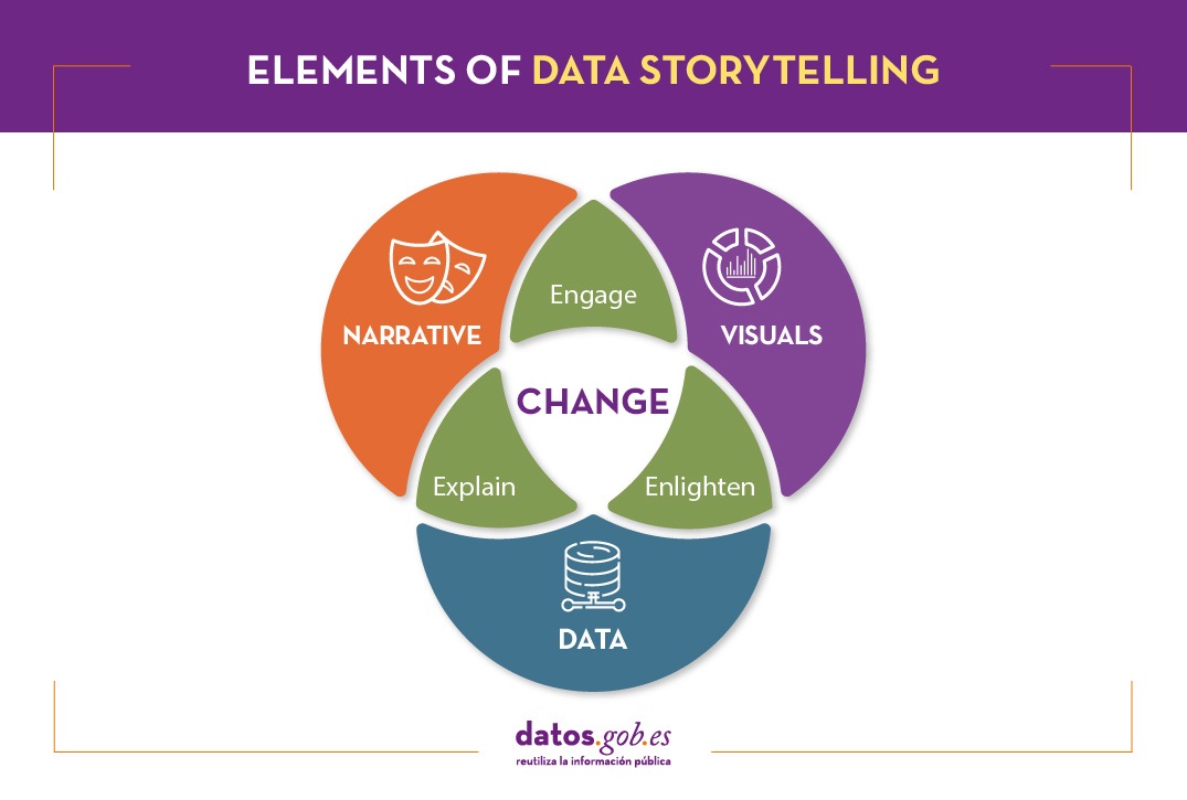
What is data storytelling?
Data storytelling consists of communicating the information resulting from data analysis through a story. It involves three ingredients: data, visualization and narrative. These three elements combine to result in effective communication:
- By combining narrative and data we move into the realm of explanation: thanks to context the audience understands what is happening (or going to happen) and why it is important.
- By combining visual elements with data, what we can call "enlightenment" happens: insights are displayed in a way that is eye-catching and easy to understand, allowing relationships and patterns to be observed.
- By combining narrative and visual elements, you connect with the audience, generating engagement: thanks to formulas linked to the entertainment sector, you get the audience's attention.
When combined, you get a data-driven story that can influence and drive change.
Data storytelling is the foundation of data journalism, but it is also increasingly used within public and private organizations to convey the ideas behind the data both internally and externally.
What do you need to consider in order to tell a story with data?
Transforming data into valuable information and telling a story requires knowledge in all three of the above areas.
The first step is to think about what our objective is. Based on this we will determine the message we want to launch, which must be clear and simple. In order to communicate it effectively, it is necessary to know the audience and their level of knowledge on the subject. The approach, tone, medium and data we use will depend on this.
It is also necessary to know the basics of data analysis and visualization. There are a multitude of tools at our disposal that we can use. It is important to choose the type of graphic to use, depending on what we want to show (comparative, trends, distributions, etc.), as well as to pay great attention to the use of color and hierarchies in the information.
To meet these needs, it is sometimes necessary to have multidisciplinary teams where different types of skills are mixed. However, simple tools designed for use by anyone are also emerging, as we shall see below.
Integrating data storytelling in open data portals: the example of Aragon Open Data
Data storytelling is also reaching open data portals as a way to bring data closer to citizens and boost its reuse, amplifying its impact.
Aragon's open data portal has developed Open Data Focus, a free service that allows portal users to develop and share their own stories based on the region's open data. It is a very intuitive tool, for which no technical knowledge is required. In the portal you can see some of the digital narratives developed around different topics of interest. In this document you can learn more about the context, objectives, methodology and results of the project.
Aragón Open Data Focus is an innovative and pioneering experience in our country, which brings public sector information closer to citizens. Given the importance of narrative and visualization in the understanding of data, it is not surprising that soon we will know more success stories in this regard.
Content prepared by the datos.gob.es team.
Noticia
R is one of the programming languages most popular in the world of data science.
It has a programming environment, R-Studio and a set of very flexible and versatile tools for statistical computing and creation of graphical representations.
One of its advantages is that functions can be easily expanded, by installing libraries or defining custom functions. In addition, it is permanently updated, since its wide community of users constantly develops new functions, libraries and updates available for free.
For this reason, R is one of the most demanded languages and there are a large number of resources to learn more about it. Here is a selection based on the recommendations of the experts who collaborate with datos.gob.es and the user communities R-Hispanic and R-Ladies, which bring together a large number of users of this language in our country.
Online courses
On the web we can find numerous online courses that introduce R to new users.
Basic R course
- Taught by: University of Cádiz
- Duration: Not available.
- Language: Spanidh
- Free
Focused on students who are doing a final degree or master's project, the course seeks to provide the basic elements to start working with the R programming language in the field of statistics. It includes knowledge about data structure (vectors, matrices, data frames ...), graphics, functions and programming elements, among others.
Introduction to R
- Taught by: Datacamp
- Duration: 4 hours.
- Language: English
- Free
The course begins with the basics, starting with how to use the console as a calculator and how to assign variables. Next, we cover the creation of vectors in R, how to work with matrices, how to compare factors, and the use of data frames or lists.
Introduction to R
- Taught by: Anáhuac University Network
- Duration: 4 weeks (5-8 hours per week).
- Language: Spanish
- Free and paid mode
Through a practical approach, with this course you will learn to create a work environment for R with R Studio, classify and manipulate data, as well as make graphs. It also provides basic notions of R programming, covering conditionals, loops, and functions.
R Programming Fundamentals
- Taught by: Stanford School of Engineering
- Duration: 6 weeks (2-3 hours per week).
- Language: English
- Free, although the certificate costs.
This course covers an introduction to R, from installation to basic statistical functions. Students learn to work with variable and external data sets, as well as to write functions. In the course you will hear one of the co-creators of the R language, Robert Gentleman.
R programming
- Taught by: Johns Hopkins University
- Duration: 57 hours
- Language: English, with Spanish subtitles.
- Of payment
This course is part of the programs of Data science and Data Science: Basics Using R. It can be taken separately or as part of these programs. With it, you will learn to understand the fundamental concepts of the programming language, to use R's loop functions and debugging tools, or to collect detailed information with R profiler, among other things.
Data Visualization & Dashboarding with R
- Taught by: Johns Hopkins University
- Duration: 4 months (5 hours per week)
- Language: English
- Of payment
Johns Hopkins University also offers this course where students will generate different types of visualizations to explore the data, from simple figures like bar and scatter charts to interactive dashboards. Students will integrate these figures into reproducible research products and share them online.
Introduction to R statistical software
- Taught by: Spanish Association for Quality (AEC)
- Duration: From October 5 to December 3, 2021 (50 hours)
- Language: Spanish
- Of payment
This is an initial practical training in the use of R software for data processing and statistical analysis through the simplest and most common techniques: exploratory analysis and relationship between variables. Among other things, students will acquire the ability to extract valuable information from data through exploratory analysis, regression, and analysis of variance.
Introduction to R programming
- Taught by: Abraham Requena
- Duration: 6 hours
- Language: Spanish
- Paid (by subscription)
Designed to get started in the world of R and learn to program with this language. You will be able to learn the different types of data and objects that are in R, to work with files and to use conditionals, as well as to create functions and handle errors and exceptions.
Programming and data analysis with R
- Taught by: University of Salamanca
- Duration: From October 25, 2021 - April 22, 2022 (80 teaching hours)
- Language: Spanish
- Payment
It starts from a basic level, with information about the first commands and the installation of packages, to continue with the data structures (variables, vectors, factors, etc.), functions, control structures, graphical functions and interactive representations, among others topics. Includes an end-of-course project.
Statistics and R
- Taught by: Harvard University
- Duration: 4 weeks (2-4 hours per week).
- Language: English
- Payment
An introduction to basic statistical concepts and R programming skills required for data analysis in bioscience. Through programming examples in R, the connection between the concepts and the application is established.
For those who want to learn more about matrix algebra, Harvard University also offers online the Introduction to Linear Models and Matrix Algebra course, where the R programming language is used to carry out the analyzes.
Free R course
- Taught by: Afi Escuela
- Duration: 7.5 hours
- Language: Spanish
- Free
This course was taught by Rocío Parrilla, Head of Data Science at Atresmedia, in virtual face-to-face format. The session was recorded and is available through Yotube. It is structured in three classes where the basic elements of R programming are explained, an introduction to data analysis is made and visualization with this language is approached (static visualization, dynamic visualization, maps with R and materials).
R programming for beginners
- Taught by: Keepcoding
- Duration: 12 hours of video content
- Language: Spanish
- Free
It consists of 4 chapters, each of them made up of several short videos. The first "Introduction" deals with the installation. The second, called "first steps in R" explains basic executions, as well as vectors, matrices or data frames, among others. The third deals with the “Flow Program R” and the last one deals with the graphs.
Autonomous online course Introduction to R
- Taught by: University of Murcia
- Duration: 4 weeks (4-7 hours per week)
- Language: Spanish
- Free
It is a practical course aimed at young researchers who need to analyze their work data and seek a methodology that optimizes their effort.
The course is part of a set of R-related courses offered by the University of Murcia, onMultivariate data analysis methods, Preparation of technical-scientific documents and reports or Methods of hypothesis testing and design of experiments, among others.
Online books related to R
If instead of a course, you prefer a manual or documentation that can help you improve your knowledge in a broader way, there are also options, such as those detailed below.
R for Data Professionals. An introduction
- Author: Carlos Gil Bellosta
- Free
The book covers 3 basics in high demand by data professionals: creating high-quality data visualizations, creating dashboards to visualize and analyze data, and creating automated reports. Its aim is that the reader can begin to apply statistical methods (and so-called data science) on their own.
Learning R without dying trying
- Author: Javier Álvarez Liébana
- Free
The objective of this tutorial is to introduce people to programming and statistical analysis in R without the need for prior programming knowledge. Its objective is to understand the basic concepts of R and provide the user with simple tricks and basic autonomy to be able to work with data.
Statistical Learning
- Author: Rubén F. Casal
- Free
It is a document with the notes of the subject of Statistical Learning of the Master in Statistical Techniques. Has been written inR-Markdown using the package bookdown and is available in Github. The book does not deal directly with R, but deals with everything from an introduction to statistical learning, to neural networks, through decision trees or linear models, among others.
Statistical simulation
- Author: Rubén F. Casal and Ricardo Cao
- Free
As in the previous case, this book is the manual of a subject, in this case ofStatistical simulation of the Master in Statistical Techniques. It has also been written inR-Markdown using the package bookdown and is available in the repository Github. After an introduction to simulation, the book addresses the generation of pseudo-random numbers in R, the analysis of simulation results or the simulation of continuous and discrete variables, among others.
Statistics with R
- Author: Joaquín Amat Rodrigo
- Free
It is not a book directly, but a website where you can find various resources and works that can serve as an example when practicing with R. Its author is Joaquín Amat Rodrigo also responsible forMachine Learning with R.
Masters
In addition to courses, it is increasingly common to find master's degrees related to this subject in universities, such as:
Master in Applied Statistics with R / Master in Machine Learning with R
- Taught by: Esucela Máxima Formación
- Duration: 10 months
- Language: Spanish
The Esucela Máxima Formación offers two masters that begin in October 2021 related to R. The Master in Applied Statistics for Data Science with R Software (13th edition) is aimed at professionals who want to develop advanced practical skills to solve real problems related to the analysis, manipulation and graphical representation of data. The Master in Machine Learning with R Software (2nd edition) is focused on working with real-time data to create analytical models and algorithms with supervised, unsupervised and deep learning.
In addition, more and more study centers offer master's degrees or programs related to data science that collect knowledge on R, both general and focused on specific sectors, in their syllabus. Some examples are:
- Master in Data Science, from the Rey Juan Carlos University, which integrates aspects of data engineering (Spark, Hadoop, cloud architectures, data collection and storage) and data analytics (statistical models, data mining, simulation, graph analysis or visualization and communication) .
- Master in Big Data, from the National University of Distance Education (UNED), includes an Introduction to Machine Learning module with R and another of advanced packages with R.
- Master in Big Data and Data Science Applied to Economics, from the National University of Distance Education (UNED), introduces R concepts as one of the most widely used software programs.
- Master Big Data - Business - Analytics, from the Complutense University of Madrid, includes a topic on Data Mining and Predictive Modeling with R.
- Master in Big Data and Data Science applied to Economics and Commerce, also from the Complutense University of Madrid, where R programming is studied, for example, for the design of maps, among others.
- Master in Digital Humanities for a Sustainable World, from the Autonomous University of Madrid, where students will be able to program in Python and R to obtain statistical data from texts (PLN).
- Master in Data Science & Business Analytics, from the University of Castilla-La Mancha, whose objective is to learn and/or deepen in Data Science, Artificial Intelligence and Business Analytics, using R statistical software.
- Expert in Modeling & Data Mining, from the University of Castilla-La Mancha, where as in the previous case also works with R to transform unstructured data into knowledge.
- Master of Big Data Finance, where they talk about Programming for data science / big data or information visualization with R.
- Big Data and Business Intelligence Program, from the University of Deusto, which enables you to perform complete cycles of data analysis (extraction, management, processing (ETL) and visualization).
We hope that some of these courses respond to your needs and you can become an expert in R. If you know of any other course that you want to recommend, leave us a comment or write to us at dinamizacion@datos.gob.es.
Blog
Maps help us to understand the world in which we live and have therefore been fundamental in the development of humanity. They allow us to know the characteristics of a place and to understand social phenomena, such as the spatial behaviour of a disease or the traceability of trade flows.
If we show data through a map, we facilitate its understanding and interpretability. But in order to build such geospatial visualisations, we need georeferenced data.
What is georeferencing?
Georeferencing is a method of determining the position of an element based on a spatial coordinate system.
Much of the open data offered by public administrations is geo-referenced or can be geo-referenced, thus increasing its value. Through geo-referenced online services for viewing or downloading data such as Spatial Data Infrastructures (SDI) or geoportals, users can access a large amount of such data. But handling this type of information is not easy.
The user of georeferenced data needs to understand key concepts linked to the visualisation of geographic information such as coordinate reference systems, cartographic projections or the different data representation models with which they work: raster - pixel map images - or vector - points, lines, etc. representing different objects. These elements can be combined with each other on Geographic Information Systems (GIS).
This article includes a set of useful tools to tackle the tasks necessary to develop geospatial data visualisations, as well as libraries based on different programming languages for geographic information processing.
Geospatial visualisation tools
Carto
Functionality:
Carto is a geospatial data analysis platform, aimed at developers with no previous experience in geospatial information systems, which facilitates the creation of geolocated interactive applications.
Main advantages:
Its main advantage is that it allows the design and development of real-time maps that work on web platforms and mobile devices. It also allows linking with cartographic services such as Google Maps or MapBox, so that some of their functionalities, such as zoom or scrolling, can be used.
By using the PostGIS library, Carto allows querying and combining geospatial datasets, and CartoCSS can be used in the data layers to easily edit the format and appearance of the maps.
Do you want to know more?
- Support Materials: On its website, Carto offers user manuals, both for users who want to use the platform for spatial analysis and for those who want to develop apps using its suite of tools. It also offers tutorials for managing the account or configuring security, regular webinars with practical examples, a blog and various videos on its YouTube channel.
- Repository: On Github we find a multitude of repositories with resources for Carto.
- User community: Users can get in touch via Stackoverflow.
- Social media: You can keep up to date with Carto's news by following its profile on Twitter (@CARTO) or LinkedIn.
OpenLayers
Functionality:
OpenLayers is the open source JavaScript library that allows the inclusion of map-like components in any web page.
Main advantages:
OpenLayers allows you to overlay different layers and add different features such as points, lines, polygons and icons on which to link a legend. It incorporates a set of basic controls and a toolbar of advanced controls, which allows the necessary functionality to be embedded using the API. It also excels at rendering DOM elements anywhere on the map.
Do you want to know more?
- Support materials: On the OpenLayers website there is a user manual that quickly explains how to put a simple map on a web page, or more advanced guides on the different components. There are also tutorials available that cover basic concepts, the background of OpenLayers or how to create an application. Outside of their website you can also find other helpful resources, some of which are listed in this article. If you are a beginner, we also recommend this video that explains basic functionalities in just 12 minutes.
- User community: If you want to know the experience of other users, and ask any questions, you can go to Stackoverflow.
- Social media: On their Twitter channel (@openlayers) you can participate in polls or find out related news. They also have a LinkedIn group.
OpenStreetMap
Functionality:
OpenStreetMap is a collaborative project focused on the creation of free, editable maps. These maps are created using geographic information captured with GPS devices, orthophotos and other public domain sources.
Main advantages:
Registered OpenStreetMap users can upload their GPS tracks, create and correct vector data using community-created editing tools. It also stands out because it uses a topological data structure that is stored in the WGS84 lat/lon (EPSG:4326) datum as a coordinate reference system.
Do you want to know more?
- Support materials: In this wiki you can find information on how to use OpenStreetMap or a beginner's guide on how to start contributing. Video tutorials are also available.
- Repository: On Github there are several repositories and resources for further progress in the creation of maps.
- User community: OpenStreetMap has an official support forum, although users also have a meeting point on Stackoverflow.
- Social media: For news and trends, you can follow the Twitter account @openstreetmap or its LinkedIn profile.
Geographic information processing tools
Although these are not geospatial visualisation tools per se, it is worth highlighting the existence of libraries of different programming languages designed for the processing of geographic information.
Geocoder and Geopy:
Functionality:
Geocoder and Geopy are Python libraries designed to solve the geocoding problem. They convert postal addresses into spatial coordinates or vice versa.
Main advantages:
Both libraries incorporate the ability to calculate the distance between geolocated points.
Do you want to know more?
- Support materials: Users who want to work with Geopy, have at their disposal this manual that includes the installation, the use of different geocoders or how to calculate distances, among other things. If you prefer Godecoder, in this guide you will find how to install it and examples of its use.
- Repository: On Github there are repositories with resources for both Geopy and Geocoder.
- User community: En Stackoverflow puedes encontrar grupos de usuarios de Geopy y Geocoder.
GDAL
Functionality:
GDAL is an open source library available for different programming languages such as Python, Java, Ruby, VB6, Perl and R.
Main advantages:
This library allows the translation between vector and raster geospatial data. A good number of tools that incorporate Geographic Information System (GIS) functions, such as PostGIS, Carto or ArcGIS, integrate GDAL to carry out this process.
Do you want to know more?
- Support materials: In this user manual you can find frequently asked questions and information about software and drivers. You can complement your reading with this tutorial.
- Repository: You can download everything you need to use it from Github.
- User community: Once again, it is on Stackoverflow where we find different open discussions about this tool.
- Social media: The @GdalOrg profile shares news of interest to all its users.
PROJ.4 and PROJ4.JS
Functionality:
PROJ.4 is a library available for several platforms, such as Ruby, Rust, Go or Julia, among others. PROJ4.JS is the implementation of PROJ.4 for JavaScript.
Main advantages:
PROJ.4 allows the transformation of geospatial coordinates from one coordinate reference system to another, as well as command line invocation for easy conversion of coordinates into text files.
Do you want to know more?
- Support materials: This manual includes information on cartographic projection, geodetic transformation or the known differences between versions, among other aspects
- Repository: On GitHub there is a space for PROJ.4 and another for PROJ4.JS.
- User community: On Stackoverflow there are also PROJ.4 and PROJ4.JS discussion groups.
The following table gives an overview of the tools mentioned above:

The criteria chosen to select these tools was their popularity, but we would like to know your opinion. Do not hesitate to leave us a comment.
These tools are included in the recently updated report "Data processing and visualisation tools". You can see more tools related to this field in the following monographs:
Content prepared by the datos.gob.es team.