Publication date
30/09/2020
Update date
20/06/2024

Description
Within this technological maelstrom in which we are constantly immersed, every day that passes, humanity is creating a great amount of information that, in many cases, we are unable to deal with.
Public administrations also generate large volumes of information, which they make available to citizens so that we can reuse it from open data portals, but how can we take advantage of this data?
On many occasions, we think that only experts can analyse these large amounts of information, but this is not the case. In this article we are going to see what opportunities open data presents for users without technical knowledge or experience in data analysis and visualisation.
Generating knowledge in 4 simple steps with a use case
Within the Spanish Government's open data platform, we can find a multitude of data at our disposal. These data are grouped by category, subject, administration that publishes the data, format or with other tags that label us its content.
We can load this data into informational analysis applications, such as PowerBI, Qlik, Tableau, Tipco, Excel, etc., which will help us to create our own graphs and tables with hardly any computer knowledge. The use of these tools will allow us to develop our own informational analysis product, with which we can create filters or unplanned queries. All this without having other computer elements such as databases or ETL tools (Abbreviation of data Extraction, Transformation and Load).
Next we will see how we can build a first dashboard in a very simple way.
1.- Data selection
Before we start collecting meaningless data, the first thing we must decide is for what purpose we will use the data. The datos.gob.es catalogue is very extensive and it is very easy to get lost in this sea of data, so we must focus on the subject matter we are looking for and the administration that publishes it, if we know it. With this simple action we will greatly reduce the scope of our search.
Once we know what to look for, we must focus on the format of the data:
- If we want to collect the information directly to write our doctoral thesis, write an article for a media outlet with statistical data, or simply acquire new knowledge for our own interest, we will focus on taking information that is already prepared and worked on. We should then use data formats such as pdf, html, jpg, docx, etc. These formats will allow us to gather that knowledge without the need for additional technological tools, since the information is served in visual formats, the so-called unstructured formats.
- If we want to work on the information applying different calculation metrics and cross them with other data in our possession, in that case we must use structured information, that is, XLS, CSV, JSON, XML formats.
As an example, let's imagine that we want to analyse the population of each of the districts of the city of Madrid. In this case the dataset we need is the census of the Madrid City Council.
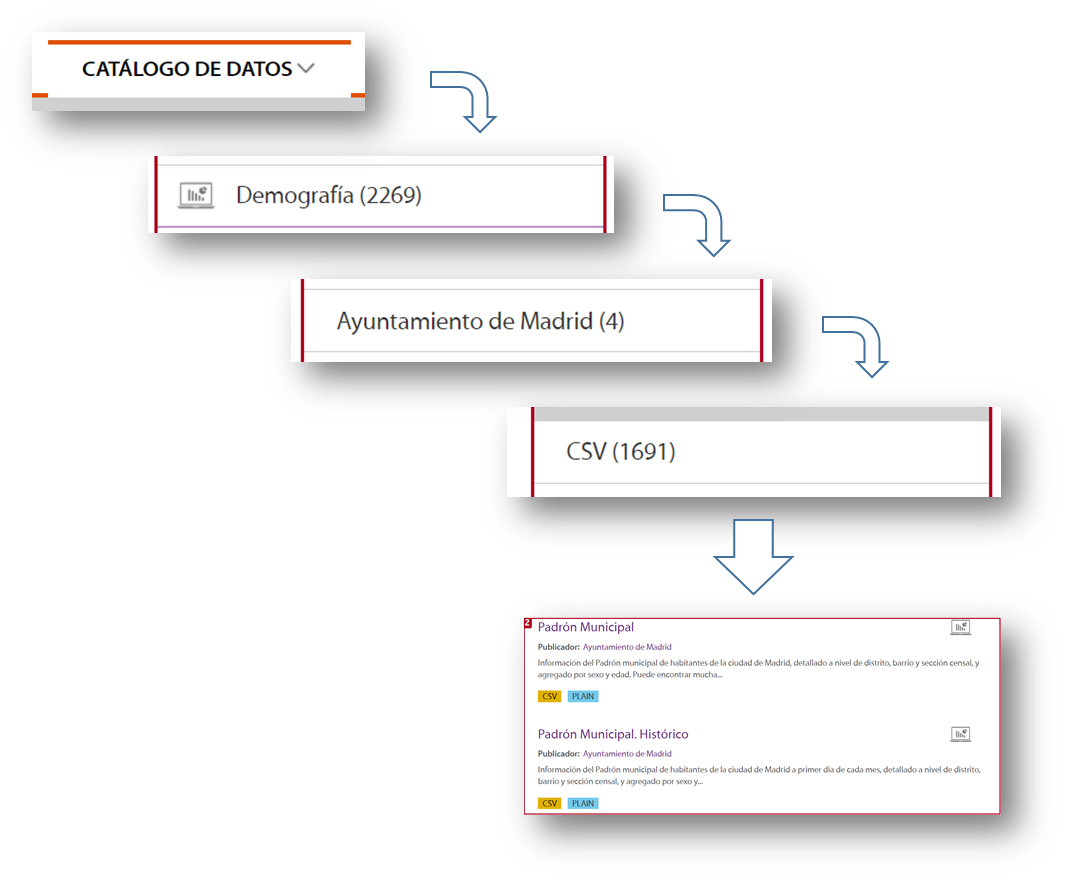
To locate this set of data, we selected Data Catalogue, Demography category, the City Council of Madrid as publisher, the CSV format and I already have the information I need on the right side of the screen. Another simple and complementary way to locate the information is to use the search engine included in the platform and type in "Padrón "+"Madrid".
With this search, the platform offers, among others, two sets of data: the historical census and the census of the last month published. For this example we will take the document corresponding to the August 2020 update.
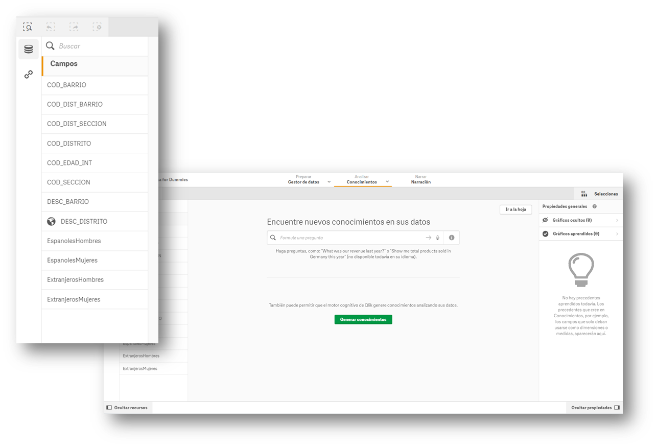
2.- Loading the information into an information display tool
Many of the information visualisation tools usually have built-in wizards to collect data that can be downloaded from an open data portal. The images in this article are from the Business version of QlikSense (which has a free 30-day trial), but any of the tools mentioned above work in a similar way. With a simple "drag and drop", you will already have the information inside the tool, to start creating indicators and thus generate knowledge.

Most of these tools directly interpret the content of the fields and propose a use for these values, differentiating them by data that can be used as filters, geographical data and data to formulate.
3.- Creation of the first graph or indicator
Now all that remains is to drag the fields on which we want to generate knowledge and create the first indicator on our dashboard. We will drag the field DESC_DISTRITO, which contains the description of the district, to see what happens.
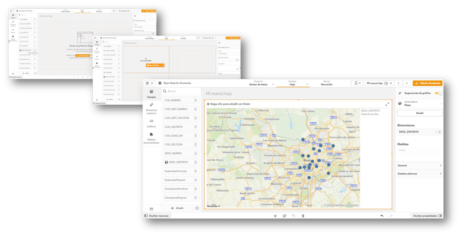
Once the action has been carried out, we see that it has geo-positioned all the districts of Madrid on a map, although at first we do not have any information to analyse. In this first automatic visualization it shows us a point in the centre of the district, but it does not provide us with any other type of additional information.
4.- Creating value in our indicator
Once we have the points on the map, we need to know what we want to see within those points. We will continue with the "Drag and Drop" to count the men and women of Spanish nationality. Let's see what happens...
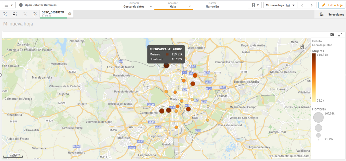
We see that, for each of the points, the tool has added the citizens by sex in each of the districts where they are registered.
In short, with four simple steps in which we have only selected the set of data and we have dragged and dropped the file into a visualisation tool, we have created the first indicator on our dashboard, where we can continue to generate knowledge.
If we continue to go deeper into the use of these tools, we will be able to create new graphics, such as dynamic tables, pie charts or interactive visualisations.
The interesting thing about this type of analysis is that it allows us to incorporate new sets of open data, such as the number of pharmacies in a district or the number and type of accidents in a particular area. By crossing the different data, we will be able to acquire more knowledge about the city and make informed decisions, such as which is the best area to set up a new pharmacy according to the population or to install a new traffic light.
Content elaborated by David Puig, Graduate in Information and Documentation and responsible for the Master Data and Reference Group at DAMA ESPAÑA
Contents and points of view expressed in this publication are the exclusive responsibility of its author.
Comments