Blog
"We are our brains and that's why we have to talk about human rights, because if you have a technology that allows you to measure the activity of the brain and change it, that same technology will allow you, sooner or later, to decipher mental activity and alter it."
Yuste, Rafael. (2025). Neurorights. A journey towards the protection of what makes us human. Paidós.
Neurotechnology incorporates a set of methods or devices to record the activity of the brain or nervous system, and may even alter it. Therefore, as the techniques for analysing brain activity and therapeutic possibilities increase, ethical concern among professionals grows.
To integrate the analysis of this phenomenon with the European legal framework, we have an excellent guide: the work of Dr. Rafael Yuste and his book "Neurorights" (2025). The calcium imaging method, pioneered by Dr. Yuste, revolutionized the possibilities of neuroscientific research. It is an optical technique that uses calcium-sensitive dyes or indicators to infer when neurons are activated. When a neuron is activated, its calcium level increases, which produces an observable light signal. This technique has evolved from the use of chemical dyes to genetic sensors that neurons themselves produce, which makes it possible to study specific neuronal types and record their activity over longer periods.
Examples of behavior manipulation using neurotechnology
Dr. Yuste in his book provides very graphic examples that allow us to understand the possibilities that this methodology opens up:
- A behavior can be stimulated in a laboratory mouse to suck a liquid in response to the viewing of video images. To do this, the neural groups that are activated by the learned visual stimulus are mapped. Then, with the stimulus turned off, those same neurons are activated with a laser and the mouse executes the expected behavioral response, without seeing anything in physical terms.
- In humans, speech neuroprostheses capable of decoding attempts at verbal production have been developed in patients with paralysis and speech loss. From the recording of cortical activity during the reading and attempt to articulate sentences, these systems can generate text, synthetic voice and the animation of a facial avatar.
- Likewise, neurostimulation techniques are being experimented with to improve the clinical situation of patients with Parkinson's disease and to intervene on certain behavioural aspects. We are also witnessing the development of new neurosurgical techniques based on brain-computer interfaces, both invasive – for example, by implants or wireless chips – and non-invasive, which can operate by means of energy beams or ultrasound.
- Finally, neurofeedback is emerging as a technology close to clinical and commercial application, as it allows brain activity to be modulated in cases such as post-traumatic stress disorder, through video games or interactive environments connected to measurement devices capable of detecting certain emotional states and generating conditions that favor the patient's improvement.
Paradoxically, artificial intelligence, which is accelerating neuroscience research processes, has largely been developed from models inspired by deep neural networks. Now, the study of biological neural networks could, in turn, decisively transform the future evolution of AI itself. Discovering the mathematical algorithms that underlie the functioning of the brain could favor the design of more efficient systems, inspired both by their processing capacity and by their very low energy cost.
The importance of neurorights
Dr. Yuste and the Neurorights Foundation have stated that these scientific advances require a specific ethical and legal approach: neurorights. In this regard, they have proposed five categories:
-
Right to mental privacy.
Research in this area of knowledge inevitably reveals private information, incorporating new risks into the profiling techniques that social networks deploy based on neuroscience.
-
Right to personal identity.
Our identity is highly dependent on the information and experience that consolidates our memory. Some therapies can affect our identity.
-
Right to free will: to be able to decide in the face of techniques that generate behavioral alterations.
It has been found that the use of neurostimulation to treat certain disorders causes the patient to behave differently. In this affectation, it is no longer just a matter of preserving identity, but of ensuring that any expected changes in the patient's personality and behavior result from their free choice.
-
Fair access to neuroaugmentation.
An expected result in the future may be the emergence of technologies that enhance our cognitive abilities. There is a danger that a market for services will be generated that privileges only those social or economic classes with the capacity to contract them.
-
Protection against bias and discrimination.
In the same way as was already the case with genetic research, the more information we have about the human brain, the greater the risk of biases and/or discrimination. Here the risk is no longer merely passive, it can be increased, for example, by the use of artificial intelligence when the risk of bias in its operation has not been adequately foreseen or governed.
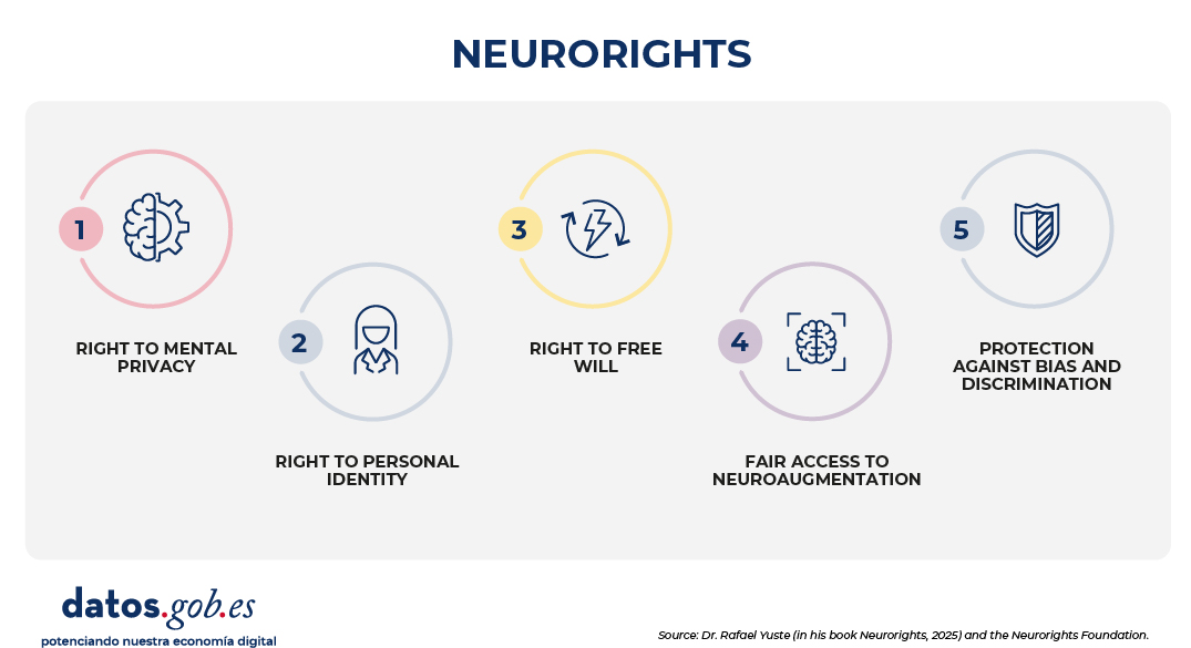
Figure 1. Neurorights – Source: Dr Rafael Yuste (in his book *Neurorights*, 2025) and the Neurorights Foundation.
This proposal inspired the consideration of neurorights by the Charter of Digital Rights promoted by the Government of Spain and is generating a deep debate at the academic and legislative levels. The proposal to regulate neurotechnology through neurorights goes beyond scientific research and its origin, and becomes urgent due to the significant interest of the industry.
Guaranteeing neurorights from the existing regulatory framework: the right to privacy
One of the challenges that we must overcome from the world of law is to be able to address the impacts of technology from the tools provided by the current legal system. The absence of a specific right does not imply that this technology can be developed and deployed without limits. The EU has understood the importance of guaranteeing a humanistic conception of technology focused on guaranteeing fundamental rights, ensuring the indemnity of patients against any physical or psychological repercussions and ensuring that technology will not put democracy or the rule of law at risk.
The right to mental privacy is proposed as the first tool available for the guarantee of people's rights in the field of neurotechnology. And, although the natural temptation is to place the focus on the scope of the fundamental right to data protection, the truth is that the right to privacy – which is recognised in Article 18.4 of the Spanish Constitution and Articles 7 and 8 of the European Charter of Fundamental Rights – offers a set of promising instruments for an early approach to the risks that the use of this technology may pose.
In the first place, from the point of view of human dignity, intimacy is projected onto our body as a scenario to guarantee the patient's free self-determination. This capacity for control and disposition is clearly manifested in the Law regulating patient autonomy, and defines informed consent as a first barrier. In this it coincides with the principles in force in the field of biomedical research. For this reason, both those who intend to develop systems based on neurotechnology and to implement them in a clinical setting find in the duty of transparency and in the establishment of guarantees to obtain free consent from the patient the first insurmountable legal barrier. Neurotechnologies are particularly complicated instruments whose understanding may escape the capabilities of the majority of the population, including legal experts themselves. Consequently, the promise of the advantages offered by the treatment or service that is intended to be provided to us will not be enough: it will be essential that the information is provided in a clear, accessible and understandable way in a verifiable process and free of any type of coercion.
Secondly, article 18 of the Constitution includes the guarantee of the right to family privacy, as well as honour and one's own image. From a material point of view, it can be understood that the impact on a subject's conduct derived from the use of neurotechnology could have an impact on these rights. On the one hand, if some type of change is caused in the personality of the subject, it could affect interpersonal relationships in the private sphere. On the other hand, honor guarantees the esteem or social consideration that a subject has had. By its very nature, it implies a certain self-perception on the part of the subject with respect to his personality, behavior and social esteem, and could be affected in the event that, as a result of the treatment, there is a personality change with reputational impact. It is more complicated to determine the existence of effects on the right to one's own image, except in relation to the dissemination of medical images or the possibility of theorizing with the idea that behavioral changes can have an impact on the image projected by a given subject when he or she decides to change it.
However, and although it has not been the subject of a specific legal development, there is an emerging property that links the right to privacy of article 18.1 of the Constitution with the problem at hand: the right to identity. Without wishing to theorize excessively, over the last two centuries it has been pointed out very precisely that the guarantee of private life operates as a sphere of protection of the individual against third parties, which provides him with a space of freedom in which to develop his personality. This is particularly noticeable in the case of children and adolescents for whom gradually expanding their sphere of privacy vis-à-vis their family environment is crucial to guarantee the processes that allow them to achieve due maturity and autonomy. The conclusion is clear: the guarantee of the right to privacy must be rigorously applied in the field of neurotechnologies as a necessary instrument for the preservation of human dignity, free individual self-determination and the development of personality.
From the fundamental right to data protection to the Artificial Intelligence Regulation: the commitment to process engineering
The guarantee of our fundamental rights with respect to the development and use of neurotechnologies will depend essentially on the processes defined by the General Data Protection Regulation (GDPR) and the Artificial Intelligence Regulation (RIA).
The right to data protection has an instrumental nature that projects them on all fundamental rights. It is not conceived in the abstract, but with reference to a concrete treatment for a specific purpose in a given context. For example, when behavioral algorithms are intended to profile a subject on a social network and guide their consumption of information, we may be affecting ideological freedom or freedom of belief. The paradigmatic example of this can be found in scientific denialism. Personalization algorithms, by betting on monetizing the user experience with advertising, do nothing more than consolidate the confirmation bias that feeds irrational beliefs. Therefore, when we apply the procedures of the GDPR for the development of systems that will be able to obtain neural information, process it, develop treatments or deploy services, we are guaranteeing that this technology is respectful of all our fundamental rights.
The GDPR and the RIA share a highly productive dual approach. The first is that of design focused on the guarantee of human rights. Therefore, in both cases, before developing any invention in the field of neurotechnology, we must ask ourselves if what we intend to achieve violates any fundamental right, incurs in any prohibited practice or finds any legal restriction in current law. In addition, we will be able to apply the ethical standards of biomedical research, as well as emerging standards both in the field of artificial intelligence development.
The second major commitment in both regulations, and expressly in the RIA, is what we can define as product orientation. That is, in both cases the two standards define a clearly articulated set of process engineering that must accompany the development process:
- Within the scope of the GDPR, it will be necessary to deploy a risk analysis or, in the most significant cases, a data protection impact assessment . This type of process will provide us with a clear identification of all types of risks. The most important, the primary ones, are those that refer to the rights of people. This is without prejudice to the fact that we can identify risks with respect to the data protection principles. Of particular importance here are those related to the quality of information and the principle of minimisation, information security, as well as any type of risk inherent to the organisation, including the training needs of personnel.
- In the design of high-risk systems in the RIA , practically all variables are addressed. As with the GDPR, it is essential to develop an impact assessment here on fundamental rights. On the other hand, as in the design of any AI-based application, it will be essential to monitor and manage risks, ensure data governance, adopt specific measures to guarantee robustness and resilience, deploy human supervision strategies, guarantee the training of the teams that will use the tool and ensure that, thanks to compliance with transparency in the deployment, The technology is implemented in complete safety.
Both standards are subject to controls. In the GDPR, these controls are specific to the organization and are based on the establishment of periodic controls, the development of regular audits and the implementation of incident management methodologies. In the field of high-risk RIA systems, in addition to implementing procedures equivalent to those of the GDPR, it is important to note that, as it requires the authorisation of a notified body, the documentation requirements are very high. On the other hand, these are products subject to post-commercial surveillance.
Therefore, it can be said that there is a regulatory framework that can perform essential functions when it comes to guaranteeing our neurorights. Any additional regulation that requires the conditions for the development and deployment of neurotechnology will always be welcome. And we must not forget an essential aspect: the two standards we have mentioned are relevant in that they offer a set of processes that allow us to guide our strategy for the development and implementation of these techniques. However, in the constitutional systems of the Member States of the European Union and in the Union itself, the fundamental rights that are guaranteed for all people are already legal norms and apply directly: there are no excuses for their violation.
Content prepared by Ricard Martínez Martínez, Director of the Chair of Privacy and Digital Transformation, Department of Constitutional Law, University of Valencia. The contents and views expressed in this publication are the sole responsibility of the author.
Blog
We live in the age of digitalization and datafication. More and more data is being generated and we observe the world through it. Satellite images, mobile phone data, commercial transactions, environmental sensors or social networks are some examples of sources of information that serve to answer questions of public interest, in areas such as health, the environment, spatial planning or food production, among others.
New York University's Open Data Policy Lab has been documenting this phenomenon for years as part of what it calls the "Third Wave of Open Data," a movement toward purpose-driven open data that extends its reach to the private sector and focuses on responsible use of information. On its blog, the lab regularly compiles recent examples of how researchers, administrations, and international organizations are leveraging this non-traditional data in various fields.
What is non-traditional data?
An article published in the Centre for Digital Development at the University of Manchester defines non-traditional data (NTD) as data captured, mediated or observed using digital technologies and which, in many cases, are generated by private companies or technology platforms. This type of data usually arises as by-products of another daily activity or comes from the operation of digital infrastructures: a phone call, a purchase in the supermarket, a publication on a social network or the passage of a satellite over the territory. Among their characteristics are that they offer information continuously and with a high level of geographical detail.
This term is often used in contrast to traditional data, which is data that is deliberately collected using standardized methodologies and consolidated measurement processes, such as official censuses, statistical surveys, or administrative records. These data tend to have a lower periodicity, a well-defined structure, and an explicit purpose: to describe social, economic, or demographic phenomena with high levels of control and validation.
Both types of data are of great value, but their combination makes their potential multiply. Thanks to their joint analysis, rapid changes or fine patterns of social behavior can be better captured.
Below, we delve into three recent examples collected by the Open Data Policy Lab, which show how non-traditional data is being applied in very different areas, with tangible consequences for society.
Public Health: Loyalty Cards to Detect Early Signs of Cancer
One of the most unique examples of non-traditional data use in healthcare is the reuse of merchant loyalty card data to investigate whether shopping habits can anticipate a cancer diagnosis.
A research team from Imperial College London is using loyalty card data from two British supermarket chains, with the consent of about 3,000 participants, to analyse whether purchasing patterns, especially of over-the-counter medicines, change before a cancer diagnosis occurs. The researchers compared the shopping habits of people with cancer versus healthy people, which allowed them to identify subtle behavioral changes prior to diagnosis.
Previous studies had already shown that buying patterns could anticipate a diagnosis of ovarian cancer up to eight months before it was clinically confirmed. Extending this approach to other cancers could facilitate earlier detection, encouraging people to seek medical care sooner. This is a clear example of how data generated for purely commercial purposes can provide health signals that traditional systems do not capture on their own.
Mobility: Responding to SMS evacuation alerts
A study published in December 2025 used anonymized data from mobile phone networks to analyze how the population responds to wildfire evacuation alerts sent by SMS. The researchers monitored the activity of about 580,000 devices at 15-minute intervals during the February 2024 wildfires in Valparaíso, Chile. To do this, they used the changes in connection to the telephone antennas as an indicator of population movement, and compared these patterns before and after the alerts were sent. This information was combined with the records of the alerts themselves and with socioeconomic data to understand if the response varied according to the type of community.
The analysis showed that early alerts elicited clear population movement, while repeated alerts generated an increasingly weak response. It was also observed that higher-income areas responded more quickly and that displacement occurred even in areas that had not been directly alerted. This type of evidence can help design more efficient warning protocols and anticipate how the population will actually behave during an emergency.
Environment: Assessing the heat resilience of buildings with drones and street imagery
Global warming is one of the biggest concerns worldwide. A study conducted in the city of Dar es Salaam, in Tanzania's Msimbazi River Delta, used drone imagery and street-level photography to analyze which building features influence heat exposure in urban environments. The researchers combined these visual sources with surface temperature data obtained by satellite and maps of buildings. They trained an artificial intelligence model capable of automatically extracting attributes such as the material of roofs and facades, the presence of vegetation, building density or the reflectivity of surfaces, and relating them to the observed thermal patterns.
The analysis makes it possible to identify which features of the built environment contribute to reducing heat exposure, offering useful guidelines for urban design and building rehabilitation. This information is particularly relevant in cities exposed to an increasing risk of heatwaves, as it facilitates more targeted interventions aimed at protecting vulnerable populations, rather than general measures applied at the urban scale.
The potential of combining data
These three cases illustrate how non-traditional data is especially useful where conventional measurement is often slow or too aggregated, whether it's to detect early signs of illness, understand how the population actually responds to an emergency, or identify which buildings are most exposed to heat.
In these examples, as well as in others that the Open Data Policy Lab has been collecting in recent years, the greatest potential appears when these data are combined with existing reference sources, such as socioeconomic data, temperature records or maps, which allow the signals detected to be validated and correctly interpreted.
As this type of source is consolidated, so is its incorporation into public and private decision-making processes. In this context, governance issues such as who has access to data or how to ensure responsible use that protects people's privacy are becoming increasingly important. Solving these challenges will be key so that the potential of these sources can generate value safely and reliably.
These examples show that it is possible to extract really useful information from non-traditional data. Now the challenge is to build the protection frameworks necessary to do so without eroding the trust of those who generate that data every day.
Noticia
The universe of data and artificial intelligence is advancing at a frenetic pace, consolidating itself as the undisputed engine of public and business innovation. To learn more about the state of this issue, in this new edition of our "What's New in the Data Ecosystem" we compile examples of initiatives, projects and activities that have taken place in the last six months and that are shaping the digital future, with a focus on Spain.
Strategic boost to the data economy
Public administrations and regulatory bodies continue to define the rules of the game and action plans to promote orderly, competitive and citizen-oriented technological growth. In Europe, progress continues in the Digital Omnibus, which seeks to simplify and unify the European digital legislative framework, affecting data regulation. After a period of public consultations and political agreements, the package of amendments has been approved by the European Parliament, although it still needs to be approved by the European Council. A milestone in this period is the reconfiguration of the regulatory calendar: transparency and labelling obligations for AI-generated content will come into force in August 2026, while the requirements for high-risk AI systems will come into force in December 2027 (in August 2028 for those integrated into products).
Another European legislative advance has been the adoption of the Open Source Strategy as part of the Technological Sovereignty package. The initiative promotes open, interoperable and resilient digital ecosystems, in order to reduce dependence on suppliers through open standards.
At the national level, the first half of 2026 has been marked by the acceleration in the creation of federated infrastructures through the Data Spaces Promotion Plan, highlighting the activation of the National Health Data Space. Also noteworthy is the Impulsa DATA program, which seeks the sharing of data under a unified governance model that guarantees the quality of information to feed artificial intelligence solutions. Work has also continued to promote Smart Territories through grants for projects that use AI, digital twins or urban data to boost the economy and the local productive sector. All this is in line with the roadmap presented in February to strengthen digital sovereignty in Spain.
The boost in the data economy is also reflected at the regional and local level. In this sense, the Spanish Federation of Municipalities and Provinces has signed an agreement with the Spanish Association for Digitalization (DigitalES) to share knowledge and coordinate digitization projects at the municipal level. In addition, at a strategic level, we find initiatives such as that of Castilla-La Mancha, which makes the "Single Data" the central axis of the Regional Statistics Plan 2026-2029. This plan includes more than 280 operations designed to provide up-to-date, open, and useful data that inform better public policies.
Thanks to all these actions, and many more, Spain continues to position itself as a leading country in terms of data. If we end 2025 as one of the European benchmarks in terms of open data according to the European data portal, at the beginning of 2026 we knew the result of two other rankings that also highlight the work of our country, this time published by the Organisation for Economic Co-operation and Development (OECD). In these new rankings, Spain is above average in digitization, standing out once again in the openness and reuse of public data.
Data reuse as a basis for technological innovation
The data shared continues to enrich projects aimed at improving our lives. Some of the initiatives with outstanding participation of public bodies that we have known these months are:
- The new simulator of the Universitat Autònoma de Barcelona combines open data from satellites, meteorology and vegetation maps with real-time sensors to predict fires almost to the minute and improve decisions in forest emergencies.
- XarMet is an educational project to promote the use of real data in classrooms in the Balearic Islands. Through the installation of 100 stations in educational centers, real-time, public, accessible and reusable weather information is generated.
- The Vall d'Hebron Institute of Oncology is participating in Ligand-IA, a European project that uses artificial intelligence and open data to predict new molecules with therapeutic potential.
- The Universitat Politècnica de València promotes OBEREK, a platform with sensors to monitor the health of the Albufera de València in real time using open data on salinity, turbidity and oxygen.
- LabIA is the new Artificial Intelligence challenge platform of the National Cryptologic Center. It allows you to train the detection and mitigation of AI model manipulation techniques through practical and interactive challenges.
- The DigitAldeas project seeks to promote the sustainable development of rural areas through a collaborative digital model based on open geospatial data and citizen participation. The Provincial Council of Badajoz participates in this initiative.
- A study by the University of Alicante has used one of the largest open epidemiological datasets on COVID-19 to train AI models aimed at improving ICU management in health emergency situations.
- The Observatori Marina Alta has presented a cartographic tool to compare refueling costs in the different municipalities of the region.
Advancements in platforms to continue providing quality data
In order to be able to implement projects such as the above, it is necessary for open data platforms to offer quality datasets and functionalities that favour their exploitation. In this regard, here are some of the new developments presented in this period:
- The Madrid City Council has presented a new open data portal with a clearer design and improvements in usability that facilitate navigation, easy access filters to datasets and more download and connection options. In addition, it includes built-in graphics and maps.
- The National Institute of Statistics has also launched a new open data portal. A more accessible, transparent and user-friendly space to promote the reuse of public information.
- The State Meteorological Agency (AEMET) and the Spanish National Research Council (CSIC) have presented a new state platform for the consultation and analysis of climate information. This tool allows access to regionalised climate change scenarios for Spain.
- The Spatial Data Infrastructure of Spain (IDEE) has facilitated access to information on the Vía de la Plata in the NCO (Nature, Culture and Leisure) viewer, within the "Culture" section in "Cultural Routes of Spain".
- MUFACE has updated its open data space with information on human resources, administrative activity, group composition and other data of interest.
- The Spanish Data Protection Agency has launched a public network that brings together almost 100 groups and research projects in privacy and emerging technologies. It is a multidisciplinary community to promote collaboration, share knowledge and strengthen the culture of data protection in Spain.
- The Generalitat Valenciana promotes "Collaborate" in the Portal de Dades Obertes. It is a channel to propose new datasets and share projects and research.
To continuously monitor the volume and quality of datasets published by Spanish public administrations, you can visit this interactive dashboard, launched by the Meloda team.
Activities to boost the use of data
Public agencies are also making efforts to publicize the potential of the data they share. This semester has concentrated a large number of events aimed at promoting the publication and reuse of data, highlighting the V National Open Data Meeting (ENDA), some activities of the Open Administration Week and Open Data Day 2026. It should be noted that an educational resource was presented at ENDA to bring open data closer to students and teachers of Compulsory Secondary Education (ESO), Baccalaureate and Vocational Training.
More and more sectoral events are being held, reflecting the maturity of this field and its cross-cutting value for different areas of economic activity. Some examples are "The International Congress on AI and Data Applied to the Agri-Food Sector", or the XI edition of the LEXDATUM Conference, this time focused on open data and privacy in the field of law. Our country also hosted the Statistics Conference of the Autonomous Communities and Fira FAIR Data, focused on the management and reuse of data according to the FAIR principles (Findable, Accessible, Interoperable and Reusable). Associations such as the Open Data Initiative also highlight the power of data with sessions such as Woman Data Lab to present data tools that support decision-making Another example: at the Connected Heritage conference, the Prado Museum and Wikimedia highlighted how open data and knowledge graphs make it possible to connect collections, enriching content with AI and making art more accessible and interoperable on a global scale.
Also noteworthy are the activities aimed at getting to know the users of the platforms better, in order to adapt content and functionalities to their needs. This is the case of this discussion group of the Madrid City Council's Open Data Portal, and this collaborative session to analyse useful open data that helps to strengthen care services for the elderly and active ageing, held in Mataró.
Data spaces were also the protagonists of multiple events, starting with the II National Meeting on the Data Economy, and continuing with sectoral or local activities, such as the session "Connected tourism: the transformative power of a unique data space" organized by SEGITTUR (State Mercantile Society for the Management of Innovation and Tourism Technologies) or the training day on the Zaragoza Data Space.
Mention should also be made of the competitions held to promote the reuse of data published by public bodies. In this period, for example, the winners of the I Open Data Contest of the Cabildo de Tenerife were announced and the 2nd edition of the Open Data Reuse Awards of Madrid City Council or the Awards for Open Data and Data Journalism Projects 2026 of the Valencia City Council were launched. Universities and associations have also presented initiatives such as the "Data & Culture" hackathon, promoted by the ESPACIOS Chair of the University of Valencia. Another example is the school competition "Andalusia on a map" aimed at promoting the use of cartography and statistics of Andalusia. At the ONCE Foundation, they held a collaborative data analysis session to explore, cross-reference and interpret real information on public financing and generate useful knowledge.
On a more entrepreneurial level, Asedie has opened the call to participate in the 12th edition of its Awards, which recognize projects and initiatives that promote the data economy and the reuse of information. The Cotec Foundation, for its part, launched the PIA 2026 Call, which seeks projects that promote Spanish industry in areas such as R+D+I, talent, technological sovereignty, sustainability or the security of value chains.
Some recommended readings
If you want to know more about data-driven innovation, we have compiled several examples of reports published in the last six months:
- The 14th edition of Asedie's Infomediary Sector Report shows how the public sector of information reuse in Spain is evolving.
- The chapter "Open Data and Smart Cities in the Management of Healthy Municipalities: A Systematic Review", of this free to download book, addresses the role of open data in promoting more active, healthy and innovative environments at the municipal level.
- The guide "How to use AI in your company: legal aspects and governance of AI" published by the Cotec Foundation details five key steps in the implementation of AI.
- The book "Legal Architecture of Data Spaces" covers everything from technological aspects to their legal implications.
Other interesting readings, these published internationally, are the methodological framework to evaluate how institutions can strengthen the production and use of data, published by OpenDataWatch, or the report on innovation in data governance by The Gov Lab.
Share more examples!
In short, the dynamism and variety of cases we have seen are just a few examples of a sector that is in a moment of expansion and that does not stop growing. The maturity of our data ecosystem is a reality and is consolidated as a key driver of innovation.
The initiatives and tools we've reviewed throughout this post are just a few illustrative examples of the enormous potential of data. Given that the sector is advancing by leaps and bounds, we are sure that we have left great projects in the inkwell. We encourage you to use the comments section to share other examples of platforms, events, or reports that you are familiar with.
Blog
When it comes to open data, it's easy to get lost in technical mazes. Often the debate focuses on file formats, semantic interoperability, licenses of use or metadata optimization. However, behind every set of data published by a public administration, there is a transformative potential that has a direct impact on people's daily lives.
In this post, we explain three specific projects currently underway in Spain, which use open data as raw material, and which have tangible consequences: in the control of the water quality of a natural park, in how science searches for new drugs against cancer and in the improvement of the response to extreme weather events.
Environment: monitoring the health of the Albufera de València in real time
The Albufera de València is one of the most important wetlands in the Mediterranean and also one of the most pressured. Decades of agricultural, industrial and tourist activity have left their mark on water quality and ecosystem health. Until now, the monitoring of this space was done with discontinuous, expensive methods and with a limited capacity to respond to extreme events. The DANA of October 2024 once again highlighted the need for real-time environmental information in order to act quickly.
In this context, OBEREK, a European project in which the Universitat Politècnica de València (UPV) and the Fundació Assut participate, emerges at the beginning of 2026. The project is developing a platform for real-time monitoring of the health of the Albufera ecosystem and biodiversity. The platform will install transmission nodes and sensors at critical points in the lake such as flow inlets or irrigation outlets to measure key parameters of the water and the natural environment.
What makes this initiative especially relevant from the perspective of open data is its access architecture: the system will have a publicly accessible dashboard so that citizens, researchers, farmers and companies can consult and reuse the data for decision-making. In addition, the project will integrate knowledge diagrams that will translate complex technical information into understandable explanations, expressly designed to facilitate its use as a participatory governance tool. Specifically, the project is key to:
- Crisis prevention: it allows anomalies in water quality to be detected early, avoiding episodes of anoxia (lack of oxygen) that endanger local fauna.
- Efficient water management: provides empirical data to regulate the gates that connect the wetland with the sea and the irrigation canals, optimizing water resources.
- Scientific evidence for public policy: government managers can design protection regulations based on a solid and transparent data history.
The ultimate goal, according to the UPV researchers, is for the solution to be replicable in at least five new European wetlands in the next three years.
Healthcare: artificial intelligence to accelerate cancer drug discovery
The second use case is in the health and biomedical research sector, where open data is beginning to change the rules of the game in one of the most expensive and time-consuming processes in modern science: the discovery of new drugs.
Developing a drug from scratch can take more than a decade and cost billions of euros. One of the reasons is the enormous difficulty in identifying which molecules have therapeutic potential before starting clinical trials. This is where the European Ligand-IA project comes in, in which the Vall d'Hebron Institute of Oncology (VHIO), one of the leading cancer research centres in Spain, participates.
This project uses advanced computational models and artificial intelligence algorithms trained and fed massively through the use of large open chemical, biological and clinical databases of public access.
Open databases provide the volume of biological and chemical information needed to train artificial intelligence algorithms. By analyzing this data, AI is able to perform a massive prediction of molecular interactions in virtual environments, which optimizes compound screening and drastically reduces times and costs in the accelerated discovery of new drugs.
Artificial intelligence requires a massive volume of previous data to learn and make accurate predictions. By reusing global open repositories of molecular structures and results from previous assays, the Ligand-IA consortium can simulate virtually millions of interactions between tumor proteins and different chemical compounds. So Ligand-IA is especially useful for:
- Drastic reduction of deadlines: what previously required years of trial and error in the chemistry lab, AI can virtually sift through in a matter of weeks or months.
- Optimization of research resources: allows scientists to rule out early those molecules that will not be effective, concentrating economic and human efforts on the candidates with the highest probability of success.
- Democratization of knowledge: by using and enriching the open data ecosystem, a global collaborative science model is fostered that benefits the entire medical community.
Climate resilience: data intelligence in the face of extreme weather events
Predicting short-term weather using conventional weather observation is a standardized practice. However, anticipating with mathematical precision how, when, and where an extreme weather event will hit requires a much higher level of computation. In the current climate change scenario, the key to mitigating the human losses and the millionaire economic costs of these catastrophes lies in transforming the massive flows of global climate data into useful predictive knowledge.
With this strategic purpose, the European CLINT (Climate Intelligence) project was born, a cutting-edge initiative funded by the European Union's Horizon Europe framework programme for research, development and innovation (R+D+i). The Spanish National Research Council (CSIC) participates in the international consortium formed for the project, contributing to the lines of research aimed at the development of algorithms for the detection, causality and attribution of these extreme weather phenomena in future scenarios.
The operational core of CLINT consists of the development of an advanced artificial intelligence (AI) and machine learning framework that is directly fed by large global open and publicly accessible data repositories. These include pan-European information flows from the Copernicus Climate Change Service (C3S), as well as historical climate analysis and seasonal prediction models. This project helps to:
- Next-generation early warning systems: enables the creation of web-based operational climate services, providing river basin confederations and civil protection authorities with tools to anticipate extreme droughts or floods weeks in advance in the Iberian Peninsula.
- Efficient management of the water-energy-food nexus: by refining predictive models using open data, both companies in the (hydropower) energy sector and irrigation communities can make informed strategic decisions about water storage and crop planning.
- Scientific support for local adaptation policies: provides planners and public administrations with rigorous data and reliable climate projections at the regional level to design urban and contingency plans adapted to the challenges of global warming.
In summary, these three examples show how by sharing information in an accessible and standardized way, the public sector acts as a catalyst that exponentially multiplies the capabilities of the scientific and business fabric. By unleashing knowledge, we enable science to advance faster, our natural resources to be managed responsibly, and society to be more resilient to the challenges of tomorrow. Promoting, maintaining and defending the culture of open data is therefore a strategic, intelligent and collaborative investment in our future collective well-being.
Blog
Opening up public data is just the first step on a much more ambitious path. The true success of open data policies is not measured in the number of datasets published or in the volume of gigabytes downloaded, but in the real impact that this data generates on society, the economy and innovation. That is, in its reuse to generate value-added services, support strategic decision-making, etc.
However, due to the anonymity that usually prevails in downloading data, open data initiatives are often unaware of who is using the information and for what. Implementing an active methodology for capturing use cases is essential to break this barrier and know the value of data.
Next, we’ll examine why this practice is crucial, what criteria to follow when selecting cases to consider, and what key information we should gather.
Why is it important to capture and publish examples of reuse?
The capture and analysis of use cases is one of the mechanisms that open data publishers have to measure the impact of their open data initiatives. In this area, we understand a use case as any business model, application, platform, service, analytics, etc. developed by an entity (whether a company, startup, NGO or the citizens themselves) that generates tangible value through the reuse of public data. In other words, we focus on processes that transform abstract data into practical solutions that solve a real problem, improve decision-making or create a new business opportunity in the market. Open data platforms usually have a section where they publish localized use cases, either through catalogs or repositories where companies with business models based on open data, applications, services or success stories are collected through specific articles or reports. It is a showcase that benefits all actors in the data ecosystem:
- For reuse companies: it works as a free high-visibility institutional showcase. Appearing on official portals, whether international, national, regional or local, endorses its reputation, its technological capacity and its business model in the eyes of potential customers and investors.
-
For society: it acts as an inspirational element that can trigger a "pull effect". Showing real and tangible solutions fosters a culture of data and stimulates entrepreneurs, researchers and developers to create new services.
For the Public Administration: it allows us to know which datasets are the most in demand and what aspects they have in common (quality, formats, frequency of updating, etc.), which gives clues as to which issues should be promoted or improved in the publication exercise. In addition, knowledge about the use of data is very useful to justify the investment of resources in opening data and demonstrate the social return on investment (SROI).
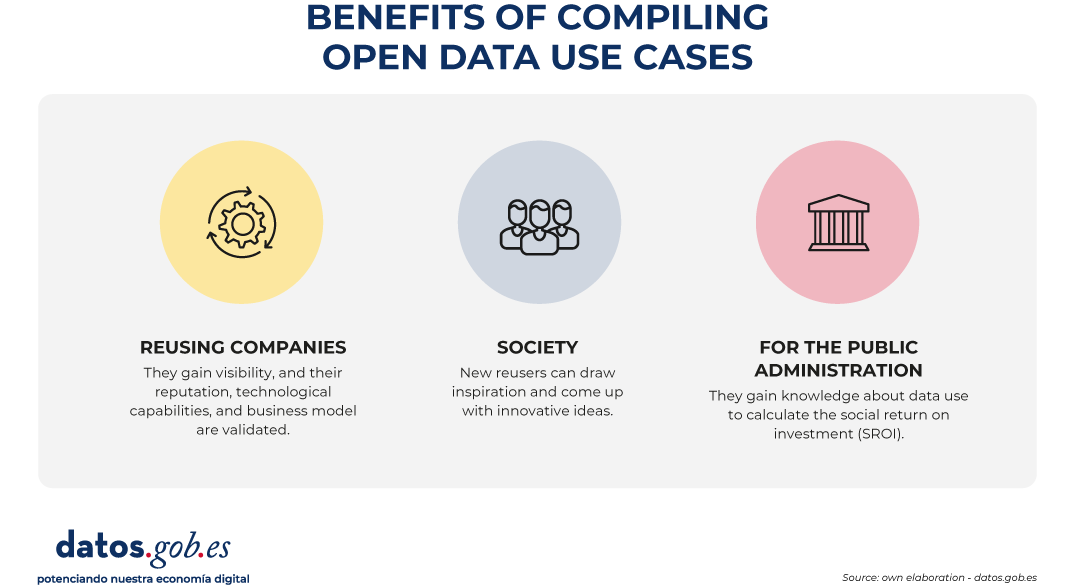
Figure 1. Benefits of compiling open data use cases. Source: own elaboration - datos.gob.es.
Three ways to nurture the repository continuously
Locating companies with open data-driven business models and specific use cases may seem like a complicated task at first, but the secret lies in combining automation with presence in the right forums. To keep the catalog constantly updated, it is recommended to activate three complementary ways:
- Proactive listening: it consists of constantly monitoring social networks, the technological media, the lists of companies from associations in the sector (such as ASEDIE), as well as the winners of hackathons and innovation awards.
- Reactive channels: in parallel to the proactive search, it is necessary to maintain a permanent and visible communication channel on the web portal. It is usual to have a simple form so that the companies themselves can apply autonomously. Disseminating this communication channel through the various means of the initiative (such as social networks, periodic newsletters, etc.) is essential to guarantee the growth of the catalog of use cases.
- Ecosystem alliances: another good option is to collaborate closely with business associations, universities, startup incubators and technology parks, which are usually the main dynamizers and birthplaces of these reuse companies.
How to choose the companies and cases to categorize?
In order for the collection of use cases to be a reference tool and maintain a high standard of quality, it is necessary to apply objective filtering criteria. It is recommended to prioritize projects under the following premises:
- Significant use of public data: the business model or solution must be based totally or partially on the reuse of datasets of public origin (local, regional, national or European), with a positive emphasis on the hybridization of different data sources (data mashup).
- Social or economic impact and relevance: priority will be given to those companies and solutions that solve real problems of citizens or the productive sectors (for example, optimisation of urban mobility, health diagnostic tools, energy efficiency or financial transparency).
- Maturity and viability: companies that offer applications, platforms or services that are already operational in the market or, at least, that have a tested and functional Minimum Viable Product (MVP) should be considered. It is advisable to avoid ideas or projects in a purely conceptual phase. These initial solutions can be showcased in the data competitions organised by various bodies, such as the Junta de Castilla y León or the Cabildo de Tenerife, among others.
- Quality and functionality: technological solutions must have a correct design and technical operation, with an optimal user experience. The goal is to ensure that the reuse of the data translates into a truly efficient and robust service for your target audience.
- Sectoral diversity: it is important to seek a thematic balance to demonstrate that open data is transversal. The repository or catalogue should reflect cases in sectors as diverse as agriculture, tourism, culture or education.
What information should be included about each use case?
In order for the use case sheets to be homogeneous, comparable and useful for portal users, the collection of information must be structured in a homogeneous way. Some of the basic pillars to include are:
- Reuser profile: name of the company, organization or person that has implemented the business model or developed the solution. In the case of companies, you can include their year of foundation, size, sector of activity, link to their corporate website, etc.
- Description of the business model/solution: name of the products or services, problems it solves, description of its functionality, target audience to which it is directed, etc.
- Open data sources used: explicit detail of the datasets consumed, including their source of origin (e.g. "Meteorological data from the State Meteorological Agency - AEMET"). This directly helps connect supply with demand for data.
- Impact obtained: Quantitative or qualitative indicators of the benefit generated for both the company and the reuser (time savings, emission reduction, turnover, jobs created, etc.).
Examples of use case catalogs
To inspire the design of your own repository or to understand how these methodologies are reflected in the real environment, it is useful to analyse how different public administrations are implementing them.
In the case of datos.gob.es, we have two different sections, one for companies and the other for applications. Both sections allow you to filter by sector of activity or tags, and also include a free text search engine, so that users can more easily find the use cases that correspond to their needs.
At the regional and local level, there are also many bodies that have decided to include a specific section on their platforms that shows the potential use of the published datasets. This is the case of the Junta de Andalucía, the Basque Government or the Madrid City Council.
If we look at Europe, our neighbours also have this functionality in their open data platforms. National initiatives such as those of France or Lithuania, which occupy the top positions in open data maturity according to Open Data Maturity 2025, also have this type of showcase.
Conclusion: moving from published data to shared value
Measuring the impact of open data is critical to ensuring the long-term sustainability of open data initiatives. Without a clear methodology for capturing and structuring success stories, portals risk becoming mere warehouses of inert digital files.
By making real examples of the usefulness of open data available to the public, the Administration not only justifies public investment in this area, but also gives back to society the knowledge necessary to continue innovating.
Documentación
Introduction
In 2018, the company Uber created a tool to visualize geospatial information and to be able to graphically represent thousands of location points, as well as trajectories in a wide time range. This tool became public domain under the name KeplerGL and, today, it is available as open source for easy mapping.
KeplerGL allows you to represent georeferenced information in a web interface without the need to use tools such as ArcGIS or QGIS, or any other software that requires installation on the computer or complex updates.
KeplerGL offers a wide variety of representation shapes, from conventional dots or rectangles to hexagonal binning or heat map clustering forms, to more sophisticated mesh systems such as H3.
The entire range of graphic elements comes with a very complete series of customization options, both in size and color through to value ranges. The background cartography itself that is used to reference the information we want to visualize also has a whole catalog of options, including light and dark backgrounds or satellite images of the visible spectrum.
In this exercise we will visualise georeferenced information related to the seismic activity of the eruption of the La Palma volcano around September 2021. This information was reflected in various ways in several infographics in the state media, where the epicentres of the earthquakes were geolocated taking the island of La Palma as a reference. In Figure 1 we see the same type of map, in which circles are superimposed on a background cartography, and where the radius of the circles is proportional to the seismic activity. In this exercise we will learn how to make maps similar in content and style quickly and intuitively thanks to KeplerGL.
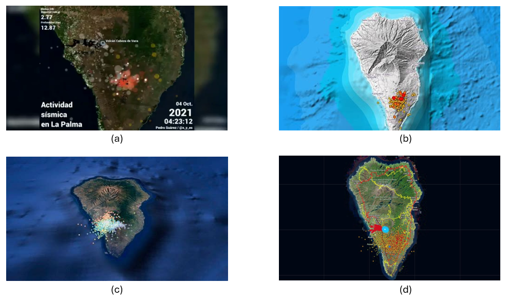
Figure 1: Map shown in various media with the epicentres of seismic activity prior to the eruption of the La Palma volcano. (a) Antena3, (b) Telemadrid, (c) La Vanguardia and (d) ElDiario.es
To create the seismic activity map, we have two options depending on the level of detail and processing we want to perform:
- The first option is to use the data downloaded directly from the data portal as it is. The Dataset section provides a link to a .CSV file containing all the data needed to create the map and complete the exercise without programming or writing code.
- The second option is to process and filter the data using Python if we want to familiarize ourselves with a few simple lines of code and select variables or time intervals of interest. Access to the GitHub repository and the Google Colab notebook for reading, selecting variables, and applying filtering criteria to obtain a subset of data can be obtained through the following links:
Access the GoogleColab notebook
Dataset
In this exercise we are going to use open data from the Cabildo Insular de La Palma collected during the seismic activity before and after the volcanic eruption on La Palma in 2021, and which are available here:
https://datos.gob.es/es/catalogo/l03380010-terremotos
In this dataset we find the record of each of the points where seismic activity was detected during those days, as well as, among others, the following metrics that characterize their geological properties:
| Metrica | Descripción |
|---|---|
| ID | Identifier associated with each event |
| Datetime | Date and time of each event |
| ErrTime | Error associated with registration time |
| RMS | Root Mean Square Spread Time |
| Latitude | Latitude coordinate in degrees |
| Longitude | Longitude coordinate in degrees |
| Az | Azimuth degree |
| Depth | Event Depth in Kilometers |
| ErrDepth | Error associated with depth measurement |
| Nsta | Number of stations used to measure the event |
| Gap | Greater azimuth difference between adjacent stations |
| Author | Body responsible for measurement |
| Magnitud | Seismic magnitude of the event |
| IntensMax | Maximum intensity of the event |
| Localización | Location |
| TipoMagnit | Type of magnitude |
| XUTM | Longitude coordinate in the UTM system |
| YUTM | Latitude coordinate in the UTM system |
| GlobalID | Event ID |
For the creation of the map we will focus on the variable associated with seismic activity: magnitude, as well as the longitude and latitude of each point and the date and time of each event.
Development Process
1. Access to the web interface
As we mentioned in the introduction, KeplerGL does not need to be installed on the computer, but can be accessed through the Internet to its interface. Therefore, the first thing we will do is open a browser and access the KeplerGL website through the domain:
Once on the home page we will click on Get Started to be able to upload the data and start creating our map.
As we can see in Figure 2, KeplerGL includes other options, such as accessing data that is stored in a database or directly querying the Github code, especially useful for developers or for integrating KeplerGL into other applications. However, in this case we will focus on the simplest option: uploading our data directly to the interface.
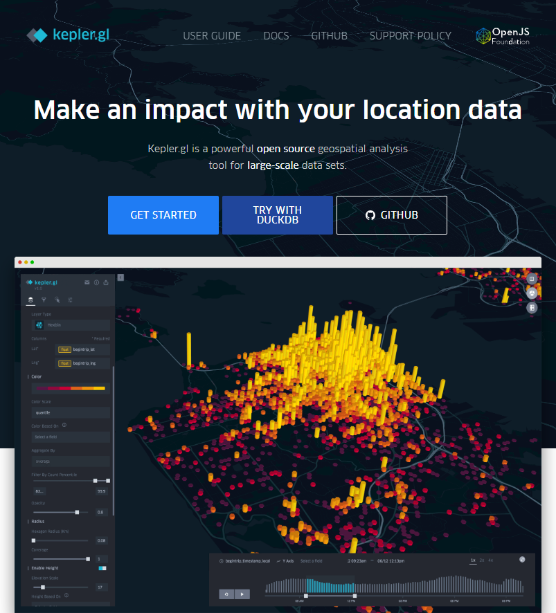
Figure 2: KeplerGL main screen where we are offered an example of visualization, as well as the option to start the process of creating our map.
2. Loading data on the page
On the data upload page we have the usual dialog box to be able to upload our data. As we can see in Figure 3, KeplerGL accepts different formats:
- CSV: the traditional format with values, usually separated by commas.
- JSON: alternative to CSV with structured entries in list and object format
- GeoJSON: Geometric shapes structured like a JSON.
- Arrow: Column-structured data for the Apache Arrow application.
- Parquet: Column format for large amounts of data.
At this point, we will upload the data we obtained directly from the portal or the filtered data we created using the Python code in the Github repository and the Google Collab notebook. Both options are valid for creating the maps.
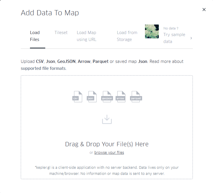
Figure 3: Dialog box for uploading files, either by selecting them from the computer or by dragging them directly into the browser.
3. Visualization
KeplerGL allows us to represent geographic information through various elements, such as points, grids, hexagon distributions, heat maps, as well as project all these shapes in three dimensions. Figure 4 details the different types of visualization possible that the tool offers.
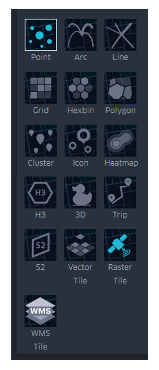
Figure 4: Options for displaying georeferenced information, including points, trajectories, lines, boxes, hexagons, polygons, clusters, icons, heatmaps, H3 cells, three-dimensional, trips, S2 cells, vector, and rasters.
Below we see in detail the characteristics of the visualization forms that we can explore with this dataset.
3.1 Dots
Within the points we can parameterize the following variables: spot color, dot edge, additional magnitude associated with radius, radius dimensions, tags, tooltip with information, interaction between overlays or transparency.
In Figure 5 we can see the direct application of the representation by points. KeplerGL identifies both latitude and longitude automatically to place each of the points on the plane. From there draw a circle with a certain radius and assign a color depending on the intensity of the magnitude.
In the control panel on the left, you can control both the radius of the circles and the color palette, and apply the options you like best to represent the intensity. Being able to play with both parameters would allow us to add another axis of information to the visualization. In this case, for simplicity's sake, we leave this representation as it is, exploring only the color and size.
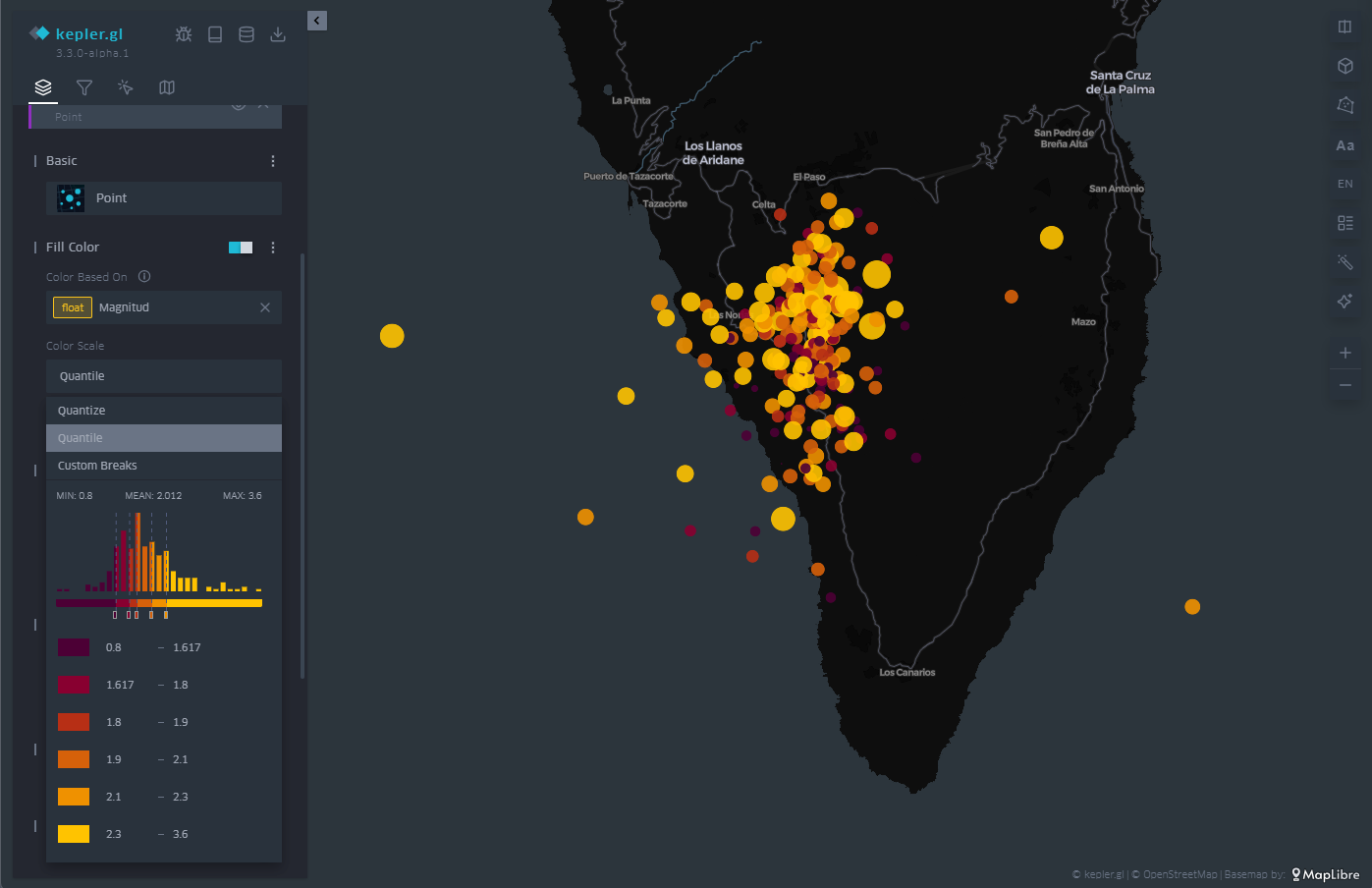
Figure 5: Map with the earthquakes on the island of La Palma represented by points. The color is proportional to the magnitude of the earthquake and the radius remains constant.
3.2 Grid
In the same way that KeplerGL identifies latitude and longitude to place circles, it is also able to average magnitude values in cells. These cells can encompass one or more points, and KeplerGL assigns a color that represents their value based on the average value, as we see in Figure 6.
As with dots, the dialog box on the left allows you to change the color palette, increase or decrease the size of cells to average over larger or smaller areas. Likewise, the scale of values on which the assignment of each of the colors of the scale is based is also subject to customization, depending on the range of values that we want to highlight in the visualization.
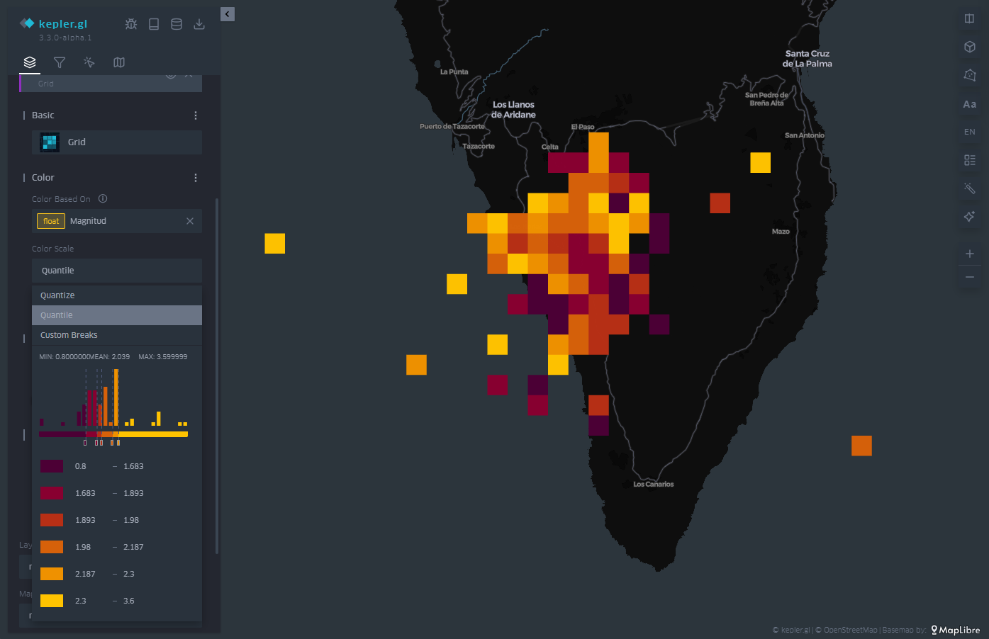
Figure 6: Map with the earthquakes on the island of La Palma represented by a mesh. The color is proportional to the magnitude of the earthquake.
3.3 Hexbin
Similar to the cell mesh, hexbin is an acronym for hexagonal binning, i.e., averaging values over hexagon-shaped cells. Unlike rectangular cells, hexagon-shaped cell packing responds to more compact structures, similar to those that can be observed in the organization of particles or atoms in the formation of solid-state structures.
The hexbin has the same properties that we have seen in the case of the cell mesh, that is, we can change the size of the hexagonal cell so that it occupies a larger surface area on average, we can also change the color palette and also the range of values on which each color interval acts. An example of hexagonal binning is found in Figure 7.
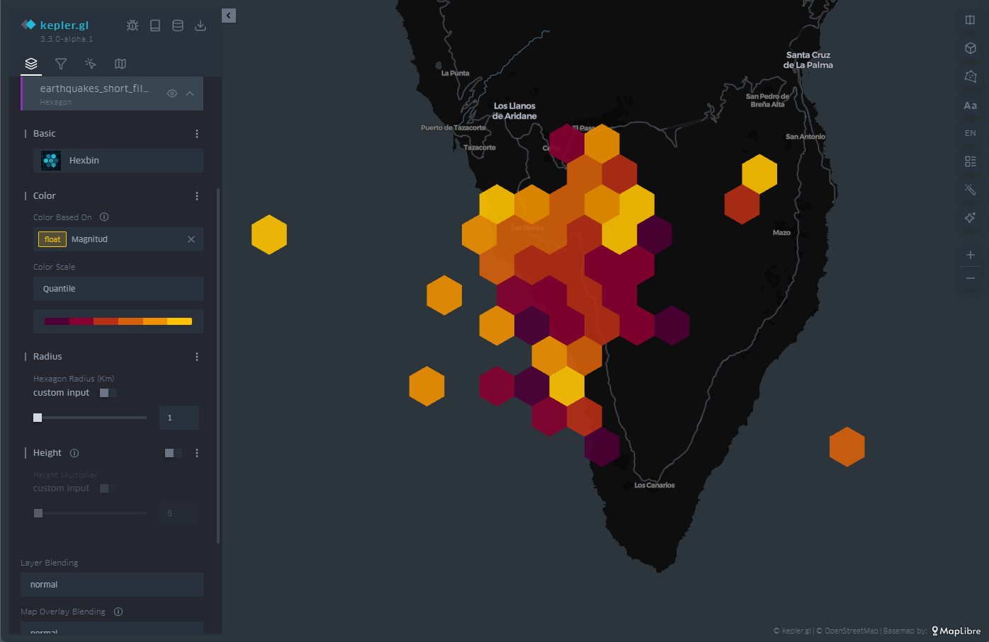
Figure 7: Map with the earthquakes on the island of La Palma represented by hexagons. The color is proportional to the magnitude of the earthquake and the hexagon adds the points that cover its extension.
3.4 Heatmap
The last of the representations that we will see on the map is the heat map. The heatmap is nothing more than a contour diagram, where each contour corresponds to a certain range of values. At the moment when the number of contour lines is very high, we get that feeling of continuity that evokes the heat map.
In this case, both the chosen color palette with its number of levels and the radius over which the values are averaged are customizable through the options in the menu on the left. In Figure 8 we have an example, where the density of events emerges naturally with this type of representation.
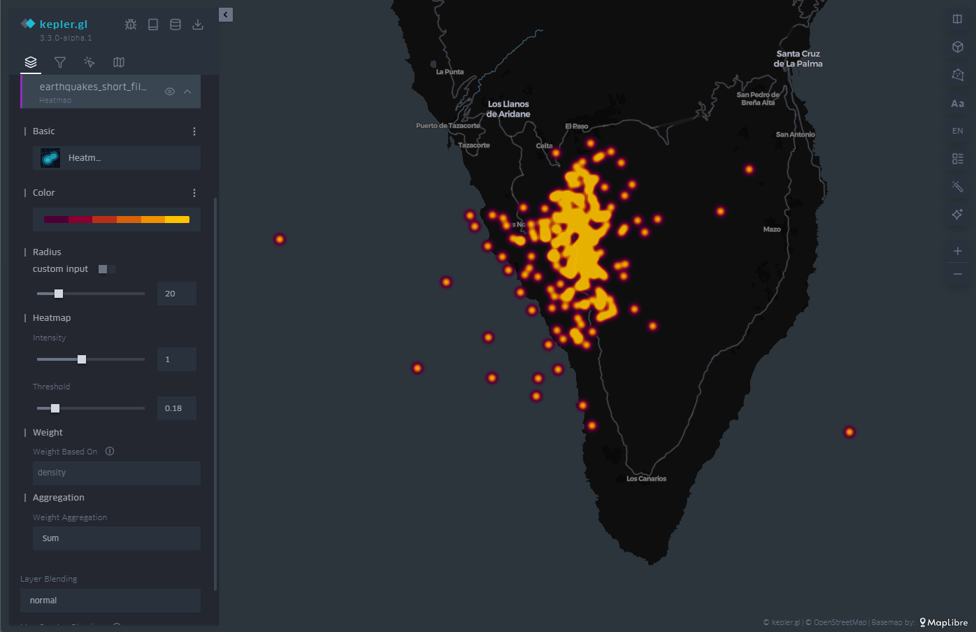
Figure 8: Map with the earthquakes on the island of La Palma represented by a heat map. The color is proportional to the density of seismic events.
3.5 Three-dimensionality
Finally, in geographical representation we have the possibility of using the z-axis, or vertical axis, to add or redound information in that dimension. To do this, we have the option called "Height" in the menu on the left. The "Height" option applies to both circles and cell meshes, where it affects the polygon that defines each of the cells.
In this way, we project another magnitude of our choice onto the vertical, which complements the magnitude already represented by the color of the cells or circles on the plane, as illustrated in Figure 9.
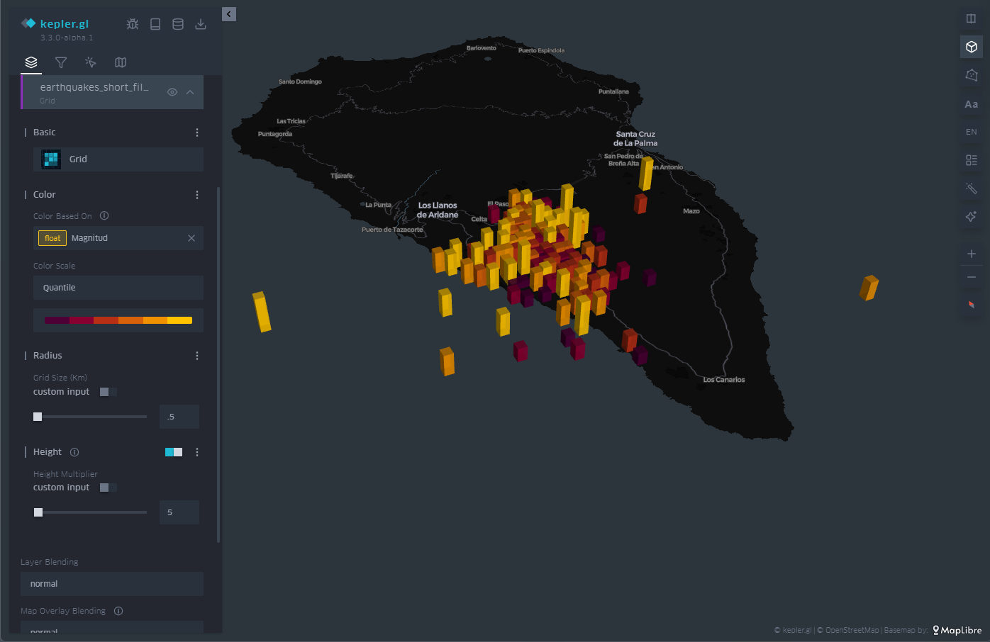
Figure 9: Map with the earthquakes on the island of La Palma represented by rectangles. The height and color is proportional to the magnitude of the earthquake.
3.6 Time Filter
As you can see in Figure 10, in the upper left menu we find a very useful tool such as the time filter. When, as in this case, we have temporal information about the events, through the date field, we can use that information axis to filter the information we want to represent and focus on those days or times of greatest interest for our analysis and visualization project.
The filter tool allows you to choose the magnitude on which we are going to make the filtered selection. Once chosen, a histogram is displayed at the bottom in which we can see at a glance the distribution of the number of dots that correspond to each date. In Figure 10 we can see the histogram at the bottom.
This tool allows you to not only select a day but also a time slot. Sliding that time interval along the histogram allows us not only to see a certain period of interest, but also to make an animation that automatically moves that time interval throughout the entire time series.
This feature makes this filter a very attractive option to be able to create in seconds what is known as storytelling, that is, an easy and very intuitive animation.
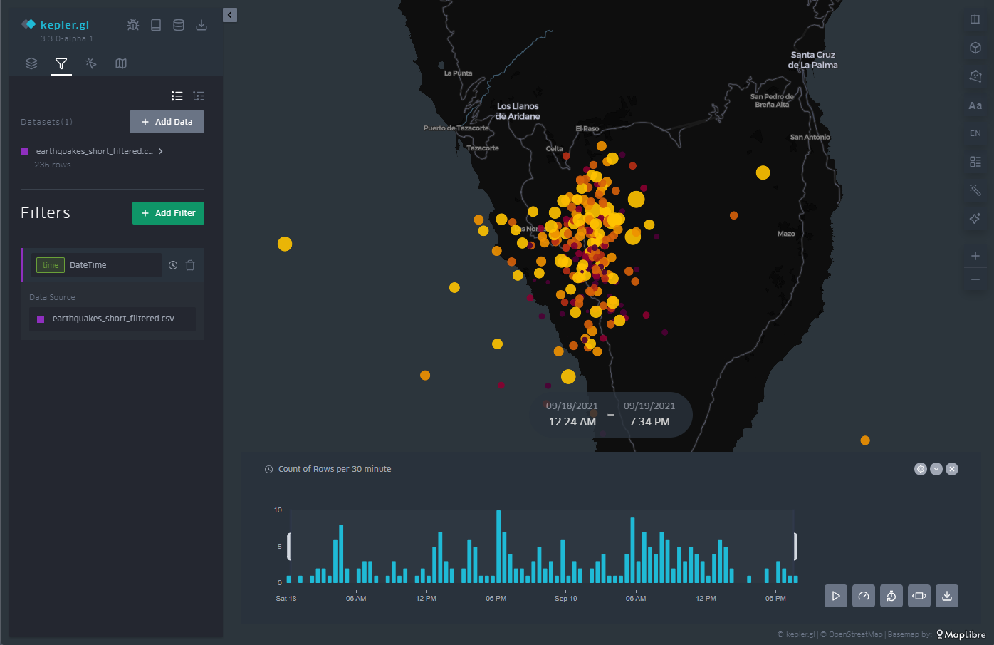
Figure 10: Maps with the earthquakes on the island of La Palma through points with a temporal filter applied to the entire data sequence at the bottom. The half-height interval in the histogram specifies the temporal length.
As an example of animation we can see in Figure 11 a video showing the filter tool and how the window we define goes through the histogram. This animation focuses on the days before and after the volcano's eruption on September 19, 2021, as well as all the seismic activity that followed the volcano's eruption well into 2022.
Access the KeplerGL earquake activity motion map
Figure 11: Sequence of seismic activity detected before, during and after the volcanic eruption on the island of La Palma around September 2021.
3.7 Legend
As illustrated in Figure 12, in the menu on the right we have different options, such as arranging the cartographic projection in three dimensions or, in the lower right corner, activating the appearance of a legend.
The legend is associated with the variable that we have chosen to represent the points, in this case, the magnitude. The ranges are predefined according to the ranges that we defined when we created the ranges in the color scale of the points.
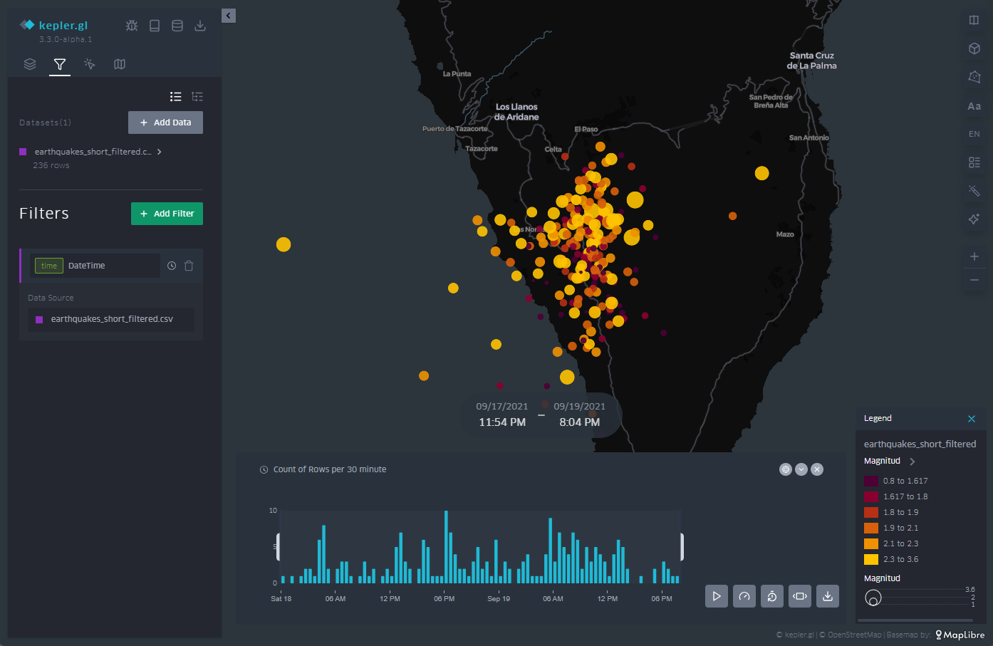
Figure 12: Legend of the color code and values used for the point representation, in line with our interval definitions in the point representation configuration.
3.8 Background Mapping
Depending on the event we represent on the map, it is convenient to use different types of background cartographies for a better understanding of the message that we are trying to convey through the visualization. Depending on the audience and context, the information provided by the background map can be more or less useful. If, as in this case, we only want to transmit geological information, its relevance is less. If, on the other hand, we also want to describe civil infrastructures that may be affected by earthquakes, it will be necessary to incorporate a basic cartography.
In this way, KeplerGL also offers a whole series of background cartographies, mainly divided into two families: those with a dark background and those with a light background. Here it is worth remembering that the human eye perceives small details better on a dark background, and interprets large shapes better on a light background. In the case of earthquakes and the scale at which we are representing them, it is advisable to use a dark background, as we will be able to discern distances and details more accurately.
To select the different background maps, go to the icon at the top of the left panel, and from the drop-down menu you can choose the one that suits you best. Figure 13 shows the different types of maps.
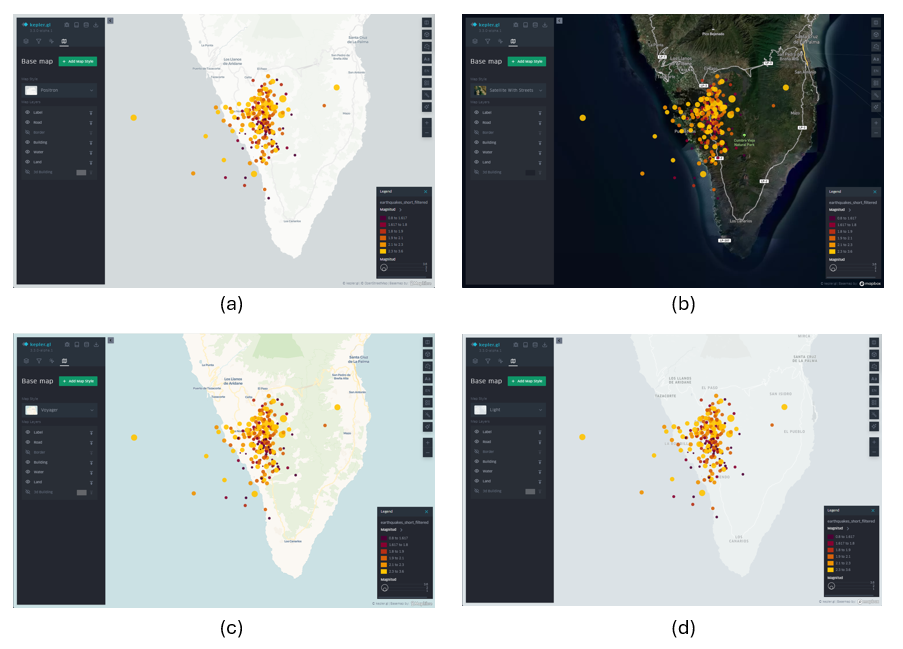
Figure 13: Different background cartographies in KeplerGL for the representation of seismic activity on the island of La Palma in September 2021: Positron (a), Satellite (b), Voyager (c) and Light (d).
4. Export the map
Finally, once we have made our map, we can export the result through the download icon located at the top of the menu on the left. Once that icon is selected, we can save the map as an image.
The options offered are: the size by the ratio of the image with respect to its horizontal and vertical dimensions, the resolution linked to that ratio that we have selected and the option to incorporate a legend in the output image, as shown in Figure 14.
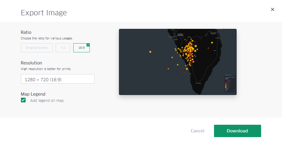
Figure 14: Dialog box to export the map as an image. Note the selection of the box to show the legend, as well as the selection of a panoramic format with space to incorporate infographic elements into other content later.
Additionally, there is the possibility of sharing the map with all its interactivity through registration in Dropbox or Carto, if the intention is to disseminate the map through other channels beyond a static image.
Lessons learned
In this exercise we have learned how to create a map in a simple and intuitive way with the help of KeplerGL. Specifically, we have learned to:
- Upload a file through the KeplerGL web interface.
- Represent georeferenced information in different ways.
- Learn how to use a temporal filter on the data series and create an animation for dissemination as a video.
- Add a legend and handle the values that that legend reflects.
- Customize each of the ways of visualization in detail.
- Export the resulting map with a certain degree of customization.
Conclusions and next steps
The world of cartography has always needed prior knowledge about projections, reference systems, georeferenced data formats and above all the installation of specific software to create maps. Thanks to the development of web products, one of these projects allows us to create maps in a very simple way and can be a very powerful tool when it comes to creating maps without the need for much prior knowledge and with a high degree of customization.
From this point on, more sophisticated tools can be explored that require either general knowledge or programming knowledge to be able to make maps with Leaflet or with D3.js, depending on the audience and the application in which we want to frame the map.
Areas of Application
The creation of simple maps has many fields of application, since cartography in general turns out to be one of the clearest and most popular forms of visualization thanks to its use since the origin of civilization. Proposed areas include:
- Journalism newsrooms: reacting to specific events such as natural disasters or large databases of georeferenced events can be easier thanks to tools such as KeplerGL.
- Corporations: Location of volumes associated with specific points of geography can be read intuitively with the creation of maps that can summarize large amounts of data.
- Applications: Integrating maps within applications often helps both the information and interactivity layers to explore the performance and outcome of a product at different scales.
Blog
Can an algorithm anticipate a flood or help a farmer better irrigate their crops? The answer is yes, and there are eight teams in Latin America that are already proving it.
Climate change is not a problem of the future. It is a reality that today displaces families, destroys crops, collapses infrastructures and puts biodiversity at risk. Faced with this scenario, technology and, specifically, the combination of open data and artificial intelligence are a powerful tool to build smarter, faster and more effective solutions.
In this post we want to present eight projects selected within the framework of the Open Data and AI Innovation Challenge (Data2AIChallenge), an initiative promoted by the Open Data Charter (ODC) with the support of the Patrick J. McGovern Foundation and the governments of Colombia and Uruguay. These eight teams have been chosen from all the proposals received to receive six months of specialized mentoring with which to bring their ideas to reality.
What is Data2AIChallenge?
The Data2AIChallenge is a regional call focused on climate action that seeks to support the development of projects that reuse open public data and apply artificial intelligence to respond to specific environmental challenges in Colombia and Uruguay.
Its objectives are:
- Encourage citizen participation.
- Promote ethical and innovative uses of AI and open data.
- To make visible solutions with real impact.
The call accepted proposals from students, developers, journalists, activists and researchers. A multidisciplinary jury (made up of specialists in open government, climate change and digital transformation from institutions such as the Development Bank of Latin America, the Agency for Electronic Government and the Information and Knowledge Society of Uruguay and the Ministry of ICT of Colombia) evaluated the proposals according to criteria of innovation, relevance and methodological rigor.
Of these, eight projects were selected that demonstrate that open data can be a lever for change in the environmental sector.
The eight selected projects
1. Alerta Yí: early warnings of floods with citizen science
The Yí River basin, in Uruguay, is an area recurrently affected by floods. The Alerta Yí team proposes a participatory early warning system that integrates open data, artificial intelligence models and citizen science. The aim is both to anticipate risk and to build community resilience, i.e. for communities themselves to be an active part of the surveillance and response system.
This type of hybrid approach between technology and citizen participation is especially valuable in contexts where institutional resources are limited and local knowledge is essential.
2. Minga Abierta: community mapping to prevent risks in Medellín
-
The slopes of Medellín (Colombia) concentrate popular neighborhoods with high exposure to landslides and floods. The Pluriverse Narrative Collective, responsible for the Minga Abierta project, combines community cartography, citizen science and predictive models to anticipate climate risks.
The name of the project is no coincidence: "minga" is a word of Quechua origin that refers to collective work. The proposal understands that data without community is not enough, and that risk prevention is also an act of social organization.
3. AgroClima Platform: smart irrigation prescriptions for family farming
Water stress directly threatens the food security of small producers in the Municipality of Magdalena (Colombia). AgroClima Platform uses artificial intelligence and open-access satellite data to generate accurate irrigation prescriptions tailored to each plot.
This is a very clear example of the democratizing potential of open data. Because climate information that was previously only available to large agro-industrial farms can now be put at the service of family farmers who most need to adapt to climate change.
4. Robo-Threat: AI to open environmental files
How many environmental impact assessment processes are buried in dense and inaccessible documents? Roboto Threat applies generative AI to transform these files into open data that can be audited, understandable and reusable by any citizen.
This project defends a fundamental premise: transparency is not just about publishing data, but about making that data understandable and actionable. When citizens can understand what the environmental files say, accountability becomes real. It should be noted that Amenaza Roboto already has a previous trajectory: it was the winning team in a previous challenge organized by the ODC itself in Uruguay in 2022.
5. Urban Light: light pollution maps to protect biodiversity
-
Light pollution is one of the least obvious forms of pollution, but with documented effects on biodiversity, the circadian cycles of animals and plants, and also on human health. Luz Urbana uses big data and artificial intelligence to cross-reference satellite images with urban data and generate maps of light pollution in Uruguay.
The project represents an innovative use of open geospatial data to address an environmental problem that is routinely left out of local political agendas.
6. Recyclables Observatory: climate decisions based on waste data
How to compare the climate impact of different waste management policies? The Recyclables Observatory project, promoted by CEMPRE Uruguay, answers these questions by applying open data, IPCC methodology and artificial intelligence to measure the climate impact of recycling decisions on a territorial scale.
The value of this proposal lies in transforming scattered data on waste into comparable and actionable indicators that can guide evidence-based public policies.
7. Slope Guardians: Actionable weather alerts against landslides
-
Colombia is one of the countries in the world with the highest incidence of landslides. Guardianes de la Ladera transforms open geospatial data into local climate alerts, using artificial intelligence to anticipate landslides with traceable evidence and communicate them in a way that can guide concrete decisions at the community level.
The proposal focuses on a classic problem of warning systems: the gap between general forecasts and local decisions.
8. BIO-AI: Data Journalism to Defend the Amazon
The Amazonian piedmont in Caquetá (Colombia) is home to a wealth of endemic species threatened by deforestation and habitat loss. BIO-AI combines artificial intelligence and data journalism to build conservation-oriented audiovisual experiences. The proposal understands that in order for scientific data to reach the public, they must be converted into stories that people can understand and that mobilize wills.
In a context where the Amazon continues to be subject to political disputes and economic pressures, projects like this show that knowledge, when communicated well, can be a tool for territorial defense.
What do these projects teach us?
Beyond their particularities, the eight selected projects share a series of features that are worth highlighting:
- Open data is the infrastructure for climate action. Without free access to satellite, climate, geospatial or waste data, none of these projects would be possible. The opening of public data allows citizen innovation to flourish.
- AI is a tool, not a magic bullet. All these teams use artificial intelligence at the service of a specific problem, with real data and clear objectives. But AI is not the idea itself, but a tool to obtain better results.
- Citizen participation amplifies impact. Several of these projects integrate citizen science and community mapping. This not only improves the quality of the data; it also generates local ownership of solutions.
- Open data reduces gaps. Family farmers, hillside communities, flood zone dwellers: the selected projects put the most sophisticated tools at the service of those who need them most.
Conclusion: When Open Data Becomes Action
The eight projects of the Data2AIChallenge are a practical demonstration that the opening of public data, combined with artificial intelligence and citizen engagement, can generate concrete solutions to real climate problems. From the slopes of Medellín to the Amazonian foothills, from the fields of Magdalena to the illuminated nights of Uruguay, these initiatives show that change does not always come from large institutions or millionaire budgets: sometimes it is born from small teams, with good questions, access to open data and a willingness to transform their environment.
The challenge now is to continue expanding the availability, quality and usability of public climate data, and to accompany those who want to use it to build a more resilient world. Because open data is the starting point for everything that is to come.
Documentación
Introduction
In recent years, we have seen how generative artificial intelligence has ceased to be a technical curiosity and has become an everyday tool in the workflow of data professionals. However, an important question remains: how does this technology translate into a real process of open data analysis?What changes in practice when an analyst works "alongside" a language model rather than alone?
This post documents a practical exercise carried out with data published on the datos.gob.es portal: the price analysis of the more than 11,000 service stations in Spain. Unlike other exercises published in this space, the analysis has not been carried out manually line by line, but has been carried out in an agentic environment: a conversational interface supported by a large language model (LLM) and a coding system assisted by artificial intelligence. In practice, this means that instead of writing the analysis code ourselves, we describe to the system in natural language what we want to obtain, and it implements it.
The objective of this post is twofold. On the one hand, to explain the analysis itself: what questions we ask ourselves about the data, what technical problems we find and what conclusions we draw. On the other hand, to reflect on the method: how an analysis process is structured when working with an AI co-pilot, what interaction patterns work best, and where the limits of automated assistance are.
Methodological note: to carry out this exercise we have used a Spec Driven Development (SDD) methodology, which guides the AI through a structured process with the aim of preventing the conversation from losing the focus of the exercise. The detailed explanation of this methodology is beyond the scope of this post, but the reader will find in the repository specifications, technical plans and checklists that document it.
Accesses the GoogleColab notebook
Accesses the GoogleColab notebook
In this video, the author explains what you will find on both Github and Google Colab.
The process: a classic, AI-assisted flow
Before entering into each phase, it is useful to describe the general outline of the work. The analysis follows five common stages in data science—ingestion, cleansing, exploration, variable engineering, and impact analysis—but introducing a conversational pattern with AI in each of them.
That pattern can be summarized in five steps:
- Describe the problem in natural language.
- Propose a first solution (AI does it).
- Question the assumptions of that proposal (the human analyst does it).
- Refine the solution until it is robust.
- Document the pattern for reuse in future projects.
Below, we will see, phase by phase, how this pattern materializes in the analysis of fuel prices. Each section begins by explaining the conceptual challenge, continues to describe how we approach the resolution with the assistance of AI, and ends by showing the resulting code and lessons learned.
Phase 1: Robust data ingestion from a public API
The challenge: public APIs that don't always respond as expected
Notice to reader: This phase goes into some technical detail about API integration, SSL errors, and backup strategies. If your profile is more analytical than developmental, you can skim through the code block and focus on the Approach and Reflection sections, where the underlying idea—how to design fault-tolerant ingestion—is explained without going into implementation details.
Downloading data from the API of the Ministry for Ecological Transition is conceptually simple: an HTTP GET request to a known endpoint should return a JSON file with approximately 11,000 service stations. In practice, however, public APIs present common difficulties that any analyst ends up encountering sooner or later:
- Expired or misconfigured SSL certificates, which cause SSLError errors.
- Blocking of IPs from cloud servers (Google Colab, AWS, etc.), interpreted as suspicious traffic.
- Unstable servers, with variable response times and sporadic timeouts.
- Inconsistencies in documentation, for example, when a JSON response is described but the server returns XML.
The key question is: how do we design an intake system that tolerates these problems rather than failing at the first hurdle?
The Approach: A Tiered Backup Architecture
In software engineering, critical systems don't depend on a single component. When one channel fails, there is a fallback channel. Applying this logic to data ingestion is especially useful when working with public sources over which we have no control.
For this exercise, we designed a three-pronged strategy:
- First attempt — requests with permissive configuration: we make the HTTP request with the standard Python library, but configuring a User-Agent that simulates a real browser and disabling SSL verification. This solves a good part of the certificate problems.
- Second attempt — curl from shell: If requests fails, we invoke curl as a thread. The reason is that curl uses a different TLS stack than Python and does not send the same certificates, which allows certain types of blocking to be circumvented.
- Third attempt — demo data: if all else fails, we generate a synthetic set of 11,000 service stations with realistic distributions. This ensures that the notebook is always executable in an educational context, even if the API is down.
The basic reasoning is simple: each method circumvents a different type of network failure, and their combination provides robustness. Below, we show the code that implements this architecture.
The resulting code
The following excerpt illustrates how the three levels of support materialize into a single function. The try/except clauses allow the failure of each method to be detected and automatically moved to the next one:
def descargar_datos_api(url):
   """
   Download data with triple backup:
    1. requests with verify=False (circumvents SSL issues)
    2. curl -k (alternate TLS stack)
    3. Synthetic data (performance guarantee)
   """
    # Attempt 1: Requests with browser headers
    Try:
        sesion = requests. Session()
       sesion.headers.update({
           "User-Agent": "Mozilla/5.0 (Windows NT 10.0; Win64; x64)"
        })
        response = sesion.get(url, timeout=45, verify=False)
       return response.json()
   except Exception as e_requests:
       print(f"[Respaldo 1] requests ha fallado: {e_requests}")

    # Attempt 2: curl as thread
    Try:
       resultado = subprocess.run(
           ["curl", "-s", "-k", url],
           capture_output=True, timeout=45, text=True
        )
        return json.loads(resultado.stdout)
   except Exception as e_curl:
       print(f"[Backup 2] curl has failed: {e_curl}")

    # Attempt 3: Demo Synthetic Data
    print("[Backup 3] Using demo data")
   return generar_datos_demo_gasolineras(11000)
Reflection: where AI adds value in this phase
Iteration with AI didn't produce the previous code in one attempt. The actual process was more interesting: we posed the problem ("the API sometimes rejects requests, I need backups"), the AI proposed an initial solution, and the breakthrough came from questioning that proposal. The question "why should curl work if requests has already failed?" forced the model to explain the differences between the two TLS stacks, which in turn allowed us to validate that the solution had real technical merit, it wasn't just "try the same thing twice".
A reasonable estimate: Solving this problem through pure trial and error would have taken about two to three hours of debugging. With assisted iteration, we tackle it in about thirty minutes.
Phase 2: Cleaning with domain knowledge
The challenge: real data is never perfect
Once the data is downloaded, the least visible but most decisive work of any analysis begins: cleaning and preparation. The quality of the final result depends to a large extent on the care put into this stage. In the case of fuels, the most common inconsistencies are:
- Non-standard textual variants: The trademark "MOEVE" may appear as "MOEVE", "Moeve" or "moeve" in different registers. To a person they are obviously the same brand, but in an aggregation by groupby they appear as three separate categories.
- Incorrect geographical coordinates: points located outside Spanish territory (remote islands, fragments of Morocco, capture errors).
- Inconsistent decimal separators: Prices coded as "1.349" with a comma, which require explicit conversion before you can trade them.
- Conversions that introduce null values: pd.to_numeric(..., errors='coerce') is very useful, but it generates silent NaN that can break subsequent analyses.
The central question of this phase is: how do we translate human domain knowledge into code rules?
The approach: validation organized in layers
Instead of cleaning up "as it happens," it's a good idea to organize validation rules into layers, each with a clear responsibility:
|
Layer |
Liability |
Example |
|---|---|---|
| Types | Conversion and coercion at appropriate rates | Price as float, date as datetime |
| Ranks | Values within reasonable limits | Price between €0.5 and €3.0 per litre |
| Semantics | Domain consistency | Coordinates within Spain, standardised marks |
Figure 1. Validation table organised by layers. Source: own elaboration - datos.gob.es
The question that each layer must answer is always the same: does this value make sense in the context of Spanish service stations? The novelty compared to a manual flow is that here we describe the rules to the AI in natural language and let it translate them into panda code. We retain the responsibility of defining what is valid and what is not.
The resulting code
The next block implements the three validation layers sequentially. It should be noted that the list of brand aliases (CEPSA → MOEVE) reflects specific business knowledge – the rebranding of CEPSA to MOEVE in 2023 – that AI could not infer on its own; it is information provided by the analyst. This is a very clear example of the contribution of human knowledge that is difficult to achieve by AI:
def validar_y_limpiar_carburantes(df):
    # Layer 1: Type Normalization
   df['price'] = (
       df['precio'].astype(str)
                    .str.replace(',', '.')
                    .astype(float)
    )
    df['March'] = df['March'].str.upper().str.strip()

    # Layer 2: Rank Validation
    df = df[(df['price'] >= 0.5) & (df['price'] <= 3.0)]
    df = df[
       (df['latitude'] >= 27.5) & (df['latitude'] <= 43.8) &
       (df['longitude'] >= -18.2) & (df['longitude'] <= 4.4)
    ]

    # Layer 3: Semantic coherence (business knowledge)
   aliases = {'CEPSA': 'MOEVE'}   # Rebranding 2023
   df['tag'] = df['tag'].map(lambda x: aliases.get(x, x))

    # Null audit
    null = df[['price', 'latitude', 'longitude', 'mark']].isnull().sum()
    if nulos.sum() > 0:
       print(f"Attention: null values have been detected:\n{null}")

   return df.dropna(subset=['price', 'latitude', 'longitude'])
Reflection: the division of work between AI and the analyst
This phase is especially revealing of the type of collaboration that AI enables. The more technical rules (type conversion, null detection, capitalization normalization) are practically automatic: just describe the problem and the model proposes a correct implementation. On the other hand, the rules that depend on the domain (that the Canary Islands have a logistics cost overrun of 5%, that CEPSA and MOEVE are the same brand after the merger, that a price of less than €0.5 is probably a loading error) must be specified by the human analyst.
The lesson learned is important: the quality of cleanliness depends directly on the domain knowledge that the analyst provides. AI speeds up deployment, but it doesn't invent context. That's why the reusable pattern is the same in any project: describe your domain in detail, let the AI write the validations, and verify yourself that the results are consistent.
Phase 3: Visual Exploratory Analysis (EDA)
The challenge: turning numbers into intuitions
With 11,000 clean records already in memory, the next step is to answer the business questions that prompted the analysis. In this case, we ask four specific questions:
- Which provinces have the most expensive fuels?
- Is there a relationship between geographical location (latitude and longitude) and price?
- Are there significant differences between brands?
- How are prices distributed (mean, median, outliers)?
The technical challenge is not complex – pandas and matplotlib solve any of these questions – but the methodological challenge is: choosing the right visualization for each question. A poorly chosen chart can hide as much as an incorrect aggregation.
The approach: each question determines its graph
In exploratory analysis there is a natural correspondence between the type of question and the most appropriate visualization. It is worth keeping this in mind before writing a single line of code:
|
Question |
Proper Visualization |
Reason |
|---|---|---|
| Ranking? | Neat bar chart | Allows you to compare ordered values |
| Spatial relationship? | Scatter with color scale | Shows correlation in two dimensions |
| Distribution and atypical? | Box plot | Reveals median, quartiles and outliers |
| Differences between groups? | Box plot o violin plot | Compare distributions simultaneously |
Figure 2. Table showing the natural correspondence between question type and the most appropriate visualisation. Source: own elaboration - datos.gob.es
The goal is not to produce flashy graphics, but graphics that answer specific questions. This is a seemingly obvious idea, but it's worth remembering: in practice, it's common for viewings to be generated by inertia, without being clear about what you want to show.
The resulting code
Below, we show one of the graphs as an example, the price ranking by province. The structure is always the same: statement of the graphic, aesthetic configuration, and a brief comment interpreting the result:
# Question 1: Which provinces are the most expensive?
top_provincias = (
   df.groupby('province')['price']
     .mean()
     .sort_values(ascending=False)
     .head(12)
)

fig, ax = plt.subplots(figsize=(12, 6))
top_provincias.plot(kind='bar', ax=ax, color='steelblue')
ax.set_title('Average fuel price by province (Top 12)',
            fontsize=14, fontweight='bold')
ax.set_ylabel('Price (€/litre)')
ax.set_xlabel('Province')
plt.xticks(rotation=45, ha='right')
plt.tight_layout()
plt.show()

# Finding: the three most expensive provinces are island or coastal
# (Balearic Islands, Canary Islands, Tarragona). Hypothesis: the logistics cost
# and the distance from distribution hubs raise the price.
In the case of the geographic scatter, we apply additional segmentation – mainland, Balearic and Canary Islands – to simultaneously visualize location and insularity. This segmentation revealed a pattern that no numerical aggregation had clearly shown: island stations have systematically higher prices, a finding probably attributable to shipping costs. Insight did not emerge from a calculation, but from visualization.
Reflection: The AI blind spot
This phase highlights an important limitation of the model: the AI does not see the graphical result. You can suggest the right type of visualization, write the code correctly, and propose a color palette, but you can't judge whether the axis scale is appropriate, whether the dot density saturates the graphic, or whether the labels overlap. All these validations remain the responsibility of humans.
In practice, this means that the EDA phase is the one that requires the most iteration between person and machine: the AI writes, the analyst observes, identifies a visual problem ("this axis does not show the variation well"), and describes the correction ("sets the Y-axis to [precio_min0.95, precio_max1.05]"). The reusable pattern is clear: a clear question, a suitable chart type, and human visual validation.
Phase 4: Feature engineering
The challenge: capturing variation with new variables
Exploratory analysis identifies patterns, but rarely explains them. To understand what factors influence the price , it is necessary to construct new variables (features) that capture specific hypotheses about market dynamics. In this exercise we formulate three hypotheses:
- Temporary: Does the day of the week influence the price? Is it more expensive to refuel at the weekend?
- Geographical: Does the distance to an economic hub (in this case, Madrid) have an influence?
- Regional: Are there structural differences between the north, centre and south of Spain?
Variable engineering consists precisely of translating these hypotheses into calculated columns that the rest of the analysis can use.
The approach: every variable, a testable story
A good variable should tell a clear story. It is not enough to calculate a number: you have to be able to explain what question you are trying to answer. In our case:
- es_fin_semana (0/1): Does the price change on Saturday and Sunday?
- distancia_a_madrid (km): Does fuel become more expensive when moving away from the logistics hub?
- Region (North/Central/South): Are there structural gaps between regions?
Each of these three variables is, in reality, an empirical question disguised as a column. If the variable does not explain anything when we cross it with the price, we simply discard it.
The resulting code
We implemented all three variables into a single function. The most technically interesting is the distance to Madrid, which requires Haversine's formula to calculate distances on the Earth's surface taking into account the curvature of the planet:
from math import radians, cos, sin, asin, sqrt

def crear_features_carburantes(df):
    # Temporal variable
    df['es_fin_semana'] = (
        df['fecha'].dt.dayofweek.isin([5, 6]).astype(int)
    )

    # Geographic variable: distance haversine to Madrid
   madrid_lat, madrid_lon = 40.4168, -3.7038
    def haversine(lat, lon):
       lat, lon = radians(lat), radians(lon)
       m_lat, m_lon = radians(madrid_lat), radians(madrid_lon)
       chisel = years - m_lat
       dlon = lon - m_lon
        a = sin(dlat/2)**2 + cos(m_lat) * cos(lat) * sin(dlon/2)**2
        return 6371 * 2 * asin(sqrt(a)) # radius of the Earth in km
    df['distancia_a_madrid'] = df.apply(
        Lambda R: haversine(r['latitude'], r['longitude']), axis=1
    )

    # Variable regional
    def region(lat):
       if lat >= 42:   return 'Norte'
       if lat >= 39:   return 'Centro'
       return 'On'
   df['region'] = df['latitud'].apply(region)

   return df
Reflection: proposing variables with argument, not just code
At this stage, AI provides particularly high value, but not in what you might think at first glance. What is really useful is not that he writes Haversine's formula – any technical reference contains it – but that he proposes candidate variables with argumentation behind them. When we asked "what features could capture the price variation?", the proposal was accompanied by reasoning: Madrid was suggested as a hub because it is the most efficient and stable market, and therefore deviations from its price work as an approximation to logistical friction.
That reasoning is what is valuable: not the formula, but the justification. Pure trial-and-error would have taken three or four hours exploring variables to find the useful ones; With assisted iteration, we arrive at a reasoned set in about forty-five minutes.
Phase 5: Analysis of the impact of the variables
The challenge: quantifying the real contribution
Building variables is one thing; Showing that they really explain something is another. In this last phase of the analysis, we evaluated the effective impact of each of the three variables created, combining two approaches: a numerical measure (correlation or difference in means) and a visual representation that allows us to interpret the result at a glance.
The approach: two complementary approaches
For each variable, we calculate:
- A numerical measure that quantifies the effect (Pearson correlation for continuous variables; mean difference for categorical variables).
- A visual representation that allows the magnitude of the effect to be interpreted and non-linear relationships to be detected.
The crossing of both approaches is what gives reliability to the result. A high correlation without a visualization to support it can be misleading (e.g., if it is dominated by outliers); A suggestive visualization without metrics can lead to overinterpretation.
The resulting code
As an example, we show the impact analysis of the distance to Madrid. First we calculate the correlation, then we segment it into quartiles to make the relationship visually interpretable:
# Numerical Measurement
correlation = df['distancia_a_madrid'].corr(df['price'])
print(f"Correlation (distance to Madrid → price): {correlation:.3f}")

# Visual representation by distance quartiles
df['cuartil_distancia'] = pd.qcut(
   df['distancia_a_madrid'], q=4,
   labels=['Q1 (near)', 'Q2', 'Q3', 'Q4 (far)']
)
precio_por_cuartil = df.groupby('cuartil_distancia')['precio'].mean()

fig, ax = plt.subplots(figsize=(10, 5))
precio_por_cuartil.plot(kind='bar', ax=ax, color='#2ecc71')
ax.set_title ('Geographical impact: average price per quartile distance to Madrid')
ax.set_ylabel('Average price (€/litre)')
plt.xticks(rotation=0)
plt.tight_layout()
plt.show()
The emerging pattern of the complete analysis – comparing the three variables – is that the distance to Madrid is the most explanatory, followed by the region, and finally by the weekend effect, which in our study period turns out to be marginal. Together, the three variables explain approximately 60-70% of the price variation; The rest depends on factors such as the specific brand, the type of season (highway, urban, rural) and specific market events.
Reflection: not all variables have the same impact
One of the virtues of this structured analysis is that it reveals which of our initial hypotheses hold and which do not. In this case, the temporal (weekend) hypothesis turned out to be much weaker than expected, while the geographical hypothesis was clearly confirmed. Without this quantification step, we would have been able to continue assuming that all variables provide valuable information.
Synthesis: the technical lessons we take away
Throughout the five previous phases we have been accumulating solutions to specific problems. The following table summarizes the most reusable; Each is documented in greater detail in the repository's Prompts directory:
|
Phase |
Problem |
Solution |
Reusable in |
|---|---|---|---|
| Intake | SSL or IP blocks in APIs | Triple respaldo: requests → curl → demo | Any public API |
| Intake | Inconsistent documentation | Structure validation + error handling | Government APIs |
| Cleaning | Textual variants in trademarks | .str.upper().str.strip() before grouping | Any categorical aggregation |
| Cleaning | Coordinates outside Spain | Bounding box [27.5–43.8, −18.2–4.4] | Geographical analyses in Spain |
| Cleaning | Compressed ranges in graphs | ax.set_xlim(min*0.95, max*1.05) | Viewing with narrow ranges |
| EDA | Choosing a chart type | Explicit Mapping Question → Graph | Any EDA |
| Features | Unjustified variables | Each feature responds to a testable hypothesis | Feature engineering in general |
| Analysis | Unquantified impact | Metric + side-by-side display | Any impact analysis |
Figure 3. Summary table of solutions to specific problems. Source: own elaboration - datos.gob.es
Final Thought: What Makes AI a Good Co-Pilot
At the end of the exercise, we can draw some general conclusions about the use of generative AI to support data analysis. We divide them into two levels: where it adds value, and where it should not replace human judgment.
Where AI clearly adds value:
- Rapid iteration. The cycle "describe problem – get solution – validate" is reduced from hours to minutes. This qualitatively changes the work dynamic: it allows us to test ideas that we would otherwise discard because of cost.
- Lateral thinking. AI proposes alternatives that an analyst might overlook, such as the idea of using curl when requests fail. It does not always get it right, but it does expand the space of solutions considered.
- Articulated documentation. AI is especially good at explaining the why of a technical decision, not just the what. This makes it easier for the resulting code to be readable by non-technical people.
Where human judgment is still essential:
- Domain knowledge. The AI does not know that CEPSA and MOEVE are the same brand, nor that the Canary Islands have a structural logistical cost overrun. That information must be provided by the analyst.
- Statistical validation. AI can suggest models, but the statistical validity of the analysis is a human responsibility.
- Reading graphs. The AI doesn't see its own visualizations. The judgment on whether a graphic is legible, communicates what is intended and respects good visual practices is still human.
- Business decisions. What to ask of the data, what to consider relevant, how to communicate the results to the organization: these are decisions that AI can support, but not replace.
In short, the idea that best sums up our experience is this: generative AI works better when it thinks with us than when it thinks for us. The exercise we present here was not to "ask Claude to do the analysis", but to have a structured conversation in which the AI proposed, the analyst questioned, the AI refined, and the analyst validated. The result of that conversation is a more robust, better documented, and more reusable analysis than we would have produced alone.
How to take advantage of this repository
The full code, prompts, and documentation are available in the project's public repository. Different profiles can take advantage of it in different ways:
- If you study data analysis: open the notebook directly in Google Colab and go through each cell in order. For each visualization, please refer to the corresponding prompt in prompts/visualization/.
- If you work as a data scientist: Check out specs/001-fuels-ia/plan.md, where architectural decisions and lessons learned are documented. Prompts/ snippets are reusable as is in other projects.
- If you're interested in prompt engineering methodology: the "describe – question – refine – validate" pattern is documented on a case-by-case basis throughout the prompts. It is replicable in any domain: finance, health, marketing, or any open data analytics.
Conclusion
The exercise we have presented shows that generative AI, used judiciously, can significantly accelerate the analysis of open data without sacrificing methodological rigor. The five phases covered – ingestion, cleaning, exploration, variable engineering and impact analysis – remain the same as in a traditional flow, but the work dynamic changes: we go from writing code to describing intentions and validating results.
The total time spent was approximately forty hours, compared to the one hundred and twenty that would have required equivalent development without AI assistance. But more important than the time savings is the quality of the resulting product: a documented, reproducible analysis accompanied by a library of reusable prompts.
Generative AI doesn't relieve us of analytical responsibility, but it does allow us to spend more time on what really matters: asking the right questions, judiciously validating results, and communicating conclusions clearly. In short, to do better data science.
Content created by Alejandro Alija, an expert in digital transformation and innovation. The content and views expressed in this publication are the sole responsibility of the author.
Documentación
One of the biggest challenges of the open data ecosystem is its dissemination and the recognition of its value by society. Knowing their existence and understanding what they are for amplifies their impact. In an environment where algorithms are increasingly present in everyday life, data literacy has become a necessary civic skill. Civil rights are increasingly expressed in a digital key and, in this context, digital rights emerge as an essential frame of reference to ensure that technological transformation leaves no one behind. Added to this is the rise of artificial intelligence, which amplifies the value of data, but also the risks derived from its biased or non-transparent use.
Incorporating data literacy into educational curricula from an early age is key to overcoming these challenges, as it provides students with technical knowledge and tools to participate in society in an informed way. The V National Open Data Meeting held in Pamplona on 8 May focused precisely on the role of data in the education sector under the slogan "Learn and undertake". The challenge of this edition has been EDUCA-DATA, a resource that brings open data to the classroom in a practical and accessible way, showing its value in understanding reality and generating opportunities.
What does the annual challenge of the National Open Data Meeting consist of?
The National Open Data Meeting poses a different challenge every year, in which experts from different fields work together to find solutions. The challenge is proposed by the organization and volunteers related to the field of data, linked to the academic world and the public administration, collaborate throughout the year to respond to the challenge. The conclusions are presented during the annual event and all the documentation generated is public.
What is EDUCA-DATA?
Data is a citizen tool to understand and transform the world. EDUCA-DATA is an educational project that facilitates learning about the use and reuse of public open data. It seeks to strengthen digital skills, critical thinking and promote the culture of open knowledge.
EDUCA-DATA is mainly aimed at students and teachers of Compulsory Secondary Education, Baccalaureate and Vocational Training, but also at citizens in general. The educational material allows students to work on open data concepts in the classroom, contains resources that teachers can use as support in the classroom and makes it easier for anyone interested to learn independently about this topic.
During the approach to this challenge, three coordinated and complementary documentary pieces have been prepared, without it being necessary to consult all three to understand the complete content. The content of each one is detailed below. All the materials are available in section 5 of the EDUCA-DATA challenge, at the bottom of the meeting page.
Presentation of open data, a collection of essential data
The centerpiece of the materials produced is a presentation in PowerPoint format. It is a 65-slide document that allows anyone without prior knowledge to approach open data. This document includes all the content that students will work on in the classroom together with the teachers and articulates the complete didactic sequence, from the introduction to the data to the benefits of its opening.
Theoretical document: concepts, examples and resources to deepen
All the material produced is based on a solid theoretical basis. The technical document develops in greater depth the concepts, definitions and examples that appear in the presentation, and acts as a reference when students or teachers need to delve deeper into a specific point.
With a didactic approach, it traces a path that allows us to understand how open data, correctly processed and published, provides significant value in areas as diverse as investigative journalism, science against climate change or citizen participation. The inclusion of real cases, explained in a clear and accessible way, makes it easier to understand their impact on our daily lives. The document is designed to be read continuously, with a fluid and enjoyable reading, and to be consulted in a timely manner whenever you want to clarify a concept or expand on a specific aspect. In addition, it includes links to external resources for those who wish to delve into the different sections.
A teacher's guide, discovering the power of data
To enable teachers to work in the classroom, an exhaustive teaching guide has been developed, which allows them to manage their work with students autonomously. This document contains the curricular framework, the didactic guidelines and the necessary information for classroom practice. The guide is organized in two parts: the first includes the conceptual framework and the curricular fit, and the second contains the classroom materials.
At the curricular level, the material developed fits mainly into the following subjects: Digitalization, Economics, Geography and History and Mathematics.
The content is developed in five didactic units that allow you to gradually approach open data:
- Introduction. The world of data.
- Open Data. What are they and what defines them?
- The formats. The packaging of information.
- Licenses. The rules of the game.
- The benefits. Why does all this matter?
Figure 1. EDUCA-DATA teaching modules: open data in the classroom. Source: own work – datos.gob.es
In the teaching guide , teachers will find everything they need to be able to teach the five teaching units and their activities autonomously, without the need for prior specific training in open data. That is:
- The conceptual and historical context that frames open data.
- Its fit into the LOMLOE curriculum of several subjects.
- The objectives and contents of each unit.
- The key ideas that should be transferred to the classroom.
- The most common errors and confusions of students.
- Proposals for rapid evaluation.
- References for further information.
The guide covers four areas:
- A conceptual and historical framework that provides teachers with the necessary context about open data. It is information that is not designed to be transferred to the classroom as it is.
- A curricular framework with the assessment of the fit in four subjects (Digitalization, Economics, Geography and History and Mathematics), a reasoned didactic recommendation, cognitive progression according to Bloom's taxonomy and detailed alignment tables with LOMLOE.
- The five didactic units. It is the core of this material and each one follows the same structure to facilitate the work of the teaching staff.
- Two integrating pieces that close the tour, in the form of practical application exercises: an integrative case study presented as a journalistic role-playing game and an advanced practical exercise to work with data.
In addition, a basic glossary and two in-depth studies on the concepts of distribution and licensing are included as transversal contents. The guide is presented as an open proposal that teachers can take as a reference and adapt it to their class, their students and their way of teaching.
Open data in the classroom, a commitment to the citizenship of the future
Bringing open data closer to students in Secondary, Baccalaureate and Vocational Training contributes to forming citizens capable of understanding the digital ecosystem of information, of contrasting what they read with public data and of exercising their right to transparency and participation. For this reason, these educational resources have a great value that goes beyond digital and data literacy, since, in their most civic dimension, they contribute to forming people who are more informed, more critical and better prepared to understand and transform the world in which they live.
Blog
Every time an asthmatic person checks the level of suspended particles before going for a run, or when a city council decides to close a playground due to a pollution episode, there is open data behind that decision. Open environmental and climate data – on air quality, water, biodiversity or extreme events – are no longer the exclusive preserve of scientists and institutions and have become a global civic infrastructure: accessible, reusable and, increasingly, generated by citizens themselves.
The question is no longer whether this data exists. They exist and in unprecedented quantities. The question is: who uses them and for what? This article covers this ecosystem of information, from global platforms to local repositories, including citizen projects that have transformed our environment.
The citizen turn: from consumers to data producers
For decades, environmental data came mainly from state agencies, government satellites, and large laboratories. That panorama began to transform when sensors became cheaper, smartphones became massive, and organized communities understood that measuring their environment was also a way to protect themselves and their surroundings. In this way, the information generated by citizens is added to that of public bodies, expanding and enriching the collective understanding of the environment. Some examples are:
- iNaturalist, the citizen science platform for documenting biodiversity, accumulates more than 200 million observations, made by 3.3 million participants worldwide. Its data, integrated into GBIF (Global Biodiversity Information Facility), is used in conservation research, in monitoring the impacts of climate change and in biodiversity policies in dozens of countries.
- IQAir AirVisual is another global air quality network, with more than 30,000 stations and real-time data from more than 100 countries, including maps, 7-day forecasts, and recommendations for vulnerable groups.
- NASA's GLOBE Observer has been allowing anyone to record observations of clouds, temperature, ground cover and mosquito habitats from their mobile phone since 2016 – a critical indicator for detecting pockets of vector-borne diseases aggravated by global warming.
- Meteoclimatic is a collaborative network of automatic weather stations that share data in real time, focused on the Iberian Peninsula and nearby areas.
These projects show that citizens no longer only consume data: they also produce it, validate it and make it available to the public.
Cases that change policies: from citizen data to public decision
One of the most persistent prejudices about citizen science is that its data is too imprecise to have a real impact or even to be considered science. Several recent projects challenge that argument and are pushing for the belief to change.
The European COMPAIR project, funded by the Horizon Europe programme between 2021 and 2024, deployed citizen air quality sensors in five cities: Athens, Berlin, Flanders, Plovdiv and Sofia. Citizen sensors are low-cost environmental measurement devices (air, noise, temperature, water, etc.) that citizens themselves install, maintain and use to generate open data on their immediate environment. These sensors were installed in neighbourhoods and spaces used by Roma communities, the elderly and schoolchildren. This choice aimed to make visible exposures to risk that are usually off the radar (for example, school routes with heavy traffic or insufficiently monitored peripheral neighborhoods) and to provide additional data that would allow administrations to design measures aimed at those who breathe the most polluted air. In Sofia, for example, the publication of pollution maps at school entrances led to a documented increase in the use of public school transport; a citizen data project that changed collective behavior.
Citizen data, moreover, when it respects methodological and legal conditions, can be admissible before the courts and contribute to policy improvement. It is precisely this type of use that is being developed by the Sensing for Justice (SensJus) project: a Marie Curie initiative – a prestigious European research funding programme – that uses networks of citizen sensors as evidence in environmental litigation and out-of-court mediations, with success stories documented in the United States and Italy.
Projects located in closer contexts
Environmental or climate data activism is not a distant phenomenon. Spain has a growing network of initiatives that take environmental measurement to the scale of the neighbourhood, river and roof.
Smart Citizen, created by the Barcelona Fab Lab of the Institute for Advanced Architecture of Catalonia (IAAC), is one of the world's leading projects in citizen sensing: it combines a low-cost sensor kit – air quality, temperature, humidity, noise, light – with an open real-time data platform. With more than 9,000 registered users and more than 1,900 sensors deployed in more than 40 countries, it demonstrates that citizen environmental monitoring can have a global reach based on a local initiative. SensaCitizens, on the other hand, is a Spanish network of low-cost environmental monitors, with LoRaWAN technology, aimed at generating useful data for local public policies on air quality and urban comfort.
In the field of everyday health, Planttes stands out, an app developed by the Autonomous University of Barcelona that allows citizens to map in real time the allergenic plants in their environment and indicate their phenological state. The result is a street-level allergy risk map that complements the official pollen information.
River surveillance, on the other hand, is manifested in the Cantabria Rivers Project, active since 2008, which involves volunteers who adopt river sections of about 500 meters and carry out biannual inspections to monitor the ecological status of the river. With 282 sections inspected and more than 300 documented actions, its data feeds the Administration's decisions on ecosystem conservation.
In the urban area there are also various initiatives. Vitoria-Gasteiz participated in the European CITI-SENSE project – together with eight other cities, such as Barcelona, Oslo and Vienna – with a specific initiative for the participatory design of public spaces, which combined noise, air quality and thermal comfort sensors. In total, the project generated more than 9.4 million observations in the participating cities.
At the citizen and local level, the recently presented SolData Spain (Universidad Autónoma de Madrid) offers an open-access geoportal to analyse the evolution of solar energy in Spain over almost three decades, by cross-referencing satellite irradiation data with historical meteorological records.
The following chart summarizes the projects mentioned so far:
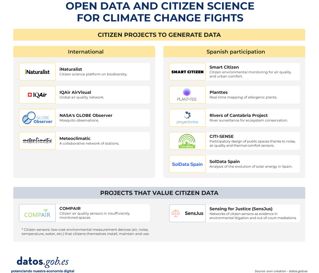
Figure 1. Open data and citizen science for climate and change fights. Source: own elaboration - datos.gob.es
The company is also taking action: climate adaptation with open data
The climate crisis is not only an environmental and social issue, but also an operational risk for businesses. According to the Smart Electric Power Alliance's Utility Transformation Profile report (2023), 62% of the utilities surveyed have developed a public carbon reduction plan (mitigation), but climate adaptation measures remain scarce and rarely quantified. However, we find some examples:
Meteoflow, from Iberdrola, is a weather forecasting platform, recognised by the International Research Centre on Artificial Intelligence (IRCAI) linked to UNESCO, among the best AI projects for sustainability. Its function is to optimise the production of its wind and solar farms by anticipating weather conditions, although it also incorporates alert modules for extreme phenomena that allow it to manage risks. To do this, it uses open-access meteorological information together with its own data, both historical and production in real time.
Another example is dotGIS's Solarmap, which combines open data from cartography (CNIG/INSPIRE), solar radiation (AEMET/Copernicus) and geospatial big data to calculate the profitability per roof of installing solar panels anywhere in Spain.
These are initiatives that have an impact on the operational resilience of companies and a potential benefit for the collective energy system, but whose transformative scope grows when their results transcend the logic of protecting corporate assets to be integrated into shared public infrastructure. In the private sector, data (open or not) can help reduce collective risks—such as avoiding blackouts or anticipating impacts on ecosystems—so its impact is not limited to protecting corporate assets. Its civic potential is multiplied when the results, methodologies and datasets that can be accessed are integrated into data infrastructures shared with other public and social actors.
Where we're headed: three trends redefining security
The landscape of open environmental and climate data is changing, and three trends are on the near horizon.
- From mitigation to adaptation. For years, climate policy focused on reducing emissions. That focus is shifting to adaptation: anticipating risks, reducing vulnerabilities, and protecting communities from irreversible changes. The Basque Country is an example of this turn: the Basque Country Climate Change Strategy 2050 (KLIMA 2050) establishes adaptation as a cross-cutting axis with objectives by sector – health, water, biodiversity, energy – and Vitoria-Gasteiz leads commitments within the framework of the European Mission for Climate Neutral Cities. The leap is also an advance in open data: in addition to measuring and publishing open data on emissions, adaptation strategies are beginning to open and document data on vulnerabilities (heatwaves, floods, public health) and institutional and community response capacities, so that they can be reused by administrations, companies and citizens.
- Citizenship as a civic sentinel. Citizens increasingly act as civic sentinels: they collect, contrast and share environmental data that complement official measurements. When a city's neighborhood detects pollution levels that official stations don't record, or when an indigenous community documents changes in its ecosystem that satellites don't capture, a second layer of information critical to risk management is generated. Projects such as OpenTEK/LICCI of the ICTA-UAB integrate indigenous knowledge from Nepal, Thailand, Vietnam and Latin American countries as scientifically legitimate sources of data on climate variability, and make them available under FAIR and CARE principles, seeking to make them as open and reusable as possible without compromising the sovereignty of the communities that generate them.
- FAIR standards and European data spaces. The European Union promotes the Green Deal Data Space and the AD4GD initiative to integrate open environmental data under FAIR (findable, accessible, interoperable, reusable) standards, which facilitate its combined use by multiple actors. In this framework, the EU's Strategic Foresight Report 2025 identifies the climate transition and security as the two axes that exert the greatest pressure on Europe, and underlines the need for shared data infrastructures based on these principles to respond with resilience.
Open environmental and climate data is not just a technical issue or an aspiration for bureaucratic transparency. They are, increasingly, a condition for communities to be able to anticipate risks, demand responsibilities and make well-informed collective decisions in the face of the greatest challenge. The infrastructure exists. The citizens who use it, too, so we must continue to promote to ensure that its use is universal and equitable.
Appendix: Where is the data? A practical guide to repositories
For anyone who wants to explore, reuse, or combine open environmental and climate data, the ecosystem of repositories is vast and increasingly accessible. Here is a selection organized by scale:
At European level:
- data.europa.eu: European data catalogue, where you can find, among others, data on air, water, biodiversity, climate and energy, with documented use cases
- Copernicus C3S: historical climate data and projections; essential climate variables.
- Copernicus CAMS: real-time air quality and atmospheric composition data.
- ESA CCI Open Data: essential climate variables on glaciers, sea level, greenhouse gases, etc.
- European Environment Agency (EEA): environmental indicators, climate risk maps, biodiversity and water quality.
- INSPIRE : is the central access point for locating, visualizing and accessing geographic information and harmonized spatial data of the member countries of the European Union.
You can find more repositories of interest in this article 10 climate-related public data repositories.
At the state level:
- datos.gob.es: National open data portal with a section on the environment.
- AEMET OpenData: historical climatological series, real-time weather data, REST API, etc.
- MITECO Open Data: data on air, water and emissions quality.
- IDEE Geoportal: geospatial data and national environmental cartography, among others.
Content produced by Miren Gutiérrez, PhD and researcher at the University of Deusto, an expert in data activism, data justice, data literacy and gender-based disinformation. The content and views expressed in this publication are the sole responsibility of the author.