Description
Introduction
In 2018, the company Uber created a tool to visualize geospatial information and to be able to graphically represent thousands of location points, as well as trajectories in a wide time range. This tool became public domain under the name KeplerGL and, today, it is available as open source for easy mapping.
KeplerGL allows you to represent georeferenced information in a web interface without the need to use tools such as ArcGIS or QGIS, or any other software that requires installation on the computer or complex updates.
KeplerGL offers a wide variety of representation shapes, from conventional dots or rectangles to hexagonal binning or heat map clustering forms, to more sophisticated mesh systems such as H3.
The entire range of graphic elements comes with a very complete series of customization options, both in size and color through to value ranges. The background cartography itself that is used to reference the information we want to visualize also has a whole catalog of options, including light and dark backgrounds or satellite images of the visible spectrum.
In this exercise we will visualise georeferenced information related to the seismic activity of the eruption of the La Palma volcano around September 2021. This information was reflected in various ways in several infographics in the state media, where the epicentres of the earthquakes were geolocated taking the island of La Palma as a reference. In Figure 1 we see the same type of map, in which circles are superimposed on a background cartography, and where the radius of the circles is proportional to the seismic activity. In this exercise we will learn how to make maps similar in content and style quickly and intuitively thanks to KeplerGL.
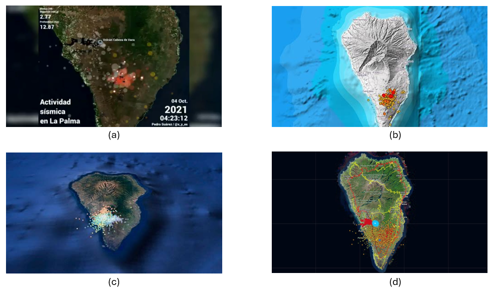
Figure 1: Map shown in various media with the epicentres of seismic activity prior to the eruption of the La Palma volcano. (a) Antena3, (b) Telemadrid, (c) La Vanguardia and (d) ElDiario.es
To create the seismic activity map, we have two options depending on the level of detail and processing we want to perform:
- The first option is to use the data downloaded directly from the data portal as it is. The Dataset section provides a link to a .CSV file containing all the data needed to create the map and complete the exercise without programming or writing code.
- The second option is to process and filter the data using Python if we want to familiarize ourselves with a few simple lines of code and select variables or time intervals of interest. Access to the GitHub repository and the Google Colab notebook for reading, selecting variables, and applying filtering criteria to obtain a subset of data can be obtained through the following links:
Access the GoogleColab notebook
Dataset
In this exercise we are going to use open data from the Cabildo Insular de La Palma collected during the seismic activity before and after the volcanic eruption on La Palma in 2021, and which are available here:
https://datos.gob.es/es/catalogo/l03380010-terremotos
In this dataset we find the record of each of the points where seismic activity was detected during those days, as well as, among others, the following metrics that characterize their geological properties:
| Metrica | Descripción |
|---|---|
| ID | Identifier associated with each event |
| Datetime | Date and time of each event |
| ErrTime | Error associated with registration time |
| RMS | Root Mean Square Spread Time |
| Latitude | Latitude coordinate in degrees |
| Longitude | Longitude coordinate in degrees |
| Az | Azimuth degree |
| Depth | Event Depth in Kilometers |
| ErrDepth | Error associated with depth measurement |
| Nsta | Number of stations used to measure the event |
| Gap | Greater azimuth difference between adjacent stations |
| Author | Body responsible for measurement |
| Magnitud | Seismic magnitude of the event |
| IntensMax | Maximum intensity of the event |
| Localización | Location |
| TipoMagnit | Type of magnitude |
| XUTM | Longitude coordinate in the UTM system |
| YUTM | Latitude coordinate in the UTM system |
| GlobalID | Event ID |
For the creation of the map we will focus on the variable associated with seismic activity: magnitude, as well as the longitude and latitude of each point and the date and time of each event.
Development Process
1. Access to the web interface
As we mentioned in the introduction, KeplerGL does not need to be installed on the computer, but can be accessed through the Internet to its interface. Therefore, the first thing we will do is open a browser and access the KeplerGL website through the domain:
Once on the home page we will click on Get Started to be able to upload the data and start creating our map.
As we can see in Figure 2, KeplerGL includes other options, such as accessing data that is stored in a database or directly querying the Github code, especially useful for developers or for integrating KeplerGL into other applications. However, in this case we will focus on the simplest option: uploading our data directly to the interface.
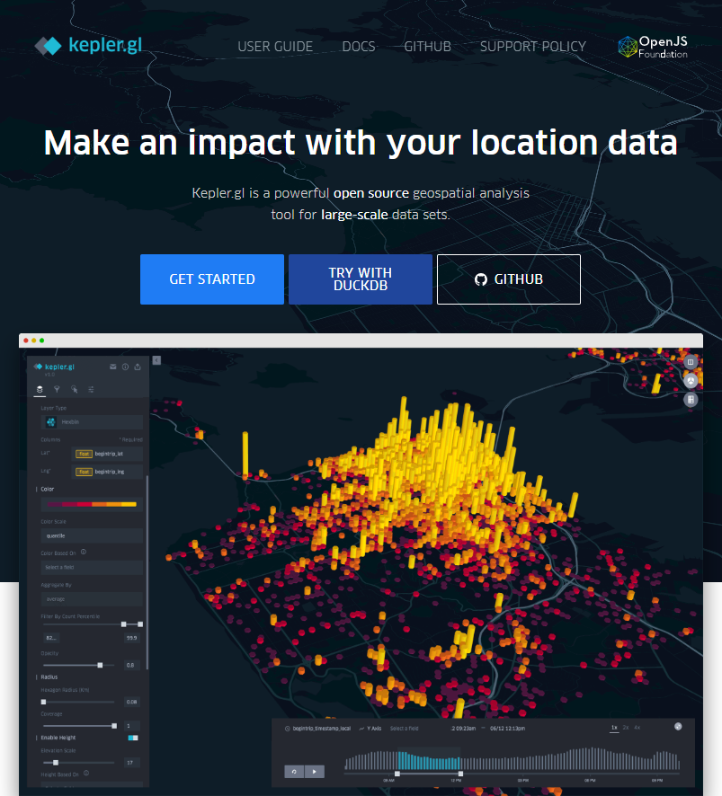
Figure 2: KeplerGL main screen where we are offered an example of visualization, as well as the option to start the process of creating our map.
2. Loading data on the page
On the data upload page we have the usual dialog box to be able to upload our data. As we can see in Figure 3, KeplerGL accepts different formats:
- CSV: the traditional format with values, usually separated by commas.
- JSON: alternative to CSV with structured entries in list and object format
- GeoJSON: Geometric shapes structured like a JSON.
- Arrow: Column-structured data for the Apache Arrow application.
- Parquet: Column format for large amounts of data.
At this point, we will upload the data we obtained directly from the portal or the filtered data we created using the Python code in the Github repository and the Google Collab notebook. Both options are valid for creating the maps.
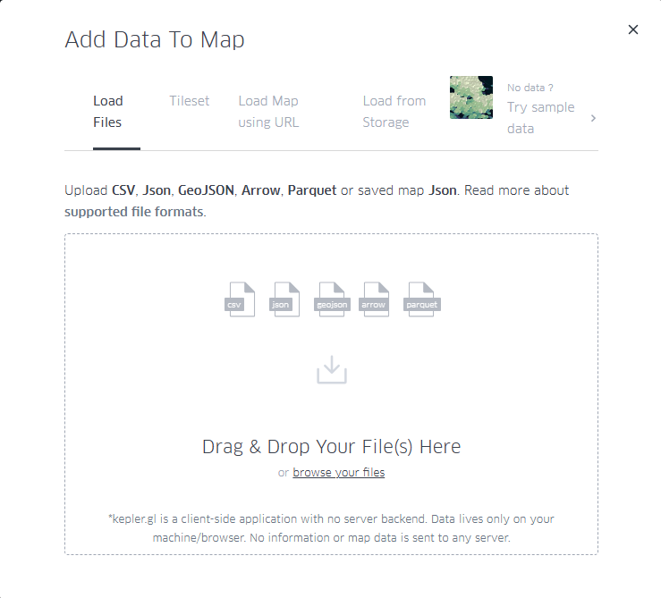
Figure 3: Dialog box for uploading files, either by selecting them from the computer or by dragging them directly into the browser.
3. Visualization
KeplerGL allows us to represent geographic information through various elements, such as points, grids, hexagon distributions, heat maps, as well as project all these shapes in three dimensions. Figure 4 details the different types of visualization possible that the tool offers.
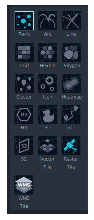
Figure 4: Options for displaying georeferenced information, including points, trajectories, lines, boxes, hexagons, polygons, clusters, icons, heatmaps, H3 cells, three-dimensional, trips, S2 cells, vector, and rasters.
Below we see in detail the characteristics of the visualization forms that we can explore with this dataset.
3.1 Dots
Within the points we can parameterize the following variables: spot color, dot edge, additional magnitude associated with radius, radius dimensions, tags, tooltip with information, interaction between overlays or transparency.
In Figure 5 we can see the direct application of the representation by points. KeplerGL identifies both latitude and longitude automatically to place each of the points on the plane. From there draw a circle with a certain radius and assign a color depending on the intensity of the magnitude.
In the control panel on the left, you can control both the radius of the circles and the color palette, and apply the options you like best to represent the intensity. Being able to play with both parameters would allow us to add another axis of information to the visualization. In this case, for simplicity's sake, we leave this representation as it is, exploring only the color and size.
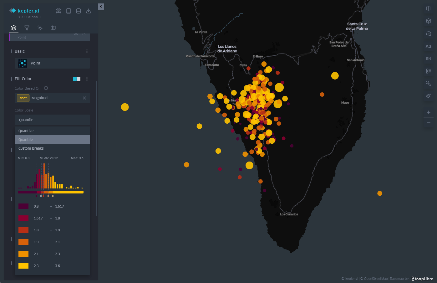
Figure 5: Map with the earthquakes on the island of La Palma represented by points. The color is proportional to the magnitude of the earthquake and the radius remains constant.
3.2 Grid
In the same way that KeplerGL identifies latitude and longitude to place circles, it is also able to average magnitude values in cells. These cells can encompass one or more points, and KeplerGL assigns a color that represents their value based on the average value, as we see in Figure 6.
As with dots, the dialog box on the left allows you to change the color palette, increase or decrease the size of cells to average over larger or smaller areas. Likewise, the scale of values on which the assignment of each of the colors of the scale is based is also subject to customization, depending on the range of values that we want to highlight in the visualization.
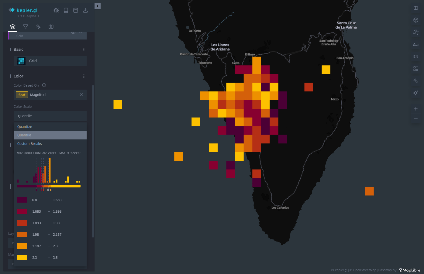
Figure 6: Map with the earthquakes on the island of La Palma represented by a mesh. The color is proportional to the magnitude of the earthquake.
3.3 Hexbin
Similar to the cell mesh, hexbin is an acronym for hexagonal binning, i.e., averaging values over hexagon-shaped cells. Unlike rectangular cells, hexagon-shaped cell packing responds to more compact structures, similar to those that can be observed in the organization of particles or atoms in the formation of solid-state structures.
The hexbin has the same properties that we have seen in the case of the cell mesh, that is, we can change the size of the hexagonal cell so that it occupies a larger surface area on average, we can also change the color palette and also the range of values on which each color interval acts. An example of hexagonal binning is found in Figure 7.
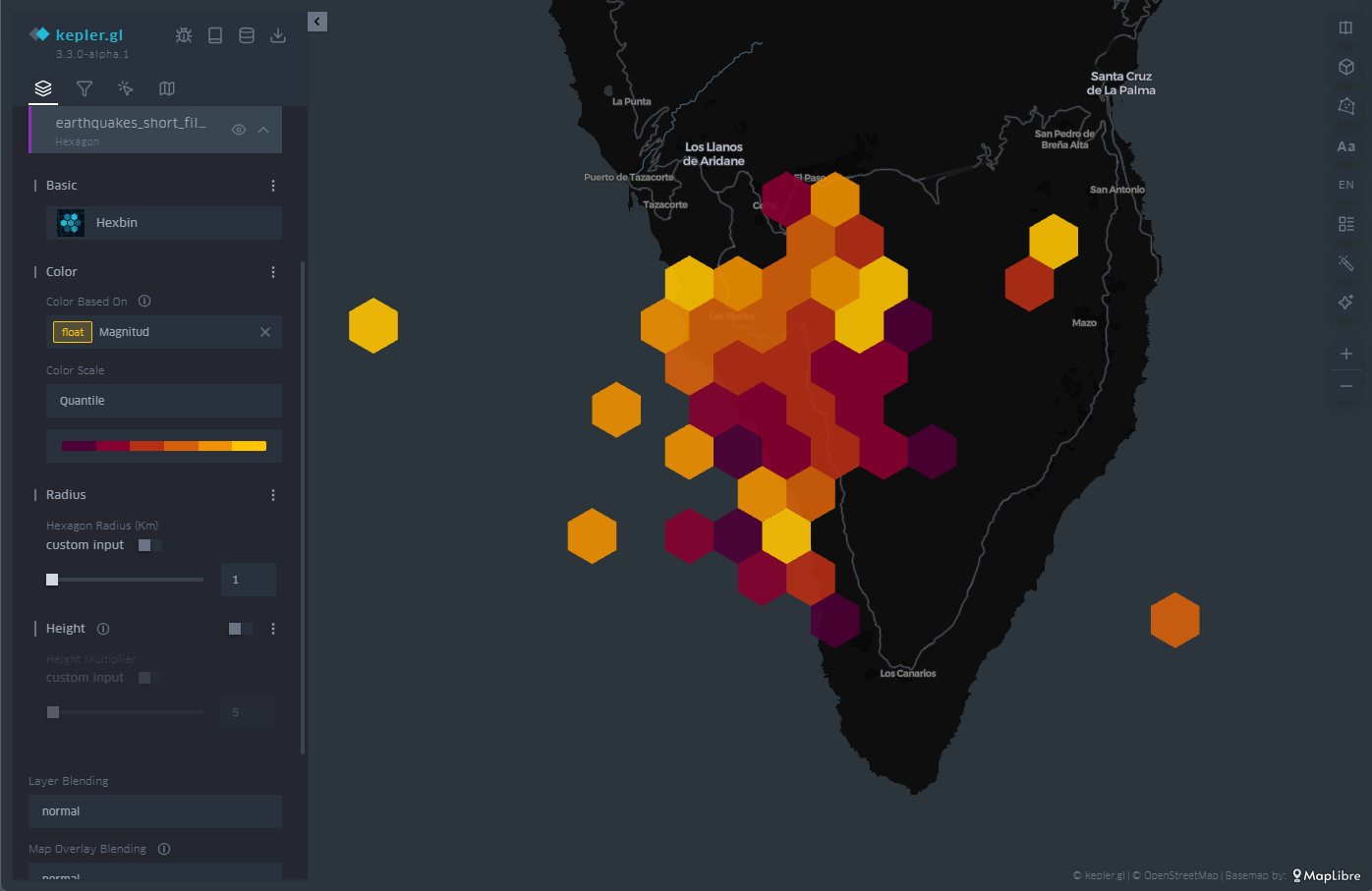
Figure 7: Map with the earthquakes on the island of La Palma represented by hexagons. The color is proportional to the magnitude of the earthquake and the hexagon adds the points that cover its extension.
3.4 Heatmap
The last of the representations that we will see on the map is the heat map. The heatmap is nothing more than a contour diagram, where each contour corresponds to a certain range of values. At the moment when the number of contour lines is very high, we get that feeling of continuity that evokes the heat map.
In this case, both the chosen color palette with its number of levels and the radius over which the values are averaged are customizable through the options in the menu on the left. In Figure 8 we have an example, where the density of events emerges naturally with this type of representation.
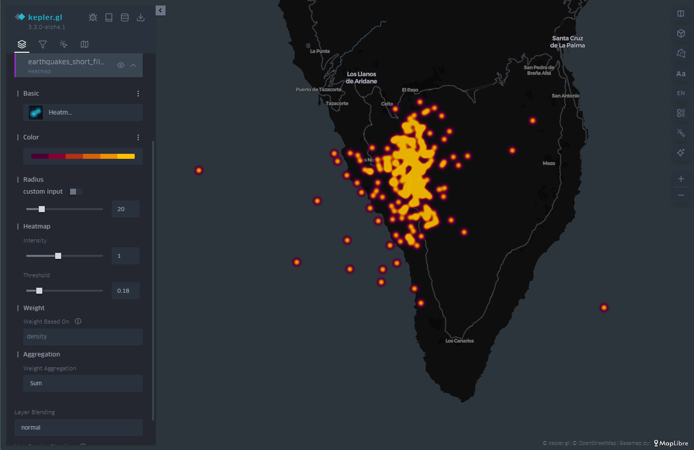
Figure 8: Map with the earthquakes on the island of La Palma represented by a heat map. The color is proportional to the density of seismic events.
3.5 Three-dimensionality
Finally, in geographical representation we have the possibility of using the z-axis, or vertical axis, to add or redound information in that dimension. To do this, we have the option called "Height" in the menu on the left. The "Height" option applies to both circles and cell meshes, where it affects the polygon that defines each of the cells.
In this way, we project another magnitude of our choice onto the vertical, which complements the magnitude already represented by the color of the cells or circles on the plane, as illustrated in Figure 9.
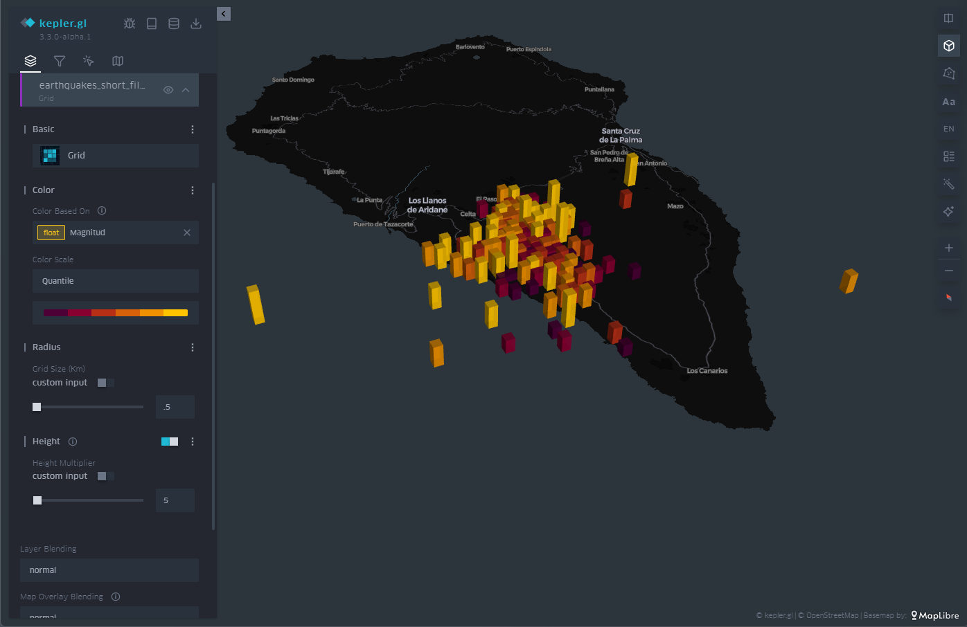
Figure 9: Map with the earthquakes on the island of La Palma represented by rectangles. The height and color is proportional to the magnitude of the earthquake.
3.6 Time Filter
As you can see in Figure 10, in the upper left menu we find a very useful tool such as the time filter. When, as in this case, we have temporal information about the events, through the date field, we can use that information axis to filter the information we want to represent and focus on those days or times of greatest interest for our analysis and visualization project.
The filter tool allows you to choose the magnitude on which we are going to make the filtered selection. Once chosen, a histogram is displayed at the bottom in which we can see at a glance the distribution of the number of dots that correspond to each date. In Figure 10 we can see the histogram at the bottom.
This tool allows you to not only select a day but also a time slot. Sliding that time interval along the histogram allows us not only to see a certain period of interest, but also to make an animation that automatically moves that time interval throughout the entire time series.
This feature makes this filter a very attractive option to be able to create in seconds what is known as storytelling, that is, an easy and very intuitive animation.
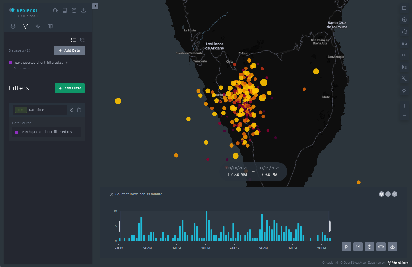
Figure 10: Maps with the earthquakes on the island of La Palma through points with a temporal filter applied to the entire data sequence at the bottom. The half-height interval in the histogram specifies the temporal length.
As an example of animation we can see in Figure 11 a video showing the filter tool and how the window we define goes through the histogram. This animation focuses on the days before and after the volcano's eruption on September 19, 2021, as well as all the seismic activity that followed the volcano's eruption well into 2022.
Access the KeplerGL earquake activity motion map
Figure 11: Sequence of seismic activity detected before, during and after the volcanic eruption on the island of La Palma around September 2021.
3.7 Legend
As illustrated in Figure 12, in the menu on the right we have different options, such as arranging the cartographic projection in three dimensions or, in the lower right corner, activating the appearance of a legend.
The legend is associated with the variable that we have chosen to represent the points, in this case, the magnitude. The ranges are predefined according to the ranges that we defined when we created the ranges in the color scale of the points.
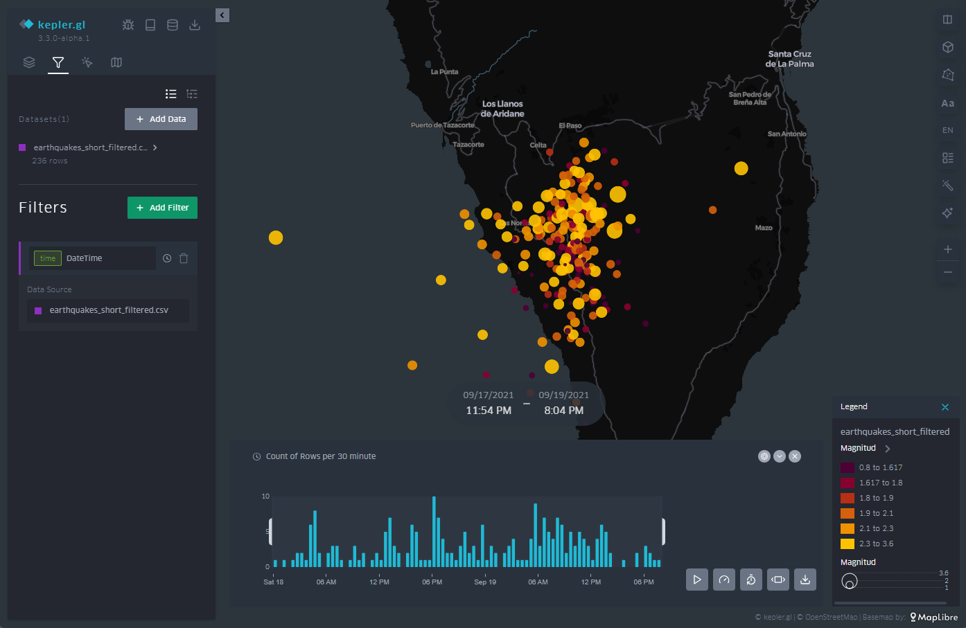
Figure 12: Legend of the color code and values used for the point representation, in line with our interval definitions in the point representation configuration.
3.8 Background Mapping
Depending on the event we represent on the map, it is convenient to use different types of background cartographies for a better understanding of the message that we are trying to convey through the visualization. Depending on the audience and context, the information provided by the background map can be more or less useful. If, as in this case, we only want to transmit geological information, its relevance is less. If, on the other hand, we also want to describe civil infrastructures that may be affected by earthquakes, it will be necessary to incorporate a basic cartography.
In this way, KeplerGL also offers a whole series of background cartographies, mainly divided into two families: those with a dark background and those with a light background. Here it is worth remembering that the human eye perceives small details better on a dark background, and interprets large shapes better on a light background. In the case of earthquakes and the scale at which we are representing them, it is advisable to use a dark background, as we will be able to discern distances and details more accurately.
To select the different background maps, go to the icon at the top of the left panel, and from the drop-down menu you can choose the one that suits you best. Figure 13 shows the different types of maps.
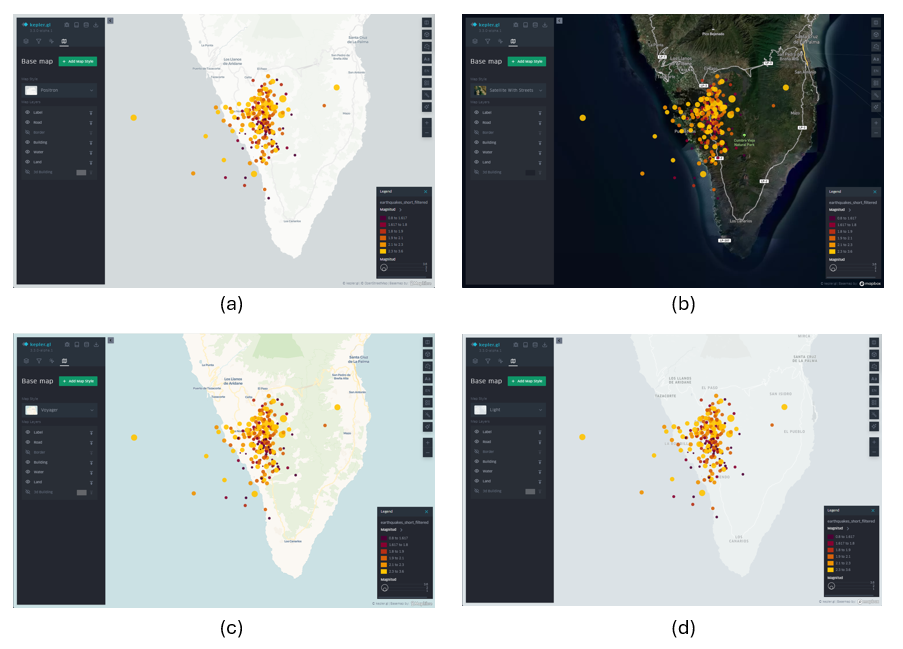
Figure 13: Different background cartographies in KeplerGL for the representation of seismic activity on the island of La Palma in September 2021: Positron (a), Satellite (b), Voyager (c) and Light (d).
4. Export the map
Finally, once we have made our map, we can export the result through the download icon located at the top of the menu on the left. Once that icon is selected, we can save the map as an image.
The options offered are: the size by the ratio of the image with respect to its horizontal and vertical dimensions, the resolution linked to that ratio that we have selected and the option to incorporate a legend in the output image, as shown in Figure 14.
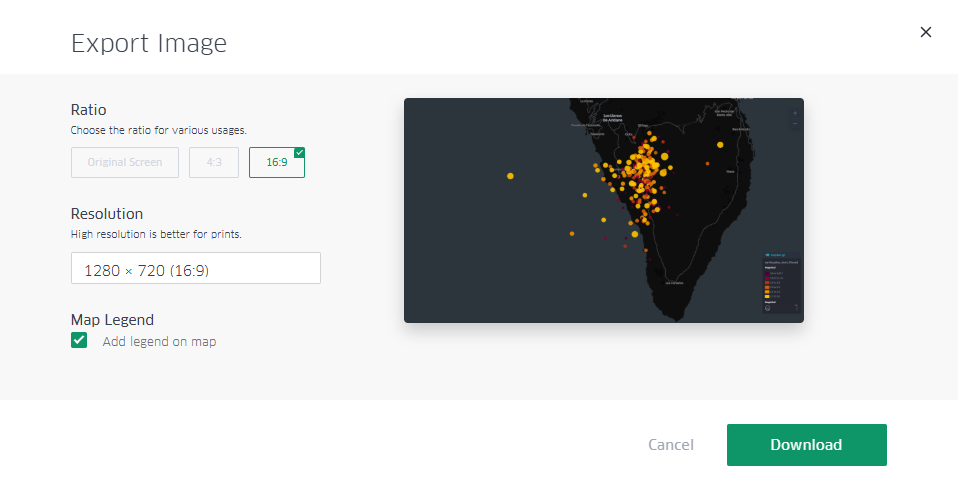
Figure 14: Dialog box to export the map as an image. Note the selection of the box to show the legend, as well as the selection of a panoramic format with space to incorporate infographic elements into other content later.
Additionally, there is the possibility of sharing the map with all its interactivity through registration in Dropbox or Carto, if the intention is to disseminate the map through other channels beyond a static image.
Lessons learned
In this exercise we have learned how to create a map in a simple and intuitive way with the help of KeplerGL. Specifically, we have learned to:
- Upload a file through the KeplerGL web interface.
- Represent georeferenced information in different ways.
- Learn how to use a temporal filter on the data series and create an animation for dissemination as a video.
- Add a legend and handle the values that that legend reflects.
- Customize each of the ways of visualization in detail.
- Export the resulting map with a certain degree of customization.
Conclusions and next steps
The world of cartography has always needed prior knowledge about projections, reference systems, georeferenced data formats and above all the installation of specific software to create maps. Thanks to the development of web products, one of these projects allows us to create maps in a very simple way and can be a very powerful tool when it comes to creating maps without the need for much prior knowledge and with a high degree of customization.
From this point on, more sophisticated tools can be explored that require either general knowledge or programming knowledge to be able to make maps with Leaflet or with D3.js, depending on the audience and the application in which we want to frame the map.
Areas of Application
The creation of simple maps has many fields of application, since cartography in general turns out to be one of the clearest and most popular forms of visualization thanks to its use since the origin of civilization. Proposed areas include:
- Journalism newsrooms: reacting to specific events such as natural disasters or large databases of georeferenced events can be easier thanks to tools such as KeplerGL.
- Corporations: Location of volumes associated with specific points of geography can be read intuitively with the creation of maps that can summarize large amounts of data.
- Applications: Integrating maps within applications often helps both the information and interactivity layers to explore the performance and outcome of a product at different scales.
Comments