Documentación
1. Introduction
Visualisations are graphical representations of data that allow to communicate, in a simple and effective way, the information linked to the data. The visualisation possibilities are very wide ranging, from basic representations such as line graphs, bar charts or relevant metrics, to interactive dashboards.
In this section of "Step-by-Step Visualisations we are regularly presenting practical exercises making use of open data available at datos.gob.es or other similar catalogues. They address and describe in a simple way the steps necessary to obtain the data, carry out the relevant transformations and analyses, and finally draw conclusions, summarizing the information.
Documented code developments and free-to-use tools are used in each practical exercise. All the material generated is available for reuse in the GitHub repository of datos.gob.es.
In this particular exercise, we will explore the current state of electric vehicle penetration in Spain and the future prospects for this disruptive technology in transport.
Access the data lab repository on Github.
Run the data pre-processing code on Google Colab.
In this video (available with English subtitles), the author explains what you will find both on Github and Google Colab.
2. Context: why is the electric vehicle important?
The transition towards more sustainable mobility has become a global priority, placing the electric vehicle (EV) at the centre of many discussions on the future of transport. In Spain, this trend towards the electrification of the car fleet not only responds to a growing consumer interest in cleaner and more efficient technologies, but also to a regulatory and incentive framework designed to accelerate the adoption of these vehicles. With a growing range of electric models available on the market, electric vehicles represent a key part of the country's strategy to reduce greenhouse gas emissions, improve urban air quality and foster technological innovation in the automotive sector.
However, the penetration of EVs in the Spanish market faces a number of challenges, from charging infrastructure to consumer perception and knowledge of EVs. Expansion of the freight network, together with supportive policies and fiscal incentives, are key to overcoming existing barriers and stimulating demand. As Spain moves towards its sustainability and energy transition goals, analysing the evolution of the electric vehicle market becomes an essential tool to understand the progress made and the obstacles that still need to be overcome.
3. Objective
This exercise focuses on showing the reader techniques for the processing, visualisation and advanced analysis of open data using Python. We will adopt a "learning-by-doing" approach so that the reader can understand the use of these tools in the context of solving a real and topical challenge such as the study of EV penetration in Spain. This hands-on approach not only enhances understanding of data science tools, but also prepares readers to apply this knowledge to solve real problems, providing a rich learning experience that is directly applicable to their own projects.
The questions we will try to answer through our analysis are:
- Which vehicle brands led the market in 2023?
- Which vehicle models were the best-selling in 2023?
- What market share will electric vehicles absorb in 2023?
- Which electric vehicle models were the best-selling in 2023?
- How have vehicle registrations evolved over time?
- Are we seeing any trends in electric vehicle registrations?
- How do we expect electric vehicle registrations to develop next year?
- How much CO2 emission reduction can we expect from the registrations achieved over the next year?
4. Resources
To complete the development of this exercise we will require the use of two categories of resources: Analytical Tools and Datasets.
4.1. Dataset
To complete this exercise we will use a dataset provided by the Dirección General de Tráfico (DGT) through its statistical portal, also available from the National Open Data catalogue (datos.gob.es). The DGT statistical portal is an online platform aimed at providing public access to a wide range of data and statistics related to traffic and road safety. This portal includes information on traffic accidents, offences, vehicle registrations, driving licences and other relevant data that can be useful for researchers, industry professionals and the general public.
In our case, we will use their dataset of vehicle registrations in Spain available via:
- Open Data Catalogue of the Spanish Government.
- Statistical portal of the DGT.
Although during the development of the exercise we will show the reader the necessary mechanisms for downloading and processing, we include pre-processed data
in the associated GitHub repository, so that the reader can proceed directly to the analysis of the data if desired.
*The data used in this exercise were downloaded on 04 March 2024. The licence applicable to this dataset can be found at https://datos.gob.es/avisolegal.
4.2. Analytical tools
- Programming language: Python - a programming language widely used in data analysis due to its versatility and the wide range of libraries available. These tools allow users to clean, analyse and visualise large datasets efficiently, making Python a popular choice among data scientists and analysts.
- Platform: Jupyter Notebooks - ia web application that allows you to create and share documents containing live code, equations, visualisations and narrative text. It is widely used for data science, data analytics, machine learning and interactive programming education.
-
Main libraries and modules:
- Data manipulation: Pandas - an open source library that provides high-performance, easy-to-use data structures and data analysis tools.
- Data visualisation:
- Matplotlib: a library for creating static, animated and interactive visualisations in Python..
- Seaborn: a library based on Matplotlib. It provides a high-level interface for drawing attractive and informative statistical graphs.
- Statistics and algorithms:
- Statsmodels: a library that provides classes and functions for estimating many different statistical models, as well as for testing and exploring statistical data.
- Pmdarima: a library specialised in automatic time series modelling, facilitating the identification, fitting and validation of models for complex forecasts.
5. Exercise development
It is advisable to run the Notebook with the code at the same time as reading the post, as both didactic resources are complementary in future explanations
The proposed exercise is divided into three main phases.
5.1 Initial configuration
This section can be found in point 1 of the Notebook.
In this short first section, we will configure our Jupyter Notebook and our working environment to be able to work with the selected dataset. We will import the necessary Python libraries and create some directories where we will store the downloaded data.
5.2 Data preparation
This section can be found in point 2 of the Notebookk.
All data analysis requires a phase of accessing and processing to obtain the appropriate data in the desired format. In this phase, we will download the data from the statistical portal and transform it into the format Apache Parquet format before proceeding with the analysis.
Those users who want to go deeper into this task, please read this guide Practical Introductory Guide to Exploratory Data Analysis.
5.3 Data analysis
This section can be found in point 3 of the Notebook.
5.3.1 Análisis descriptivo
In this third phase, we will begin our data analysis. To do so,we will answer the first questions using datavisualisation tools to familiarise ourselves with the data. Some examples of the analysis are shown below:
- Top 10 Vehicles registered in 2023: In this visualisation we show the ten vehicle models with the highest number of registrations in 2023, also indicating their combustion type. The main conclusions are:
- The only European-made vehicles in the Top 10 are the Arona and the Ibiza from Spanish brand SEAT. The rest are Asians.
- Nine of the ten vehicles are powered by gasoline.
- The only vehicle in the Top 10 with a different type of propulsion is the DACIA Sandero LPG (Liquefied Petroleum Gas).
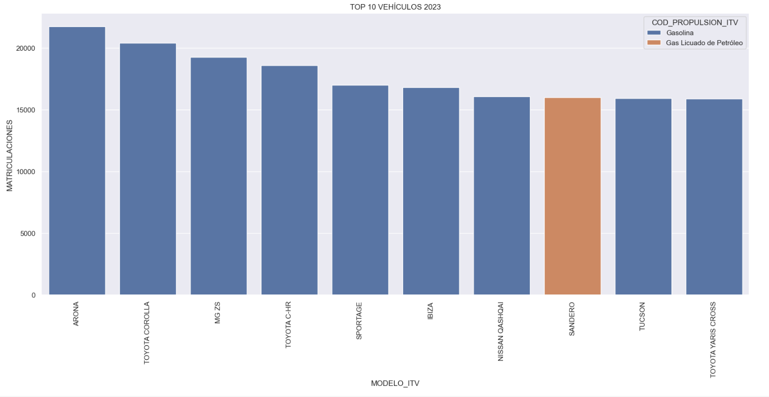
Figure 1. Graph "Top 10 vehicles registered in 2023"
- Market share by propulsion type: In this visualisation we represent the percentage of vehicles registered by each type of propulsion (petrol, diesel, electric or other). We see how the vast majority of the market (>70%) was taken up by petrol vehicles, with diesel being the second choice, and how electric vehicles reached 5.5%.
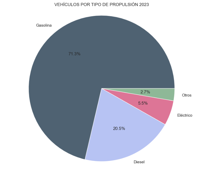
Figure 2. Graph "Market share by propulsion type".
- Historical development of registrations: This visualisation represents the evolution of vehicle registrations over time. It shows the monthly number of registrations between January 2015 and December 2023 distinguishing between the propulsion types of the registered vehicles, and there are several interesting aspects of this graph:
- We observe an annual seasonal behaviour, i.e. we observe patterns or variations that are repeated at regular time intervals. We see recurring high levels of enrolment in June/July, while in August/September they decrease drastically. This is very relevant, as the analysis of time series with a seasonal factor has certain particularities.
-
The huge drop in registrations during the first months of COVID is also very remarkable.
-
We also see that post-covid enrolment levels are lower than before.
-
Finally, we can see how between 2015 and 2023 the registration of electric vehicles is gradually increasing.
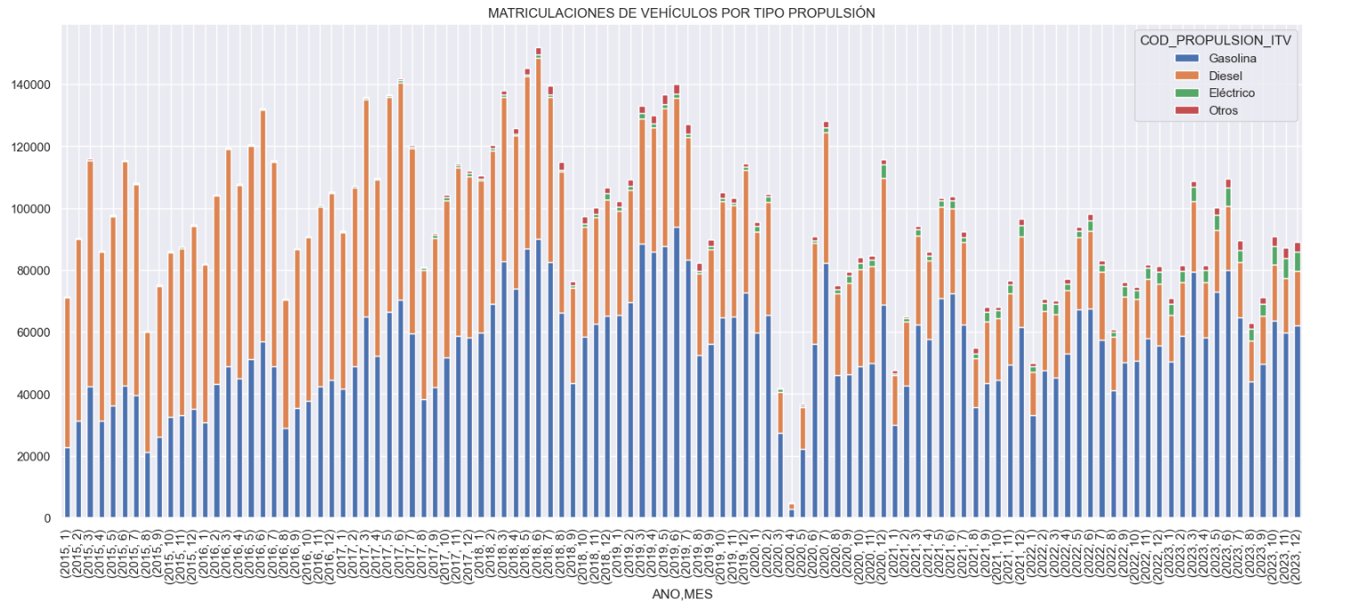
Figure 3. Graph "Vehicle registrations by propulsion type".
- Trend in the registration of electric vehicles: We now analyse the evolution of electric and non-electric vehicles separately using heat maps as a visual tool. We can observe very different behaviours between the two graphs. We observe how the electric vehicle shows a trend of increasing registrations year by year and, despite the COVID being a halt in the registration of vehicles, subsequent years have maintained the upward trend.
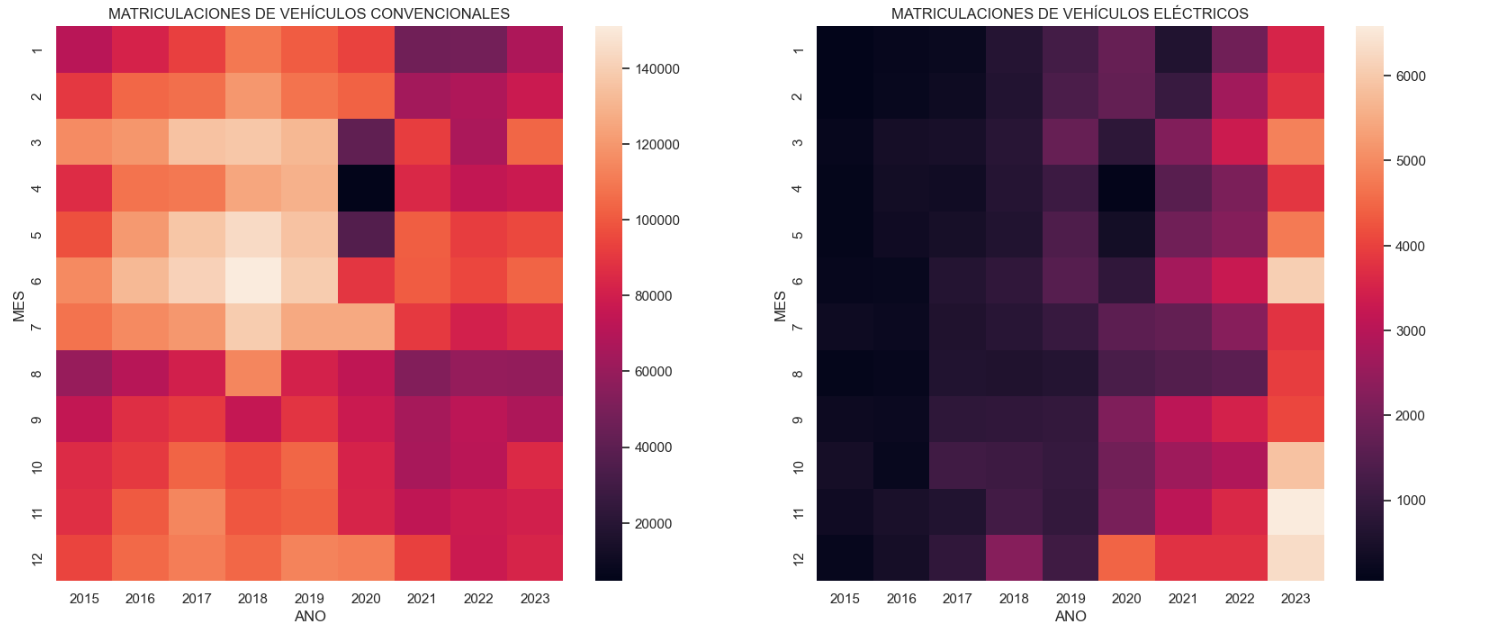
Figure 4. Graph "Trend in registration of conventional vs. electric vehicles".
5.3.2. Predictive analytics
To answer the last question objectively, we will use predictive models that allow us to make estimates regarding the evolution of electric vehicles in Spain. As we can see, the model constructed proposes a continuation of the expected growth in registrations throughout the year of 70,000, reaching values close to 8,000 registrations in the month of December 2024 alone.
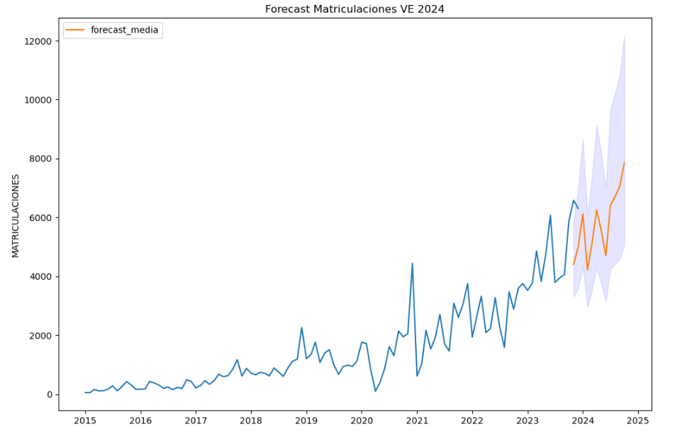
Figure 5. Graph "Predicted electric vehicle registrations".
5. Conclusions
As a conclusion of the exercise, we can observe, thanks to the analysis techniques used, how the electric vehicle is penetrating the Spanish vehicle fleet at an increasing speed, although it is still at a great distance from other alternatives such as diesel or petrol, for now led by the manufacturer Tesla. We will see in the coming years whether the pace grows at the level needed to meet the sustainability targets set and whether Tesla remains the leader despite the strong entry of Asian competitors.
6. Do you want to do the exercise?
If you want to learn more about the Electric Vehicle and test your analytical skills, go to this code repository where you can develop this exercise step by step.
Also, remember that you have at your disposal more exercises in the section "Step by step visualisations" "Step-by-step visualisations" section.
Content elaborated by Juan Benavente, industrial engineer and expert in technologies linked to the data economy. The contents and points of view reflected in this publication are the sole responsibility of the author.
Documentación
1. Introduction
Visualizations are graphical representations of data that allow you to communicate, in a simple and effective way, the information linked to it. The visualization possibilities are very extensive, from basic representations such as line graphs, bar graphs or relevant metrics, to visualizations configured on interactive dashboards.
In the section of “Step-by-step visualizations” we are periodically presenting practical exercises making use of open data available in datos.gob.es or other similar catalogs. They address and describe in a simple way the steps necessary to obtain the data, carry out the transformations and analyses that are pertinent to finally obtain conclusions as a summary of this information.
In each of these hands-on exercises, conveniently documented code developments are used, as well as free-to-use tools. All generated material is available for reuse in the datos.gob.es GitHub repository.
Accede al repositorio del laboratorio de datos en Github.
Ejecuta el código de pre-procesamiento de datos sobre Google Colab.
2. Objetive
The main objective of this exercise is to show how to carry out, in a didactic way, a predictive analysis of time series based on open data on electricity consumption in the city of Barcelona. To do this, we will carry out an exploratory analysis of the data, define and validate the predictive model, and finally generate the predictions together with their corresponding graphs and visualizations.
Predictive time series analytics are statistical and machine learning techniques used to forecast future values in datasets that are collected over time. These predictions are based on historical patterns and trends identified in the time series, with their primary purpose being to anticipate changes and events based on past data.
The initial open dataset consists of records from 2019 to 2022 inclusive, on the other hand, the predictions will be made for the year 2023, for which we do not have real data.
Once the analysis has been carried out, we will be able to answer questions such as the following:
- What is the future prediction of electricity consumption?
- How accurate has the model been with the prediction of already known data?
- Which days will have maximum and minimum consumption based on future predictions?
- Which months will have a maximum and minimum average consumption according to future predictions?
These and many other questions can be solved through the visualizations obtained in the analysis, which will show the information in an orderly and easy-to-interpret way.
3. Resources
3.1. Datasets
The open datasets used contain information on electricity consumption in the city of Barcelona in recent years. The information they provide is the consumption in (MWh) broken down by day, economic sector, zip code and time slot.
These open datasets are published by Barcelona City Council in the datos.gob.es catalogue, through files that collect the records on an annual basis. It should be noted that the publisher updates these datasets with new records frequently, so we have used only the data provided from 2019 to 2022 inclusive.
These datasets are also available for download from the following Github repository.
3.2. Tools
To carry out the analysis, the Python programming language written on a Jupyter Notebook hosted in the Google Colab cloud service has been used.
"Google Colab" or, also called Google Colaboratory, is a cloud service from Google Research that allows you to program, execute and share code written in Python or R on top of a Jupyter Notebook from your browser, so it requires no configuration. This service is free of charge.
The Looker Studio tool was used to create the interactive visualizations.
"Looker Studio", formerly known as Google Data Studio, is an online tool that allows you to make interactive visualizations that can be inserted into websites or exported as files.
If you want to know more about tools that can help you in data processing and visualization, you can refer to the "Data processing and visualization tools" report.
4. Predictive time series analysis
Predictive time series analysis is a technique that uses historical data to predict future values of a variable that changes over time. Time series is data that is collected at regular intervals, such as days, weeks, months, or years. It is not the purpose of this exercise to explain in detail the characteristics of time series, as we focus on briefly explaining the prediction model. However, if you want to know more about it, you can consult the following manual.
This type of analysis assumes that the future values of a variable will be correlated with historical values. Using statistical and machine learning techniques, patterns in historical data can be identified and used to predict future values.
The predictive analysis carried out in the exercise has been divided into five phases; data preparation, exploratory data analysis, model training, model validation, and prediction of future values), which will be explained in the following sections.
The processes described below are developed and commented on in the following Notebook executable from Google Colab along with the source code that is available in our Github account.
It is advisable to run the Notebook with the code at the same time as reading the post, since both didactic resources are complementary in future explanations.
4.1 Data preparation
This section can be found in point 1 of the Notebook.
In this section, the open datasets described in the previous points that we will use in the exercise are imported, paying special attention to obtaining them and validating their content, ensuring that they are in the appropriate and consistent format for processing and that they do not contain errors that could condition future steps.
4.2 Exploratory Data Analysis (EDA)
This section can be found in point 2 of the Notebook.
In this section we will carry out an exploratory data analysis (EDA), in order to properly interpret the source data, detect anomalies, missing data, errors or outliers that could affect the quality of subsequent processes and results.
Then, in the following interactive visualization, you will be able to inspect the data table with the historical consumption values generated in the previous point, being able to filter by specific period. In this way, we can visually understand the main information in the data series.
Once you have inspected the interactive visualization of the time series, you will have observed several values that could potentially be considered outliers, as shown in the figure below. We can also numerically calculate these outliers, as shown in the notebook.

Once the outliers have been evaluated, for this year it has been decided to modify only the one registered on the date "2022-12-05". To do this, the value will be replaced by the average of the value recorded the previous day and the day after.
The reason for not eliminating the rest of the outliers is because they are values recorded on consecutive days, so it is assumed that they are correct values affected by external variables that are beyond the scope of the exercise. Once the problem detected with the outliers has been solved, this will be the time series of data that we will use in the following sections.
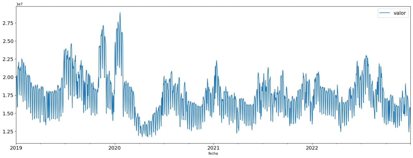
Figure 2. Time series of historical data after outliers have been processed.
If you want to know more about these processes, you can refer to the Practical Guide to Introduction to Exploratory Data Analysis.
4.3 Model training
This section can be found in point 3 of the Notebook.
First, we create within the data table the temporal attributes (year, month, day of the week, and quarter). These attributes are categorical variables that help ensure that the model is able to accurately capture the unique characteristics and patterns of these variables. Through the following box plot visualizations, we can see their relevance within the time series values.
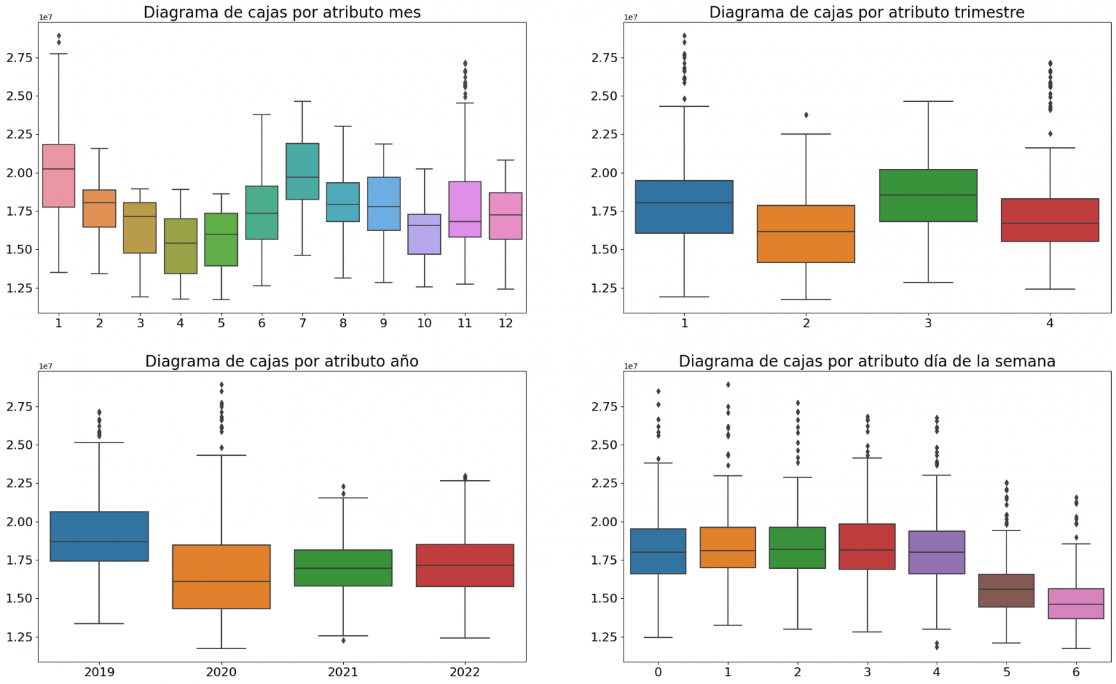
Figure 3. Box Diagrams of Generated Temporal Attributes
We can observe certain patterns in the charts above, such as the following:
- Weekdays (Monday to Friday) have a higher consumption than on weekends.
- The year with the lowest consumption values is 2020, which we understand is due to the reduction in service and industrial activity during the pandemic.
- The month with the highest consumption is July, which is understandable due to the use of air conditioners.
- The second quarter is the one with the lowest consumption values, with April standing out as the month with the lowest values.
Next, we divide the data table into training set and validation set. The training set is used to train the model, i.e., the model learns to predict the value of the target variable from that set, while the validation set is used to evaluate the performance of the model, i.e., the model is evaluated against the data from that set to determine its ability to predict the new values.
This splitting of the data is important to avoid overfitting, with the typical proportion of the data used for the training set being 70% and the validation set being approximately 30%. For this exercise we have decided to generate the training set with the data between "01-01-2019" to "01-10-2021", and the validation set with those between "01-10-2021" and "31-12-2022" as we can see in the following graph.
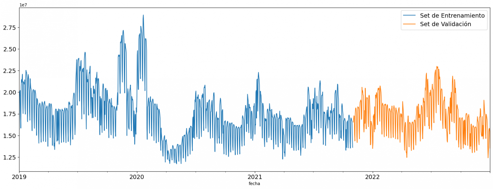
Figure 4. Historical data time series divided into training set and validation set
For this type of exercise, we have to use some regression algorithm. There are several models and libraries that can be used for time series prediction. In this exercise we will use the "Gradient Boosting" model, a supervised regression model that is a machine learning algorithm used to predict a continuous value based on the training of a dataset containing known values for the target variable (in our example the variable "value") and the values of the independent variables (in our exercise the temporal attributes).
It is based on decision trees and uses a technique called "boosting" to improve the accuracy of the model, being known for its efficiency and ability to handle a variety of regression and classification problems.
Its main advantages are the high degree of accuracy, robustness and flexibility, while some of its disadvantages are its sensitivity to outliers and that it requires careful optimization of parameters.
We will use the supervised regression model offered in the XGBBoost library, which can be adjusted with the following parameters:
- n_estimators: A parameter that affects the performance of the model by indicating the number of trees used. A larger number of trees generally results in a more accurate model, but it can also take more time to train.
- early_stopping_rounds: A parameter that controls the number of training rounds that will run before the model stops if performance in the validation set does not improve.
- learning_rate: Controls the learning speed of the model. A higher value will make the model learn faster, but it can lead to overfitting.
- max_depth: Control the maximum depth of trees in the forest. A higher value can provide a more accurate model, but it can also lead to overfitting.
- min_child_weight: Control the minimum weight of a sheet. A higher value can help prevent overfitting.
- Gamma: Controls the amount of expected loss reduction needed to split a node. A higher value can help prevent overfitting.
- colsample_bytree: Controls the proportion of features that are used to build each tree. A higher value can help prevent overfitting.
- Subsample: Controls the proportion of the data that is used to construct each tree. A higher value can help prevent overfitting.
These parameters can be adjusted to improve model performance on a specific dataset. It's a good idea to experiment with different values of these parameters to find the value that provides the best performance in your dataset.
Finally, by means of a bar graph, we will visually observe the importance of each of the attributes during the training of the model. It can be used to identify the most important attributes in a dataset, which can be useful for model interpretation and feature selection.
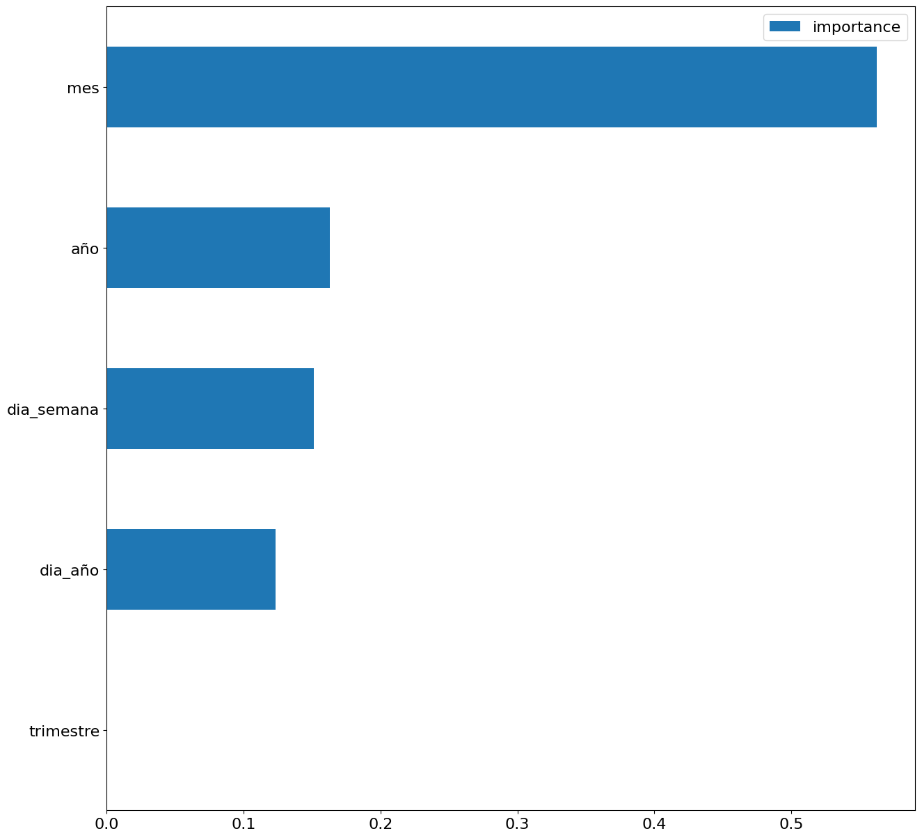
Figure 5. Bar Chart with Importance of Temporal Attributes
4.4 Model training
This section can be found in point 4 of the Notebook.
Once the model has been trained, we will evaluate how accurate it is for the known values in the validation set.
We can visually evaluate the model by plotting the time series with the known values along with the predictions made for the validation set as shown in the figure below.
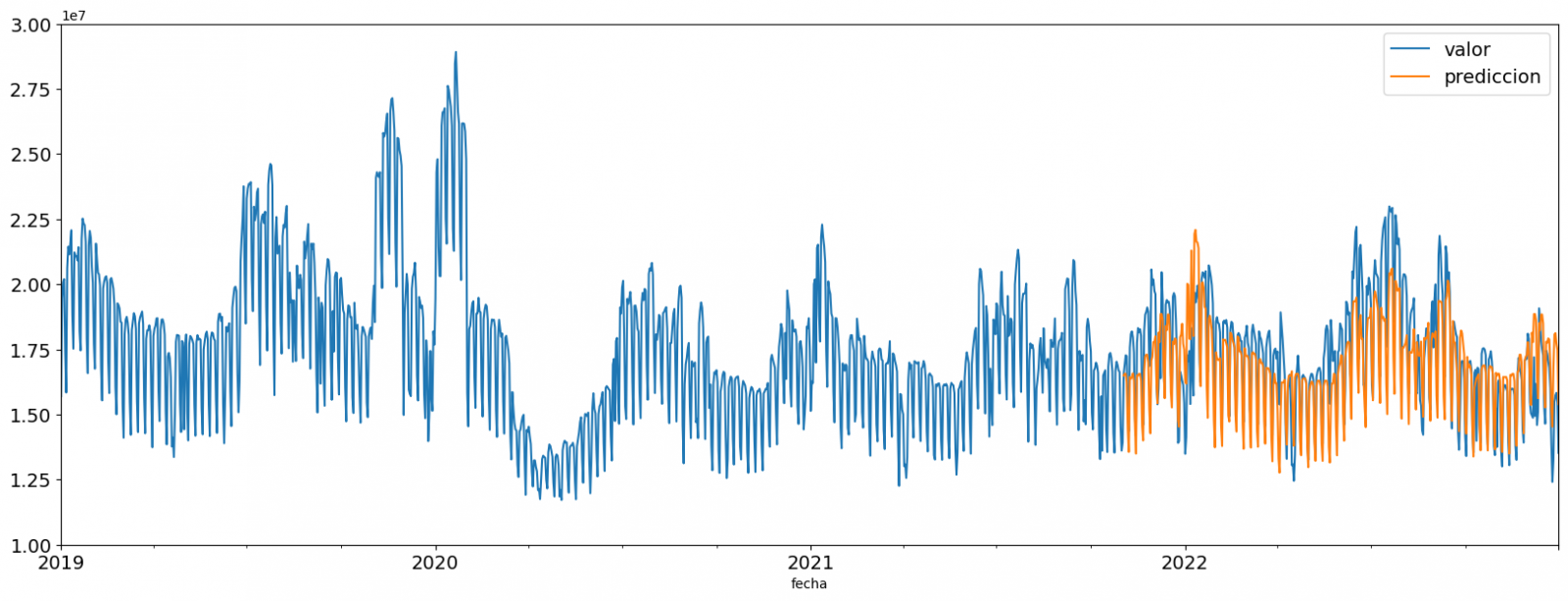
Figure 6. Time series with validation set data next to prediction data.
We can also numerically evaluate the accuracy of the model using different metrics. In this exercise, we have chosen to use the mean absolute percentage error (ASM) metric, which has been 6.58%. The accuracy of the model is considered high or low depending on the context and expectations in such a model, generally an ASM is considered low when it is less than 5%, while it is considered high when it is greater than 10%. In this exercise, the result of the model validation can be considered an acceptable value.
If you want to consult other types of metrics to evaluate the accuracy of models applied to time series, you can consult the following link.
4.5 Predictions of future values
This section can be found in point 5 of the Notebook.
Once the model has been generated and its MAPE = 6.58% performance has been evaluated, we will apply this model to all known data, in order to predict the unknown electricity consumption values for 2023.
First of all, we retrain the model with the known values until the end of 2022, without dividing it into a training and validation set. Finally, we calculate future values for the year 2023.

Figure 7. Time series with historical data and prediction for 2023
In the following interactive visualization you can see the predicted values for the year 2023 along with their main metrics, being able to filter by time period.
Improving the results of predictive time series models is an important goal in data science and data analytics. Several strategies that can help improve the accuracy of the exercise model are the use of exogenous variables, the use of more historical data or generation of synthetic data, optimization of parameters, ...
Due to the informative nature of this exercise and to promote the understanding of less specialized readers, we have proposed to explain the exercise in a way that is as simple and didactic as possible. You may come up with many ways to optimize your predictive model to achieve better results, and we encourage you to do so!
5. Conclusions of the exercise
Once the exercise has been carried out, we can see different conclusions such as the following:
- The maximum values for consumption predictions in 2023 are given in the last half of July, exceeding values of 22,500,000 MWh
- The month with the highest consumption according to the predictions for 2023 will be July, while the month with the lowest average consumption will be November, with a percentage difference between the two of 25.24%
- The average daily consumption forecast for 2023 is 17,259,844 MWh, 1.46% lower than that recorded between 2019 and 2022.
We hope that this exercise has been useful for you to learn some common techniques in the study and analysis of open data. We'll be back to show you new reuses. See you soon!
Documentación
In order to extract the full value of data, it is necessary to classify, filter and cross-reference it through analytics processes that help us draw conclusions, turning data into information and knowledge. Traditionally, data analytics is divided into 3 categories:
- Descriptive analytics, which helps us to understand the current situation, what has happened to get there and why it has happened.
- Predictive analytics, which aims to anticipate relevant events. In other words, it tells us what is going to happen so that a human being can make a decision.
- Prescriptive analytics, which provides information on the best decisions based on a series of future scenarios. In other words, it tells us what to do.
The third report in the "Awareness, Inspire, Action" series focuses on the second stage, Predictive Analytics. It follows the same methodology as the two previous reports on Artificial Intelligence and Natural Language Processing.
Predictive analytics allows us to answer business questions such as: Will we suffer a stockout, will the price of a certain share fall, or will more tourists visit us in the future? Based on this information, companies can define their business strategy, and public bodies can develop policies that respond to the needs of citizens.
After a brief introduction that contextualises the subject matter and explains the methodology, the report, written by Alejandro Alija, is developed as follows:
- Awareness. The Awareness section explains the key concepts, highlighting the three attributes of predictive analytics: the emphasis on prediction, the business relevance of the resulting knowledge and its trend towards democratisation to extend its use beyond specialist users and data scientists. This section also mentions the mathematical models it makes use of and details some of its most important milestones throughout history, such as the Kyoto protocol or its usefulness in detecting customer leakage.
- Inspire. The Inspire section analyses some of the most relevant use cases of predictive analytics today in three very different sectors. It starts with the industrial sector, explaining how predictive maintenance and anomaly detection works. It continues with examples relating to price and demand prediction, in the distribution chain of a supermarket and in the energy sector. Finally, it ends with the health sector and augmented medical imaging diagnostics.
- Action. In the Action section, a concrete use case is developed in a practical way, using real data and technological tools. In this case, the selected dataset is traffic accidents in the city of Madrid, published by the Madrid City Council. Through the methodology shown in the following figure, it is explained in a simple way how to use time series analysis techniques to model and predict the number of accidents in future months.

The report ends with the Last stop section, where courses, books and articles of interest are compiled for those users who want to continue advancing in the subject.
In this video, the author tells you more about the report and predictive analytics (only available in Spanish).
Below, you can download the full report in pdf and word (reusable version), as well as access the code used in the Action example at this link.