Documentación
1. Introduction
Data visualization is a task linked to data analysis that aims to represent graphically the underlying information. Visualizations play a fundamental role in data communication, since they allow to draw conclusions in a visual and understandable way, also allowing detection of patterns, trends, anomalous data or projection of predictions, among many other functions. This makes its application transversal to any process that involves data. The visualization possibilities are very broad, from basic representations such as line, bar or sector graph, to complex visualizations configured on interactive dashboards.
Before starting to build an effective visualization, a prior data treatment must be performed, paying attention to their collection and validation of their content, ensuring that they are free of errors and in an adequate and consistent format for processing. The previous data treatment is essential to carry out any task related to data analysis and realization of effective visualizations.
We will periodically present a series of practical exercises on open data visualizations that are available on the portal datos.gob.es and in other similar catalogues. In there, we approach and describe in a simple way the necessary steps to obtain data, perform transformations and analysis that are relevant to creation of interactive visualizations from which we may extract all the possible information summarised in final conclusions. In each of these practical exercises we will use simple code developments which will be conveniently documented, relying on free tools. Created material will be available to reuse in Data Lab on Github.
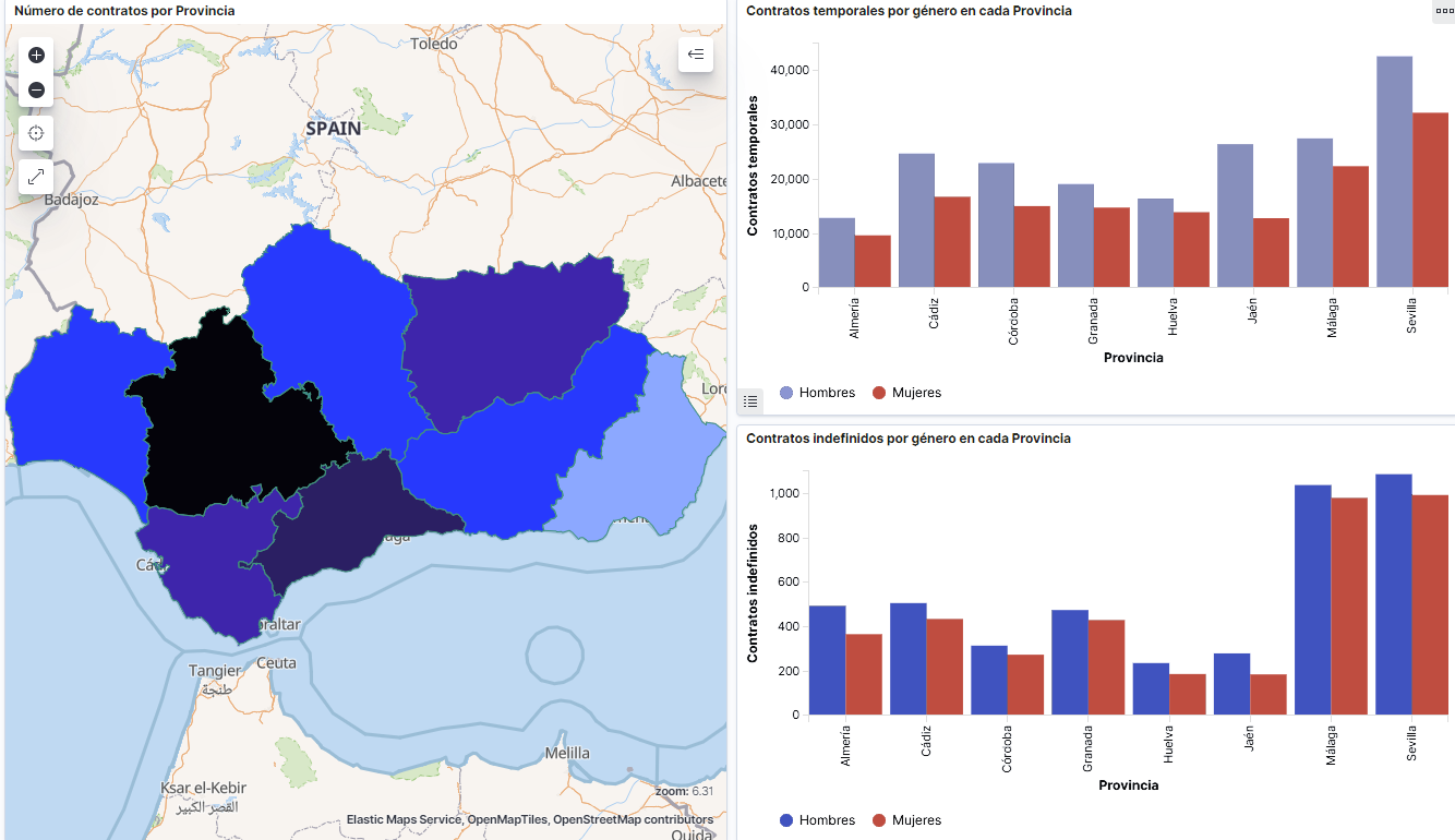
Captura del vídeo que muestra la interacción con el dashboard de la caracterización de la demanda de empleo y la contratación registrada en España disponible al final de este artículo
2. Objetives
The main objective of this post is to create an interactive visualization using open data. For this purpose, we have used datasets containing relevant information on evolution of employment demand in Spain over the last years. Based on these data, we have determined a profile that represents employment demand in our country, specifically investigating how does gender gap affects a group and impact of variables such as age, unemployment benefits or region.
3. Resources
3.1. Datasets
For this analysis we have selected datasets published by the Public State Employment Service (SEPE), coordinated by the Ministry of Labour and Social Economy, which collects time series data with distinct breakdowns that facilitate the analysis of the qualities of job seekers. These data are available on datos.gob.es, with the following characteristics:
- Demandantes de empleo por municipio: contains the number of job seekers broken down by municipality, age and gender, between the years 2006-2020.
- Gasto de prestaciones por desempleo por Provincia: time series between the years 2010-2020 related to unemployment benefits expenditure, broken down by province and type of benefit.
- Contratos registrados por el Servicio Público de Empleo Estatal (SEPE) por municipio: these datasets contain the number of registered contracts to both, job seekers and non-job seekers, broken down by municipality, gender and contract type, between the years 2006-2020.
3.2. Tools.
R (versión 4.0.3) and RStudio with RMarkdown add-on have been used to carry out this analysis (working environment, programming and drafting).
RStudio is an integrated open source development environment for R programming language, dedicated to statistical analysis and graphs creation.
RMarkdown allows creation of reports integrating text, code and dynamic results into a single document.
To create interactive graphs, we have used Kibana tool.
Kibana is an open code application that forms a part of Elastic Stack (Elasticsearch, Beats, Logstasg y Kibana) qwhich provides visualization and exploration capacities of the data indexed on the analytics engine Elasticsearch. The main advantages of this tool are:
- Presents visual information through interactive and customisable dashboards using time intervals, filters faceted by range, geospatial coverage, among others
- Contains development tools catalogue (Dev Tools) to interact with data stored in Elasticsearch.
- It has a free version ready to use on your own computer and enterprise version that is developed in the Elastic cloud and other cloud infrastructures, such as Amazon Web Service (AWS).
On Elastic website you may find user manuals for the download and installation of the tool, but also how to create graphs, dashboards, etc. Furthermore, it offers short videos on the youtube channel and organizes webinars dedicated to explanation of diverse aspects related to Elastic Stack.
If you want to learn more about these and other tools which may help you with data processing, see the report “Data processing and visualization tools” that has been recently updated.
4. Data processing
To create a visualization, it´s necessary to prepare the data properly by performing a series of tasks that include pre-processing and exploratory data analysis (EDA), to understand better the data that we are dealing with. The objective is to identify data characteristics and detect possible anomalies or errors that could affect the quality of results. Data pre-processing is essential to ensure the consistency and effectiveness of analysis or visualizations that are created afterwards.
In order to support learning of readers who are not specialised in programming, the R code included below, which can be accessed by clicking on “Code” button, is not designed to be efficient but rather to be easy to understand. Therefore, it´s probable that the readers more advanced in this programming language may consider to code some of the functionalities in an alternative way. A reader will be able to reproduce this analysis if desired, as the source code is available on the datos.gob.es Github account. The way to provide the code is through a RMarkdown document. Once it´s loaded to the development environment, it may be easily run or modified.
4.1. Installation and import of libraries
R base package, which is always available when RStudio console is open, includes a wide set of functionalities to import data from external sources, carry out statistical analysis and obtain graphic representations. However, there are many tasks for which it´s required to resort to additional packages, incorporating functions and objects defined in them into the working environment. Some of them are already available in the system, but others should be downloaded and installed.
#Instalación de paquetes \r\n #El paquete dplyr presenta una colección de funciones para realizar de manera sencilla operaciones de manipulación de datos \r\n if (!requireNamespace(\"dplyr\", quietly = TRUE)) {install.packages(\"dplyr\")}\r\n #El paquete lubridate para el manejo de variables tipo fecha \r\n if (!requireNamespace(\"lubridate\", quietly = TRUE)) {install.packages(\"lubridate\")}\r\n#Carga de paquetes en el entorno de desarrollo \r\nlibrary (dplyr)\r\nlibrary (lubridate)\r\n4.2. Data import and cleansing
a. Import of datasets
Data which will be used for visualization are divided by annualities in the .CSV and .XLS files. All the files of interest should be imported to the development environment. To make this post easier to understand, the following code shows the upload of a single .CSV file into a data table.
To speed up the loading process in the development environment, it´s necessary to download the datasets required for this visualization to the working directory. The datasets are available on the datos.gob.es Github account.
#Carga del datasets de demandantes de empleo por municipio de 2020. \r\n Demandantes_empleo_2020 <- \r\n read.csv(\"Conjuntos de datos/Demandantes de empleo por Municipio/Dtes_empleo_por_municipios_2020_csv.csv\",\r\n sep=\";\", skip = 1, header = T)\r\nOnce all the datasets are uploaded as data tables in the development environment, they need to be merged in order to obtain a single dataset that includes all the years of the time series, for each of the characteristics related to job seekers that will be analysed: number of job seekers, unemployment expenditure and new contracts registered by SEPE.
#Dataset de demandantes de empleo\r\nDatos_desempleo <- rbind(Demandantes_empleo_2006, Demandantes_empleo_2007, Demandantes_empleo_2008, Demandantes_empleo_2009, \r\n Demandantes_empleo_2010, Demandantes_empleo_2011,Demandantes_empleo_2012, Demandantes_empleo_2013,\r\n Demandantes_empleo_2014, Demandantes_empleo_2015, Demandantes_empleo_2016, Demandantes_empleo_2017, \r\n Demandantes_empleo_2018, Demandantes_empleo_2019, Demandantes_empleo_2020) \r\n#Dataset de gasto en prestaciones por desempleo\r\ngasto_desempleo <- rbind(gasto_2010, gasto_2011, gasto_2012, gasto_2013, gasto_2014, gasto_2015, gasto_2016, gasto_2017, gasto_2018, gasto_2019, gasto_2020)\r\n#Dataset de nuevos contratos a demandantes de empleo\r\nContratos <- rbind(Contratos_2006, Contratos_2007, Contratos_2008, Contratos_2009,Contratos_2010, Contratos_2011, Contratos_2012, Contratos_2013, \r\n Contratos_2014, Contratos_2015, Contratos_2016, Contratos_2017, Contratos_2018, Contratos_2019, Contratos_2020)b. Selection of variables
Once the tables with three time series are obtained (number of job seekers, unemployment expenditure and new registered contracts), the variables of interest will be extracted and included in a new table.
First, the tables with job seekers (“unemployment_data”) and new registered contracts (“contracts”) should be added by province, to facilitate the visualization. They should match the breakdown by province of the unemployment benefits expenditure table (“unemployment_expentidure”). In this step, only the variables of interest will be selected from the three datasets.
#Realizamos un group by al dataset de \"datos_desempleo\", agruparemos las variables numéricas que nos interesen, en función de varias variables categóricas\r\nDtes_empleo_provincia <- Datos_desempleo %>% \r\n group_by(Código.mes, Comunidad.Autónoma, Provincia) %>%\r\n summarise(total.Dtes.Empleo = (sum(total.Dtes.Empleo)), Dtes.hombre.25 = (sum(Dtes.Empleo.hombre.edad...25)), \r\n Dtes.hombre.25.45 = (sum(Dtes.Empleo.hombre.edad.25..45)), Dtes.hombre.45 = (sum(Dtes.Empleo.hombre.edad...45)),\r\n Dtes.mujer.25 = (sum(Dtes.Empleo.mujer.edad...25)), Dtes.mujer.25.45 = (sum(Dtes.Empleo.mujer.edad.25..45)),\r\n Dtes.mujer.45 = (sum(Dtes.Empleo.mujer.edad...45)))\r\n#Realizamos un group by al dataset de \"contratos\", agruparemos las variables numericas que nos interesen en función de las varibles categóricas.\r\nContratos_provincia <- Contratos %>% \r\n group_by(Código.mes, Comunidad.Autónoma, Provincia) %>%\r\n summarise(Total.Contratos = (sum(Total.Contratos)),\r\n Contratos.iniciales.indefinidos.hombres = (sum(Contratos.iniciales.indefinidos.hombres)), \r\n Contratos.iniciales.temporales.hombres = (sum(Contratos.iniciales.temporales.hombres)), \r\n Contratos.iniciales.indefinidos.mujeres = (sum(Contratos.iniciales.indefinidos.mujeres)), \r\n Contratos.iniciales.temporales.mujeres = (sum(Contratos.iniciales.temporales.mujeres)))\r\n#Seleccionamos las variables que nos interesen del dataset de \"gasto_desempleo\"\r\ngasto_desempleo_nuevo <- gasto_desempleo %>% select(Código.mes, Comunidad.Autónoma, Provincia, Gasto.Total.Prestación, Gasto.Prestación.Contributiva)Secondly, the three tables should be merged into one that we will work with from this point onwards..
Caract_Dtes_empleo <- Reduce(merge, list(Dtes_empleo_provincia, gasto_desempleo_nuevo, Contratos_provincia))
c. Transformation of variables
When the table with variables of interest is created for further analysis and visualization, some of them should be transformed to other types, more adequate for future aggregations.
#Transformación de una variable fecha\r\nCaract_Dtes_empleo$Código.mes <- as.factor(Caract_Dtes_empleo$Código.mes)\r\nCaract_Dtes_empleo$Código.mes <- parse_date_time(Caract_Dtes_empleo$Código.mes(c(\"200601\", \"ym\")), truncated = 3)\r\n#Transformamos a variable numérica\r\nCaract_Dtes_empleo$Gasto.Total.Prestación <- as.numeric(Caract_Dtes_empleo$Gasto.Total.Prestación)\r\nCaract_Dtes_empleo$Gasto.Prestación.Contributiva <- as.numeric(Caract_Dtes_empleo$Gasto.Prestación.Contributiva)\r\n#Transformación a variable factor\r\nCaract_Dtes_empleo$Provincia <- as.factor(Caract_Dtes_empleo$Provincia)\r\nCaract_Dtes_empleo$Comunidad.Autónoma <- as.factor(Caract_Dtes_empleo$Comunidad.Autónoma)d. Exploratory analysis
Let´s see what variables and structure the new dataset presents.
str(Caract_Dtes_empleo)\r\nsummary(Caract_Dtes_empleo)The output of this portion of the code is omitted to facilitate reading. Main characteristics presented in the dataset are as follows:
- Time range covers a period from January to December 2020.
- Number of columns (variables) is 17. .
- It presents two categorical variables (“Province”, “Autonomous.Community”), one date variable (“Code.month”) and the rest are numerical variables.
e. Detection and processing of missing data
Next, we will analyse whether the dataset has missing values (NAs). A treatment or elimination of NAs is essential, otherwise it will not be possible to process properly the numerical variables.
any(is.na(Caract_Dtes_empleo)) \r\n#Como el resultado es \"TRUE\", eliminamos los datos perdidos del dataset, ya que no sabemos cual es la razón por la cual no se encuentran esos datos\r\nCaract_Dtes_empleo <- na.omit(Caract_Dtes_empleo)\r\nany(is.na(Caract_Dtes_empleo))4.3. Creation of new variables
In order to create a visualization, we are going to make a new variable from the two variables present in the data table. This operation is very common in the data analysis, as sometimes it´s interesting to work with calculated data (e.g., the sum or the average of different variables) instead of source data. In this case, we will calculate the average unemployment expenditure for each job seeker. For this purpose, variables of total expenditure per benefit (“Expenditure.Total.Benefit”) and the total number of job seekers (“total.JobSeekers.Employment”) will be used.
Caract_Dtes_empleo$gasto_desempleado <-\r\n (1000 * (Caract_Dtes_empleo$Gasto.Total.Prestación/\r\n Caract_Dtes_empleo$total.Dtes.Empleo))4.4. Save the dataset
Once the table containing variables of interest for analysis and visualizations is obtained, we will save it as a data file in CSV format to perform later other statistical analysis or use it within other processing or data visualization tools. It´s important to use the UTF-8 encoding (Unicode Transformation Format), so the special characters may be identified correctly by any other tool.
write.csv(Caract_Dtes_empleo,\r\n file=\"Caract_Dtes_empleo_UTF8.csv\",\r\n fileEncoding= \"UTF-8\")5. Creation of a visualization on the characteristics of employment demand in Spain using Kibana
The development of this interactive visualization has been performed with usage of Kibana in the local environment. We have followed Elastic company tutorial for both, download and installation of the software.
Below you may find a tutorial video related to the whole process of creating a visualization. In the video you may see the creation of dashboard with different interactive indicators by generating graphic representations of different types. The steps to build a dashboard are as follows:
A continuación se adjunta un vídeo tutorial donde se muestra todo el proceso de realización de la visualización. En el vídeo podrás ver la creación de un cuadro de mando (dashboard) con diferentes indicadores interactivos mediante la generación de representaciones gráficas de diferentes tipos. Los pasos para obtener el dashboard son los siguientes:
- Load the data into Elasticsearch and generate an index that allows to interact with the data from Kibana. This index permits a search and management of the data in the loaded files, practically in real time.
- Generate the following graphic representations:
- Line graph to represent a time series on the job seekers in Spain between 2006 and 2020.
- Sector graph with job seekers broken down by province and Autonomous Community
- Thematic map showing the number of new contracts registered in each province on the territory. For creation of this visual it´s necessary to download a dataset with province georeferencing published in the open data portal Open Data Soft.
- Build a dashboard.
Below you may find a tutorial video interacting with the visualization that we have just created:
6. Conclusions
Looking at the visualization of the data related to the profile of job seekers in Spain during the years 2010-2020, the following conclusions may be drawn, among others:
- There are two significant increases of the job seekers number. The first, approximately in 2010, coincides with the economic crisis. The second, much more pronounced in 2020, coincides with the pandemic crisis.
- A gender gap may be observed in the group of job seekers: the number of female job seekers is higher throughout the time series, mainly in the age groups above 25.
- At the regional level, Andalusia, followed by Catalonia and Valencia, are the Autonomous Communities with the highest number of job seekers. In contrast to Andalusia, which is an Autonomous Community with the lowest unemployment expenditure, Catalonia presents the highest value.
- Temporal contracts are leading and the provinces which generate the highest number of contracts are Madrid and Barcelona, what coincides with the highest number of habitants, while on the other side, provinces with the lowest number of contracts are Soria, Ávila, Teruel and Cuenca, what coincides with the most depopulated areas of Spain.
This visualization has helped us to synthetise a large amount of information and give it a meaning, allowing to draw conclusions and, if necessary, make decisions based on results. We hope that you like this new post, we will be back to present you new reuses of open data. See you soon!
Noticia
We live in a connected world, where we all carry a mobile device that allows us to capture our environment and share it with whoever we want through social networks or different tools. This allows us to maintain contact with our loved ones even if we are thousands of kilometers away, but ... What if we also take advantage of this circumstance to enrich scientific research? We would be talking about what is known as citizen science.
Citizen science seeks "general public engagement in scientific research activities when citizens actively contribute to science either with their intellectual effort or surrounding knowledge or with their tools and resources". This definition is taken from the Green Paper on Citizen Science, developed in the framework of the European project Socientize (FP7), and explain us some of the keys to citizen science. In particular, citizen science is:
- Participatory: Citizens of all types can collaborate in different ways, through the collection of information, or by making their experience and knowledge available to the research. This mixture of profiles creates a perfect atmosphere for innovation and new discoveries.
- Volunteer: Given that participation is often altruistic, citizen science projects need to be aligned with the demands and interests of society. For this reason, projects that awaken the social conscience of citizens (for example, those related to environmentalism) are common.
- Efficient: Thanks to the technological advances that we mentioned at the beginning, samples of the environment can be captured with greater ubiquity and immediacy. In addition, it facilitates the interconnection, and with it the cooperation, of companies, researchers and civil society. All this generate cost reduction and agile results.
- Open: The data, metadata and publications generated during the investigation are published in open and accessible formats. This fact makes information easier to reuse and facilitate the repetition of research investigations to ensure its accuracy and soundness.
In short, this type of initiative seeks to generate a more democratic science that responds to the interests of all those involved, but above all, responds to the interest of citizens. And that generates information that can be reused in favour of society. Let's see some examples:
- Mosquito Alert: This project seeks to fight against the tiger mosquito and the yellow fever mosquito, species that transmit diseases such as Zika, Dengue or Chikungunya. In this case, citizen participation consists in sending photographs of insects observed in the environment that are likely to belong to these species. A team of professionals analyzes the images to validate the findings. The data generated allows to monitor and make predictions about their behavior, which helps control their expansion. All this information is shared openly through GBIF España.
- Sponsor a rock: With the objective of favoring the conservation of the Spanish geological heritage, the participants in this project commit to visit, at least once a year, the place of geological interest that they have sponsored. They will have to warn of any action or threat that they observe (anomalies, aggressions, pillaging of minerals or fossils ...). The information will help enrich the Spanish Inventory of Places of Geological Interest.
- RitmeNatura.cat: The project consists of following the seasonal changes in plants and animals: when flowering is, the appearance of new insects, the changes in bird migration ... The objective is to control the effects of the climate change. The results can be downloaded in this link.
- Identification of near-Earth asteroids: Participants in the project will help identify asteroids using astronomical images. The Minor Planet Center (organism of the International Astronomical Union responsible for the minor bodies of the Solar System) will evaluate the data to improve the orbits of these objects and estimate more accurately the probability of a possible impact with the Earth. You can see some of the results here.
- Arturo: An area where citizen science can bring great advantages is in the training of artificial intelligences. This is the case of Arturo, an automatic learning algorithm designed to determine which the most optimal urban conditions are. To do this, collaborators must answer a questionnaire where they will choose the images that best fit their concept of a habitable environment. The objective is to help technicians and administrations to generate environments aligned with the needs of citizens. The data generated and the model used can be downloaded at the following link.
If you are interested in knowing more projects of this type, you can visit the Spanish Citizen Science webpage whose objective is to increase knowledge and vision about citizen science. It includes the Ministry of Science, Innovation and Universities, the Spanish Foundation for Science and Technology and the Ibercivis Foundation. A quick look at the projects section will let you know what kind of activities are being carried out. Maybe you find one of your interest...
Empresa reutilizadora
portalestadistico.com integrates and disseminates official statistics from multiple sources for each of the territories that make up Spain. The offer interactive dashboards and visual data analysis tools, thus promoting the reuse of public information and multiplying data possibilities.
In short, they help local administrations to be more efficient and transparent by disseminating open intelligent data related to their territories.
Noticia
During 2018, a large number of acts and demonstrations that sought to promote gender equality have taken place. The feminist demonstrations of March 8 or the #metoo movement (which began at the end of 2017) highlighted the need to promote real equality in all society sectors.
Open data, just as it have contributed in other fields, such as health, tourism or entrepreneurship, can be a very useful tool to help achieve gender equality. But first it is necessary to overcome a series of challenges, such as:
- The existence of a gender gap in data: data disaggregated by sex allows us to understand if there are inequalities between people of different gender and make decisions that can help reduce those inequalities. However, there are still significant shortcomings in this type of data.
- Few women in open data ecosystem: As in other technological sectors, the number of women that participate in open data ecosystem is reduced. This means that their vision and concens are sometimes left out of the debate table. As an example, The Feminist Open Government Initiative was created to encourage governments and civil society to defend gender advances in a context of open government, but it is mainly managed by male members.
To solve these challenges, various groups of women have been created, such as Open Heroine, composed of more than 400 women worldwide working in the fields of open government, open data and civic technology. It is a virtual space where women can share their experiences and reflect on the challenges they face, as well as promote a higher presence of women in the open data discussion groups. This association was responsible for one of the pre-events held within the framework of the last International Open Data Conference. Through a "do-a-thon" format, they created working groups to try to solve challenges such as the prevention of femicides or the gender gap in data from Buenos Aires city.
In Spain, there are also organizations trying to boost the presence of women in these fields, but from a general point of view. For example, the project "I want to be an engineer", from the University of Granada, seeks to boost the presence of women in careers related to STEM (Science, Technology, Engineering and Mathematics). For this, they visit secondary education centers, and an Engineering Fair and a summer campus are held. It should be pointed out that, although women represent 54% of the Spanish university population, they only are 10% in ICT careers, according to Ministry of Education data.
Another example is the "Women and open data" space of Barcelona Open Data Initiative. This space shows visualizations as the result of 3 events organized by Barcelona Open Data to explore open data sources and solve social challenges related to women: Data X Women, Wiki-Data-Thon and Women Poverty and Precariousness Index. These visualizations allow us to see gender differences in areas such as home care and street maps in big cities such as Barcelona. They also promote the creation of digital solutions that facilitate the respond to these differences.
Women are 50% of society and they should be represented in all areas. Although its presence is increasing in the open data community (as Aporta Meeting showed), there is still work to be done: we need more gender data and more spaces to analyze and try to solve the women challenges using open data.
Empresa reutilizadora
GIS4tech is a Spanish Spin-Off company founded in 2016, as a result of the research activity of the Cluster Territorial group and the Department of Urban Planning of the University of Granada. GIS4tech is dedicated to technical assistance, advice, training, research and development supported by Geographic Information Systems and related technologies. The team has more than 20 years of experience in territory studies, elaboration of cartographies and Geographic Information Systems.
Noticia
More than half of the world's population are women, who also play a key role in our society. For example, it is women who grow, produce and sell more than 90% of locally grown food. Paradoxically, these same women are beneficiaries of only 1% of agricultural loans and receive less than 1% of public contracts. One of the reasons for this growing discrimination is precisely the scarcity of the availability of the gender data required to adequately evaluate public policies and ensure that women are included and their particular needs taken into account.
As we see, far from taking advantage of the benefits promised by open data and appart from suffering the usual discrimination due to gender issues, women around the world are now also forced to live a new form of discrimination through the data: women have less online presence than men; they are generally less likely to be heard in the consultation and design phase of data policies; they are less valued in the rankings of data scientists and usually they do not even have representation in official statistics.
The goals defined through the Sustainable Development Goals include a specific objective to eliminate all forms of discrimination against women. However, even though we already have a great variety of data disaggregated by sex, a recent study by the United Nations has detected the existence of important gender data gaps when dealing with these specific sources of discrimination in such relevant areas such as health, education, economic opportunities, political participation or even one's physical integrity.
Ending discrimination will be a much more difficult task if you do not even have the basic data necessary to understand the extent of the problem to solve it. Therefore, an important first step is to make the most of the already available data, but also be able to clearly visualize these deficiencies. Political commitment at the highest level is very high with initiatives such as the Global Data Alliance for Sustainable Development, the Open Data Charter or the African Consensus on Data, showing their explicit support for more inclusive data policies. Nevertheless, this commitment has not materialized, as even today only 13% of governments include in their budgets the regular collection of gender data.
In order to close this new digital gender gap, a new comprehensive approach will therefore be necessary to identify the necessary data, ensure that this data is collected and shared as open data, conduct training actions so the interested parties can understand and analyze these data by themselves and enable dialogue and participation mechanisms to ensure that public budgets adequately capture these needs.
In an increasingly digital world, without equality of data, we will not be able to understand the totality of the reality about women's life and well-being, nor reach true gender equality to make each and every one of women be taken into account.