Blog
The humanitarian crisis following the earthquake in Haiti in 2010 was the starting point for a voluntary initiative to create maps to identify the level of damage and vulnerability by areas, and thus to coordinate emergency teams. Since then, the collaborative mapping project known as Hot OSM (OpenStreetMap) has played a key role in crisis situations and natural disasters.
Now, the organisation has evolved into a global network of volunteers who contribute their online mapping skills to help in crisis situations around the world. The initiative is an example of data-driven collaboration to solve societal problems, a theme we explore in this data.gob.es report.
Hot OSM works to accelerate data-driven collaboration with humanitarian and governmental organisations, as well as local communities and volunteers around the world, to provide accurate and detailed maps of areas affected by natural disasters or humanitarian crises. These maps are used to help coordinate emergency response, identify needs and plan for recovery.
In its work, Hot OSM prioritises collaboration and empowerment of local communities. The organisation works to ensure that people living in affected areas have a voice and power in the mapping process. This means that Hot OSM works closely with local communities to ensure that areas important to them are mapped. In this way, the needs of communities are considered when planning emergency response and recovery.
Hot OSM's educational work
In addition to its work in crisis situations, Hot OSM is dedicated to promoting access to free and open geospatial data, and works in collaboration with other organisations to build tools and technologies that enable communities around the world to harness the power of collaborative mapping.
Through its online platform, Hot OSM provides free access to a wide range of tools and resources to help volunteers learn and participate in collaborative mapping. The organisation also offers training for those interested in contributing to its work.
One example of a HOT project is the work the organisation carried out in the context of Ebola in West Africa. In 2014, an Ebola outbreak affected several West African countries, including Sierra Leone, Liberia and Guinea. The lack of accurate and detailed maps in these areas made it difficult to coordinate the emergency response.
In response to this need, HOT initiated a collaborative mapping project involving more than 3,000 volunteers worldwide. Volunteers used online tools to map Ebola-affected areas, including roads, villages and treatment centres.
This mapping allowed humanitarian workers to better coordinate the emergency response, identify high-risk areas and prioritize resource allocation. In addition, the project also helped local communities to better understand the situation and participate in the emergency response.
This case in West Africa is just one example of HOT's work around the world to assist in humanitarian crisis situations. The organisation has worked in a variety of contexts, including earthquakes, floods and armed conflict, and has helped provide accurate and detailed maps for emergency response in each of these contexts.
On the other hand, the platform is also involved in areas where there is no map coverage, such as in many African countries. In these areas, humanitarian aid projects are often very challenging in the early stages, as it is very difficult to quantify what population is living in an area and where they are located. Having the location of these people and showing access routes "puts them on the map" and allows them to gain access to resources.
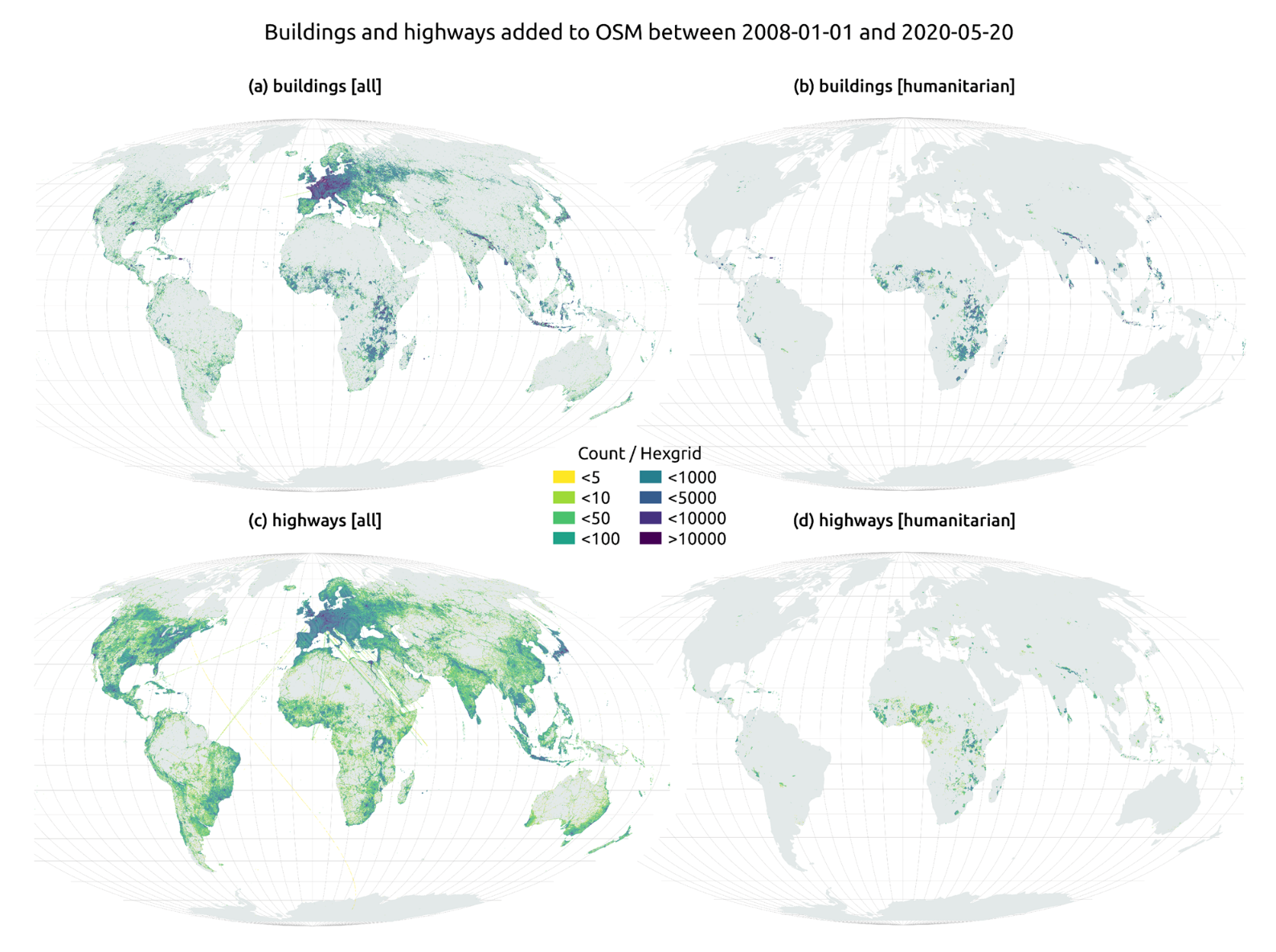
In this article The evolution of humanitarian mapping within the OpenStreetMap community by Nature, we can see graphically some of the achievements of the platform.
How to collaborate
It is easy to start collaborating with Hot OSM, just go to https://tasks.hotosm.org/explore and see the open projects that need collaboration.
This screen allows us a lot of options when searching for projects, selected by level of difficulty, organisation, location or interests among others.
To participate, simply click on the Register button.
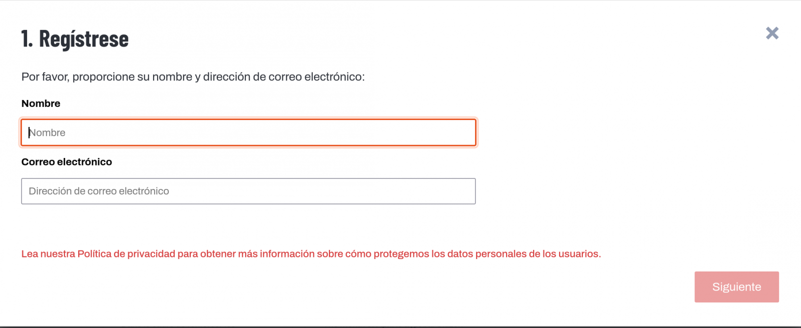
Give a name and an e-mail adress on the next screen:
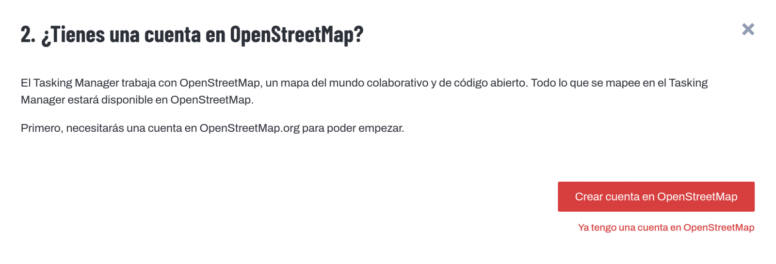
It will ask us if we have already created an account in Open Street Maps or if we want to create one.
If we want to see the process in more detail, this website makes it very easy.
Once the user has been created, on the learning page we find help on how to participate in the project.
It is important to note that the contributions of the volunteers are reviewed and validated and there is a second level of volunteers, the validators, who validate the work of the beginners. During the development of the tool, the HOT team has taken great care to make it a user-friendly application so as not to limit its use to people with computer skills.
In addition, organisations such as the Red Cross and the United Nations regularly organise mapathons to bring together groups of people for specific projects or to teach new volunteers how to use the tool. These meetings serve, above all, to remove the new users' fear of "breaking something" and to allow them to see how their voluntary work serves concrete purposes and helps other people.
Another of the project's great strengths is that it is based on free software and allows for its reuse. In the MissingMaps project's Github repository we can find the code and if we want to create a community based on the software, the Missing Maps organisation facilitates the process and gives visibility to our group.
In short, Hot OSM is a citizen science and data altruism project that contributes to bringing benefits to society through the development of collaborative maps that are very useful in emergency situations. This type of initiative is aligned with the European concept of data governance that seeks to encourage altruism to voluntarily facilitate the use of data for the common good.
Content by Santiago Mota, senior data scientist.
The contents and views reflected in this publication are the sole responsibility of the author.
Blog
The European Commission's 'European Data Strategy' states that the creation of a single market for shared data is key. In this strategy, the Commission has set as one of its main objectives the promotion of a data economy in line with European values of self-determination in data sharing (sovereignty), confidentiality, transparency, security and fair competition.
Common data spaces at European level are a fundamental resource in the data strategy because they act as enablers for driving the data economy. Indeed, pooling European data in key sectors, fostering data circulation and creating collective and interoperable data spaces are actions that contribute to the benefit of society.
Although data sharing environments have existed for a long time, the creation of data spaces that guarantee EU values and principles is an issue. Developing enabling legislative initiatives is not only a technological challenge, but also one of coordination among stakeholders, governance, adoption of standards and interoperability.
To address a challenge of this magnitude, the Commission plans to invest close to €8 billion by 2027 in the deployment of Europe's digital transformation. Part of the project includes the promotion of infrastructures, tools, architectures and data sharing mechanisms. For this strategy to succeed, a data space paradigm that is embedded in the industry needs to be developed, based on the fulfilment of European values. This data space paradigm will act as a de facto technology standard and will advance social awareness of the possibilities of data, which will enable the economic return on the investments required to create it.
In order to make the data space paradigm a reality, from the convergence of current initiatives, the European Commission has committed to the development of the Simpl project.
What exactly is Simpl?
Simpl is a €150 million project funded by the European Commission's Digital Europe programme with a three-year implementation period. Its objective is to provide society with middleware for building data ecosystems and cloud infrastructure services that support the European values of data sovereignty, privacy and fair markets.
The Simpl project consists of the delivery of 3 products:
- Simpl-Open: Middleware itself. This is a software solution to create ecosystems of data services (data and application sharing) and cloud infrastructure services (IaaS, PaaS, SaaS, etc). This software must include agents enabling connection to the data space, operational services and brokerage services (catalogue, vocabulary, activity log, etc.). The result should be delivered under an open source licence and an attempt will be made to build an open source community to ensure its evolution.
- Simpl-Labs: Infrastructure for creating test bed environments so that interested users can test the latest version of the software in self-service mode. This environment is primarily intended for data space developers who want to do the appropriate technical testing prior to a deployment.
- Simpl-Live: Deployments of Simpl-open in production environments that will correspond to sectorial spaces contemplated in the Digital Europe programme. In particular, the deployment of data spaces managed by the European Commission itself (Health, Procurement, Language) is envisaged.
The project is practically oriented and aims to deliver results as soon as possible. It is therefore intended that, in addition to supplying the software, the contractor will provide a laboratory service for user testing. The company developing Simpl will also have to adapt the software for the deployment of common European data spaces foreseen in the Digital Europe programme.
The Gaia-X partnership is considered to be the closest in its objectives to the Simpl project, so the outcome of the project should strive for the reuse of the components made available by Gaia-X.
For its part, the Data Space Support Center, which involves the main European initiatives for the creation of technological frameworks and standards for the construction of data spaces, will have to define the middleware requirements by means of specifications, architectural models and the selection of standards.
Simpl's preparatory work was completed in May 2022, setting out the scope and technical requirements of the project which have been the subject of detail in the currently open contractual process. The tender was launched on 24 February 2023. All information is available on TED eTendering, including how to ask questions about the tendering process. The deadline for applications is 24 April 2023 at 17:00 (Brussels time).
Simpl expects to have a minimum viable platform published in early 2024. In parallel, and as soon as possible, the open test environment (Simpl-Labs) will be made available for interested parties to experiment. This will be followed by the progressive integration of different use cases, helping to tailor Simpl to specific needs, with priority being given to cases otherwise funded under the Europe DIGITAL work programme.
In conclusion, Simpl is the European Commission's commitment to the deployment and interoperability of the different sectoral data space initiatives, ensuring alignment with the specifications and requirements emanating from the Data Space Support Center and, therefore, with the convergence process of the different European initiatives for the construction of data spaces (Gaia-X, IDSA, Fiware, BDVA).
Documentación
1. Introduction
Visualizations are graphical representations of data that allows comunication in a simple and effective way the information linked to it. The visualization possibilities are very wide, from basic representations, such as a graph of lines, bars or sectors, to visualizations configured on dashboards or interactive dashboards. Visualizations play a fundamental role in drawing conclusions using visual language, also allowing to detect patterns, trends, anomalous data or project predictions, among many other functions.
In this section of "Step-by-Step Visualizations" we are periodically presenting practical exercises of open data visualizations available in datos.gob.es or other similar catalogs. They address and describe in a simple way the necessary stages to obtain the data, perform the transformations and analysis that are relevant to it and finally, the creation of interactive visualizations. From these visualizations we can extract information to summarize in the final conclusions. In each of these practical exercises, simple and well-documented code developments are used, as well as free to use tools. All generated material is available for reuse in the Github data lab repository belonging to datos.gob.es.
In this practical exercise, we have carried out a simple code development that is conveniently documented based on free to use tool.
Access the data lab repository on Github.
Run the data pre-processing code on Google Colab.
2. Objetive
The main objective of this post is to show how to make an interactive visualization based on open data. For this practical exercise we have used a dataset provided by the Ministry of Justice that contains information about the toxicological results made after traffic accidents that we will cross with the data published by the Central Traffic Headquarters (DGT) that contain the detail on the fleet of vehicles registered in Spain.
From this data crossing we will analyze and be able to observe the ratios of positive toxicological results in relation to the fleet of registered vehicles.
It should be noted that the Ministry of Justice makes available to citizens various dashboards to view data on toxicological results in traffic accidents. The difference is that this practical exercise emphasizes the didactic part, we will show how to process the data and how to design and build the visualizations.
3. Resources
3.1. Datasets
For this case study, a dataset provided by the Ministry of Justice has been used, which contains information on the toxicological results carried out in traffic accidents. This dataset is in the following Github repository:
The datasets of the fleet of vehicles registered in Spain have also been used. These data sets are published by the Central Traffic Headquarters (DGT), an agency under the Ministry of the Interior. They are available on the following page of the datos.gob.es Data Catalog:
3.2. Tools
To carry out the data preprocessing tasks it has been used the Python programming language written on a Jupyter Notebook hosted in the Google Colab cloud service.
Google Colab (also called Google Colaboratory), is a free cloud service from Google Research that allows you to program, execute and share code written in Python or R from your browser, so it does not require the installation of any tool or configuration.
For the creation of the interactive visualization, the Google Data Studio tool has been used.
Google Data Studio is an online tool that allows you to make graphs, maps or tables that can be embedded in websites or exported as files. This tool is simple to use and allows multiple customization options.
If you want to know more about tools that can help you in the treatment and visualization of data, you can use the report "Data processing and visualization tools".
4. Data processing or preparation
Before launching to build an effective visualization, we must carry out a previous treatment of the data, paying special attention to obtaining it and validating its content, ensuring that it is in the appropriate and consistent format for processing and that it does not contain errors.
The processes that we describe below will be discussed in the Notebook that you can also run from Google Colab. Link to Google Colab notebook
As a first step of the process, it is necessary to perform an exploratory data analysis (EDA) in order to properly interpret the starting data, detect anomalies, missing data or errors that could affect the quality of subsequent processes and results. Pre-processing of data is essential to ensure that analyses or visualizations subsequently created from it are reliable and consistent. If you want to know more about this process, you can use the Practical Guide to Introduction to Exploratory Data Analysis.
The next step to take is the generation of the preprocessed data tables that we will use to generate the visualizations. To do this we will adjust the variables, cross data between both sets and filter or group as appropriate.
The steps followed in this data preprocessing are as follows:
- Importing libraries
- Loading data files to use
- Detection and processing of missing data (NAs)
- Modifying and adjusting variables
- Generating tables with preprocessed data for visualizations
- Storage of tables with preprocessed data
You will be able to reproduce this analysis since the source code is available in our GitHub account. The way to provide the code is through a document made on a Jupyter Notebook that once loaded into the development environment you can execute or modify easily. Due to the informative nature of this post and favor the understanding of non-specialized readers, the code does not intend to be the most efficient, but to facilitate its understanding, so you will possibly come up with many ways to optimize the proposed code to achieve similar purposes. We encourage you to do so!
5. Generating visualizations
Once we have done the preprocessing of the data, we go with the visualizations. For the realization of these interactive visualizations, the Google Data Studio tool has been used. Being an online tool, it is not necessary to have software installed to interact or generate any visualization, but it is necessary that the data tables that we provide are properly structured, for this we have made the previous steps for the preparation of the data.
The starting point is the approach of a series of questions that visualization will help us solve. We propose the following:
- How is the fleet of vehicles in Spain distributed by Autonomous Communities?
- What type of vehicle is involved to a greater and lesser extent in traffic accidents with positive toxicological results?
- Where are there more toxicological findings in traffic fatalities?
Let''s look for the answers by looking at the data!
5.1. Fleet of vehicles registered by Autonomous Communities
This visual representation has been made considering the number of vehicles registered in the different Autonomous Communities, breaking down the total by type of vehicle. The data, corresponding to the average of the month-to-month records of the years 2020 and 2021, are stored in the "parque_vehiculos.csv" table generated in the preprocessing of the starting data.
Through a choropleth map we can visualize which CCAAs are those that have a greater fleet of vehicles. The map is complemented by a ring graph that provides information on the percentages of the total for each Autonomous Community.
As defined in the "Data visualization guide of the Generalitat Catalana" the choropletic (or choropleth) maps show the values of a variable on a map by painting the areas of each affected region of a certain color. They are used when you want to find geographical patterns in the data that are categorized by zones or regions.
Ring charts, encompassed in pie charts, use a pie representation that shows how the data is distributed proportionally.
Once the visualization is obtained, through the drop-down tab, the option to filter by type of vehicle appears.
View full screen visualization
5.2. Ratio of positive toxicological results for different types of vehicles
This visual representation has been made considering the ratios of positive toxicological results by number of vehicles nationwide. We count as a positive result each time a subject tests positive in the analysis of each of the substances, that is, the same subject can count several times in the event that their results are positive for several substances. For this purpose, the table "resultados_vehiculos.csv” has been generated during data preprocessing.
Using a stacked bar chart, we can evaluate the ratios of positive toxicological results by number of vehicles for different substances and different types of vehicles.
As defined in the "Data visualization guide of the Generalitat Catalana" bar graphs are used when you want to compare the total value of the sum of the segments that make up each of the bars. At the same time, they offer insight into how large these segments are.
When stacked bars add up to 100%, meaning that each segmented bar occupies the height of the representation, the graph can be considered a graph that allows you to represent parts of a total.
The table provides the same information in a complementary way.
Once the visualization is obtained, through the drop-down tab, the option to filter by type of substance appears.
View full screen visualization
5.3. Ratio of positive toxicological results for the Autonomous Communities
This visual representation has been made taking into account the ratios of the positive toxicological results by the fleet of vehicles of each Autonomous Community. We count as a positive result each time a subject tests positive in the analysis of each of the substances, that is, the same subject can count several times in the event that their results are positive for several substances. For this purpose, the "resultados_ccaa.csv" table has been generated during data preprocessing.
It should be noted that the Autonomous Community of registration of the vehicle does not have to coincide with the Autonomous Community where the accident has been registered, however, since this is a didactic exercise and it is assumed that in most cases they coincide, it has been decided to start from the basis that both coincide.
Through a choropleth map we can visualize which CCAAs are the ones with the highest ratios. To the information provided in the first visualization on this type of graph, we must add the following.
As defined in the "Data Visualization Guide for Local Entities" one of the requirements for choropleth maps is to use a numerical measure or datum, a categorical datum for the territory, and a polygon geographic datum.
The table and bar chart provides the same information in a complementary way.
Once the visualization is obtained, through the peeling tab, the option to filter by type of substance appears.
View full screen visualization
6. Conclusions of the study
Data visualization is one of the most powerful mechanisms for exploiting and analyzing the implicit meaning of data, regardless of the type of data and the degree of technological knowledge of the user. Visualizations allow us to build meaning on top of data and create narratives based on graphical representation. In the set of graphical representations of data that we have just implemented, the following can be observed:
- The fleet of vehicles of the Autonomous Communities of Andalusia, Catalonia and Madrid corresponds to about 50% of the country''s total.
- The highest positive toxicological results ratios occur in motorcycles, being of the order of three times higher than the next ratio, passenger cars, for most substances.
- The lowest positive toxicology result ratios occur in trucks.
- Two-wheeled vehicles (motorcycles and mopeds) have higher "cannabis" ratios than those obtained in "cocaine", while four-wheeled vehicles (cars, vans and trucks) have higher "cocaine" ratios than those obtained in "cannabis"
- The Autonomous Community where the ratio for the total of substances is highest is La Rioja.
It should be noted that in the visualizations you have the option to filter by type of vehicle and type of substance. We encourage you to do so to draw more specific conclusions about the specific information you''re most interested in.
We hope that this step-by-step visualization has been useful for learning some very common techniques in the treatment and representation of open data. We will return to show you new reuses. See you soon!
Noticia
Effective equality between men and women is a common goal to be achieved as a society. This is stated by the United Nations (UN), which includes "Achieve gender equality and empower all women and girls" as one of the Sustainable Development Goals to be achieved by 2030.
For this, it is essential to have quality data that show us the reality and the situations of risk and vulnerability that women face. This is the only way to design effective policies that are more equitable and informed, in areas such as violence against women or the fight to break glass ceilings. This has led to an increasing number of organisations opening up data related to gender inequality. However, according to the UN itself, less than half of the data needed to monitor gender inequality is currently available.
What data are needed?
In order to understand the real situation of women and girls in the world, it is necessary to systematically include a gender analysis in all stages of the production of statistics. This implies from using gender-sensitive concepts to broadening the sources of information in order to highlight phenomena that are currently not being measured.
Gender data does not only refer to sex-disaggregated data. Data also need to be based on concepts and definitions that adequately reflect the diversity of women and men, capturing all aspects of their lives and especially those areas that are most susceptible to inequalities. In addition, data collection methods need to take into account stereotypes and social and cultural factors that may induce gender bias in the data.
Resources for gender mainstreaming in data
From datos.gob.es we have already addressed this issue in other contents, providing some initial clues on the creation of datasets with a gender perspective, but more and more organisations are becoming involved in this area, producing materials that can help to alleviate this issue.
The UN Statistics Division produced the report “Integrating a Gender Perspective into Statistics” to provide the methodological and analytical information needed to improve the availability, quality and use of gender statistics. The report focuses on 10 themes: education; work; poverty; environment; food security; power and decision-making; population, households and families; health; migration, displaced persons and refugees; and violence against women. For each theme, the report details the gender issues to be addressed, the data needed to address them, data sources to be considered, and specific conceptual and measurement issues. The report also discusses in a cross-cutting manner how to generate surveys, conduct data analysis or generate appropriate visualisations.
UN agencies are also working on this issue in their various areas of action. For example, Unicef has also developed guides of interest such as “Gender statistics and administrative data systems”, which compiles resources such as conceptual and strategic frameworks, practical tools and use cases, among others.
Another example is the World Bank. This organisation has a gender-sensitive data portal, where it offers indicators and statistics on various aspects such as health, education, violence or employment. The data can be downloaded in CSV or Excel, but it is also displayed through narratives and visualisations, which make it easier to understand. In addition, they can be accessed through an API. This portal also includes a section where tools and guidelines are compiled to improve data collection, use and dissemination of gender statistics. These materials are focused on specific sectors, such as agri-food or domestic work. It also has a section on courses, where we can find, among others, training on how to communicate and use gender statistics.
Initiatives in Spain
If we focus on our country, we also find very interesting initiatives. We have already talked about GenderDataLab.org, a repository of open data with a gender perspective. Its website also includes guides on how to generate and share these datasets. If you want to know more about this project, we invite you to watch this interview with Thais Ruiz de Alda, founder and CEO of Digital Fems, one of the entities behind this initiative.
In addition, an increasing number of agencies are implementing mechanisms to publish gender-sensitive datasets. The Government of the Canary Islands has created the web tool “Canary Islands in perspective” to bring together different statistical sources and provide a scorecard with data disaggregated by sex, which is continuously updated. Another project worth mentioning is the “Women and Men in the Canary Islands” website, the result of a statistical operation designed by the Canary Islands Statistics Institute (ISTAC) in collaboration with the Canary Islands Institute for Equality. It compiles information from different statistical operations and analyses it from a gender perspective.
The Government of Catalonia has also included this issue in its Government Plan. In the report "Prioritisation of open data relating to gender inequality for the Government of Catalonia" they compile bibliography and local and international experiences that can serve as inspiration for both the publication and use of this type of datasets. The report also proposes a series of indicators to be taken into account and details some datasets that need to be opened up.
These are just a few examples that show the commitment of civil associations and public bodies in this area. A field we must continue to work in order to get the necessary data to be able to assess the real situation of women in the world and thus design political solutions that will enable a fairer world for all.
Blog
On 24 February Europe entered a scenario that not even the data could have predicted: Russia invaded Ukraine, unleashing the first war on European soil so far in the 21st century.
Almost five months later, on 26 September, the United Nations (UN) published its official figures: 4,889 dead and 6,263 wounded. According to the official UN data, month after month, the reality of the Ukrainian victims was as follows:
| Date | Deceased | Injured |
|---|---|---|
| 24-28 February | 336 | 461 |
| March | 3028 | 2384 |
| April | 660 | 1253 |
| May | 453 | 1012 |
| Jun | 361 | 1029 |
| 1-3 july | 51 | 124 |
According to data extracted by the mission that the UN High Commissioner for Human Rights has been carrying out in Ukraine since Russia invaded Crimea in 2014, the total number of civilians displaced as a result of the conflict is more than 7 million people.
However, as in other areas, the data serve not only to develop solutions, but also to gain an in-depth understanding of aspects of reality that would otherwise not be possible. In the case of the war in Ukraine, the collection, monitoring and analysis of data on the territory allows organisations such as the United Nations to draw their own conclusions.
With the aim of making visible how data can be used to achieve peace, we will now analyse the role of data in relation to the following tasks:
Prediction
In this area, data are used to try to anticipate situations and plan an appropriate response to the anticipated risk. Whereas before the outbreak of war, data was used to assess the risk of future conflict, it is now being used to establish control and anticipate escalation.
For example, satellite images provided by applications such as Google Maps have made it possible to monitor the advance of Russian troops. Similarly, visualisers such as Subnational Surge Tracker identify peaks of violence at different administrative levels: states, provinces or municipalities.
Information
It is just as important to know the facts in order to prevent violence as it is to use them to limit misinformation and communicate the facts objectively, truthfully and in line with official figures. To achieve this, fact-checking applications have begun to be used, capable of responding to fake news with official data.
Among them is Newsguard, a verification entity that has developed a tracker that gathers all the websites that share disinformation about the conflict, placing special emphasis on the most popular false narratives circulating on the web. It even catalogues this type of content according to the language in which it is promoted.
Material damage
The data can also be used to locate material damage and track the occurrence of new damage. Over the past months, the Russian offensive has damaged the Ukrainian public infrastructure network, rendering roads, bridges, water and electricity supplies, and even hospitals unusable.
Data on this reality is very useful for organising a response aimed at reconstructing these areas and sending humanitarian assistance to civilians who have been left without services.
In this sense, we highlight the following use cases:
- The United Nations Development Programme''s (UNDP) machine learning algorithm has been developed and improved to identify and classify war-damaged infrastructure.
- In parallel, the HALO Trust uses social media mining capable of capturing information from social media, satellite imagery and even geographic data to help identify areas with ''explosive remnants''. Thanks to this finding, organisations deployed across the Ukrainian terrain can move more safely to organise a coordinated humanitarian response.
- The light information captured by NASA satellites is also being used to build a database to help identify areas of active conflict in Ukraine. As in the previous examples, this data can be used to track and send aid to where it is most needed.
Human rights violations and abuses
Unfortunately, in such conflicts, violations of the human rights of the civilian population are the order of the day. In fact, according to experience on the ground and information gathered by the UN High Commissioner for Human Rights, such violations have been documented throughout the entire period of war in Ukraine.
In order to understand what is happening to Ukrainian civilians, monitoring and human rights officers collect data, public information and first-person accounts of the war in Ukraine. From this, they develop a mosaic map that facilitates decision-making and the search for just solutions for the population.
Another very interesting work developed with open data is carried out by Conflict Observatory. Thanks to the collaboration of analysts and developers, and the use of geospatial information and artificial intelligence, it has been possible to discover and map war crimes that might otherwise remain invisible.
Migratory movements
Since the outbreak of war last February, more than 7 million Ukrainians have fled the war and thus their own country. As in previous cases, data on migration flows can be used to bolster humanitarian efforts for refugees and IDPs.
Some of the initiatives where open data contributes include the following:
The Displacement Tracking Matrix is a project developed by the International Organization for Migration and aimed at obtaining data on migration flows within Ukraine. Based on the information provided by approximately 2,000 respondents through telephone interviews, a database was created and used to ensure the effective distribution of humanitarian actions according to the needs of each area of the country
Humanitarian response
Similar to the analysis carried out to monitor migratory movements, the data collected on the conflict also serves to design humanitarian response actions and track the aid provided.
In this line, one of the most active actors in recent months has been the United Nations Population Fund (UNFPA), which created a dataset containing updated projections by gender, age and Ukrainian region. In other words, thanks to this updated mapping of the Ukrainian population, it is much easier to think about what needs each area has in terms of medical supplies, food or even mental health support.
Another initiative that is also providing support in this area is the Ukraine Data Explorer, an open source project developed on the Humanitarian Data Exchange (HDX) platform that provides collaboratively collected information on refugees, victims and funding needs for humanitarian efforts.
Finally, the data collected and subsequently analysed by Premise provides visibility on areas with food and fuel shortages. Monitoring this information is really useful for locating the areas of the country with the least resources for people who have migrated internally and, in turn, for signalling to humanitarian organisations which areas are most in need of assistance.
Innovation and the development of tools capable of collecting data and drawing conclusions from it is undoubtedly a major step towards reducing the impact of armed conflict. Thanks to this type of forecasting and data analysis, it is possible to respond quickly and in a coordinated manner to the needs of civil society in the most affected areas, without neglecting the refugees who are displaced thousands of kilometres from their homes.
We are facing a humanitarian crisis that has generated more than 12.6 million cross-border movements. Specifically, our country has attended to more than 145,600 people since the beginning of the invasion and more than 142,190 applications for temporary protection have been granted, 35% of them to minors. These figures make Spain the fifth Member State with the highest number of favourable temporary protection decisions. Likewise, more than 63,500 displaced persons have been registered in the National Health System and with the start of the academic year, there are 30,919 displaced Ukrainian students enrolled in school, of whom 28,060 are minors..
Content prepared by the datos.gob.es team.
Empresa reutilizadora
Estudio Alfa is a technology company dedicated to offering services that promote the image of companies and brands on the Internet, including the development of apps. To carry out these services, they use techniques and strategies that comply with usability standards and favour positioning in search engines, thus helping their clients' websites to receive more visitors and thus potential clients. They also have special experience in the production and tourism sectors.
Noticia
The deadline for receiving applications to participate in the IV Aporta Challenge closed on 15 February. In total, 38 valid proposals were received in due time and form, all of high quality, whose aim is to promote improvements in the health and well-being of citizens through the reuse of data offered by public administrations for their reuse.
Disruptive technologies, key to extracting maximum value from data
According to the competition rules, in this first phase, participants had to present ideas that identified new opportunities to capture, analyse and use data intelligence in the development of solutions of all kinds: studies, mobile applications, services or websites.
All the ideas seek to address various challenges related to health and wellbeing, many of which have a direct impact on our healthcare system, such as improving the efficiency of services, optimising resources or boosting transparency. Some of the areas addressed by participants include pressure on the health system, diagnosis of diseases, mental health, healthy lifestyles, air quality and the impact of climate change.
Many of the participants have chosen to use disruptive technologies to address these challenges. Among the proposals, we find solutions that harness the power of algorithms to cross-reference data and determine healthy habits or predictive models that allow us to know the evolution of diseases or the situation of the health system. Some even use gamification techniques. There are also a large number of solutions aimed at bringing useful information to citizens, through maps or visualisations.
Likewise, the specific groups at which the solutions are aimed are diverse: we find tools aimed at improving the quality of life of people with disabilities, the elderly, children, individuals who live alone or who need home care, etc.
Proposals from all over Spain and with a greater presence of women
Teams and individuals from all over Spain have been encouraged to participate in the Challenge. We have representatives from 13 Autonomous Communities: Madrid, Catalonia, the Basque Country, Andalusia, Valencia, the Canary Islands, Galicia, Aragon, Extremadura, Castile and Leon, Castile-La Mancha, La Rioja and Asturias.
25% of the proposals were submitted by individuals and 75% by multidisciplinary teams made up of various members. The same distribution is found between individuals (75%) and legal entities (25%). In the latter category, we find teams from universities, organisations linked to the Public Administration and different companies.
It is worth noting that in this edition the number of women participants has increased, demonstrating the progress of our society in the field of equality. Two editions ago, 38% of the proposals were submitted by women or by teams with women members. Now that number has risen to 47.5%. While this is a significant improvement, there is still work to be done in promoting STEM subjects among women and girls in our country.
Jury deliberation begins
Once the proposals have been accepted, it is time for the jury's assessment, made up of experts in the field of innovation, data and health. The assessment will be based on a series of criteria detailed in the rules, such as the overall quality and clarity of the proposed idea, the data sources used or the expected impact of the proposed idea on improving the health and well-being of citizens.
The 10 proposals with the best evaluation will move on to phase II, and will have a minimum of two months to develop the prototype resulting from their idea. The proposals will be presented to the same jury, which will score each project individually. The three prototypes with the highest scores will be the winners and will receive a prize of 5,000, 4,000 and 3,000 euros, respectively.
Good luck to all participants!
Blog
Today, 8 March is the day on which we commemorate women's struggle to achieve their full participation in society, as well as giving visibility to the current gender inequality and demanding global action for effective equality of rights in all areas.
However, the data seem to indicate that we still have some way to go in this respect. 70% of the 1.3 billion people living in poverty are women. Women predominate in global food production (up to 80% in some areas), but own less than 10% of the land. Eighty per cent of people displaced by disasters and climate-related changes worldwide are women and girls. And the situation for women has only worsened due to the pandemic, causing the estimate of the time needed to close the current gender gap to now grow to more than 135 years.
The importance of data in the fight for equality
It is therefore a fact that women have fallen behind on many of the sustainable development indicators, an inequality that is also being replicated in the digital world - and even amplified through the increasing use of algorithms that lack the necessary training data to be representative of women's reality. But it is also a fact that we do not even have all the data we need to know with certainty where we stand on a large number of key indicators.
There is a widespread shortage of gender data that cuts across all economic and social sectors. The World Bank, the European Union, the OECD, the United Nations, UNICEF, the ITU or the IMF - more and more international bodies are making their own particular efforts to compile their own gender databases. However, indicators are still lacking in many key areas, in addition to other important gaps in the quality of existing data that are often incomplete or outdated.
This lack of data is something that can be particularly problematic when it comes to such sensitive issues as gender-based violence - an area where we are fortunately seeing more and more data globally, including some great and encouraging examples such as the ILDA-led femicide data initiative. This is a very important step forward because it is even more difficult to improve when we don't even know what the current situation is. Data, and the governance policies we create to manage it, can also be sexist.
Data are tools for making better decisions and better policies. They allow us to set goals and measure our progress. Data has therefore become an indispensable tool for creating social impact in communities. This is why the lack of data on the lives of women and girls is so damaging.
Addressing the gender gap through data
In seeking solutions to this problem, and thus working for gender equality also through data, it is crucial that we involve the protagonists and give them a voice. In this way, through their own experiences, we can develop more inclusive processes for data collection, analysis and publication. We will then be in a much better position to use data as an inclusive tool to address gender equality. Catherine D'Ignazio and Lauren Klein's excellent Data Feminism Handbook provides a set of strategies and principles to guide us in doing this:
- Examining power - Data feminism begins by looking at how power operates in the world.
- Challenging power - We must commit to challenging power structures when they are unequal and working for equity.
- Empowering emotions and embodiment - Data feminism teaches us to value multiple forms of knowledge, including that which comes from people.
- Rethink binarisms and hierarchies - We must challenge gender binarism, as well as other systems of quantification and classification that could lead to various forms of marginalisation.
- Embrace pluralism - The most complete knowledge emerges from synthesising multiple perspectives, prioritising local knowledge and experiences.
- Consider context - Data are neither neutral nor objective. They are products of unequal social relations, and understanding that context will be essential to ethical and accurate analysis.
- Make the work visible - The work of data science is the collaborative product of many people. All of this work must be made visible, so that it can be recognised and valued.
Nuestras opciones para contribuir a reducir la brecha de datos
In order to make progress in this fight for equality, we need much more gender-disaggregated data that adequately reflects the concerns of women and girls, their diversity and all aspects of their lives. We can and should all do our part in drawing attention to the disadvantages women face through data. Here are some tips:
- Start by always collecting and publishing data disaggregated by gender.
- Always use women as a reference group in our calculations when we are dealing with inequalities that affect them directly.
- Document the decisions we make and our methodologies in working with gender data, including any changes in our approaches over time and their justification.
- Always share raw and complete data in an open and reusable format. In this way, even if we have not focused on the challenges women face, at least others can do so using the same data.
Together we can make the invisible visible and finally ensure that every single woman and girl in the world is counted. The situation is urgent and now is the time to make a determined bid to close the data gap as a necessary tool to close the gender gap as well.
Content prepared by Carlos Iglesias, Open data Researcher and consultant, World Wide Web Foundation. The contents and views expressed in this publication are the sole responsibility of the author.
Blog
Today, no one can deny that open data holds great economic power. The European Commission itself estimates that the turnover of open data in the EU27 could reach 334.2 billion in 2025, driven by its use in areas linked to disruptive technologies such as artificial intelligence, machine learning or language technologies.
But in addition to its economic impact, open data also has an important value for society: it provides information that makes social reality visible, driving informed decision-making for the common good.
There are thousands of areas where open data is essential, from refugee crises to the inclusion of people with disabilities, but in this article we will focus on the scourge of gender violence.
Where can I obtain data on the subject?
Globally, agencies such as the UN, the World Health Organization and the World Bank offer resources and statistics related to violence against women.
In our country, local, autonomous and state agencies publish related datasets. To facilitate unified access to them, the Government Delegation against Gender Violence has a statistical portal that includes in a single space data from various sources such as the Ministry of Finance and Public Administration, the General Council of the Judiciary or the Public Employment Service of the Ministry of Employment and Social Security. The user can cross-reference variables and create tables and graphs to facilitate the visualization of the information, as well as export the data sets in CSV or Excel format.
Projects to raise awareness and visibility
But data alone can be complicated to understand. Data need a context that gives them meaning and transforms them into information and knowledge. This is where different projects arise that seek to bring data to the public in a simple way.
There are many associations and organizations that take advantage of published data to create visualizations and stories with data that help to raise awareness about gender violence. As an example, the Barcelona Open Data Initiative is developing the "DatosXViolenciaXMujeres" project. It is a visual and interactive tour on the impact of gender violence in Spain and by Autonomous Communities during the period 2008-2020, although it is updated periodically. Using data storytelling techniques, it shows the evolution of gender violence within the couple, the judicial response (orders issued and final convictions), the public resources allocated, the impact of COVID-19 in this area and crimes of sexual violence. Each graph includes links to the original source and to places where the data can be downloaded so that they can be reused in other projects.
Another example is "Datos contra el ruido” (Data against noise), developed within the framework of GenderDataLab, a collaborative platform for the digital common good that has the support of various associations, such as Pyladies or Canodron, and the Barcelona City Council, among others. This association promotes the inclusion of the gender perspective in the collection of open data through various projects such as the aforementioned "Dotos contra el ruido", which makes visible and understandable the information published by the judicial system and the police on gender violence. Through data and visualizations, it provides information on the types of crimes or their geographical distribution throughout our country, among other issues. As with "DatosXViolenciaXMujeres", a link to the original source of the data and download spaces are included.
Tools and solutions to support victims
But in addition to providing visibility, open data can also give us information on the resources dedicated to helping victims, as we saw in some of the previous projects. Making this information available to victims in a quick and easy way is essential. Maps showing the location of help centers are of great help, such as this one from the SOL.NET project, with information on organizations that offer support and care services for victims of gender-based violence in Spain. Or this one with the centers and social services of the Valencian Community aimed at disadvantaged groups, including victims of gender violence, prepared by the public institution itself.
This information is also incorporated in applications aimed at victims, such as Anticípate. This app not only provides information and resources to women in vulnerable situations, but also has an emergency call button and allows access to legal, psychological or even self-defense advice, facilitating access to a social criminologist.
In short, we are facing a particularly sensitive issue, which we must continue to raise awareness and fight to put an end to. A task to which open data can make a significant contribution.
If you know of any other example that shows the power of open data in this field, we encourage you to share it in the comments section or send us an email to dinamizacion@datos.gob.es.
Content prepared by the datos.gob.es team.
Noticia
15 personalities from the field of innovation, data and health will be in charge of evaluating the proposals received at the IV edition of the Aporta Challenge, the competition that seeks to reward ideas and prototypes that promote improvements in a specific sector -in this case health and well-being- through the use of open data.
The names of the members of the jury have become known through a resolution published in the Red.es electronic headquarters. Among them we find representatives of the Public Administrations, organizations linked to the digital economy and the field of the university and data communities. Do you want to know who they are?
Organizations linked to digital advancement
The jury includes a series of representatives of public organizations at the national and regional level focused on the digitization and digital transformation of our country.
- Alberto Palomo Lozano, Chief Data Officer of the Data Office, dependent on the Secretary of State for Digitalization and Artificial Intelligence of the Ministry of Economic Affairs and Digital Transformation (MINECO). Among its functions is the promotion of the sharing, management and use of data throughout all productive sectors.
- Miguel Valle del Olmo, Deputy Director General of Artificial Intelligence and Digital Enabling Technologies f the Secretary of State for Digitalisation and Artificial Intelligence (MINECO), in charge of the design and implementation of the National Artificial Intelligence Strategy of Spain.
- Santiago Graña Dominguez, Deputy Director General of Planning and Governance of the Digital Administration of MINECO. Its aboutbody in charge of promoting the process of rationalization of information and communication technologies in the scope of the General Administration of the State and its Public Bodies.
- Francisco Javier García Vieira, Director of Digital Public Services of Red.es, a public entity promoter of the Digital Agenda in Spain. The Public service area works in three areas: in education, with Educa en Digital and the Educational Posts at Home; in health, with chronicity projects in Andalusia and Extremadura and with a whole range of local and provincial developments through the Smart Territories.
- María Fernández Rancaño, Deputy Director of Digital Public Services of Red.es, unit in charge of the deployment of technological implementation programs in public services of the Administration.
- Zaida Sampedro Loan, Deputy Director General of Services to Ministries and Digital Administration of Madrid Digital, the Agency for Digital Administration of the Community of Madrid.
Entities in the field of health
Given the sectorial nature of the Challenge, representatives of organizations linked to health and well-being have been invited to form part of the jury.
- Carlos Gallego Pérez, Director of Area IA of the Tic Salut Social Foundation of the Department of Health, of the Generalitat de Catalunya. This organismpromotes the development and use of ICT in health and social welfare, functioning as an observatory of new trends and innovation. Among its projects we find initiatives to bring the health field Artificial intelligence and Emerging technologies like 5G.
- Carlos Luis Parra Calderon, Head of the Technological Innovation Section of the Virgen del Rocío University Hospital of the Andalusian Health Service. This center has a R + D + i area focused on Learning Health Systems projects, Language Technologies or Big Data for Healthcare Management, among others.
- Noemí Cívicos Villa, General Director of Digital Health and Information Systems for the National system of health of the Ministry of Health. These are organizations that encompass health benefits and services in Spain.
Business associations
The Aporta Challenge seeks to highlight the power of data as the basis for business models that drive the economy. Therefore, the representatives of business entities could not be absent from the jury.
- Antonio Cimorra Boats, Director of Digital Transformation and Enabling Technologies of Ametic (Multisectoral Association of Information Technology, Communications and Electronics Companies). This association represents companies of all sizes linked to the Spanish digital technology industry.
- Olga Quirós Bonet. Secretary General of ASEDIE (Multisectoral Information Association). ASEDIE represents infomediary companies that, from different sectors, reuse information to create value-added products and services.
- Víctor María Calvo-Sotelo Ibáñez-Martín, Managing Director of Digital (Spanish Association for Digitization), which brings together companies present throughout the digital value chain. DigitalEs is part of the Advisory Council for the Digital Transformation of the Government and is a member of the CEOE board of directors.
Universities and data communities
Students and developers are, among others, two of the target audiences of this competition, and for this reason it was also important to have the participation of data communities and universities.
- Emilio López Cano, Contracted Professor of the Higher Technical School of Computer Engineering of the Rey Juan Carlos University of Madrid. Emilio is also the President of R-Hispano, a community of users and developers whose objective is to promote the advancement of the knowledge and use of the programming language in R.
- Fernando Diaz de Maria, Professor and Head of the Multimedia Processing Group of the Higher Polytechnic School of the Carlos III University of Madrid. This entity has an attractive training offer in data, both in degrees like in postgraduate.
- Maria Sanchez Gonzalez, Associate Professor of the Department of Journalism at the University of Malaga and co-organizer of DataBeers Malaga, a non-profit initiative specialized in dynamic events related to the universe of data, including data open data.
The Secretariat of the Jury, with voice and vote, falls to Sonia Castro García-Muñoz, Coordinator of the Aporta Initiative in the Directorate of Digital Public Services of Red.es.

The registration closing date has been extended to February 15
In the same resolution, the closing date for submitting proposals has also been extended to February 15, 2022 at 1:00 p.m. Those citizens who wish to participate in the Challenge must present before that date an idea for a solution that promotes improvements in the field of health and well-being, using at least one set of data generated by Public Administrations, whether national or international
All the available information is published, together with the bases, in the section Aporta Challenge.