


Publication date
29/09/2026
Type
Data exercises


Description
Introduction
The celestial dance of the stars in the solar system offers unique and singular spectacles from time to time, such as the entire total eclipses that took place in the Iberian Peninsula this year, and that will happen in 2027 and 2028. During a total eclipse, the Moon comes between the Earth and the Sun, hiding the sun and casting a shadow on a part of the Earth's surface for a few minutes.
The total eclipse of August 12, 2026 began at around 8:30 p.m. (GMT+01:00), covering the penumbra from Galicia to the Balearic Islands throughout the hour and a half duration of the eclipse.
The National Center for Geographic Information (CNIG) has made available to the public datasets that offer a wide spectrum of astronomical information related to the eclipse that occurred over the Iberian Peninsula in 2026, as well as those that will happen over the next two years.
These datasets include information on the visibility of the terrain itself at the time of the eclipse, the duration of the eclipse at each point of the Spanish geography, the level of obscuration or elevation of the Sun at the maximum point of the eclipse, as well as the shadow cast by the Moon on its path in front of the Sun.
In this exercise we will access the data sets of the CNIG and open the .TIF and .GPKG files with all the information related to the eclipse, and specifically with everything related to the shadow areas, both in terms of visibility due to the effect of the relief on the peninsula, and with regard to the shadow area itself due to the total eclipse.
Once we have accessed the data, we will limit our analysis to a specific area on visibility by relief, we will cut the original data with the perimeter of a municipality, we will export the result in GeoJSON format and, making use of it, we will be able to create different types of maps with various useful and intuitive tools such as KeplerGL, GoogleEarth, Leaflet or D3.js.
Data for the exercise
The data available to carry out this exercise are accessible in the Catalog of open data of datos.gob.es, there are three files with relevant information to describe and characterize the eclipse. Specifically, we find:
- Terrain shadows: File describing visibility by relief in a mesh of dots covering the Iberian Peninsula and the western part of North Africa.
- Contour Lines: A file containing the duration, maximum dimming, and penumbra curves projected from the Moon onto the Earth.
- Ephemeris: File that houses the eclipse ephemeris, such as elevation, azimuth, sunrise and sunset, as well as the beginning and end of the eclipse.
In this exercise we will focus on the first two, as they contain information on the shadow cast by both the relief and the Moon on the Iberian Peninsula.
In addition, we will also use the Data Catalogue to obtain the perimeter in SHP format of a municipality that allows us to analyse in detail the shadow by relief. In this way we will complete the access and reading of three different georeferenced data formats:
- TIFF: A popular format for high-resolution graphic information that tolerates high degrees of lossless compression and is therefore very manageable. The acronym stands for Tagged Image File Format.
- GPKG: An acronym for GeoPackage. This format is used in geographic information systems to store data in both radara and vector modes.
- SHP: vector data format containing geometric locations, also widely used in geographic information systems. It contains exclusively points, lines or polygons and is composed of several files containing indexes or attributes.
We will need the SHP format to have the perimeter of a municipality and thus be able to limit our study to a specific area of interest. Within the Data Catalog we have municipal perimeters in the Basque Country in this dataset. Within this SHP file we can choose one of these municipalities since they are characterized by its name.
Development process
In this section we will see the different stages that must be covered to get from the original compressed file to deploy maps on various platforms with the relevant information of the total eclipse. The code for reading and processing the data has been made in Python and can be consulted on Github, Google Colab and, the result, on Observable. The repository on Github can be found at the following link:
At Google Colab, we have two notebooks. The first allows us to extract and represent the shadow areas by the natural relief at the time of the eclipse, while the second allows us to obtain and visualize the shadow areas created by the eclipse itself:
Access the Google Colab notebooks
Finally, in Observable we can consult the code that allows us to create the maps with the information extracted in both Leaflet and D3.js:
Access the Observable notebooks
1. Visibility by relief
The first step of this exercise is to identify points where the eclipse was visible in ideal conditions without any cloudiness, a circumstance that was not completely ideal on the day of the eclipse, especially in coastal areas where the heat generated mist and fog in the late afternoon.
The data we analyse refer to the points affected by the relief and orography of the Iberian Peninsula itself. The data offered in TIFF format detail those points where visibility was total, partial or non-existent due to the effect of the relief, assigning four values:
- Value 0: The terrain prevents you from seeing the eclipse
- Value 1: the terrain allows you to see the upper half of the Sun.
- Value 2: the terrain allows you to see the upper half and part of the lower half of the Sun
- Value 3: the terrain allows you to see the Sun in its entirety
1.1 Reading the TIFF file
To read the TIFF we will use the Rioxarray Python library, which allows us to dump the content of a TIFF into a xarray, a data structure widely used to work with georeferenced information. Once the data has been loaded and formatted as a xarray, it is possible to use theiMatplotlib library to create a map and inspect the geographical area it comprises, shown as follows:
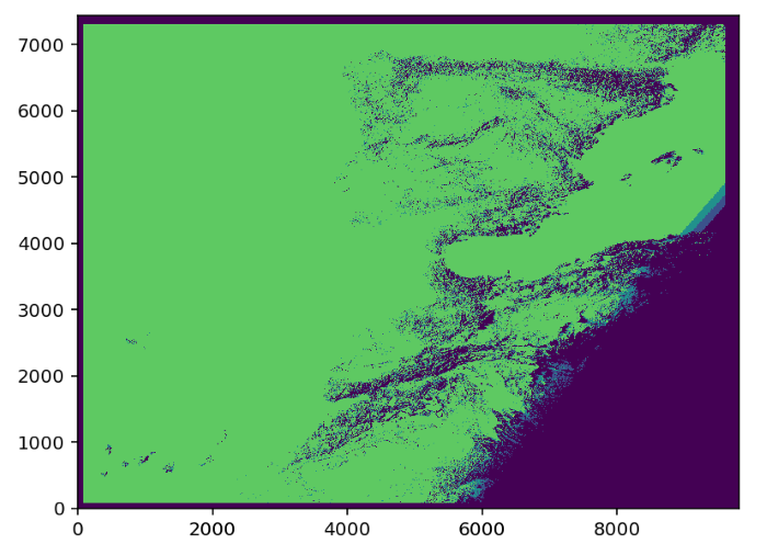
Figure 1: Relief visibility map of the Sun on August 12, 2026. Source: Done by datos.gob.es.
The data, as mentioned in the Introduction, cover the entire Iberian Peninsula, part of France and the western part of North Africa, so that the Balearic Islands and the Canary Islands are part of a single dataset. At this point, it can be seen how the shadow areas are intuitively related to the orography of mountain ranges and plateaus, as well as to the sunset and the shadow it induces in the east at the time of the eclipse.
Another relevant information that we can observe is the resolution of this dataset. In the x and y axes you can see the approximate number of points in each of the dimensions, which translates into a high resolution aimed at obtaining the greatest possible detail.
Given that our goal is to develop maps and visualizations that can be published on the web, as well as the agile processing of data, we will focus on a specific area, taking as a sample the extension of a municipality. In this way, the output files are relatively light and always below 10Mb, allowing current browsers to be able to process them quickly and efficiently.
1.2 Perimeter analysis
Using the data on the municipal perimeters in the Basque Country, we proceed to read the SHP file and structure it in GeoPandas format, a Python library that allows you to create geometries associated with a series of properties and attributes in an intuitive way.
To carry out this exercise we selected the municipality of Amurrio, since it has a diverse orography that allows us to have the entire possible spectrum of visibilities. In the next image we can see the limits of the municipality using the Matplotlib Python library, contextualized in longitude and latitude coordinates.
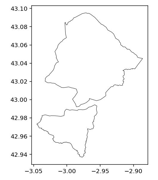
Figure 2: Map of the perimeter of the municipality of Amurrio in the Basque Country based on the SHP accessible as open data in datos.gob.es. Source: Done by datos.gob.es.
1.3 Perimeter Trimming
Thanks to the Shapely Python library, it is possible to cut out a xarray with the municipal information contained in the GeoPandas. Once cropped, we used Matplotlib to represent the subset of data, where we observed the variety of values and, therefore, the diversity of places with total, partial or no visibility in a relatively small region within what is the extension of the Iberian Peninsula. We observe the pattern of a dominant area of good visibility and others of poorer visibility as follows:
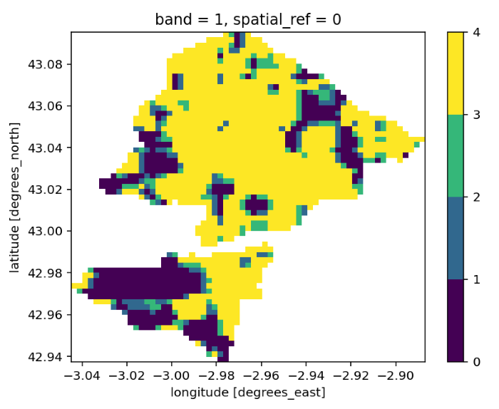
Figure 3: Map of the natural shadow areas by elevation of the terrain at the time of the eclipse in the municipality of Amurrio. Source: Done by datos.gob.es.
1.4 Export as GeoJSON
Once we have a small and manageable dataset, we can export each of the points in GeoJSON format. This format is very versatile when it comes to exporting data and using it in a large number of applications and tools, unlike the original TIFF which is usually restricted to specific geographic information system programs.
1.5 Visualization on GeoJSON maps
The resulting GeoJSON file allows us to present the information in geographic visualization applications such as KeplerGL or GoogleEarth, as well as easily integrate it into visualization projects using Javascript. To do this, libraries such as Leaflet or D3.js can be used, requiring only a few lines of code.
The first tool we will use to visualize the areas of shadow by relief is going to be the KeplerGL tool, which we already introduced in a previous exercise on geospatial data. To do this, simply drag the file to the file upload interface, after which a representation by dots associated with each point is automatically generated. In the visualization configuration, we link the color to the shadow variable and set the Quantize scale to distribute the values homogeneously throughout the interval. Finally, we selected a base layer of satellite images to contextualize the information and facilitate the identification of the underlying relief that gives rise to the areas of greater and lesser visibility, as we can see in the next image.
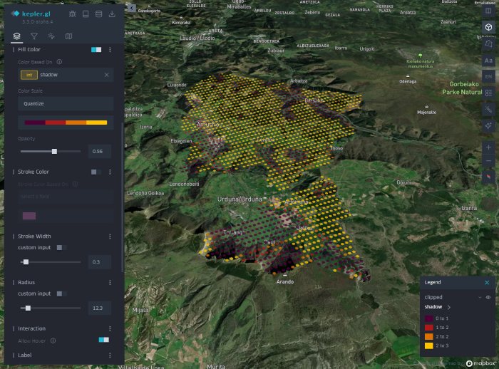
Figure 4: KeplerGL map of the natural shadow areas by elevation of the terrain at the time of the eclipse in the municipality of Amurrio. Source: Done by datos.gob.es.
The next tool in which we can visualize the result of a GeoJSON is Google Earth. In its development environment we can load the GeoJSON file, select the color scale and configure different display parameters using the corresponding dialog box. Despite being much more limited in customization than KeplerGL, GoogleEarth has a precise three-dimensional distribution that allows us to associate each point with its equivalent on the map, but this time incorporating the altitude of the point. The effect of distributing points in height gives the map more realism, illustrated by the next figure.
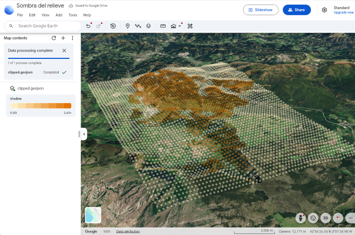
Figure 5: Map on GoogleEarth of the natural shadow areas by elevation of the terrain at the time of the eclipse in the municipality of Amurrio. Source: Done by datos.gob.es.
Finally, the GeoJSON file can be incorporated into a web front-end where the Leaflet library allows you to create a cartography in which you can project the points contained within the data file. In the next image we can see the result, very similar to the previous cases, where on a satellite image we have the points that we have extracted from the TIFF originally. This type of maps can be incorporated into web front-ends with a high degree of customization, surpassing the possibilities offered by tools such as KeplerGL or GoogleEarth. The notebook with the Javascript code for Leaflet can be consulted in Observable.
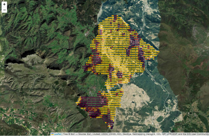
Figure 6: Map of the natural shadow areas by elevation of the terrain at the time of the eclipse in the municipality of Amurrio in Leaflet. Source: Done by datos.gob.es.
2. Eclipse Shadow Zone
Once we have identified the points of the Iberian geography where it is possible to see the eclipse in its fullness, we move on to visualize the trajectory and extension of the shadow area that the Moon projects on the Earth's surface.
To do this, we use the . GPKG file of the CNIG, which includes a layer dedicated to the location and extension of shadow areas at certain time intervals.
2.1 Reading .GPKG
The . GPKG file will be read with the help of the Python GeoPandas library . First, we extract the names of the different layers contained in the geopackage, which are defined by the first two words: oscurez_standard, moon_shadow and durtot_standard.
The layer we're interested in is moon_shadow, so we dump the contents of that layer into a GeoPandas dataframe. To get a global perspective of the shadow's entire path across the peninsula, we stitched together all the geometries of each time interval into a single geometric shape.
2.2 Aggregate shadow zone
With the help of the Cartopy library we can create a simple map of the extent of the entire eclipse path over the peninsula. Here we can see the route contextualized by the latitude and longitude coordinates.
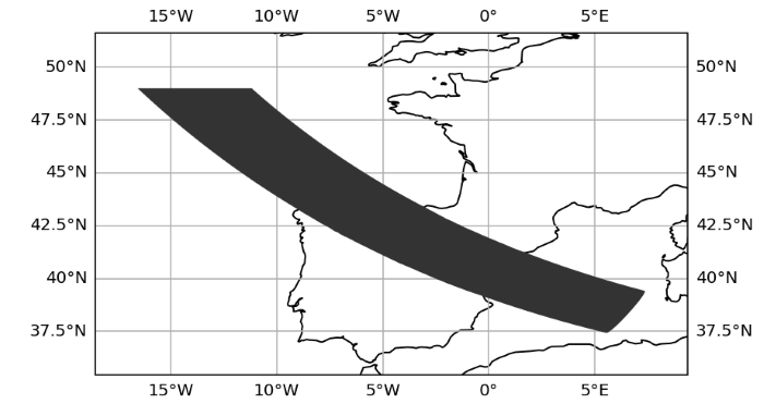
Figure 7: Map of the aggregate shadow zone created by the eclipse developed at Cartopy. Source: Done by datos.gob.es.
As in the case of the relief shadow areas, we are interested in focusing on the detail, in this case a specific time interval. To do this, we choose a specific time for the duration of the eclipse and create a specific map for that moment, which allows us to see with great realism what shape the shadow area on Earth can take. The next image shows the shadow area for t = 200, about 20 minutes after the beginning of the eclipse.
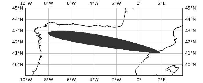
Figure 8: Map of the shadow zone 20 minutes after the beginning of the eclipse created in Cartopy. Source: Done by datos.gob.es.
2.3 Export as GeoJSON
Once we have selected a certain moment and shadow area, we can export that geometry in GeoJSON format to be able to use other more sophisticated tools or to incorporate it into a web environment. To do this, we redefine the order of the coordinates of the points that make up the geometry. This step, which is not very intuitive, allows us to guarantee the correct definition of the shape of the geometry in Javascript. It must be taken into account that in a closed geometric shape, the interior can be considered the exterior and vice versa. By forcing the order of the points that are followed to create a closed geometric shape, we guarantee the definition of what is exterior and interior, thus facilitating the subsequent coloring of the geometry in Javascript.
2.4 Visualization on GeoJSON maps
As in the section on shadow areas by relief and orography, we incorporated the GeoJSON file into different Javascript mapping tools and methods to explore different forms of visualization, taking advantage of the advantages of each of them.
In KeplerGL we can upload the output GeoJSON file and create a polygonal shape with all the points contained in the file. The result is the shadow area projected on a map that we can modify as we explained in a previous data exercise. The result is shown here.
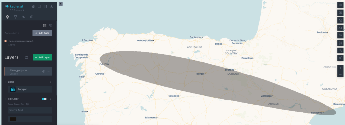
Figure 9: Map of the shadow zones created by the eclipse in KeplerGL. Source: Done by datos.gob.es.
Alternatively, we can use Google Earth and take advantage of its cartographic projection in the form of a sphere to highlight the effect produced by the eclipse on a planetary scale and where curved and distorted geometric shapes take on more realism and meaning. An eclipse is still the result of the interference of light between two spheres projected on another sphere. In this context, "flat" projections lose the coherence of a spherical projection. The result can be seen as follows:
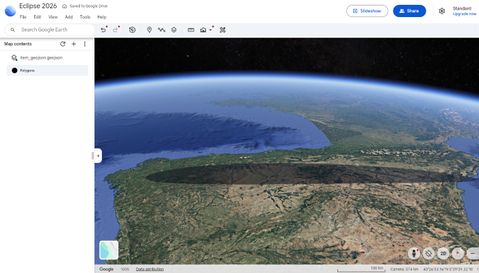
Figure 10: Map of the shadow areas created by the eclipse in Google Earth. Source: Done by datos.gob.es.
When integrating these visualizations into a web environment, Javascript libraries such as Leaflet or D3.js are of great help, since with a few lines of code you can create a map with the polygons contained in a GeoJSON, and customize the styles of that polygon in an easy and intuitive way. In the case of Leaflet, the next image shows the extent of the shadow area on a satellite projection. The corresponding code for the creation of this map can be found in an Observable notebook.
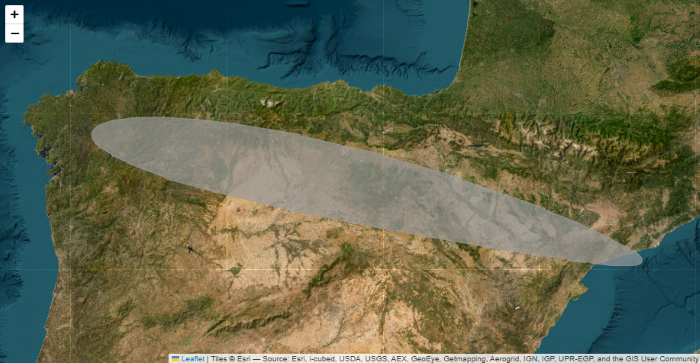
Figure 11: Map of the shadow zones created by the eclipse in Leaflet. Source: Done by datos.gob.es.
In the case of D3.js, we took advantage of the extensive library of cartographic projections to create a globe and, as in the case of Google Earth, give that planetary perspective that is, without a doubt, more realistic to understand the nature of an eclipse and the combined effect of the spherical geometries involved. In the following figure you can see the trace of the shadow area chosen for this exercise. To replicate this map you can use the code of the corresponding Observable notebook.
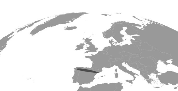
Figure 12: Map of the shadow areas created by the eclipse created with D3.js. Source: Done by datos.gob.es.
Lessons learned
In this data exercise we have learned how to read a . TIFF or . GPKG file, extract the relevant information, dump the data on structures such as xarray or GeoPandas, make a preliminary map without leaving Python, export the data in GeoJSON format and, finally, explore various tools depending on the environment we need for the visualization project. In this way, we have managed:
- Gain familiarity with different geographic information formats such as . TIFF, . GPKG, or . SHP. This allows us to take advantage of the wealth of available formats, have the same geographic information represented in different forms, and thus enable the use of a plethora of tools to represent the data.
- Read .TIF files through Python both for their graphic representation and for their transformation into valid formats to create visualizations on the web. In this process we also learn how to convert geographic data, going from input . TIFF and . GPKG files to output files in a manageable format suitable for web environments such as the GeoJSON format.
- Delimit areas of interest from files with a wide spatial coverage, to focus on specific populations or regions and to be able to transmit a specific message when communicating relevant information. Specifically, we learn to cut out georeferenced information in TIFF format on a specific contour such as the boundaries of a municipality and to discard any data that is outside that contour.
- Use the Cartopy and Matplotlib Python libraries to preview the information contained in a TIFF file.
- Create a globe where the shadow area of an eclipse can be visualized using Google Earth or D3.js, providing a visualization with greater astronomical rigor.
- Explore different visualization alternatives thanks to the diversity of tools available. Specifically, we take a tour of the entire spectrum of complexity of spatial visualizations, from intuitive tools such as GoogleEarth, with which the public is already familiar thanks to GoogleMaps, to code tools such as Python or Javascript through D3.js.
Conclusions
This data exercise has allowed us to move from formats commonly used in professional geographic information systems environments to more manageable ones to be able to create our own maps, either with the help of popular applications such as KeplerGL or GoogleEarth, or with Javascript libraries for integration into web projects.
We have also seen how with a few lines of code we can manipulate the input data to focus on regions of interest, select certain time intervals or customize maps to our liking and choice.
Next steps
The next steps proposed to deepen the analysis are:
- Explore NetCDF or KML/KMZ formats, also georeferenced, to have greater control and mastery over the most popular data formats in geospatial mapping and analysis.
- Compare the astronomical characteristics of the 2026 eclipse with those of 2027 and 2028, also available in the CNIG database accessible in the datos.gob.es Data Catalog .
- Represent variables that have not been shown in this exercise, such as ephemeris or parameters such as the duration, elevation or azimuth of the celestial bodies involved in the eclipse.
Areas of application
The result of this data visualization exercise applies and appeals to the following areas of data analysis:
- Journalistic: for the dissemination of accurate information regarding solar eclipses.
- Scientific: once the data are accessible, all the astronomical variables included in the CNIG dataset can be explored and a much more complete portrait of the astronomical phenomenon can be made than the one described in this exercise
- Analytical: the exercise has been limited to the most traditional visualization based on maps and cartographies. Exploring other forms of visualization with such an attractive dataset can encourage creativity and innovation when representing this type of event.
Comments