Documentación
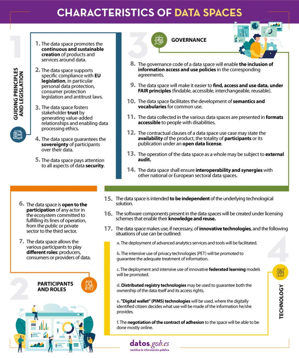
A data space is an ecosystem where, on a voluntary basis, the data of its participants (public sector, large and small technology or business companies, individuals, research organizations, etc.) are pooled. Thus, under a context of sovereignty, trust and security, products or services can be shared, consumed and designed from these data spaces.
This is especially important because if the user feels that he has control over his own data, thanks to clear and concise communication about the terms and conditions that will mark its use, the sharing of such data will become effective, thus promoting the economic and social development of the environment.
In line with this idea and with the aim of improving the design of data spaces, the Data Office establishes a series of characteristics whose objective is to record the regulations that must be followed to design, from an architectural point of view, efficient and functional data spaces.
We summarize in the following visual some of the most important characteristics for the creation of data spaces. To consult the original document and all the standards proposed by the Data Office, please download the attached document at the end of this article.
(You can download the accessible version in word here)
Documentación
1. Introduction
Visualizations are graphical representations of data that allow to transmit in a simple and effective way the information linked to them. The visualization potential is very wide, from basic representations, such as a graph of lines, bars or sectors, to visualizations configured on control panels or interactive dashboards. Visualizations play a fundamental role in drawing conclusions from visual information, also allowing to detect patterns, trends, anomalous data, or project predictions, among many other functions.
Before proceeding to build an effective visualization, we need to perform a previous treatment of the data, paying special attention to obtaining them and validating their content, ensuring that they are in the appropriate and consistent format for processing and do not contain errors. A preliminary treatment of the data is essential to perform any task related to the analysis of data and of performing an effective visualization.
In the \"Visualizations step-by-step\" section, we are periodically presenting practical exercises on open data visualization that are available in the datos.gob.es catalog or other similar catalogs. There we approach and describe in a simple way the necessary steps to obtain the data, perform the transformations and analyzes that are pertinent to, finally, we create interactive visualizations, from which we can extract information that is finally summarized in final conclusions.
In this practical exercise, we have carried out a simple code development that is conveniently documented by relying on tools for free use. All generated material is available for reuse in the GitHub Data Lab repository.
Access the data lab repository on Github.
Run the data pre-processing code on Google Colab.
2. Objetives
The main objective of this post is to learn how to make an interactive visualization based on open data. For this practical exercise we have chosen datasets that contain relevant information about the students of the Spanish university over the last few years. From these data we will observe the characteristics presented by the students of the Spanish university and which are the most demanded studies.
3. Resources
3.1. Datasets
For this practical case, data sets published by the Ministry of Universities have been selected, which collects time series of data with different disaggregations that facilitate the analysis of the characteristics presented by the students of the Spanish university. These data are available in the datos.gob.es catalogue and in the Ministry of Universities' own data catalogue. The specific datasets we will use are:
- Enrolled by type of university modality, area of nationality and field of science, and enrolled by type and modality of university, gender, age group and field of science for PHD students by autonomous community from the academic year 2015-2016 to 2020-2021.
- Enrolled by type of university modality, area of nationality and field of science, and enrolled by type and modality of the university, gender, age group and field of science for master's students by autonomous community from the academic year 2015-2016 to 2020-2021.
- Enrolled by type of university modality, area of nationality and field of science and enrolled by type and modality of the university, gender, age group and field of study for bachelor´s students by autonomous community from the academic year 2015-2016 to 2020-2021.
- Enrolments for each of the degrees taught by Spanish universities that is published in the Statistics section of the official website of the Ministry of Universities. The content of this dataset covers from the academic year 2015-2016 to 2020-2021, although for the latter course the data with provisional.
3.2. Tools
To carry out the pre-processing of the data, the R programming language has been used from the Google Colab cloud service, which allows the execution of Notebooks de Jupyter.
Google Colaboratory also called Google Colab, is a free cloud service from Google Research that allows you to program, execute and share code written in Python or R from your browser, so it does not require the installation of any tool or configuration.
For the creation of the interactive visualization the Datawrapper tool has been used.
Datawrapper is an online tool that allows you to make graphs, maps or tables that can be embedded online or exported as PNG, PDF or SVG. This tool is very simple to use and allows multiple customization options.
If you want to know more about tools that can help you in the treatment and visualization of data, you can use the report \"Data processing and visualization tools\".
4. Data pre-processing
As the first step of the process, it is necessary to perform an exploratory data analysis (EDA) in order to properly interpret the initial data, detect anomalies, missing data or errors that could affect the quality of subsequent processes and results, in addition to performing the tasks of transformation and preparation of the necessary variables. Pre-processing of data is essential to ensure that analyses or visualizations subsequently created from it are reliable and consistent. If you want to know more about this process you can use the Practical Guide to Introduction to Exploratory Data Analysis.
The steps followed in this pre-processing phase are as follows:
- Installation and loading the libraries
- Loading source data files
- Creating work tables
- Renaming some variables
- Grouping several variables into a single one with different factors
- Variables transformation
- Detection and processing of missing data (NAs)
- Creating new calculated variables
- Summary of transformed tables
- Preparing data for visual representation
- Storing files with pre-processed data tables
You'll be able to reproduce this analysis, as the source code is available in this GitHub repository. The way to provide the code is through a document made on a Jupyter Notebook that once loaded into the development environment can be executed or modified easily. Due to the informative nature of this post and in order to facilitate learning of non-specialized readers, the code does not intend to be the most efficient, but rather make it easy to understand, therefore it is likely to come up with many ways to optimize the proposed code to achieve a similar purpose. We encourage you to do so!
You can follow the steps and run the source code on this notebook in Google Colab.
5. Data visualizations
Once the data is pre-processed, we proceed with the visualization. To create this interactive visualization we use the Datawrapper tool in its free version. It is a very simple tool with special application in data journalism that we encourage you to use. Being an online tool, it is not necessary to have software installed to interact or generate any visualization, but it is necessary that the data table that we provide is properly structured.
To address the process of designing the set of visual representations of the data, the first step is to consider the queries we intent to resolve. We propose the following:
- How is the number of men and women being distributed among bachelor´s, master's and PHD students over the last few years?
If we focus on the last academic year 2020-2021:
- What are the most demanded fields of science in Spanish universities? What about degrees?
- Which universities have the highest number of enrolments and where are they located?
- In what age ranges are bachelor´s university students?
- What is the nationality of bachelor´s students from Spanish universities?
Let's find out by looking at the data!
5.1. Distribution of enrolments in Spanish universities from the 2015-2016 academic year to 2020-2021, disaggregated by gender and academic level
We created this visual representation taking into account the bachelor, master and PHD enrolments. Once we have uploaded the data table to Datawrapper (dataset \"Matriculaciones_NivelAcademico\"), we have selected the type of graph to be made, in this case a stacked bar diagram to be able to reflect by each course and gender, the people enrolled in each academic level. In this way we can also see the total number of students enrolled per course. Next, we have selected the type of variable to represent (Enrolments) and the disaggregation variables (Gender and Course). Once the graph is obtained, we can modify the appearance in a very simple way, modifying the colors, the description and the information that each axis shows, among other characteristics.
To answer the following questions, we will focus on bachelor´s students and the 2020-2021 academic year, however, the following visual representations can be replicated for master's and PHD students, and for the different courses.
5.2. Map of georeferenced Spanish universities, showing the number of students enrolled in each of them
To create the map, we have used a list of georeferenced Spanish universities published by the Open Data Portal of Esri Spain. Once the data of the different geographical areas have been downloaded in GeoJSON format, we transform them into Excel, in order to combine the datasets of the georeferenced universities and the dataset that presents the number of enrolled by each university that we have previously pre-processed. For this we have used the Excel VLOOKUP() function that will allow us to locate certain elements in a range of cells in a table
Before uploading the dataset to Datawrapper, we need to select the layer that shows the map of Spain divided into provinces provided by the tool itself. Specifically, we have selected the option \"Spain>>Provinces(2018)\". Then we proceed to incorporate the dataset \"Universities\", previously generated, (this dataset is attached in the GitHub datasets folder for this step-by-step visualization), indicating which columns contain the values of the variables Latitude and Longitude.
From this point, Datawrapper has generated a map showing the locations of each of the universities. Now we can modify the map according to our preferences and settings. In this case, we will set the size and the color of the dots dependent from the number of registrations presented by each university. In addition, for this data to be displayed, in the \"Annotate\" tab, in the \"Tooltips\" section, we have to indicate the variables or text that we want to appear.
5.3. Ranking of enrolments by degree
For this graphic representation, we use the Datawrapper table visual object (Table) and the \"Titulaciones_totales\" dataset to show the number of registrations presented by each of the degrees available during the 2020-2021 academic year. Since the number of degrees is very extensive, the tool offers us the possibility of including a search engine that allows us to filter the results.
5.4. Distribution of enrolments by field of science
For this visual representation, we have used the \"Matriculaciones_Rama_Grado\" dataset and selected sector graphs (Pie Chart), where we have represented the number of enrolments according to sex in each of the field of science in which the degrees in the universities are divided (Social and Legal Sciences, Health Sciences, Arts and Humanities, Engineering and Architecture and Sciences). Just like in the rest of the graphics, we can modify the color of the graph, in this case depending on the branch of teaching.
5.5. Matriculaciones de Grado por edad y nacionalidad
For the realization of these two representations of visual data we use bar charts (Bar Chart), where we show the distribution of enrolments in the first, disaggregated by gender and nationality, we will use the data set \"Matriculaciones_Grado_nacionalidad\" and in the second, disaggregated by gender and age, using the data set \"Matriculaciones_Grado_edad \". Like the previous visuals, the tool easily facilitates the modification of the characteristics presented by the graphics.
6. Conclusions
Data visualization is one of the most powerful mechanisms for exploiting and analyzing the implicit meaning of data, regardless of the type of data and the degree of technological knowledge of the user. Visualizations allow us to extract meaning out of the data and create narratives based on graphical representation. In the set of graphical representations of data that we have just implemented, the following can be observed:
- The number of enrolments increases throughout the academic years regardless of the academic level (bachelor´s, master's or PHD).
- The number of women enrolled is higher than the men in bachelor's and master's degrees, however it is lower in the case of PHD enrollments, except in the 2019-2020 academic year.
- The highest concentration of universities is found in the Community of Madrid, followed by the autonomous community of Catalonia.
- The university that concentrates the highest number of enrollments during the 2020-2021 academic year is the UNED (National University of Distance Education) with 146,208 enrollments, followed by the Complutense University of Madrid with 57,308 registrations and the University of Seville with 52,156.
- The most demanded degree in the 2020-2021 academic year is the Degree in Law with 82,552 students nationwide, followed by the Degree in Psychology with 75,738 students and with hardly any difference, the Degree in Business Administration and Management with 74,284 students.
- The branch of education with the highest concentration of students is Social and Legal Sciences, while the least demanded is the branch of Sciences.
- The nationalities that have the most representation in the Spanish university are from the region of the European Union, followed by the countries of Latin America and the Caribbean, at the expense of the Spanish one.
- The age range between 18 and 21 years is the most represented in the student body of Spanish universities.
We hope that this step-by-step visualization has been useful for learning some very common techniques in the treatment and representation of open data. We will return to show you new reuses. See you soon!
Documentación
By analysing data, we can discover meaningful patterns and gain insights that lead to informed decision making. But good data analysis needs to be methodical and follow a series of steps in an orderly fashion. In this video (in Spanish) we give you some tips on the steps to follow:
The importance of pre-analysis work
The first step is to be clear about the final objective. It should be concrete, clear and straightforward and identify a problem to be solved. One way to set the objective is to shape a concrete question to be answered, such as how many traffic accidents there are or how air quality will evolve.
It is also important to know the prior state of the issue. It is likely that other people and organisations have asked the same questions before. It is therefore important to find out what previous projects exist on the chosen topic. On platforms such as data.europa.eu or datos.gob.es you have sections where use cases such as applications and companies are collected. It is also advisable to examine the proposals submitted to hackathons, challenges and competitions, both national and international, as well as to closely follow the activity of companies and start-ups focused on the field of study.
To be able to cover so many fronts, it is advisable to have a multidisciplinary team with different points of view, including data scientists, engineers, business analysts, communicators, etc. Soft skills, such as critical thinking, effective communication and industry knowledge, are as important as technical skills for success.
Where to locate the data?
With the end goal clear, it will be easier to determine what data we need to answer the initial question. It is most common to combine different sources of information, public and/or private, to enrich the analysis and reach an appropriate level of depth.
In addition to the multitude of existing national data catalogues, you can also search specialised repositories in specific fields such as environment, health and welfare or economics.
The analysis process
Once the data is available, it is time to start the analysis, following the workflow below:
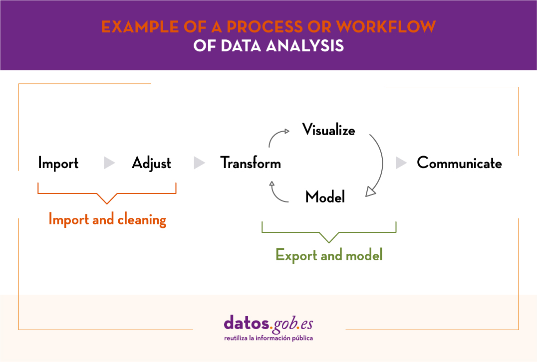
- Phase 1: Import and cleaning. Before the analysis, the data must be cleaned in order to achieve a homogeneous structure, free of errors and in the right format. For this purpose, it is recommended to perform an Exploratory Data Analysis (EDA). This will result in clean, error-free and homogeneous data.
- Phase 2: Export and modelling. Depending on the question to be answered, we will determine the type of analysis to be carried out: descriptive analysis (what has happened?), diagnostic (why has it happened?), predictive (what is going to happen?) or prescriptive (what should I do to make it happen again -or not?).
- Phase 3: Communicate. Once the data has been analysed, we will have obtained new knowledge, which we must communicate to our target audience in a way that is easy to understand. This can be done using data storytelling techniques, visualisations, web or mobile applications, services or commercial products, depending on the initial objectives.
In order to carry out these 3 phases, we have different tools at our disposal. You can see some examples in the report "Data processing and visualisation tools".
From datos.gob.es we encourage you to practice with the data in our catalogue and put different analyses into practice. You can share the results of your analyses with us through the e-mail box dinamizacion@datos.god.es.
Documentación
1. Introduction
Visualizations are a graphic representation that allow us to comprehend in a simple way the information that the data contains. Thanks to visual elements, such as graphs, maps or word clouds, visualizations also help to explain trends, patterns, or outliers that data may present.
Visualizations can be generated from the data of a different nature, such as words that compose a news, a book or a song. To make visualizations out of this kind of data, it is required that the machines, through software programs, are able to understand, interpret and recognize the words that form human speech (both written or spoken) in multiple languages. The field of studies focused on such data treatment is called Natural Language Processing (NLP). It is an interdisciplinary field that combines the powers of artificial intelligence, computational linguistics, and computer science. NLP-based systems have allowed great innovations such as Google's search engine, Amazon's voice assistant, automatic translators, sentiment analysis of different social networks or even spam detection in an email account.
In this practical exercise, we will apply a graphical visualization for a keywords summary representing various texts extracted with NLP techniques. Especially, we are going to create a word cloud that summarizes which are the most reoccurring terms in several posts of the portal.
This visualization is included within a series of practical exercises, in which open data available on the datos.gob.es portal is used. These address and describe in a simple way the steps necessary to obtain the data, perform transformations and analysis that are relevant to the creation of the visualization, with the maximum information extracted. In each of the practical exercises, simple code developments are used that will be conveniently documented, as well as free and open use tools. All the generated material will be available in the Data Lab repository on GitHub.
2. Objetives
The main objective of this post is to learn how to create a visualization that includes images, generated from sets of words representative of various texts, popularly known as \"word clouds\". For this practical exercise we have chosen 6 posts published in the blog section of the datos.gob.es portal. From these texts using NLP techniques we will generate a word cloud for each text that will allow us to detect in a simple and visual way the frequency and importance of each word, facilitating the identification of the keywords and the main theme of each of the posts.
From a text we build a cloud of words applying Natural Language Processing (NLP) techniques
3. Resources
3.1. Tools
To perform the pre-treatment of the data (work environment, programming and the very edition), such as the visualization itself, Python (versión 3.7) and Jupyter Notebook (versión 6.1) are used, tools that you will find integrated in, along with many others in Anaconda, one of the most popular platforms to install, update and manage software to work in data science. To tackle tasks related to Natural Language Processing, we use two libraries, Scikit-Learn (sklearn) and wordcloud. All these tools are open source and available for free..
Scikit-Learn is a very popular vast library, designed in the first place to carry out machine learning tasks on data in textual form. Among others, it has algorithms to perform classification, regression, clustering, and dimensionality reduction tasks. In addition, it is designed for deep learning on textual data, being useful for handling textual feature sets in the form of matrices, performing tasks such as calculating similarities, classifying text and clustering. In Python, to perform this type of tasks, it is also possible to work with other equally popular libraries such as NLTK or spacy, among others.
wordcloud eis a library specialized in creating word clouds using a simple algorithm that can be easily modified.
To facilitate understanding for readers not specialized in programming, the Python code included below, accessible by clicking on the \"Code\" button in each section, is not designed to maximize its efficiency, but to facilitate its comprehension, therefore it is likely that readers more advanced in this language may consider more efficient, alternative ways to code some functionalities. The reader will be able to reproduce this analysis if desired, as the source code is available on datos.gob.es's GitHub account. The way the code is provided is through a Jupyter Notebook, which once loaded into the development environment can be easily executed or modified if desired.
3.2. Datasets
For this analysis, 6 posts recently published on the open data portal datos.gob.es, in its blog section, have been selected. These posts are related to different topics related to open data:
- The latest news in natural language processing: summaries of classic works in just a few hundred words.
- The importance of anonymization and data privacy.
- The value of real-time data through a practical example.
- New initiatives to open and harness data for health research.
- Kaggle and other alternative platforms for learning data science.
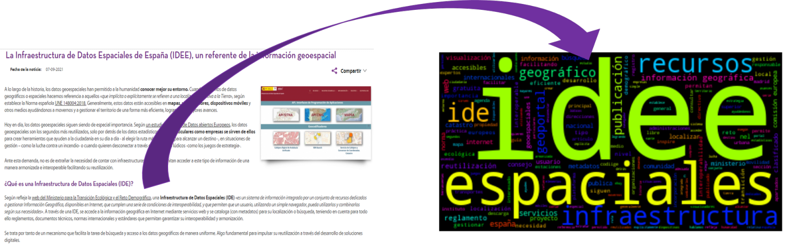
- The Spatial Data Infrastructure of Spain (IDEE), a benchmark for geospatial information.
4. Data processing
Before advancing to creation of an effective visualization, we must perform a preliminary data treatment or pre-processing of the data, paying attention to obtaining them, ensuring that they do not contain errors and are in a suitable format for processing. Data pre-processing is essential for build any effective and consistent visual representation.
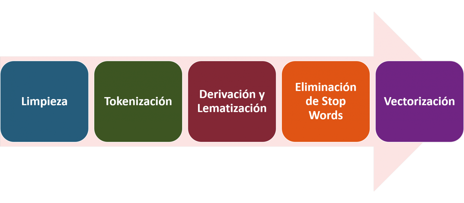
In NLP, the pre-processing of the data consists mainly of a series of transformations that are carried out on the input data, in our case several posts in TXT format, with the aim of obtaining standardized data and without elements that may affect the quality of the results, in order to facilitate its subsequent processing to perform tasks such as, generate a word cloud, perform opinion/sentiment mining or generate automated summaries from input texts. In general, the flowchart to be followed to perform word preprocessing includes the following steps:
- Cleaning: Removal of special characters and symbols that inflict results distortion, such as punctuation marks.
- Tokenize: Tokenization is the process of separating a text into smaller units, tokens. Tokens can be sentences, words, or even characters.
- Derivation and Lemmatisation: this process consists of transforming words to their basic form, that is, to their canonical form or lemma, eliminating plurals, verb tenses or genders. This action is sometimes redundant since it is not always required for further processing to know the semantic similarity between the different words of the text.
- Elimination of stop words: stop words or empty words are those words of common use that do not contribute in a significant way to the text. These words should be removed before text processing as they do not provide any unique information that can be used for the classification or grouping of the text, for example, determining articles such as 'a', 'an', 'the' etc.
- Vectorization: in this step we transform each of the tokens obtained in the previous step to a vector of real numbers that is generated based on the frequency of the appearance of each word in the text. Vectorization allows machines to be able to process text and apply, among others, machine learning techniques.
4.1. Installation and loading of libraries
Before starting with data pre-processing, we need to import the libraries to work with. Python provides a vast number of libraries that allow to implement functionalities for many tasks, such as data visualization, Machine Learning, Deep Learning or Natural Language Processing, among many others. The libraries that we will use for this analysis and visualization are the following:
- os, which allows access to operating system-dependent functionality, such as manipulating the directory structure.
- re, provides functions for processing regular expressions.
- pandas, is a very popular and essential library for processing data tables.
- string, provides a series of very useful functions for handling strings.
- matplotlib.pyplot, contains a collection of functions that will allow us to generate the graphical representations of the word clouds.
- sklearn.feature_extraction.text (Scikit-Learn library), converts a collection of text documents into a vector array. From this library we will use some commands that we will discuss later.
- wordcloud, library with which we can generate the word cloud.
# Importaremos las librerías necesarias para realizar este análisis y la visualización. import os import re import pandas as pd import string import matplotlib.pyplot as plt from sklearn.feature_extraction.text import CountVectorizer from sklearn.feature_extraction.text import TfidfTransformer from wordcloud import WordCloud4.2. Data loading
Once the libraries are loaded, we prepare the data with which we are going to work. Before starting to load the data, in the working directory we need: (a) a folder called \"post\" that will contain all the files in TXT format with which we are going to work and that are available in the repository of this project of the GitHub of datos.gob.es; (b) a file called \"stop_words_spanish.txt\" that contains the list of stop words in Spanish, which is also available in said repository and (c) a folder called \"images\" where we will save the images of the word clouds in PNG format, which we will create below.
# Generamos la carpeta \"imagenes\".nueva_carpeta = \"imagenes/\" try: os.mkdir(nueva_carpeta)except OSError: print (\"Ya existe una carpeta llamada %s\" % nueva_carpeta)else: print (\"Se ha creado la carpeta: %s\" % nueva_carpeta)Next, we will proceed to load the data. The input data, as we have already mentioned, are in TXT files and each file contains a post. As we want to perform the analysis and visualization of several posts at the same time, we will load in our development environment all the texts that interest us, to later insert them in a single table or dataframe.
# Generamos una lista donde incluiremos todos los archivos que debe leer, indicándole la carpeta donde se encuentran.filePath = []for file in os.listdir(\"./post/\"): filePath.append(os.path.join(\"./post/\", file))# Generamos un dataframe en el cual incluiremos una fila por cada post.post_df = pd.DataFrame()for file in filePath: with open (file, \"rb\") as readFile: post_df = pd.DataFrame([readFile.read().decode(\"utf8\")], append(post_df)# Nombramos la columna que contiene los textos en el dataframe.post_df.columns = [\"texto\"]4.3. Data pre-processing
In order to obtain our objective: generate word clouds for each post, we will perform the following pre-processing tasks.
a) Data cleansing
Once a table containing the texts with which we are going to work has been generated, we must eliminate the noise beyond the text that interests us: special characters, punctuation marks and carriage returns.
First, we put all characters in lowercase to avoid any errors in case-sensitive processes, by using the lower() command.
Then we eliminate punctuation marks, such as periods, commas, exclamations, questions, among many others. For the elimination of these we will resort to the preinitialized string.punctuacion of the string library, which returns a set of symbols considered punctuation marks. In addition, we must eliminate tabs, cart jumps and extra spaces, which do not provide information in this analysis, using regular expressions.
It is essential to apply all these steps in a single function so that they are processed sequentially, because all processes are highly related.
# Eliminamos los signos de puntuación, los saltos de carro/tabulaciones y espacios en blanco extra.# Para ello generamos una función en la cual indicamos todos los cambios que queremos aplicar al texto.def limpiar_texto(texto): texto = texto.lower() texto = re.sub(\"\\[.*?¿\\]\\%\", \" \", texto) texto = re.sub(\"[%s]\" % re.escape(string.punctuation), \" \", texto) texto re.sub(\"\\w*\\d\\w*\", \" \", texto) return texto# Aplicamos los cambios al texto.limpiar_texto = lambda x: limpiar_texto(x)post_clean = pd.DataFrame(post_clean.texto.apply/limpiar_texto)b) Tokenize
Once we have eliminated the noise in the texts with which we are going to work, we will tokenize each of the texts in words. For this we will use the split() function, using space as a separator between words. This will allow separating the words independently (tokens) for future analysis.
# Tokenizar los textos. Se crea una nueva columna en la tabla con los tokens con el texto \"tokenizado\".def tokenizar(text): text = texto.split(sep = \" \") return(text)post_df[\"texto_tokenizado\"] = post_df[\"texto\"].apply(lambda x: tokenizar(x))c) Removal of \"stop words\"
After removing punctuation marks and other elements that can distort the target display, we will remove \"stop words\". To carry out this step we use a list of Spanish stop words since each language has its own list. This list consists of a total of 608 words, which include articles, prepositions, linking verbs, adverbs, among others and is recently updated. This list can be downloaded from the datos.gob.es GitHub account in TXT format and must be located in the working directory.
# Leemos el archivo que contiene las palabras vacías en castellano.with open \"stop_words_spanish.txt\", encoding = \"UTF8\") as f: lines = f.read().splitlines()In this list of words, we will include new words that do not contribute relevant information to our texts or appear recurrently due to their own context. In this case, there is a bunch of words, which we should eliminate since they are present in all posts repetitively since they all deal with the subject of open data and there is a high probability that these are the most significant words. Some of these words are, \"item\", \"data\", \"open\", \"case\", among others. This will allow to obtain a more representative graphic representation of the content of each post.
On the other hand, a visual inspection of the results obtained allows to detect words or characters derived from errors included in the texts, which obviously have no meaning and that have not been eliminated in the previous steps. These should be removed from the analysis so that they do not distort the subsequent results. These are words like, \"nen\", \"nun\" or \"nla\"
# Actualizamos nuestra lista de stop words.stop_words.extend((\"caso\", \"forma\",\"unido\", \"abiertos\", \"post\", \"espera\", \"datos\", \"dato\", \"servicio\", \"nun\", \"día\", \"nen\", \"data\", \"conjuntos\", \"importantes\", \"unido\", \"unión\", \"nla\", \"r\", \"n\"))# Eliminamos las stop words de nuestra tabla.post_clean = post_clean [~(post_clean[\"texto_tokenizado\"].isin(stop_words))]d) Vectorization
Machines are not capable of understanding words and sentences therefore, they must be transformed to some numerical structure. The method consists of generating vectors from each token. In this post we use a simple technique known as bag-of-words (BoW). It consists of assigning a weight to each token proportional to the frequency of appearance of that token in the text. To do this, we work on an array in which each row represents a text and each column a token. To perform the vectorization we will resort to the CountVectorizer() and TfidTransformer() commands of the scikit-learn library.
The CountVectorizer() function allows you to transform text into a vector of frequencies or word counts. In this case we will obtain 6 vectors with as many dimensions as there are tokens in each text, one for each post, which we will integrate into a single matrix, where the columns will be the tokens or words and the rows will be the posts.
# Calculamos la matriz de frecuencia de palabras del texto.vectorizador = CountVectorizer()post_vec = vectorizador.fit_transform(post_clean.texto_tokenizado)Once the word frequency matrix is generated, it is necessary to convert it into a normalized vector form in order to reduce the impact of tokens that occur very frequently in the text. To do this we will use the TfidfTransformer() function.
# Convertimos una matriz de frecuencia de palabras en una forma vectorial regularizada.transformer = TfidfTransformer()post_trans = transformer.fit_transform(post_vec).toarray()If you want to know more about the importance of applying this technique, you will find numerous articles on the Internet that talk about it and how relevant it is, among other issues, for SEO optimization.
5. Creation of the word cloud
Once we have concluded the pre-processing of the text, as we indicated at the beginning of the post, it is possible to perform NLP tasks. In this exercise we will create a word cloud or \"WordCloud\" for each of the analyzed texts.
A word cloud is a visual representation of the words with the highest rate of occurrence in the text. It allows to detect in a simple way the frequency and importance of each of the words, facilitating the identification of the keywords and discovering with a single glance the main theme treated in the text.
For this we are going to use the \"wordcloud\" library that incorporates the necessary functions to build each representation. First, we have to indicate the characteristics that each word cloud should present, such as the background color (background_color function), the color map that the words will take (colormap function), the maximum font size (max_font_size function) or set a seed so that the word cloud generated is always the same (function random_state) in future implementations. We can apply these and many other functions to customize each word cloud.
# Indicamos las características que presentará cada nube de palabras.wc = WordCloud(stopwords = stop_words, background_color = \"black\", colormap = \"hsv\", max_font_size = 150, random_state = 123)Once we have indicated the characteristics that we want each word cloud to present, we proceed to create it and save it as an image in PNG format. To generate the word cloud, we will use a loop in which we will indicate different functions of the matplotlib library (represented by the plt prefix) necessary to graphically generate the word cloud according to the specification defined in the previous step. We have to specify that a world cloud needs to be created for each row of the table, that is, for each text, with the function plt.subplot(). With the command plt.imshow() we indicate that the result is a 2D image. If we want the axes not to be displayed, we must indicate it with the plt.axis() function. Finally, with the function plt.savefig() we will save the generated visualization.
# Generamos las nubes de palabras para cada uno de los posts.for index, i in enumerate(post.columns): wc.generate(post.texto_tokenizado[i]) plt.subplot(3, 2, index+1 plt.imshow(wc, interpolation = \"bilinear\") plt.axis(\"off\") plt.savefig(\"imagenes/.png\")# Mostramos las nubes de palabras resultantes.plt.show()The visualization obtained is:
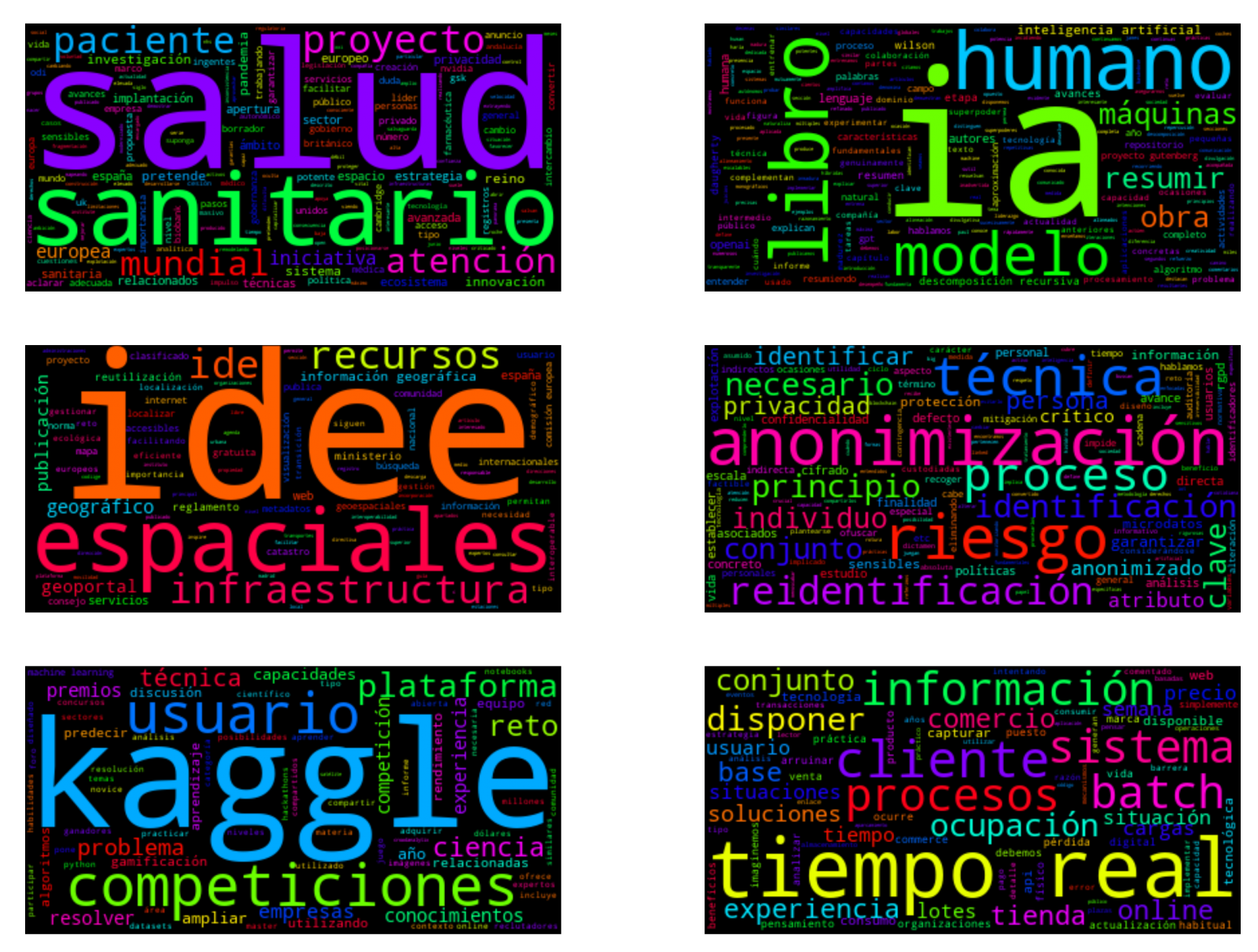
Visualization of the word clouds obtained from the texts of different posts of the blog section of datos.gob.es
5. Conclusions
Data visualization is one of the most powerful mechanisms for exploiting and analyzing the implicit meaning of data, regardless of the data type and the degree of technological knowledge of the user. Visualizations allow us to extract meaning out of the data and create narratives based on graphical representation.
Word clouds are a tool that allows us to speed up the analysis of textual data, since through them we can quickly and easily identify and interpret the words with the greatest relevance in the analyzed text, which gives us an idea of the subject.
If you want to learn more about Natural Language Processing, you can consult the guide \"Emerging Technologies and Open Data: Natural Language Processing\" and the posts \"Natural Language Processing\" and \" The latest news in natural language processing: summaries of classic works in just a few hundred words\".
Hopefully this step-by-step visualization has taught you a few things about the ins and outs of Natural Language Processing and word cloud creation. We will return to show you new data reuses. See you soon!
Documentación
1. Introduction
Data visualization is a task linked to data analysis that aims to graphically represent underlying data information. Visualizations play a fundamental role in the communication function that data possess, since they allow to drawn conclusions in a visual and understandable way, allowing also to detect patterns, trends, anomalous data or to project predictions, alongside with other functions. This makes its application transversal to any process in which data intervenes. The visualization possibilities are very numerous, from basic representations, such as a line graphs, graph bars or sectors, to complex visualizations configured from interactive dashboards.
Before we start to build an effective visualization, we must carry out a pre-treatment of the data, paying attention to how to obtain them and validating the content, ensuring that they do not contain errors and are in an adequate and consistent format for processing. Pre-processing of data is essential to start any data analysis task that results in effective visualizations.
A series of practical data visualization exercises based on open data available on the datos.gob.es portal or other similar catalogues will be presented periodically. They will address and describe, in a simple way; the stages necessary to obtain the data, perform the transformations and analysis that are relevant for the creation of interactive visualizations, from which we will be able summarize on in its final conclusions the maximum mount of information. In each of the exercises, simple code developments will be used (that will be adequately documented) as well as free and open use tools. All generated material will be available for reuse in the Data Lab repository on Github.
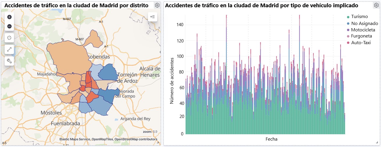
Visualization of traffic accidents occurring in the city of Madrid, by district and type of vehicle
2. Objetives
The main objective of this post is to learn how to make an interactive visualization based on open data available on this portal. For this exercise, we have chosen a dataset that covers a wide period and contains relevant information on the registration of traffic accidents that occur in the city of Madrid. From these data we will observe what is the most common type of accidents in Madrid and the incidence that some variables such as age, type of vehicle or the harm produced by the accident have on them.
3. Resources
3.1. Datasets
For this analysis, a dataset available in datos.gob.es on traffic accidents in the city of Madrid published by the City Council has been selected. This dataset contains a time series covering the period 2010 to 2021 with different subcategories that facilitate the analysis of the characteristics of traffic accidents that occurred. For example, the environmental conditions in which each accident occurred or the type of accident. Information on the structure of each data file is available in documents covering the period 2010-2018 and 2019 onwards. It should be noted that there are inconsistencies in the data before and after the year 2019, due to data structure variations. This is a common situation that data analysts must face when approaching the preprocessing tasks of the data that will be used, this is derived from the lack of a homogeneous structure of the data over time. For example, alterations on the number of variables, modification of the type of variables or changes to different measurement units. This is a compelling reason that justifies the need to accompany each open data set with complete documentation explaining its structure.
3.2. Tools
R (versión 4.0.3) and RStudio with the RMarkdown complement have been used to carry out the pre-treatment of the data (work environment setup, programming and writing).
R is an object-oriented and interpreted open-source programming language, initially created for statistical computing and the creation of graphical representations. Nowadays, it is a very powerful tool for all types of data processing and manipulation permanently updated. It contains a programming environment, RStudio, also open source.
The Kibana tool has been used for the creation of the interactive visualization.
Kibana is an open source tool that belongs to the Elastic Stack product suite (Elasticsearch, Beats, Logstash and Kibana) that enables visualization creation and exploration of indexed data on top of the Elasticsearch analytics engine.
If you want to know more about these tools or anyother that can help you in data processing and creating interactive visualizations, you can consult the report \"Data processing and visualization tools\".
4. Data processing
For the realization of the subsequent analysis and visualizations, it is necessary to prepare the data adequately, so that the results obtained are consistent and effective. We must perform an exploratory data analysis (EDA), in order to know and understand the data with which we want to work. The main objective of this data pre-processing is to detect possible anomalies or errors that could affect the quality of subsequent results and identify patterns of information contained in the data.
To facilitate the understanding of readers not specialized in programming, the R code included below, which you can access by clicking on the \"Code\" button in each section, is not designed to maximize its efficiency, but to facilitate its understanding, so it is possible that more advanced readers in this language might consider alternatives more efficient to encode some functionalities. The reader will be able to reproduce this analysis if desired, as the source code is available on datos.gob.es's Github account. In order to provide the code a plain text document will be used, which once loaded into the development environment can be easily executed or modified if desired.
4.1. Installation and loading of libraries
For the development of this analysis, we need to install a series of additional R packages to the base distribution, incorporating the functions and objects defined by them into the work environment. There are many packages available in R but the most suitable to work with this dataset are: tidyverse, lubridate and data.table.Tidyverse is a collection of R packages (it contains other packages such as dplyr, ggplot2, readr, etc.) specifically designed to work in Data Science, facilitating the loading and processing of data, and graphical representations and other essential functionalities for data analysis. It requires a progressive knowledge to get the most out of the packages that integrates. On the other hand, the lubridate package will be used for the management of date variables. Finally the data.table package allows a more efficient management of large data sets. These packages will need to be downloaded and installed in the development environment.
#Lista de librerías que queremos instalar y cargar en nuestro entorno de desarrollo librerias <- c(\"tidyverse\", \"lubridate\", \"data.table\")#Descargamos e instalamos las librerías en nuestros entorno de desarrollo package.check <- lapplay (librerias, FUN = function(x) { if (!require (x, character.only = TRUE)) { install.packages(x, dependencies = TRUE) library (x, character.only = TRUE } }4.2. Uploading and cleaning data
a. Loading datasets
The data that we are going to use in the visualization are divided by annuities in CSV files. As we want to perform an analysis of several years we must download and upload in our development environment all the datasets that interest us.
To do this, we generate the working directory \"datasets\", where we will download all the datasets. We use two lists, one with all the URLs where the datasets are located and another with the names that we assign to each file saved on our machine, with this we facilitate subsequent references to these files.
#Generamos una carpeta en nuestro directorio de trabajo para guardar los datasets descargadosif (dir.exists(\".datasets\") == FALSE)#Nos colocamos dentro de la carpetasetwd(\".datasets\")#Listado de los datasets que nos interese descargardatasets <- c(\"https://datos.madrid.es/egob/catalogo/300228-10-accidentes-trafico-detalle.csv\", \"https://datos.madrid.es/egob/catalogo/300228-11-accidentes-trafico-detalle.csv\", \"https://datos.madrid.es/egob/catalogo/300228-12-accidentes-trafico-detalle.csv\", \"https://datos.madrid.es/egob/catalogo/300228-13-accidentes-trafico-detalle.csv\", \"https://datos.madrid.es/egob/catalogo/300228-14-accidentes-trafico-detalle.csv\", \"https://datos.madrid.es/egob/catalogo/300228-15-accidentes-trafico-detalle.csv\", \"https://datos.madrid.es/egob/catalogo/300228-16-accidentes-trafico-detalle.csv\", \"https://datos.madrid.es/egob/catalogo/300228-17-accidentes-trafico-detalle.csv\", \"https://datos.madrid.es/egob/catalogo/300228-18-accidentes-trafico-detalle.csv\", \"https://datos.madrid.es/egob/catalogo/300228-19-accidentes-trafico-detalle.csv\", \"https://datos.madrid.es/egob/catalogo/300228-21-accidentes-trafico-detalle.csv\", \"https://datos.madrid.es/egob/catalogo/300228-22-accidentes-trafico-detalle.csv\")#Descargamos los datasets de interésdt <- list()for (i in 1: length (datasets)){ files <- c(\"Accidentalidad2010\", \"Accidentalidad2011\", \"Accidentalidad2012\", \"Accidentalidad2013\", \"Accidentalidad2014\", \"Accidentalidad2015\", \"Accidentalidad2016\", \"Accidentalidad2017\", \"Accidentalidad2018\", \"Accidentalidad2019\", \"Accidentalidad2020\", \"Accidentalidad2021\") download.file(datasets[i], files[i]) filelist <- list.files(\".\") print(i) dt[i] <- lapply (filelist[i], read_delim, sep = \";\", escape_double = FALSE, locale = locale(encoding = \"WINDOWS-1252\", trim_ws = \"TRUE\") }b. Creating the worktable
Once we have all the datasets loaded into our development environment, we create a single worktable that integrates all the years of the time series.
Accidentalidad <- rbindlist(dt, use.names = TRUE, fill = TRUE)Once the worktable is generated, we must solve one of the most common problems in all data preprocessing: the inconsistency in the naming of the variables in the different files that make up the time series. This anomaly produces variables with different names, but we know that they represent the same information. In this case it is explained in the data dictionary described in the documentation of the files, if this was not the case, it is necessary to resort to the observation and descriptive exploration of the files. In this case, the variable \"\"RANGO EDAD\"\" that presents data from 2010 to 2018 and the variable \"\"RANGO EDAD\"\" that presents the same data but from 2019 to 2021 are different. To solve this problem, we must unite/merge the variables that present this anomaly in a single variable.
#Con la función unite() unimos ambas variables. Debemos indicarle el nombre de la tabla, el nombre que queremos asignarle a la variable y la posición de las variables que queremos unificar. Accidentalidad <- unite(Accidentalidad, LESIVIDAD, c(25, 44), remove = TRUE, na.rm = TRUE)Accidentalidad <- unite(Accidentalidad, NUMERO_VICTIMAS, c(20, 27), remove = TRUE, na.rm = TRUE)Accidentalidad <- unite(Accidentalidad, RANGO_EDAD, c(26, 35, 42), remove = TRUE, na.rm = TRUE)Accidentalidad <- unite(Accidentalidad, TIPO_VEHICULO, c(20, 27), remove = TRUE, na.rm = TRUE)Once we have the table with the complete time series, we create a new table counting only the variables that are relevant to us to make the interactive visualization that we want to develop.
Accidentalidad <- Accidentalidad %>% select (c(\"FECHA\", \"DISTRITO\", \"LUGAR ACCIDENTE\", \"TIPO_VEHICULO\", \"TIPO_PERSONA\", \"TIPO ACCIDENTE\", \"SEXO\", \"LESIVIDAD\", \"RANGO_EDAD\", \"NUMERO_VICTIMAS\") c. Variable transformation
Next, we examine the type of variables and values to transform the necessary variables to be able to perform future aggregations, graphs or different statistical analyses.
#Re-ajustar la variable tipo fechaAccidentalidad$FECHA <- dmy (Accidentalidad$FECHA #Re-ajustar el resto de variables a tipo factor Accidentalidad$'TIPO ACCIDENTE' <- as.factor(Accidentalidad$'TIPO.ACCIDENTE')Accidentalidad$'Tipo Vehiculo' <- as.factor(Accidentalidad$'Tipo Vehiculo')Accidentalidad$'TIPO PERSONA' <- as.factor(Accidentalidad$'TIPO PERSONA')Accidentalidad$'Tramo Edad' <- as.factor(Accidentalidad$'Tramo Edad')Accidentalidad$SEXO <- as.factor(Accidentalidad$SEXO)Accidentalidad$LESIVIDAD <- as.factor(Accidentalidad$LESIVIDAD)Accidentalidad$DISTRITO <- as.factor (Accidentalidad$DISTRITO)d. Creation of new variables
Let's divide the variable \"\"FECHA\"\" into a hierarchy of variables of date types, \"\"Año\", \"\"Mes\"\" and \"\"Día\"\". This action is very common in data analytics, since it is interesting to analyze other time ranges, for example; years, months, weeks (and any other unit of time), or we need to generate aggregations from the day of the week.
#Generación de la variable AñoAccidentalidad$Año <- year(Accidentalidad$FECHA)Accidentalidad$Año <- as.factor(Accidentalidad$Año) #Generación de la variable MesAccidentalidad$Mes <- month(Accidentalidad$FECHA)Accidentalidad$Mes <- as.factor(Accidentalidad$Mes)levels (Accidentalidad$Mes) <- c(\"Enero\", \"Febrero\", \"Marzo\", \"Abril\", \"Mayo\", \"Junio\", \"Julio\", \"Agosto\", \"Septiembre\", \"Octubre\", \"Noviembre\", \"Diciembre\") #Generación de la variable DiaAccidentalidad$Dia <- month(Accidentalidad$FECHA)Accidentalidad$Dia <- as.factor(Accidentalidad$Dia)levels(Accidentalidad$Dia)<- c(\"Domingo\", \"Lunes\", \"Martes\", \"Miercoles\", \"Jueves\", \"Viernes\", \"Sabado\")e. Detection and processing of lost data
The detection and processing of lost data (NAs) is an essential task in order to be able to process the variables contained in the table, since the lack of data can cause problems when performing aggregations, graphs or statistical analysis.
Next, we will analyze the absence of data (detection of NAs) in the table:
#Suma de todos los NAs que presenta el datasetsum(is.na(Accidentalidad))#Porcentaje de NAs en cada una de las variablescolMeans(is.na(Accidentalidad))Once the NAs presented by the dataset have been detected, we must treat them somehow. In this case, as all the interesting variables are categorical, we will complete the missing values with the new value \"Unassigned\", this way we do not lose sample size and relevant information.
#Sustituimos los NAs de la tabla por el valor \"No asignado\"Accidentalidad [is.na(Accidentalidad)] <- \"No asignado\"f. Level assignments in variables
Once we have the variables of interest in the table, we can perform a more exhaustive analysis of the data and categories presented by each of the variables. If we analyze each one independently, we can see that some of them have repeated categories, simply by use of accents, special characters or capital letters. We will reassign the levels to the variables that require so that future visualizations or statistical analysis are built efficiently and without errors.
For space reasons, in this post we will only show an example with the variable \"HARMFULNESS\". This variable was typified until 2018 with a series of categories (IL, HL, HG, MT), while from 2019 other categories were used (values from 0 to 14). Fortunately, this task is easily approachable since it is documented in the information about the structure that accompanies each dataset. This issue (as we have said before), that does not always happen, greatly hinders this type of data transformations.
#Comprobamos las categorías que presenta la variable \"LESIVIDAD\"levels(Accidentalidad$LESIVIDAD)#Asignamos las nuevas categoríaslevels(Accidentalidad$LESIVIDAD)<- c(\"Sin asistencia sanitaria\", \"Herido leve\", \"Herido leve\", \"Herido grave\", \"Fallecido\", \"Herido leve\", \"Herido leve\", \"Herido leve\", \"Ileso\", \"Herido grave\", \"Herido leve\", \"Ileso\", \"Fallecido\", \"No asignado\")#Comprobamos de nuevo las catergorías que presenta la variablelevels(Accidentalidad$LESIVIDAD)4.3. Dataset Summary
Let's see what variables and structure the new dataset presents after the transformations made:
str(Accidentalidad)summary(Accidentalidad)The output of these commands will be omitted for reading simplicity. The main characteristics of the dataset are:
- It is composed of 14 variables: 1 date variable and 13 categorical variables.
- The time range covers from 01-01-2010 to 31-06-2021 (the end date may vary, since the dataset of the year 2021 is being updated periodically).
- For space reasons in this post, not all available variables have been considered for analysis and visualization.
4.4. Save the generated dataset
Once we have the dataset with the structure and variables ready for us to perform the visualization of the data, we will save it as a data file in CSV format to later perform other statistical analysis. Or use it in other data processing or visualization tools such as the one we address below. It is important to save it with a UTF-8 (Unicode Transformation Format) encoding so that special characters are correctly identified by any software.
write.csv(Accidentalidad, file = Accidentalidad.csv\", fileEncoding=\"UTF-8\")5. Creation of the visualization on traffic accidents that occur in the city of Madrid using Kibana
To create this interactive visualization the Kibana tool (in its free version) has been used on our local environment. Before being able to perform the visualization it is necessary to have the software installed since we have followed the steps of the download and installation tutorial provided by the company Elastic.
Once the Kibana software is installed, we proceed to develop the interactive visualization. Below there are two video tutorials, which show the process of creating the visualization and interacting with it.
This first video tutorial shows the visualization development process by performing the following steps:
- Loading data into Elasticsearch, generating an index in Kibana that allows us to interact with the data practically in real time and interaction with the variables presented by the dataset.
- Generation of the following graphical representations:
- Line graph to represent the time series on traffic accidents that occurred in the city of Madrid.
- Horizontal bar chart showing the most common accident type
- Thematic map, we will show the number of accidents that occur in each of the districts of the city of Madrid. For the creation of this visual it is necessary to download the \"dataset containing the georeferenced districts in GeoJSON format\".
- Construction of the dashboard integrating the visuals generated in the previous step.
In this second video tutorial we will show the interaction with the visualization that we have just created:
6. Conclusions
Observing the visualization of the data on traffic accidents that occurred in the city of Madrid from 2010 to June 2021, the following conclusions can be drawn:
- The number of accidents that occur in the city of Madrid is stable over the years, except for 2019 where a strong increase is observed and during the second quarter of 2020 where a significant decrease is observed, which coincides with the period of the first state of alarm due to the COVID-19 pandemic.
- Every year there is a decrease in the number of accidents during the month of August.
- Men tend to have a significantly higher number of accidents than women.
- The most common type of accident is the double collision, followed by the collision of an animal and the multiple collision.
- About 50% of accidents do not cause harm to the people involved.
- The districts with the highest concentration of accidents are: the district of Salamanca, the district of Chamartín and the Centro district.
Data visualization is one of the most powerful mechanisms for autonomously exploiting and analyzing the implicit meaning of data, regardless of the degree of the user's technological knowledge. Visualizations allow us to build meaning on top of data and create narratives based on graphical representation.
If you want to learn how to make a prediction about the future accident rate of traffic accidents using Artificial Intelligence techniques from this data, consult the post on \"Emerging technologies and open data: Predictive Analytics\".
We hope you liked this post and we will return to show you new data reuses. See you soon!
Noticia
R is one of the programming languages most popular in the world of data science.
It has a programming environment, R-Studio and a set of very flexible and versatile tools for statistical computing and creation of graphical representations.
One of its advantages is that functions can be easily expanded, by installing libraries or defining custom functions. In addition, it is permanently updated, since its wide community of users constantly develops new functions, libraries and updates available for free.
For this reason, R is one of the most demanded languages and there are a large number of resources to learn more about it. Here is a selection based on the recommendations of the experts who collaborate with datos.gob.es and the user communities R-Hispanic and R-Ladies, which bring together a large number of users of this language in our country.
Online courses
On the web we can find numerous online courses that introduce R to new users.
Basic R course
- Taught by: University of Cádiz
- Duration: Not available.
- Language: Spanidh
- Free
Focused on students who are doing a final degree or master's project, the course seeks to provide the basic elements to start working with the R programming language in the field of statistics. It includes knowledge about data structure (vectors, matrices, data frames ...), graphics, functions and programming elements, among others.
Introduction to R
- Taught by: Datacamp
- Duration: 4 hours.
- Language: English
- Free
The course begins with the basics, starting with how to use the console as a calculator and how to assign variables. Next, we cover the creation of vectors in R, how to work with matrices, how to compare factors, and the use of data frames or lists.
Introduction to R
- Taught by: Anáhuac University Network
- Duration: 4 weeks (5-8 hours per week).
- Language: Spanish
- Free and paid mode
Through a practical approach, with this course you will learn to create a work environment for R with R Studio, classify and manipulate data, as well as make graphs. It also provides basic notions of R programming, covering conditionals, loops, and functions.
R Programming Fundamentals
- Taught by: Stanford School of Engineering
- Duration: 6 weeks (2-3 hours per week).
- Language: English
- Free, although the certificate costs.
This course covers an introduction to R, from installation to basic statistical functions. Students learn to work with variable and external data sets, as well as to write functions. In the course you will hear one of the co-creators of the R language, Robert Gentleman.
R programming
- Taught by: Johns Hopkins University
- Duration: 57 hours
- Language: English, with Spanish subtitles.
- Of payment
This course is part of the programs of Data science and Data Science: Basics Using R. It can be taken separately or as part of these programs. With it, you will learn to understand the fundamental concepts of the programming language, to use R's loop functions and debugging tools, or to collect detailed information with R profiler, among other things.
Data Visualization & Dashboarding with R
- Taught by: Johns Hopkins University
- Duration: 4 months (5 hours per week)
- Language: English
- Of payment
Johns Hopkins University also offers this course where students will generate different types of visualizations to explore the data, from simple figures like bar and scatter charts to interactive dashboards. Students will integrate these figures into reproducible research products and share them online.
Introduction to R statistical software
- Taught by: Spanish Association for Quality (AEC)
- Duration: From October 5 to December 3, 2021 (50 hours)
- Language: Spanish
- Of payment
This is an initial practical training in the use of R software for data processing and statistical analysis through the simplest and most common techniques: exploratory analysis and relationship between variables. Among other things, students will acquire the ability to extract valuable information from data through exploratory analysis, regression, and analysis of variance.
Introduction to R programming
- Taught by: Abraham Requena
- Duration: 6 hours
- Language: Spanish
- Paid (by subscription)
Designed to get started in the world of R and learn to program with this language. You will be able to learn the different types of data and objects that are in R, to work with files and to use conditionals, as well as to create functions and handle errors and exceptions.
Programming and data analysis with R
- Taught by: University of Salamanca
- Duration: From October 25, 2021 - April 22, 2022 (80 teaching hours)
- Language: Spanish
- Payment
It starts from a basic level, with information about the first commands and the installation of packages, to continue with the data structures (variables, vectors, factors, etc.), functions, control structures, graphical functions and interactive representations, among others topics. Includes an end-of-course project.
Statistics and R
- Taught by: Harvard University
- Duration: 4 weeks (2-4 hours per week).
- Language: English
- Payment
An introduction to basic statistical concepts and R programming skills required for data analysis in bioscience. Through programming examples in R, the connection between the concepts and the application is established.
For those who want to learn more about matrix algebra, Harvard University also offers online the Introduction to Linear Models and Matrix Algebra course, where the R programming language is used to carry out the analyzes.
Free R course
- Taught by: Afi Escuela
- Duration: 7.5 hours
- Language: Spanish
- Free
This course was taught by Rocío Parrilla, Head of Data Science at Atresmedia, in virtual face-to-face format. The session was recorded and is available through Yotube. It is structured in three classes where the basic elements of R programming are explained, an introduction to data analysis is made and visualization with this language is approached (static visualization, dynamic visualization, maps with R and materials).
R programming for beginners
- Taught by: Keepcoding
- Duration: 12 hours of video content
- Language: Spanish
- Free
It consists of 4 chapters, each of them made up of several short videos. The first "Introduction" deals with the installation. The second, called "first steps in R" explains basic executions, as well as vectors, matrices or data frames, among others. The third deals with the “Flow Program R” and the last one deals with the graphs.
Autonomous online course Introduction to R
- Taught by: University of Murcia
- Duration: 4 weeks (4-7 hours per week)
- Language: Spanish
- Free
It is a practical course aimed at young researchers who need to analyze their work data and seek a methodology that optimizes their effort.
The course is part of a set of R-related courses offered by the University of Murcia, onMultivariate data analysis methods, Preparation of technical-scientific documents and reports or Methods of hypothesis testing and design of experiments, among others.
Online books related to R
If instead of a course, you prefer a manual or documentation that can help you improve your knowledge in a broader way, there are also options, such as those detailed below.
R for Data Professionals. An introduction
- Author: Carlos Gil Bellosta
- Free
The book covers 3 basics in high demand by data professionals: creating high-quality data visualizations, creating dashboards to visualize and analyze data, and creating automated reports. Its aim is that the reader can begin to apply statistical methods (and so-called data science) on their own.
Learning R without dying trying
- Author: Javier Álvarez Liébana
- Free
The objective of this tutorial is to introduce people to programming and statistical analysis in R without the need for prior programming knowledge. Its objective is to understand the basic concepts of R and provide the user with simple tricks and basic autonomy to be able to work with data.
Statistical Learning
- Author: Rubén F. Casal
- Free
It is a document with the notes of the subject of Statistical Learning of the Master in Statistical Techniques. Has been written inR-Markdown using the package bookdown and is available in Github. The book does not deal directly with R, but deals with everything from an introduction to statistical learning, to neural networks, through decision trees or linear models, among others.
Statistical simulation
- Author: Rubén F. Casal and Ricardo Cao
- Free
As in the previous case, this book is the manual of a subject, in this case ofStatistical simulation of the Master in Statistical Techniques. It has also been written inR-Markdown using the package bookdown and is available in the repository Github. After an introduction to simulation, the book addresses the generation of pseudo-random numbers in R, the analysis of simulation results or the simulation of continuous and discrete variables, among others.
Statistics with R
- Author: Joaquín Amat Rodrigo
- Free
It is not a book directly, but a website where you can find various resources and works that can serve as an example when practicing with R. Its author is Joaquín Amat Rodrigo also responsible forMachine Learning with R.
Masters
In addition to courses, it is increasingly common to find master's degrees related to this subject in universities, such as:
Master in Applied Statistics with R / Master in Machine Learning with R
- Taught by: Esucela Máxima Formación
- Duration: 10 months
- Language: Spanish
The Esucela Máxima Formación offers two masters that begin in October 2021 related to R. The Master in Applied Statistics for Data Science with R Software (13th edition) is aimed at professionals who want to develop advanced practical skills to solve real problems related to the analysis, manipulation and graphical representation of data. The Master in Machine Learning with R Software (2nd edition) is focused on working with real-time data to create analytical models and algorithms with supervised, unsupervised and deep learning.
In addition, more and more study centers offer master's degrees or programs related to data science that collect knowledge on R, both general and focused on specific sectors, in their syllabus. Some examples are:
- Master in Data Science, from the Rey Juan Carlos University, which integrates aspects of data engineering (Spark, Hadoop, cloud architectures, data collection and storage) and data analytics (statistical models, data mining, simulation, graph analysis or visualization and communication) .
- Master in Big Data, from the National University of Distance Education (UNED), includes an Introduction to Machine Learning module with R and another of advanced packages with R.
- Master in Big Data and Data Science Applied to Economics, from the National University of Distance Education (UNED), introduces R concepts as one of the most widely used software programs.
- Master Big Data - Business - Analytics, from the Complutense University of Madrid, includes a topic on Data Mining and Predictive Modeling with R.
- Master in Big Data and Data Science applied to Economics and Commerce, also from the Complutense University of Madrid, where R programming is studied, for example, for the design of maps, among others.
- Master in Digital Humanities for a Sustainable World, from the Autonomous University of Madrid, where students will be able to program in Python and R to obtain statistical data from texts (PLN).
- Master in Data Science & Business Analytics, from the University of Castilla-La Mancha, whose objective is to learn and/or deepen in Data Science, Artificial Intelligence and Business Analytics, using R statistical software.
- Expert in Modeling & Data Mining, from the University of Castilla-La Mancha, where as in the previous case also works with R to transform unstructured data into knowledge.
- Master of Big Data Finance, where they talk about Programming for data science / big data or information visualization with R.
- Big Data and Business Intelligence Program, from the University of Deusto, which enables you to perform complete cycles of data analysis (extraction, management, processing (ETL) and visualization).
We hope that some of these courses respond to your needs and you can become an expert in R. If you know of any other course that you want to recommend, leave us a comment or write to us at dinamizacion@datos.gob.es.
Documentación
1. Introduction
Data visualization is a task linked to data analysis that aims to graphically represent underlying data information. Visualizations play a fundamental role in the communication function that data possess, since they allow to drawn conclusions in a visual and understandable way, allowing also to detect patterns, trends, anomalous data or to project predictions, alongside with other functions. This makes its application transversal to any process in which data intervenes. The visualization possibilities are very numerous, from basic representations, such as a line graphs, graph bars or sectors, to complex visualizations configured from interactive dashboards.
Before we start to build an effective visualization, we must carry out a pre-treatment of the data, paying attention to how to obtain them and validating the content, ensuring that they do not contain errors and are in an adequate and consistent format for processing. Pre-processing of data is essential to start any data analysis task that results in effective visualizations.
A series of practical data visualization exercises based on open data available on the datos.gob.es portal or other similar catalogues will be presented periodically. They will address and describe, in a simple way; the stages necessary to obtain the data, perform the transformations and analysis that are relevant for the creation of interactive visualizations, from which we will be able summarize on in its final conclusions the maximum mount of information. In each of the exercises, simple code developments will be used (that will be adequately documented) as well as free and open use tools. All generated material will be available for reuse in the Data Lab repository on Github.
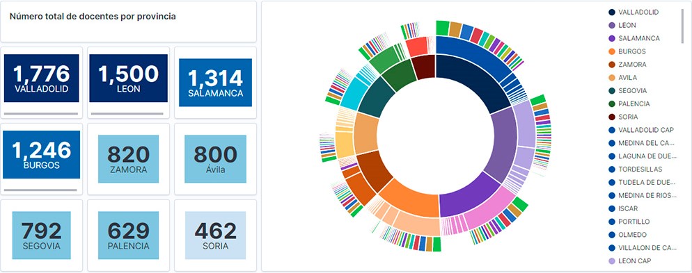
Visualization of the teaching staff of Castilla y León classified by Province, Locality and Teaching Specialty
2. Objetives
The main objective of this post is to learn how to treat a dataset from its download to the creation of one or more interactive graphs. For this, datasets containing relevant information on teachers and students enrolled in public schools in Castilla y León during the 2019-2020 academic year have been used. Based on these data, analyses of several indicators that relate teachers, specialties and students enrolled in the centers of each province or locality of the autonomous community.
3. Resources
3.1. Datasets
For this study, datasets on Education published by the Junta de Castilla y León have been selected, available on the open data portal datos.gob.es. Specifically:
- Dataset of the legal figures of the public centers of Castilla y León of all the teaching positions, except for the schoolteachers, during the academic year 2019-2020. This dataset is disaggregated by specialty of the teacher, educational center, town and province.
- Dataset of student enrolments in schools during the 2019-2020 academic year. This dataset is obtained through a query that supports different configuration parameters. Instructions for doing this are available at the dataset download point. The dataset is disaggregated by educational center, town and province.
3.2. Tools
To carry out this analysis (work environment set up, programming and writing) Python (versión 3.7) programming language and JupyterLab (versión 2.2) have been used. This tools will be found integrated in Anaconda, one of the most popular platforms to install, update or manage software to work with Data Science. All these tools are open and available for free.
JupyterLab is a web-based user interface that provides an interactive development environment where the user can work with so-called Jupyter notebooks on which you can easily integrate and share text, source code and data.
To create the interactive visualization, the Kibana tool (versión 7.10) has been used.
Kibana is an open source application that is part of the Elastic Stack product suite (Elasticsearch, Logstash, Beats and Kibana) that provides visualization and exploration capabilities of indexed data on top of the Elasticsearch analytics engine..
If you want to know more about these tools or others that can help you in the treatment and visualization of data, you can see the recently updated \"Data Processing and Visualization Tools\" report.
4. Data processing
As a first step of the process, it is necessary to perform an exploratory data analysis (EDA) to properly interpret the starting data, detect anomalies, missing data or errors that could affect the quality of subsequent processes and results. Pre-processing of data is essential to ensure that analyses or visualizations subsequently created from it are consistent and reliable.
Due to the informative nature of this post and to favor the understanding of non-specialized readers, the code does not intend to be the most efficient, but to facilitate its understanding. So you will probably come up with many ways to optimize the proposed code to get similar results. We encourage you to do so! You will be able to reproduce this analysis since the source code is available in our Github account. The way to provide the code is through a document made on JupyterLab that once loaded into the development environment you can execute or modify easily.
4.1. Installation and loading of libraries
The first thing we must do is import the libraries for the pre-processing of the data. There are many libraries available in Python but one of the most popular and suitable for working with these datasets is Pandas. The Pandas library is a very popular library for manipulating and analyzing datasets.
import pandas as pd 4.2. Loading datasets
First, we download the datasets from the open data catalog datos.gob.es and upload them into our development environment as tables to explore them and perform some basic data cleaning and processing tasks. For the loading of the data we will resort to the function read_csv(), where we will indicate the download url of the dataset, the delimiter (\"\";\"\" in this case) and, we add the parameter \"encoding\"\" that we adjust to the value \"\"latin-1\"\", so that it correctly interprets the special characters such as the letters with accents or \"\"ñ\"\" present in the text strings of the dataset.
#Cargamos el dataset de las plantillas jurídicas de los centros públicos de Castilla y León de todos los cuerpos de profesorado, a excepción de los maestros url = \"https://datosabiertos.jcyl.es/web/jcyl/risp/es/educacion/plantillas-centros-educativos/1284922684978.csv\"docentes = pd.read_csv(url, delimiter=\";\", header=0, encoding=\"latin-1\")docentes.head(3)#Cargamos el dataset de los alumnos matriculados en los centros educativos públicos de Castilla y León alumnos = pd.read_csv(\"matriculaciones.csv\", delimiter=\",\", names=[\"Municipio\", \"Matriculaciones\"], encoding=\"latin-1\") alumnos.head(3)The column \"\"Localidad\"\" of the table \"\"alumnos\"\" is composed of the code of the municipality and the name of the same. We must divide this column in two, so that its treatment is more efficient.
columnas_Municipios = alumnos[\"Municipio\"].str.split(\" \", n=1, expand = TRUE)alumnos[\"Codigo_Municipio\"] = columnas_Municipios[0]alumnos[\"Nombre_Munipicio\"] = columnas_Munipicio[1]alumnos.head(3)4.3. Creating a new table
Once we have both tables with the variables of interest, we create a new table resulting from their union. The union variables will be: \"\"Localidad\"\" in the table of \"\"docentes\"\" and \"\"Nombre_Municipio” in the table of \"\"alumnos\".
docentes_alumnos = pd.merge(docentes, alumnos, left_on = \"Localidad\", right_on = \"Nombre_Municipio\")docentes_alumnos.head(3)4.4. Exploring the dataset
Once we have the table that interests us, we must spend some time exploring the data and interpreting each variable. In these cases, it is very useful to have the data dictionary that always accompanies each downloaded dataset to know all its details, but this time we do not have this essential tool. Observing the table, in addition to interpreting the variables that make it up (data types, units, ranges of values), we can detect possible errors such as mistyped variables or the presence of missing values (NAs) that can reduce analysis capacity.
docentes_alumnos.info()In the output of this section of code, we can see the main characteristics of the table:
- Contains a total of 4,512 records
- It is composed of 13 variables, 5 numerical variables (integer type) and 8 categorical variables (\"object\" type)
- There is no missing of values.
Once we know the structure and content of the table, we must rectify errors, as is the case of the transformation of some of the variables that are not properly typified, for example, the variable that houses the center code (\"Código.centro\").
docentes_alumnos.Codigo_centro = data.Codigo_centro.astype(\"object\")docentes_alumnos.Codigo_cuerpo = data.Codigo_cuerpo.astype(\"object\")docentes_alumnos.Codigo_especialidad = data.Codigo_especialidad.astype(\"object\")Once we have the table free of errors, we obtain a description of the numerical variables, \"\"Plantilla\" and \"\"Matriculaciones\", which will help us to know important details. In the output of the code that we present below we observe the mean, the standard deviation, the maximum and minimum number, among other statistical descriptors.
docentes_alumnos.describe()4.5. Save the dataset
Once we have the table free of errors and with the variables that we are interested in graphing, we will save it in a folder of our choice to use it later in other analysis or visualization tools. We will save it in CSV format encoded as UTF-8 (Unicode Transformation Format) so that special characters are correctly identified by any tool we might use later.
df = pd.DataFrame(docentes_alumnos)filname = \"docentes_alumnos.csv\"df.to_csv(filename, index = FALSE, encoding = \"utf-8\")5. Creation of the visualization on the teachers of the public educational centers of Castilla y León using the Kibana tool
For the realization of this visualization, we have used the Kibana tool in our local environment. To do this it is necessary to have Elasticsearch and Kibana installed and running. The company Elastic makes all the information about the download and installation available in this tutorial.
Attached below are two video tutorials, which shows the process of creating the visualization and the interaction with the generated dashboard.
In this first video, you can see the creation of the dashboard by generating different graphic representations, following these steps:
- We load the table of previously processed data into Elasticsearch and generate an index that allows us to interact with the data from Kibana. This index allows search and management of data, practically in real time.
- Generation of the following graphical representations:
- Graph of sectors where to show the teaching staff by province, locality and specialty.
- Metrics of the number of teachers by province.
- Bar chart, where we will show the number of registrations by province.
- Filter by province, locality and teaching specialty.
- Construction of the dashboard.
In this second video, you will be able to observe the interaction with the dashboard generated previously.
6. Conclusions
Observing the visualization of the data on the number of teachers in public schools in Castilla y León, in the academic year 2019-2020, the following conclusions can be obtained, among others:
- The province of Valladolid is the one with both the largest number of teachers and the largest number of students enrolled. While Soria is the province with the lowest number of teachers and the lowest number of students enrolled.
- As expected, the localities with the highest number of teachers are the provincial capitals.
- In all provinces, the specialty with the highest number of students is English, followed by Spanish Language and Literature and Mathematics.
- It is striking that the province of Zamora, although it has a low number of enrolled students, is in fifth position in the number of teachers.
This simple visualization has helped us to synthesize a large amount of information and to obtain a series of conclusions at a glance, and if necessary, make decisions based on the results obtained. We hope you have found this new post useful and we will return to show you new reuses of open data. See you soon!
Documentación
1. Introduction
Data visualization is a task linked to data analysis that aims to represent graphically the underlying information. Visualizations play a fundamental role in data communication, since they allow to draw conclusions in a visual and understandable way, also allowing detection of patterns, trends, anomalous data or projection of predictions, among many other functions. This makes its application transversal to any process that involves data. The visualization possibilities are very broad, from basic representations such as line, bar or sector graph, to complex visualizations configured on interactive dashboards.
Before starting to build an effective visualization, a prior data treatment must be performed, paying attention to their collection and validation of their content, ensuring that they are free of errors and in an adequate and consistent format for processing. The previous data treatment is essential to carry out any task related to data analysis and realization of effective visualizations.
We will periodically present a series of practical exercises on open data visualizations that are available on the portal datos.gob.es and in other similar catalogues. In there, we approach and describe in a simple way the necessary steps to obtain data, perform transformations and analysis that are relevant to creation of interactive visualizations from which we may extract all the possible information summarised in final conclusions. In each of these practical exercises we will use simple code developments which will be conveniently documented, relying on free tools. Created material will be available to reuse in Data Lab on Github.
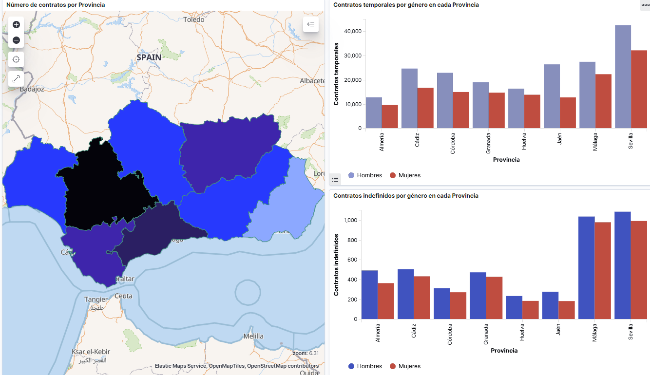
Captura del vídeo que muestra la interacción con el dashboard de la caracterización de la demanda de empleo y la contratación registrada en España disponible al final de este artículo
2. Objetives
The main objective of this post is to create an interactive visualization using open data. For this purpose, we have used datasets containing relevant information on evolution of employment demand in Spain over the last years. Based on these data, we have determined a profile that represents employment demand in our country, specifically investigating how does gender gap affects a group and impact of variables such as age, unemployment benefits or region.
3. Resources
3.1. Datasets
For this analysis we have selected datasets published by the Public State Employment Service (SEPE), coordinated by the Ministry of Labour and Social Economy, which collects time series data with distinct breakdowns that facilitate the analysis of the qualities of job seekers. These data are available on datos.gob.es, with the following characteristics:
- Demandantes de empleo por municipio: contains the number of job seekers broken down by municipality, age and gender, between the years 2006-2020.
- Gasto de prestaciones por desempleo por Provincia: time series between the years 2010-2020 related to unemployment benefits expenditure, broken down by province and type of benefit.
- Contratos registrados por el Servicio Público de Empleo Estatal (SEPE) por municipio: these datasets contain the number of registered contracts to both, job seekers and non-job seekers, broken down by municipality, gender and contract type, between the years 2006-2020.
3.2. Tools.
R (versión 4.0.3) and RStudio with RMarkdown add-on have been used to carry out this analysis (working environment, programming and drafting).
RStudio is an integrated open source development environment for R programming language, dedicated to statistical analysis and graphs creation.
RMarkdown allows creation of reports integrating text, code and dynamic results into a single document.
To create interactive graphs, we have used Kibana tool.
Kibana is an open code application that forms a part of Elastic Stack (Elasticsearch, Beats, Logstasg y Kibana) qwhich provides visualization and exploration capacities of the data indexed on the analytics engine Elasticsearch. The main advantages of this tool are:
- Presents visual information through interactive and customisable dashboards using time intervals, filters faceted by range, geospatial coverage, among others
- Contains development tools catalogue (Dev Tools) to interact with data stored in Elasticsearch.
- It has a free version ready to use on your own computer and enterprise version that is developed in the Elastic cloud and other cloud infrastructures, such as Amazon Web Service (AWS).
On Elastic website you may find user manuals for the download and installation of the tool, but also how to create graphs, dashboards, etc. Furthermore, it offers short videos on the youtube channel and organizes webinars dedicated to explanation of diverse aspects related to Elastic Stack.
If you want to learn more about these and other tools which may help you with data processing, see the report “Data processing and visualization tools” that has been recently updated.
4. Data processing
To create a visualization, it´s necessary to prepare the data properly by performing a series of tasks that include pre-processing and exploratory data analysis (EDA), to understand better the data that we are dealing with. The objective is to identify data characteristics and detect possible anomalies or errors that could affect the quality of results. Data pre-processing is essential to ensure the consistency and effectiveness of analysis or visualizations that are created afterwards.
In order to support learning of readers who are not specialised in programming, the R code included below, which can be accessed by clicking on “Code” button, is not designed to be efficient but rather to be easy to understand. Therefore, it´s probable that the readers more advanced in this programming language may consider to code some of the functionalities in an alternative way. A reader will be able to reproduce this analysis if desired, as the source code is available on the datos.gob.es Github account. The way to provide the code is through a RMarkdown document. Once it´s loaded to the development environment, it may be easily run or modified.
4.1. Installation and import of libraries
R base package, which is always available when RStudio console is open, includes a wide set of functionalities to import data from external sources, carry out statistical analysis and obtain graphic representations. However, there are many tasks for which it´s required to resort to additional packages, incorporating functions and objects defined in them into the working environment. Some of them are already available in the system, but others should be downloaded and installed.
#Instalación de paquetes \r\n #El paquete dplyr presenta una colección de funciones para realizar de manera sencilla operaciones de manipulación de datos \r\n if (!requireNamespace(\"dplyr\", quietly = TRUE)) {install.packages(\"dplyr\")}\r\n #El paquete lubridate para el manejo de variables tipo fecha \r\n if (!requireNamespace(\"lubridate\", quietly = TRUE)) {install.packages(\"lubridate\")}\r\n#Carga de paquetes en el entorno de desarrollo \r\nlibrary (dplyr)\r\nlibrary (lubridate)\r\n4.2. Data import and cleansing
a. Import of datasets
Data which will be used for visualization are divided by annualities in the .CSV and .XLS files. All the files of interest should be imported to the development environment. To make this post easier to understand, the following code shows the upload of a single .CSV file into a data table.
To speed up the loading process in the development environment, it´s necessary to download the datasets required for this visualization to the working directory. The datasets are available on the datos.gob.es Github account.
#Carga del datasets de demandantes de empleo por municipio de 2020. \r\n Demandantes_empleo_2020 <- \r\n read.csv(\"Conjuntos de datos/Demandantes de empleo por Municipio/Dtes_empleo_por_municipios_2020_csv.csv\",\r\n sep=\";\", skip = 1, header = T)\r\nOnce all the datasets are uploaded as data tables in the development environment, they need to be merged in order to obtain a single dataset that includes all the years of the time series, for each of the characteristics related to job seekers that will be analysed: number of job seekers, unemployment expenditure and new contracts registered by SEPE.
#Dataset de demandantes de empleo\r\nDatos_desempleo <- rbind(Demandantes_empleo_2006, Demandantes_empleo_2007, Demandantes_empleo_2008, Demandantes_empleo_2009, \r\n Demandantes_empleo_2010, Demandantes_empleo_2011,Demandantes_empleo_2012, Demandantes_empleo_2013,\r\n Demandantes_empleo_2014, Demandantes_empleo_2015, Demandantes_empleo_2016, Demandantes_empleo_2017, \r\n Demandantes_empleo_2018, Demandantes_empleo_2019, Demandantes_empleo_2020) \r\n#Dataset de gasto en prestaciones por desempleo\r\ngasto_desempleo <- rbind(gasto_2010, gasto_2011, gasto_2012, gasto_2013, gasto_2014, gasto_2015, gasto_2016, gasto_2017, gasto_2018, gasto_2019, gasto_2020)\r\n#Dataset de nuevos contratos a demandantes de empleo\r\nContratos <- rbind(Contratos_2006, Contratos_2007, Contratos_2008, Contratos_2009,Contratos_2010, Contratos_2011, Contratos_2012, Contratos_2013, \r\n Contratos_2014, Contratos_2015, Contratos_2016, Contratos_2017, Contratos_2018, Contratos_2019, Contratos_2020)b. Selection of variables
Once the tables with three time series are obtained (number of job seekers, unemployment expenditure and new registered contracts), the variables of interest will be extracted and included in a new table.
First, the tables with job seekers (“unemployment_data”) and new registered contracts (“contracts”) should be added by province, to facilitate the visualization. They should match the breakdown by province of the unemployment benefits expenditure table (“unemployment_expentidure”). In this step, only the variables of interest will be selected from the three datasets.
#Realizamos un group by al dataset de \"datos_desempleo\", agruparemos las variables numéricas que nos interesen, en función de varias variables categóricas\r\nDtes_empleo_provincia <- Datos_desempleo %>% \r\n group_by(Código.mes, Comunidad.Autónoma, Provincia) %>%\r\n summarise(total.Dtes.Empleo = (sum(total.Dtes.Empleo)), Dtes.hombre.25 = (sum(Dtes.Empleo.hombre.edad...25)), \r\n Dtes.hombre.25.45 = (sum(Dtes.Empleo.hombre.edad.25..45)), Dtes.hombre.45 = (sum(Dtes.Empleo.hombre.edad...45)),\r\n Dtes.mujer.25 = (sum(Dtes.Empleo.mujer.edad...25)), Dtes.mujer.25.45 = (sum(Dtes.Empleo.mujer.edad.25..45)),\r\n Dtes.mujer.45 = (sum(Dtes.Empleo.mujer.edad...45)))\r\n#Realizamos un group by al dataset de \"contratos\", agruparemos las variables numericas que nos interesen en función de las varibles categóricas.\r\nContratos_provincia <- Contratos %>% \r\n group_by(Código.mes, Comunidad.Autónoma, Provincia) %>%\r\n summarise(Total.Contratos = (sum(Total.Contratos)),\r\n Contratos.iniciales.indefinidos.hombres = (sum(Contratos.iniciales.indefinidos.hombres)), \r\n Contratos.iniciales.temporales.hombres = (sum(Contratos.iniciales.temporales.hombres)), \r\n Contratos.iniciales.indefinidos.mujeres = (sum(Contratos.iniciales.indefinidos.mujeres)), \r\n Contratos.iniciales.temporales.mujeres = (sum(Contratos.iniciales.temporales.mujeres)))\r\n#Seleccionamos las variables que nos interesen del dataset de \"gasto_desempleo\"\r\ngasto_desempleo_nuevo <- gasto_desempleo %>% select(Código.mes, Comunidad.Autónoma, Provincia, Gasto.Total.Prestación, Gasto.Prestación.Contributiva)Secondly, the three tables should be merged into one that we will work with from this point onwards..
Caract_Dtes_empleo <- Reduce(merge, list(Dtes_empleo_provincia, gasto_desempleo_nuevo, Contratos_provincia))
c. Transformation of variables
When the table with variables of interest is created for further analysis and visualization, some of them should be transformed to other types, more adequate for future aggregations.
#Transformación de una variable fecha\r\nCaract_Dtes_empleo$Código.mes <- as.factor(Caract_Dtes_empleo$Código.mes)\r\nCaract_Dtes_empleo$Código.mes <- parse_date_time(Caract_Dtes_empleo$Código.mes(c(\"200601\", \"ym\")), truncated = 3)\r\n#Transformamos a variable numérica\r\nCaract_Dtes_empleo$Gasto.Total.Prestación <- as.numeric(Caract_Dtes_empleo$Gasto.Total.Prestación)\r\nCaract_Dtes_empleo$Gasto.Prestación.Contributiva <- as.numeric(Caract_Dtes_empleo$Gasto.Prestación.Contributiva)\r\n#Transformación a variable factor\r\nCaract_Dtes_empleo$Provincia <- as.factor(Caract_Dtes_empleo$Provincia)\r\nCaract_Dtes_empleo$Comunidad.Autónoma <- as.factor(Caract_Dtes_empleo$Comunidad.Autónoma)d. Exploratory analysis
Let´s see what variables and structure the new dataset presents.
str(Caract_Dtes_empleo)\r\nsummary(Caract_Dtes_empleo)The output of this portion of the code is omitted to facilitate reading. Main characteristics presented in the dataset are as follows:
- Time range covers a period from January to December 2020.
- Number of columns (variables) is 17. .
- It presents two categorical variables (“Province”, “Autonomous.Community”), one date variable (“Code.month”) and the rest are numerical variables.
e. Detection and processing of missing data
Next, we will analyse whether the dataset has missing values (NAs). A treatment or elimination of NAs is essential, otherwise it will not be possible to process properly the numerical variables.
any(is.na(Caract_Dtes_empleo)) \r\n#Como el resultado es \"TRUE\", eliminamos los datos perdidos del dataset, ya que no sabemos cual es la razón por la cual no se encuentran esos datos\r\nCaract_Dtes_empleo <- na.omit(Caract_Dtes_empleo)\r\nany(is.na(Caract_Dtes_empleo))4.3. Creation of new variables
In order to create a visualization, we are going to make a new variable from the two variables present in the data table. This operation is very common in the data analysis, as sometimes it´s interesting to work with calculated data (e.g., the sum or the average of different variables) instead of source data. In this case, we will calculate the average unemployment expenditure for each job seeker. For this purpose, variables of total expenditure per benefit (“Expenditure.Total.Benefit”) and the total number of job seekers (“total.JobSeekers.Employment”) will be used.
Caract_Dtes_empleo$gasto_desempleado <-\r\n (1000 * (Caract_Dtes_empleo$Gasto.Total.Prestación/\r\n Caract_Dtes_empleo$total.Dtes.Empleo))4.4. Save the dataset
Once the table containing variables of interest for analysis and visualizations is obtained, we will save it as a data file in CSV format to perform later other statistical analysis or use it within other processing or data visualization tools. It´s important to use the UTF-8 encoding (Unicode Transformation Format), so the special characters may be identified correctly by any other tool.
write.csv(Caract_Dtes_empleo,\r\n file=\"Caract_Dtes_empleo_UTF8.csv\",\r\n fileEncoding= \"UTF-8\")5. Creation of a visualization on the characteristics of employment demand in Spain using Kibana
The development of this interactive visualization has been performed with usage of Kibana in the local environment. We have followed Elastic company tutorial for both, download and installation of the software.
Below you may find a tutorial video related to the whole process of creating a visualization. In the video you may see the creation of dashboard with different interactive indicators by generating graphic representations of different types. The steps to build a dashboard are as follows:
A continuación se adjunta un vídeo tutorial donde se muestra todo el proceso de realización de la visualización. En el vídeo podrás ver la creación de un cuadro de mando (dashboard) con diferentes indicadores interactivos mediante la generación de representaciones gráficas de diferentes tipos. Los pasos para obtener el dashboard son los siguientes:
- Load the data into Elasticsearch and generate an index that allows to interact with the data from Kibana. This index permits a search and management of the data in the loaded files, practically in real time.
- Generate the following graphic representations:
- Line graph to represent a time series on the job seekers in Spain between 2006 and 2020.
- Sector graph with job seekers broken down by province and Autonomous Community
- Thematic map showing the number of new contracts registered in each province on the territory. For creation of this visual it´s necessary to download a dataset with province georeferencing published in the open data portal Open Data Soft.
- Build a dashboard.
Below you may find a tutorial video interacting with the visualization that we have just created:
6. Conclusions
Looking at the visualization of the data related to the profile of job seekers in Spain during the years 2010-2020, the following conclusions may be drawn, among others:
- There are two significant increases of the job seekers number. The first, approximately in 2010, coincides with the economic crisis. The second, much more pronounced in 2020, coincides with the pandemic crisis.
- A gender gap may be observed in the group of job seekers: the number of female job seekers is higher throughout the time series, mainly in the age groups above 25.
- At the regional level, Andalusia, followed by Catalonia and Valencia, are the Autonomous Communities with the highest number of job seekers. In contrast to Andalusia, which is an Autonomous Community with the lowest unemployment expenditure, Catalonia presents the highest value.
- Temporal contracts are leading and the provinces which generate the highest number of contracts are Madrid and Barcelona, what coincides with the highest number of habitants, while on the other side, provinces with the lowest number of contracts are Soria, Ávila, Teruel and Cuenca, what coincides with the most depopulated areas of Spain.
This visualization has helped us to synthetise a large amount of information and give it a meaning, allowing to draw conclusions and, if necessary, make decisions based on results. We hope that you like this new post, we will be back to present you new reuses of open data. See you soon!
Blog
The democratisation of technology in all areas is an unstoppable trend. With the spread of smartphones and Internet access, an increasing number of people can access high-tech products and services without having to resort to advanced knowledge or specialists. The world of data is no stranger to this transformation and in this post we tell you why.
Introduction
Nowadays, you don't need to be an expert in video editing and post-production to have your own YouTube channel and generate high quality content. In the same way that you don't need to be a super specialist to have a smart and connected home. This is due to the fact that technology creators are paying more and more attention to providing simple tools with a careful user experience for the average consumer. It is a similar story with data. Given the importance of data in today's society, both for private and professional use, in recent years we have seen the democratisation of tools for simple data analysis, without the need for advanced programming skills.
In this sense, spreadsheets have always lived among us and we have become so accustomed to their use that we use them for almost anything, from a shopping list to a family budget. Spreadsheets are so popular that they are even considered as a sporting event. However, despite their great versatility, they are not the most visual tools from the point of view of communicating information. Moreover, spreadsheets are not suitable for a type of data that is becoming more and more important nowadays: real-time data.
The natively digital world increasingly generates real-time data. Some reports suggest that by 2025, a quarter of the world's data will be real-time data. That is, it will be data with a much shorter lifecycle, during which it will be generated, analysed in real time and disappear as it will not make sense to store it for later use. One of the biggest contributors to real-time data will be the growth of Internet of Things (IoT) technologies.
Just as with spreadsheets or self-service business intelligence tools, data technology developers are now focusing on democratising data tools designed for real-time data. Let's take a concrete example of such a tool.
Low-code programming tools
Low-code programming tools are those that allow us to build programs without the need for specific programming knowledge. Normally, low-code tools use a graphical programming system, using blocks or boxes, in which the user can build a program, choosing and dragging the boxes he/she needs to build his/her program. Contrary to what it might seem, low-code programming tools are not new and have been with us for many years in specialised fields such as engineering or process design. In this post, we are going to focus on a specific one, especially designed for data and in particular, real-time data.
Node-RED
Node-RED is an open-source tool under the umbrella of the OpenJS foundation which is part of the Linux Foundation projects. Node-RED defines itself as a low-code tool specially designed for event-driven applications. Event-driven applications are computer programs whose basic functionality receives and generates data in the form of events. For example, an application that generates a notification in an instant messaging service from an alarm triggered by a sensor is an event-driven application. Both the input data - the sensor alarm - and the output data - the messaging notification - are events or real-time data.
This type of programming was invented by Paul Morrison in the 1970s. It works by having a series of boxes or nodes, each of which has a specific functionality (receiving data from a sensor or generating a notification). The nodes are connected to each other (graphically, without having to program anything) to build what is known as a flow, which is the equivalent of a programme or a specific part of a programme. Once the flow is built, the application is in charge of maintaining a constant flow of data from its input to its output. Let's look at a concrete example to understand it better.
Analysis of real-time noise data in the city of Valencia
The best way to demonstrate the power of Node-RED is by making a simple prototype (a program in less than 5 minutes) that allows us to access and visualise the data from the noise meters installed in a specific neighbourhood in the city of Valencia. To do this, the first thing we are going to do is to locate a set of open data from the datos.gob.es catalogue. In this case we have chosen this set, which provides the data through an API and whose particularity is that it is updated in real time with the data obtained directly from the noise pollution network installed in Valencia. We now choose the distribution that provides us with the data in XML format and execute the call.
The result returned by the browser looks like this (the result is truncated - what the API returns has been cut off - due to the long length of the response):
<response>
<resources name="response">
<resource>
<str name="LAeq">065.6</str>
<str name="name">Sensor de ruido del barrio de ruzafa. Cadiz 3</str>
<str name="dateObserved">2021-06-05T08:18:07Z</str>
<date name="modified">2021-06-05T08:19:08.579Z</date>
<str name="uri">http://apigobiernoabiertortod.valencia.es/rest/datasets/estado_sonometros_cb/t248655.xml</str>
</resource>
<resource>
<str name="LAeq">058.9</str>
<str name="name">Sensor de ruido del barrio de ruzafa. Sueca Esq. Denia</str>
<str name="dateObserved">2021-06-05T08:18:04Z</str>
<date name="modified">2021-06-05T08:19:08.579Z</date>
<str name="uri">http://apigobiernoabiertortod.valencia.es/rest/datasets/estado_sonometros_cb/t248652.xml</str>
</resource>
Where the parameter LAeq is the measure of noise level[1]
To get this same result returned by the API in a real-time program with Node-RED, we just have to start Node-RED in our browser (to install Node-RED on your computer you can follow the instructions here).
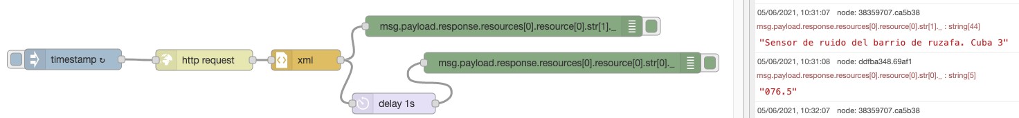
With only 6 nodes (included by default in the basic installation of Node-RED) we can build this flow or program that requests the data from the sensor installed in "Noise sensor in the Ruzafa neighbourhood. Cádiz 3" and return the noise value that is automatically updated every minute. You can see a demonstration video here.
Node-Red has many more possibilities, it is possible to combine several flows to make much more complex programmes or to build very visual dashboards like this one for final applications.
In short, in this article we have shown you how you don't need to know how to program or use complex software to make your own applications accessing open data in real time. You can get much more information on how to start using Node-RED here. You can also try other tools similar to Node-RED such as Apache Nify or ThingsBoard. We're sure the possibilities you can think of are endless - get creative!
[1] Equivalent continuous sound level. It is defined in ISO 1996-2:2017 as the value of the pressure level in dBA in A-weighting of a stable sound which in a time interval T has the same root mean square sound pressure as the sound being measured and whose level varies with time. In this case the period set for this sensor is 1 minute.
Content elaborated by Alejandro Alija, expert in Digital Transformation and Innovation.
Contents and points of view expressed in this publication are the exclusive responsibility of its author.
Noticia
Summer is just around the corner and with it the well-deserved holidays. Undoubtedly, this time of year gives us time to rest, reconnect with the family and spend pleasant moments with our friends.
However, it is also a great opportunity to take advantage of and improve our knowledge of data and technology through the courses that different universities make available to us during these dates. Whether you are a student or a working professional, these types of courses can contribute to increase your training and help you gain competitive advantages in the labour market.
Below, we show you some examples of summer courses from Spanish universities on these topics. We have also included some online training, available all year round, which can be an excellent product to learn during the summer season.
Courses related to open data
We begin our compilation with the course 'Big & Open Data. Analysis and programming with R and Python' given by the Complutense University of Madrid. It will be held at the Fundación General UCM from 5 to 23 July, Monday to Friday from 9 am to 2 pm. This course is aimed at university students, teachers, researchers and professionals who wish to broaden and perfect their knowledge of this subject.
Data analysis and visualisation
If you are interested in learning the R language, the University of Santiago de Compostela organises two courses related to this subject, within the framework of its 'Universidade de Verán' The first one is 'Introduction to geographic and cartographic information systems with the R environment', which will be held from 6 to 9 July at the Faculty of Geography and History of Santiago de Compostela. You can consult all the information and the syllabus through this link.
The second is 'Visualisation and analysis of data with R', which will take place from 13 to 23 July at the Faculty of Mathematics of the USC. In this case, the university offers students the possibility of attending in two shifts (morning and afternoon). As you can see in the programme, statistics is one of the key aspects of this training.
If your field is social sciences and you want to learn how to handle data correctly, the course of the International University of Andalusia (UNIA) 'Techniques of data analysis in Humanities and Social Sciences' seeks to approach the use of new statistical and spatial techniques in research in these fields. It will be held from 23 to 26 August in classroom mode.
Big Data
Big Data is increasingly becoming one of the elements that contribute most to the acceleration of digital transformation. If you are interested in this field, you can opt for the course 'Big Data Geolocated: Tools for capture, analysis and visualisation' which will be given by the Complutense University of Madrid from 5 to 23 July from 9 am to 2 pm, in person at the Fundación General UCM.
Another option is the course 'Big Data: technological foundations and practical applications' organised by the University of Alicante, which will be held online from 19 to 23 July.
Artificial intelligence
The Government has recently launched the online course 'Elements of AI' in Spanish with the aim of promoting and improving the training of citizens in artificial intelligence. The Secretary of State for Digitalisation and Artificial Intelligence will implement this project in collaboration with the UNED, which will provide the technical and academic support for this training. Elements of AI is a massive open educational project (MOOC) that aims to bring citizens knowledge and skills on Artificial Intelligence and its various applications. You can find out all the information about this course here. And if you want to start the training now, you can register through this link. The course is free of charge.
Another interesting training related to this field is the course 'Practical introduction to artificial intelligence and deep learning' organised by the International University of Andalusia (UNIA). It will be taught in person at the Antonio Machado headquarters in Baeza between 17 and 20 August 2021. Among its objectives, it offers students an overview of data processing models based on artificial intelligence and deep learning techniques, among others.
These are just a few examples of courses that are currently open for enrolment, although there are many more, as the offer is wide and varied. In addition, it should be remembered that summer has not yet begun and that new data-related courses could appear in the coming weeks. If you know of any other course that might be of interest, do not hesitate to leave us a comment below or write to us at contacto@datos.gob.es.