Documentación
1. Introduction
Visualisations are graphical representations of data that allow to communicate, in a simple and effective way, the information linked to the data. The visualisation possibilities are very wide ranging, from basic representations such as line graphs, bar charts or relevant metrics, to interactive dashboards.
In this section of "Step-by-Step Visualisations we are regularly presenting practical exercises making use of open data available at datos.gob.es or other similar catalogues. They address and describe in a simple way the steps necessary to obtain the data, carry out the relevant transformations and analyses, and finally draw conclusions, summarizing the information.
Documented code developments and free-to-use tools are used in each practical exercise. All the material generated is available for reuse in the GitHub repository of datos.gob.es.
In this particular exercise, we will explore the current state of electric vehicle penetration in Spain and the future prospects for this disruptive technology in transport.
Access the data lab repository on Github.
Run the data pre-processing code on Google Colab.
In this video (available with English subtitles), the author explains what you will find both on Github and Google Colab.
2. Context: why is the electric vehicle important?
The transition towards more sustainable mobility has become a global priority, placing the electric vehicle (EV) at the centre of many discussions on the future of transport. In Spain, this trend towards the electrification of the car fleet not only responds to a growing consumer interest in cleaner and more efficient technologies, but also to a regulatory and incentive framework designed to accelerate the adoption of these vehicles. With a growing range of electric models available on the market, electric vehicles represent a key part of the country's strategy to reduce greenhouse gas emissions, improve urban air quality and foster technological innovation in the automotive sector.
However, the penetration of EVs in the Spanish market faces a number of challenges, from charging infrastructure to consumer perception and knowledge of EVs. Expansion of the freight network, together with supportive policies and fiscal incentives, are key to overcoming existing barriers and stimulating demand. As Spain moves towards its sustainability and energy transition goals, analysing the evolution of the electric vehicle market becomes an essential tool to understand the progress made and the obstacles that still need to be overcome.
3. Objective
This exercise focuses on showing the reader techniques for the processing, visualisation and advanced analysis of open data using Python. We will adopt a "learning-by-doing" approach so that the reader can understand the use of these tools in the context of solving a real and topical challenge such as the study of EV penetration in Spain. This hands-on approach not only enhances understanding of data science tools, but also prepares readers to apply this knowledge to solve real problems, providing a rich learning experience that is directly applicable to their own projects.
The questions we will try to answer through our analysis are:
- Which vehicle brands led the market in 2023?
- Which vehicle models were the best-selling in 2023?
- What market share will electric vehicles absorb in 2023?
- Which electric vehicle models were the best-selling in 2023?
- How have vehicle registrations evolved over time?
- Are we seeing any trends in electric vehicle registrations?
- How do we expect electric vehicle registrations to develop next year?
- How much CO2 emission reduction can we expect from the registrations achieved over the next year?
4. Resources
To complete the development of this exercise we will require the use of two categories of resources: Analytical Tools and Datasets.
4.1. Dataset
To complete this exercise we will use a dataset provided by the Dirección General de Tráfico (DGT) through its statistical portal, also available from the National Open Data catalogue (datos.gob.es). The DGT statistical portal is an online platform aimed at providing public access to a wide range of data and statistics related to traffic and road safety. This portal includes information on traffic accidents, offences, vehicle registrations, driving licences and other relevant data that can be useful for researchers, industry professionals and the general public.
In our case, we will use their dataset of vehicle registrations in Spain available via:
- Open Data Catalogue of the Spanish Government.
- Statistical portal of the DGT.
Although during the development of the exercise we will show the reader the necessary mechanisms for downloading and processing, we include pre-processed data
in the associated GitHub repository, so that the reader can proceed directly to the analysis of the data if desired.
*The data used in this exercise were downloaded on 04 March 2024. The licence applicable to this dataset can be found at https://datos.gob.es/avisolegal.
4.2. Analytical tools
- Programming language: Python - a programming language widely used in data analysis due to its versatility and the wide range of libraries available. These tools allow users to clean, analyse and visualise large datasets efficiently, making Python a popular choice among data scientists and analysts.
- Platform: Jupyter Notebooks - ia web application that allows you to create and share documents containing live code, equations, visualisations and narrative text. It is widely used for data science, data analytics, machine learning and interactive programming education.
-
Main libraries and modules:
- Data manipulation: Pandas - an open source library that provides high-performance, easy-to-use data structures and data analysis tools.
- Data visualisation:
- Matplotlib: a library for creating static, animated and interactive visualisations in Python..
- Seaborn: a library based on Matplotlib. It provides a high-level interface for drawing attractive and informative statistical graphs.
- Statistics and algorithms:
- Statsmodels: a library that provides classes and functions for estimating many different statistical models, as well as for testing and exploring statistical data.
- Pmdarima: a library specialised in automatic time series modelling, facilitating the identification, fitting and validation of models for complex forecasts.
5. Exercise development
It is advisable to run the Notebook with the code at the same time as reading the post, as both didactic resources are complementary in future explanations
The proposed exercise is divided into three main phases.
5.1 Initial configuration
This section can be found in point 1 of the Notebook.
In this short first section, we will configure our Jupyter Notebook and our working environment to be able to work with the selected dataset. We will import the necessary Python libraries and create some directories where we will store the downloaded data.
5.2 Data preparation
This section can be found in point 2 of the Notebookk.
All data analysis requires a phase of accessing and processing to obtain the appropriate data in the desired format. In this phase, we will download the data from the statistical portal and transform it into the format Apache Parquet format before proceeding with the analysis.
Those users who want to go deeper into this task, please read this guide Practical Introductory Guide to Exploratory Data Analysis.
5.3 Data analysis
This section can be found in point 3 of the Notebook.
5.3.1 Análisis descriptivo
In this third phase, we will begin our data analysis. To do so,we will answer the first questions using datavisualisation tools to familiarise ourselves with the data. Some examples of the analysis are shown below:
- Top 10 Vehicles registered in 2023: In this visualisation we show the ten vehicle models with the highest number of registrations in 2023, also indicating their combustion type. The main conclusions are:
- The only European-made vehicles in the Top 10 are the Arona and the Ibiza from Spanish brand SEAT. The rest are Asians.
- Nine of the ten vehicles are powered by gasoline.
- The only vehicle in the Top 10 with a different type of propulsion is the DACIA Sandero LPG (Liquefied Petroleum Gas).
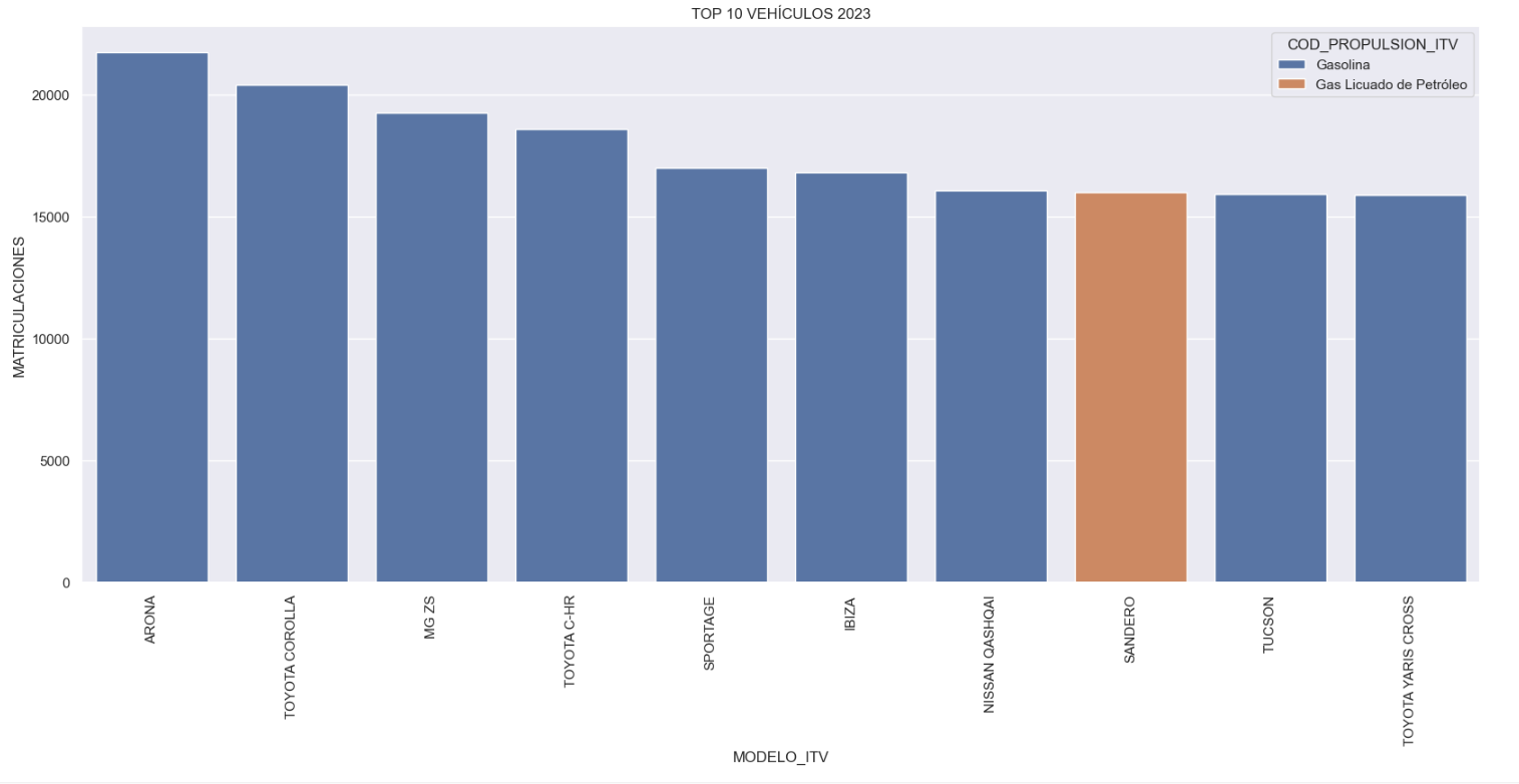
Figure 1. Graph "Top 10 vehicles registered in 2023"
- Market share by propulsion type: In this visualisation we represent the percentage of vehicles registered by each type of propulsion (petrol, diesel, electric or other). We see how the vast majority of the market (>70%) was taken up by petrol vehicles, with diesel being the second choice, and how electric vehicles reached 5.5%.
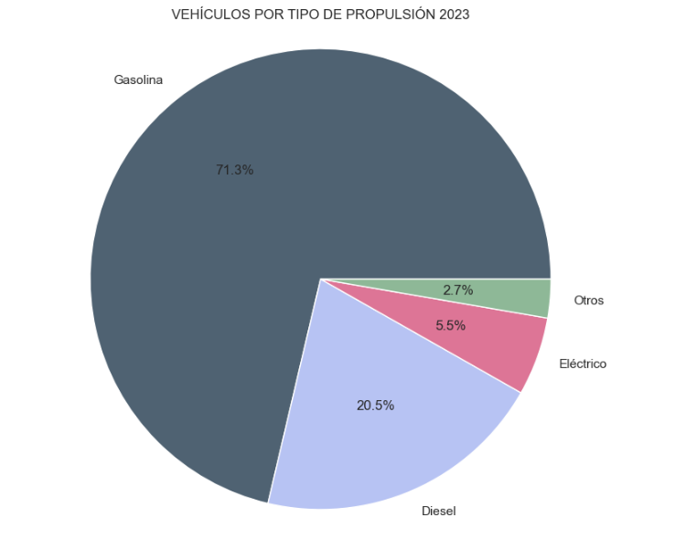
Figure 2. Graph "Market share by propulsion type".
- Historical development of registrations: This visualisation represents the evolution of vehicle registrations over time. It shows the monthly number of registrations between January 2015 and December 2023 distinguishing between the propulsion types of the registered vehicles, and there are several interesting aspects of this graph:
- We observe an annual seasonal behaviour, i.e. we observe patterns or variations that are repeated at regular time intervals. We see recurring high levels of enrolment in June/July, while in August/September they decrease drastically. This is very relevant, as the analysis of time series with a seasonal factor has certain particularities.
-
The huge drop in registrations during the first months of COVID is also very remarkable.
-
We also see that post-covid enrolment levels are lower than before.
-
Finally, we can see how between 2015 and 2023 the registration of electric vehicles is gradually increasing.
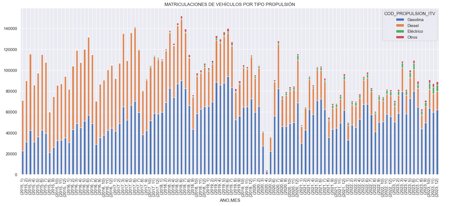
Figure 3. Graph "Vehicle registrations by propulsion type".
- Trend in the registration of electric vehicles: We now analyse the evolution of electric and non-electric vehicles separately using heat maps as a visual tool. We can observe very different behaviours between the two graphs. We observe how the electric vehicle shows a trend of increasing registrations year by year and, despite the COVID being a halt in the registration of vehicles, subsequent years have maintained the upward trend.
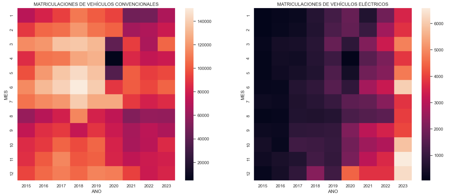
Figure 4. Graph "Trend in registration of conventional vs. electric vehicles".
5.3.2. Predictive analytics
To answer the last question objectively, we will use predictive models that allow us to make estimates regarding the evolution of electric vehicles in Spain. As we can see, the model constructed proposes a continuation of the expected growth in registrations throughout the year of 70,000, reaching values close to 8,000 registrations in the month of December 2024 alone.
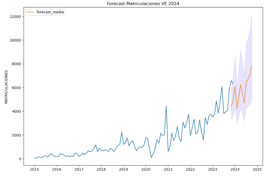
Figure 5. Graph "Predicted electric vehicle registrations".
5. Conclusions
As a conclusion of the exercise, we can observe, thanks to the analysis techniques used, how the electric vehicle is penetrating the Spanish vehicle fleet at an increasing speed, although it is still at a great distance from other alternatives such as diesel or petrol, for now led by the manufacturer Tesla. We will see in the coming years whether the pace grows at the level needed to meet the sustainability targets set and whether Tesla remains the leader despite the strong entry of Asian competitors.
6. Do you want to do the exercise?
If you want to learn more about the Electric Vehicle and test your analytical skills, go to this code repository where you can develop this exercise step by step.
Also, remember that you have at your disposal more exercises in the section "Step by step visualisations" "Step-by-step visualisations" section.
Content elaborated by Juan Benavente, industrial engineer and expert in technologies linked to the data economy. The contents and points of view reflected in this publication are the sole responsibility of the author.
Blog
Last November 2023, Crue Spanish Universities published the report TIC360 "Data Analytics in the University". The report is an initiative of the Crue-Digitalisation IT Management working group and aims to show how the optimisation of data extraction and processing processes is key to the generation of knowledge in Spanish public university environments. To this end, five chapters address certain aspects related to data holdings and the analytical capacities of universities to generate knowledge about their functioning.
The following is a summary of the chapters, explaining to the reader what can be found in each chapter.
Why is data analytics important and what are the challenges?
In the introduction, the concept of data analytics is recalled as the extraction of knowledge from available data, highlighting its growing importance in the current era. Data analytics is the right tool to obtain the necessary information to support decision-making in different fields. Among other things, it helps to optimise management processes or improve the energy efficiency of the organisation, to give a few examples. While fundamental to all sectors, the paper focuses on the potential impact of data on the economy and education, emphasising the need for an ethical and responsible approach.
The report explores the accelerated development of this discipline, driven by the abundance of data and advanced computing power; however, it also warns about the inherent risks of tools based on techniques and algorithms that are still under development, and that may introduce biases based on age, background, gender, socio-economic status, etc.In this regard, it is important to bear in mind the importance of privacy, personal data protection, transparency and explainability, i.e. when an algorithm generates a result, it must be possible to explain how that result has been arrived at.
A good summary of this chapter is the following sentence by the author: "Good use of data will not lead us to paradise, but it can build a more sustainable, just and inclusive society. On the contrary, its misuse could bring us closer to a digital hell.
How would universities benefit from participating in Data Spaces?
The first chapter, starting from the premise that data is the main protagonist and the backbone asset of the digital transformation, addresses the concept of the Data Spacehighlighting its relevance in the European Commission's strategy as the most important asset of the data economy.
Highlighting the potential benefits of data sharing, the chapter highlights how the data economy, driven by a single market for shared data, can be aligned with European values and contribute to a fairer and more inclusive digital economy. Initiatives such as the Digital Spain Strategy 2026which highlights the role of data as a key asset in digital transformation.
There are many advantages to university participation in data spaces, such as sharing, accessing and reusing data resources generated by other university communities. This allows for faster progress in research, optimising the public resources previously dedicated to research. One initiative that demonstrates these benefits is the European Open Science Space (EOSC)which aims to link researchers and practitioners in science and technology in a virtual environment with open and seamless services for the storage, management, analysis and re-use of scientific data, across physical boundaries and scientific disciplines. The chapter also introduces different aspects related to data spaces such as guiding principles, legislation, participants and roles to be considered. It also highlights some issues related to the governance of data spaces and the technologies needed for their deployment.
What is the European Skill Data Space (ESDS)?
This second chapter explores the creation of a common European data space, with a focus on skills. This space aims to reduce the gap between educational skills and labour market needs, increasing productivity and competitiveness through cross-border access to key data for the creation of applications and other innovative uses. In this respect, it is essential to take into account the release of the version 3.1 of the European Learning Model (ELM)which is to be consolidated as the single European data model for all types of learning (formal, non-formal, informal) as the basis for the European Skills Data Space.
The report defines the key phases and elements for the creation and integration into the European Skills Data Space, highlighting what contributions the different roles (education and training provider, jobseeker, citizen, learner and employer) could make and expect.
what is the role of the Spanish university in the context of European Data Spaces?
This chapter focuses on the role of Spanish universities within European data spaces as a key agent for the country's digital transformation. To achieve these results and reap the benefits of data analytics and interaction with European data spaces, institutions must move from a static model, based on medium- and long-term planning criteria, to flexible models more suited to the liquid reality in which we live, so that data can be harnessed to improve education and research.
In this context, the importance of collaboration and data exchange at European level is crucial, but taking into account existing legislation, both generic and domain-specific. In this sense, we are witnessing a revolution for which compliance and commitment on the part of the university organisation is crucial. There is a risk that organisations that are not able to comply with the regulatory block will not be able to generate high quality datasets.
Finally, the chapter offers a number of indications as to what kind of staff universities should have in order not to be deprived of creating a corps of analysts and computer experts, vital for the future.
What kind of certifications exist in the field of data?
In order to address the challenges introduced in the chapters of the report, universities need to have in place: (1) data with adequate standards; (2) good practices with regard to governance, management and quality; and (3) sufficiently qualified and skilled professionals to perform the different tasks. To convey confidence in these elements, this chapter justifies the importance of having certifications for the three elements presented:
- Data product quality level certifications such as ISO/IEC 25012, ISO/IEC 25024 and ISO/IEC 25040.
- Organisational maturity level certifications with respect to data governance, data management and data quality management, based on the MAMD model.
- Certifications of personal data competences, such as those related to technological skills or professional competence certifications, including those issued by CDMP or the CertGed Certification.
What is the state of the University in the data age?
Although progress has been made in this area, Spanish universities still have a long way to go to adapt and transform themselves into data-driven organisations in order to get the maximum benefit from data analytics. In this sense, it is necessary to update the way of operating in all the areas covered by the university, which requires acting and leading the necessary changes in order to be competitive in the new reality in which we are already living.
The aim is for analytics to have an impact on the improvement of university teaching, for which the digitisation of teaching and learning processesis fundamental. This will also generate benefits in the personalisation of learning and the optimisation of administrative and management processes.
In summary, data analytics is an area of great importance for improving the efficiency of the university sector, but to achieve its full benefits, further work is needed on both the development of data spaces and staff training. This report seeks to provide information to move the issue forward in both directions.
The document is publicly available for reading at: https://www.crue.org/wp-content/uploads/2023/10/TIC-360_2023_WEB.pdf
Content prepared by Dr. Ismael Caballero, Full Professor at UCLM
The contents and points of view reflected in this publication are the sole responsibility of its author.
Documentación
1. Introduction
Visualizations are graphical representations of data that allow you to communicate, in a simple and effective way, the information linked to it. The visualization possibilities are very extensive, from basic representations such as line graphs, bar graphs or relevant metrics, to visualizations configured on interactive dashboards.
In the section of “Step-by-step visualizations” we are periodically presenting practical exercises making use of open data available in datos.gob.es or other similar catalogs. They address and describe in a simple way the steps necessary to obtain the data, carry out the transformations and analyses that are pertinent to finally obtain conclusions as a summary of this information.
In each of these hands-on exercises, conveniently documented code developments are used, as well as free-to-use tools. All generated material is available for reuse in the datos.gob.es GitHub repository.
Accede al repositorio del laboratorio de datos en Github.
Ejecuta el código de pre-procesamiento de datos sobre Google Colab.
2. Objetive
The main objective of this exercise is to show how to carry out, in a didactic way, a predictive analysis of time series based on open data on electricity consumption in the city of Barcelona. To do this, we will carry out an exploratory analysis of the data, define and validate the predictive model, and finally generate the predictions together with their corresponding graphs and visualizations.
Predictive time series analytics are statistical and machine learning techniques used to forecast future values in datasets that are collected over time. These predictions are based on historical patterns and trends identified in the time series, with their primary purpose being to anticipate changes and events based on past data.
The initial open dataset consists of records from 2019 to 2022 inclusive, on the other hand, the predictions will be made for the year 2023, for which we do not have real data.
Once the analysis has been carried out, we will be able to answer questions such as the following:
- What is the future prediction of electricity consumption?
- How accurate has the model been with the prediction of already known data?
- Which days will have maximum and minimum consumption based on future predictions?
- Which months will have a maximum and minimum average consumption according to future predictions?
These and many other questions can be solved through the visualizations obtained in the analysis, which will show the information in an orderly and easy-to-interpret way.
3. Resources
3.1. Datasets
The open datasets used contain information on electricity consumption in the city of Barcelona in recent years. The information they provide is the consumption in (MWh) broken down by day, economic sector, zip code and time slot.
These open datasets are published by Barcelona City Council in the datos.gob.es catalogue, through files that collect the records on an annual basis. It should be noted that the publisher updates these datasets with new records frequently, so we have used only the data provided from 2019 to 2022 inclusive.
These datasets are also available for download from the following Github repository.
3.2. Tools
To carry out the analysis, the Python programming language written on a Jupyter Notebook hosted in the Google Colab cloud service has been used.
"Google Colab" or, also called Google Colaboratory, is a cloud service from Google Research that allows you to program, execute and share code written in Python or R on top of a Jupyter Notebook from your browser, so it requires no configuration. This service is free of charge.
The Looker Studio tool was used to create the interactive visualizations.
"Looker Studio", formerly known as Google Data Studio, is an online tool that allows you to make interactive visualizations that can be inserted into websites or exported as files.
If you want to know more about tools that can help you in data processing and visualization, you can refer to the "Data processing and visualization tools" report.
4. Predictive time series analysis
Predictive time series analysis is a technique that uses historical data to predict future values of a variable that changes over time. Time series is data that is collected at regular intervals, such as days, weeks, months, or years. It is not the purpose of this exercise to explain in detail the characteristics of time series, as we focus on briefly explaining the prediction model. However, if you want to know more about it, you can consult the following manual.
This type of analysis assumes that the future values of a variable will be correlated with historical values. Using statistical and machine learning techniques, patterns in historical data can be identified and used to predict future values.
The predictive analysis carried out in the exercise has been divided into five phases; data preparation, exploratory data analysis, model training, model validation, and prediction of future values), which will be explained in the following sections.
The processes described below are developed and commented on in the following Notebook executable from Google Colab along with the source code that is available in our Github account.
It is advisable to run the Notebook with the code at the same time as reading the post, since both didactic resources are complementary in future explanations.
4.1 Data preparation
This section can be found in point 1 of the Notebook.
In this section, the open datasets described in the previous points that we will use in the exercise are imported, paying special attention to obtaining them and validating their content, ensuring that they are in the appropriate and consistent format for processing and that they do not contain errors that could condition future steps.
4.2 Exploratory Data Analysis (EDA)
This section can be found in point 2 of the Notebook.
In this section we will carry out an exploratory data analysis (EDA), in order to properly interpret the source data, detect anomalies, missing data, errors or outliers that could affect the quality of subsequent processes and results.
Then, in the following interactive visualization, you will be able to inspect the data table with the historical consumption values generated in the previous point, being able to filter by specific period. In this way, we can visually understand the main information in the data series.
Once you have inspected the interactive visualization of the time series, you will have observed several values that could potentially be considered outliers, as shown in the figure below. We can also numerically calculate these outliers, as shown in the notebook.

Once the outliers have been evaluated, for this year it has been decided to modify only the one registered on the date "2022-12-05". To do this, the value will be replaced by the average of the value recorded the previous day and the day after.
The reason for not eliminating the rest of the outliers is because they are values recorded on consecutive days, so it is assumed that they are correct values affected by external variables that are beyond the scope of the exercise. Once the problem detected with the outliers has been solved, this will be the time series of data that we will use in the following sections.
Figure 2. Time series of historical data after outliers have been processed.
If you want to know more about these processes, you can refer to the Practical Guide to Introduction to Exploratory Data Analysis.
4.3 Model training
This section can be found in point 3 of the Notebook.
First, we create within the data table the temporal attributes (year, month, day of the week, and quarter). These attributes are categorical variables that help ensure that the model is able to accurately capture the unique characteristics and patterns of these variables. Through the following box plot visualizations, we can see their relevance within the time series values.
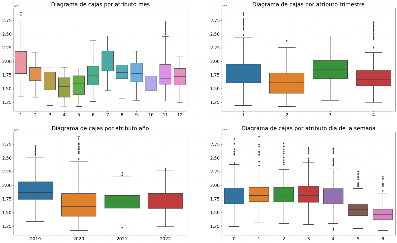
Figure 3. Box Diagrams of Generated Temporal Attributes
We can observe certain patterns in the charts above, such as the following:
- Weekdays (Monday to Friday) have a higher consumption than on weekends.
- The year with the lowest consumption values is 2020, which we understand is due to the reduction in service and industrial activity during the pandemic.
- The month with the highest consumption is July, which is understandable due to the use of air conditioners.
- The second quarter is the one with the lowest consumption values, with April standing out as the month with the lowest values.
Next, we divide the data table into training set and validation set. The training set is used to train the model, i.e., the model learns to predict the value of the target variable from that set, while the validation set is used to evaluate the performance of the model, i.e., the model is evaluated against the data from that set to determine its ability to predict the new values.
This splitting of the data is important to avoid overfitting, with the typical proportion of the data used for the training set being 70% and the validation set being approximately 30%. For this exercise we have decided to generate the training set with the data between "01-01-2019" to "01-10-2021", and the validation set with those between "01-10-2021" and "31-12-2022" as we can see in the following graph.
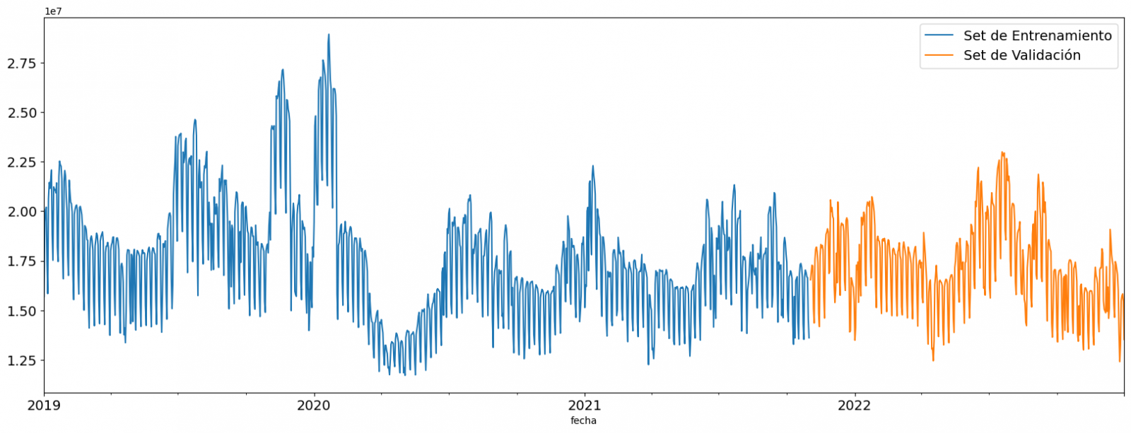
Figure 4. Historical data time series divided into training set and validation set
For this type of exercise, we have to use some regression algorithm. There are several models and libraries that can be used for time series prediction. In this exercise we will use the "Gradient Boosting" model, a supervised regression model that is a machine learning algorithm used to predict a continuous value based on the training of a dataset containing known values for the target variable (in our example the variable "value") and the values of the independent variables (in our exercise the temporal attributes).
It is based on decision trees and uses a technique called "boosting" to improve the accuracy of the model, being known for its efficiency and ability to handle a variety of regression and classification problems.
Its main advantages are the high degree of accuracy, robustness and flexibility, while some of its disadvantages are its sensitivity to outliers and that it requires careful optimization of parameters.
We will use the supervised regression model offered in the XGBBoost library, which can be adjusted with the following parameters:
- n_estimators: A parameter that affects the performance of the model by indicating the number of trees used. A larger number of trees generally results in a more accurate model, but it can also take more time to train.
- early_stopping_rounds: A parameter that controls the number of training rounds that will run before the model stops if performance in the validation set does not improve.
- learning_rate: Controls the learning speed of the model. A higher value will make the model learn faster, but it can lead to overfitting.
- max_depth: Control the maximum depth of trees in the forest. A higher value can provide a more accurate model, but it can also lead to overfitting.
- min_child_weight: Control the minimum weight of a sheet. A higher value can help prevent overfitting.
- Gamma: Controls the amount of expected loss reduction needed to split a node. A higher value can help prevent overfitting.
- colsample_bytree: Controls the proportion of features that are used to build each tree. A higher value can help prevent overfitting.
- Subsample: Controls the proportion of the data that is used to construct each tree. A higher value can help prevent overfitting.
These parameters can be adjusted to improve model performance on a specific dataset. It's a good idea to experiment with different values of these parameters to find the value that provides the best performance in your dataset.
Finally, by means of a bar graph, we will visually observe the importance of each of the attributes during the training of the model. It can be used to identify the most important attributes in a dataset, which can be useful for model interpretation and feature selection.
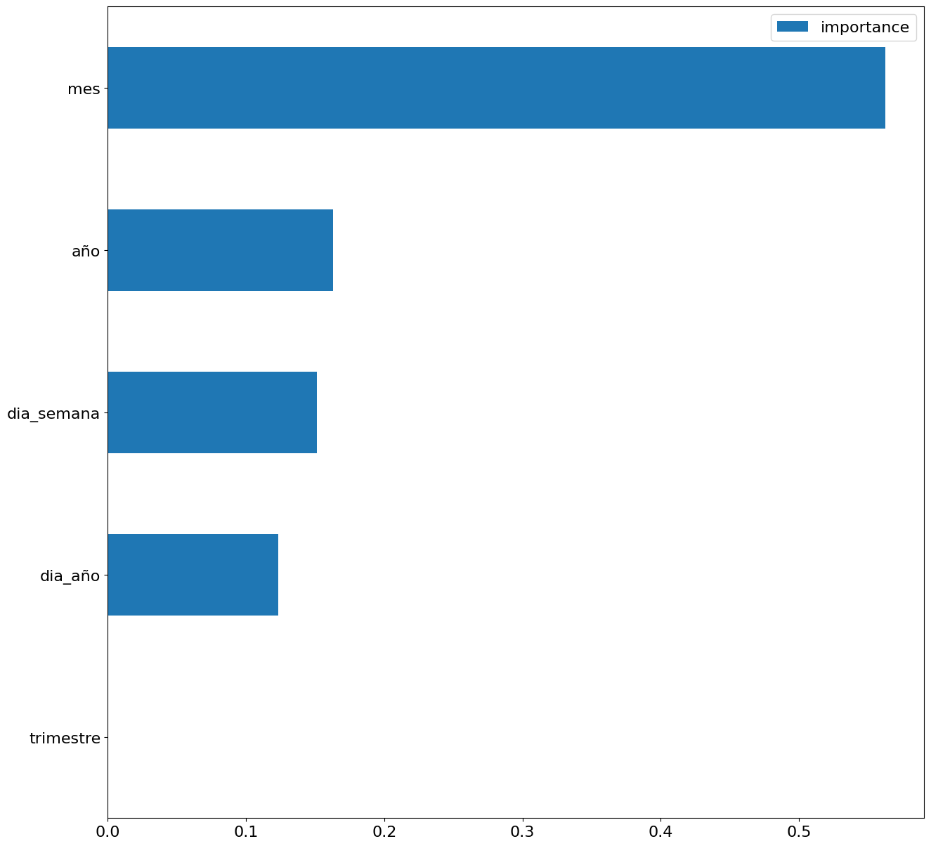
Figure 5. Bar Chart with Importance of Temporal Attributes
4.4 Model training
This section can be found in point 4 of the Notebook.
Once the model has been trained, we will evaluate how accurate it is for the known values in the validation set.
We can visually evaluate the model by plotting the time series with the known values along with the predictions made for the validation set as shown in the figure below.
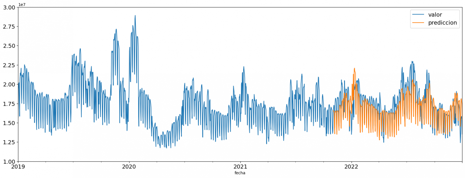
Figure 6. Time series with validation set data next to prediction data.
We can also numerically evaluate the accuracy of the model using different metrics. In this exercise, we have chosen to use the mean absolute percentage error (ASM) metric, which has been 6.58%. The accuracy of the model is considered high or low depending on the context and expectations in such a model, generally an ASM is considered low when it is less than 5%, while it is considered high when it is greater than 10%. In this exercise, the result of the model validation can be considered an acceptable value.
If you want to consult other types of metrics to evaluate the accuracy of models applied to time series, you can consult the following link.
4.5 Predictions of future values
This section can be found in point 5 of the Notebook.
Once the model has been generated and its MAPE = 6.58% performance has been evaluated, we will apply this model to all known data, in order to predict the unknown electricity consumption values for 2023.
First of all, we retrain the model with the known values until the end of 2022, without dividing it into a training and validation set. Finally, we calculate future values for the year 2023.

Figure 7. Time series with historical data and prediction for 2023
In the following interactive visualization you can see the predicted values for the year 2023 along with their main metrics, being able to filter by time period.
Improving the results of predictive time series models is an important goal in data science and data analytics. Several strategies that can help improve the accuracy of the exercise model are the use of exogenous variables, the use of more historical data or generation of synthetic data, optimization of parameters, ...
Due to the informative nature of this exercise and to promote the understanding of less specialized readers, we have proposed to explain the exercise in a way that is as simple and didactic as possible. You may come up with many ways to optimize your predictive model to achieve better results, and we encourage you to do so!
5. Conclusions of the exercise
Once the exercise has been carried out, we can see different conclusions such as the following:
- The maximum values for consumption predictions in 2023 are given in the last half of July, exceeding values of 22,500,000 MWh
- The month with the highest consumption according to the predictions for 2023 will be July, while the month with the lowest average consumption will be November, with a percentage difference between the two of 25.24%
- The average daily consumption forecast for 2023 is 17,259,844 MWh, 1.46% lower than that recorded between 2019 and 2022.
We hope that this exercise has been useful for you to learn some common techniques in the study and analysis of open data. We'll be back to show you new reuses. See you soon!
Documentación
1. Introduction
Visualizations are graphical representations of data that allow the information linked to them to be communicated in a simple and effective way. The visualization possibilities are very wide, from basic representations, such as line, bar or sector graphs, to visualizations configured on interactive dashboards.
In this "Step-by-Step Visualizations" section we are regularly presenting practical exercises of open data visualizations available in datos.gob.es or other similar catalogs. They address and describe in a simple way the stages necessary to obtain the data, perform the transformations and analyses that are relevant to, finally, enable the creation of interactive visualizations that allow us to obtain final conclusions as a summary of said information. In each of these practical exercises, simple and well-documented code developments are used, as well as tools that are free to use. All generated material is available for reuse in the GitHub Data Lab repository.
Then, and as a complement to the explanation that you will find below, you can access the code that we will use in the exercise and that we will explain and develop in the following sections of this post.
Access the data lab repository on Github.
Run the data pre-processing code on top of Google Colab.
2. Objetive
The main objective of this exercise is to show how to perform a network or graph analysis based on open data on rental bicycle trips in the city of Madrid. To do this, we will perform a preprocessing of the data in order to obtain the tables that we will use next in the visualization generating tool, with which we will create the visualizations of the graph.
Network analysis are methods and tools for the study and interpretation of the relationships and connections between entities or interconnected nodes of a network, these entities being persons, sites, products, or organizations, among others. Network analysis seeks to discover patterns, identify communities, analyze influence, and determine the importance of nodes within the network. This is achieved by using specific algorithms and techniques to extract meaningful insights from network data.
Once the data has been analyzed using this visualization, we can answer questions such as the following:
- What is the network station with the highest inbound and outbound traffic?
- What are the most common interstation routes?
- What is the average number of connections between stations for each of them?
- What are the most interconnected stations within the network?
3. Resources
3.1. Datasets
The open datasets used contain information on loan bike trips made in the city of Madrid. The information they provide is about the station of origin and destination, the time of the journey, the duration of the journey, the identifier of the bicycle, ...
These open datasets are published by the Madrid City Council, through files that collect the records on a monthly basis.
These datasets are also available for download from the following Github repository.
3.2. Tools
To carry out the data preprocessing tasks, the Python programming language written on a Jupyter Notebook hosted in the Google Colab cloud service has been used.
"Google Colab" or, also called Google Colaboratory, is a cloud service from Google Research that allows you to program, execute and share code written in Python or R on a Jupyter Notebook from your browser, so it does not require configuration. This service is free of charge.
For the creation of the interactive visualization, the Gephi tool has been used.
"Gephi" is a network visualization and analysis tool. It allows you to represent and explore relationships between elements, such as nodes and links, in order to understand the structure and patterns of the network. The program requires download and is free.
If you want to know more about tools that can help you in the treatment and visualization of data, you can use the report "Data processing and visualization tools".
4. Data processing or preparation
The processes that we describe below you will find them commented in the Notebook that you can also run from Google Colab.
Due to the high volume of trips recorded in the datasets, we defined the following starting points when analysing them:
- We will analyse the time of day with the highest travel traffic
- We will analyse the stations with a higher volume of trips
Before launching to analyse and build an effective visualization, we must carry out a prior treatment of the data, paying special attention to its obtaining and the validation of its content, making sure that they are in the appropriate and consistent format for processing and that they do not contain errors.
As a first step of the process, it is necessary to perform an exploratory analysis of the data (EDA), in order to properly interpret the starting data, detect anomalies, missing data or errors that could affect the quality of subsequent processes and results. If you want to know more about this process you can resort to the Practical Guide of Introduction to Exploratory Data Analysis
The next step is to generate the pre-processed data table that we will use to feed the network analysis tool (Gephi) that will visually help us understand the information. To do this, we will modify, filter and join the data according to our needs.
The steps followed in this data preprocessing, explained in this Google Colab Notebook, are as follows:
- Installation of libraries and loading of datasets
- Exploratory Data Analysis (EDA)
- Generating pre-processed tables
You will be able to reproduce this analysis with the source code that is available in our GitHub account. The way to provide the code is through a document made on a Jupyter Notebook that, once loaded into the development environment, you can easily run or modify.
Due to the informative nature of this post and to favour the understanding of non-specialized readers, the code is not intended to be the most efficient but to facilitate its understanding, so you will possibly come up with many ways to optimize the proposed code to achieve similar purposes. We encourage you to do so!
5. Network analysis
5.1. Definition of the network
The analysed network is formed by the trips between different bicycle stations in the city of Madrid, having as main information of each of the registered trips the station of origin (called "source") and the destination station (called "target").
The network consists of 253 nodes (stations) and 3012 edges (interactions between stations). It is a directed graph, because the interactions are bidirectional and weighted, because each edge between the nodes has an associated numerical value called "weight" which in this case corresponds to the number of trips made between both stations.
5.2. Loading the pre-processed table in to Gephi
Using the "import spreadsheet" option on the file tab, we import the previously pre-processed data table in CSV format. Gephi will detect what type of data is being loaded, so we will use the default predefined parameters.


5.3. Network display options
5.3.1 Distribution window
First, we apply in the distribution window, the Force Atlas 2 algorithm. This algorithm uses the technique of node repulsion depending on the degree of connection in such a way that the sparsely connected nodes are separated from those with a greater force of attraction to each other.
To prevent the related components from being out of the main view, we set the value of the parameter "Severity in Tuning" to a value of 10 and to avoid that the nodes are piled up, we check the option "Dissuade Hubs" and "Avoid overlap".

Dentro de la ventana de distribución, también aplicamos el algoritmo de Expansión con la finalidad de que los nodos no se encuentren tan juntos entre sí mismos.

Figure 3. Distribution window - Expansion algorithm
5.3.2 Appearance window
Next, in the appearance window, we modify the nodes and their labels so that their size is not equal but depends on the value of the degree of each node (nodes with a higher degree, larger visual size). We will also modify the colour of the nodes so that the larger ones are a more striking colour than the smaller ones. In the same appearance window we modify the edges, in this case we have opted for a unitary colour for all of them, since by default the size is according to the weight of each of them.
A higher degree in one of the nodes implies a greater number of stations connected to that node, while a greater weight of the edges implies a greater number of trips for each connection.

5.3.3 Graph window
Finally, in the lower area of the interface of the graph window, we have several options such as activating / deactivating the button to show the labels of the different nodes, adapting the size of the edges in order to make the visualization cleaner, modify the font of the labels, ...

Next, we can see the visualization of the graph that represents the network once the visualization options mentioned in the previous points have been applied.

Figure 6. Graph display
Activating the option to display labels and placing the cursor on one of the nodes, the links that correspond to the node and the rest of the nodes that are linked to the chosen one through these links will be displayed.
Next, we can visualize the nodes and links related to the bicycle station "Fernando el Católico". In the visualization, the nodes that have a greater number of connections are easily distinguished, since they appear with a larger size and more striking colours, such as "Plaza de la Cebada" or "Quevedo".

5.4 Main network measures
Together with the visualization of the graph, the following measurements provide us with the main information of the analysed network. These averages, which are the usual metrics when performing network analytics, can be calculated in the statistics window.

- Nodes (N): are the different individual elements that make up a network, representing different entities. In this case the different bicycle stations. Its value on the network is 243
- Links (L): are the connections that exist between the nodes of a network. Links represent the relationships or interactions between the individual elements (nodes) that make up the network. Its value in the network is 3014
- Maximum number of links (Lmax): is the maximum possible number of links in the network. It is calculated by the following formula Lmax= N(N-1)/2. Its value on the network is 31878
- Average grade (k): is a statistical measure to quantify the average connectivity of network nodes. It is calculated by averaging the degrees of all nodes in the network. Its value in the network is 23.8
- Network density (d): indicates the proportion of connections between network nodes to the total number of possible connections. Its value in the network is 0.047
- Diámetro (dmax ): is the longest graph distance between any two nodes of the res, i.e., how far away the 2 nodes are farther apart. Its value on the network is 7
- Mean distance (d):is the average mean graph distance between the nodes of the network. Its value on the network is 2.68
- Mean clustering coefficient (C): Indicates how nodes are embedded between their neighbouring nodes. The average value gives a general indication of the grouping in the network. Its value in the network is 0.208
- Related component: A group of nodes that are directly or indirectly connected to each other but are not connected to nodes outside that group. Its value on the network is 24
5.5 Interpretation of results
The probability of degrees roughly follows a long-tail distribution, where we can observe that there are a few stations that interact with a large number of them while most interact with a low number of stations.
The average grade is 23.8 which indicates that each station interacts on average with about 24 other stations (input and output).
In the following graph we can see that, although we have nodes with degrees considered as high (80, 90, 100, ...), it is observed that 25% of the nodes have degrees equal to or less than 8, while 75% of the nodes have degrees less than or equal to 32.

The previous graph can be broken down into the following two corresponding to the average degree of input and output (since the network is directional). We see that both have similar long-tail distributions, their mean degree being the same of 11.9
Its main difference is that the graph corresponding to the average degree of input has a median of 7 while the output is 9, which means that there is a majority of nodes with lower degrees in the input than the output.


The value of the average grade with weights is 346.07 which indicates the average of total trips in and out of each station.

The network density of 0.047 is considered a low density indicating that the network is dispersed, that is, it contains few interactions between different stations in relation to the possible ones. This is considered logical because connections between stations will be limited to certain areas due to the difficulty of reaching stations that are located at long distances.
The average clustering coefficient is 0.208 meaning that the interaction of two stations with a third does not necessarily imply interaction with each other, that is, it does not necessarily imply transitivity, so the probability of interconnection of these two stations through the intervention of a third is low.
Finally, the network has 24 related components, of which 2 are weak related components and 22 are strong related components.
5.6 Centrality analysis
A centrality analysis refers to the assessment of the importance of nodes in a network using different measures. Centrality is a fundamental concept in network analysis and is used to identify key or influential nodes within a network. To perform this task, you start from the metrics calculated in the statistics window.
- The degree centrality measure indicates that the higher the degree of a node, the more important it is. The five stations with the highest values are: 1º Plaza de la Cebada, 2º Plaza de Lavapiés, 3º Fernando el Católico, 4º Quevedo, 5º Segovia 45.