Application
Edalitics is a cloud-based analytics service that allows you to connect data, model it, create reports and dashboards without deploying your own infrastructure and without technical knowledge. It is based on EDA (Enterprise Data Analytics), the open source platform of the company Jortilles and is offered as SaaS (Software as a Service), which reduces technical complexity: the user accesses through a browser, selects their sources and builds visualizations by simply dragging and dropping, or through SQL.
Edalitics works as a corporate and public data platform: it can connect to databases and web services, and it also supports CSV files that the user uploads to enrich their model. From there, dashboards, KPIs and email alerts are created, and private or public reports are published for different decision profiles, with access control and traceability. It allows you to have unlimited users, which makes it interesting for large organizations with many users.
It is important to clarify that Edalitics does not incorporate datasets by default, but integrates with APIs or open portals. Organisations such as the Baix Empordà County Council have used Edalitics to deploy their open data catalogues.
Edalitics offers two modes of use:
- Cloud version. The platform can be used directly in the cloud, with a tiered pricing model. This version is free for organizations with limited usage. Organizations with higher data usage or volume demands can access a paid version for a monthly fee.
- Installation on own servers (On-Premise). For those organizations that prefer to host Edalitics on their own infrastructure, Jortilles offers:
- Assistance in installation and configuration, adapting to the customer's environment.
- Possibility of contracting annual maintenance that includes: direct technical support from the developer team and access to updates and improvements proactively, ensuring the proper functioning and evolution of the platform.
Documentación
Open data portals are an invaluable source of public information. However, extracting meaningful insights from this data can be challenging for users without advanced technical knowledge.
In this practical exercise, we will explore the development of a web application that democratizes access to this data through the use of artificial intelligence, allowing users to make queries in natural language.
The application, developed using the datos.gob.es portal as a data source, integrates modern technologies such as Streamlit for the user interface and Google's Gemini language model for natural language processing. The modular nature allows any Artificial Intelligence model to be used with minimal changes. The complete project is available in the Github repository.
Access the data laboratory repository on Github.
Run the data preprocessing code on Google Colab.
In this video, the author explains what you will find both on Github and Google Colab.
Application Architecture
The core of the application is based on four main interconnected sections that work together to process user queries:
- Context Generation
- Analyzes the characteristics of the chosen dataset.
- Generates a detailed description including dimensions, data types, and statistics.
- Creates a structured template with specific guidelines for code generation.
- Context and Query Combination
- Combines the generated context with the user's question, creating the prompt that the artificial intelligence model will receive.
- Response Generation
- Sends the prompt to the model and obtains the Python code that allows solving the generated question.
- Code Execution
- Safely executes the generated code with a retry and automatic correction system.
- Captures and displays the results in the application frontend.

Figure 1. Request processing flow
Development Process
The first step is to establish a way to access public data. The datos.gob.es portal offers datasets via API. Functions have been developed to navigate the catalog and download these files efficiently.
Figura 2. API de datos.gob
The second step addresses the question: how to convert natural language questions into useful data analysis? This is where Gemini, Google's language model, comes in. However, it's not enough to simply connect the model; it's necessary to teach it to understand the specific context of each dataset.
A three-layer system has been developed:
- A function that analyzes the dataset and generates a detailed "technical sheet".
- Another that combines this sheet with the user's question.
- And a third that translates all this into executable Python code.
You can see in the image below how this process develops and, subsequently, the results of the generated code are shown once executed.

Figure 3. Visualization of the application's response processing
Finally, with Streamlit, a web interface has been built that shows the process and its results to the user. The interface is as simple as choosing a dataset and asking a question, but also powerful enough to display complex visualizations and allow data exploration.
The final result is an application that allows anyone, regardless of their technical knowledge, to perform data analysis and learn about the code executed by the model. For example, a municipal official can ask "What is the average age of the vehicle fleet?" and get a clear visualization of the age distribution.

Figure 4. Complete use case. Visualizing the distribution of registration years of the municipal vehicle fleet of Almendralejo in 2018
What Can You Learn?
This practical exercise allows you to learn:
- AI Integration in Web Applications:
- How to communicate effectively with language models like Gemini.
- Techniques for structuring prompts that generate precise code.
- Strategies for safely handling and executing AI-generated code.
- Web Development with Streamlit:
- Creating interactive interfaces in Python.
- Managing state and sessions in web applications.
- Implementing visual components for data.
- Working with Open Data:
- Connecting to and consuming public data APIs.
- Processing Excel files and DataFrames.
- Data visualization techniques.
- Development Best Practices:
- Modular structuring of Python code.
- Error handling and retries.
- Implementation of visual feedback systems.
- Web application deployment using ngrok.
Conclusions and Future
This exercise demonstrates the extraordinary potential of artificial intelligence as a bridge between public data and end users. Through the practical case developed, we have been able to observe how the combination of advanced language models with intuitive interfaces allows us to democratize access to data analysis, transforming natural language queries into meaningful analysis and informative visualizations.
For those interested in expanding the system's capabilities, there are multiple promising directions for its evolution:
- Incorporation of more advanced language models that allow for more sophisticated analysis.
- Implementation of learning systems that improve responses based on user feedback.
- Integration with more open data sources and diverse formats.
- Development of predictive and prescriptive analysis capabilities.
In summary, this exercise not only demonstrates the feasibility of democratizing data analysis through artificial intelligence, but also points to a promising path toward a future where access to and analysis of public data is truly universal. The combination of modern technologies such as Streamlit, language models, and visualization techniques opens up a range of possibilities for organizations and citizens to make the most of the value of open data.
Documentación
Open data portals play a fundamental role in accessing and reusing public information. A key aspect in these environments is the tagging of datasets, which facilitates their organization and retrieval.
Word embeddings represent a transformative technology in the field of natural language processing, allowing words to be represented as vectors in a multidimensional space where semantic relationships are mathematically preserved. This exercise explores their practical application in a tag recommendation system, using the datos.gob.es open data portal as a case study.
The exercise is developed in a notebook that integrates the environment configuration, data acquisition, and recommendation system processing, all implemented in Python. The complete project is available in the Github repository.
Access the data lab repository on GitHub.
Run the data preprocessing code on Google Colab.
In this video, the author explains what you will find both on Github and Google Colab (English subtitles available).
Understanding word embeddings
Word embeddings are numerical representations of words that revolutionize natural language processing by transforming text into a mathematically processable format. This technique encodes each word as a numerical vector in a multidimensional space, where the relative position between vectors reflects semantic and syntactic relationships between words. The true power of embeddings lies in three fundamental aspects:
- Context capture: unlike traditional techniques such as one-hot encoding, embeddings learn from the context in which words appear, allowing them to capture meaning nuances.
- Semantic algebra: the resulting vectors allow mathematical operations that preserve semantic relationships. For example, vector('Madrid') - vector('Spain') + vector('France') ≈ vector('Paris'), demonstrating the capture of capital-country relationships.
- Quantifiable similarity: similarity between words can be measured through metrics, allowing identification of not only exact synonyms but also terms related in different degrees and generalizing these relationships to new word combinations.
In this exercise, pre-trained GloVe (Global Vectors for Word Representation) embeddings were used, a model developed by Stanford that stands out for its ability to capture global semantic relationships in text. In our case, we use 50-dimensional vectors, a balance between computational complexity and semantic richness. To comprehensively evaluate its ability to represent Spanish language, multiple tests were conducted:
- Word similarity was analyzed using cosine similarity, a metric that evaluates the angle between two word vectors. This measure results in values between -1 and 1, where values close to 1 indicate high semantic similarity, while values close to 0 indicate little or no relationship. Terms like "amor" (love), "trabajo" (work), and "familia" (family) were evaluated to verify that the model correctly identified semantically related words.
- The model's ability to solve linguistic analogies was tested, for example, "hombre es a mujer lo que rey es a reina" (Man is to woman what king is to queen), confirming its ability to capture complex semantic relationships.
- Vector operations were performed (such as "rey - hombre + mujer") to check if the results maintained semantic coherence.
- Finally, dimensionality reduction techniques were applied to a representative sample of 40 Spanish words, allowing visualization of semantic relationships in a two-dimensional space. The results revealed natural grouping patterns among semantically related terms, as observed in the figure:
- Emotions: alegría (joy), felicidad (happiness) or pasión (passion) appear grouped in the upper right.
- Family-related terms: padre (father), hermano (brother) or abuelo (grandfather) concentrate at the bottom.
- Transport: coche (car), autobús (bus), or camión (truck) form a distinctive group.
- Colors: azul (blue), verde (green) or rojo (red) appear close to each other.
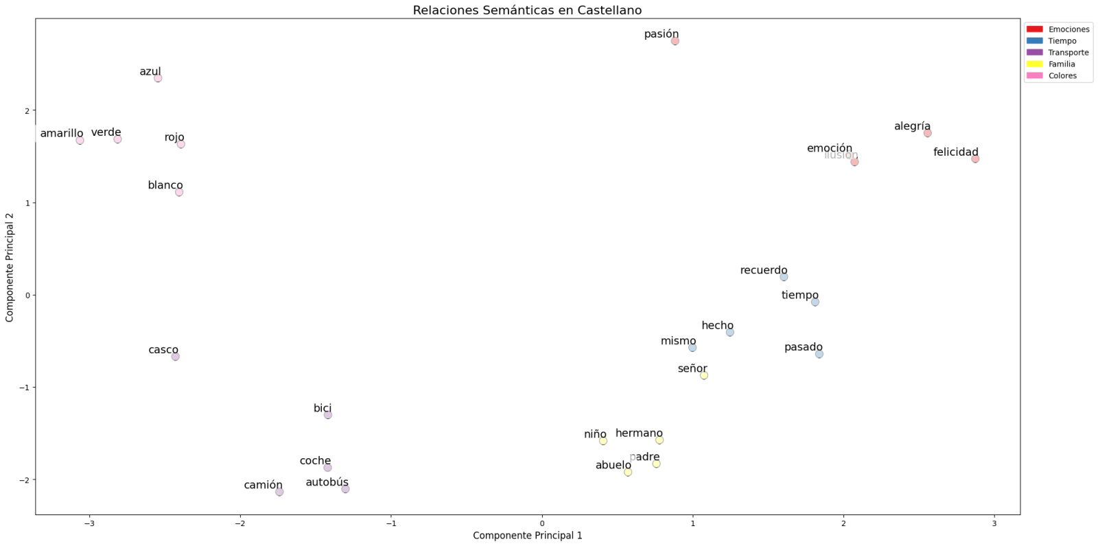
Figure 1. Principal Components Analysis on 50 dimensions (embeddings) with an explained variability percentage by the two components of 0.46
To systematize this evaluation process, a unified function has been developed that encapsulates all the tests described above. This modular architecture allows automatic and reproducible evaluation of different pre-trained embedding models, thus facilitating objective comparison of their performance in Spanish language processing. The standardization of these tests not only optimizes the evaluation process but also establishes a consistent framework for future comparisons and validations of new models by the public.
The good capacity to capture semantic relationships in Spanish language is what we leverage in our tag recommendation system.
Embedding-based Recommendation System
Leveraging the properties of embeddings, we developed a tag recommendation system that follows a three-phase process:
- Embedding generation: for each dataset in the portal, we generate a vector representation combining the title and description. This allows us to compare datasets by their semantic similarity.
- Similar dataset identification: using cosine similarity between vectors, we identify the most semantically similar datasets.
- Tag extraction and standardization: from similar sets, we extract their associated tags and map them with Eurovoc thesaurus terms. This thesaurus, developed by the European Union, is a multilingual controlled vocabulary that provides standardized terminology for cataloging documents and data in the field of European policies. Again, leveraging the power of embeddings, we identify the semantically closest Eurovoc terms to our tags, thus ensuring coherent standardization and better interoperability between European information systems.
The results show that the system can generate coherent and standardized tag recommendations. To illustrate the system's operation, let's take the case of the dataset "Tarragona City Activities Agenda":
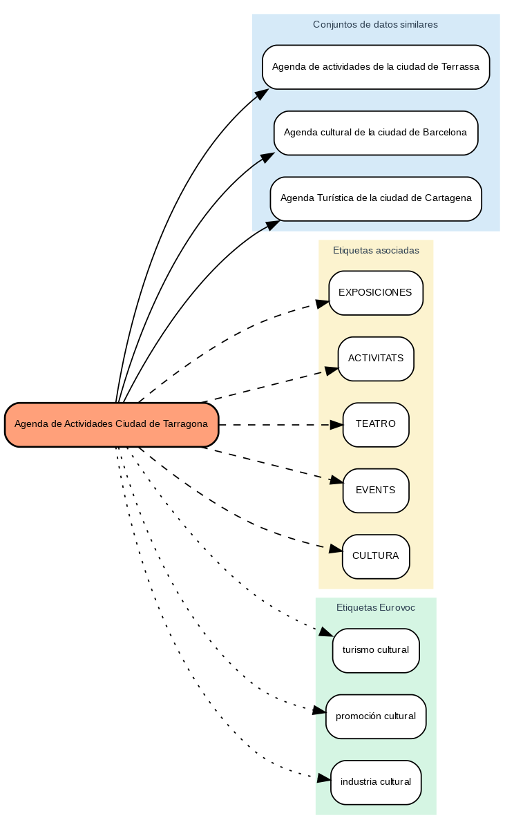
Figure 2. Tarragona City Events Guide
The system:
- Finds similar datasets like "Terrassa Activities Agenda" and "Barcelona Cultural Agenda".
- Identifies common tags from these datasets, such as "EXHIBITIONS", "THEATER", and "CULTURE".
- Suggests related Eurovoc terms: "cultural tourism", "cultural promotion", and "cultural industry".
Advantages of the Approach
This approach offers significant advantages:
- Contextual Recommendations: the system suggests tags based on the real meaning of the content, not just textual matches.
- Automatic Standardization: integration with Eurovoc ensures a controlled and coherent vocabulary.
- Continuous Improvement: the system learns and improves its recommendations as new datasets are added.
- Interoperability: the use of Eurovoc facilitates integration with other European systems.
Conclusions
This exercise demonstrates the great potential of embeddings as a tool for associating texts based on their semantic nature. Through the analyzed practical case, it has been possible to observe how, by identifying similar titles and descriptions between datasets, precise recommendations of tags or keywords can be generated. These tags, in turn, can be linked with keywords from a standardized thesaurus like Eurovoc, applying the same principle.
Despite the challenges that may arise, implementing these types of systems in production environments presents a valuable opportunity to improve information organization and retrieval. The accuracy in tag assignment can be influenced by various interrelated factors in the process:
- The specificity of dataset titles and descriptions is fundamental, as correct identification of similar content and, therefore, adequate tag recommendation depends on it.
- The quality and representativeness of existing tags in similar datasets directly determines the relevance of generated recommendations.
- The thematic coverage of the Eurovoc thesaurus, which, although extensive, may not cover specific terms needed to describe certain datasets precisely.
- The vectors' capacity to faithfully capture semantic relationships between content, which directly impacts the precision of assigned tags.
For those who wish to delve deeper into the topic, there are other interesting approaches to using embeddings that complement what we've seen in this exercise, such as:
- Using more complex and computationally expensive embedding models (like BERT, GPT, etc.)
- Training models on a custom domain-adapted corpus.
- Applying deeper data cleaning techniques.
In summary, this exercise not only demonstrates the effectiveness of embeddings for tag recommendation but also unlocks new possibilities for readers to explore all the possibilities this powerful tool offers.
Blog
There is no doubt that data has become the strategic asset for organisations. Today, it is essential to ensure that decisions are based on quality data, regardless of the alignment they follow: data analytics, artificial intelligence or reporting. However, ensuring data repositories with high levels of quality is not an easy task, given that in many cases data come from heterogeneous sources where data quality principles have not been taken into account and no context about the domain is available.
To alleviate as far as possible this casuistry, in this article, we will explore one of the most widely used libraries in data analysis: Pandas. Let's check how this Python library can be an effective tool to improve data quality. We will also review the relationship of some of its functions with the data quality dimensions and properties included in the UNE 0081 data quality specification, and some concrete examples of its application in data repositories with the aim of improving data quality.
Using Pandas for data profiling
Si bien el data profiling y la evaluación de calidad de datos están estrechamente relacionados, sus enfoques son diferentes:
- Data Profiling: is the process of exploratory analysis performed to understand the fundamental characteristics of the data, such as its structure, data types, distribution of values, and the presence of missing or duplicate values. The aim is to get a clear picture of what the data looks like, without necessarily making judgements about its quality.
- Data quality assessment: involves the application of predefined rules and standards to determine whether data meets certain quality requirements, such as accuracy, completeness, consistency, credibility or timeliness. In this process, errors are identified and actions to correct them are determined. A useful guide for data quality assessment is the UNE 0081 specification.
It consists of exploring and analysing a dataset to gain a basic understanding of its structure, content and characteristics, before conducting a more in-depth analysis or assessment of the quality of the data. The main objective is to obtain an overview of the data by analysing the distribution, types of data, missing values, relationships between columns and detection of possible anomalies. Pandas has several functions to perform this data profiling.
En resumen, el data profiling es un paso inicial exploratorio que ayuda a preparar el terreno para una evaluación más profunda de la calidad de los datos, proporcionando información esencial para identificar áreas problemáticas y definir las reglas de calidad adecuadas para la evaluación posterior.
What is Pandas and how does it help ensure data quality?
Pandas is one of the most popular Python libraries for data manipulation and analysis. Its ability to handle large volumes of structured information makes it a powerful tool in detecting and correcting errors in data repositories. With Pandas, complex operations can be performed efficiently, from data cleansing to data validation, all of which are essential to maintain quality standards. The following are some examples of how to improve data quality in repositories with Pandas:
1. Detection of missing or inconsistent values: One of the most common data errors is missing or inconsistent values. Pandas allows these values to be easily identified by functions such as isnull() or dropna(). This is key for the completeness property of the records and the data consistency dimension, as missing values in critical fields can distort the results of the analyses.
-
# Identify null values in a dataframe.
df.isnull().sum()
2. Data standardisation and normalisation: Errors in naming or coding consistency are common in large repositories. For example, in a dataset containing product codes, some may be misspelled or may not follow a standard convention. Pandas provides functions like merge() to perform a comparison with a reference database and correct these values. This option is key to maintaining the dimension and semantic consistency property of the data.
# Substitution of incorrect values using a reference table
df = df.merge(product_codes, left_on='product_code', right_on='ref_code', how= 'left')
3. Validation of data requirements: Pandas allows the creation of customised rules to validate the compliance of data with certain standards. For example, if an age field should only contain positive integer values, we can apply a function to identify and correct values that do not comply with this rule. In this way, any business rule of any of the data quality dimensions and properties can be validated.
# Identify records with invalid age values (negative or decimals)
age_errors = df[(df['age'] < 0) | (df['age'] % 1 != 0)])
4. Exploratory analysis to identify anomalous patterns: Functions such as describe() or groupby() in Pandas allow you to explore the general behaviour of your data. This type of analysis is essential for detecting anomalous or out-of-range patterns in any data set, such as unusually high or low values in columns that should follow certain ranges.
# Statistical summary of the data
df.describe()
#Sort by category or property
df.groupby()
5. Duplication removal: Duplicate data is a common problem in data repositories. Pandas provides methods such as drop_duplicates() to identify and remove these records, ensuring that there is no redundancy in the dataset. This capacity would be related to the dimension of completeness and consistency.
# Remove duplicate rows
df = df.drop_duplicates()
Practical example of the application of Pandas
Having presented the above functions that help us to improve the quality of data repositories, we now consider a case to put the process into practice. Suppose we are managing a repository of citizens' data and we want to ensure:
- Age data should not contain invalid values (such as negatives or decimals).
- That nationality codes are standardised.
- That the unique identifiers follow a correct format.
- The place of residence must be consistent.
With Pandas, we could perform the following actions:
1. Age validation without incorrect values:
# Identify records with ages outside the allowed ranges (e.g. less than 0 or non-integers)
age_errors = df[(df['age'] < 0) | (df['age'] % 1 != 0)])
2. Correction of nationality codes:
# Use of an official dataset of nationality codes to correct incorrect entries
df_corregida = df.merge(nacionalidades_ref, left_on='nacionalidad', right_on='codigo_ref', how='left')
3. Validation of unique identifiers:
# Check if the format of the identification number follows a correct pattern
df['valid_id'] = df['identificacion'].str.match(r'^[A-Z0-9]{8}$')
errores_id = df[df['valid_id'] == False]
4. Verification of consistency in place of residence:
# Detect possible inconsistencies in residency (e.g. the same citizen residing in two places at the same time).
duplicados_residencia = df.groupby(['id_ciudadano', 'fecha_residencia'])['lugar_residencia'].nunique()
inconsistencias_residencia = duplicados_residencia[duplicados_residencia > 1]
Integration with a variety of technologies
Pandas is an extremely flexible and versatile library that integrates easily with many technologies and tools in the data ecosystem. Some of the main technologies with which Pandas is integrated or can be used are:
- SQL databases:
Pandas integrates very well with relational databases such as MySQL, PostgreSQL, SQLite, and others that use SQL. The SQLAlchemy library or directly the database-specific libraries (such as psycopg2 for PostgreSQL or sqlite3) allow you to connect Pandas to these databases, perform queries and read/write data between the database and Pandas.
- Common function: pd.read_sql() to read a SQL query into a DataFrame, and to_sql() to export the data from Pandas to a SQL table.
- REST and HTTP-based APIs:
Pandas can be used to process data obtained from APIs using HTTP requests. Libraries such as requests allow you to get data from APIs and then transform that data into Pandas DataFrames for analysis.
- Big Data (Apache Spark):
Pandas can be used in combination with PySpark, an API for Apache Spark in Python. Although Pandas is primarily designed to work with in-memory data, Koalas, a library based on Pandas and Spark, allows you to work with Spark distributed structures using a Pandas-like interface. Tools like Koalas help Pandas users scale their scripts to distributed data environments without having to learn all the PySpark syntax.
- Hadoop and HDFS:
Pandas can be used in conjunction with Hadoop technologies, especially the HDFS distributed file system. Although Pandas is not designed to handle large volumes of distributed data, it can be used in conjunction with libraries such as pyarrow or dask to read or write data to and from HDFS on distributed systems. For example, pyarrow can be used to read or write Parquet files in HDFS.
- Popular file formats:
Pandas is commonly used to read and write data in different file formats, such as:
- CSV: pd.read_csv()
- Excel: pd.read_excel() and to_excel().
- JSON: pd.read_json()
- Parquet: pd.read_parquet() for working with space and time efficient files.
- Feather: a fast file format for interchange between languages such as Python and R (pd.read_feather()).
- Data visualisation tools:
Pandas can be easily integrated with visualisation tools such as Matplotlib, Seaborn, and Plotly.. These libraries allow you to generate graphs directly from Pandas DataFrames.
- Pandas includes its own lightweight integration with Matplotlib to generate fast plots using df.plot().
- For more sophisticated visualisations, it is common to use Pandas together with Seaborn or Plotly for interactive graphics.
- Machine learning libraries:
Pandas is widely used in pre-processing data before applying machine learning models. Some popular libraries with which Pandas integrates are:
- Scikit-learn: la mayoría de los pipelines de machine learning comienzan con la preparación de datos en Pandas antes de pasar los datos a modelos de Scikit-learn.
- TensorFlow y PyTorch: aunque estos frameworks están más orientados al manejo de matrices numéricas (Numpy), Pandas se utiliza frecuentemente para la carga y limpieza de datos antes de entrenar modelos de deep learning.
- XGBoost, LightGBM, CatBoost: Pandas supports these high-performance machine learning libraries, where DataFrames are used as input to train models.
- Jupyter Notebooks:
Pandas is central to interactive data analysis within Jupyter Notebooks, which allow you to run Python code and visualise the results immediately, making it easy to explore data and visualise it in conjunction with other tools.
- Cloud Storage (AWS, GCP, Azure):
Pandas can be used to read and write data directly from cloud storage services such as Amazon S3, Google Cloud Storage and Azure Blob Storage. Additional libraries such as boto3 (for AWS S3) or google-cloud-storage facilitate integration with these services. Below is an example for reading data from Amazon S3.
import pandas as pd
import boto3
#Create an S3 client
s3 = boto3.client('s3')
#Obtain an object from the bucket
obj = s3.get_object(Bucket='mi-bucket', Key='datos.csv')
#Read CSV file from a DataFrame
df = pd.read_csv(obj['Body'])
10. Docker and containers:
Pandas can be used in container environments using Docker.. Containers are widely used to create isolated environments that ensure the replicability of data analysis pipelines .
In conclusion, the use of Pandas is an effective solution to improve data quality in complex and heterogeneous repositories. Through clean-up, normalisation, business rule validation, and exploratory analysis functions, Pandas facilitates the detection and correction of common errors, such as null, duplicate or inconsistent values. In addition, its integration with various technologies, databases, big dataenvironments, and cloud storage, makes Pandas an extremely versatile tool for ensuring data accuracy, consistency and completeness.
Content prepared by Dr. Fernando Gualo, Professor at UCLM and Data Governance and Quality Consultant. The content and point of view reflected in this publication is the sole responsibility of its author.
Documentación
The following presents a new guide to Exploratory Data Analysis (EDA) implemented in Python, which evolves and complements the version published in R in 2021. This update responds to the needs of an increasingly diverse community in the field of data science.
Exploratory Data Analysis (EDA) represents a critical step prior to any statistical analysis, as it allows:
- Comprehensive understanding of the data before analyzing it.
- Verification of statistical requirements that will ensure the validity of subsequent analyses.
To exemplify its importance, let's take the case of detecting and treating outliers, one of the tasks to be performed in an EDA. This phase has a significant impact on fundamental statistics such as the mean, standard deviation, or coefficient of variation.
This guide maintains as a practical case the analysis of air quality data from Castilla y León, demonstrating how to transform public data into valuable information through the use of fundamental Python libraries such as pandas, matplotlib, and seaborn, along with modern automated analysis tools like ydata-profiling.
In addition to explaining the different phases of an EDA, the guide illustrates them with a practical case. In this sense, the analysis of air quality data from Castilla y León is maintained as a practical case. Through explanations that users can replicate, public data is transformed into valuable information using fundamental Python libraries such as pandas, matplotlib, and seaborn, along with modern automated analysis tools like ydata-profiling.
Why a new guide in Python?
The choice of Python as the language for this new guide reflects its growing relevance in the data science ecosystem. Its intuitive syntax and extensive catalog of specialized libraries have made it a fundamental tool for data analysis. By maintaining the same dataset and analytical structure as the R version, understanding the differences between both languages is facilitated. This is especially valuable in environments where multiple technologies coexist. This approach is particularly relevant in the current context, where numerous organizations are migrating their analyses from traditional languages/tools like R, SAS, or SPSS to Python. The guide seeks to facilitate these transitions and ensure continuity in the quality of analyses during the migration process.
New features and improvements
The content has been enriched with the introduction to automated EDA and data profiling tools, thus responding to one of the latest trends in the field. The document delves into essential aspects such as environmental data interpretation, offers a more rigorous treatment of outliers, and presents a more detailed analysis of correlations between variables. Additionally, it incorporates good practices in code writing.
The practical application of these concepts is illustrated through the analysis of air quality data, where each technique makes sense in a real context. For example, when analyzing correlations between pollutants, it not only shows how to calculate them but also explains how these patterns reflect real atmospheric processes and what implications they have for air quality management.
Structure and contents
The guide follows a practical and systematic approach, covering the five fundamental stages of EDA:
- Descriptive analysis to obtain a representative view of the data.
- Variable type adjustment to ensure consistency.
- Detection and treatment of missing data.
- Identification and management of outliers.
- Correlation analysis between variables.

Figure 1. Phases of exploratory data analysis. Source: own elaboration.
As a novelty in the structure, a section on automated exploratory analysis is included, presenting modern tools that facilitate the systematic exploration of large datasets.
Who is it for?
This guide is designed for open data users who wish to conduct exploratory analyses and reuse the valuable sources of public information found in this and other data portals worldwide. While basic knowledge of the language is recommended, the guide includes resources and references to improve Python skills, as well as detailed practical examples that facilitate self-directed learning.
The complete material, including both documentation and source code, is available in the portal's GitHub repository. The implementation has been done using open-source tools such as Jupyter Notebook in Google Colab, which allows reproducing the examples and adapting the code according to the specific needs of each project.
The community is invited to explore this new guide, experiment with the provided examples, and take advantage of these resources to develop their own open data analyses.
Click to see the full infographic, in accessible version
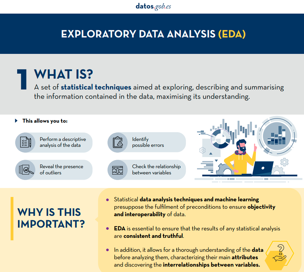
Figure 2. Capture of the infographic. Source: own elaboration.
Blog
Almost half of European adults lack basic digital skills. According to the latest State of the Digital Decade report, in 2023, only 55.6% of citizens reported having such skills. This percentage rises to 66.2% in the case of Spain, ahead of the European average.
Having basic digital skills is essential in today's society because it enables access to a wider range of information and services, as well as effective communication in onlineenvironments, facilitating greater participation in civic and social activities. It is also a great competitive advantage in the world of work.
In Europe, more than 90% of professional roles require a basic level of digital skills. Technological knowledge has long since ceased to be required only for technical professions, but is spreading to all sectors, from business to transport and even agriculture. In this respect, more than 70% of companies said that the lack of staff with the right digital skills is a barrier to investment.
A key objective of the Digital Decade is therefore to ensure that at least 80% of people aged 16-74 have at least basic digital skills by 2030.
Basic technology skills that everyone should have
When we talk about basic technological capabilities, we refer, according to the DigComp framework , to a number of areas, including:
- Information and data literacy: includes locating, retrieving, managing and organising data, judging the relevance of the source and its content.
- Communication and collaboration: involves interacting, communicating and collaborating through digital technologies taking into account cultural and generational diversity. It also includes managing one's own digital presence, identity and reputation.
- Digital content creation: this would be defined as the enhancement and integration of information and content to generate new messages, respecting copyrights and licences. It also involves knowing how to give understandable instructions to a computer system.
- Security: this is limited to the protection of devices, content, personal data and privacy in digital environments, to protect physical and mental health.
- Problem solving: it allows to identify and solve needs and problems in digital environments. It also focuses on the use of digital tools to innovate processes and products, keeping up with digital evolution.
Which data-related jobs are most in demand?
Now that the core competences are clear, it is worth noting that in a world where digitalisation is becoming increasingly important , it is not surprising that the demand for advanced technological and data-related skills is also growing.
According to data from the LinkedIn employment platform, among the 25 fastest growing professions in Spain in 2024 are security analysts (position 1), software development analysts (2), data engineers (11) and artificial intelligence engineers (25). Similar data is offered by Fundación Telefónica's Employment Map, which also highlights four of the most in-demand profiles related to data:
- Data analyst: responsible for the management and exploitation of information, they are dedicated to the collection, analysis and exploitation of data, often through the creation of dashboards and reports.
- Database designer or database administrator: focused on designing, implementing and managing databases. As well as maintaining its security by implementing backup and recovery procedures in case of failures.
- Data engineer: responsible for the design and implementation of data architectures and infrastructures to capture, store, process and access data, optimising its performance and guaranteeing its security.
- Data scientist: focused on data analysis and predictive modelling, optimisation of algorithms and communication of results.
These are all jobs with good salaries and future prospects, but where there is still a large gap between men and women. According to European data, only 1 in 6 ICT specialists and 1 in 3 science, technology, engineering and mathematics (STEM) graduates are women.
To develop data-related professions, you need, among others, knowledge of popular programming languages such as Python, R or SQL, and multiple data processing and visualisation tools, such as those detailed in these articles:
- Debugging and data conversion tools
- Data analysis tools
- Data visualisation tools
- Data visualisation libraries and APIs
- Geospatial visualisation tools
- Network analysis tools
The range of training courses on all these skills is growing all the time.
Future prospects
Nearly a quarter of all jobs (23%) will change in the next five years, according to the World Economic Forum's Future of Jobs 2023 Report. Technological advances will create new jobs, transform existing jobs and destroy those that become obsolete. Technical knowledge, related to areas such as artificial intelligence or Big Data, and the development of cognitive skills, such as analytical thinking, will provide great competitive advantages in the labour market of the future. In this context, policy initiatives to boost society's re-skilling , such as the European Digital Education Action Plan (2021-2027), will help to generate common frameworks and certificates in a constantly evolving world.
The technological revolution is here to stay and will continue to change our world. Therefore, those who start acquiring new skills earlier will be better positioned in the future employment landscape.
Documentación
Before performing data analysis, for statistical or predictive purposes, for example through machine learning techniques, it is necessary to understand the raw material with which we are going to work. It is necessary to understand and evaluate the quality of the data in order to, among other aspects, detect and treat atypical or incorrect data, avoiding possible errors that could have an impact on the results of the analysis.
One way to carry out this pre-processing is through exploratory data analysis (EDA).
What is exploratory data analysis?
EDA consists of applying a set of statistical techniques aimed at exploring, describing and summarising the nature of the data, in such a way that we can guarantee its objectivity and interoperability.
This allows us to identify possible errors, reveal the presence of outliers, check the relationship between variables (correlations) and their possible redundancy, and perform a descriptive analysis of the data by means of graphical representations and summaries of the most significant aspects.
On many occasions, this exploration of the data is neglected and is not carried out correctly. For this reason, at datos.gob.es we have prepared an introductory guide that includes a series of minimum tasks to carry out a correct exploratory data analysis, a prior and necessary step before carrying out any type of statistical or predictive analysis linked to machine learning techniques.
What does the guide include?
The guide explains in a simple way the steps to be taken to ensure consistent and accurate data. It is based on the exploratory data analysis described in the freely available book R for Data Science by Wickman and Grolemund (2017). These steps are:
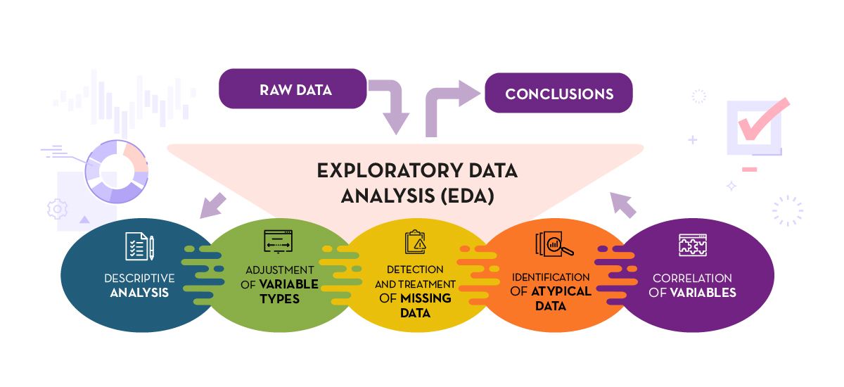
Figure 1. Phases of exploratory data analysis. Source: own elaboration.
The guide explains each of these steps and why they are necessary. They are also illustrated in a practical way through an example. For this case study, we have used the dataset relating to the air quality register in the Autonomous Community of Castilla y León included in our open data catalogue. The processing has been carried out with Open Source and free technological tools. The guide includes the code so that users can replicate it in a self-taught way following the indicated steps.
The guide ends with a section of additional resources for those who want to further explore the subject.
Who is the target audience?
The target audience of the guide is users who reuse open data. In other words, developers, entrepreneurs or even data journalists who want to extract as much value as possible from the information they work with in order to obtain reliable results.
It is advisable that the user has a basic knowledge of the R programming language, chosen to illustrate the examples. However, the bibliography section includes resources for acquiring greater skills in this field.
Below, in the documentation section, you can download the guide, as well as an infographic-summary that illustrates the main steps of exploratory data analysis. The source code of the practical example is also available in our Github.
Click to see the full infographic, in accessible version
Figure 2. Capture of the infographic. Source: own elaboration.
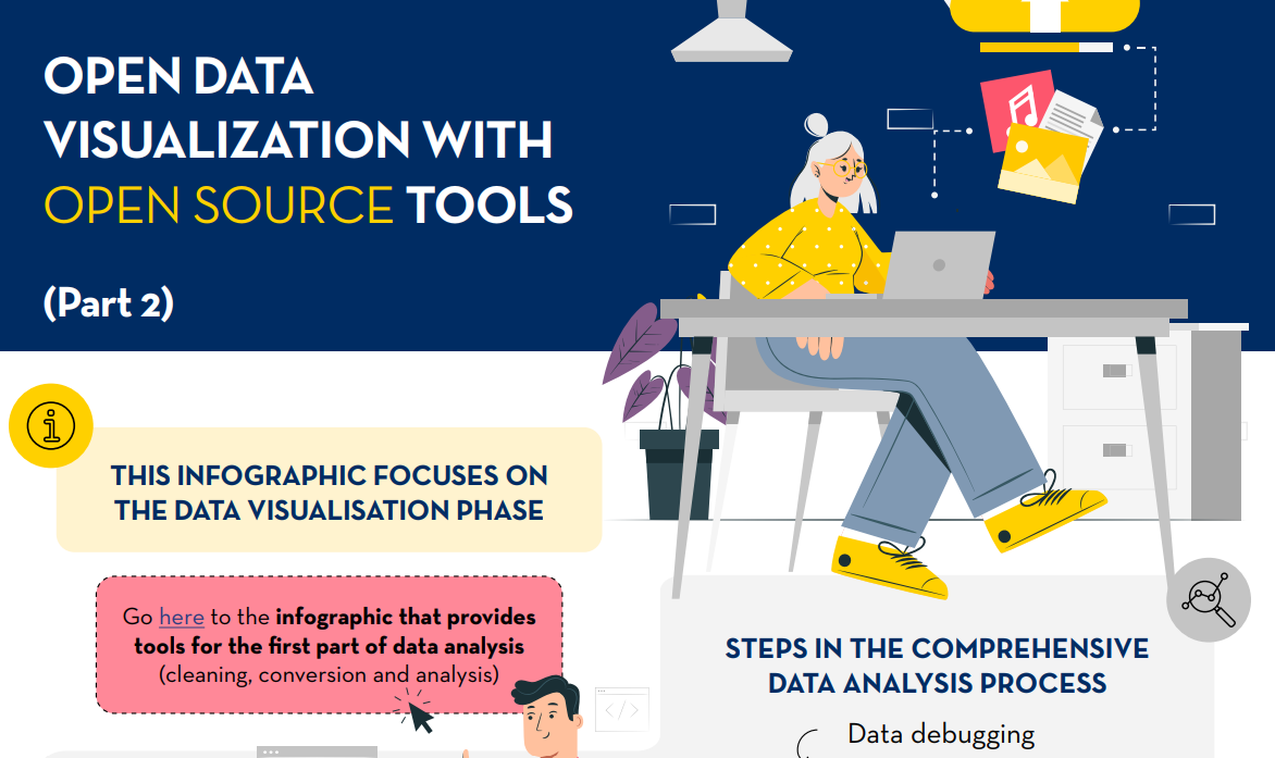
Open data visualization with open source tools (infographic part 2)
Documentación
1. Introduction
Visualizations are graphical representations of data that allow for the simple and effective communication of information linked to them. The possibilities for visualization are very broad, from basic representations such as line graphs, bar charts or relevant metrics, to visualizations configured on interactive dashboards.
In this section "Visualizations step by step" we are periodically presenting practical exercises using open data available on datos.gob.es or other similar catalogs. In them, the necessary steps to obtain the data, perform the transformations and relevant analyses to, finally obtain conclusions as a summary of said information, are addressed and described in a simple way.
Each practical exercise uses documented code developments and free-to-use tools. All generated material is available for reuse in the GitHub repository of datos.gob.es.
In this specific exercise, we will explore tourist flows at a national level, creating visualizations of tourists moving between autonomous communities (CCAA) and provinces.
Access the data laboratory repository on Github.
Execute the data pre-processing code on Google Colab.
In this video, the author explains what you will find on both Github and Google Colab.
2. Context
Analyzing national tourist flows allows us to observe certain well-known movements, such as, for example, that the province of Alicante is a very popular summer tourism destination. In addition, this analysis is interesting for observing trends in the economic impact that tourism may have, year after year, in certain CCAA or provinces. The article on experiences for the management of visitor flows in tourist destinations illustrates the impact of data in the sector.
3. Objective
The main objective of the exercise is to create interactive visualizations in Python that allow visualizing complex information in a comprehensive and attractive way. This objective will be met using an open dataset that contains information on national tourist flows, posing several questions about the data and answering them graphically. We will be able to answer questions such as those posed below:
- In which CCAA is there more tourism from the same CA?
- Which CA is the one that leaves its own CA the most?
- What differences are there between tourist flows throughout the year?
- Which Valencian province receives the most tourists?
The understanding of the proposed tools will provide the reader with the ability to modify the code contained in the notebook that accompanies this exercise to continue exploring the data on their own and detect more interesting behaviors from the dataset used.
In order to create interactive visualizations and answer questions about tourist flows, a data cleaning and reformatting process will be necessary, which is described in the notebook that accompanies this exercise.
4. Resources
Dataset
The open dataset used contains information on tourist flows in Spain at the CCAA and provincial level, also indicating the total values at the national level. The dataset has been published by the National Institute of Statistics, through various types of files. For this exercise we only use the .csv file separated by ";". The data dates from July 2019 to March 2024 (at the time of writing this exercise) and is updated monthly.
Number of tourists by CCAA and destination province disaggregated by PROVINCE of origin
The dataset is also available for download in this Github repository.
Analytical tools
The Python programming language has been used for data cleaning and visualization creation. The code created for this exercise is made available to the reader through a Google Colab notebook.
The Python libraries we will use to carry out the exercise are:
- pandas: is a library used for data analysis and manipulation.
- holoviews: is a library that allows creating interactive visualizations, combining the functionalities of other libraries such as Bokeh and Matplotlib.
5. Exercise development
To interactively visualize data on tourist flows, we will create two types of diagrams: chord diagrams and Sankey diagrams.
Chord diagrams are a type of diagram composed of nodes and edges, see Figure 1. The nodes are located in a circle and the edges symbolize the relationships between the nodes of the circle. These diagrams are usually used to show types of flows, for example, migratory or monetary flows. The different volume of the edges is visualized in a comprehensible way and reflects the importance of a flow or a node. Due to its circular shape, the chord diagram is a good option to visualize the relationships between all the nodes in our analysis (many-to-many type relationship).
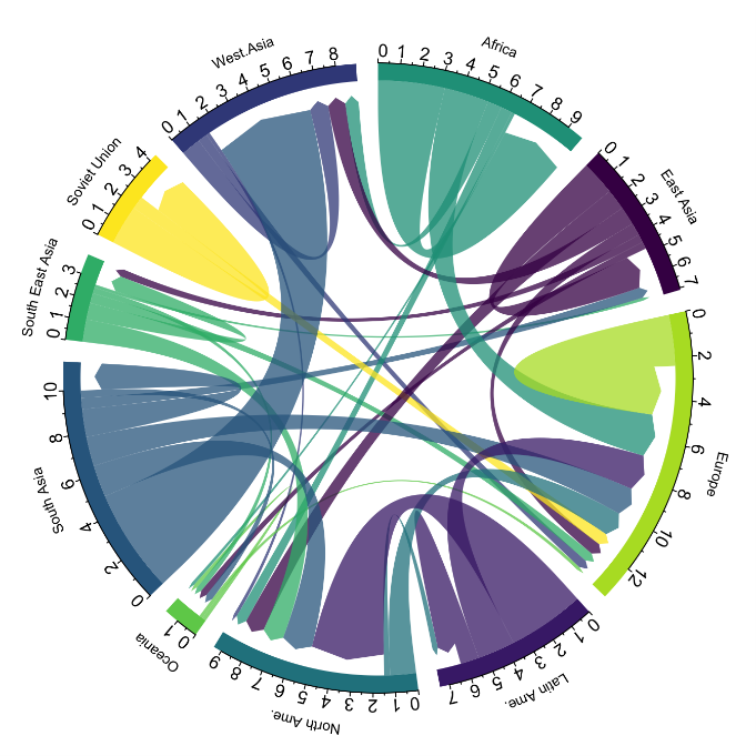
Figure 1. Chord Diagram (Global Migration). Source.
Sankey diagrams, like chord diagrams, are a type of diagram composed of nodes and edges, see Figure 2. The nodes are represented at the margins of the visualization, with the edges between the margins. Due to this linear grouping of nodes, Sankey diagrams are better than chord diagrams for analyses in which we want to visualize the relationship between:
- several nodes and other nodes (many-to-many, or many-to-few, or vice versa)
- several nodes and a single node (many-to-one, or vice versa)

Figure 2. Sankey Diagram (UK Internal Migration). Source.
The exercise is divided into 5 parts, with part 0 ("initial configuration") only setting up the programming environment. Below, we describe the five parts and the steps carried out.
5.1. Load data
This section can be found in point 1 of the notebook.
In this part, we load the dataset to process it in the notebook. We check the format of the loaded data and create a pandas.DataFrame that we will use for data processing in the following steps.
5.2. Initial data exploration
This section can be found in point 2 of the notebook.
In this part, we perform an exploratory data analysis to understand the format of the dataset we have loaded and to have a clearer idea of the information it contains. Through this initial exploration, we can define the cleaning steps we need to carry out to create interactive visualizations.
If you want to learn more about how to approach this task, you have at your disposal this introductory guide to exploratory data analysis.
5.3. Data format analysis
This section can be found in point 3 of the notebook.
In this part, we summarize the observations we have been able to make during the initial data exploration. We recapitulate the most important observations here:
| Province of origin | Province of origin | CCAA and destination province | CCAA and destination province | CCAA and destination province | Tourist concept | Period | Total |
|---|---|---|---|---|---|---|---|
| National Total | National Total | Tourists | 2024M03 | 13.731.096 | |||
| National Total | Ourense | National Total | Andalucía | Almería | Tourists | 2024M03 | 373 |
Figure 3. Fragment of the original dataset.
We can observe in columns one to four that the origins of tourist flows are disaggregated by province, while for destinations, provinces are aggregated by CCAA. We will take advantage of the mapping of CCAA and their provinces that we can extract from the fourth and fifth columns to aggregate the origin provinces by CCAA.
We can also see that the information contained in the first column is sometimes superfluous, so we will combine it with the second column. In addition, we have found that the fifth and sixth columns do not add value to our analysis, so we will remove them. We will rename some columns to have a more comprehensible pandas.DataFrame.
5.4. Data cleaning
This section can be found in point 4 of the notebook.
In this part, we carry out the necessary steps to better format our data. For this, we take advantage of several functionalities that pandas offers us, for example, to rename the columns. We also define a reusable function that we need to concatenate the values of the first and second columns with the aim of not having a column that exclusively indicates "National Total" in all rows of the pandas.DataFrame. In addition, we will extract from the destination columns a mapping of CCAA to provinces that we will apply to the origin columns.
We want to obtain a more compressed version of the dataset with greater transparency of the column names and that does not contain information that we are not going to process. The final result of the data cleaning process is the following:
| Origin | Province of origin | Destination | Province of destination | Period | Total |
|---|---|---|---|---|---|
| National Total | National Total | 2024M03 | 13731096.0 | ||
| Galicia | Ourense | Andalucía | Almería | 2024M03 | 373.0 |
Figure 4. Fragment of the clean dataset.
5.5. Create visualizations
This section can be found in point 5 of the notebook
In this part, we create our interactive visualizations using the Holoviews library. In order to draw chord or Sankey graphs that visualize the flow of people between CCAA and CCAA and/or provinces, we have to structure the information of our data in such a way that we have nodes and edges. In our case, the nodes are the names of CCAA or province and the edges, that is, the relationship between the nodes, are the number of tourists. In the notebook we define a function to obtain the nodes and edges that we can reuse for the different diagrams we want to make, changing the time period according to the season of the year we are interested in analyzing.
We will first create a chord diagram using exclusively data on tourist flows from March 2024. In the notebook, this chord diagram is dynamic. We encourage you to try its interactivity.
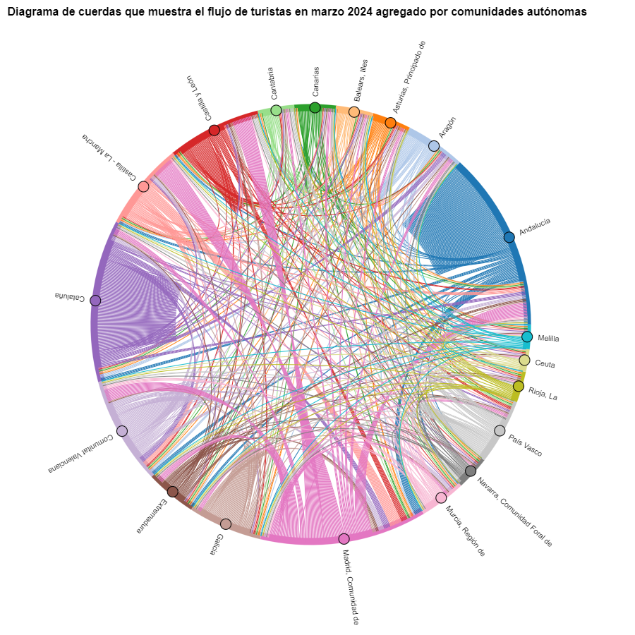
Figure 5. Chord diagram showing the flow of tourists in March 2024 aggregated by autonomous communities.
The chord diagram visualizes the flow of tourists between all CCAA. Each CA has a color and the movements made by tourists from this CA are symbolized with the same color. We can observe that tourists from Andalucía and Catalonia travel a lot within their own CCAA. On the other hand, tourists from Madrid leave their own CA a lot.
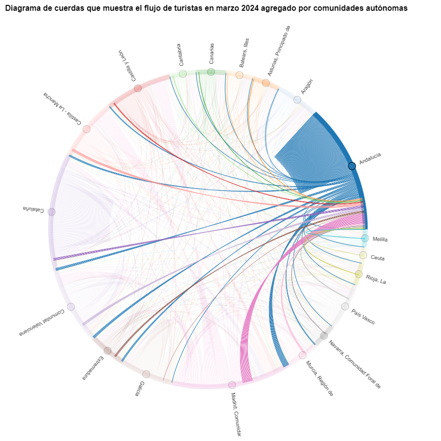
Figure 6. Chord diagram showing the flow of tourists entering and leaving Andalucía in March 2024 aggregated by autonomous communities.
We create another chord diagram using the function we have created and visualize tourist flows in August 2023.
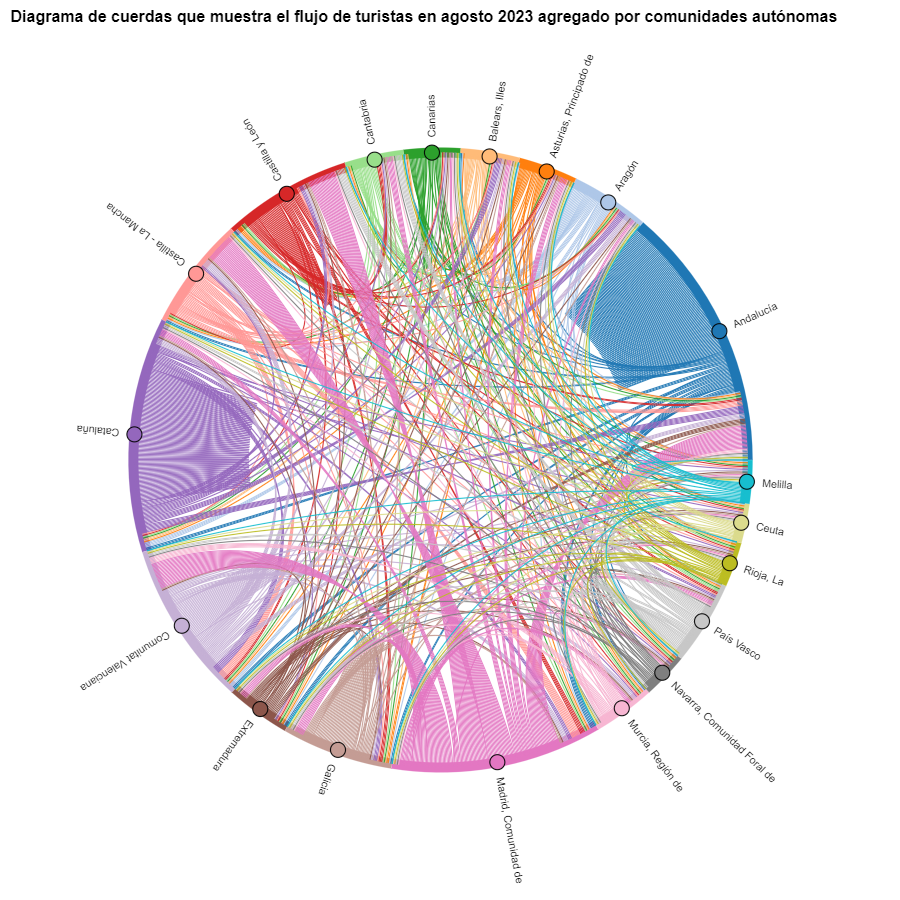
Figure 7. Chord diagram showing the flow of tourists in August 2023 aggregated by autonomous communities.
We can observe that, broadly speaking, tourist movements do not change, only that the movements we have already observed for March 2024 intensify.
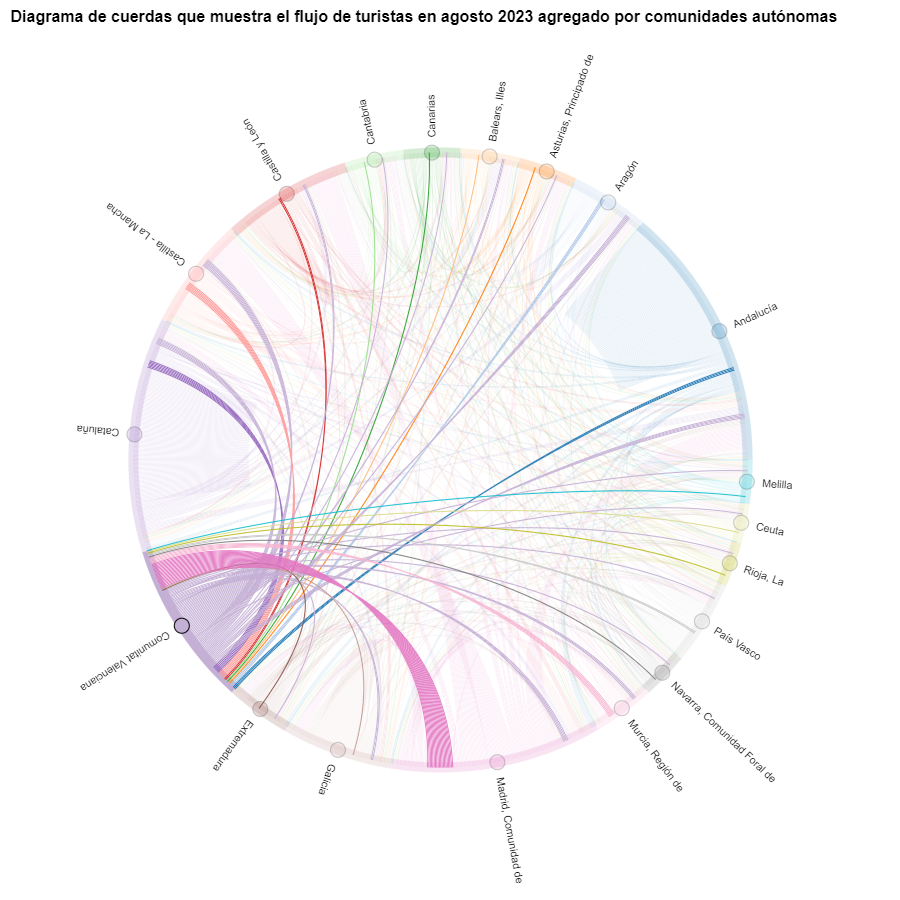
Figure 8. Chord diagram showing the flow of tourists entering and leaving the Valencian Community in August 2023 aggregated by autonomous communities.
The reader can create the same diagram for other time periods, for example, for the summer of 2020, in order to visualize the impact of the pandemic on summer tourism, reusing the function we have created.
For the Sankey diagrams, we will focus on the Valencian Community, as it is a popular holiday destination. We filter the edges we created for the previous chord diagram so that they only contain flows that end in the Valencian Community. The same procedure could be applied to study any other CA or could be inverted to analyze where Valencians go on vacation. We visualize the Sankey diagram which, like the chord diagrams, is interactive within the notebook. The visual aspect would be like this:
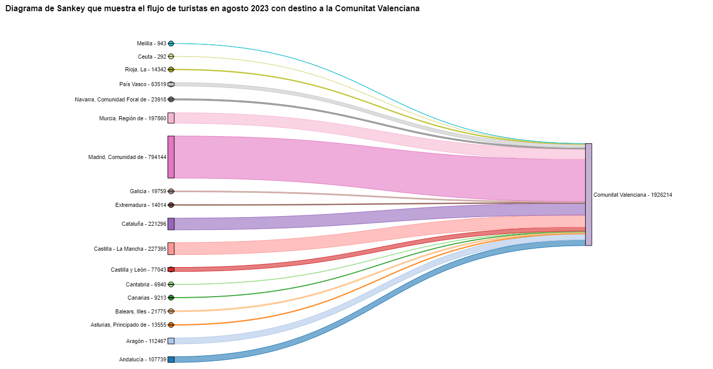
Figure 9. Sankey diagram showing the flow of tourists in August 2023 destined for the Valencian Community.
As we could already intuit from the chord diagram above, see Figure 8, the largest group of tourists arriving in the Valencian Community comes from Madrid. We also see that there is a high number of tourists visiting the Valencian Community from neighboring CCAA such as Murcia, Andalucía, and Catalonia.
To verify that these trends occur in the three provinces of the Valencian Community, we are going to create a Sankey diagram that shows on the left margin all the CCAA and on the right margin the three provinces of the Valencian Community.
To create this Sankey diagram at the provincial level, we have to filter our initial pandas.DataFrame to extract the relevant information from it. The steps in the notebook can be adapted to perform this analysis at the provincial level for any other CA. Although we are not reusing the function we used previously, we can also change the analysis period.
The Sankey diagram that visualizes the tourist flows that arrived in August 2023 to the three Valencian provinces would look like this:
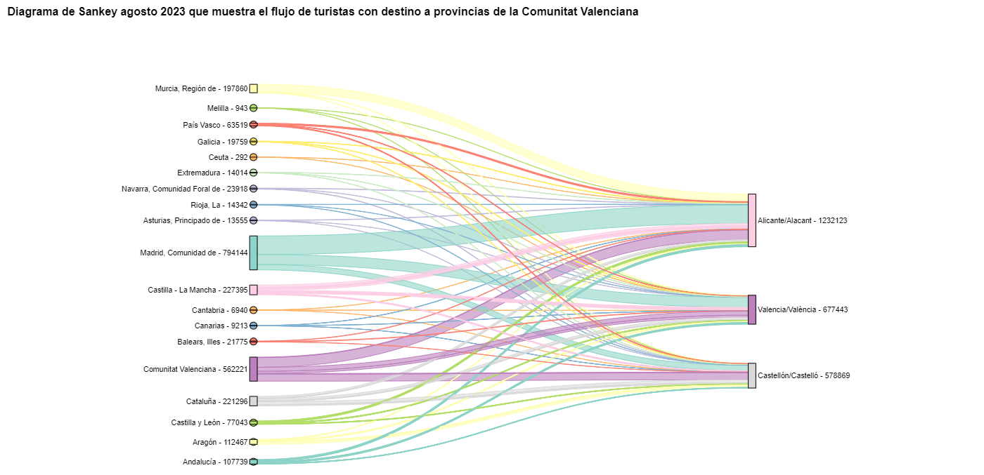
Figure 10. Sankey diagram August 2023 showing the flow of tourists destined for provinces of the Valencian Community.
We can observe that, as we already assumed, the largest number of tourists arriving in the Valencian Community in August comes from the Community of Madrid. However, we can verify that this is not true for the province of Castellón, where in August 2023 the majority of tourists were Valencians who traveled within their own CA.
6. Conclusions of the exercise
Thanks to the visualization techniques used in this exercise, we have been able to observe the tourist flows that move within the national territory, focusing on making comparisons between different times of the year and trying to identify patterns. In both the chord diagrams and the Sankey diagrams that we have created, we have been able to observe the influx of Madrilenian tourists on the Valencian coasts in summer. We have also been able to identify the autonomous communities where tourists leave their own autonomous community the least, such as Catalonia and Andalucía.
7. Do you want to do the exercise?
We invite the reader to execute the code contained in the Google Colab notebook that accompanies this exercise to continue with the analysis of tourist flows. We leave here some ideas of possible questions and how they could be answered:
- The impact of the pandemic: we have already mentioned it briefly above, but an interesting question would be to measure the impact that the coronavirus pandemic has had on tourism. We can compare the data from previous years with 2020 and also analyze the following years to detect stabilization trends. Given that the function we have created allows easily changing the time period under analysis, we suggest you do this analysis on your own.
- Time intervals: it is also possible to modify the function we have been using in such a way that it not only allows selecting a specific time period, but also allows time intervals.
- Provincial level analysis: likewise, an advanced reader with Pandas can challenge themselves to create a Sankey diagram that visualizes which provinces the inhabitants of a certain region travel to, for example, Ourense. In order not to have too many destination provinces that could make the Sankey diagram illegible, only the 10 most visited could be visualized. To obtain the data to create this visualization, the reader would have to play with the filters they apply to the dataset and with the groupby method of pandas, being inspired by the already executed code.
We hope that this practical exercise has provided you with sufficient knowledge to develop your own visualizations. If you have any data science topic that you would like us to cover soon, do not hesitate to propose your interest through our contact channels.
In addition, remember that you have more exercises available in the section "Data science exercises".
Documentación
1. Introduction
In the information age, artificial intelligence has proven to be an invaluable tool for a variety of applications. One of the most incredible manifestations of this technology is GPT (Generative Pre-trained Transformer), developed by OpenAI. GPT is a natural language model that can understand and generate text, providing coherent and contextually relevant responses. With the recent introduction of Chat GPT-4, the capabilities of this model have been further expanded, allowing for greater customisation and adaptability to different themes.
In this post, we will show you how to set up and customise a specialised critical minerals wizard using GPT-4 and open data sources. As we have shown in previous publications critical minerals are fundamental to numerous industries, including technology, energy and defence, due to their unique properties and strategic importance. However, information on these materials can be complex and scattered, making a specialised assistant particularly useful.
The aim of this post is to guide you step by step from the initial configuration to the implementation of a GPT wizard that can help you to solve doubts and provide valuable information about critical minerals in your day to day life. In addition, we will explore how to customise aspects of the assistant, such as the tone and style of responses, to perfectly suit your needs. At the end of this journey, you will have a powerful, customised tool that will transform the way you access and use critical open mineral information.
Access the data lab repository on Github.
2. Context
The transition to a sustainable future involves not only changes in energy sources, but also in the material resources we use. The success of sectors such as energy storage batteries, wind turbines, solar panels, electrolysers, drones, robots, data transmission networks, electronic devices or space satellites depends heavily on access to the raw materials critical to their development. We understand that a mineral is critical when the following factors are met:
- Its global reserves are scarce
- There are no alternative materials that can perform their function (their properties are unique or very unique)
- They are indispensable materials for key economic sectors of the future, and/or their supply chain is high risk
You can learn more about critical minerals in the post mentioned above.
3. Target
This exercise focuses on showing the reader how to customise a specialised GPT model for a specific use case. We will adopt a "learning-by-doing" approach, so that the reader can understand how to set up and adjust the model to solve a real and relevant problem, such as critical mineral expert advice. This hands-on approach not only improves understanding of language model customisation techniques, but also prepares readers to apply this knowledge to real-world problem solving, providing a rich learning experience directly applicable to their own projects.
The GPT assistant specialised in critical minerals will be designed to become an essential tool for professionals, researchers and students. Its main objective will be to facilitate access to accurate and up-to-date information on these materials, to support strategic decision-making and to promote education in this field. The following are the specific objectives we seek to achieve with this assistant:
- Provide accurate and up-to-date information:
- The assistant should provide detailed and accurate information on various critical minerals, including their composition, properties, industrial uses and availability.
- Keep up to date with the latest research and market trends in the field of critical minerals.
- Assist in decision-making:
- To provide data and analysis that can assist strategic decision making in industry and critical minerals research.
- Provide comparisons and evaluations of different minerals in terms of performance, cost and availability.
- Promote education and awareness of the issue:
- Act as an educational tool for students, researchers and practitioners, helping to improve their knowledge of critical minerals.
- Raise awareness of the importance of these materials and the challenges related to their supply and sustainability.
4. Resources
To configure and customise our GPT wizard specialising in critical minerals, it is essential to have a number of resources to facilitate implementation and ensure the accuracy and relevance of the model''s responses. In this section, we will detail the necessary resources that include both the technological tools and the sources of information that will be integrated into the assistant''s knowledge base.
Tools and Technologies
The key tools and technologies to develop this exercise are:
- OpenAI account: required to access the platform and use the GPT-4 model. In this post, we will use ChatGPT''s Plus subscription to show you how to create and publish a custom GPT. However, you can develop this exercise in a similar way by using a free OpenAI account and performing the same set of instructions through a standard ChatGPT conversation.
- Microsoft Excel: we have designed this exercise so that anyone without technical knowledge can work through it from start to finish. We will only use office tools such as Microsoft Excel to make some adjustments to the downloaded data.
In a complementary way, we will use another set of tools that will allow us to automate some actions without their use being strictly necessary:
- Google Colab: is a Python Notebooks environment that runs in the cloud, allowing users to write and run Python code directly in the browser. Google Colab is particularly useful for machine learning, data analysis and experimentation with language models, offering free access to powerful computational resources and facilitating collaboration and project sharing.
- Markmap: is a tool that visualises Markdown mind maps in real time. Users write ideas in Markdown and the tool renders them as an interactive mind map in the browser. Markmap is useful for project planning, note taking and organising complex information visually. It facilitates understanding and the exchange of ideas in teams and presentations.
Sources of information
- Raw Materials Information System (RMIS): raw materials information system maintained by the Joint Research Center of the European Union. It provides detailed and up-to-date data on the availability, production and consumption of raw materials in Europe.
- International Energy Agency (IEA) Catalogue of Reports and Data: the International Energy Agency (IEA) offers a comprehensive catalogue of energy-related reports and data, including statistics on production, consumption and reserves of energy and critical minerals.
- Mineral Database of the Spanish Geological and Mining Institute (BDMIN in its acronym in Spanish): contains detailed information on minerals and mineral deposits in Spain, useful to obtain specific data on the production and reserves of critical minerals in the country.
With these resources, you will be well equipped to develop a specialised GPT assistant that can provide accurate and relevant answers on critical minerals, facilitating informed decision-making in the field.
5. Development of the exercise
5.1. Building the knowledge base
For our specialised critical minerals GPT assistant to be truly useful and accurate, it is essential to build a solid and structured knowledge base. This knowledge base will be the set of data and information that the assistant will use to answer queries. The quality and relevance of this information will determine the effectiveness of the assistant in providing accurate and useful answers.
Search for Data Sources
We start with the collection of information sources that will feed our knowledge base. Not all sources of information are equally reliable. It is essential to assess the quality of the sources identified, ensuring that:
- Information is up to date: the relevance of data can change rapidly, especially in dynamic fields such as critical minerals.
- The source is reliable and recognised: it is necessary to use sources from recognised and respected academic and professional institutions.
- Data is complete and accessible: it is crucial that data is detailed and accessible for integration into our wizard.
In our case, we developed an online search in different platforms and information repositories trying to select information belonging to different recognised entities:
- Research centres and universities:
- They publish detailed studies and reports on the research and development of critical minerals.
- Example: RMIS of the Joint Research Center of the European Union.
- Governmental institutions and international organisations:
- These entities usually provide comprehensive and up-to-date data on the availability and use of critical minerals.
- Example: International Energy Agency (IEA).
- Specialised databases:
- They contain technical and specific data on deposits and production of critical minerals.
- Example: Minerals Database of the Spanish Geological and Mining Institute (BDMIN).
Selection and preparation of information
We will now focus on the selection and preparation of existing information from these sources to ensure that our GPT assistant can access accurate and useful data.
RMIS of the Joint Research Center of the European Union:
- Selected information:
We selected the report "Supply chain analysis and material demand forecast in strategic technologies and sectors in the EU - A foresight study". This is an analysis of the supply chain and demand for minerals in strategic technologies and sectors in the EU. It presents a detailed study of the supply chains of critical raw materials and forecasts the demand for minerals up to 2050.
- Necessary preparation:
The format of the document, PDF, allows the direct ingestion of the information by our assistant. However, as can be seen in Figure 1, there is a particularly relevant table on pages 238-240 which analyses, for each mineral, its supply risk, typology (strategic, critical or non-critical) and the key technologies that employ it. We therefore decided to extract this table into a structured format (CSV), so that we have two pieces of information that will become part of our knowledge base.

Figure 1: Table of minerals contained in the JRC PDF
To programmatically extract the data contained in this table and transform it into a more easily processable format, such as CSV(comma separated values), we will use a Python script that we can use through the platform Google Colab platform (Figure 2).

Figure 2: Script Python para la extracción de datos del PDF de JRC desarrollado en plataforma Google Colab.
To summarise, this script:
- It is based on the open source library PyPDF2capable of interpreting information contained in PDF files.
- First, it extracts in text format (string) the content of the pages of the PDF where the mineral table is located, removing all the content that does not correspond to the table itself.
- It then goes through the string line by line, converting the values into columns of a data table. We will know that a mineral is used in a key technology if in the corresponding column of that mineral we find a number 1 (otherwise it will contain a 0).
- Finally, it exports the table to a CSV file for further use.
International Energy Agency (IEA):
- Selected information:
We selected the report "Global Critical Minerals Outlook 2024". It provides an overview of industrial developments in 2023 and early 2024, and offers medium- and long-term prospects for the demand and supply of key minerals for the energy transition. It also assesses risks to the reliability, sustainability and diversity of critical mineral supply chains.
- Necessary preparation:
The format of the document, PDF, allows us to ingest the information directly by our virtual assistant. In this case, we will not make any adjustments to the selected information.
Spanish Geological and Mining Institute''s Minerals Database (BDMIN)
- Selected information:
In this case, we use the form to select the existing data in this database for indications and deposits in the field of metallogeny, in particular those with lithium content.
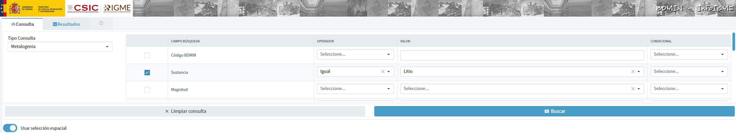
Figure 3: Dataset selection in BDMIN.
- Necessary preparation:
We note how the web tool allows online visualisation and also the export of this data in various formats. Select all the data to be exported and click on this option to download an Excel file with the desired information.

Figure 4: Visualization and download tool in BDMIN

Figure 5: BDMIN Downloaded Data.
All the files that make up our knowledge base can be found at GitHub, so that the reader can skip the downloading and preparation phase of the information.
5.2. GPT configuration and customisation for critical minerals
When we talk about "creating a GPT," we are actually referring to the configuration and customisation of a GPT (Generative Pre-trained Transformer) based language model to suit a specific use case. In this context, we are not creating the model from scratch, but adjusting how the pre-existing model (such as OpenAI''s GPT-4) interacts and responds within a specific domain, in this case, on critical minerals.
First of all, we access the application through our browser and, if we do not have an account, we follow the registration and login process on the ChatGPT platform. As mentioned above, in order to create a GPT step-by-step, you will need to have a Plus account. However, readers who do not have such an account can work with a free account by interacting with ChatGPT through a standard conversation.
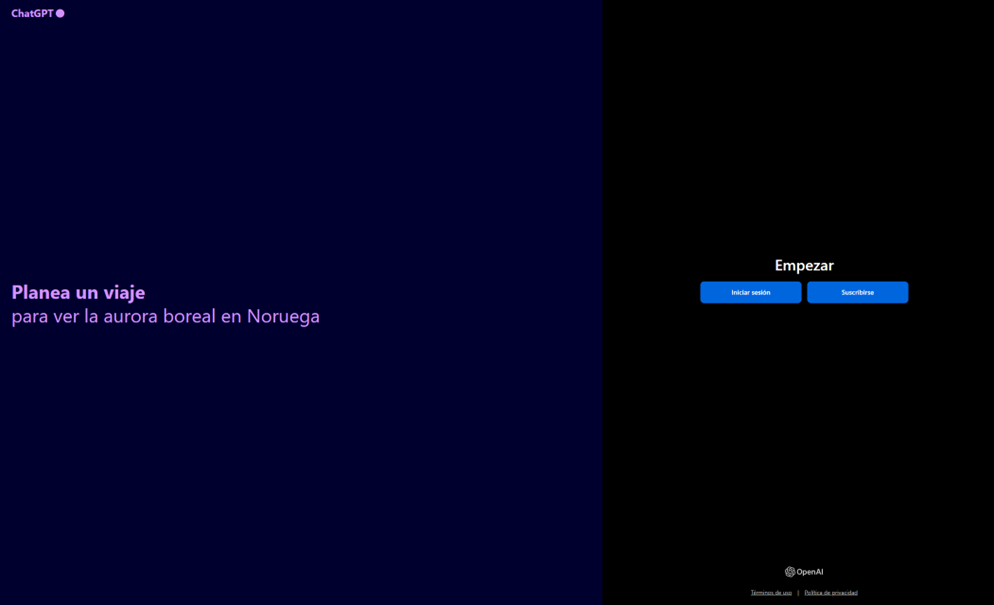
Figure 6: ChatGPT login and registration page.
Once logged in, select the "Explore GPT" option, and then click on "Create" to begin the process of creating your GPT.

Figure 7: Creation of new GPT.
The screen will display the split screen for creating a new GPT: on the left, we will be able to talk to the system to indicate the characteristics that our GPT should have, while on the left we will be able to interact with our GPT to validate that its behaviour is adequate as we go through the configuration process.

Figure 8: Screen of creating new GPT.
In the GitHub of this project, we can find all the prompts or instructions that we will use to configure and customise our GPT and that we will have to introduce sequentially in the "Create" tab, located on the left tab of our screens, to complete the steps detailed below.
The steps we will follow for the creation of the GPT are as follows:
- First, we will outline the purpose and basic considerations for our GPT so that you can understand how to use it.

Figure 9: Basic instructions for new GPT.
2. We will then create a name and an image to represent our GPT and make it easily identifiable. In our case, we will call it MateriaGuru.

Figure 10: Name selection for new GPT.

Figure 11: Image creation for GPT.
3.We will then build the knowledge base from the information previously selected and prepared to feed the knowledge of our GPT.


Figure 12: Uploading of information to the new GPT knowledge base.
4. Now, we can customise conversational aspects such as their tone, the level of technical complexity of their response or whether we expect brief or elaborate answers.
5. Lastly, from the "Configure" tab, we can indicate the conversation starters desired so that users interacting with our GPT have some ideas to start the conversation in a predefined way.

Figure 13: Configure GPT tab.
In Figure 13 we can also see the final result of our training, where key elements such as their image, name, instructions, conversation starters or documents that are part of their knowledge base appear.
5.3. Validation and publication of GPT
Before we sign off our new GPT-based assistant, we will proceed with a brief validation of its correct configuration and learning with respect to the subject matter around which we have trained it. For this purpose, we prepared a battery of questions that we will ask MateriaGuru to check that it responds appropriately to a real scenario of use.
| # | Question | Answer |
|---|---|---|
| 1 | Which critical minerals have experienced a significant drop in prices in 2023? | Battery mineral prices saw particularly large drops with lithium prices falling by 75% and cobalt, nickel and graphite prices falling by between 30% and 45%. |
| 2 | What percentage of global solar photovoltaic (PV) capacity was added by China in 2023? | China accounted for 62% of the increase in global solar PV capacity in 2023. |
| 3 | What is the scenario that projects electric car (EV) sales to reach 65% by 2030? | The Net Zero Emissions (NZE) scenario for 2050 projects that electric car sales will reach 65% by 2030. |
| 4 | What was the growth in lithium demand in 2023? | Lithium demand increased by 30% in 2023. |
| 5 | Which country was the largest electric car market in 2023? | China was the largest electric car market in 2023 with 8.1 million electric car sales representing 60% of the global total. |
| 6 | What is the main risk associated with market concentration in the battery graphite supply chain? | More than 90% of battery-grade graphite and 77% of refined rare earths in 2030 originate in China, posing a significant risk to market concentration. |
| 7 | What proportion of global battery cell production capacity was in China in 2023? | China owned 85% of battery cell production capacity in 2023. |
| 8 | How much did investment in critical minerals mining increase in 2023? | Investment in critical minerals mining grew by 10% in 2023. |
| 9 | What percentage of battery storage capacity in 2023 was composed of lithium iron phosphate (LFP) batteries? | By 2023, LFP batteries would constitute approximately 80% of the total battery storage market. |
| 10 | What is the forecast for copper demand in a net zero emissions (NZE) scenario for 2040? | In the net zero emissions (NZE) scenario for 2040, copper demand is expected to have the largest increase in terms of production volume. |
Figure 14: Table with battery of questions for the validation of our GPT.
Using the preview section on the right-hand side of our screens, we launch the battery of questions and validate that the answers correspond to those expected.
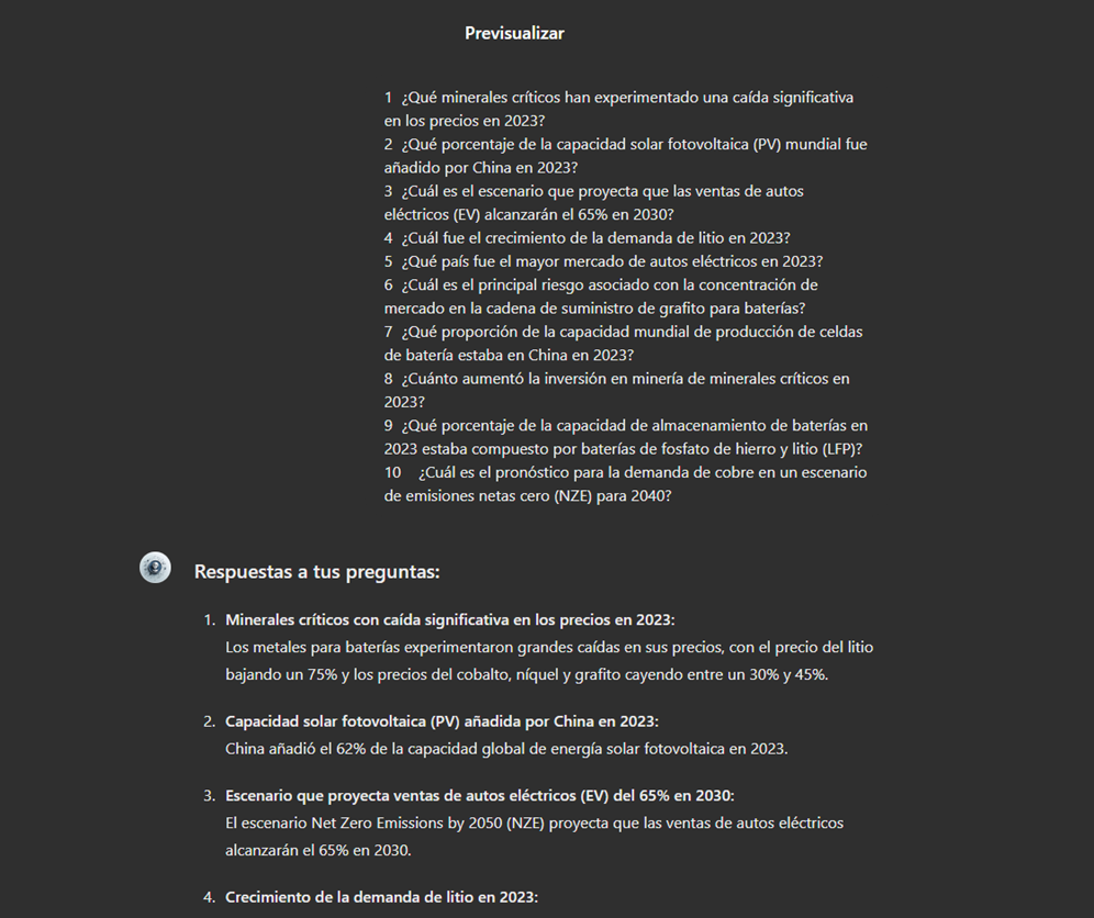
Figure 15: Validation of GPT responses.
Finally, click on the "Create" button to finalise the process. We will be able to select between different alternatives to restrict its use by other users.

Figure 16: Publication of our GPT.
6. Scenarios of use
In this section we show several scenarios in which we can take advantage of MateriaGuru in our daily life. On the GitHub of the project you can find the prompts used to replicate each of them.
6.1. Consultation of critical minerals information
The most typical scenario for the use of this type of GPTs is assistance in resolving doubts related to the topic in question, in this case, critical minerals. As an example, we have prepared a set of questions that the reader can pose to the GPT created to understand in more detail the relevance and current status of a critical material such as graphite from the reports provided to our GPT.

Figure 17: Resolution of critical mineral queries.
We can also ask you specific questions about the tabulated information provided on existing sites and evidence on Spanish territory.
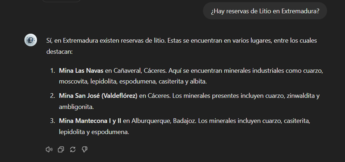
Figure 18: Lithium reserves in Extremadura.
6.2. Representation of quantitative data visualisations
Another common scenario is the need to consult quantitative information and make visual representations for better understanding. In this scenario, we can see how MateriaGuru is able to generate an interactive visualisation of graphite production in tonnes for the main producing countries.

Figure 19: Interactive visualisation generation with our GPT.
6.3. Generating mind maps to facilitate understanding
Finally, in line with the search for alternatives for a better access and understanding of the existing knowledge in our GPT, we will propose to MateriaGuru the construction of a mind map that allows us to understand in a visual way key concepts of critical minerals. For this purpose, we use the open Markmap notation (Markdown Mindmap), which allows us to define mind maps using markdown notation.

Figure 20: Generation of mind maps from our GPT
We will need to copy the generated code and enter it in a markmapviewer in order to generate the desired mind map. We facilitate here a version of this code generated by MateriaGuru.

Figure 21: Visualisation of mind maps.
7. Results and conclusions
In the exercise of building an expert assistant using GPT-4, we have succeeded in creating a specialised model for critical minerals. This wizard provides detailed and up-to-date information on critical minerals, supporting strategic decision making and promoting education in this field. We first gathered information from reliable sources such as the RMIS, the International Energy Agency (IEA), and the Spanish Geological and Mining Institute (BDMIN). We then process and structure the data appropriately for integration into the model. Validations showed that the wizard accurately answers domain-relevant questions, facilitating access to your information.
In this way, the development of the specialised critical minerals assistant has proven to be an effective solution for centralising and facilitating access to complex and dispersed information.
The use of tools such as Google Colab and Markmap has enabled better organisation and visualisation of data, increasing efficiency in knowledge management. This approach not only improves the understanding and use of critical mineral information, but also prepares users to apply this knowledge in real-world contexts.
The practical experience gained in this exercise is directly applicable to other projects that require customisation of language models for specific use cases.
8. Do you want to do the exercise?
If you want to replicate this exercise, access this this repository where you will find more information (the prompts used, the code generated by MateriaGuru, etc.)
Also, remember that you have at your disposal more exercises in the section "Step-by-step visualisations".
Content elaborated by Juan Benavente, industrial engineer and expert in technologies linked to the data economy. The contents and points of view reflected in this publication are the sole responsibility of the author.
Blog
What is data profiling?
Data profiling is the set of activities and processes aimed at determining the metadata about a particular dataset. This process, considered as an indispensable technique during exploratory data analysis, includes the application of different statistics with the main objective of determining aspects such as the number of null values, the number of distinct values in a column, the types of data and/or the most frequent patterns of data values. Its ultimate goal is to provide a clear and detailed understanding of the structure, content and quality of the data, which is essential prior to its use in any application.
Types of data profiling
There are different alternatives in terms of the statistical principles to be applied during data profiling, as well as their typology. For this article, a review of various approaches by different authors has been carried out. On this basis, it is decided to focus the article on the typology of data profiling techniques on three high-level categories: single-column profiling, multi-column profiling and dependency profiling. For each category, possible techniques and uses are identified, as discussed below.
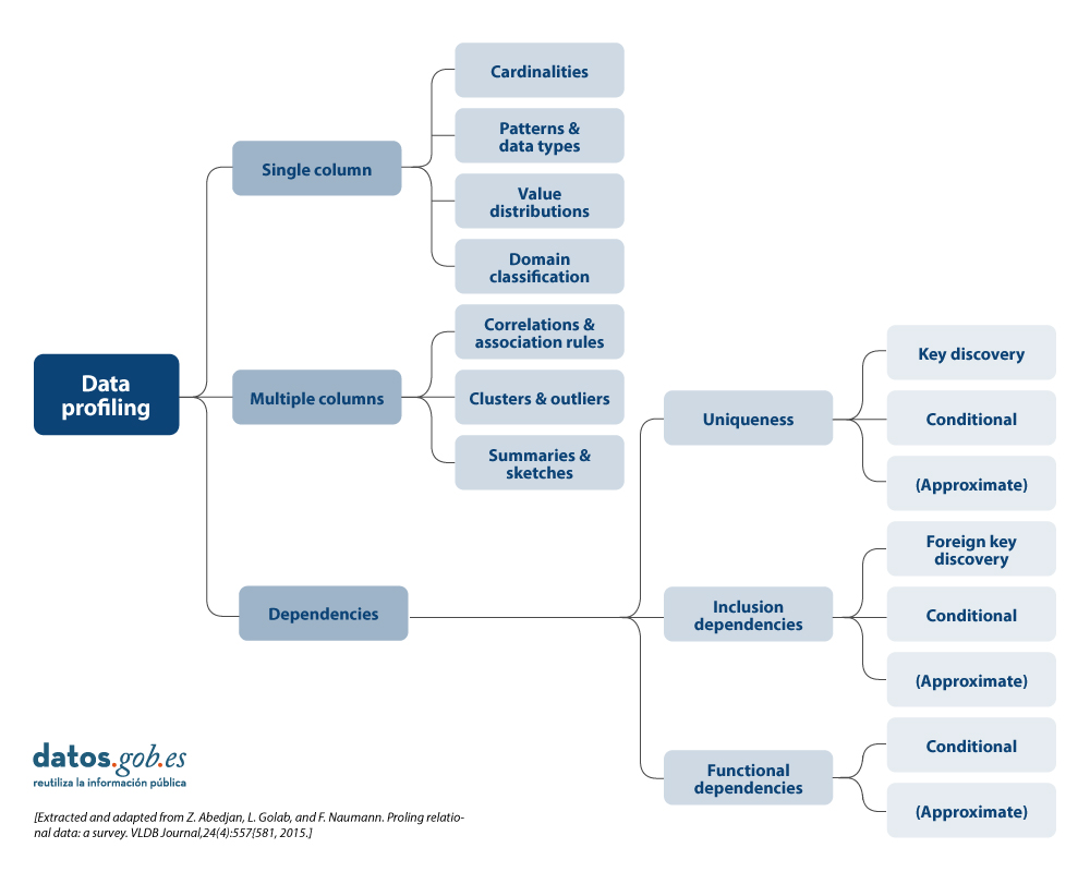
More detail on each of the categories and the benefits they bring is presented below.
1. Profiling of a column
Single-column profiling focuses on analysing each column of a dataset individually. This analysis includes the collection of descriptive statistics such as:
-
Count of distinct values, to determine the exact number of unique records in a list and to be able to sort them. For example, in the case of a dataset containing grants awarded by a public body, this task will allow us to know how many different beneficiaries there are for the beneficiaries column, and whether any of them are repeated.
-
Distribution of values (frequency), which refers to the analysis of the frequency with which different values occur within the same column. This can be represented by histograms that divide the values into intervals and show how many values are in each interval. For example, in an age column, we might find that 20 people are between 25-30 years old, 15 people are between 30-35 years old, and so on.
-
Counting null or missing values, which involves counting the number of null or empty values in each column of a dataset. It helps to determine the completeness of the data and can point to potential quality problems. For example, in a column of email addresses, 5 out of 100 records could be empty, indicating 5% missing data.
- Minimum, maximum and average length of values (for text columns), which is oriented to calculate what is the length of the values in a text column. This is useful for identifying unusual values and for defining length restrictions in databases. For example, in a column of names, we might find that the shortest name is 3 characters, the longest is 20 characters, and the average is 8 characters.
The main benefits of using this data profiling include:
- Anomaly detection: allows the identification of unusual or out-of-range values.
- Improved data preparation: assists in normalising and cleaning data prior to use in more advanced analytics or machine learningmodels.
2. Multi-column profiling
Multi-column profiling analyses the relationship between two or more columns within the same data set. This type of profiling may include:
-
Correlation analysis, used to identify relationships between numerical columns in a data set. A common technique is to calculate pairwise correlations between all numerical columns to discover patterns of relationships. For example, in a table of researchers, we might find that age and number of publications are correlated, indicating that as the age of researchers and their category increases, their number of publications tends to increase. A Pearson correlation coefficient could quantify this relationship.
- Outliers, which involves identifying data that deviate significantly from other data points. Outliers may indicate errors, natural variability or interesting data points that merit further investigation. For example, in a column of budgets for annual R&D projects, a value of one million euros could be an outlier if most of the income is between 30,000 and 100,000 euros. However, if the amount is represented in relation to the duration of the project, it could be a normal value if the 1 million project has 10 times the duration of the 100,000 euro project.
- Frequent value combination detection, focused on finding sets of values that occur together frequently in the data. They are used to discover associations between elements, as in transaction data. For example, in a shopping dataset, we might find that the products "nappies" and "baby formula" are frequently purchased together. An association rule algorithm could generate the rule {breads} → {formula milk}, indicating that customers who buy bread also tend to buy butter with a high probability.
The main benefits of using this data profiling include:
- Trend detection: allows the identification of significant relationships and correlations between columns, which can help in the detection of patterns and trends.
- Improved data consistency: ensures that there is referential integrity and that, for example, similar data type formats are followed between data across multiple columns.
- Dimensionality reduction: allows to reduce the number of columns containing redundant or highly correlated data.
3. Profiling of dependencies
Dependency profiling focuses on discovering and validating logical relationships between different columns, such as:
- Foreign key discovery, which is aimed at establishing which values or combinations of values from one set of columns also appear in the other set of columns, a prerequisite for a foreign key. For example, in the Investigator table, the ProjectID column contains the values [101, 102, 101, 103]. To set ProjectID as a foreign key, we verify that these values are also present in the ProjectID column of the Project table [101, 102, 103]. As all values match, ProjectID in Researcher can be a foreign key referring to ProjectID in Project.
- Functional dependencies, which establishes relationships in which the value of one column depends on the value of another. It is also used for the validation of specific rules that must be complied with (e.g. a discount value must not exceed the total value).
The main benefits of using this data profiling include:
- Improved referential integrity: ensures that relationships between tables are valid and maintained correctly.
- Consistency validation between values: allows to ensure that the data comply with certain constraints or calculations defined by the organisation.
- Data repository optimisation: allows to improve the structure and design of databases by validating and adjusting dependencies.
Uses of data profiling
The above-mentioned statistics can be used in many areas in organisations. One use case would be in data science and data engineering initiatives where it allows for a thorough understanding of the characteristics of a dataset prior to analysis or modelling.
- By generating descriptive statistics, identifying outliers and missing values, uncovering hidden patterns, identifying and correcting problems such as null values, duplicates and inconsistencies, data profiling facilitates data cleaning and data preparation, ensuring data quality and consistency.
- It is also crucial for the early detection of problems, such as duplicates or errors, and for the validation of assumptions in predictive analytics projects.
- It is also essential for the integration of data from multiple sources, ensuring consistency and compatibility.
- In the area of data governance, management and quality, profiling can help establish sound policies and procedures, while in compliance it ensures that data complies with applicable regulations.
- Finally, in terms of management, it helps optimiseExtract, Transform and Load ( ETL) processes, supports data migration between systems and prepares data sets for machine learning and predictive analytics, improving the effectiveness of data-driven models and decisions.
Difference between data profiling and data quality assessment
This term data profiling is sometimes confused with data quality assessment. While data profiling focuses on discovering and understanding the metadata and characteristics of the data, data quality assessment goes one step further and focuses for example on analysing whether the data meets certain requirements or quality standards predefined in the organisation through business rules. Likewise, data quality assessment involves verifying the quality value for different characteristics or dimensions such as those included in the UNE 0081 specification: accuracy, completeness, consistency or timeliness, etc., and ensuring that the data is suitable for its intended use in the organisation: analytics, artificial intelligence, business intelligence, etc.
Data profiling tools or solutions
Finally, there are several outstanding open source solutions (tools, libraries, or dependencies) for data profiling that facilitate the understanding of the data. These include:
- Pandas Profiling and YData Profiling offering detailed reporting and advanced visualisations in Python
- Great Expectations and Dataprep to validate and prepare data, ensuring data integrity throughout the data lifecycle
- R dtables that allows the generation of detailed reports and visualisations for exploratory analysis and data profiling for the R ecosystem.
In summary, data profiling is an important part of exploratory data analysis that provides a detailed understanding of the structure, contents, etc. and is recommended to be taken into account in data analysis initiatives. It is important to dedicate time to this activity, with the necessary resources and tools, in order to have a better understanding of the data being handled and to be aware that it is one more technique to be used as part of data quality management, and that it can be used as a step prior to data quality assessment
Content elaborated by Dr. Fernando Gualo, Professor at UCLM and Data Governance and Quality Consultant The content and the point of view reflected in this publication are the sole responsibility of its author.