Blog
The "Support center for data exchange”(Support Center for Data Sharing or SCDS in English) was born in 2019 as part of the European strategy to promote a common data ecosystem. It is a space to investigate and report on the practices of so-called data sharing, which they themselves define as “transactions of any type of information in digital form, between different types of organizations”.
The SCDS provides practical support to public or private organizations that seek to share their data - regardless of the model chosen for it. Among other things, it disseminates good practices and success stories with the aim of inspiring others in the exchange of data. The examples, which are not limited to the geographical scope of Europe, cover different sectors, from agriculture to health to mobility.
In the report Data Sharing Practice Examples we found some of them. This report focuses primarily on third-party platforms and initiatives that can support governance and compliance in data sharing practices.
Practical examples and data sharing initiatives
One of the main challenges faced by organizations that begin to develop data exchange actions is the lack of trust that the sharing of their information can generate in the industry and the public. The use of third-party standards and technological solutions help to alleviate this challenge, also increasing efficiency by not having to dedicate time and resources to self-development.
The report divides the examples it shows into 3 categories, based on their main function:
- Data space catalysts: its objective is to create spaces for the sharing of data, addressing a specific sector or territory.
- Political / legal facilitatorsThey focus on the legal challenges of data exchange, either from a support position or offering their insight from experience.
- Technological facilitators: they are dedicated to developing technology - or advising on it - for the exchange of data in a general way, without focusing on a specific sector.
The report includes examples related to each of these categories as we will see below.
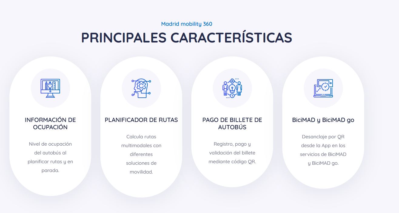
Data space catalysts: MaaS Madrid
We start with an example related to our country and the mobility sector. In Madrid there are about 70 mobility operators that offer bus, train, tram, car, bicycle and motorcycle services. Of them, 41 are public.
MaaS Madrid is a data aggregator that allows users to access real-time information from the aforementioned operators on a single integrated platform. It incorporates the information available on public transport and the adhered shared mobility services, redirecting to the applications of each of them to complete the reservation.
This is a great advantage for users, who will have all the centralized information to choose the route and the service that best meets their needs, while promoting the use of public or shared transport (with the consequent benefit for the environment).
This model also has advantages for operators, which increase their visibility and become better known among their public. In addition, it allows the collection of anonymous aggregated data in real time, very useful for decision-making and planning of mobility policies by public entities.
Political / Legal Facilitators: Technology Industries Finland
Technology Industries of Finland (TIF)is the organization in defense of electronics, electrotechnical, mechanical and metallurgical companies, engineering consulting and information technology in the Nordic country, with more than 1,600 members. After analyzing the use of data in these fields and observing the lack of established practices regarding data use rights, TIF has developed a model of conditions for the exchange of information, which they are promoting within and outside the country.
This model includes a series of standard clauses compatible with the legislation on competition and protection of personal data of the European Union. TIF recommends including these clauses as appendices to the pre-existing agreements between the parties involved in the data exchange.
Model terms are available in the webstore of Teknova.
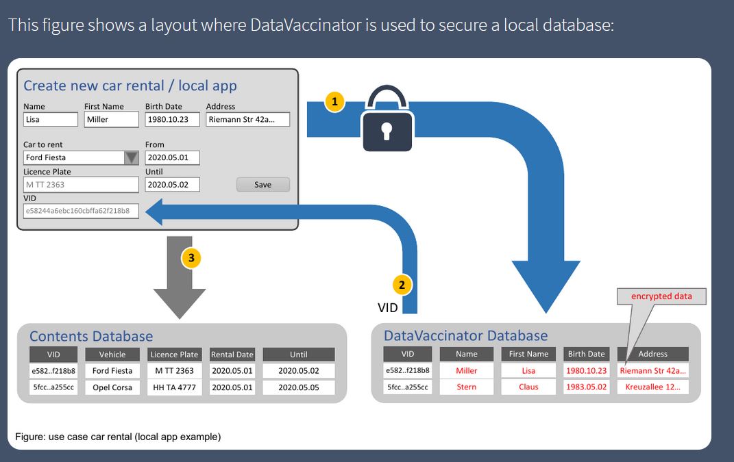
Technology Enablers: DataVaccinators
DataVaccinators focuses on the exchange of personal data in a secure way. It offers an open source software solution for the storage and protection of personal data through the use of pseudonymisation techniques applied at the time of data generation, which are separated into different databases and encrypted.
Developers can integrate other components into the database. The source code can be viewed and downloaded at GitHub (AGPL licensed), like the implementation in JavaScipt (licensed by MIT).
This solution is aimed at any type of organization, although it is especially useful for hospitals, universities, banks, insurers or manufacturers, who can take advantage of anonymized customer data to extract trends and make decisions.
Access more examples
These are just 3 examples, but the report includes many more. In addition, on the SCDS website you can find more success stories. As indicated by the SCDS itself, no model has yet emerged that has imposed itself on others, so it is important to document and be aware of the initiatives that are emerging in this area, in order to choose the one that best suits our needs. needs, although this situation has the risk of creating silos, based on the solution chosen by each operator.
The exchange of data between private organizations and with public bodies in all its forms can generate multiple benefits, mainly by providing more information to make better decisions that affect both the economic and social spheres. But to take advantage of all its advantages, it is necessary to carry out this exchange in a safe, legal and respectful way with the privacy rights of citizens.
Content prepared by the datos.gob.es team.
Blog
The world of technology and data is constantly evolving. Keeping up with the latest developments and trends can be a difficult task. Therefore, spaces for dialogue where knowledge, doubts and recommendations can be shared are important.
What are communities?
Communities are open channels through which different people interested in the same subject or technology meet physically or virtually to contribute, ask questions, discuss and resolve issues related to that technology. They are commonly created through an online platform, although there are communities that organise regular meetings and events where they share experiences, establish objectives and strengthen the bonds created through the screen.
How do they work?
Many developer communities use open source platforms known as GitHub or Stack Overflow, through which they store and manage their code, as well as share and discuss related topics.
Regarding how they are organised, not all communities have an organisational chart as such, some do, but there is no parameter that governs the organisation of communities in general. However, there may be roles defined according to the skills and knowledge of each of their members.
Developer communities as data reusers
There are a significant number of communities that bring knowledge about data and its associated technologies to different user groups. Some of them are made up of developers, who come together to expand their skills through webinars, competitions or projects. Sometimes these activities help drive innovation and transformation in the world of technology and data, and can act as a showcase to promote the use of open data.
Here are three examples of data-related developer communities that may be of interest to you if you want to expand your knowledge in this field:
Hackathon Lovers
Since its creation in 2013, this community of developers, designers and entrepreneurs who love hackathons have been organising meetings to test new platforms, APIs, products, hardware, etc. Among its main objectives is to create new projects and learn, while users have fun and strengthen ties with other professionals.
The topics they address in their events are varied. In the #SerchathonSalud hackathon, they focused on promoting training and research in the field of health based on bibliographic searches in 3 databases (PubMed, Embase, Cochrane).). Other events have focused on the use of specific APIs. This is the case of #OpenApiHackathon, a development event on Open Banking and #hackaTrips, a hackathon to find ideas on sustainable tourism.
Through which channels can you follow their news?
Hackathon Lovers is present in the main social networks such as Twitter and Facebook, as well as YouTube, Github, Flickr and has its own blog.
Comunidad R Hispano
It was created in November 2011, as part of the 3rd R User Conference held at the Escuela de Organización Industrial in Madrid. Organised through local user groups, its main objective is to promote the advancement of knowledge and use of the R programming language, as well as the development of the profession in all its aspects, especially research, teaching and business.
One of its main fields is the training of R and associated technologies for its users, in which open data has a place. With regard to the activities they carry out, there are events such as:
- Annual conferences: so far there have been eleven editions based on talks and workshops with attendees with R software as the protagonist.
- Local initiatives: although the association is the main promoter of the annual conferences, the feeling of community is forged thanks to local groups such as those in Madrid, sponsored by RConsortium, the Canary Islands, which communicates aspects such as public and geographic data, or Seville, which during its latest hackathons has developed several packages linked to open data.
- Collaboration with groups and initiatives focused on data: such as UNED, Grupo de Periodismo de Datos, Grupo Machine Learning Spain or companies such as Kabel or Kernel Analytics.
- Collaboration with Spanish academic institutions: such as EOI, Universidad Francisco de Vitoria, ESIC, or K-School, among others.
- Relationship with international institutions: such as RConsortium or RStudio.
- Creation of data-centric packages in Spain: participation in ROpenSpain, an initiative for R and open data enthusiasts aimed at creating top quality R packages for the reuse of Spanish data of general interest.
Through which channels can you follow their news?
This community is made up of more than 500 members. The main communication channel for contacting its users is Twitter, although its local groups have their own accounts, as is the case in Malaga, the Canary Islands and Valencia, among others.
R- Ladies Madrid
R-Ladies Madrid is a local branch of R-Ladies Global -a project funded by the R Consortium-Linux Foundation- born in 2016. It is an open source community developed by women who support each other and help each other grow within the R sector.
The main activity of this community lies in the celebration of monthly meetings or meet ups where female speakers share knowledge and projects they are working on, or teach functionalities related to R. Its members range from professionals who have R as their main working tool to amateurs who are looking to learn and improve their skills.
R-Ladies Madrid is very active within the software community and supports different technological initiatives, from the creation of open source working groups to its participation in different technological events. In some of their working groups they use open data from sources such as the BOE or Open Data NASA. In addition, they have also helped to set up a working group with data on Covid-19. In previous years they have organised gender hackathons where all participating teams were made up of 50% women and proposed to work with data from non-profit organisations.
Through which channels can you follow their news?
R – Ladies Madrid is present on Twitter, as well as having a Meetup group.
This has been a first approximation, but there are more communities of developers related to the world of data in our country. These are essential not only to bring theoretical and technical knowledge to users, but also to promote the reuse of public data through various projects like the ones we have seen. Do you know of any other organisation with similar aims? Do not hesitate to write to us at dinamizacion@datos.gob.es or leave us all the information in the comments.
Blog
People, governments, economy, infrastructure, environment ... all these elements come together in our cities and they have to make the most of the constant flow of data on their streets to be more efficient. Analysis of the efficiency of services, monitoring of investment, improvement of public transport, participation and collaboration with citizens, reduction of waste or prevention of natural disasters are just some of the multiple examples of innovation in cities driven by data that how local governments are getting better services and improving the quality of life of their citizens thanks to the openness and better exploitation of their data.
From finding a parking space to discover new leisure places or simply move around the city. The applications that facilitate us day by day are already part of the usual urban landscape. At the same time, the data is also transforming the cities little by little and offers us an alternative vision of them through the definition of new virtual neighborhoods based on the footprint we are leaving with our actions and our data.
Hyperconnected cities, driven by data, managed by artificial intelligence and inhabited by a greater number of robots than humans will no longer be exclusive to science fiction movies and series, but real projects in the middle of the desert with already defined plans that have been launched in search of diversification and with the aim of transforming and renewing economies that are too dependent on the old oil ironically thanks to the supposed new oil of the data. Returning for a moment to the present, we also find examples of how this transformation through data is real and is happening in such tangible cases as the prevention of crimes and the reduction of violence in the favelas of Rio de Janeiro.
But not all expectations are so optimistic, since the transformative vision that some technology companies have for our neighborhoods also generates serious doubts, not only about how our most personal data will be managed and who will actually be the othe that have access and control over them, but also on the supposed transforming power of the data itself.
Right now the only thing that seems to be totally clear is that the role of data in the transformation of cities and citizens of the immediate future will be essential and we must find our own way halfway between the most optimistic and the most pessimistic visions to define what we understand as the new paradigm of Smart Cities, but always with a focus on the human element and not only on purely technological aspects and with participation and co-creation as key elements.
Blog
Most likely, most of us will know, or at least have heard of blockchain technology, because of its relationship with the most popular cryptocurrency nowadays - Bitcoin. However, blockchain is not a technology born solely to sustain this new digital economy, but like many other blockchain technologies its main purpose is storing and managing data chains in a decentralized and distributed way.
Blockchain has a number of features that that will make it a useful technology in several fields of application: privacy, (quasi) anonymity, integrity, trust distribution, transparency, security, sustainability and Open Source. While it is clear that its most widespread application so far is in the field of finance, and more specifically cryptocurrencies, it can also be very useful for many other areas, both within and outside of governments, particularly everything related to personal identificationor the protection of personal data through the decentralization of privacy.
Regarding the improvement of governments, blockchain can contribute in very diverse areas such as the provision of public services, the authenticity of public registers, the management of public sector data, the fight against corruption or the guarantees in the voting processes among others. There are also dozens of examples of entrepreneurs applying this technology to innovate in such important fields such as health or agriculture.
In short, blockchain is a technology with the potential to transform our political systems and at the same time enable relevant social changes. But, as happens also with any other disruptive technology and still in the maturation phase, not all are advantages and we will also find some disadvantages and limitations to be overcome, such as scalability problems, the high computational cost and interconnection that support the operations, the environmental impact associated with that cost, the excessive centralization of each chain or the high complexity of the cryptographic processes.
On the other hand, even though blockchain has quickly become a trendy technology and despite the apparent simplicity of the underlying concept, it remains at the same time one of the most cryptic and misunderstood technologies as regards its potential beneficiaries. Therefore, in order for these decentralized data management technologies to become popular in the near future, it will also be necessary to face another type of entry barriers of a more structural nature related to the need for more training, an improvement in usability, greater capacity for institutional adaptation or the development of the necessary regulatory changes to support it.
Blog
"The simple graph has brought more information to the data analyst’s mind than any other device.” — John Tukey
The graphic visualization of data constitutes a discipline within data science universe. This practice has become important milestones throughout history in data analytics. In this post we help you discover and understand its importance and impact in an enjoyable and practical way.
But, let's start the story at the beginning. In 1975, a 33-year-old man began to teach a course in statistics at Princeton University, laying the foundations of the future discipline of visual analytics. That young man, named Edward Tufte, is considered the Leonardo da Vinci of the data. Currently, Tufte is a professor emeritus of political science, statistics and computer science at Yale University. Between 2001 and 2006, Professor Tufte wrote a series of 4 books - considered already classic - on the graphic visualization of data. Some central ideas of Tufte's thesis refer to the elimination of useless and non-informative elements in the graphs. Tufte stand for the elimination of non-quantitative and decorative elements from the visualizations, arguing that these elements distract attention from the elements that are really explanatory and valuable.
From the simplest graph to the most complex and refined one (figure 1), all graphs offer high value both to the analyst, during his data science process, and to the end user, to whom we are communicating a data-based story.
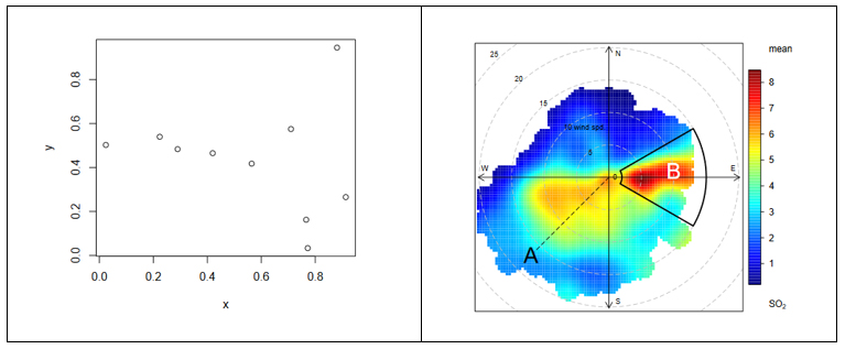
Figure 1. The figure shows the difference between two graphical visualizations of data. On the left, an example of the simplest data visualization that can be performed. Point representation in Cartesian coordinates x | y. On the right, an example of a complex data visualization in which the distribution of a pollutant (SO2) is represented in polar coordinates. The axes represent the wind directions N | S E | W (in degrees) while the radius of the distribution represents the wind speed according to the direction in m / s. The colour scale represents the average concentration of SO2 (in ppb) for those directions and wind speeds. With this type of visualization we can represent graphically three variables (wind direction, wind speed and concentration of pollutants) in a "flat" graph with two dimensions (2D). 2D visualization is very convenient because it is easier to interpret for the human brain.
Why is graphic visualization of data so important?
In data science there are many different types of data to analyze. One way of classifying data is according to their level of logical structure. For example, it is understood that data in spreadsheet-like formats - those data that are structured in the form of rows and columns - are data with a well-defined structure - or structured data. However, those data such as the 140 characters of a twitter feed are considered data without structure - or unstructured data. In the middle of these two extremes is a whole range of greys, from files delimited by special characters (commas, periods and commas, spaces, etc.) to images or videos on YouTube. It is evident that images and videos only make sense for humans once they are visually represented. It would be useless (for a human) to represent an image as a matrix integrated by numbers that represent a combination of RGB colors (Red, Green, Blue).
In the case of structured data, its graphic representation is necessary for all stages of the analysis process, from the exploratory stage to the final presentation of results. Let's see an example:
In 1963, the American airline company Pam Am used the graphic representation (time series 1949-1960) applied to the monthly number of international passengers in order to forecast the future demand for aircraft and place a purchase order. In the example, we see the difference between the matrix representation of the data and its graphic representation. The advantage of graphically representing the data is obvious with the example of Figure 2.
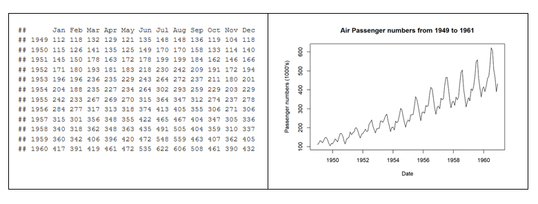
Figure 2. Difference between the tabular representation of the data and the graphic representation or visualization.
The graphic visualization of the data plays a fundamental role in all stages of data analysis. There are multiple approaches on how to perform a data analysis process correctly and completely. According to Garrett Grolemund and Hadley Wickham in their recent book R for Data Science, a standard process in data analysis would be as follows (figure 3):
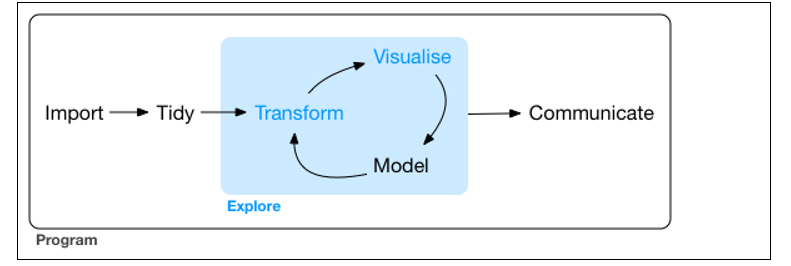
Figure 3. Representation of a standard process using advanced data analytics.
Data visualization is at the core of the process. It is a basic tool for data analyst or data scientist who, through an iterative process, is transforming and composing a logical model with data. Based on the visualization, the analyst discovers the secrets buried in the data. The visualization allows quickly:
- Discard unrepresentative or erroneous data.
- Identify those variables that depend on each other and, therefore, contain redundant information
- Cut the data to be able to observe them from different perspectives.
- Finally, check that those models, trends, predictions and groups that we have applied to the data give us back the expected result.
Tools for visual data analysis
So important is the graphic visualization of data in all areas of science, engineering, business, banking, environment, etc. that there are many tools to design, develop and communicate the graphic visualization of the data.
These tools cover a broad spectrum of the target audience, from software developers, to data scientists, journalists or communication professionals.
- For software developers, there are hundreds of libraries and software packages containing thousands of types of visualizations. The developers just have to load these libraries in their respective programming frameworks and parameterize the type of graphic they wish to generate. The developer only has to indicate the data source that he wants to represent, the type of graph (lines, bars, etc.) and the parameterization of that graph (scales, colors, labels, etc.). In the last few years, web visualization has been in fashion, and the most popular libraries are based on JavaScript frameworks (most open source). Perhaps one of the most popular, according to its power, is D3.JS, although there are many more.
- The data scientist is accustomed to working with a concrete analysis framework that normally includes all the components, such as the visual analysis engine of the data, among others. Currently, the most popular environments for data science are R and Python, and both include native libraries for visual analytics. Perhaps the most popular and powerful library in R is ggplot2, while, matplotlib and Plotly are among the most popular in Python.
- For professional communicators or non-technical personnel from the different business areas (Marketing, Human Resources, Production, etc.) that need to make decisions based on data, there are tools - which are not only visual analytics tools - with functionalities to generate graphic representations of the data. Modern self-service Business Intelligence tools such as MS Excel, MS Power BI, Qlik, Tableau, etc. are great tools to communicate data without the need of programming or coding skills.
In conclusion, the visualization tools allow all these professionals to access to data in a more agile and simple way. In a universe where the amount of useful data to be analysed is continuously growing, this type of tools are becoming more and more necessary. This tools facilitate the creation of value from the data and, with this, improve decisions making regarding the present and the future of our business or activity.
If you want to know more about data visualization tools, we recommend the report Data visualization: definition, technologies and tools, as well as the training material Use of basic data processing tools.
Content prepared by Alejandro Alija, expert in Digital Transformation and innovation.
Contents and points of view expressed in this publication are the exclusive responsibility of its author.
Evento
On October 23, the day before the Aporta Meeting 2017, the report “The reuse of data for business generation” will be presented, which analyses published data and the portals where it is published, together with those responsible for its management and services generated from it.
During the session, which will take place - from 4.30pm to 6.00pm - at the headquarters of the Foundation for Innovation COTEC, the data in the report will be presented and a debate will be opened on the key aspects related to the publication of data to generate new services, as well as on the opportunity for a European association of data publishers.
The organisation of this day, will be published on social media with the hashtag #DatosAbiertosCotec, the Barcelona Open Data Initiative and the King Juan Carlos University will participate and it will be led by the open data expert Alberto Abella.
The conclusions of the event will be presented on October 24 during the afternoon of the Aporta Meeting 2017.