Blog
Talking about GPT-3 these days is not the most original topic in the world, we know it. The entire technology community is publishing examples, holding events and predicting the end of the world of language and content generation as we know it today. In this post, we ask ChatGPT to help us in programming an example of data visualisation with R from an open dataset available at datos.gob.es.
Introduction
Our previous post talked about Dall-e and GPT-3's ability to generate synthetic images from a description of what we want to generate in natural language. In this new post, we have done a completely practical exercise in which we ask artificial intelligence to help us make a simple program in R that loads an open dataset and generates some graphical representations.
We have chosen an open dataset from the platform datos.gob.es. Specifically, a simple dataset of usage data from madrid.es portals. The description of the repository explains that it includes information related to users, sessions and number of page views of the following portals of the Madrid City Council: Municipal Web Portal, Sede Electrónica, Transparency Portal, Open Data Portal, Libraries and Decide Madrid.
The file can be downloaded in .csv or .xslx format and if we preview it, it looks as follows:

OK, let's start co-programming with ChatGPT!
First we access the website and log in with our username and password. You need to be registered on the openai.com website to be able to access GPT-3 capabilities, including ChatGPT.
We start our conversation:
During this exercise we have tried to have a conversation in the same way as we would have with a programming partner. So the first step we do is to say ‘hello’ and mention the problem we have. When we ask the AI to help us create a small program in R that graphically represents some data, it gives us some examples and helps us with the explanation of the program:

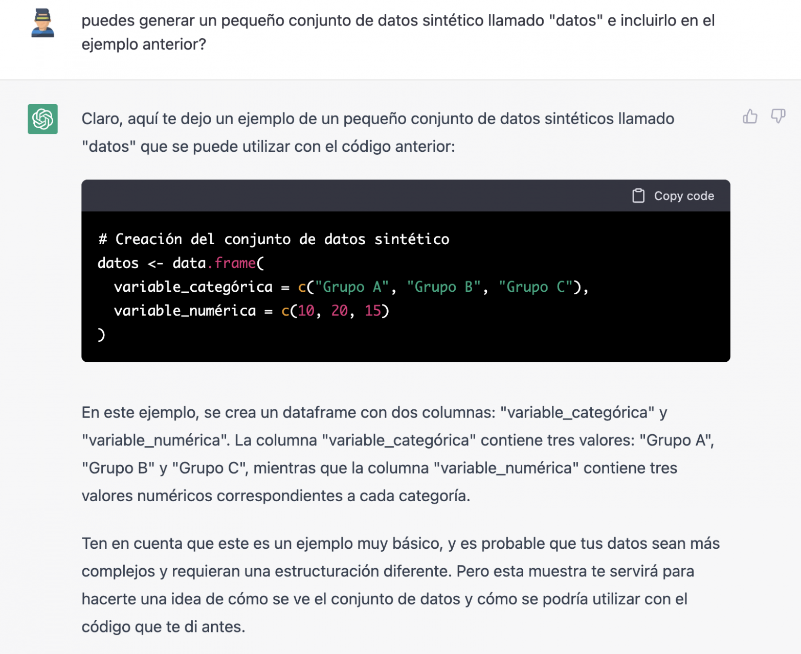
Since we have no data, we cannot do anything practical at the moment, so we ask it to help us generate some synthetic data.
As we say, we behave with the AI as we would with a person (it looks good).

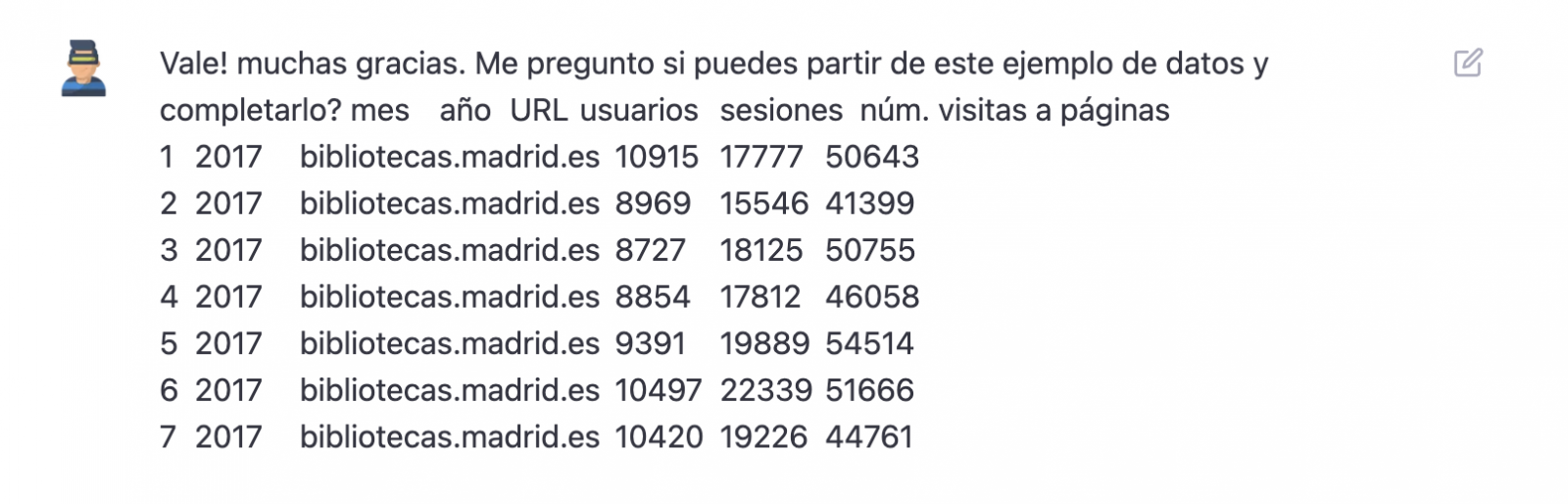
Once the AI seems to easily answer our questions, we go to the next step, we are going to give it the data. And here the magic begins... We have opened the data file that we have downloaded from datos.gob.es and we have copied and pasted a sample.
| Note: ChatGPT has no internet connection and therefore cannot access external data, so all we can do is give it an example of the actual data we want to work with. |

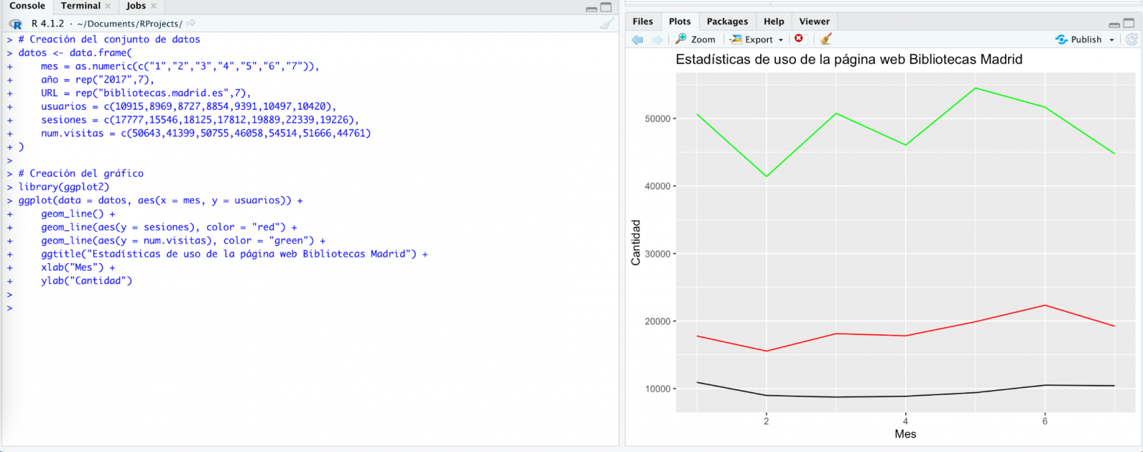
With the data copied and pasted as we have given it to it, the AI writes the code in R to load it manually into a dataframe called \"data\". It then gives us the code for ggplot2 (the most popular graphics library in R) to plot the data along with an explanation of how the code works.

Great! This is a spectacular result with a totally natural language and not at all adapted to talk to a machine. Let's see what happens next:
But it turns out that when we copy and paste the code into an RStudio environment it is no running.

So, we tell to it what's going on and ask it to help us to solve it.

We tried again and, in this case, it works!
However, the result is a bit clumsy. So, we tell it.

From here (and after several attempts to copy and paste more and more rows of data) the AI changes the approach slightly and provides me with instructions and code to load my own data file from my computer instead of manually entering the data into the code.

We take its opinion into account and copy a couple of years of data into a text file on our computer. Watch what happens next:
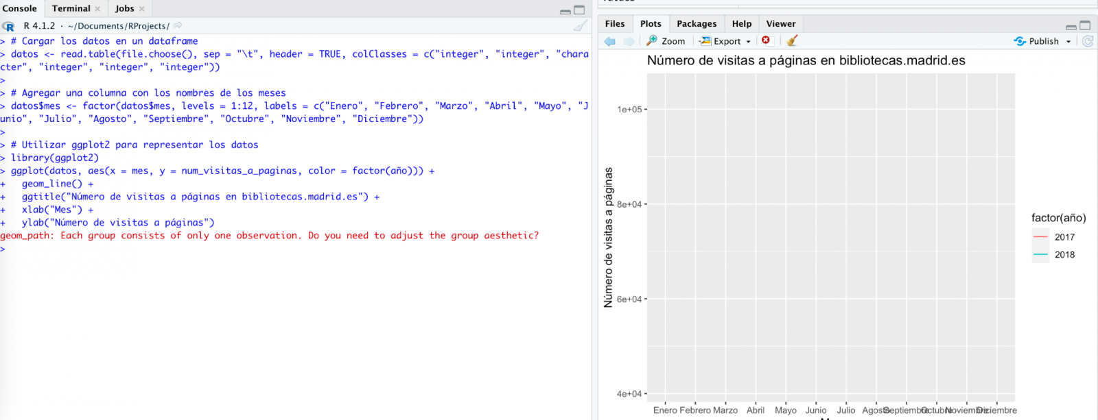

We try again:
As you can see, it works, but the result is not quite right.
And let's see what happens.

Finally, it looks like it has understood us! That is, we have a bar chart with the visits to the website per month, for the years 2017 (blue) and 2018 (red). However, I am not convinced by the format of the axis title and the numbering of the axis itself.

Let's look at the result now.

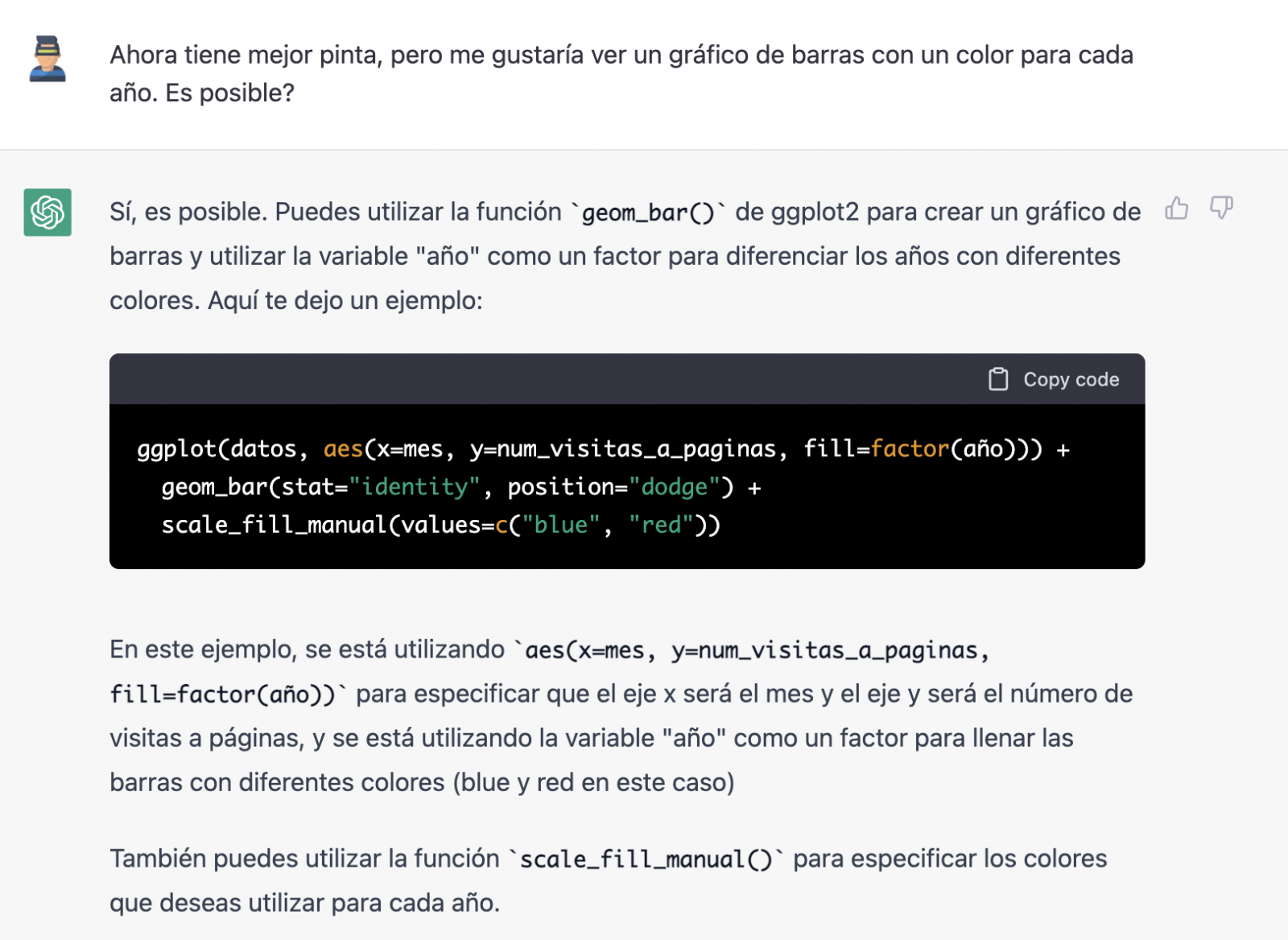
It looks much better, doesn't it? But what if we give it one more twist?
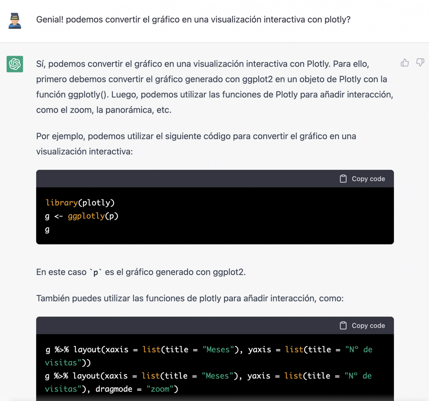
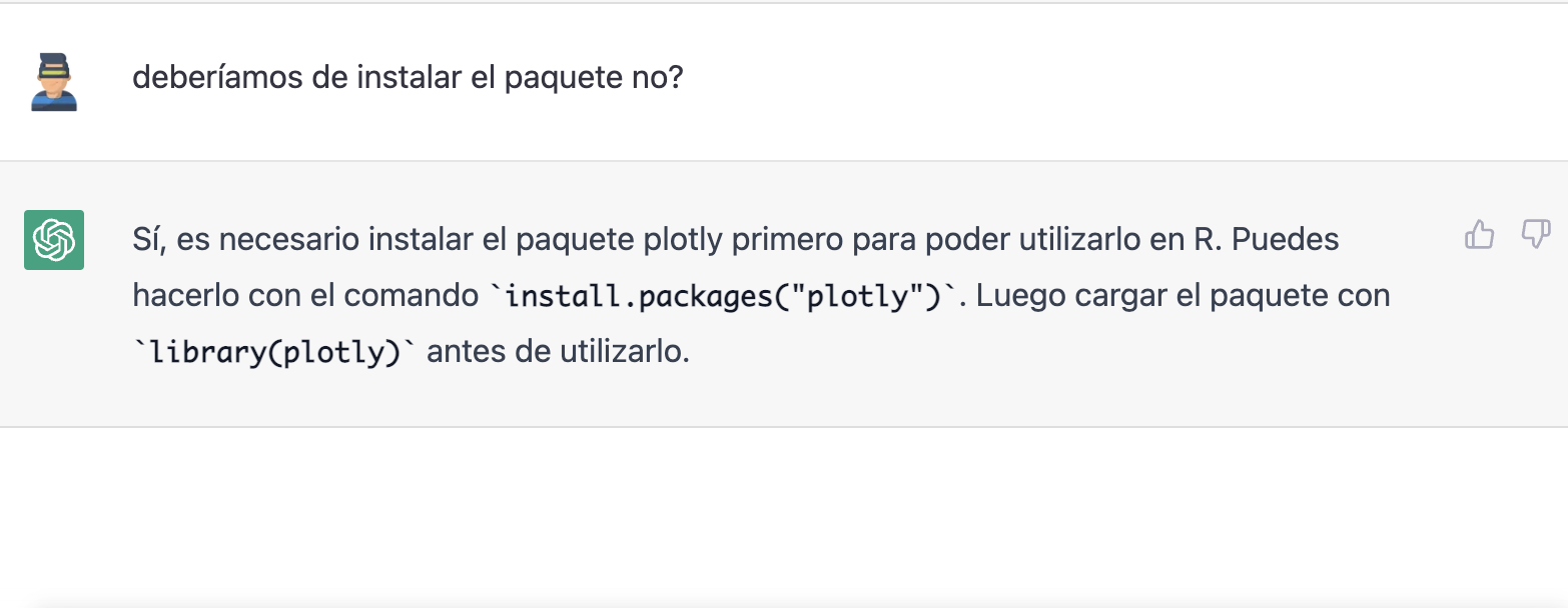
However, it forgot to tell us that we must install the plotly package or library in R. So, we remind it.
Let's have a look at the result:

As you can see, we have now the interactive chart controls, so that we can select a particular year from the legend, zoom in and out, and so on.
Conclusion
You may be one of those sceptics, conservatives or cautious people who think that the capabilities demonstrated by GPT-3 so far (ChatGPT, Dall-E2, etc) are still very infantile and impractical in real life. All considerations in this respect are legitimate and, many of them, probably well-founded.
However, some of us have spent a good part of our lives writing programs, looking for documentation and code examples that we could adapt or take inspiration from; debugging bugs, etc. For all of us (programmers, analysts, scientists, etc.) to be able to experience this level of interlocution with an artificial intelligence in beta mode, made freely available to the public and being able to demonstrate this capacity for assistance in co-programming, is undoubtedly a qualitative and quantitative leap in the discipline of programming.
We don't know what is going to happen, but we are probably on the verge of a major paradigm shift in computer science, to the point that perhaps the way we program has changed forever and we haven't even realised it yet.
Content prepared by Alejandro Alija, Digital Transformation expert.
The contents and points of view reflected in this publication are the sole responsibility of the author.
Noticia
The Plenary Session of the Council of the Valencian Community has approved a collaboration agreement between the Ministry of Participation, Transparency, Cooperation and Democratic Quality and the Polytechnic University of Valencia (UPV) with the aim of promoting the development of activities in the field of transparency and open data during 2023.
Thus, the Transparency Ministry will allocate 65,000 euros to promote the activities of the agreement focused on the opening and reuse of data present at different levels of public administrations.
Among the planned actions, the third edition of the Open Data Datathon stands out, an event that seeks to encourage the use of open data to develop applications and services that provide benefits to citizens. This collaboration will also promote the reuse of data related to the business sector, promoting innovation, dissemination, and awareness in various fields.
In parallel, it is planned to work jointly with different entities from civil society to establish a series of intelligent sensors for collecting data, while also promoting workshops and seminars on data journalism.
In turn, a series of informative sessions are included aimed at disseminating knowledge on the use and sharing of open data, the presentation of the Datos y Mujeres project, or the dissemination of open data repositories for research or transparency in algorithms.
Likewise, the collaboration includes the programming of talks and workshops to promote the use of open data in high schools, the integration of open data in different subjects of the PhD, bachelor's, and master's degrees on Public Management and Administration, the Master's degree in Cultural Management, and some transversal doctoral subjects.
Finally, this collaboration between the university and the administration also seeks to promote and mentor a large part of the work on transparency and open data, including the development of a guide to the reuse of open data aimed at reuse organizations, as well as activities to disseminate the Open Government Alliance (OGP) and action plans of the Valencian Community.
Previous projects related to open data
Apart from the plan of activities designed for this 2023 and detailed in the previous lines, this is not the first time that the Polytechnic University of Valencia and the Department of Participation and Transparency have worked together in the dissemination and promotion of open data. In fact, to be exact, they have been actively working through the Open Data and Transparency Observatory, belonging to the same university, to promote the value and sharing of data both in the academic and social spheres.
For instance, in line with this dissemination work, last year 2022, they promoted the 'Women and Data' initiative from the same entity, a project that brought together several women from the data field to talk about their professional experience, the challenges and opportunities addressed in the sector.
Among the interviewees, prominent names included Sonia Castro, coordinator of datos.gob.es, Ana Tudela, co-founder of Datadista, or Laura Castro, data visualization designer at Affective Advisory, among many other professionals.
Likewise, last spring and coinciding with the International Open Data Day, the second edition of Datathon took place, whose purpose was to promote the development of new tools from open data linked to responsible consumption, the environment or culture.
Thus, this particular alliance between the Department of Participation and Transparency and the Polytechnic University of Valencia demonstrates that not only is it possible to showcase the potential of open data, but also that dissemination opportunities are multiplied when institutions and the academic sphere work together in a coordinated and planned manner towards the same objectives.
Blog
The promotion of the so-called data economy is one of the main priorities on which the European Union, in general, and Spain, in particular, are currently working. Having a single digital market for data exchange is one of the keys to achieving this momentum among the Member States, and data spaces come into play for this purpose.
Data Spaces Business Alliance (DSBA)
A data space is an ecosystem capable of realising the voluntary sharing of data among its participants, while respecting their sovereignty over it, i.e. being able to set the conditions for its access and use. The DSBA, founded in 2021, is composed of the main actors in the definition of standards, models and technological frameworks for the construction and operation of data spaces. Specifically, the alliance is composed of the Big Data Value Association (BDVA), the FIWARE Foundation and the Gaia-X European Association for Data and Cloud AISBL and the International Data Spaces Association (IDSA). The purpose of the alliance is to agree on a common technological framework that avoids technological fragmentation of the activity, as well as harmonisation in messaging and dissemination activities.
Technical Convergence Discussion Document
On the technological side, the DSBA published in September 2022 a first approximation of the desired technological convergence.
The document technically analyses the anchor points for creating trusted data spaces, federated catalogues and shared markets, and the ability to define data use policies (based on the use of a common language). This ability to share while respecting the sovereignty of the data owner is what makes these spaces novel and truly disruptive, offering for the first time technical elements with which to control the risks associated with information sharing.
The document explains, step by step and from a purely technical perspective, the actions to be addressed by each of the identified roles, with the purpose of guiding potential scenarios that could occur in reality.
To achieve technical convergence, the partnership agreed on the development of a minimum viable framework (MVF) based on three pillars:
- Interoperability in data exchange through the use of the standard NGSI-LD data exchange protocol/API and the extended Smart Data Models for the adoption of the information model defined by the IDS architecture.
- Sovereignty and trust in data exchange through the adoption of a decentralised model (Self-Sovereign Identity) as proposed by Gaia-X (with its Trust Framework) that would use the DLT (Distributed Ledger Technologies) promoted by the European Commission (EBSI). The result will be a trust environment compatible with the EU's eIDAS 2.0 regulation.
- Value creation (brokering) services consisting of a decentralised data catalogue and trading services based on TM Forum standards.
The alliance believes that this MVF would be a good starting point from which to work towards the desired technological convergence, counting and reusing parts of the current solutions provided by the different suppliers.
Example of a public data marketplace
The paper gives the example of a data service provider offering its service in a public data marketplace, so that consumers can easily access this offer. In addition, providers can also delegate access to their users to modify attributes of the service they contract.
This is an example that can be seen in detail in the document, which is interesting because different authentication systems, security and access policies and, in short, different systems that must interoperate with each other come into play.

Additionally, an example of integration between the Data Marketplace and a data catalogue is presented using the approach followed by the European Horizon 2020 project 'Digital Open Marketplace Ecosystem' (DOME). In this way, offers are created in the shared catalogue and can be subsequently consulted following the defined access policies.
The future of the DSBA
The DSBA considers that the aforementioned MVF is only the first step towards the convergence of the different existing architectures and technologies in the construction of data spaces. The next steps of the alliance will take into account the roles assigned to each of the participants. More specifically:
-
IDSA: Develops data space architectures and standards. In particular, a model for connectors to ensure sovereign data sharing in a scalable way.
-
Gaia-X: Develops and deploys an architecture, a governance model according to business specifications for sectoral data spaces, as well as a toolkit (Gaia-X Federation Services toolkit) to instantiate interoperability, composability and transparency of infrastructure and cloud data services.
- FIWARE: With a technology stack that comes from the world of Digital Twins, the community develops software components that allow to implement the construction of data spaces.
The DSBA has also set itself the following priority objectives:
- The compatibility of the IDS architecture with an identity management mechanism based on decentralised identifiers.
- The integration of a federated catalogue such as the one proposed with the metadata broker proposed in the IDS architecture.
- The definition of a common vocabulary.
- Advancing jointly with the work of the Data Space Support Center (a programme funded by the European Commission, where these associations play a leading role), as well as with the standardisation efforts based on the EC's Smart Middleware Platform (SIMPL) project.
Content prepared by Juan Mañes, expert in Data Governance.
The contents and views expressed in this publication are the sole responsibility of the author.
Blog
Although it may seem like a novel concept, the term 'artificial intelligence' was already coined in the mid-twentieth century. However, its popularity has experienced a vertiginous increase in recent years thanks to the increase in data volumes or the application of advanced algorithms in everyday situations, among other aspects.
Artificial intelligence allows machines to learn from experience to perform various tasks in a human-like manner. To do so, its training techniques often rely on deep learning and natural language processing (NLP), among others. By employing these technologies in the service of AI, machines can be trained to carry out very specific tasks such as processing large amounts of data or pattern recognition in them.
What is artificial intelligence?
The European Commission defines artificial intelligence as the ability of a machine to imitate some of the characteristics of human intelligence such as learning, reasoning or creativity. To do so, computers analyze available information in order to achieve specific objectives.
Artificial intelligence is also composed of subfields based on technologies such as Machine Learning or Deep Learning. Both activities aim to build systems that have the ability to solve problems without the need for human intervention.
What is the role of open data in artificial intelligence?
To ensure the proper development of artificial intelligence, open data is extremely important. This is because its algorithms must be trained with high-quality data that is readily available, as reflected in various state and European-level strategies and guidelines such as the National Artificial Intelligence Strategy, the European Regulation on Artificial Intelligence, and the White Paper on Artificial Intelligence.
Examples of use cases of artificial intelligence
The application of artificial intelligence allows many fields to achieve improvements in various processes, services, or applications. Some examples are:
- Health: AI allows for the identification of different pathologies through the processing of medical images, for example, through QMenta, which processes and visualizes images to perform analysis of brain data.
- Environment: AI allows for more efficient forest management. An example is Forecast, which offers tools for decision-making by forest managers.
- Economy: AI is used to optimize the management of tenders, as with the Arbatro Tender tool, designed to find and choose the most suitable public tenders for each company.
- Tourism: AI allows for the development of virtual tourism assistants like Castilla y León Gurú, which features advanced NLP functions, detection of points of interest in images, and use of geolocated context.
- Culture: thanks to AI, it is possible to generate original texts and summaries of existing ones through natural language processing. MarIA has been the first Spanish-language artificial intelligence to achieve this.
- Advertising and content writing: AI systems such as Chat GPT allow for the development of texts based on specific requests.
As we can see, there are a multitude of use cases that combine artificial intelligence and open data to contribute to the progress and well-being of society. We recommend that you check out this informative infographic where we provide more details, as well as some interesting articles like this one on Dall-E so that you can expand your knowledge.
Moreover, if you want to learn more about related use cases, discover the report "Emerging Technologies and Open Data: Artificial Intelligence," which includes a practical step-by-step case study on image recognition and classification.
Click on the infographic to see it in full size and access the links:

You can view the infographic in full size by clicking here.
Blog
The demand for professionals with skills related to data analytics continues to grow and it is already estimated that just the industry in Spain would need more than 90,000 data and artificial intelligence professionals to boost the economy. Training professionals who can fill this gap is a major challenge. Even large technology companies such as Google, Amazon or Microsoft are proposing specialised training programmes in parallel to those proposed by the formal education system. And in this context, open data plays a very relevant role in the practical training of these professionals, as open data is often the only possibility to carry out real exercises and not just simulated ones.
Moreover, although there is not yet a solid body of research on the subject, some studies already suggest positive effects derived from the use of open data as a tool in the teaching-learning process of any subject, not only those related to data analytics. Some European countries have already recognised this potential and have developed pilot projects to determine how best to introduce open data into the school curriculum.
In this sense, open data can be used as a tool for education and training in several ways. For example, open data can be used to develop new teaching and learning materials, to create real-world data-based projects for students or to support research on effective pedagogical approaches. In addition, open data can be used to create opportunities for collaboration between educators, students and researchers to share best practices and collaborate on solutions to common challenges.
Projects based on real-world data
A key contribution of open data is its authenticity, as it is a representation of the enormous complexity and even flaws of the real world as opposed to artificial constructs or textbook examples that are based on much simpler assumptions.
An interesting example in this regard is documented by Simon Fraser University in Canada in their Masters in Publishing where most of their students come from non-STEM university programmes and therefore had limited data handling skills. The project is available as an open educational resource on the OER Commons platform and aims to help students understand that metrics and measurement are important strategic tools for understanding the world around us.
By working with real-world data, students can develop story-building and research skills, and can apply analytical and collaborative skills in using data to solve real-world problems. The case study conducted with the first edition of this open data-based OER is documented in the book "Open Data as Open Educational Resources - Case studies of emerging practice". It shows that the opportunity to work with data pertaining to their field of study was essential to keep students engaged in the project. However, it was dealing with the messiness of 'real world' data that allowed them to gain valuable learning and new practical skills.
Development of new learning materials
Open datasets have a great potential to be used in the development of open educational resources (OER), which are free digital teaching, learning and research materials, as they are published under an open licence (Creative Commons) that allows their use, adaptation and redistribution for non-commercial uses according to UNESCO's definition.
In this context, although open data are not always OER, we can say that they become OER when are used in pedagogical contexts. Open data used as an educational resource facilitates students to learn and experiment by working with the same datasets used by researchers, governments and civil society. It is a key component for students to develop analytical, statistical, scientific and critical thinking skills.
It is difficult to estimate the current presence of open data as part of OER but it is not difficult to find interesting examples within the main open educational resource platforms. On the Procomún platform we can find interesting examples such as Learning Geography through the evolution of agrarian landscapes in Spain, which builds a Webmap for learning about agrarian landscapes in Spain on the ArcGIS Online platform of the Complutense University of Madrid. The educational resource uses specific examples from different autonomous communities using photographs or geolocated still images and its own data integrated with open data. In this way, students work on the concepts not through a mere text description but with interactive resources that also favour the improvement of their digital and spatial competences.
On the OER Commons platform, for example, we find the resource "From open data to civic engagement", which is aimed at audiences from secondary school upwards, with the objective of teaching them to interpret how public money is spent in a given regional, local area or neighbourhood. It is based on the well-known projects to analyse public budgets "Where do my taxes go?", available in many parts of the world as a result of the transparency policies of public authorities. This resource could be easily ported to Spain, as there are numerous "Where do my taxes go?" projects, such as the one maintained by Fundación Civio.
Data-related skills
When we refer to training and education in data-related skills, we are actually referring to a very broad area that is also very difficult to master in all its facets. In fact, it is common for data-related projects to be tackled in teams where each member has a specialised role in one of these areas. For example, it is common to distinguish at least data cleaning and preparation, data modelling and data visualisation as the main activities performed in a data science and artificial intelligence project.
In all cases, the use of open data is widely adopted as a central resource in the projects proposed for the acquisition of any of these skills. The well-known data science community Kaggle organises competitions based on open datasets contributed to the community and which are an essential resource for real project-based learning for those who want to acquire data-related skills. There are other subscription-based proposals such as Dataquest or ProjectPro but in all cases they use real datasets from multiple general open data repositories or knowledge area specific repositories.
Open data, as in other areas, has not yet developed its full potential as a tool for education and training. However, as can be seen in the programme of the latest edition of the OER Conference 2022, there are an increasing number of examples of open data playing a central role in teaching, new educational practices and the creation of new educational resources for all kinds of subjects, concepts and skills
Content written by Jose Luis Marín, Senior Consultant in Data, Strategy, Innovation & Digitalization.
The contents and views reflected in this publication are the sole responsibility of the author.
Evento
UniversiDATA organizes its first Datathon.
Are you interested in data analysis? If the answer is yes, you will be interested to know that UniversiDATA has launched a datathon to recognize open data processing projects based on the datasets available on its portal.
This initiative seeks not only to reward talent, but also to promote the content offered and encourage its use, inspiring new projects through the dissemination of reference cases. It is also an opportunity to get to know their reusers and better understand their objectives, challenges and needs. This valuable information will be used to drive improvements to the platform.
Who can participate?
The call is open to any natural person of legal age with tax residence in the European Union. Students, developers, researchers or any citizen interested in data analysis can participate.
How does the competition take place?
The competition is structured in two phases:
Elimination phase
A jury of experts will evaluate all the applications received on the basis of the project descriptions provided by the participants in the registration form. Four criteria detailed in the competition rules will be taken into account: impact, quality of the proposal, usability/presentation and reusability.
After the evaluation, a maximum of 10 finalists will pass to the next phase.
Final phase
The finalists will have to present their projects via videoconference to the members of the jury.
After the presentation, the three winners will be announced.
What are the requirements for the projects submitted?
The submitted projects must fulfill three obligations:
- At least one dataset published on the open data portal UniversiDATA must be used. These datasets may be combined with secondary data from other sources.
- The use made of the UniversiDATA datasets must be essential to obtain the results of the analysis.
- The analysis of the data must have a clear purpose or utility. Generic data treatments will not be accepted.
It should be noted that existing work, previously presented in other contexts, may be submitted. Furthermore, there are no limitations regarding the technology to be used for the analysis -each user may use the tools he/she considers appropriate- or regarding the format of the final result of the analysis. That is to say, you can compete with a mobile App, a web application, a data analysis in Jupyter or R-Markdown, etc...
What are the prizes?
The three winners will receive a total of €3,500, distributed as follows:
- First prize: €2,000
- Second prize: 1,000 €.
- Third prize: 500 €.
The other finalists will receive a diploma of recognition.
How can I participate?
The registration period is now open. The easiest way to participate is to fill out the form available at the end of the competition website before October 14, 2022.
Before registering, we recommend that you review all the complete information in the competition rules. If you have any questions, you can contact the organizers. Various channels will soon be available for participants to ask questions regarding not only the competition procedures, but also the platform's datasets.
Competition schedule
- Receipt of applications: until October 14, 2022
- Publication of the 10 finalists: November 14, 2022
- Communication of the three winners: December 16, 2022
Find out more about UniversiDATA
UniversiDATA was born at the end of 2020 with the aim of promoting open data in the higher education sector in Spain in a harmonized way. It is a public-private initiative that currently encompasses Universidad Rey Juan Carlos, Universidad Complutense de Madrid, Universidad Autónoma de Madrid, Universidad Carlos III de Madrid, Universidad de Valladolid, Universidad de Huelva and "Dimetrical, The Analytics Lab", S.L.
In 2021 UniversiDATA won the First Prize of the III Desafío Aporta for its project UniversiDATA-Lab, a public portal for the advanced and automatic analysis of datasets published by universities. You can learn more about the project in this interview.
Empresa reutilizadora
Estudio Alfa is a technology company dedicated to offering services that promote the image of companies and brands on the Internet, including the development of apps. To carry out these services, they use techniques and strategies that comply with usability standards and favour positioning in search engines, thus helping their clients' websites to receive more visitors and thus potential clients. They also have special experience in the production and tourism sectors.
Blog
Spanish universities have numerous quality data that have great economic and social potential. For this reason, for some time now we have been witnessing a data opening movement by universities in our country, with the aim of promoting the use and reuse of the information they generate, as well as improving its transparency, among others.
As a result of this openness movement, open data portals linked to universities have emerged, many of which are federated with datos.gob.es, such as the University of Cantabria, the University of Extremadura or Pablo de Olavide University, although there are many more. There have even been collaborative initiatives such as UniversityDATA, which seeks to promote open data in the higher education sector in a harmonized way. UniversiData currently brings together 6 universities, but its intention is to continue growing and act as a single access point where the different universities can share their data in a simple way. Also noteworthy is the role of the Ministry of Universities, which currently offers thus 1,000 datasets through datos.gob.es.
Between the datasets shared by universities we find administrative data, on the profile of the students or the different academic itineraries, although they also have a relevant role in the publication of the data of their research groups.
But the role of universities in the open data ecosystem goes far beyond mere publishers, but also has a prominent role in promoting the opening of more data and its reuse.
Examples of open data groups linked to universities
The field of data in general, and that of open data in particular, has more and more weight and importance within the university environment, in academic matters but also in the area of dissemination. As a consequence, today we find various examples of groups, chairs or professionals linked to higher education focused on promoting the use and reuse of academic data.
Next, we analyze some groups of open data linked to the field of higher education in our country:
Chair of Transparency and Open Data – Valencian Observatory of Open Data and Transparency
What is it and what is its purpose?
This organization has been created by the Valencian Generalitat and the Polytechnic University of Valencia, through its Higher School of Computer Engineering and the University Master's Degree in Information Management, to carry out activities related to transparency, participation and citizen access to public information in the Valencian Community.
What functions does it carry out?
The chair organizes and develops a series of activities related to the field of transparency and open data that can be classified into three different categories:
- Training activities: The chair collaborates in teaching activities, such as the Official University Master's Degree in Information Management; in the implementation of permanent training programs aimed at officials, local entities and associations; or the creation of scholarships and prizes for the best degree projects in the field of transparency for UPV students.
- Technical, technological and artistic dissemination activities: Through workshops, conferences and conferences, it seeks to promote both the publication and reuse of open data. They also develop work spaces together with the administration's technical staff, computer programmers and public managers.
- Research and development activities: From the chair they work on different lines of research, especially in the field of open data from the web GVAObert of the Generalitat. They also promote innovative technological solutions in terms of transparency, participation and access to public information.
Next steps
In addition to the Datathon, they also plan to hold an international conference with the collaboration of Open Knowledge Foundation, a series of news verification workshops through open data together with Newtral, various dissemination and training sessions with several business federations, or a workshop on open data from a gender perspective. Among his plans is also to create a directory of reusers of the Valencian Community.
Although work is being done on them, these events still do not have an official agenda and calendar.
Cajasiete Chair of Big Data, Open Data and Blockchain, University of La Laguna
What is it and what is its purpose?
The University of La Laguna and Cajasiete create last year the Big Data, Open Data and Blockchain Chair with the purpose of contributing to digital transformation and the development of a competitive economy in the Canary Islands, through research, training and dissemination in fields such as Big Data, Open Data or Blockchain. This Chair has in its Advisory Council a group of representatives of public and private entities of the archipelago, which are key players when it comes to promoting digital transformation and the development of public-private business models in the Canary Islands.
What functions does it carry out?
One of their most outstanding projects has been "Mapa BOB", where they analyzed in detail the situation of the Canarian entities in terms of digitization to take concrete actions that help fulfill their mission. After this analysis, from the chair they have focused on various initiatives with the aim of raising the level of digitization in the archipelago, many of which have been focused on open data:
- BOB Webinars: They have developed online seminars on specific topics to learn about and disseminate good practices in the field of technology and data.
- Meetings of Public Administrations: They have also set up spaces so that different AA.PP. Canary Islands can share experiences on specific issues related to data. In the last face-to-face edition there was a discussion table dedicated to the analysis of open data.
- Projects: Among the projects they have carried out, it stands out “Practical application of open data: update and prediction”. This is a Final Degree Project whose objective was based on defining a quality indicator to, based on open data related to COVID-19, make predictions of the evolution of the accumulated incidence.
- Training courses: Within the field of open data, it has organized different training courses, such as:
- Course on the CKAN platform for the Cabildo de Lanzarote.
- Masterclass on Open Data and Big Data for business students at the University of La Laguna.
- Open Data courses for Public Administrations within the initiative "Elements to modernize the Administration and improve the provision of public services in the current context" of the University of La Laguna.
- Python course, whose final project consisted of analyzing open tourism data on the island of Tenerife.
Next steps
Currently, the BOB Chair is collaborating in the initiative "DIGINNOVA”, a training program to train unemployed people in digitization matters specific to the needs of the islands. With regard to 2022, various dissemination, training and research activities have been planned with which they hope to continue growing and adding value, although at the moment none of them have been officially presented yet.
Hablando en data
What is it and what is its purpose?
It is a dissemination channel aimed at sharing information and knowledge of interest with the community of data scientists. In this space we can find interviews, review concepts, news or events on Data Science and Artificial Intelligence. In this case we are not talking about a project linked to a university, but to its professionals. This channel has been created by Abilio Romero Ramos and Ivan Robles Acute, two data scientists with extensive experience in the sector who dedicate part of their professional time to teaching subjects related to the field of data in different master's degrees at higher education centers such as the European University and CEU San Pablo University.
What functions does it carry out?
Their YouTube channel has become the central axis of its dissemination project. Through it they try to approach and explain in an entertaining and simple way various concepts necessary to take advantage of the value that is hidden in the data, especially in those that are available to the public.
On the other hand, in his web page they centralize and collect a multitude of content related to data science. In it we can identify some of the functions that this initiative carries out, such as:
- Divulgation: They have a section dedicated to the dissemination of blogs, websites and channels that have information of interest on this subject.
- Training: On its website we can find a section dedicated to disseminating training materials of interest on data science, either through free books, documentaries or online courses.
- Data science for school: an initiative that tries to bring data to the entire population, especially students. Here they share useful and fun resources to help young people get into the world of data science.
The collaboration that this initiative carries out with SoGoodData, an NGO that helps and supports social projects thanks to the combination of public information and that shared by collaborating companies.
Next steps
The closest future plans for this initiative are to continue disseminating knowledge about data science among its community and to continue taking advantage of the possibilities that this field offers. They will continue to spread the use and reuse of public data, not only from their YouTube channel but also from the masters in which they teach and through initiatives such as SoGoodData.
As we have seen, university entities and their professionals have acquired a relevant role in the open data sector in our country, as publishers, disseminators and reusers, although that is for another article.
Do you know of any other initiative for the dissemination of open data in the university field? Leave us a comment or write us an email at dinamizacion@datos.gob.es and tell us. We will be happy to read you.
Documentación
1. Introduction
Visualizations are graphical representations of data that allow to transmit in a simple and effective way the information linked to them. The visualization potential is very wide, from basic representations, such as a graph of lines, bars or sectors, to visualizations configured on control panels or interactive dashboards. Visualizations play a fundamental role in drawing conclusions from visual information, also allowing to detect patterns, trends, anomalous data, or project predictions, among many other functions.
Before proceeding to build an effective visualization, we need to perform a previous treatment of the data, paying special attention to obtaining them and validating their content, ensuring that they are in the appropriate and consistent format for processing and do not contain errors. A preliminary treatment of the data is essential to perform any task related to the analysis of data and of performing an effective visualization.
In the \"Visualizations step-by-step\" section, we are periodically presenting practical exercises on open data visualization that are available in the datos.gob.es catalog or other similar catalogs. There we approach and describe in a simple way the necessary steps to obtain the data, perform the transformations and analyzes that are pertinent to, finally, we create interactive visualizations, from which we can extract information that is finally summarized in final conclusions.
In this practical exercise, we have carried out a simple code development that is conveniently documented by relying on tools for free use. All generated material is available for reuse in the GitHub Data Lab repository.
Access the data lab repository on Github.
Run the data pre-processing code on Google Colab.
2. Objetives
The main objective of this post is to learn how to make an interactive visualization based on open data. For this practical exercise we have chosen datasets that contain relevant information about the students of the Spanish university over the last few years. From these data we will observe the characteristics presented by the students of the Spanish university and which are the most demanded studies.
3. Resources
3.1. Datasets
For this practical case, data sets published by the Ministry of Universities have been selected, which collects time series of data with different disaggregations that facilitate the analysis of the characteristics presented by the students of the Spanish university. These data are available in the datos.gob.es catalogue and in the Ministry of Universities' own data catalogue. The specific datasets we will use are:
- Enrolled by type of university modality, area of nationality and field of science, and enrolled by type and modality of university, gender, age group and field of science for PHD students by autonomous community from the academic year 2015-2016 to 2020-2021.
- Enrolled by type of university modality, area of nationality and field of science, and enrolled by type and modality of the university, gender, age group and field of science for master's students by autonomous community from the academic year 2015-2016 to 2020-2021.
- Enrolled by type of university modality, area of nationality and field of science and enrolled by type and modality of the university, gender, age group and field of study for bachelor´s students by autonomous community from the academic year 2015-2016 to 2020-2021.
- Enrolments for each of the degrees taught by Spanish universities that is published in the Statistics section of the official website of the Ministry of Universities. The content of this dataset covers from the academic year 2015-2016 to 2020-2021, although for the latter course the data with provisional.
3.2. Tools
To carry out the pre-processing of the data, the R programming language has been used from the Google Colab cloud service, which allows the execution of Notebooks de Jupyter.
Google Colaboratory also called Google Colab, is a free cloud service from Google Research that allows you to program, execute and share code written in Python or R from your browser, so it does not require the installation of any tool or configuration.
For the creation of the interactive visualization the Datawrapper tool has been used.
Datawrapper is an online tool that allows you to make graphs, maps or tables that can be embedded online or exported as PNG, PDF or SVG. This tool is very simple to use and allows multiple customization options.
If you want to know more about tools that can help you in the treatment and visualization of data, you can use the report \"Data processing and visualization tools\".
4. Data pre-processing
As the first step of the process, it is necessary to perform an exploratory data analysis (EDA) in order to properly interpret the initial data, detect anomalies, missing data or errors that could affect the quality of subsequent processes and results, in addition to performing the tasks of transformation and preparation of the necessary variables. Pre-processing of data is essential to ensure that analyses or visualizations subsequently created from it are reliable and consistent. If you want to know more about this process you can use the Practical Guide to Introduction to Exploratory Data Analysis.
The steps followed in this pre-processing phase are as follows:
- Installation and loading the libraries
- Loading source data files
- Creating work tables
- Renaming some variables
- Grouping several variables into a single one with different factors
- Variables transformation
- Detection and processing of missing data (NAs)
- Creating new calculated variables
- Summary of transformed tables
- Preparing data for visual representation
- Storing files with pre-processed data tables
You'll be able to reproduce this analysis, as the source code is available in this GitHub repository. The way to provide the code is through a document made on a Jupyter Notebook that once loaded into the development environment can be executed or modified easily. Due to the informative nature of this post and in order to facilitate learning of non-specialized readers, the code does not intend to be the most efficient, but rather make it easy to understand, therefore it is likely to come up with many ways to optimize the proposed code to achieve a similar purpose. We encourage you to do so!
You can follow the steps and run the source code on this notebook in Google Colab.
5. Data visualizations
Once the data is pre-processed, we proceed with the visualization. To create this interactive visualization we use the Datawrapper tool in its free version. It is a very simple tool with special application in data journalism that we encourage you to use. Being an online tool, it is not necessary to have software installed to interact or generate any visualization, but it is necessary that the data table that we provide is properly structured.
To address the process of designing the set of visual representations of the data, the first step is to consider the queries we intent to resolve. We propose the following:
- How is the number of men and women being distributed among bachelor´s, master's and PHD students over the last few years?
If we focus on the last academic year 2020-2021:
- What are the most demanded fields of science in Spanish universities? What about degrees?
- Which universities have the highest number of enrolments and where are they located?
- In what age ranges are bachelor´s university students?
- What is the nationality of bachelor´s students from Spanish universities?
Let's find out by looking at the data!
5.1. Distribution of enrolments in Spanish universities from the 2015-2016 academic year to 2020-2021, disaggregated by gender and academic level
We created this visual representation taking into account the bachelor, master and PHD enrolments. Once we have uploaded the data table to Datawrapper (dataset \"Matriculaciones_NivelAcademico\"), we have selected the type of graph to be made, in this case a stacked bar diagram to be able to reflect by each course and gender, the people enrolled in each academic level. In this way we can also see the total number of students enrolled per course. Next, we have selected the type of variable to represent (Enrolments) and the disaggregation variables (Gender and Course). Once the graph is obtained, we can modify the appearance in a very simple way, modifying the colors, the description and the information that each axis shows, among other characteristics.
To answer the following questions, we will focus on bachelor´s students and the 2020-2021 academic year, however, the following visual representations can be replicated for master's and PHD students, and for the different courses.
5.2. Map of georeferenced Spanish universities, showing the number of students enrolled in each of them
To create the map, we have used a list of georeferenced Spanish universities published by the Open Data Portal of Esri Spain. Once the data of the different geographical areas have been downloaded in GeoJSON format, we transform them into Excel, in order to combine the datasets of the georeferenced universities and the dataset that presents the number of enrolled by each university that we have previously pre-processed. For this we have used the Excel VLOOKUP() function that will allow us to locate certain elements in a range of cells in a table
Before uploading the dataset to Datawrapper, we need to select the layer that shows the map of Spain divided into provinces provided by the tool itself. Specifically, we have selected the option \"Spain>>Provinces(2018)\". Then we proceed to incorporate the dataset \"Universities\", previously generated, (this dataset is attached in the GitHub datasets folder for this step-by-step visualization), indicating which columns contain the values of the variables Latitude and Longitude.
From this point, Datawrapper has generated a map showing the locations of each of the universities. Now we can modify the map according to our preferences and settings. In this case, we will set the size and the color of the dots dependent from the number of registrations presented by each university. In addition, for this data to be displayed, in the \"Annotate\" tab, in the \"Tooltips\" section, we have to indicate the variables or text that we want to appear.
5.3. Ranking of enrolments by degree
For this graphic representation, we use the Datawrapper table visual object (Table) and the \"Titulaciones_totales\" dataset to show the number of registrations presented by each of the degrees available during the 2020-2021 academic year. Since the number of degrees is very extensive, the tool offers us the possibility of including a search engine that allows us to filter the results.
5.4. Distribution of enrolments by field of science
For this visual representation, we have used the \"Matriculaciones_Rama_Grado\" dataset and selected sector graphs (Pie Chart), where we have represented the number of enrolments according to sex in each of the field of science in which the degrees in the universities are divided (Social and Legal Sciences, Health Sciences, Arts and Humanities, Engineering and Architecture and Sciences). Just like in the rest of the graphics, we can modify the color of the graph, in this case depending on the branch of teaching.
5.5. Matriculaciones de Grado por edad y nacionalidad
For the realization of these two representations of visual data we use bar charts (Bar Chart), where we show the distribution of enrolments in the first, disaggregated by gender and nationality, we will use the data set \"Matriculaciones_Grado_nacionalidad\" and in the second, disaggregated by gender and age, using the data set \"Matriculaciones_Grado_edad \". Like the previous visuals, the tool easily facilitates the modification of the characteristics presented by the graphics.
6. Conclusions
Data visualization is one of the most powerful mechanisms for exploiting and analyzing the implicit meaning of data, regardless of the type of data and the degree of technological knowledge of the user. Visualizations allow us to extract meaning out of the data and create narratives based on graphical representation. In the set of graphical representations of data that we have just implemented, the following can be observed:
- The number of enrolments increases throughout the academic years regardless of the academic level (bachelor´s, master's or PHD).
- The number of women enrolled is higher than the men in bachelor's and master's degrees, however it is lower in the case of PHD enrollments, except in the 2019-2020 academic year.
- The highest concentration of universities is found in the Community of Madrid, followed by the autonomous community of Catalonia.
- The university that concentrates the highest number of enrollments during the 2020-2021 academic year is the UNED (National University of Distance Education) with 146,208 enrollments, followed by the Complutense University of Madrid with 57,308 registrations and the University of Seville with 52,156.
- The most demanded degree in the 2020-2021 academic year is the Degree in Law with 82,552 students nationwide, followed by the Degree in Psychology with 75,738 students and with hardly any difference, the Degree in Business Administration and Management with 74,284 students.
- The branch of education with the highest concentration of students is Social and Legal Sciences, while the least demanded is the branch of Sciences.
- The nationalities that have the most representation in the Spanish university are from the region of the European Union, followed by the countries of Latin America and the Caribbean, at the expense of the Spanish one.
- The age range between 18 and 21 years is the most represented in the student body of Spanish universities.
We hope that this step-by-step visualization has been useful for learning some very common techniques in the treatment and representation of open data. We will return to show you new reuses. See you soon!
Entrevista
Publishing open data following the best practices of linked data allows to boost its reuse. Data and metadata are described using RDF standards that allow representing relationships between entities, properties and values. In this way, datasets are interconnected with each other, regardless of the digital repository where they are located, which facilitates their contextualization and exploitation.
If there is a field where this type of data is especially valued, it is research. It is therefore not surprising that more and more universities are beginning to use this technology. This is the case of the University of Extremadura (UEX), which has a research portal that automatically compiles the scientific production linked to the institution. Adolfo Lozano, Director of the Office of Transparency and Open Data at the University of Extremadura and collaborator in the preparation of the "Practical guide for the publication of linked data in RDF", tells us how this project was launched.
Full interview:
1. The research portal of the University of Extremadura is a pioneering initiative in our country. How did the project come about?
The research portal of the University of Extremadura has been launched about a year ago, and has had a magnificent reception among UEX researchers and external entities looking for the lines of work of our researchers.
But the UEX open data portal initiative started in 2015, applying the knowledge of our research group Quercus of the University of Extremadura on semantic representation, and with the experience we had in the open data portal of the City Council of Cáceres. The biggest boost came about 3 years ago when the Vice-Rectorate for Digital Transformation created the UEX Office of Transparency and Open Data.
From the beginning, we were clear that we wanted a portal with quality data, with the highest level of reusability, and where international standards would be applied. Although it was a considerable effort to publish all the datasets using ontological schemas, always representing the data in RDF, and linking the resources as usual practice, we can say that in the medium term the benefits of organizing the information in this way gives us great potential to extract and manage the information for multiple purposes.
We wanted a portal with quality data, with the highest level of reusability, and where international standards. [...] it was a considerable effort to publish all the datasets using ontological schemas, always representing the data in RDF, and linking the resources.
2. One of the first steps in a project of this type is to select vocabularies, that allow conceptualizing and establishing semantic relationships between data. Did you have a good starting point or did you need to develop a vocabulary ex-profeso for this context? Does the availability of reference vocabularies constitute a brake on the development of data interoperability?
One of the first steps in following ontology schemas in an open data portal is to identify the most appropriate terms to represent the classes, attributes and relationships that will configure the datasets. And it is also a practice that continues as new datasets are incorporated.
In our case, we have tried to reuse the most extended vocabularies as possible such as foaf, schema, dublin core and also some specific ones such as vibo or bibo. But in many cases we have had to define our own terms in our ontology because those components did not exist. In our opinion, when the CRUE-TIC Hercules project would be operational and the generic ontology schemas for universities would be defined, it will greatly improve the interoperability between our data, and above all it will encourage other universities to create their open data portals with these models.
One of the first steps in following ontology schemas in an open data portal is to identify the most appropriate terms to represent the classes, attributes and relationships that will configure the datasets.
3. How did you approach the development of this initiative, what difficulties did you encounter and what profiles are necessary to carry out a project of this type?
In our opinion, if you want to make a portal that is useful in the medium term, it is clear that an initial effort is required to organize the information. Perhaps the most complicated thing at the beginning is to collect the data that are scattered in different services of the University in multiple formats, understand what they consist of, find the best way to represent them, and then coordinate how to access them periodically for updates.
In our case, we have developed specific scripts for different data source formats, from different UEX Services (such as the IT Service, the Transfer Service, or from external publication servers) and that transform them into RDF representation. In this sense, it is essential to have Computer Engineers specialized in semantic representation and with extensive knowledge of RDF and SPARQL. In addition, of course, different services of the University must be involved to coordinate this information maintenance.
4. How do you assess the impact of the initiative? Can you tell us with some success stories of reuse of the provided datasets?
From the logs of queries, especially to the research portal, we see that many researchers use the portal as a data collection point that they use to prepare their resumes. In addition, we know that companies that need some specific development, use the portal to obtain the profile of our researchers.
But, on the other hand, it is common that some users (inside and outside the UEX) ask us for specific queries to the portal data. And curiously, in many cases, it is the University's own services that provide us with the data that ask us for specific lists or graphs where they are linked and crossed with other datasets of the portal.
By having the data linked, a UEX professor is linked to the subject he/she teaches, the area of knowledge, the department, the center, but also to his/her research group, to each of his/her publications, the projects in which he/she participates, the patents, etc. The publications are linked to journals and these in turn with their impact indexes.
On the other hand, the subjects are linked to the degrees where they are taught, the centers, and we also have the number of students enrolled in each subject, and quality and user satisfaction indexes. In this way, complex queries and reports can be made by handling all this information together.
As use cases, for example, we can mention that the Word documents of the 140 quality commissions of the degrees are automatically generated (including annual evolution graphs and lists) by means of queries to the opendata portal. This has saved dozens of hours of joint work for the members of these commissions.
Another example, which we have completed this year, is the annual research report, which has also been generated automatically through SPARQL queries. We are talking about more than 1,500 pages where all the scientific production and transfer of the UEX is exposed, grouped by research institutes, groups, centers and departments.
As use cases, for example, we can mention that the Word documents of the 140 quality commissions of the degrees are automatically generated (including annual evolution graphs and lists) by means of queries to the opendata portal. This has saved dozens of hours of joint work for the members of these commissions.
5. What are the future plans of the University of Extremadura in terms of open data?
Much remains to be done. For now we are addressing first of all those topics that we have considered to be most useful for the university community, such as scientific production and transfer, and academic information of the UEX. But in the near future we want to develop datasets and applications related to economic issues (such as public contracts, evolution of expenditure, hiring tables) and administrative issues (such as the teaching organization plan, organization chart of Services, compositions of governing bodies, etc.) to improve the transparency of the institution.