Documentación
Data possesses a fluid and complex nature: it changes, grows, and evolves constantly, displaying a volatility that profoundly differentiates it from source code. To respond to the challenge of reliably managing this evolution, we have developed the new 'Technical Guide: Data Version Control'.
This guide addresses an emerging discipline that adapts software engineering principles to the data ecosystem: Data Version Control (DVC). The document not only explores the theoretical foundations but also offers a practical approach to solving critical data management problems, such as the reproducibility of machine learning models, traceability in regulatory audits, and efficient collaboration in distributed teams.
Why is a guide on data versioning necessary?
Historically, data versioning has been done manually (files with suffixes like "_final_v2.csv"), an error-prone and unsustainable approach in professional environments. While tools like Git have revolutionized software development, they are not designed to efficiently handle large files or binaries, which are intrinsic characteristics of datasets.
This guide was created to bridge that technological and methodological gap, explaining the fundamental differences between code versioning and data versioning. The document details how specialized tools like DVC (Data Version Control) allow you to manage the data lifecycle with the same rigor as code, ensuring that you can always answer the question: "What exact data was used to obtain this result?"
Structure and contents
The document follows a progressive approach, starting from basic concepts and progressing to technical implementation, and is structured in the following key blocks:
- Version Control Fundamentals: Analysis of the current problem (the "phantom model", impossible audits) and definition of key concepts such as Snapshots, Data Lineage and Checksums.
- Strategies and Methodologies: Adaptation of semantic versioning (SemVer) to datasets, storage strategies (incremental vs. full) and metadata management to ensure traceability.
- Tools in practice: A detailed analysis of tools such as DVC, Git LFS and cloud-native solutions (AWS, Google Cloud, Azure), including a comparison to choose the most suitable one according to the size of the team and the data.
- Practical case study: A step-by-step tutorial on how to set up a local environment with DVC and Git, simulating a real data lifecycle: from generation and initial versioning, to updating, remote synchronization, and rollback.
- Governance and best practices: Recommendations on roles, retention policies and compliance to ensure successful implementation in the organization.
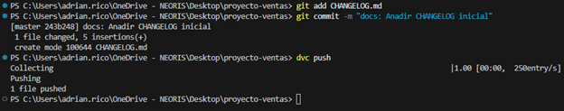
Figure 1: Practical example of using GIT and DVC commands included in the guide.
Who is it aimed at?
This guide is designed for a broad technical profile within the public and private sectors: data scientists, data engineers, analysts and data catalog managers.
It is especially useful for professionals looking to streamline their workflows, ensure the scientific reproducibility of their research, or guarantee regulatory compliance in regulated sectors. While basic knowledge of Git and the command line is recommended, the guide includes practical examples and detailed explanations to facilitate learning.
Documentación
The following presents a new guide to Exploratory Data Analysis (EDA) implemented in Python, which evolves and complements the version published in R in 2021. This update responds to the needs of an increasingly diverse community in the field of data science.
Exploratory Data Analysis (EDA) represents a critical step prior to any statistical analysis, as it allows:
- Comprehensive understanding of the data before analyzing it.
- Verification of statistical requirements that will ensure the validity of subsequent analyses.
To exemplify its importance, let's take the case of detecting and treating outliers, one of the tasks to be performed in an EDA. This phase has a significant impact on fundamental statistics such as the mean, standard deviation, or coefficient of variation.
This guide maintains as a practical case the analysis of air quality data from Castilla y León, demonstrating how to transform public data into valuable information through the use of fundamental Python libraries such as pandas, matplotlib, and seaborn, along with modern automated analysis tools like ydata-profiling.
In addition to explaining the different phases of an EDA, the guide illustrates them with a practical case. In this sense, the analysis of air quality data from Castilla y León is maintained as a practical case. Through explanations that users can replicate, public data is transformed into valuable information using fundamental Python libraries such as pandas, matplotlib, and seaborn, along with modern automated analysis tools like ydata-profiling.
Why a new guide in Python?
The choice of Python as the language for this new guide reflects its growing relevance in the data science ecosystem. Its intuitive syntax and extensive catalog of specialized libraries have made it a fundamental tool for data analysis. By maintaining the same dataset and analytical structure as the R version, understanding the differences between both languages is facilitated. This is especially valuable in environments where multiple technologies coexist. This approach is particularly relevant in the current context, where numerous organizations are migrating their analyses from traditional languages/tools like R, SAS, or SPSS to Python. The guide seeks to facilitate these transitions and ensure continuity in the quality of analyses during the migration process.
New features and improvements
The content has been enriched with the introduction to automated EDA and data profiling tools, thus responding to one of the latest trends in the field. The document delves into essential aspects such as environmental data interpretation, offers a more rigorous treatment of outliers, and presents a more detailed analysis of correlations between variables. Additionally, it incorporates good practices in code writing.
The practical application of these concepts is illustrated through the analysis of air quality data, where each technique makes sense in a real context. For example, when analyzing correlations between pollutants, it not only shows how to calculate them but also explains how these patterns reflect real atmospheric processes and what implications they have for air quality management.
Structure and contents
The guide follows a practical and systematic approach, covering the five fundamental stages of EDA:
- Descriptive analysis to obtain a representative view of the data.
- Variable type adjustment to ensure consistency.
- Detection and treatment of missing data.
- Identification and management of outliers.
- Correlation analysis between variables.

Figure 1. Phases of exploratory data analysis. Source: own elaboration.
As a novelty in the structure, a section on automated exploratory analysis is included, presenting modern tools that facilitate the systematic exploration of large datasets.
Who is it for?
This guide is designed for open data users who wish to conduct exploratory analyses and reuse the valuable sources of public information found in this and other data portals worldwide. While basic knowledge of the language is recommended, the guide includes resources and references to improve Python skills, as well as detailed practical examples that facilitate self-directed learning.
The complete material, including both documentation and source code, is available in the portal's GitHub repository. The implementation has been done using open-source tools such as Jupyter Notebook in Google Colab, which allows reproducing the examples and adapting the code according to the specific needs of each project.
The community is invited to explore this new guide, experiment with the provided examples, and take advantage of these resources to develop their own open data analyses.
Click to see the full infographic, in accessible version
Figure 2. Capture of the infographic. Source: own elaboration.
Documentación
Before performing data analysis, for statistical or predictive purposes, for example through machine learning techniques, it is necessary to understand the raw material with which we are going to work. It is necessary to understand and evaluate the quality of the data in order to, among other aspects, detect and treat atypical or incorrect data, avoiding possible errors that could have an impact on the results of the analysis.
One way to carry out this pre-processing is through exploratory data analysis (EDA).
What is exploratory data analysis?
EDA consists of applying a set of statistical techniques aimed at exploring, describing and summarising the nature of the data, in such a way that we can guarantee its objectivity and interoperability.
This allows us to identify possible errors, reveal the presence of outliers, check the relationship between variables (correlations) and their possible redundancy, and perform a descriptive analysis of the data by means of graphical representations and summaries of the most significant aspects.
On many occasions, this exploration of the data is neglected and is not carried out correctly. For this reason, at datos.gob.es we have prepared an introductory guide that includes a series of minimum tasks to carry out a correct exploratory data analysis, a prior and necessary step before carrying out any type of statistical or predictive analysis linked to machine learning techniques.
What does the guide include?
The guide explains in a simple way the steps to be taken to ensure consistent and accurate data. It is based on the exploratory data analysis described in the freely available book R for Data Science by Wickman and Grolemund (2017). These steps are:
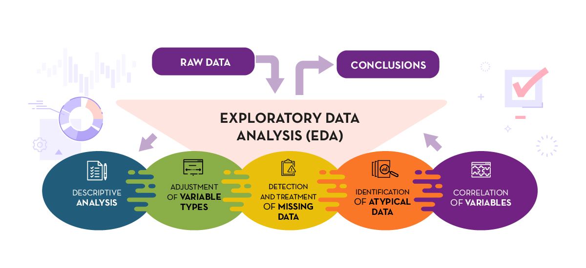
Figure 1. Phases of exploratory data analysis. Source: own elaboration.
The guide explains each of these steps and why they are necessary. They are also illustrated in a practical way through an example. For this case study, we have used the dataset relating to the air quality register in the Autonomous Community of Castilla y León included in our open data catalogue. The processing has been carried out with Open Source and free technological tools. The guide includes the code so that users can replicate it in a self-taught way following the indicated steps.
The guide ends with a section of additional resources for those who want to further explore the subject.
Who is the target audience?
The target audience of the guide is users who reuse open data. In other words, developers, entrepreneurs or even data journalists who want to extract as much value as possible from the information they work with in order to obtain reliable results.
It is advisable that the user has a basic knowledge of the R programming language, chosen to illustrate the examples. However, the bibliography section includes resources for acquiring greater skills in this field.
Below, in the documentation section, you can download the guide, as well as an infographic-summary that illustrates the main steps of exploratory data analysis. The source code of the practical example is also available in our Github.
Click to see the full infographic, in accessible version
Figure 2. Capture of the infographic. Source: own elaboration.
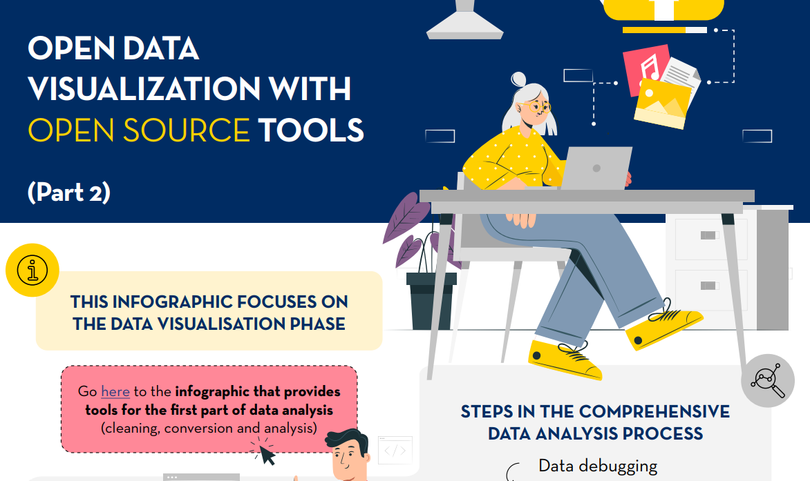
Open data visualization with open source tools (infographic part 2)
Blog
The Big Data Test Infrastructure (BDTI) is a tool funded by the European Digital Agenda, which enables public administrations to perform analysis with open data and open source tools in order to drive innovation.
This free-to-use, cloud-based tool was created in 2019 to accelerate digital and social transformation. With this approach and also following the European Open Data Directive, the European Commission concluded that in order to achieve a digital and economic boost, the power of public administrations' data should be harnessed, i.e. its availability, quality and usability should be increased. This is how BDTI was born, with the purpose of encouraging the reuse of this information by providing a free analysis test environment that allows public administrations to prototype solutions in the cloud before implementing them in the production environment of their own facilities.
What tools does BDTI offer?
Big Data Test Infrastructure offers European public administrations a set of standard open source tools for storing, processing and analysing their data. The platform consists of virtual machines, analysis clusters, storage and network facilities. The tools it offers are:
- Databases: to store data and perform queries on the stored data. The BDTI currently includes a relational database(PostgreSQL), a document-oriented database(MongoDB) and a graph database(Virtuoso).
- Data lake: for storing large amounts of structured and unstructured data (MinIO). Unstructured raw data can be processed with deployed configurations of other building blocks (BDTI components) and stored in a more structured format within the data lake solution.
- Development environments: provide the computing capabilities and tools necessary to perform standard data analysis activities on data from external sources, such as data lakes and databases.
- JupyterLab, an interactive, online development environment for creating Jupyter notebooks, code and data.
- Rstudio, an integrated development environment for R, a programming language for statistical computing and graphics.
- KNIME, an open source data integration, reporting and analytics platform with machine learning and data mining components, can be used for the entire data science lifecycle.
- H2O.ai, an open sourcemachine learning ( ML) and artificial intelligence (AI) platform designed to simplify and accelerate the creation, operation and innovation with ML and AI in any environment.
- Advanced processing: clusters and tools can also be created to process large volumes of data and perform real-time search operations(Apache Spark, Elasticsearch and Kibana)
- Display: BDTI also offers data visualisation applications such as Apache Superset, capable of handling petabyte-scale data, or Metabase.
- Orchestration: for the automation of data-driven processes throughout their lifecycle, from preparing data to making data-driven decisions and taking actions based on those decisions, is offered:
- Apache Airflow, an open source workflow management platform that allows complex data pipelines to be easily scheduled and executed.
Through these cloud-based tools, public workers in EU countries can create their own pilot projects to demonstrate the value that data can bring to innovation. Once the project is completed, users have the possibility to download the source code and data to continue the work themselves, using environments of their choice. In addition, civil society, academia and the private sector can participate in these pilot projects, as long as there is a public entity involved in the use case.
Success stories
These resources have enabled the creation of various projects in different EU countries. Some examples of use cases can be found on the BDTI website. For example, Eurostat carried out a pilot project using open data from internet job advertisements to map the situation of European labour markets. Other success stories included the optimisation of public procurement by the Norwegian Agency for Digitisation, data sharing efforts by the European Blood Alliance and work to facilitate understanding of the impact of COVID-19 on the city of Florence .
In Spain, BDTI enabled a data mining project atthe Conselleria de Sanitat de la Comunidad Valenciana. Thanks to BDTI, knowledge could be extracted from the enormous amount of scientific clinical articles, a task that supported clinicians and managers in their clinical practices and daily work.

Courses, newsletter and other resources
In addition to publishing use cases, theBig Data Test Infrastructure website offers an free online course to learn how to get the most out of BDTI. This course focuses on a highly practical use case: analysing the financing of green projects and initiatives in polluted regions of the EU, using open data from data.europa.eu and other open sources.
In addition, a monthly newsletter on the latest BDTI news, best practices and data analytics opportunities for the public sector has recently been launched .
In short, the re-use of public sector data (RISP) is a priority for the European Commission and BDTI(Big Data Test Infrastructure) is one of the tools contributing to its development. If you work in the public administration and you are interested in using BDTI register here.
Evento
There is never an end to opportunities to discuss, learn and share experiences on open data and related technologies. In this post, we select some of the upcoming ones, and tell you everything you need to know: what it's about, when and where it takes place and how you can register.
Don't miss this selection of events on cutting-edge topics such as geospatial data, accessible data reuse strategies and even innovative trends in data journalism. the best thing? All are free of charge.
Let's talk about data in Alicante
The National Association of Big Data and Analytics (ANBAN) is organising an open and free event in Alicante to debate and exchange views on data and artificial intelligence. During the meeting, not only will use cases that relate data with AI be presented, but also a part of the event will be dedicated to encourage networking among the attendees.
- What is it about? let's talk about data' will start with two talks on artificial intelligence projects that are already making an impact. Afterwards, the course on AI organised by the University of Alicante together with ANBAN will be explained. The final part of the event will be more relaxed to encourage attendees to make valuable connections.
- When and where? Thursday 29 February at 20.30h at ULAB (Pza. San Cristóbal, 14) in Alicante.
- How do I register? Book your place by signing up here: https://www.eventbrite.es/e/entradas-hablemos-del-dato-beers-alicante-823931670807?aff=oddtdtcreator&utm_source=rrss&utm_medium=colaborador&utm_campaign=HDD-ALC-2902
Open Data Day in Barcelona: Re-using data to improve the city
Open Data Day is an international event that brings together open data activities around the world. Within this framework, the barcelona Open Data initiative initiative has organised an event to discuss projects and strategies for the publication and reuse of open data to make a clean, safe, friendly and accessible city possible.
- What is it about? Through open data projects and data-driven strategies, the challenge of security, coexistence of uses and maintenance of shared spaces in municipalities will be addressed. The aim is to generate dialogue between organisations that publish and reuse data to add value and develop strategies together.
- When and where? On 6 March from 5 to 7.30 p.m. at Ca l'Alier (C/ de Pere IV, 362).
- How do I register? Through this link: https://www.eventbrite.es/e/entradas-open-data-day-2024-819879711287?aff=oddtdtcreator
Presentation of the "Good Practice Guide for Data Journalists"
The Valencian Observatory of Open Data and Transparency of the Universitat Politècnica de València has created a guide for journalists and data professionals with practical advice on how to turn data into attractive and relevant journalistic stories for society. The author of this reference material will talk to a data journalist about the challenges and opportunities that data offers in journalism.
- What is it about? It is an event that will address key concepts of the Good Practice Guide for Data Journalists through practical examples and cases to analyse and visualise data correctly. Ethics will also be a theme of the presentation.
- When and where? Friday 8th March from 12h to 13h in the Assembly Hall of the Faculty of ADE of the UPV (Avda. Tarongers s/n) in Valencia.
- How do I register? More information and registration here: https://www.eventbrite.es/e/entradas-presentacion-de-la-guia-de-buenas-practicas-para-periodistas-de-datos-835947741197
Geodata Conference of the Madrid City Council Geoportal
Madrid hosts the sixth edition of this event which brings together heads of institutions and benchmark companies in cartography, geographic information systems, digital twin, BIM, Big Data and artificial intelligence. The event will also be used as an opportunity to award the prizes of the Geodata Stand.
- What is it about? Followingin the footsteps of previous years, the Madrid Geodata Conference will present case studies and new developments in cartography, digital twinning, reuse of georeferenced data, as well as the best papers presented at the Geodata Stand.
- When and where? The event starts on 12 March at 9am in the Auditorio de La Nave in Madrid and will last until 2pm. The following day, 13 March, the session will be virtual and will present the projects and new developments in geo-information production and distribution via the Madrid Geoportal.
- How do I register? Through the event portal. Places are limited https://geojornadas.madrid.es/
3rd URJC Free Culture Conference
The Free Culture Conference of the Universidad Rey Juan Carlos is a meeting point, learning and exchange of experiences about free culture in the university. Topics such as open publishing of teaching and research materials, open science, open data, and free software will be addressed.
- What is it about? The two-day event will feature presentations by experts, workshops on specific topics and an opportunity for the university community to present papers. In addition, there will be an exhibition space where tools and news related to culture and free software will be shared, as well as a poster exhibition area
- When and where? 20 and 21 March at the Fuenlabrada Campus of the URJC
- How do I register? Registration is free of charge via this link: https://eventos.urjc.es/109643/tickets/iii-jornadas-de-cultura-libre-de-la-urjc.html
These are some of the upcoming events. In any case, don't forget to follow us on social media so you don't miss any news about innovation and open data. We are on Twitter y LinkedIn you can also write to us at dinamizacion@datos.gob.es if you would like us to add another event to the list or if you need extra information.
Blog
Image segmentation is a method that divides a digital image into subgroups (segments) to reduce its complexity, thus facilitating its processing or analysis. The purpose of segmentation is to assign labels to pixels to identify objects, people, or other elements in the image.
Image segmentation is crucial for artificial vision technologies and algorithms, but it is also used in many applications today, such as medical image analysis, autonomous vehicle vision, face recognition and detection, and satellite image analysis, among others.
Segmenting an image is a slow and costly process. Therefore, instead of processing the entire image, a common practice is image segmentation using the mean-shift approach. This procedure employs a sliding window that progressively traverses the image, calculating the average pixel values within that region.
This calculation is done to determine which pixels should be incorporated into each of the delineated segments. As the window advances along the image, it iteratively recalibrates the calculation to ensure the suitability of each resulting segment.
When segmenting an image, the factors or characteristics primarily considered are:
-
Color: Graphic designers have the option to use a green-toned screen to ensure chromatic uniformity in the background of the image. This practice enables the automation of background detection and replacement during the post-processing stage.
-
Edges: Edge-based segmentation is a technique that identifies the edges of various objects in a given image. These edges are identified based on variations in contrast, texture, color, and saturation.
-
Contrast: The image is processed to distinguish between a dark figure and a light background based on high-contrast values.
These factors are applied in different segmentation techniques:
-
Thresholds: Divide the pixels based on their intensity relative to a specified threshold value. This method is most suitable for segmenting objects with higher intensity than other objects or backgrounds.
-
Regions: Divide an image into regions with similar characteristics by grouping pixels with similar features.
-
Clusters: Clustering algorithms are unsupervised classification algorithms that help identify hidden information in the images. The algorithm divides the images into groups of pixels with similar characteristics, separating elements into groups and grouping similar elements in these groups.
-
Watersheds: This process transforms grayscale images, treating them as topographic maps, where the brightness of pixels determines their height. This technique is used to detect lines forming ridges and watersheds, marking the areas between watershed boundaries.
Machine learning and deep learning have improved these techniques, such as cluster segmentation, and have also generated new segmentation approaches that use model training to enhance program capabilities in identifying important features. Deep neural network technology is especially effective for image segmentation tasks.
Currently, there are different types of image segmentation, with the main ones being:
- Semantic Segmentation: Semantic image segmentation is a process that creates regions within an image and assigns semantic meaning to each of them. These objects, also known as semantic classes, such as cars, buses, people, trees, etc., have been previously defined through model training, where these objects are classified and labeled. The result is an image where pixels are classified into each located object or class.
- Instance Segmentation: Instance segmentation combines the semantic segmentation method (interpreting the objects in an image) with object detection (locating them within the image). As a result of this segmentation, objects are located, and each of them is individualized through a bounding box and a binary mask, determining which pixels within that window belong to the located object.
- Panoptic Segmentation: This is the most recent type of segmentation. It combines semantic segmentation and instance segmentation. This method can determine the identity of each object because it locates and distinguishes different objects or instances and assigns two labels to each pixel in the image: a semantic label and an instance ID. This way, each object is unique.
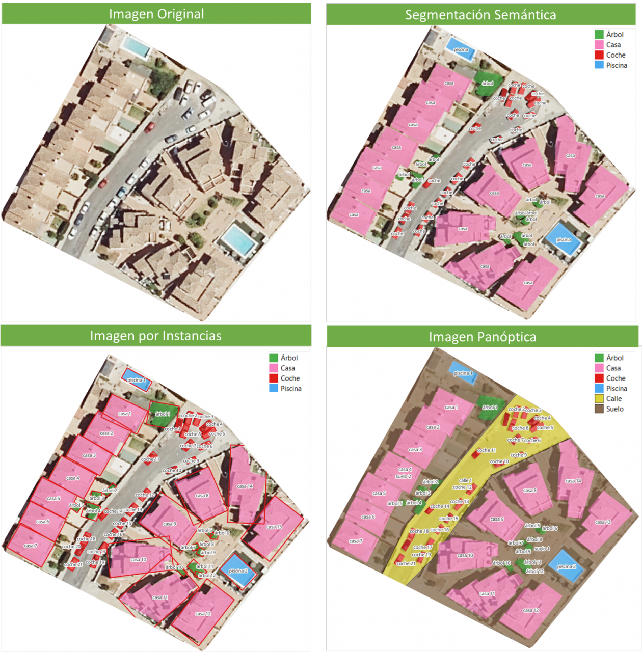
In the image, you can observe the results of applying different segmentations to a satellite image. Semantic segmentation returns a category for each type of identified object. Instance segmentation provides individualized objects along with their bounding boxes, and in panoptic segmentation, we obtain individualized objects and also differentiate the context, allowing for the detection of the ground and street regions.
Meta's New Model: SAM
In April 2023, Meta's research department introduced a new Artificial Intelligence (AI) model called SAM (Segment Anything Model). With SAM, image segmentation can be performed in three ways:
-
By selecting a point in the image, SAM will search for and distinguish the object intersecting with that point and find all identical objects in the image.
-
Using a bounding box, a rectangle is drawn on the image, and all objects found in that area are identified.
-
By using keywords, users can type a word in a console, and SAM can identify objects that match that word or explicit command in both images and videos, even if that information was not included in its training.
SAM is a flexible model that was trained on the largest dataset to date, called SA-1B, which includes 11 million images and 1.1 billion segmentation masks. Thanks to this data, SAM can detect various objects without the need for additional training.
Currently, SAM and the SA-1B dataset are available for non-commercial use and research purposes only. Users who upload their images are required to commit to using it solely for academic purposes. To try it out, you can visit this GitHub link.
In August 2023, the Image and Video Analysis Group of the Chinese Academy of Sciences released an update to their model called FastSAM, significantly reducing processing time with a 50 times faster execution speed compared to the original SAM model. This makes the model more practical for real-world usage. FastSAM achieved this acceleration by training on only 2% of the data used to train SAM, resulting in lower computational requirements while maintaining high accuracy.
SAMGEO: The Version for Analyzing Geospatial Data
The segment-geospatial package developed by Qiusheng Wu aims to facilitate the use of the Segment Anything Model (SAM) for geospatial data. For this purpose, two Python packages, segment-anything-py and segment-geospatial, have been developed, and they are available on PyPI and conda-forge.
The goal is to simplify the process of leveraging SAM for geospatial data analysis, allowing users to achieve it with minimal coding effort. These libraries serve as the basis for the QGIS Geo-SAM plugin and the integration of the model in ArcGIS Pro.
En la imagen se pueden observar los resultados de aplicar las distintas segmentaciones a una imagen satelital. La segmentación semántica devuelve una categoría por cada tipo de objeto identificado. La segmentación por instancia devuelve los objetos individualizados y la caja delimitadora y, en la segmentación panóptica, obtenemos los objetos individualizados y el contexto también diferenciado, pudiendo detectar el suelo y la región de calles.

Conclusions
In summary, SAM represents a significant revolution not only for the possibilities it opens in terms of editing photos or extracting elements from images for collages or video editing but also for the opportunities it provides to enhance computer vision when using augmented reality glasses or virtual reality headsets.
SAM also marks a revolution in spatial information acquisition, improving object detection through satellite imagery and facilitating the rapid detection of changes in the territory.
Content created by Mayte Toscano, Senior Consultant in Data Economy Technologies.
The content and viewpoints reflected in this publication are the sole responsibility of the author.
Blog
The "Stories of Use Cases" series, organized by the European Open Data portal (data.europe.eu), is a collection of online events focused on the use of open data to contribute to common European Union objectives such as consolidating democracy, boosting the economy, combating climate change, and driving digital transformation. The series comprises four events, and all recordings are available on the European Open Data portal's YouTube channel. The presentations used to showcase each case are also published.
In a previous post on datos.gob.es, we explained the applications presented in two of the series' events, specifically those related to the economy and democracy. Now, we focus on use cases related to climate and technology, as well as the open datasets used for their development.
Open data has enabled the development of applications offering diverse information and services. In terms of climate, some examples can trace waste management processes or visualize relevant data about organic agriculture. Meanwhile, the application of open data in the technological sphere facilitates process management. Discover the highlighted examples by the European Open Data portal!
Open Data for Fulfilling the European Green Deal
The European Green Deal is a strategy by the European Commission aiming to achieve climate neutrality in Europe by 2050 and promote sustainable economic growth. To reach this objective, the European Commission is working on various actions, including reducing greenhouse gas emissions, transitioning to a circular economy, and improving energy efficiency. Under this common goal and utilizing open datasets, three applications have been developed and presented in one of the webinars of the series on data.europe.eu use cases: Eviron Mate, Geofluxus, and MyBioEuBuddy.
- Eviron Mate: It's an educational project aimed at raising awareness among young people about climate change and related data. To achieve this goal, Eviron Mate utilizes open data from Eurostat, the Copernicus Program and data.europa.eu.
- Geofluxus: This initiative tracks waste from its origin to its final destination to promote material reuse and reduce waste volume. Its main objective is to extend material lifespan and provide businesses with tools for better waste management decisions. Geofluxus uses open data from Eurostat and various national open data portals.
- MyBioEuBuddy is a project offering information and visualizations about sustainable agriculture in Europe, using open data from Eurostat and various regional open data portals.
The Role of Open Data in Digital Transformation
In addition to contributing to the fight against climate change by monitoring environment-related processes, open data can yield interesting outcomes in other digitally-operating domains. The combination of open data with innovative technologies provides valuable results, such as natural language processing, artificial intelligence, or augmented reality.
Another online seminar from the series, presented by the European Data Portal, delved into this theme: driving digital transformation in Europe through open data. During the event, three applications that combine cutting-edge technology and open data were presented: Big Data Test Infrastructure, Lobium, and 100 Europeans.
- "Big Data Test Infrastructure (BDTI)": This is a European Commission tool featuring a cloud platform to facilitate the analysis of open data for public sector administrations, offering a free and ready-to-use solution. BDTI provides open-source tools that promote the reuse of public sector data. Any public administration can request the free advisory service by filling out a form. BDTI has already aided some public sector entities in optimizing procurement processes, obtaining mobility information for service redesign, and assisting doctors in extracting knowledge from articles.
- Lobium: A website assisting public affairs managers in addressing the complexities of their tasks. Its aim is to provide tools for campaign management, internal reporting, KPI measurement, and government affairs dashboards. Ultimately, its solution leverages digital tools' advantages to enhance and optimize public management.
- 100 Europeans: An application that simplifies European statistics, dividing the European population into 100 individuals. Through scrolling navigation, it presents data visualizations with figures related to healthy habits and consumption in Europe.
These six applications are examples of how open data can be used to develop solutions of societal interest. Discover more use cases created with open data in this article we have published on datos.gob.es

Learn more about these applications in their seminars -> Recordings here
Documentación
Este informe, que publica el Portal de Datos Europeo, analiza el potencial de reutilización de los datos en tiempo real. Los datos en tiempo real ofrecen información con alta frecuencia de actualización sobre el entorno que nos rodea (por ejemplo, información sobre el tráfico, datos meteorológicos, mediciones de la contaminación ambiental, información sobre riesgos naturales, etc.).
El documento resume los resultados y conclusiones de un seminario web organizado por el equipo del Portal de Datos Europeo celebrado el pasado 5 de abril de 2022, donde se explicaron diferentes formas de compartir datos en tiempo real desde plataformas de datos abiertos.
En primer lugar, el informe hace un repaso sobre el fundamento de los datos en tiempo real e incluye ejemplos que justifican el valor que aporta este tipo de datos para, a continuación, describir dos enfoques tecnológicos sobre cómo compartir datos en tiempo real del ámbito de IoT y el transporte. Incluye, además, un bloque que resume las principales conclusiones de las preguntas y comentarios de los participantes que giran, principalmente, en torno a difentes necesidades de fuentes de datos y funcionalidades requeridas para su reutilización.
Para terminar, basándose en el feedback y la discusión generada, se proporciona un conjunto de recomendaciones y acciones a corto y medio plazo sobre cómo mejorar la capacidad para localizar fuentes de datos en tiempo real a través del Portal de Datos Europeo.
Este informe se encuentra disponible en el siguiente enlace: "Datos en tiempo real: Enfoques para integrar fuentes de datos en tiempo real en data.europa.eu"
Documentación
1. Introduction
Visualizations are graphical representations of data that allow to transmit in a simple and effective way the information linked to them. The visualization potential is very wide, from basic representations, such as a graph of lines, bars or sectors, to visualizations configured on control panels or interactive dashboards. Visualizations play a fundamental role in drawing conclusions from visual information, also allowing to detect patterns, trends, anomalous data, or project predictions, among many other functions.
Before proceeding to build an effective visualization, we need to perform a previous treatment of the data, paying special attention to obtaining them and validating their content, ensuring that they are in the appropriate and consistent format for processing and do not contain errors. A preliminary treatment of the data is essential to perform any task related to the analysis of data and of performing an effective visualization.
In the \"Visualizations step-by-step\" section, we are periodically presenting practical exercises on open data visualization that are available in the datos.gob.es catalog or other similar catalogs. There we approach and describe in a simple way the necessary steps to obtain the data, perform the transformations and analyzes that are pertinent to, finally, we create interactive visualizations, from which we can extract information that is finally summarized in final conclusions.
In this practical exercise, we have carried out a simple code development that is conveniently documented by relying on tools for free use. All generated material is available for reuse in the GitHub Data Lab repository.
Access the data lab repository on Github.
Run the data pre-processing code on Google Colab.
2. Objetives
The main objective of this post is to learn how to make an interactive visualization based on open data. For this practical exercise we have chosen datasets that contain relevant information about the students of the Spanish university over the last few years. From these data we will observe the characteristics presented by the students of the Spanish university and which are the most demanded studies.
3. Resources
3.1. Datasets
For this practical case, data sets published by the Ministry of Universities have been selected, which collects time series of data with different disaggregations that facilitate the analysis of the characteristics presented by the students of the Spanish university. These data are available in the datos.gob.es catalogue and in the Ministry of Universities' own data catalogue. The specific datasets we will use are:
- Enrolled by type of university modality, area of nationality and field of science, and enrolled by type and modality of university, gender, age group and field of science for PHD students by autonomous community from the academic year 2015-2016 to 2020-2021.
- Enrolled by type of university modality, area of nationality and field of science, and enrolled by type and modality of the university, gender, age group and field of science for master's students by autonomous community from the academic year 2015-2016 to 2020-2021.
- Enrolled by type of university modality, area of nationality and field of science and enrolled by type and modality of the university, gender, age group and field of study for bachelor´s students by autonomous community from the academic year 2015-2016 to 2020-2021.
- Enrolments for each of the degrees taught by Spanish universities that is published in the Statistics section of the official website of the Ministry of Universities. The content of this dataset covers from the academic year 2015-2016 to 2020-2021, although for the latter course the data with provisional.
3.2. Tools
To carry out the pre-processing of the data, the R programming language has been used from the Google Colab cloud service, which allows the execution of Notebooks de Jupyter.
Google Colaboratory also called Google Colab, is a free cloud service from Google Research that allows you to program, execute and share code written in Python or R from your browser, so it does not require the installation of any tool or configuration.
For the creation of the interactive visualization the Datawrapper tool has been used.
Datawrapper is an online tool that allows you to make graphs, maps or tables that can be embedded online or exported as PNG, PDF or SVG. This tool is very simple to use and allows multiple customization options.
If you want to know more about tools that can help you in the treatment and visualization of data, you can use the report \"Data processing and visualization tools\".
4. Data pre-processing
As the first step of the process, it is necessary to perform an exploratory data analysis (EDA) in order to properly interpret the initial data, detect anomalies, missing data or errors that could affect the quality of subsequent processes and results, in addition to performing the tasks of transformation and preparation of the necessary variables. Pre-processing of data is essential to ensure that analyses or visualizations subsequently created from it are reliable and consistent. If you want to know more about this process you can use the Practical Guide to Introduction to Exploratory Data Analysis.
The steps followed in this pre-processing phase are as follows:
- Installation and loading the libraries
- Loading source data files
- Creating work tables
- Renaming some variables
- Grouping several variables into a single one with different factors
- Variables transformation
- Detection and processing of missing data (NAs)
- Creating new calculated variables
- Summary of transformed tables
- Preparing data for visual representation
- Storing files with pre-processed data tables
You'll be able to reproduce this analysis, as the source code is available in this GitHub repository. The way to provide the code is through a document made on a Jupyter Notebook that once loaded into the development environment can be executed or modified easily. Due to the informative nature of this post and in order to facilitate learning of non-specialized readers, the code does not intend to be the most efficient, but rather make it easy to understand, therefore it is likely to come up with many ways to optimize the proposed code to achieve a similar purpose. We encourage you to do so!
You can follow the steps and run the source code on this notebook in Google Colab.
5. Data visualizations
Once the data is pre-processed, we proceed with the visualization. To create this interactive visualization we use the Datawrapper tool in its free version. It is a very simple tool with special application in data journalism that we encourage you to use. Being an online tool, it is not necessary to have software installed to interact or generate any visualization, but it is necessary that the data table that we provide is properly structured.
To address the process of designing the set of visual representations of the data, the first step is to consider the queries we intent to resolve. We propose the following:
- How is the number of men and women being distributed among bachelor´s, master's and PHD students over the last few years?
If we focus on the last academic year 2020-2021:
- What are the most demanded fields of science in Spanish universities? What about degrees?
- Which universities have the highest number of enrolments and where are they located?
- In what age ranges are bachelor´s university students?
- What is the nationality of bachelor´s students from Spanish universities?
Let's find out by looking at the data!
5.1. Distribution of enrolments in Spanish universities from the 2015-2016 academic year to 2020-2021, disaggregated by gender and academic level
We created this visual representation taking into account the bachelor, master and PHD enrolments. Once we have uploaded the data table to Datawrapper (dataset \"Matriculaciones_NivelAcademico\"), we have selected the type of graph to be made, in this case a stacked bar diagram to be able to reflect by each course and gender, the people enrolled in each academic level. In this way we can also see the total number of students enrolled per course. Next, we have selected the type of variable to represent (Enrolments) and the disaggregation variables (Gender and Course). Once the graph is obtained, we can modify the appearance in a very simple way, modifying the colors, the description and the information that each axis shows, among other characteristics.
To answer the following questions, we will focus on bachelor´s students and the 2020-2021 academic year, however, the following visual representations can be replicated for master's and PHD students, and for the different courses.
5.2. Map of georeferenced Spanish universities, showing the number of students enrolled in each of them
To create the map, we have used a list of georeferenced Spanish universities published by the Open Data Portal of Esri Spain. Once the data of the different geographical areas have been downloaded in GeoJSON format, we transform them into Excel, in order to combine the datasets of the georeferenced universities and the dataset that presents the number of enrolled by each university that we have previously pre-processed. For this we have used the Excel VLOOKUP() function that will allow us to locate certain elements in a range of cells in a table
Before uploading the dataset to Datawrapper, we need to select the layer that shows the map of Spain divided into provinces provided by the tool itself. Specifically, we have selected the option \"Spain>>Provinces(2018)\". Then we proceed to incorporate the dataset \"Universities\", previously generated, (this dataset is attached in the GitHub datasets folder for this step-by-step visualization), indicating which columns contain the values of the variables Latitude and Longitude.
From this point, Datawrapper has generated a map showing the locations of each of the universities. Now we can modify the map according to our preferences and settings. In this case, we will set the size and the color of the dots dependent from the number of registrations presented by each university. In addition, for this data to be displayed, in the \"Annotate\" tab, in the \"Tooltips\" section, we have to indicate the variables or text that we want to appear.
5.3. Ranking of enrolments by degree
For this graphic representation, we use the Datawrapper table visual object (Table) and the \"Titulaciones_totales\" dataset to show the number of registrations presented by each of the degrees available during the 2020-2021 academic year. Since the number of degrees is very extensive, the tool offers us the possibility of including a search engine that allows us to filter the results.
5.4. Distribution of enrolments by field of science
For this visual representation, we have used the \"Matriculaciones_Rama_Grado\" dataset and selected sector graphs (Pie Chart), where we have represented the number of enrolments according to sex in each of the field of science in which the degrees in the universities are divided (Social and Legal Sciences, Health Sciences, Arts and Humanities, Engineering and Architecture and Sciences). Just like in the rest of the graphics, we can modify the color of the graph, in this case depending on the branch of teaching.
5.5. Matriculaciones de Grado por edad y nacionalidad
For the realization of these two representations of visual data we use bar charts (Bar Chart), where we show the distribution of enrolments in the first, disaggregated by gender and nationality, we will use the data set \"Matriculaciones_Grado_nacionalidad\" and in the second, disaggregated by gender and age, using the data set \"Matriculaciones_Grado_edad \". Like the previous visuals, the tool easily facilitates the modification of the characteristics presented by the graphics.
6. Conclusions
Data visualization is one of the most powerful mechanisms for exploiting and analyzing the implicit meaning of data, regardless of the type of data and the degree of technological knowledge of the user. Visualizations allow us to extract meaning out of the data and create narratives based on graphical representation. In the set of graphical representations of data that we have just implemented, the following can be observed:
- The number of enrolments increases throughout the academic years regardless of the academic level (bachelor´s, master's or PHD).
- The number of women enrolled is higher than the men in bachelor's and master's degrees, however it is lower in the case of PHD enrollments, except in the 2019-2020 academic year.
- The highest concentration of universities is found in the Community of Madrid, followed by the autonomous community of Catalonia.
- The university that concentrates the highest number of enrollments during the 2020-2021 academic year is the UNED (National University of Distance Education) with 146,208 enrollments, followed by the Complutense University of Madrid with 57,308 registrations and the University of Seville with 52,156.
- The most demanded degree in the 2020-2021 academic year is the Degree in Law with 82,552 students nationwide, followed by the Degree in Psychology with 75,738 students and with hardly any difference, the Degree in Business Administration and Management with 74,284 students.
- The branch of education with the highest concentration of students is Social and Legal Sciences, while the least demanded is the branch of Sciences.
- The nationalities that have the most representation in the Spanish university are from the region of the European Union, followed by the countries of Latin America and the Caribbean, at the expense of the Spanish one.
- The age range between 18 and 21 years is the most represented in the student body of Spanish universities.
We hope that this step-by-step visualization has been useful for learning some very common techniques in the treatment and representation of open data. We will return to show you new reuses. See you soon!
Documentación
1. Introduction
Visualizations are a graphic representation that allow us to comprehend in a simple way the information that the data contains. Thanks to visual elements, such as graphs, maps or word clouds, visualizations also help to explain trends, patterns, or outliers that data may present.
Visualizations can be generated from the data of a different nature, such as words that compose a news, a book or a song. To make visualizations out of this kind of data, it is required that the machines, through software programs, are able to understand, interpret and recognize the words that form human speech (both written or spoken) in multiple languages. The field of studies focused on such data treatment is called Natural Language Processing (NLP). It is an interdisciplinary field that combines the powers of artificial intelligence, computational linguistics, and computer science. NLP-based systems have allowed great innovations such as Google's search engine, Amazon's voice assistant, automatic translators, sentiment analysis of different social networks or even spam detection in an email account.
In this practical exercise, we will apply a graphical visualization for a keywords summary representing various texts extracted with NLP techniques. Especially, we are going to create a word cloud that summarizes which are the most reoccurring terms in several posts of the portal.
This visualization is included within a series of practical exercises, in which open data available on the datos.gob.es portal is used. These address and describe in a simple way the steps necessary to obtain the data, perform transformations and analysis that are relevant to the creation of the visualization, with the maximum information extracted. In each of the practical exercises, simple code developments are used that will be conveniently documented, as well as free and open use tools. All the generated material will be available in the Data Lab repository on GitHub.
2. Objetives
The main objective of this post is to learn how to create a visualization that includes images, generated from sets of words representative of various texts, popularly known as \"word clouds\". For this practical exercise we have chosen 6 posts published in the blog section of the datos.gob.es portal. From these texts using NLP techniques we will generate a word cloud for each text that will allow us to detect in a simple and visual way the frequency and importance of each word, facilitating the identification of the keywords and the main theme of each of the posts.
From a text we build a cloud of words applying Natural Language Processing (NLP) techniques
3. Resources
3.1. Tools
To perform the pre-treatment of the data (work environment, programming and the very edition), such as the visualization itself, Python (versión 3.7) and Jupyter Notebook (versión 6.1) are used, tools that you will find integrated in, along with many others in Anaconda, one of the most popular platforms to install, update and manage software to work in data science. To tackle tasks related to Natural Language Processing, we use two libraries, Scikit-Learn (sklearn) and wordcloud. All these tools are open source and available for free..
Scikit-Learn is a very popular vast library, designed in the first place to carry out machine learning tasks on data in textual form. Among others, it has algorithms to perform classification, regression, clustering, and dimensionality reduction tasks. In addition, it is designed for deep learning on textual data, being useful for handling textual feature sets in the form of matrices, performing tasks such as calculating similarities, classifying text and clustering. In Python, to perform this type of tasks, it is also possible to work with other equally popular libraries such as NLTK or spacy, among others.
wordcloud eis a library specialized in creating word clouds using a simple algorithm that can be easily modified.
To facilitate understanding for readers not specialized in programming, the Python code included below, accessible by clicking on the \"Code\" button in each section, is not designed to maximize its efficiency, but to facilitate its comprehension, therefore it is likely that readers more advanced in this language may consider more efficient, alternative ways to code some functionalities. The reader will be able to reproduce this analysis if desired, as the source code is available on datos.gob.es's GitHub account. The way the code is provided is through a Jupyter Notebook, which once loaded into the development environment can be easily executed or modified if desired.
3.2. Datasets
For this analysis, 6 posts recently published on the open data portal datos.gob.es, in its blog section, have been selected. These posts are related to different topics related to open data:
- The latest news in natural language processing: summaries of classic works in just a few hundred words.
- The importance of anonymization and data privacy.
- The value of real-time data through a practical example.
- New initiatives to open and harness data for health research.
- Kaggle and other alternative platforms for learning data science.
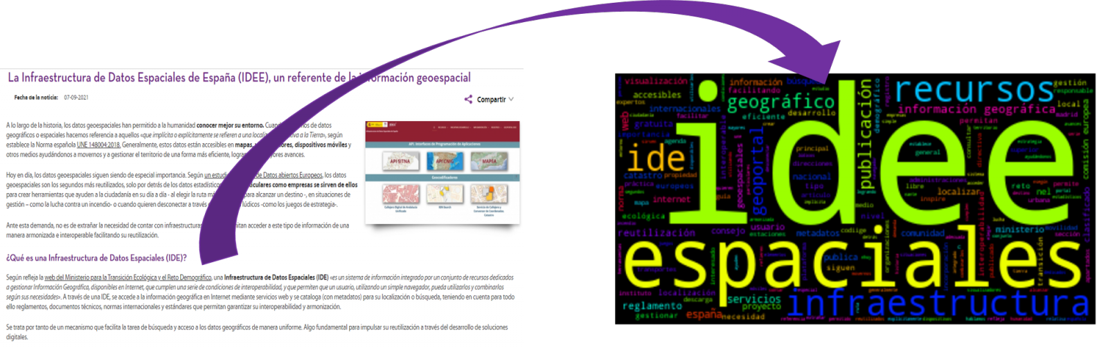
- The Spatial Data Infrastructure of Spain (IDEE), a benchmark for geospatial information.
4. Data processing
Before advancing to creation of an effective visualization, we must perform a preliminary data treatment or pre-processing of the data, paying attention to obtaining them, ensuring that they do not contain errors and are in a suitable format for processing. Data pre-processing is essential for build any effective and consistent visual representation.
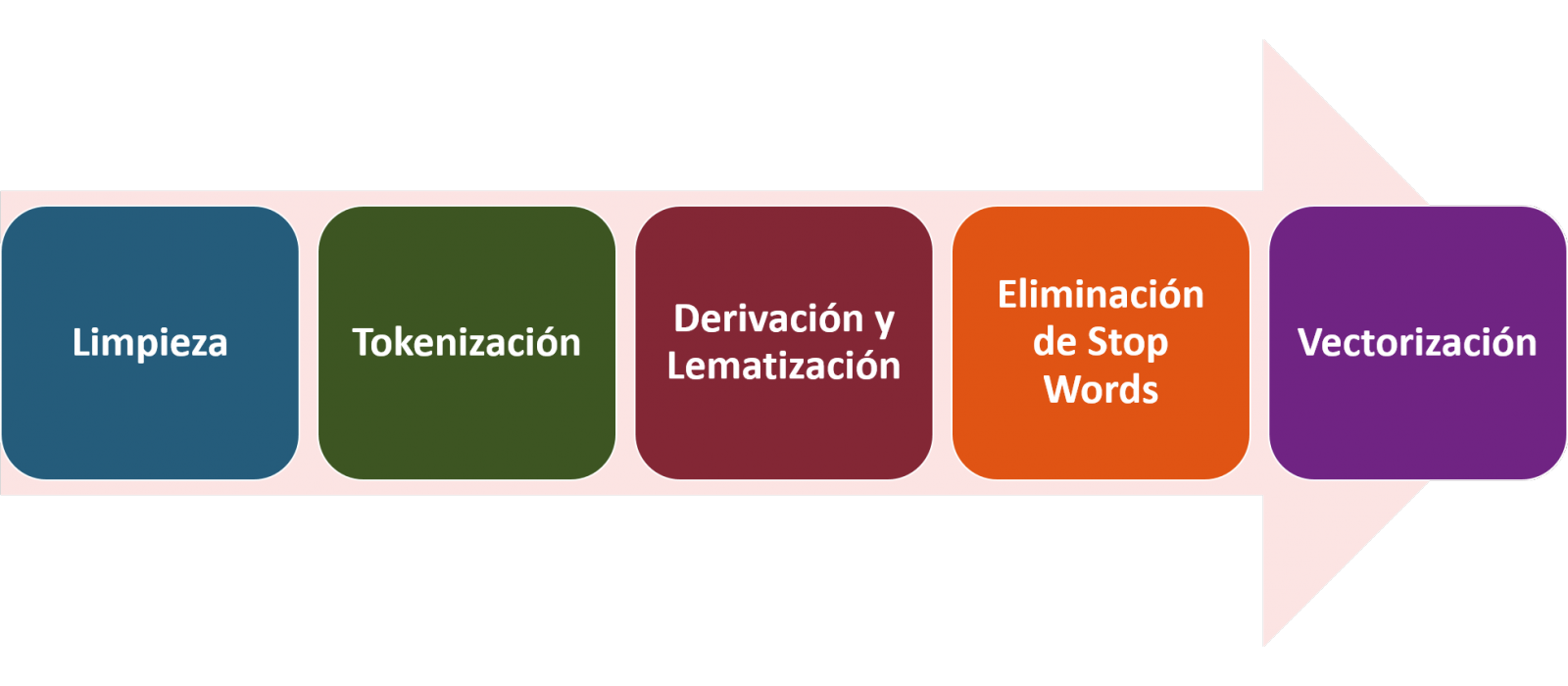
In NLP, the pre-processing of the data consists mainly of a series of transformations that are carried out on the input data, in our case several posts in TXT format, with the aim of obtaining standardized data and without elements that may affect the quality of the results, in order to facilitate its subsequent processing to perform tasks such as, generate a word cloud, perform opinion/sentiment mining or generate automated summaries from input texts. In general, the flowchart to be followed to perform word preprocessing includes the following steps:
- Cleaning: Removal of special characters and symbols that inflict results distortion, such as punctuation marks.
- Tokenize: Tokenization is the process of separating a text into smaller units, tokens. Tokens can be sentences, words, or even characters.
- Derivation and Lemmatisation: this process consists of transforming words to their basic form, that is, to their canonical form or lemma, eliminating plurals, verb tenses or genders. This action is sometimes redundant since it is not always required for further processing to know the semantic similarity between the different words of the text.
- Elimination of stop words: stop words or empty words are those words of common use that do not contribute in a significant way to the text. These words should be removed before text processing as they do not provide any unique information that can be used for the classification or grouping of the text, for example, determining articles such as 'a', 'an', 'the' etc.
- Vectorization: in this step we transform each of the tokens obtained in the previous step to a vector of real numbers that is generated based on the frequency of the appearance of each word in the text. Vectorization allows machines to be able to process text and apply, among others, machine learning techniques.
4.1. Installation and loading of libraries
Before starting with data pre-processing, we need to import the libraries to work with. Python provides a vast number of libraries that allow to implement functionalities for many tasks, such as data visualization, Machine Learning, Deep Learning or Natural Language Processing, among many others. The libraries that we will use for this analysis and visualization are the following:
- os, which allows access to operating system-dependent functionality, such as manipulating the directory structure.
- re, provides functions for processing regular expressions.
- pandas, is a very popular and essential library for processing data tables.
- string, provides a series of very useful functions for handling strings.
- matplotlib.pyplot, contains a collection of functions that will allow us to generate the graphical representations of the word clouds.
- sklearn.feature_extraction.text (Scikit-Learn library), converts a collection of text documents into a vector array. From this library we will use some commands that we will discuss later.
- wordcloud, library with which we can generate the word cloud.
# Importaremos las librerías necesarias para realizar este análisis y la visualización. import os import re import pandas as pd import string import matplotlib.pyplot as plt from sklearn.feature_extraction.text import CountVectorizer from sklearn.feature_extraction.text import TfidfTransformer from wordcloud import WordCloud4.2. Data loading
Once the libraries are loaded, we prepare the data with which we are going to work. Before starting to load the data, in the working directory we need: (a) a folder called \"post\" that will contain all the files in TXT format with which we are going to work and that are available in the repository of this project of the GitHub of datos.gob.es; (b) a file called \"stop_words_spanish.txt\" that contains the list of stop words in Spanish, which is also available in said repository and (c) a folder called \"images\" where we will save the images of the word clouds in PNG format, which we will create below.
# Generamos la carpeta \"imagenes\".nueva_carpeta = \"imagenes/\" try: os.mkdir(nueva_carpeta)except OSError: print (\"Ya existe una carpeta llamada %s\" % nueva_carpeta)else: print (\"Se ha creado la carpeta: %s\" % nueva_carpeta)Next, we will proceed to load the data. The input data, as we have already mentioned, are in TXT files and each file contains a post. As we want to perform the analysis and visualization of several posts at the same time, we will load in our development environment all the texts that interest us, to later insert them in a single table or dataframe.
# Generamos una lista donde incluiremos todos los archivos que debe leer, indicándole la carpeta donde se encuentran.filePath = []for file in os.listdir(\"./post/\"): filePath.append(os.path.join(\"./post/\", file))# Generamos un dataframe en el cual incluiremos una fila por cada post.post_df = pd.DataFrame()for file in filePath: with open (file, \"rb\") as readFile: post_df = pd.DataFrame([readFile.read().decode(\"utf8\")], append(post_df)# Nombramos la columna que contiene los textos en el dataframe.post_df.columns = [\"texto\"]4.3. Data pre-processing
In order to obtain our objective: generate word clouds for each post, we will perform the following pre-processing tasks.
a) Data cleansing
Once a table containing the texts with which we are going to work has been generated, we must eliminate the noise beyond the text that interests us: special characters, punctuation marks and carriage returns.
First, we put all characters in lowercase to avoid any errors in case-sensitive processes, by using the lower() command.
Then we eliminate punctuation marks, such as periods, commas, exclamations, questions, among many others. For the elimination of these we will resort to the preinitialized string.punctuacion of the string library, which returns a set of symbols considered punctuation marks. In addition, we must eliminate tabs, cart jumps and extra spaces, which do not provide information in this analysis, using regular expressions.
It is essential to apply all these steps in a single function so that they are processed sequentially, because all processes are highly related.
# Eliminamos los signos de puntuación, los saltos de carro/tabulaciones y espacios en blanco extra.# Para ello generamos una función en la cual indicamos todos los cambios que queremos aplicar al texto.def limpiar_texto(texto): texto = texto.lower() texto = re.sub(\"\\[.*?¿\\]\\%\", \" \", texto) texto = re.sub(\"[%s]\" % re.escape(string.punctuation), \" \", texto) texto re.sub(\"\\w*\\d\\w*\", \" \", texto) return texto# Aplicamos los cambios al texto.limpiar_texto = lambda x: limpiar_texto(x)post_clean = pd.DataFrame(post_clean.texto.apply/limpiar_texto)b) Tokenize
Once we have eliminated the noise in the texts with which we are going to work, we will tokenize each of the texts in words. For this we will use the split() function, using space as a separator between words. This will allow separating the words independently (tokens) for future analysis.
# Tokenizar los textos. Se crea una nueva columna en la tabla con los tokens con el texto \"tokenizado\".def tokenizar(text): text = texto.split(sep = \" \") return(text)post_df[\"texto_tokenizado\"] = post_df[\"texto\"].apply(lambda x: tokenizar(x))c) Removal of \"stop words\"
After removing punctuation marks and other elements that can distort the target display, we will remove \"stop words\". To carry out this step we use a list of Spanish stop words since each language has its own list. This list consists of a total of 608 words, which include articles, prepositions, linking verbs, adverbs, among others and is recently updated. This list can be downloaded from the datos.gob.es GitHub account in TXT format and must be located in the working directory.
# Leemos el archivo que contiene las palabras vacías en castellano.with open \"stop_words_spanish.txt\", encoding = \"UTF8\") as f: lines = f.read().splitlines()In this list of words, we will include new words that do not contribute relevant information to our texts or appear recurrently due to their own context. In this case, there is a bunch of words, which we should eliminate since they are present in all posts repetitively since they all deal with the subject of open data and there is a high probability that these are the most significant words. Some of these words are, \"item\", \"data\", \"open\", \"case\", among others. This will allow to obtain a more representative graphic representation of the content of each post.
On the other hand, a visual inspection of the results obtained allows to detect words or characters derived from errors included in the texts, which obviously have no meaning and that have not been eliminated in the previous steps. These should be removed from the analysis so that they do not distort the subsequent results. These are words like, \"nen\", \"nun\" or \"nla\"
# Actualizamos nuestra lista de stop words.stop_words.extend((\"caso\", \"forma\",\"unido\", \"abiertos\", \"post\", \"espera\", \"datos\", \"dato\", \"servicio\", \"nun\", \"día\", \"nen\", \"data\", \"conjuntos\", \"importantes\", \"unido\", \"unión\", \"nla\", \"r\", \"n\"))# Eliminamos las stop words de nuestra tabla.post_clean = post_clean [~(post_clean[\"texto_tokenizado\"].isin(stop_words))]d) Vectorization
Machines are not capable of understanding words and sentences therefore, they must be transformed to some numerical structure. The method consists of generating vectors from each token. In this post we use a simple technique known as bag-of-words (BoW). It consists of assigning a weight to each token proportional to the frequency of appearance of that token in the text. To do this, we work on an array in which each row represents a text and each column a token. To perform the vectorization we will resort to the CountVectorizer() and TfidTransformer() commands of the scikit-learn library.
The CountVectorizer() function allows you to transform text into a vector of frequencies or word counts. In this case we will obtain 6 vectors with as many dimensions as there are tokens in each text, one for each post, which we will integrate into a single matrix, where the columns will be the tokens or words and the rows will be the posts.
# Calculamos la matriz de frecuencia de palabras del texto.vectorizador = CountVectorizer()post_vec = vectorizador.fit_transform(post_clean.texto_tokenizado)Once the word frequency matrix is generated, it is necessary to convert it into a normalized vector form in order to reduce the impact of tokens that occur very frequently in the text. To do this we will use the TfidfTransformer() function.
# Convertimos una matriz de frecuencia de palabras en una forma vectorial regularizada.transformer = TfidfTransformer()post_trans = transformer.fit_transform(post_vec).toarray()If you want to know more about the importance of applying this technique, you will find numerous articles on the Internet that talk about it and how relevant it is, among other issues, for SEO optimization.
5. Creation of the word cloud
Once we have concluded the pre-processing of the text, as we indicated at the beginning of the post, it is possible to perform NLP tasks. In this exercise we will create a word cloud or \"WordCloud\" for each of the analyzed texts.
A word cloud is a visual representation of the words with the highest rate of occurrence in the text. It allows to detect in a simple way the frequency and importance of each of the words, facilitating the identification of the keywords and discovering with a single glance the main theme treated in the text.
For this we are going to use the \"wordcloud\" library that incorporates the necessary functions to build each representation. First, we have to indicate the characteristics that each word cloud should present, such as the background color (background_color function), the color map that the words will take (colormap function), the maximum font size (max_font_size function) or set a seed so that the word cloud generated is always the same (function random_state) in future implementations. We can apply these and many other functions to customize each word cloud.
# Indicamos las características que presentará cada nube de palabras.wc = WordCloud(stopwords = stop_words, background_color = \"black\", colormap = \"hsv\", max_font_size = 150, random_state = 123)Once we have indicated the characteristics that we want each word cloud to present, we proceed to create it and save it as an image in PNG format. To generate the word cloud, we will use a loop in which we will indicate different functions of the matplotlib library (represented by the plt prefix) necessary to graphically generate the word cloud according to the specification defined in the previous step. We have to specify that a world cloud needs to be created for each row of the table, that is, for each text, with the function plt.subplot(). With the command plt.imshow() we indicate that the result is a 2D image. If we want the axes not to be displayed, we must indicate it with the plt.axis() function. Finally, with the function plt.savefig() we will save the generated visualization.
# Generamos las nubes de palabras para cada uno de los posts.for index, i in enumerate(post.columns): wc.generate(post.texto_tokenizado[i]) plt.subplot(3, 2, index+1 plt.imshow(wc, interpolation = \"bilinear\") plt.axis(\"off\") plt.savefig(\"imagenes/.png\")# Mostramos las nubes de palabras resultantes.plt.show()The visualization obtained is:
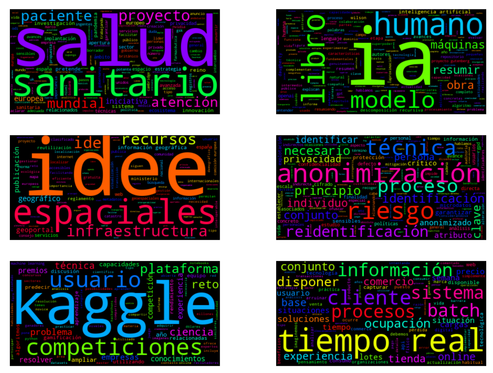
Visualization of the word clouds obtained from the texts of different posts of the blog section of datos.gob.es
5. Conclusions
Data visualization is one of the most powerful mechanisms for exploiting and analyzing the implicit meaning of data, regardless of the data type and the degree of technological knowledge of the user. Visualizations allow us to extract meaning out of the data and create narratives based on graphical representation.
Word clouds are a tool that allows us to speed up the analysis of textual data, since through them we can quickly and easily identify and interpret the words with the greatest relevance in the analyzed text, which gives us an idea of the subject.
If you want to learn more about Natural Language Processing, you can consult the guide \"Emerging Technologies and Open Data: Natural Language Processing\" and the posts \"Natural Language Processing\" and \" The latest news in natural language processing: summaries of classic works in just a few hundred words\".
Hopefully this step-by-step visualization has taught you a few things about the ins and outs of Natural Language Processing and word cloud creation. We will return to show you new data reuses. See you soon!