Blog
The European High-Value Datasets (HVD) regulation, established by Implementing Regulation (EU) 2023/138, consolidates the role of APIs as an essential infrastructure for the reuse of public information, making their availability a legal obligation and not just a good technological practice.
Since 9 June 2024, public bodies in all Member States are required to publish datasets classified as HVDs free of charge, in machine-readable formats and accessible via APIs. The six categories regulated are: geospatial data, Earth observation, environment, statistics, business information and mobility.
This framework is not merely declarative. Member States must report to the European Commission compliance status every two years, including persistent links to APIs that give access to such data. The situation in Spain in terms of transparency, open data and Systematic API Provisioning can be consulted in the indicators published by the Open Data Maturity Report.
In practice, this means that APIs are the bridge between the norm and reality. The regulation not only says what data must be opened, but also requires it to be done in such a way that it can be automatically integrated into applications, studies or digital services. Therefore, reviewing the public APIs available in Spain is a concrete way to understand how this framework is being applied on a day-to-day basis.
Inventory of public APIs in Spain
INE — API JSON (Tempus3)
The National Institute of Statistics offers a API REST that Exposes the entire database Tempus3 broadcast format JSON, which includes official statistical series on demography, economy, labour market, industry, services, prices, living conditions and other socio-economic indicators.
To make calls, the structure must follow the pattern https://servicios.ine.es/wstempus/js/{language}/{function}/{input}. The tip=AM parameter allows you to get metadata along with the data, and tv filters by specific variables. For example, to obtain the population figures by province, simply consult the corresponding operation (IOE 30243) and filter by the desired geographical variable.
No authentication or API key required: any well-formed GET request returns data directly.
Example in Python — get the resident population series with metadata:
import requests

url = ("https://servicios.ine.es/wstempus/js/ES/"

       "DATOS_TABLA/t20/e245/p08/l0/01002.px?tip=AM")

response = requests.get(url)

data = response.json()

for serie in data[:3]:  # primeras 3 series

    name = series["Name"]

    last = series["Date"][-1]

    print(f"{name}: {last['Value']:,.0f} ({last['PeriodName']})")

    TOTAL AGES, TOTAL, Both sexes: 39,852,651 (1998)

    TOTAL AGES, TOTAL, Males: 19,488,465 (1998)

    TOTAL EDADES, TOTAL, Mujeres: 20,364,186 (1998)
AEMET — OpenData API REST
The State Meteorological Agency exposes its data through a REST API, documented with Swagger UI (an open-source tool that generates interactive documentation), observed meteorological data and official predictions, including temperature, precipitation, wind, alerts and adverse phenomena.
Unlike the INE, AEMET requires a Free API key, which is obtained by providing an email address in the portal opendata.aemet.es. A API key works as A type of "password" or identifier: it is used to allow the agency to know who is using the service, control the volume of requests and ensure proper use of the infrastructure.
A relevant technical aspect is that AEMET implements a two-call model: the first request returns a JSON with a temporary URL in the data field, and a second request to that URL retrieves the actual dataset. The rate limit is 50 requests per minute.
Example in Python — daily weather data (double call):
import requests

API_KEY = "tu_api_key_aqui"

headers = {"api_key": API_KEY}

#1st call: Get temporary data URLs

url = ("https://opendata.aemet.es/opendata/api/"

        "Values/Climatological/Daily/Data/"

        "fechaini/2025-01-01T00:00:00UTC/"

       "fechafin/2025-01-10T23:59:59UTC/"

       "allseasons")

resp1 = requests.get(url, headers=headers).json()

#2nd call: Download the actual dataset

datos = requests.get(resp1["datos"], headers=headers).json()

for estacion in datos[:3]:

     print(f"{station['name']}: "

           f"Tmax={station.get('tmax','N/A')}°C, "

          f"Prec={estacion.get('prec','N/A')}mm")

CITFAGRO_88_GAITERO: Tmax=8.8°C, Prev=0.0mm

ABANILLA: Tmax=14,8°C, Prec=0,0mm

LA RODA DE ANDALUCÍA: Tmax=15.7°C, Prec=0.2mm
CNIG / IDEE — Servicios OGC y OGC API Features
The National Center for Geographic Information It publishes official geospatial data – base mapping, digital terrain models, river networks, administrative boundaries and other topographic elements – through interoperable services. These have evolved from WMS/WFS to the OGC API (Features, Maps and Processes), implemented with open software such as pygeoapi.
The main advantage of OGC API Features over WFS is the response format: instead of GML (heavy and complex), the data is served in GeoJSON and HTML, native formats of the web ecosystem. This allows them to be consumed directly from libraries such as Leaflet, OpenLayers or GDAL. Available datasets include Cartociudad addresses, hydrography, transport networks and geographical gazetteer.
Example in Python — query geographic features via OGC API:
import requests

# OGC API Features - Basic Geographical Gazetteer of Spain

base = "https://api-features.idee.es/collections"

collection = "falls" # Waterfalls

url = f"{base}/{collection}/items?limit=5&f=json"

resp = requests.get(url).json()

for feat in resp["features"]:

props = feat["properties"]

coords = feat["geometry"]["coordinates"]

print(f"{props['number']}: ({coords[0]:.4f}, {coords[1]:.4f})")

None: (-6.2132, 42.8982)

Cascada del Cervienzo: (-6.2572, 42.9763)

El Xaral Waterfall: (-6.3815, 42.9881)

Rexiu Waterfall: (-7.2256, 42.5743)

Santalla Waterfall: (-7.2543, 42.6510)
MITECO — Open Data Portal (CKAN)
The Ministry for the Ecological Transition maintains a CKAN-based portal that exposes three access layers: the CKAN Action API for metadata and dataset search, the Datastore API (OpenAPI) for live queries on tabular resources, and RDF/JSON-LD endpoints compliant with DCAT-AP and GeoDCAT-AP. In its catalogue you can find data on air quality, emissions and climate change, water (state of masses and hydrological planning), biodiversity and protected areas, waste, energy and environmental assessment.
Featured datasets include Natura 2000 Network protected areas, bodies of water, and greenhouse gas emissions projections.
Example in Python — search for datasets:
import requests

BASE = "https://catalogo.datosabiertos.miteco.gob.es/ catalog"

# Search for datasets containing 'natura 2000'

busqueda = requests.get(

    f"{BASE}/api/3/action/package_search",

params={"q": "natura 2000", "rows": 3},

).json()

for ds in busqueda["result"]["results"]:

print(f"{ds['title']} ({ds['num_resources']} resources)")

Protected Areas of the Natura 2000 Network (13 resources)

Database of Natura 2000 Network Protected Areas of Spain (CNTRYES) (1 resources)

Protected Areas of the Natura 2000 Network - API - High Value Data (1 resources)
Technical comparison
| Organisim | Protocol | Format | Authentication | Rate limit | HVD |
|---|---|---|---|---|---|
| INE | REST | JSON | None | Undeclared | Yes (statistic) |
| AEMET | REST | JSON | API key (free) | 50 reg/min | Yes (environment) |
| CNIG/IDEA | OGC API/WFS | GeoJSON/GML | None | Undeclared | Yes (geoespatial) |
| MITECO | CKAN/REST | JSON/RDF | None | Undeclared | Yes (environment) |
Figure 1. Comparative table of the APIs from various public agencies discussed in this post. Source: Compiled by the author – datos.gob.es.
The availability of public APIs isn't just a matter of technical convenience. From a data perspective, these interfaces enable three critical capabilities:
- Pipeline automation: the periodic ingestion of public data can be orchestrated with standard tools (Airflow, Prefect, cron) without manual intervention or file downloads.
- Reproducibility: API URLs act as static references to authoritative sources, facilitating auditing and traceability in analytics projects.
- Interoperability: the use of open standards (REST, OGC API, DCAT-AP) allows heterogeneous sources to be crossed without depending on proprietary formats.
The public API ecosystem in Spain has different levels of development depending on the body and the sectoral scope. While entities such as the INE and AEMET have consolidated and well-documented interfaces, in other cases access is articulated through CKAN portals or traditional OGC services. The regulation regarding High Value Datasets (HVDs) is driving the progressive adoption of REST standards, although the degree of implementation evolves at different rates. For data professionals, these APIs are already a fully operational source that is increasingly common to integrate into data architectures in engineering and analytical environments.ás habitual en entornos analíticos y de ingeniería.
Content produced by Juan Benavente, a senior industrial engineer and expert in technologies related to the data economy. The content and views expressed in this publication are the sole responsibility of the author.
Blog
Data visualization is not a recent discipline. For centuries, people have used graphs , maps, and diagrams to represent complex information. Classic examples such as the statistical maps of the nineteenth century or the graphs used in the press show that the need to "see" the data in order to understand it has always existed.
For a long time, creating visualizations required specialized knowledge and access to professional tools, which limited their production to very specific profiles. However, the digital and technological revolution has profoundly transformed this landscape. Today, anyone with access to a computer and data can create visualizations. Tools have been democratized, many of them are free or open source, and visualization work has extended beyond design to integrate into areas such as statistics, data science, academic research, public administration, or education.
Today, data visualization is a transversal competence that allows citizens to explore public information, institutions to better communicate their policies, and reusers to generate new services and knowledge from open data. In this post we present some of the most accessible and used options in data visualization.
A broad and diverse ecosystem of tools
The ecosystem of data visualization tools is broad and diverse, both in functionalities and levels of complexity. There are options designed for a first exploration of the data, others aimed at in-depth analysis and some designed to create interactive visualizations or complex digital narratives.
This variety allows you to tailor the visualization to different contexts and goals—from understanding a dataset in advance to publishing interactive charts, dashboards, or maps on the web.
The Data Visualization Society's annual survey reflects this diversity and shows how the use of certain tools evolves over time, consolidating some widely known options and giving way to new solutions that respond to emerging needs. These are some of the tools mentioned in the survey, ordered according to usage profiles.
The following criteria have been taken into account for the preparation of this list:
- Degree of use and maturity of the tool.
- Free access, free or with open versions.
- Useful for projects related to public data.
- Priority to open tools or with free versions.
Simple tools to get started
These tools are characterized by visual interfaces, a low learning curve, and the ability to create basic charts quickly. They are especially useful for getting started exploring open datasets or for outreach activities.
- Excel: it is one of the most widespread and well-known tools. It allows basic graphs and first data scans to be carried out in a simple way. While not specifically designed for advanced visualization, it is still a common gateway to working with data and its graphical representation.
- Google Sheets: works as a free and collaborative alternative to Excel. Its main advantage is the ability to work in a shared way and publish simple graphics online, which facilitates the dissemination of basic visualizations.
- Datawrapper: widely used in public communication and data journalism. It allows you to create clear graphs, maps, and interactive tables without the need for technical knowledge. It is particularly suitable for explaining data in a way that is understandable to a wide audience.
- RAWGraphs: free software tool aimed at visual exploration. It allows you to experiment with less common types of charts and discover new ways to represent data. It is especially useful in exploratory phases.
- Canva: While its approach is more informative than analytical, it can be useful for creating simple visual pieces that integrate basic graphics with design elements. It is suitable for visual communication of results, not so much for data analysis.
Data exploration and analysis tools
This group of tools is geared towards profiles that want to go beyond basic charts and perform more structured analysis. Many of them are open and widely consolidated in the field of data analysis.
- A: Free programming language widely used in statistics and data analysis. It has a wide ecosystem of packages that allow you to work with public data in a reproducible and transparent way.
- Ggplot2: R language display library. It is one of the most powerful tools for creating rigorous and well-structured graphs, both for analysis and for communicating results.
- Python (Matplotlib and Plotly): Python is one of the most widely used languages in data analysis. Matplotlib allows you to create customizable static charts, while Plotly makes it easy to create interactive visualizations. Together they offer a good balance between power and flexibility.
- Apache Superset: Open source platform for data analysis and dashboard creation. It has a more institutional and scalable approach, making it suitable for organizations that work with large volumes of public data.
This block is especially relevant for open data reusers and intermediate technical profiles who seek to combine analysis and visualization in a systematic way.
Tools for interactive and web visualization
These tools allow you to create advanced visualizations for publication in web environments. Although they require greater technical knowledge, they offer great flexibility and expressive possibilities.
- D3.js: it is one of the benchmarks in web visualization. It is based on open standards and allows full control over the visual representation of data. Its flexibility is very high, although so is its complexity.
In this practical exercise you can see how to use this library
- Vega and Vega-Lite: declarative languages for visualization that simplify the use of D3. They allow you to define graphics in a structured and reproducible way, offering a good balance between power and simplicity.
- Observable: interactive environment closely linked to D3 and Vega. It's especially useful for creating educational examples, prototypes, and exploratory visualizations that combine code, text, and graphics.
- Three.js and WebGL: technologies aimed at advanced and three-dimensional visualizations. Its use is more experimental and is usually linked to dissemination projects or visual research.
In this section, it should be noted that, although the technical barriers are greater, these tools allow for the creation of rich interactive experiences that can be very effective in communicating complex public data.
Geospatial data and mapping tools
Geographic visualization is especially relevant in the field of open data, since a large part of public information has a territorial dimension. In this field, free software has a prominent weight and is closely aligned with use in public administrations.
- QGIS: a benchmark in free software for geographic information systems (GIS). It is widely used in public administrations and allows spatial data to be analysed and visualised in great detail.
- ArcGIS: very widespread in the institutional field. Although it is not free software, its use is well established and is part of the regular ecosystem of many public organizations.
- Mapbox: platform aimed at creating interactive web maps. It is widely used in online visualization projects and allows geographic data to be integrated into web applications.
- Leaflet: A popular open-source library for creating interactive maps on the web. It is lightweight, flexible, and widely used in geographic open data reuse projects.
This toolkit facilitates the territorial representation of data and its reuse in local, regional or national contexts.
In conclusion, the choice of a visualization tool depends largely on the goal being pursued. Learning and experimenting is not the same as analyzing data in depth or communicating results to a wide audience. Therefore, it is useful to reflect beforehand on the type of data available, the audience to which the visualization is aimed and the message you want to convey.
Betting on accessible and open tools allows more people to explore, interpret and communicate public data. In this sense, visualising data is also a way of bringing information closer to citizens and encouraging its reuse.
Blog
In 2010, following the devastating earthquake in Haiti, hundreds of humanitarian organizations arrived in the country ready to help. They encountered an unexpected obstacle: there were no updated maps. Without reliable geographic information, coordinating resources, locating isolated communities, or planning safe routes was nearly impossible.
That gap marked a turning point: it was the moment when the global OpenStreetMap (OSM) community demonstrated its enormous humanitarian potential. More than 600 volunteers from all over the world organized themselves and began mapping Haiti in record time. This gave impetus to the Humanitarian OpenStreetMap Team project.
What is Humanitarian OpenStreetMap Team?
Humanitarian OpenStreetMap Team, known by the acronym HOT, is an international non-profit organization dedicated to improving people's lives through accurate and accessible geographic data. Their work is inspired by the principles of OSM, the collaborative project that seeks to create an open, free and editable digital map for anyone.
The difference with OSM is that HOT is specifically aimed at contexts where the lack of data directly affects people's lives: it is about providing data and tools that allow more informed decisions to be made in critical situations. That is, it applies the principles of open software and data to collaborative mapping with social and humanitarian impact.
In this sense, the HOT team not only produces maps, but also facilitates technical capacities and promotes new ways of working tools, the for different actors who need precise spatial data. Their work ranges from immediate response when a disaster strikes to structural programs that strengthen local resilience to challenges such as climate change or urban sprawl.
Four priority geographical areas
While HOT is not limited to a single country or region, it has established priority areas where its mapping efforts have the greatest impact due to significant data gaps or urgent humanitarian needs. It currently works in more than 90 countries and organizes its activities through four Open Mapping Hubs (regional centers) that coordinate initiatives according to local needs:
- Asia-Pacific: challenges range from frequent natural disasters (such as typhoons and earthquakes) to access to remote rural areas with poor map coverage.
- Eastern and Southern Africa: this region faces multiple intertwined crises (droughts, migratory movements, deficiencies in basic infrastructure) so having up-to-date maps is key for health planning, resource management and emergency response.
- West Africa and North Africa: in this area, HOT promotes activities that combine local capacity building with technological projects, promoting the active participation of communities in the creation of useful maps for their environment.
- Latin America and the Caribbean: frequently affected by hurricanes, earthquakes, and volcanic hazards, this region has seen a growing adoption of collaborative mapping in both emergency response and urban development and climate resilience initiatives.
The choice of these priority areas is not arbitrary: it responds to contexts in which the lack of open data can limit rapid and effective responses, as well as the ability of governments and communities to plan their future with reliable information.
Open source tools developed by HOT
An essential part of HOT's impact lies in the open-source tools and platforms that facilitate collaborative mapping and the use of spatial data in real-world scenarios. To this end, an E2E Value Chain Mapping was developed, which is the core methodology that enables communities to move from image capture and mapping to impact. This value chain supports all of its programs, ensuring that mapping is a transformative process based on open data, education, and community empowerment.
These tools not only support HOT's work, but are available for anyone or community to use, adapt, or expand. Specifically, tools have been developed to create, access, manage, analyse and share open map data. You can explore them in the Learning Center, a training space that offers capacity building, skills strengthening and an accreditation process for interested individuals and organisations. These tools are described below:
It allows drone flights to be planned for up-to-date, high-resolution aerial imagery, which is critical when commercial imagery is too expensive. In this way, anyone with access to a drone – including low-cost and commonly used models – can contribute to a global repository of free and open imagery, democratizing access to geospatial data critical to disaster response, community resilience, and local planning.
The platform coordinates multiple operators and generates automated flight plans to cover areas of interest, making it easy to capture 2D and 3D images accurately and efficiently. In addition, it includes training plans and promotes safety and compliance with local regulations, supporting project management, data visualization and collaborative exchange between pilots and organizations.
Figure 1. Drone Tasking Manager (DroneTM) screenshot. Source: Humanitarian OpenStreetMap Team (HOT).
It is an open-source platform that offers access to a community library of openly-licensed aerial imagery, obtained from satellites, drones, or other aircraft. It has a simple interface where you can zoom in on a map to search for available images. OAM allows you to both download and contribute new imagery, thus expanding a global repository of visual data that anyone can use and plot in OpenStreetMap.
All imagery hosted on OpenAerialMap is licensed under CC-BY 4.0, which means that they are publicly accessible and can be reused with attribution, facilitating their integration into geospatial analysis applications, emergency response projects, or local planning initiatives. OAM relies on the Open Imagery Network (OIN) to structure and serve these images.
It facilitates collaborative mapping in OpenStreetMap. Its main purpose is to coordinate thousands of volunteers from all over the world to aggregate geographic data in an organized and efficient way. To do this, it breaks down a large mapping project into small "tasks" that can be completed quickly by people working remotely.
The way it works is simple: projects are subdivided into grids, each assignable to a volunteer in order to map out elements such as streets, buildings, or points of interest in OSM. Each task is validated by experienced mappers to ensure data quality. The platform clearly shows which areas still need mapping or review, avoiding duplication and improving the efficiency of collaborative work.

Figure 2. Tasking Manager screenshot. Source: Humanitarian OpenStreetMap Team (HOT).
It uses artificial intelligence to assist the mapping process in OpenStreetMap for humanitarian purposes. Through computer vision models, fAIr analyzes satellite or aerial images and suggests the detection of geographical elements such as buildings, roads, watercourses or vegetation from free images such as those of OpenAerialMap. The idea is that volunteers can use these predictions as an aid to map faster and more accurately, without performing automated mass imports, always integrating human judgment into the validation of each element.
One of the most outstanding features of fAIr is that the creation and training of AI models is in the hands of the mapping communities themselves: users can generate their own training sets adjusted to their region or context, which helps reduce biases of standard models and makes predictions more relevant to local needs.
It is a mobile and web application that facilitates the coordination of mapping campaigns directly in the field. Field-TM is used in conjunction with OpenDataKit (ODK), a data collection platform on Android that allows information to be entered in the field using mobile devices themselves. Thanks to it, volunteers can enter geospatial information verified by local observation, such as the purpose of each building (whether it is a store, a hospital, etc.).
The app provides an interface to assign tasks, track progress, and ensure data consistency. Its main purpose is to improve the efficiency, organization and quality of fieldwork by enriching it with local information, as well as to reduce duplications, avoid uncovered areas and allow clear monitoring of the progress of each collaborator in a mapping campaign.
Transform conversations from instant messaging apps (like WhatsApp) into interactive maps. In many communities, especially in disaster-prone or low-tech literacy areas, people are already using chat apps to communicate and share their location. ChatMap leverages those exported messages, extracts location data along with texts, photos, and videos, and automatically renders them on a map, without the need for complex installations or advanced technical knowledge.
This solution works even in conditions of limited or offline connectivity, relying on the phone's GPS signal to record locations and store them until the information can be uploaded.

Figure 3. ChatMap screenshot. Source: OpenStreetMap Humanitarian Team (HOT).
Facilitate access to and download of up-to-date geospatial data from OpenStreetMap in useful formats for analysis and projects. Through this web platform, you can select an area of interest on the map, choose what data you want (such as roads, buildings, or services), and download that data in multiple formats, such as GeoJSON, Shapefile, GeoPackage, KML, or CSV. This allows the information to be used in GIS (Geographic Information Systems) software or integrated directly into custom applications. You can also export all the data for a zone or download data associated with a specific project from the Tasking Manager.
The tool is designed to be accessible to both technical analysts and non-GIS experts: in a matter of minutes, custom OSM extracts can be generated without the need to install specialized software. It also offers an API and data quality metrics.
It is an open-source interactive map creation platform that allows anyone to easily visualize, customize, and share geospatial data. Based on OpenStreetMap maps, uMap allows you to add custom layers, markers, lines and polygons, manage colors and icons, import data in common formats (such as GeoJSON, GPX or KML) and choose licenses for the data, without the need to install specialized software. The maps created can be embedded in websites or shared using links.
The tool offers templates and integration options with other HOT tools, such as ChatMap and OpenAerialMap, to enrich the data on the map.
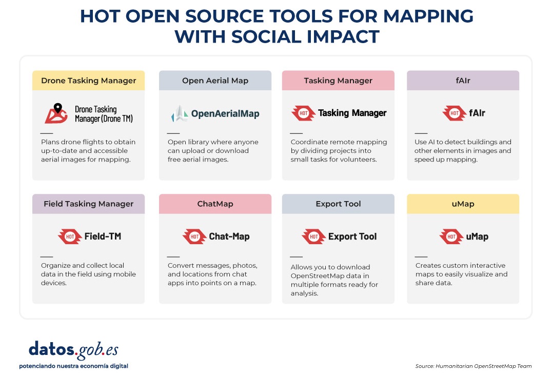
Figure 4. HOT open source tools for mapping with social impact. Source: Humanitarian OpenStreetMap Team (HOT).
All of these tools are available to local communities around the world. HOT also offers training to promote its use and improve the impact of open data in humanitarian responses.
How can you join HOT's impact?
HOT is built alongside a global community that drives the use of open data to strengthen decision-making and save lives. If you represent an organization, university, collective, public agency, or community initiative and have a project idea or interest in an alliance, the HOT team is open to exploring collaborations. You can write to partnerships@hotosm.org.
When communities have access to accurate data, open tools, and the knowledge to generate geospatial information on an ongoing basis, they become informed agents, ready to make decisions in any situation. They are better equipped to identify climate risks, respond to emergencies, solve local problems, and mobilize support. Open mapping, therefore, does not only represent territories: it empowers people to transform their reality with data that can save lives.
Blog
AI systems designed to assist us from the first dives to the final bibliography.
One of the missions of contemporary artificial intelligence is to help us find, sort and digest information, especially with the help of large language models. These systems have come at a time when we most need to manage knowledge that we produce and share en masse, but then struggle to embrace and consume. Its value lies in finding the ideas and data we need quickly, so that we can devote our effort and time to thinking or, in other words, start climbing the ladder a rung or two ahead.
AI-based systems academic research as well as trend studies in the business world. AI analytics tools can analyse thousands of papers to show us which authors collaborate with each other or how topics are grouped, creating an interactive, filterable map of the literature on demand. The Generative AI,the long-awaited one, can start from a research question and return useful sub-content as a synthesis or a contrast of approaches. The first shows us the terrain on the map, while the second suggests where we can move forward.
Practical tools
Starting with the more analytical ones and leaving the mixed or generative ones for last, we go through four practical research tools that integrate AI as a functionality, and one extra ball.
It is a tool based above all on the connection between authors, topics and articles, which shows us networks of citations and allows us to create the complete graph of the literature around a topic. As a starting point, Inciteful asks for the title or URL of a paper, but you can also simply search by your research topic. There is also the possibility to enter the data of two items, to show how they are connected to each other.
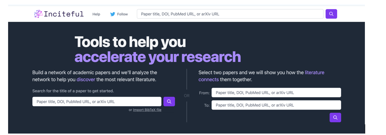
Figure 1. Screenshot in Inciteful: initial search screen and connection between papers.
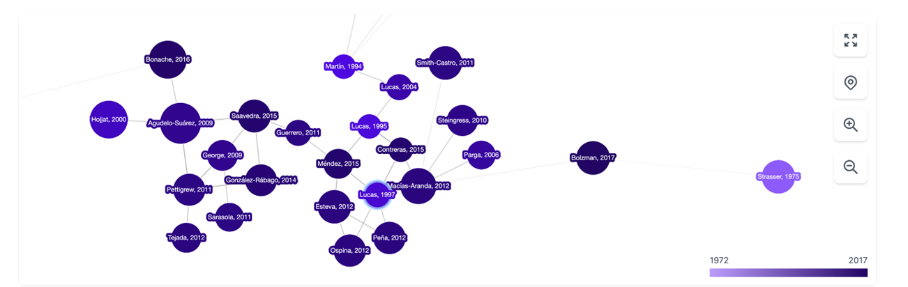
Figure 2. Screenshot on Inciteful: network of nodes with articles and authors.
In Scite, AI integration is more obvious and practical: given a question, it creates a single summary answer by combining information from all references. The tool analyses the semantics of the papers to extract the nature of each quote: how many quotes support it ( check symbol), question it (question mark) or just mention it (slash). This allows us to do something as valuable as adding context to the impact metrics of an article in our bibliography.
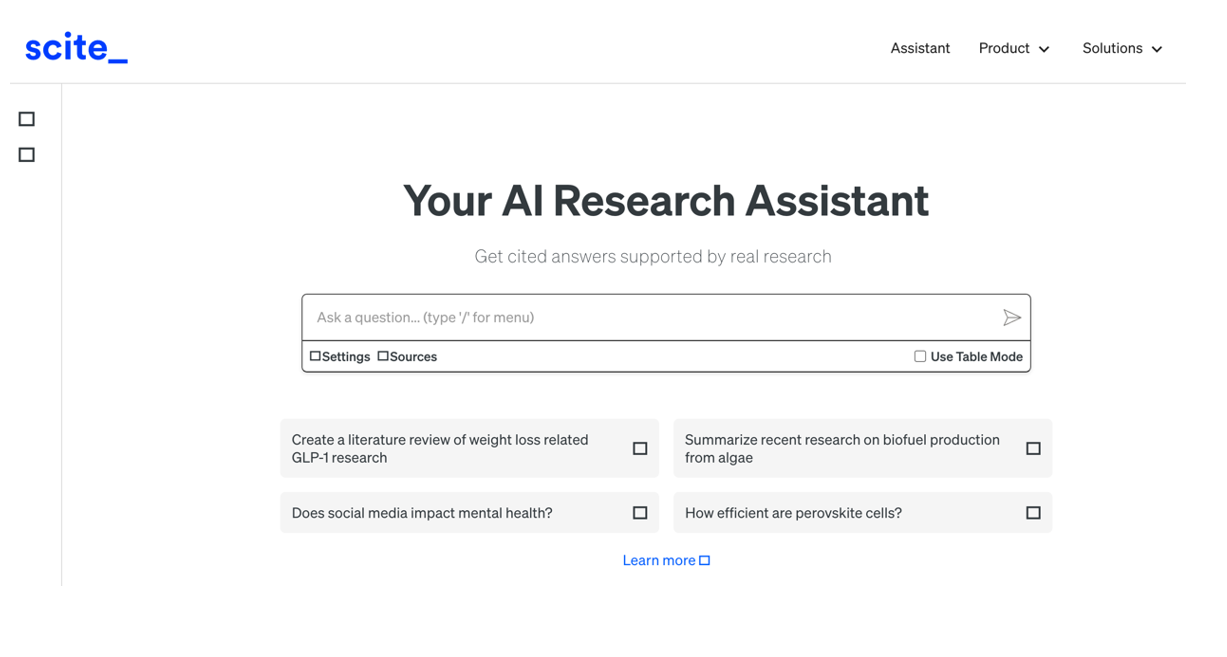
Figure 3. Screenshot in Scite: initial search screen.
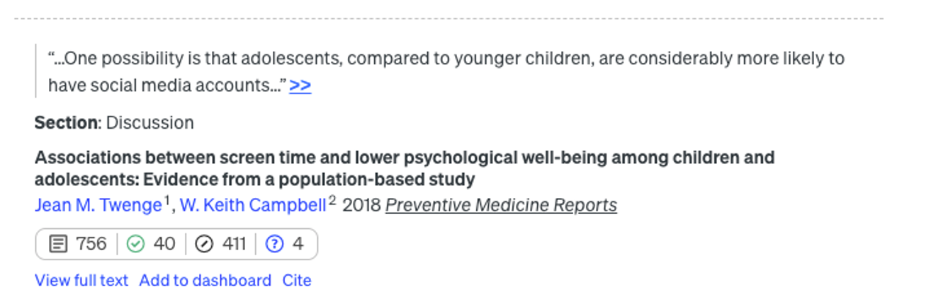
Figure 4. Screenshot in Scite: citation assessment of an article.
In addition to integrating the functionalities of the previous ones, it is a very complete digital product that not only allows you to navigate from paper to paper in the form of a visual network, but also makes it possible to set up alerts on a topic or an author you follow and create lists of papers. In addition, the system itself suggests which other papers you might be interested in, all in the style of a recommendation system like Spotify or Netflix. It also allows you to make public lists, as in Google Maps, and to work collaboratively with other users.
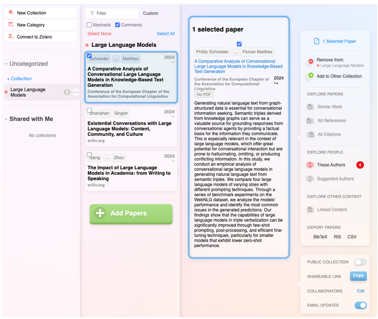
Figure 5. Screenshot on Research Rabbit: customised list of items.
It has the backing of the British government, Stanford University and NASA, and is based entirely on generative AI. Its flagship functionality is the ability to ask direct questions to a paper or a collection of articles, and finally get a targeted report with all the references. But actually, the most striking feature is the ability to improve the user's initial question: the tool instantly evaluates the quality of the question and makes suggestions to make it more accurate or interesting.

Figure 6. Screenshot in Elicit: suggestions for improvement for the initial question..
Extra ball: Consensus.
What started as a humble customised GPT within the Plus version of ChatGPT has turned into a full-fledged digital research product. Based on a question, attempt to synthesise the scientific consensus on that topic, indicating whether there is agreement or disagreement between studies. In a simple and visual way it shows how many support a statement, how many doubt it and which conclusions predominate, as well as providing a short report for quick guidance.

Figure 7. Screenshot on Consensus: impact metrics from a question
The depth button
In recent months, a new functionality has appeared on the platforms of large commercial language models focused on in-depth research. Specifically, it is a button with the same name, "in-depth research" or "deep research", which can already be found in ChatGPT, Plus version (with limited requests) or Pro, and in Gemini Advanced, although they promise that it will gradually be opened to free use and allow some tests without cost.

Figure 8. Screenshot in ChatGPT Plus: In-depth research button.

Figure 9. Screenshot in Gemini Advanced: Deep Research button.
This option, which must be activated before launching the prompt, works as a shortcut: the model generates a synthetic and organised report on the topic, gathering key information, data and context. Before starting the investigation, the system may ask additional questions to better focus the search.

Figure 10. Screenshot in ChatGPT Plus: questions to narrow down the research
It should be noted that, once these questions have been answered, the system initiates a process that may take much longer than a normal response. In particular, in ChatGPT Plus it can take up to 10 minutes. A progress bar indicates progress.

Figure 11. Screenshot in ChatGPT Plus: Research start and progress bar
What we get now is a comprehensive, considerably accurate report, including examples and links that can quickly put us on the track of what we are looking for.
Figure 12: Screenshot of ChatGPT Plus: research result (excerpt).
Closure
The tools designed to apply AI for research are neither infallible nor definitive, and may still be subject to errors and hallucinations, but research with AI is already a radically different process from research without it. Assisted search is, like almost everything else when it comes to AI, about not dismissing as imperfect what can be useful, spending some time trying out new uses that can save us many hours later on, and focusing on what it can do to keep our focus on the next steps.
Content prepared by Carmen Torrijos, expert in AI applied to language and communication. The contents and points of view reflected in this publication are the sole responsibility of the author.
Blog
The increasing complexity of machine learning models and the need to optimise their performance has been driving the development of AutoML (Automated Machine Learning) for years. This discipline seeks to automate key tasks in the model development lifecycle, such as algorithm selection, data processing and hyperparameter optimisation.
AutoML allows users to develop models more easily and quickly. It is an approach that facilitates access to the discipline, making it accessible to professionals with less programming experience and speeding up processes for those with more experience. Thus, for a user with in-depth programming knowledge, AutoML can also be of interest. Thanks to auto machine learning, this user could automatically apply the necessary technical settings, such as defining variables or interpreting the results in a more agile way.
In this post, we will discuss the keys to these automation processes and compile a series of free and/or freemium open source tools that can help you to deepen your knowledge of AutoML.
Learn how to create your own machine learning modeling
As indicated above, thanks to automation, the training and evaluation process of models based on AutoML tools is faster than in a usual machine learning (ML) process, although the stages for model creation are similar.
In general, the key components of AutoML are:
- Data processing: automates tasks such as data cleaning, transformation and feature selection.
- Model selection: examines a variety of machine learning algorithms and chooses the most appropriate one for the specific task.
- Hyperparameter optimisation: automatically adjusts model parameters to improve model performance.
- Model evaluation: provides performance metrics and validates models using techniques such as cross-validation.
- Implementation and maintenance: facilitates the implementation of models in production and, in some cases, their upgrade.
All these elements together offer a number of advantages as shown in the picture below
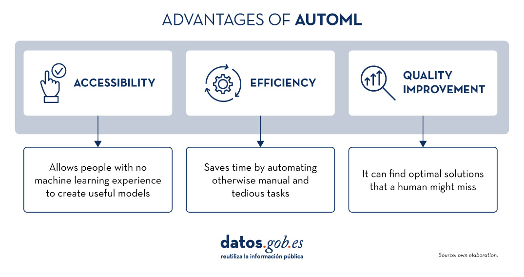
Figure 1. Source: Own elaboration
Examples of AutoML tools
Although AutoML can be very useful, it is important to highlight some of its limitations such as the risk of overfitting (when the model fits too closely to the training data and does not generalise knowledge well), the loss of control over the modelling process or the interpretability of certain results.
However, as AutoML continues to gain ground in the field of machine learning, a number of tools have emerged to facilitate its implementation and use. In the following, we will explore some of the most prominent open source AutoML tools:
H2O.ai, versatile and scalable, ideal for enterprises
H2O.ai is an AutoML platform that includes deep learning and machine learning models such as XGBoost (machine learning library designed to improve model efficiency) and a graphical user interface. This tool is used in large-scale projects and allows a high level of customisation. H2O.ai includes options for classification, regression and time series models, and stands out for its ability to handle large volumes of data.
Although H2O makes machine learning accessible to non-experts, some knowledge and experience in data science is necessary to get the most out of the tool. In addition, it enables a large number of modelling tasks that would normally require many lines of code, making it easier for the data analyst. H2O offers a freemium model and also has an open source community version.
TPOT, based on genetic algorithms, good option for experimentation
TPOT (Tree-based Pipeline Optimization Tool) is a free and open source Python machine learning tool that optimises processes through genetic programming.
This solution looks for the best combination of data pre-processing and machine learning models for a specific dataset. To do so, it uses genetic algorithms that allow it to explore and optimise different pipelines, data transformation and models. This is a more experimental option that may be less intuitive, but offers innovative solutions.
In addition, TPOT is built on top of the popular scikit-learn library, so models generated by TPOT can be used and adjusted with the same techniques that would be used in scikit-learn..
Auto-sklearn, accessible to scikit-learn users and efficient on structured problems
Like TPOT, Auto-sklearn is based on scikit-learn and serves to automate algorithm selection and hyperparameter optimisation in machine learning models in Python.
In addition to being a free and open source option, it includes techniques for handling missing data, a very useful feature when working with real-world datasets. On the other hand, Auto-sklearn offers a simple and easy-to-use API, allowing users to start the modelling process with few lines of code..
BigML, integration via REST APIs and flexible pricing models
BigML is a consumable, programmable and scalable machine learning platform that, like the other tools mentioned above, facilitates the resolution and automation of classification, regression, time series forecasting, cluster analysis, anomaly detection, association discovery and topic modelling tasks. It features an intuitive interface and a focus on visualisation that makes it easy to create and manage ML models, even for users with little programming knowledge.
In addition, BigML has a REST API that enables integration with various applications and languages, and is scalable to handle large volumes of data. On the other hand, it offers a flexible pricing model based on usage, and has an active community that regularly updates the learning resources available.
The following table shows a comparison between these tools:
| H2O.ai | TPOT | Auto-sklearn | BigML | |
|---|---|---|---|---|
| Use | For large-scale projects. | To experiment with genetic algorithms and optimise pipelines. | For users of scikit-learn who want to automate the model selection process and for structured tasks. | To create and deploy ML models in an accessible and simple way. |
| Difficult to configure | Simple, with advanced options. | Medium difficulty. A more technical option by genetic algorithms. | Medium difficulty. It requires technical configuration, but is easy for scikit-learn users. | Simple Intuitive interface with customisation options. |
| Ease of use | Easy to use with the most common programming languages. It has a graphical interface and APIs for R and Python. | Easy to use, but requires knowledge of Python. | Easy to use, but requires prior knowledge. Easy option for scikit-learn users. | Easy to use, focused on visualisation, no programming skills required. |
| Scalability | Scalable to large volumes of data. | Focus on small and medium-sized datasets. Less efficient on large datasets | Effective on small and medium sized datasets. | Scalable for different sizes of datasets. |
| Interoperability | Compatible with several libraries and languages, such as Java, Scala, Python and R. | Based on Python. | Based on Python integrating scikit-learn. | Compatible with REST APIs and various languages. |
| Community | Extensive and active sharing of reference documentation. | Less extensive, but growing. | It is supported by the scikit-learn community. | Active community and support available. |
| Disadvantages | Although versatile, its advanced customisation could be challenging for beginners without technical experience. | May be less efficient on large data sets due to the intensive nature of genetic algorithms. | Its performance is optimised for structured tasks (structured data), which may limit its use for other types of problems. | Its advanced customisation could be challenging for beginners without technical experience |
Figure 2. Comparative table of autoML tools. Source: Own elaboration
Each tool has its own value proposition, and the choice will depend on the specific needs and environment in which the user works.
Here are some examples of free and open source tools that you can explore to get into AutoML. We invite you to share your experience with these or other tools in the comments section below.
If you are looking for tools to help you in data processing, from datos.gob.es we offer you the report "Tools for data processing and visualisation", as well as the following monographic articles:.
Blog
The INSPIRE (Infrastructure for Spatial Information in Europe) Directive sets out the general rules for the establishment of an Infrastructure for Spatial Information in the European Community based on the Infrastructures of the Member States. Adopted by the European Parliament and the Council on 14 March 2007 (Directive 2007/2/EC), it entered into force on 25 April 2007.
INSPIRE makes it easier to find, share and use spatial data from different countries. The information is available through an online portal where it can be found broken down into different formats and topics of interest.
To ensure that these data are compatible and interoperable in a Community and cross-border context, the Directive requires the adoption of common Implementing Rules specific to the following areas:
- Metadata
- Data sets
- Network services
- Data sharing and services
- Spatial data services
- Monitoring and reporting
The technical implementation of these standards is done through Technical Guidelines, technical documents based on international standards and norms.
Inspire and semantic interoperability
These rules are considered Commission decisions or regulations and are therefore binding in each EU country. The transposition of this Directive into Spanish law is developed through Law 14/2010 of 5 July, which refers to the infrastructures and geographic information services of Spain (LISIGE) and the IDEE portal, both of which are the result of the implementation of the INSPIRE Directive in Spain.
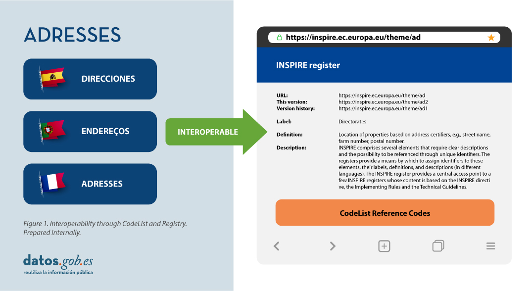
Semantic interoperability plays a decisive role in INSPIRE. Thanks to this, there is a common language in spatial data, as the integration of knowledge is only possible when a homogenisation or common understanding of the concepts that constitute a domain or area of knowledge is achieved. Thus, in INSPIRE, semantic interoperability is responsible for ensuring that the content of the information exchanged is understood in the same way by any system.
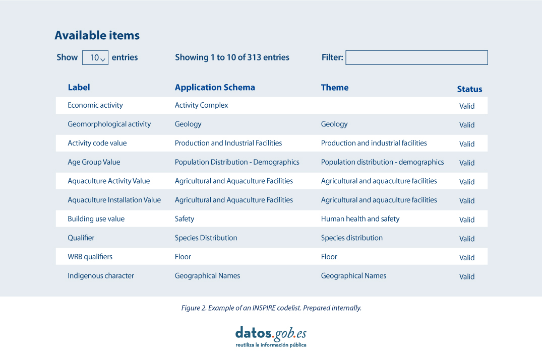
Therefore, in the implementation of spatial data models in INSPIRE, in GML exchange format, we can find codelists that are an important part of the INSPIRE data specifications and contribute substantially to interoperability.
In general, a codelist (or code list) contains several terms whose definitions are universally accepted and understood. Code lists promote data interoperability and constitute a shared vocabulary for a community. They can even be multilingual.
INSPIRE code lists are commonly managed and maintained in the central Federated INSPIRE Registry (ROR) which provides search capabilities, so that both end-users and client applications can easily access code list values for reference.
Registers are necessary because:
- They provide the codes defined in the Technical Guidelines, Regulations and Technical Specifications necessary to implement the Directive.
- They allow unambiguous references of the elements.
- Provides unique and persistent identifiers for resources.
- Enable consistent management and version control of different elements
The code lists used in INSPIRE are maintained at:
- The Inspire Central Federated Registry (ROR).
- The register of code lists of a member state,
- The list registry of a recognised external third party that maintains a domain-specific code list.
To add a new code list, you will need to set up your own registry or work with the administration of one of the existing registries to publish your code list. This can be quite a complicated process, but a new tool helps us in this task.
Re3gistry is a reusable open-source solution, released under EUPL, that allows companies and organisations to manage and share \"reference codes\" through persistent URIs, ensuring that concepts are unambiguously referenced in any domain and facilitating the management of these resources graphically throughout their lifecycle.
Funded by ELISE, ISA2 is a solution recognised by the Europeans in the Interoperability Framework as a supporting tool.
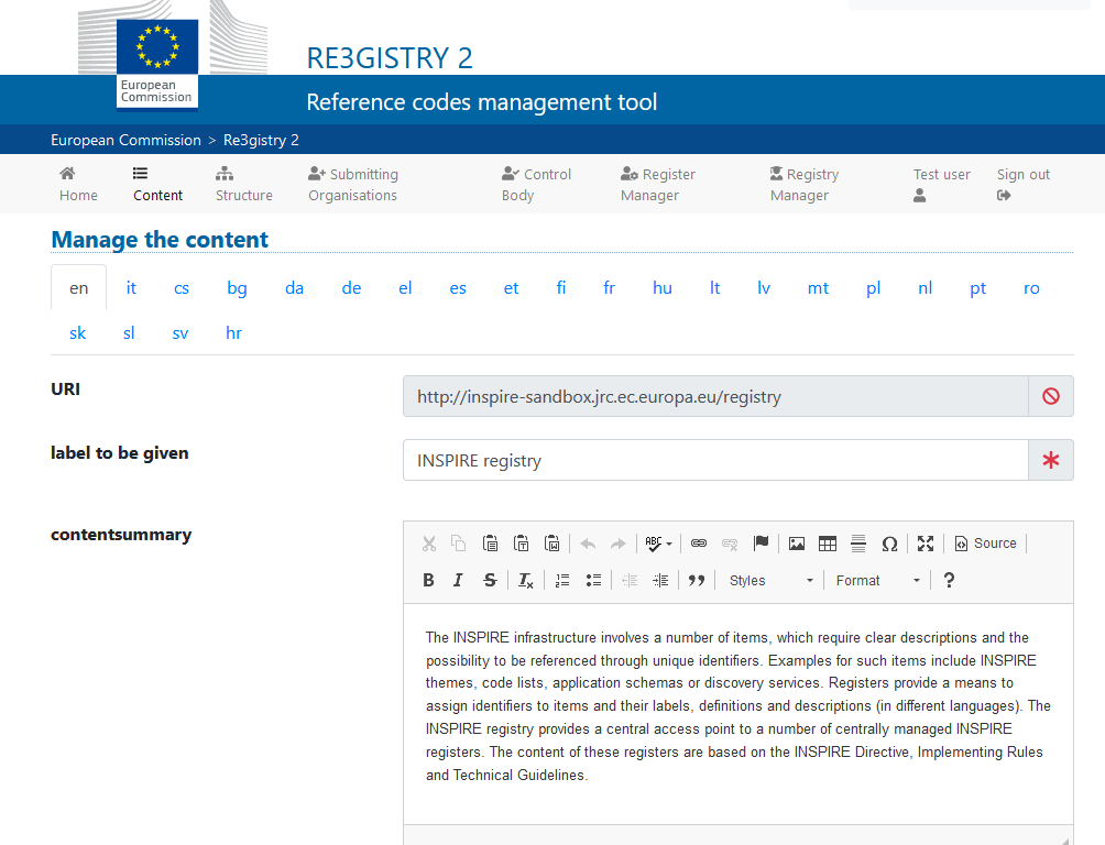
Illustration 3: Image of the Re3gister interface
Re3gistry is available for both Windows and Linux and offers an easy-to-use Web Interface for adding, editing, and managing records and reference codes. In addition, it allows the management of the complete lifecycle of reference codes (based on ISO 19135: 2005 Integrated procedures for the registration of reference codes)
The editing interface also provides a flag to allow the system to expose the reference code in the format that allows its integration with RoR, so that it can eventually be imported into the INSPIRE registry federation. For this integration, Reg3gistry makes an export in a format based on the following specifications:
- The W3C Data Catalogue (DCAT) vocabulary used to model the entity registry (dcat:Catalog).
- The W3C Simple Knowledge Organisation System (SKOS) which is used to model the entity registry (skos:ConceptScheme) and the element (skos:Concept).
Other notable features of Re3gistry
- Highly flexible and customisable data models
- Multi-language content support
- Support for version control
- RESTful API with content negotiation (including OpenAPI 3 descriptor)
- Free-text search
- Supported formats: HTML, ISO 19135 XML, JSON
- Service formats can be easily added or customised (default formats): JSON and ISO 19135 XML
- Multiple authentication options
- Externally governed elements referenced through URIs
- INSPIRE record federation format support (option to automatically create RoR format)
- Easy data export and re-indexing (SOLR)
- Guides for users, administrators, and developers
- RSS feed
Ultimately, Re3gistry provides a central access point where reference code labels and descriptions are easily accessible to both humans and machines, while fostering semantic interoperability between organisations by enabling:
- Avoid common mistakes such as misspellings, entering synonyms or filling in online forms.
- Facilitate the internationalisation of user interfaces by providing multilingual labels.
- Ensure semantic interoperability in the exchange of data between systems and applications.
- Tracking changes over time through a well-documented version control system.
- Increase the value of reference codes if they are widely reused and referenced.
More about Re3gistry:


References
https://github.com/ec-jrc/re3gistry
https://inspire.ec.europa.eu/codelist
https://ec.europa.eu/isa2/solutions/re3gistry_en/
https://live.osgeo.org/en/quickstart/re3gistry_quickstart.html
Content prepared by Mayte Toscano, Senior Consultant in Technologies linked to the data economy.
The contents and views expressed in this publication are the sole responsibility of the author.
Blog
Public administration is working to ensure access to open data, in order to empowering citizens in their right to information. Aligned with this objective, the European open data portal (data.europa.eu) references a large volume of data on a variety of topics.
However, although the data belong to different information domains or are in different formats, it is complex to exploit them together to maximise their value. One way to achieve this is through the use of RDF (Resource Description Framework), a data model that enables semantic interoperability of data on the web, standardised by the W3C, and highlighted in the FAIR principles. RDF occupies one of the top levels of the five-star schema for open data publishing, proposed by Tim Berners-Lee, the father of the web.
In RDF, data and metadata are automatically interconnected, generating a network of Linked Open Data (LOD) by providing the necessary semantic context through explicit relationships between data from different sources to facilitate their interconnection. This model maximises the exploitation potential of linked data.
It is a data sharing paradigm that is particularly relevant within the EU data space initiative explained in this post.
RDF offers great advantages to the community. However, in order to maximise the exploitation of linked open data it is necessary to know the SPARQL query language, a technical requirement that can hinder public access to the data.
An example of the use of RDF is the open data catalogues available on portals such as datos.gob.es or data.europa.eu that are developed following the DCAT standard, which is an RDF data model to facilitate their interconnection. These portals have interfaces to configure queries in SPARQL language and retrieve the metadata of the available datasets.
A new app to make interlinked data accessible: Vinalod.
Faced with this situation and with the aim of facilitating access to linked data, Teresa Barrueco, a data scientist and visualisation specialist who participated in the 2018 EU Datathon, the EU competition to promote the design of digital solutions and services related to open data, developed an application together with the European Publications Office.
The result is a tool for exploring LOD without having to be familiar with SPARQL syntax, called Vinalod: Visualisation and navigation of linked open data. The application, as its name suggests, allows you to navigate and visualise data structures in knowledge graphs that represent data objects linked to each other through the use of vocabularies that represent the existing relationships between them. Thus, through a visual and intuitive interaction, the user can access different data sources:
- EU Vocabularies. EU reference data containing, among others, information from Digital Europa Thesaurus, NUTS classification (hierarchical system to divide the economic territory of the EU) and controlled vocabularies from the Named Authority Lists.
- Who's Who in the EU. Official EU directory to identify the institutions that make up the structure of the European administration.
- EU Data. Sets and visualisations of data published on the EU open data portal that can be browsed according to origin and subject.
- EU publications. Reports published by the European Union classified according to their subject matter.
- EU legislation. EU Treaties and their classification.
The good news is that the BETA version of Vinalod is now available for use, an advance that allows for temporary filtering of datasets by country or language.
To test the tool, we tried searching for data catalogues published in Spanish, which have been modified in the last three months. The response of the tool is as follows:

And it can be interpreted as follows:

Therefore, the data.europa.eu portal hosts ("has catalog") several catalogues that meet the defined criteria: they are in Spanish language and have been published in the last three months. The user can drill down into each node ("to") and find out which datasets are published in each portal.
In the example above, we have explored the 'EU data' section. However, we could do a similar exercise with any of the other sections. These are: EU Vocabularies; Who's Who in the EU; EU Publications and EU Legislation.
All of these sections are interrelated, that means, a user can start by browsing the 'EU Facts', as in the example above, and end up in 'Who's Who in the EU' with the directory of European public officials.

As can be deduced from the above tests, browsing Vinalod is a practical exercise in itself that we encourage all users interested in the management, exploitation and reuse of open data to try out.
To this end, in this link we link the BETA version of the tool that contributes to making open data more accessible without the need to know SPARQL, which means that anyone with minimal technical knowledge can work with the linked open data.
This is a valuable contribution to the community of developers and reusers of open data because it is a resource that can be accessed by any user profile, regardless of their technical background. In short, Vinalod is a tool that empowers citizens, respects their right to information and contributes to the further opening of open data.
Blog
Ensuring data quality is an essential task for any open data initiative. Before publication, datasets need to be validated to check that they are free of errors, duplication, etc. In this way, their potential for re-use will grow.
Data quality is conditioned by many aspects. In this sense, the Aporta Initiative has developed the "Practical guide for improving the quality of open data", which provides a compendium of guidelines to act on the different characteristics that define quality and promote its improvement.
The guide includes a list of some free tools aimed at applying corrective measures on the data at source. In this article we share some examples. These tools are useful for working on specific aspects related to quality, so their usefulness will depend on the data you are working with and their characteristics.
This is a collection of online tools for format conversion and character encoding tasks. You can choose between different converters, but we highlight the tools for working with UTF8 encoding. This collection compiles a wide catalogue of programming tools, which offer conversion functionalities, encryption, password generation, editing and management of texts and images, date and time conversion, mathematical operations, etc.
All tools are free, without intrusive ads, and easy to use thanks to a simple user interface. In addition, each of them includes examples of use.
Managed by the Open Data Institute, this online tool allows you to check whether a CSV file is machine-readable and to verify the columns and types it should include. It also allows users to add schemas to data files. After analysis, it generates a report with the results and a tag that can be embedded in the data portal from which the evaluated dataset comes.
Although it is very easy to use (just upload the file to be verified and click on the validate button), the website includes a help section. It works well with files up to 100 Mb in size. It also offers a simple manual with guidelines on how to create a CSV file correctly and avoid the most common mistakes.
DenCode offers online encoding and decoding tools. Among the functionalities offered we can find this tool that helps publishers to convert date-type data to ISO 8601 format, which is the international standard that facilitates the homogenisation of this type of data and its interoperability.
The tool is very intuitive, as it is only necessary to type the date and time to be converted in the section provided for this purpose.
XML Escape / Unescape is an open source online tool used for "escaping" or masking special characters in XML and performing the reverse process. The tool removes traces of characters that could be misinterpreted.
As in the previous case, the tool is very intuitive. It is only necessary to copy and paste the fragment to be processed in the editor.
JSONLint is a validator and reformulator for JSON, which allows to check if the code is valid according to that specification. It has an editor where you can write or copy and paste the code, although you can also directly enter a url for validation. JSONLint will analyse the code to find and suggest the correction of errors, explaining the multiple reasons why they may occur. The tool can also be used as a compressor, thus reducing file size.
Its website includes information on good practices when working with the JSON format, as well as information on common errors.
Open Refine is a tool designed for data processing and enrichment: it allows you to clean data, transform their format and extend them with web services and external data. One of its main features is that it uses its own language, GREL (Google Refine Expression Language), which allows advanced debugging tasks to be carried out. It is available in more than 15 languages.
Its website offers several videos explaining how it works. It also has a documentation section with online courses, guides and FAQs. In addition, users can use its large community and discussion groups on Google, Gitter and Stackoverflow to solve doubts and share experiences.
OpenRefine allows to add different extensions. One of them allows transforming tabular data to an RDF schema through a SPARQL point. It allows to work with the following specific formats: TSV, CSV, SV, XLS, XLSX, JSON, XML, RDF as XML and Google sheet. The visual interface guides in the choice of predicates, the definition of data type mappings to RDF and the implementation of complex transformations using the GREL language.
The website includes information on how to use the tool, as well as use cases.
This tool allows JSON schemas to be generated and validated from JSON files. These schemas allow to describe existing data formats, providing clear and readable documentation for both humans and machines.
On the JSON Schema website, there are several training materials available, including examples, and information on different implementations. You can also learn more about JSON schema on their Github profile.
This is an online validation tool for the SHACL specification, the W3C standard for validating RDF graphs against a set of conditions expressed in SHACL. As with the previous tools, it is only necessary to cut and paste the code for its validation.
The tool provides some examples of use. In addition, all the code is available on github.
Swagger is a tool for editing and validating specifications that follow the OpenAPI standard. Although it has a paid version with more features, users can create a free account that will allow them to design APIS documentation in a fast and standardised way. This free version has intelligent error detection and syntax auto-completion functionalities.
Sphinx is an open source software for generating any kind of documentation on data. It allows creating hierarchical content structures and automatic indexes, as well as extending cross-references through semantic markup and automatic links for functions, classes, citations, glossary terms and similar pieces of information. It uses the reStructuredText markup language by default, and can read MyST markdown through third-party extensions.
Through its website you can access a large number of tutorials and guides. It also has a large community of users.
This is open source software for hosting and documenting data semantics, similar to the one above. It aims to simplify the generation of software documentation by automating the creation, version control and hosting of documentation.
It has an extensive tutorial on how to create a documentation project.
This tool allows to convert the words in a text into upper and/or lower case. The user only has to enter a text and the tool converts it into different formats: all uppercase, all lowercase, Title Case (where all important words start with uppercase, while minor terms, such as articles or prepositions, use lowercase) or AP-Style Title Case (where all terms start with uppercase).
This is just an example of some online tools that can help you work on data quality issues. If you want to recommend any other tool, you can leave us a comment or send a message to dinamizacion@datos.gob.es.
Content prepared by the datos.gob.es team.
Documentación
Visualization is critical for data analysis. It provides a first line of attack, revealing intricate structures in data that cannot be absorbed otherwise. We discover unimaginable effects and question those that have been imagined."
William S. Cleveland (de Visualizing Data, Hobart Press)
Over the years an enormous amount of public information has been generated and stored. This information, if viewed in a linear fashion, consists of a large number of disjointed numbers and facts that, out of context, lack any meaning. For this reason, visualization is presented as an easy solution towards understanding and interpreting information.
To obtain good visualizations, it is necessary to work with data that meets two characteristics:
- It has to be quality data. They need to be accurate, complete, reliable, current and relevant.
- They have to be well treated. That is, conveniently identified, correctly extracted, in a structured way, etc.
Therefore, it is important to properly process the information before its graphic treatment. The treatment of the data and its visualization form an attractive tandem for the user who demands, more and more, to be able to interpret data in an agile and fast way.
There are a large number of tools for this purpose. The report "Data processing and visualization tools" offers us a list of different tools that help us in data processing, from obtaining them to creating a visualization that allows us to interpret them in a simple way.
What can you find in the report?
The guide includes a collection of tools for:
- Web scraping
- Data debugging
- Data conversion
- Data analysis for programmers and non-programmers
- Generic visualization services, geospatial and libraries and APIs.
- Network analysis
All the tools present in the guide have a freely available version so that any user can access them.
New edition 2021: incorporation of new tools
The first version of this report was published in 2016. Five years later it has been updated. The news and changes made are:
- New currently popular data visualization and processing tools such as Talend Open Studio, Python, Kibana or Knime have been incorporated.
- Some outdated tools have been removed.
- The layout has been updated.
If you know of any additional tools, not currently included in the guide, we invite you to share the information in the comments.
In addition, we have prepared a series of posts where the different types of tools that can be found in the report are explained:
Blog
Many people don't know, but we are surrounded by APIs. APIs are the mechanism by which services communicate on the Internet. APIs are what make it possible for us to log into our email or make a purchase online.
API stands for Application Programming Interface, which for most Internet users means nothing. However, the reality is that thanks to APIs today we can do all those fantastic things that we love so much in the digital world. From logging into any Internet service, making a purchase on Amazon or reserving a hotel room on Booking. All these services are possible thanks to APIs.
A simple way to explain what an API is for is as follows: a mechanism by which two software programs can “talk” and exchange the data they need to fulfill the functionality for which they were designed. For example, to log in to our email provider, there is a program in charge of validating that we have a correct username and password. However, this program must receive that username and password from a person who interacts with a web browser or a mobile application. In order for the mobile application to know how to send that program the username and password of the person who wants to access the service, it uses an API as an exchange language. This API defines the way the mobile app sends this data and the way the validation program consumes it. Thus, when a new mobile application requires the same validation process, it will be enough to follow the same API to verify the user's credentials.
The importance of APIs in creating data products
In this new post, we focus on the field of APIs as a key technological base for the creation of data products. The fundamental characteristic of digital disruption is the role of data as the main transforming element of organizations and society. This is why data products are becoming more common and valuable. Data products are digital applications and services created with the integrated data component from design. The data component does not have to be the only characteristic of the product or service, but it does play a fundamental role in the operation of the product (physical or digital) or service. Take, for example, a mobile map application. Its main functionality may be to show us a map and physically locate our current position. However, the application can be understood as a data product where, in addition to our current position, we find nearby services such as restaurants, gas stations, libraries, etc. In addition, we can over-print weather information or current traffic conditions. An application of this type cannot be understood without an ecosystem of APIs that allow the intercommunication of the different services (meteorology, traffic, points of interest, etc.) with the application itself.
How to Manage APIs in Data Products: The Friendliness Checker API Example
Having clearly understood the importance of APIs in data products, let us now analyze the complexity of managing one or more large APIs in a data product. Creating good APIs is hard work. You need to determine what data you are going to provide and accept our API. We must estimate the volume of requests that we will have to assume. We must think about the update mechanisms as well as the monitoring of the use that the API is having. Not to mention the security and privacy of the data that the API will handle.
For these and many other reasons, the Support Center for Data Sharing has created the API Friendliness Checker tool. The Support Center for Data Sharing (SCDS) is a European project led by a consortium of three companies: Capgemini Invent, Fraunhofer Fokus and Timelex.
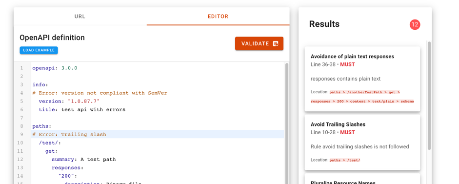
The API Friendliness Checker tool allows API developers to analyze whether their APIs comply with the OpenAPI specification: an established and widely recognized standard for developing APIs. The OpenAPI specification was developed with accessibility criteria in mind. The goal is that the services and applications that implement it can be understood by humans and machines alike, without the need to access programming code or documentation. In other words, an API developed under the OpenAPI specification is self-contained and can be used out of the box without the need for additional documentation or code. In other words, an API developed under the OpenAPI specification is self-contained and can be used out of the box without the need for additional documentation or code.
When we use the tool, the API compatibility validator allows the developer to compare their API against the essential quality and usability criteria defined by the OpenAPI specification. The tool allows you to copy the specification url of our API to evaluate its compatibility. It is also possible to copy and paste the description of our API in the editor of the tool. Just by pressing the validate button, the compatibility checker will evaluate the API and display any comments for improvement.
For more information on the technical characteristics of this validation tool, all the information can be consulted on the SCDS website https://eudatasharing.eu/es/node/578.
If you are thinking of creating a new data product, we are sure that this tool to validate your API before putting it into production will be of great help. Finally, if your digital product is based on real-time data, you will surely be interested in exploring these other concepts such as event-oriented systems and asynchronous APIs.
Do you want to know more about the APIs?
As we have seen, APIs are a fundamental element in the world of data. Whether you are a publisher or a reuser of open data, at datos.gob.es you have at your disposal some materials that can help you:
- Report "How to generate value from data: formats, techniques and tools to analyze open data". Aimed at reusers, it discusses the world of APIs in more detail, including practical examples on their use on the Internet.
- “Practical guide for the publication of Open Data using APIs”. Aimed at those data portals that do not yet have an API, this guide offers guidelines to define and implement this data access mechanism.
Contenido elaborado por Alejandro Alija,experto en Transformación Digital e Innovación.
Los contenidos y los puntos de vista reflejados en esta publicación son responsabilidad exclusiva de su autor.