Documentación
1. Introduction
Visualizations are graphical representations of data that allow the information linked to them to be communicated in a simple and effective way. The visualization possibilities are very wide, from basic representations, such as line, bar or sector graphs, to visualizations configured on interactive dashboards.
In this "Step-by-Step Visualizations" section we are regularly presenting practical exercises of open data visualizations available in datos.gob.es or other similar catalogs. They address and describe in a simple way the stages necessary to obtain the data, perform the transformations and analyses that are relevant to, finally, enable the creation of interactive visualizations that allow us to obtain final conclusions as a summary of said information. In each of these practical exercises, simple and well-documented code developments are used, as well as tools that are free to use. All generated material is available for reuse in the GitHub Data Lab repository.
Then, as a complement to the explanation that you will find below, you can access the code that we will use in the exercise and that we will explain and develop in the following sections of this post.
Access the data lab repository on Github.
Run the data pre-processing code on top of Google Colab.
2. Objetive
The main objective of this exercise is to show how to generate an interactive dashboard that, based on open data, shows us relevant information on the food consumption of Spanish households based on open data. To do this, we will pre-process the open data to obtain the tables that we will use in the visualization generating tool to create the interactive dashboard.
Dashboards are tools that allow you to present information in a visual and easily understandable way. Also known by the term "dashboards", they are used to monitor, analyze and communicate data and indicators. Your content typically includes charts, tables, indicators, maps, and other visuals that represent relevant data and metrics. These visualizations help users quickly understand a situation, identify trends, spot patterns, and make informed decisions.
Once the data has been analyzed, through this visualization we will be able to answer questions such as those posed below:
- What is the trend in recent years regarding spending and per capita consumption in the different foods that make up the basic basket?
- What foods are the most and least consumed in recent years?
- In which Autonomous Communities is there a greater expenditure and consumption in food?
- Has the increase in the cost of certain foods in recent years meant a reduction in their consumption?
These, and many other questions can be solved through the dashboard that will show information in an orderly and easy to interpret way.
3. Resources
3.1. Datasets
The open datasets used in this exercise contain different information on per capita consumption and per capita expenditure of the main food groups broken down by Autonomous Community. The open datasets used, belonging to the Ministry of Agriculture, Fisheries and Food (MAPA), are provided in annual series (we will use the annual series from 2010 to 2021)
Annual series data on household food consumption
These datasets are also available for download from the following Github repository.
These datasets are also available for download from the following Github repository.
3.2. Tools
To carry out the data preprocessing tasks, the Python programming language written on a Jupyter Notebook hosted in the Google Colab cloud service has been used.
"Google Colab" or, also called Google Colaboratory, is a cloud service from Google Research that allows you to program, execute and share code written in Python or R on a Jupyter Notebook from your browser, so it does not require configuration. This service is free of charge.
For the creation of the dashboard, the Looker Studio tool has been used.
"Looker Studio" formerly known as Google Data Studio, is an online tool that allows you to create interactive dashboards that can be inserted into websites or exported as files. This tool is simple to use and allows multiple customization options.
If you want to know more about tools that can help you in the treatment and visualization of data, you can use the report "Data processing and visualization tools".
4. Processing or preparation of data
The processes that we describe below you will find commented in the following Notebook that you can run from Google Colab.
Before embarking on building an effective visualization, we must carry out a prior treatment of the data, paying special attention to its obtaining and the validation of its content, making sure that it is in the appropriate and consistent format for processing and that it does not contain errors.
As a first step of the process, once the initial data sets are loaded, it is necessary to perform an exploratory data analysis (EDA) to properly interpret the starting data, detect anomalies, missing data or errors that could affect the quality of subsequent processes and results. If you want to know more about this process, you can resort to the Practical Guide of Introduction to Exploratory Data Analysis.
The next step is to generate the pre-processed data table that we will use to feed the visualization tool (Looker Studio). To do this, we will modify, filter and join the data according to our needs.
The steps followed in this data preprocessing, explained in the following Google Colab Notebook, are as follows:
- Installation of libraries and loading of datasets
- Exploratory Data Analysis (EDA)
- Generating preprocessed tables
You will be able to reproduce this analysis with the source code that is available in our GitHub account. The way to provide the code is through a document made on a Jupyter Notebook that once loaded into the development environment you can run or modify easily. Due to the informative nature of this post and to favor the understanding of non-specialized readers, the code is not intended to be the most efficient, but to facilitate its understanding so you will possibly come up with many ways to optimize the proposed code to achieve similar purposes. We encourage you to do so!
5. Displaying the interactive dashboard
Once we have done the preprocessing of the data, we go with the generation of the dashboard. A scorecard is a visual tool that provides a summary view of key data and metrics. It is useful for monitoring, decision-making and effective communication, by providing a clear and concise view of relevant information.
For the realization of the interactive visualizations that make up the dashboard, the Looker Studio tool has been used. Being an online tool, it is not necessary to have software installed to interact or generate any visualization, but it is necessary that the data table that we provide is properly structured, which is why we have carried out the previous steps related to the preprocessing of the data. If you want to know more about how to use Looker Studio, in the following link you can access training on the use of the tool.
Below is the dashboard, which can be opened in a new tab in the following link. In the following sections we will break down each of the components that make it up.
5.1. Filters
Filters in a dashboard are selection options that allow you to visualize and analyze specific data by applying various filtering criteria to the datasets presented in the dashboard. They help you focus on relevant information and get a more accurate view of your data.

The filters included in the generated dashboard allow you to choose the type of analysis to be displayed, the territory or Autonomous Community, the category of food and the years of the sample.
It also incorporates various buttons to facilitate the deletion of the chosen filters, download the dashboard as a report in PDF format and access the raw data with which this dashboard has been prepared.
5.2. Interactive visualizations
The dashboard is composed of various types of interactive visualizations, which are graphical representations of data that allow users to actively explore and manipulate information.
Unlike static visualizations, interactive visualizations provide the ability to interact with data, allowing users to perform different and interesting actions such as clicking on elements, dragging them, zooming or reducing focus, filtering data, changing parameters and viewing results in real time.
This interaction is especially useful when working with large and complex data sets, as it makes it easier for users to examine different aspects of the data as well as discover patterns, trends and relationships in a more intuitive way.
To define each type of visualization, we have based ourselves on the data visualization guide for local entities presented by the NETWORK of Local Entities for Transparency and Citizen Participation of the FEMP.
5.2.1 Data tables
Data tables allow the presentation of a large amount of data in an organized and clear way, with a high space/information performance.
However, they can make it difficult to present patterns or interpretations with respect to other visual objects of a more graphic nature.
5.2.2 Map of chloropetas
t is a map in which numerical data are shown by territories marking with intensity of different colours the different areas. For its elaboration it requires a measure or numerical data, a categorical data for the territory and a geographical data to delimit the area of each territory.
5.2.3 Pie chart
It is a graph that shows the data from polar axes in which the angle of each sector marks the proportion of a category with respect to the total. Its functionality is to show the different proportions of each category with respect to a total using pie charts.
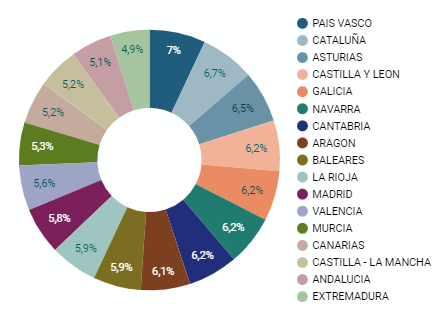
Figure 4. Dashboard pie chart
5.2.4 Line chart
It is a graph that shows the relationship between two or more measurements of a series of values on two Cartesian axes, reflecting on the X axis a temporal dimension, and a numerical measure on the Y axis. These charts are ideal for representing time data series with a large number of data points or observations.
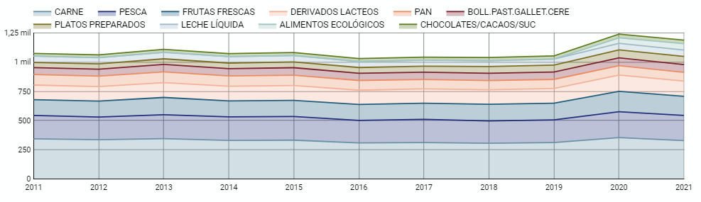
Figure 5. Dashboard line chart
5.2.5 Bar chart
It is a graph of the most used for the clarity and simplicity of preparation. It makes it easier to read values from the ratio of the length of the bars. The chart displays the data using an axis that represents the quantitative values and another that includes the qualitative data of the categories or time.
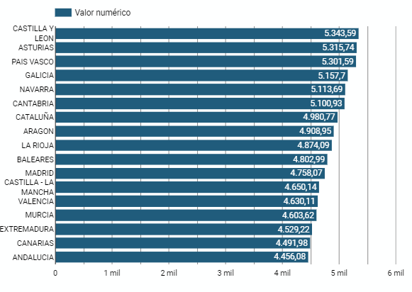
Figure 6. Dashboard bar chart
5.2.6 Hierarchy chart
It is a graph formed by different rectangles that represent categories, and that allows hierarchical groupings of the sectors of each category. The dimension of each rectangle and its placement varies depending on the value of the measurement of each of the categories shown with respect to the total value of the sample.
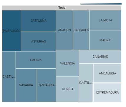
Figure 7. Dashboard Hierarchy chart
6. Conclusions
Dashboards are one of the most powerful mechanisms for exploiting and analyzing the meaning of data. It should be noted the importance they offer us when it comes to monitoring, analyzing and communicating data and indicators in a clear, simple and effective way.
As a result, we have been able to answer the questions originally posed:
- The trend in per capita consumption has been declining since 2013, when it peaked, with a small rebound in 2020 and 2021.
- The trend of per capita expenditure has remained stable since 2011 until in 2020 it has suffered a rise of 17.7%, going from being the average annual expenditure of 1052 euros to 1239 euros, producing a slight decrease of 4.4% from the data of 2020 to those of 2021.
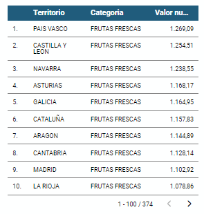
- The three most consumed foods during all the years analyzed are: fresh fruits, liquid milk and meat (values in kgs)
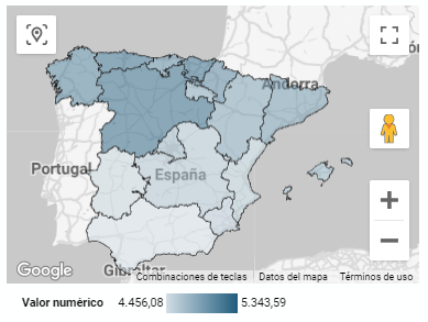
- The Autonomous Communities where per capita spending is highest are the Basque Country, Catalonia and Asturias, while Castilla la Mancha, Andalusia and Extremadura have the lowest spending.
- The Autonomous Communities where a higher per capita consumption occurs are Castilla y León, Asturias and the Basque Country, while in those with the lowest are Extremadura, the Canary Islands and Andalusia.
We have also been able to observe certain interesting patterns, such as a 17.33% increase in alcohol consumption (beers, wine and spirits) in the years 2019 and 2020.
You can use the different filters to find out and look for more trends or patterns in the data based on your interests and concerns.
We hope that this step-by-step visualization has been useful for learning some very common techniques in the treatment and representation of open data. We will be back to show you new reuses. See you soon!
Documentación
1. Introduction
Visualizations are graphical representations of the data allowing to transmit in a simple and effective way related information. The visualization capabilities are extensive, from basic representations, such as a line chart, bars or sectors, to visualizations configured on control panels or interactive dashboards.
In this "Step-by-Step Visualizations" section we are periodically presenting practical exercises of open data visualizations available in datos.gob.es or other similar catalogs. They address and describe in an easy manner stages necessary to obtain the data, to perform transformations and analysis relevant to finally creating interactive visualizations, from which we can extract information summarized in final conclusions. In each of these practical exercises simple and well-documented code developments are used, as well as open-source tools. All generated materials are available for reuse in the GitHub repository.
In this practical exercise, we made a simple code development that is conveniently documented relying on free to use tools.
Access the data lab repository on Github
Run the data pre-procesing code on top of Google Colab
2. Objective
The main scope of this post is to show how to generate a custom Google Maps map using the "My Maps" tool based on open data. These types of maps are highly popular on websites, blogs and applications in the tourism sector, however, the useful information provided to the user is usually scarce.
In this exercise, we will use potential of the open-source data to expand the information to be displayed on our map in an automatic way. We will also show how to enrich open data with context information that significantly improves the user experience.
From a functional point of view, the goal of the exercise is to create a personalized map for planning tourist routes through the natural areas of the autonomous community of Castile and León. For this, open data sets published by the Junta of Castile and León have been used, which we have pre-processed and adapted to our needs in order to generate a personalized map.
3. Resources
3.1. Datasets
The datasets contain different tourist information of geolocated interest. Within the open data catalog of the Junta of Castile and León, we may find the "dictionary of entities" (additional information section), a document of vital importance, since it defines the terminology used in the different data sets.
- Viewpoints in natural areas
- Observatories in natural areas
- Shelters in natural areas
- Trees in natural areas
- Park houses in natural areas
- Recreational areas in natural areas
- Registration of hotel establishments
These datasets are also available in the Github repository.
3.2. Tools
To carry out the data preprocessing tasks, the Python programming language written on a Jupyter Notebook hosted in the Google Colab cloud service has been used.
"Google Colab" also called " Google Colaboratory", is a free cloud service from Google Research that allows you to program, execute and share from your browser code written in Python or R, so it does not require installation of any tool or configuration.
For the creation of the interactive visualization, the Google My Maps tool has been used.
"Google My Maps" is an online tool that allows you to create interactive maps that can be embedded in websites or exported as files. This tool is free, easy to use and allows multiple customization options.
If you want to know more about tools that can help you with the treatment and visualization of data, you can go to the section "Data processing and visualization tools".
4. Data processing and preparation
The processes that we describe below are commented in the Notebook which you can run from Google Colab.
Before embarking on building an effective visualization, we must carry out a prior data treatment, paying special attention to obtaining them and validating their content, ensuring that they are in the appropriate and consistent format for processing and that they do not contain errors.
The first step necessary is performing the exploratory analysis of the data (EDA) in order to properly interpret the starting data, detect anomalies, missing data or errors that could affect the quality of the subsequent processes and results. If you want to know more about this process, you can go to the Practical Guide of Introduction to Exploratory Data Analysis.
The next step is to generate the tables of preprocessed data that will be used to feed the map. To do so, we will transform the coordinate systems, modify and filter the information according to our needs.
The steps required in this data preprocessing, explained in the Notebook, are as follows:
- Installation and loading of libraries
- Loading datasets
- Exploratory Data Analysis (EDA)
- Preprocessing of datasets
During the preprocessing of the data tables, it is necessary to change the coordinate system since in the source datasets the ESTR89 (standard system used in the European Union) is used, while we will need them in the WGS84 (system used by Google My Maps among other geographical applications). How to make this coordinate change is explained in the Notebook. If you want to know more about coordinate types and systems, you can use the "Spatial Data Guide".
Once the preprocessing is finished, we will obtain the data tables "recreational_natural_parks.csv", "rural_accommodations_2stars.csv", "natural_park_shelters.csv", "observatories_natural_parks.csv", "viewpoints_natural_parks.csv", "park_houses.csv", "trees_natural_parks.csv" which include generic and common information fields such as: name, observations, geolocation,... together with specific information fields, which are defined in details in section "6.2 Personalization of the information to be displayed on the map".
You will be able to reproduce this analysis, as the source code is available in our GitHub account. The code can be provided through a document made on a Jupyter Notebook once loaded into the development environment can be easily run or modified. Due to informative nature of this post and to favor understanding of non-specialized readers, the code is not intended to be the most efficient, but rather to facilitate its understanding so you could possibly come up with many ways to optimize the proposed code to achieve similar purposes. We encourage you to do so!
5. Data enrichment
To provide more related information, a data enrichment process is carried out on the dataset "hotel accommodation registration" explained below. With this step we will be able to automatically add complementary information that was initially not included. With this, we will be able to improve the user experience during their use of the map by providing context information related to each point of interest.
For this we will apply a useful tool for such kind of a tasks: OpenRefine. This open-source tool allows multiple data preprocessing actions, although this time we will use it to carry out an enrichment of our data by incorporating context by automatically linking information that resides in the popular Wikidata knowledge repository.
Once the tool is installed on our computer, when executed – a web application will open in the browser in case it is not opened automatically.
Here are the steps to follow.
Step 1
Loading the CSV into the system (Figure 1). In this case, the dataset "Hotel accommodation registration".
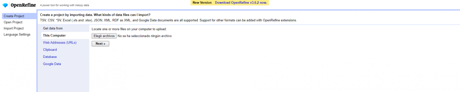
Figure 1. Uploading CSV file to OpenRefine
Step 2
Creation of the project from the uploaded CSV (Figure 2). OpenRefine is managed by projects (each uploaded CSV will be a project), which are saved on the computer where OpenRefine is running for possible later use. In this step we must assign a name to the project and some other data, such as the column separator, although the most common is that these last settings are filled automatically.
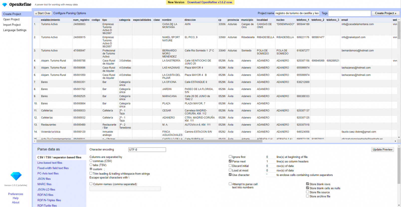
Figure 2. Creating a project in OpenRefine
Step 3
Linked (or reconciliation, using OpenRefine nomenclature) with external sources. OpenRefine allows us to link resources that we have in our CSV with external sources such as Wikidata. To do this, the following actions must be carried out:
- Identification of the columns to be linked. Usually, this step is based on the analyst experience and knowledge of the data that is represented in Wikidata. As a hint, generically you can reconcile or link columns that contain more global or general information such as country, streets, districts names etc., and you cannot link columns like geographical coordinates, numerical values or closed taxonomies (types of streets, for example). In this example, we have the column "municipalities" that contains the names of the Spanish municipalities.
- Beginning of reconciliation (Figure 3). We start the reconciliation and select the default source that will be available: Wikidata. After clicking Start Reconciling, it will automatically start searching for the most suitable Wikidata vocabulary class based on the values in our column.
- Obtaining the values of reconciliation. OpenRefine offers us an option of improving the reconciliation process by adding some features that allow us to conduct the enrichment of information with greater precision.
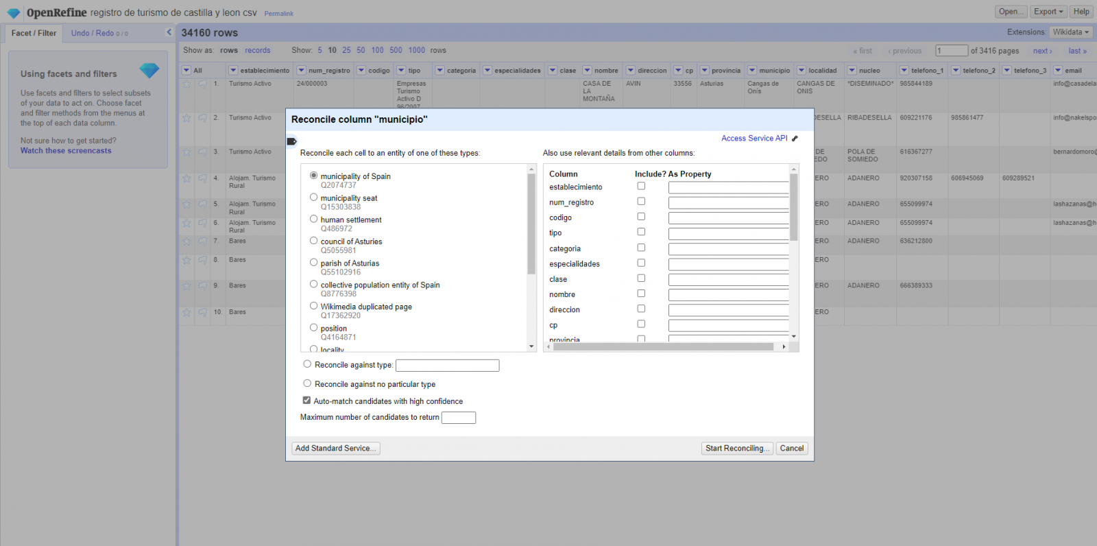
Figure 3. Selecting the class that best represents the values in the "municipality"
Step 4
Generate a new column with the reconciled or linked values (Figure 4). To do this we need to click on the column "municipality" and go to "Edit Column → Add column based in this column", where a text will be displayed in which we will need to indicate the name of the new column (in this example it could be "wikidata"). In the expression box we must indicate: "http://www.wikidata.org/ entity/"+cell.recon.match.id and the values appear as previewed in the Figure. "http://www.wikidata.org/entity/" is a fixed text string to represent Wikidata entities, while the reconciled value of each of the values is obtained through the cell.recon.match.id statement, that is, cell.recon.match.id("Adanero") = Q1404668
Thanks to the abovementioned operation, a new column will be generated with those values. In order to verify that it has been executed correctly, we click on one of the cells in the new column which should redirect to the Wikidata webpage with reconciled value information.
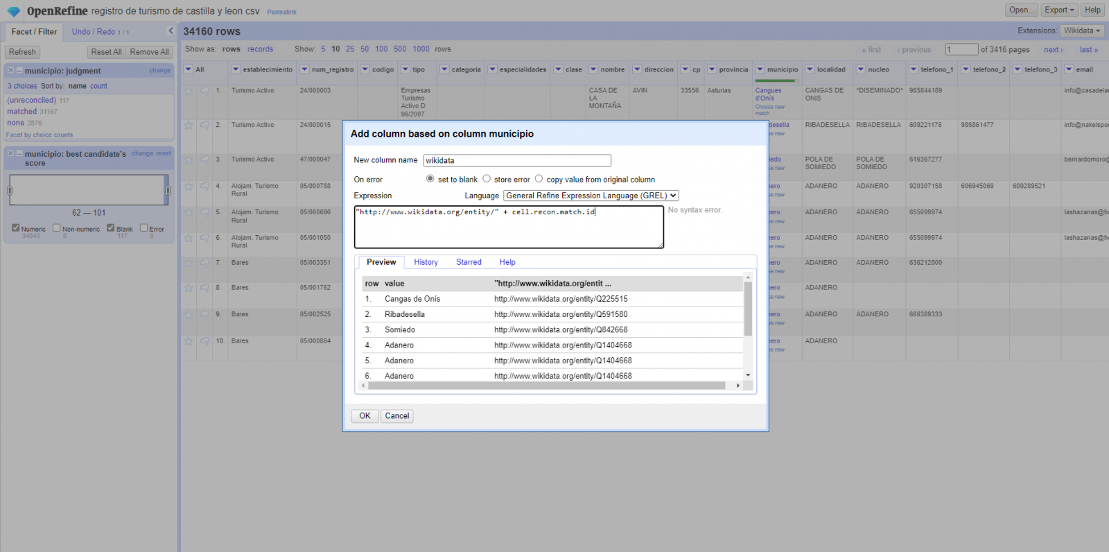
Figure 4. Generating a new column with reconciled values
Step 5
We repeat the process by changing in step 4 the "Edit Column → Add column based in this column" with "Add columns from reconciled values" (Figure 5). In this way, we can choose the property of the reconciled column.
In this exercise we have chosen the "image" property with identifier P18 and the "population" property with identifier P1082. Nevertheless, we could add all the properties that we consider useful, such as the number of inhabitants, the list of monuments of interest, etc. It should be mentioned that just as we enrich data with Wikidata, we can do so with other reconciliation services.
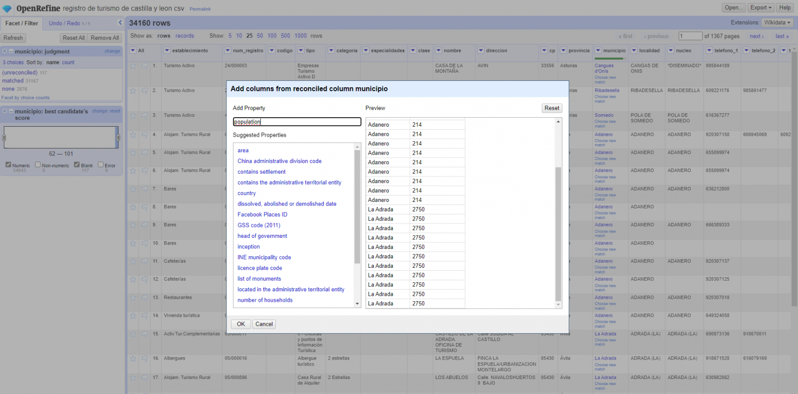
Figura 5. Choice of property for reconciliation
In the case of the "image" property, due to the display, we want the value of the cells to be in the form of a link, so we have made several adjustments. These adjustments have been the generation of several columns according to the reconciled values, adequacy of the columns through commands in GREL language (OpenRefine''s own language) and union of the different values of both columns. You can check these settings and more techniques to improve your handling of OpenRefine and adapt it to your needs in the following User Manual.
6. Map visualization
6.1 Map generation with "Google My Maps"
To generate the custom map using the My Maps tool, we have to execute the following steps:
- We log in with a Google account and go to "Google My Maps", with free access with no need to download any kind of software.
- We import the preprocessed data tables, one for each new layer we add to the map. Google My Maps allows you to import CSV, XLSX, KML and GPX files (Figure 6), which should include associated geographic information. To perform this step, you must first create a new layer from the side options menu.
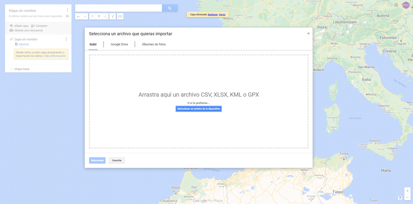
Figure 6. Importing files into "Google My Maps"
- In this case study, we''ll import preprocessed data tables that contain one variable with latitude and other with longitude. This geographic information will be automatically recognized. My Maps also recognizes addresses, postal codes, countries, ...
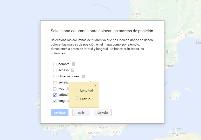
Figura 7. Select columns with placement values
- With the edit style option in the left side menu, in each of the layers, we can customize the pins, editing their color and shape.

Figure 8. Position pin editing
- Finally, we can choose the basemap that we want to display at the bottom of the options sidebar.
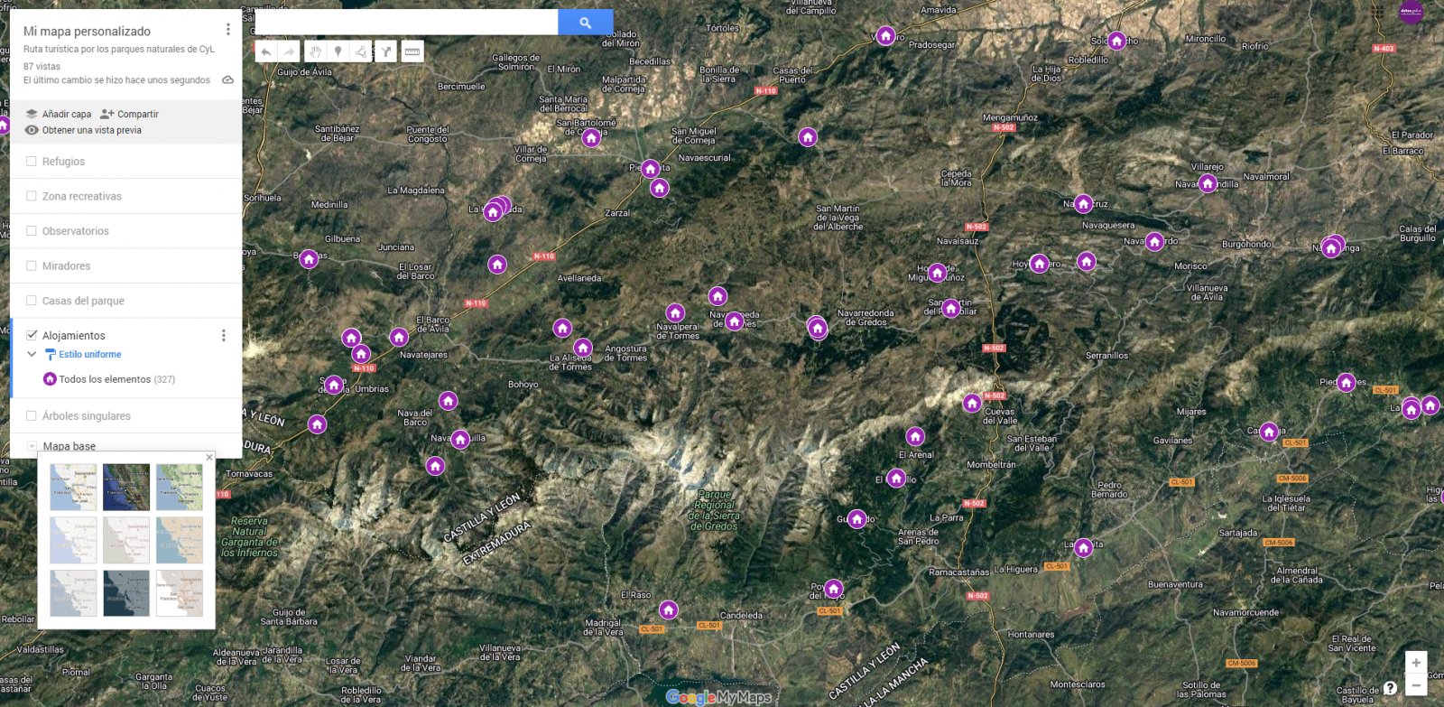
Figura 9. Basemap selection
If you want to know more about the steps for generating maps with "Google My Maps", check out the following step-by-step tutorial.
6.2 Personalization of the information to be displayed on the map
During the preprocessing of the data tables, we have filtered the information according to the focus of the exercise, which is the generation of a map to make tourist routes through the natural spaces of Castile and León. The following describes the customization of the information that we have carried out for each of the datasets.
- In the dataset belonging to the singular trees of the natural areas, the information to be displayed for each record is the name, observations, signage and position (latitude / longitude)
- In the set of data belonging to the houses of the natural areas park, the information to be displayed for each record is the name, observations, signage, access, web and position (latitude / longitude)
- In the set of data belonging to the viewpoints of the natural areas, the information to be displayed for each record is the name, observations, signage, access and position (latitude / longitude)
- In the dataset belonging to the observatories of natural areas, the information to be displayed for each record is the name, observations, signaling and position (latitude / longitude)
- In the dataset belonging to the shelters of the natural areas, the information to be displayed for each record is the name, observations, signage, access and position (latitude / longitude). Since shelters can be in very different states and that some records do not offer information in the "observations" field, we have decided to filter to display only those that have information in that field.
- In the set of data belonging to the recreational areas of the natural park, the information to be displayed for each record is the name, observations, signage, access and position (latitude / longitude). We have decided to filter only those that have information in the "observations" and "access" fields.
- In the set of data belonging to the accommodations, the information to be displayed for each record is the name, type of establishment, category, municipality, web, telephone and position (latitude / longitude). We have filtered the "type" of establishment only those that are categorized as rural tourism accommodations and those that have 2 stars.
Following a visualization of the custom map we have created is returned. By selecting the icon to enlarge the map that appears in the upper right corner, you can access its full-screen display
6.3 Map functionalities (layers, pins, routes and immersive 3D view)
At this point, once the custom map is created, we will explain various functionalities offered by "Google My Maps" during the visualization of the data.
- Layers
Using the drop-down menu on the left, we can activate and deactivate the layers to be displayed according to our needs.
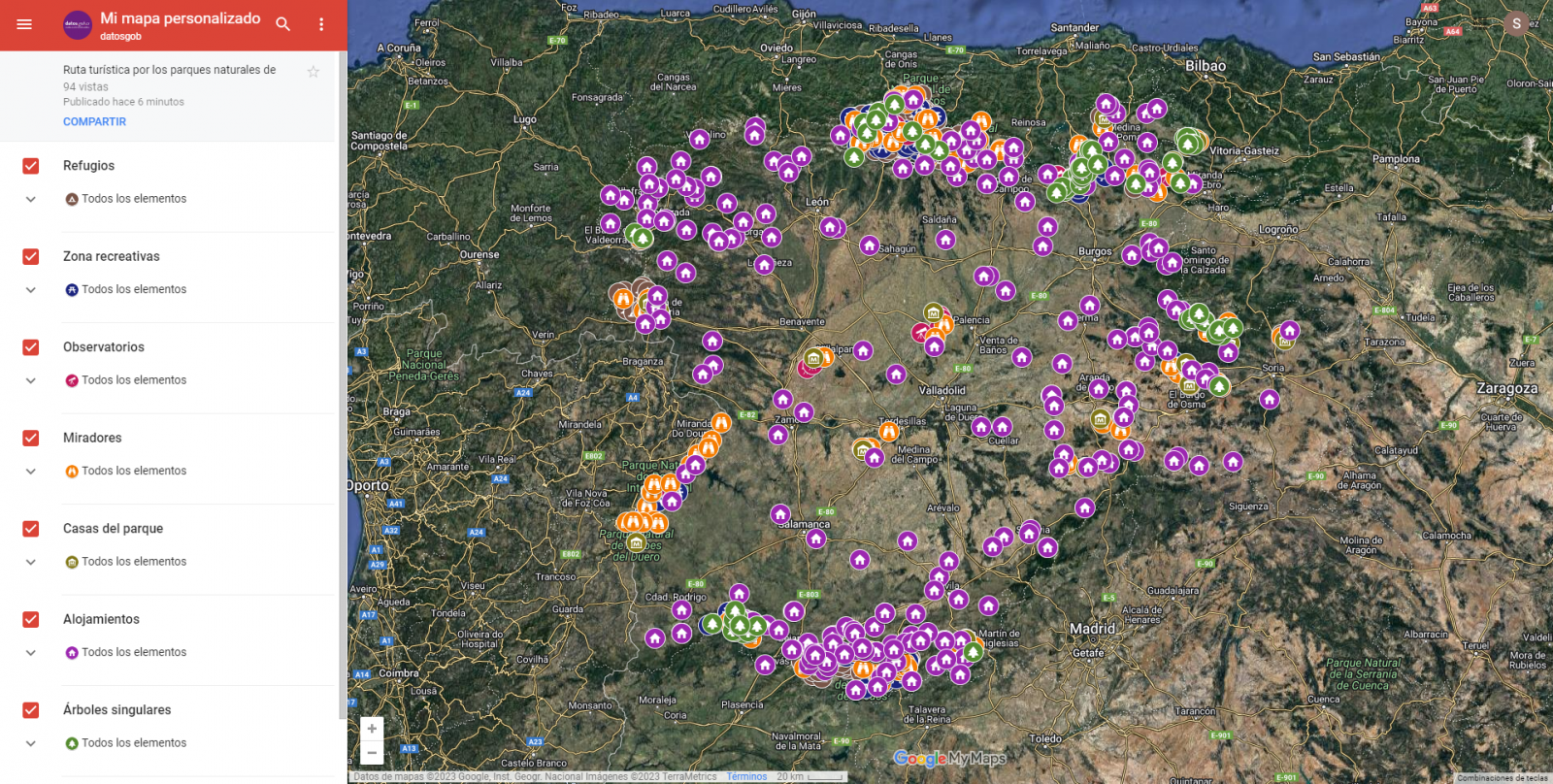
Figure 10. Layers in "My Maps"
-
Pins
By clicking on each of the pins of the map we can access the information associated with that geographical position.
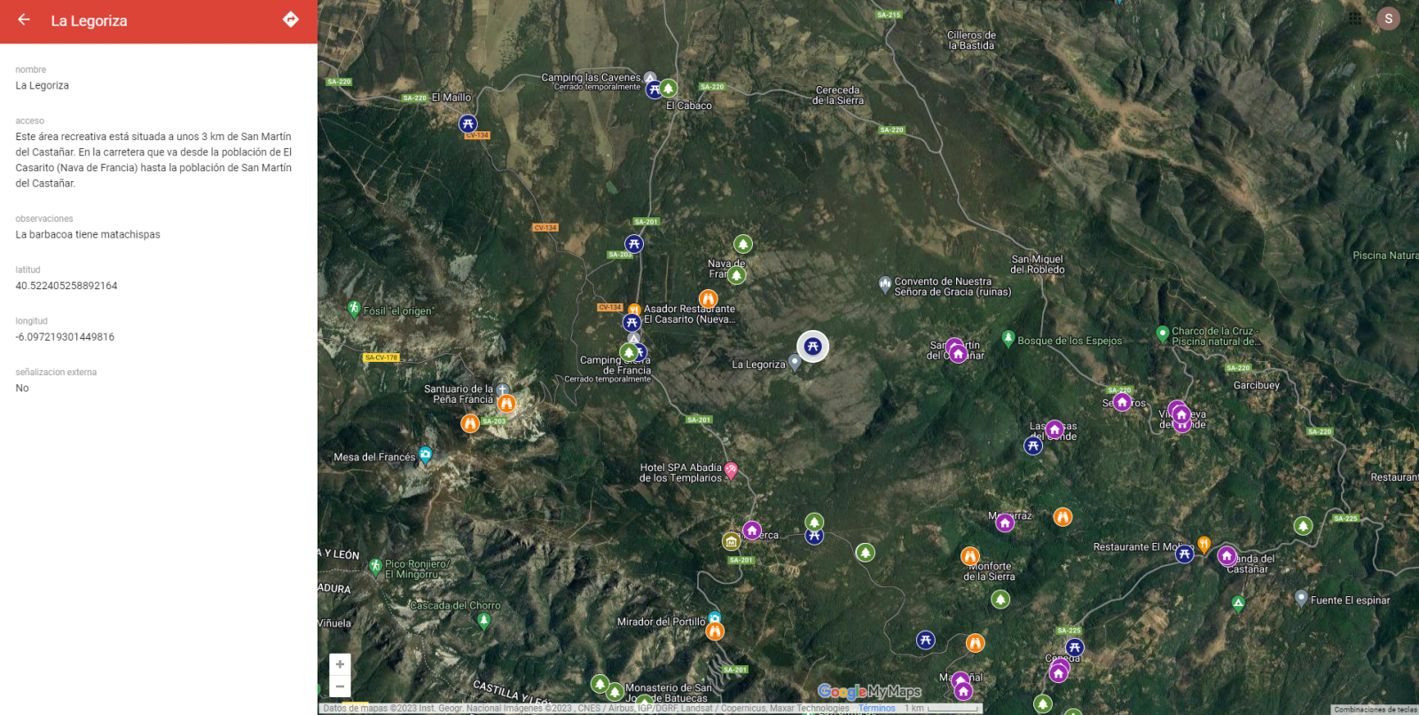
Figure 11. Pins in "My Maps"
-
Routes
We can create a copy of the map on which to add our personalized tours.
In the options of the left side menu select "copy map". Once the map is copied, using the add directions symbol, located below the search bar, we will generate a new layer. To this layer we can indicate two or more points, next to the means of transport and it will create the route next to the route indications.

Figure 12. Routes in "My Maps"
-
3D immersive map
Through the options symbol that appears in the side menu, we can access Google Earth, from where we can explore the immersive map in 3D, highlighting the ability to observe the altitude of the different points of interest. You can also access through the following link.
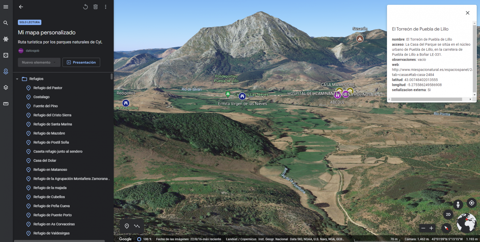
Figure 13. 3D immersive view
7. Conclusions of the exercise
Data visualization is one of the most powerful mechanisms for exploiting and analyzing the implicit meaning of data. It is worth highlighting the vital importance that geographical data have in the tourism sector, which we have been able to verify in this exercise.
As a result, we have developed an interactive map with information provided by Linked Data, which we have customized according to our interests.
We hope that this step-by-step visualization has been useful for learning some very common techniques in the treatment and representation of open data. We will be back to show you new reuses. See you soon!
Documentación
1. Introduction
Visualizations are graphical representations of data that allows comunication in a simple and effective way the information linked to it. The visualization possibilities are very wide, from basic representations, such as a graph of lines, bars or sectors, to visualizations configured on dashboards or interactive dashboards. Visualizations play a fundamental role in drawing conclusions using visual language, also allowing to detect patterns, trends, anomalous data or project predictions, among many other functions.
In this section of "Step-by-Step Visualizations" we are periodically presenting practical exercises of open data visualizations available in datos.gob.es or other similar catalogs. They address and describe in a simple way the necessary stages to obtain the data, perform the transformations and analysis that are relevant to it and finally, the creation of interactive visualizations. From these visualizations we can extract information to summarize in the final conclusions. In each of these practical exercises, simple and well-documented code developments are used, as well as free to use tools. All generated material is available for reuse in the Github data lab repository belonging to datos.gob.es.
In this practical exercise, we have carried out a simple code development that is conveniently documented based on free to use tool.
Access the data lab repository on Github.
Run the data pre-processing code on Google Colab.
2. Objetive
The main objective of this post is to show how to make an interactive visualization based on open data. For this practical exercise we have used a dataset provided by the Ministry of Justice that contains information about the toxicological results made after traffic accidents that we will cross with the data published by the Central Traffic Headquarters (DGT) that contain the detail on the fleet of vehicles registered in Spain.
From this data crossing we will analyze and be able to observe the ratios of positive toxicological results in relation to the fleet of registered vehicles.
It should be noted that the Ministry of Justice makes available to citizens various dashboards to view data on toxicological results in traffic accidents. The difference is that this practical exercise emphasizes the didactic part, we will show how to process the data and how to design and build the visualizations.
3. Resources
3.1. Datasets
For this case study, a dataset provided by the Ministry of Justice has been used, which contains information on the toxicological results carried out in traffic accidents. This dataset is in the following Github repository:
The datasets of the fleet of vehicles registered in Spain have also been used. These data sets are published by the Central Traffic Headquarters (DGT), an agency under the Ministry of the Interior. They are available on the following page of the datos.gob.es Data Catalog:
3.2. Tools
To carry out the data preprocessing tasks it has been used the Python programming language written on a Jupyter Notebook hosted in the Google Colab cloud service.
Google Colab (also called Google Colaboratory), is a free cloud service from Google Research that allows you to program, execute and share code written in Python or R from your browser, so it does not require the installation of any tool or configuration.
For the creation of the interactive visualization, the Google Data Studio tool has been used.
Google Data Studio is an online tool that allows you to make graphs, maps or tables that can be embedded in websites or exported as files. This tool is simple to use and allows multiple customization options.
If you want to know more about tools that can help you in the treatment and visualization of data, you can use the report "Data processing and visualization tools".
4. Data processing or preparation
Before launching to build an effective visualization, we must carry out a previous treatment of the data, paying special attention to obtaining it and validating its content, ensuring that it is in the appropriate and consistent format for processing and that it does not contain errors.
The processes that we describe below will be discussed in the Notebook that you can also run from Google Colab. Link to Google Colab notebook
As a first step of the process, it is necessary to perform an exploratory data analysis (EDA) in order to properly interpret the starting data, detect anomalies, missing data or errors that could affect the quality of subsequent processes and results. Pre-processing of data is essential to ensure that analyses or visualizations subsequently created from it are reliable and consistent. If you want to know more about this process, you can use the Practical Guide to Introduction to Exploratory Data Analysis.
The next step to take is the generation of the preprocessed data tables that we will use to generate the visualizations. To do this we will adjust the variables, cross data between both sets and filter or group as appropriate.
The steps followed in this data preprocessing are as follows:
- Importing libraries
- Loading data files to use
- Detection and processing of missing data (NAs)
- Modifying and adjusting variables
- Generating tables with preprocessed data for visualizations
- Storage of tables with preprocessed data
You will be able to reproduce this analysis since the source code is available in our GitHub account. The way to provide the code is through a document made on a Jupyter Notebook that once loaded into the development environment you can execute or modify easily. Due to the informative nature of this post and favor the understanding of non-specialized readers, the code does not intend to be the most efficient, but to facilitate its understanding, so you will possibly come up with many ways to optimize the proposed code to achieve similar purposes. We encourage you to do so!
5. Generating visualizations
Once we have done the preprocessing of the data, we go with the visualizations. For the realization of these interactive visualizations, the Google Data Studio tool has been used. Being an online tool, it is not necessary to have software installed to interact or generate any visualization, but it is necessary that the data tables that we provide are properly structured, for this we have made the previous steps for the preparation of the data.
The starting point is the approach of a series of questions that visualization will help us solve. We propose the following:
- How is the fleet of vehicles in Spain distributed by Autonomous Communities?
- What type of vehicle is involved to a greater and lesser extent in traffic accidents with positive toxicological results?
- Where are there more toxicological findings in traffic fatalities?
Let''s look for the answers by looking at the data!
5.1. Fleet of vehicles registered by Autonomous Communities
This visual representation has been made considering the number of vehicles registered in the different Autonomous Communities, breaking down the total by type of vehicle. The data, corresponding to the average of the month-to-month records of the years 2020 and 2021, are stored in the "parque_vehiculos.csv" table generated in the preprocessing of the starting data.
Through a choropleth map we can visualize which CCAAs are those that have a greater fleet of vehicles. The map is complemented by a ring graph that provides information on the percentages of the total for each Autonomous Community.
As defined in the "Data visualization guide of the Generalitat Catalana" the choropletic (or choropleth) maps show the values of a variable on a map by painting the areas of each affected region of a certain color. They are used when you want to find geographical patterns in the data that are categorized by zones or regions.
Ring charts, encompassed in pie charts, use a pie representation that shows how the data is distributed proportionally.
Once the visualization is obtained, through the drop-down tab, the option to filter by type of vehicle appears.
View full screen visualization
5.2. Ratio of positive toxicological results for different types of vehicles
This visual representation has been made considering the ratios of positive toxicological results by number of vehicles nationwide. We count as a positive result each time a subject tests positive in the analysis of each of the substances, that is, the same subject can count several times in the event that their results are positive for several substances. For this purpose, the table "resultados_vehiculos.csv” has been generated during data preprocessing.
Using a stacked bar chart, we can evaluate the ratios of positive toxicological results by number of vehicles for different substances and different types of vehicles.
As defined in the "Data visualization guide of the Generalitat Catalana" bar graphs are used when you want to compare the total value of the sum of the segments that make up each of the bars. At the same time, they offer insight into how large these segments are.
When stacked bars add up to 100%, meaning that each segmented bar occupies the height of the representation, the graph can be considered a graph that allows you to represent parts of a total.
The table provides the same information in a complementary way.
Once the visualization is obtained, through the drop-down tab, the option to filter by type of substance appears.
View full screen visualization
5.3. Ratio of positive toxicological results for the Autonomous Communities
This visual representation has been made taking into account the ratios of the positive toxicological results by the fleet of vehicles of each Autonomous Community. We count as a positive result each time a subject tests positive in the analysis of each of the substances, that is, the same subject can count several times in the event that their results are positive for several substances. For this purpose, the "resultados_ccaa.csv" table has been generated during data preprocessing.
It should be noted that the Autonomous Community of registration of the vehicle does not have to coincide with the Autonomous Community where the accident has been registered, however, since this is a didactic exercise and it is assumed that in most cases they coincide, it has been decided to start from the basis that both coincide.
Through a choropleth map we can visualize which CCAAs are the ones with the highest ratios. To the information provided in the first visualization on this type of graph, we must add the following.
As defined in the "Data Visualization Guide for Local Entities" one of the requirements for choropleth maps is to use a numerical measure or datum, a categorical datum for the territory, and a polygon geographic datum.
The table and bar chart provides the same information in a complementary way.
Once the visualization is obtained, through the peeling tab, the option to filter by type of substance appears.
View full screen visualization
6. Conclusions of the study
Data visualization is one of the most powerful mechanisms for exploiting and analyzing the implicit meaning of data, regardless of the type of data and the degree of technological knowledge of the user. Visualizations allow us to build meaning on top of data and create narratives based on graphical representation. In the set of graphical representations of data that we have just implemented, the following can be observed:
- The fleet of vehicles of the Autonomous Communities of Andalusia, Catalonia and Madrid corresponds to about 50% of the country''s total.
- The highest positive toxicological results ratios occur in motorcycles, being of the order of three times higher than the next ratio, passenger cars, for most substances.
- The lowest positive toxicology result ratios occur in trucks.
- Two-wheeled vehicles (motorcycles and mopeds) have higher "cannabis" ratios than those obtained in "cocaine", while four-wheeled vehicles (cars, vans and trucks) have higher "cocaine" ratios than those obtained in "cannabis"
- The Autonomous Community where the ratio for the total of substances is highest is La Rioja.
It should be noted that in the visualizations you have the option to filter by type of vehicle and type of substance. We encourage you to do so to draw more specific conclusions about the specific information you''re most interested in.
We hope that this step-by-step visualization has been useful for learning some very common techniques in the treatment and representation of open data. We will return to show you new reuses. See you soon!
Blog
Python, R, SQL, JavaScript, C++, HTML... Nowadays we can find a multitude of programming languages that allow us to develop software programmes, applications, web pages, etc. Each one has unique characteristics that differentiate it from the rest and make it more appropriate for certain tasks. But how do we know when and where to use each language? In this article we give you some clues.
Types of programming languages
Programming languages are syntactic and semantic rules that allow us to execute a series of instructions. Depending on their level of complexity, we can speak of different levels:
- Low-level languages: they use basic instructions that are directly interpreted by the machine and are difficult for humans to understand. They are custom-designed for each hardware and cannot be migrated, but they are very efficient, as they make the most of the characteristics of each machine.
- High-level languages: they use clear instructions using natural language, which is more understandable by humans. These languages emulate our way of thinking and reasoning, but must then be translated into machine language through translators/interpreters or compilers. They can be migrated and are not hardware-dependent.
Medium-level languages are sometimes also described as languages that, although they function like a low-level language, allow some abstract machine-independent handling.
The most widely used programming languages
In this article we are going to focus on the most used high-level languages in data science. To do so, we look at this survey, conducted by Anaconda in 2021, and the article by KD Nuggets.
How often are the following programming languages used?
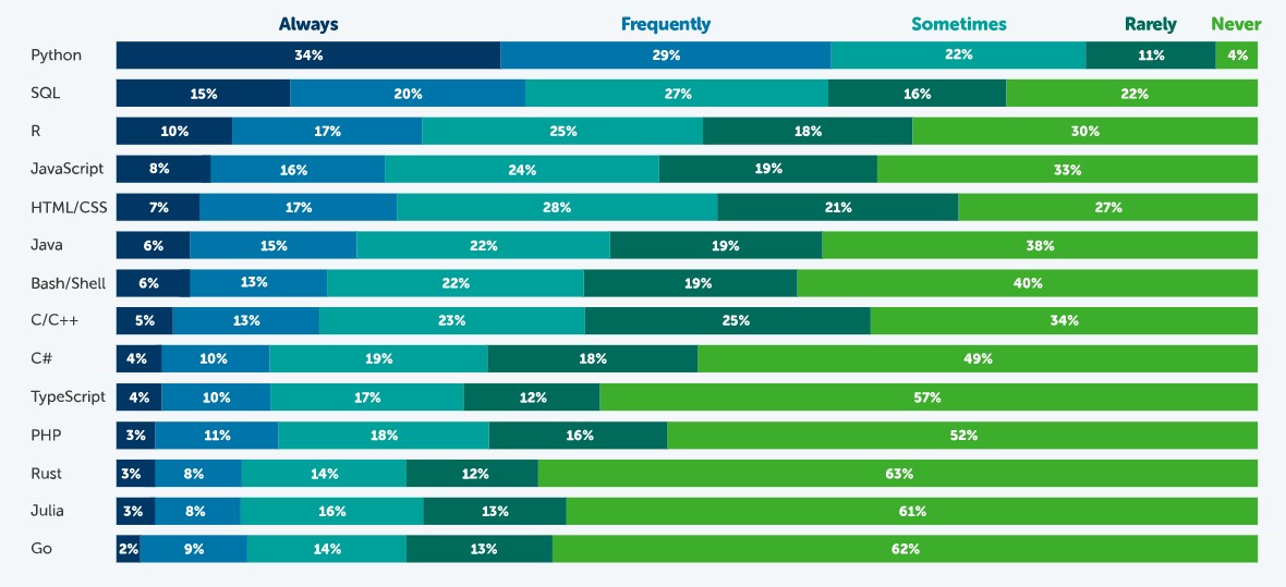
Source: State of Data Science in 2021, Anaconda.
According to this survey, the most popular language is Python. 63% of respondents - 3,104 data scientists, researchers, students and data professionals from around the world - indicated that they use Python always or frequently and only 4% indicated that they never use it. This is because it is a very versatile language, which can be used in the various tasks that exist throughout a data science project.
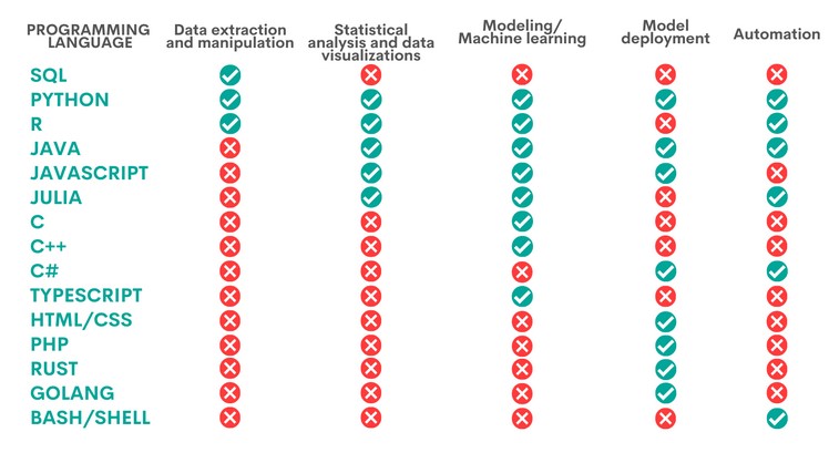
A data science project has different phases and tasks. Some languages can be used to perform different tasks, but with unequal performance. The following table, compiled by KD Nuggets, shows which language is most recommended for some of the most popular tasks:
Source: Data Science Programming Languages and When To Use Them, KD Nuggets, 2022.
As we can see, Python is the only language that is appropriate for all the areas analysed by KD Nuggets, although there are other options that are also very interesting, depending on the task to be carried out, as we will see below:
- Languages for data extraction and manipulation. These tasks are aimed at obtaining the data and debugging them in order to achieve a homogeneous structure, without incomplete data, free of errors and in the right format. For this purpose, it is recommended to perform an Exploratory Data Analysis. SQL is the programming language that excels the most with respect to data extraction, especially when working with relational databases. It is fast at retrieving data and has a standardised syntax, which makes it relatively simple. However, it is more limited when it comes to data manipulation. A task in which Python and R, two programs that have a large number of libraries for these tasks, give better results.
- Statistical analysis and data visualisation. This involves processing data to find patterns that are then converted into knowledge. There are different types of analysis depending on their purpose: to learn more about our environment, to make predictions or to obtain recommendations. The best language for this is R, an interpreted language that also has a programming environment, R-Studio, and a set of very flexible and versatile tools for statistical computing. Python, Java and Julia are other tools that perform well in this task, for which JavaScript can also be used. The above languages allow, in addition to performing analyses, the creation of graphical visualisations that facilitate the understanding of the information.
- Modelling/machine learning (ML). If we want to work with machine learning and build algorithms, Python, Java, Java/JavaScript, Julia and TypeScript are the best options. All of them simplify the task of writing code, although it is necessary to have extensive knowledge to be able to work with the different machine learning techniques. More experienced users can work with C/C++, a very machine-readable programming language, but with a lot of code, which can be difficult to learn. In contrast, R can be a good choice for less experienced users, although it is slower and not well suited for complex neural networks.
- Model deployment. Once a model has been created, it is necessary to deploy it, taking into account all the necessary requirements for its entry into production in a real environment. For this purpose, the most suitable languages are Python, Java, JavaScript and C#, followed by PHP, Rust, GoLang and, if we are working with basic applications, HTML/CSS.
- Automation. While not all parts of a data scientist's job can be automated, there are some tedious and repetitive tasks whose automation speeds up performance. Python, for example, has a large number of libraries for automating machine learning tasks. If we are working with mobile applications, then Java is our best option. Other options are C# (especially useful for automating model building), Bash/Shell (for data extraction and manipulation) and R (for statistical analysis and visualisations).
Ultimately, the programming language we use will depend entirely on the task at hand and our capabilities. Not all data science professionals need to know all languages, but should choose the one that is most appropriate for their daily work.
Some additional resources to learn more about these languages
At datos.gob.es we have prepared some guides and resources that may be useful for you to learn some of these languages:
- Data processing and visualization tools
- Courses to learn more about R
- Courses to learn more about Python
- Online courses to learn more about data visualization
- R and Python Communities for Developer
Content prepared by the datos.gob.es team.
Blog
The advance of supercomputing and data analytics in fields as diverse as social networks or customer service is encouraging a part of artificial intelligence (AI) to focus on developing algorithms capable of processing and generating natural language.
To be able to carry out this task in the current context, having access to a heterogeneous list of natural language processing libraries is key to designing effective and functional AI solutions in an agile way. These source code files, which are used to develop software, facilitate programming by providing common functionalities, previously solved by other developers, avoiding duplication and minimising errors.
Thus, with the aim of encouraging sharing and reuse to design applications and services that provide economic and social value, we break down four sets of natural language processing libraries, divided on the basis of the programming language used.
Python libraries
Ideal for coding using the Python programming language. As with the examples available for other languages, these libraries have a variety of implementations that allow the developer to create a new interface on their own.
Examples include:
NLTK: Natural Language Toolkit
- Description: NLTK provides easy-to-use interfaces to more than 50 corpora and lexical resources such as WordNet, together with a set of text processing libraries. It enables text pre-processing tasks, including classification, tokenisation, lemmatisation or exclusion of stop words, parsing and semantic reasoning.
- Supporting materials: One of the most interesting sections to consult information and resolve doubts is the section dedicated to frequently asked questions. You can find it at this link. It also has available examples of use and a wiki.
Gensim
- Description: Gensim is an open source Python library for representing documents as semantic vectors. The main difference with respect to other natural language libraries for Python is that Gensim is capable of automatically identifying the subject matter of the set of documents to be processed. It also allows us to analyse the similarity between files, which is really useful when we use the library to perform searches.
- Supporting materials: In the Documentation section of its website, it is possible to find didactic materials focused on three very specific areas. On the one hand, there is a series of tutorials aimed at programmers who have never used this type of library before. There are training lessons oriented towards specific programming language issues, a series of guides aimed at resolving doubts that arise when faced with certain problems, and also a section dedicated solely to frequently asked questions.
Libraries for JavaScript
JavaScript libraries serve to diversify the range of resources that can be used by programmers and web developers who make use of this language. You can choose from the following examples below:
Apache OpenNLP
- Description: The Apache OpenNLP library is a machine learning-based toolkit for natural language text processing. It supports the basic tasks of natural language programming, tokenisation, sentence segmentation, part-of-speech tagging, named entity extraction, language detection and much more.
- Supporting materials: Within the General category of its website, there is a sub-section called Books, Tutorials and Talks, which provides a series of talks, tutorials and publications aimed at resolving programmers' doubts. Likewise, in the Documentation category, they have different user manuals.
NLP.js
- Description: NLP.js targets node.js, an open source JavaScript runtime environment. It natively supports 41 languages and can even be extended to 104 languages with the use of Bert embeddings. It is a library mainly used for building bots, sentiment analysis or automatic language identification, among other functions. Precisely for this reason, it is a library to be taken into account for the construction of chatbots.
- Supporting materials: Within their profile hosted on the Github code portal, they offer a section of frequently asked questions and another of examples of use that may be useful when using the library to develop an app or service.
Natural
- Description: Like NLP.js, Natural also facilitates natural language processing for node.js. It offers a wide range of functionalities such as tokenisation, phonetic matching, term frequency (TF-IDF) and integration with the WordNet database, among others.
- Supporting materials: Like the previous library, this library does not have its own website. In its Github profile, it has support content such as examples of use cases previously developed by other programmers.
Wink
- Description: Wink is a family of open source packages for statistical analysis, natural language processing and machine learning in NodeJS. It has been optimised to achieve a balance between performance and accuracy, making the package capable of handling large amounts of raw text at high speed.
- Supporting materials: Accessing the tutorials from its website is very intuitive, as one of the categories with the same name contains precisely this type of informative content. Here it is possible to find learning guides divided according to the level of experience of the programmer or the part of the process in which he/she is immersed.
Libraries for R
In this last section we bring together the specific libraries for building a website, application or service using the R coding language. Some of them are:
koRpus
- Description: This is a text analysis package capable of automatic language detection and various indexes of lexical diversity or readability, among other functions. It also includes the RKWard plugin which provides graphical dialogue boxes for its basic functions.
- Supporting materials: koRpus offers a series of guidelines focused on its installation and gathered in the Read me document that you can find in this link. Also, in the News section you can find the updates and changes that have been made in the successive versions of the library.
Quanteda
- Description: This library has been designed to allow programmers using R to apply natural language processing techniques to their texts from the original version to the final output. Therefore, its API has been developed to enable powerful and efficient analysis with a minimum of steps, thus reducing the learning barriers to natural language processing and quantitative text analysis.
- Supporting materials: It offers as main support material this quick start guide. Through it, it is possible to follow the main instructions in order not to make any mistakes. It also includes several examples that can be used to compare results.
Isa - Natural Language Processing
- Description: This library is based on latent semantic analysis, which consists of creating structured data from a collection of unstructured text.
- Supporting materials: In the documentation section, we can find useful information for development.
Libraries for Python and R
We talk about libraries for Python and R to refer to those that are compatible for coding using both programming languages.
spaCy
- Description: It is a very useful tool for preparing texts that will later be used in other machine learning tasks. It also allows statistical linguistic models to be applied to solve different natural language processing problems.
- Supporting materials: spaCy offers a series of online courses divided into different chapters that you can find here. Through the contents shared in NLP Advanced you will be able to follow step by step the utilities of this library, as each chapter focuses on a part of text processing. If you still want to learn more about this library, we recommend you to read this article by Alejandro Alija regarding his experience testing this library.
In this article we have shared a sample of some of the most popular libraries for natural language processing. However, it should be stressed that this is only a selection.
So, if you know of any other libraries of interest that you would like to recommend, please leave us a message in the comments or send us an email to dinamizacion@datos.gob.es.
Content prepared by the datos.gob.es team.
Documentación
1. Introduction
Visualizations are graphical representations of data that allow the information linked to them to be communicated in a simple and effective way. The visualization possibilities are very broad, from basic representations such as line, bar or pie chart, to visualizations configured on control panels or interactive dashboards. Visualizations play a fundamental role in drawing conclusions from visual information, allowing detection of patterns, trends, anomalous data or projection of predictions, among many other functions.
Before starting to build an effective visualization, a prior data treatment must be performed, paying special attention to their collection and validation of their content, ensuring that they are in a proper and consistent format for processing and free of errors. The previous data treatment is essential to carry out any task related to data analysis and realization of effective visualizations.
In the section “Visualizations step-by-step” we are periodically presenting practical exercises on open data visualizations that are available in datos.gob.es catalogue and other similar catalogues. In there, we approach and describe in a simple way the necessary steps to obtain data, perform transformations and analysis that are relevant to creation of interactive visualizations from which we may extract information in the form of final conclusions.
In this practical exercise we have performed a simple code development which is conveniently documented, relying on free tools.
Access the Data Lab repository on Github.
Run the data pre-processing code on Google Colab.
2. Objetives
The main objective of this post is to learn how to make an interactive visualization using open data. For this practical exercise we have chosen datasets containing relevant information on national reservoirs. Based on that, we will analyse their state and time evolution within the last years.
3. Resources
3.1. Datasets
For this case study we have selected datasets published by Ministry for the Ecological Transition and Demographic Challenge, which in its hydrological bulletin collects time series data on the volume of water stored in the recent years in all the national reservoirs with capacity greater than 5hm3. Historical data on the volume of stored water are available at:
Furthermore, a geospatial dataset has been selected. During the search, two possible input data files have been found, one that contains geographical areas corresponding to the reservoirs in Spain and one that contains dams, including their geopositioning as a geographic point. Even though they are not the same thing, reservoirs and dams are related and to simplify this practical exercise, we choose to use the file containing the list of dams in Spain. Inventory of dams is available at: https://www.mapama.gob.es/ide/metadatos/index.html?srv=metadata.show&uuid=4f218701-1004-4b15-93b1-298551ae9446
This dataset contains geolocation (Latitude, Longitude) of dams throughout Spain, regardless of their ownership. A dam is defined as an artificial structure that limits entirely or partially a contour of an enclosure nestled in terrain and is destined to store water within it.
To generate geographic points of interest, a processing has been executed with the usage of QGIS tool. The steps are the following: download ZIP file, upload it to QGIS and save it as CSV, including the geometry of each element as two fields specifying its position as a geographic point (Latitude, Longitude).
Also, a filtering has been performed, in order to extract the data related to dams of reservoirs with capacity greater than 5hm3.
3.2. Tools
To perform data pre-processing, we have used Python programming language in the Google Colab cloud service, which allows the execution of JNotebooks de Jupyter.
Google Colab, also called Google Colaboratory, is a free service in the Google Research cloud which allows to program, execute and share a code written in Python or R through the browser, as it does not require installation of any tool or configuration.
Google Data Studio tool has been used for the creation of the interactive visualization.
Google Data Studio in an online tool which allows to create charts, maps or tables that can be embedded on websites or exported as files. This tool is easy to use and permits multiple customization options.
If you want to know more about tools that can help you with data treatment and visualization, see the report “Data processing and visualization tools”.
4. Enriquecimiento de los datos
In order to provide more information about each of the dams in the geospatial dataset, a process of data enrichment is carried out, as explained below.
To do this, we will focus on OpenRefine, which is a useful tool for this type of tasks. This open source tool allows to perform multiple data pre-processing actions, although at that point we will use it to conduct enrichment of our data by incorporation of context, automatically linking information that resides in a popular knowledge repository, Wikidata.
Once the tool is installed and launched on computer, a web application will open in the browser. In case this doesn´t happen, the application may be accessed by typing http://localhost:3333 in the browser´s search bar.
Steps to follow:
- Step 1: Upload of CSV to the system (Figure 1).

Figure 1 – Upload of a CSV file to OpenRefine
- Step 2: Creation of a project from uploaded CSV (Figure 2). OpenRefine is managed through projects (each uploaded CSV will become a project) that are saved for possible later use on a computer where OpenRefine is running. At this stage it´s required to name the project and some other data, such as the column separator, though the latter settings are usually filled in automatically.

Figure 2 – Creation of a project in OpenRefine
- Step 3: Linkage (or reconciliation, according to the OpenRefine nomenclature) with external sources. OpenRefine allows to link the CSV resources with external sources, such as Wikidata. For this purpose, the following actions need to be taken (steps 3.1 to 3.3):
- Step 3.1: Identification of the columns to be linked. This step is commonly based on analyst´s experience and knowledge of the data present in Wikidata. A tip: usually, it is feasible to reconcile or link the columns containing information of global or general character, such as names of countries, streets, districts, etc. and it´s not possible to link columns with geographic coordinates, numerical values or closed taxonomies (e.g. street types). In this example, we have found a NAME column containing name of each reservoir that can serve as a unique identifier for each item and may be a good candidate for linking
- Step 3.2: Start of reconciliation. As indicated in figure 3, start reconciliation and select the only available source: Wikidata(en). After clicking Start Reconciling, the tool will automatically start searching for the most suitable vocabulary class on Wikidata, based on the values from the selected column.

Figure 3 – Start of the reconciliation process for the NAME column in OpenRefine
- Step 3.3: Selection of the Wikidata class. In this step reconciliation values will be obtained. In this case, as the most probable value, select property “reservoir”, which description may be found at https://www.wikidata.org/wiki/Q131681 and it corresponds to the description of an “artificial lake to accumulate water”. It´s necessary to click again on Start Reconciling.
OpenRefine offers a possibility of improving the reconciliation process by adding some features that allow to target the information enrichment with higher precision. For that purpose, adjust property P4568, which description matches the identifier of a reservoir in Spain within SNCZI-IPE, as it may be seen in the figure 4.

Figure 4 – Selection of a Wikidata class that best represents the values on NAME column
- Step 4: Generation of a column with reconciled or linked values. To do that, click on the NAME column and go to “Edit column → Add column based in this column”. A window will open where a name of the new column must be specified (in this case, WIKIDATA_RESERVOIR). In the expression box introduce: “http://www.wikidata.org/entity/”+cell.recon.match.id, so the values will be displayed as it´s previewed in figure 6. “http://www.wikidata.org/entity/” is a fixed text string that represents Wikidata entities, while the reconciled value of each of the values we obtain through the command cell.recon.match.id, that is, cell.recon.match.id(“ALMODOVAR”) = Q5369429.
Launching described operation will result in generation of a new column with those values. Its correctness may be confirmed by clicking on one of the new column cells, as it should redirect to a Wikidata web page containing information about reconciled value.
Repeat the process to add other type of enriched information as a reference for Google and OpenStreetMap.

Figure 5 – Generation of Wikidata entities through a reconciliation within a new column.
- Step 5: Download of enriched CSV. Go to the function Export → Custom tabular exporter placed in the upper right part of the screen and select the features indicated in Figure 6.

Figure 6 – Options of CSV file download via OpenRefine
5. Data pre-processing
During the pre-processing it´s necessary to perform an exploratory data analysis (EDA) in order to interpret properly the input data, detect anomalies, missing data and errors that could affect the quality of subsequent processes and results, in addition to realization of the transformation tasks and preparation of the necessary variables. Data pre-processing is essential to ensure the reliability and consistency of analysis or visualizations that are created afterwards. To learn more about this process, see A Practical Introductory Guide to Exploratory Data Analysis.
The steps involved in this pre-processing phase are the following:
- Installation and import of libraries
- Import of source data files
- Modification and adjustment of variables
- Prevention and treatment of missing data (NAs)
- Generation of new variables
- Creation of a table for visualization “Historical evolution of water reserve between the years 2012-2022”
- Creation of a table for visualization “Water reserve (hm3) between the years 2012-2022”
- Creation of a table for visualization “Water reserve (%) between the years 2012-2022”
- Creation of a table for visualization “Monthly evolution of water reserve (hm3) for different time series”
- Saving the tables with pre-processed data
You may reproduce this analysis, as the source code is available in the GitHub repository. The way to provide the code is through a document made on Jupyter Notebook which once loaded to the development environment may be easily run or modified. Due to the informative nature of this post and its purpose to support learning of non-specialist readers, the code is not intended to be the most efficient but rather to be understandable. Therefore, it´s possible that you will think of many ways of optimising the proposed code to achieve a similar purpose. We encourage you to do it!
You may follow the steps and run the source code on this notebook in Google Colab.
6. Data visualization
Once the data pre-processing is done, we may move on to interactive visualizations. For this purpose, we have used Google Data Studio. As it´s an online tool, it´s not necessary to install software to interact or generate a visualization, but it´s required to structure adequately provided data tables.
In order to approach the process of designing the set of data visual representations, the first step is to raise the questions that we want to solve. We suggest the following:
-
What is the location of reservoirs within the national territory?
-
Which reservoirs have the largest and the smallest volume of water (water reserve in hm3) stored in the whole country?
-
Which reservoirs have the highest and the lowest filling percentage (water reserve in %)?
-
What is the trend of the water reserve evolution within the last years?
Let´s find the answers by looking at the data!
6.1. Geographic location and main information on each reservoir
This visual representation has been created with consideration of geographic location of reservoirs and distinct information associated with each one of them. For this task, a table “geo.csv” has been generated during the data pre-processing.
Location of reservoirs in the national territory is shown on a map of geographic points.
Once the map is obtained, you may access additional information about each reservoir by clicking on it. The information will display in the table below. Furthermore, an option of filtering by hydrographic demarcation and by reservoir is available through the drop-down tabs.
View the visualization in full screen
6.2. Water reserve between the years 2012-2022
This visual representation has been made with consideration of water reserve (hm3) per reservoir between the years 2012 (inclusive) and 2022. For this purpose, a table “volumen.csv” has been created during the data pre-processing.
A rectangular hierarchy chart displays intuitively the importance of each reservoir in terms of volumn stored within the national total for the time period indicated above.
Ones the chart is obtained, an option of filtering by hydrographic demarcation and by reservoir is available through the drop-down tabs.
View the visualization in full screen
6.3. Water reserve (%) between the years 2012-2022
This visual representation has been made with consideration of water reserve (%) per reservoir between the years 2012 (inclusive) and 2022. For this task, a table “porcentaje.csv” has been generated during the data pre-processing.
The percentage of each reservoir filling for the time period indicated above is intuitively displayed in a bar chart.
Ones the chart is obtained, an option of filtering by hydrographic demarcation and by reservoir is available through the drop-down tabs.
View the visualization in ful screen
6.4. Historical evolution of water reserve between the years 2012-2022
This visual representation has been made with consideration of water reserve historical data (hm3 and %) per reservoir between the years 2012 (inclusive) and 2022. For this purpose, a table “lineas.csv” has been created during the data pre-processing.
Line charts and their trend lines show the time evolution of the water reserve (hm3 and %).
Ones the chart is obtained, modification of time series, as well as filtering by hydrographic demarcation and by reservoir is possible through the drop-down tabs.
View the visualization in full screen
6.5. Monthly evolution of water reserve (hm3) for different time series
This visual representation has been made with consideration of water reserve (hm3) from distinct reservoirs broken down by months for different time series (each year from 2012 to 2022). For this purpose, a table “lineas_mensual.csv” has been created during the data pre-processing.
Line chart shows the water reserve month by month for each time series.
Ones the chart is obtained, filtering by hydrographic demarcation and by reservoir is possible through the drop-down tabs. Additionally, there is an option to choose time series (each year from 2012 to 2022) that we want to visualize through the icon appearing in the top right part of the chart.
View the visualization in full screen
7. Conclusions
Data visualization is one of the most powerful mechanisms for exploiting and analysing the implicit meaning of data, independently from the data type and the user´s level of the technological knowledge. Visualizations permit to create meaningful data and narratives based on a graphical representation. In the set of implemented graphical representations the following may be observed:
-
A significant trend in decreasing the volume of water stored in the reservoirs throughout the country between the years 2012-2022.
-
2017 is the year with the lowest percentage values of the total reservoirs filling, reaching less than 45% at certain times of the year.
-
2013 is the year with the highest percentage values of the total reservoirs filling, reaching more than 80% at certain times of the year.
It should be noted that visualizations have an option of filtering by hydrographic demarcation and by reservoir. We encourage you to do it in order to draw more specific conclusions from hydrographic demarcation and reservoirs of your interest.
Hopefully, this step-by-step visualization has been useful for the learning of some common techniques of open data processing and presentation. We will be back to present you new reuses. See you soon!
Blog
Programming libraries refer to the sets of code files that have been created to develop software in a simple way . Thanks to them, developers can avoid code duplication and minimize errors with greater agility and lower cost. There are many bookstores, focused on different activities. A few weeks ago we saw some examples of libraries for creating visualizations , and this time we are going to focus on useful libraries for machine learning tasks .
These libraries are highly practical when implementing Machine Learning flows . This discipline, belonging to the field of Artificial Intelligence, uses algorithms that offer, for example, the ability to identify patterns in massive data or the ability to help develop predictive analysis.
Below, we show you some of the most popular data analysis and Machine Learning libraries that currently exist for the main programming languages, such as Python or R:
Libraries for Python
NumPy
- Description:
This Python library is specialized in mathematical computation and big data analysis . It allows working with arrays that allow representing collections of data of the same type in various dimensions, as well as very efficient functions for their manipulation.
- Support materials:
Here we find the Beginner's Guide , with basic concepts and tutorials, the User's Guide , with information on general features, or the Contributor's Guide , to help maintain and develop the code or write technical documentation. NumPy also has a Reference Guide that details functions, modules and objects included in this library, as well as a series of tutorials to learn how to use it easily.
Pandas
- Description :
It is one of the most used libraries for data processing in Python . This data analysis and manipulation tool is characterized, among other aspects, by defining new data functionalities based on the arrays of the NumPy library . It allows you to easily read and write files in CSV, Excel format and specify queries to SQL databases .
- Support materials:
Its website has different documents such as the User's Guide , with detailed basic information and useful explanations, the Developer's Guide , which details the steps to follow when identifying errors or suggestions for improvements in functionalities, as well as the Reference Guide , with a detailed description of its API. In addition, it offers a series of tutorials contributed by the community and references on equivalent operations in other software and languages such as SAS, SQL or R.
Scikit-learn
- Description:
Scikit-Learn is a library that implements a large number of Machine Learning algorithms for classification, regression, clustering , and dimensionality reduction tasks . In addition, it is compatible with other Python libraries such as NumPy, SciPy and Matplotlib (Matpotlib is a data visualization library and as such is included in the previous article ).
- Support materials:
This library has different help documents such as an Installation Manual , a User's Guide or a Glossary of common terms and elements of its API . In addition, it offers a section with different examples that illustrate the features of the library, as well as other sections of interest with tutorials , frequently asked questions or access to its GitHub .
Scipy
- Description:
This library features a collection of mathematical algorithms and functions built on top of the NumPy extension . It includes extension modules for Python on statistics, optimization, integration, linear algebra or image processing, among others.
- Support materials:
Like the previous examples, this library also has materials such as Installation Guides , User Guides , Developer Guides or a document with detailed descriptions of its API . It also provides information on act , a tool for running GitHub actions locally.
Libraries for R
mlr
- Description:
This library offers essential components to develop machine learning tasks, among others, preprocessing, pipelining , feature selection, visualization and implementation of supervised and unsupervised techniques using a wide range of algorithms.
- Support materials:
On its website, it has multiple resources for users and developers, among which a reference tutorial stands out that presents an extensive tour that covers the basic aspects of tasks, predictions or data preprocessing to the implementation of complex projects using advanced functions.
In addition, it has a section that redirects to GitHub in which it offers talks, videos and workshops of interest on the operation and uses of this library.
Tidyverse
- Description:
This library offers a collection of R packages designed for data science that provide very useful functionality to import, transform, visualize, model and communicate information from data. They all share the same design philosophy, grammar, and underlying data structures. The main packages that make it up are: dplyr, ggplot2, forcats, tibble, readr, stringr, tidyr and purrr.
- Support materials:
Tidyverse has a blog where you can find posts about programming, packages or tricks and techniques to work with this library. In addition, it has a section that recommends books and workshops to learn how to use this library in a simpler and more enjoyable way.
Caret
- Description:
This popular library contains an interface that unifies hundreds of functions for training classifiers and regressors under a single framework , greatly facilitating all stages of preprocessing, training, optimization and validation of predictive models.
- Support materials:
The project website contains exhaustive information that makes it easier for the user to tackle the aforementioned tasks. References can also be found on CRAN and the project is hosted on GitHub . Some resources of interest for managing this library can be found through books such as Applied Predictive Modeling , articles , seminars or tutorials , among others.
Libraries to tackle Big Data tasks
TensorFlow
- Description:
In addition to Python and R, this library is also compatible with other languages such as JavaScript, C++ or Julia. TensorFlow offers the ability to build and train ML models using APIs . The most prominent API is Keras , which allows building and training deep learning models (Deep Learning).
- Support materials:
On its website you can find resources such as previously established and developed models and data sets, tools , libraries and extensions , certification programs , knowledge about machine learning or resources and tools to integrate responsible AI practices . You can access their GitHub page here .
Dmlc XGBoost
- Description:
Scalable, portable and distributed "Gradient Boosting" (GBM, GBRT, GBDT) library supports C ++, Python, R, Java, Scala, Perl and Julia programming languages . This library allows you to solve many data science problems quickly and accurately and can be integrated with Flink, Spark and other cloud data flow systems to tackle Big Data tasks.
- Support materials:
On its website it has a blog with related topics such as algorithm updates or integrations, as well as a documentation section that has installation guides, tutorials, frequently asked questions, a user forum or packages for the different programming languages. You can access their GitHub page via this link .
H20
- Description:
This library combines the main algorithms of Machine Learning and statistical learning with Big Data , as well as being able to work with millions of records. H20 is written in Java , and follows the Key/Value paradigm to store data and Map/Reduce to implement algorithms. Thanks to its API , it can be accessed from R, Python or Scala.
- Support materials:
It has a series of videos in the form of a tutorial to teach and facilitate its use for users. On its GitHub page you can find additional resources such as blogs , projects, resources, research papers, courses or books about H20 .
In this article we have offered a sample of some of the most popular libraries that offer versatile functionality to tackle typical data science and machine learning tasks, although there are many others . This type of library is constantly evolving thanks to the possibility it offers its users to participate in its improvement through actions such as contributing to code writing, generating new documentation or reporting errors. All this allows you to continuously enrich and refine your results.
If you know of any other bookstore of interest that you want to recommend, you can leave us a message in comments or send us an email to dinamizacion@datos.gob.es
Content prepared by the datos.gob.es team.
Blog
Programming libraries are sets of code files that are used to develop software. Their purpose is to facilitate programming by providing common functionalities that have already been solved by other programmers.
Libraries are an essential component for developers to be able to program in a simple way, avoiding duplication of code and minimising errors. They also allow for greater agility by reducing development time and costs.
These advantages are reflected when using libraries to make visualisations using popular languages such as Python, R and JavaScript.
Python libraries
Python is one of the most widely used programming languages. It is an interpreted language (easy to read and write thanks to its similarity to the human language), multiplatform, free and open source. In this previous article you can find courses to learn more about it.
Given its popularity, it is not surprising that we can find many libraries on the web that make creating visualisations with this language easier, such as, for example:
Matplotlib
- Description:
Matplotlib is a complete library for generating static, animated and interactive visualisations from data contained in lists or arrays in the Python programming language and its mathematical extension NumPy.
- Supporting materials:
The website contains examples of visualisations with source code to inspire new users, and various guides for both beginners and more advanced users. An external resources section is also available on the website, with links to books, articles, videos and tutorials produced by third parties.
Seaborn
- Description:
Seaborn is a Python data visualisation library based on matplotlib. It provides a high-level interface to draw attractive and informative statistical graphs.
- Supporting materials:
Tutorials are available on their website, with information on the API and the different types of functions, as well as a gallery of examples. It is also advisable to take a look at this paper by The Journal of Open Source Software.
Bokeh
- Description:
Bokeh is a library for interactive data visualisation in a web browser. Its functions range from the creation of simple graphs to the creation of interactive dashboards.
- Supporting materials:
Users can find detailed descriptions and examples describing the most common tasks in the guide. The guide includes the definition of basic concepts, working with geographic data or how to generate interactions, among others.
The website also has a gallery with examples, tutorials and a community section, where doubts can be raised and resolved.
Geoplotlib
- Description:
Geoplotlib is an open source Python library for visualising geographic data. It is a simple API that produces visualisations on top of OpenStreetMap tiles. It allows the creation of point maps, data density estimators, spatial graphics and shapefiles, among many other spatial visualisations.
- Supporting materials:
In Github you have available this user guide, which explains how to load data, create colour maps or add interactivity to layers, among others. Code examples are also available.
Libraries for R
R is also an interpreted language for statistical computing and the creation of graphical representations (you can learn more about it by following one of these courses). It has its own programming environment, R-Studio, and a very flexible and versatile set of tools that can be easily extended by installing libraries or packages - using its own terminology - such as those detailed below:
ggplot 2
- Description:
Ggplot is one of the most popular and widely used libraries in R for the creation of interactive data visualisations. Its operation is based on the paradigm described in The Grammar of Graphics for the creation of visualisations with 3 layers of elements: data (data frame), the list of relationships between variables (aesthetics) and the geometric elements to be represented (geoms).
- Supporting materials:
On its website you can find various materials, such as this cheatsheet that summarises the main functionalities of ggplot2. This guide begins by explaining the general characteristics of the system, using scatter diagrams as an example, and then goes on to detail how to represent some of the most popular graphs. It also includes a number of FAQs that may be of help.
Lattice
- Description:
Lattice is a data visualisation system inspired by Trellis or raster graphs, with a focus on multivariate data. Lattice's user interface consists of several generic "high-level" functions, each designed to create a particular type of graph by default.
- Supporting materials:
In this manual you can find information about the different functionalities, although if you want to learn more about them, in this section of the web you can find several manuals such as R Graphics by Paul Murrell or Lattice by Deepayan Sarkar.
Esquisse
- Description:
Esquise allows you to interactively explore data and create detailed visualisations with the ggplot2 package through a drag-and-drop interface. It includes a multitude of elements: scatter plots, line plots, box plots, multi-axis plots, sparklines, dendograms, 3D plots, etc.
- Supporting materials:
Documentation is available via this link, including information on installation and the various functions. Information is also available on the R website.
Leaflet
- Description:
Leaflet allows the creation of highly detailed, interactive and customised maps. It is based on the JavaScript library of the same name.
- Supporting materials:
On this website you have documentation on the various functionalities: how the widget works, markers, how to work with GeoJSON & TopoJSON, how to integrate with Shiny, etc.
Librerías para JavaScript
JavaScript is also an interpreted programming language, responsible for making web pages more interactive and dynamic. It is an object-oriented, prototype-based and dynamic language.
Some of the main libraries for JavaScript are:
D3.js
- Description:
D3.js is aimed at creating data visualisations and animations using web standards, such as SVG, Canvas and HTML. It is a very powerful and complex library.
- Supporting materials:
On Github you can find a gallery with examples of the various graphics and visualisations that can be obtained with this library, as well as various tutorials and information on specific techniques.
Chart.js
- Description:
Chart.js is a JavaScript library that uses HTML5 canvas to create interactive charts. Specifically, it supports 9 chart types: bar, line, area, pie, bubble, radar, polar, scatter and mixed.
- Supporting materials:
On its own website you can find information on installation and configuration, and examples of the different types of graphics. There is also a section for developers with various documentation.
Other libraries
Plotly
- Description:
Plotly is a high-level graphics library, which allows the creation of more than 40 types of graphics, including 3D graphics, statistical graphics and SVG maps. It is an Open Source library, but has paid versions.
Plotly is not tied to a single programming language, but allows integration with R, Python and JavaScript.
- Supporting materials:
It has a complete website where users can find guides, use cases by application areas, practical examples, webinars and a community section where knowledge can be shared.
Any user can contribute to any of these libraries by writing code, generating new documentation or reporting bugs, among others. In this way they are enriched and perfected, improving their results continuously.
Do you know of any other library you would like to recommend? Leave us a message in the comments or send us an email to dinamizacion@datos.gob.es.
Content prepared by the datos.gob.es team.
Noticia
Some time ago we presented you some interesting courses about R. On this occasion, we are giving a second article on online training, but this time on another of the most popular programming languages in the world of data science: Python.
Python is a high-level programming language used to develop applications of various kinds. This language presents a big difference with respect to other languages such as Java or .NET, since Python is an interpreted language.
Python is a language that is easy to read and write thanks to its similarity to the human language. It is a free and open source cross-platform language, which encourages the possibility of developing software without limits.
In recent years, this language has gained followers thanks to its simplicity and the wide possibilities it offers to collaborate with other fields such as artificial intelligence, big data, machine learning or data science, among others.
Below is a selection of courses and training based on the recommendations of the experts who collaborate with datos.gob.es and some user communities such as Python Canarias that have collaborated in the creation of this list.
Online courses
Python Programming: Learn Python from scratch (May 2021)
- Taught by: Santiago Hernández (Udemy)
- Duration: Not specified
- Language: Spanish
- Price: 94,99€
An eminently practical course aimed at anyone who wants to get started in the world of programming language with Python. It also addresses the application of Python to different disciplines such as machine learning, cybersecurity or video game development.
Complete course on Machine Learning: Data Science in Python (November 2021)
- Taught by: Juan Gabriel Gomila, Frogrames SL (Udemy)
- Duration: 50 hours (approximately)
- Language: Spanish
- Price: 99,99€
Aimed at all types of users who are interested in learning more about Python, this course addresses the mathematics and algorithms behind this programming language, as well as Python programming libraries. Its practical approach allows students to work with real-life examples, as well as practice building their own machine learning models.
Python for Data Science, AI & Development (December 2021)
- Taught by: Coursera (IBM)
- Duration: 20 hours
- Language: English
- Price: Free
Thanks to this course you will be able to start learning Python for data science, as well as programming in general. You will start from scratch to program in Python, without previous programming experience.
Python for Beginners (January 2020)
- Taught by: Microsoft Developer (YouTube)
- Duration: 5 hours
- Language: English
- Price: Free
This online course, available for free on YouTube, provides the basics of Python programming, starting with code and common everyday scenarios.
Anylize data with Python
- Taught by: Codecademy
- Duration: 10 weeks
- Language: English
- Price: Free basic content and full content subject to subscription
Thanks to this course you will be able to enhance and perfect the basic fundamentals of data analysis while developing skills in the Python programming language. Upon completion of the course, you will be able to use the acquired Python skills to better present data through visualizations, among many other aspects.
Learn Python (2020)
- Taught by: Sergio Delgado Quintero
- Duration: Not specified
- Language: Spanish
- Price: Free
Free course that allows you to learn the Python programming language with a practical approach. Includes exercises and coverage for different levels of knowledge.
Get started in Python
- Taught by: Andalusian Government
- Duration: 20 hours
- Language: Spanish
- Price: Free
With this free Python course, you will be able to get started with this tool and have the basic programming knowledge. If you don't have much experience with Python, don't worry. This course starts from a zero level.
Masters
Not all Python training is offered in the form of courses. More and more study centers offer masters or programs related to data science that include Python knowledge in their agenda. Here are some examples:
- Master's Degree in Data Science with Python (120 hours): Offered by the Spanish Association of Computer Programmers, this master's degree provides students with knowledge of modeling and technology to support data-driven decision making.
- Master's Degree in Big Data, from the National University of Distance Education (UNED) (Duration not specified): one of its objectives is for students to learn to program in Python and to store in Hadoop or in NoSQL databases.
- Master's Degree in Big Data and Data Science Applied to Economics (12 months): from the National University of Distance Education (UNED), introduces Python concepts as one of the most widely used software programs.
- Master Big Data - Business - Analytics (520 hours): from the Complutense University of Madrid, includes a topic on Introduction and basics of Python programming, as well as another on Machine Learning with R and Python.
- Master in Big Data and Data Science applied to Economics and Commerce: (520 hours) also from the Complutense University of Madrid, includes a module on programming languages in Python and R.
- Master in Digital Humanities for a Sustainable World (Duration not specified): from the Autonomous University of Madrid, where students will be able to program in Python and R to obtain statistical data from texts (natural language processing).
- Master in Advanced Python Programming for Hacking, Big Data and Machine Learning (1,500 hours): taught by the European University Miguel de Cervantes, this master's degree will prepare students to perform programming work in Python specialized in important areas such as Big Data, Hacking and Machine Learning.
- University Expert in Python Programming (4 months): this Course in Python Programming, given by the International University of Valencia, offers its students a complete training in the field of programming, starting from the most basic fundamentals to the most demanded specializations.
- Master in Data Science (14 weeks): offered by the European University, it is aimed at students who want to learn how to develop data-driven projects. The first module is focused on learning Python. The European University also offers a 10-month Master in Big Data Analytics, an 8-month master's degree in Business Analytics and an online course on the fundamentals of Big Data.
If you want to know more, in the Pyhton España website, they have a section with tutorials, books and courses, sorted by levels. They also include the link to several Python communities in Spanish (Discord , Telegram and Stack Overflow)where you can solve your doubts with this powerful tool.
This has been just a small compilation of training courses related to the Python language that we hope will be of interest to you. If you know of any other course that you would like to recommend, you can leave us a comment or send us an email to dinamizacion@datos.gob.es.
Documentación
1. Introduction
Visualizations are a graphic representation that allow us to comprehend in a simple way the information that the data contains. Thanks to visual elements, such as graphs, maps or word clouds, visualizations also help to explain trends, patterns, or outliers that data may present.
Visualizations can be generated from the data of a different nature, such as words that compose a news, a book or a song. To make visualizations out of this kind of data, it is required that the machines, through software programs, are able to understand, interpret and recognize the words that form human speech (both written or spoken) in multiple languages. The field of studies focused on such data treatment is called Natural Language Processing (NLP). It is an interdisciplinary field that combines the powers of artificial intelligence, computational linguistics, and computer science. NLP-based systems have allowed great innovations such as Google's search engine, Amazon's voice assistant, automatic translators, sentiment analysis of different social networks or even spam detection in an email account.
In this practical exercise, we will apply a graphical visualization for a keywords summary representing various texts extracted with NLP techniques. Especially, we are going to create a word cloud that summarizes which are the most reoccurring terms in several posts of the portal.
This visualization is included within a series of practical exercises, in which open data available on the datos.gob.es portal is used. These address and describe in a simple way the steps necessary to obtain the data, perform transformations and analysis that are relevant to the creation of the visualization, with the maximum information extracted. In each of the practical exercises, simple code developments are used that will be conveniently documented, as well as free and open use tools. All the generated material will be available in the Data Lab repository on GitHub.
2. Objetives
The main objective of this post is to learn how to create a visualization that includes images, generated from sets of words representative of various texts, popularly known as \"word clouds\". For this practical exercise we have chosen 6 posts published in the blog section of the datos.gob.es portal. From these texts using NLP techniques we will generate a word cloud for each text that will allow us to detect in a simple and visual way the frequency and importance of each word, facilitating the identification of the keywords and the main theme of each of the posts.
From a text we build a cloud of words applying Natural Language Processing (NLP) techniques
3. Resources
3.1. Tools
To perform the pre-treatment of the data (work environment, programming and the very edition), such as the visualization itself, Python (versión 3.7) and Jupyter Notebook (versión 6.1) are used, tools that you will find integrated in, along with many others in Anaconda, one of the most popular platforms to install, update and manage software to work in data science. To tackle tasks related to Natural Language Processing, we use two libraries, Scikit-Learn (sklearn) and wordcloud. All these tools are open source and available for free..
Scikit-Learn is a very popular vast library, designed in the first place to carry out machine learning tasks on data in textual form. Among others, it has algorithms to perform classification, regression, clustering, and dimensionality reduction tasks. In addition, it is designed for deep learning on textual data, being useful for handling textual feature sets in the form of matrices, performing tasks such as calculating similarities, classifying text and clustering. In Python, to perform this type of tasks, it is also possible to work with other equally popular libraries such as NLTK or spacy, among others.
wordcloud eis a library specialized in creating word clouds using a simple algorithm that can be easily modified.
To facilitate understanding for readers not specialized in programming, the Python code included below, accessible by clicking on the \"Code\" button in each section, is not designed to maximize its efficiency, but to facilitate its comprehension, therefore it is likely that readers more advanced in this language may consider more efficient, alternative ways to code some functionalities. The reader will be able to reproduce this analysis if desired, as the source code is available on datos.gob.es's GitHub account. The way the code is provided is through a Jupyter Notebook, which once loaded into the development environment can be easily executed or modified if desired.
3.2. Datasets
For this analysis, 6 posts recently published on the open data portal datos.gob.es, in its blog section, have been selected. These posts are related to different topics related to open data:
- The latest news in natural language processing: summaries of classic works in just a few hundred words.
- The importance of anonymization and data privacy.
- The value of real-time data through a practical example.
- New initiatives to open and harness data for health research.
- Kaggle and other alternative platforms for learning data science.
- The Spatial Data Infrastructure of Spain (IDEE), a benchmark for geospatial information.
4. Data processing
Before advancing to creation of an effective visualization, we must perform a preliminary data treatment or pre-processing of the data, paying attention to obtaining them, ensuring that they do not contain errors and are in a suitable format for processing. Data pre-processing is essential for build any effective and consistent visual representation.
In NLP, the pre-processing of the data consists mainly of a series of transformations that are carried out on the input data, in our case several posts in TXT format, with the aim of obtaining standardized data and without elements that may affect the quality of the results, in order to facilitate its subsequent processing to perform tasks such as, generate a word cloud, perform opinion/sentiment mining or generate automated summaries from input texts. In general, the flowchart to be followed to perform word preprocessing includes the following steps:
- Cleaning: Removal of special characters and symbols that inflict results distortion, such as punctuation marks.
- Tokenize: Tokenization is the process of separating a text into smaller units, tokens. Tokens can be sentences, words, or even characters.
- Derivation and Lemmatisation: this process consists of transforming words to their basic form, that is, to their canonical form or lemma, eliminating plurals, verb tenses or genders. This action is sometimes redundant since it is not always required for further processing to know the semantic similarity between the different words of the text.
- Elimination of stop words: stop words or empty words are those words of common use that do not contribute in a significant way to the text. These words should be removed before text processing as they do not provide any unique information that can be used for the classification or grouping of the text, for example, determining articles such as 'a', 'an', 'the' etc.
- Vectorization: in this step we transform each of the tokens obtained in the previous step to a vector of real numbers that is generated based on the frequency of the appearance of each word in the text. Vectorization allows machines to be able to process text and apply, among others, machine learning techniques.
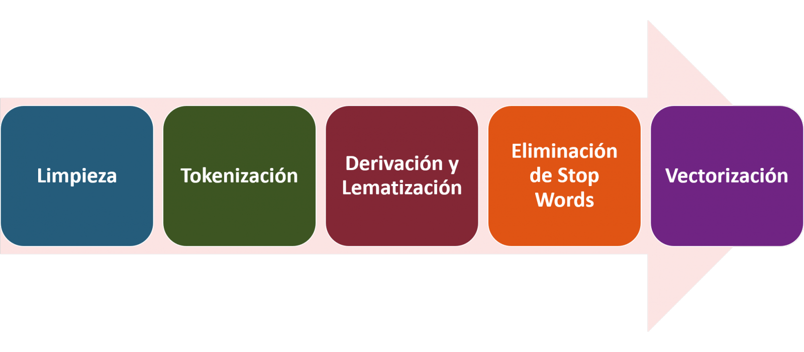
4.1. Installation and loading of libraries
Before starting with data pre-processing, we need to import the libraries to work with. Python provides a vast number of libraries that allow to implement functionalities for many tasks, such as data visualization, Machine Learning, Deep Learning or Natural Language Processing, among many others. The libraries that we will use for this analysis and visualization are the following:
- os, which allows access to operating system-dependent functionality, such as manipulating the directory structure.
- re, provides functions for processing regular expressions.
- pandas, is a very popular and essential library for processing data tables.
- string, provides a series of very useful functions for handling strings.
- matplotlib.pyplot, contains a collection of functions that will allow us to generate the graphical representations of the word clouds.
- sklearn.feature_extraction.text (Scikit-Learn library), converts a collection of text documents into a vector array. From this library we will use some commands that we will discuss later.
- wordcloud, library with which we can generate the word cloud.
# Importaremos las librerías necesarias para realizar este análisis y la visualización. import os import re import pandas as pd import string import matplotlib.pyplot as plt from sklearn.feature_extraction.text import CountVectorizer from sklearn.feature_extraction.text import TfidfTransformer from wordcloud import WordCloud4.2. Data loading
Once the libraries are loaded, we prepare the data with which we are going to work. Before starting to load the data, in the working directory we need: (a) a folder called \"post\" that will contain all the files in TXT format with which we are going to work and that are available in the repository of this project of the GitHub of datos.gob.es; (b) a file called \"stop_words_spanish.txt\" that contains the list of stop words in Spanish, which is also available in said repository and (c) a folder called \"images\" where we will save the images of the word clouds in PNG format, which we will create below.
# Generamos la carpeta \"imagenes\".nueva_carpeta = \"imagenes/\" try: os.mkdir(nueva_carpeta)except OSError: print (\"Ya existe una carpeta llamada %s\" % nueva_carpeta)else: print (\"Se ha creado la carpeta: %s\" % nueva_carpeta)Next, we will proceed to load the data. The input data, as we have already mentioned, are in TXT files and each file contains a post. As we want to perform the analysis and visualization of several posts at the same time, we will load in our development environment all the texts that interest us, to later insert them in a single table or dataframe.
# Generamos una lista donde incluiremos todos los archivos que debe leer, indicándole la carpeta donde se encuentran.filePath = []for file in os.listdir(\"./post/\"): filePath.append(os.path.join(\"./post/\", file))# Generamos un dataframe en el cual incluiremos una fila por cada post.post_df = pd.DataFrame()for file in filePath: with open (file, \"rb\") as readFile: post_df = pd.DataFrame([readFile.read().decode(\"utf8\")], append(post_df)# Nombramos la columna que contiene los textos en el dataframe.post_df.columns = [\"texto\"]4.3. Data pre-processing
In order to obtain our objective: generate word clouds for each post, we will perform the following pre-processing tasks.
a) Data cleansing
Once a table containing the texts with which we are going to work has been generated, we must eliminate the noise beyond the text that interests us: special characters, punctuation marks and carriage returns.
First, we put all characters in lowercase to avoid any errors in case-sensitive processes, by using the lower() command.
Then we eliminate punctuation marks, such as periods, commas, exclamations, questions, among many others. For the elimination of these we will resort to the preinitialized string.punctuacion of the string library, which returns a set of symbols considered punctuation marks. In addition, we must eliminate tabs, cart jumps and extra spaces, which do not provide information in this analysis, using regular expressions.
It is essential to apply all these steps in a single function so that they are processed sequentially, because all processes are highly related.
# Eliminamos los signos de puntuación, los saltos de carro/tabulaciones y espacios en blanco extra.# Para ello generamos una función en la cual indicamos todos los cambios que queremos aplicar al texto.def limpiar_texto(texto): texto = texto.lower() texto = re.sub(\"\\[.*?¿\\]\\%\", \" \", texto) texto = re.sub(\"[%s]\" % re.escape(string.punctuation), \" \", texto) texto re.sub(\"\\w*\\d\\w*\", \" \", texto) return texto# Aplicamos los cambios al texto.limpiar_texto = lambda x: limpiar_texto(x)post_clean = pd.DataFrame(post_clean.texto.apply/limpiar_texto)b) Tokenize
Once we have eliminated the noise in the texts with which we are going to work, we will tokenize each of the texts in words. For this we will use the split() function, using space as a separator between words. This will allow separating the words independently (tokens) for future analysis.
# Tokenizar los textos. Se crea una nueva columna en la tabla con los tokens con el texto \"tokenizado\".def tokenizar(text): text = texto.split(sep = \" \") return(text)post_df[\"texto_tokenizado\"] = post_df[\"texto\"].apply(lambda x: tokenizar(x))c) Removal of \"stop words\"
After removing punctuation marks and other elements that can distort the target display, we will remove \"stop words\". To carry out this step we use a list of Spanish stop words since each language has its own list. This list consists of a total of 608 words, which include articles, prepositions, linking verbs, adverbs, among others and is recently updated. This list can be downloaded from the datos.gob.es GitHub account in TXT format and must be located in the working directory.
# Leemos el archivo que contiene las palabras vacías en castellano.with open \"stop_words_spanish.txt\", encoding = \"UTF8\") as f: lines = f.read().splitlines()In this list of words, we will include new words that do not contribute relevant information to our texts or appear recurrently due to their own context. In this case, there is a bunch of words, which we should eliminate since they are present in all posts repetitively since they all deal with the subject of open data and there is a high probability that these are the most significant words. Some of these words are, \"item\", \"data\", \"open\", \"case\", among others. This will allow to obtain a more representative graphic representation of the content of each post.
On the other hand, a visual inspection of the results obtained allows to detect words or characters derived from errors included in the texts, which obviously have no meaning and that have not been eliminated in the previous steps. These should be removed from the analysis so that they do not distort the subsequent results. These are words like, \"nen\", \"nun\" or \"nla\"
# Actualizamos nuestra lista de stop words.stop_words.extend((\"caso\", \"forma\",\"unido\", \"abiertos\", \"post\", \"espera\", \"datos\", \"dato\", \"servicio\", \"nun\", \"día\", \"nen\", \"data\", \"conjuntos\", \"importantes\", \"unido\", \"unión\", \"nla\", \"r\", \"n\"))# Eliminamos las stop words de nuestra tabla.post_clean = post_clean [~(post_clean[\"texto_tokenizado\"].isin(stop_words))]d) Vectorization
Machines are not capable of understanding words and sentences therefore, they must be transformed to some numerical structure. The method consists of generating vectors from each token. In this post we use a simple technique known as bag-of-words (BoW). It consists of assigning a weight to each token proportional to the frequency of appearance of that token in the text. To do this, we work on an array in which each row represents a text and each column a token. To perform the vectorization we will resort to the CountVectorizer() and TfidTransformer() commands of the scikit-learn library.
The CountVectorizer() function allows you to transform text into a vector of frequencies or word counts. In this case we will obtain 6 vectors with as many dimensions as there are tokens in each text, one for each post, which we will integrate into a single matrix, where the columns will be the tokens or words and the rows will be the posts.
# Calculamos la matriz de frecuencia de palabras del texto.vectorizador = CountVectorizer()post_vec = vectorizador.fit_transform(post_clean.texto_tokenizado)Once the word frequency matrix is generated, it is necessary to convert it into a normalized vector form in order to reduce the impact of tokens that occur very frequently in the text. To do this we will use the TfidfTransformer() function.
# Convertimos una matriz de frecuencia de palabras en una forma vectorial regularizada.transformer = TfidfTransformer()post_trans = transformer.fit_transform(post_vec).toarray()If you want to know more about the importance of applying this technique, you will find numerous articles on the Internet that talk about it and how relevant it is, among other issues, for SEO optimization.
5. Creation of the word cloud
Once we have concluded the pre-processing of the text, as we indicated at the beginning of the post, it is possible to perform NLP tasks. In this exercise we will create a word cloud or \"WordCloud\" for each of the analyzed texts.
A word cloud is a visual representation of the words with the highest rate of occurrence in the text. It allows to detect in a simple way the frequency and importance of each of the words, facilitating the identification of the keywords and discovering with a single glance the main theme treated in the text.
For this we are going to use the \"wordcloud\" library that incorporates the necessary functions to build each representation. First, we have to indicate the characteristics that each word cloud should present, such as the background color (background_color function), the color map that the words will take (colormap function), the maximum font size (max_font_size function) or set a seed so that the word cloud generated is always the same (function random_state) in future implementations. We can apply these and many other functions to customize each word cloud.
# Indicamos las características que presentará cada nube de palabras.wc = WordCloud(stopwords = stop_words, background_color = \"black\", colormap = \"hsv\", max_font_size = 150, random_state = 123)Once we have indicated the characteristics that we want each word cloud to present, we proceed to create it and save it as an image in PNG format. To generate the word cloud, we will use a loop in which we will indicate different functions of the matplotlib library (represented by the plt prefix) necessary to graphically generate the word cloud according to the specification defined in the previous step. We have to specify that a world cloud needs to be created for each row of the table, that is, for each text, with the function plt.subplot(). With the command plt.imshow() we indicate that the result is a 2D image. If we want the axes not to be displayed, we must indicate it with the plt.axis() function. Finally, with the function plt.savefig() we will save the generated visualization.
# Generamos las nubes de palabras para cada uno de los posts.for index, i in enumerate(post.columns): wc.generate(post.texto_tokenizado[i]) plt.subplot(3, 2, index+1 plt.imshow(wc, interpolation = \"bilinear\") plt.axis(\"off\") plt.savefig(\"imagenes/.png\")# Mostramos las nubes de palabras resultantes.plt.show()The visualization obtained is:
Visualization of the word clouds obtained from the texts of different posts of the blog section of datos.gob.es
5. Conclusions
Data visualization is one of the most powerful mechanisms for exploiting and analyzing the implicit meaning of data, regardless of the data type and the degree of technological knowledge of the user. Visualizations allow us to extract meaning out of the data and create narratives based on graphical representation.
Word clouds are a tool that allows us to speed up the analysis of textual data, since through them we can quickly and easily identify and interpret the words with the greatest relevance in the analyzed text, which gives us an idea of the subject.
If you want to learn more about Natural Language Processing, you can consult the guide \"Emerging Technologies and Open Data: Natural Language Processing\" and the posts \"Natural Language Processing\" and \" The latest news in natural language processing: summaries of classic works in just a few hundred words\".
Hopefully this step-by-step visualization has taught you a few things about the ins and outs of Natural Language Processing and word cloud creation. We will return to show you new data reuses. See you soon!