Documentación
1. Introduction
Visualizations are graphical representations of data that allow the information linked to them to be communicated in a simple and effective way. The visualization possibilities are very wide, from basic representations, such as line, bar or sector graphs, to visualizations configured on interactive dashboards.
In this "Step-by-Step Visualizations" section we are regularly presenting practical exercises of open data visualizations available in datos.gob.es or other similar catalogs. They address and describe in a simple way the stages necessary to obtain the data, perform the transformations and analyses that are relevant to, finally, enable the creation of interactive visualizations that allow us to obtain final conclusions as a summary of said information. In each of these practical exercises, simple and well-documented code developments are used, as well as tools that are free to use. All generated material is available for reuse in the GitHub Data Lab repository.
Then, and as a complement to the explanation that you will find below, you can access the code that we will use in the exercise and that we will explain and develop in the following sections of this post.
Access the data lab repository on Github.
Run the data pre-processing code on top of Google Colab.
2. Objetive
The main objective of this exercise is to show how to perform a network or graph analysis based on open data on rental bicycle trips in the city of Madrid. To do this, we will perform a preprocessing of the data in order to obtain the tables that we will use next in the visualization generating tool, with which we will create the visualizations of the graph.
Network analysis are methods and tools for the study and interpretation of the relationships and connections between entities or interconnected nodes of a network, these entities being persons, sites, products, or organizations, among others. Network analysis seeks to discover patterns, identify communities, analyze influence, and determine the importance of nodes within the network. This is achieved by using specific algorithms and techniques to extract meaningful insights from network data.
Once the data has been analyzed using this visualization, we can answer questions such as the following:
- What is the network station with the highest inbound and outbound traffic?
- What are the most common interstation routes?
- What is the average number of connections between stations for each of them?
- What are the most interconnected stations within the network?
3. Resources
3.1. Datasets
The open datasets used contain information on loan bike trips made in the city of Madrid. The information they provide is about the station of origin and destination, the time of the journey, the duration of the journey, the identifier of the bicycle, ...
These open datasets are published by the Madrid City Council, through files that collect the records on a monthly basis.
These datasets are also available for download from the following Github repository.
3.2. Tools
To carry out the data preprocessing tasks, the Python programming language written on a Jupyter Notebook hosted in the Google Colab cloud service has been used.
"Google Colab" or, also called Google Colaboratory, is a cloud service from Google Research that allows you to program, execute and share code written in Python or R on a Jupyter Notebook from your browser, so it does not require configuration. This service is free of charge.
For the creation of the interactive visualization, the Gephi tool has been used.
"Gephi" is a network visualization and analysis tool. It allows you to represent and explore relationships between elements, such as nodes and links, in order to understand the structure and patterns of the network. The program requires download and is free.
If you want to know more about tools that can help you in the treatment and visualization of data, you can use the report "Data processing and visualization tools".
4. Data processing or preparation
The processes that we describe below you will find them commented in the Notebook that you can also run from Google Colab.
Due to the high volume of trips recorded in the datasets, we defined the following starting points when analysing them:
- We will analyse the time of day with the highest travel traffic
- We will analyse the stations with a higher volume of trips
Before launching to analyse and build an effective visualization, we must carry out a prior treatment of the data, paying special attention to its obtaining and the validation of its content, making sure that they are in the appropriate and consistent format for processing and that they do not contain errors.
As a first step of the process, it is necessary to perform an exploratory analysis of the data (EDA), in order to properly interpret the starting data, detect anomalies, missing data or errors that could affect the quality of subsequent processes and results. If you want to know more about this process you can resort to the Practical Guide of Introduction to Exploratory Data Analysis
The next step is to generate the pre-processed data table that we will use to feed the network analysis tool (Gephi) that will visually help us understand the information. To do this, we will modify, filter and join the data according to our needs.
The steps followed in this data preprocessing, explained in this Google Colab Notebook, are as follows:
- Installation of libraries and loading of datasets
- Exploratory Data Analysis (EDA)
- Generating pre-processed tables
You will be able to reproduce this analysis with the source code that is available in our GitHub account. The way to provide the code is through a document made on a Jupyter Notebook that, once loaded into the development environment, you can easily run or modify.
Due to the informative nature of this post and to favour the understanding of non-specialized readers, the code is not intended to be the most efficient but to facilitate its understanding, so you will possibly come up with many ways to optimize the proposed code to achieve similar purposes. We encourage you to do so!
5. Network analysis
5.1. Definition of the network
The analysed network is formed by the trips between different bicycle stations in the city of Madrid, having as main information of each of the registered trips the station of origin (called "source") and the destination station (called "target").
The network consists of 253 nodes (stations) and 3012 edges (interactions between stations). It is a directed graph, because the interactions are bidirectional and weighted, because each edge between the nodes has an associated numerical value called "weight" which in this case corresponds to the number of trips made between both stations.
5.2. Loading the pre-processed table in to Gephi
Using the "import spreadsheet" option on the file tab, we import the previously pre-processed data table in CSV format. Gephi will detect what type of data is being loaded, so we will use the default predefined parameters.


5.3. Network display options
5.3.1 Distribution window
First, we apply in the distribution window, the Force Atlas 2 algorithm. This algorithm uses the technique of node repulsion depending on the degree of connection in such a way that the sparsely connected nodes are separated from those with a greater force of attraction to each other.
To prevent the related components from being out of the main view, we set the value of the parameter "Severity in Tuning" to a value of 10 and to avoid that the nodes are piled up, we check the option "Dissuade Hubs" and "Avoid overlap".

Dentro de la ventana de distribución, también aplicamos el algoritmo de Expansión con la finalidad de que los nodos no se encuentren tan juntos entre sí mismos.

Figure 3. Distribution window - Expansion algorithm
5.3.2 Appearance window
Next, in the appearance window, we modify the nodes and their labels so that their size is not equal but depends on the value of the degree of each node (nodes with a higher degree, larger visual size). We will also modify the colour of the nodes so that the larger ones are a more striking colour than the smaller ones. In the same appearance window we modify the edges, in this case we have opted for a unitary colour for all of them, since by default the size is according to the weight of each of them.
A higher degree in one of the nodes implies a greater number of stations connected to that node, while a greater weight of the edges implies a greater number of trips for each connection.

5.3.3 Graph window
Finally, in the lower area of the interface of the graph window, we have several options such as activating / deactivating the button to show the labels of the different nodes, adapting the size of the edges in order to make the visualization cleaner, modify the font of the labels, ...

Next, we can see the visualization of the graph that represents the network once the visualization options mentioned in the previous points have been applied.

Figure 6. Graph display
Activating the option to display labels and placing the cursor on one of the nodes, the links that correspond to the node and the rest of the nodes that are linked to the chosen one through these links will be displayed.
Next, we can visualize the nodes and links related to the bicycle station "Fernando el Católico". In the visualization, the nodes that have a greater number of connections are easily distinguished, since they appear with a larger size and more striking colours, such as "Plaza de la Cebada" or "Quevedo".

5.4 Main network measures
Together with the visualization of the graph, the following measurements provide us with the main information of the analysed network. These averages, which are the usual metrics when performing network analytics, can be calculated in the statistics window.

- Nodes (N): are the different individual elements that make up a network, representing different entities. In this case the different bicycle stations. Its value on the network is 243
- Links (L): are the connections that exist between the nodes of a network. Links represent the relationships or interactions between the individual elements (nodes) that make up the network. Its value in the network is 3014
- Maximum number of links (Lmax): is the maximum possible number of links in the network. It is calculated by the following formula Lmax= N(N-1)/2. Its value on the network is 31878
- Average grade (k): is a statistical measure to quantify the average connectivity of network nodes. It is calculated by averaging the degrees of all nodes in the network. Its value in the network is 23.8
- Network density (d): indicates the proportion of connections between network nodes to the total number of possible connections. Its value in the network is 0.047
- Diámetro (dmax ): is the longest graph distance between any two nodes of the res, i.e., how far away the 2 nodes are farther apart. Its value on the network is 7
- Mean distance (d):is the average mean graph distance between the nodes of the network. Its value on the network is 2.68
- Mean clustering coefficient (C): Indicates how nodes are embedded between their neighbouring nodes. The average value gives a general indication of the grouping in the network. Its value in the network is 0.208
- Related component: A group of nodes that are directly or indirectly connected to each other but are not connected to nodes outside that group. Its value on the network is 24
5.5 Interpretation of results
The probability of degrees roughly follows a long-tail distribution, where we can observe that there are a few stations that interact with a large number of them while most interact with a low number of stations.
The average grade is 23.8 which indicates that each station interacts on average with about 24 other stations (input and output).
In the following graph we can see that, although we have nodes with degrees considered as high (80, 90, 100, ...), it is observed that 25% of the nodes have degrees equal to or less than 8, while 75% of the nodes have degrees less than or equal to 32.

The previous graph can be broken down into the following two corresponding to the average degree of input and output (since the network is directional). We see that both have similar long-tail distributions, their mean degree being the same of 11.9
Its main difference is that the graph corresponding to the average degree of input has a median of 7 while the output is 9, which means that there is a majority of nodes with lower degrees in the input than the output.


The value of the average grade with weights is 346.07 which indicates the average of total trips in and out of each station.

The network density of 0.047 is considered a low density indicating that the network is dispersed, that is, it contains few interactions between different stations in relation to the possible ones. This is considered logical because connections between stations will be limited to certain areas due to the difficulty of reaching stations that are located at long distances.
The average clustering coefficient is 0.208 meaning that the interaction of two stations with a third does not necessarily imply interaction with each other, that is, it does not necessarily imply transitivity, so the probability of interconnection of these two stations through the intervention of a third is low.
Finally, the network has 24 related components, of which 2 are weak related components and 22 are strong related components.
5.6 Centrality analysis
A centrality analysis refers to the assessment of the importance of nodes in a network using different measures. Centrality is a fundamental concept in network analysis and is used to identify key or influential nodes within a network. To perform this task, you start from the metrics calculated in the statistics window.
- The degree centrality measure indicates that the higher the degree of a node, the more important it is. The five stations with the highest values are: 1º Plaza de la Cebada, 2º Plaza de Lavapiés, 3º Fernando el Católico, 4º Quevedo, 5º Segovia 45.

- The closeness centrality indicates that the higher the proximity value of a node, the more central it is, since it can reach any other node in the network with the least possible effort. The five stations with the highest values are: 1º Fernando el Católico 2º General Pardiñas, 3º Plaza de la Cebada, 4º Plaza de Lavapiés, 5º Puerta de Madrid.


- The measure of betweenness centrality indicates that the greater the intermediation measure of a node, the more important it is since it is present in more interaction paths between nodes than the rest of the nodes in the network. The five stations with the highest values are: 1º Fernando el Católico, 2º Plaza de Lavapiés, 3º Plaza de la Cebada, 4º Puerta de Madrid, 5º Quevedo.

 FIgure 16. Graphic visualization betweenness centrality
With the Gephi tool you can calculate a large number of metrics and parameters that are not reflected in this study, such as the eigenvector measure or centrality distribution "eigenvector".
5.7 Filters
Through the filtering window, we can select certain parameters that simplify the visualizations in order to show relevant information of network analysis in a clearer way visually.

Next, we will show several filtered performed:
- Range (grade) filtering, which shows nodes with a rank greater than 50, assuming 13.44% (34 nodes) and 15.41% (464 edges).

- Edge filtering (edge weight), showing edges weighing more than 100, assuming 0.7% (20 edges).

Within the filters window, there are many other filtering options on attributes, ranges, partition sizes, edges, ... with which you can try to make new visualizations to extract information from the graph. If you want to know more about the use of Gephi, you can consult the following courses and trainings about the tool.
6. Conclusions of the exercice
Once the exercise is done, we can appreciate the following conclusions:
- The three stations most interconnected with other stations are Plaza de la Cebada (133), Plaza de Lavapiés (126) and Fernando el Católico (114).
- The station that has the highest number of input connections is Plaza de la Cebada (78), while the one with the highest number of exit connections is Plaza de Lavapiés with the same number as Fernando el Católico (57).
- The three stations with the highest number of total trips are Plaza de la Cebada (4524), Plaza de Lavapiés (4237) and Fernando el Católico (3526).
- There are 20 routes with more than 100 trips. Being the 3 routes with a greater number of them: Puerta de Toledo – Plaza Conde Suchil (141), Quintana Fuente del Berro – Quintana (137), Camino Vinateros – Miguel Moya (134).
- Taking into account the number of connections between stations and trips, the most important stations within the network are: Plaza la Cebada, Plaza de Lavapiés and Fernando el Católico.
We hope that this step-by-step visualization has been useful for learning some very common techniques in the treatment and representation of open data. We will be back to show you further reuses. See you soon!
Blog
Open data is a valuable tool for making informed decisions that encourage the success of a process and enhance its effectiveness. From a sectorial perspective, open data provides relevant information about the legal, educational, or health sectors. All of these, along with many other areas, utilize open sources to measure improvement compliance or develop tools that streamline work for professionals.
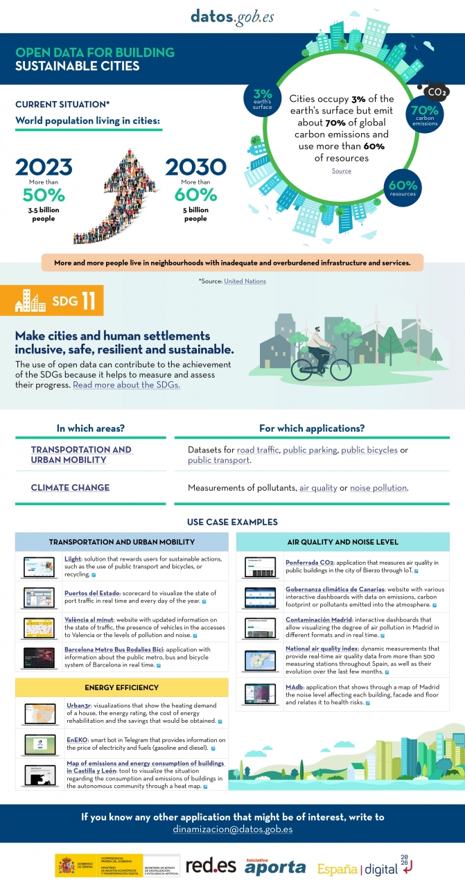
The benefits of using open data are extensive, and their variety goes hand in hand with technological innovation: every day, more opportunities arise to employ open data in the development of innovative solutions. An example of this can be seen in urban development aligned with the sustainability values advocated by the United Nations (UN).
Cities cover only 3% of the Earth's surface; however, they emit 70% of carbon emissions and consume over 60% of the world's resources, according to the UN. In 2023, more than half of the global population lives in cities, and this figure is projected to keep growing. By 2030, it is estimated that over 5 billion people would live in cities, meaning more than 60% of the world's population.
Despite this trend, infrastructures and neighborhoods do not meet the appropriate conditions for sustainable development, and the goal is to "Make cities and human settlements inclusive, safe, resilient, and sustainable," as recognized in Sustainable Development Goal (SDG) number 11. Proper planning and management of urban resources are significant factors in creating and maintaining sustainability-based communities. In this context, open data plays a crucial role in measuring compliance with this SDG and thus achieving the goal of sustainable cities.
In conclusion, open data stands as a fundamental tool for the strengthening and progress of sustainable city development.
In this infographic, we have gathered use cases that utilize sets of open data to monitor and/or enhance energy efficiency, transportation and urban mobility, air quality, and noise levels. Issues that contribute to the proper functioning of urban centers.
Click on the infographic to view it in full size.
Noticia
Last March 13th, a session of the Mobility Working Group of the Gaia-X Spain Hub was held, addressing the main challenges of the sector regarding projects related to data sharing and exploitation. The session, which took place at the Technical School of Civil Engineers of the Polytechnic University of Madrid, allowed attendees to learn firsthand about the main challenges of the sector, as well as some of the cutting-edge data projects in the mobility industry. The event was also a meeting point where ideas and reflections were shared among key actors in the sector.
The session began with a presentation from the Ministry of Transport, Mobility, and Urban Agenda, which highlighted the great importance of the National Access Point for Multimodal Transport, a European project that allows all information on passenger transport services in the country to be centralized in a single national point, with the aim of providing the foundation for driving the development of future mobility services.
Next, the Data Office of the State Secretariat for Artificial Intelligence (SEDIA) provided their vision of the Data Spaces development model and the design principles of such spaces aligned with European values. The importance of business networks based on data ecosystems, the intersectoral nature of the Mobility industry, and the significant role of open data in the sector's data spaces were highlighted.
Next, use cases were presented by Vicomtech, Amadeus, i2CAT, and the Alcobendas City Council, which allowed attendees to learn firsthand about some examples of technology use for data sharing projects (both data spaces and data lakes).
Finally, an initial study by the i2CAT Foundation, FACTUAL Consulting, and EIT Urban Mobility on the basic components of future mobility data spaces in Spain was presented. The study, which can be downloaded here in Spanish, addresses the potential of mobility data spaces for the Spanish market. Although it focuses on Spain, it takes a national and international research approach, framed in the European context to establish standards, develop the technical components that enable data spaces, the first flagship projects, and address common challenges to achieve milestones in sustainable mobility in Europe.
The presentations used in the session are available at this link.
Noticia
Updated: 21/03/2024
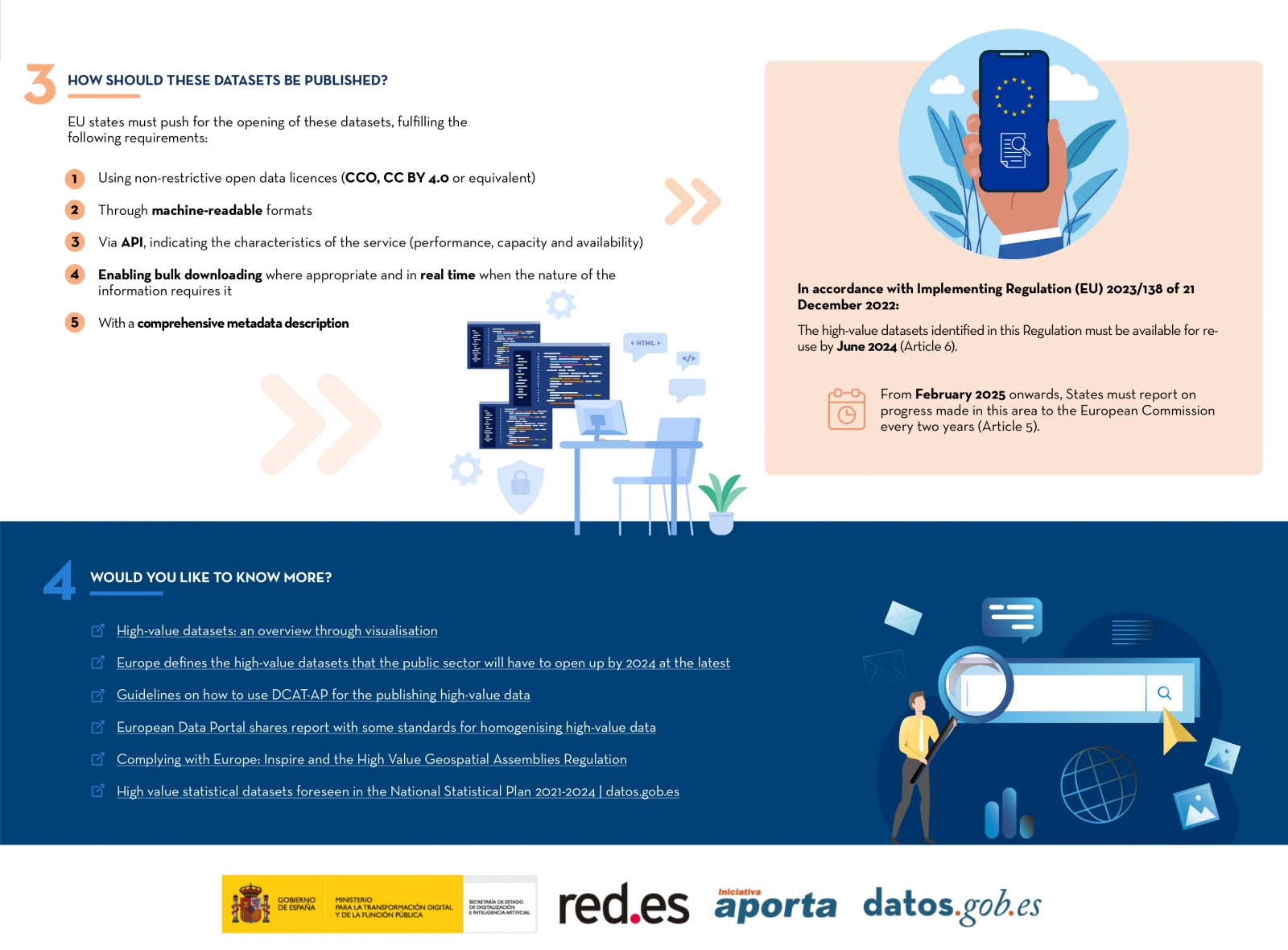
On January 2023, the European Commission published a list of high-value datasets that public sector bodies must make available to the public within a maximum of 16 months. The main objective of establishing the list of high-value datasets was to ensure that public data with the highest socio-economic potential are made available for re-use with minimal legal and technical restriction, and at no cost. Among these public sector datasets, some, such as meteorological or air quality data, are particularly interesting for developers and creators of services such as apps or websites, which bring added value and important benefits for society, the environment or the economy.
The publication of the Regulation has been accompanied by frequently asked questions to help public bodies understand the benefit of HVDS (High Value Datasets) for society and the economy, as well as to explain some aspects of the obligatory nature of HVDS (High Value Datasets) and the support for publication.
In line with this proposal, Executive Vice-President for a Digitally Ready Europe, Margrethe Vestager, stated the following in the press release issued by the European Commission:
"Making high-value datasets available to the public will benefit both the economy and society, for example by helping to combat climate change, reducing urban air pollution and improving transport infrastructure. This is a practical step towards the success of the Digital Decade and building a more prosperous digital future".
In parallel, Internal Market Commissioner Thierry Breton also added the following words on the announcement of the list of high-value data: "Data is a cornerstone of our industrial competitiveness in the EU. With the new list of high-value datasets we are unlocking a wealth of public data for the benefit of all”. Start-ups and SMEs will be able to use this to develop new innovative products and solutions to improve the lives of citizens in the EU and around the world.
Six categories to bring together new high-value datasets
The regulation is thus created under the umbrella of the European Open Data Directive, which defines six categories to differentiate the new high-value datasets requested:
- Geospatial
- Earth observation and environmental
- Meteorological
- Statistical
- Business
- Mobility
However, as stated in the European Commission's press release, this thematic range could be extended at a later stage depending on technological and market developments. Thus, the datasets will be available in machine-readable format, via an application programming interface (API) and, if relevant, also with a bulk download option.
In addition, the reuse of datasets such as mobility or building geolocation data can expand the business opportunities available for sectors such as logistics or transport. In parallel, weather observation, radar, air quality or soil pollution data can also support research and digital innovation, as well as policy making in the fight against climate change.
Ultimately, greater availability of data, especially high-value data, has the potential to boost entrepreneurship as these datasets can be an important resource for SMEs to develop new digital products and services, which in turn can also attract new investors.
Find out more in this infographic:

Access the accessible version on two pages.
Documentación
1. Introduction
Visualizations are graphical representations of data that allows comunication in a simple and effective way the information linked to it. The visualization possibilities are very wide, from basic representations, such as a graph of lines, bars or sectors, to visualizations configured on dashboards or interactive dashboards. Visualizations play a fundamental role in drawing conclusions using visual language, also allowing to detect patterns, trends, anomalous data or project predictions, among many other functions.
In this section of "Step-by-Step Visualizations" we are periodically presenting practical exercises of open data visualizations available in datos.gob.es or other similar catalogs. They address and describe in a simple way the necessary stages to obtain the data, perform the transformations and analysis that are relevant to it and finally, the creation of interactive visualizations. From these visualizations we can extract information to summarize in the final conclusions. In each of these practical exercises, simple and well-documented code developments are used, as well as free to use tools. All generated material is available for reuse in the Github data lab repository belonging to datos.gob.es.
In this practical exercise, we have carried out a simple code development that is conveniently documented based on free to use tool.
Access the data lab repository on Github.
Run the data pre-processing code on Google Colab.
2. Objetive
The main objective of this post is to show how to make an interactive visualization based on open data. For this practical exercise we have used a dataset provided by the Ministry of Justice that contains information about the toxicological results made after traffic accidents that we will cross with the data published by the Central Traffic Headquarters (DGT) that contain the detail on the fleet of vehicles registered in Spain.
From this data crossing we will analyze and be able to observe the ratios of positive toxicological results in relation to the fleet of registered vehicles.
It should be noted that the Ministry of Justice makes available to citizens various dashboards to view data on toxicological results in traffic accidents. The difference is that this practical exercise emphasizes the didactic part, we will show how to process the data and how to design and build the visualizations.
3. Resources
3.1. Datasets
For this case study, a dataset provided by the Ministry of Justice has been used, which contains information on the toxicological results carried out in traffic accidents. This dataset is in the following Github repository:
The datasets of the fleet of vehicles registered in Spain have also been used. These data sets are published by the Central Traffic Headquarters (DGT), an agency under the Ministry of the Interior. They are available on the following page of the datos.gob.es Data Catalog:
3.2. Tools
To carry out the data preprocessing tasks it has been used the Python programming language written on a Jupyter Notebook hosted in the Google Colab cloud service.
Google Colab (also called Google Colaboratory), is a free cloud service from Google Research that allows you to program, execute and share code written in Python or R from your browser, so it does not require the installation of any tool or configuration.
For the creation of the interactive visualization, the Google Data Studio tool has been used.
Google Data Studio is an online tool that allows you to make graphs, maps or tables that can be embedded in websites or exported as files. This tool is simple to use and allows multiple customization options.
If you want to know more about tools that can help you in the treatment and visualization of data, you can use the report "Data processing and visualization tools".
4. Data processing or preparation
Before launching to build an effective visualization, we must carry out a previous treatment of the data, paying special attention to obtaining it and validating its content, ensuring that it is in the appropriate and consistent format for processing and that it does not contain errors.
The processes that we describe below will be discussed in the Notebook that you can also run from Google Colab. Link to Google Colab notebook
As a first step of the process, it is necessary to perform an exploratory data analysis (EDA) in order to properly interpret the starting data, detect anomalies, missing data or errors that could affect the quality of subsequent processes and results. Pre-processing of data is essential to ensure that analyses or visualizations subsequently created from it are reliable and consistent. If you want to know more about this process, you can use the Practical Guide to Introduction to Exploratory Data Analysis.
The next step to take is the generation of the preprocessed data tables that we will use to generate the visualizations. To do this we will adjust the variables, cross data between both sets and filter or group as appropriate.
The steps followed in this data preprocessing are as follows:
- Importing libraries
- Loading data files to use
- Detection and processing of missing data (NAs)
- Modifying and adjusting variables
- Generating tables with preprocessed data for visualizations
- Storage of tables with preprocessed data
You will be able to reproduce this analysis since the source code is available in our GitHub account. The way to provide the code is through a document made on a Jupyter Notebook that once loaded into the development environment you can execute or modify easily. Due to the informative nature of this post and favor the understanding of non-specialized readers, the code does not intend to be the most efficient, but to facilitate its understanding, so you will possibly come up with many ways to optimize the proposed code to achieve similar purposes. We encourage you to do so!
5. Generating visualizations
Once we have done the preprocessing of the data, we go with the visualizations. For the realization of these interactive visualizations, the Google Data Studio tool has been used. Being an online tool, it is not necessary to have software installed to interact or generate any visualization, but it is necessary that the data tables that we provide are properly structured, for this we have made the previous steps for the preparation of the data.
The starting point is the approach of a series of questions that visualization will help us solve. We propose the following:
- How is the fleet of vehicles in Spain distributed by Autonomous Communities?
- What type of vehicle is involved to a greater and lesser extent in traffic accidents with positive toxicological results?
- Where are there more toxicological findings in traffic fatalities?
Let''s look for the answers by looking at the data!
5.1. Fleet of vehicles registered by Autonomous Communities
This visual representation has been made considering the number of vehicles registered in the different Autonomous Communities, breaking down the total by type of vehicle. The data, corresponding to the average of the month-to-month records of the years 2020 and 2021, are stored in the "parque_vehiculos.csv" table generated in the preprocessing of the starting data.
Through a choropleth map we can visualize which CCAAs are those that have a greater fleet of vehicles. The map is complemented by a ring graph that provides information on the percentages of the total for each Autonomous Community.
As defined in the "Data visualization guide of the Generalitat Catalana" the choropletic (or choropleth) maps show the values of a variable on a map by painting the areas of each affected region of a certain color. They are used when you want to find geographical patterns in the data that are categorized by zones or regions.
Ring charts, encompassed in pie charts, use a pie representation that shows how the data is distributed proportionally.
Once the visualization is obtained, through the drop-down tab, the option to filter by type of vehicle appears.
View full screen visualization
5.2. Ratio of positive toxicological results for different types of vehicles
This visual representation has been made considering the ratios of positive toxicological results by number of vehicles nationwide. We count as a positive result each time a subject tests positive in the analysis of each of the substances, that is, the same subject can count several times in the event that their results are positive for several substances. For this purpose, the table "resultados_vehiculos.csv” has been generated during data preprocessing.
Using a stacked bar chart, we can evaluate the ratios of positive toxicological results by number of vehicles for different substances and different types of vehicles.
As defined in the "Data visualization guide of the Generalitat Catalana" bar graphs are used when you want to compare the total value of the sum of the segments that make up each of the bars. At the same time, they offer insight into how large these segments are.
When stacked bars add up to 100%, meaning that each segmented bar occupies the height of the representation, the graph can be considered a graph that allows you to represent parts of a total.
The table provides the same information in a complementary way.
Once the visualization is obtained, through the drop-down tab, the option to filter by type of substance appears.
View full screen visualization
5.3. Ratio of positive toxicological results for the Autonomous Communities
This visual representation has been made taking into account the ratios of the positive toxicological results by the fleet of vehicles of each Autonomous Community. We count as a positive result each time a subject tests positive in the analysis of each of the substances, that is, the same subject can count several times in the event that their results are positive for several substances. For this purpose, the "resultados_ccaa.csv" table has been generated during data preprocessing.
It should be noted that the Autonomous Community of registration of the vehicle does not have to coincide with the Autonomous Community where the accident has been registered, however, since this is a didactic exercise and it is assumed that in most cases they coincide, it has been decided to start from the basis that both coincide.
Through a choropleth map we can visualize which CCAAs are the ones with the highest ratios. To the information provided in the first visualization on this type of graph, we must add the following.
As defined in the "Data Visualization Guide for Local Entities" one of the requirements for choropleth maps is to use a numerical measure or datum, a categorical datum for the territory, and a polygon geographic datum.
The table and bar chart provides the same information in a complementary way.
Once the visualization is obtained, through the peeling tab, the option to filter by type of substance appears.
View full screen visualization
6. Conclusions of the study
Data visualization is one of the most powerful mechanisms for exploiting and analyzing the implicit meaning of data, regardless of the type of data and the degree of technological knowledge of the user. Visualizations allow us to build meaning on top of data and create narratives based on graphical representation. In the set of graphical representations of data that we have just implemented, the following can be observed:
- The fleet of vehicles of the Autonomous Communities of Andalusia, Catalonia and Madrid corresponds to about 50% of the country''s total.
- The highest positive toxicological results ratios occur in motorcycles, being of the order of three times higher than the next ratio, passenger cars, for most substances.
- The lowest positive toxicology result ratios occur in trucks.
- Two-wheeled vehicles (motorcycles and mopeds) have higher "cannabis" ratios than those obtained in "cocaine", while four-wheeled vehicles (cars, vans and trucks) have higher "cocaine" ratios than those obtained in "cannabis"
- The Autonomous Community where the ratio for the total of substances is highest is La Rioja.
It should be noted that in the visualizations you have the option to filter by type of vehicle and type of substance. We encourage you to do so to draw more specific conclusions about the specific information you''re most interested in.
We hope that this step-by-step visualization has been useful for learning some very common techniques in the treatment and representation of open data. We will return to show you new reuses. See you soon!
Documentación
Este informe, que publica el Portal de Datos Europeo, analiza el potencial de reutilización de los datos en tiempo real. Los datos en tiempo real ofrecen información con alta frecuencia de actualización sobre el entorno que nos rodea (por ejemplo, información sobre el tráfico, datos meteorológicos, mediciones de la contaminación ambiental, información sobre riesgos naturales, etc.).
El documento resume los resultados y conclusiones de un seminario web organizado por el equipo del Portal de Datos Europeo celebrado el pasado 5 de abril de 2022, donde se explicaron diferentes formas de compartir datos en tiempo real desde plataformas de datos abiertos.
En primer lugar, el informe hace un repaso sobre el fundamento de los datos en tiempo real e incluye ejemplos que justifican el valor que aporta este tipo de datos para, a continuación, describir dos enfoques tecnológicos sobre cómo compartir datos en tiempo real del ámbito de IoT y el transporte. Incluye, además, un bloque que resume las principales conclusiones de las preguntas y comentarios de los participantes que giran, principalmente, en torno a difentes necesidades de fuentes de datos y funcionalidades requeridas para su reutilización.
Para terminar, basándose en el feedback y la discusión generada, se proporciona un conjunto de recomendaciones y acciones a corto y medio plazo sobre cómo mejorar la capacidad para localizar fuentes de datos en tiempo real a través del Portal de Datos Europeo.
Este informe se encuentra disponible en el siguiente enlace: "Datos en tiempo real: Enfoques para integrar fuentes de datos en tiempo real en data.europa.eu"
Blog
Open data portals are experiencing a significant growth in the number of datasets being published in the transport and mobility category. For example, the EU's open data portal already has almost 48,000 datasets in the transport category or Spain's own portal datos.gob.es, which has around 2,000 datasets if we include those in the public sector category. One of the main reasons for the growth in the publication of transport-related data is the existence of three directives that aim to maximise the re-use of datasets in the area. The PSI directive on the re-use of public sector information in combination with the INSPIRE directive on spatial information infrastructure and the ITS directive on the implementation of intelligent transport systems, together with other legislative developments, make it increasingly difficult to justify keeping transport and mobility data closed.
In this sense, in Spain, Law 37/2007, as amended in November 2021, adds the obligation to publish open data to commercial companies belonging to the institutional public sector that act as airlines. This goes a step further than the more frequent obligations with regard to data on public passenger transport services by rail and road.
In addition, open data is at the heart of smart, connected and environmentally friendly mobility strategies, both in the case of the Spanish "es.movilidad" strategy and in the case of the sustainable mobility strategy proposed by the European Commission. In both cases, open data has been introduced as one of the key innovation vectors in the digital transformation of the sector to contribute to the achievement of the objectives of improving the quality of life of citizens and protecting the environment.
However, much less is said about the importance and necessity of open data during the research phase, which then leads to the innovations we all enjoy. And without this stage in which researchers work to acquire a better understanding of the functioning of the transport and mobility dynamics of which we are all a part, and in which open data plays a fundamental role, it would not be possible to obtain relevant innovations or well-informed public policies. In this sense, we are going to review two very relevant initiatives in which coordinated multi-national efforts are being made in the field of mobility and transport research.
The information and monitoring system for transport research and innovation
At the European level, the EU also strongly supports research and innovation in transport, aware that it needs to adapt to global realities such as climate change and digitalisation. The Strategic Transport Research and Innovation Agenda (STRIA) describes what the EU is doing to accelerate the research and innovation needed to radically change transport by supporting priorities such as electrification, connected and automated transport or smart mobility.
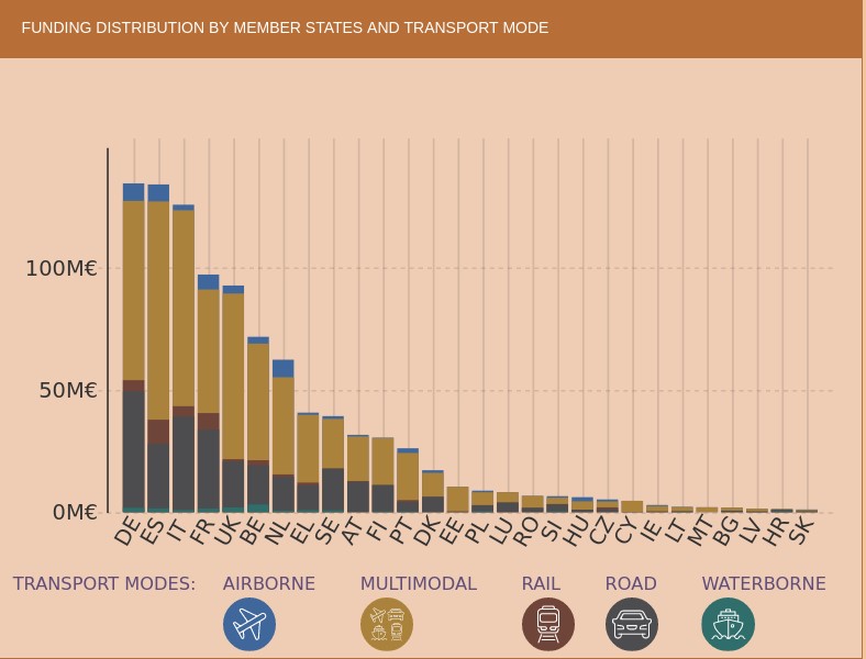
In this sense, the Transport Research and Innovation Monitoring and Information System (TRIMIS) is the tool maintained by the European Commission to provide open access information on research and innovation (R&I) in transport and was launched with the mission to support the formulation of public policies in the field of transport and mobility.
TRIMIS maintains an up-to-date dashboard to visualise data on transport research and innovation and provides an overview and detailed data on the funding and organisations involved in this research. The information can be filtered by the seven STRIA priorities and also includes data on the innovation capacity of the transport sector.
If we look at the geographical distribution of research funds provided by TRIMIS, we see that Spain appears in fifth place, far behind Germany and France. The transport systems in which the greatest effort is being made are road and air transport, beneficiaries of more than half of the total effort.
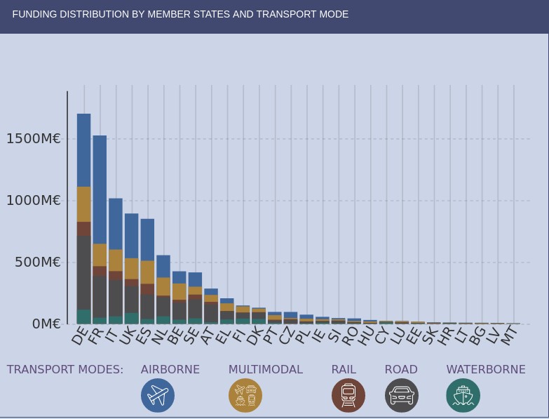
However, we find that in the strategic area of Smart Mobility and Services (SMO), which are evaluated in terms of their contribution to the overall sustainability of the energy and transport system, Spain is leading the research effort at the same level as Germany. It should also be noted that the effort being made in Spain in terms of multimodal transport is higher than in other countries.
As an example of the research effort being carried out in Spain, we have the pilot dataset to implement semantic capabilities on traffic incident information related to safety on the Spanish state road network, except for the Basque Country and Catalonia, which is published by the General Directorate of Traffic and which uses an ontology to represent traffic incidents developed by the University of Valencia.
The area of intelligent mobility systems and services aims to contribute to the decarbonisation of the European transport sector and its main priorities include the development of systems that connect urban and rural mobility services and promote modal shift, sustainable land use, travel demand sufficiency and active and light travel modes; the development of mobility data management solutions and public digital infrastructure with fair access or the implementation of intermodality, interoperability and sectoral coupling.
The 100 mobility questions initiative
The 100 Questions Initiative, launched by The Govlab in collaboration with Schmidt Futures, aims to identify the world's 100 most important questions in a number of domains critical to the future of humanity, such as gender, migration or air quality.
One of these domains is dedicated precisely to transport and urban mobility and aims to identify questions where data and data science have great potential to provide answers that will help drive major advances in knowledge and innovation on the most important public dilemmas and the most serious problems that need to be solved.
In accordance with the methodology used, the initiative completed the fourth stage on 28 July, in which the general public voted to decide on the final 10 questions to be addressed. The initial 48 questions were proposed by a group of mobility experts and data scientists and are designed to be data-driven and planned to have a transformative impact on urban mobility policies if they can be solved.
In the next stage, the GovLab working group will identify which datasets could provide answers to the selected questions, some as complex as "where do commuters want to go but really can't and what are the reasons why they can't reach their destination easily?" or "how can we incentivise people to make trips by sustainable modes, such as walking, cycling and/or public transport, rather than personal motor vehicles?"
Other questions relate to the difficulties encountered by reusers and have been frequently highlighted in research articles such as "Open Transport Data for maximising reuse in multimodal route": "How can transport/mobility data collected with devices such as smartphones be shared and made available to researchers, urban planners and policy makers?"
In some cases it is foreseeable that the datasets needed to answer the questions may not be available or may belong to private companies, so an attempt will also be made to define what new datasets should be generated to help fill the gaps identified. The ultimate goal is to provide a clear definition of the data requirements to answer the questions and to facilitate the formation of data collaborations that will contribute to progress towards these answers.
Ultimately, changes in the way we use transport and lifestyles, such as the use of smartphones, mobile web applications and social media, together with the trend towards renting rather than owning a particular mode of transport, have opened up new avenues towards sustainable mobility and enormous possibilities in the analysis and research of the data captured by these applications.
Global initiatives to coordinate research efforts are therefore essential as cities need solid knowledge bases to draw on for effective policy decisions on urban development, clean transport, equal access to economic opportunities and quality of life in urban centres. We must not forget that all this knowledge is also key to proper prioritisation so that we can make the best use of the scarce public resources that are usually available to meet the challenges.
Content written by Jose Luis Marín, Senior Consultant in Data, Strategy, Innovation & Digitalization.
The contents and views reflected in this publication are the sole responsibility of the author.
Documentación
This report published by the European Data Portal (EDP) aims to help open data users in harnessing the potential of the data generated by the Copernicus program.
The Copernicus project generates high-value satellite data, generating a large amount of Earth observation data, this is in line with the European Data Portal's objective of increasing the accessibility and value of open data.
The report addresses the following questions, What can I do with Copernicus data? How can I access the data?, and What tools do I need to use the data? using the information found in the European Data Portal, specialized catalogues and examining practical examples of applications using Copernicus data.
This report is available at this link: "Copernicus data for the open data community"
Blog
Spain was the second country in the world that received the most tourists during 2019, with 83.8 million visitors. That year, tourism activity represented 12.4% of GDP, employing more than 2.2 million people (12.7% of the total). It is therefore a fundamental sector for our economy.
These figures have been reduced due to the pandemic, but the sector is expected to recover in the coming months. Open data can help. Up-to-date information can bring benefits to all actors involved in this industry:
- Tourists: Open data helps tourists plan their trips, providing them with the information they need to choose where to stay or what activities to do. The up-to-date information that open data can provide is particularly important in times of COVID. There are several portals that collect information and visualisations of travel restrictions, such as the UN's Humanitarian Data Exchange. This website hosts a daily updated interactive map of travel restrictions by country and airline.
- Businesses. Businesses can generate various applications targeted at travellers, with useful information. In addition, by analysing the data, tourism establishments can detect untapped markets and destinations. They can also personalise their offers and even create recommendation systems that help to promote different activities, with a positive impact on the travellers' experience.
- Public administrations. More and more governments are implementing solutions to capture and analyse data from different sources in real time, in order to better understand the behaviour of their visitors. Examples include Segovia, Mallorca and Gran Canaria. Thanks to these tools, they will be able to define strategies and make informed decisions, for example, aimed at avoiding overcrowding. In this sense, tools such as Affluences allow them to report on the occupation of museums, swimming pools and shops in real time, and to obtain predictions for successive time slots.
The benefits of having quality tourism-related data are such that it is not surprising that the Spanish Government has chosen this sector as a priority when it comes to creating data spaces that allow voluntary data sharing between organisations. In this way, data from different sources can be cross-referenced, enriching the various use cases.
The data used in this field are very diverse: data on consumption, transport, cultural activities, economic trends or even weather forecasts. But in order to make good use of this highly dynamic data, it needs to be available to users in appropriate, up-to-date formats and access needs to be automated through application programming interfaces (APIs).
Many organisations already offer data through APIs. In this infographic you can see several examples linked to our country at national, regional and local level. But in addition to general data portals, we can also find APIs in open data platforms linked exclusively to the tourism sector. In the following infographic you can see several examples:
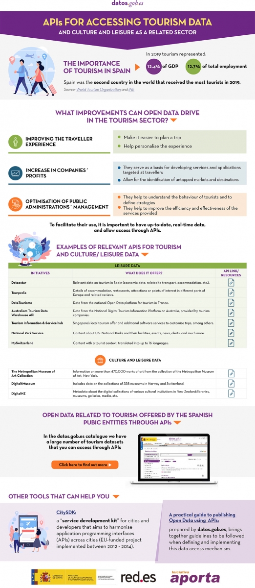
Click here to see the infographic in full size and in its accessible version.
Do you know more examples of APIs or other resources that facilitate access to tourism-related open data? Leave us a comment or write to datos.gob.es!
Content prepared by the datos.gob.es team.
Blog
Mobility is a key economic driver. Increasing the efficiency and quality of a country's mobility system contributes both to the strength of its economy and to improving the quality of life of its citizens. This is particularly important in the mobility systems of cities and their metropolitan areas, where most of the population and, thus, most of the economic activity is concentrated.
Aware of this - and because we citizens demand it - local authorities have for decades allocated a significant part of their annual resources to expanding, improving and making their transport and mobility networks more efficient.
In the last decade, open data has been one of the most important vectors of innovation that have been introduced in the mobility strategies developed by cities, giving rise to initiatives that would have been difficult to imagine in previous periods. Despite all the complexities involved, opening both static and real-time mobility datasets for reuse is actually cheap and simple compared to the cost of building a new transport infrastructure or the cost of acquiring and maintaining the operational support systems (OSS) associated with mobility services. In addition, the existence of an increasing deployment of sensor networks, accessible through control systems deployed in the context of "smart city" strategies, makes the task a little easier.
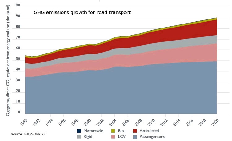
We should not forget, moreover, that public transport is key to tackling climate change as it is one of the fastest growing sources of greenhouse gas emissions, and public transport offers the best mobility solution to move people quickly and efficiently in cities around the world. As shown in the figure, simply shifting passengers using their private vehicles to public transport has a major impact on reducing greenhouse gas emissions. The Bus Industry Confederation estimates that shifting passengers from cars to public transport can lead to a 65% reduction in emissions during peak hours. This reduction could be as high as 95% in emissions during off-peak hours for those commuters who switch from private cars to public transport.
For all these reasons, there are already numerous examples where freeing up transport and mobility data to put it in the hands of travellers is proving to be a policy with important benefits for many cities: it allows better use of resources and contributes to more efficient mobility in urban space.
Let's look at some examples that may not be as well-known as the ones that usually reach the media, but which demonstrate how the release of data allows for innovations that benefit both users and, in some cases, the authorities themselves.
Redesigning New York City bus routes
All cities are constantly thinking of ways to improve their bus routes in order to provide the best possible service to citizens. In New York City, however, the open data policy, as an unplanned consequence, provided an important aid to the authorities, based on the analysis of data from the bus network users themselves.
The rider-driven Bus Turnaround Coalition campaign, supported by TransitCenter, a foundation working to improve public transport in US cities, and the Riders Alliance, is using open data to raise awareness about the state of New York City's bus network, proposing solutions for improvement to the Metropolitan Transportation Authority (MTA).
To formulate their recommendations, the organisations analysed bus arrival times using the MTA's own location maps, incorporated real-time data through the GTFS specification, reviewed ridership data, and mapped (and optimised) bus routes.
Among the most innovative proposals is the shift in approach to route design criteria. Instead of trying to cater to all types of travellers, the Bus Turnaround Coalition, after analysing how people actually move around the city and what type of transport they would need to achieve their goals efficiently, proposed the following recommendations:
- Add lines to take passengers from the outskirts of the city directly to the underground lines, facilitating a quick trip.
- Improve lines to offer short, fast routes within a neighbourhood for people who want to run a quick errand or visit a close friend.
- Split routes that are too long to minimise the risk of delays.
- Readjust the distance between stops, which are often too close together, complementing gaps in metro coverage.
Open data has turned frequent rider protests and complaints about poor network performance into a set of reasoned, data-driven inputs, which have been captured in a series of MTA commitments to improve New York's bus network, such as redesigning the network by 2021, increasing journey speeds by 25%, and proactively managing bus maintenance.
Bicycle usage data in San Francisco
Like many other cities, San Francisco, through its Municipal Transportation Agency (SFMTA), records travel data from users of its public bike-sharing system and makes it available as open data. In this case, the transport authority itself publishes regular reports, both on the overall use of the system and on the conclusions it draws for the improvement of the city's own mobility.
By documenting and analysing the volumes and trends of bicycle use in San Francisco, they are able to support the goals of the SFMTA's Strategic Plan, which aims to prioritise other forms of travel in the city than the private car.
For example, ongoing analysis of bicycle passenger volumes at key intersections in the city and citizen input has reduced traffic congestion and accidents by re-prioritising vehicle traffic priorities according to actual roadway usage at any given time of day.
Efficient parking in Sacramento
Many cities try to address traffic congestion problems from different perspectives including efficient parking management. Therefore, one of the datasets frequently published by cities with open data initiatives is public parking occupancy.
In the city of Sacramento, California, the open data initiative publishes datasets from the citywide sensor network that monitors parking availability at parking meters and not only in the city's public car parks. In this way they have managed to reduce emissions as vehicles spend less time looking for parking, while significantly improving traffic flow and the satisfaction of citizens using the Sacpark app.
In 2020, due to the pandemic, passenger transport around the world was drastically reduced due to the mobility restriction policies that governments around the world had to deploy to curb the spread of the virus, as seen in the image below.
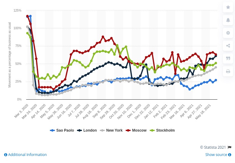
In June 2021 cities are still far from recovering the levels of mobility they had in March 2020, but we continue to make progress in making data the basis on which to build useful information, and essential in the new innovations coming through artificial intelligence.
So, as the pandemic recedes, and many initiatives resume, we continue to see how open data is at the heart of smart, connected and environmentally friendly mobility strategies.
Content prepared by Jose Luis Marín, Senior Consultant in Data, Strategy, Innovation & Digitalization.
The contents and views reflected in this publication are the sole responsibility of the author.