Blog
Open data can transform how we interact with our cities, offering opportunities to improve quality of life. When made publicly available, they enable the development of innovative applications and tools that address urban challenges, from accessibility to road safety and participation.
Real-time information can have positive impacts on citizens. For example, applications that use open data can suggest the most efficient routes, considering factors such as traffic and ongoing construction; information on the accessibility of public spaces can improve mobility for people with disabilities; data on cycling or pedestrian routes encourages greener and healthier modes of transport; and access to urban data can empower citizens to participate in decision-making about their city. In other words, citizen use of open data not only improves the efficiency of the city and its services, but also promotes a more inclusive, sustainable and participatory city.
To illustrate these ideas, this article discusses maps for "navigating" cities, made with open data. In other words, initiatives are shown that improve the relationship between citizens and their urban environment from different aspects such as accessibility, school safety and citizen participation. The first project is Mapcesible, which allows users to map and assess the accessibility of different locations in Spain. The second, Eskola BideApp, a mobile application designed to support safe school routes. And finally, maps that promote transparency and citizen participation in urban management. The first identifies noise pollution, the second locates available services in various areas within 15 minutes and the third displays banks in the city. These maps use a variety of public data sources to provide a detailed overview of different aspects of urban life.
The first initiative is a project of a large foundation, the second a collaborative and local proposal, and the third a personal project. Although they are based on very different approaches, all three have in common the use of public and open data and the vocation to help people understand and experience the city. The variety of origins of these projects indicates that the use of public and open data is not limited to large organisations.
Below is a summary of each project, followed by a comparison and reflection on the use of public and open data in urban environments.
Mapcesible, map for people with reduced mobility
Mapcessible was launched in 2019 to assess the accessibility of various spaces such as shops, public toilets, car parks, accommodation, restaurants, cultural spaces and natural environments.

Figure 1. Mapcesible. Source: https://mapcesible.fundaciontelefonica.com/intro
This project is supported by organizations such as the NGO Spanish Confederation of People with Physical and Organic Disabilities (COCEMFE) and the company ILUNION. It currently has more than 40,000 evaluated accessible spaces and thousands of users.

Figure 2. Mapcesible. Source: https://mapcesible.fundaciontelefonica.com/filters
Mapcesible uses open data as part of its operation. Specifically, the application incorporates fourteen datasets from official bodies, including the Ministry of Agriculture and Environment, city councils of different cities (including Madrid and Barcelona) and regional governments. This open data is combined with information provided by the users of the application, who can map and evaluate the accessibility of the places they visit. This combination of official data and citizen collaboration allows Mapcesible to provide up-to-date and detailed information on the accessibility of various spaces throughout Spain, thus benefiting people with reduced mobility.
Eskola BideAPP, application to define safe school routes.
Eskola BideAPP is an application developed by Montera34 - a team dedicated to data visualisation and the development of collaborative projects - in alliance with the Solasgune Association to support school pathways. Eskola BideAPP has served to ensure that boys and girls can access their schools safely and efficiently. The project mainly uses public data from the OpenStreetMap, e.g. geographical and cartographic data on streets, pavements, crossings, as well as data collected during the process of creating safe routes for children to walk to school in order to promote their autonomy and sustainable mobility.
The application offers an interactive dashboard to visualise the collected data, the generation of paper maps for sessions with students, and the creation of reports for municipal technicians. It uses technologies such as QGIS (a free and open source geographic information system) and a development environment for the R programming language, dedicated to statistical computing and graphics.
The project is divided into three main stages:
- Data collection through questionnaires in classrooms.
- Analysis and discussion of results with the children to co-design personalised routes.
- Testing of the designed routes.
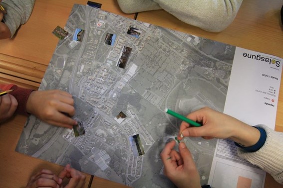
Figure 3. Eskola BideaAPP. Photo by Julián Maguna (Solasgune). Source: https://montera34.com/project/eskola-bideapp/
Pablo Rey, one of the promoters of Montera34 together with Alfonso Sánchez, reports for this article that Eskola BideAPP, since 2019, has been used in eight municipalities, including Derio, Erandio, Galdakao, Gatika, Plentzia, Leioa, Sopela and Bilbao. However, it is currently only operational in the latter two. "The idea is to implement it in Portugalete at the beginning of 2025," he adds.
It''s worth noting the maps from Montera34 that illustrated the effect of Airbnb in San Sebastián and other cities, as well as the data analyses and maps published during the COVID-19 pandemic, which also visualized public data.In addition, Montera34 has used public data to analyse abstention, school segregation, minor contracts or make open data available to the public. For this last project, Montera34 has started with the ordinances of the Bilbao City Council and the minutes of its plenary sessions, so that they are not only available in a PDF document but also in the form of open and accessible data.
Mapas de Madrid sobre contaminación acústica, servicios y ubicación de bancos
Abel Vázquez Montoro has made several maps with open data that are very interesting, for example, the one made with data from the Strategic Noise Map (MER) offered by the Madrid City Council and land registry data. The map shows the noise affecting each building, facade and floor in Madrid.

Figure 4. Noise maps in Madrid. Source: https://madb.netlify.app/.
This map is organised as a dashboard with three sections: general data of the area visible on the map, dynamic 2D and 3D map with configurable options and detailed information on specific buildings. It is an open, free, non-commercial platform that uses free and open source software such as GitLab - a web-based Git repository management platform - and QGIS. The map allows the assessment of compliance with noise regulations and the impact on quality of life, as it also calculates the health risk associated with noise levels, using the attributable risk ratio (AR%).
15-minCity is another interactive map that visualises the concept of the "15-minute city" applied to different urban areas, i.e. it calculates how accessible different services are within a 15-minute walking or cycling radius from any point in the selected city.

Figure 5. 15-minCity. Source: https://whatif.sonycsl.it/15mincity/15min.php?idcity=9166
Finally, "Where to sit in Madrid" is another interactive map that shows the location of benches and other places to sit in public spaces in Madrid, highlighting the differences between rich (generally with more public seating) and poor (with less) neighbourhoods. This map uses the map-making tool, Felt, to visualise and share geospatial information in an accessible way. The map presents different types of seating, including traditional benches, individual seats, bleachers and other types of seating structures.

Figure 6. Where to sit in Madrid. Source: https://felt.com/map/Donde-sentarse-en-Madrid-TJx8NGCpRICRuiAR3R1WKC?loc=40.39689,-3.66392,13.97z
Its maps visualise public data on demographic information (e.g. population data by age, gender and nationality), urban information on land use, buildings and public spaces, socio-economic data (e.g. income, employment and other economic indicators for different districts and neighbourhoods), environmental data, including air quality, green spaces and other related aspects, and mobility data.
What do they have in common?
| Name | Promoter | Type of data used | Profit motive | Users | Characteristics |
|---|---|---|---|---|---|
| Mapcesible | Telefónica Foundation | Combines user-generated and public data (14 open data sets from government agencies) | Non-profit | More than 5.000 | Collaborative app, available on iOS and Android, more than 40,000 mapped accessible points. |
| Eskola BideAPP | Montera34 and Solasgune Association | Combines user-generated and public data (classroom questionnaires) and some public data. | Non-profit. | 4.185 | Focus on safe school routes, uses QGIS and R for data processing |
| Mapa Estratégico de Ruido (MER) | Madrid City Council | 2D and 3D geographic and visible area data | Non-profit | No data | It allows the assessment of compliance with noise regulations and the impact on quality of life, as it also calculates the associated health risk. |
| 15 min-City | Sony GSL | Geographic data and services | Non-profit | No data | Interactive map visualising the concept of the "15-minute city" applied to different urban areas. |
| MAdB "Dónde sentarse en Madrid" | Private | Public data (demographic, electoral, urban, socio-economic, etc.) | Non-profit | No data | Interactive maps of Madrid |
Figure 7. Comparative table of solutions
These projects share the approach of using open data to improve access to urban services, although they differ in their specific objectives and in the way information is collected and presented. Mapcesible, Eskola BideApp, MAdB and "Where to sit in Madrid" are of great value.
On the one hand, Mapcesible offers unified and updated information that allows people with disabilities to move around the city and access services. Eskola BideApp involves the community in the design and testing of safe routes for walking to school; this not only improves road safety, but also empowers young people to be active agents in urban planning. In the meantime, 15-min city, MER and the maps developed by Vázquez Montoro visualise complex data about Madrid so that citizens can better understand how their city works and how decisions that affect them are made.
Overall, the value of these projects lies in their ability to create a data culture, teaching how to value, interpret and use information to improve communities.
Content created by Miren Gutiérrez, PhD and researcher at the University of Deusto, expert in data activism, data justice, data literacy, and gender disinformation. The contents and viewpoints reflected in this publication are the sole responsibility of the author.
Entrevista
In this episode we will delve into the importance of three related categories of high-value datasets. These are Earth observation and environmental data, geospatial data and mobility data. To tell us about them, we have interviewed two experts in the field:
- Paloma Abad Power, deputy director of the National Centre for Geographic Information (CNIG).
- Rafael Martínez Cebolla, geographer of the Government of Aragón.
With them we have explored how these high-value datasets are transforming our environment, contributing to sustainable development and technological innovation.
Listen to the full podcast (only available in Spanish)
Summary / Transcript of the interview
1. What are high-value datasets and why are their important?
Paloma Abad Power: According to the regulation, high-value datasets are those that ensure highest socio-economic potential and, for this, they must be easy to find, i.e. they must be accessible, interoperable and usable. And what does this mean? That means that the datasets must have their descriptions, i.e. the online metadata, which report the statistics and their properties, and which can be easily downloaded or used.
In many cases, these data are often reference data, i.e. data that serve to generate other types of data, such as thematic data, or can generate added value.
Rafael Martínez Cebolla: They could be defined as those datasets that represent phenomena that are useful for decision making, for any public policy or for any action that a natural or legal person may undertake.
In this sense, there are already some directives, which are not so recent, such as the Water Framework Directive or the INSPIRE Directive, which motivated this need to provide shared data under standards that drive the sustainable development of our society.
2. These high-value data are defined by a European Directive and an Implementing Regulation which dictated six categories of high-value datasets. On this occasion we will focus on three of them: Earth observation and environmental data, geospatial data and mobility data. What do these three categories of data have in common and what specific datasets do they cover?
Paloma Abad Power: In my opinion, these data have in common the geographical component, i.e. they are data located on the ground and therefore serve to solve problems of different nature and linked to society.
Thus, for example, we have, with national coverage, the National Aerial Orthophotography Plan (PNOA), which are the aerial images, the System of Land Occupation Information (SIOSE), cadastral parcels, boundary lines, geographical names, roads, postal addresses, protected sites - which can be both environmental and also castles, i.e. historical heritage- etc. And these categories cover almost all the themes defined by the annexes of the INSPIRE directive.
Rafael Martínez Cebolla: It is necessary to know what is pure geographic information, with a direct geographic reference, as opposed to other types of phenomena that have indirect geographic references. In today's world, 90% of information can be located, either directly or indirectly. Today more than ever, geographic tagging is mandatory for any corporation that wants to implement a certain activity, be it social, cultural, environmental or economic: the implementation of renewable energies, where I am going to eat today, etc. These high-value datasets enhance these geographical references, especially of an indirect nature, which help us to make a decision.
3. Which agencies publish these high-value datasets? In other words, where could a user locate datasets in these categories?
Paloma Abad Power: It is necessary to highlight the role of the National Cartographic System, which is an action model in which the organisations of the NSA (National State Administration) and the autonomous communities participate. It is coordinating the co-production of many unique products, funded by these organisations.
These products are published through interoperable web services. They are published, in this case, by the National Center for Geographic Information (CNIG), which is also responsible for much of the metadata for these products.
They could be located through the Catalogues of the IDEE (Spatial Data Infrastructure of Spain) or the Official Catalogue of INSPIRE Data and Services, which is also included in datos.gob.es and the European Data Portal.
And who can publish? All bodies that have a legal mandate for a product classified under the Regulation. Examples: all the mapping bodies of the Autonomous Communities, the General Directorate of Cadastre, Historical Heritage, the National Statistics Institute, the Geological and Mining Institute (IGME), the Hydrographic Institute of the Navy, the Ministry of Agriculture, Fisheries and Food (MAPA), the Ministry for Ecological Transition and the Demographic Challenge, etc. There are a multitude of organisations and many of them, as I have mentioned, participate in the National Cartographic System, provide the data and generate a single service for the citizen.
Rafael Martínez Cebolla: The National Cartographic System defines very well the degree of competences assumed by the administrations. In other words, the public administration at all levels provides official data, assisted by private enterprise, sometimes through public procurement.
The General State Administration goes up to scales of 1:25,000 in the case of the National Geographic Institute (IGN) and then the distribution of competencies for the rest of the scales is for the autonomous or local administrations. In addition, there are a number of actors, such as hydrographic confederations, state departments or the Cadastre, which have under their competences the legal obligation to generate these datasets.
For me it is an example of how it should be distributed, although it is true that it is then necessary to coordinate very well, through collegiate bodies, so that the cartographic production is well integrated.
Paloma Abad Power: There are also collaborative projects, such as, for example, a citizen map, technically known as an X, Y, Z map, which consists of capturing the mapping of all organisations at national and local level. That is, from small scales 1:1,000,000 or 1:50,000,000 to very large scales, such as 1:1000, to provide the citizen with a single multi-scale map that can be served through interoperable and standardised web services.
4. Do you have any other examples of direct application of this type of data?
Rafael Martínez Cebolla: A clear example was seen with the pandemic, with the mobility data published by the National Institute of Statistics. These were very useful data for the administration, for decision making, and from which we have to learn much more for the management of future pandemics and crises, including economic crises. We need to learn and develop our early warning systems.
I believe that this is the line of work: data that is useful for the general public. That is why I say that mobility has been a clear example, because it was the citizen himself who was informing the administration about how he was moving.
Paloma Abad Power: I am going to contribute some data. For example, according to statistics from the National Cartographic System services, the most demanded data are aerial images and digital terrain models. In 2022 there were 8 million requests and in 2023 there were 19 million requests for orthoimages alone.
Rafael Martínez Cebolla: I would like to add that this increase is also because things are being done well. On the one hand, discovery systems are improved. My general feeling is that there are many successful example projects, both from the administration itself and from companies that need this basic information to generate their products.
There was an application that was generated very quickly with de-escalation - you went to a website and it told you how far you could walk through your municipality - because people wanted to get out and walk. This example arises from spatial data that have moved out of the public administration. I believe that this is the importance of successful examples, which come from people who see a compelling need.
5. And how do you incentivise such re-use?
Rafael Martínez Cebolla: I have countless examples. Incentivisation also involves promotion and marketing, something that has sometimes failed us in the public administration. You stick to certain competences and it seems that just putting it on a website is enough. And that is not all.
We are incentivising re-use in two ways. On the one hand, internally, within the administration itself, teaching them that geographic information is useful for planning and evaluating public policies. And I give you the example of the Public Health Atlas of the Government of Aragon, awarded by an Iberian society of epidemiology the year before the pandemic. It was useful for them to know what the health of the Aragonese was like and what preventive measures they had to take.
As for the external incentives, in the case of the Geographic Institute of Aragon, it was seen that the profile entering the geoportal was very technical. The formats used were also very technical, which meant that the general public was not reached. To solve this problem, we promoted portals such as the IDE didactica, a portal for teaching geography, which reaches any citizen who wants to learn about the territory of Aragon.
Paloma Abad Power: I would like to highlight the economic benefit of this, as was shown, for example, in the economic study carried out by the National Centre for Graphic Information with the University of Leuven to measure the economic benefit of the Spatial Data Infrastructure of Spain. It measure the benefit of private companies using free and open services, rather than using, for example, Google Maps or other non-open sources..
Rafael Martínez Cebolla: For better and for worse, because the quality of the official data sometimes we wish it were better. Both Paloma in the General State Administration and I in the regional administration sometimes know that there are official data where more money needs to be invested so that the quality of the data would be better and could be reusable.
But it is true that these studies are key to know in which dimension high-value datasets move. That is to say, having studies that report on the real benefit of having a spatial data infrastructure at state or regional level is, for me, key for two things: for the citizen to understand its importance and, above all, for the politician who arrives every N years to understand the evolution of these platforms and the revolution in geospatial information that we have experienced in the last 20 years.
6. The Geographic Institute of Aragon has also produced a report on the advantages of reusing this type of data, is that right?
Rafael Martínez Cebolla: Yes, it was published earlier this year. We have been doing this report internally for three or four years, because we knew we were going to make the leap to a spatial knowledge infrastructure and we wanted to see the impact of implementing a knowledge graph within the data infrastructure. The Geographic Institute of Aragon has made an effort in recent years to analyse the economic benefit of having this infrastructure available for the citizens themselves, not for the administration. In other words, how much money Aragonese citizens save in their taxes by having this infrastructure. Today we know that having a geographic information platform saves approximately 2 million euros a year for the citizens of Aragon.
I would like to see the report for the next January or February, because I think the leap will be significant. The knowledge graph was implemented in April last year and this gap will be felt in the year ahead. We have noticed a significant increase in requests, both for viewing and downloading.
Basically from one year to the next, we have almost doubled both the number of accesses and downloads. This affects the technological component: you have to redesign it. More people are discovering you, more people are accessing your data and, therefore, you have to dedicate more investment to the technological component, because it is being the bottleneck.
7. What do you see as the challenges to be faced in the coming years?
Paloma Abad Power: In my opinion, the first challenge is to get to know the user in order to provide a better service. The technical user, the university students, the users on the street, etc. We are thinking of doing a survey when the user is going to use our geographic information. But of course, such surveys sometimes slow down the use of geographic information. That is the great challenge: to know the user in order to make services more user-friendly, applications, etc. and to know how to get to what they want and give it to them better.
There is also another technical challenge. When the spatial infrastructures began, the technical level was very high, you had to know what a visualisation service was, the metadata, know the parameters, etc. This has to be eliminated, the user can simply say I want, for example, to consult and visualise the length of the Ebro river, in a more user-friendly way. Or for example the word LiDAR, which was the Italian digital model with high accuracy. All these terms need to be made much more user-friendly.
Rafael Martínez Cebolla: Above all, let them be discovered. My perception is that we must continue to promote the discovery of spatial data without having to explain to the untrained user, or even to some technicians, that we must have a data, a metadata, a service..... No, no. Basically it is that generalist search engines know how to find high-value datasets without knowing that there is such a thing as spatial data infrastructure.
It is a matter of publishing the data under friendly standards, under accessible versions and, above all, publishing them in permanent URIs, which are not going to change. In other words, the data will improve in quality, but will never change.
And above all, from a technical point of view, both spatial data infrastructures and geoportals and knowledge infrastructures have to ensure that high-value information nodes are related to each other from a semantic and geographical point of view. I understand that knowledge networks will help in this regard. In other words, mobility has to be related to the observation of the territory, to public health data or to statistical data, which also have a geographical component. This geographical semantic relationship is key for me.
Interview clips
1. What are high-value datasets and why are their important?
2. Where can a user locate geographic data?
3. How is the reuse of data with a geographic component being encouraged?
Blog
Many people use apps to get around in their daily lives. Apps such as Google Maps, Moovit or CityMapper provide the fastest and most efficient route to a destination. However, what many users are unaware of is that behind these platforms lies a valuable source of information: open data. By reusing public datasets, such as those related to air quality, traffic or public transport, these applications can provide a better service.
In this post, we will explore how the reuse of open data by these platforms empowers a smarter and more sustainable urban ecosystem .
Google Maps: aggregates air quality information and transport data into GTFS.
More than a billion people use Google Maps every month around the world. The tech giant offers a free, up-to-date world map that draws its data from a variety of sources, some of them open.
One of the functions provided by the app is information about the air quality in the user's location. The Air Quality Index (AQI) is a parameter that is determined by each country or region. The European benchmark can be consulted on this map which shows air quality by geolocated zones in real time.
To display the air quality of the user's location, Google Maps applies a model based on a multi-layered approach known as the "fusion approach". This method combines data from several input sources and weights the layers with a sophisticated procedure. The input layers are:
- Government reference monitoring stations
- Commercial sensor networks
- Global and regional dispersion models
- Dust and smoke fire models
- Satellite information
- Traffic data
- Ancillary information such as surface area
- Meteorology
In the case of Spain, this information is obtained from open data sources such as the Ministry of Ecological Transition and Demographic Challenge, the Regional Ministry of Environment, Territory and Housing of the Xunta de Galicia or the Community of Madrid. Open data sources used in other countries around the worldcan be found here .
Another functionality offered by Google Maps to plan the best routes to reach a destination is the information on public transport. These data are provided on a voluntary basis by the public companies providing transport services in each city. In order to make this open data available to the user, it is first dumped into Google Transit and must comply with the open public transport standard GTFS (General Transit Feed Specification).
Moovit: reusing open data to deliver real-time information
Moovit is another urban mobility app most used by Spaniards, which uses open and collaborative data to make it easier for users to plan their journeys by public transport.
Since its launch in 2012, the free-to-download app offers real-time information on the different transport options, suggests the best routes to reach the indicated destination, guides users during their journey (how long they have to wait, how many stops are left, when they have to get off, etc.) and provides constant updates in the event of any alteration in the service.
Like other mobility apps , it is also available in offline mode and allows you to save routes and frequent lines in "Favourites". It is also an inclusive solution as it integrates VoiceOver (iOs) or TalkBack (Android) for blind people.
The platform not only leverages open data provided by governments and local authorities, but also collects information from its users, allowing it to offer a dynamic and constantly updated service.
CityMapper: born as a reuser of open mobility data
The CityMapper development team recognises that the application was born with an open DNA that still remains. They reuse open datasets from, for example, OpenStreetMap at global level or RENFE and Cercanías Bilbao at national level. As the application becomes available in more cities, the list of open data reference sources from which it draws information grows.
The platform offers real-time information on public transport routes, including bus, train, metro and bike sharing. It also adds options for walking, cycling and ridesharing. It is designed to provide the most efficient and fastest route to a destinationby integrating data from different modes of transport into a single interface.
As we published in the monographic report "Municipal Innovation through Open Data" CityMapper mainly uses open data from local transport authorities, typically using the GTFS (General Transit Feed Specification) standard . However, when this data is not sufficient or accurate enough, CityMapper combines it with datasets generated by the application's own users who voluntarily collaborate. It also uses data enhanced and managed by the work of the company's own local employees. All this data is combined with artificial intelligence algorithms developed to optimise routes and provide recommendations tailored to users' needs.
In conclusion, the use of open data in transport is driving a significant transformation in the mobility sector in cities. Through their contribution to applications, users can access up-to-date and accurate data, plan their journeys efficiently and make informed decisions. Governments, for their part, have taken on the role of facilitators by enabling the dissemination of data through open platforms, optimising resources and fostering collaboration across sectors. In addition, open data has created new opportunities for developers and the private sector, who have contributed with technological solutions such as Google Maps, Moovit or CityMapper. Ultimately, the potential of open data to transform the future of urban mobility is undeniable.
Application
AUVASA Pay is a mobile application that provides real-time information about the public bus network of Valladolid. Through AUVASA Pay you can check details such as waiting times at bus stops or even buy tickets in QR format and recharge the transport card to use it on the buses.
This application uses open data from Open Street Map to display maps of the city. In addition, it offers open data sets about public transport in Valladolid available for download and reuse under Creative Commons license at Open Data - AUVASA
Documentación
The digital revolution is transforming municipal services, driven by the increasing adoption of artificial intelligence (AI) technologies that also benefit from open data. These developments have the potential to redefine the way municipalities deliver services to their citizens, providing tools to improve efficiency, accessibility and sustainability. This report looks at success stories in the deployment of applications and platforms that seek to improve various aspects of life in municipalities, highlighting their potential to unlock more of the vast untapped potential of open data and associated artificial intelligence technologies.
The applications and platforms described in this report have a high potential for replicability in different municipal contexts, as they address common problems. Replication of these solutions can take place through collaboration between municipalities, companies and developers, as well as through the release and standardisation of open data.
Despite the benefits, the adoption of open data for municipal innovation also presents significant challenges. The quality, updating and standardisation of data published by local authorities, as well as interoperability between different platforms and systems, must be ensured. In addition, the open data culture needs to be reinforced among all actors involved, including citizens, developers, businesses and public administrations themselves.
The use cases analysed are divided into four sections. Each of these sections is described below and some examples of the solutions included in the report are shown.
Transport and Mobility
One of the most significant challenges in urban areas is transport and mobility management. Applications using open data have proven to be effective in improving these services. For example, applications such as Park4Dis make it easy to locate parking spaces for people with reduced mobility, using data from multiple municipalities and contributions from volunteers. CityMapper, which has gone global, on the other hand, offers optimised public transport routes in real time, integrating data from various transport modes to provide the most efficient route. These applications not only improve mobility, but also contribute to sustainability by reducing congestion and carbon emissions.
Environment and Sustainability
Growing awareness of sustainability has spurred the development of applications that promote environmentally friendly practices. CleanSpot, for example, facilitates the location of recycling points and the management of municipal waste. The application encourages citizen participation in cleaning and recycling, contributing to the reduction of the ecological footprint. Liight gamifies sustainable behaviour by rewarding users for actions such as recycling or using public transport. These applications not only improve environmental management, but also educate and motivate citizens to adopt more sustainable habits.
Optimisation of Basic Public Services
Urban service management platforms, such as Gestdropper, use open data to monitor and control urban infrastructure in real time. These tools enable more efficient management of resources such as street lighting, water networks and street furniture, optimising maintenance, incident response and reducing operating costs. Moreover, the deployment of appointment management systems, such as CitaME, helps to reduce waiting times and improve efficiency in customer service.
Citizen Services Aggregators
Applications that centralise public information and services, such as Badajoz Es Más and AppValencia, improve accessibility and communication between administrations and citizens. These platforms provide real-time data on public transport, cultural events, tourism and administrative procedures, making life in the municipality easier for residents and tourists alike. For example, integrating multiple services into a single application improves efficiency and reduces the need for unnecessary travel. These tools also support local economies by promoting cultural events and commercial services.
Conclusions
The use of open data and artificial intelligence technologies is transforming municipal management, improving the efficiency, accessibility and sustainability of public services. The success stories presented in this report describe how these tools can benefit both citizens and public administrations by making cities smarter, more inclusive and sustainable environments, and more responsive to the needs and well-being of their inhabitants and visitors.
Listen the podcast (only availible in spanish)
Blog
Spain, as part of the European Union, is committed to the implementation of the European directives on open data and re-use of public sector information. This includes the adoption of initiatives such as the Implementing Regulation (EU) 2023/138 issued by the European Commission, which defines specific guidelines for government entities with regard to the availability of High value datasets (HVD). These data are categorised into themes previously detailed in earlier discussions: Geospatial, Earth Observation and Environment, Meteorology, Statistics, Societies and Societal Properties, and Mobility. In this article we will focus on the last group mentioned.
The Mobility category encompasses data collections falling under the domain of "Transport Networks", as demarcated in Annex I of the Directive 2007/2/EC of the European Parliament and of the Council of 14 March 2007 establishing an Infrastructure for Spatial Information in the European Community (INSPIRE). In particular, this Directive refers to the requirement to make available to users datasets relating to road, rail, air and inland waterway networks, with their associated infrastructure, connections between different networks and the trans-European transport network, as defined by Decision No 1692/96/EC of the European Parliament and of the Council of 23 July 1996 on Community guidelines for the development of the trans-European transport network.
In addition, it includes the datasets as described in the Directive 2005/44/EC of the European Parliament and of the Council of 7 September 2005 on harmonised River Information Services (RIS) on inland waterways in the Community. The main objective of the Directive is to improve inland waterway traffic and transport, and it applies to canals, rivers, lakes and ports capable of accommodating vessels of between 1,000 and 1,500 tonnes. These datasets include:
| Data type | Inland waterways datasets |
|---|---|
| Static data |
|
| Dynamic data |
|
| Inland electronic and navigational charts (Inland ENC according to the Inland ECDIS Standard) |
|
Figure 1: Table with the high value datasets related to Directive 2005/44/EC for the creation of a trans-European river information network.
In order for all of us to make the most of the information available, the Regulation defines some basic rules on how this data is shared:
- Free and easy to use. The data must be ready to be used and shared with everyone for any purpose by acknowledging and citing the source of the data, as prescribed by the Creative Commons BY 4.0 licence.
- Easy to read and use. Data will be presented in a way that both people and computers can easily understand them and everything will be explained in public.
- Direct and easy access. There will be special ways (called APIs) that allow programs to access data automatically. In addition, the user can alternatively download a lot of information at once.
- Always up to date. It is important that data is up to date, so there will be access to the most recent version. But if the user needs to access previous data, it will also be possible to view previous versions.
- Detailed and precise. Data will be shared in as much detail as possible, to a very fine level of accuracy, so that the whole territory is covered when combined.
- Information on information. There will be "information about the information" (metadata) that will tell everything about the data. The metadata shall contain at least the elements listed in the Annex to Commission Regulation (EC) No 1205/2008 of 3 December 2008.
- Understandable and orderly: It will explain well how the data are organised and what all means, in a way that is easy for everyone to understand (structure and semantics).
- Common language. Data shall use vocabularies, code lists and categories that are recognised and accepted at European or global level.
in Spain, who is responsible for the creation and maintenance of mobility data?
In Spain, the responsibility for the creation and maintenance of mobility data generally lies with different governmental entities, depending on the type of mobility and the territorial scope:
- Level national level. The Ministry of Transport and Sustainable Mobility is the main body in charge of mobility in terms of infrastructure and transport at national level. This would include data on roads, railways, air and maritime transport.
- Regional and local level. Autonomous communities and municipalities also play an important role in urban and regional mobility. They are responsible for urban mobility, public transport and public roads, within their respective jurisdictions.
- Public business entities. There are entities such as ADIF (acronym for Administrador de Infraestructuras Ferroviarias, that is Railway Infrastructure Administrator), AENA (acronym for Aeropuertos Españoles y Navegación Aérea, that is Spanish Airports and Air Navigation), Puertos del Estado (State Ports) and others tentities hat manage specific data related to their field of action in rail, air and maritime transport, respectively.
In Spain, the Ministry of Transport and Sustainable Mobility, in collaboration with the autonomous communities, plays a key role in providing access to a wide range of mobility data. In compliance with INSPIRE and LISIGE (Law 14/2010 of 5 July 2010 on geographic information infrastructures and services in Spain, which transposes the INSPIRE Directive), it offers resources such as the Geoportal of the Spatial Data Infrastructure of Spain (IDEE in Spanish acronyms) where citizens and professionals can access geographic data and services, especially with regard to mobility.
Does Spain comply with the HVD Mobility Regulation?
To solve this question we have to go to the INSPIRE Geoportal where official information classified as high value datasets in Europe is available. Specifically in the mobility category.

Figure 2: Screenshot of the Inspire Geoportal.
As of April 2024 Spain has published the following information in the INSPIRE Geoportal:
- Port service areas in Spain. The port service areas include the cartographic and alphanumeric information of the land service area and water areas I and II. The Spanish State-owned Port System is made up of 46 ports of general interest, managed by 28 Port Authorities.
- Spanish Transport Networks. The Transport Network of the Geographic Reference Information of the National Cartographic System of Spain is a three-dimensional network of national coverage, defined and published in accordance with the INSPIRE Directive, which contemplates five modes of transport: road, rail, inland waterways, air and cable, together with their respective intermodal connections and the infrastructures associated with each mode. This information has the linear geometry of the roads and the punctual geometry of the portals and kilometre points.
- ADIF''s Spanish Rail Transport Network. Public geographic dataset on the adaptation of the Spanish ADIF Common Traamification to the INSPIRE regulations (Transport Networks Annex I).
The publication of these high-value datasets responds positively to the question of Spain''s compliance with the HVD regulation, and is an achievement that reflects Spain''s continued commitment to transparency and access to mobility data.
The joint effort between the Ministry of Transport, Mobility and Urban Agenda, the National Cartographic System and the Autonomous Communities and Public Business Entities underlines the importance of a collaborative approach to mobility information management.
The availability of this data highlights Spain''s commitment to publishing high-value datasets and underlines the importance of continuously improving access to information to optimise inland navigation and mobility data.
Content prepared by Mayte Toscano, Senior Consultant in Data Economy Technologies. The contents and points of view reflected in this publication are the sole responsibility of its author.
Documentación
1. Introduction
Visualisations are graphical representations of data that allow to communicate, in a simple and effective way, the information linked to the data. The visualisation possibilities are very wide ranging, from basic representations such as line graphs, bar charts or relevant metrics, to interactive dashboards.
In this section of "Step-by-Step Visualisations we are regularly presenting practical exercises making use of open data available at datos.gob.es or other similar catalogues. They address and describe in a simple way the steps necessary to obtain the data, carry out the relevant transformations and analyses, and finally draw conclusions, summarizing the information.
Documented code developments and free-to-use tools are used in each practical exercise. All the material generated is available for reuse in the GitHub repository of datos.gob.es.
In this particular exercise, we will explore the current state of electric vehicle penetration in Spain and the future prospects for this disruptive technology in transport.
Access the data lab repository on Github.
Run the data pre-processing code on Google Colab.
In this video (available with English subtitles), the author explains what you will find both on Github and Google Colab.
2. Context: why is the electric vehicle important?
The transition towards more sustainable mobility has become a global priority, placing the electric vehicle (EV) at the centre of many discussions on the future of transport. In Spain, this trend towards the electrification of the car fleet not only responds to a growing consumer interest in cleaner and more efficient technologies, but also to a regulatory and incentive framework designed to accelerate the adoption of these vehicles. With a growing range of electric models available on the market, electric vehicles represent a key part of the country's strategy to reduce greenhouse gas emissions, improve urban air quality and foster technological innovation in the automotive sector.
However, the penetration of EVs in the Spanish market faces a number of challenges, from charging infrastructure to consumer perception and knowledge of EVs. Expansion of the freight network, together with supportive policies and fiscal incentives, are key to overcoming existing barriers and stimulating demand. As Spain moves towards its sustainability and energy transition goals, analysing the evolution of the electric vehicle market becomes an essential tool to understand the progress made and the obstacles that still need to be overcome.
3. Objective
This exercise focuses on showing the reader techniques for the processing, visualisation and advanced analysis of open data using Python. We will adopt a "learning-by-doing" approach so that the reader can understand the use of these tools in the context of solving a real and topical challenge such as the study of EV penetration in Spain. This hands-on approach not only enhances understanding of data science tools, but also prepares readers to apply this knowledge to solve real problems, providing a rich learning experience that is directly applicable to their own projects.
The questions we will try to answer through our analysis are:
- Which vehicle brands led the market in 2023?
- Which vehicle models were the best-selling in 2023?
- What market share will electric vehicles absorb in 2023?
- Which electric vehicle models were the best-selling in 2023?
- How have vehicle registrations evolved over time?
- Are we seeing any trends in electric vehicle registrations?
- How do we expect electric vehicle registrations to develop next year?
- How much CO2 emission reduction can we expect from the registrations achieved over the next year?
4. Resources
To complete the development of this exercise we will require the use of two categories of resources: Analytical Tools and Datasets.
4.1. Dataset
To complete this exercise we will use a dataset provided by the Dirección General de Tráfico (DGT) through its statistical portal, also available from the National Open Data catalogue (datos.gob.es). The DGT statistical portal is an online platform aimed at providing public access to a wide range of data and statistics related to traffic and road safety. This portal includes information on traffic accidents, offences, vehicle registrations, driving licences and other relevant data that can be useful for researchers, industry professionals and the general public.
In our case, we will use their dataset of vehicle registrations in Spain available via:
- Open Data Catalogue of the Spanish Government.
- Statistical portal of the DGT.
Although during the development of the exercise we will show the reader the necessary mechanisms for downloading and processing, we include pre-processed data
in the associated GitHub repository, so that the reader can proceed directly to the analysis of the data if desired.
*The data used in this exercise were downloaded on 04 March 2024. The licence applicable to this dataset can be found at https://datos.gob.es/avisolegal.
4.2. Analytical tools
- Programming language: Python - a programming language widely used in data analysis due to its versatility and the wide range of libraries available. These tools allow users to clean, analyse and visualise large datasets efficiently, making Python a popular choice among data scientists and analysts.
- Platform: Jupyter Notebooks - ia web application that allows you to create and share documents containing live code, equations, visualisations and narrative text. It is widely used for data science, data analytics, machine learning and interactive programming education.
-
Main libraries and modules:
- Data manipulation: Pandas - an open source library that provides high-performance, easy-to-use data structures and data analysis tools.
- Data visualisation:
- Matplotlib: a library for creating static, animated and interactive visualisations in Python..
- Seaborn: a library based on Matplotlib. It provides a high-level interface for drawing attractive and informative statistical graphs.
- Statistics and algorithms:
- Statsmodels: a library that provides classes and functions for estimating many different statistical models, as well as for testing and exploring statistical data.
- Pmdarima: a library specialised in automatic time series modelling, facilitating the identification, fitting and validation of models for complex forecasts.
5. Exercise development
It is advisable to run the Notebook with the code at the same time as reading the post, as both didactic resources are complementary in future explanations
The proposed exercise is divided into three main phases.
5.1 Initial configuration
This section can be found in point 1 of the Notebook.
In this short first section, we will configure our Jupyter Notebook and our working environment to be able to work with the selected dataset. We will import the necessary Python libraries and create some directories where we will store the downloaded data.
5.2 Data preparation
This section can be found in point 2 of the Notebookk.
All data analysis requires a phase of accessing and processing to obtain the appropriate data in the desired format. In this phase, we will download the data from the statistical portal and transform it into the format Apache Parquet format before proceeding with the analysis.
Those users who want to go deeper into this task, please read this guide Practical Introductory Guide to Exploratory Data Analysis.
5.3 Data analysis
This section can be found in point 3 of the Notebook.
5.3.1 Análisis descriptivo
In this third phase, we will begin our data analysis. To do so,we will answer the first questions using datavisualisation tools to familiarise ourselves with the data. Some examples of the analysis are shown below:
- Top 10 Vehicles registered in 2023: In this visualisation we show the ten vehicle models with the highest number of registrations in 2023, also indicating their combustion type. The main conclusions are:
- The only European-made vehicles in the Top 10 are the Arona and the Ibiza from Spanish brand SEAT. The rest are Asians.
- Nine of the ten vehicles are powered by gasoline.
- The only vehicle in the Top 10 with a different type of propulsion is the DACIA Sandero LPG (Liquefied Petroleum Gas).
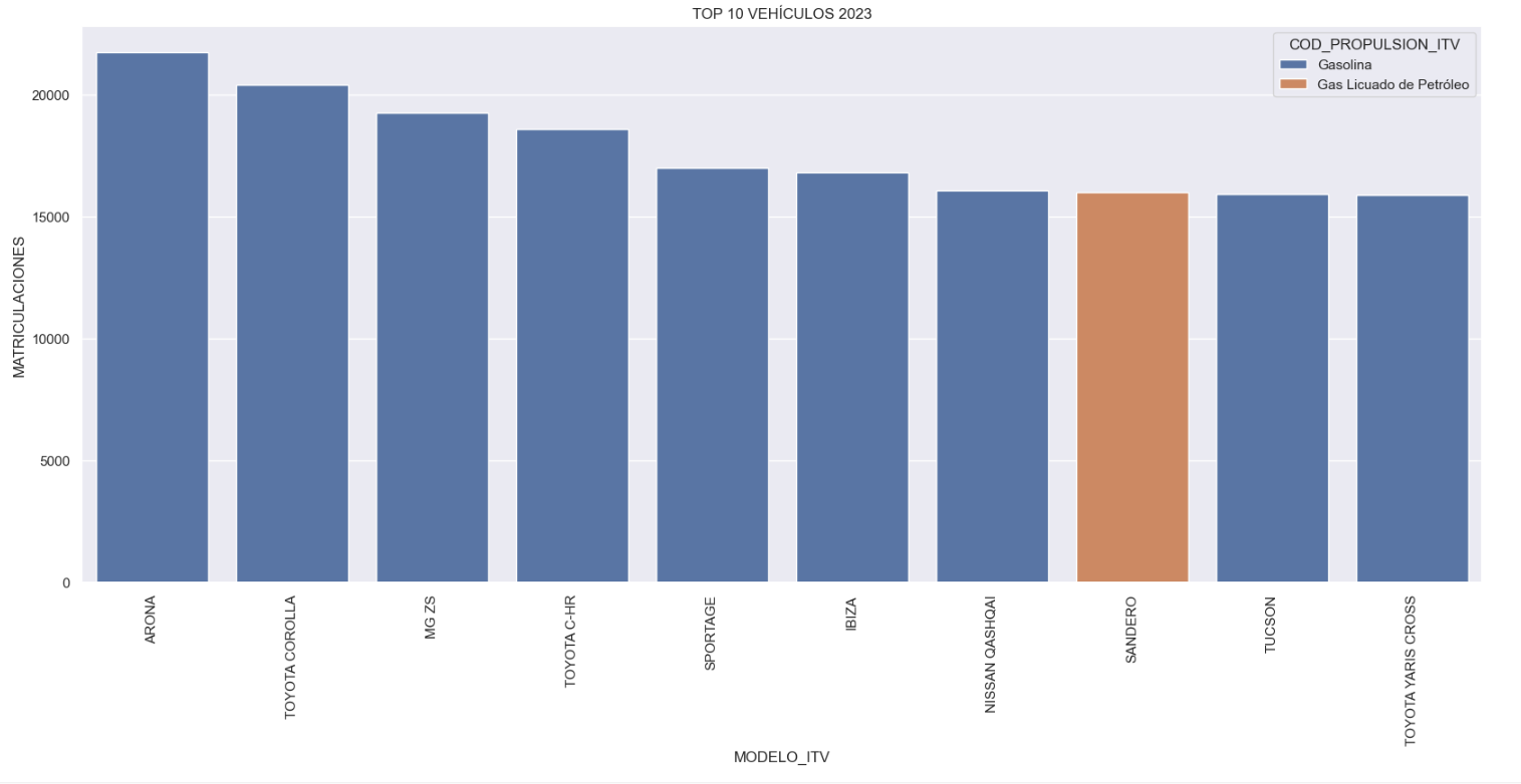
Figure 1. Graph "Top 10 vehicles registered in 2023"
- Market share by propulsion type: In this visualisation we represent the percentage of vehicles registered by each type of propulsion (petrol, diesel, electric or other). We see how the vast majority of the market (>70%) was taken up by petrol vehicles, with diesel being the second choice, and how electric vehicles reached 5.5%.
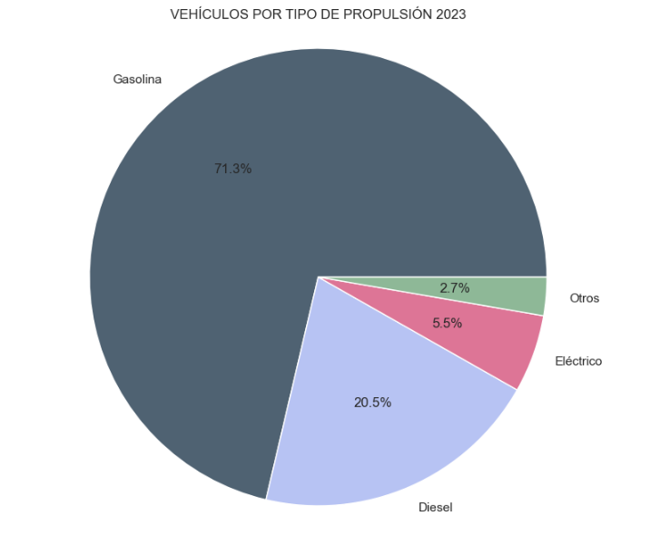
Figure 2. Graph "Market share by propulsion type".
- Historical development of registrations: This visualisation represents the evolution of vehicle registrations over time. It shows the monthly number of registrations between January 2015 and December 2023 distinguishing between the propulsion types of the registered vehicles, and there are several interesting aspects of this graph:
- We observe an annual seasonal behaviour, i.e. we observe patterns or variations that are repeated at regular time intervals. We see recurring high levels of enrolment in June/July, while in August/September they decrease drastically. This is very relevant, as the analysis of time series with a seasonal factor has certain particularities.
-
The huge drop in registrations during the first months of COVID is also very remarkable.
-
We also see that post-covid enrolment levels are lower than before.
-
Finally, we can see how between 2015 and 2023 the registration of electric vehicles is gradually increasing.
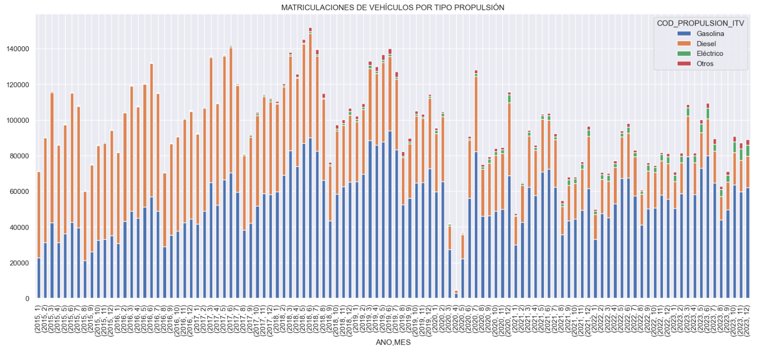
Figure 3. Graph "Vehicle registrations by propulsion type".
- Trend in the registration of electric vehicles: We now analyse the evolution of electric and non-electric vehicles separately using heat maps as a visual tool. We can observe very different behaviours between the two graphs. We observe how the electric vehicle shows a trend of increasing registrations year by year and, despite the COVID being a halt in the registration of vehicles, subsequent years have maintained the upward trend.
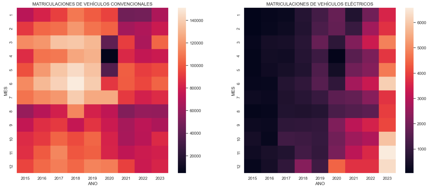
Figure 4. Graph "Trend in registration of conventional vs. electric vehicles".
5.3.2. Predictive analytics
To answer the last question objectively, we will use predictive models that allow us to make estimates regarding the evolution of electric vehicles in Spain. As we can see, the model constructed proposes a continuation of the expected growth in registrations throughout the year of 70,000, reaching values close to 8,000 registrations in the month of December 2024 alone.
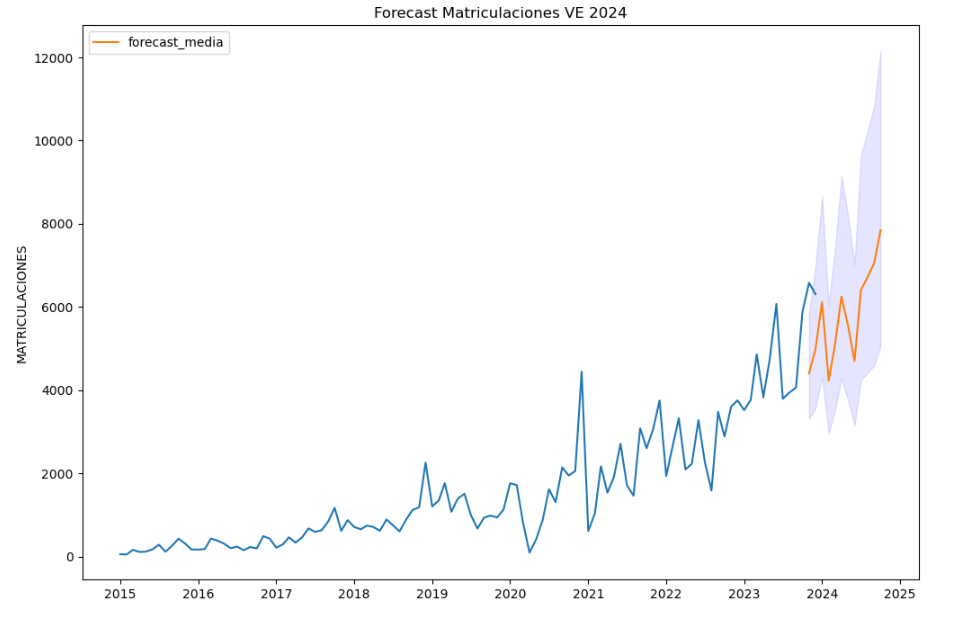
Figure 5. Graph "Predicted electric vehicle registrations".
5. Conclusions
As a conclusion of the exercise, we can observe, thanks to the analysis techniques used, how the electric vehicle is penetrating the Spanish vehicle fleet at an increasing speed, although it is still at a great distance from other alternatives such as diesel or petrol, for now led by the manufacturer Tesla. We will see in the coming years whether the pace grows at the level needed to meet the sustainability targets set and whether Tesla remains the leader despite the strong entry of Asian competitors.
6. Do you want to do the exercise?
If you want to learn more about the Electric Vehicle and test your analytical skills, go to this code repository where you can develop this exercise step by step.
Also, remember that you have at your disposal more exercises in the section "Step by step visualisations" "Step-by-step visualisations" section.
Content elaborated by Juan Benavente, industrial engineer and expert in technologies linked to the data economy. The contents and points of view reflected in this publication are the sole responsibility of the author.
Noticia
The Council of Ministers approved in February this year the Sustainable Mobility Bill (PL), a commitment to a digital and innovative transport system in which open mobility data will play a key role.
Inaddition to regulating innovative solutions such as on-demand transport, car sharing or temporary use of vehicles, the regulation will encourage the promotion ofopen data by administrations, infrastructure managers and public and private operators. All this, as stated in Chapter III Title V of the Draft Law "will bring enormous benefits to citizens, e.g. for new mobility and their contribution to the European Green Pact".
This Bill is aligned with the European Data Strategy, which has among its objectives to create a single market for data that ensures Europe' s global competitiveness and data sovereignty through the creation of common European data spaces common European data spaces in nine strategic sectors. In particular, it foresees the creation and development of a common European mobility data space to put Europe at the forefront of the development of a smart transport system, including connected cars and other modes of transport. Along these lines, the European Commission presented its Sustainable and Intelligent Mobility Strategywhich includes an action dedicated to innovation, data and artificial intelligence for smarter mobility. Following in Europe's footsteps, Spain has launched this Sustainable Mobility Bill.
In this post we look at the benefits that the use of open data can bring to the sector, the obligations that the PL will place on data, and the next steps in building the Integrated Mobility Data Space.
Benefits of using open data on sustainable mobility
The Ministry of Transport and Sustainable Mobility, in the web section created for the Law, identifies some of the benefits that access to and use of open transport and mobility data can offer both to the business community and to public administrations and citizens in general:
- Encourage the development of applications that enable citizens to make decisions on the planning of their journeys and during the course of their journeys.
- Improve the conditions of service provision and the travel experience .
- Incentivise research, create new developments and businesses from the data generated in the transport and mobility ecosystem.
- Enable public administrations to have a better understanding of the transport and mobility system in order to improve the definition of public policies and the management of the system.
- Encourage the use of this data for other public interest purposes that may arise.

Ensuring access to open mobility data
In order to make good use of these data and thus take advantage of all the benefits they offer, the Draft Law determines a strategy to ensure the availability of open data in the field of transport and mobility. This strategy concerns:
- transport companies and infrastructure managers, which must drive digitalisation and provide a significant part of the data, with specific characteristics and functionalities.
- administrations and public entities were already obliged to ensure the openness of their data by design, as well as its re-use on the basis of the already existing
In short, the guidelines for re-use already defined in Law 37/2007 for the public sector are respected, and the need to regulate access to this information and the way in which this data is used by third parties, i.e. companies in the sector, is also included.
Integrated Mobility Data Space
In line with the European Data Strategy mentioned at the beginning of the post, the PL determines the obligation to create the Integrated Mobility Data Space (EDIM) under the direction of the Ministry of Transport and Sustainable Mobility, in coordination with the Secretary of State for Digitalisation and Artificial Intelligence. In the EDIM, the aforementioned transport companies, infrastructure managers and administrations will share their data, which will optimise the decision making of all actors when planning the implementation of new infrastructures and the launch of new services.
The Draft Law defines some characteristics of the Integrated Mobility Data Space such as the modular structure, which will include information in a systematic way on different areas of urban, metropolitan and interurban mobility, both for people and goods.
Specifically, the EDIM, according to Article 14, would collect data "in digital form in a free, non-discriminatory and up-to-date manner" on:
- Supply and demand of the different modes of transport and mobility, information on public transport services and mobility services under the responsibility of the administrations
- Financial situation and costs of providing services for all modes of public transport, investments in transport infrastructure, inventory of transport infrastructure and terminals, conditions and degree of accessibility.
- Other data to be agreed at the Sectoral Conference on Transport.
It identifies examples of this type of data and information on the responsibility for its provision, format, frequency of updating and other characteristics.
As referred to in the CP, the data and information managed by the EDIM will provide an integrated vision to analyse and facilitate mobility management, improving the design of sustainable and efficient solutions, and transparency in the design of public transport and mobility policies. In addition, the Law will promote the creation of a sandbox or test environment to serve as an incubator for innovative mobility projects. The outcome of the tests will allow both the developer and the administration to learn by observing the market in a controlled environment.
National Bimodal Transport Access Point
On the other hand, the Bill also provides for the creation of a National Bimodal Transport Access Point that will collect the information communicated to the Ministry of Transport and Sustainable Mobility in the framework of the priority action "Provision of information services on multimodal journeys throughout the Union" of Directive 2010/40/EU which refers to the transport of goods and/or persons by more than one means of transport.
This information will be freely accessible and will also serve to feed the EDIM in the area related to the characterisation of transport and mobility of persons, as well as the National Catalogue of Public Information maintained by the General State Administration.
The Bill defines that the provision of services to citizens using transport and mobility data from the National Multimodal Transport Access Point must be done in a fair, neutral, impartial, non-discriminatory and transparent manner. It adds that the Ministry of Transport and Sustainable Mobility will propose rules for the use of such data within 12 months after the entry into force of this law.
The Sustainable Mobility Bill is currently in parliamentary procedure, as it has been sent to the Spanish Parliament for urgent processing and approval in 2024.
Application
This application shows the location of charging stations for electric vehicles within the Community of Castilla y León. The user can select the province of interest and access information on the available stations. For each station, various information is provided, such as its location, the supplier company, the number of charging stations and the available connectors.
In addition, within the app the user can also find information on incentive programmes for electric mobility, such as the MOVES III Plan.
The geographical data of these chargers have been obtained from the servers of the public platform of Open Data of Castilla y León.
Translated with DeepL.com (free version)
Application
The application provides users with real-time information on the status of the parking lot: free spaces and occupied spaces. By means of a map of the parking lot, the user can directly visualize the occupancy status of each parking space (free or occupied) and the entire parking lot (number of free and occupied spaces). It also shows the option of consulting the access route to the parking lot from the user's position. Another type of data offered is the current rates for the use of the parking lot.
The data used by the application to display information, such as the set of data on parking sensors, are available on the transparency portal of the City Council of Villanueva de la Serena.