4 posts found
Data visualization: the best charts for representing comparisons
Data is a valuable source of knowledge for society. Public commitment to achieving data openness, public-private collaboration on data, and the development of applications with open data are actions that are part of the data economy, which seeks the innovative, ethical, and practical use of data to…

How to choose the right chart to visualise open data
A statistical graph is a visual representation designed to contain a series of data whose objective is to highlight a specific part of the reality. However, organising a set of data in an informative way is not an easy task, especially, if we want to capture the viewer’s attention and to present the…

Open image repositories for training AI models
Perhaps one of the most everyday uses of artificial intelligence that we can experience in our day-to-day lives is through interaction with artificial vision and object identification systems. From unlocking our smartphone to searching for images on the Internet. All these functionalities are possib…

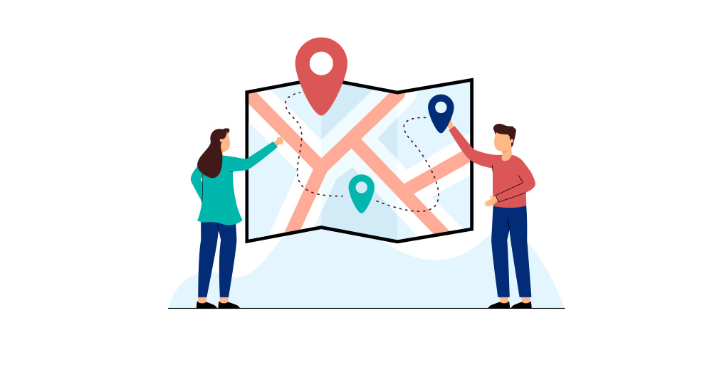
Most popular geospatial visualisation tools
Maps help us to understand the world in which we live and have therefore been fundamental in the development of humanity. They allow us to know the characteristics of a place and to understand social phenomena, such as the spatial behaviour of a disease or the traceability of trade flows.
If we sho…