
Description
Data visualization is not a recent discipline. For centuries, people have used graphs , maps, and diagrams to represent complex information. Classic examples such as the statistical maps of the nineteenth century or the graphs used in the press show that the need to "see" the data in order to understand it has always existed.
For a long time, creating visualizations required specialized knowledge and access to professional tools, which limited their production to very specific profiles. However, the digital and technological revolution has profoundly transformed this landscape. Today, anyone with access to a computer and data can create visualizations. Tools have been democratized, many of them are free or open source, and visualization work has extended beyond design to integrate into areas such as statistics, data science, academic research, public administration, or education.
Today, data visualization is a transversal competence that allows citizens to explore public information, institutions to better communicate their policies, and reusers to generate new services and knowledge from open data. In this post we present some of the most accessible and used options in data visualization.
A broad and diverse ecosystem of tools
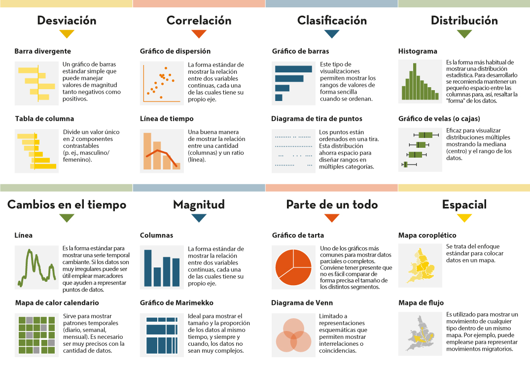
The ecosystem of data visualization tools is broad and diverse, both in functionalities and levels of complexity. There are options designed for a first exploration of the data, others aimed at in-depth analysis and some designed to create interactive visualizations or complex digital narratives.
This variety allows you to tailor the visualization to different contexts and goals—from understanding a dataset in advance to publishing interactive charts, dashboards, or maps on the web.
The Data Visualization Society's annual survey reflects this diversity and shows how the use of certain tools evolves over time, consolidating some widely known options and giving way to new solutions that respond to emerging needs. These are some of the tools mentioned in the survey, ordered according to usage profiles.
The following criteria have been taken into account for the preparation of this list:
- Degree of use and maturity of the tool.
- Free access, free or with open versions.
- Useful for projects related to public data.
- Priority to open tools or with free versions.
Simple tools to get started
These tools are characterized by visual interfaces, a low learning curve, and the ability to create basic charts quickly. They are especially useful for getting started exploring open datasets or for outreach activities.
- Excel: it is one of the most widespread and well-known tools. It allows basic graphs and first data scans to be carried out in a simple way. While not specifically designed for advanced visualization, it is still a common gateway to working with data and its graphical representation.
- Google Sheets: works as a free and collaborative alternative to Excel. Its main advantage is the ability to work in a shared way and publish simple graphics online, which facilitates the dissemination of basic visualizations.
- Datawrapper: widely used in public communication and data journalism. It allows you to create clear graphs, maps, and interactive tables without the need for technical knowledge. It is particularly suitable for explaining data in a way that is understandable to a wide audience.
- RAWGraphs: free software tool aimed at visual exploration. It allows you to experiment with less common types of charts and discover new ways to represent data. It is especially useful in exploratory phases.
- Canva: While its approach is more informative than analytical, it can be useful for creating simple visual pieces that integrate basic graphics with design elements. It is suitable for visual communication of results, not so much for data analysis.
Data exploration and analysis tools
This group of tools is geared towards profiles that want to go beyond basic charts and perform more structured analysis. Many of them are open and widely consolidated in the field of data analysis.
- A: Free programming language widely used in statistics and data analysis. It has a wide ecosystem of packages that allow you to work with public data in a reproducible and transparent way.
- Ggplot2: R language display library. It is one of the most powerful tools for creating rigorous and well-structured graphs, both for analysis and for communicating results.
- Python (Matplotlib and Plotly): Python is one of the most widely used languages in data analysis. Matplotlib allows you to create customizable static charts, while Plotly makes it easy to create interactive visualizations. Together they offer a good balance between power and flexibility.
- Apache Superset: Open source platform for data analysis and dashboard creation. It has a more institutional and scalable approach, making it suitable for organizations that work with large volumes of public data.
This block is especially relevant for open data reusers and intermediate technical profiles who seek to combine analysis and visualization in a systematic way.
Tools for interactive and web visualization
These tools allow you to create advanced visualizations for publication in web environments. Although they require greater technical knowledge, they offer great flexibility and expressive possibilities.
- D3.js: it is one of the benchmarks in web visualization. It is based on open standards and allows full control over the visual representation of data. Its flexibility is very high, although so is its complexity.
In this practical exercise you can see how to use this library
- Vega and Vega-Lite: declarative languages for visualization that simplify the use of D3. They allow you to define graphics in a structured and reproducible way, offering a good balance between power and simplicity.
- Observable: interactive environment closely linked to D3 and Vega. It's especially useful for creating educational examples, prototypes, and exploratory visualizations that combine code, text, and graphics.
- Three.js and WebGL: technologies aimed at advanced and three-dimensional visualizations. Its use is more experimental and is usually linked to dissemination projects or visual research.
In this section, it should be noted that, although the technical barriers are greater, these tools allow for the creation of rich interactive experiences that can be very effective in communicating complex public data.
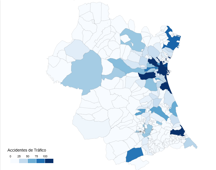
Geospatial data and mapping tools
Geographic visualization is especially relevant in the field of open data, since a large part of public information has a territorial dimension. In this field, free software has a prominent weight and is closely aligned with use in public administrations.
- QGIS: a benchmark in free software for geographic information systems (GIS). It is widely used in public administrations and allows spatial data to be analysed and visualised in great detail.
- ArcGIS: very widespread in the institutional field. Although it is not free software, its use is well established and is part of the regular ecosystem of many public organizations.
- Mapbox: platform aimed at creating interactive web maps. It is widely used in online visualization projects and allows geographic data to be integrated into web applications.
- Leaflet: A popular open-source library for creating interactive maps on the web. It is lightweight, flexible, and widely used in geographic open data reuse projects.
This toolkit facilitates the territorial representation of data and its reuse in local, regional or national contexts.
In conclusion, the choice of a visualization tool depends largely on the goal being pursued. Learning and experimenting is not the same as analyzing data in depth or communicating results to a wide audience. Therefore, it is useful to reflect beforehand on the type of data available, the audience to which the visualization is aimed and the message you want to convey.
Betting on accessible and open tools allows more people to explore, interpret and communicate public data. In this sense, visualising data is also a way of bringing information closer to citizens and encouraging its reuse.

Comments