Painting and Data


Fecha de la noticia: 28-03-2019

Until relatively recently, talking about art and data in the same conversation might seem strange. However, recent advances in data science and artificial intelligence seem to open the door to a new discipline in which science, art and technology go hand in hand.
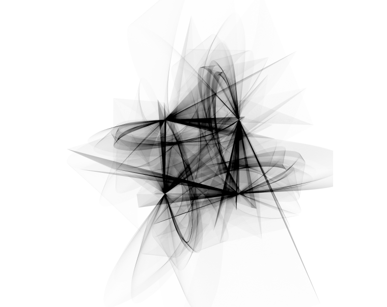
The cover image has been extracted from the blog https://www.r-graph-gallery.com and was originally created by Marcus Volz on his website.
The image above could be an abstract painting created by some modern art author and exhibited at the MoMA in New York. However, it is an image created with some R-code lines that use complex mathematical expressions. Despite the spectacularity of the resulting figure, the beautiful shape of the strokes does not represent a real form. But the ability to create art with data is not limited to generating abstract forms. The possibilities of creating art with code go much further. Here you are two examples:
Real art and representation of plants
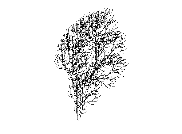
With less than 100 lines of R code we can create this plant and infinite variations in terms of branches, symmetry and complexity. Without being an expert in plants and algae, I am sure that I have seen plants and algae similar to this in many occasions. With these representations, we just try to reproduce what nature creates naturally, taking into account physics and mathematics laws. The figures shown below have been created using the R code originally extracted from Antonio Sánchez Chinchón blog.
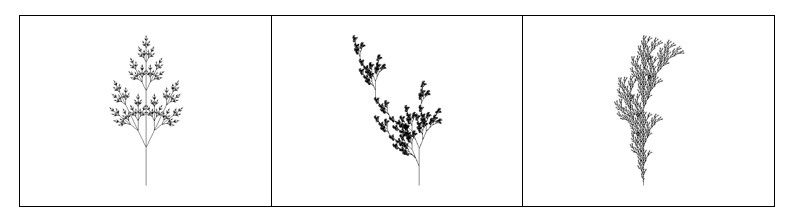
Variations of plants artificially created by R code and fractal expressions.
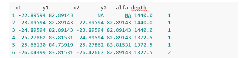
As an example, these are the data that make up some of the figures discussed above:
Photography and art with data
But it is not just possible to construct abstract figures or representations that imitate the forms of plants. With the help of data tools and artificial intelligence we can imitate, and even create new works. In the following example, we obtain simplified versions of photographs, using subsets of pixels from the original photograph. Let's see this example in detail.
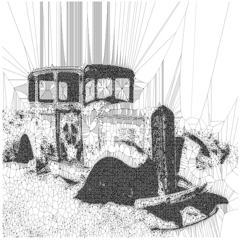
We take a photograph of a bank of open images, in this case Wikimedia Commons website, such as the following:

By Finetooth - Own work, CC BY-SA 3.0, https://commons.wikimedia.org/w/index.php?curid=11692574
Next, we execute a relatively simple algorithm that generates polygonal shapes around the main pixels of the original image. In addition to a simple images treatment to turn this photograph into a flat black and white image, this algorithm applies a mathematical method called Voronoid diagram. When the subset of data (on which we apply the Voronoid diagram) is small, the result of the treatment is poor and we can barely distinguish the underlying form of the figure.
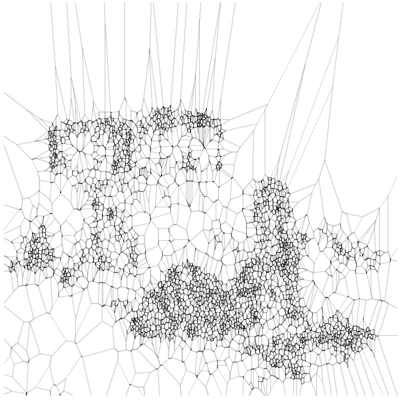
However, as we increase the subset of points to reproduce the initial photograph, we begin to find fascinating results. Finally, with less than 20% of all the points that make up the original image, we obtain a really beautiful and artistic result. This experiment is based on the original post by Antonio Sánchez Chinchón on his blog Fronkostin.
The ability to generate art with the powerful combination of mathematics and programming codes is absolutely powerful. In the following link it is possible to appreciate some of the most impressive works that exist in this art form. The author of this blog is Marcus Volz, researcher at the University of Melbourne. Marcus works with R to generate the figures in two dimensions and with Houdini for 3D and animation.
Content prepared by Alejandro Alija, expert in Digital Transformation and innovation.
Contents and points of view expressed in this publication are the exclusive responsibility of its author.