
Description
Before performing a data visualization, it is important to understand two issues. On the one hand, what exactly you have in your hands, that is, the type of data, its format and other relevant characteristics; and, on the other hand, what is to be visualized, the objective of the graphic representation that is going to be made.
In the specific case of geographical data , enormous narrative possibilities open up because visualizations allow territorial distributions to be shown, spatial patterns to be identified, regions to be compared, or the evolution of a phenomenon to be traced in time and space. To take advantage of these possibilities, it is important to keep in mind that the archive can:
- Contain coordinates in different reference systems.
- Represent phenomena that require very specific types of maps.
Taking a few minutes to understand those features before choosing a tool is actually the shortest path to a useful and rigorous result. In this post we review, step by step, how geographic data should be worked on and what tools exist to represent it graphically.
Before drawing any map: format, scale and projection
The first pitfall when working with geospatial data is often format. Georeferenced data comes in a wide variety of presentations: from a simple CSV with latitude and longitude columns, to more specialized formats such as GeoJSON (ideal for exchanging geometries in web environments), Shapefile (SHP, the historical standard for geographic information systems), or scientific formats such as NetCDF and GRIB (designed for climate and meteorological data in grids). Knowing what format the data is in and which one is most suitable for each tool saves a lot of time and avoids import errors.
The second critical aspect is the coordinate reference system (CRS). Not all coordinates speak the same language. The WGS84 system is the one used by GPS and most web map services; UTM, on the other hand, works in meters and is more accurate for distance or area calculations. Mixing data into different systems without reprojecting them (i.e., without converting coordinates from one reference system to another) produces displacements and geometries that do not fit.
The third element to consider before choosing a tool is the type of representation that best communicates the data. It is not the same to show points of interest as it is to trace trajectories, make a choropleth map (with areas colored according to a statistical value), or build digital elevation models or 3D visualizations. Each type of data and each analytical question has its most appropriate cartographic representation.
With these three clear factors (format, projection and type of map) it is time to choose the tool.
Basic Tools: Exploration Without Installation
For those who are new to geographic data visualization, or for those who need to explore a dataset quickly without going into complex configurations, there are accessible options that work directly from the browser or with minimal installation. They are ideal for a first contact with data and for communicating results to non-technical audiences.
Kepler.gl is probably the best option for those who want to get quality interactive maps without writing a single line of code. It is a free and open-source web tool that allows you to drag and drop files in formats such as CSV, GeoJSON or Shapefile and get visualizations immediately.
- What it's used for: Visual exploration of large volumes of mobility data, spatial distribution, and geographic patterns.
- Supported formats: CSV, GeoJSON, Shapefile, and JSON.
- Strength: it offers multiple types of layers – points, arcs, hexbinning, contours – with an intuitive visual interface and visually very careful results, without the need to install anything.
Google Earth is another accessible option for initial exploration. It's free but not open-source, and uploaded data can be processed by Google. Its web version allows you to import KML/KMZ files and is useful for contextualizing information on satellite imagery.
- What it's used for: Contextualization of data on satellite imagery and visual geographic exploration.
- Supported formats: KML and KMZ.
- Strength: the quality and updating of its satellite imagery database makes it a reference tool for placing data in its real territorial context. For rigorous analysis or institutional publication, it is advisable to evaluate more open alternatives.
Intermediate level: Python libraries for analysis and publishing
When the initial exploration gives way to analysis and the need to reproduce, automate, or integrate maps into broader workflows, there are Python libraries that can be a good option. Their use requires basic programming knowledge, but in return they allow much greater control over every aspect of the visualization and facilitate integration with other data analysis tools.
Cartopy is a library that integrates with Matplotlib and is oriented towards the representation of scientific and climate data. Its great strength is the management of cartographic projections, with support for dozens of reference systems.
- What it is used for: Generation of publication maps with scientific data, especially climate and atmospheric data in grid format.
- Supported formats: NetCDF, GRIB, and any source compatible with Matplotlib.
- Strength: fine control over projections and cartographic elements, ideal when the deformation introduced by the projection has a direct impact on the interpretation of the data.
Folium occupies a different niche: it generates interactive web maps based on Leaflet.js directly from Python code, without the need for JavaScript knowledge. It's especially convenient for producing visualizations that are integrated into Jupyter notebooks or web pages.
- What it's used for: Creating interactive maps for web publishing or notebook presentation, with markers, layers, and pop-ups.
- Supported formats: GeoJSON, CSV, and data sources from pandas and GeoPandas.
- Strength: It combines the convenience of Python with the interactivity of Leaflet.js, allowing you to generate complete web visualizations with very few lines of code. Its main limitation is performance with very large datasets.
Advanced level: web maps with full control
If the goal is to build cartographic applications integrated into their own web environments, with the capacity to handle large volumes of data and offer a fluid user experience, it is necessary to go a step further. Tools at this level require web development skills, but offer virtually unlimited control over the behavior and appearance of the map.
OpenStreetMap (OSM) is not exactly a visualization tool, but the world's largest collaborative geographic database, with an open license (ODbL). Its ecosystem includes tools like Overpass Turbo for querying and extracting data, and its cartographic tiles are the foundation on which many web maps are built.
- What it's used for: Obtaining open geographic data and using it as a basemap in web projects.
- Supported formats: OSM XML, PBF and GeoJSON via export.
- Strength: It is the most comprehensive and up-to-date source of open geographic data in the world. For projects committed to open data, using OSM as a foundation is the most consistent option with those principles.
MapLibre GL JS is an open-source JavaScript library that allows you to build high-performance interactive web maps using vector tiles.
- What it's used for: Web mapping app development with full style customization, dynamic data layers, and interactive filters.
- Supported formats: Vector tiles (MVT), GeoJSON, and raster tile fonts.
- Strength: performance far superior to libraries based on SVG or classic canvas, with the ability to handle large geometries smoothly and almost unlimited visual customization.
Professional level: geographic information systems
When spatial analysis goes beyond visualization and requires complex operations on data such as reprojections, network analysis, interpolations, geometrie editing, or precision mapping production, a desktop geographic information system (GIS) is the right tool. This type of software is specifically designed for rigorous work with geospatial data and offers capabilities that no web solution can match.
QGIS is the go-to desktop GIS in the open source world. Free, cross-platform and with a very active community, it covers practically any need for analysis and cartographic production.
- What it's used for: Complex spatial analysis, layer editing, reprojections, generating quality maps for print or digital publishing, and automating geospatial workflows.
- Supported formats: Shapefile, GeoJSON, GeoTIFF, PostGIS, WMS, WFS, and dozens more.
- Strength: The combination of analytical power, flexibility, and zero licensing cost makes it the go-to choice for agencies that regularly work with geospatial data. The learning curve is real, but the investment pays for itself quickly.
ArcGIS, developed by Esri, is the most widely used commercial GIS platform in professional and institutional settings. It offers advanced map analysis, editing, and publishing capabilities, and its cloud ecosystem makes it easy to collaborate and manage geographic data portals.
- What it is used for: advanced spatial analysis, management of geospatial data infrastructures and publication of institutional cartographic portals.
- Supported formats: All industry standards, with native integration with Esri services.
- Strength: very mature ecosystem with professional technical support and wide implementation in the public sector. Its licensing model comes at a high cost that puts it out of reach for many teams. It is mentioned here because of its relevance in the sector, with QGIS being the open alternative that covers most needs without license cost.
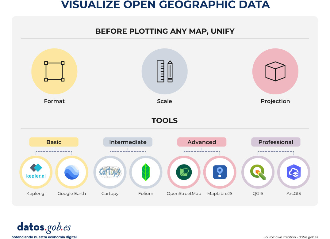
Figure 1. Displays open spatial data. Source: own creation – datos.gob.es
None of these tools is better than the others in absolute terms: each one responds well to a type of task, a user profile and a context of use. However, in this post we select some of the most used according to the level of technical knowledge of each professional profile:
- For fast exploration and data communication: Kepler.gl
- For accessible geographic visualization and 3D exploration of the territory: Google Earth
- For scientific analysis reproducible in Python: Cartopy and Folium
- For web development with advanced mapping: MapLibre GL JS
- For open base mapping and projects that require free and editable data: OpenStreetMap
- And for spatial analysis and mapping production: QGIS
In all cases, the starting point is always the same: know the data, understand its structure, and make sure that the map to be built is the one that best communicates what that data has to say. The tool, in the end, is only the last step in a process that begins much earlier.


Comments