Analysis of meteorological data using the "ggplot2" library


Fecha del documento: 12-04-2023
1. Introduction
Visualizations are graphical representations of data that allow the information linked to them to be communicated in a simple and effective way. The visualization possibilities are very wide, from basic representations, such as a line chart, bars or sectors, to visualizations configured on dashboards or interactive dashboards.
In this "Step-by-Step Visualizations" section we are regularly presenting practical exercises of open data visualizations available on datos.gob.es or similar catalogs. They address and describe in a simple way the stages necessary to obtain the data, perform the transformations and analysis that are relevant to and finally, the creation of interactive visualizations; from which we can extract information summarized in final conclusions. In each of these practical exercises, simple and well-documented code developments are used, as well as free to use tools. All generated material is available for reuse in GitHub's Data Lab repository.
Run the data pre-processing code on top of Google Colab.
Below, you can access the material that we will use in the exercise and that we will explain and develop in the following sections of this post.
Access the data lab repository on Github.
Run the data pre-processing code on top of Google Colab.
2. Objective
The main objective of this exercise is to make an analysis of the meteorological data collected in several stations during the last years. To perform this analysis, we will use different visualizations generated by the "ggplot2" library of the programming language "R".
Of all the Spanish weather stations, we have decided to analyze two of them, one in the coldest province of the country (Burgos) and another in the warmest province of the country (Córdoba), according to data from the AEMET. Patterns and trends in the different records between 1990 and 2020 will be sought to understand the meteorological evolution suffered in this period of time.
Once the data has been analyzed, we can answer questions such as those shown below:
- What is the trend in the evolution of temperatures in recent years?
- What is the trend in the evolution of rainfall in recent years?
- Which weather station (Burgos or Córdoba) presents a greater variation of climatological data in recent years?
- What degree of correlation is there between the different climatological variables recorded?
These, and many other questions can be solved by using tools such as ggplot2 that facilitate the interpretation of data through interactive visualizations.
3. Resources
3.1. Datasets
The datasets contain different meteorological information of interest for the two stations in question broken down by year. Within the AEMET download center, we can download them, upon request of the API key, in the section "monthly / annual climatologies". From the existing weather stations, we have selected two of which we will obtain the data: Burgos airport (2331) and Córdoba airport (5402)
It should be noted that, along with the datasets, we can also download their metadata, which are of special importance when identifying the different variables registered in the datasets.
These datasets are also available in the Github repository.
3.2. Tools
To carry out the data preprocessing tasks, the R programming language written on a Jupyter Notebook hosted in the Google Colab cloud service has been used.
"Google Colab" or, also called Google Colaboratory, is a cloud service from Google Research that allows you to program, execute and share code written in Python or R on a Jupyter Notebook from your browser, so it does not require configuration. This service is free of charge.
For the creation of the visualizations, the ggplot2 library has been used.
"ggplot2" is a data visualization package for the R programming language. It focuses on the construction of graphics from layers of aesthetic, geometric and statistical elements. ggplot2 offers a wide range of high-quality statistical charts, including bar charts, line charts, scatter plots, box and whisker charts, and many others.
If you want to know more about tools that can help you in the treatment and visualization of data, you can use the report "Data processing and visualization tools".
4. Data processing or preparation
The processes that we describe below you will find them commented in the Notebook that you can also run from Google Colab.
Before embarking on building an effective visualization, we must carry out a prior treatment of the data, paying special attention to obtaining them and validating their content, ensuring that they are in the appropriate and consistent format for processing and that they do not contain errors.
As a first step of the process, once the necessary libraries have been imported and the datasets loaded, it is necessary to perform an exploratory analysis of the data (EDA) in order to properly interpret the starting data, detect anomalies, missing data or errors that could affect the quality of the subsequent processes and results. If you want to know more about this process, you can resort to the Practical Guide of Introduction to Exploratory Data Analysis.
The next step is to generate the preprocessed data tables that we will use in the visualizations. To do this, we will filter the initial data sets and calculate the values that are necessary and of interest for the analysis carried out in this exercise.
Once the preprocessing is finished, we will obtain the data tables "datos_graficas_C" and "datos_graficas_B" which we will use in the next section of the Notebook to generate the visualizations.
The structure of the Notebook in which the steps previously described are carried out together with explanatory comments of each of them, is as follows:
- Installation and loading of libraries.
- Loading datasets
- Exploratory Data Analysis (EDA)
- Preparing the data tables
- Views
- Saving graphics
You will be able to reproduce this analysis, as the source code is available in our GitHub account. The way to provide the code is through a document made on a Jupyter Notebook that once loaded into the development environment you can run or modify easily. Due to the informative nature of this post and in order to favor the understanding of non-specialized readers, the code is not intended to be the most efficient but to facilitate its understanding so you will possibly come up with many ways to optimize the proposed code to achieve similar purposes. We encourage you to do so!
5. Visualizations
Various types of visualizations and graphs have been made to extract information on the tables of preprocessed data and answer the initial questions posed in this exercise. As mentioned previously, the R "ggplot2" package has been used to perform the visualizations.
The "ggplot2" package is a data visualization library in the R programming language. It was developed by Hadley Wickham and is part of the "tidyverse" package toolkit. The "ggplot2" package is built around the concept of "graph grammar", which is a theoretical framework for building graphs by combining basic elements of data visualization such as layers, scales, legends, annotations, and themes. This allows you to create complex, custom data visualizations with cleaner, more structured code.
If you want to have a summary view of the possibilities of visualizations with ggplot2, see the following "cheatsheet". You can also get more detailed information in the following "user manual".
5.1. Line charts
Line charts are a graphical representation of data that uses points connected by lines to show the evolution of a variable in a continuous dimension, such as time. The values of the variable are represented on the vertical axis and the continuous dimension on the horizontal axis. Line charts are useful for visualizing trends, comparing evolutions, and detecting patterns.
Next, we can visualize several line graphs with the temporal evolution of the values of average, minimum and maximum temperatures of the two meteorological stations analyzed (Córdoba and Burgos). On these graphs, we have introduced trend lines to be able to observe their evolution in a visual and simple way.


To compare the evolutions, not only visually through the graphed trend lines, but also numerically, we obtain the slope coefficients of the trend line, that is, the change in the response variable (tm_ month, tm_min, tm_max) for each unit of change in the predictor variable (year).
- Average temperature slope coefficient Córdoba: 0.036
- Average temperature slope coefficient Burgos: 0.025
- Coefficient of slope minimum temperature Córdoba: 0.020
- Coefficient of slope minimum temperature Burgos: 0.020
- Slope coefficient maximum temperature Córdoba: 0.051
- Slope coefficient maximum temperature Burgos: 0.030
We can interpret that the higher this value, the more abrupt the average temperature rise in each observed period.
Finally, we have created a line graph for each weather station, in which we jointly visualize the evolution of average, minimum and maximum temperatures over the years.


The main conclusions obtained from the visualizations of this section are:
- The average, minimum and maximum annual temperatures recorded in Córdoba and Burgos have an increasing trend.
- The most significant increase is observed in the evolution of the maximum temperatures of Córdoba (slope coefficient = 0.051)
- The slightest increase is observed in the evolution of the minimum temperatures, both in Córdoba and Burgos (slope coefficient = 0.020)
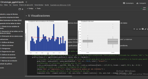
5.2. Bar charts
Bar charts are a graphical representation of data that uses rectangular bars to show the magnitude of a variable in different categories or groups. The height or length of the bars represents the amount or frequency of the variable, and the categories are represented on the horizontal axis. Bar charts are useful for comparing the magnitude of different categories and for visualizing differences between them.
We have generated two bar graphs with the data corresponding to the total accumulated precipitation per year for the different weather stations.


As in the previous section, we plot the trend line and calculate the slope coefficient.
- Slope coefficient for accumulated rainfall Córdoba: -2.97
- Slope coefficient for accumulated rainfall Burgos: -0.36
The main conclusions obtained from the visualizations of this section are:
- The annual accumulated rainfall has a decreasing trend for both Córdoba and Burgos.
- The downward trend is greater for Córdoba (coefficient = -2.97), being more moderate for Burgos (coefficient = -0.36)
5.3. Histograms
Histograms are a graphical representation of a frequency distribution of numeric data in a range of values. The horizontal axis represents the values of the data divided into intervals, called "bin", and the vertical axis represents the frequency or amount of data found in each "bin". Histograms are useful for identifying patterns in data, such as distribution, dispersion, symmetry, or bias.
We have generated two histograms with the distributions of the data corresponding to the total accumulated precipitation per year for the different meteorological stations, being the chosen intervals of 50 mm3.


The main conclusions obtained from the visualizations of this section are:
- The records of annual accumulated precipitation in Burgos present a distribution close to a normal and symmetrical distribution.
- The records of annual accumulated precipitation in Córdoba do not present a symmetrical distribution.
5.4. Box and whisker diagrams
Box and whisker diagrams are a graphical representation of the distribution of a set of numerical data. These graphs represent the median, interquartile range, and minimum and maximum values of the data. The chart box represents the interquartile range, that is, the range between the first and third quartiles of the data. Out-of-the-box points, called outliers, can indicate extreme values or anomalous data. Box plots are useful for comparing distributions and detecting extreme values in your data.
We have generated a graph with the box diagrams corresponding to the accumulated rainfall data from the weather stations.
To understand the graph, the following points should be highlighted:
- The boundaries of the box indicate the first and third quartiles (Q1 and Q3), which leave below each, 25% and 75% of the data respectively.
- The horizontal line inside the box is the median (equivalent to the second quartile Q2), which leaves half of the data below.
- The whisker limits are the extreme values, that is, the minimum value and the maximum value of the data series.
- The points outside the whiskers are the outliers.

The main conclusions obtained from the visualization of this section are:
- Both distributions present 3 extreme values, being significant those of Córdoba with values greater than 1000 mm3.
- The records of Córdoba have a greater variability than those of Burgos, which are more stable
5.5. Pie charts
A pie chart is a type of pie chart that represents proportions or percentages of a whole. It consists of several sections or sectors, where each sector represents a proportion of the whole set. The size of the sector is determined based on the proportion it represents, and is expressed in the form of an angle or percentage. It is a useful tool for visualizing the relative distribution of the different parts of a set and facilitates the visual comparison of the proportions between the different groups.
We have generated two graphs of (polar) sectors. The first of them with the number of days that the values exceed 30º in Córdoba and the second of them with the number of days that the values fall below 0º in Burgos.
For the realization of these graphs, we have grouped the sum of the number of days described above into six groups, corresponding to periods of 5 years from 1990 to 2020.


The main conclusions obtained from the visualizations of this section are:
- There is an increase of 31.9% in the total number of annual days with temperatures above 30º in Córdoba for the period between 2015-2020 compared to the period 1990-1995.
- There is an increase of 33.5% in the total number of annual days with temperatures above 30º in Burgos for the period between 2015-2020 compared to the period 1990-1995.
5.6. Scatter plots
Scatter plots are a data visualization tool that represent the relationship between two numerical variables by locating points on a Cartesian plane. Each dot represents a pair of values of the two variables and its position on the graph indicates how they relate to each other. Scatter plots are commonly used to identify patterns and trends in data, as well as to detect any possible correlation between variables. These charts can also help identify outliers or data that doesn't fit the overall trend.
We have generated two scattering plots in which the values of maximum average temperatures and minimum averages are compared, looking for correlation trends between them for the values of each weather station.


To analyze the correlations, not only visually through graphs, but also numerically, we obtain Pearson's correlation coefficients. This coefficient is a statistical measure that indicates the degree of linear association between two quantitative variables. It is used to assess whether there is a positive linear relationship (both variables increase or decrease simultaneously at a constant rate), negative (the values of both variables vary oppositely) or null (no relationship) between two variables and the strength of such a relationship, the closer to +1, the higher their association.
- Pearson coefficient (Average temperature max VS min) Córdoba: 0.15
- Pearson coefficient (Average temperature max VS min) Burgos: 0.61
In the image we observe that while in Córdoba a greater dispersion is appreciated, in Burgos a greater correlation is observed.
Next, we will modify the previous scatter plots so that they provide us with more information visually. To do this, we divide the space by colored sectors (red with higher temperature values / blue lower temperature values) and show in the different bubbles the label with the corresponding year. It should be noted that the color change limits of the quadrants correspond to the average values of each of the variables.


The main conclusions obtained from the visualizations of this section are:
- There is a positive linear relationship between the average maximum and minimum temperature in both Córdoba and Burgos, this correlation being greater in the Burgos data.
- The years with the highest values of maximum and minimum temperatures in Burgos are (2003, 2006 and 2020)
- The years with the highest values of maximum and minimum temperatures in Córdoba are (1995, 2006 and 2020)
5.7. Correlation matrix
The correlation matrix is a table that shows the correlations between all variables in a dataset. It is a square matrix that shows the correlation between each pair of variables on a scale ranging from -1 to 1. A value of -1 indicates a perfect negative correlation, a value of 0 indicates no correlation, and a value of 1 indicates a perfect positive correlation. The correlation matrix is commonly used to identify patterns and relationships between variables in a dataset, which can help to better understand the factors that influence a phenomenon or outcome.
We have generated two heat maps with the correlation matrix data for both weather stations.


The main conclusions obtained from the visualizations of this section are:
- There is a strong negative correlation (-0.42) for Córdoba and (-0.45) for Burgos between the number of annual days with temperatures above 30º and accumulated rainfall. This means that as the number of days with temperatures above 30º increases, precipitation decreases significantly.
6. Conclusions of the exercise
Data visualization is one of the most powerful mechanisms for exploiting and analyzing the implicit meaning of data. As we have seen in this exercise, "ggplot2" is a powerful library capable of representing a wide variety of graphics with a high degree of customization that allows you to adjust numerous characteristics of each graph.
After analyzing the previous visualizations, we can conclude that both for the weather station of Burgos, as well as that of Córdoba, temperatures (minimum, average, maximum) have suffered a considerable increase, days with extreme heat (temperature > 30º) have also suffered and rainfall has decreased in the period of time analyzed, from 1990 to 2020.
We hope that this step-by-step visualization has been useful for learning some very common techniques in the treatment, representation and interpretation of open data. We will be back to show you new reuses. See you soon!