Analysis of the state and evolution of the national water reservoirs


Fecha del documento: 21-07-2022

1. Introduction
Visualizations are graphical representations of data that allow the information linked to them to be communicated in a simple and effective way. The visualization possibilities are very broad, from basic representations such as line, bar or pie chart, to visualizations configured on control panels or interactive dashboards. Visualizations play a fundamental role in drawing conclusions from visual information, allowing detection of patterns, trends, anomalous data or projection of predictions, among many other functions.
Before starting to build an effective visualization, a prior data treatment must be performed, paying special attention to their collection and validation of their content, ensuring that they are in a proper and consistent format for processing and free of errors. The previous data treatment is essential to carry out any task related to data analysis and realization of effective visualizations.
In the section “Visualizations step-by-step” we are periodically presenting practical exercises on open data visualizations that are available in datos.gob.es catalogue and other similar catalogues. In there, we approach and describe in a simple way the necessary steps to obtain data, perform transformations and analysis that are relevant to creation of interactive visualizations from which we may extract information in the form of final conclusions.
In this practical exercise we have performed a simple code development which is conveniently documented, relying on free tools.
Access the Data Lab repository on Github.
Run the data pre-processing code on Google Colab.
2. Objetives
The main objective of this post is to learn how to make an interactive visualization using open data. For this practical exercise we have chosen datasets containing relevant information on national reservoirs. Based on that, we will analyse their state and time evolution within the last years.
3. Resources
3.1. Datasets
For this case study we have selected datasets published by Ministry for the Ecological Transition and Demographic Challenge, which in its hydrological bulletin collects time series data on the volume of water stored in the recent years in all the national reservoirs with capacity greater than 5hm3. Historical data on the volume of stored water are available at:
Furthermore, a geospatial dataset has been selected. During the search, two possible input data files have been found, one that contains geographical areas corresponding to the reservoirs in Spain and one that contains dams, including their geopositioning as a geographic point. Even though they are not the same thing, reservoirs and dams are related and to simplify this practical exercise, we choose to use the file containing the list of dams in Spain. Inventory of dams is available at: https://www.mapama.gob.es/ide/metadatos/index.html?srv=metadata.show&uuid=4f218701-1004-4b15-93b1-298551ae9446
This dataset contains geolocation (Latitude, Longitude) of dams throughout Spain, regardless of their ownership. A dam is defined as an artificial structure that limits entirely or partially a contour of an enclosure nestled in terrain and is destined to store water within it.
To generate geographic points of interest, a processing has been executed with the usage of QGIS tool. The steps are the following: download ZIP file, upload it to QGIS and save it as CSV, including the geometry of each element as two fields specifying its position as a geographic point (Latitude, Longitude).
Also, a filtering has been performed, in order to extract the data related to dams of reservoirs with capacity greater than 5hm3.
3.2. Tools
To perform data pre-processing, we have used Python programming language in the Google Colab cloud service, which allows the execution of JNotebooks de Jupyter.
Google Colab, also called Google Colaboratory, is a free service in the Google Research cloud which allows to program, execute and share a code written in Python or R through the browser, as it does not require installation of any tool or configuration.
Google Data Studio tool has been used for the creation of the interactive visualization.
Google Data Studio in an online tool which allows to create charts, maps or tables that can be embedded on websites or exported as files. This tool is easy to use and permits multiple customization options.
If you want to know more about tools that can help you with data treatment and visualization, see the report “Data processing and visualization tools”.
4. Enriquecimiento de los datos
In order to provide more information about each of the dams in the geospatial dataset, a process of data enrichment is carried out, as explained below.
To do this, we will focus on OpenRefine, which is a useful tool for this type of tasks. This open source tool allows to perform multiple data pre-processing actions, although at that point we will use it to conduct enrichment of our data by incorporation of context, automatically linking information that resides in a popular knowledge repository, Wikidata.
Once the tool is installed and launched on computer, a web application will open in the browser. In case this doesn´t happen, the application may be accessed by typing http://localhost:3333 in the browser´s search bar.
Steps to follow:
- Step 1: Upload of CSV to the system (Figure 1).

Figure 1 – Upload of a CSV file to OpenRefine
- Step 2: Creation of a project from uploaded CSV (Figure 2). OpenRefine is managed through projects (each uploaded CSV will become a project) that are saved for possible later use on a computer where OpenRefine is running. At this stage it´s required to name the project and some other data, such as the column separator, though the latter settings are usually filled in automatically.

Figure 2 – Creation of a project in OpenRefine
- Step 3: Linkage (or reconciliation, according to the OpenRefine nomenclature) with external sources. OpenRefine allows to link the CSV resources with external sources, such as Wikidata. For this purpose, the following actions need to be taken (steps 3.1 to 3.3):
- Step 3.1: Identification of the columns to be linked. This step is commonly based on analyst´s experience and knowledge of the data present in Wikidata. A tip: usually, it is feasible to reconcile or link the columns containing information of global or general character, such as names of countries, streets, districts, etc. and it´s not possible to link columns with geographic coordinates, numerical values or closed taxonomies (e.g. street types). In this example, we have found a NAME column containing name of each reservoir that can serve as a unique identifier for each item and may be a good candidate for linking
- Step 3.2: Start of reconciliation. As indicated in figure 3, start reconciliation and select the only available source: Wikidata(en). After clicking Start Reconciling, the tool will automatically start searching for the most suitable vocabulary class on Wikidata, based on the values from the selected column.

Figure 3 – Start of the reconciliation process for the NAME column in OpenRefine
- Step 3.3: Selection of the Wikidata class. In this step reconciliation values will be obtained. In this case, as the most probable value, select property “reservoir”, which description may be found at https://www.wikidata.org/wiki/Q131681 and it corresponds to the description of an “artificial lake to accumulate water”. It´s necessary to click again on Start Reconciling.
OpenRefine offers a possibility of improving the reconciliation process by adding some features that allow to target the information enrichment with higher precision. For that purpose, adjust property P4568, which description matches the identifier of a reservoir in Spain within SNCZI-IPE, as it may be seen in the figure 4.

Figure 4 – Selection of a Wikidata class that best represents the values on NAME column
- Step 4: Generation of a column with reconciled or linked values. To do that, click on the NAME column and go to “Edit column → Add column based in this column”. A window will open where a name of the new column must be specified (in this case, WIKIDATA_RESERVOIR). In the expression box introduce: “http://www.wikidata.org/entity/”+cell.recon.match.id, so the values will be displayed as it´s previewed in figure 6. “http://www.wikidata.org/entity/” is a fixed text string that represents Wikidata entities, while the reconciled value of each of the values we obtain through the command cell.recon.match.id, that is, cell.recon.match.id(“ALMODOVAR”) = Q5369429.
Launching described operation will result in generation of a new column with those values. Its correctness may be confirmed by clicking on one of the new column cells, as it should redirect to a Wikidata web page containing information about reconciled value.
Repeat the process to add other type of enriched information as a reference for Google and OpenStreetMap.

Figure 5 – Generation of Wikidata entities through a reconciliation within a new column.
- Step 5: Download of enriched CSV. Go to the function Export → Custom tabular exporter placed in the upper right part of the screen and select the features indicated in Figure 6.

Figure 6 – Options of CSV file download via OpenRefine
5. Data pre-processing
During the pre-processing it´s necessary to perform an exploratory data analysis (EDA) in order to interpret properly the input data, detect anomalies, missing data and errors that could affect the quality of subsequent processes and results, in addition to realization of the transformation tasks and preparation of the necessary variables. Data pre-processing is essential to ensure the reliability and consistency of analysis or visualizations that are created afterwards. To learn more about this process, see A Practical Introductory Guide to Exploratory Data Analysis.
The steps involved in this pre-processing phase are the following:
- Installation and import of libraries
- Import of source data files
- Modification and adjustment of variables
- Prevention and treatment of missing data (NAs)
- Generation of new variables
- Creation of a table for visualization “Historical evolution of water reserve between the years 2012-2022”
- Creation of a table for visualization “Water reserve (hm3) between the years 2012-2022”
- Creation of a table for visualization “Water reserve (%) between the years 2012-2022”
- Creation of a table for visualization “Monthly evolution of water reserve (hm3) for different time series”
- Saving the tables with pre-processed data
You may reproduce this analysis, as the source code is available in the GitHub repository. The way to provide the code is through a document made on Jupyter Notebook which once loaded to the development environment may be easily run or modified. Due to the informative nature of this post and its purpose to support learning of non-specialist readers, the code is not intended to be the most efficient but rather to be understandable. Therefore, it´s possible that you will think of many ways of optimising the proposed code to achieve a similar purpose. We encourage you to do it!
You may follow the steps and run the source code on this notebook in Google Colab.
6. Data visualization
Once the data pre-processing is done, we may move on to interactive visualizations. For this purpose, we have used Google Data Studio. As it´s an online tool, it´s not necessary to install software to interact or generate a visualization, but it´s required to structure adequately provided data tables.
In order to approach the process of designing the set of data visual representations, the first step is to raise the questions that we want to solve. We suggest the following:
-
What is the location of reservoirs within the national territory?
-
Which reservoirs have the largest and the smallest volume of water (water reserve in hm3) stored in the whole country?
-
Which reservoirs have the highest and the lowest filling percentage (water reserve in %)?
-
What is the trend of the water reserve evolution within the last years?
Let´s find the answers by looking at the data!
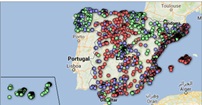
6.1. Geographic location and main information on each reservoir
This visual representation has been created with consideration of geographic location of reservoirs and distinct information associated with each one of them. For this task, a table “geo.csv” has been generated during the data pre-processing.
Location of reservoirs in the national territory is shown on a map of geographic points.
Once the map is obtained, you may access additional information about each reservoir by clicking on it. The information will display in the table below. Furthermore, an option of filtering by hydrographic demarcation and by reservoir is available through the drop-down tabs.
View the visualization in full screen
6.2. Water reserve between the years 2012-2022
This visual representation has been made with consideration of water reserve (hm3) per reservoir between the years 2012 (inclusive) and 2022. For this purpose, a table “volumen.csv” has been created during the data pre-processing.
A rectangular hierarchy chart displays intuitively the importance of each reservoir in terms of volumn stored within the national total for the time period indicated above.
Ones the chart is obtained, an option of filtering by hydrographic demarcation and by reservoir is available through the drop-down tabs.
View the visualization in full screen
6.3. Water reserve (%) between the years 2012-2022
This visual representation has been made with consideration of water reserve (%) per reservoir between the years 2012 (inclusive) and 2022. For this task, a table “porcentaje.csv” has been generated during the data pre-processing.
The percentage of each reservoir filling for the time period indicated above is intuitively displayed in a bar chart.
Ones the chart is obtained, an option of filtering by hydrographic demarcation and by reservoir is available through the drop-down tabs.
View the visualization in ful screen
6.4. Historical evolution of water reserve between the years 2012-2022
This visual representation has been made with consideration of water reserve historical data (hm3 and %) per reservoir between the years 2012 (inclusive) and 2022. For this purpose, a table “lineas.csv” has been created during the data pre-processing.
Line charts and their trend lines show the time evolution of the water reserve (hm3 and %).
Ones the chart is obtained, modification of time series, as well as filtering by hydrographic demarcation and by reservoir is possible through the drop-down tabs.
View the visualization in full screen
6.5. Monthly evolution of water reserve (hm3) for different time series
This visual representation has been made with consideration of water reserve (hm3) from distinct reservoirs broken down by months for different time series (each year from 2012 to 2022). For this purpose, a table “lineas_mensual.csv” has been created during the data pre-processing.
Line chart shows the water reserve month by month for each time series.
Ones the chart is obtained, filtering by hydrographic demarcation and by reservoir is possible through the drop-down tabs. Additionally, there is an option to choose time series (each year from 2012 to 2022) that we want to visualize through the icon appearing in the top right part of the chart.
View the visualization in full screen
7. Conclusions
Data visualization is one of the most powerful mechanisms for exploiting and analysing the implicit meaning of data, independently from the data type and the user´s level of the technological knowledge. Visualizations permit to create meaningful data and narratives based on a graphical representation. In the set of implemented graphical representations the following may be observed:
-
A significant trend in decreasing the volume of water stored in the reservoirs throughout the country between the years 2012-2022.
-
2017 is the year with the lowest percentage values of the total reservoirs filling, reaching less than 45% at certain times of the year.
-
2013 is the year with the highest percentage values of the total reservoirs filling, reaching more than 80% at certain times of the year.
It should be noted that visualizations have an option of filtering by hydrographic demarcation and by reservoir. We encourage you to do it in order to draw more specific conclusions from hydrographic demarcation and reservoirs of your interest.
Hopefully, this step-by-step visualization has been useful for the learning of some common techniques of open data processing and presentation. We will be back to present you new reuses. See you soon!