Analysis of travel networks in BICIMAD


Fecha del documento: 11-09-2023
1. Introduction
Visualizations are graphical representations of data that allow the information linked to them to be communicated in a simple and effective way. The visualization possibilities are very wide, from basic representations, such as line, bar or sector graphs, to visualizations configured on interactive dashboards.
In this "Step-by-Step Visualizations" section we are regularly presenting practical exercises of open data visualizations available in datos.gob.es or other similar catalogs. They address and describe in a simple way the stages necessary to obtain the data, perform the transformations and analyses that are relevant to, finally, enable the creation of interactive visualizations that allow us to obtain final conclusions as a summary of said information. In each of these practical exercises, simple and well-documented code developments are used, as well as tools that are free to use. All generated material is available for reuse in the GitHub Data Lab repository.
Then, and as a complement to the explanation that you will find below, you can access the code that we will use in the exercise and that we will explain and develop in the following sections of this post.
Access the data lab repository on Github.
Run the data pre-processing code on top of Google Colab.
2. Objetive
The main objective of this exercise is to show how to perform a network or graph analysis based on open data on rental bicycle trips in the city of Madrid. To do this, we will perform a preprocessing of the data in order to obtain the tables that we will use next in the visualization generating tool, with which we will create the visualizations of the graph.
Network analysis are methods and tools for the study and interpretation of the relationships and connections between entities or interconnected nodes of a network, these entities being persons, sites, products, or organizations, among others. Network analysis seeks to discover patterns, identify communities, analyze influence, and determine the importance of nodes within the network. This is achieved by using specific algorithms and techniques to extract meaningful insights from network data.
Once the data has been analyzed using this visualization, we can answer questions such as the following:
- What is the network station with the highest inbound and outbound traffic?
- What are the most common interstation routes?
- What is the average number of connections between stations for each of them?
- What are the most interconnected stations within the network?
3. Resources
3.1. Datasets
The open datasets used contain information on loan bike trips made in the city of Madrid. The information they provide is about the station of origin and destination, the time of the journey, the duration of the journey, the identifier of the bicycle, ...
These open datasets are published by the Madrid City Council, through files that collect the records on a monthly basis.
These datasets are also available for download from the following Github repository.
3.2. Tools
To carry out the data preprocessing tasks, the Python programming language written on a Jupyter Notebook hosted in the Google Colab cloud service has been used.
"Google Colab" or, also called Google Colaboratory, is a cloud service from Google Research that allows you to program, execute and share code written in Python or R on a Jupyter Notebook from your browser, so it does not require configuration. This service is free of charge.
For the creation of the interactive visualization, the Gephi tool has been used.
"Gephi" is a network visualization and analysis tool. It allows you to represent and explore relationships between elements, such as nodes and links, in order to understand the structure and patterns of the network. The program requires download and is free.
If you want to know more about tools that can help you in the treatment and visualization of data, you can use the report "Data processing and visualization tools".
4. Data processing or preparation
The processes that we describe below you will find them commented in the Notebook that you can also run from Google Colab.
Due to the high volume of trips recorded in the datasets, we defined the following starting points when analysing them:
- We will analyse the time of day with the highest travel traffic
- We will analyse the stations with a higher volume of trips
Before launching to analyse and build an effective visualization, we must carry out a prior treatment of the data, paying special attention to its obtaining and the validation of its content, making sure that they are in the appropriate and consistent format for processing and that they do not contain errors.
As a first step of the process, it is necessary to perform an exploratory analysis of the data (EDA), in order to properly interpret the starting data, detect anomalies, missing data or errors that could affect the quality of subsequent processes and results. If you want to know more about this process you can resort to the Practical Guide of Introduction to Exploratory Data Analysis
The next step is to generate the pre-processed data table that we will use to feed the network analysis tool (Gephi) that will visually help us understand the information. To do this, we will modify, filter and join the data according to our needs.
The steps followed in this data preprocessing, explained in this Google Colab Notebook, are as follows:
- Installation of libraries and loading of datasets
- Exploratory Data Analysis (EDA)
- Generating pre-processed tables
You will be able to reproduce this analysis with the source code that is available in our GitHub account. The way to provide the code is through a document made on a Jupyter Notebook that, once loaded into the development environment, you can easily run or modify.
Due to the informative nature of this post and to favour the understanding of non-specialized readers, the code is not intended to be the most efficient but to facilitate its understanding, so you will possibly come up with many ways to optimize the proposed code to achieve similar purposes. We encourage you to do so!
5. Network analysis
5.1. Definition of the network
The analysed network is formed by the trips between different bicycle stations in the city of Madrid, having as main information of each of the registered trips the station of origin (called "source") and the destination station (called "target").
The network consists of 253 nodes (stations) and 3012 edges (interactions between stations). It is a directed graph, because the interactions are bidirectional and weighted, because each edge between the nodes has an associated numerical value called "weight" which in this case corresponds to the number of trips made between both stations.
5.2. Loading the pre-processed table in to Gephi
Using the "import spreadsheet" option on the file tab, we import the previously pre-processed data table in CSV format. Gephi will detect what type of data is being loaded, so we will use the default predefined parameters.


5.3. Network display options
5.3.1 Distribution window
First, we apply in the distribution window, the Force Atlas 2 algorithm. This algorithm uses the technique of node repulsion depending on the degree of connection in such a way that the sparsely connected nodes are separated from those with a greater force of attraction to each other.
To prevent the related components from being out of the main view, we set the value of the parameter "Severity in Tuning" to a value of 10 and to avoid that the nodes are piled up, we check the option "Dissuade Hubs" and "Avoid overlap".

Dentro de la ventana de distribución, también aplicamos el algoritmo de Expansión con la finalidad de que los nodos no se encuentren tan juntos entre sí mismos.

Figure 3. Distribution window - Expansion algorithm
5.3.2 Appearance window
Next, in the appearance window, we modify the nodes and their labels so that their size is not equal but depends on the value of the degree of each node (nodes with a higher degree, larger visual size). We will also modify the colour of the nodes so that the larger ones are a more striking colour than the smaller ones. In the same appearance window we modify the edges, in this case we have opted for a unitary colour for all of them, since by default the size is according to the weight of each of them.
A higher degree in one of the nodes implies a greater number of stations connected to that node, while a greater weight of the edges implies a greater number of trips for each connection.

5.3.3 Graph window
Finally, in the lower area of the interface of the graph window, we have several options such as activating / deactivating the button to show the labels of the different nodes, adapting the size of the edges in order to make the visualization cleaner, modify the font of the labels, ...

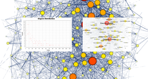
Next, we can see the visualization of the graph that represents the network once the visualization options mentioned in the previous points have been applied.

Figure 6. Graph display
Activating the option to display labels and placing the cursor on one of the nodes, the links that correspond to the node and the rest of the nodes that are linked to the chosen one through these links will be displayed.
Next, we can visualize the nodes and links related to the bicycle station "Fernando el Católico". In the visualization, the nodes that have a greater number of connections are easily distinguished, since they appear with a larger size and more striking colours, such as "Plaza de la Cebada" or "Quevedo".

5.4 Main network measures
Together with the visualization of the graph, the following measurements provide us with the main information of the analysed network. These averages, which are the usual metrics when performing network analytics, can be calculated in the statistics window.

- Nodes (N): are the different individual elements that make up a network, representing different entities. In this case the different bicycle stations. Its value on the network is 243
- Links (L): are the connections that exist between the nodes of a network. Links represent the relationships or interactions between the individual elements (nodes) that make up the network. Its value in the network is 3014
- Maximum number of links (Lmax): is the maximum possible number of links in the network. It is calculated by the following formula Lmax= N(N-1)/2. Its value on the network is 31878
- Average grade (k): is a statistical measure to quantify the average connectivity of network nodes. It is calculated by averaging the degrees of all nodes in the network. Its value in the network is 23.8
- Network density (d): indicates the proportion of connections between network nodes to the total number of possible connections. Its value in the network is 0.047
- Diámetro (dmax ): is the longest graph distance between any two nodes of the res, i.e., how far away the 2 nodes are farther apart. Its value on the network is 7
- Mean distance (d):is the average mean graph distance between the nodes of the network. Its value on the network is 2.68
- Mean clustering coefficient (C): Indicates how nodes are embedded between their neighbouring nodes. The average value gives a general indication of the grouping in the network. Its value in the network is 0.208
- Related component: A group of nodes that are directly or indirectly connected to each other but are not connected to nodes outside that group. Its value on the network is 24
5.5 Interpretation of results
The probability of degrees roughly follows a long-tail distribution, where we can observe that there are a few stations that interact with a large number of them while most interact with a low number of stations.
The average grade is 23.8 which indicates that each station interacts on average with about 24 other stations (input and output).
In the following graph we can see that, although we have nodes with degrees considered as high (80, 90, 100, ...), it is observed that 25% of the nodes have degrees equal to or less than 8, while 75% of the nodes have degrees less than or equal to 32.

The previous graph can be broken down into the following two corresponding to the average degree of input and output (since the network is directional). We see that both have similar long-tail distributions, their mean degree being the same of 11.9
Its main difference is that the graph corresponding to the average degree of input has a median of 7 while the output is 9, which means that there is a majority of nodes with lower degrees in the input than the output.


The value of the average grade with weights is 346.07 which indicates the average of total trips in and out of each station.

The network density of 0.047 is considered a low density indicating that the network is dispersed, that is, it contains few interactions between different stations in relation to the possible ones. This is considered logical because connections between stations will be limited to certain areas due to the difficulty of reaching stations that are located at long distances.
The average clustering coefficient is 0.208 meaning that the interaction of two stations with a third does not necessarily imply interaction with each other, that is, it does not necessarily imply transitivity, so the probability of interconnection of these two stations through the intervention of a third is low.
Finally, the network has 24 related components, of which 2 are weak related components and 22 are strong related components.
5.6 Centrality analysis
A centrality analysis refers to the assessment of the importance of nodes in a network using different measures. Centrality is a fundamental concept in network analysis and is used to identify key or influential nodes within a network. To perform this task, you start from the metrics calculated in the statistics window.
- The degree centrality measure indicates that the higher the degree of a node, the more important it is. The five stations with the highest values are: 1º Plaza de la Cebada, 2º Plaza de Lavapiés, 3º Fernando el Católico, 4º Quevedo, 5º Segovia 45.

- The closeness centrality indicates that the higher the proximity value of a node, the more central it is, since it can reach any other node in the network with the least possible effort. The five stations with the highest values are: 1º Fernando el Católico 2º General Pardiñas, 3º Plaza de la Cebada, 4º Plaza de Lavapiés, 5º Puerta de Madrid.


- The measure of betweenness centrality indicates that the greater the intermediation measure of a node, the more important it is since it is present in more interaction paths between nodes than the rest of the nodes in the network. The five stations with the highest values are: 1º Fernando el Católico, 2º Plaza de Lavapiés, 3º Plaza de la Cebada, 4º Puerta de Madrid, 5º Quevedo.

 FIgure 16. Graphic visualization betweenness centrality
With the Gephi tool you can calculate a large number of metrics and parameters that are not reflected in this study, such as the eigenvector measure or centrality distribution "eigenvector".
5.7 Filters
Through the filtering window, we can select certain parameters that simplify the visualizations in order to show relevant information of network analysis in a clearer way visually.

Next, we will show several filtered performed:
- Range (grade) filtering, which shows nodes with a rank greater than 50, assuming 13.44% (34 nodes) and 15.41% (464 edges).

- Edge filtering (edge weight), showing edges weighing more than 100, assuming 0.7% (20 edges).

Within the filters window, there are many other filtering options on attributes, ranges, partition sizes, edges, ... with which you can try to make new visualizations to extract information from the graph. If you want to know more about the use of Gephi, you can consult the following courses and trainings about the tool.
6. Conclusions of the exercice
Once the exercise is done, we can appreciate the following conclusions:
- The three stations most interconnected with other stations are Plaza de la Cebada (133), Plaza de Lavapiés (126) and Fernando el Católico (114).
- The station that has the highest number of input connections is Plaza de la Cebada (78), while the one with the highest number of exit connections is Plaza de Lavapiés with the same number as Fernando el Católico (57).
- The three stations with the highest number of total trips are Plaza de la Cebada (4524), Plaza de Lavapiés (4237) and Fernando el Católico (3526).
- There are 20 routes with more than 100 trips. Being the 3 routes with a greater number of them: Puerta de Toledo – Plaza Conde Suchil (141), Quintana Fuente del Berro – Quintana (137), Camino Vinateros – Miguel Moya (134).
- Taking into account the number of connections between stations and trips, the most important stations within the network are: Plaza la Cebada, Plaza de Lavapiés and Fernando el Católico.
We hope that this step-by-step visualization has been useful for learning some very common techniques in the treatment and representation of open data. We will be back to show you further reuses. See you soon!