Characteristics of the Spanish University students and most demanded degrees


Fecha del documento: 05-04-2022

1. Introduction
Visualizations are graphical representations of data that allow to transmit in a simple and effective way the information linked to them. The visualization potential is very wide, from basic representations, such as a graph of lines, bars or sectors, to visualizations configured on control panels or interactive dashboards. Visualizations play a fundamental role in drawing conclusions from visual information, also allowing to detect patterns, trends, anomalous data, or project predictions, among many other functions.
Before proceeding to build an effective visualization, we need to perform a previous treatment of the data, paying special attention to obtaining them and validating their content, ensuring that they are in the appropriate and consistent format for processing and do not contain errors. A preliminary treatment of the data is essential to perform any task related to the analysis of data and of performing an effective visualization.
In the "Visualizations step-by-step" section, we are periodically presenting practical exercises on open data visualization that are available in the datos.gob.es catalog or other similar catalogs. There we approach and describe in a simple way the necessary steps to obtain the data, perform the transformations and analyzes that are pertinent to, finally, we create interactive visualizations, from which we can extract information that is finally summarized in final conclusions.
In this practical exercise, we have carried out a simple code development that is conveniently documented by relying on tools for free use. All generated material is available for reuse in the GitHub Data Lab repository.
Access the data lab repository on Github.
Run the data pre-processing code on Google Colab.
2. Objetives
The main objective of this post is to learn how to make an interactive visualization based on open data. For this practical exercise we have chosen datasets that contain relevant information about the students of the Spanish university over the last few years. From these data we will observe the characteristics presented by the students of the Spanish university and which are the most demanded studies.
3. Resources
3.1. Datasets
For this practical case, data sets published by the Ministry of Universities have been selected, which collects time series of data with different disaggregations that facilitate the analysis of the characteristics presented by the students of the Spanish university. These data are available in the datos.gob.es catalogue and in the Ministry of Universities' own data catalogue. The specific datasets we will use are:
- Enrolled by type of university modality, area of nationality and field of science, and enrolled by type and modality of university, gender, age group and field of science for PHD students by autonomous community from the academic year 2015-2016 to 2020-2021.
- Enrolled by type of university modality, area of nationality and field of science, and enrolled by type and modality of the university, gender, age group and field of science for master's students by autonomous community from the academic year 2015-2016 to 2020-2021.
- Enrolled by type of university modality, area of nationality and field of science and enrolled by type and modality of the university, gender, age group and field of study for bachelor´s students by autonomous community from the academic year 2015-2016 to 2020-2021.
- Enrolments for each of the degrees taught by Spanish universities that is published in the Statistics section of the official website of the Ministry of Universities. The content of this dataset covers from the academic year 2015-2016 to 2020-2021, although for the latter course the data with provisional.
3.2. Tools
To carry out the pre-processing of the data, the R programming language has been used from theGoogle Colab cloud service, which allows the execution of Notebooks de Jupyter.
Google Colaboratory also called Google Colab, is a free cloud service from Google Research that allows you to program, execute and share code written in Python or R from your browser, so it does not require the installation of any tool or configuration.
For the creation of the interactive visualization the Datawrapper tool has been used.
Datawrapper is an online tool that allows you to make graphs, maps or tables that can be embedded online or exported as PNG, PDF or SVG. This tool is very simple to use and allows multiple customization options.
If you want to know more about tools that can help you in the treatment and visualization of data, you can use the report "Data processing and visualization tools".
4. Data pre-processing
As the first step of the process, it is necessary to perform an exploratory data analysis (EDA) in order to properly interpret the initial data, detect anomalies, missing data or errors that could affect the quality of subsequent processes and results, in addition to performing the tasks of transformation and preparation of the necessary variables. Pre-processing of data is essential to ensure that analyses or visualizations subsequently created from it are reliable and consistent. If you want to know more about this process you can use the Practical Guide to Introduction to Exploratory Data Analysis.
The steps followed in this pre-processing phase are as follows:
- Installation and loading the libraries
- Loading source data files
- Creating work tables
- Renaming some variables
- Grouping several variables into a single one with different factors
- Variables transformation
- Detection and processing of missing data (NAs)
- Creating new calculated variables
- Summary of transformed tables
- Preparing data for visual representation
- Storing files with pre-processed data tables
You'll be able to reproduce this analysis, as the source code is available in this GitHub repository. The way to provide the code is through a document made on a Jupyter Notebook that once loaded into the development environment can be executed or modified easily. Due to the informative nature of this post and in order to facilitate learning of non-specialized readers, the code does not intend to be the most efficient, but rather make it easy to understand, therefore it is likely to come up with many ways to optimize the proposed code to achieve a similar purpose. We encourage you to do so!
You can follow the steps and run the source code on this notebook in Google Colab.
5. Data visualizations
Once the data is pre-processed, we proceed with the visualization. To create this interactive visualization we use the Datawrapper tool in its free version. It is a very simple tool with special application in data journalism that we encourage you to use. Being an online tool, it is not necessary to have software installed to interact or generate any visualization, but it is necessary that the data table that we provide is properly structured.
To address the process of designing the set of visual representations of the data, the first step is to consider the queries we intent to resolve. We propose the following:
- How is the number of men and women being distributed among bachelor´s, master's and PHD students over the last few years?
If we focus on the last academic year 2020-2021:
- What are the most demanded fields of science in Spanish universities? What about degrees?
- Which universities have the highest number of enrolments and where are they located?
- In what age ranges are bachelor´s university students?
- What is the nationality of bachelor´s students from Spanish universities?
Let's find out by looking at the data!
5.1. Distribution of enrolments in Spanish universities from the 2015-2016 academic year to 2020-2021, disaggregated by gender and academic level
We created this visual representation taking into account the bachelor, master and PHD enrolments. Once we have uploaded the data table to Datawrapper (dataset "Matriculaciones_NivelAcademico"), we have selected the type of graph to be made, in this case a stacked bar diagram to be able to reflect by each course and gender, the people enrolled in each academic level. In this way we can also see the total number of students enrolled per course. Next, we have selected the type of variable to represent (Enrolments) and the disaggregation variables (Gender and Course). Once the graph is obtained, we can modify the appearance in a very simple way, modifying the colors, the description and the information that each axis shows, among other characteristics.
To answer the following questions, we will focus on bachelor´s students and the 2020-2021 academic year, however, the following visual representations can be replicated for master's and PHD students, and for the different courses.
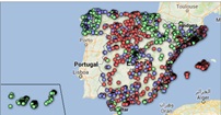
5.2. Map of georeferenced Spanish universities, showing the number of students enrolled in each of them
To create the map, we have used a list of georeferenced Spanish universities published by the Open Data Portal of Esri Spain. Once the data of the different geographical areas have been downloaded in GeoJSON format, we transform them into Excel, in order to combine the datasets of the georeferenced universities and the dataset that presents the number of enrolled by each university that we have previously pre-processed. For this we have used the Excel VLOOKUP() function that will allow us to locate certain elements in a range of cells in a table
Before uploading the dataset to Datawrapper, we need to select the layer that shows the map of Spain divided into provinces provided by the tool itself. Specifically, we have selected the option "Spain>>Provinces(2018)". Then we proceed to incorporate the dataset "Universities", previously generated, (this dataset is attached in the GitHub datasets folder for this step-by-step visualization), indicating which columns contain the values of the variables Latitude and Longitude.
From this point, Datawrapper has generated a map showing the locations of each of the universities. Now we can modify the map according to our preferences and settings. In this case, we will set the size and the color of the dots dependent from the number of registrations presented by each university. In addition, for this data to be displayed, in the "Annotate" tab, in the "Tooltips" section, we have to indicate the variables or text that we want to appear.
5.3. Ranking of enrolments by degree
For this graphic representation, we use the Datawrapper table visual object (Table) and the "Titulaciones_totales" dataset to show the number of registrations presented by each of the degrees available during the 2020-2021 academic year. Since the number of degrees is very extensive, the tool offers us the possibility of including a search engine that allows us to filter the results.
5.4. Distribution of enrolments by field of science
For this visual representation, we have used the "Matriculaciones_Rama_Grado" dataset and selected sector graphs (Pie Chart), where we have represented the number of enrolments according to sex in each of the field of science in which the degrees in the universities are divided (Social and Legal Sciences, Health Sciences, Arts and Humanities, Engineering and Architecture and Sciences). Just like in the rest of the graphics, we can modify the color of the graph, in this case depending on the branch of teaching.
5.5. Matriculaciones de Grado por edad y nacionalidad
For the realization of these two representations of visual data we use bar charts (Bar Chart), where we show the distribution of enrolments in the first, disaggregated by gender and nationality, we will use the data set "Matriculaciones_Grado_nacionalidad" and in the second, disaggregated by gender and age, using the data set "Matriculaciones_Grado_edad ". Like the previous visuals, the tool easily facilitates the modification of the characteristics presented by the graphics.
6. Conclusions
Data visualization is one of the most powerful mechanisms for exploiting and analyzing the implicit meaning of data, regardless of the type of data and the degree of technological knowledge of the user. Visualizations allow us to extract meaning out of the data and create narratives based on graphical representation. In the set of graphical representations of data that we have just implemented, the following can be observed:
- The number of enrolments increases throughout the academic years regardless of the academic level (bachelor´s, master's or PHD).
- The number of women enrolled is higher than the men in bachelor's and master's degrees, however it is lower in the case of PHD enrollments, except in the 2019-2020 academic year.
- The highest concentration of universities is found in the Community of Madrid, followed by the autonomous community of Catalonia.
- The university that concentrates the highest number of enrollments during the 2020-2021 academic year is the UNED (National University of Distance Education) with 146,208 enrollments, followed by the Complutense University of Madrid with 57,308 registrations and the University of Seville with 52,156.
- The most demanded degree in the 2020-2021 academic year is the Degree in Law with 82,552 students nationwide, followed by the Degree in Psychology with 75,738 students and with hardly any difference, the Degree in Business Administration and Management with 74,284 students.
- The branch of education with the highest concentration of students is Social and Legal Sciences, while the least demanded is the branch of Sciences.
- The nationalities that have the most representation in the Spanish university are from the region of the European Union, followed by the countries of Latin America and the Caribbean, at the expense of the Spanish one.
- The age range between 18 and 21 years is the most represented in the student body of Spanish universities.
We hope that this step-by-step visualization has been useful for learning some very common techniques in the treatment and representation of open data. We will return to show you new reuses. See you soon!