How many accidents occur in the city of Madrid?


Fecha del documento: 19-10-2021

1. Introduction
Data visualization is a task linked to data analysis that aims to graphically represent underlying data information. Visualizations play a fundamental role in the communication function that data possess, since they allow to drawn conclusions in a visual and understandable way, allowing also to detect patterns, trends, anomalous data or to project predictions, alongside with other functions. This makes its application transversal to any process in which data intervenes. The visualization possibilities are very numerous, from basic representations, such as a line graphs, graph bars or sectors, to complex visualizations configured from interactive dashboards.
Before we start to build an effective visualization, we must carry out a pre-treatment of the data, paying attention to how to obtain them and validating the content, ensuring that they do not contain errors and are in an adequate and consistent format for processing. Pre-processing of data is essential to start any data analysis task that results in effective visualizations.
A series of practical data visualization exercises based on open data available on the datos.gob.es portal or other similar catalogues will be presented periodically. They will address and describe, in a simple way; the stages necessary to obtain the data, perform the transformations and analysis that are relevant for the creation of interactive visualizations, from which we will be able summarize on in its final conclusions the maximum mount of information. In each of the exercises, simple code developments will be used (that will be adequately documented) as well as free and open use tools. All generated material will be available for reuse in the Data Lab repository on Github.
Visualization of traffic accidents occurring in the city of Madrid, by district and type of vehicle
2. Objetives
The main objective of this post is to learn how to make an interactive visualization based on open data available on this portal. For this exercise, we have chosen a dataset that covers a wide period and contains relevant information on the registration of traffic accidents that occur in the city of Madrid. From these data we will observe what is the most common type of accidents in Madrid and the incidence that some variables such as age, type of vehicle or the harm produced by the accident have on them.
3. Resources
3.1. Datasets
For this analysis, a dataset available in datos.gob.es on traffic accidents in the city of Madrid published by the City Council has been selected. This dataset contains a time series covering the period 2010 to 2021 with different subcategories that facilitate the analysis of the characteristics of traffic accidents that occurred. For example, the environmental conditions in which each accident occurred or the type of accident. Information on the structure of each data file is available in documents covering the period 2010-2018 and 2019 onwards. It should be noted that there are inconsistencies in the data before and after the year 2019, due to data structure variations. This is a common situation that data analysts must face when approaching the preprocessing tasks of the data that will be used, this is derived from the lack of a homogeneous structure of the data over time. For example, alterations on the number of variables, modification of the type of variables or changes to different measurement units. This is a compelling reason that justifies the need to accompany each open data set with complete documentation explaining its structure.
3.2. Tools
R (versión 4.0.3) and RStudio with the RMarkdown complement have been used to carry out the pre-treatment of the data (work environment setup, programming and writing).
R is an object-oriented and interpreted open-source programming language, initially created for statistical computing and the creation of graphical representations. Nowadays, it is a very powerful tool for all types of data processing and manipulation permanently updated. It contains a programming environment, RStudio, also open source.
The Kibana tool has been used for the creation of the interactive visualization.
Kibana is an open source tool that belongs to the Elastic Stack product suite (Elasticsearch, Beats, Logstash and Kibana) that enables visualization creation and exploration of indexed data on top of the Elasticsearch analytics engine.
If you want to know more about these tools or anyother that can help you in data processing and creating interactive visualizations, you can consult the report "Data processing and visualization tools".
4. Data processing
For the realization of the subsequent analysis and visualizations, it is necessary to prepare the data adequately, so that the results obtained are consistent and effective. We must perform an exploratory data analysis (EDA), in order to know and understand the data with which we want to work. The main objective of this data pre-processing is to detect possible anomalies or errors that could affect the quality of subsequent results and identify patterns of information contained in the data.
To facilitate the understanding of readers not specialized in programming, the R code included below, which you can access by clicking on the "Code" button in each section, is not designed to maximize its efficiency, but to facilitate its understanding, so it is possible that more advanced readers in this language might consider alternatives more efficient to encode some functionalities. The reader will be able to reproduce this analysis if desired, as the source code is available on datos.gob.es's Github account. In order to provide the code a plain text document will be used, which once loaded into the development environment can be easily executed or modified if desired.
4.1. Installation and loading of libraries
For the development of this analysis, we need to install a series of additional R packages to the base distribution, incorporating the functions and objects defined by them into the work environment. There are many packages available in R but the most suitable to work with this dataset are: tidyverse, lubridate and data.table.Tidyverse is a collection of R packages (it contains other packages such as dplyr, ggplot2, readr, etc.) specifically designed to work in Data Science, facilitating the loading and processing of data, and graphical representations and other essential functionalities for data analysis. It requires a progressive knowledge to get the most out of the packages that integrates. On the other hand, the lubridate package will be used for the management of date variables. Finally the data.table package allows a more efficient management of large data sets. These packages will need to be downloaded and installed in the development environment.
4.2. Uploading and cleaning data
a. Loading datasets
The data that we are going to use in the visualization are divided by annuities in CSV files. As we want to perform an analysis of several years we must download and upload in our development environment all the datasets that interest us.
To do this, we generate the working directory "datasets", where we will download all the datasets. We use two lists, one with all the URLs where the datasets are located and another with the names that we assign to each file saved on our machine, with this we facilitate subsequent references to these files.
b. Creating the worktable
Once we have all the datasets loaded into our development environment, we create a single worktable that integrates all the years of the time series.
Once the worktable is generated, we must solve one of the most common problems in all data preprocessing: the inconsistency in the naming of the variables in the different files that make up the time series. This anomaly produces variables with different names, but we know that they represent the same information. In this case it is explained in the data dictionary described in the documentation of the files, if this was not the case, it is necessary to resort to the observation and descriptive exploration of the files. In this case, the variable ""RANGO EDAD"" that presents data from 2010 to 2018 and the variable ""RANGO EDAD"" that presents the same data but from 2019 to 2021 are different. To solve this problem, we must unite/merge the variables that present this anomaly in a single variable.
Once we have the table with the complete time series, we create a new table counting only the variables that are relevant to us to make the interactive visualization that we want to develop.
c. Variable transformation
Next, we examine the type of variables and values to transform the necessary variables to be able to perform future aggregations, graphs or different statistical analyses.
d. Creation of new variables
Let's divide the variable ""FECHA"" into a hierarchy of variables of date types, ""Año", ""Mes"" and ""Día"". This action is very common in data analytics, since it is interesting to analyze other time ranges, for example; years, months, weeks (and any other unit of time), or we need to generate aggregations from the day of the week.
e. Detection and processing of lost data
The detection and processing of lost data (NAs) is an essential task in order to be able to process the variables contained in the table, since the lack of data can cause problems when performing aggregations, graphs or statistical analysis.
Next, we will analyze the absence of data (detection of NAs) in the table:
Once the NAs presented by the dataset have been detected, we must treat them somehow. In this case, as all the interesting variables are categorical, we will complete the missing values with the new value "Unassigned", this way we do not lose sample size and relevant information.
f. Level assignments in variables
Once we have the variables of interest in the table, we can perform a more exhaustive analysis of the data and categories presented by each of the variables. If we analyze each one independently, we can see that some of them have repeated categories, simply by use of accents, special characters or capital letters. We will reassign the levels to the variables that require so that future visualizations or statistical analysis are built efficiently and without errors.
For space reasons, in this post we will only show an example with the variable "HARMFULNESS". This variable was typified until 2018 with a series of categories (IL, HL, HG, MT), while from 2019 other categories were used (values from 0 to 14). Fortunately, this task is easily approachable since it is documented in the information about the structure that accompanies each dataset. This issue (as we have said before), that does not always happen, greatly hinders this type of data transformations.
4.3. Dataset Summary
Let's see what variables and structure the new dataset presents after the transformations made:
The output of these commands will be omitted for reading simplicity. The main characteristics of the dataset are:
- It is composed of 14 variables: 1 date variable and 13 categorical variables.
- The time range covers from 01-01-2010 to 31-06-2021 (the end date may vary, since the dataset of the year 2021 is being updated periodically).
- For space reasons in this post, not all available variables have been considered for analysis and visualization.
4.4. Save the generated dataset
Once we have the dataset with the structure and variables ready for us to perform the visualization of the data, we will save it as a data file in CSV format to later perform other statistical analysis. Or use it in other data processing or visualization tools such as the one we address below. It is important to save it with a UTF-8 (Unicode Transformation Format) encoding so that special characters are correctly identified by any software.
5. Creation of the visualization on traffic accidents that occur in the city of Madrid using Kibana
To create this interactive visualization the Kibana tool (in its free version) has been used on our local environment. Before being able to perform the visualization it is necessary to have the software installed since we have followed the steps of the download and installation tutorial provided by the company Elastic.
Once the Kibana software is installed, we proceed to develop the interactive visualization. Below there are two video tutorials, which show the process of creating the visualization and interacting with it.
This first video tutorial shows the visualization development process by performing the following steps:
- Loading data into Elasticsearch, generating an index in Kibana that allows us to interact with the data practically in real time and interaction with the variables presented by the dataset.
- Generation of the following graphical representations:
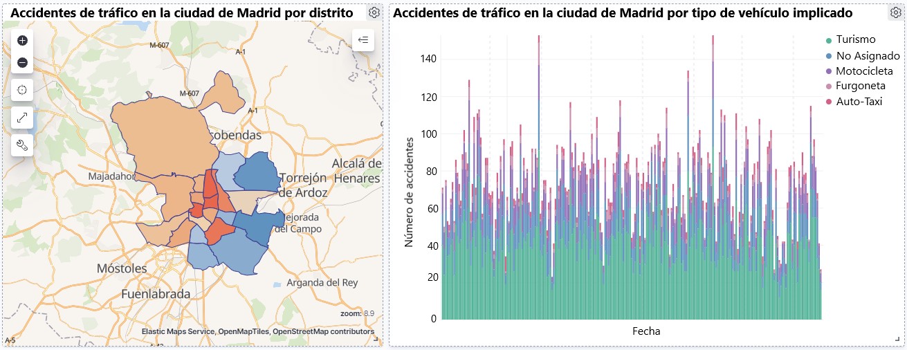
- Line graph to represent the time series on traffic accidents that occurred in the city of Madrid.
- Horizontal bar chart showing the most common accident type
- Thematic map, we will show the number of accidents that occur in each of the districts of the city of Madrid. For the creation of this visual it is necessary to download the "dataset containing the georeferenced districts in GeoJSON format".
- Construction of the dashboard integrating the visuals generated in the previous step.
In this second video tutorial we will show the interaction with the visualization that we have just created:
6. Conclusions
Observing the visualization of the data on traffic accidents that occurred in the city of Madrid from 2010 to June 2021, the following conclusions can be drawn:
- The number of accidents that occur in the city of Madrid is stable over the years, except for 2019 where a strong increase is observed and during the second quarter of 2020 where a significant decrease is observed, which coincides with the period of the first state of alarm due to the COVID-19 pandemic.
- Every year there is a decrease in the number of accidents during the month of August.
- Men tend to have a significantly higher number of accidents than women.
- The most common type of accident is the double collision, followed by the collision of an animal and the multiple collision.
- About 50% of accidents do not cause harm to the people involved.
- The districts with the highest concentration of accidents are: the district of Salamanca, the district of Chamartín and the Centro district.
Data visualization is one of the most powerful mechanisms for autonomously exploiting and analyzing the implicit meaning of data, regardless of the degree of the user's technological knowledge. Visualizations allow us to build meaning on top of data and create narratives based on graphical representation.
If you want to learn how to make a prediction about the future accident rate of traffic accidents using Artificial Intelligence techniques from this data, consult the post on "Emerging technologies and open data: Predictive Analytics".
We hope you liked this post and we will return to show you new data reuses. See you soon!