Predictive analisys of electric consuption in the city of Barcelona


Fecha del documento: 08-11-2023
1. Introduction
Visualizations are graphical representations of data that allow you to communicate, in a simple and effective way, the information linked to it. The visualization possibilities are very extensive, from basic representations such as line graphs, bar graphs or relevant metrics, to visualizations configured on interactive dashboards.
In the section of “Step-by-step visualizations” we are periodically presenting practical exercises making use of open data available in datos.gob.es or other similar catalogs. They address and describe in a simple way the steps necessary to obtain the data, carry out the transformations and analyses that are pertinent to finally obtain conclusions as a summary of this information.
In each of these hands-on exercises, conveniently documented code developments are used, as well as free-to-use tools. All generated material is available for reuse in the datos.gob.es GitHub repository.
Accede al repositorio del laboratorio de datos en Github.
Ejecuta el código de pre-procesamiento de datos sobre Google Colab.
2. Objetive
The main objective of this exercise is to show how to carry out, in a didactic way, a predictive analysis of time series based on open data on electricity consumption in the city of Barcelona. To do this, we will carry out an exploratory analysis of the data, define and validate the predictive model, and finally generate the predictions together with their corresponding graphs and visualizations.
Predictive time series analytics are statistical and machine learning techniques used to forecast future values in datasets that are collected over time. These predictions are based on historical patterns and trends identified in the time series, with their primary purpose being to anticipate changes and events based on past data.
The initial open dataset consists of records from 2019 to 2022 inclusive, on the other hand, the predictions will be made for the year 2023, for which we do not have real data.
Once the analysis has been carried out, we will be able to answer questions such as the following:
- What is the future prediction of electricity consumption?
- How accurate has the model been with the prediction of already known data?
- Which days will have maximum and minimum consumption based on future predictions?
- Which months will have a maximum and minimum average consumption according to future predictions?
These and many other questions can be solved through the visualizations obtained in the analysis, which will show the information in an orderly and easy-to-interpret way.
3. Resources
3.1. Datasets
The open datasets used contain information on electricity consumption in the city of Barcelona in recent years. The information they provide is the consumption in (MWh) broken down by day, economic sector, zip code and time slot.
These open datasets are published by Barcelona City Council in the datos.gob.es catalogue, through files that collect the records on an annual basis. It should be noted that the publisher updates these datasets with new records frequently, so we have used only the data provided from 2019 to 2022 inclusive.
These datasets are also available for download from the following Github repository.
3.2. Tools
To carry out the analysis, the Python programming language written on a Jupyter Notebook hosted in the Google Colab cloud service has been used.
"Google Colab" or, also called Google Colaboratory, is a cloud service from Google Research that allows you to program, execute and share code written in Python or R on top of a Jupyter Notebook from your browser, so it requires no configuration. This service is free of charge.
The Looker Studio tool was used to create the interactive visualizations.
"Looker Studio", formerly known as Google Data Studio, is an online tool that allows you to make interactive visualizations that can be inserted into websites or exported as files.
If you want to know more about tools that can help you in data processing and visualization, you can refer to the "Data processing and visualization tools" report.
4. Predictive time series analysis
Predictive time series analysis is a technique that uses historical data to predict future values of a variable that changes over time. Time series is data that is collected at regular intervals, such as days, weeks, months, or years. It is not the purpose of this exercise to explain in detail the characteristics of time series, as we focus on briefly explaining the prediction model. However, if you want to know more about it, you can consult the following manual.
This type of analysis assumes that the future values of a variable will be correlated with historical values. Using statistical and machine learning techniques, patterns in historical data can be identified and used to predict future values.
The predictive analysis carried out in the exercise has been divided into five phases; data preparation, exploratory data analysis, model training, model validation, and prediction of future values), which will be explained in the following sections.
The processes described below are developed and commented on in the following Notebook executable from Google Colab along with the source code that is available in our Github account.
It is advisable to run the Notebook with the code at the same time as reading the post, since both didactic resources are complementary in future explanations.
4.1 Data preparation
This section can be found in point 1 of the Notebook.
In this section, the open datasets described in the previous points that we will use in the exercise are imported, paying special attention to obtaining them and validating their content, ensuring that they are in the appropriate and consistent format for processing and that they do not contain errors that could condition future steps.
4.2 Exploratory Data Analysis (EDA)
This section can be found in point 2 of the Notebook.
In this section we will carry out an exploratory data analysis (EDA), in order to properly interpret the source data, detect anomalies, missing data, errors or outliers that could affect the quality of subsequent processes and results.
Then, in the following interactive visualization, you will be able to inspect the data table with the historical consumption values generated in the previous point, being able to filter by specific period. In this way, we can visually understand the main information in the data series.
Once you have inspected the interactive visualization of the time series, you will have observed several values that could potentially be considered outliers, as shown in the figure below. We can also numerically calculate these outliers, as shown in the notebook.

Once the outliers have been evaluated, for this year it has been decided to modify only the one registered on the date "2022-12-05". To do this, the value will be replaced by the average of the value recorded the previous day and the day after.
The reason for not eliminating the rest of the outliers is because they are values recorded on consecutive days, so it is assumed that they are correct values affected by external variables that are beyond the scope of the exercise. Once the problem detected with the outliers has been solved, this will be the time series of data that we will use in the following sections.
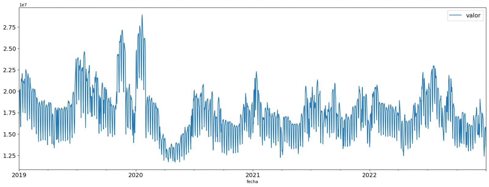
Figure 2. Time series of historical data after outliers have been processed.
If you want to know more about these processes, you can refer to the Practical Guide to Introduction to Exploratory Data Analysis.
4.3 Model training
This section can be found in point 3 of the Notebook.
First, we create within the data table the temporal attributes (year, month, day of the week, and quarter). These attributes are categorical variables that help ensure that the model is able to accurately capture the unique characteristics and patterns of these variables. Through the following box plot visualizations, we can see their relevance within the time series values.
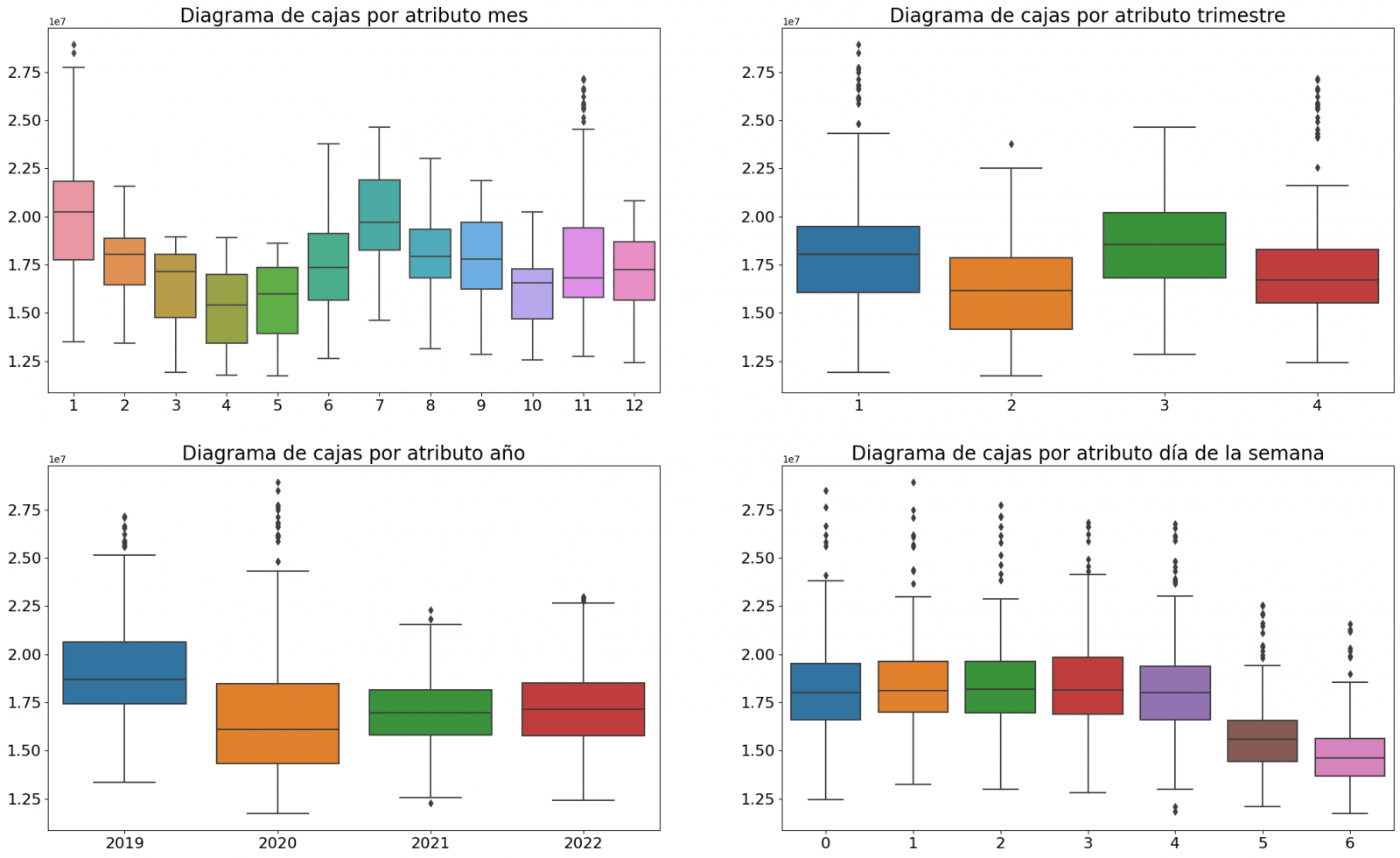
Figure 3. Box Diagrams of Generated Temporal Attributes
We can observe certain patterns in the charts above, such as the following:
- Weekdays (Monday to Friday) have a higher consumption than on weekends.
- The year with the lowest consumption values is 2020, which we understand is due to the reduction in service and industrial activity during the pandemic.
- The month with the highest consumption is July, which is understandable due to the use of air conditioners.
- The second quarter is the one with the lowest consumption values, with April standing out as the month with the lowest values.
Next, we divide the data table into training set and validation set. The training set is used to train the model, i.e., the model learns to predict the value of the target variable from that set, while the validation set is used to evaluate the performance of the model, i.e., the model is evaluated against the data from that set to determine its ability to predict the new values.
This splitting of the data is important to avoid overfitting, with the typical proportion of the data used for the training set being 70% and the validation set being approximately 30%. For this exercise we have decided to generate the training set with the data between "01-01-2019" to "01-10-2021", and the validation set with those between "01-10-2021" and "31-12-2022" as we can see in the following graph.
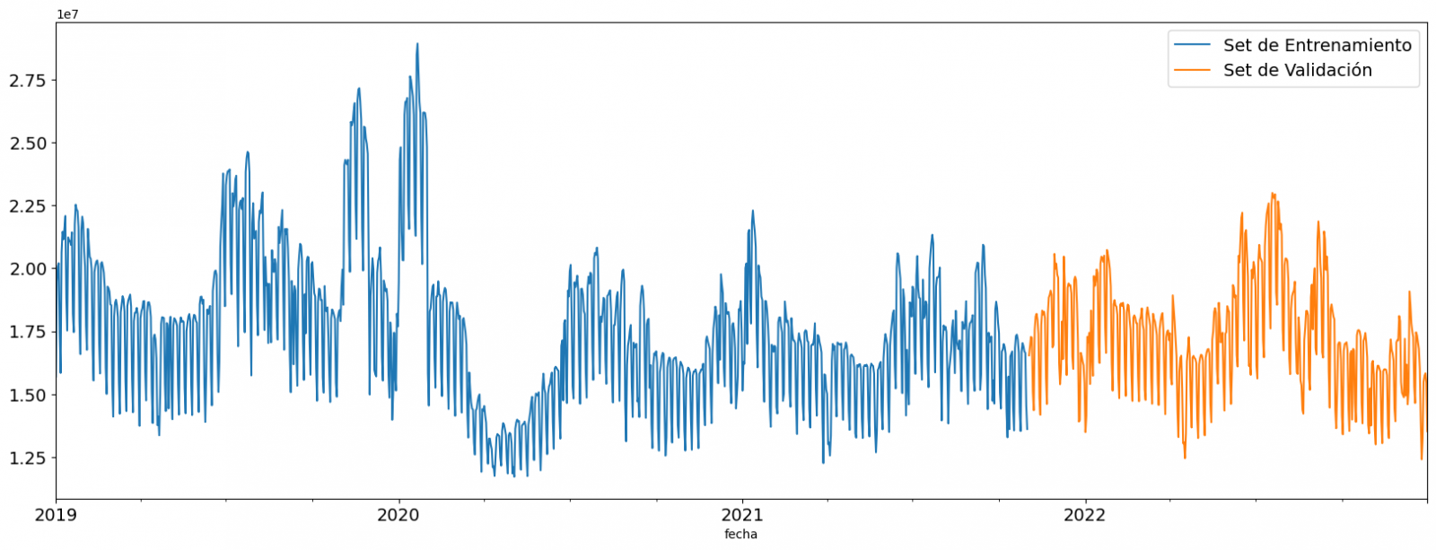
Figure 4. Historical data time series divided into training set and validation set
For this type of exercise, we have to use some regression algorithm. There are several models and libraries that can be used for time series prediction. In this exercise we will use the "Gradient Boosting" model, a supervised regression model that is a machine learning algorithm used to predict a continuous value based on the training of a dataset containing known values for the target variable (in our example the variable "value") and the values of the independent variables (in our exercise the temporal attributes).
It is based on decision trees and uses a technique called "boosting" to improve the accuracy of the model, being known for its efficiency and ability to handle a variety of regression and classification problems.
Its main advantages are the high degree of accuracy, robustness and flexibility, while some of its disadvantages are its sensitivity to outliers and that it requires careful optimization of parameters.
We will use the supervised regression model offered in the XGBBoost library, which can be adjusted with the following parameters:
- n_estimators: A parameter that affects the performance of the model by indicating the number of trees used. A larger number of trees generally results in a more accurate model, but it can also take more time to train.
- early_stopping_rounds: A parameter that controls the number of training rounds that will run before the model stops if performance in the validation set does not improve.
- learning_rate: Controls the learning speed of the model. A higher value will make the model learn faster, but it can lead to overfitting.
- max_depth: Control the maximum depth of trees in the forest. A higher value can provide a more accurate model, but it can also lead to overfitting.
- min_child_weight: Control the minimum weight of a sheet. A higher value can help prevent overfitting.
- Gamma: Controls the amount of expected loss reduction needed to split a node. A higher value can help prevent overfitting.
- colsample_bytree: Controls the proportion of features that are used to build each tree. A higher value can help prevent overfitting.
- Subsample: Controls the proportion of the data that is used to construct each tree. A higher value can help prevent overfitting.
These parameters can be adjusted to improve model performance on a specific dataset. It's a good idea to experiment with different values of these parameters to find the value that provides the best performance in your dataset.
Finally, by means of a bar graph, we will visually observe the importance of each of the attributes during the training of the model. It can be used to identify the most important attributes in a dataset, which can be useful for model interpretation and feature selection.
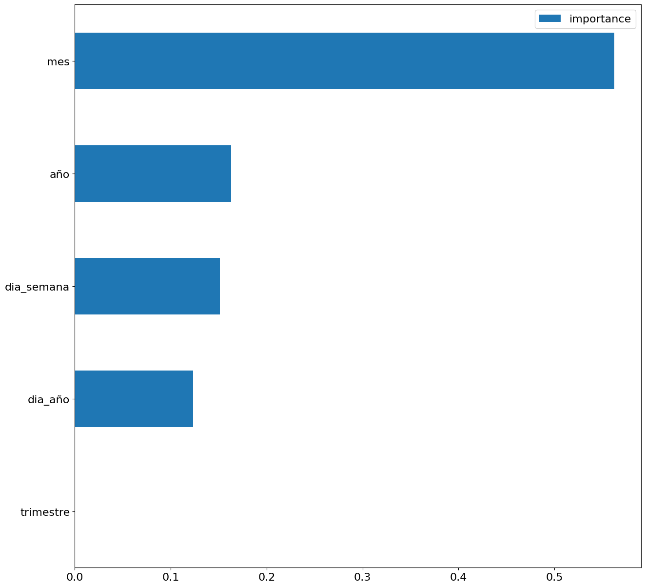
Figure 5. Bar Chart with Importance of Temporal Attributes
4.4 Model training
This section can be found in point 4 of the Notebook.
Once the model has been trained, we will evaluate how accurate it is for the known values in the validation set.
We can visually evaluate the model by plotting the time series with the known values along with the predictions made for the validation set as shown in the figure below.
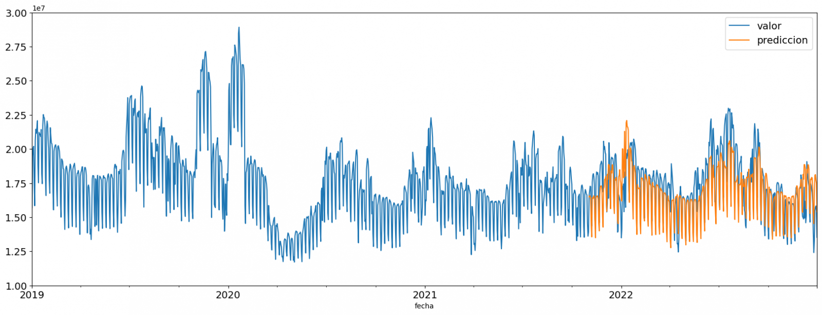
Figure 6. Time series with validation set data next to prediction data.
We can also numerically evaluate the accuracy of the model using different metrics. In this exercise, we have chosen to use the mean absolute percentage error (ASM) metric, which has been 6.58%. The accuracy of the model is considered high or low depending on the context and expectations in such a model, generally an ASM is considered low when it is less than 5%, while it is considered high when it is greater than 10%. In this exercise, the result of the model validation can be considered an acceptable value.
If you want to consult other types of metrics to evaluate the accuracy of models applied to time series, you can consult the following link.
4.5 Predictions of future values
This section can be found in point 5 of the Notebook.
Once the model has been generated and its MAPE = 6.58% performance has been evaluated, we will apply this model to all known data, in order to predict the unknown electricity consumption values for 2023.
First of all, we retrain the model with the known values until the end of 2022, without dividing it into a training and validation set. Finally, we calculate future values for the year 2023.

Figure 7. Time series with historical data and prediction for 2023
In the following interactive visualization you can see the predicted values for the year 2023 along with their main metrics, being able to filter by time period.
Improving the results of predictive time series models is an important goal in data science and data analytics. Several strategies that can help improve the accuracy of the exercise model are the use of exogenous variables, the use of more historical data or generation of synthetic data, optimization of parameters, ...
Due to the informative nature of this exercise and to promote the understanding of less specialized readers, we have proposed to explain the exercise in a way that is as simple and didactic as possible. You may come up with many ways to optimize your predictive model to achieve better results, and we encourage you to do so!
5. Conclusions of the exercise
Once the exercise has been carried out, we can see different conclusions such as the following:
- The maximum values for consumption predictions in 2023 are given in the last half of July, exceeding values of 22,500,000 MWh
- The month with the highest consumption according to the predictions for 2023 will be July, while the month with the lowest average consumption will be November, with a percentage difference between the two of 25.24%
- The average daily consumption forecast for 2023 is 17,259,844 MWh, 1.46% lower than that recorded between 2019 and 2022.
We hope that this exercise has been useful for you to learn some common techniques in the study and analysis of open data. We'll be back to show you new reuses. See you soon!