Teachers of public schools in Castilla y León


Fecha del documento: 29-09-2021
1. Introduction
Data visualization is a task linked to data analysis that aims to graphically represent underlying data information. Visualizations play a fundamental role in the communication function that data possess, since they allow to drawn conclusions in a visual and understandable way, allowing also to detect patterns, trends, anomalous data or to project predictions, alongside with other functions. This makes its application transversal to any process in which data intervenes. The visualization possibilities are very numerous, from basic representations, such as a line graphs, graph bars or sectors, to complex visualizations configured from interactive dashboards.
Before we start to build an effective visualization, we must carry out a pre-treatment of the data, paying attention to how to obtain them and validating the content, ensuring that they do not contain errors and are in an adequate and consistent format for processing. Pre-processing of data is essential to start any data analysis task that results in effective visualizations.
A series of practical data visualization exercises based on open data available on the datos.gob.es portal or other similar catalogues will be presented periodically. They will address and describe, in a simple way; the stages necessary to obtain the data, perform the transformations and analysis that are relevant for the creation of interactive visualizations, from which we will be able summarize on in its final conclusions the maximum mount of information. In each of the exercises, simple code developments will be used (that will be adequately documented) as well as free and open use tools. All generated material will be available for reuse in the Data Lab repository on Github.

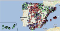
Visualization of the teaching staff of Castilla y León classified by Province, Locality and Teaching Specialty
2. Objetives
The main objective of this post is to learn how to treat a dataset from its download to the creation of one or more interactive graphs. For this, datasets containing relevant information on teachers and students enrolled in public schools in Castilla y León during the 2019-2020 academic year have been used. Based on these data, analyses of several indicators that relate teachers, specialties and students enrolled in the centers of each province or locality of the autonomous community.
3. Resources
3.1. Datasets
For this study, datasets on Education published by the Junta de Castilla y León have been selected, available on the open data portal datos.gob.es. Specifically:
- Dataset of the legal figures of the public centers of Castilla y León of all the teaching positions, except for the schoolteachers, during the academic year 2019-2020. This dataset is disaggregated by specialty of the teacher, educational center, town and province.
- Dataset of student enrolments in schools during the 2019-2020 academic year. This dataset is obtained through a query that supports different configuration parameters. Instructions for doing this are available at the dataset download point. The dataset is disaggregated by educational center, town and province.
3.2. Tools
To carry out this analysis (work environment set up, programming and writing) Python (versión 3.7) programming language and JupyterLab (versión 2.2) have been used. This tools will be found integrated in Anaconda, one of the most popular platforms to install, update or manage software to work with Data Science. All these tools are open and available for free.
JupyterLab is a web-based user interface that provides an interactive development environment where the user can work with so-called Jupyter notebooks on which you can easily integrate and share text, source code and data.
To create the interactive visualization, the Kibana tool (versión 7.10) has been used.
Kibana is an open source application that is part of the Elastic Stack product suite (Elasticsearch, Logstash, Beats and Kibana) that provides visualization and exploration capabilities of indexed data on top of the Elasticsearch analytics engine..
If you want to know more about these tools or others that can help you in the treatment and visualization of data, you can see the recently updated "Data Processing and Visualization Tools" report.
4. Data processing
As a first step of the process, it is necessary to perform an exploratory data analysis (EDA) to properly interpret the starting data, detect anomalies, missing data or errors that could affect the quality of subsequent processes and results. Pre-processing of data is essential to ensure that analyses or visualizations subsequently created from it are consistent and reliable.
Due to the informative nature of this post and to favor the understanding of non-specialized readers, the code does not intend to be the most efficient, but to facilitate its understanding. So you will probably come up with many ways to optimize the proposed code to get similar results. We encourage you to do so! You will be able to reproduce this analysis since the source code is available in our Github account. The way to provide the code is through a document made on JupyterLab that once loaded into the development environment you can execute or modify easily.
4.1. Installation and loading of libraries
The first thing we must do is import the libraries for the pre-processing of the data. There are many libraries available in Python but one of the most popular and suitable for working with these datasets is Pandas. The Pandas library is a very popular library for manipulating and analyzing datasets.
4.2. Loading datasets
First, we download the datasets from the open data catalog datos.gob.es and upload them into our development environment as tables to explore them and perform some basic data cleaning and processing tasks. For the loading of the data we will resort to the function read_csv(), where we will indicate the download url of the dataset, the delimiter ("";"" in this case) and, we add the parameter "encoding"" that we adjust to the value ""latin-1"", so that it correctly interprets the special characters such as the letters with accents or ""ñ"" present in the text strings of the dataset.
The column ""Localidad"" of the table ""alumnos"" is composed of the code of the municipality and the name of the same. We must divide this column in two, so that its treatment is more efficient.
4.3. Creating a new table
Once we have both tables with the variables of interest, we create a new table resulting from their union. The union variables will be: ""Localidad"" in the table of ""docentes"" and ""Nombre_Municipio” in the table of ""alumnos".
4.4. Exploring the dataset
Once we have the table that interests us, we must spend some time exploring the data and interpreting each variable. In these cases, it is very useful to have the data dictionary that always accompanies each downloaded dataset to know all its details, but this time we do not have this essential tool. Observing the table, in addition to interpreting the variables that make it up (data types, units, ranges of values), we can detect possible errors such as mistyped variables or the presence of missing values (NAs) that can reduce analysis capacity.
In the output of this section of code, we can see the main characteristics of the table:
- Contains a total of 4,512 records
- It is composed of 13 variables, 5 numerical variables (integer type) and 8 categorical variables ("object" type)
- There is no missing of values.
Once we know the structure and content of the table, we must rectify errors, as is the case of the transformation of some of the variables that are not properly typified, for example, the variable that houses the center code ("Código.centro").
Once we have the table free of errors, we obtain a description of the numerical variables, ""Plantilla" and ""Matriculaciones", which will help us to know important details. In the output of the code that we present below we observe the mean, the standard deviation, the maximum and minimum number, among other statistical descriptors.
4.5. Save the dataset
Once we have the table free of errors and with the variables that we are interested in graphing, we will save it in a folder of our choice to use it later in other analysis or visualization tools. We will save it in CSV format encoded as UTF-8 (Unicode Transformation Format) so that special characters are correctly identified by any tool we might use later.
5. Creation of the visualization on the teachers of the public educational centers of Castilla y León using the Kibana tool
For the realization of this visualization, we have used the Kibana tool in our local environment. To do this it is necessary to have Elasticsearch and Kibana installed and running. The company Elastic makes all the information about the download and installation available in this tutorial.
Attached below are two video tutorials, which shows the process of creating the visualization and the interaction with the generated dashboard.
In this first video, you can see the creation of the dashboard by generating different graphic representations, following these steps:
- We load the table of previously processed data into Elasticsearch and generate an index that allows us to interact with the data from Kibana. This index allows search and management of data, practically in real time.
- Generation of the following graphical representations:
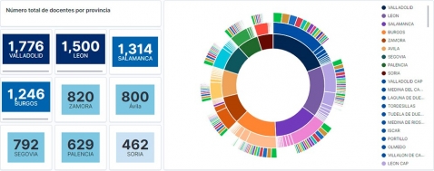
- Graph of sectors where to show the teaching staff by province, locality and specialty.
- Metrics of the number of teachers by province.
- Bar chart, where we will show the number of registrations by province.
- Filter by province, locality and teaching specialty.
- Construction of the dashboard.
In this second video, you will be able to observe the interaction with the dashboard generated previously.
6. Conclusions
Observing the visualization of the data on the number of teachers in public schools in Castilla y León, in the academic year 2019-2020, the following conclusions can be obtained, among others:
- The province of Valladolid is the one with both the largest number of teachers and the largest number of students enrolled. While Soria is the province with the lowest number of teachers and the lowest number of students enrolled.
- As expected, the localities with the highest number of teachers are the provincial capitals.
- In all provinces, the specialty with the highest number of students is English, followed by Spanish Language and Literature and Mathematics.
- It is striking that the province of Zamora, although it has a low number of enrolled students, is in fifth position in the number of teachers.
This simple visualization has helped us to synthesize a large amount of information and to obtain a series of conclusions at a glance, and if necessary, make decisions based on the results obtained. We hope you have found this new post useful and we will return to show you new reuses of open data. See you soon!