Application
Edalitics is a cloud-based analytics service that allows you to connect data, model it, create reports and dashboards without deploying your own infrastructure and without technical knowledge. It is based on EDA (Enterprise Data Analytics), the open source platform of the company Jortilles and is offered as SaaS (Software as a Service), which reduces technical complexity: the user accesses through a browser, selects their sources and builds visualizations by simply dragging and dropping, or through SQL.
Edalitics works as a corporate and public data platform: it can connect to databases and web services, and it also supports CSV files that the user uploads to enrich their model. From there, dashboards, KPIs and email alerts are created, and private or public reports are published for different decision profiles, with access control and traceability. It allows you to have unlimited users, which makes it interesting for large organizations with many users.
It is important to clarify that Edalitics does not incorporate datasets by default, but integrates with APIs or open portals. Organisations such as the Baix Empordà County Council have used Edalitics to deploy their open data catalogues.
Edalitics offers two modes of use:
- Cloud version. The platform can be used directly in the cloud, with a tiered pricing model. This version is free for organizations with limited usage. Organizations with higher data usage or volume demands can access a paid version for a monthly fee.
- Installation on own servers (On-Premise). For those organizations that prefer to host Edalitics on their own infrastructure, Jortilles offers:
- Assistance in installation and configuration, adapting to the customer's environment.
- Possibility of contracting annual maintenance that includes: direct technical support from the developer team and access to updates and improvements proactively, ensuring the proper functioning and evolution of the platform.
Blog
Two decades ago they did not exist, but in recent years, social networks have become an important part of our lives. 29 million Spaniards actively use these services, according to data compiled by EPData. On average, users spend almost 2 hours a day connected to them.
This data makes social networks a fundamental source of information for understanding our environment. However, this information is not usually structured; it is necessary to resort to network analysis tools to analyse the data and draw conclusions.
What is network analysis?
Network analysis is the process of representing, analysing and extracting meaningful patterns from social media data. It is a methodological and theoretical approach to observe relationships between people, countries or organisations in order to describe behaviours, structures or mechanisms of influence.
The application of network analysis has increased in recent years due to the proliferation of related contexts and its use in multiple disciplines, such as mathematics, anthropology, health, sociology or marketing, among others.
Network analysis tools allow us to study the intrinsic characteristics of social networks such as the degree of centrality, density, intermediation or closeness between members of a network. In this article we will gather information on two useful tools to tackle this task.
Two examples of network analysis tools
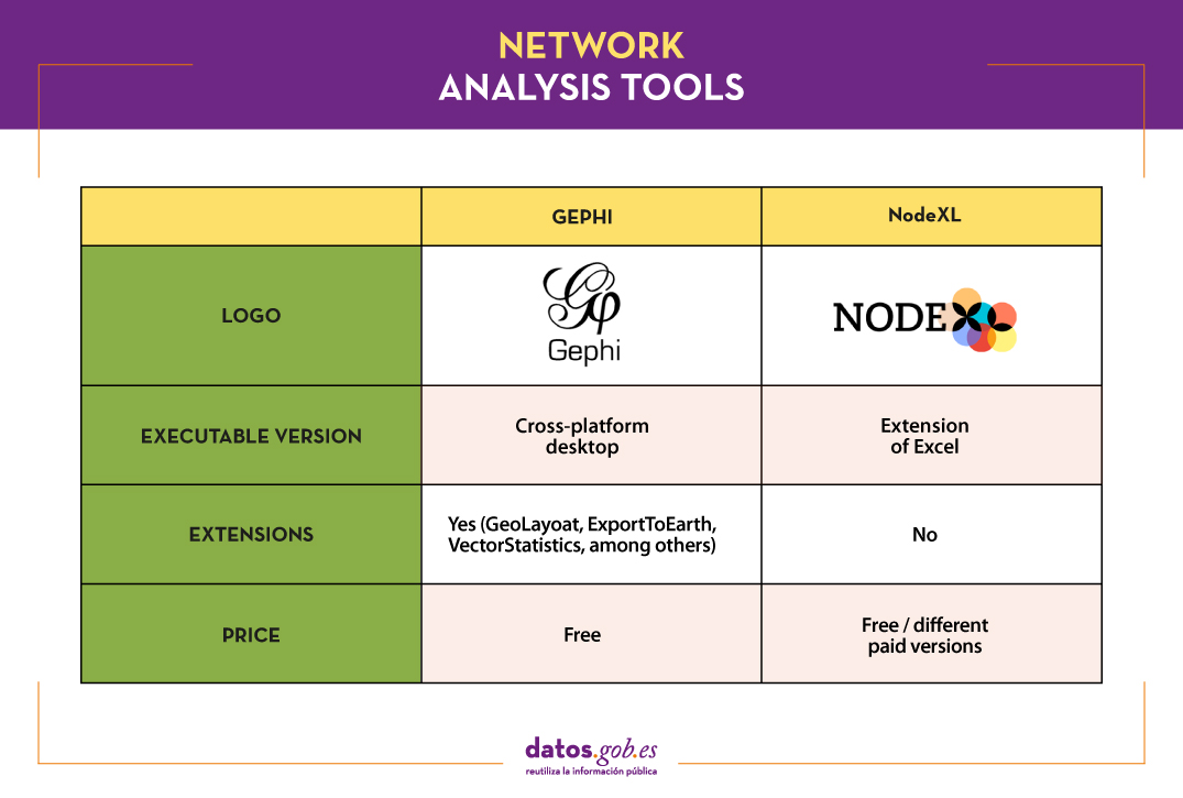
Gephi:
Functionality:
Gephi is an interactive exploration and visualisation software for all types of complex, dynamic and hierarchical networks and graphs, with a modular architecture.
Main advantages:
No programming skills are required to work with Gephi. It can handle large networks (up to 50,000 nodes and one million edges), by partitioning and sorting the graphs. It also supports multiple input formats, common in network analysis, such as GDF (GUESS), GML, Pajek NET, GEXF or GraphML, among others.
Another of its advantages is that it offers a set of statistics associated with network analysis and allows the export of the reports and graphs generated.
Do you want to know more?
- Support materials: On the Gephi website you can find official tutorials and documents produced by the user community, in text or video format. There are documents in several languages, including this one in Spanish, which shows a practical example for users to recreate.
- Repository: There are several repositories on GitHub with resources and tools for Gephi.
- User community: Gephi discussion groups can be found on Stackoverflow.
- Social media: The Twitter account @Gephi shares news and trends in a friendly way. Gephi also has a company profile on LinkedIn.
NodeXL:
Functionality:
NodeXL is a Microsoft Excel extension for graph analysis and representation. It works by displaying graphs from a given list of connections, providing capabilities for analysis and discovery of patterns and relationships between data.
Main advantages:
This tool features direct connections to analyse online social media, and includes connections to query the Twitter, Flickr and Youtube APIs. In addition, it allows automation of tasks.
Do you want to know more?
- Support materials: On the official website of the Social Media Research Foundation, the home of NodeXL, there is a space for tutorials in text and video format. Among other things, we find information on how to work with lists of Twitter users, create a semantic network using the text analysis function or establish video recommendation networks on YouTube. On Slideshare you can also find tutorials such as this introductory one. NodeXL also has a Youtube channel and a blog with examples of use.
- User community: On the official website there are forums where users can ask any questions they may have.
- Social media: The Twitter account @smr_foundation reports on events, webinars and news about the tool. You can also follow the director of the Social Media Research Foundation on LinkedIn, who shares helpful content and use cases, among other things.
The following table gives an overview of the tools mentioned above:
If you want to share your experience with these or other tools, let us know in the comments section.
This article is the latest in a series of tools for data processing, analysis and visualisation. Other issues in the series are:
- The most popular data analysis tools
- The most popular data conversion and data cleaning tools
- The most popular data visualisation tools
- The most popular data visualisation libraries and APIs
- The most popular geospatial visualisation tools
You can find information on all of them in the recently updated report "Data processing and visualisation tools".
Content prepared by the datos.gob.es team.
Blog
Data is a fundamental pillar in business decision making. Before making any decision, it is necessary to analyze the situation to understand the context and envision possible alternatives. And for this it is necessary to present the data in a clear and understandable way.
Data analysis is useless if we cannot get the result to be understood. And the best way to understand the data is to visualize it.
What is data visualization?
Data visualization is a task linked to data analysis whose objective is the graphical representation of the underlying information of the data. For this, basic graphic elements are used, such as line graphs, scatter graphs or heat maps, to complex visualizations configured on a dashboard or control panel.Data visualization allows you to detect patterns, trends or anomalous data, project predictions or communicate inferences derived froml data analysis, among other issues.
Thanks to these representations, people without advanced analytics knowledge can interpret and understand data more easily and make decisions based on them in fields as diverse as marketing, health, science, economics, journalism or even art.
We can divide the data visualization tools into two categories. On the one hand, the generic visualization tools and, on the other, the libraries and visualization APIs, which are more versatile, but require the use of programming languages.In this article we are going to focus on the former.
Top examples of generic data visualization tools
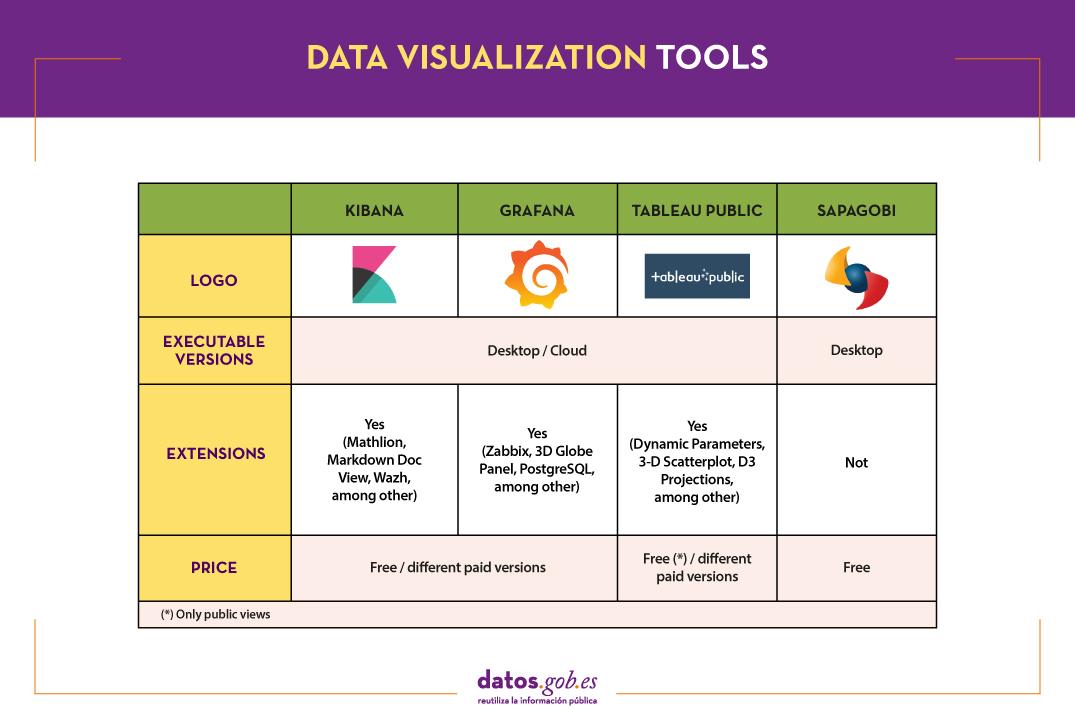
Kibana
Functionality:
Kibana is an open source software that is part of the product package Elastic Stack. Provides indexed data exploration and visualization capabilities on top of the analytics engine Elasticsearch.
Main advantages:
Its main advantage is that it presents the information visually through customizable dashboards, through the integration of faceted filters by ranges, information categories, geospatial coverage or time intervals, among others. In addition, it has a catalog of development tools (Dev Tools) to interact with the data stored in Elasticsearch.
Do you want to know more?
- Support materials: On Elastic's own website we find this user manualIt includes basic concepts to configure Kibana, how to create and customize dashboards, how to interact with Kibana APIs, among others. Elastic also offers short videos on its channel Youtube and organizes, periodically, webinars where various aspects and use cases are explained on Kibana.
- Repository: In this Github you have different resources for its configuration, including plugins, tests and examples.
- User community: There is an official user community in their Web page, although you can also find discussion groups at Stackoverflow.
- Social media: You can follow the Twitter account @elastic to stay up-to-date with Kibana news and discover user experiences, or join their group of LinkedIn.
Tableau Public
Functionality:
Tableau Public is a tool designed to carry out visualizations combining a graphical interface with common elements of the Business Integillence tools, such as the variable organization model through the use of dimensions and the connection with databases or datasets.
Main advantages:
It stands out for its graphic, efficient and fast interface, and for its simple integration of databases or spreadsheets of any size. In addition, it allows the combination of various data sources in a single view.
As a negative point, in order to use the free version, both the data and the views must be published on your website in a public way, eliminating the confidentiality of the information.
Do you want to know more?
- Support materials: Tableau offers a manual with 8 stepsto get started with Tableau Desktop, including everything from connecting to your data to sharing your findings. You can also find on the Tableau website tutorials, a visualization gallery, resources for users (such as podcasts or contests) and a Blog with related articles.
- User community: In the official forum From Tableau you can find more than 450 user groups and answers to more than 195,000 questions.
- Social media: On the Twitter account @tableaupublic Examples of visualizations, experiences, and news information are included. Also available is a group of LinkedIn.
SpagoBI (Knowage)
Functionality:
Grafana allows you to create interactive and dynamic visualizations. Originally started as a component of Kibana, today they are completely independent tools.
Main advantages:
SpagoBI allows you to create customizable and exportable reports in different formats (HTML, PDF, XLS, XML, TXT, CSV and RTF) that can contain tables, cross tables, interactive graphics and text.
Do you want to know more?
- Support materials: On this document you can find an installation manual, an administration manual, a user guide and information about the different functionalities. On his channelYoutubeYou can find different playlists with success stories, examples of visualizations, tutorials on different functionalities or webinars, among others. In the case of webinars, you can also access them fromtheir website, where the agenda with the next appointments is included.
- Repository: On Github there are different repositories with material of interest to SpagoBI users.
- User community: You can find different questions posed by users -and their answers- in Stackoverflow.
- Social media: The user community also has at its disposal a group of LinkedIn. On Twitter, channels coexist @SpagoBI and @knowage_suite, that inform about the news and show examples of work carried out with this tool.
Grafana
Functionality:
Grafana allows you to create interactive and dynamic visualizations. Originally started as a component of Kibana, today they are completely independent tools.
Main advantages:
This tool allows users to interact, exchanging data or dashboards. In addition, it integrates different databases such as: PostgreSQL, MySQL and Elasticsearch, from which you can obtain metrics, filter data or make annotations in real time.
Do you want to know more?
- Support materials: In the Grafana websitethere is multiple information on how to install this tool, create a dashboard or manage alerts. They also have a Blog as well as with webinars and videos, also available in your Youtube channel.
- Repository: From this GitHub you can download packages and resources, like plugins.
- User community: As in some of the previous cases, we found an official community in the own Grafana website, and informal communities in Gitter and Stackoverflow.
- Social media: Twitter account @grafana shows examples of use and helps spread the news highlighted on the blog. Users can also join their group of LinkedIn.
The following table shows a summary of the tools mentioned above:
These are just 4 examples of popular tools fromdata visualization. Soon we will put at your disposal an article with examples of libraries and visualization APIs. We invite you to share your experience with these or other tools in the comments.
If you want to know more about the different phases of data processing, you can see the full report "Data processing and visualization tools", recently updated. In addition, you have at your disposal the following monographic articles:
- The most popular data conversion and data cleaning tools
- The most popular data analysis tools
- The most popular data visualisation libraries and APIs
- The most popular geospatial visualisation tools
- The most popular network analysis tools
Content prepared by the datos.gob.es team.
Blog
Data analysis is a process that allows us to obtain knowledge of the underlying information of the data, with the purpose of drawing conclusions that allow us to make informed decisions. Without data analytics, companies and organizations are limited in examining their results and determining the direction to take to have the best chance of success.
Types of analytics
Within the field of analytics we find different processes that try to respond to the past, present and future of our activities:
- Exploratory analysis, which subjects the data to statistical treatment, to determine why a certain event has occurred.
- Descriptive analysis, which explores the data from different perspectives to find out what happened.
- Predictive analytics, which allows predicting future values of the variables of interest to know what will happen.
- Prescriptive analysis, that offers recommendations when testing the environment variables and suggesting those with the highest probability of generating a positive result.
This article contains a selection of popular data analysis tools that will allow you to perform these tasks, divided based on two target audiences:
- Tools that perform simple analysis and do not involve programming tasks, aimed at users without advanced technical knowledge.
- Tools that present greater versatility, but require the use of programming languages, so they are aimed at users with mathematical and computer knowledge.
It is convenient to remember that before carrying out any analysis of this type it is necessary to transform the data that we use so that they have the same structure and format, free of errors, something that we already saw in the article Data conversion and debugging tools.
Data analysis tools for non-programmers
WEKA
Functionality:
WEKA is a cross-platform machine learning and data mining software. Its functionalities can be accessed through a graphical interface, a command line or a Java API.
Main advantages:
One of its main advantages is that it contains a large number of built-in tools for standard machine learning tasks and allows access to other tools such as scikit-learn, R and Deeplearning4j.
Do you want to know more?
- Support materials: As an appendix to the book Data Mining: Practical Machine Learning: tools and techniques, we found this WEKA manual that brings us closer to its panels and functionalities. It includes methods for the main data mining problems: regression, classification, clustering, association rules, and attribute selection. We also have at our disposal on the net this manual and these tutorials prepared by the University of Waikato, a body that has also launched a Blog on matter.
- Repository: The official WEKA source code is available at this url. You can also access it from this repository Github, as well as different packages or tools.
- User community: You can find user groups in Stackoverflow.
KNIME
Functionality:
KNIME is a data mining software that allows data analysis and visualizations through a graphical interface.
Main advantages:
The graphical interface on which the data analysis flows are modeled uses nodes, which represent the different algorithms and arrows that show the flow of data in the processing pipeline. In addition, it allows incorporating code developed in R and Python, as well as interaction with WEKA.
Do you want to know more?
- Support materials: On KNIME's own website you can find different help documents, that guide you in its installation, the creation of workflows or the use of nodes. In addition, on his channe lYoutube you can find multiple videos, including playlists with basic aspects for users who are facing this tool for the first time.
- Repository: On GitHub Tools are provided to configure the KNIME SDK (Software Development Kit), so that you can work with the source code of the extensions or develop your own.
- User community: KNIME users have groups at their disposal to answer questions in Gitter Y Stackoverflow, as well as a discussion forum on the website of Knime.
- Social media: You can follow the Twitter account @knime and his profile of LinkedIn to keep up to date with KNIME news and related events or talks.
ORANGE
Functionality:
Orange is open machine learning and data mining software, similar to Knime.
Main advantages:
Orange creates the analysis and data visualizations using the drag and drop paradigm from awidget catalog representing different tasks. Also, it can be installed as a Python library.
Do you want to know more?
- Support materials: In this case we highlight two books. First, Introduction to data mining with Orange, which collects the workflows and visualizations of the course on Introduction to Data Mining from Orange himself. Second, Orange Data Mining LibraryDocumentation, a brief introduction to scripting in Orange. You can also find video tutorials on the YouTube channel Orange Data Mining.
- Repository: From this GitHub you can download the necessary resources for its installation.
- User Community: In Gitter, StackExchange and Stackoverflow users have created spaces where they can ask questions and share experiences.
- Social media: On twitter profile@OrangeDataMiner and his LinkedIn account reports, events, use cases and news related to this tool are collected.
Data analysis tools for non-programmers
R (The R Project for statistical computing)
Functionality:
R is an interpreted object-oriented programming language, initially created for statistical computing and the creation of graphical representations.
Main advantages:
R is one of the most used languages in scientific research and this is due to its many advantages:
- It has a programming environment, R-Studio.
- It consists of a set of functions that can be easily expanded by installing libraries or defining custom functions.
- It is permanently updated due to its extensive community of users and programmers, who since its inception contribute to the development of new functions, libraries and updates available to all users freely and for free.
Do you want to know more?
- support materials: Due to its popularity, there are a large number of helpful materials. As an example we highlight the books R for Data Science and R manual. You can also find guides in the web space The R Manuals and the webinars that from the own R Studio they organize.
- User community: There is a discussion space in Stackoverflow. In addition, in Spain, we find two groups that carry out different activities (hackathons, conferences, courses ...) to promote the use of R: R-Hispanic community and R-Ladies. You can know more about them in this article.
- Social media: R has a LinkedIn group with almost 150,000 members.
Python
Funcionalidad:
Python is a dynamic, multi-platform, multi-paradigm interpreted programming language, partially supporting object-oriented programming, structured programming, imperative programming, and functional programming.
Main advantages:
It is a simple programming language. Its philosophy emphasizes providing human-readable, easy-to-use, and easy-to-learn code syntax. In addition, it allows the integration of libraries such as Matplotlib, Bokeh, Numpy, Pandas or spaCy, to implement functions that enable complex interactive graphing and statistical analysis.
Do you want to know more?
- Support materials: As with R, being a very popular language, we find a lot of materials and help on the net, such as tutorials The Python Tutorial Y LearnPython.org, or the portal with videos Pyvideo, where you can find various webinars.
- Repository: In Github you can find different repositories related to the Python programming language.
- Community of users: Those uruaries with questions can seek the help of people in the same situation in Stackoverflow or Gitter. On Python's own website you can also find a large number of communities Worldwide.
- Social media: The official twitter profile of the Python Software Foundation is @ThePSF. There is also group in Linkedin.
GNU Octave
Functionality:
GNU Octave is a programming language designed primarily to solve computational algebra tasks. It is the best known alternative to the commercial MATLAB solution, but free and open. Also, it does not have a graphical interface.
Main advantages:
GNU Octave has powerful built-in mathematical functions (differential equations, linear algebra, matrix calculus) and can be extended with the addition of libraries, such as Scientific Library, Dionysus or Bc. It also has a index package with numerous extensions that enrich the functionality of the tool.
Do you want to know more?
- Support materials: In this link You have the notes of the GNU Octave course from the Complutense University of Madrid. On the GNU Octave website you can also find manuals and on your youtube profile, video tutorials.
- Repository: The GNU Octave developer community has a variety of repositories on Github with materials of interest.
- User Community: In Stackoverflow and in the GNU Octave website there is a space for users to share opinions and experience.
- Social media: You can follow the news related to this tool on the Twitter account @GnuOctave and this group of LinkedIn.
The following table shows a summary of the tools mentioned above:

This is just a selection of data analysis tools, but there are many more. We invite you to share your experience with these or other solutions in the comments.
For those who want to know more about these tools and others that can help us during the different phases of data processing, at datos.gob.es we offer you the recently updated report "Data processing and visualization tools". You can see the full report here.
You can see more tools related to this field in the following monographs:
- The most popular data conversion and data cleaning tools
- The most popular data visualisation tools
- The most popular data visualisation libraries and APIs
- The most popular geospatial visualisation tools
- The most popular network analysis tools
Content prepared by the datos.gob.es team.
Blog
When carrying out a data analysis project, it is usual to work with different sources, which in many cases include datasets with Heterogeneous formats and structures that do not always share the same quality. Therefore, one of the first phases in any data analysis process is known as data cleaning.
What is data cleaning?
When we talk about data cleaning, we refer to the set of processes necessary for the preparation and transformation of data from different sources for analysis. As a result of these processes, a homogeneous structure is generated, free of errors and in the appropriate format, which will be actionable in the subsequent stages of analysis. This resulting data set is known as a data mining view.
Cleannig is essential in data processing, as it standardizes and formats it before entering it into the target system, so that we can work with it appropriately.
Among the different processes that make up the data purification phase, the conversion of the data is included, which involves the transformation of the data to a specific format. In this way they can be used by tools that only accept certain formats.
In the market we find many data cleaning tools that also convert them to other formats, although there are also tools that perform each of these tasks exclusively. Here are some examples selected in phase of their popularity, although we invite you to leave in comments any mention of other tools that may be of interest to you.
Top examples of data cleaning tools
Two of the most used tools in the field of data cleaning are Open Refine and Talend Open Studio.
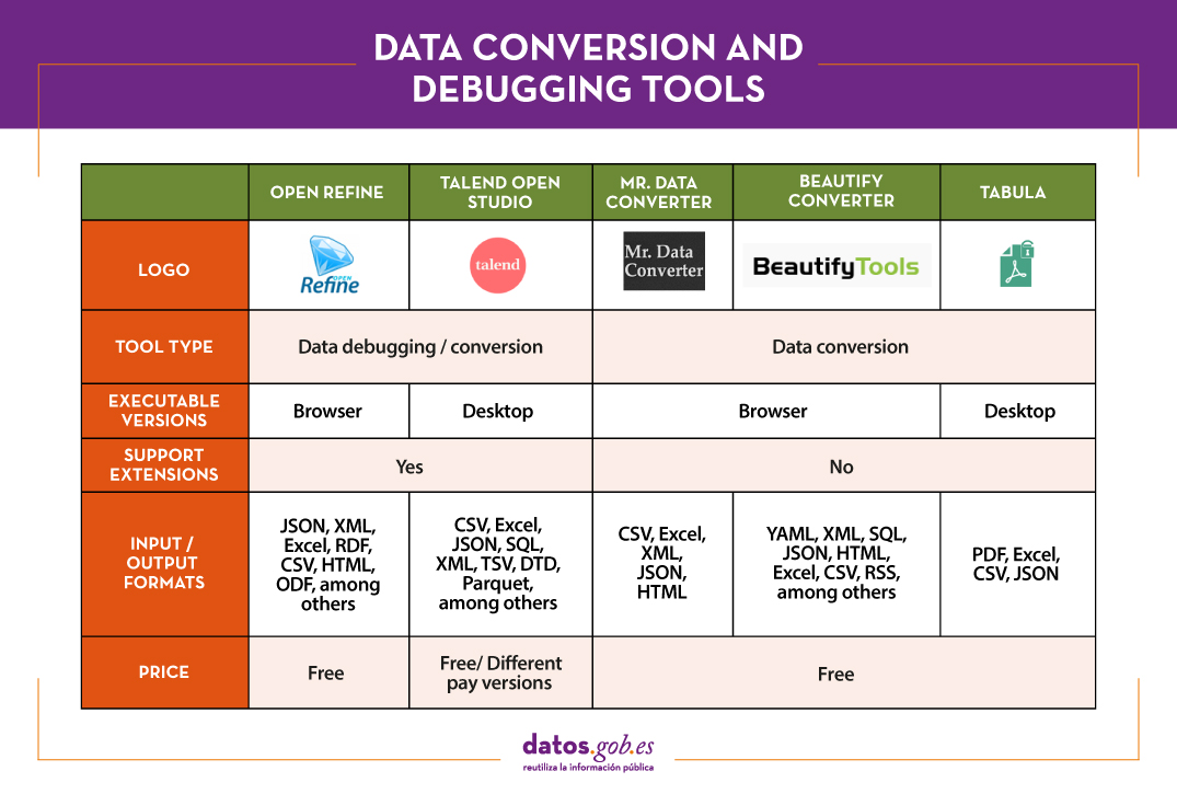
OpenRefine
Functionality:
OpenRefine is a free tool that seeks to improve the quality and structure of the data by correcting common errors such as data duplication, incomplete data or inconsistencies. Thanks to it, users can organize, clean, apply transformations, convert to different formats, and enrich data by using web services and other external data sources.
Main advantages:
One of its main advantages is that it uses the language GREL (Google Refine Expression Language), which allows you to perform advanced debugging tasks by applying a large number of functions using regular expressions. In addition, it allows incorporating additional extensions by accessing functions to georeference information, link data from the DBpedia or other sources, generating data linked in RDF.
Do you want to know more?
- Support materials: In this user manual all aspects of configuring and using Open Refine 3.4.1 are covered, including all functions and features of the interface and this youtube account different video-tutorials.
- Repository: In this GitHub there are the necessary resources so that you can operate OpenRefine from Mac OS, Linux and Windows.
- User community:OpenRefine users can find discussion groups atGoogle, and Stackoverflow.
- Social media:On the Twitter account of @OpenRefine You can find videos, guides, information about the latest news or upcoming events related to OpenRefine.
Talend Open Studio
Functionality:
Talend Open Studio is an open source solution that integrates a set of ETL (Extract, Transform and Load) tools designed to extract, debug and transform data sets for further analysis. As a result, it generates standardized code in Perl and Java that can be reused in different projects.
Main advantages:
This tool stands out for its intuitive interface based on component programming, a technique that consists of concatenating processes with various functionalities through input and output flows.
Do you want to know more?
- Support materials: On Talend's own website you can find different user manuals Y tutorials to discover Talend Studio and its interface, and create a project, along with simple sample jobs.
- Repository: This GitHub contains the Talend Open Studio source files, which files should be used in conjunction with the common code contained in tcommon-studio-se
- User community: OnStackoverflow There are channels where users share their experience and ask different questions.
- Social media: Talend Open Studio has a page of LinkedIn and the perfil@Talend on Twitter, where they share news, experiences and use cases, among others.
Top Examples of Data Conversion Tools
In the case of data conversion, Mr Data Converter, Beautify Converters and Tabula stand out for their popularity.
Mr Data Converter
Functionality:
Mr Data Converter is a web application that allows you to easily convert data found in CSV or Excel to other formats such as CSV, JSON, HTML and XML.
Main advantages:
One of its strengths is that the data is incorporated by copying and pasting on the application interface, without the need to upload any files. The same happens when exporting, where it is enough to copy and paste the generated code. On the negative side of the scale, we find a limitation in the maximum size of the data, which should not exceed 300 MB.
Do you want to know more?
- Repository: You can find information about the license and different materials in this GitHub.
Beautify Converters
Functionality:
Beautify Converters a web application that allows you to convert data to JSON, SQL, CSV or Excel formats, among others. It belongs to the Beautify Tools collection of free online tools.
Main advantages:
As with Mr Data Converter, the user can incorporate the data by copying and pasting on the application interface. You can also do this by uploading the file from a local computer. Unlike the previous tool, it supports a significantly higher number of formats, SQL, YAML or RSS.
Do you want to know more?
- Repository: In this repository GitHub You have information about the license and the rest of the tools in the Beautify Tools collection.
Tabula
Functionality:
Tabula allows you to extract tables from PDF reports -except for those that are only image-, in formats reusable by data analysis and visualization tools.
Main advantages:
Its main advantage is a very simple interface. It will only be necessary to upload the PDF, select the tables that we want to extract and finally select the desired format, Excel, CSV or JSON.
Do you want to know more?
- Support materials: The Junta de Andalucía has developed thistutorialwhere it tells how to upload a PDF file to Tabula and extract the tabular data in CSV format, ready for use in spreadsheets. The process is exemplified with the data setSanitary quality of bathing water.
- Repository: You can download the materials from this link or GitHub.
- Social media: Twitter. Account @TabulaPDF Although it is not very up-to-date, it offers, among others, information on bug fixes and maintenance, guides and comments from users who use this tool.
The following table shows a summary of the tools mentioned above:
The adaptation and conversion of the data can consume a great amount of resources, economic and temporary, of any project. These types of tools help to carry out these activities with agility and efficiency, freeing up data scientists to focus on other activities.
For those who want to know more about these tools and others that can help us during the different phases of data processing, at datos.gob.es we offer you the recently updated report "Data processing and visualization tools". You can see the full report here.
You can see more tools related to this field in the following monographs:
- The most popular data analysis tools
- The most popular data visualisation tools
- The most popular data visualisation libraries and APIs
- The most popular geospatial visualisation tools
- The most popular network analysis tools
Content prepared by the datos.gob.es team.
Blog
Data science is reaching all sectors, from agriculture to health, tourism or transport. And culture, as illustrated by the DataLab of Juan March Foundation, a knowledge laboratory that not only seeks to manage and disseminate the contents from the Library, but also extracts valuable information that can be used to optimize processes, take better decisions or create new services.
This DataLab was created in 2013, collecting the experiences learned in the Data Library of the former Center for Advanced Studies in Social Sciences (CEACS) of Juan March Institute. The DataLab was born inside the Juan March Foundation Library in order to lead the organization of digital knowledge produced by the Library itself and the rest of the Foundation's areas, dealing with the structure, curation and analytics of digital data.
The challenge was big. The Foundation had been created in 1955, and, since then, it had accumulated a valuable collection composed of contents with different formats: videos, images, audios, texts... in addition to the large amount of knowledge organized and conserved for internal purposes in the Foundation's departments.
In order to face this challenge, a multidisciplinary team was chosen, integrating librarians, technologists and mathematicians. Using technologies and methodologies specific to data science, they were able to explore new ways of analyzing and visualizing information.
Specifically, the DataLab has 4 areas of action:
- Data curation: One of the main tasks of this DataLab is the management and continuous maintenance of the digital repositories property of Juan March Foundation. Their responsibilities include the classification, documentation, storage, integration and digital preservation of data. Currently these data are disseminated through thematic knowledge portals (for example, focused on contemporary Spanish music or Spanish musical theater), visited by an average of 10,000 users per month, including researchers and specialists in social sciences and humanities that look for an inspiration source for new projects.
- Analytics: One of the new features of this DataLab is its commitment to analytics applied to cultural data. On the one hand, they apply analytical technologies to data curation, which results in automated processes that facilitate the classification of information. On the other hand, they also make use of data analytically. In other words, the DataLab functions as a transversal service that provides business intelligence to other Foundation's areas, through the creation of scorecards and the resolution of specific requests for information and analysis.
- Infrastructure: To implement a project of this magnitude, it was necessary to create an entire technological infrastructure that allow capturing data from different sources, organizing and structuring to take advantage using different tools and processes. Therefore, they are in a continuous process of development to redifine data capture, normalization, analysis and enrichment. All this is carried out using specialized Big Data environments in the cloud.
- Innovation. One of the fundamental pillars of this DataLab is the experimentation with new technologies that can provide an additional value layer to data. For example, data capture processes are enriched thanks to Artificial Intelligence tools, which carry out from sentiment analysis of social media to content transcriptions and automatic classifications.
All this work has resulted in a project in continuous evolution and growth, which makes valuable information available to users, demonstrating the potential of data science applied to culture.
Empresa reutilizadora
A company dedicated to business and technology information for companies. Its main mission is to help companies around the world, with advanced analytics solutions and data integration tools, to identify business opportunities and potential risks of non-payment through business information, predictive models and propensity to buy; so that the areas of finance, risk, marketing, sales, purchasing and logistics can identify opportunities and potential risks of non-payment through business information, predictive models and propensity to buy; so that the areas of finance, risk, marketing, sales, purchasing and logistics can identify opportunities and potential risks of non-payment:
- Find new and good customers.
- Analyse the financial health of companies.
- Minimise the risk of non-payment of commercial transactions.
Iberinform is a subsidiary of Crédito y Caución, a global credit insurance operator with a presence in more than 50 countries.
Empresa reutilizadora
Axesor is a service company specialising in credit risk management, business knowledge, financial and marketing systems.
- A company of the Experian group, an international global information services company, with 17,800 people operating in 45 countries.
- Axesor has an offer adapted to all kinds of clients, with an important penetration in multinationals.
Its main objectives include:
- Maximising savings for companies by reducing their bad debts and average collection periods, optimising their resources and management times, thanks to advanced management of commercial credit risk.
- Improve companies' Marketing and Expansion Plans, through an exhaustive analysis of their environment and competition, as well as a better knowledge of clients.
- Optimising the resources of companies, taking on their procedures with the Public Administrations.
Empresa reutilizadora
Betterplace is a technology company specializing in Location Intelligence, whose technology extracts and analyzes business information that, combined with public and private data, helps users to optimize time and resources in their day-to-day business. In his own words: "we turn tables into maps to guide decision-making".
Empresa reutilizadora
Clikalia is a Spanish proptech that was born with the aim of converting the complex and slow processes of buying and selling real estate, in simple and fast processes providing immediate liquidity to sellers buying their home in just seven days. The key to its success lies in its strong commitment to technology and the digitalization of all its processes.