Blog
2023 was a year full of new developments in artificial intelligence, algorithms and data-related technologies. Therefore, these Christmas holidays are a good time to take advantage of the arrival of the Three Wise Men and ask them for a book to enjoy reading during the holidays, the well-deserved rest and the return to routine after the holiday period.
Whether you are looking for a reading that will improve your professional profile, learn about new technological developments and applications linked to the world of data and artificial intelligence, or if you want to offer your loved ones a didactic and interesting gift, from datos.gob.es we want to offer you some examples. For the elaboration of the list we have counted on the opinion of experts in the field.
Take paper and pencil because you still have time to include them in your letter to the Three Wise Men!
1. Inteligencia Artificial: Ficción, Realidad y... sueños, Nuria Oliver, Real Academia de Ingeniería GTT (2023)
What it’s about: The book has its origin in the author's acceptance speech to the Royal Academy of Engineering. In it, she explores the history of AI, its implications and development, describes its current impact and raises several perspectives.
Who should read it: It is designed for people interested in entering the world of Artificial Intelligence, its history and practical applications. It is also aimed at those who want to enter the world of ethical AI and learn how to use it for social good.
2. A Data-Driven Company. 21 Claves para crear valor a través de los datos y de la Inteligencia Artificial, Richard Benjamins, Lid Editorial (2022)
What it's about: A Data-Driven Company looks at 21 key decisions companies need to face in order to become a data-driven, AI-driven enterprise. It addresses the typical organizational, technological, business, personnel, business, and ethical decisions that organizations must face to start making data-driven decisions, including how to fund their data strategy, organize teams, measure results, and scale.
Who should read it: It is suitable for professionals who are just starting to work with data, as well as for those who already have experience, but need to adapt to work with big data, analytics or artificial intelligence.
3. Digital Empires: The Global Battle to Regulate Technology, Anu Bradford, OUP USA (2023)
What it's about: In the face of technological advances around the world and the arrival of corporate giants spread across international powers, Bradford examines three competing regulatory approaches: the market-driven U.S. model, the state-driven Chinese model, and the rights-based European regulatory model. It examines how governments and technology companies navigate the inevitable conflicts that arise when these regulatory approaches clash internationally.
Who should read it: This is a book for those who want to learn more about the regulatory approach to technologies around the world and how it affects business. It is written in a clear and understandable way, despite the complexity of the subject. However, the reader will need to know English, because it has not yet been translated into Spanish.
4. El mito del algoritmo, Richard Benjamins e Idoia Salazar, Anaya Multimedia (2020)
What it's about: Artificial intelligence and its exponential use in multiple disciplines is causing an unprecedented social change. With it, philosophical thoughts as deep as the existence of the soul or debates related to the possibility of machines having feelings are beginning to emerge. This is a book to learn about the challenges, challenges and opportunities of this technology.
Who should read it: It is aimed at people with an interest in the philosophy of technology and the development of technological advances. By using simple and enlightening language, it is a book within the reach of a general public.
5. ¿Cómo sobrevivir a la incertidumbre?, de Anabel Forte Deltell, Next Door Publishers
What it is about: It explains in a simple way and with examples how statistics and probability are more present in daily life. The book starts from the present day, in which data, numbers, percentages and graphs have taken over our daily lives and have become indispensable for making decisions or for understanding the world around us.
Who should read it: A general public that wants to understand how the analysis of data, statistics and probability are shaping a large part of political, social, economic and social decisions?
6. Análisis espacial con R: Usa R como un Sistema de Información Geográfica, Jean François Mas, European Scientific Institute
What it is about: This is a more technical book, which provides a brief introduction to the main concepts for handling the R programming language and environment (types of objects and basic operations) and then introduces the reader to the use of the sf library or package for spatial data in vector format through its main functions for reading, writing and analysis. The book approaches, from a practical and applicative perspective with an easy-to-understand language, the first steps to get started with the use of R in spatial analysis applications; for this, it is necessary that users have basic knowledge of Geographic Information Systems.
Who should read it: A public with some knowledge of R and basic knowledge of GIS who wish to enter the world of spatial analysis applications.
This is just a small sample of the great variety of existing literature related to the world of data. We are sure that we have left some interesting book without including it, so if you have any extra recommendation you would like to make, do not hesitate to leave us your favorite title in the comments. Those of us on the datos.gob.es team would be delighted to read your recommendations.
Blog
We are currently in the midst of an unprecedented race to master innovations in Artificial Intelligence. Over the past year, the star of the show has been Generative Artificial Intelligence (GenAI), i.e., that which is capable of generating original and creative content such as images, text or music. But advances continue to come and go, and lately news is beginning to arrive suggesting that the utopia of Artificial General Intelligence (AGI) may not be as far away as we thought. We are talking about machines capable of understanding, learning and performing intellectual tasks with results similar to those of the human brain.
Whether this is true or simply a very optimistic prediction, a consequence of the amazing advances achieved in a very short space of time, what is certain is that Artificial Intelligence already seems capable of revolutionizing practically all facets of our society based on the ever-increasing amount of data used to train it.
And the fact is that if, as Andrew Ng argued back in 2017, artificial intelligence is the new electricity, open data would be the fuel that powers its engine, at least in a good number of applications whose main and most valuable source is public information that is accessible for reuse. In this article we will review a field in which we are likely to see great advances in the coming years thanks to the combination of artificial intelligence and open data: artistic creation.
Generative Creation Based on Open Cultural Data
The ability of artificial intelligence to generate new content could lead us to a new revolution in artistic creation, driven by access to open cultural data and a new generation of artists capable of harnessing these advances to create new forms of painting, music or literature, transcending cultural and temporal barriers.
Music
The world of music, with its diversity of styles and traditions, represents a field full of possibilities for the application of generative artificial intelligence. Open datasets in this field include recordings of folk, classical, modern and experimental music from all over the world and from all eras, digitized scores, and even information on documented music theories. From the arch-renowned MusicBrainz, the open music encyclopedia, to datasets opened by streaming industry dominators such as Spotify or projects such as Open Music Europe, these are some examples of resources that are at the basis of progress in this area. From the analysis of all this data, artificial intelligence models can identify unique patterns and styles from different cultures and eras, fusing them to create unpublished musical compositions with tools and models such as OpenAI's MuseNet or Google's Music LM.
Literature and painting
In the realm of literature, Artificial Intelligence also has the potential to make not only the creation of content on the Internet more productive, but to produce more elaborate and complex forms of storytelling. Access to digital libraries that house literary works from antiquity to the present day will make it possible to explore and experiment with literary styles, themes and storytelling archetypes from diverse cultures throughout history, in order to create new works in collaboration with human creativity itself. It will even be possible to generate literature of a more personalized nature to the tastes of more minority groups of readers. The availability of open data such as the Guttemberg Project with more than 70,000 books or the open digital catalogs of museums and institutions that have published manuscripts, newspapers and other written resources produced by mankind, are a valuable resource to feed the learning of artificial intelligence.
The resources of the Digital Public Library of America1 (DPLA) in the United States or Europeana in the European Union are just a few examples. These catalogs not only include written text, but also vast collections of visual works of art, digitized from the collections of museums and institutions, which in many cases cannot even be admired because the organizations that preserve them do not have enough space to exhibit them to the public. Artificial intelligence algorithms, by analyzing these works, discover patterns and learn about artistic techniques, styles and themes from different cultures and historical periods. This makes it possible for tools such as DALL-E2 or Midjourney to create visual works from simple text instructions with aesthetics of Renaissance painting, Impressionist painting or a mixture of both.
However, these fascinating possibilities are accompanied by a still unresolved controversy about copyright that is being debated in academic, legal and juridical circles and that poses new challenges to the definition of authorship and intellectual property. On the one hand, there is the question of the ownership of rights over creations produced by artificial intelligence. On the other hand, there is the use of datasets containing copyrighted works that have been used in the training of models without the consent of the authors. On both issues there are numerous legal disputes around the world and requests for explicit removal of content from the main training datasets.
In short, we are facing a field where the advance of artificial intelligence seems unstoppable, but we must be very aware not only of the opportunities, but also of the risks involved.
Content prepared by Jose Luis Marín, Senior Consultant in Data, Strategy, Innovation & Digitalization. The contents and points of view reflected in this publication are the sole responsibility of its author.
Noticia
Mark them on your calendar, make a note in your agenda, or set reminders on your mobile to not forget about this list of events on data and open government taking place this autumn. This time of year brings plenty of opportunities to learn about technological innovation and discuss the transformative power of open data in society.
From practical workshops to congresses and keynote speeches, in this post, we present some of the standout events happening in October and November. Sign up before the slots fill up!
Data spaces in the EU: synergies between data protection and data spaces
At the beginning of the tenth month of the year, the Spanish Data Protection Agency (AEPD) and the European Cybersecurity Agency (ENISA) will hold an event in English to address the challenges and opportunities of implementing the provisions of the General Data Protection Regulation (GDPR) in EU data spaces.
During the conference, the conference will review best practices of existing EU data spaces, analyse the interaction between EU legislation and policies on data exchange and present data protection engineering as an integral element in the structure of data spaces, as well as its legal implications.
- Who is it aimed at? This event promises to be a platform for knowledge and collaboration of interest to anyone interested in the future of data in the region.
- When and where is it? On October 2nd in Madrid from 9:30 AM to 6:00 PM and available for streaming with prior registration until 2:45 PM.
- Registration: link no longer available
SEMIC Conference 'Interoperable Europe in the age of AI'
Also in October, the annual SEMIC conference organised by the European Commission in collaboration with the Spanish Presidency of the Council of the European Union returns. This year's event takes place in Madrid and will explore how interoperability in the public sector and artificial intelligence can benefit each other through concrete use cases and successful projects.
Sessions will address the latest trends in data spaces, digital governance, data quality assurance and generative artificial intelligence, among others. In addition, a proposal for an Interoperable Europe Act will be presented.
- Who is it aimed at? Public or private sector professionals working with data, governance and/or technology. Last year's edition attracted more than 1,000 professionals from 60 countries.
- When and where is it? The conference will be held on October 18th at the Hotel Riu Plaza in Madrid and can also be followed online. Pre-conference workshops will take place on October 17th at the National Institute of Public Administration
- Registration: https://semic2023.eu/registration/

Data and AI in action: sustainable impact and future realities
From October 25th to 27th, an event on the value of data in artificial intelligence is taking place in Valencia, with the collaboration of the European Commission and the Spanish Presidency of the Council of the European Union, among others.
Over the course of the three days, approximately one-hour presentations will be given on a variety of topics such as sectoral data spaces, the data economy and cybersecurity.
- Who is it aimed at? Members of the European Big Data Value Forum will receive a discounted entrance fee and associate members receive three tickets per organisation. The ticket price varies from 120 to 370 euros.
- When and where is it? It will take place on October 25th, 26th and 27th in Valencia.
- Registration: bipeek.
European Webinars: open data for research, regional growth with open data and data spaces
The European Open Data Portal organises regular webinars on open data projects and technologies. In datos.gob.es we report on this in summary publications on each session or in social networks. In addition, once the event is over, the materials used to carry out the didactic session are published. The October events calendar is now available on the portal's website. Sign up to receive a reminder of the webinar and, subsequently, the materials used.
Data spaces: Discovering block architecture
- When? On October 6th from 10:00 AM to 11:30 AM
- Registration: data.europa academy 'Data spaces: Discovering the building blocks' (clickmeeting.com)
How to use open data in your research?
- When? On October 19th from 10:00 AM to 11:30 AM
- Registration: How to use open data for your research (clickmeeting.com)
Open Data Maturity Report: The in-depth impact dimension
- When? On October 27th from 10:00 AM to 11.30 AM
- Registration: data.europa academy 'Open Data Maturity 2022: Diving deeper into the impact dimension' (clickmeeting.com)
ODI SUMMIT 2023: Changes in data
November starts with an Open Data Institute (ODI) event that poses the following question by way of introduction: how does data impact on technology development to address global challenges? For society to benefit from such innovative technologies as artificial intelligence, data is needed.
This year's ODI SUMMIT features speakers of the calibre of World Wide Web founder Tim Berners-Lee, Women Income Network co-founder Alicia Mbalire and ODI CEO Louise Burke. It is a free event with prior registration.
- Who is it aimed at? Teachers, students, industry professionals and researchers are welcome to attend the event.
- When and where is it? It is on November 7th, online.
- Entry: Form (hsforms.com)
These are some of the events that are scheduled for this autumn. Anyway, don't forget to follow us on social media so you don't miss any news about innovation and open data. We are on Twitter and LinkedIn; you can also write to us at dinamizacion@datos.gob.es if you want us to add any other event to the list or if you need extra information.
Documentación
1. Introduction
Visualizations are graphical representations of data that allow the information linked to them to be communicated in a simple and effective way. The visualization possibilities are very wide, from basic representations, such as line, bar or sector graphs, to visualizations configured on interactive dashboards.
In this "Step-by-Step Visualizations" section we are regularly presenting practical exercises of open data visualizations available in datos.gob.es or other similar catalogs. They address and describe in a simple way the stages necessary to obtain the data, perform the transformations and analyses that are relevant to, finally, enable the creation of interactive visualizations that allow us to obtain final conclusions as a summary of said information. In each of these practical exercises, simple and well-documented code developments are used, as well as tools that are free to use. All generated material is available for reuse in the GitHub Data Lab repository.
Then, and as a complement to the explanation that you will find below, you can access the code that we will use in the exercise and that we will explain and develop in the following sections of this post.
Access the data lab repository on Github.
Run the data pre-processing code on top of Google Colab.
2. Objetive
The main objective of this exercise is to show how to perform a network or graph analysis based on open data on rental bicycle trips in the city of Madrid. To do this, we will perform a preprocessing of the data in order to obtain the tables that we will use next in the visualization generating tool, with which we will create the visualizations of the graph.
Network analysis are methods and tools for the study and interpretation of the relationships and connections between entities or interconnected nodes of a network, these entities being persons, sites, products, or organizations, among others. Network analysis seeks to discover patterns, identify communities, analyze influence, and determine the importance of nodes within the network. This is achieved by using specific algorithms and techniques to extract meaningful insights from network data.
Once the data has been analyzed using this visualization, we can answer questions such as the following:
- What is the network station with the highest inbound and outbound traffic?
- What are the most common interstation routes?
- What is the average number of connections between stations for each of them?
- What are the most interconnected stations within the network?
3. Resources
3.1. Datasets
The open datasets used contain information on loan bike trips made in the city of Madrid. The information they provide is about the station of origin and destination, the time of the journey, the duration of the journey, the identifier of the bicycle, ...
These open datasets are published by the Madrid City Council, through files that collect the records on a monthly basis.
These datasets are also available for download from the following Github repository.
3.2. Tools
To carry out the data preprocessing tasks, the Python programming language written on a Jupyter Notebook hosted in the Google Colab cloud service has been used.
"Google Colab" or, also called Google Colaboratory, is a cloud service from Google Research that allows you to program, execute and share code written in Python or R on a Jupyter Notebook from your browser, so it does not require configuration. This service is free of charge.
For the creation of the interactive visualization, the Gephi tool has been used.
"Gephi" is a network visualization and analysis tool. It allows you to represent and explore relationships between elements, such as nodes and links, in order to understand the structure and patterns of the network. The program requires download and is free.
If you want to know more about tools that can help you in the treatment and visualization of data, you can use the report "Data processing and visualization tools".
4. Data processing or preparation
The processes that we describe below you will find them commented in the Notebook that you can also run from Google Colab.
Due to the high volume of trips recorded in the datasets, we defined the following starting points when analysing them:
- We will analyse the time of day with the highest travel traffic
- We will analyse the stations with a higher volume of trips
Before launching to analyse and build an effective visualization, we must carry out a prior treatment of the data, paying special attention to its obtaining and the validation of its content, making sure that they are in the appropriate and consistent format for processing and that they do not contain errors.
As a first step of the process, it is necessary to perform an exploratory analysis of the data (EDA), in order to properly interpret the starting data, detect anomalies, missing data or errors that could affect the quality of subsequent processes and results. If you want to know more about this process you can resort to the Practical Guide of Introduction to Exploratory Data Analysis
The next step is to generate the pre-processed data table that we will use to feed the network analysis tool (Gephi) that will visually help us understand the information. To do this, we will modify, filter and join the data according to our needs.
The steps followed in this data preprocessing, explained in this Google Colab Notebook, are as follows:
- Installation of libraries and loading of datasets
- Exploratory Data Analysis (EDA)
- Generating pre-processed tables
You will be able to reproduce this analysis with the source code that is available in our GitHub account. The way to provide the code is through a document made on a Jupyter Notebook that, once loaded into the development environment, you can easily run or modify.
Due to the informative nature of this post and to favour the understanding of non-specialized readers, the code is not intended to be the most efficient but to facilitate its understanding, so you will possibly come up with many ways to optimize the proposed code to achieve similar purposes. We encourage you to do so!
5. Network analysis
5.1. Definition of the network
The analysed network is formed by the trips between different bicycle stations in the city of Madrid, having as main information of each of the registered trips the station of origin (called "source") and the destination station (called "target").
The network consists of 253 nodes (stations) and 3012 edges (interactions between stations). It is a directed graph, because the interactions are bidirectional and weighted, because each edge between the nodes has an associated numerical value called "weight" which in this case corresponds to the number of trips made between both stations.
5.2. Loading the pre-processed table in to Gephi
Using the "import spreadsheet" option on the file tab, we import the previously pre-processed data table in CSV format. Gephi will detect what type of data is being loaded, so we will use the default predefined parameters.


5.3. Network display options
5.3.1 Distribution window
First, we apply in the distribution window, the Force Atlas 2 algorithm. This algorithm uses the technique of node repulsion depending on the degree of connection in such a way that the sparsely connected nodes are separated from those with a greater force of attraction to each other.
To prevent the related components from being out of the main view, we set the value of the parameter "Severity in Tuning" to a value of 10 and to avoid that the nodes are piled up, we check the option "Dissuade Hubs" and "Avoid overlap".

Dentro de la ventana de distribución, también aplicamos el algoritmo de Expansión con la finalidad de que los nodos no se encuentren tan juntos entre sí mismos.

Figure 3. Distribution window - Expansion algorithm
5.3.2 Appearance window
Next, in the appearance window, we modify the nodes and their labels so that their size is not equal but depends on the value of the degree of each node (nodes with a higher degree, larger visual size). We will also modify the colour of the nodes so that the larger ones are a more striking colour than the smaller ones. In the same appearance window we modify the edges, in this case we have opted for a unitary colour for all of them, since by default the size is according to the weight of each of them.
A higher degree in one of the nodes implies a greater number of stations connected to that node, while a greater weight of the edges implies a greater number of trips for each connection.

5.3.3 Graph window
Finally, in the lower area of the interface of the graph window, we have several options such as activating / deactivating the button to show the labels of the different nodes, adapting the size of the edges in order to make the visualization cleaner, modify the font of the labels, ...

Next, we can see the visualization of the graph that represents the network once the visualization options mentioned in the previous points have been applied.

Figure 6. Graph display
Activating the option to display labels and placing the cursor on one of the nodes, the links that correspond to the node and the rest of the nodes that are linked to the chosen one through these links will be displayed.
Next, we can visualize the nodes and links related to the bicycle station "Fernando el Católico". In the visualization, the nodes that have a greater number of connections are easily distinguished, since they appear with a larger size and more striking colours, such as "Plaza de la Cebada" or "Quevedo".

5.4 Main network measures
Together with the visualization of the graph, the following measurements provide us with the main information of the analysed network. These averages, which are the usual metrics when performing network analytics, can be calculated in the statistics window.

- Nodes (N): are the different individual elements that make up a network, representing different entities. In this case the different bicycle stations. Its value on the network is 243
- Links (L): are the connections that exist between the nodes of a network. Links represent the relationships or interactions between the individual elements (nodes) that make up the network. Its value in the network is 3014
- Maximum number of links (Lmax): is the maximum possible number of links in the network. It is calculated by the following formula Lmax= N(N-1)/2. Its value on the network is 31878
- Average grade (k): is a statistical measure to quantify the average connectivity of network nodes. It is calculated by averaging the degrees of all nodes in the network. Its value in the network is 23.8
- Network density (d): indicates the proportion of connections between network nodes to the total number of possible connections. Its value in the network is 0.047
- Diámetro (dmax ): is the longest graph distance between any two nodes of the res, i.e., how far away the 2 nodes are farther apart. Its value on the network is 7
- Mean distance (d):is the average mean graph distance between the nodes of the network. Its value on the network is 2.68
- Mean clustering coefficient (C): Indicates how nodes are embedded between their neighbouring nodes. The average value gives a general indication of the grouping in the network. Its value in the network is 0.208
- Related component: A group of nodes that are directly or indirectly connected to each other but are not connected to nodes outside that group. Its value on the network is 24
5.5 Interpretation of results
The probability of degrees roughly follows a long-tail distribution, where we can observe that there are a few stations that interact with a large number of them while most interact with a low number of stations.
The average grade is 23.8 which indicates that each station interacts on average with about 24 other stations (input and output).
In the following graph we can see that, although we have nodes with degrees considered as high (80, 90, 100, ...), it is observed that 25% of the nodes have degrees equal to or less than 8, while 75% of the nodes have degrees less than or equal to 32.

The previous graph can be broken down into the following two corresponding to the average degree of input and output (since the network is directional). We see that both have similar long-tail distributions, their mean degree being the same of 11.9
Its main difference is that the graph corresponding to the average degree of input has a median of 7 while the output is 9, which means that there is a majority of nodes with lower degrees in the input than the output.


The value of the average grade with weights is 346.07 which indicates the average of total trips in and out of each station.

The network density of 0.047 is considered a low density indicating that the network is dispersed, that is, it contains few interactions between different stations in relation to the possible ones. This is considered logical because connections between stations will be limited to certain areas due to the difficulty of reaching stations that are located at long distances.
The average clustering coefficient is 0.208 meaning that the interaction of two stations with a third does not necessarily imply interaction with each other, that is, it does not necessarily imply transitivity, so the probability of interconnection of these two stations through the intervention of a third is low.
Finally, the network has 24 related components, of which 2 are weak related components and 22 are strong related components.
5.6 Centrality analysis
A centrality analysis refers to the assessment of the importance of nodes in a network using different measures. Centrality is a fundamental concept in network analysis and is used to identify key or influential nodes within a network. To perform this task, you start from the metrics calculated in the statistics window.
- The degree centrality measure indicates that the higher the degree of a node, the more important it is. The five stations with the highest values are: 1º Plaza de la Cebada, 2º Plaza de Lavapiés, 3º Fernando el Católico, 4º Quevedo, 5º Segovia 45.

- The closeness centrality indicates that the higher the proximity value of a node, the more central it is, since it can reach any other node in the network with the least possible effort. The five stations with the highest values are: 1º Fernando el Católico 2º General Pardiñas, 3º Plaza de la Cebada, 4º Plaza de Lavapiés, 5º Puerta de Madrid.


- The measure of betweenness centrality indicates that the greater the intermediation measure of a node, the more important it is since it is present in more interaction paths between nodes than the rest of the nodes in the network. The five stations with the highest values are: 1º Fernando el Católico, 2º Plaza de Lavapiés, 3º Plaza de la Cebada, 4º Puerta de Madrid, 5º Quevedo.

 FIgure 16. Graphic visualization betweenness centrality
With the Gephi tool you can calculate a large number of metrics and parameters that are not reflected in this study, such as the eigenvector measure or centrality distribution "eigenvector".
5.7 Filters
Through the filtering window, we can select certain parameters that simplify the visualizations in order to show relevant information of network analysis in a clearer way visually.

Next, we will show several filtered performed:
- Range (grade) filtering, which shows nodes with a rank greater than 50, assuming 13.44% (34 nodes) and 15.41% (464 edges).

- Edge filtering (edge weight), showing edges weighing more than 100, assuming 0.7% (20 edges).

Within the filters window, there are many other filtering options on attributes, ranges, partition sizes, edges, ... with which you can try to make new visualizations to extract information from the graph. If you want to know more about the use of Gephi, you can consult the following courses and trainings about the tool.
6. Conclusions of the exercice
Once the exercise is done, we can appreciate the following conclusions:
- The three stations most interconnected with other stations are Plaza de la Cebada (133), Plaza de Lavapiés (126) and Fernando el Católico (114).
- The station that has the highest number of input connections is Plaza de la Cebada (78), while the one with the highest number of exit connections is Plaza de Lavapiés with the same number as Fernando el Católico (57).
- The three stations with the highest number of total trips are Plaza de la Cebada (4524), Plaza de Lavapiés (4237) and Fernando el Católico (3526).
- There are 20 routes with more than 100 trips. Being the 3 routes with a greater number of them: Puerta de Toledo – Plaza Conde Suchil (141), Quintana Fuente del Berro – Quintana (137), Camino Vinateros – Miguel Moya (134).
- Taking into account the number of connections between stations and trips, the most important stations within the network are: Plaza la Cebada, Plaza de Lavapiés and Fernando el Católico.
We hope that this step-by-step visualization has been useful for learning some very common techniques in the treatment and representation of open data. We will be back to show you further reuses. See you soon!
Blog
In the process of analysing data and training machine learning models, it is essential to have an adequate dataset. Therefore, the questions arise: how should you prepare your datasets for machine learning and analytics, and how can you be confident that the data will lead to robust conclusions and accurate predictions?
The first thing to consider when preparing your data is to know the type of problem you are trying to solve. For example, if your intention is to create a machine learning model capable of recognising someone's emotional state from their facial expressions, you will need a dataset with images or videos of people's faces. Or, perhaps, the goal is to create a model that identifies unwanted emails. For this, you will need data in text format from emails.
Furthermore, the data required also depends on the type of algorithm you want to use. Supervised learning algorithms, such as linear regression or decision trees, require a field containing the true value of an outcome for the model to learn from. In addition to this true value, called the target, they require fields containing information about the observations, known as features. In contrast, unsupervised learning algorithms, such as k-means clustering or recommendation systems based on collaborative filtering, usually only need features.
However, finding the data is only half the job. Real-world datasets can contain all sorts of errors that can render all the work useless if they are not detected and corrected before starting. In this post, we'll introduce some of the main pitfalls that can be found in datasets for machine learning and analytics, as well as some ways in which the collaborative data science platform, Datalore, can help spot them quickly and remedy them.
Is the data representative of what you want to measure?
Most datasets for machine learning projects or analytics are not designed specifically for that purpose. In the absence of a metadata dictionary or an explanation of what the fields in the dataset mean, the user may have to figure out the unknown based on the information available to them.
One way to determine what features in a dataset measure is to check their relationships to other features. If two fields are assumed to measure similar things, one would expect them to be closely related. Conversely, if two domains measure very different things, you would expect them to be unrelated. These ideas are known as convergent and discriminant validity, respectively.
Another important thing to check is whether any of the traits are too closely related to the target audience. If this happens, it may indicate that this feature is accessing the same information as the target to be predicted. This phenomenon is known as feature leakage. If such data is used, there is a risk of artificially inflating the performance of the model.
In this sense, Datalore allows you to quickly scan the relationship between continuous variables by means of the correlation graph in the Visualise tab for a DataFrame. Another way to test these relationships is by using bar charts or cross tabulations, or effect size measures such as the coefficient of determination or Cramer's V.
Is the dataset properly filtered and cleaned?
Datasets can contain all kinds of inconsistencies that can negatively affect our models or analyses. Some of the most important indicators of dirty data are:
- Implausible values: This includes values that are out of range, such as negatives in a count variable or frequencies that are much higher or lower than expected for a particular field.
- Outliers: These are extreme values, which can represent anything from coding errors that occurred at the time the data were written, to rare but real values that lie outside the bulk of the other observations.
- Missing values: The pattern and amount of missing data determines the impact it will have, the most serious being those related to the target or features.
Dirty data can undermine the quality of your analyses and models, largely because it distorts conclusions or leads to poor model performance. Datalore's Statistics tab makes it easy to check for these problems by showing at a glance the distribution, the number of missing values and the presence of outliers for each field. Datalore also facilitates the exploration of the raw data and allows to perform basic filtering, sorting and column selection operations directly in a DataFrame, exporting the Python code corresponding to each action to a new cell.
Are the variables balanced?
Unbalanced data occur when categorical fields have an uneven distribution of observations across all classes. This situation can cause significant problems for models and analyses. When you have a very unbalanced target, you can create lazy models that can still achieve good performance by simply predicting the majority class by default. Let's take an extreme example: we have a dataset where 90% of the observations fall into one of the target classes and 10% fall into the other. If we always predicted the majority class for this dataset, we would still get an accuracy of 90%, which shows that, in these cases, a model that learns nothing from the features can perform excellently.
Features are also affected by class imbalance. Models work by learning patterns, and when classes are too small, it is difficult for models to make predictions for these groups. These effects can be exacerbated when you have several unbalanced features, leading to situations where a particular combination of rare classes can only occur in a handful of observations.
Unbalanced data can be rectified by various sampling techniques. Undersampling involves reducing the number of observations in the larger classes to equalise the distribution of the data, and oversampling involves creating more data in the smaller classes. There are many ways to do this. Examples include using Python packages such as imbalanced-learn or services such as Gretel. Unbalanced features can also be corrected by feature engineering, which aims to combine classes within a field without losing information.
In short, is the dataset representative?
When creating a dataset, you have in mind a target group for which you want your model or analysis to work. For example, a model to predict the likelihood that American men interested in fashion will buy a certain brand. This target group is the population you want to be able to make generalisations about. However, as it is often impractical to collect information on all individuals who constitute this part of the population, a subset called a sample is used instead.
Sometimes problems arise that cause the sample data for the machine learning model and analysis to misrepresent the behaviour of the population. This is called data bias. For example, the sample may not capture all subgroups of the population, a type of bias called selection bias.
One way to check for bias is to inspect the distribution of the fields in your data and check that they make sense based on what you know about that population group. Using Datalore's Statistics tab allows you to scan the distribution of continuous and categorical variables in a DataFrame.
Is the actual performance of the models being measured?
A final issue that can put you in a bind is measuring the performance of your models. Many models are prone to a problem called overfitting which is when the model fits the training data so well that it does not generalise well to new data. The telltale sign of overfitting is a model that performs extremely well on training data and underperforms on new data. The way to account for this is to split the dataset into several sets: a training set to train the model, a validation set to compare the performance of different models, and a final test set to check how the model will perform in the real world.
However, creating a clean training-validation-testing split can be tricky. A major problem is data leakage, whereby information from the other two datasets leaks into the training set. This can lead to problems ranging from the obvious, such as duplicate observations ending up in all three datasets, to more subtle ones, such as using information from the entire dataset to perform feature pre-processing before splitting the data. In addition, it is important that the three datasets have the same distribution of targets and features, so that each is a representative sample of the population.
To avoid any problems, you should split the dataset into training, validation and test sets at the beginning of your work, prior to any exploration or processing. To ensure that each dataset has the same distribution of each field, you can use a method such as scikit-learn's train_test_split, which is specifically designed to create representative splits of the data. Finally, it is advisable to compare the descriptive statistics of each dataset to check for signs of data leakage or uneven splits, which is easily done using the Statistics tab in Datalore.
Ultimately, there are a number of issues that can occur when preparing data for machine learning and analytics and it is important to know how to mitigate them. While this can be a time-consuming part of the work process, there are tools that can make it quicker and easier to spot problems at an early stage.
Content drawn from Jodie Burchell's post How to prepare your dataset for machine learning and analysis published in The JetBrains Datalore Blog
Blog
We continue with the series of posts about Chat GPT-3. The expectation raised by the conversational system more than justifies the publication of several articles about its features and applications. In this post, we take a closer look at one of the latest news published by openAI related to Chat GPT-3. In this case, we introduce its API, that is, its programming interface with which we can integrate Chat GPT-3 into our own applications.
Introduction.
In our last post about Chat GPT-3 we carried out a co-programming or assisted programming exercise in which we asked the AI to write us a simple program, in R programming language, to visualise a set of data. As we saw in the post, we used Chat GTP-3's own available interface. The interface is very minimalistic and functional, we just have to ask the AI in the text box and it answers us in the subsequent text box. As we concluded in the post, the result of the exercise was more than satisfactory. However, we also detected some points for improvement. For example, the standard interface can be a bit slow. For a long exercise, with multiple conversational interactions with the AI (a long dialogue), the interface takes quite a long time to write the answers. Several users report the same feeling and so some, like this developer, have created their own interface with the conversational assistant to improve its response speed.
But how is this possible? The reason is simple, thanks to the GPT-3 Chat API. We have talked a lot about APIs in this space in the past. Not surprisingly, APIs are the standard mechanisms in the world of digital technologies for integrating services and applications. Any app on our smartphone makes use of APIs to show us results. When we consult the weather, sports results or the public transport timetable, apps make calls to the APIs of the services to consult the information and display the results.
The GPT-3 Chat API
Like any other current service, openAI provides its users with an API with which they can invoke (call) its different services based on the trained natural language model GPT-3. To use the API, we just have to log in with our account at https://platform.openai.com/ and locate the menu (top right) View API Keys. Click on create a new secret key and we have our new access key to the service.

What do we do now? Well, to illustrate what we can do with this brand new key, let's look at some examples:
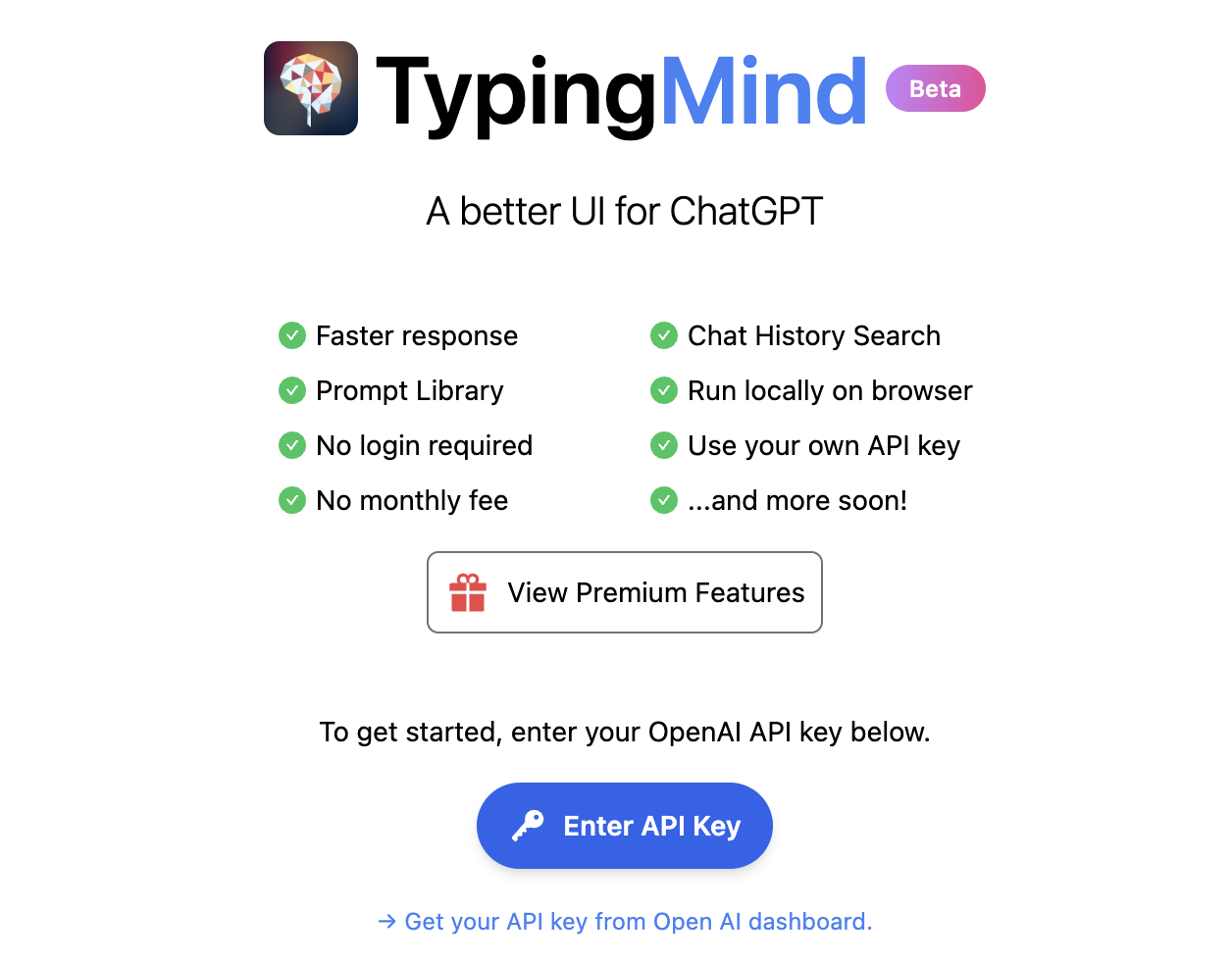
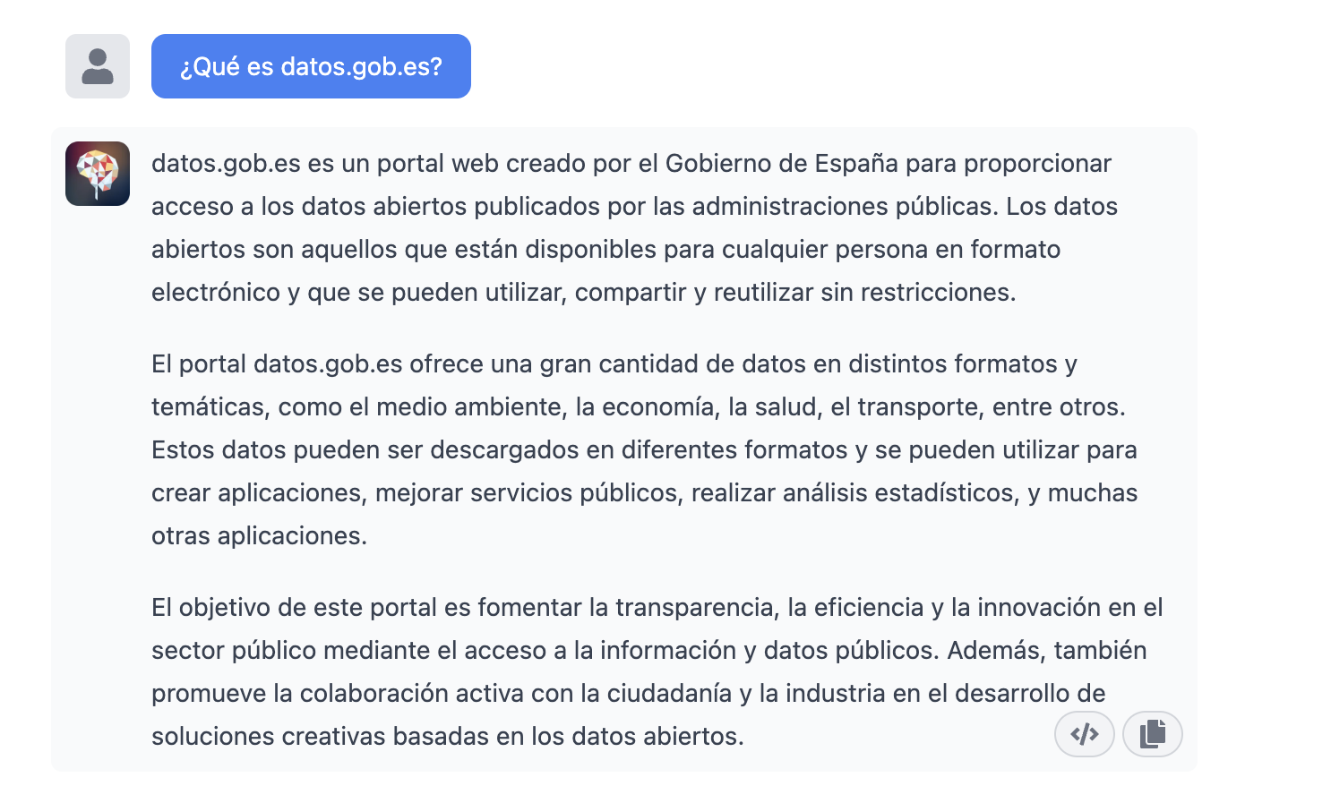
As we said in the introduction, we may want to try alternative interfaces to Chat GPT-3 such as https://www.typingmind.com/. When we access this website, the first thing we have to do is enter our API Key.
Once inside, let's do an example and see how this new interface behaves. Let's ask Chat GPT-3 What is datos.gob.es?
| Note: It is important to note that most services will not work if we do not activate a means of payment on the OpenAI website. Normally, if we have not configured a credit card, the API calls will return an error message similar to \"You exceeded your current quota, please check your plan and billing details\". |
Let's now look at another application of the GPT-3 Chat API.
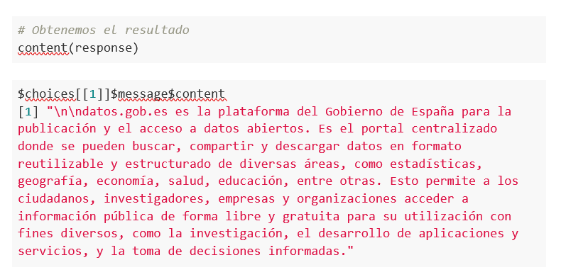
Programmatic access with R to access Chat GPT-3 programmatically (in other words, with a few lines of code in R we have access to the conversational power of the GPT-3 model). This demonstration is based on the recent post published in R Bloggers. Let's access Chat GPT-3 programmatically with the following example.
| Note: Note that the API Key has been hidden for security and privacy reasons. |

En este ejemplo, utilizamos código en R para hacer una llamada HTTPs de tipo POST y le preguntamos a Chat GPT-3 ¿Qué es datos.gob.es? Vemos que estamos utilizando el modelo gpt-3.5-turbo que, tal y como se especifica en la documentación está indicado para tareas de tipo conversacional. Toda la información sobre la API y los diferentes modelos está disponible aquí. Pero, veamos el resultado:
Not bad, right? As a curious fact we can see that a few GPT-3 Chat API calls have had the following API usage:

The use of the API is priced per token (something similar to words) and the public prices can be consulted here. Specifically, the model we are using has these prices: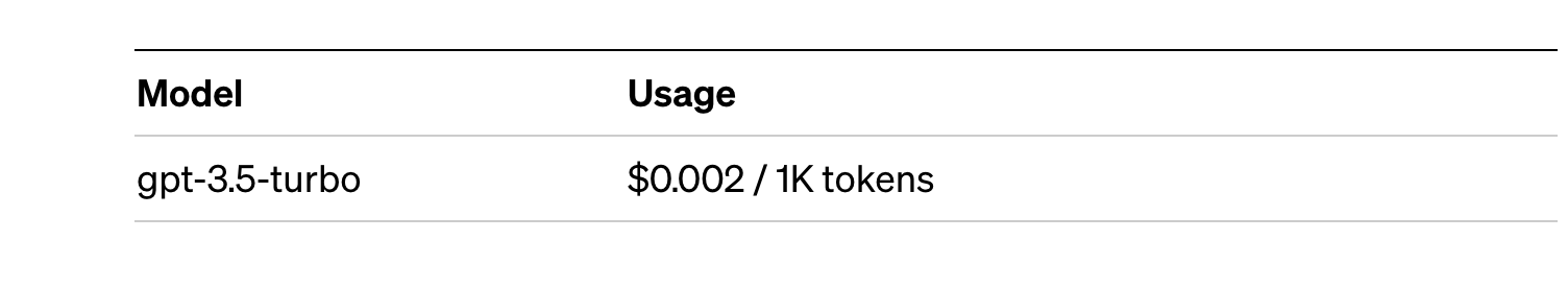
For small tests and examples, we can afford it. In the case of enterprise applications for production environments, there is a premium model that allows you to control costs without being so dependent on usage.
Conclusion
Naturally, Chat GPT-3 enables an API to provide programmatic access to its conversational engine. This mechanism allows the integration of applications and systems (i.e. everything that is not human) opening the door to the definitive take-off of Chat GPT-3 as a business model. Thanks to this mechanism, the Bing search engine now integrates GPT-3 Chat for conversational search responses. Similarly, Microsoft Azure has just announced the availability of GPT-3 Chat as a new public cloud service. No doubt in the coming weeks we will see communications from all kinds of applications, apps and services, known and unknown, announcing their integration with GPT-3 Chat to improve conversational interfaces with their customers. See you in the next episode, maybe with GPT-4.
Documentación
1. Introduction
Visualizations are graphical representations of the data allowing to transmit in a simple and effective way related information. The visualization capabilities are extensive, from basic representations, such as a line chart, bars or sectors, to visualizations configured on control panels or interactive dashboards.
In this "Step-by-Step Visualizations" section we are periodically presenting practical exercises of open data visualizations available in datos.gob.es or other similar catalogs. They address and describe in an easy manner stages necessary to obtain the data, to perform transformations and analysis relevant to finally creating interactive visualizations, from which we can extract information summarized in final conclusions. In each of these practical exercises simple and well-documented code developments are used, as well as open-source tools. All generated materials are available for reuse in the GitHub repository.
In this practical exercise, we made a simple code development that is conveniently documented relying on free to use tools.
Access the data lab repository on Github
Run the data pre-procesing code on top of Google Colab
2. Objective
The main scope of this post is to show how to generate a custom Google Maps map using the "My Maps" tool based on open data. These types of maps are highly popular on websites, blogs and applications in the tourism sector, however, the useful information provided to the user is usually scarce.
In this exercise, we will use potential of the open-source data to expand the information to be displayed on our map in an automatic way. We will also show how to enrich open data with context information that significantly improves the user experience.
From a functional point of view, the goal of the exercise is to create a personalized map for planning tourist routes through the natural areas of the autonomous community of Castile and León. For this, open data sets published by the Junta of Castile and León have been used, which we have pre-processed and adapted to our needs in order to generate a personalized map.
3. Resources
3.1. Datasets
The datasets contain different tourist information of geolocated interest. Within the open data catalog of the Junta of Castile and León, we may find the "dictionary of entities" (additional information section), a document of vital importance, since it defines the terminology used in the different data sets.
- Viewpoints in natural areas
- Observatories in natural areas
- Shelters in natural areas
- Trees in natural areas
- Park houses in natural areas
- Recreational areas in natural areas
- Registration of hotel establishments
These datasets are also available in the Github repository.
3.2. Tools
To carry out the data preprocessing tasks, the Python programming language written on a Jupyter Notebook hosted in the Google Colab cloud service has been used.
"Google Colab" also called " Google Colaboratory", is a free cloud service from Google Research that allows you to program, execute and share from your browser code written in Python or R, so it does not require installation of any tool or configuration.
For the creation of the interactive visualization, the Google My Maps tool has been used.
"Google My Maps" is an online tool that allows you to create interactive maps that can be embedded in websites or exported as files. This tool is free, easy to use and allows multiple customization options.
If you want to know more about tools that can help you with the treatment and visualization of data, you can go to the section "Data processing and visualization tools".
4. Data processing and preparation
The processes that we describe below are commented in the Notebook which you can run from Google Colab.
Before embarking on building an effective visualization, we must carry out a prior data treatment, paying special attention to obtaining them and validating their content, ensuring that they are in the appropriate and consistent format for processing and that they do not contain errors.
The first step necessary is performing the exploratory analysis of the data (EDA) in order to properly interpret the starting data, detect anomalies, missing data or errors that could affect the quality of the subsequent processes and results. If you want to know more about this process, you can go to the Practical Guide of Introduction to Exploratory Data Analysis.
The next step is to generate the tables of preprocessed data that will be used to feed the map. To do so, we will transform the coordinate systems, modify and filter the information according to our needs.
The steps required in this data preprocessing, explained in the Notebook, are as follows:
- Installation and loading of libraries
- Loading datasets
- Exploratory Data Analysis (EDA)
- Preprocessing of datasets
During the preprocessing of the data tables, it is necessary to change the coordinate system since in the source datasets the ESTR89 (standard system used in the European Union) is used, while we will need them in the WGS84 (system used by Google My Maps among other geographical applications). How to make this coordinate change is explained in the Notebook. If you want to know more about coordinate types and systems, you can use the "Spatial Data Guide".
Once the preprocessing is finished, we will obtain the data tables "recreational_natural_parks.csv", "rural_accommodations_2stars.csv", "natural_park_shelters.csv", "observatories_natural_parks.csv", "viewpoints_natural_parks.csv", "park_houses.csv", "trees_natural_parks.csv" which include generic and common information fields such as: name, observations, geolocation,... together with specific information fields, which are defined in details in section "6.2 Personalization of the information to be displayed on the map".
You will be able to reproduce this analysis, as the source code is available in our GitHub account. The code can be provided through a document made on a Jupyter Notebook once loaded into the development environment can be easily run or modified. Due to informative nature of this post and to favor understanding of non-specialized readers, the code is not intended to be the most efficient, but rather to facilitate its understanding so you could possibly come up with many ways to optimize the proposed code to achieve similar purposes. We encourage you to do so!
5. Data enrichment
To provide more related information, a data enrichment process is carried out on the dataset "hotel accommodation registration" explained below. With this step we will be able to automatically add complementary information that was initially not included. With this, we will be able to improve the user experience during their use of the map by providing context information related to each point of interest.
For this we will apply a useful tool for such kind of a tasks: OpenRefine. This open-source tool allows multiple data preprocessing actions, although this time we will use it to carry out an enrichment of our data by incorporating context by automatically linking information that resides in the popular Wikidata knowledge repository.
Once the tool is installed on our computer, when executed – a web application will open in the browser in case it is not opened automatically.
Here are the steps to follow.
Step 1
Loading the CSV into the system (Figure 1). In this case, the dataset "Hotel accommodation registration".
Figure 1. Uploading CSV file to OpenRefine
Step 2
Creation of the project from the uploaded CSV (Figure 2). OpenRefine is managed by projects (each uploaded CSV will be a project), which are saved on the computer where OpenRefine is running for possible later use. In this step we must assign a name to the project and some other data, such as the column separator, although the most common is that these last settings are filled automatically.
Figure 2. Creating a project in OpenRefine
Step 3
Linked (or reconciliation, using OpenRefine nomenclature) with external sources. OpenRefine allows us to link resources that we have in our CSV with external sources such as Wikidata. To do this, the following actions must be carried out:
- Identification of the columns to be linked. Usually, this step is based on the analyst experience and knowledge of the data that is represented in Wikidata. As a hint, generically you can reconcile or link columns that contain more global or general information such as country, streets, districts names etc., and you cannot link columns like geographical coordinates, numerical values or closed taxonomies (types of streets, for example). In this example, we have the column "municipalities" that contains the names of the Spanish municipalities.
- Beginning of reconciliation (Figure 3). We start the reconciliation and select the default source that will be available: Wikidata. After clicking Start Reconciling, it will automatically start searching for the most suitable Wikidata vocabulary class based on the values in our column.
- Obtaining the values of reconciliation. OpenRefine offers us an option of improving the reconciliation process by adding some features that allow us to conduct the enrichment of information with greater precision.
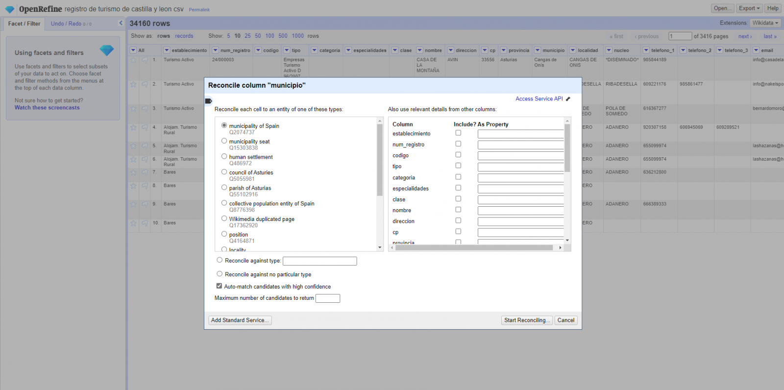
Figure 3. Selecting the class that best represents the values in the "municipality"
Step 4
Generate a new column with the reconciled or linked values (Figure 4). To do this we need to click on the column "municipality" and go to "Edit Column → Add column based in this column", where a text will be displayed in which we will need to indicate the name of the new column (in this example it could be "wikidata"). In the expression box we must indicate: "http://www.wikidata.org/ entity/"+cell.recon.match.id and the values appear as previewed in the Figure. "http://www.wikidata.org/entity/" is a fixed text string to represent Wikidata entities, while the reconciled value of each of the values is obtained through the cell.recon.match.id statement, that is, cell.recon.match.id("Adanero") = Q1404668
Thanks to the abovementioned operation, a new column will be generated with those values. In order to verify that it has been executed correctly, we click on one of the cells in the new column which should redirect to the Wikidata webpage with reconciled value information.
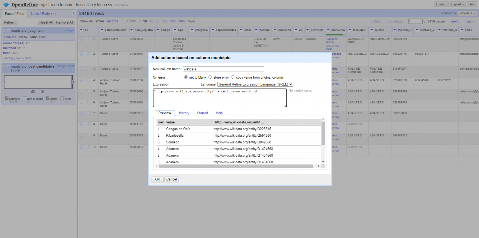
Figure 4. Generating a new column with reconciled values
Step 5
We repeat the process by changing in step 4 the "Edit Column → Add column based in this column" with "Add columns from reconciled values" (Figure 5). In this way, we can choose the property of the reconciled column.
In this exercise we have chosen the "image" property with identifier P18 and the "population" property with identifier P1082. Nevertheless, we could add all the properties that we consider useful, such as the number of inhabitants, the list of monuments of interest, etc. It should be mentioned that just as we enrich data with Wikidata, we can do so with other reconciliation services.
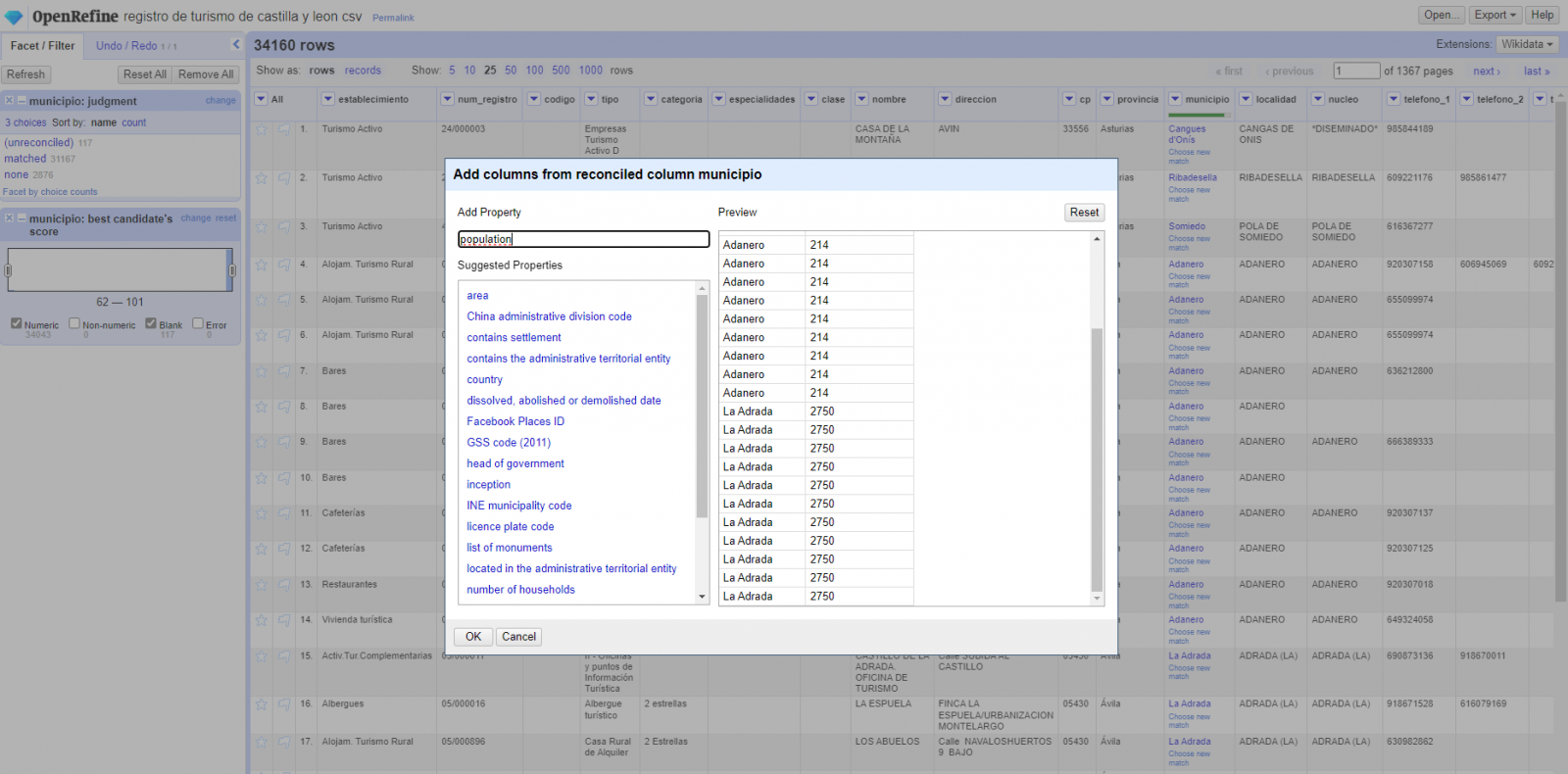
Figura 5. Choice of property for reconciliation
In the case of the "image" property, due to the display, we want the value of the cells to be in the form of a link, so we have made several adjustments. These adjustments have been the generation of several columns according to the reconciled values, adequacy of the columns through commands in GREL language (OpenRefine''s own language) and union of the different values of both columns. You can check these settings and more techniques to improve your handling of OpenRefine and adapt it to your needs in the following User Manual.
6. Map visualization
6.1 Map generation with "Google My Maps"
To generate the custom map using the My Maps tool, we have to execute the following steps:
- We log in with a Google account and go to "Google My Maps", with free access with no need to download any kind of software.
- We import the preprocessed data tables, one for each new layer we add to the map. Google My Maps allows you to import CSV, XLSX, KML and GPX files (Figure 6), which should include associated geographic information. To perform this step, you must first create a new layer from the side options menu.
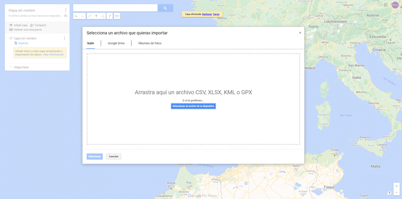
Figure 6. Importing files into "Google My Maps"
- In this case study, we''ll import preprocessed data tables that contain one variable with latitude and other with longitude. This geographic information will be automatically recognized. My Maps also recognizes addresses, postal codes, countries, ...
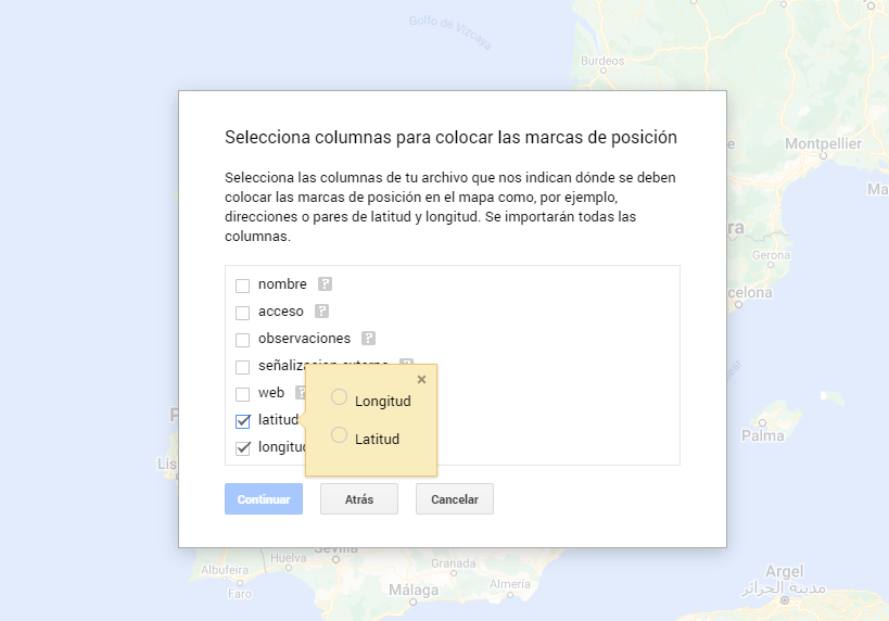
Figura 7. Select columns with placement values
- With the edit style option in the left side menu, in each of the layers, we can customize the pins, editing their color and shape.

Figure 8. Position pin editing
- Finally, we can choose the basemap that we want to display at the bottom of the options sidebar.
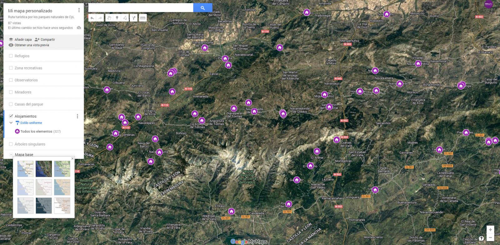
Figura 9. Basemap selection
If you want to know more about the steps for generating maps with "Google My Maps", check out the following step-by-step tutorial.
6.2 Personalization of the information to be displayed on the map
During the preprocessing of the data tables, we have filtered the information according to the focus of the exercise, which is the generation of a map to make tourist routes through the natural spaces of Castile and León. The following describes the customization of the information that we have carried out for each of the datasets.
- In the dataset belonging to the singular trees of the natural areas, the information to be displayed for each record is the name, observations, signage and position (latitude / longitude)
- In the set of data belonging to the houses of the natural areas park, the information to be displayed for each record is the name, observations, signage, access, web and position (latitude / longitude)
- In the set of data belonging to the viewpoints of the natural areas, the information to be displayed for each record is the name, observations, signage, access and position (latitude / longitude)
- In the dataset belonging to the observatories of natural areas, the information to be displayed for each record is the name, observations, signaling and position (latitude / longitude)
- In the dataset belonging to the shelters of the natural areas, the information to be displayed for each record is the name, observations, signage, access and position (latitude / longitude). Since shelters can be in very different states and that some records do not offer information in the "observations" field, we have decided to filter to display only those that have information in that field.
- In the set of data belonging to the recreational areas of the natural park, the information to be displayed for each record is the name, observations, signage, access and position (latitude / longitude). We have decided to filter only those that have information in the "observations" and "access" fields.
- In the set of data belonging to the accommodations, the information to be displayed for each record is the name, type of establishment, category, municipality, web, telephone and position (latitude / longitude). We have filtered the "type" of establishment only those that are categorized as rural tourism accommodations and those that have 2 stars.
Following a visualization of the custom map we have created is returned. By selecting the icon to enlarge the map that appears in the upper right corner, you can access its full-screen display
6.3 Map functionalities (layers, pins, routes and immersive 3D view)
At this point, once the custom map is created, we will explain various functionalities offered by "Google My Maps" during the visualization of the data.
- Layers
Using the drop-down menu on the left, we can activate and deactivate the layers to be displayed according to our needs.
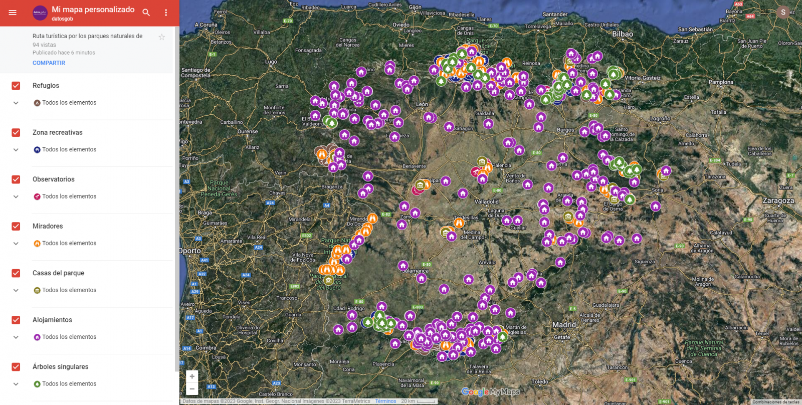
Figure 10. Layers in "My Maps"
-
Pins
By clicking on each of the pins of the map we can access the information associated with that geographical position.
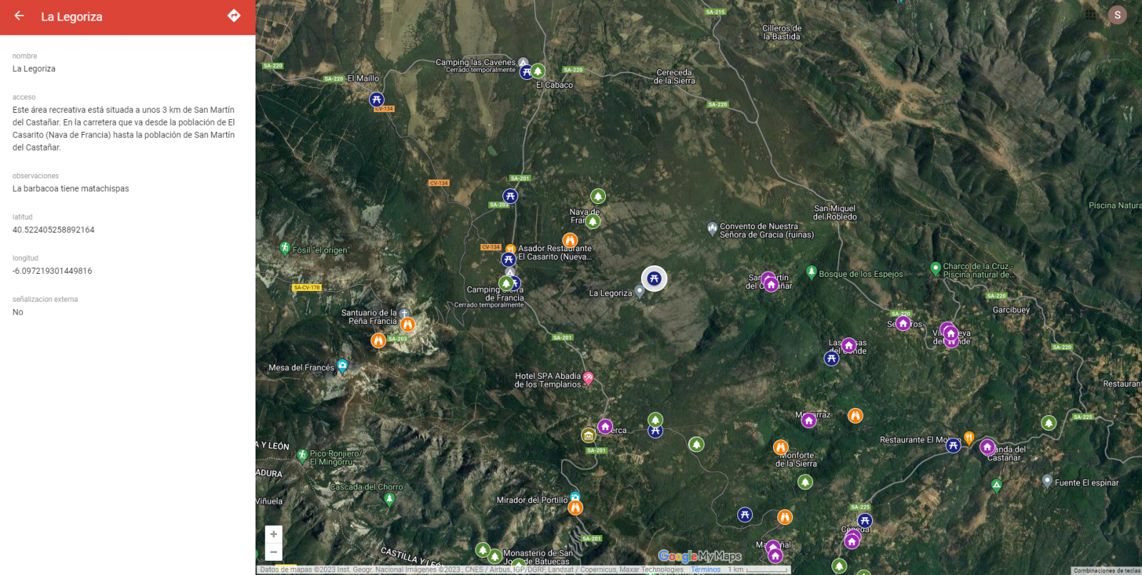
Figure 11. Pins in "My Maps"
-
Routes
We can create a copy of the map on which to add our personalized tours.
In the options of the left side menu select "copy map". Once the map is copied, using the add directions symbol, located below the search bar, we will generate a new layer. To this layer we can indicate two or more points, next to the means of transport and it will create the route next to the route indications.

Figure 12. Routes in "My Maps"
-
3D immersive map
Through the options symbol that appears in the side menu, we can access Google Earth, from where we can explore the immersive map in 3D, highlighting the ability to observe the altitude of the different points of interest. You can also access through the following link.
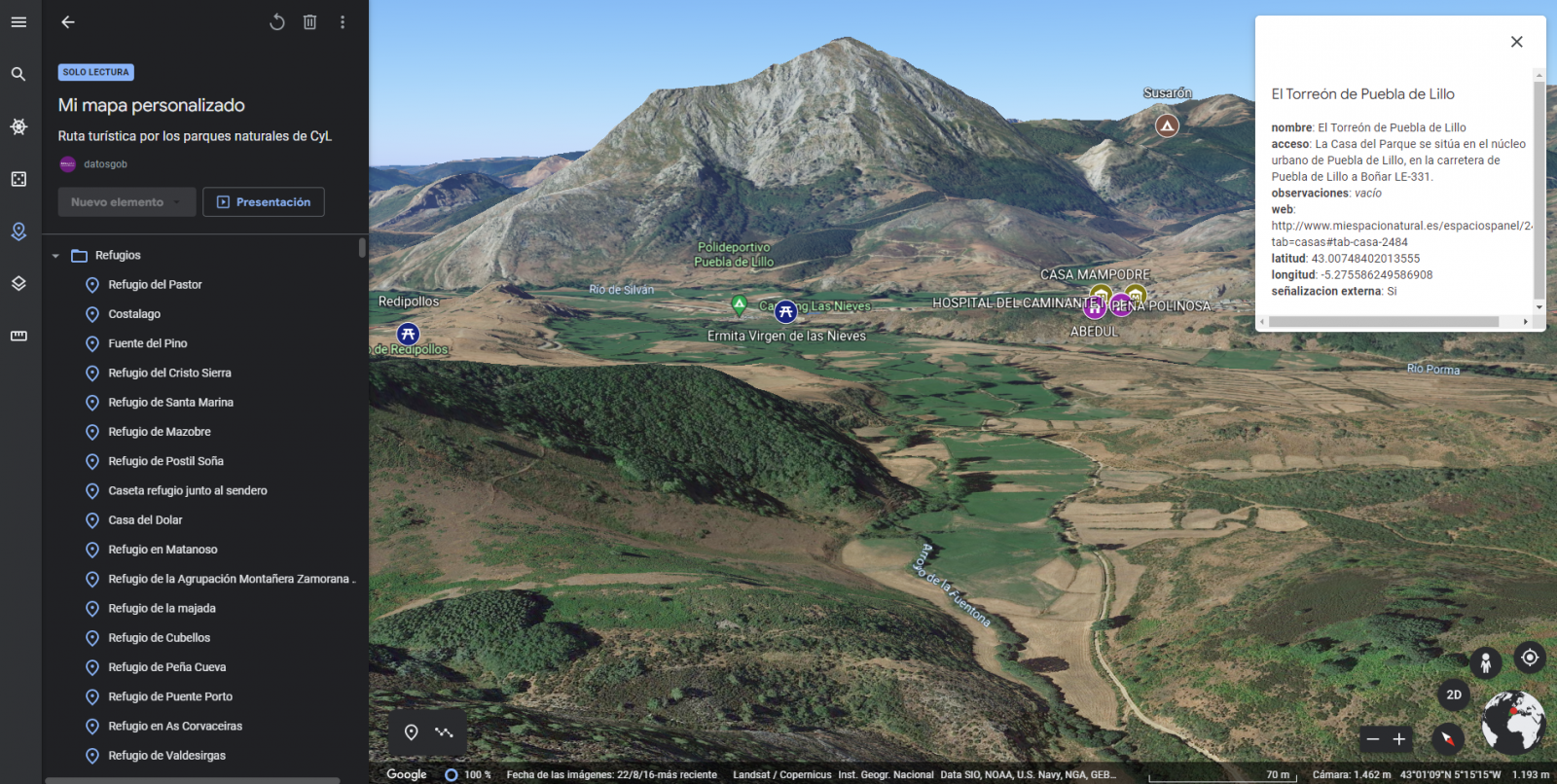
Figure 13. 3D immersive view
7. Conclusions of the exercise
Data visualization is one of the most powerful mechanisms for exploiting and analyzing the implicit meaning of data. It is worth highlighting the vital importance that geographical data have in the tourism sector, which we have been able to verify in this exercise.
As a result, we have developed an interactive map with information provided by Linked Data, which we have customized according to our interests.
We hope that this step-by-step visualization has been useful for learning some very common techniques in the treatment and representation of open data. We will be back to show you new reuses. See you soon!
Noticia
On 21 February, the winners of the 6th edition of the Castilla y León Open Data Competition were presented with their prizes. This competition, organised by the Regional Ministry of the Presidency of the Regional Government of Castilla y León, recognises projects that provide ideas, studies, services, websites or mobile applications, using datasets from its Open Data Portal.
The event was attended, among others, by Jesús Julio Carnero García, Minister of the Presidency, and Rocío Lucas Navas, Minister of Education of the Junta de Castilla y León.
In his speech, the Minister Jesús Julio Carnero García emphasised that the Regional Government is going to launch the Data Government project, with which they intend to combine Transparency and Open Data, in order to improve the services offered to citizens.
In addition, the Data Government project has an approved allocation of almost 2.5 million euros from the Next Generation Funds, which includes two lines of work: both the design and implementation of the Data Government model, as well as the training for public employees.
This is an Open Government action which, as the Councillor himself added, "is closely related to transparency, as we intend to make Open Data freely available to everyone, without copyright restrictions, patents or other control or registration mechanisms".
Nine prize-winners in the 6th edition of the Castilla y León Open Data Competition
It is precisely in this context that initiatives such as the 6th edition of the Castilla y León Open Data Competition stand out. In its sixth edition, it has received a total of 26 proposals from León, Palencia, Salamanca, Zamora, Madrid and Barcelona.
In this way, the 12,000 euros distributed in the four categories defined in the rules have been distributed among nine of the above-mentioned proposals. This is how the awards were distributed by category:
Products and Services Category: aimed at recognising projects that provide studies, services, websites or applications for mobile devices and that are accessible to all citizens via the web through a URL.
- First prize: 'Oferta de Formación profesional de Castilla y León. An attractive and accessible alternative with no-cod tools'". Author: Laura Folgado Galache (Zamora). 2,500 euros.
- Second prize: 'Enjoycyl: collection and exploitation of assistance and evaluation of cultural activities'. Author: José María Tristán Martín (Palencia). 1,500 euros.
- Third prize: 'Aplicación del problema de la p-mediana a la Atención Primaria en Castilla y León'. Authors: Carlos Montero and Ernesto Ramos (Salamanca) 500 euros.
- Student prize: 'Play4CyL'. Authors: Carlos Montero and Daniel Heras (Salamanca) 1,500 euros.
Ideas category: seeks to reward projects that describe an idea for developing studies, services, websites or applications for mobile devices.
- First prize: 'Elige tu Universidad (Castilla y León)'. Authors: Maite Ugalde Enríquez and Miguel Balbi Klosinski (Barcelona) 1,500 euros.
- Second prize: 'Bots to interact with open data - Conversational interfaces to facilitate access to public data (BODI)'. Authors: Marcos Gómez Vázquez and Jordi Cabot Sagrera (Barcelona) 500 euros
Data Journalism Category: awards journalistic pieces published or updated (in a relevant way) in any medium (written or audiovisual).
- First prize: '13-F elections in Castilla y León: there will be 186 fewer polling stations than in the 2019 regional elections'. Authors: Asociación Maldita contra la desinformación (Madrid) 1,500 euros.
- Second prize: 'More than 2,500 mayors received nothing from their city council in 2020 and another 1,000 have not reported their salary'. Authors: Asociación Maldita contra la desinformación (Madrid). 1,000 euros.
Didactic Resource Category: recognises the creation of new and innovative open didactic resources (published under Creative Commons licences) that support classroom teaching.
In short, and as the Regional Ministry of the Presidency itself points out, with this type of initiative and the Open Data Portal, two basic principles are fulfilled: firstly, that of transparency, by making available to society as a whole data generated by the Community Administration in the development of its functions, in open formats and with a free licence for its use; and secondly, that of collaboration, allowing the development of shared initiatives that contribute to social and economic improvements through joint work between citizens and public administrations.
Blog
The Spanish Hub of Gaia-X (Gaia-X Hub Spain), a non-profit association whose aim is to accelerate Europe's capacity in data sharing and digital sovereignty, seeks to create a community around data for different sectors of the economy, thus promoting an environment conducive to the creation of sectoral data spaces. Framed within the Spain Digital 2026 strategy and with the Recovery, Transformation and Resilience Plan as a roadmap for Spain's digital transformation, the objective of the hub is to promote the development of innovative solutions based on data and artificial intelligence, while contributing to boosting the competitiveness of our country's companies.
The hub is organized into different working groups, with a specific one dedicated to analyzing the challenges and opportunities of data sharing and exploitation spaces in the tourism sector. Tourism is one of the key productive sectors in the Spanish economy, reaching a volume of 12.2% of the national GDP.
Tourism, given its ecosystem of public and private participants of different sizes and levels of technological maturity, constitutes an optimal environment to contrast the benefits of these federated data ecosystems. Thanks to them, the extraction of value from non-traditional data sources is facilitated, with high scalability, and ensuring robust conditions of security, privacy, and thus data sovereignty.
Thus, with the aim of producing the first X-ray of this dataspace in Spain, the Data Office, in collaboration with the Spanish Hub of Gaia-X, has developed the report 'X-ray of the Tourism Dataspace in Spain', a document that seeks to summarize and highlight the current status of the design of this dataspace, the different opportunities for the sector, and the main challenges that must be overcome to achieve its deployment, offering a roadmap for its construction and deployment.
Why is a tourism data space necessary?
If something became clear after the outbreak of the COVID-19 pandemic, it is that tourism is an interdependent activity with other industries, so when it was paused, sectors such as mobility, logistics, health, agriculture, automotive, or food, among others, were also affected.
Situations like the one mentioned above highlight the possibilities offered by data sharing between sectors, as they can help improve decision-making. However, achieving this in the tourism sector is not an easy task since deploying a data space for this sector requires coordinated efforts among the different parts of society involved.
Thus, the objective and challenge is to create intelligent "spaces" capable of providing a context of security and trust that promotes the exchange and combination of data. In this way, and based on the added value generated by data, it would be possible to solve some of the existing problems in the sector and create new strategies focused on better understanding the tourist and, therefore, improving their travel experience.
The creation of these data sharing and exploitation spaces will bring significant benefits to the sector, as it will facilitate the creation of more personalized offers, products, and services that provide an enhanced and tailored experience to meet the needs of customers, thus improving the capacity to attract tourists. In addition, it will promote a better understanding of the sector and informed decision-making by both public and private organizations, which can more easily detect new business opportunities.
Challenges of security and data governance to take advantage of digital tourism market opportunities
One of the main obstacles to developing a sectoral data space is the lack of trust in data sharing, the absence of shared data models, or the insufficient interoperability standards for efficient data exchange between different existing platforms and actors in the value chain.
Moving to more specific challenges, the tourism sector also faces the need to combine B2B data spaces (sharing between private companies and organizations) with C2B and G2B spaces (sharing between users and companies, and between the public sector and companies, respectively). If we add to this the ideal need to land the tourism sector's datasets at the national, regional, and local levels, the challenge becomes even greater.
To design a sector data space, it is also important to take into account the differences in data quality among the aforementioned actors. Due to the lack of specific standards, there are differences in the level of granularity and quality of data, semantics, as well as disparity in formats and licenses, resulting in a disconnected data landscape.
Furthermore, it is essential to understand the demands of the different actors in the industry, which can only be achieved by listening and taking notes on the needs present at the different levels of the industry. Therefore, it is important to remember that tourism is a social activity whose focus should not be solely on the destination. The success of a tourism data space will also rely on the ability to better understand the customer and, consequently, offer services tailored to their demands to improve their experience and incentivize them to continue traveling.
Thus, as stated in the report prepared by the Data Office, in collaboration with the Spanish hub of Gaia-X, it is interesting to redirect the focus and shift it from the destination to the tourist, in line with the discovery and generation of use cases by SEGITTUR. While it is true that focusing on the destination has helped develop digital platforms that have driven competitiveness, efficiency, and tourism strategy, a strategy that pays the same attention to the tourist would allow for expanding and improving the available data catalogs.
Measuring the factors that condition tourists' experience during their visit to our country allows for optimizing their satisfaction throughout the entire travel circuit, while also contributing to creating increasingly personalized marketing campaigns, based on the analysis of the interests of different market segments.
Current status of the construction of the Spanish Tourism data space and next steps
The lack of maturity of the market in the creation of data spaces as a solution makes an experimental approach necessary, both for the consolidation of the technological components and for the validation of the different facets (soft infrastructure) present in the data spaces.
Currently, the Tourism Working Group of the Spanish Gaia-X Hub is working on the definition of the key elements of the tourism data space, based on use cases aligned with the sector's challenges. The objective is to answer some key questions, using existing knowledge in the field of data spaces:
- What are the key characteristics of the tourism environment and what business problems can be addressed?
- What data-oriented models can be worked on in different use cases?
- What requirements exist and what governance model is necessary? What types of participants should be considered?
- What business, legal, operational, functional, and technological components are necessary?
- What reference technology architecture can be used?
- What development, integration, testing, and technology deployment processes can be employed?
Empresa reutilizadora
KSNET (Knowledge Sharing Network S.L) is a company dedicated to the transfer of knowledge that aims to improve programmes and policies with both a social and economic impact. That is why they accompany their clients throughout the process of creating these programmes, from the diagnosis, design and implementation phase to the evaluation of the results and impact achieved, also providing a vision of the future based on proposals for improvement.