Blog
There is such a close relationship between data management, data quality management and data governance that the terms are often used interchangeably or confused. However, there are important nuances.
The overall objective of data management is to ensure that data meets the business requirements that will support the organisation's processes, such as collecting, storing, protecting, analysing and documenting data, in order to implement the objectives of the data governance strategy. It is such a broad set of tasks that there are several categories of standards to certify each of the different processes: ISO/IEC 27000 for information security and privacy, ISO/IEC 20000 for IT service management, ISO/IEC 19944 for interoperability, architecture or service level agreements in the cloud, or ISO/IEC 8000-100 for data exchange and master data management.
Data quality management refers to the techniques and processes used to ensure that data is fit for its intended use. This requires a Data Quality Plan that must be in line with the organisation's culture and business strategy and includes aspects such as data validation, verification and cleansing, among others. In this regard, there is also a set of technical standards for achieving data quality] including data quality management for transaction data, product data and enterprise master data (ISO 8000) and data quality measurement tasks (ISO 25024:2015).
Data governance, according to Deloitte's definition, consists of an organisation's set of rules, policies and processes to ensure that the organisation's data is correct, reliable, secure and useful. In other words, it is the strategic, high-level planning and control to create business value from data. In this case, open data governance has its own specificities due to the number of stakeholders involved and the collaborative nature of open data itself.
The Alarcos Model
In this context, the Alarcos Model for Data Improvement (MAMD), currently in its version 3, aims to collect the necessary processes to achieve the quality of the three dimensions mentioned above: data management, data quality management and data governance. This model has been developed by a group of experts coordinated by the Alarcos research group of the University of Castilla-La Mancha in collaboration with the specialised companies DQTeam and AQCLab.
The MAMD Model is aligned with existing best practices and standards such as Data Management Community (DAMA), Data management maturity (DMM) or the ISO 8000 family of standards, each of which addresses different aspects related to data quality and master data management from different perspectives. In addition, the Alarcos model is based on the family of standards to define the maturity model so it is possible to achieve AENOR certification for ISO 8000-MAMD data governance, management and quality.
The MAMD model consists of 21 processes, 9 processes correspond to data management (DM), data quality management (DQM) includes 4 more processes and data governance (DG), which adds another 8 processes.
The progressive incorporation of the 21 processes allows the definition of 5 maturity levels that contribute to the organisation improving its data management, data quality and data governance. Starting with level 1 (Performed) where the organisation can demonstrate that it uses good practices in the use of data and has the necessary technological support, but does not pay attention to data governance and data quality, up to level 5 (Innovative) where the organisation is able to achieve its objectives and is continuously improving.
The model can be certified with an audit equivalent to that of other AENOR standards, so there is the possibility of including it in the cycle of continuous improvement and internal control of regulatory compliance of organisations that already have other certificates.
Practical exercises
The Library of the University of Castilla-La Mancha (UCLM), which supports more than 30,000 students and 3,000 professionals including teachers and administrative and service staff, is one of the first organisations to pass the certification audit and therefore obtain level 2 maturity in ISO/IEC 33000 - ISO 8000 (MAMD).
The strengths identified in this certification process were the commitment of the management team and the level of coordination with other universities. As with any audit, improvements were proposed such as the need to document periodic data security reviews which helped to feed into the improvement cycle.
The fact that organisations of all types place an increasing value on their data assets means that technical certification models and standards have a key role to play in ensuring the quality, security, privacy, management or proper governance of these data assets. In addition to existing standards, a major effort continues to be made to develop new standards covering aspects that have not been considered central until now due to the reduced importance of data in the value chains of organisations. However, it is still necessary to continue with the formalisation of models that, like the Alarcos Data Improvement Model, allow the evaluation and improvement process of the organisation in the treatment of its data assets to be addressed holistically, and not only from its different dimensions.
Content prepared by Jose Luis Marín, Senior Consultant in Data, Strategy, Innovation & Digitalization.
The contents and points of view reflected in this publication are the sole responsibility of the author.
Documentación
1. Introduction
Visualizations are graphical representations of data that allows comunication in a simple and effective way the information linked to it. The visualization possibilities are very wide, from basic representations, such as a graph of lines, bars or sectors, to visualizations configured on dashboards or interactive dashboards. Visualizations play a fundamental role in drawing conclusions using visual language, also allowing to detect patterns, trends, anomalous data or project predictions, among many other functions.
In this section of "Step-by-Step Visualizations" we are periodically presenting practical exercises of open data visualizations available in datos.gob.es or other similar catalogs. They address and describe in a simple way the necessary stages to obtain the data, perform the transformations and analysis that are relevant to it and finally, the creation of interactive visualizations. From these visualizations we can extract information to summarize in the final conclusions. In each of these practical exercises, simple and well-documented code developments are used, as well as free to use tools. All generated material is available for reuse in the Github data lab repository belonging to datos.gob.es.
In this practical exercise, we have carried out a simple code development that is conveniently documented based on free to use tool.
Access the data lab repository on Github.
Run the data pre-processing code on Google Colab.
2. Objetive
The main objective of this post is to show how to make an interactive visualization based on open data. For this practical exercise we have used a dataset provided by the Ministry of Justice that contains information about the toxicological results made after traffic accidents that we will cross with the data published by the Central Traffic Headquarters (DGT) that contain the detail on the fleet of vehicles registered in Spain.
From this data crossing we will analyze and be able to observe the ratios of positive toxicological results in relation to the fleet of registered vehicles.
It should be noted that the Ministry of Justice makes available to citizens various dashboards to view data on toxicological results in traffic accidents. The difference is that this practical exercise emphasizes the didactic part, we will show how to process the data and how to design and build the visualizations.
3. Resources
3.1. Datasets
For this case study, a dataset provided by the Ministry of Justice has been used, which contains information on the toxicological results carried out in traffic accidents. This dataset is in the following Github repository:
The datasets of the fleet of vehicles registered in Spain have also been used. These data sets are published by the Central Traffic Headquarters (DGT), an agency under the Ministry of the Interior. They are available on the following page of the datos.gob.es Data Catalog:
3.2. Tools
To carry out the data preprocessing tasks it has been used the Python programming language written on a Jupyter Notebook hosted in the Google Colab cloud service.
Google Colab (also called Google Colaboratory), is a free cloud service from Google Research that allows you to program, execute and share code written in Python or R from your browser, so it does not require the installation of any tool or configuration.
For the creation of the interactive visualization, the Google Data Studio tool has been used.
Google Data Studio is an online tool that allows you to make graphs, maps or tables that can be embedded in websites or exported as files. This tool is simple to use and allows multiple customization options.
If you want to know more about tools that can help you in the treatment and visualization of data, you can use the report "Data processing and visualization tools".
4. Data processing or preparation
Before launching to build an effective visualization, we must carry out a previous treatment of the data, paying special attention to obtaining it and validating its content, ensuring that it is in the appropriate and consistent format for processing and that it does not contain errors.
The processes that we describe below will be discussed in the Notebook that you can also run from Google Colab. Link to Google Colab notebook
As a first step of the process, it is necessary to perform an exploratory data analysis (EDA) in order to properly interpret the starting data, detect anomalies, missing data or errors that could affect the quality of subsequent processes and results. Pre-processing of data is essential to ensure that analyses or visualizations subsequently created from it are reliable and consistent. If you want to know more about this process, you can use the Practical Guide to Introduction to Exploratory Data Analysis.
The next step to take is the generation of the preprocessed data tables that we will use to generate the visualizations. To do this we will adjust the variables, cross data between both sets and filter or group as appropriate.
The steps followed in this data preprocessing are as follows:
- Importing libraries
- Loading data files to use
- Detection and processing of missing data (NAs)
- Modifying and adjusting variables
- Generating tables with preprocessed data for visualizations
- Storage of tables with preprocessed data
You will be able to reproduce this analysis since the source code is available in our GitHub account. The way to provide the code is through a document made on a Jupyter Notebook that once loaded into the development environment you can execute or modify easily. Due to the informative nature of this post and favor the understanding of non-specialized readers, the code does not intend to be the most efficient, but to facilitate its understanding, so you will possibly come up with many ways to optimize the proposed code to achieve similar purposes. We encourage you to do so!
5. Generating visualizations
Once we have done the preprocessing of the data, we go with the visualizations. For the realization of these interactive visualizations, the Google Data Studio tool has been used. Being an online tool, it is not necessary to have software installed to interact or generate any visualization, but it is necessary that the data tables that we provide are properly structured, for this we have made the previous steps for the preparation of the data.
The starting point is the approach of a series of questions that visualization will help us solve. We propose the following:
- How is the fleet of vehicles in Spain distributed by Autonomous Communities?
- What type of vehicle is involved to a greater and lesser extent in traffic accidents with positive toxicological results?
- Where are there more toxicological findings in traffic fatalities?
Let''s look for the answers by looking at the data!
5.1. Fleet of vehicles registered by Autonomous Communities
This visual representation has been made considering the number of vehicles registered in the different Autonomous Communities, breaking down the total by type of vehicle. The data, corresponding to the average of the month-to-month records of the years 2020 and 2021, are stored in the "parque_vehiculos.csv" table generated in the preprocessing of the starting data.
Through a choropleth map we can visualize which CCAAs are those that have a greater fleet of vehicles. The map is complemented by a ring graph that provides information on the percentages of the total for each Autonomous Community.
As defined in the "Data visualization guide of the Generalitat Catalana" the choropletic (or choropleth) maps show the values of a variable on a map by painting the areas of each affected region of a certain color. They are used when you want to find geographical patterns in the data that are categorized by zones or regions.
Ring charts, encompassed in pie charts, use a pie representation that shows how the data is distributed proportionally.
Once the visualization is obtained, through the drop-down tab, the option to filter by type of vehicle appears.
View full screen visualization
5.2. Ratio of positive toxicological results for different types of vehicles
This visual representation has been made considering the ratios of positive toxicological results by number of vehicles nationwide. We count as a positive result each time a subject tests positive in the analysis of each of the substances, that is, the same subject can count several times in the event that their results are positive for several substances. For this purpose, the table "resultados_vehiculos.csv” has been generated during data preprocessing.
Using a stacked bar chart, we can evaluate the ratios of positive toxicological results by number of vehicles for different substances and different types of vehicles.
As defined in the "Data visualization guide of the Generalitat Catalana" bar graphs are used when you want to compare the total value of the sum of the segments that make up each of the bars. At the same time, they offer insight into how large these segments are.
When stacked bars add up to 100%, meaning that each segmented bar occupies the height of the representation, the graph can be considered a graph that allows you to represent parts of a total.
The table provides the same information in a complementary way.
Once the visualization is obtained, through the drop-down tab, the option to filter by type of substance appears.
View full screen visualization
5.3. Ratio of positive toxicological results for the Autonomous Communities
This visual representation has been made taking into account the ratios of the positive toxicological results by the fleet of vehicles of each Autonomous Community. We count as a positive result each time a subject tests positive in the analysis of each of the substances, that is, the same subject can count several times in the event that their results are positive for several substances. For this purpose, the "resultados_ccaa.csv" table has been generated during data preprocessing.
It should be noted that the Autonomous Community of registration of the vehicle does not have to coincide with the Autonomous Community where the accident has been registered, however, since this is a didactic exercise and it is assumed that in most cases they coincide, it has been decided to start from the basis that both coincide.
Through a choropleth map we can visualize which CCAAs are the ones with the highest ratios. To the information provided in the first visualization on this type of graph, we must add the following.
As defined in the "Data Visualization Guide for Local Entities" one of the requirements for choropleth maps is to use a numerical measure or datum, a categorical datum for the territory, and a polygon geographic datum.
The table and bar chart provides the same information in a complementary way.
Once the visualization is obtained, through the peeling tab, the option to filter by type of substance appears.
View full screen visualization
6. Conclusions of the study
Data visualization is one of the most powerful mechanisms for exploiting and analyzing the implicit meaning of data, regardless of the type of data and the degree of technological knowledge of the user. Visualizations allow us to build meaning on top of data and create narratives based on graphical representation. In the set of graphical representations of data that we have just implemented, the following can be observed:
- The fleet of vehicles of the Autonomous Communities of Andalusia, Catalonia and Madrid corresponds to about 50% of the country''s total.
- The highest positive toxicological results ratios occur in motorcycles, being of the order of three times higher than the next ratio, passenger cars, for most substances.
- The lowest positive toxicology result ratios occur in trucks.
- Two-wheeled vehicles (motorcycles and mopeds) have higher "cannabis" ratios than those obtained in "cocaine", while four-wheeled vehicles (cars, vans and trucks) have higher "cocaine" ratios than those obtained in "cannabis"
- The Autonomous Community where the ratio for the total of substances is highest is La Rioja.
It should be noted that in the visualizations you have the option to filter by type of vehicle and type of substance. We encourage you to do so to draw more specific conclusions about the specific information you''re most interested in.
We hope that this step-by-step visualization has been useful for learning some very common techniques in the treatment and representation of open data. We will return to show you new reuses. See you soon!
Evento
The first National Open Data Meeting will take place in Barcelona on 21 November. It is an initiative promoted and co-organised by Barcelona Provincial Council, Government of Aragon and Provincial Council of Castellón, with the aim of identifying and developing specific proposals to promote the reuse of open data.
This first meeting will focus on the role of open data in developing territorial cohesion policies that contribute to overcoming the demographic challenge.
Agenda
The day will begin at 9:00 am and will last until 18:00 pm.
After the opening, which will be given by Marc Verdaguer, Deputy for Innovation, Local Governments and Territorial Cohesion of the Barcelona Provincial Council, there will be a keynote speech, where Carles Ramió, Vice-Rector for Institutional Planning and Evaluation at Pompeu Fabra University, will present the context of the subject.
Then, the event will be divided into four sessions where the following topics will be discussed:
- 10:30 a.m. State of art: lights and some shadows of opening and reusing data.
- 12:30 p.m. What does society need and expect from public administrations' open data portals?
- 15:00. Local commitment to fight against depopulation through open data
- 4:30 p.m. What can Public Administrations do using their data to jointly fight depopulation?
Experts linked to various open data initiatives, public organisations and business associations will participate in the conference. Specifically, the Aporta Initiative will participate in the first session, where the challenges and opportunities of the use of open data will be discussed.
The importance of addressing the demographic challenge
The conference will address how the ageing of the population, the geographical isolation that hinders access to health, administrative and educational centres and the loss of economic activity affect the smaller municipalities, both rural and urban. A situation with great repercussions on the sustainability and supply of the whole country, as well as on the preservation of culture and diversity.
Documentación
1. Introduction
Visualizations are graphical representations of data that allow the information linked to them to be communicated in a simple and effective way. The visualization possibilities are very broad, from basic representations such as line, bar or pie chart, to visualizations configured on control panels or interactive dashboards. Visualizations play a fundamental role in drawing conclusions from visual information, allowing detection of patterns, trends, anomalous data or projection of predictions, among many other functions.
Before starting to build an effective visualization, a prior data treatment must be performed, paying special attention to their collection and validation of their content, ensuring that they are in a proper and consistent format for processing and free of errors. The previous data treatment is essential to carry out any task related to data analysis and realization of effective visualizations.
In the section “Visualizations step-by-step” we are periodically presenting practical exercises on open data visualizations that are available in datos.gob.es catalogue and other similar catalogues. In there, we approach and describe in a simple way the necessary steps to obtain data, perform transformations and analysis that are relevant to creation of interactive visualizations from which we may extract information in the form of final conclusions.
In this practical exercise we have performed a simple code development which is conveniently documented, relying on free tools.
Access the Data Lab repository on Github.
Run the data pre-processing code on Google Colab.
2. Objetives
The main objective of this post is to learn how to make an interactive visualization using open data. For this practical exercise we have chosen datasets containing relevant information on national reservoirs. Based on that, we will analyse their state and time evolution within the last years.
3. Resources
3.1. Datasets
For this case study we have selected datasets published by Ministry for the Ecological Transition and Demographic Challenge, which in its hydrological bulletin collects time series data on the volume of water stored in the recent years in all the national reservoirs with capacity greater than 5hm3. Historical data on the volume of stored water are available at:
Furthermore, a geospatial dataset has been selected. During the search, two possible input data files have been found, one that contains geographical areas corresponding to the reservoirs in Spain and one that contains dams, including their geopositioning as a geographic point. Even though they are not the same thing, reservoirs and dams are related and to simplify this practical exercise, we choose to use the file containing the list of dams in Spain. Inventory of dams is available at: https://www.mapama.gob.es/ide/metadatos/index.html?srv=metadata.show&uuid=4f218701-1004-4b15-93b1-298551ae9446
This dataset contains geolocation (Latitude, Longitude) of dams throughout Spain, regardless of their ownership. A dam is defined as an artificial structure that limits entirely or partially a contour of an enclosure nestled in terrain and is destined to store water within it.
To generate geographic points of interest, a processing has been executed with the usage of QGIS tool. The steps are the following: download ZIP file, upload it to QGIS and save it as CSV, including the geometry of each element as two fields specifying its position as a geographic point (Latitude, Longitude).
Also, a filtering has been performed, in order to extract the data related to dams of reservoirs with capacity greater than 5hm3.
3.2. Tools
To perform data pre-processing, we have used Python programming language in the Google Colab cloud service, which allows the execution of JNotebooks de Jupyter.
Google Colab, also called Google Colaboratory, is a free service in the Google Research cloud which allows to program, execute and share a code written in Python or R through the browser, as it does not require installation of any tool or configuration.
Google Data Studio tool has been used for the creation of the interactive visualization.
Google Data Studio in an online tool which allows to create charts, maps or tables that can be embedded on websites or exported as files. This tool is easy to use and permits multiple customization options.
If you want to know more about tools that can help you with data treatment and visualization, see the report “Data processing and visualization tools”.
4. Enriquecimiento de los datos
In order to provide more information about each of the dams in the geospatial dataset, a process of data enrichment is carried out, as explained below.
To do this, we will focus on OpenRefine, which is a useful tool for this type of tasks. This open source tool allows to perform multiple data pre-processing actions, although at that point we will use it to conduct enrichment of our data by incorporation of context, automatically linking information that resides in a popular knowledge repository, Wikidata.
Once the tool is installed and launched on computer, a web application will open in the browser. In case this doesn´t happen, the application may be accessed by typing http://localhost:3333 in the browser´s search bar.
Steps to follow:
- Step 1: Upload of CSV to the system (Figure 1).

Figure 1 – Upload of a CSV file to OpenRefine
- Step 2: Creation of a project from uploaded CSV (Figure 2). OpenRefine is managed through projects (each uploaded CSV will become a project) that are saved for possible later use on a computer where OpenRefine is running. At this stage it´s required to name the project and some other data, such as the column separator, though the latter settings are usually filled in automatically.

Figure 2 – Creation of a project in OpenRefine
- Step 3: Linkage (or reconciliation, according to the OpenRefine nomenclature) with external sources. OpenRefine allows to link the CSV resources with external sources, such as Wikidata. For this purpose, the following actions need to be taken (steps 3.1 to 3.3):
- Step 3.1: Identification of the columns to be linked. This step is commonly based on analyst´s experience and knowledge of the data present in Wikidata. A tip: usually, it is feasible to reconcile or link the columns containing information of global or general character, such as names of countries, streets, districts, etc. and it´s not possible to link columns with geographic coordinates, numerical values or closed taxonomies (e.g. street types). In this example, we have found a NAME column containing name of each reservoir that can serve as a unique identifier for each item and may be a good candidate for linking
- Step 3.2: Start of reconciliation. As indicated in figure 3, start reconciliation and select the only available source: Wikidata(en). After clicking Start Reconciling, the tool will automatically start searching for the most suitable vocabulary class on Wikidata, based on the values from the selected column.

Figure 3 – Start of the reconciliation process for the NAME column in OpenRefine
- Step 3.3: Selection of the Wikidata class. In this step reconciliation values will be obtained. In this case, as the most probable value, select property “reservoir”, which description may be found at https://www.wikidata.org/wiki/Q131681 and it corresponds to the description of an “artificial lake to accumulate water”. It´s necessary to click again on Start Reconciling.
OpenRefine offers a possibility of improving the reconciliation process by adding some features that allow to target the information enrichment with higher precision. For that purpose, adjust property P4568, which description matches the identifier of a reservoir in Spain within SNCZI-IPE, as it may be seen in the figure 4.

Figure 4 – Selection of a Wikidata class that best represents the values on NAME column
- Step 4: Generation of a column with reconciled or linked values. To do that, click on the NAME column and go to “Edit column → Add column based in this column”. A window will open where a name of the new column must be specified (in this case, WIKIDATA_RESERVOIR). In the expression box introduce: “http://www.wikidata.org/entity/”+cell.recon.match.id, so the values will be displayed as it´s previewed in figure 6. “http://www.wikidata.org/entity/” is a fixed text string that represents Wikidata entities, while the reconciled value of each of the values we obtain through the command cell.recon.match.id, that is, cell.recon.match.id(“ALMODOVAR”) = Q5369429.
Launching described operation will result in generation of a new column with those values. Its correctness may be confirmed by clicking on one of the new column cells, as it should redirect to a Wikidata web page containing information about reconciled value.
Repeat the process to add other type of enriched information as a reference for Google and OpenStreetMap.

Figure 5 – Generation of Wikidata entities through a reconciliation within a new column.
- Step 5: Download of enriched CSV. Go to the function Export → Custom tabular exporter placed in the upper right part of the screen and select the features indicated in Figure 6.

Figure 6 – Options of CSV file download via OpenRefine
5. Data pre-processing
During the pre-processing it´s necessary to perform an exploratory data analysis (EDA) in order to interpret properly the input data, detect anomalies, missing data and errors that could affect the quality of subsequent processes and results, in addition to realization of the transformation tasks and preparation of the necessary variables. Data pre-processing is essential to ensure the reliability and consistency of analysis or visualizations that are created afterwards. To learn more about this process, see A Practical Introductory Guide to Exploratory Data Analysis.
The steps involved in this pre-processing phase are the following:
- Installation and import of libraries
- Import of source data files
- Modification and adjustment of variables
- Prevention and treatment of missing data (NAs)
- Generation of new variables
- Creation of a table for visualization “Historical evolution of water reserve between the years 2012-2022”
- Creation of a table for visualization “Water reserve (hm3) between the years 2012-2022”
- Creation of a table for visualization “Water reserve (%) between the years 2012-2022”
- Creation of a table for visualization “Monthly evolution of water reserve (hm3) for different time series”
- Saving the tables with pre-processed data
You may reproduce this analysis, as the source code is available in the GitHub repository. The way to provide the code is through a document made on Jupyter Notebook which once loaded to the development environment may be easily run or modified. Due to the informative nature of this post and its purpose to support learning of non-specialist readers, the code is not intended to be the most efficient but rather to be understandable. Therefore, it´s possible that you will think of many ways of optimising the proposed code to achieve a similar purpose. We encourage you to do it!
You may follow the steps and run the source code on this notebook in Google Colab.
6. Data visualization
Once the data pre-processing is done, we may move on to interactive visualizations. For this purpose, we have used Google Data Studio. As it´s an online tool, it´s not necessary to install software to interact or generate a visualization, but it´s required to structure adequately provided data tables.
In order to approach the process of designing the set of data visual representations, the first step is to raise the questions that we want to solve. We suggest the following:
-
What is the location of reservoirs within the national territory?
-
Which reservoirs have the largest and the smallest volume of water (water reserve in hm3) stored in the whole country?
-
Which reservoirs have the highest and the lowest filling percentage (water reserve in %)?
-
What is the trend of the water reserve evolution within the last years?
Let´s find the answers by looking at the data!
6.1. Geographic location and main information on each reservoir
This visual representation has been created with consideration of geographic location of reservoirs and distinct information associated with each one of them. For this task, a table “geo.csv” has been generated during the data pre-processing.
Location of reservoirs in the national territory is shown on a map of geographic points.
Once the map is obtained, you may access additional information about each reservoir by clicking on it. The information will display in the table below. Furthermore, an option of filtering by hydrographic demarcation and by reservoir is available through the drop-down tabs.
View the visualization in full screen
6.2. Water reserve between the years 2012-2022
This visual representation has been made with consideration of water reserve (hm3) per reservoir between the years 2012 (inclusive) and 2022. For this purpose, a table “volumen.csv” has been created during the data pre-processing.
A rectangular hierarchy chart displays intuitively the importance of each reservoir in terms of volumn stored within the national total for the time period indicated above.
Ones the chart is obtained, an option of filtering by hydrographic demarcation and by reservoir is available through the drop-down tabs.
View the visualization in full screen
6.3. Water reserve (%) between the years 2012-2022
This visual representation has been made with consideration of water reserve (%) per reservoir between the years 2012 (inclusive) and 2022. For this task, a table “porcentaje.csv” has been generated during the data pre-processing.
The percentage of each reservoir filling for the time period indicated above is intuitively displayed in a bar chart.
Ones the chart is obtained, an option of filtering by hydrographic demarcation and by reservoir is available through the drop-down tabs.
View the visualization in ful screen
6.4. Historical evolution of water reserve between the years 2012-2022
This visual representation has been made with consideration of water reserve historical data (hm3 and %) per reservoir between the years 2012 (inclusive) and 2022. For this purpose, a table “lineas.csv” has been created during the data pre-processing.
Line charts and their trend lines show the time evolution of the water reserve (hm3 and %).
Ones the chart is obtained, modification of time series, as well as filtering by hydrographic demarcation and by reservoir is possible through the drop-down tabs.
View the visualization in full screen
6.5. Monthly evolution of water reserve (hm3) for different time series
This visual representation has been made with consideration of water reserve (hm3) from distinct reservoirs broken down by months for different time series (each year from 2012 to 2022). For this purpose, a table “lineas_mensual.csv” has been created during the data pre-processing.
Line chart shows the water reserve month by month for each time series.
Ones the chart is obtained, filtering by hydrographic demarcation and by reservoir is possible through the drop-down tabs. Additionally, there is an option to choose time series (each year from 2012 to 2022) that we want to visualize through the icon appearing in the top right part of the chart.
View the visualization in full screen
7. Conclusions
Data visualization is one of the most powerful mechanisms for exploiting and analysing the implicit meaning of data, independently from the data type and the user´s level of the technological knowledge. Visualizations permit to create meaningful data and narratives based on a graphical representation. In the set of implemented graphical representations the following may be observed:
-
A significant trend in decreasing the volume of water stored in the reservoirs throughout the country between the years 2012-2022.
-
2017 is the year with the lowest percentage values of the total reservoirs filling, reaching less than 45% at certain times of the year.
-
2013 is the year with the highest percentage values of the total reservoirs filling, reaching more than 80% at certain times of the year.
It should be noted that visualizations have an option of filtering by hydrographic demarcation and by reservoir. We encourage you to do it in order to draw more specific conclusions from hydrographic demarcation and reservoirs of your interest.
Hopefully, this step-by-step visualization has been useful for the learning of some common techniques of open data processing and presentation. We will be back to present you new reuses. See you soon!
Documentación
This report published by the European Data Portal (EDP) aims to advance the debate on the medium and long-term sustainability of open data portal infrastructures.
It provides recommendations to open data publishers and data publishers on how to make open data available and how to promote its reuse. It is based on the previous work done by the data.europa.eu team, on research on open data management, and on the interaction between humans and data.
Considering the conclusions, 10 recommendations are proposed for increasing the reuse of data.
The report is available at this link: " Principles and recommendations to make data.europa.eu data more reusable: A strategy mapping report "
Documentación
1. Introduction
Visualizations are graphical representations of data that allow to transmit in a simple and effective way the information linked to them. The visualization potential is very wide, from basic representations, such as a graph of lines, bars or sectors, to visualizations configured on control panels or interactive dashboards. Visualizations play a fundamental role in drawing conclusions from visual information, also allowing to detect patterns, trends, anomalous data, or project predictions, among many other functions.
Before proceeding to build an effective visualization, we need to perform a previous treatment of the data, paying special attention to obtaining them and validating their content, ensuring that they are in the appropriate and consistent format for processing and do not contain errors. A preliminary treatment of the data is essential to perform any task related to the analysis of data and of performing an effective visualization.
In the \"Visualizations step-by-step\" section, we are periodically presenting practical exercises on open data visualization that are available in the datos.gob.es catalog or other similar catalogs. There we approach and describe in a simple way the necessary steps to obtain the data, perform the transformations and analyzes that are pertinent to, finally, we create interactive visualizations, from which we can extract information that is finally summarized in final conclusions.
In this practical exercise, we have carried out a simple code development that is conveniently documented by relying on tools for free use. All generated material is available for reuse in the GitHub Data Lab repository.
Access the data lab repository on Github.
Run the data pre-processing code on Google Colab.
2. Objetives
The main objective of this post is to learn how to make an interactive visualization based on open data. For this practical exercise we have chosen datasets that contain relevant information about the students of the Spanish university over the last few years. From these data we will observe the characteristics presented by the students of the Spanish university and which are the most demanded studies.
3. Resources
3.1. Datasets
For this practical case, data sets published by the Ministry of Universities have been selected, which collects time series of data with different disaggregations that facilitate the analysis of the characteristics presented by the students of the Spanish university. These data are available in the datos.gob.es catalogue and in the Ministry of Universities' own data catalogue. The specific datasets we will use are:
- Enrolled by type of university modality, area of nationality and field of science, and enrolled by type and modality of university, gender, age group and field of science for PHD students by autonomous community from the academic year 2015-2016 to 2020-2021.
- Enrolled by type of university modality, area of nationality and field of science, and enrolled by type and modality of the university, gender, age group and field of science for master's students by autonomous community from the academic year 2015-2016 to 2020-2021.
- Enrolled by type of university modality, area of nationality and field of science and enrolled by type and modality of the university, gender, age group and field of study for bachelor´s students by autonomous community from the academic year 2015-2016 to 2020-2021.
- Enrolments for each of the degrees taught by Spanish universities that is published in the Statistics section of the official website of the Ministry of Universities. The content of this dataset covers from the academic year 2015-2016 to 2020-2021, although for the latter course the data with provisional.
3.2. Tools
To carry out the pre-processing of the data, the R programming language has been used from the Google Colab cloud service, which allows the execution of Notebooks de Jupyter.
Google Colaboratory also called Google Colab, is a free cloud service from Google Research that allows you to program, execute and share code written in Python or R from your browser, so it does not require the installation of any tool or configuration.
For the creation of the interactive visualization the Datawrapper tool has been used.
Datawrapper is an online tool that allows you to make graphs, maps or tables that can be embedded online or exported as PNG, PDF or SVG. This tool is very simple to use and allows multiple customization options.
If you want to know more about tools that can help you in the treatment and visualization of data, you can use the report \"Data processing and visualization tools\".
4. Data pre-processing
As the first step of the process, it is necessary to perform an exploratory data analysis (EDA) in order to properly interpret the initial data, detect anomalies, missing data or errors that could affect the quality of subsequent processes and results, in addition to performing the tasks of transformation and preparation of the necessary variables. Pre-processing of data is essential to ensure that analyses or visualizations subsequently created from it are reliable and consistent. If you want to know more about this process you can use the Practical Guide to Introduction to Exploratory Data Analysis.
The steps followed in this pre-processing phase are as follows:
- Installation and loading the libraries
- Loading source data files
- Creating work tables
- Renaming some variables
- Grouping several variables into a single one with different factors
- Variables transformation
- Detection and processing of missing data (NAs)
- Creating new calculated variables
- Summary of transformed tables
- Preparing data for visual representation
- Storing files with pre-processed data tables
You'll be able to reproduce this analysis, as the source code is available in this GitHub repository. The way to provide the code is through a document made on a Jupyter Notebook that once loaded into the development environment can be executed or modified easily. Due to the informative nature of this post and in order to facilitate learning of non-specialized readers, the code does not intend to be the most efficient, but rather make it easy to understand, therefore it is likely to come up with many ways to optimize the proposed code to achieve a similar purpose. We encourage you to do so!
You can follow the steps and run the source code on this notebook in Google Colab.
5. Data visualizations
Once the data is pre-processed, we proceed with the visualization. To create this interactive visualization we use the Datawrapper tool in its free version. It is a very simple tool with special application in data journalism that we encourage you to use. Being an online tool, it is not necessary to have software installed to interact or generate any visualization, but it is necessary that the data table that we provide is properly structured.
To address the process of designing the set of visual representations of the data, the first step is to consider the queries we intent to resolve. We propose the following:
- How is the number of men and women being distributed among bachelor´s, master's and PHD students over the last few years?
If we focus on the last academic year 2020-2021:
- What are the most demanded fields of science in Spanish universities? What about degrees?
- Which universities have the highest number of enrolments and where are they located?
- In what age ranges are bachelor´s university students?
- What is the nationality of bachelor´s students from Spanish universities?
Let's find out by looking at the data!
5.1. Distribution of enrolments in Spanish universities from the 2015-2016 academic year to 2020-2021, disaggregated by gender and academic level
We created this visual representation taking into account the bachelor, master and PHD enrolments. Once we have uploaded the data table to Datawrapper (dataset \"Matriculaciones_NivelAcademico\"), we have selected the type of graph to be made, in this case a stacked bar diagram to be able to reflect by each course and gender, the people enrolled in each academic level. In this way we can also see the total number of students enrolled per course. Next, we have selected the type of variable to represent (Enrolments) and the disaggregation variables (Gender and Course). Once the graph is obtained, we can modify the appearance in a very simple way, modifying the colors, the description and the information that each axis shows, among other characteristics.
To answer the following questions, we will focus on bachelor´s students and the 2020-2021 academic year, however, the following visual representations can be replicated for master's and PHD students, and for the different courses.
5.2. Map of georeferenced Spanish universities, showing the number of students enrolled in each of them
To create the map, we have used a list of georeferenced Spanish universities published by the Open Data Portal of Esri Spain. Once the data of the different geographical areas have been downloaded in GeoJSON format, we transform them into Excel, in order to combine the datasets of the georeferenced universities and the dataset that presents the number of enrolled by each university that we have previously pre-processed. For this we have used the Excel VLOOKUP() function that will allow us to locate certain elements in a range of cells in a table
Before uploading the dataset to Datawrapper, we need to select the layer that shows the map of Spain divided into provinces provided by the tool itself. Specifically, we have selected the option \"Spain>>Provinces(2018)\". Then we proceed to incorporate the dataset \"Universities\", previously generated, (this dataset is attached in the GitHub datasets folder for this step-by-step visualization), indicating which columns contain the values of the variables Latitude and Longitude.
From this point, Datawrapper has generated a map showing the locations of each of the universities. Now we can modify the map according to our preferences and settings. In this case, we will set the size and the color of the dots dependent from the number of registrations presented by each university. In addition, for this data to be displayed, in the \"Annotate\" tab, in the \"Tooltips\" section, we have to indicate the variables or text that we want to appear.
5.3. Ranking of enrolments by degree
For this graphic representation, we use the Datawrapper table visual object (Table) and the \"Titulaciones_totales\" dataset to show the number of registrations presented by each of the degrees available during the 2020-2021 academic year. Since the number of degrees is very extensive, the tool offers us the possibility of including a search engine that allows us to filter the results.
5.4. Distribution of enrolments by field of science
For this visual representation, we have used the \"Matriculaciones_Rama_Grado\" dataset and selected sector graphs (Pie Chart), where we have represented the number of enrolments according to sex in each of the field of science in which the degrees in the universities are divided (Social and Legal Sciences, Health Sciences, Arts and Humanities, Engineering and Architecture and Sciences). Just like in the rest of the graphics, we can modify the color of the graph, in this case depending on the branch of teaching.
5.5. Matriculaciones de Grado por edad y nacionalidad
For the realization of these two representations of visual data we use bar charts (Bar Chart), where we show the distribution of enrolments in the first, disaggregated by gender and nationality, we will use the data set \"Matriculaciones_Grado_nacionalidad\" and in the second, disaggregated by gender and age, using the data set \"Matriculaciones_Grado_edad \". Like the previous visuals, the tool easily facilitates the modification of the characteristics presented by the graphics.
6. Conclusions
Data visualization is one of the most powerful mechanisms for exploiting and analyzing the implicit meaning of data, regardless of the type of data and the degree of technological knowledge of the user. Visualizations allow us to extract meaning out of the data and create narratives based on graphical representation. In the set of graphical representations of data that we have just implemented, the following can be observed:
- The number of enrolments increases throughout the academic years regardless of the academic level (bachelor´s, master's or PHD).
- The number of women enrolled is higher than the men in bachelor's and master's degrees, however it is lower in the case of PHD enrollments, except in the 2019-2020 academic year.
- The highest concentration of universities is found in the Community of Madrid, followed by the autonomous community of Catalonia.
- The university that concentrates the highest number of enrollments during the 2020-2021 academic year is the UNED (National University of Distance Education) with 146,208 enrollments, followed by the Complutense University of Madrid with 57,308 registrations and the University of Seville with 52,156.
- The most demanded degree in the 2020-2021 academic year is the Degree in Law with 82,552 students nationwide, followed by the Degree in Psychology with 75,738 students and with hardly any difference, the Degree in Business Administration and Management with 74,284 students.
- The branch of education with the highest concentration of students is Social and Legal Sciences, while the least demanded is the branch of Sciences.
- The nationalities that have the most representation in the Spanish university are from the region of the European Union, followed by the countries of Latin America and the Caribbean, at the expense of the Spanish one.
- The age range between 18 and 21 years is the most represented in the student body of Spanish universities.
We hope that this step-by-step visualization has been useful for learning some very common techniques in the treatment and representation of open data. We will return to show you new reuses. See you soon!
Documentación
1. Introduction
Visualizations are a graphic representation that allow us to comprehend in a simple way the information that the data contains. Thanks to visual elements, such as graphs, maps or word clouds, visualizations also help to explain trends, patterns, or outliers that data may present.
Visualizations can be generated from the data of a different nature, such as words that compose a news, a book or a song. To make visualizations out of this kind of data, it is required that the machines, through software programs, are able to understand, interpret and recognize the words that form human speech (both written or spoken) in multiple languages. The field of studies focused on such data treatment is called Natural Language Processing (NLP). It is an interdisciplinary field that combines the powers of artificial intelligence, computational linguistics, and computer science. NLP-based systems have allowed great innovations such as Google's search engine, Amazon's voice assistant, automatic translators, sentiment analysis of different social networks or even spam detection in an email account.
In this practical exercise, we will apply a graphical visualization for a keywords summary representing various texts extracted with NLP techniques. Especially, we are going to create a word cloud that summarizes which are the most reoccurring terms in several posts of the portal.
This visualization is included within a series of practical exercises, in which open data available on the datos.gob.es portal is used. These address and describe in a simple way the steps necessary to obtain the data, perform transformations and analysis that are relevant to the creation of the visualization, with the maximum information extracted. In each of the practical exercises, simple code developments are used that will be conveniently documented, as well as free and open use tools. All the generated material will be available in the Data Lab repository on GitHub.
2. Objetives
The main objective of this post is to learn how to create a visualization that includes images, generated from sets of words representative of various texts, popularly known as \"word clouds\". For this practical exercise we have chosen 6 posts published in the blog section of the datos.gob.es portal. From these texts using NLP techniques we will generate a word cloud for each text that will allow us to detect in a simple and visual way the frequency and importance of each word, facilitating the identification of the keywords and the main theme of each of the posts.
From a text we build a cloud of words applying Natural Language Processing (NLP) techniques
3. Resources
3.1. Tools
To perform the pre-treatment of the data (work environment, programming and the very edition), such as the visualization itself, Python (versión 3.7) and Jupyter Notebook (versión 6.1) are used, tools that you will find integrated in, along with many others in Anaconda, one of the most popular platforms to install, update and manage software to work in data science. To tackle tasks related to Natural Language Processing, we use two libraries, Scikit-Learn (sklearn) and wordcloud. All these tools are open source and available for free..
Scikit-Learn is a very popular vast library, designed in the first place to carry out machine learning tasks on data in textual form. Among others, it has algorithms to perform classification, regression, clustering, and dimensionality reduction tasks. In addition, it is designed for deep learning on textual data, being useful for handling textual feature sets in the form of matrices, performing tasks such as calculating similarities, classifying text and clustering. In Python, to perform this type of tasks, it is also possible to work with other equally popular libraries such as NLTK or spacy, among others.
wordcloud eis a library specialized in creating word clouds using a simple algorithm that can be easily modified.
To facilitate understanding for readers not specialized in programming, the Python code included below, accessible by clicking on the \"Code\" button in each section, is not designed to maximize its efficiency, but to facilitate its comprehension, therefore it is likely that readers more advanced in this language may consider more efficient, alternative ways to code some functionalities. The reader will be able to reproduce this analysis if desired, as the source code is available on datos.gob.es's GitHub account. The way the code is provided is through a Jupyter Notebook, which once loaded into the development environment can be easily executed or modified if desired.
3.2. Datasets
For this analysis, 6 posts recently published on the open data portal datos.gob.es, in its blog section, have been selected. These posts are related to different topics related to open data:
- The latest news in natural language processing: summaries of classic works in just a few hundred words.
- The importance of anonymization and data privacy.
- The value of real-time data through a practical example.
- New initiatives to open and harness data for health research.
- Kaggle and other alternative platforms for learning data science.
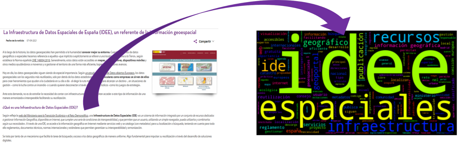
- The Spatial Data Infrastructure of Spain (IDEE), a benchmark for geospatial information.
4. Data processing
Before advancing to creation of an effective visualization, we must perform a preliminary data treatment or pre-processing of the data, paying attention to obtaining them, ensuring that they do not contain errors and are in a suitable format for processing. Data pre-processing is essential for build any effective and consistent visual representation.
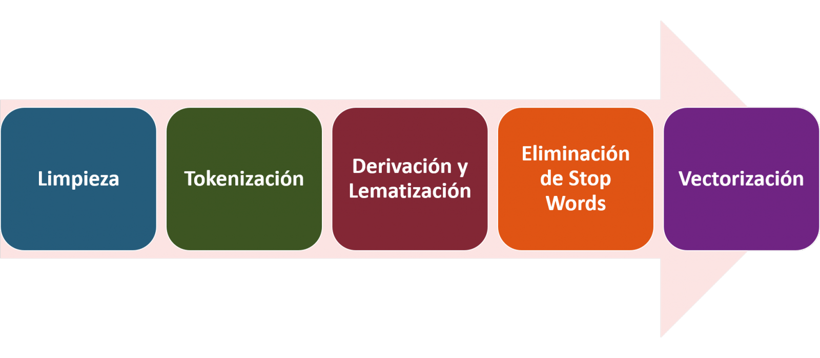
In NLP, the pre-processing of the data consists mainly of a series of transformations that are carried out on the input data, in our case several posts in TXT format, with the aim of obtaining standardized data and without elements that may affect the quality of the results, in order to facilitate its subsequent processing to perform tasks such as, generate a word cloud, perform opinion/sentiment mining or generate automated summaries from input texts. In general, the flowchart to be followed to perform word preprocessing includes the following steps:
- Cleaning: Removal of special characters and symbols that inflict results distortion, such as punctuation marks.
- Tokenize: Tokenization is the process of separating a text into smaller units, tokens. Tokens can be sentences, words, or even characters.
- Derivation and Lemmatisation: this process consists of transforming words to their basic form, that is, to their canonical form or lemma, eliminating plurals, verb tenses or genders. This action is sometimes redundant since it is not always required for further processing to know the semantic similarity between the different words of the text.
- Elimination of stop words: stop words or empty words are those words of common use that do not contribute in a significant way to the text. These words should be removed before text processing as they do not provide any unique information that can be used for the classification or grouping of the text, for example, determining articles such as 'a', 'an', 'the' etc.
- Vectorization: in this step we transform each of the tokens obtained in the previous step to a vector of real numbers that is generated based on the frequency of the appearance of each word in the text. Vectorization allows machines to be able to process text and apply, among others, machine learning techniques.
4.1. Installation and loading of libraries
Before starting with data pre-processing, we need to import the libraries to work with. Python provides a vast number of libraries that allow to implement functionalities for many tasks, such as data visualization, Machine Learning, Deep Learning or Natural Language Processing, among many others. The libraries that we will use for this analysis and visualization are the following:
- os, which allows access to operating system-dependent functionality, such as manipulating the directory structure.
- re, provides functions for processing regular expressions.
- pandas, is a very popular and essential library for processing data tables.
- string, provides a series of very useful functions for handling strings.
- matplotlib.pyplot, contains a collection of functions that will allow us to generate the graphical representations of the word clouds.
- sklearn.feature_extraction.text (Scikit-Learn library), converts a collection of text documents into a vector array. From this library we will use some commands that we will discuss later.
- wordcloud, library with which we can generate the word cloud.
# Importaremos las librerías necesarias para realizar este análisis y la visualización. import os import re import pandas as pd import string import matplotlib.pyplot as plt from sklearn.feature_extraction.text import CountVectorizer from sklearn.feature_extraction.text import TfidfTransformer from wordcloud import WordCloud4.2. Data loading
Once the libraries are loaded, we prepare the data with which we are going to work. Before starting to load the data, in the working directory we need: (a) a folder called \"post\" that will contain all the files in TXT format with which we are going to work and that are available in the repository of this project of the GitHub of datos.gob.es; (b) a file called \"stop_words_spanish.txt\" that contains the list of stop words in Spanish, which is also available in said repository and (c) a folder called \"images\" where we will save the images of the word clouds in PNG format, which we will create below.
# Generamos la carpeta \"imagenes\".nueva_carpeta = \"imagenes/\" try: os.mkdir(nueva_carpeta)except OSError: print (\"Ya existe una carpeta llamada %s\" % nueva_carpeta)else: print (\"Se ha creado la carpeta: %s\" % nueva_carpeta)Next, we will proceed to load the data. The input data, as we have already mentioned, are in TXT files and each file contains a post. As we want to perform the analysis and visualization of several posts at the same time, we will load in our development environment all the texts that interest us, to later insert them in a single table or dataframe.
# Generamos una lista donde incluiremos todos los archivos que debe leer, indicándole la carpeta donde se encuentran.filePath = []for file in os.listdir(\"./post/\"): filePath.append(os.path.join(\"./post/\", file))# Generamos un dataframe en el cual incluiremos una fila por cada post.post_df = pd.DataFrame()for file in filePath: with open (file, \"rb\") as readFile: post_df = pd.DataFrame([readFile.read().decode(\"utf8\")], append(post_df)# Nombramos la columna que contiene los textos en el dataframe.post_df.columns = [\"texto\"]4.3. Data pre-processing
In order to obtain our objective: generate word clouds for each post, we will perform the following pre-processing tasks.
a) Data cleansing
Once a table containing the texts with which we are going to work has been generated, we must eliminate the noise beyond the text that interests us: special characters, punctuation marks and carriage returns.
First, we put all characters in lowercase to avoid any errors in case-sensitive processes, by using the lower() command.
Then we eliminate punctuation marks, such as periods, commas, exclamations, questions, among many others. For the elimination of these we will resort to the preinitialized string.punctuacion of the string library, which returns a set of symbols considered punctuation marks. In addition, we must eliminate tabs, cart jumps and extra spaces, which do not provide information in this analysis, using regular expressions.
It is essential to apply all these steps in a single function so that they are processed sequentially, because all processes are highly related.
# Eliminamos los signos de puntuación, los saltos de carro/tabulaciones y espacios en blanco extra.# Para ello generamos una función en la cual indicamos todos los cambios que queremos aplicar al texto.def limpiar_texto(texto): texto = texto.lower() texto = re.sub(\"\\[.*?¿\\]\\%\", \" \", texto) texto = re.sub(\"[%s]\" % re.escape(string.punctuation), \" \", texto) texto re.sub(\"\\w*\\d\\w*\", \" \", texto) return texto# Aplicamos los cambios al texto.limpiar_texto = lambda x: limpiar_texto(x)post_clean = pd.DataFrame(post_clean.texto.apply/limpiar_texto)b) Tokenize
Once we have eliminated the noise in the texts with which we are going to work, we will tokenize each of the texts in words. For this we will use the split() function, using space as a separator between words. This will allow separating the words independently (tokens) for future analysis.
# Tokenizar los textos. Se crea una nueva columna en la tabla con los tokens con el texto \"tokenizado\".def tokenizar(text): text = texto.split(sep = \" \") return(text)post_df[\"texto_tokenizado\"] = post_df[\"texto\"].apply(lambda x: tokenizar(x))c) Removal of \"stop words\"
After removing punctuation marks and other elements that can distort the target display, we will remove \"stop words\". To carry out this step we use a list of Spanish stop words since each language has its own list. This list consists of a total of 608 words, which include articles, prepositions, linking verbs, adverbs, among others and is recently updated. This list can be downloaded from the datos.gob.es GitHub account in TXT format and must be located in the working directory.
# Leemos el archivo que contiene las palabras vacías en castellano.with open \"stop_words_spanish.txt\", encoding = \"UTF8\") as f: lines = f.read().splitlines()In this list of words, we will include new words that do not contribute relevant information to our texts or appear recurrently due to their own context. In this case, there is a bunch of words, which we should eliminate since they are present in all posts repetitively since they all deal with the subject of open data and there is a high probability that these are the most significant words. Some of these words are, \"item\", \"data\", \"open\", \"case\", among others. This will allow to obtain a more representative graphic representation of the content of each post.
On the other hand, a visual inspection of the results obtained allows to detect words or characters derived from errors included in the texts, which obviously have no meaning and that have not been eliminated in the previous steps. These should be removed from the analysis so that they do not distort the subsequent results. These are words like, \"nen\", \"nun\" or \"nla\"
# Actualizamos nuestra lista de stop words.stop_words.extend((\"caso\", \"forma\",\"unido\", \"abiertos\", \"post\", \"espera\", \"datos\", \"dato\", \"servicio\", \"nun\", \"día\", \"nen\", \"data\", \"conjuntos\", \"importantes\", \"unido\", \"unión\", \"nla\", \"r\", \"n\"))# Eliminamos las stop words de nuestra tabla.post_clean = post_clean [~(post_clean[\"texto_tokenizado\"].isin(stop_words))]d) Vectorization
Machines are not capable of understanding words and sentences therefore, they must be transformed to some numerical structure. The method consists of generating vectors from each token. In this post we use a simple technique known as bag-of-words (BoW). It consists of assigning a weight to each token proportional to the frequency of appearance of that token in the text. To do this, we work on an array in which each row represents a text and each column a token. To perform the vectorization we will resort to the CountVectorizer() and TfidTransformer() commands of the scikit-learn library.
The CountVectorizer() function allows you to transform text into a vector of frequencies or word counts. In this case we will obtain 6 vectors with as many dimensions as there are tokens in each text, one for each post, which we will integrate into a single matrix, where the columns will be the tokens or words and the rows will be the posts.
# Calculamos la matriz de frecuencia de palabras del texto.vectorizador = CountVectorizer()post_vec = vectorizador.fit_transform(post_clean.texto_tokenizado)Once the word frequency matrix is generated, it is necessary to convert it into a normalized vector form in order to reduce the impact of tokens that occur very frequently in the text. To do this we will use the TfidfTransformer() function.
# Convertimos una matriz de frecuencia de palabras en una forma vectorial regularizada.transformer = TfidfTransformer()post_trans = transformer.fit_transform(post_vec).toarray()If you want to know more about the importance of applying this technique, you will find numerous articles on the Internet that talk about it and how relevant it is, among other issues, for SEO optimization.
5. Creation of the word cloud
Once we have concluded the pre-processing of the text, as we indicated at the beginning of the post, it is possible to perform NLP tasks. In this exercise we will create a word cloud or \"WordCloud\" for each of the analyzed texts.
A word cloud is a visual representation of the words with the highest rate of occurrence in the text. It allows to detect in a simple way the frequency and importance of each of the words, facilitating the identification of the keywords and discovering with a single glance the main theme treated in the text.
For this we are going to use the \"wordcloud\" library that incorporates the necessary functions to build each representation. First, we have to indicate the characteristics that each word cloud should present, such as the background color (background_color function), the color map that the words will take (colormap function), the maximum font size (max_font_size function) or set a seed so that the word cloud generated is always the same (function random_state) in future implementations. We can apply these and many other functions to customize each word cloud.
# Indicamos las características que presentará cada nube de palabras.wc = WordCloud(stopwords = stop_words, background_color = \"black\", colormap = \"hsv\", max_font_size = 150, random_state = 123)Once we have indicated the characteristics that we want each word cloud to present, we proceed to create it and save it as an image in PNG format. To generate the word cloud, we will use a loop in which we will indicate different functions of the matplotlib library (represented by the plt prefix) necessary to graphically generate the word cloud according to the specification defined in the previous step. We have to specify that a world cloud needs to be created for each row of the table, that is, for each text, with the function plt.subplot(). With the command plt.imshow() we indicate that the result is a 2D image. If we want the axes not to be displayed, we must indicate it with the plt.axis() function. Finally, with the function plt.savefig() we will save the generated visualization.
# Generamos las nubes de palabras para cada uno de los posts.for index, i in enumerate(post.columns): wc.generate(post.texto_tokenizado[i]) plt.subplot(3, 2, index+1 plt.imshow(wc, interpolation = \"bilinear\") plt.axis(\"off\") plt.savefig(\"imagenes/.png\")# Mostramos las nubes de palabras resultantes.plt.show()The visualization obtained is:
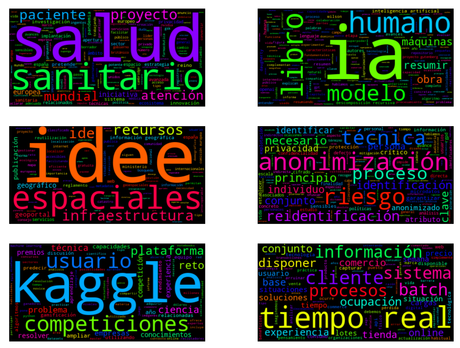
Visualization of the word clouds obtained from the texts of different posts of the blog section of datos.gob.es
5. Conclusions
Data visualization is one of the most powerful mechanisms for exploiting and analyzing the implicit meaning of data, regardless of the data type and the degree of technological knowledge of the user. Visualizations allow us to extract meaning out of the data and create narratives based on graphical representation.
Word clouds are a tool that allows us to speed up the analysis of textual data, since through them we can quickly and easily identify and interpret the words with the greatest relevance in the analyzed text, which gives us an idea of the subject.
If you want to learn more about Natural Language Processing, you can consult the guide \"Emerging Technologies and Open Data: Natural Language Processing\" and the posts \"Natural Language Processing\" and \" The latest news in natural language processing: summaries of classic works in just a few hundred words\".
Hopefully this step-by-step visualization has taught you a few things about the ins and outs of Natural Language Processing and word cloud creation. We will return to show you new data reuses. See you soon!
Documentación
1. Introduction
Data visualization is a task linked to data analysis that aims to graphically represent underlying data information. Visualizations play a fundamental role in the communication function that data possess, since they allow to drawn conclusions in a visual and understandable way, allowing also to detect patterns, trends, anomalous data or to project predictions, alongside with other functions. This makes its application transversal to any process in which data intervenes. The visualization possibilities are very numerous, from basic representations, such as a line graphs, graph bars or sectors, to complex visualizations configured from interactive dashboards.
Before we start to build an effective visualization, we must carry out a pre-treatment of the data, paying attention to how to obtain them and validating the content, ensuring that they do not contain errors and are in an adequate and consistent format for processing. Pre-processing of data is essential to start any data analysis task that results in effective visualizations.
A series of practical data visualization exercises based on open data available on the datos.gob.es portal or other similar catalogues will be presented periodically. They will address and describe, in a simple way; the stages necessary to obtain the data, perform the transformations and analysis that are relevant for the creation of interactive visualizations, from which we will be able summarize on in its final conclusions the maximum mount of information. In each of the exercises, simple code developments will be used (that will be adequately documented) as well as free and open use tools. All generated material will be available for reuse in the Data Lab repository on Github.
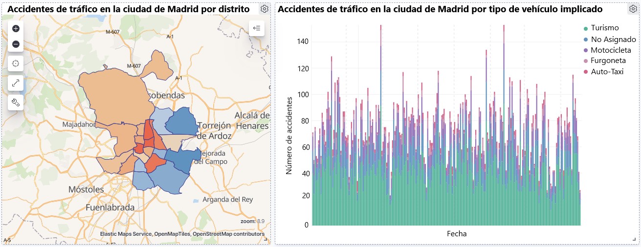
Visualization of traffic accidents occurring in the city of Madrid, by district and type of vehicle
2. Objetives
The main objective of this post is to learn how to make an interactive visualization based on open data available on this portal. For this exercise, we have chosen a dataset that covers a wide period and contains relevant information on the registration of traffic accidents that occur in the city of Madrid. From these data we will observe what is the most common type of accidents in Madrid and the incidence that some variables such as age, type of vehicle or the harm produced by the accident have on them.
3. Resources
3.1. Datasets
For this analysis, a dataset available in datos.gob.es on traffic accidents in the city of Madrid published by the City Council has been selected. This dataset contains a time series covering the period 2010 to 2021 with different subcategories that facilitate the analysis of the characteristics of traffic accidents that occurred. For example, the environmental conditions in which each accident occurred or the type of accident. Information on the structure of each data file is available in documents covering the period 2010-2018 and 2019 onwards. It should be noted that there are inconsistencies in the data before and after the year 2019, due to data structure variations. This is a common situation that data analysts must face when approaching the preprocessing tasks of the data that will be used, this is derived from the lack of a homogeneous structure of the data over time. For example, alterations on the number of variables, modification of the type of variables or changes to different measurement units. This is a compelling reason that justifies the need to accompany each open data set with complete documentation explaining its structure.
3.2. Tools
R (versión 4.0.3) and RStudio with the RMarkdown complement have been used to carry out the pre-treatment of the data (work environment setup, programming and writing).
R is an object-oriented and interpreted open-source programming language, initially created for statistical computing and the creation of graphical representations. Nowadays, it is a very powerful tool for all types of data processing and manipulation permanently updated. It contains a programming environment, RStudio, also open source.
The Kibana tool has been used for the creation of the interactive visualization.
Kibana is an open source tool that belongs to the Elastic Stack product suite (Elasticsearch, Beats, Logstash and Kibana) that enables visualization creation and exploration of indexed data on top of the Elasticsearch analytics engine.
If you want to know more about these tools or anyother that can help you in data processing and creating interactive visualizations, you can consult the report \"Data processing and visualization tools\".
4. Data processing
For the realization of the subsequent analysis and visualizations, it is necessary to prepare the data adequately, so that the results obtained are consistent and effective. We must perform an exploratory data analysis (EDA), in order to know and understand the data with which we want to work. The main objective of this data pre-processing is to detect possible anomalies or errors that could affect the quality of subsequent results and identify patterns of information contained in the data.
To facilitate the understanding of readers not specialized in programming, the R code included below, which you can access by clicking on the \"Code\" button in each section, is not designed to maximize its efficiency, but to facilitate its understanding, so it is possible that more advanced readers in this language might consider alternatives more efficient to encode some functionalities. The reader will be able to reproduce this analysis if desired, as the source code is available on datos.gob.es's Github account. In order to provide the code a plain text document will be used, which once loaded into the development environment can be easily executed or modified if desired.
4.1. Installation and loading of libraries
For the development of this analysis, we need to install a series of additional R packages to the base distribution, incorporating the functions and objects defined by them into the work environment. There are many packages available in R but the most suitable to work with this dataset are: tidyverse, lubridate and data.table.Tidyverse is a collection of R packages (it contains other packages such as dplyr, ggplot2, readr, etc.) specifically designed to work in Data Science, facilitating the loading and processing of data, and graphical representations and other essential functionalities for data analysis. It requires a progressive knowledge to get the most out of the packages that integrates. On the other hand, the lubridate package will be used for the management of date variables. Finally the data.table package allows a more efficient management of large data sets. These packages will need to be downloaded and installed in the development environment.
#Lista de librerías que queremos instalar y cargar en nuestro entorno de desarrollo librerias <- c(\"tidyverse\", \"lubridate\", \"data.table\")#Descargamos e instalamos las librerías en nuestros entorno de desarrollo package.check <- lapplay (librerias, FUN = function(x) { if (!require (x, character.only = TRUE)) { install.packages(x, dependencies = TRUE) library (x, character.only = TRUE } }4.2. Uploading and cleaning data
a. Loading datasets
The data that we are going to use in the visualization are divided by annuities in CSV files. As we want to perform an analysis of several years we must download and upload in our development environment all the datasets that interest us.
To do this, we generate the working directory \"datasets\", where we will download all the datasets. We use two lists, one with all the URLs where the datasets are located and another with the names that we assign to each file saved on our machine, with this we facilitate subsequent references to these files.
#Generamos una carpeta en nuestro directorio de trabajo para guardar los datasets descargadosif (dir.exists(\".datasets\") == FALSE)#Nos colocamos dentro de la carpetasetwd(\".datasets\")#Listado de los datasets que nos interese descargardatasets <- c(\"https://datos.madrid.es/egob/catalogo/300228-10-accidentes-trafico-detalle.csv\", \"https://datos.madrid.es/egob/catalogo/300228-11-accidentes-trafico-detalle.csv\", \"https://datos.madrid.es/egob/catalogo/300228-12-accidentes-trafico-detalle.csv\", \"https://datos.madrid.es/egob/catalogo/300228-13-accidentes-trafico-detalle.csv\", \"https://datos.madrid.es/egob/catalogo/300228-14-accidentes-trafico-detalle.csv\", \"https://datos.madrid.es/egob/catalogo/300228-15-accidentes-trafico-detalle.csv\", \"https://datos.madrid.es/egob/catalogo/300228-16-accidentes-trafico-detalle.csv\", \"https://datos.madrid.es/egob/catalogo/300228-17-accidentes-trafico-detalle.csv\", \"https://datos.madrid.es/egob/catalogo/300228-18-accidentes-trafico-detalle.csv\", \"https://datos.madrid.es/egob/catalogo/300228-19-accidentes-trafico-detalle.csv\", \"https://datos.madrid.es/egob/catalogo/300228-21-accidentes-trafico-detalle.csv\", \"https://datos.madrid.es/egob/catalogo/300228-22-accidentes-trafico-detalle.csv\")#Descargamos los datasets de interésdt <- list()for (i in 1: length (datasets)){ files <- c(\"Accidentalidad2010\", \"Accidentalidad2011\", \"Accidentalidad2012\", \"Accidentalidad2013\", \"Accidentalidad2014\", \"Accidentalidad2015\", \"Accidentalidad2016\", \"Accidentalidad2017\", \"Accidentalidad2018\", \"Accidentalidad2019\", \"Accidentalidad2020\", \"Accidentalidad2021\") download.file(datasets[i], files[i]) filelist <- list.files(\".\") print(i) dt[i] <- lapply (filelist[i], read_delim, sep = \";\", escape_double = FALSE, locale = locale(encoding = \"WINDOWS-1252\", trim_ws = \"TRUE\") }b. Creating the worktable
Once we have all the datasets loaded into our development environment, we create a single worktable that integrates all the years of the time series.
Accidentalidad <- rbindlist(dt, use.names = TRUE, fill = TRUE)Once the worktable is generated, we must solve one of the most common problems in all data preprocessing: the inconsistency in the naming of the variables in the different files that make up the time series. This anomaly produces variables with different names, but we know that they represent the same information. In this case it is explained in the data dictionary described in the documentation of the files, if this was not the case, it is necessary to resort to the observation and descriptive exploration of the files. In this case, the variable \"\"RANGO EDAD\"\" that presents data from 2010 to 2018 and the variable \"\"RANGO EDAD\"\" that presents the same data but from 2019 to 2021 are different. To solve this problem, we must unite/merge the variables that present this anomaly in a single variable.
#Con la función unite() unimos ambas variables. Debemos indicarle el nombre de la tabla, el nombre que queremos asignarle a la variable y la posición de las variables que queremos unificar. Accidentalidad <- unite(Accidentalidad, LESIVIDAD, c(25, 44), remove = TRUE, na.rm = TRUE)Accidentalidad <- unite(Accidentalidad, NUMERO_VICTIMAS, c(20, 27), remove = TRUE, na.rm = TRUE)Accidentalidad <- unite(Accidentalidad, RANGO_EDAD, c(26, 35, 42), remove = TRUE, na.rm = TRUE)Accidentalidad <- unite(Accidentalidad, TIPO_VEHICULO, c(20, 27), remove = TRUE, na.rm = TRUE)Once we have the table with the complete time series, we create a new table counting only the variables that are relevant to us to make the interactive visualization that we want to develop.
Accidentalidad <- Accidentalidad %>% select (c(\"FECHA\", \"DISTRITO\", \"LUGAR ACCIDENTE\", \"TIPO_VEHICULO\", \"TIPO_PERSONA\", \"TIPO ACCIDENTE\", \"SEXO\", \"LESIVIDAD\", \"RANGO_EDAD\", \"NUMERO_VICTIMAS\") c. Variable transformation
Next, we examine the type of variables and values to transform the necessary variables to be able to perform future aggregations, graphs or different statistical analyses.
#Re-ajustar la variable tipo fechaAccidentalidad$FECHA <- dmy (Accidentalidad$FECHA #Re-ajustar el resto de variables a tipo factor Accidentalidad$'TIPO ACCIDENTE' <- as.factor(Accidentalidad$'TIPO.ACCIDENTE')Accidentalidad$'Tipo Vehiculo' <- as.factor(Accidentalidad$'Tipo Vehiculo')Accidentalidad$'TIPO PERSONA' <- as.factor(Accidentalidad$'TIPO PERSONA')Accidentalidad$'Tramo Edad' <- as.factor(Accidentalidad$'Tramo Edad')Accidentalidad$SEXO <- as.factor(Accidentalidad$SEXO)Accidentalidad$LESIVIDAD <- as.factor(Accidentalidad$LESIVIDAD)Accidentalidad$DISTRITO <- as.factor (Accidentalidad$DISTRITO)d. Creation of new variables
Let's divide the variable \"\"FECHA\"\" into a hierarchy of variables of date types, \"\"Año\", \"\"Mes\"\" and \"\"Día\"\". This action is very common in data analytics, since it is interesting to analyze other time ranges, for example; years, months, weeks (and any other unit of time), or we need to generate aggregations from the day of the week.
#Generación de la variable AñoAccidentalidad$Año <- year(Accidentalidad$FECHA)Accidentalidad$Año <- as.factor(Accidentalidad$Año) #Generación de la variable MesAccidentalidad$Mes <- month(Accidentalidad$FECHA)Accidentalidad$Mes <- as.factor(Accidentalidad$Mes)levels (Accidentalidad$Mes) <- c(\"Enero\", \"Febrero\", \"Marzo\", \"Abril\", \"Mayo\", \"Junio\", \"Julio\", \"Agosto\", \"Septiembre\", \"Octubre\", \"Noviembre\", \"Diciembre\") #Generación de la variable DiaAccidentalidad$Dia <- month(Accidentalidad$FECHA)Accidentalidad$Dia <- as.factor(Accidentalidad$Dia)levels(Accidentalidad$Dia)<- c(\"Domingo\", \"Lunes\", \"Martes\", \"Miercoles\", \"Jueves\", \"Viernes\", \"Sabado\")e. Detection and processing of lost data
The detection and processing of lost data (NAs) is an essential task in order to be able to process the variables contained in the table, since the lack of data can cause problems when performing aggregations, graphs or statistical analysis.
Next, we will analyze the absence of data (detection of NAs) in the table:
#Suma de todos los NAs que presenta el datasetsum(is.na(Accidentalidad))#Porcentaje de NAs en cada una de las variablescolMeans(is.na(Accidentalidad))Once the NAs presented by the dataset have been detected, we must treat them somehow. In this case, as all the interesting variables are categorical, we will complete the missing values with the new value \"Unassigned\", this way we do not lose sample size and relevant information.
#Sustituimos los NAs de la tabla por el valor \"No asignado\"Accidentalidad [is.na(Accidentalidad)] <- \"No asignado\"f. Level assignments in variables
Once we have the variables of interest in the table, we can perform a more exhaustive analysis of the data and categories presented by each of the variables. If we analyze each one independently, we can see that some of them have repeated categories, simply by use of accents, special characters or capital letters. We will reassign the levels to the variables that require so that future visualizations or statistical analysis are built efficiently and without errors.
For space reasons, in this post we will only show an example with the variable \"HARMFULNESS\". This variable was typified until 2018 with a series of categories (IL, HL, HG, MT), while from 2019 other categories were used (values from 0 to 14). Fortunately, this task is easily approachable since it is documented in the information about the structure that accompanies each dataset. This issue (as we have said before), that does not always happen, greatly hinders this type of data transformations.
#Comprobamos las categorías que presenta la variable \"LESIVIDAD\"levels(Accidentalidad$LESIVIDAD)#Asignamos las nuevas categoríaslevels(Accidentalidad$LESIVIDAD)<- c(\"Sin asistencia sanitaria\", \"Herido leve\", \"Herido leve\", \"Herido grave\", \"Fallecido\", \"Herido leve\", \"Herido leve\", \"Herido leve\", \"Ileso\", \"Herido grave\", \"Herido leve\", \"Ileso\", \"Fallecido\", \"No asignado\")#Comprobamos de nuevo las catergorías que presenta la variablelevels(Accidentalidad$LESIVIDAD)4.3. Dataset Summary
Let's see what variables and structure the new dataset presents after the transformations made:
str(Accidentalidad)summary(Accidentalidad)The output of these commands will be omitted for reading simplicity. The main characteristics of the dataset are:
- It is composed of 14 variables: 1 date variable and 13 categorical variables.
- The time range covers from 01-01-2010 to 31-06-2021 (the end date may vary, since the dataset of the year 2021 is being updated periodically).
- For space reasons in this post, not all available variables have been considered for analysis and visualization.
4.4. Save the generated dataset
Once we have the dataset with the structure and variables ready for us to perform the visualization of the data, we will save it as a data file in CSV format to later perform other statistical analysis. Or use it in other data processing or visualization tools such as the one we address below. It is important to save it with a UTF-8 (Unicode Transformation Format) encoding so that special characters are correctly identified by any software.
write.csv(Accidentalidad, file = Accidentalidad.csv\", fileEncoding=\"UTF-8\")5. Creation of the visualization on traffic accidents that occur in the city of Madrid using Kibana
To create this interactive visualization the Kibana tool (in its free version) has been used on our local environment. Before being able to perform the visualization it is necessary to have the software installed since we have followed the steps of the download and installation tutorial provided by the company Elastic.
Once the Kibana software is installed, we proceed to develop the interactive visualization. Below there are two video tutorials, which show the process of creating the visualization and interacting with it.
This first video tutorial shows the visualization development process by performing the following steps:
- Loading data into Elasticsearch, generating an index in Kibana that allows us to interact with the data practically in real time and interaction with the variables presented by the dataset.
- Generation of the following graphical representations:
- Line graph to represent the time series on traffic accidents that occurred in the city of Madrid.
- Horizontal bar chart showing the most common accident type
- Thematic map, we will show the number of accidents that occur in each of the districts of the city of Madrid. For the creation of this visual it is necessary to download the \"dataset containing the georeferenced districts in GeoJSON format\".
- Construction of the dashboard integrating the visuals generated in the previous step.
In this second video tutorial we will show the interaction with the visualization that we have just created:
6. Conclusions
Observing the visualization of the data on traffic accidents that occurred in the city of Madrid from 2010 to June 2021, the following conclusions can be drawn:
- The number of accidents that occur in the city of Madrid is stable over the years, except for 2019 where a strong increase is observed and during the second quarter of 2020 where a significant decrease is observed, which coincides with the period of the first state of alarm due to the COVID-19 pandemic.
- Every year there is a decrease in the number of accidents during the month of August.
- Men tend to have a significantly higher number of accidents than women.
- The most common type of accident is the double collision, followed by the collision of an animal and the multiple collision.
- About 50% of accidents do not cause harm to the people involved.
- The districts with the highest concentration of accidents are: the district of Salamanca, the district of Chamartín and the Centro district.
Data visualization is one of the most powerful mechanisms for autonomously exploiting and analyzing the implicit meaning of data, regardless of the degree of the user's technological knowledge. Visualizations allow us to build meaning on top of data and create narratives based on graphical representation.
If you want to learn how to make a prediction about the future accident rate of traffic accidents using Artificial Intelligence techniques from this data, consult the post on \"Emerging technologies and open data: Predictive Analytics\".
We hope you liked this post and we will return to show you new data reuses. See you soon!
Documentación
1. Introduction
Data visualization is a task linked to data analysis that aims to graphically represent underlying data information. Visualizations play a fundamental role in the communication function that data possess, since they allow to drawn conclusions in a visual and understandable way, allowing also to detect patterns, trends, anomalous data or to project predictions, alongside with other functions. This makes its application transversal to any process in which data intervenes. The visualization possibilities are very numerous, from basic representations, such as a line graphs, graph bars or sectors, to complex visualizations configured from interactive dashboards.
Before we start to build an effective visualization, we must carry out a pre-treatment of the data, paying attention to how to obtain them and validating the content, ensuring that they do not contain errors and are in an adequate and consistent format for processing. Pre-processing of data is essential to start any data analysis task that results in effective visualizations.
A series of practical data visualization exercises based on open data available on the datos.gob.es portal or other similar catalogues will be presented periodically. They will address and describe, in a simple way; the stages necessary to obtain the data, perform the transformations and analysis that are relevant for the creation of interactive visualizations, from which we will be able summarize on in its final conclusions the maximum mount of information. In each of the exercises, simple code developments will be used (that will be adequately documented) as well as free and open use tools. All generated material will be available for reuse in the Data Lab repository on Github.
Visualization of the teaching staff of Castilla y León classified by Province, Locality and Teaching Specialty
2. Objetives
The main objective of this post is to learn how to treat a dataset from its download to the creation of one or more interactive graphs. For this, datasets containing relevant information on teachers and students enrolled in public schools in Castilla y León during the 2019-2020 academic year have been used. Based on these data, analyses of several indicators that relate teachers, specialties and students enrolled in the centers of each province or locality of the autonomous community.
3. Resources
3.1. Datasets
For this study, datasets on Education published by the Junta de Castilla y León have been selected, available on the open data portal datos.gob.es. Specifically:
- Dataset of the legal figures of the public centers of Castilla y León of all the teaching positions, except for the schoolteachers, during the academic year 2019-2020. This dataset is disaggregated by specialty of the teacher, educational center, town and province.
- Dataset of student enrolments in schools during the 2019-2020 academic year. This dataset is obtained through a query that supports different configuration parameters. Instructions for doing this are available at the dataset download point. The dataset is disaggregated by educational center, town and province.
3.2. Tools
To carry out this analysis (work environment set up, programming and writing) Python (versión 3.7) programming language and JupyterLab (versión 2.2) have been used. This tools will be found integrated in Anaconda, one of the most popular platforms to install, update or manage software to work with Data Science. All these tools are open and available for free.
JupyterLab is a web-based user interface that provides an interactive development environment where the user can work with so-called Jupyter notebooks on which you can easily integrate and share text, source code and data.
To create the interactive visualization, the Kibana tool (versión 7.10) has been used.
Kibana is an open source application that is part of the Elastic Stack product suite (Elasticsearch, Logstash, Beats and Kibana) that provides visualization and exploration capabilities of indexed data on top of the Elasticsearch analytics engine..
If you want to know more about these tools or others that can help you in the treatment and visualization of data, you can see the recently updated \"Data Processing and Visualization Tools\" report.
4. Data processing
As a first step of the process, it is necessary to perform an exploratory data analysis (EDA) to properly interpret the starting data, detect anomalies, missing data or errors that could affect the quality of subsequent processes and results. Pre-processing of data is essential to ensure that analyses or visualizations subsequently created from it are consistent and reliable.
Due to the informative nature of this post and to favor the understanding of non-specialized readers, the code does not intend to be the most efficient, but to facilitate its understanding. So you will probably come up with many ways to optimize the proposed code to get similar results. We encourage you to do so! You will be able to reproduce this analysis since the source code is available in our Github account. The way to provide the code is through a document made on JupyterLab that once loaded into the development environment you can execute or modify easily.
4.1. Installation and loading of libraries
The first thing we must do is import the libraries for the pre-processing of the data. There are many libraries available in Python but one of the most popular and suitable for working with these datasets is Pandas. The Pandas library is a very popular library for manipulating and analyzing datasets.
import pandas as pd 4.2. Loading datasets
First, we download the datasets from the open data catalog datos.gob.es and upload them into our development environment as tables to explore them and perform some basic data cleaning and processing tasks. For the loading of the data we will resort to the function read_csv(), where we will indicate the download url of the dataset, the delimiter (\"\";\"\" in this case) and, we add the parameter \"encoding\"\" that we adjust to the value \"\"latin-1\"\", so that it correctly interprets the special characters such as the letters with accents or \"\"ñ\"\" present in the text strings of the dataset.
#Cargamos el dataset de las plantillas jurídicas de los centros públicos de Castilla y León de todos los cuerpos de profesorado, a excepción de los maestros url = \"https://datosabiertos.jcyl.es/web/jcyl/risp/es/educacion/plantillas-centros-educativos/1284922684978.csv\"docentes = pd.read_csv(url, delimiter=\";\", header=0, encoding=\"latin-1\")docentes.head(3)#Cargamos el dataset de los alumnos matriculados en los centros educativos públicos de Castilla y León alumnos = pd.read_csv(\"matriculaciones.csv\", delimiter=\",\", names=[\"Municipio\", \"Matriculaciones\"], encoding=\"latin-1\") alumnos.head(3)The column \"\"Localidad\"\" of the table \"\"alumnos\"\" is composed of the code of the municipality and the name of the same. We must divide this column in two, so that its treatment is more efficient.
columnas_Municipios = alumnos[\"Municipio\"].str.split(\" \", n=1, expand = TRUE)alumnos[\"Codigo_Municipio\"] = columnas_Municipios[0]alumnos[\"Nombre_Munipicio\"] = columnas_Munipicio[1]alumnos.head(3)4.3. Creating a new table
Once we have both tables with the variables of interest, we create a new table resulting from their union. The union variables will be: \"\"Localidad\"\" in the table of \"\"docentes\"\" and \"\"Nombre_Municipio” in the table of \"\"alumnos\".
docentes_alumnos = pd.merge(docentes, alumnos, left_on = \"Localidad\", right_on = \"Nombre_Municipio\")docentes_alumnos.head(3)4.4. Exploring the dataset
Once we have the table that interests us, we must spend some time exploring the data and interpreting each variable. In these cases, it is very useful to have the data dictionary that always accompanies each downloaded dataset to know all its details, but this time we do not have this essential tool. Observing the table, in addition to interpreting the variables that make it up (data types, units, ranges of values), we can detect possible errors such as mistyped variables or the presence of missing values (NAs) that can reduce analysis capacity.
docentes_alumnos.info()In the output of this section of code, we can see the main characteristics of the table:
- Contains a total of 4,512 records
- It is composed of 13 variables, 5 numerical variables (integer type) and 8 categorical variables (\"object\" type)
- There is no missing of values.
Once we know the structure and content of the table, we must rectify errors, as is the case of the transformation of some of the variables that are not properly typified, for example, the variable that houses the center code (\"Código.centro\").
docentes_alumnos.Codigo_centro = data.Codigo_centro.astype(\"object\")docentes_alumnos.Codigo_cuerpo = data.Codigo_cuerpo.astype(\"object\")docentes_alumnos.Codigo_especialidad = data.Codigo_especialidad.astype(\"object\")Once we have the table free of errors, we obtain a description of the numerical variables, \"\"Plantilla\" and \"\"Matriculaciones\", which will help us to know important details. In the output of the code that we present below we observe the mean, the standard deviation, the maximum and minimum number, among other statistical descriptors.
docentes_alumnos.describe()4.5. Save the dataset
Once we have the table free of errors and with the variables that we are interested in graphing, we will save it in a folder of our choice to use it later in other analysis or visualization tools. We will save it in CSV format encoded as UTF-8 (Unicode Transformation Format) so that special characters are correctly identified by any tool we might use later.
df = pd.DataFrame(docentes_alumnos)filname = \"docentes_alumnos.csv\"df.to_csv(filename, index = FALSE, encoding = \"utf-8\")5. Creation of the visualization on the teachers of the public educational centers of Castilla y León using the Kibana tool
For the realization of this visualization, we have used the Kibana tool in our local environment. To do this it is necessary to have Elasticsearch and Kibana installed and running. The company Elastic makes all the information about the download and installation available in this tutorial.
Attached below are two video tutorials, which shows the process of creating the visualization and the interaction with the generated dashboard.
In this first video, you can see the creation of the dashboard by generating different graphic representations, following these steps:
- We load the table of previously processed data into Elasticsearch and generate an index that allows us to interact with the data from Kibana. This index allows search and management of data, practically in real time.
- Generation of the following graphical representations:
- Graph of sectors where to show the teaching staff by province, locality and specialty.
- Metrics of the number of teachers by province.
- Bar chart, where we will show the number of registrations by province.
- Filter by province, locality and teaching specialty.
- Construction of the dashboard.
In this second video, you will be able to observe the interaction with the dashboard generated previously.
6. Conclusions
Observing the visualization of the data on the number of teachers in public schools in Castilla y León, in the academic year 2019-2020, the following conclusions can be obtained, among others:
- The province of Valladolid is the one with both the largest number of teachers and the largest number of students enrolled. While Soria is the province with the lowest number of teachers and the lowest number of students enrolled.
- As expected, the localities with the highest number of teachers are the provincial capitals.
- In all provinces, the specialty with the highest number of students is English, followed by Spanish Language and Literature and Mathematics.
- It is striking that the province of Zamora, although it has a low number of enrolled students, is in fifth position in the number of teachers.
This simple visualization has helped us to synthesize a large amount of information and to obtain a series of conclusions at a glance, and if necessary, make decisions based on the results obtained. We hope you have found this new post useful and we will return to show you new reuses of open data. See you soon!
Documentación
1. Introduction
Data visualization is a task linked to data analysis that aims to represent graphically the underlying information. Visualizations play a fundamental role in data communication, since they allow to draw conclusions in a visual and understandable way, also allowing detection of patterns, trends, anomalous data or projection of predictions, among many other functions. This makes its application transversal to any process that involves data. The visualization possibilities are very broad, from basic representations such as line, bar or sector graph, to complex visualizations configured on interactive dashboards.
Before starting to build an effective visualization, a prior data treatment must be performed, paying attention to their collection and validation of their content, ensuring that they are free of errors and in an adequate and consistent format for processing. The previous data treatment is essential to carry out any task related to data analysis and realization of effective visualizations.
We will periodically present a series of practical exercises on open data visualizations that are available on the portal datos.gob.es and in other similar catalogues. In there, we approach and describe in a simple way the necessary steps to obtain data, perform transformations and analysis that are relevant to creation of interactive visualizations from which we may extract all the possible information summarised in final conclusions. In each of these practical exercises we will use simple code developments which will be conveniently documented, relying on free tools. Created material will be available to reuse in Data Lab on Github.
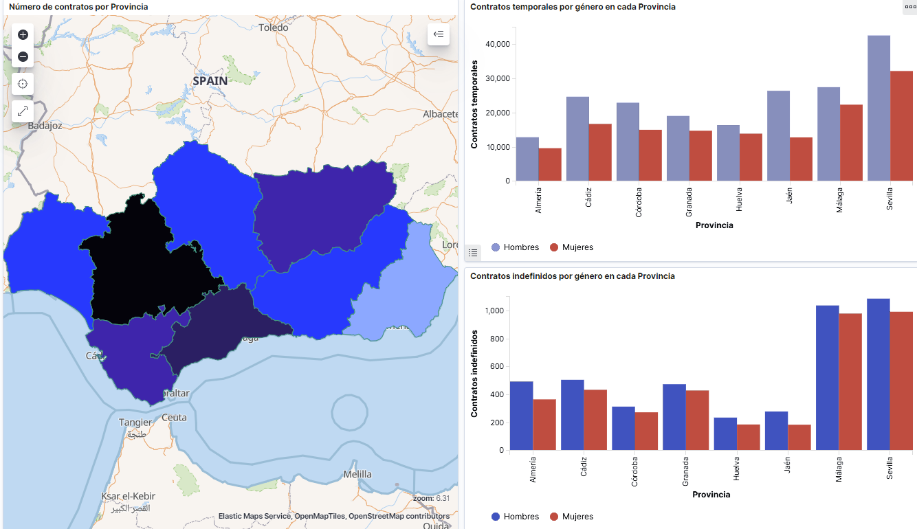
Captura del vídeo que muestra la interacción con el dashboard de la caracterización de la demanda de empleo y la contratación registrada en España disponible al final de este artículo
2. Objetives
The main objective of this post is to create an interactive visualization using open data. For this purpose, we have used datasets containing relevant information on evolution of employment demand in Spain over the last years. Based on these data, we have determined a profile that represents employment demand in our country, specifically investigating how does gender gap affects a group and impact of variables such as age, unemployment benefits or region.
3. Resources
3.1. Datasets
For this analysis we have selected datasets published by the Public State Employment Service (SEPE), coordinated by the Ministry of Labour and Social Economy, which collects time series data with distinct breakdowns that facilitate the analysis of the qualities of job seekers. These data are available on datos.gob.es, with the following characteristics:
- Demandantes de empleo por municipio: contains the number of job seekers broken down by municipality, age and gender, between the years 2006-2020.
- Gasto de prestaciones por desempleo por Provincia: time series between the years 2010-2020 related to unemployment benefits expenditure, broken down by province and type of benefit.
- Contratos registrados por el Servicio Público de Empleo Estatal (SEPE) por municipio: these datasets contain the number of registered contracts to both, job seekers and non-job seekers, broken down by municipality, gender and contract type, between the years 2006-2020.
3.2. Tools.
R (versión 4.0.3) and RStudio with RMarkdown add-on have been used to carry out this analysis (working environment, programming and drafting).
RStudio is an integrated open source development environment for R programming language, dedicated to statistical analysis and graphs creation.
RMarkdown allows creation of reports integrating text, code and dynamic results into a single document.
To create interactive graphs, we have used Kibana tool.
Kibana is an open code application that forms a part of Elastic Stack (Elasticsearch, Beats, Logstasg y Kibana) qwhich provides visualization and exploration capacities of the data indexed on the analytics engine Elasticsearch. The main advantages of this tool are:
- Presents visual information through interactive and customisable dashboards using time intervals, filters faceted by range, geospatial coverage, among others
- Contains development tools catalogue (Dev Tools) to interact with data stored in Elasticsearch.
- It has a free version ready to use on your own computer and enterprise version that is developed in the Elastic cloud and other cloud infrastructures, such as Amazon Web Service (AWS).
On Elastic website you may find user manuals for the download and installation of the tool, but also how to create graphs, dashboards, etc. Furthermore, it offers short videos on the youtube channel and organizes webinars dedicated to explanation of diverse aspects related to Elastic Stack.
If you want to learn more about these and other tools which may help you with data processing, see the report “Data processing and visualization tools” that has been recently updated.
4. Data processing
To create a visualization, it´s necessary to prepare the data properly by performing a series of tasks that include pre-processing and exploratory data analysis (EDA), to understand better the data that we are dealing with. The objective is to identify data characteristics and detect possible anomalies or errors that could affect the quality of results. Data pre-processing is essential to ensure the consistency and effectiveness of analysis or visualizations that are created afterwards.
In order to support learning of readers who are not specialised in programming, the R code included below, which can be accessed by clicking on “Code” button, is not designed to be efficient but rather to be easy to understand. Therefore, it´s probable that the readers more advanced in this programming language may consider to code some of the functionalities in an alternative way. A reader will be able to reproduce this analysis if desired, as the source code is available on the datos.gob.es Github account. The way to provide the code is through a RMarkdown document. Once it´s loaded to the development environment, it may be easily run or modified.
4.1. Installation and import of libraries
R base package, which is always available when RStudio console is open, includes a wide set of functionalities to import data from external sources, carry out statistical analysis and obtain graphic representations. However, there are many tasks for which it´s required to resort to additional packages, incorporating functions and objects defined in them into the working environment. Some of them are already available in the system, but others should be downloaded and installed.
#Instalación de paquetes \r\n #El paquete dplyr presenta una colección de funciones para realizar de manera sencilla operaciones de manipulación de datos \r\n if (!requireNamespace(\"dplyr\", quietly = TRUE)) {install.packages(\"dplyr\")}\r\n #El paquete lubridate para el manejo de variables tipo fecha \r\n if (!requireNamespace(\"lubridate\", quietly = TRUE)) {install.packages(\"lubridate\")}\r\n#Carga de paquetes en el entorno de desarrollo \r\nlibrary (dplyr)\r\nlibrary (lubridate)\r\n4.2. Data import and cleansing
a. Import of datasets
Data which will be used for visualization are divided by annualities in the .CSV and .XLS files. All the files of interest should be imported to the development environment. To make this post easier to understand, the following code shows the upload of a single .CSV file into a data table.
To speed up the loading process in the development environment, it´s necessary to download the datasets required for this visualization to the working directory. The datasets are available on the datos.gob.es Github account.
#Carga del datasets de demandantes de empleo por municipio de 2020. \r\n Demandantes_empleo_2020 <- \r\n read.csv(\"Conjuntos de datos/Demandantes de empleo por Municipio/Dtes_empleo_por_municipios_2020_csv.csv\",\r\n sep=\";\", skip = 1, header = T)\r\nOnce all the datasets are uploaded as data tables in the development environment, they need to be merged in order to obtain a single dataset that includes all the years of the time series, for each of the characteristics related to job seekers that will be analysed: number of job seekers, unemployment expenditure and new contracts registered by SEPE.
#Dataset de demandantes de empleo\r\nDatos_desempleo <- rbind(Demandantes_empleo_2006, Demandantes_empleo_2007, Demandantes_empleo_2008, Demandantes_empleo_2009, \r\n Demandantes_empleo_2010, Demandantes_empleo_2011,Demandantes_empleo_2012, Demandantes_empleo_2013,\r\n Demandantes_empleo_2014, Demandantes_empleo_2015, Demandantes_empleo_2016, Demandantes_empleo_2017, \r\n Demandantes_empleo_2018, Demandantes_empleo_2019, Demandantes_empleo_2020) \r\n#Dataset de gasto en prestaciones por desempleo\r\ngasto_desempleo <- rbind(gasto_2010, gasto_2011, gasto_2012, gasto_2013, gasto_2014, gasto_2015, gasto_2016, gasto_2017, gasto_2018, gasto_2019, gasto_2020)\r\n#Dataset de nuevos contratos a demandantes de empleo\r\nContratos <- rbind(Contratos_2006, Contratos_2007, Contratos_2008, Contratos_2009,Contratos_2010, Contratos_2011, Contratos_2012, Contratos_2013, \r\n Contratos_2014, Contratos_2015, Contratos_2016, Contratos_2017, Contratos_2018, Contratos_2019, Contratos_2020)b. Selection of variables
Once the tables with three time series are obtained (number of job seekers, unemployment expenditure and new registered contracts), the variables of interest will be extracted and included in a new table.
First, the tables with job seekers (“unemployment_data”) and new registered contracts (“contracts”) should be added by province, to facilitate the visualization. They should match the breakdown by province of the unemployment benefits expenditure table (“unemployment_expentidure”). In this step, only the variables of interest will be selected from the three datasets.
#Realizamos un group by al dataset de \"datos_desempleo\", agruparemos las variables numéricas que nos interesen, en función de varias variables categóricas\r\nDtes_empleo_provincia <- Datos_desempleo %>% \r\n group_by(Código.mes, Comunidad.Autónoma, Provincia) %>%\r\n summarise(total.Dtes.Empleo = (sum(total.Dtes.Empleo)), Dtes.hombre.25 = (sum(Dtes.Empleo.hombre.edad...25)), \r\n Dtes.hombre.25.45 = (sum(Dtes.Empleo.hombre.edad.25..45)), Dtes.hombre.45 = (sum(Dtes.Empleo.hombre.edad...45)),\r\n Dtes.mujer.25 = (sum(Dtes.Empleo.mujer.edad...25)), Dtes.mujer.25.45 = (sum(Dtes.Empleo.mujer.edad.25..45)),\r\n Dtes.mujer.45 = (sum(Dtes.Empleo.mujer.edad...45)))\r\n#Realizamos un group by al dataset de \"contratos\", agruparemos las variables numericas que nos interesen en función de las varibles categóricas.\r\nContratos_provincia <- Contratos %>% \r\n group_by(Código.mes, Comunidad.Autónoma, Provincia) %>%\r\n summarise(Total.Contratos = (sum(Total.Contratos)),\r\n Contratos.iniciales.indefinidos.hombres = (sum(Contratos.iniciales.indefinidos.hombres)), \r\n Contratos.iniciales.temporales.hombres = (sum(Contratos.iniciales.temporales.hombres)), \r\n Contratos.iniciales.indefinidos.mujeres = (sum(Contratos.iniciales.indefinidos.mujeres)), \r\n Contratos.iniciales.temporales.mujeres = (sum(Contratos.iniciales.temporales.mujeres)))\r\n#Seleccionamos las variables que nos interesen del dataset de \"gasto_desempleo\"\r\ngasto_desempleo_nuevo <- gasto_desempleo %>% select(Código.mes, Comunidad.Autónoma, Provincia, Gasto.Total.Prestación, Gasto.Prestación.Contributiva)Secondly, the three tables should be merged into one that we will work with from this point onwards..
Caract_Dtes_empleo <- Reduce(merge, list(Dtes_empleo_provincia, gasto_desempleo_nuevo, Contratos_provincia))
c. Transformation of variables
When the table with variables of interest is created for further analysis and visualization, some of them should be transformed to other types, more adequate for future aggregations.
#Transformación de una variable fecha\r\nCaract_Dtes_empleo$Código.mes <- as.factor(Caract_Dtes_empleo$Código.mes)\r\nCaract_Dtes_empleo$Código.mes <- parse_date_time(Caract_Dtes_empleo$Código.mes(c(\"200601\", \"ym\")), truncated = 3)\r\n#Transformamos a variable numérica\r\nCaract_Dtes_empleo$Gasto.Total.Prestación <- as.numeric(Caract_Dtes_empleo$Gasto.Total.Prestación)\r\nCaract_Dtes_empleo$Gasto.Prestación.Contributiva <- as.numeric(Caract_Dtes_empleo$Gasto.Prestación.Contributiva)\r\n#Transformación a variable factor\r\nCaract_Dtes_empleo$Provincia <- as.factor(Caract_Dtes_empleo$Provincia)\r\nCaract_Dtes_empleo$Comunidad.Autónoma <- as.factor(Caract_Dtes_empleo$Comunidad.Autónoma)d. Exploratory analysis
Let´s see what variables and structure the new dataset presents.
str(Caract_Dtes_empleo)\r\nsummary(Caract_Dtes_empleo)The output of this portion of the code is omitted to facilitate reading. Main characteristics presented in the dataset are as follows:
- Time range covers a period from January to December 2020.
- Number of columns (variables) is 17. .
- It presents two categorical variables (“Province”, “Autonomous.Community”), one date variable (“Code.month”) and the rest are numerical variables.
e. Detection and processing of missing data
Next, we will analyse whether the dataset has missing values (NAs). A treatment or elimination of NAs is essential, otherwise it will not be possible to process properly the numerical variables.
any(is.na(Caract_Dtes_empleo)) \r\n#Como el resultado es \"TRUE\", eliminamos los datos perdidos del dataset, ya que no sabemos cual es la razón por la cual no se encuentran esos datos\r\nCaract_Dtes_empleo <- na.omit(Caract_Dtes_empleo)\r\nany(is.na(Caract_Dtes_empleo))4.3. Creation of new variables
In order to create a visualization, we are going to make a new variable from the two variables present in the data table. This operation is very common in the data analysis, as sometimes it´s interesting to work with calculated data (e.g., the sum or the average of different variables) instead of source data. In this case, we will calculate the average unemployment expenditure for each job seeker. For this purpose, variables of total expenditure per benefit (“Expenditure.Total.Benefit”) and the total number of job seekers (“total.JobSeekers.Employment”) will be used.
Caract_Dtes_empleo$gasto_desempleado <-\r\n (1000 * (Caract_Dtes_empleo$Gasto.Total.Prestación/\r\n Caract_Dtes_empleo$total.Dtes.Empleo))4.4. Save the dataset
Once the table containing variables of interest for analysis and visualizations is obtained, we will save it as a data file in CSV format to perform later other statistical analysis or use it within other processing or data visualization tools. It´s important to use the UTF-8 encoding (Unicode Transformation Format), so the special characters may be identified correctly by any other tool.
write.csv(Caract_Dtes_empleo,\r\n file=\"Caract_Dtes_empleo_UTF8.csv\",\r\n fileEncoding= \"UTF-8\")5. Creation of a visualization on the characteristics of employment demand in Spain using Kibana
The development of this interactive visualization has been performed with usage of Kibana in the local environment. We have followed Elastic company tutorial for both, download and installation of the software.
Below you may find a tutorial video related to the whole process of creating a visualization. In the video you may see the creation of dashboard with different interactive indicators by generating graphic representations of different types. The steps to build a dashboard are as follows:
A continuación se adjunta un vídeo tutorial donde se muestra todo el proceso de realización de la visualización. En el vídeo podrás ver la creación de un cuadro de mando (dashboard) con diferentes indicadores interactivos mediante la generación de representaciones gráficas de diferentes tipos. Los pasos para obtener el dashboard son los siguientes:
- Load the data into Elasticsearch and generate an index that allows to interact with the data from Kibana. This index permits a search and management of the data in the loaded files, practically in real time.
- Generate the following graphic representations:
- Line graph to represent a time series on the job seekers in Spain between 2006 and 2020.
- Sector graph with job seekers broken down by province and Autonomous Community
- Thematic map showing the number of new contracts registered in each province on the territory. For creation of this visual it´s necessary to download a dataset with province georeferencing published in the open data portal Open Data Soft.
- Build a dashboard.
Below you may find a tutorial video interacting with the visualization that we have just created:
6. Conclusions
Looking at the visualization of the data related to the profile of job seekers in Spain during the years 2010-2020, the following conclusions may be drawn, among others:
- There are two significant increases of the job seekers number. The first, approximately in 2010, coincides with the economic crisis. The second, much more pronounced in 2020, coincides with the pandemic crisis.
- A gender gap may be observed in the group of job seekers: the number of female job seekers is higher throughout the time series, mainly in the age groups above 25.
- At the regional level, Andalusia, followed by Catalonia and Valencia, are the Autonomous Communities with the highest number of job seekers. In contrast to Andalusia, which is an Autonomous Community with the lowest unemployment expenditure, Catalonia presents the highest value.
- Temporal contracts are leading and the provinces which generate the highest number of contracts are Madrid and Barcelona, what coincides with the highest number of habitants, while on the other side, provinces with the lowest number of contracts are Soria, Ávila, Teruel and Cuenca, what coincides with the most depopulated areas of Spain.
This visualization has helped us to synthetise a large amount of information and give it a meaning, allowing to draw conclusions and, if necessary, make decisions based on results. We hope that you like this new post, we will be back to present you new reuses of open data. See you soon!