Evento
March is approaching and with it a new edition of the Open Data Day. It is an annual worldwide celebration that has been organised for 12 years, promoted by the Open Knowledge Foundation through the Open Knowledge Network. It aims to promote the use of open data in all countries and cultures.
This year's central theme is "Open data to address the polycrisis". The term polycrisis refers to a situation where different risks exist in the same time period. This theme aims to focus on open data as a tool to address, through its reuse, global challenges such as poverty and multiple inequalities, violence and conflict, climate risks and natural disasters.
If several years ago the activities were limited to a single day, from 2023 we have a week to enjoy various conferences, seminars, workshops, etc. centred on this theme. Specifically, in 2025, Open Data Day activities will take place from 1 to 7 March.
Through its website you can see the various activities that will take place throughout the week all over the world. In this article we review some of those that you can follow from Spain, either because they take place in Spain or because they can be followed online.
Open Data Day 2025: Women Leading Open Data for Equality
Iniciativa Barcelona Open Data is organising a session on the afternoon of 6 March focusing on how open data can help address equality challenges. The event will bring together women experts in data technologies and open data, to share knowledge, experiences and best practices in both the publication and reuse of open data in this field.
The event will start at 17:30 with a welcome and introduction. This will be followed by two panel discussions and an interview:
- Round Table 1. Publishing institutions. Gender-sensitive data strategy to address the feminist agenda.
- DIALOGUE Data lab. Building feminist Tech Data practice.
- Round Table 2. Re-users. Projects based on the use of open data to address the feminist agenda.
The day will end at 19:40 with a cocktail and the opportunity for attendees to discuss the topics discussed and expand their network through networking.
How can you follow the event? This is an in-person event, which will be held at Ca l'Alier, Carrer de Pere IV, 362 (Barcelona).
Open access scientific and scholarly publishing as a tool to face the 21st century polycrisis: the key role of publishers
Organised by a private individual, Professor Damián Molgaray, this conference looks at the key role of editors in open access scientific and scholarly publishing. The idea is for participants to reflect on how open knowledge is positioned as a fundamental tool to face the challenges of the 21st century polycrisis, with a focus on Latin America.
The event will take place on 4 March at 11:00 in Argentina (15:00 in mainland Spain).
How can you follow the event? This is an online event through Google Meet.
WhoFundsThem
The organisation mySociety will show the results of its latest project. Over the last few months, a team of volunteers has collected data on the financial interests of the 650 MPs in the UK House of Commons, using sources such as the official Register of Interests, Companies House, MPs' attendance at debates etc. This data, checked and verified with MPs themselves through a 'right of reply' system, has been transformed into an easily accessible format, so that anyone can easily understand it, and will be published on the parliamentary tracking website TheyWorkForYou.
At this event, the project will be presented and the conclusions will be discussed. It takes place on Tuesday 4 at 14:00 London time (15:00 in Spain peninsular).
How can you follow the event? The session can be followed online, but registration is required. The event will be in English.
Science on the 7th: A conversation on Open Data & Air Quality
El viernes 7 a las 9:00 EST – (15:00 en España peninsular) se podrá seguir online una conferencia sobre datos abiertos y calidad del aire. La sesión reunirá a diversos expertos para debatir los temas de actualidad en materia de calidad del aire y salud mundial, y se examinará la contaminación atmosférica procedente de fuentes clave, como las partículas, el ozono y la contaminación relacionada con el tráfico.
Esta iniciativa está organizada por Health Effects Institute, una corporación sin ánimo de lucro que proporciona datos científicos sobre los efectos de la contaminación atmosférica en la salud.
A conference on open data and air quality will be available online on Friday 7 at 9:00 EST (15:00 in mainland Spain). The session will bring together a range of experts to discuss topical issues in air quality and global health, and will examine air pollution from key sources such as particulate matter, ozone and traffic-related pollution.
This initiative is organised by Health Effects Institute, a non-profit corporation that provides scientific data on the health effects of air pollution.
How can you follow the event? The conference, which will be in English, can be viewed on YouTube. No registration is required.
Deadline open for new event proposals
The above events are just a few examples of the activities that are part of this global celebration, but, as mentioned above, you can see all the actions on the initiative's website.
In addition, the deadline for registering new events is still open. If you have a proposal, you can register it via this link.
From datos.gob.es we invite you to join this week of celebration, which serves to vindicate the power of open data to generate positive changes in our society. Don't miss it!
Documentación
Open data portals are an invaluable source of public information. However, extracting meaningful insights from this data can be challenging for users without advanced technical knowledge.
In this practical exercise, we will explore the development of a web application that democratizes access to this data through the use of artificial intelligence, allowing users to make queries in natural language.
The application, developed using the datos.gob.es portal as a data source, integrates modern technologies such as Streamlit for the user interface and Google's Gemini language model for natural language processing. The modular nature allows any Artificial Intelligence model to be used with minimal changes. The complete project is available in the Github repository.
Access the data laboratory repository on Github.
Run the data preprocessing code on Google Colab.
In this video, the author explains what you will find both on Github and Google Colab.
Application Architecture
The core of the application is based on four main interconnected sections that work together to process user queries:
- Context Generation
- Analyzes the characteristics of the chosen dataset.
- Generates a detailed description including dimensions, data types, and statistics.
- Creates a structured template with specific guidelines for code generation.
- Context and Query Combination
- Combines the generated context with the user's question, creating the prompt that the artificial intelligence model will receive.
- Response Generation
- Sends the prompt to the model and obtains the Python code that allows solving the generated question.
- Code Execution
- Safely executes the generated code with a retry and automatic correction system.
- Captures and displays the results in the application frontend.

Figure 1. Request processing flow
Development Process
The first step is to establish a way to access public data. The datos.gob.es portal offers datasets via API. Functions have been developed to navigate the catalog and download these files efficiently.
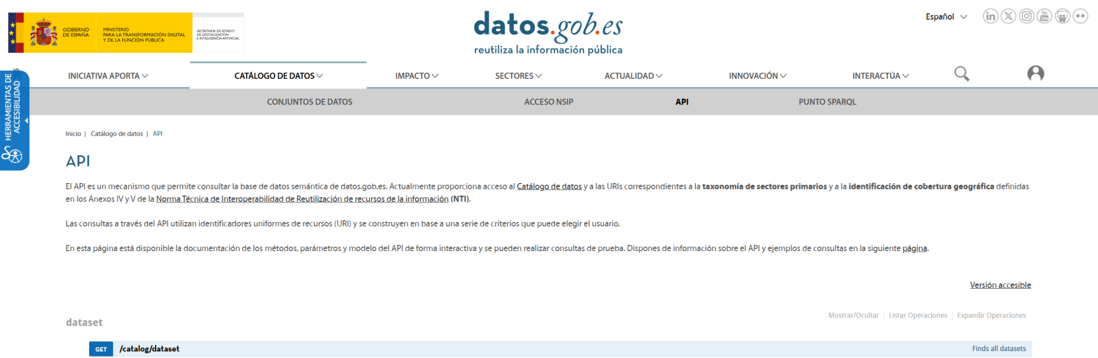
Figura 2. API de datos.gob
The second step addresses the question: how to convert natural language questions into useful data analysis? This is where Gemini, Google's language model, comes in. However, it's not enough to simply connect the model; it's necessary to teach it to understand the specific context of each dataset.
A three-layer system has been developed:
- A function that analyzes the dataset and generates a detailed "technical sheet".
- Another that combines this sheet with the user's question.
- And a third that translates all this into executable Python code.
You can see in the image below how this process develops and, subsequently, the results of the generated code are shown once executed.

Figure 3. Visualization of the application's response processing
Finally, with Streamlit, a web interface has been built that shows the process and its results to the user. The interface is as simple as choosing a dataset and asking a question, but also powerful enough to display complex visualizations and allow data exploration.
The final result is an application that allows anyone, regardless of their technical knowledge, to perform data analysis and learn about the code executed by the model. For example, a municipal official can ask "What is the average age of the vehicle fleet?" and get a clear visualization of the age distribution.

Figure 4. Complete use case. Visualizing the distribution of registration years of the municipal vehicle fleet of Almendralejo in 2018
What Can You Learn?
This practical exercise allows you to learn:
- AI Integration in Web Applications:
- How to communicate effectively with language models like Gemini.
- Techniques for structuring prompts that generate precise code.
- Strategies for safely handling and executing AI-generated code.
- Web Development with Streamlit:
- Creating interactive interfaces in Python.
- Managing state and sessions in web applications.
- Implementing visual components for data.
- Working with Open Data:
- Connecting to and consuming public data APIs.
- Processing Excel files and DataFrames.
- Data visualization techniques.
- Development Best Practices:
- Modular structuring of Python code.
- Error handling and retries.
- Implementation of visual feedback systems.
- Web application deployment using ngrok.
Conclusions and Future
This exercise demonstrates the extraordinary potential of artificial intelligence as a bridge between public data and end users. Through the practical case developed, we have been able to observe how the combination of advanced language models with intuitive interfaces allows us to democratize access to data analysis, transforming natural language queries into meaningful analysis and informative visualizations.
For those interested in expanding the system's capabilities, there are multiple promising directions for its evolution:
- Incorporation of more advanced language models that allow for more sophisticated analysis.
- Implementation of learning systems that improve responses based on user feedback.
- Integration with more open data sources and diverse formats.
- Development of predictive and prescriptive analysis capabilities.
In summary, this exercise not only demonstrates the feasibility of democratizing data analysis through artificial intelligence, but also points to a promising path toward a future where access to and analysis of public data is truly universal. The combination of modern technologies such as Streamlit, language models, and visualization techniques opens up a range of possibilities for organizations and citizens to make the most of the value of open data.
Noticia
Promoting the data culture is a key objective at the national level that is also shared by the regional administrations. One of the ways to achieve this purpose is to award those solutions that have been developed with open datasets, an initiative that enhances their reuse and impact on society.
On this mission, the Junta de Castilla y León and the Basque Government have been organising open data competitions for years, a subject we talked about in our first episode of the datos.gob.es podcast that you can listen to here.
In this post, we take a look at the winning projects in the latest editions of the open data competitions in the Basque Country and Castilla y León.
Winners of the 8th Castile and Leon Open Data Competition
In the eighth edition of this annual competition, which usually opens at the end of summer, 35 entries were submitted, from which 8 winners were chosen in different categories.
Ideas category: participants had to describe an idea to create studies, services, websites or applications for mobile devices. A first prize of 1,500€ and a second prize of 500€ were awarded.
- First prize: Green Guardians of Castilla y León presented by Sergio José Ruiz Sainz. This is a proposal to develop a mobile application to guide visitors to the natural parks of Castilla y León. Users can access information (such as interactive maps with points of interest) as well as contribute useful data from their visit, which enriches the application.
- Second prize: ParkNature: intelligent parking management system in natural spaces presented by Víctor Manuel Gutiérrez Martín. It consists of an idea to create an application that optimises the experience of visitors to the natural areas of Castilla y León, by integrating real-time data on parking and connecting with nearby cultural and tourist events.
Products and Services Category: Awarded studies, services, websites or applications for mobile devices, which must be accessible to all citizens via the web through a URL. In this category, first, second and third prizes of €2,500, €1,500 and €500 respectively were awarded, as well as a specific prize of €1,500 for students.
- First prize: AquaCyL from Pablo Varela Vázquez. It is an application that provides information about the bathing areas in the autonomous community.
- Second prize: ConquistaCyL presented by Markel Juaristi Mendarozketa and Maite del Corte Sanz. It is an interactive game designed for tourism in Castilla y León and learning through a gamified process.
- Third prize: All the sport of Castilla y León presented by Laura Folgado Galache. It is an app that presents all the information of interest associated with a sport according to the province.
- Student prize: Otto Wunderlich en Segovia by Jorge Martín Arévalo. It is a photographic repository sorted according to type of monuments and location of Otto Wunderlich's photographs.
Didactic Resource Category: consisted of the creation of new and innovative open didactic resources to support classroom teaching. These resources were to be published under Creative Commons licences. A single first prize of €1,500 was awarded in this category.
- First prize: StartUp CyL: Business creation through Artificial Intelligence and Open Data presented by José María Pérez Ramos. It is a chatbot that uses the ChatGPT API to assist in setting up a business using open data.
Data Journalism category: awarded for published or updated (in a relevant way) journalistic pieces, both in written and audiovisual media, and offered a prize of €1,500.
- First prize: Codorniz, perdiz y paloma torcaz son las especies más cazadas en Burgos, presented by Sara Sendino Cantera, which analyses data on hunting in Burgos.
Winners of the 5th edition of the Open Data Euskadi Open Data Competition
As in previous editions, the Basque open data portal opened two prize categories: an ideas competition and an applications competition, each of which was divided into several categories. On this occasion, 41 applications were submitted for the ideas competition and 30 for the applications competition.
Idea competition: In this category, two prizes of €3,000 and €1,500 have been awarded in each category.
Health and Social Category
- First prize: Development of a Model for Predicting the Volume of Patients attending the Emergency Department of Osakidetza by Miren Bacete Martínez. It proposes the development of a predictive model using time series capable of anticipating both the volume of people attending the emergency department and the level of severity of cases.
- Second prize: Euskoeduca by Sandra García Arias. It is a proposed digital solution designed to provide personalised academic and career guidance to students, parents and guardians.
Category Environment and Sustainability
- First prize: Baratzapp by Leire Zubizarreta Barrenetxea. The idea consists of the development of a software that facilitates and assists in the planning of a vegetable garden by means of algorithms that seek to enhance the knowledge related to the self-consumption vegetable garden, while integrating, among others, climatological, environmental and plot information in a personalised way for the user.
- Second prize: Euskal Advice by Javier Carpintero Ordoñez. The aim of this proposal is to define a tourism recommender based on artificial intelligence.
General Category
- First prize: Lanbila by Hodei Gonçalves Barkaiztegi. It is a proposed app that uses generative AI and open data to match curriculum vitae with job offers in a semantic way.. It provides personalised recommendations, proactive employment and training alerts, and enables informed decisions through labour and territorial indicators.
- Second prize: Development of an LLM for the interactive consultation of Open Data of the Basque Government by Ibai Alberdi Martín. The proposal consists in the development of a Large Scale Language Model (LLM) similar to ChatGPT, specifically trained with open data, focused on providing a conversational and graphical interface that allows users to get accurate answers and dynamic visualisations.
Applications competition: this modality has selected one project in the web services category, awarded with €8,000, and two more in the General Category, which have received a first prize of €8,000 and a second prize of €5,000.
Category Web Services
- First prize: Bizidata: Plataforma de visualización del uso de bicicletas en Vitoria-Gasteiz by Igor Díaz de Guereñu de los Ríos. It is a platform that visualises, analyses and downloads data on bicycle use in Vitoria-Gasteiz, and explores how external factors, such as the weather and traffic, influence bicycle use.
General Category
- First prize: Garbiñe AI by Beatriz Arenal Redondo. It is an intelligent assistant that combines Artificial Intelligence (AI) with open data from Open Data Euskadi to promote the circular economy and improve recycling rates in the Basque Country.
- Second prize: Vitoria-Gasteiz Businessmap by Zaira Gil Ozaeta. It is an interactive visualisation tool based on open data, designed to improve strategic decisions in the field of entrepreneurship and economic activity in Vitoria-Gasteiz.
All these award-winning solutions reuse open datasets from the regional portal of Castilla y León or Euskadi, as the case may be. We encourage you to take a look at the proposals that may inspire you to participate in the next edition of these competitions. Follow us on social media so you don't miss out on this year's calls!
Evento
ASEDIE, Asociación Multisectorial de la Información, will hold its usual International Conference on the Reuse of Public Sector Information on December 12. This will be its 16th edition and the central theme is "ASEDIE, 25 years driving the data economy". The aim of the meeting is to address the progress made during this time, provide a snapshot of the current situation and discuss barriers and possible solutions for the re-use of public sector information.

When and where does it take place?
The event will be held in a face-to-face format on 12 December 2024 at the National Statistics Institute (INE), located at Avenida de Manoteras 52, in Madrid. Seating is limited, the reception will start at 9:00 and the event will end at 13:40. To attend the event you must register at this link..
What is the programme?
The focus of this edition will be on the reuse of public sector information and on commemorating the 25 years that the ASEDIE Association has been promoting the data economy in Spain.
The session will open at 9:30 a.m. with the inauguration of the event by the President of ASEDIE, Ignacio Jiménez and the President of INE, Elena Manzanera, to welcome the attendees.
The event will feature three round tables:
- The first round table will take place from 9:45 to 10:30 and will deal with 'Artificial Intelligence and data protection coexisting with reuse'. It will feature the participation of Miguel Valle del Olmo, Digital Transformation Advisor of the Permanent Representation of Spain to the European Union and Leonardo Cervera Navas, Secretary General of European Data Protection Supervisor; and will be moderated by Valentín Arce, Vice-president of ASEDIE.
At the end of this thematic block, the ASEDIE 2024 Award will be presented to recognize those individuals, companies or institutions that stand out for the best work or the greatest contribution to innovation and development of the Infomediary sector in the current year.
After a coffee break, the second round table will start at 11:30:
- This second roundtable under the title "Leadership in open data" will bring together leading figures from the public sector to highlight their coordinating role. The event will be attended by Carmen Cabanilla, Director General of Public Governance of the Secretary of State for Public Function; Ruth del Campo, General Data Director and Francisco Javier García Vieira, Director of RedIRIS and Digital Public Services of Red.es.. All this, moderated by Manuel Suarez, Member of the Board of Directors of ASEDIE.
- The third round table on "The reality of open data: quality, governance and access" will start at 12:30 and will be moderated by Carmen de Pablo, Professor at the Universidad Rey Juan Carlos. This round table will be attended by Fernando Serrano, Advisor to the General Directorate of Cadastre; Joseba Asiain, Director General of the Presidency, Open Government and Relations with the Parliament of the Government of Navarre and Ángela Perez, Director General of Transparency and Quality of the Madrid City Council.
Finally, the event will end with a brief closing speech by Ignacio Jiménez, president of ASEDIE.
You can consult the complete program here.
How can I register?
Attendance is in person with limited seating and registrations can be made on the ASEDIE website.
Documentación
Open data portals play a fundamental role in accessing and reusing public information. A key aspect in these environments is the tagging of datasets, which facilitates their organization and retrieval.
Word embeddings represent a transformative technology in the field of natural language processing, allowing words to be represented as vectors in a multidimensional space where semantic relationships are mathematically preserved. This exercise explores their practical application in a tag recommendation system, using the datos.gob.es open data portal as a case study.
The exercise is developed in a notebook that integrates the environment configuration, data acquisition, and recommendation system processing, all implemented in Python. The complete project is available in the Github repository.
Access the data lab repository on GitHub.
Run the data preprocessing code on Google Colab.
In this video, the author explains what you will find both on Github and Google Colab (English subtitles available).
Understanding word embeddings
Word embeddings are numerical representations of words that revolutionize natural language processing by transforming text into a mathematically processable format. This technique encodes each word as a numerical vector in a multidimensional space, where the relative position between vectors reflects semantic and syntactic relationships between words. The true power of embeddings lies in three fundamental aspects:
- Context capture: unlike traditional techniques such as one-hot encoding, embeddings learn from the context in which words appear, allowing them to capture meaning nuances.
- Semantic algebra: the resulting vectors allow mathematical operations that preserve semantic relationships. For example, vector('Madrid') - vector('Spain') + vector('France') ≈ vector('Paris'), demonstrating the capture of capital-country relationships.
- Quantifiable similarity: similarity between words can be measured through metrics, allowing identification of not only exact synonyms but also terms related in different degrees and generalizing these relationships to new word combinations.
In this exercise, pre-trained GloVe (Global Vectors for Word Representation) embeddings were used, a model developed by Stanford that stands out for its ability to capture global semantic relationships in text. In our case, we use 50-dimensional vectors, a balance between computational complexity and semantic richness. To comprehensively evaluate its ability to represent Spanish language, multiple tests were conducted:
- Word similarity was analyzed using cosine similarity, a metric that evaluates the angle between two word vectors. This measure results in values between -1 and 1, where values close to 1 indicate high semantic similarity, while values close to 0 indicate little or no relationship. Terms like "amor" (love), "trabajo" (work), and "familia" (family) were evaluated to verify that the model correctly identified semantically related words.
- The model's ability to solve linguistic analogies was tested, for example, "hombre es a mujer lo que rey es a reina" (Man is to woman what king is to queen), confirming its ability to capture complex semantic relationships.
- Vector operations were performed (such as "rey - hombre + mujer") to check if the results maintained semantic coherence.
- Finally, dimensionality reduction techniques were applied to a representative sample of 40 Spanish words, allowing visualization of semantic relationships in a two-dimensional space. The results revealed natural grouping patterns among semantically related terms, as observed in the figure:
- Emotions: alegría (joy), felicidad (happiness) or pasión (passion) appear grouped in the upper right.
- Family-related terms: padre (father), hermano (brother) or abuelo (grandfather) concentrate at the bottom.
- Transport: coche (car), autobús (bus), or camión (truck) form a distinctive group.
- Colors: azul (blue), verde (green) or rojo (red) appear close to each other.
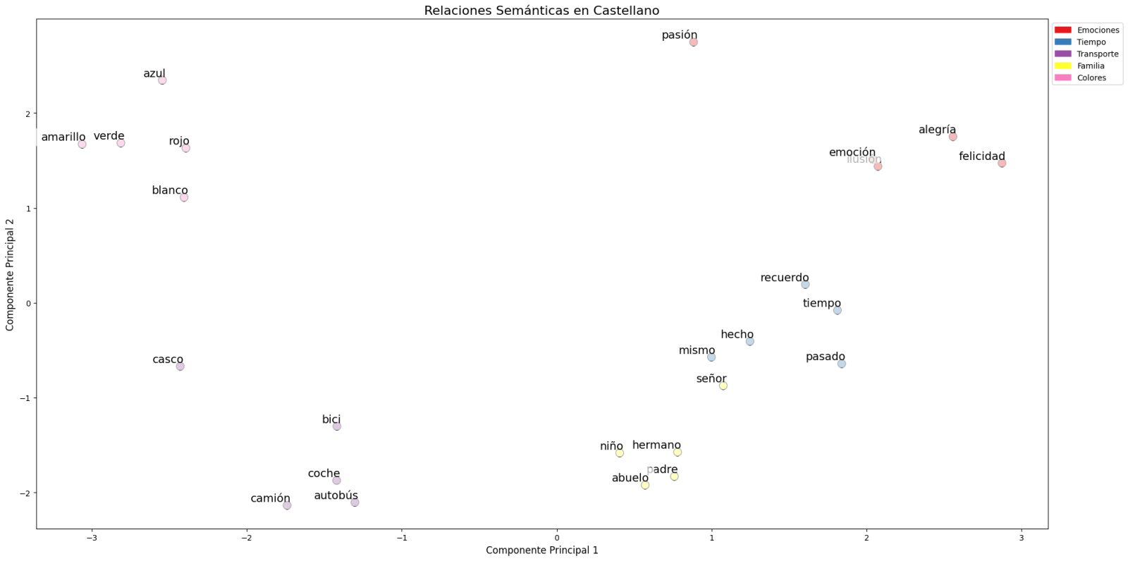
Figure 1. Principal Components Analysis on 50 dimensions (embeddings) with an explained variability percentage by the two components of 0.46
To systematize this evaluation process, a unified function has been developed that encapsulates all the tests described above. This modular architecture allows automatic and reproducible evaluation of different pre-trained embedding models, thus facilitating objective comparison of their performance in Spanish language processing. The standardization of these tests not only optimizes the evaluation process but also establishes a consistent framework for future comparisons and validations of new models by the public.
The good capacity to capture semantic relationships in Spanish language is what we leverage in our tag recommendation system.
Embedding-based Recommendation System
Leveraging the properties of embeddings, we developed a tag recommendation system that follows a three-phase process:
- Embedding generation: for each dataset in the portal, we generate a vector representation combining the title and description. This allows us to compare datasets by their semantic similarity.
- Similar dataset identification: using cosine similarity between vectors, we identify the most semantically similar datasets.
- Tag extraction and standardization: from similar sets, we extract their associated tags and map them with Eurovoc thesaurus terms. This thesaurus, developed by the European Union, is a multilingual controlled vocabulary that provides standardized terminology for cataloging documents and data in the field of European policies. Again, leveraging the power of embeddings, we identify the semantically closest Eurovoc terms to our tags, thus ensuring coherent standardization and better interoperability between European information systems.
The results show that the system can generate coherent and standardized tag recommendations. To illustrate the system's operation, let's take the case of the dataset "Tarragona City Activities Agenda":
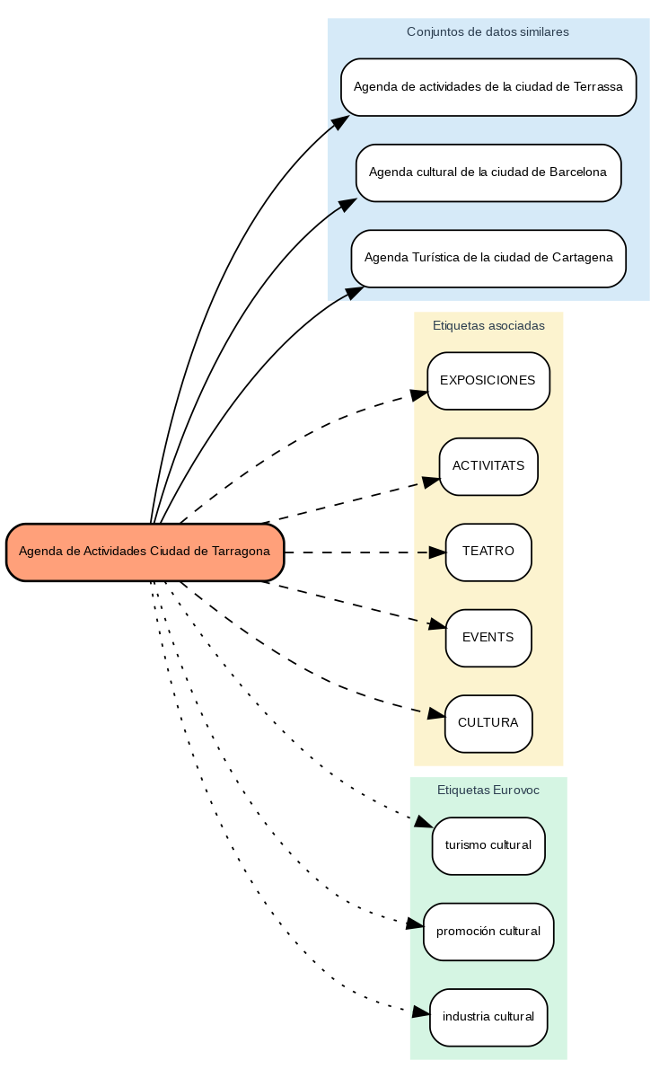
Figure 2. Tarragona City Events Guide
The system:
- Finds similar datasets like "Terrassa Activities Agenda" and "Barcelona Cultural Agenda".
- Identifies common tags from these datasets, such as "EXHIBITIONS", "THEATER", and "CULTURE".
- Suggests related Eurovoc terms: "cultural tourism", "cultural promotion", and "cultural industry".
Advantages of the Approach
This approach offers significant advantages:
- Contextual Recommendations: the system suggests tags based on the real meaning of the content, not just textual matches.
- Automatic Standardization: integration with Eurovoc ensures a controlled and coherent vocabulary.
- Continuous Improvement: the system learns and improves its recommendations as new datasets are added.
- Interoperability: the use of Eurovoc facilitates integration with other European systems.
Conclusions
This exercise demonstrates the great potential of embeddings as a tool for associating texts based on their semantic nature. Through the analyzed practical case, it has been possible to observe how, by identifying similar titles and descriptions between datasets, precise recommendations of tags or keywords can be generated. These tags, in turn, can be linked with keywords from a standardized thesaurus like Eurovoc, applying the same principle.
Despite the challenges that may arise, implementing these types of systems in production environments presents a valuable opportunity to improve information organization and retrieval. The accuracy in tag assignment can be influenced by various interrelated factors in the process:
- The specificity of dataset titles and descriptions is fundamental, as correct identification of similar content and, therefore, adequate tag recommendation depends on it.
- The quality and representativeness of existing tags in similar datasets directly determines the relevance of generated recommendations.
- The thematic coverage of the Eurovoc thesaurus, which, although extensive, may not cover specific terms needed to describe certain datasets precisely.
- The vectors' capacity to faithfully capture semantic relationships between content, which directly impacts the precision of assigned tags.
For those who wish to delve deeper into the topic, there are other interesting approaches to using embeddings that complement what we've seen in this exercise, such as:
- Using more complex and computationally expensive embedding models (like BERT, GPT, etc.)
- Training models on a custom domain-adapted corpus.
- Applying deeper data cleaning techniques.
In summary, this exercise not only demonstrates the effectiveness of embeddings for tag recommendation but also unlocks new possibilities for readers to explore all the possibilities this powerful tool offers.
Evento
Spatial and geospatial data are essential for decision-making, spatial planning and resource management. The ability to visualise and analyse data in a spatial context offers valuable tools to address complex challenges in areas ranging from defence to sustainability. Participating in events that address these issues not only broadens our knowledge, but also fosters collaboration and innovation in the sector.
In this post, we present two upcoming events dealing with geospatial data and its most innovative uses. Don't miss them!
II Conference on Geospatial Intelligence: Territory and Defence
The Instituto Geográfico de Aragón (IGEAR) in collaboration with the Academia General Militar, the Centro Universitario de la Defensa and Telespazio Ibérica, has organized the second edition of the Jornada de Inteligencia Geoespacial: Territory and Defence, an event that will bring together professionals from the sector to explore how geospatial data can optimize strategies in the field of security and territorial management.
During the next 21 November, the crown room of the Pignatelli Building in Zaragoza will bring together speakers and attendees to discuss the impact of geospatial intelligence in Spain. The event will be open to a maximum of 100 attendees by invitation.
Geospatial intelligence, or GEOINT for short, focuses on understanding the dynamics occurring within a given geographic space.To achieve this, GEOINT relies on detailed analysis of imagery, databases and other relevant information, based on the idea that, although the circumstances surrounding each situation may vary, there is one common characteristic: all action takes place at specific geographic coordinates.
GEOINT is a very broad field that can be applied both in the military field, to execute movements by analyzing the terrain, and in the scientific field , to study environments, or even in the business field, to help adapt census, historical, meteorological, agricultural and geological information to commercial uses.
The II Geospatial Intelligence Conference will present case studies and technological advances and will promote discussions on the future of geospatial intelligence in defense contexts. For more details, you can visit the event's website.
- When? On 21 November 2024 at 8:00h.
- Wheree? Crown Hall of the Pignatelli Building. Paseo María Agustín, 36. Zaragoza.
- How to access? Through this link.
XV Edition of the Iberian Conference on Spatial Data Infrastructures (JIIDE) and III geoEuskadi
This year, the Board of Directors of the Geographic Information Infrastructure of Spain (CODIIGE) is jointly organizing the Iberian Conference on Spatial Data Infrastructures (JIIDE ) and the III geoEuskadi Kongresua Congress. Both events aim to enhance and promote activities related to geographic information in various sectors, covering both the publication and standardized accessibility of geographic data as well as its production, processing and exploitation.
On the one hand, in the JIIDE collaborate the Direção-Geral do Território de Portugal, the Instituto Geográfico Nacional de España, through the Centro Nacional de Información Geográfica, and the Govern d'Andorra.
The geoEuskadi Kongresua is organised by the Directorate of Territorial Planning and Urban Agenda of the Basque Government. This year, all these entities will come together to carry out a single event under the slogan “The value of geospatial data”.
The conference will focus on new technological trends related to data accessibility and reuse, as well as current techniques for Earth observation and representation.
Digital geospatial data is a key driver for economic growth, competitiveness, innovation, job creation and social progress. Therefore, III geoEuskadi and the XV edition JIIDE 2024 will emphasize the importance of technologies, such as big data and artificial intelligence, to generate ideas that improve business decision making and the creation of systems that perform tasks that traditionally require human intervention.
In addition, collaboration for the co-production and harmonization of data between different administrations and organizations will be highlighted, something that continues to be essential to generate valuable geospatial data that can become true references. This is a time of renewal, driven by the revision of the INSPIRE Directive, the update of the regulations on environmental spatial data and the new regulations on open data and data governance that favor a modernization in the publication and reuse of these data.
During the event, examples of reuse of high-value datasets will also be presented, both through OGC APIs and through download services and interoperable formats.
The combination of these events will represent a privileged space to reflect on geographic information and will be a showcase for the most innovative projects in the Iberian Peninsula. In addition, there will be technical workshops to share specific knowledge and round tables to promote debate. To learn more about this event, visit the JIIDE portal..
- When? From 13 to 15 November.
- Where? Europa Conference Centre (Vitoria-Gasteiz).
- How do I register? Through this link.
Don't miss the opportunity to participate in these events that promote the advancement of the use of spatial and geospatial data. We encourage you to join this conference to learn, collaborate and contribute to the development of this constantly evolving sector.
Blog
Many people use apps to get around in their daily lives. Apps such as Google Maps, Moovit or CityMapper provide the fastest and most efficient route to a destination. However, what many users are unaware of is that behind these platforms lies a valuable source of information: open data. By reusing public datasets, such as those related to air quality, traffic or public transport, these applications can provide a better service.
In this post, we will explore how the reuse of open data by these platforms empowers a smarter and more sustainable urban ecosystem .
Google Maps: aggregates air quality information and transport data into GTFS.
More than a billion people use Google Maps every month around the world. The tech giant offers a free, up-to-date world map that draws its data from a variety of sources, some of them open.
One of the functions provided by the app is information about the air quality in the user's location. The Air Quality Index (AQI) is a parameter that is determined by each country or region. The European benchmark can be consulted on this map which shows air quality by geolocated zones in real time.
To display the air quality of the user's location, Google Maps applies a model based on a multi-layered approach known as the "fusion approach". This method combines data from several input sources and weights the layers with a sophisticated procedure. The input layers are:
- Government reference monitoring stations
- Commercial sensor networks
- Global and regional dispersion models
- Dust and smoke fire models
- Satellite information
- Traffic data
- Ancillary information such as surface area
- Meteorology
In the case of Spain, this information is obtained from open data sources such as the Ministry of Ecological Transition and Demographic Challenge, the Regional Ministry of Environment, Territory and Housing of the Xunta de Galicia or the Community of Madrid. Open data sources used in other countries around the worldcan be found here .
Another functionality offered by Google Maps to plan the best routes to reach a destination is the information on public transport. These data are provided on a voluntary basis by the public companies providing transport services in each city. In order to make this open data available to the user, it is first dumped into Google Transit and must comply with the open public transport standard GTFS (General Transit Feed Specification).
Moovit: reusing open data to deliver real-time information
Moovit is another urban mobility app most used by Spaniards, which uses open and collaborative data to make it easier for users to plan their journeys by public transport.
Since its launch in 2012, the free-to-download app offers real-time information on the different transport options, suggests the best routes to reach the indicated destination, guides users during their journey (how long they have to wait, how many stops are left, when they have to get off, etc.) and provides constant updates in the event of any alteration in the service.
Like other mobility apps , it is also available in offline mode and allows you to save routes and frequent lines in "Favourites". It is also an inclusive solution as it integrates VoiceOver (iOs) or TalkBack (Android) for blind people.
The platform not only leverages open data provided by governments and local authorities, but also collects information from its users, allowing it to offer a dynamic and constantly updated service.
CityMapper: born as a reuser of open mobility data
The CityMapper development team recognises that the application was born with an open DNA that still remains. They reuse open datasets from, for example, OpenStreetMap at global level or RENFE and Cercanías Bilbao at national level. As the application becomes available in more cities, the list of open data reference sources from which it draws information grows.
The platform offers real-time information on public transport routes, including bus, train, metro and bike sharing. It also adds options for walking, cycling and ridesharing. It is designed to provide the most efficient and fastest route to a destinationby integrating data from different modes of transport into a single interface.
As we published in the monographic report "Municipal Innovation through Open Data" CityMapper mainly uses open data from local transport authorities, typically using the GTFS (General Transit Feed Specification) standard . However, when this data is not sufficient or accurate enough, CityMapper combines it with datasets generated by the application's own users who voluntarily collaborate. It also uses data enhanced and managed by the work of the company's own local employees. All this data is combined with artificial intelligence algorithms developed to optimise routes and provide recommendations tailored to users' needs.
In conclusion, the use of open data in transport is driving a significant transformation in the mobility sector in cities. Through their contribution to applications, users can access up-to-date and accurate data, plan their journeys efficiently and make informed decisions. Governments, for their part, have taken on the role of facilitators by enabling the dissemination of data through open platforms, optimising resources and fostering collaboration across sectors. In addition, open data has created new opportunities for developers and the private sector, who have contributed with technological solutions such as Google Maps, Moovit or CityMapper. Ultimately, the potential of open data to transform the future of urban mobility is undeniable.
Application
It is a website that compiles public information on the state of the different reservoirs in Spain. The user can filter the information by river basins and administrative units such as provinces or autonomous communities.
The data are updated daily and are shown with percentages and graphs. In addition, it also offers information on rain gauges and the comparison between the percentage of water currently embasada and the one that existed a year ago and 10 years ago.
Embales.net shares in a clear and understandable way open data obtained from AEMET and the Ministry of Ecological Transition and Demographic Challenge.
Blog
In today's digital age, data sharing and opendatahave emerged as key pillars for innovation, transparency and economic development. A number of companies and organisations around the world are adopting these approaches to foster open access to information and enhance data-driven decision making. Below, we explore some international and national examples of how these practices are being implemented.
Global success stories
One of the global leaders in data sharing is LinkedIn with its Data for Impactprogramme. This programme provides governments and organisations with access to aggregated and anonymised economic data, based on LinkedIn's Economic Graph, which represents global professional activity. It is important to clarify that the data may only be used for research and development purposes. Access must be requested via email, attaching a proposal for evaluation, and priority is given to proposals from governments and multilateral organisations. These data have been used by organisations such as the World Bank and the European Central Bank to inform key economic policies and decisions. LinkedIn's focus on privacy and data quality ensures that these collaborations benefit both organisations and citizens, promoting inclusive, green and digitally aligned economic growth.
On the other hand, the Registry of Open Data on AWS (RODA) is an Amazon Web Services (AWS) managed repository that hosts public datasets. The datasets are not provided directly by AWS, but are maintained by government organisations, researchers, companies and individuals. We can find, at the time of writing this post, more than 550 datasets published by different organisations, including some such as the Allen Institute for Artificial Intelligence (AI2) or NASAitself. This platform makes it easy for users to leverage AWS cloud computing services for analytics.
In the field of data journalism, FiveThirtyEight, owned by ABC News, has taken a radical transparency approach by publicly sharing the data and code behind its articles and visualisations. These are accessible via GitHub in easily reusable formats such as CSV. This practice not only allows for independent verification of their work, but also encourages the creation of new stories and analysis by other researchers and journalists. FiveThirtyEight has become a role model for how open data can improve the quality and credibility of journalism.
Success stories in Spain
Spain is not lagging behind in terms of data sharing and open data initiatives by private companies. Several Spanish companies are leading initiatives that promote data accessibility and transparency in different sectors. Let us look at some examples.
Idealista, one of the most important real estate portals in the country, has published an open data set that includes detailed information on more than 180,000 homes in Madrid, Barcelona and Valencia. This dataset provides the geographical coordinates and sales prices of each property, together with its internal characteristics and official information from the Spanish cadastre. This dataset is available for access through GitHub as an R package and has become a great tool for real estate market analysis, allowing researchers and practitioners to develop automatic valuation models and conduct detailed studies on market segmentation. It should be noted that Idealista also reuses public data from organisations such as the land registry or the INE to offer data services that support decisions in the real estate market, such as contracting mortgages, market studies, portfolio valuation, etc. For its part, BBVA, through its Foundation, offers access to an extensive statistical collection with databases that include tables, charts and dynamic graphs. These databases, which are free to download, cover topics such as productivity, competitiveness, human capital and inequality in Spain, among others. They also provide historical series on the Spanish economy, investments, cultural activities and public spending. These tools are designed to complement printed publications and provide an in-depth insight into the country's economic and social developments.
In addition, Esri Spain enables its Open Data Portal, which provides users with a wide variety of content that can be consulted, analysed and downloaded. This portal includes data managed by Esri Spain, together with a collection of other open data portals developed with Esritechnology. This significantly expands the possibilities for researchers, developers and practitioners looking to leverage geospatial data in their projects. Datasets can be found in the categories of health, science and technology or economics, among others.
In the area of public companies, Spain also has outstanding examples of commitment to open data. Renfe, the main railway operator, and Red Eléctrica Española (REE), the entity responsible for the operation of the electricity system ,have developed open data programmes that facilitate access to relevant information for citizens and for the development of applications and services that improve efficiency and sustainability. In the case of REE, it is worth highlighting the possibility of consuming the available data through RESTAPIs, which facilitate the integration of applications on data sets that receive continuous updates on the state of the electricity markets.
Conclusion
Data sharing and open data represent a crucial evolution in the way organisations manage and exploit information. From international tech giants such as LinkedIn and AWS to national innovators such as Idealista and BBVA, they are providing open access to data in order to drive significant change in how decisions are made, policy development and the creation of new economic opportunities. In Spain, both private and public companies are showing a strong commitment to these practices, positioning the country as a leader in the adoption of open data and data sharing models that benefit society as a whole.
Content prepared by Juan Benavente, senior industrial engineer and expert in technologies linked to the data economy. The contents and points of view reflected in this publication are the sole responsibility of the author.
Empresa reutilizadora
Coopdevs is an open cooperative that aims to improve society through technology, its values are framed within open cooperativism, that is, they focus on providing value both to customers or projects in which they participate as well as to a much broader ecosystem of digital commons.