Evento
Spatial and geospatial data are essential for decision-making, spatial planning and resource management. The ability to visualise and analyse data in a spatial context offers valuable tools to address complex challenges in areas ranging from defence to sustainability. Participating in events that address these issues not only broadens our knowledge, but also fosters collaboration and innovation in the sector.
In this post, we present two upcoming events dealing with geospatial data and its most innovative uses. Don't miss them!
II Conference on Geospatial Intelligence: Territory and Defence
The Instituto Geográfico de Aragón (IGEAR) in collaboration with the Academia General Militar, the Centro Universitario de la Defensa and Telespazio Ibérica, has organized the second edition of the Jornada de Inteligencia Geoespacial: Territory and Defence, an event that will bring together professionals from the sector to explore how geospatial data can optimize strategies in the field of security and territorial management.
During the next 21 November, the crown room of the Pignatelli Building in Zaragoza will bring together speakers and attendees to discuss the impact of geospatial intelligence in Spain. The event will be open to a maximum of 100 attendees by invitation.
Geospatial intelligence, or GEOINT for short, focuses on understanding the dynamics occurring within a given geographic space.To achieve this, GEOINT relies on detailed analysis of imagery, databases and other relevant information, based on the idea that, although the circumstances surrounding each situation may vary, there is one common characteristic: all action takes place at specific geographic coordinates.
GEOINT is a very broad field that can be applied both in the military field, to execute movements by analyzing the terrain, and in the scientific field , to study environments, or even in the business field, to help adapt census, historical, meteorological, agricultural and geological information to commercial uses.
The II Geospatial Intelligence Conference will present case studies and technological advances and will promote discussions on the future of geospatial intelligence in defense contexts. For more details, you can visit the event's website.
- When? On 21 November 2024 at 8:00h.
- Wheree? Crown Hall of the Pignatelli Building. Paseo María Agustín, 36. Zaragoza.
- How to access? Through this link.
XV Edition of the Iberian Conference on Spatial Data Infrastructures (JIIDE) and III geoEuskadi
This year, the Board of Directors of the Geographic Information Infrastructure of Spain (CODIIGE) is jointly organizing the Iberian Conference on Spatial Data Infrastructures (JIIDE ) and the III geoEuskadi Kongresua Congress. Both events aim to enhance and promote activities related to geographic information in various sectors, covering both the publication and standardized accessibility of geographic data as well as its production, processing and exploitation.
On the one hand, in the JIIDE collaborate the Direção-Geral do Território de Portugal, the Instituto Geográfico Nacional de España, through the Centro Nacional de Información Geográfica, and the Govern d'Andorra.
The geoEuskadi Kongresua is organised by the Directorate of Territorial Planning and Urban Agenda of the Basque Government. This year, all these entities will come together to carry out a single event under the slogan “The value of geospatial data”.
The conference will focus on new technological trends related to data accessibility and reuse, as well as current techniques for Earth observation and representation.
Digital geospatial data is a key driver for economic growth, competitiveness, innovation, job creation and social progress. Therefore, III geoEuskadi and the XV edition JIIDE 2024 will emphasize the importance of technologies, such as big data and artificial intelligence, to generate ideas that improve business decision making and the creation of systems that perform tasks that traditionally require human intervention.
In addition, collaboration for the co-production and harmonization of data between different administrations and organizations will be highlighted, something that continues to be essential to generate valuable geospatial data that can become true references. This is a time of renewal, driven by the revision of the INSPIRE Directive, the update of the regulations on environmental spatial data and the new regulations on open data and data governance that favor a modernization in the publication and reuse of these data.
During the event, examples of reuse of high-value datasets will also be presented, both through OGC APIs and through download services and interoperable formats.
The combination of these events will represent a privileged space to reflect on geographic information and will be a showcase for the most innovative projects in the Iberian Peninsula. In addition, there will be technical workshops to share specific knowledge and round tables to promote debate. To learn more about this event, visit the JIIDE portal..
- When? From 13 to 15 November.
- Where? Europa Conference Centre (Vitoria-Gasteiz).
- How do I register? Through this link.
Don't miss the opportunity to participate in these events that promote the advancement of the use of spatial and geospatial data. We encourage you to join this conference to learn, collaborate and contribute to the development of this constantly evolving sector.
Blog
Many people use apps to get around in their daily lives. Apps such as Google Maps, Moovit or CityMapper provide the fastest and most efficient route to a destination. However, what many users are unaware of is that behind these platforms lies a valuable source of information: open data. By reusing public datasets, such as those related to air quality, traffic or public transport, these applications can provide a better service.
In this post, we will explore how the reuse of open data by these platforms empowers a smarter and more sustainable urban ecosystem .
Google Maps: aggregates air quality information and transport data into GTFS.
More than a billion people use Google Maps every month around the world. The tech giant offers a free, up-to-date world map that draws its data from a variety of sources, some of them open.
One of the functions provided by the app is information about the air quality in the user's location. The Air Quality Index (AQI) is a parameter that is determined by each country or region. The European benchmark can be consulted on this map which shows air quality by geolocated zones in real time.
To display the air quality of the user's location, Google Maps applies a model based on a multi-layered approach known as the "fusion approach". This method combines data from several input sources and weights the layers with a sophisticated procedure. The input layers are:
- Government reference monitoring stations
- Commercial sensor networks
- Global and regional dispersion models
- Dust and smoke fire models
- Satellite information
- Traffic data
- Ancillary information such as surface area
- Meteorology
In the case of Spain, this information is obtained from open data sources such as the Ministry of Ecological Transition and Demographic Challenge, the Regional Ministry of Environment, Territory and Housing of the Xunta de Galicia or the Community of Madrid. Open data sources used in other countries around the worldcan be found here .
Another functionality offered by Google Maps to plan the best routes to reach a destination is the information on public transport. These data are provided on a voluntary basis by the public companies providing transport services in each city. In order to make this open data available to the user, it is first dumped into Google Transit and must comply with the open public transport standard GTFS (General Transit Feed Specification).
Moovit: reusing open data to deliver real-time information
Moovit is another urban mobility app most used by Spaniards, which uses open and collaborative data to make it easier for users to plan their journeys by public transport.
Since its launch in 2012, the free-to-download app offers real-time information on the different transport options, suggests the best routes to reach the indicated destination, guides users during their journey (how long they have to wait, how many stops are left, when they have to get off, etc.) and provides constant updates in the event of any alteration in the service.
Like other mobility apps , it is also available in offline mode and allows you to save routes and frequent lines in "Favourites". It is also an inclusive solution as it integrates VoiceOver (iOs) or TalkBack (Android) for blind people.
The platform not only leverages open data provided by governments and local authorities, but also collects information from its users, allowing it to offer a dynamic and constantly updated service.
CityMapper: born as a reuser of open mobility data
The CityMapper development team recognises that the application was born with an open DNA that still remains. They reuse open datasets from, for example, OpenStreetMap at global level or RENFE and Cercanías Bilbao at national level. As the application becomes available in more cities, the list of open data reference sources from which it draws information grows.
The platform offers real-time information on public transport routes, including bus, train, metro and bike sharing. It also adds options for walking, cycling and ridesharing. It is designed to provide the most efficient and fastest route to a destinationby integrating data from different modes of transport into a single interface.
As we published in the monographic report "Municipal Innovation through Open Data" CityMapper mainly uses open data from local transport authorities, typically using the GTFS (General Transit Feed Specification) standard . However, when this data is not sufficient or accurate enough, CityMapper combines it with datasets generated by the application's own users who voluntarily collaborate. It also uses data enhanced and managed by the work of the company's own local employees. All this data is combined with artificial intelligence algorithms developed to optimise routes and provide recommendations tailored to users' needs.
In conclusion, the use of open data in transport is driving a significant transformation in the mobility sector in cities. Through their contribution to applications, users can access up-to-date and accurate data, plan their journeys efficiently and make informed decisions. Governments, for their part, have taken on the role of facilitators by enabling the dissemination of data through open platforms, optimising resources and fostering collaboration across sectors. In addition, open data has created new opportunities for developers and the private sector, who have contributed with technological solutions such as Google Maps, Moovit or CityMapper. Ultimately, the potential of open data to transform the future of urban mobility is undeniable.
Application
It is a website that compiles public information on the state of the different reservoirs in Spain. The user can filter the information by river basins and administrative units such as provinces or autonomous communities.
The data are updated daily and are shown with percentages and graphs. In addition, it also offers information on rain gauges and the comparison between the percentage of water currently embasada and the one that existed a year ago and 10 years ago.
Embales.net shares in a clear and understandable way open data obtained from AEMET and the Ministry of Ecological Transition and Demographic Challenge.
Blog
In today's digital age, data sharing and opendatahave emerged as key pillars for innovation, transparency and economic development. A number of companies and organisations around the world are adopting these approaches to foster open access to information and enhance data-driven decision making. Below, we explore some international and national examples of how these practices are being implemented.
Global success stories
One of the global leaders in data sharing is LinkedIn with its Data for Impactprogramme. This programme provides governments and organisations with access to aggregated and anonymised economic data, based on LinkedIn's Economic Graph, which represents global professional activity. It is important to clarify that the data may only be used for research and development purposes. Access must be requested via email, attaching a proposal for evaluation, and priority is given to proposals from governments and multilateral organisations. These data have been used by organisations such as the World Bank and the European Central Bank to inform key economic policies and decisions. LinkedIn's focus on privacy and data quality ensures that these collaborations benefit both organisations and citizens, promoting inclusive, green and digitally aligned economic growth.
On the other hand, the Registry of Open Data on AWS (RODA) is an Amazon Web Services (AWS) managed repository that hosts public datasets. The datasets are not provided directly by AWS, but are maintained by government organisations, researchers, companies and individuals. We can find, at the time of writing this post, more than 550 datasets published by different organisations, including some such as the Allen Institute for Artificial Intelligence (AI2) or NASAitself. This platform makes it easy for users to leverage AWS cloud computing services for analytics.
In the field of data journalism, FiveThirtyEight, owned by ABC News, has taken a radical transparency approach by publicly sharing the data and code behind its articles and visualisations. These are accessible via GitHub in easily reusable formats such as CSV. This practice not only allows for independent verification of their work, but also encourages the creation of new stories and analysis by other researchers and journalists. FiveThirtyEight has become a role model for how open data can improve the quality and credibility of journalism.
Success stories in Spain
Spain is not lagging behind in terms of data sharing and open data initiatives by private companies. Several Spanish companies are leading initiatives that promote data accessibility and transparency in different sectors. Let us look at some examples.
Idealista, one of the most important real estate portals in the country, has published an open data set that includes detailed information on more than 180,000 homes in Madrid, Barcelona and Valencia. This dataset provides the geographical coordinates and sales prices of each property, together with its internal characteristics and official information from the Spanish cadastre. This dataset is available for access through GitHub as an R package and has become a great tool for real estate market analysis, allowing researchers and practitioners to develop automatic valuation models and conduct detailed studies on market segmentation. It should be noted that Idealista also reuses public data from organisations such as the land registry or the INE to offer data services that support decisions in the real estate market, such as contracting mortgages, market studies, portfolio valuation, etc. For its part, BBVA, through its Foundation, offers access to an extensive statistical collection with databases that include tables, charts and dynamic graphs. These databases, which are free to download, cover topics such as productivity, competitiveness, human capital and inequality in Spain, among others. They also provide historical series on the Spanish economy, investments, cultural activities and public spending. These tools are designed to complement printed publications and provide an in-depth insight into the country's economic and social developments.
In addition, Esri Spain enables its Open Data Portal, which provides users with a wide variety of content that can be consulted, analysed and downloaded. This portal includes data managed by Esri Spain, together with a collection of other open data portals developed with Esritechnology. This significantly expands the possibilities for researchers, developers and practitioners looking to leverage geospatial data in their projects. Datasets can be found in the categories of health, science and technology or economics, among others.
In the area of public companies, Spain also has outstanding examples of commitment to open data. Renfe, the main railway operator, and Red Eléctrica Española (REE), the entity responsible for the operation of the electricity system ,have developed open data programmes that facilitate access to relevant information for citizens and for the development of applications and services that improve efficiency and sustainability. In the case of REE, it is worth highlighting the possibility of consuming the available data through RESTAPIs, which facilitate the integration of applications on data sets that receive continuous updates on the state of the electricity markets.
Conclusion
Data sharing and open data represent a crucial evolution in the way organisations manage and exploit information. From international tech giants such as LinkedIn and AWS to national innovators such as Idealista and BBVA, they are providing open access to data in order to drive significant change in how decisions are made, policy development and the creation of new economic opportunities. In Spain, both private and public companies are showing a strong commitment to these practices, positioning the country as a leader in the adoption of open data and data sharing models that benefit society as a whole.
Content prepared by Juan Benavente, senior industrial engineer and expert in technologies linked to the data economy. The contents and points of view reflected in this publication are the sole responsibility of the author.
Noticia
The Basque Government announces the fifth edition of the awards for the best open data reuse projects in the Basque Country. An initiative that was created with the aim of rewarding the best ideas and applications/services created from the open data catalogue of the Basque Country (Open Data Euskadi) to show its potential and promote open data culture.
As in previous editions, there are two types of prizes: an ideas competition and an applications competition. In the first, a sum of 13,500 euros in prize money will be awarded. In the second, the prize money amounts to €21,000.
Below are the details of the call for proposals for each of the modalities:
Competition of ideas
Proposals for services, studies, visualisations and applications (web and mobile) that reuse open datasets from the Open Data Euskadi portal to provide value to society will be evaluated. Ideas may be of general utility or focus on one of two sectors: health and social or environment and sustainability.
- Who is it aimed at? To all those people or companies from inside and outside the Basque Country who wish to present ideas and projects for the reuse of open data from the Basque Country. This modality does not require technical knowledge of programming or computer development.
- How can you take part? It will be necessary to explain the idea in a text document and attach it when registering. Registration can be done either online or in person.
- What prizes are on offer? Two winning projects will be chosen for each category, which will be divided into a first prize of 3,000 euros and a second prize of 1,500 euros. In other words, in summary, the awards are:
- Health and social category
- First prize: €3,000
- Second prize: €1,500
- Environment and sustainability category
- First prize: €3,000
- Second prize: €1,500
- General category
- First prize: €3,000
- Second prize: €1,500
Here you can read the rules of the Open Data Euskadi ideas competition: https://www.euskadi.eus/servicios/1028505
Application competition
This modality does require some technical knowledge of programming or computer development, asalready developed solutions using Open Data Euskadi open datasets must bepresented . Applications may be submitted in the general category or in the specific category of web services.
- Who is it aimed at? To those people or companies capable of creating services, studies, visualisations, web applications or applications for mobile devices that use at least one set of open data from one of the Basque Country's open data catalogues.
- How can you take part? The project must be explained in a text document and the developed project (service, study, visualisation, web or mobile application) must be accessible via a URL. At registering both the explanatory document and the URL of the project will be attached.
- What prizes are on offer? This category offers a single prize of 8,000 euros for the web services category and two prizes for the general category of 8,000 and 5,000 euros.
-
Category web services
- Only one prize: €8,000
- General category
- First prize: €8,000
- Second prize: €5,000
-
Check here the rules of the competition in application development mode: https://www.euskadi.eus/servicios/1028605
Deadline for registration:
The competition has been accepting proposals since 31 July and closes on 10 October. Follow us on social media so you don't miss any news about open data reuse events and competitions: @datosgob
Take part!
Noticia
The Junta de Castilla y León has just launched a new edition of its open data competition. In doing so, it seeks to recognise the implementation of projects using datasets from its Open Data Portal. The call for applications will be open until the end of September, so you can take advantage of the remaining weeks of summer to submit your application.
What does the competition consist of?
The objective of the 8th Open Data Competition is to recognise the implementation of projects using open data in four categories:
- Ideas" category: participants will have to describe an idea to create studies, services, websites or applications for mobile devices.
- Products and Services" category: studies, services, websites or applications for mobile devices, which must be accessible to all citizens via the web through a URL, will be awarded.
- Didactic Resource" category: consists of the creation of new and innovative open didactic resources to support classroom teaching. These resources must be published under Creative Commons licences.
- Category "Data Journalism": Journalistic pieces published or updated (in a relevant way) in both written and audiovisual media are sought.
All categories have one thing in common: the project must use at least one dataset from the Junta de Castilla y León's Open Data portal. These datasets can be combined, if the authors so wish, with other data sources, private or public, from any level of administration.
Who can participate?
The competition is open to any natural or legal person who has carried out a project and meets the requirements of each category. Neither public administrations nor those persons who have collaborated directly or indirectly in the preparation of the regulatory bases and the call for applications may participate.
You can participate as an individual or in a group. In addition, the same person may submit more than one application for the same or different categories. The same project can also be submitted in several categories, although it can only be awarded in one category.
What do the prizes consist of?
A jury will evaluate the proposals received on the basis of a series of requirements, including their usefulness, economic value, originality, quality, etc. Once all the projects have been evaluated, a number of winners will be announced, who will receive a diploma, open data consultancy and the following prize money :
- Category Ideas.
- First prize €1,500.
- Second prize 500€.
- Category Products and services. In this case, a special award for students has also been created, aimed at people enrolled in the 2023/2024 and 2024/2025 academic years, both in university and non-university education, provided that it is official.
- First prize €2,500.
- Second prize: €1,500.
- Third prize: €500.
- Student Prize: €1,500.
- Category Educational resource.
- First prize: €1,500.
- Category Data Journalism.
- First prize: €1,500.
- Second prize : €1,000.
In addition, the winning entries will be disseminated and promoted through the Open Data Portal of Castilla y León and other media of the Administration.
What are the deadlines?
The deadline for receiving applications opened on 23 July 2024, one day after the publication of the rules in the Official Gazette of Castilla y León. Participants will have until 23 September 2024 to submit their applications.
How can I participate?
Applications can be submitted in person or electronically.
- In person: at the General Registry of the Regional Ministry of the Presidency , the Registry Assistance Offices of the Regional Government of Castilla y León or at any of the places established in article 16.4 of Law 39/2015.
- Electronic: through the electronic office.
Applications should include information on:
- Author(s) of the project.
- Project title.
- Category or categories for which you are applying.
- Project report, with a maximum length of 1,000 words.
You have all the detailed information at the website, where the competition rules are included.
With this new edition, the Castilla y León Data Portal reaffirms its commitment not only to the publication of open data, but also to the promotion of its reuse. Such actions are a showcase to promote examples of the use of open data in different fields. You can see last year's winning projects in this article.
Come and take part!
Application
AUVASA Pay is a mobile application that provides real-time information about the public bus network of Valladolid. Through AUVASA Pay you can check details such as waiting times at bus stops or even buy tickets in QR format and recharge the transport card to use it on the buses.
This application uses open data from Open Street Map to display maps of the city. In addition, it offers open data sets about public transport in Valladolid available for download and reuse under Creative Commons license at Open Data - AUVASA
Documentación
1. Introduction
Visualizations are graphical representations of data that allow for the simple and effective communication of information linked to them. The possibilities for visualization are very broad, from basic representations such as line graphs, bar charts or relevant metrics, to visualizations configured on interactive dashboards.
In this section "Visualizations step by step" we are periodically presenting practical exercises using open data available on datos.gob.es or other similar catalogs. In them, the necessary steps to obtain the data, perform the transformations and relevant analyses to, finally obtain conclusions as a summary of said information, are addressed and described in a simple way.
Each practical exercise uses documented code developments and free-to-use tools. All generated material is available for reuse in the GitHub repository of datos.gob.es.
In this specific exercise, we will explore tourist flows at a national level, creating visualizations of tourists moving between autonomous communities (CCAA) and provinces.
Access the data laboratory repository on Github.
Execute the data pre-processing code on Google Colab.
In this video, the author explains what you will find on both Github and Google Colab.
2. Context
Analyzing national tourist flows allows us to observe certain well-known movements, such as, for example, that the province of Alicante is a very popular summer tourism destination. In addition, this analysis is interesting for observing trends in the economic impact that tourism may have, year after year, in certain CCAA or provinces. The article on experiences for the management of visitor flows in tourist destinations illustrates the impact of data in the sector.
3. Objective
The main objective of the exercise is to create interactive visualizations in Python that allow visualizing complex information in a comprehensive and attractive way. This objective will be met using an open dataset that contains information on national tourist flows, posing several questions about the data and answering them graphically. We will be able to answer questions such as those posed below:
- In which CCAA is there more tourism from the same CA?
- Which CA is the one that leaves its own CA the most?
- What differences are there between tourist flows throughout the year?
- Which Valencian province receives the most tourists?
The understanding of the proposed tools will provide the reader with the ability to modify the code contained in the notebook that accompanies this exercise to continue exploring the data on their own and detect more interesting behaviors from the dataset used.
In order to create interactive visualizations and answer questions about tourist flows, a data cleaning and reformatting process will be necessary, which is described in the notebook that accompanies this exercise.
4. Resources
Dataset
The open dataset used contains information on tourist flows in Spain at the CCAA and provincial level, also indicating the total values at the national level. The dataset has been published by the National Institute of Statistics, through various types of files. For this exercise we only use the .csv file separated by ";". The data dates from July 2019 to March 2024 (at the time of writing this exercise) and is updated monthly.
Number of tourists by CCAA and destination province disaggregated by PROVINCE of origin
The dataset is also available for download in this Github repository.
Analytical tools
The Python programming language has been used for data cleaning and visualization creation. The code created for this exercise is made available to the reader through a Google Colab notebook.
The Python libraries we will use to carry out the exercise are:
- pandas: is a library used for data analysis and manipulation.
- holoviews: is a library that allows creating interactive visualizations, combining the functionalities of other libraries such as Bokeh and Matplotlib.
5. Exercise development
To interactively visualize data on tourist flows, we will create two types of diagrams: chord diagrams and Sankey diagrams.
Chord diagrams are a type of diagram composed of nodes and edges, see Figure 1. The nodes are located in a circle and the edges symbolize the relationships between the nodes of the circle. These diagrams are usually used to show types of flows, for example, migratory or monetary flows. The different volume of the edges is visualized in a comprehensible way and reflects the importance of a flow or a node. Due to its circular shape, the chord diagram is a good option to visualize the relationships between all the nodes in our analysis (many-to-many type relationship).
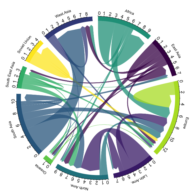
Figure 1. Chord Diagram (Global Migration). Source.
Sankey diagrams, like chord diagrams, are a type of diagram composed of nodes and edges, see Figure 2. The nodes are represented at the margins of the visualization, with the edges between the margins. Due to this linear grouping of nodes, Sankey diagrams are better than chord diagrams for analyses in which we want to visualize the relationship between:
- several nodes and other nodes (many-to-many, or many-to-few, or vice versa)
- several nodes and a single node (many-to-one, or vice versa)

Figure 2. Sankey Diagram (UK Internal Migration). Source.
The exercise is divided into 5 parts, with part 0 ("initial configuration") only setting up the programming environment. Below, we describe the five parts and the steps carried out.
5.1. Load data
This section can be found in point 1 of the notebook.
In this part, we load the dataset to process it in the notebook. We check the format of the loaded data and create a pandas.DataFrame that we will use for data processing in the following steps.
5.2. Initial data exploration
This section can be found in point 2 of the notebook.
In this part, we perform an exploratory data analysis to understand the format of the dataset we have loaded and to have a clearer idea of the information it contains. Through this initial exploration, we can define the cleaning steps we need to carry out to create interactive visualizations.
If you want to learn more about how to approach this task, you have at your disposal this introductory guide to exploratory data analysis.
5.3. Data format analysis
This section can be found in point 3 of the notebook.
In this part, we summarize the observations we have been able to make during the initial data exploration. We recapitulate the most important observations here:
| Province of origin | Province of origin | CCAA and destination province | CCAA and destination province | CCAA and destination province | Tourist concept | Period | Total |
|---|---|---|---|---|---|---|---|
| National Total | National Total | Tourists | 2024M03 | 13.731.096 | |||
| National Total | Ourense | National Total | Andalucía | Almería | Tourists | 2024M03 | 373 |
Figure 3. Fragment of the original dataset.
We can observe in columns one to four that the origins of tourist flows are disaggregated by province, while for destinations, provinces are aggregated by CCAA. We will take advantage of the mapping of CCAA and their provinces that we can extract from the fourth and fifth columns to aggregate the origin provinces by CCAA.
We can also see that the information contained in the first column is sometimes superfluous, so we will combine it with the second column. In addition, we have found that the fifth and sixth columns do not add value to our analysis, so we will remove them. We will rename some columns to have a more comprehensible pandas.DataFrame.
5.4. Data cleaning
This section can be found in point 4 of the notebook.
In this part, we carry out the necessary steps to better format our data. For this, we take advantage of several functionalities that pandas offers us, for example, to rename the columns. We also define a reusable function that we need to concatenate the values of the first and second columns with the aim of not having a column that exclusively indicates "National Total" in all rows of the pandas.DataFrame. In addition, we will extract from the destination columns a mapping of CCAA to provinces that we will apply to the origin columns.
We want to obtain a more compressed version of the dataset with greater transparency of the column names and that does not contain information that we are not going to process. The final result of the data cleaning process is the following:
| Origin | Province of origin | Destination | Province of destination | Period | Total |
|---|---|---|---|---|---|
| National Total | National Total | 2024M03 | 13731096.0 | ||
| Galicia | Ourense | Andalucía | Almería | 2024M03 | 373.0 |
Figure 4. Fragment of the clean dataset.
5.5. Create visualizations
This section can be found in point 5 of the notebook
In this part, we create our interactive visualizations using the Holoviews library. In order to draw chord or Sankey graphs that visualize the flow of people between CCAA and CCAA and/or provinces, we have to structure the information of our data in such a way that we have nodes and edges. In our case, the nodes are the names of CCAA or province and the edges, that is, the relationship between the nodes, are the number of tourists. In the notebook we define a function to obtain the nodes and edges that we can reuse for the different diagrams we want to make, changing the time period according to the season of the year we are interested in analyzing.
We will first create a chord diagram using exclusively data on tourist flows from March 2024. In the notebook, this chord diagram is dynamic. We encourage you to try its interactivity.
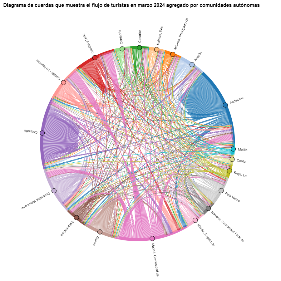
Figure 5. Chord diagram showing the flow of tourists in March 2024 aggregated by autonomous communities.
The chord diagram visualizes the flow of tourists between all CCAA. Each CA has a color and the movements made by tourists from this CA are symbolized with the same color. We can observe that tourists from Andalucía and Catalonia travel a lot within their own CCAA. On the other hand, tourists from Madrid leave their own CA a lot.
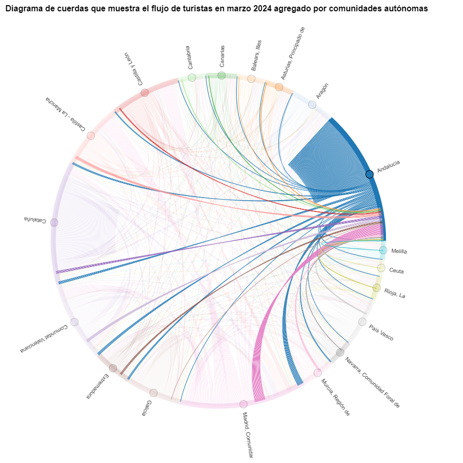
Figure 6. Chord diagram showing the flow of tourists entering and leaving Andalucía in March 2024 aggregated by autonomous communities.
We create another chord diagram using the function we have created and visualize tourist flows in August 2023.
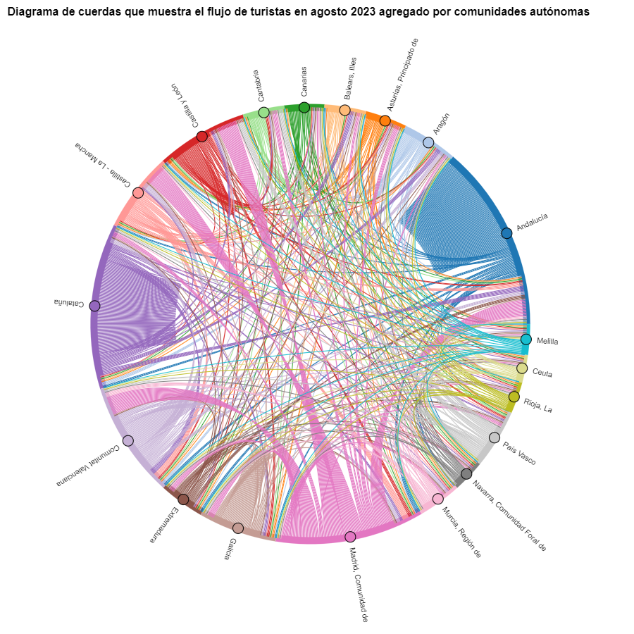
Figure 7. Chord diagram showing the flow of tourists in August 2023 aggregated by autonomous communities.
We can observe that, broadly speaking, tourist movements do not change, only that the movements we have already observed for March 2024 intensify.
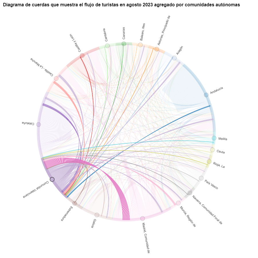
Figure 8. Chord diagram showing the flow of tourists entering and leaving the Valencian Community in August 2023 aggregated by autonomous communities.
The reader can create the same diagram for other time periods, for example, for the summer of 2020, in order to visualize the impact of the pandemic on summer tourism, reusing the function we have created.
For the Sankey diagrams, we will focus on the Valencian Community, as it is a popular holiday destination. We filter the edges we created for the previous chord diagram so that they only contain flows that end in the Valencian Community. The same procedure could be applied to study any other CA or could be inverted to analyze where Valencians go on vacation. We visualize the Sankey diagram which, like the chord diagrams, is interactive within the notebook. The visual aspect would be like this:
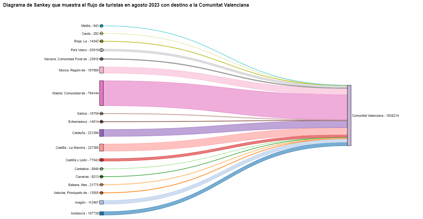
Figure 9. Sankey diagram showing the flow of tourists in August 2023 destined for the Valencian Community.
As we could already intuit from the chord diagram above, see Figure 8, the largest group of tourists arriving in the Valencian Community comes from Madrid. We also see that there is a high number of tourists visiting the Valencian Community from neighboring CCAA such as Murcia, Andalucía, and Catalonia.
To verify that these trends occur in the three provinces of the Valencian Community, we are going to create a Sankey diagram that shows on the left margin all the CCAA and on the right margin the three provinces of the Valencian Community.
To create this Sankey diagram at the provincial level, we have to filter our initial pandas.DataFrame to extract the relevant information from it. The steps in the notebook can be adapted to perform this analysis at the provincial level for any other CA. Although we are not reusing the function we used previously, we can also change the analysis period.
The Sankey diagram that visualizes the tourist flows that arrived in August 2023 to the three Valencian provinces would look like this:
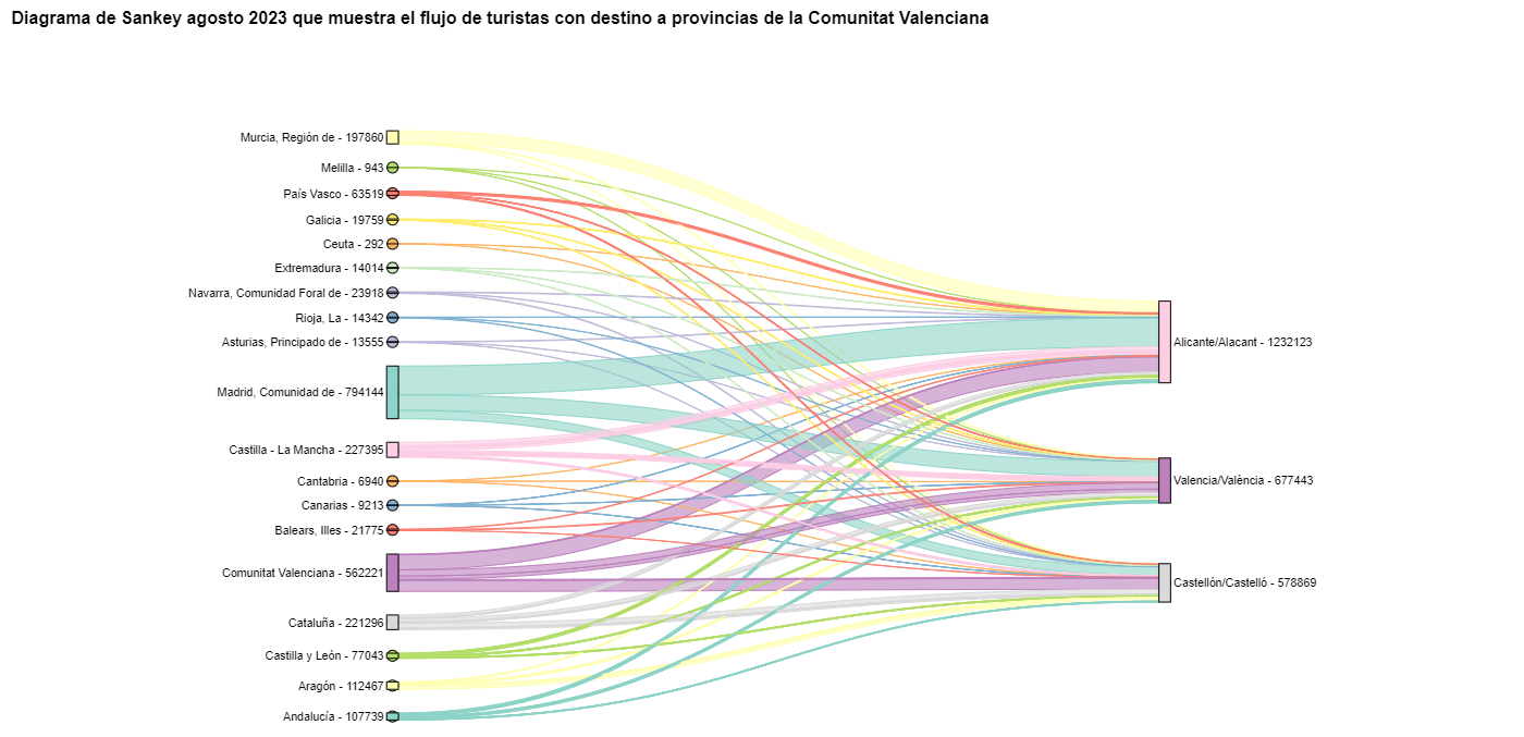
Figure 10. Sankey diagram August 2023 showing the flow of tourists destined for provinces of the Valencian Community.
We can observe that, as we already assumed, the largest number of tourists arriving in the Valencian Community in August comes from the Community of Madrid. However, we can verify that this is not true for the province of Castellón, where in August 2023 the majority of tourists were Valencians who traveled within their own CA.
6. Conclusions of the exercise
Thanks to the visualization techniques used in this exercise, we have been able to observe the tourist flows that move within the national territory, focusing on making comparisons between different times of the year and trying to identify patterns. In both the chord diagrams and the Sankey diagrams that we have created, we have been able to observe the influx of Madrilenian tourists on the Valencian coasts in summer. We have also been able to identify the autonomous communities where tourists leave their own autonomous community the least, such as Catalonia and Andalucía.
7. Do you want to do the exercise?
We invite the reader to execute the code contained in the Google Colab notebook that accompanies this exercise to continue with the analysis of tourist flows. We leave here some ideas of possible questions and how they could be answered:
- The impact of the pandemic: we have already mentioned it briefly above, but an interesting question would be to measure the impact that the coronavirus pandemic has had on tourism. We can compare the data from previous years with 2020 and also analyze the following years to detect stabilization trends. Given that the function we have created allows easily changing the time period under analysis, we suggest you do this analysis on your own.
- Time intervals: it is also possible to modify the function we have been using in such a way that it not only allows selecting a specific time period, but also allows time intervals.
- Provincial level analysis: likewise, an advanced reader with Pandas can challenge themselves to create a Sankey diagram that visualizes which provinces the inhabitants of a certain region travel to, for example, Ourense. In order not to have too many destination provinces that could make the Sankey diagram illegible, only the 10 most visited could be visualized. To obtain the data to create this visualization, the reader would have to play with the filters they apply to the dataset and with the groupby method of pandas, being inspired by the already executed code.
We hope that this practical exercise has provided you with sufficient knowledge to develop your own visualizations. If you have any data science topic that you would like us to cover soon, do not hesitate to propose your interest through our contact channels.
In addition, remember that you have more exercises available in the section "Data science exercises".
Documentación
The digital revolution is transforming municipal services, driven by the increasing adoption of artificial intelligence (AI) technologies that also benefit from open data. These developments have the potential to redefine the way municipalities deliver services to their citizens, providing tools to improve efficiency, accessibility and sustainability. This report looks at success stories in the deployment of applications and platforms that seek to improve various aspects of life in municipalities, highlighting their potential to unlock more of the vast untapped potential of open data and associated artificial intelligence technologies.
The applications and platforms described in this report have a high potential for replicability in different municipal contexts, as they address common problems. Replication of these solutions can take place through collaboration between municipalities, companies and developers, as well as through the release and standardisation of open data.
Despite the benefits, the adoption of open data for municipal innovation also presents significant challenges. The quality, updating and standardisation of data published by local authorities, as well as interoperability between different platforms and systems, must be ensured. In addition, the open data culture needs to be reinforced among all actors involved, including citizens, developers, businesses and public administrations themselves.
The use cases analysed are divided into four sections. Each of these sections is described below and some examples of the solutions included in the report are shown.
Transport and Mobility
One of the most significant challenges in urban areas is transport and mobility management. Applications using open data have proven to be effective in improving these services. For example, applications such as Park4Dis make it easy to locate parking spaces for people with reduced mobility, using data from multiple municipalities and contributions from volunteers. CityMapper, which has gone global, on the other hand, offers optimised public transport routes in real time, integrating data from various transport modes to provide the most efficient route. These applications not only improve mobility, but also contribute to sustainability by reducing congestion and carbon emissions.
Environment and Sustainability
Growing awareness of sustainability has spurred the development of applications that promote environmentally friendly practices. CleanSpot, for example, facilitates the location of recycling points and the management of municipal waste. The application encourages citizen participation in cleaning and recycling, contributing to the reduction of the ecological footprint. Liight gamifies sustainable behaviour by rewarding users for actions such as recycling or using public transport. These applications not only improve environmental management, but also educate and motivate citizens to adopt more sustainable habits.
Optimisation of Basic Public Services
Urban service management platforms, such as Gestdropper, use open data to monitor and control urban infrastructure in real time. These tools enable more efficient management of resources such as street lighting, water networks and street furniture, optimising maintenance, incident response and reducing operating costs. Moreover, the deployment of appointment management systems, such as CitaME, helps to reduce waiting times and improve efficiency in customer service.
Citizen Services Aggregators
Applications that centralise public information and services, such as Badajoz Es Más and AppValencia, improve accessibility and communication between administrations and citizens. These platforms provide real-time data on public transport, cultural events, tourism and administrative procedures, making life in the municipality easier for residents and tourists alike. For example, integrating multiple services into a single application improves efficiency and reduces the need for unnecessary travel. These tools also support local economies by promoting cultural events and commercial services.
Conclusions
The use of open data and artificial intelligence technologies is transforming municipal management, improving the efficiency, accessibility and sustainability of public services. The success stories presented in this report describe how these tools can benefit both citizens and public administrations by making cities smarter, more inclusive and sustainable environments, and more responsive to the needs and well-being of their inhabitants and visitors.
To delve deeper into the report’s content, we’ve recorded a podcast and a video-interview in which the author explains the key points of this guide. We’ve also created an infographic and an executive summary.
Listen to the podcast (only available in spanish)
Watch the video-interview with the author
Noticia
One of the objectives of datos.gob.es is to disseminate the data culture. To this end, we use different channels to disseminate content such as a specialised content blog, a fortnightly newsletter or profiles on social networks such as X (formerly Twitter) or LinkedIn. Social networks serve both as a channel for dissemination and as a space for contact with the open data reuse community. In our didactic mission to raise awareness of data culture, we will now also be present on Instagram.
This visual and dynamic platform will become a new meeting point where our followers can discover, explore and leverage the value of open data and related technologies.
On our Instagram account (@datosgob), we will offer a variety of content:
- Key concepts: definitions of concepts from the world of data and related technologies explained in a clear and concise way to create a glossary at your fingertips.
- Informative infographics: complex issues such as laws, use cases or application of innovative technologies explained graphically and in a simpler way.
- Impact stories: inspiring projects that use open data to make a positive impact on society.
- Tutorials and tips: to learn how to use our platform more effectively, data science exercises and step-by-step visualisations, among others.
- Events and news: important activities, launches of new datasets and the latest developments in the world of open data.
Varied formats of valuable content
In addition, all this information of interest will be presented in formats suitable for the platform, such as:
- Publications: informative pills posts, infographics, monographs, interviews, audiovisual pieces and success stories that will help you learn how different digital tools and methodologies are your allies. You will be able to enjoy different types of publications (fixed, carousels, collaborative with other reference accounts, etc.), where you will can share your opinions, doubts and experiences, and connect with other professionals.
- Stories: announcements, polls or calendars so you can stay on top of what's happening in the data ecosystem and be part of it by sharing your impressions.
- Featured stories: at the top of our profile, we will leave selected and ordered the most relevant information on the different topics and initiatives of datos.gob.es, in three areas: training, events and news.
A participatory and collaborative platform
As we have been doing in the other social networks where we are present, we want our account to be a space for dialogue and collaboration. Therefore, we invite all citizens, researchers, journalists, developers and anyone interested in open data to join the datos.gob.es community. Here are some ways you can get involved:
- Comment and share: we want to hear your opinions, questions and suggestions. Interact with our publications and share our content with your network to help spread the word about the importance of open data.
- Tag us: if you are working on a project that uses open data, show us! Tag us in your posts and use the hashtag #datosgob so we can see and share your work with our community.
- Featured stories: do you have an interesting story to tell about how you have used open data? Send us a direct message and we may feature it on our account to inspire others.
Why Instagram?
In a world where visual information has become a powerful tool for communication and learning, we have decided to make the leap to Instagram. This platform will not only allow us to report on developments in the data ecosystem in a more engaging and understandable way, but will also help us to connect with a wider and more diverse audience. We want to make public information accessible and relevant to everyone, and we believe Instagram is the perfect place to do this.
In short, the launch of our Instagram account marks an important step in our mission to make open data more accessible and useful for all.
Follow us on Instagram at @datosgob and join a growing community of people interested in transparency, innovation and knowledge sharing. By following us, you will have immediate access to a constant source of information and resources to help you make the most of open data. Also, don't forget to follow us on our other social networks X o LinkedIn.