Application
This mobile application developed by the City Council of Ourense allows you to consult updated information about the city: news, notices or upcoming events on different topics such as:
- Arts and festivities: Cultural events organized by the city council.
- Tourism: Information about thermal facilities, tourist attractions, heritage, routes and gastronomy.
- Notifications: Real time notifications about possible traffic cuts, opening of monuments or other specific issues.
- Information: Data of general interest such as emergency telephone numbers or citizen services of the city council.
The mOUbil app, developed through local open data sets, unifies all the information of interest to the neighbors of Ourense, as well as tourists who want to know the city. In addition, anyone can make suggestions for improvement on the application through this form: Queries and Suggestions (ourense.gal).
Your download is available for both Android mOUbil - Ourense no peto! - Apps in Google Play and iOS: moubil - Ourense no peto! in App Store (apple.com)
Blog
We are living in a historic moment in which data is a key asset, on which many small and large decisions of companies, public bodies, social entities and citizens depend every day. It is therefore important to know where each piece of information comes from, to ensure that the issues that affect our lives are based on accurate information.
What is data subpoena?
When we talk about "citing" we refer to the process of indicating which external sources have been used to create content. This is a highly commendable issue that affects all data, including public data as enshrined in our legal system. In the case of data provided by administrations, Royal Decree 1495/2011 includes the need for the reuser to cite the source of origin of the information.
To assist users in this task, the Publications Office of the European Union published Data Citation: A guide to best practice, which discusses the importance of data citation and provides recommendations for good practice, as well as the challenges to be overcome in order to cite datasets correctly.
Why is data citation important?
The guide mentions the most relevant reasons why it is advisable to carry out this practice:
- Credit. Creating datasets takes work. Citing the author(s) allows them to receive feedback and to know that their work is useful, which encourages them to continue working on new datasets.
- Transparency. When data is cited, the reader can refer to it to review it, better understand its scope and assess its appropriateness.
- Integrity. Users should not engage in plagiarism. They should not take credit for the creation of datasets that are not their own.
- Reproducibility. Citing the data allows a third party to attempt to reproduce the same results, using the same information.
- Re-use. Data citation makes it easier for more and more datasets to be made available and thus to increase their use.
- Text mining. Data is not only consumed by humans, it can also be consumed by machines. Proper citation will help machines better understand the context of datasets, amplifying the benefits of their reuse.
General good practice
Of all the general good practices included in the guide, some of the most relevant are highlighted below:
- Be precise. It is necessary that the data cited are precisely defined. The data citation should indicate which specific data have been used from each dataset. It is also important to note whether they have been processed and whether they come directly from the originator or from an aggregator (such as an observatory that has taken data from various sources).
- It uses "persistent identifiers" (PIDs). Just as every book in a library has an identifier, so too can (and should) have an identifier. Persistent identifiers are formal schemes that provide a common nomenclature, which uniquely identify data sets, avoiding ambiguities. When citing datasets, it is necessary to locate them and write them as an actionable hyperlink, which can be clicked on to access the cited dataset and its metadata. There are different families of PIDs, but the guide highlights two of the most common: the Handle system and the Digital Object Identifier (DOI).
- Indicates the time at which the data was accessed. This issue is of great importance when working with dynamic data (which are updated and changed periodically) or continuous data (on which additional data are added without modifying the old data). In such cases, it is important to cite the date of access. In addition, if necessary, the user can add "snapshots" of the dataset, i.e. copies taken at specific points in time.
- Consult the metadata of the dataset used and the functionalities of the portal in which it is located. Much of the information necessary for the citation is contained in the metadata.
In addition, data portals can include tools to assist with citation. This is the case of data.europa.ue, where you can find the citation button in the top menu.
- Rely on software tools. Most of the software used to create documents allows for the automatic creation and formatting of citations, ensuring their formatting. In addition, there are specific citation management tools such as BibTeX or Mendeley, which allow the creation of citation databases taking into account their peculiarities, a very useful function when it is necessary to cite numerous datasets in multiple documents
With regard to the order of all this information, there are different guidelines for the general structure of citations. The guide shows the most appropriate forms of citation according to the type of document in which the citation appears (journalistic documents, online, etc.), including examples and recommendations. One example is the Interinstitutional Style Guide (ISG), which is published by the EU Publications Office. This style guide does not contain specific guidance on how to cite data, but it does contain a general citation structure that can be applied to datasets, shown in the image below.
How to cite correctly
The second part of the report contains the technical reference material for creating citations that meet the above recommendations. It covers the elements that a citation should include and how to arrange them for different purposes.
Elements that should be included in a citation include:
- Author, can refer to either the individual who created the dataset (personal author) or the responsible organisation (corporate author).
- Title of the dataset.
- Version/edition.
- Publisher, which is the entity that makes the dataset available and may or may not coincide with the author (in case of coincidence it is not necessary to repeat it).
- Date of publication, indicating the year in which it was created. It is important to include the time of the last update in brackets.
- Date of citation, which expresses the date on which the creator of the citation accessed the data, including the time if necessary. For date and time formats, the guide recommends using the DCAT specification , as it offers greater accuracy in terms of interoperability.
- Persistent identifier.

The guide ends with a series of annexes containing checklists, diagrams and examples.
If you want to know more about this document, we recommend you to watch this webinar where the most important points are summarised.
Ultimately, correctly citing datasets improves the quality and transparency of the data re-use process, while at the same time stimulating it. Encouraging the correct citation of data is therefore not only recommended, but increasingly necessary.
Application
ContratosMenores.es is a website that provides information on minor contracts carried out in Spain since January 2022. Through this application you can locate the contracts according to their classification in the Common Procurement Vocabulary (CPV), following the hierarchical tree of public procurement bodies, with a free text search, or from different rankings, for example, of most expensive contracts, most frequent awardees and others.
In the file of each organization and of each awardee, details are given of their outstanding relations with other entities, the most frequent categories of their contracts, similar companies, duration of the contracts, amount, and much more.
In the case of the awarded companies, a map is drawn with the location of the contracts they have received.
The website is completely free, does not require registration, and is updated daily, starting with more than one million registered minor contracts.
Blog
The regulatory approach in the European Union has taken a major turn since the first regulation on the reuse of public sector information was promoted in 2003. Specifically, as a consequence of the European Data Strategy approved in 2020, the regulatory approach is being expanded from at least two points of view:
-
on the one hand, governance models are being promoted that take into account the need to integrate, from the design and by default, respect for other legally relevant rights and interests, such as the protection of personal data, intellectual property or commercial secrecy, as has happened in particular through the Data Governance Regulation;
-
on the other hand, extending the subjective scope of the rules to go beyond the public sector, so that obligations specifically aimed at private entities are also beginning to be contemplated, as shown by the approval in November 2023 of the Regulation on harmonized rules for fair access to and use of data (known as the Data Act).
In this new approach, data spaces take on a singular role, both in terms of the importance of the sectors they deal with (health, mobility, environment, energy...) and, above all, because of the important role they are called upon to play in facilitating the availability of large amounts of data, specifically in overcoming the technical and legal obstacles that hinder their sharing. In this regard, in Spain we already have a legal provision in this regard, which has materialized with the creation of a specific section in the Public Sector Procurement Platform.
The Strategy itself envisages the creation of "a common European data space for public administrations, in order to improve transparency and accountability of public spending and the quality of spending, fight corruption at both national and EU level, and address compliance needs, as well as support the effective implementation of EU legislation and encourage innovative applications". At the same time, however, it is recognized that "data concerning public procurement are disseminated through various systems in the Member States, are available in different formats and are not user-friendly", concluding the need, in many cases, to "improve the quality of the data".
Why a data space in the field of public procurement?
Within the activity carried out by public entities, public procurement stands out, whose relevance in the economy of the EU as a whole reaches almost 14% of GDP, so it is a strategic pole to boost a more innovative, competitive and efficient economy. However, as expressly recognized in the Commission's Communication Public Procurement: A Data Space to improve public spending, boost data-driven policy making and improve access to tenders for SMEs published in March 2023, although there is a large amount of data on public procurement, however "at the moment its usefulness for taxpayers, public decision-makers and public purchasers is scarce".
The regulation on public procurement approved in 2014 incorporated a strong commitment to the use of electronic media in the dissemination of information related to the call for tenders and the awarding of procedures, although this regulation suffers from some important limitations:
-
refers only to contracts that exceed certain minimum thresholds set at European level, which limits the measure to 20% of public procurement in the EU, so that it is up to the States themselves to promote their own transparency measures for the rest of the cases;
-
does not affect the contractual execution phase, so that it does not apply to such relevant issues as the price finally paid, the execution periods actually consumed or, among other issues, possible breaches by the contractor and, if applicable, the measures adopted by the public entities in this respect;
-
although it refers to the use of electronic media when complying with the obligation of transparency, it does not, however, contemplate the need for it to be articulated on the basis of open formats that allow the automated reuse of the information.
Certainly, since the adoption of the 2014 regulation, significant progress has been made in facilitating the standardization of the data collection process, notably by imposing the use of electronic forms for the above-mentioned thresholds as of October 25, 2023. However, a more ambitious approach was needed to "fully leverage the power of procurement data". To this end, this new initiative envisages not only measures aimed at decisively increasing the quantity and quality of data available, but also the creation of an EU-wide platform to address the current dispersion, as well as the combination with a set of tools based on advanced technologies, notably artificial intelligence.
The advantages of this approach are obvious from several points of view:
-
on the one hand, it could provide public entities with more accurate information for planning and decision-making;
-
on the other hand, it would also facilitate the control and supervision functions of the competent authorities and society in general;
-
and, above all, it would give a decisive boost to the effective access of companies and, in particular, of SMEs to information on current or future procedures in which they could compete.
What are the main challenges to be faced from a legal point of view?
The Communication on the European Public Procurement Data Space is an important initiative of great interest in that it outlines the way forward, setting out the potential benefits of its implementation, emphasizing the possibilities offered by such an ambitious approach and identifying the main conditions that would make it feasible. All this is based on the analysis of relevant use cases, the identification of the key players in this process and the establishment of a precise timetable with a time horizon up to 2025.
The promotion of a specific European data space in the field of public procurement is undoubtedly an initiative that could potentially have an enormous impact both on the contractual activity of public entities and also on companies and, in general, on society as a whole. But for this to be possible, major challenges would also have to be addressed from a legal perspective:
Firstly, there are currently no plans to extend the publication obligation to contracts below the thresholds set at European level, which would mean that most tenders would remain outside the scope of the area. This limitation poses an additional consequence, as it means leaving it up to the Member States to establish additional active publication obligations on the basis of which to collect and, if necessary, integrate the data, which could pose a major difficulty in ensuring the integration of multiple and heterogeneous data sources, particularly from the perspective of interoperability. In this respect, the Commission intends to create a harmonized set of data which, if they were to be mandatory for all public entities at European level, would not only allow data to be collected by electronic means, but also to be translated into a common language that facilitates their automated processing.
Secondly, although the Communication urges States to "endeavor to collect data at both the pre-award and post-award stages", it nevertheless makes contract completion notices voluntary. If they were mandatory, it would be possible to "achieve a much more detailed understanding of the entire public procurement cycle", as well as to encourage corrective action in legally questionable situations, both as regards the legal position of the companies that were not awarded the contracts and of the authorities responsible for carrying out audit functions.
Another of the main challenges for the optimal functioning of the European data space is the reliability of the data published, since errors can often slip in when filling in the forms or, even, this task can be perceived as a routine activity that is sometimes carried out without paying due attention to its execution, as has been demonstrated by administrative practice in relation to the CPVs. Although it must be recognized that there are currently advanced tools that could help to correct this type of dysfunction, the truth is that it is essential to go beyond the mere digitization of management processes and make a firm commitment to automated processing models that are based on data and not on documents, as is still common in many areas of the public sector. Based on these premises, it would be possible to move forward decisively from the interoperability requirements referred to above and implement the analytical tools based on emerging technologies referred to in the Communication.
The necessary adaptation of European public procurement regulations
Given the relevance of the objectives proposed and the enormous difficulty involved in the challenges indicated above, it seems justified that such an ambitious initiative with such a significant potential impact should be articulated on the basis of a solid regulatory foundation. It is essential to go beyond recommendations, establishing clear and precise legal obligations for the Member States and, in general, for public entities, when managing and disseminating information on their contractual activity, as has been proposed, for example, in the health data space.
In short, almost ten years after the approval of the package of directives on public procurement, perhaps the time has come to update them with a more ambitious approach that, based on the requirements and possibilities of technological innovation, will allow us to really make the most of the huge amount of data generated in this area. Moreover, why not configure public procurement data as high-value data under the regulation on open data and reuse of public sector information?
Content prepared by Julián Valero, Professor at the University of Murcia and Coordinator of the Research Group "Innovation, Law and Technology" (iDerTec). The contents and points of view reflected in this publication are the sole responsibility of its author.
Blog
Since 24 September last year, the Regulation (EU) 2022/868 of the European Parliament and of the Council of 30 May 2022, on European Data Governance (Data Governance Regulation) has been applicable throughout the European Union. Since it is a Regulation, its provisions are directly effective without the need for transposing State legislation, as is the case with directives. However, with regard to the application of its regulation to Public Administrations, the Spanish legislator has considered it appropriate to make some amendments to the Law 37/2007, of 16 November 2007, on the re-use of public sector information. Specifically:
- A specific sanctioning regime has been incorporated within the scope of the General State Administration for cases of non-compliance with its provisions by re-users, as will be explained in detail below;
- Specific criteria have been established on the calculation of the fees that may be charged by public administrations and public sector entities that are not of an industrial or commercial nature;
- And finally, some singularities have been established in relation to the administrative procedure for requesting re-use, in particular a maximum period of two months is established for notifying the corresponding resolution -which may be extended to a maximum of thirty days due to the length or complexity of the request-, after which the request will be deemed to have been rejected.
What is the scope of this new regulation?
As is the case with the Directive (EU) 2019/1024 of the European Parliament and of the Council of 20 June 2019 on open data and the reuse of public sector informationthis Regulation applies to data generated in the course of the "public service remit" in order to facilitate its re-use. However, the former did not contemplate the re-use of those data protected by the concurrence of certain legal assets, such as confidentiality, trade secrets, the intellectual property or, singularly, the protection of personal data.
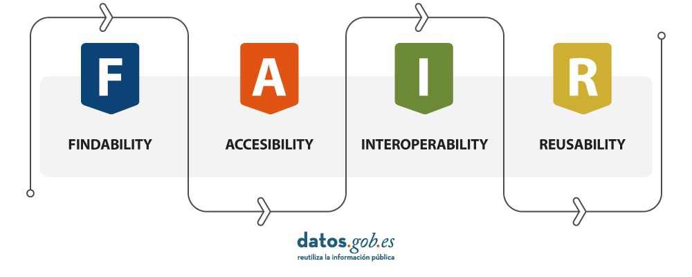
You can see a summary of the regulations in this infographic.
Indeed, one of the main objectives of the Regulation is to facilitate the re-use of this type of data held by administrations and other public sector entities for research, innovation and statistical purposes, by providing for enhanced safeguards for this purpose. It is therefore a matter of establishing the legal conditions that allow access to the data and their further use without affecting other rights and legal interests of third parties. Consequently, the Regulation does not establish new obligations for public bodies to allow access to and re-use of information, which remains a competence reserved for Member States. It simply incorporates a number of novel mechanisms aimed at making access to information compatible, as far as possible, with respect for the confidentiality requirements mentioned above. In fact, it is expressly warned that, in the event of a conflict with the Regulation (EU) 2016/679 on the protection of natural persons with regard to the processing of personal data and on the free movement of such data (GDPR), the latter shall in any case prevail (GDPR), the latter shall in any case prevail.
Apart from the regulation referring to the public sector, to which we will refer below, the Regulation incorporates specific provisions for certain types of services which, although they could also be provided by public entities in some cases, will normally be assumed by private entities. Specifically, intermediation services and the altruistic transfer of data are regulated, establishing a specific legal regime for both cases. The Ministry of Economic Affairs and Digital Transformation will be in charge of overseeing this process in Spain
As regards, in particular, the impact of the Regulation on the public sector, its provisions do not apply to public undertakings , i.e. those in which there is a dominant influence of a public sector body, to broadcasting activities and, inter alia, to cultural and educational establishments. Nor to data which, although generated in the performance of a public service mission, are protected for reasons of public security, defence or national security.
Under what conditions can information be re-used?
In general, the conditions under which re-use is authorised must preserve the protected nature of the information. For this reason, as a general rule, access will be to data that are anonymised or, where appropriate, aggregated, modified or subject to prior processing to meet this requirement. In this respect, public bodies are authorised to charge fees which, among other criteria, are to be calculated on the basis of the costs necessary for the anonymisation of personal data or the adaptation of data subject to confidentiality.
It is also expressly foreseen that access and re-use take place in a secure environment controlled by the public body itself, be it a physical or virtual environment. In this way, direct supervision can be carried out, which could consist not only in verifying the activity of the re-user, but also in prohibiting the results of processing operations that jeopardise the rights and interests of third parties whose integrity must be guaranteed. Precisely, the cost for the maintenance of these spaces is included among the criteria that can be taken into account when calculating the corresponding fee that can be charged by the public body.
In the case of personal data, the Regulation does not add a new legal basis to legitimise the re-use of personal data other than those already established by the general rules on re-use. Public bodies are therefore encouraged to provide assistance to re-usersin such cases to help them obtain permission from stakeholders. However, this is a support measure that can in no way place disproportionate burdens on the agencies. In this respect, the possibility to re-use pseudonymised data should be covered by some of the cases provided for in the GDPR. Furthermore, as an additional guarantee, the purpose for which the data are intended to be re-used must be compatible with the purpose for which the data were originally intended justified the processing of the data by the public body in the exercise of its main activity, and appropriate safeguards must be adopted.
A practical example of great interest concerns the re-use of health data for biomedical research purposes reuse of health data for biomedical research purposes, which the Spanish legislator which has been established by the Spanish legislator under the provisions of the latter precept. Specifically, the 17th additional provision of Organic Law 3/2018, of 5 December, on the Protection of Personal Data and the Guarantee of Digital Rightsallows the reuse of pseudonymised data in this area when certain specific guarantees are established, which could be reinforced with the use of the aforementioned secure environments in the case of the use of particularly incisive technologies, such as artificial intelligence. This is without prejudice to compliance with other obligations which must be taken into account depending on the conditions of the data processing, in particular the carrying out of impact assessments.
What instruments are foreseen to ensure effective implementation?
From an organisational perspective, States need to ensure thatinformation is easily accessible through a single point. In the case of Spain, this point is available through the platform enabled through the platform datos.gob.esplatform, although there may also be other access points for specific sectors and different territorial levels, in which case they must be linked. Re-users may contact this point in order to make enquiries and requests, which shall be forwarded to thethese will be forwarded to the competent body or entity for processing and response.
The following must also be designated and notified to the notify to the European Commission one or more specialised entities with the appropriate technical and human resources, which could be some of the existing ones, that perform the function of assisting public bodies in granting or refusing re-use. However, if foreseen by European or national regulations, these bodies could assume decision-making functions and not only mere assistance. In any case, it is foreseen that the administrations and, where appropriate, the entities of the institutional public sector, according to the ‑‑according to the terminology of article 2 of Law 27/2007‑‑who make this designation and communicate it to the Ministry of Economic Affairs and Digital Transformationwhich, for its part, will be responsible for the corresponding notification at European level.
Finally, as indicated at the beginning, the following have been classified as specific infringements for the scope of the General Administration of the State certain conducts of re-users which are punishable by fines ranging from 10,001 to 100,000 euros. Specifically, it concerns conduct that, either deliberately or negligently, involves a breach of the main guarantees provided for in European legislation: in particular, failure to comply with the conditions for access to data or to secure areas, re-identification or failure to report security problems.
In short, as pointed out in the European Data Strategyif the European Union wants to play a leading role in the data economy , it is essential, among other measures, to improve governance structures and increase repositories of quality data , which are often affected by significant legal obstacles. With the Data Governance Regulation an important step has been taken at the regulatory level, but it now remains to be seen whether public bodies are able to take a proactive stance to facilitate the implementation of its measures, which ultimately imply important challenges in the digital transformation of their document management.
Content prepared by Julián Valero, Professor at the University of Murcia and Coordinator of the "Innovation, Law and Technology" Research Group (iDerTec).
The contents and points of view reflected in this publication are the sole responsibility of the author.
Documentación
1. Introduction
Visualizations are graphical representations of data that allow you to communicate, in a simple and effective way, the information linked to it. The visualization possibilities are very extensive, from basic representations such as line graphs, bar graphs or relevant metrics, to visualizations configured on interactive dashboards.
In the section of “Step-by-step visualizations” we are periodically presenting practical exercises making use of open data available in datos.gob.es or other similar catalogs. They address and describe in a simple way the steps necessary to obtain the data, carry out the transformations and analyses that are pertinent to finally obtain conclusions as a summary of this information.
In each of these hands-on exercises, conveniently documented code developments are used, as well as free-to-use tools. All generated material is available for reuse in the datos.gob.es GitHub repository.
Accede al repositorio del laboratorio de datos en Github.
Ejecuta el código de pre-procesamiento de datos sobre Google Colab.
2. Objetive
The main objective of this exercise is to show how to carry out, in a didactic way, a predictive analysis of time series based on open data on electricity consumption in the city of Barcelona. To do this, we will carry out an exploratory analysis of the data, define and validate the predictive model, and finally generate the predictions together with their corresponding graphs and visualizations.
Predictive time series analytics are statistical and machine learning techniques used to forecast future values in datasets that are collected over time. These predictions are based on historical patterns and trends identified in the time series, with their primary purpose being to anticipate changes and events based on past data.
The initial open dataset consists of records from 2019 to 2022 inclusive, on the other hand, the predictions will be made for the year 2023, for which we do not have real data.
Once the analysis has been carried out, we will be able to answer questions such as the following:
- What is the future prediction of electricity consumption?
- How accurate has the model been with the prediction of already known data?
- Which days will have maximum and minimum consumption based on future predictions?
- Which months will have a maximum and minimum average consumption according to future predictions?
These and many other questions can be solved through the visualizations obtained in the analysis, which will show the information in an orderly and easy-to-interpret way.
3. Resources
3.1. Datasets
The open datasets used contain information on electricity consumption in the city of Barcelona in recent years. The information they provide is the consumption in (MWh) broken down by day, economic sector, zip code and time slot.
These open datasets are published by Barcelona City Council in the datos.gob.es catalogue, through files that collect the records on an annual basis. It should be noted that the publisher updates these datasets with new records frequently, so we have used only the data provided from 2019 to 2022 inclusive.
These datasets are also available for download from the following Github repository.
3.2. Tools
To carry out the analysis, the Python programming language written on a Jupyter Notebook hosted in the Google Colab cloud service has been used.
"Google Colab" or, also called Google Colaboratory, is a cloud service from Google Research that allows you to program, execute and share code written in Python or R on top of a Jupyter Notebook from your browser, so it requires no configuration. This service is free of charge.
The Looker Studio tool was used to create the interactive visualizations.
"Looker Studio", formerly known as Google Data Studio, is an online tool that allows you to make interactive visualizations that can be inserted into websites or exported as files.
If you want to know more about tools that can help you in data processing and visualization, you can refer to the "Data processing and visualization tools" report.
4. Predictive time series analysis
Predictive time series analysis is a technique that uses historical data to predict future values of a variable that changes over time. Time series is data that is collected at regular intervals, such as days, weeks, months, or years. It is not the purpose of this exercise to explain in detail the characteristics of time series, as we focus on briefly explaining the prediction model. However, if you want to know more about it, you can consult the following manual.
This type of analysis assumes that the future values of a variable will be correlated with historical values. Using statistical and machine learning techniques, patterns in historical data can be identified and used to predict future values.
The predictive analysis carried out in the exercise has been divided into five phases; data preparation, exploratory data analysis, model training, model validation, and prediction of future values), which will be explained in the following sections.
The processes described below are developed and commented on in the following Notebook executable from Google Colab along with the source code that is available in our Github account.
It is advisable to run the Notebook with the code at the same time as reading the post, since both didactic resources are complementary in future explanations.
4.1 Data preparation
This section can be found in point 1 of the Notebook.
In this section, the open datasets described in the previous points that we will use in the exercise are imported, paying special attention to obtaining them and validating their content, ensuring that they are in the appropriate and consistent format for processing and that they do not contain errors that could condition future steps.
4.2 Exploratory Data Analysis (EDA)
This section can be found in point 2 of the Notebook.
In this section we will carry out an exploratory data analysis (EDA), in order to properly interpret the source data, detect anomalies, missing data, errors or outliers that could affect the quality of subsequent processes and results.
Then, in the following interactive visualization, you will be able to inspect the data table with the historical consumption values generated in the previous point, being able to filter by specific period. In this way, we can visually understand the main information in the data series.
Once you have inspected the interactive visualization of the time series, you will have observed several values that could potentially be considered outliers, as shown in the figure below. We can also numerically calculate these outliers, as shown in the notebook.

Once the outliers have been evaluated, for this year it has been decided to modify only the one registered on the date "2022-12-05". To do this, the value will be replaced by the average of the value recorded the previous day and the day after.
The reason for not eliminating the rest of the outliers is because they are values recorded on consecutive days, so it is assumed that they are correct values affected by external variables that are beyond the scope of the exercise. Once the problem detected with the outliers has been solved, this will be the time series of data that we will use in the following sections.
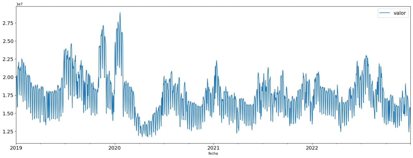
Figure 2. Time series of historical data after outliers have been processed.
If you want to know more about these processes, you can refer to the Practical Guide to Introduction to Exploratory Data Analysis.
4.3 Model training
This section can be found in point 3 of the Notebook.
First, we create within the data table the temporal attributes (year, month, day of the week, and quarter). These attributes are categorical variables that help ensure that the model is able to accurately capture the unique characteristics and patterns of these variables. Through the following box plot visualizations, we can see their relevance within the time series values.
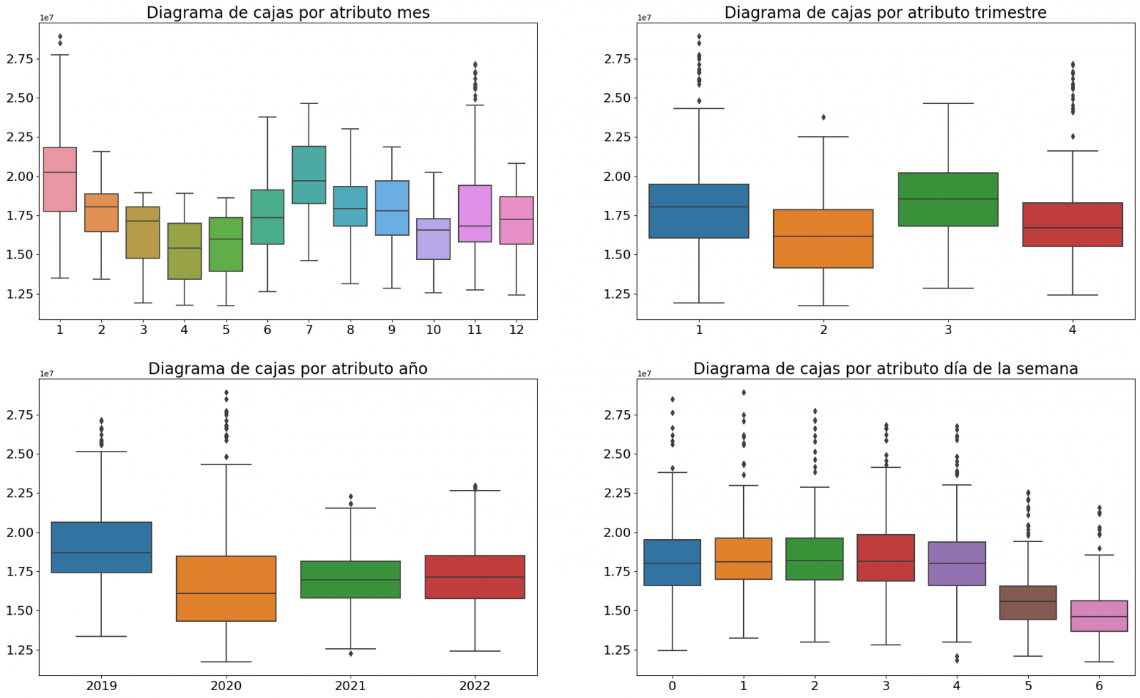
Figure 3. Box Diagrams of Generated Temporal Attributes
We can observe certain patterns in the charts above, such as the following:
- Weekdays (Monday to Friday) have a higher consumption than on weekends.
- The year with the lowest consumption values is 2020, which we understand is due to the reduction in service and industrial activity during the pandemic.
- The month with the highest consumption is July, which is understandable due to the use of air conditioners.
- The second quarter is the one with the lowest consumption values, with April standing out as the month with the lowest values.
Next, we divide the data table into training set and validation set. The training set is used to train the model, i.e., the model learns to predict the value of the target variable from that set, while the validation set is used to evaluate the performance of the model, i.e., the model is evaluated against the data from that set to determine its ability to predict the new values.
This splitting of the data is important to avoid overfitting, with the typical proportion of the data used for the training set being 70% and the validation set being approximately 30%. For this exercise we have decided to generate the training set with the data between "01-01-2019" to "01-10-2021", and the validation set with those between "01-10-2021" and "31-12-2022" as we can see in the following graph.
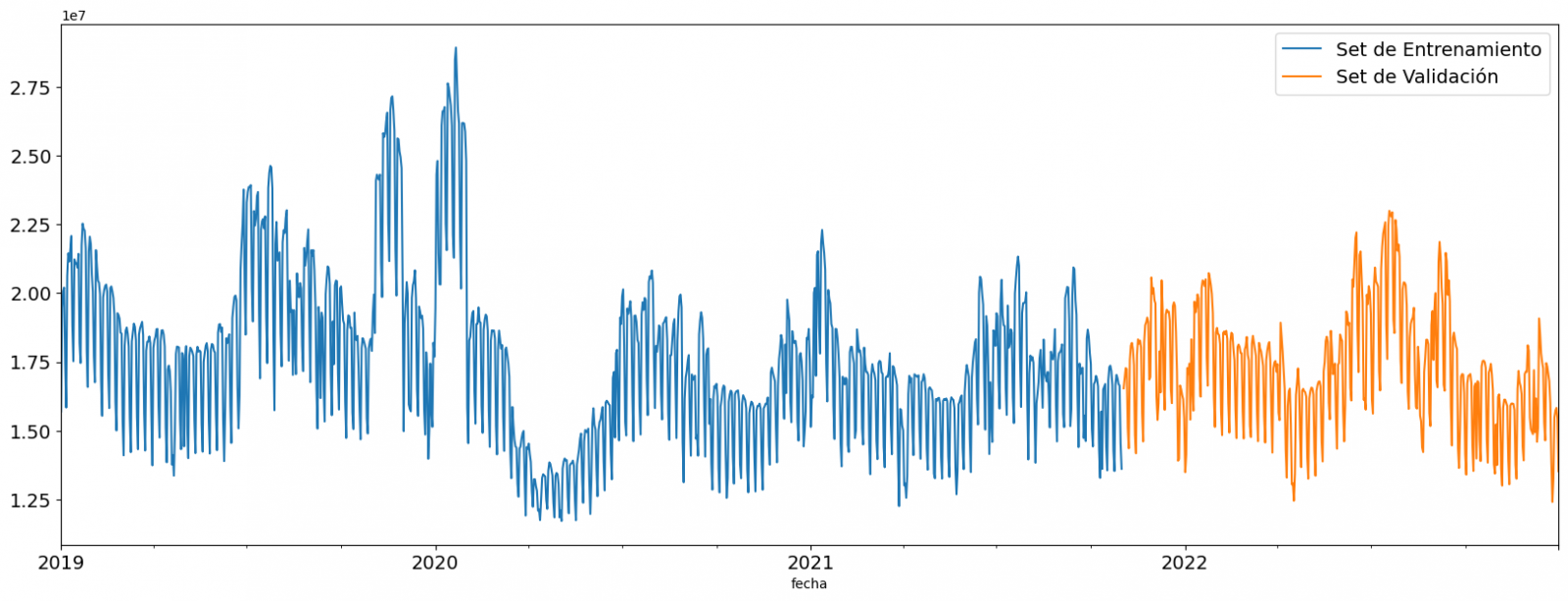
Figure 4. Historical data time series divided into training set and validation set
For this type of exercise, we have to use some regression algorithm. There are several models and libraries that can be used for time series prediction. In this exercise we will use the "Gradient Boosting" model, a supervised regression model that is a machine learning algorithm used to predict a continuous value based on the training of a dataset containing known values for the target variable (in our example the variable "value") and the values of the independent variables (in our exercise the temporal attributes).
It is based on decision trees and uses a technique called "boosting" to improve the accuracy of the model, being known for its efficiency and ability to handle a variety of regression and classification problems.
Its main advantages are the high degree of accuracy, robustness and flexibility, while some of its disadvantages are its sensitivity to outliers and that it requires careful optimization of parameters.
We will use the supervised regression model offered in the XGBBoost library, which can be adjusted with the following parameters:
- n_estimators: A parameter that affects the performance of the model by indicating the number of trees used. A larger number of trees generally results in a more accurate model, but it can also take more time to train.
- early_stopping_rounds: A parameter that controls the number of training rounds that will run before the model stops if performance in the validation set does not improve.
- learning_rate: Controls the learning speed of the model. A higher value will make the model learn faster, but it can lead to overfitting.
- max_depth: Control the maximum depth of trees in the forest. A higher value can provide a more accurate model, but it can also lead to overfitting.
- min_child_weight: Control the minimum weight of a sheet. A higher value can help prevent overfitting.
- Gamma: Controls the amount of expected loss reduction needed to split a node. A higher value can help prevent overfitting.
- colsample_bytree: Controls the proportion of features that are used to build each tree. A higher value can help prevent overfitting.
- Subsample: Controls the proportion of the data that is used to construct each tree. A higher value can help prevent overfitting.
These parameters can be adjusted to improve model performance on a specific dataset. It's a good idea to experiment with different values of these parameters to find the value that provides the best performance in your dataset.
Finally, by means of a bar graph, we will visually observe the importance of each of the attributes during the training of the model. It can be used to identify the most important attributes in a dataset, which can be useful for model interpretation and feature selection.
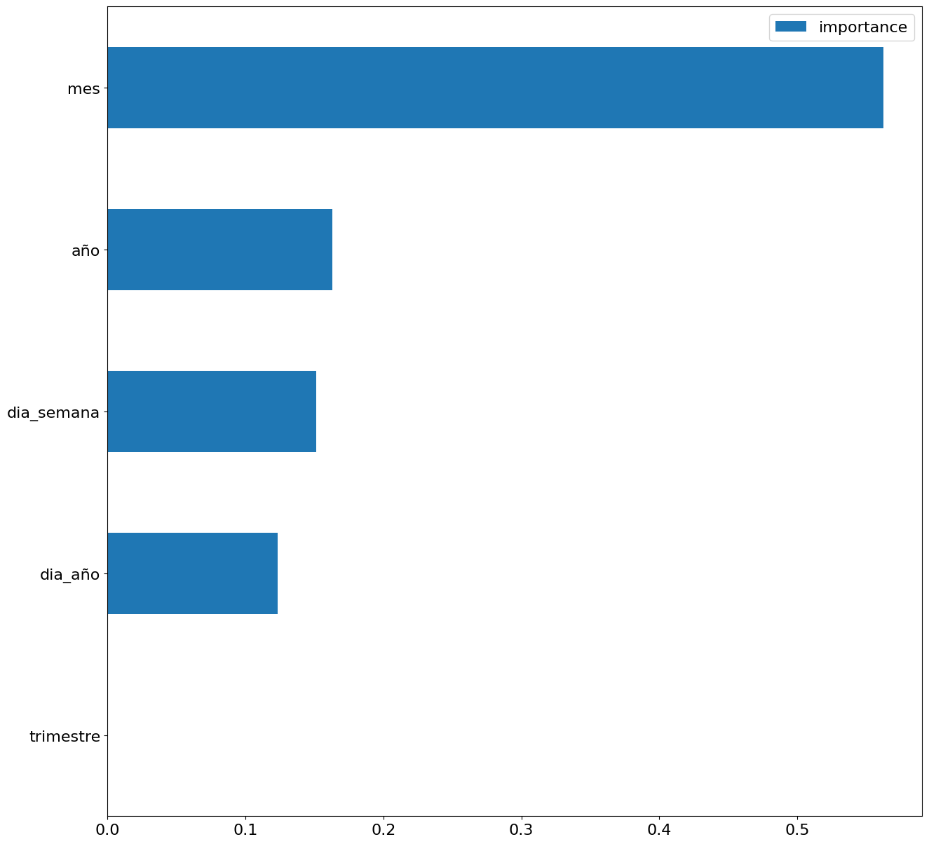
Figure 5. Bar Chart with Importance of Temporal Attributes
4.4 Model training
This section can be found in point 4 of the Notebook.
Once the model has been trained, we will evaluate how accurate it is for the known values in the validation set.
We can visually evaluate the model by plotting the time series with the known values along with the predictions made for the validation set as shown in the figure below.
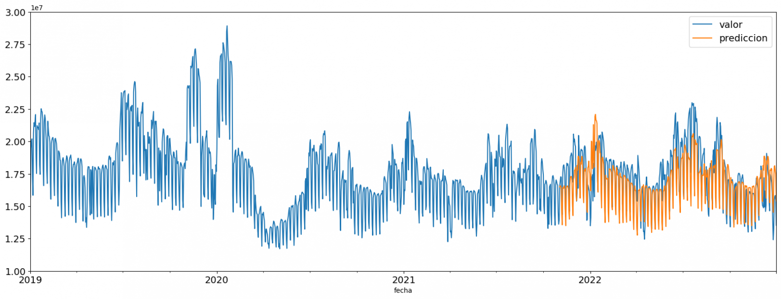
Figure 6. Time series with validation set data next to prediction data.
We can also numerically evaluate the accuracy of the model using different metrics. In this exercise, we have chosen to use the mean absolute percentage error (ASM) metric, which has been 6.58%. The accuracy of the model is considered high or low depending on the context and expectations in such a model, generally an ASM is considered low when it is less than 5%, while it is considered high when it is greater than 10%. In this exercise, the result of the model validation can be considered an acceptable value.
If you want to consult other types of metrics to evaluate the accuracy of models applied to time series, you can consult the following link.
4.5 Predictions of future values
This section can be found in point 5 of the Notebook.
Once the model has been generated and its MAPE = 6.58% performance has been evaluated, we will apply this model to all known data, in order to predict the unknown electricity consumption values for 2023.
First of all, we retrain the model with the known values until the end of 2022, without dividing it into a training and validation set. Finally, we calculate future values for the year 2023.

Figure 7. Time series with historical data and prediction for 2023
In the following interactive visualization you can see the predicted values for the year 2023 along with their main metrics, being able to filter by time period.
Improving the results of predictive time series models is an important goal in data science and data analytics. Several strategies that can help improve the accuracy of the exercise model are the use of exogenous variables, the use of more historical data or generation of synthetic data, optimization of parameters, ...
Due to the informative nature of this exercise and to promote the understanding of less specialized readers, we have proposed to explain the exercise in a way that is as simple and didactic as possible. You may come up with many ways to optimize your predictive model to achieve better results, and we encourage you to do so!
5. Conclusions of the exercise
Once the exercise has been carried out, we can see different conclusions such as the following:
- The maximum values for consumption predictions in 2023 are given in the last half of July, exceeding values of 22,500,000 MWh
- The month with the highest consumption according to the predictions for 2023 will be July, while the month with the lowest average consumption will be November, with a percentage difference between the two of 25.24%
- The average daily consumption forecast for 2023 is 17,259,844 MWh, 1.46% lower than that recorded between 2019 and 2022.
We hope that this exercise has been useful for you to learn some common techniques in the study and analysis of open data. We'll be back to show you new reuses. See you soon!
Blog
The UNESCO (United Nations Educational, Scientific and Cultural Organization) is a United Nations agency whose purpose is to contribute to peace and security in the world through education, science, culture and communication. In order to achieve its objective, this organisation usually establishes guidelines and recommendations such as the one published on 5 July 2023 entitled 'Open data for AI: what now?'
In the aftermath of the COVID-19 pandemic the UNESCO highlights a number of lessons learned:
- Policy frameworks and data governance models must be developed, supported by sufficient infrastructure, human resources and institutional capacities to address open data challenges, in order to be better prepared for pandemics and other global challenges.
- The relationship between open data and AI needs to be further specified, including what characteristics of open data are necessary to make it "AI-Ready".
- A data management, collaboration and sharing policy should be established for research, as well as for government institutions that hold or process health-related data, while ensuring data privacy through anonymisation and anonymisation data privacy should be ensured through anonymisation and anonymisation.
- Government officials who handle data that are or may become relevant to pandemics may need training to recognise the importance of such data, as well as the imperative to share them.
- As much high quality data as possible should be collected and collated. The data needs to come from a variety of credible sources, which, however, must also be ethical, i.e. it must not include data sets with biases and harmful content, and it must be collected only with consent and not in a privacy-invasive manner. In addition, pandemics are often rapidly evolving processes, so continuous updating of data is essential.
- These data characteristics are especially mandatory for improving inadequate AI diagnostic and predictive tools in the future. Efforts are needed to convert the relevant data into a machine-readable format, which implies the preservation of the collected data, i.e. cleaning and labelling.
- A wide range of pandemic-related data should be opened up, adhering to the FAIR principles.
- The target audience for pandemic-related open data includes research and academia, decision-makers in governments, the private sector for the development of relevant products, but also the public, all of whom should be informed about the available data.
- Pandemic-related open data initiatives should be institutionalised rather than ad hoc, and should therefore be put in place for future pandemic preparedness. These initiatives should also be inclusive and bring together different types of data producers and users.
- The beneficial use of pandemic-related data for AI machine learning techniques should also be regulated to prevent misuse for the development of artificial pandemics, i.e. biological weapons, with the help of AI systems.
The UNESCO builds on these lessons learned to establish Recommendations on Open Science by facilitating data sharing, improving reproducibility and transparency, promoting data interoperability and standards, supporting data preservation and long-term access.
As we increasingly recognise the role of Artificial Intelligence (AI), the availability and accessibility of data is more crucial than ever, which is why UNESCO is conducting research in the field of AI to provide knowledge and practical solutions to foster digital transformation and build inclusive knowledge societies.
Open data is the main focus of these recommendations, as it is seen as a prerequisite for planning, decision-making and informed interventions. The report therefore argues that Member States must share data and information, ensuring transparency and accountability, as well as opportunities for anyone to make use of the data.
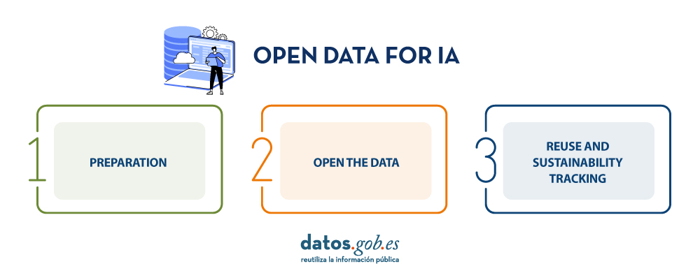
UNESCO provides a guide that aims to raise awareness of the value of open data and specifies concrete steps that Member States can take to open their data. These are practical, but high-level steps on how to open data, based on existing guidelines. Three phases are distinguished: preparation, data opening and follow-up for re-use and sustainability, and four steps are presented for each phase.
It is important to note that several of the steps can be carried out simultaneously, i.e. not necessarily consecutively.
Step 1: Preparation
- Develop a data management and sharing policy: A data management and sharing policy is an important prerequisite for opening up data, as such a policy defines the governments' commitment to share data. The Open Data Institute suggests the following elements of an open data policy:
- A definition of open data, a general statement of principles, an outline of the types of data and references to any relevant legislation, policy or other guidance.
- Governments are encouraged to adhere to the principle "as open as possible, as closed as necessary". If data cannot be opened for legal, privacy or other reasons, e.g. personal or sensitive data, this should be clearly explained.
In addition, governments should also encourage researchers and the private sector in their countries to develop data management and sharing policies that adhere to the same principles.
- Collect and collate high quality data: Existing data should be collected and stored in the same repository, e.g. from various government departments where it may have been stored in silos. Data must be accurate and not out of date. Furthermore, data should be comprehensive and should not, for example, neglect minorities or the informal economy. Data on individuals should be disaggregated where relevant, including by income, sex, age, race, ethnicity, migration status, disability and geographic location.
- Develop open data capabilities: These capacities address two groups:
- For civil servants, it includes understanding the benefits of open data by empowering and enabling the work that comes with open data.
- For potential users, it includes demonstrating the opportunities of open data, such as its re-use, and how to make informed decisions.
- Prepare data for AI: If data is not only to be used by humans, but can also feed AI systems, it must meet a few more criteria to be AI-ready.
- The first step in this regard is to prepare the data in a machine-readable format.
- Some formats are more conducive to readability by artificial intelligence systems than others.
- Data must also be cleaned and labelled, which is often time-consuming and therefore costly.
The success of an AI system depends on the quality of the training data, including its consistency and relevance. The required amount of training data is difficult to know in advance and must be controlled by performance checks. The data should cover all scenarios for which the AI system has been created.
Step 2: Open the data
- Select the datasets to be opened: The first step in opening the data is to decide which datasets are to be opened. The criteria in favour of openness are:
- If there have been previous requests to open these data
- Whether other governments have opened up this data and whether this has led to beneficial uses of the data.
Openness of data must not violate national laws, such as data privacy laws.
- Open the datasets legally: Before opening the datasets, the relevant government has to specify exactly under which conditions, if any, the data can be used. In publishing the data, governments may choose the license that best suits their objectives, such as the creative Commons and Open. To support the licence selection the European Commission makes available JLA - Compatibility Checkera tool that supports this decision
- Open the datasets technically: The most common way to open the data is to publish it in electronic format for download on a website, and APIs must be in place for the consumption of this data, either by the government itself or by a third party.
Data should be presented in a format that allows for localisation, accessibility, interoperability and re-use, thus complying with the FAIR principles.
In addition, the data could also be published in a data archive or repository, which should be, according to the UNESCO Recommendation, supported and maintained by a well-established academic institution, learned society, government agency or other non-profit organisation dedicated to the common good that allows for open access, unrestricted distribution, interoperability and long-term digital archiving and preservation.
- Create a culture driven by open data: Experience has shown that, in addition to legal and technical openness of data, at least two other things need to be achieved to achieve an open data culture:
- Government departments are often not used to sharing data and it has been necessary to create a mindset and educate them to this end.
- Furthermore, data should, if possible, become the exclusive basis for decision-making; in other words, decisions should be based on data.
- In addition, cultural changes are required on the part of all staff involved, encouraging proactive disclosure of data, which can ensure that data is available even before it is requested.
Step 3: Monitoring of re-use and sustainability
- Support citizen participation: Once the data is open, it must be discoverable by potential users. This requires the development of an advocacy strategy, which may include announcing the openness of the data in open data communities and relevant social media channels.
Another important activity is early consultation and engagement with potential users, who, in addition to being informed about open data, should be encouraged to use and re-use it and to stay involved.
- Supporting international engagement: International partnerships would further enhance the benefits of open data, for example through south-south and north-south collaboration. Particularly important are partnerships that support and build capacity for data reuse, whether using AI or not.
- Support beneficial AI participation: Open data offers many opportunities for AI systems. To realise the full potential of data, developers need to be empowered to make use of it and develop AI systems accordingly. At the same time, the abuse of open data for irresponsible and harmful AI applications must be avoided. A best practice is to keep a public record of what data AI systems have used and how they have used it.
- Maintain high quality data: A lot of data quickly becomes obsolete. Therefore, datasets need to be updated on a regular basis. The step "Maintain high quality data" turns this guideline into a loop, as it links to the step "Collect and collate high quality data".
Conclusions
These guidelines serve as a call to action by UNESCO on the ethics of artificial intelligence. Open data is a necessary prerequisite for monitoring and achieving sustainable development monitoring and achieving sustainable development.
Due to the magnitude of the tasks, governments must not only embrace open data, but also create favourable conditions for beneficial AI engagement that creates new insights from open data for evidence-based decision-making.
If UNESCO Member States follow these guidelines and open their data in a sustainable way, build capacity, as well as a culture driven by open data, we can achieve a world where data is not only more ethical, but where applications on this data are more accurate and beneficial to humanity.
References
https://www.unesco.org/en/articles/open-data-ai-what-now
Author : Ziesche, Soenke , ISBN : 978-92-3-100600-5
Content prepared by Mayte Toscano, Senior Consultant in Data Economy Technologies. The contents and points of view reflected in this publication are the sole responsibility of its author.
Documentación
The Open Data Maturity Study 2022 provides a snapshot of the level of development of policies promoting open data in countries, as well as an assessment of the expected impact of these policies. Among its findings, it highlights that measuring the impact of open data is a priority, but also a major challenge across Europe.
In this edition, there has been a 7% decrease in the average maturity level in the impact dimension for EU27 countries, which coincides with the restructuring of the impact dimension indicators. However, it is not so much a decrease in the level of maturity, but a more accurate picture of the difficulty in assessing the resulting impact of reuse of open data difficulty in assessing the impact resulting from the re-use of open data.
Therefore, in order to better understand how to make progress on the challenge of measuring the impact of open data, we have looked at existing best practices for measuring the impact of open data in Europe. To achieve this objective, we have worked with the data provided by the countries in their responses to the survey questionnaire and in particular with those of the eleven countries that have scored more than 500 points in the Impact dimension, regardless of their overall score and their position in the ranking: France, Ireland, Cyprus, Estonia and the Czech Republic scoring the maximum 600 points; and Poland, Spain, Italy, Denmark and Sweden scoring above 510 points.
In the report we provide a country profile for each of the ten countries, analysing in general terms the country's performance in all dimensions of the study and in detail the different components of the impact dimension, summarising the practices that have led to its high score based on the analysis of the responses to the questionnaire.
Through this tabbed structure the document allows for a direct comparison between country indicators and provides a detailed overview of best practices and challenges in the use of open data in terms of measuring impact through the following indicators:
- "Strategic awareness": It quantifies the awareness and preparedness of countries to understand the level of reuse and impact of open data within their territory.
- "Measuring reuse": It focuses on how countries measure open data re-use and what methods they use.
-
"Impact created": It collects data on the impact created within four impact areas: government impact (formerly policy impact), social impact, environmental impact and economic impact.
Finally, the report provides a comparative analysis of these countries and draws out a series of recommendations and good practices that aim to provide ideas on how to improve the impact of open data on each of the three indicators measured in the study.
If you want to know more about the content of this report, you can watch the interview with its author interview with its author.
Below, you can download the full report, the executive summary and a presentation-summary.
Content prepared by Jose Luis Marín, Senior Consultant in Data, Strategy, Innovation & Digitalization.
The contents and views expressed in this publication are the sole responsibility of the author.
Documentación
1. Introduction
Visualizations are graphical representations of data that allow the information linked to them to be communicated in a simple and effective way. The visualization possibilities are very wide, from basic representations, such as line, bar or sector graphs, to visualizations configured on interactive dashboards.
In this "Step-by-Step Visualizations" section we are regularly presenting practical exercises of open data visualizations available in datos.gob.es or other similar catalogs. They address and describe in a simple way the stages necessary to obtain the data, perform the transformations and analyses that are relevant to, finally, enable the creation of interactive visualizations that allow us to obtain final conclusions as a summary of said information. In each of these practical exercises, simple and well-documented code developments are used, as well as tools that are free to use. All generated material is available for reuse in the GitHub Data Lab repository.
Then, and as a complement to the explanation that you will find below, you can access the code that we will use in the exercise and that we will explain and develop in the following sections of this post.
Access the data lab repository on Github.
Run the data pre-processing code on top of Google Colab.
2. Objetive
The main objective of this exercise is to show how to perform a network or graph analysis based on open data on rental bicycle trips in the city of Madrid. To do this, we will perform a preprocessing of the data in order to obtain the tables that we will use next in the visualization generating tool, with which we will create the visualizations of the graph.
Network analysis are methods and tools for the study and interpretation of the relationships and connections between entities or interconnected nodes of a network, these entities being persons, sites, products, or organizations, among others. Network analysis seeks to discover patterns, identify communities, analyze influence, and determine the importance of nodes within the network. This is achieved by using specific algorithms and techniques to extract meaningful insights from network data.
Once the data has been analyzed using this visualization, we can answer questions such as the following:
- What is the network station with the highest inbound and outbound traffic?
- What are the most common interstation routes?
- What is the average number of connections between stations for each of them?
- What are the most interconnected stations within the network?
3. Resources
3.1. Datasets
The open datasets used contain information on loan bike trips made in the city of Madrid. The information they provide is about the station of origin and destination, the time of the journey, the duration of the journey, the identifier of the bicycle, ...
These open datasets are published by the Madrid City Council, through files that collect the records on a monthly basis.
These datasets are also available for download from the following Github repository.
3.2. Tools
To carry out the data preprocessing tasks, the Python programming language written on a Jupyter Notebook hosted in the Google Colab cloud service has been used.
"Google Colab" or, also called Google Colaboratory, is a cloud service from Google Research that allows you to program, execute and share code written in Python or R on a Jupyter Notebook from your browser, so it does not require configuration. This service is free of charge.
For the creation of the interactive visualization, the Gephi tool has been used.
"Gephi" is a network visualization and analysis tool. It allows you to represent and explore relationships between elements, such as nodes and links, in order to understand the structure and patterns of the network. The program requires download and is free.
If you want to know more about tools that can help you in the treatment and visualization of data, you can use the report "Data processing and visualization tools".
4. Data processing or preparation
The processes that we describe below you will find them commented in the Notebook that you can also run from Google Colab.
Due to the high volume of trips recorded in the datasets, we defined the following starting points when analysing them:
- We will analyse the time of day with the highest travel traffic
- We will analyse the stations with a higher volume of trips
Before launching to analyse and build an effective visualization, we must carry out a prior treatment of the data, paying special attention to its obtaining and the validation of its content, making sure that they are in the appropriate and consistent format for processing and that they do not contain errors.
As a first step of the process, it is necessary to perform an exploratory analysis of the data (EDA), in order to properly interpret the starting data, detect anomalies, missing data or errors that could affect the quality of subsequent processes and results. If you want to know more about this process you can resort to the Practical Guide of Introduction to Exploratory Data Analysis
The next step is to generate the pre-processed data table that we will use to feed the network analysis tool (Gephi) that will visually help us understand the information. To do this, we will modify, filter and join the data according to our needs.
The steps followed in this data preprocessing, explained in this Google Colab Notebook, are as follows:
- Installation of libraries and loading of datasets
- Exploratory Data Analysis (EDA)
- Generating pre-processed tables
You will be able to reproduce this analysis with the source code that is available in our GitHub account. The way to provide the code is through a document made on a Jupyter Notebook that, once loaded into the development environment, you can easily run or modify.
Due to the informative nature of this post and to favour the understanding of non-specialized readers, the code is not intended to be the most efficient but to facilitate its understanding, so you will possibly come up with many ways to optimize the proposed code to achieve similar purposes. We encourage you to do so!
5. Network analysis
5.1. Definition of the network
The analysed network is formed by the trips between different bicycle stations in the city of Madrid, having as main information of each of the registered trips the station of origin (called "source") and the destination station (called "target").
The network consists of 253 nodes (stations) and 3012 edges (interactions between stations). It is a directed graph, because the interactions are bidirectional and weighted, because each edge between the nodes has an associated numerical value called "weight" which in this case corresponds to the number of trips made between both stations.
5.2. Loading the pre-processed table in to Gephi
Using the "import spreadsheet" option on the file tab, we import the previously pre-processed data table in CSV format. Gephi will detect what type of data is being loaded, so we will use the default predefined parameters.


5.3. Network display options
5.3.1 Distribution window
First, we apply in the distribution window, the Force Atlas 2 algorithm. This algorithm uses the technique of node repulsion depending on the degree of connection in such a way that the sparsely connected nodes are separated from those with a greater force of attraction to each other.
To prevent the related components from being out of the main view, we set the value of the parameter "Severity in Tuning" to a value of 10 and to avoid that the nodes are piled up, we check the option "Dissuade Hubs" and "Avoid overlap".

Dentro de la ventana de distribución, también aplicamos el algoritmo de Expansión con la finalidad de que los nodos no se encuentren tan juntos entre sí mismos.

Figure 3. Distribution window - Expansion algorithm
5.3.2 Appearance window
Next, in the appearance window, we modify the nodes and their labels so that their size is not equal but depends on the value of the degree of each node (nodes with a higher degree, larger visual size). We will also modify the colour of the nodes so that the larger ones are a more striking colour than the smaller ones. In the same appearance window we modify the edges, in this case we have opted for a unitary colour for all of them, since by default the size is according to the weight of each of them.
A higher degree in one of the nodes implies a greater number of stations connected to that node, while a greater weight of the edges implies a greater number of trips for each connection.

5.3.3 Graph window
Finally, in the lower area of the interface of the graph window, we have several options such as activating / deactivating the button to show the labels of the different nodes, adapting the size of the edges in order to make the visualization cleaner, modify the font of the labels, ...

Next, we can see the visualization of the graph that represents the network once the visualization options mentioned in the previous points have been applied.

Figure 6. Graph display
Activating the option to display labels and placing the cursor on one of the nodes, the links that correspond to the node and the rest of the nodes that are linked to the chosen one through these links will be displayed.
Next, we can visualize the nodes and links related to the bicycle station "Fernando el Católico". In the visualization, the nodes that have a greater number of connections are easily distinguished, since they appear with a larger size and more striking colours, such as "Plaza de la Cebada" or "Quevedo".

5.4 Main network measures
Together with the visualization of the graph, the following measurements provide us with the main information of the analysed network. These averages, which are the usual metrics when performing network analytics, can be calculated in the statistics window.

- Nodes (N): are the different individual elements that make up a network, representing different entities. In this case the different bicycle stations. Its value on the network is 243
- Links (L): are the connections that exist between the nodes of a network. Links represent the relationships or interactions between the individual elements (nodes) that make up the network. Its value in the network is 3014
- Maximum number of links (Lmax): is the maximum possible number of links in the network. It is calculated by the following formula Lmax= N(N-1)/2. Its value on the network is 31878
- Average grade (k): is a statistical measure to quantify the average connectivity of network nodes. It is calculated by averaging the degrees of all nodes in the network. Its value in the network is 23.8
- Network density (d): indicates the proportion of connections between network nodes to the total number of possible connections. Its value in the network is 0.047
- Diámetro (dmax ): is the longest graph distance between any two nodes of the res, i.e., how far away the 2 nodes are farther apart. Its value on the network is 7
- Mean distance (d):is the average mean graph distance between the nodes of the network. Its value on the network is 2.68
- Mean clustering coefficient (C): Indicates how nodes are embedded between their neighbouring nodes. The average value gives a general indication of the grouping in the network. Its value in the network is 0.208
- Related component: A group of nodes that are directly or indirectly connected to each other but are not connected to nodes outside that group. Its value on the network is 24
5.5 Interpretation of results
The probability of degrees roughly follows a long-tail distribution, where we can observe that there are a few stations that interact with a large number of them while most interact with a low number of stations.
The average grade is 23.8 which indicates that each station interacts on average with about 24 other stations (input and output).
In the following graph we can see that, although we have nodes with degrees considered as high (80, 90, 100, ...), it is observed that 25% of the nodes have degrees equal to or less than 8, while 75% of the nodes have degrees less than or equal to 32.

The previous graph can be broken down into the following two corresponding to the average degree of input and output (since the network is directional). We see that both have similar long-tail distributions, their mean degree being the same of 11.9
Its main difference is that the graph corresponding to the average degree of input has a median of 7 while the output is 9, which means that there is a majority of nodes with lower degrees in the input than the output.


The value of the average grade with weights is 346.07 which indicates the average of total trips in and out of each station.

The network density of 0.047 is considered a low density indicating that the network is dispersed, that is, it contains few interactions between different stations in relation to the possible ones. This is considered logical because connections between stations will be limited to certain areas due to the difficulty of reaching stations that are located at long distances.
The average clustering coefficient is 0.208 meaning that the interaction of two stations with a third does not necessarily imply interaction with each other, that is, it does not necessarily imply transitivity, so the probability of interconnection of these two stations through the intervention of a third is low.
Finally, the network has 24 related components, of which 2 are weak related components and 22 are strong related components.
5.6 Centrality analysis
A centrality analysis refers to the assessment of the importance of nodes in a network using different measures. Centrality is a fundamental concept in network analysis and is used to identify key or influential nodes within a network. To perform this task, you start from the metrics calculated in the statistics window.
- The degree centrality measure indicates that the higher the degree of a node, the more important it is. The five stations with the highest values are: 1º Plaza de la Cebada, 2º Plaza de Lavapiés, 3º Fernando el Católico, 4º Quevedo, 5º Segovia 45.

- The closeness centrality indicates that the higher the proximity value of a node, the more central it is, since it can reach any other node in the network with the least possible effort. The five stations with the highest values are: 1º Fernando el Católico 2º General Pardiñas, 3º Plaza de la Cebada, 4º Plaza de Lavapiés, 5º Puerta de Madrid.


- The measure of betweenness centrality indicates that the greater the intermediation measure of a node, the more important it is since it is present in more interaction paths between nodes than the rest of the nodes in the network. The five stations with the highest values are: 1º Fernando el Católico, 2º Plaza de Lavapiés, 3º Plaza de la Cebada, 4º Puerta de Madrid, 5º Quevedo.

 FIgure 16. Graphic visualization betweenness centrality
With the Gephi tool you can calculate a large number of metrics and parameters that are not reflected in this study, such as the eigenvector measure or centrality distribution "eigenvector".
5.7 Filters
Through the filtering window, we can select certain parameters that simplify the visualizations in order to show relevant information of network analysis in a clearer way visually.

Next, we will show several filtered performed:
- Range (grade) filtering, which shows nodes with a rank greater than 50, assuming 13.44% (34 nodes) and 15.41% (464 edges).

- Edge filtering (edge weight), showing edges weighing more than 100, assuming 0.7% (20 edges).

Within the filters window, there are many other filtering options on attributes, ranges, partition sizes, edges, ... with which you can try to make new visualizations to extract information from the graph. If you want to know more about the use of Gephi, you can consult the following courses and trainings about the tool.
6. Conclusions of the exercice
Once the exercise is done, we can appreciate the following conclusions:
- The three stations most interconnected with other stations are Plaza de la Cebada (133), Plaza de Lavapiés (126) and Fernando el Católico (114).
- The station that has the highest number of input connections is Plaza de la Cebada (78), while the one with the highest number of exit connections is Plaza de Lavapiés with the same number as Fernando el Católico (57).
- The three stations with the highest number of total trips are Plaza de la Cebada (4524), Plaza de Lavapiés (4237) and Fernando el Católico (3526).
- There are 20 routes with more than 100 trips. Being the 3 routes with a greater number of them: Puerta de Toledo – Plaza Conde Suchil (141), Quintana Fuente del Berro – Quintana (137), Camino Vinateros – Miguel Moya (134).
- Taking into account the number of connections between stations and trips, the most important stations within the network are: Plaza la Cebada, Plaza de Lavapiés and Fernando el Católico.
We hope that this step-by-step visualization has been useful for learning some very common techniques in the treatment and representation of open data. We will be back to show you further reuses. See you soon!
Documentación
The digitalization in the public sector in Spain has also reached the judicial field. The first regulation to establish a legal framework in this regard was the reform that took place through Law 18/2011, of July 5th (LUTICAJ). Since then, there have been advances in the technological modernization of the Administration of Justice. Last year, the Council of Ministers approved a new legislative package to definitively address the digital transformation of the public justice service, the Digital Efficiency Bill.
This project incorporates various measures specifically aimed at promoting data-driven management, in line with the overall approach formulated through the so-called Data Manifesto promoted by the Data Office.
Once the decision to embrace data-driven management has been made, it must be approached taking into account the requirements and implications of Open Government, so that not only the possibilities for improvement in the internal management of judicial activity are strengthened, but also the possibilities for reuse of the information generated as a result of the development of said public service (RISP).
Open data: a premise for the digital transformation of justice
To address the challenge of the digital transformation of justice, data openness is a fundamental requirement. In this regard, open data requires conditions that allow their automated integration in the judicial field. First, an improvement in the accessibility conditions of the data sets must be carried out, which should be in interoperable and reusable formats. In fact, there is a need to promote an institutional model based on interoperability and the establishment of homogeneous conditions that, through standardization adapted to the singularities of the judicial field, facilitate their automated integration.
In order to deepen the synergy between open data and justice, the report prepared by expert Julián Valero identifies the keys to digital transformation in the judicial field, as well as a series of valuable open data sources in the sector.
If you want to learn more about the content of this report, you can watch the interview with its author.
Below, you can download the full report, the executive summary, and a summary presentation.