Application
Goio is a virtual assistant powered by Turismo de Tenerife whose goal is to improve the experience of both residents and visitors to the island. It combines tourist information, smart mobility and advanced conversational services to offer personalised recommendations, answer questions and facilitate the planning of activities and travel on the island.
Developed with artificial intelligence technologies and cognitive services, Goio offers text and voice interaction capabilities. Although it is currently in the learning process, it is capable of responding to thousands of queries daily, providing up-to-date information and accompanying the user throughout their trip to Tenerife. Specifically, the application offers features such as:
Real-time mobility information: public transport, traffic, routes and sustainable alternatives.
Access to a catalogue of more than 4,000 activities and points of interest on the island.
Personalised recommendations based on user preferences (using criteria such as speed, sustainability, accessibility, tourist interests, etc.).
Display of tourist attractions, services and facilities nearby.
Alerts and notifications about changes in traffic, roadworks or events that may affect travel.
To offer these services, the app integrates data from institutional sources, such as the Cabildo de Tenerife, and combines it with ex
Blog
Between ice cream and longer days, summer is here. At this time of year, open information can become our best ally to plan getaways, know schedules of the bathing areas in our community or even know the state of traffic on roads that take us to our next destination.
Whether you're on the move or at home resting, you can find a wide variety of datasets and apps on the datos.gob.es portal that can transform the way you live and enjoy the summer. In addition, if you want to take advantage of the summer season to train, we also have resources for you.
Training, rest or adventure, in this post, we offer you some of the resources that can be useful this summer.
An opportunity to learn: courses and cultural applications
Are you thinking of making a change in your professional career? Or would you like to improve in a discipline? Data science is one of the most in-demand skills for companies and artificial intelligence offers new opportunities every day to apply it in our day-to-day lives.
To understand both disciplines well and be up to date with their development, you can take advantage of the summer to train in programming, data visualization or even generative AI. In this post, which we published at the beginning of summer, you have a list of proposals, you are still in time to sign up for some!
If you already have some knowledge, we advise you to review our step-by-step exercises. In each of them you will find the code reproducible and fully documented, so you can replicate it at your own pace. In this infographic we show you several examples, divided by themes and level of difficulty. A practical way to test your technical skills and learn about innovative tools and technologies.
If instead of data science, you want to take advantage of it to gain more cultural knowledge, we also have options for you. First of all, we recommend this dataset on the cultural agenda of events in the Basque Country to discover festivals, concerts and other cultural activities. Another interesting dataset is that of tourist information offices in Tenerife where they will inform you how to plan cultural itineraries. And this application will accompany you on a tour of Castilla y León through a gamified map to identify tourist places of interest.
Plan your perfect getaway: datasets for tourism and vacations
Some of the open datasets you can find on datos.gob.es are the basis for creating applications that can be very useful for travel. We are talking, for example, about the dataset of campsites in Navarre that provides updated data on active tourism camps, including information on services, location and capacity. In this same autonomous community, this dataset on restaurants and cafeterias may be useful to you.
On the other hand, this dataset on the supply of tourist accommodation in Aragon presents a complete catalogue of hotels, inns and hostels classified by category, allowing travellers to make informed decisions according to their budget and preferences.
Another interesting resource is this dataset published by the National Institute of Statistics, which you can also find federated in datos.gob.es on trips, overnight stays, average duration and expenditure per trip. Thanks to this dataset, you can get an idea of how people travel and take it as a reference to plan your trip.
Enjoy the Water: Open Datasets for Water Activities
Access to information about beaches and bathing areas is essential for a safe and pleasant summer. The Bizkaia beach dataset provides detailed information on the characteristics of each beach, including available services, accessibility and water conditions. Similarly, this dataset of bathing areas in the Community of Madrid provides data on safe and controlled aquatic spaces in the region.
If you want a more general view, this application developed by the Ministry for Ecological Transition and Demographic Challenge (MITECO) with open data offers a national visualization of beaches at the national level. More recently, RTVE's data team has developed this Great Map of Spain's beaches that includes more than 3,500 destinations with specific information.
For lovers of water sports and sailing, tide prediction datasets for both Galicia and the Basque Country offer crucial information for planning activities at sea. This data allows boaters, surfers and fishermen to optimize their activities according to ocean conditions.
Smart mobility: datasets for hassle-free travel
It is not news that mobility during these months is even greater than in the rest of the year. Datasets on traffic conditions in Barcelona and the roads in Navarra provide real-time information that helps travellers avoid congestion and plan efficient routes. This information is especially valuable during periods of increased summer mobility, when roads experience a significant increase in traffic.
The applications that provide information on the price of fuel at the different Spanish petrol stations are among the most consulted on our portal throughout the year, but in summer their popularity skyrockets even more. They are interesting because they allow you to locate the service stations with the most competitive prices, optimizing the travel budget. This information can also be found in regularly updated datasets and is especially useful for long trips and route planning.
The future of open data in tourism
The convergence of open data, mobile technology and artificial intelligence is creating new opportunities to personalize and enhance the tourism experience. The datasets and resources available in datos.gob.es not only provide current information, but also serve as a basis for the development of innovative solutions that can anticipate needs, optimize resources, and create more satisfying experiences for travelers.
From route planning to selecting accommodations or finding cultural activities, these datasets and apps empower citizens and are a useful resource to maximize the enjoyment of this time of year. This summer, before you pack your bags, it's worth exploring the possibilities offered by open data.
Blog
Artificial intelligence is no longer a thing of the future: it is here and can become an ally in our daily lives. From making tasks easier for us at work, such as writing emails or summarizing documents, to helping us organize a trip, learn a new language, or plan our weekly menus, AI adapts to our routines to make our lives easier. You don't have to be tech-savvy to take advantage of it; while today's tools are very accessible, understanding their capabilities and knowing how to ask the right questions will maximize their usefulness.
AI Passive and Active Subjects
The applications of artificial intelligence in everyday life are transforming our daily lives. AI already covers multiple fields of our routines. Virtual assistants, such as Siri or Alexa, are among the most well-known tools that incorporate artificial intelligence, and are used to answer questions, schedule appointments, or control devices.
Many people use tools or applications with artificial intelligence on a daily basis, even if it operates imperceptibly to the user and does not require their intervention. Google Maps, for example, uses AI to optimize routes in real time, predict traffic conditions, suggest alternative routes or estimate the time of arrival. Spotify applies it to personalize playlists or suggest songs, and Netflix to make recommendations and tailor the content shown to each user.
But it is also possible to be an active user of artificial intelligence using tools that interact directly with the models. Thus, we can ask questions, generate texts, summarize documents or plan tasks. AI is no longer a hidden mechanism but a kind of digital co-pilot that assists us in our day-to-day lives. ChatGPT, Copilot or Gemini are tools that allow us to use AI without having to be experts. This makes it easier for us to automate daily tasks, freeing up time to spend on other activities.
AI in Home and Personal Life
Virtual assistants respond to voice commands and inform us what time it is, the weather or play the music we want to listen to. But their possibilities go much further, as they are able to learn from our habits to anticipate our needs. They can control different devices that we have in the home in a centralized way, such as heating, air conditioning, lights or security devices. It is also possible to configure custom actions that are triggered via a voice command. For example, a "good morning" routine that turns on the lights, informs us of the weather forecast and the traffic conditions.
When we have lost the manual of one of the appliances or electronic devices we have at home, artificial intelligence is a good ally. By sending a photo of the device, you will help us interpret the instructions, set it up, or troubleshoot basic issues.
If you want to go further, AI can do some everyday tasks for you. Through these tools we can plan our weekly menus, indicating needs or preferences, such as dishes suitable for celiacs or vegetarians, prepare the shopping list and obtain the recipes. It can also help us choose between the dishes on a restaurant's menu taking into account our preferences and dietary restrictions, such as allergies or intolerances. Through a simple photo of the menu, the AI will offer us personalized suggestions.
Physical exercise is another area of our personal lives in which these digital co-pilots are very valuable. We may ask you, for example, to create exercise routines adapted to different physical conditions, goals and available equipment.
Planning a vacation is another of the most interesting features of these digital assistants. If we provide them with a destination, a number of days, interests, and even a budget, we will have a complete plan for our next trip.
Applications of AI in studies
AI is profoundly transforming the way we study, offering tools that personalize learning. Helping the little ones in the house with their schoolwork, learning a language or acquiring new skills for our professional development are just some of the possibilities.
There are platforms that generate personalized content in just a few minutes and didactic material made from open data that can be used both in the classroom and at home to review. Among university students or high school students, some of the most popular options are applications that summarize or make outlines from longer texts. It is even possible to generate a podcast from a file, which can help us understand and become familiar with a topic while playing sports or cooking.
But we can also create our applications to study or even simulate exams. Without having programming knowledge, it is possible to generate an application to learn multiplication tables, irregular verbs in English or whatever we can think of.
How to Use AI in Work and Personal Finance
In the professional field, artificial intelligence offers tools that increase productivity. In fact, it is estimated that in Spain 78% of workers already use AI tools in the workplace. By automating processes, we save time to focus on higher-value tasks. These digital assistants summarize long documents, generate specialized reports in a field, compose emails, or take notes in meetings.
Some platforms already incorporate the transcription of meetings in real time, something that can be very useful if we do not master the language. Microsoft Teams, for example, offers useful options through Copilot from the "Summary" tab of the meeting itself, such as transcription, a summary or the possibility of adding notes.
The management of personal finances has also evolved thanks to applications that use AI, allowing you to control expenses and manage a budget. But we can also create our own personal financial advisor using an AI tool, such as ChatGPT. By providing you with insights into income, fixed expenses, variables, and savings goals, it analyzes the data and creates personalized financial plans.
Prompts and creation of useful applications for everyday life
We have seen the great possibilities that artificial intelligence offers us as a co-pilot in our day-to-day lives. But to make it a good digital assistant, we must know how to ask it and give it precise instructions.
A prompt is a basic instruction or request that is made to an AI model to guide it, with the aim of providing us with a coherent and quality response. Good prompting is the key to getting the most out of AI. It is essential to ask well and provide the necessary information.
To write effective prompts we have to be clear, specific, and avoid ambiguities. We must indicate what the objective is, that is, what we want the AI to do: summarize, translate, generate an image, etc. It is also key to provide it with context, explaining who it is aimed at or why we need it, as well as how we expect the response to be. This can include the tone of the message, the formatting, the fonts used to generate it, etc.
Here are some tips for creating effective prompts:
- Use short, direct and concrete sentences. The clearer the request, the more accurate the answer. Avoid expressions such as "please" or "thank you", as they only add unnecessary noise and consume more resources. Instead, use words like "must," "do," "include," or "list." To reinforce the request, you can capitalize those words. These expressions are especially useful for fine-tuning a first response from the model that doesn't meet your expectations.
- It indicates the audience to which it is addressed. Specify whether the answer is aimed at an expert audience, inexperienced audience, children, adolescents, adults, etc. When we want a simple answer, we can, for example, ask the AI to explain it to us as if we were ten years old.
- Use delimiters. Separate the instructions using a symbol, such as slashes (//) or quotation marks to help the model understand the instruction better. For example, if you want it to do a translation, it uses delimiters to separate the command ("Translate into English") from the phrase it is supposed to translate.
- Indicates the function that the model should adopt. Specifies the role that the model should assume to generate the response. Telling them whether they should act like an expert in finance or nutrition, for example, will help generate more specialized answers as they will adapt both the content and the tone.
- Break down entire requests into simple requests. If you're going to make a complex request that requires an excessively long prompt, it's a good idea to break it down into simpler steps. If you need detailed explanations, use expressions like "Think by step" to give you a more structured answer.
- Use examples. Include examples of what you're looking for in the prompt to guide the model to the answer.
- Provide positive instructions. Instead of asking them not to do or include something, state the request in the affirmative. For example, instead of "Don't use long sentences," say, "Use short, concise sentences." Positive instructions avoid ambiguities and make it easier for the AI to understand what it needs to do. This happens because negative prompts put extra effort on the model, as it has to deduce what the opposite action is.
- Offer tips or penalties. This serves to reinforce desired behaviors and restrict inappropriate responses. For example, "If you use vague or ambiguous phrases, you will lose 100 euros."
- Ask them to ask you what they need. If we instruct you to ask us for additional information we reduce the possibility of hallucinations, as we are improving the context of our request.
- Request that they respond like a human. If the texts seem too artificial or mechanical, specify in the prompt that the response is more natural or that it seems to be crafted by a human.
- Provides the start of the answer. This simple trick is very useful in guiding the model towards the response we expect.
- Define the fonts to use. If we narrow down the type of information you should use to generate the answer, we will get more refined answers. It asks, for example, that it only use data after a specific year.
- Request that it mimic a style. We can provide you with an example to make your response consistent with the style of the reference or ask you to follow the style of a famous author.
While it is possible to generate functional code for simple tasks and applications without programming knowledge, it is important to note that developing more complex or robust solutions at a professional level still requires programming and software development expertise. To create, for example, an application that helps us manage our pending tasks, we ask AI tools to generate the code, explaining in detail what we want it to do, how we expect it to behave, and what it should look like. From these instructions, the tool will generate the code and guide us to test, modify and implement it. We can ask you how and where to run it for free and ask for help making improvements.
As we've seen, the potential of these digital assistants is enormous, but their true power lies in large part in how we communicate with them. Clear and well-structured prompts are the key to getting accurate answers without needing to be tech-savvy. AI not only helps us automate routine tasks, but it expands our capabilities, allowing us to do more in less time. These tools are redefining our day-to-day lives, making it more efficient and leaving us time for other things. And best of all: it is now within our reach.
Blog
A Smart Tourism Destination (ITD) is based on a management model based on innovation and the use of advanced technology to optimise the visitor experience and improve the sustainability of the destination, while strengthening the quality of life of residents. The DTI model is based on a series of indicators that allow the state of the tourism destination to be analysed, areas for improvement to be diagnosed and strategic action plans to be developed. This approach, promoted by SEGITTUR (Sociedad Estatal para la Gestión de la Innovación y las Tecnologías Turísticas) and other regional public entities (e.g. the DTI-CV model of the Comunitat Valenciana defined by INVATTUR - Instituto Valenciano de Tecnologías Turísticas), has been consolidated as a key pillar in the digital transformation of tourism. This intensive use of technologies in ITDs has transformed them into true data-generating centres, which - combined with external sources - can be used to optimise decision-making and improve destination management.
Data provenance in an ITD and its use
In an ITD, data are basically generated from two main areas:
- Data generated by visitors or tourists: they create a digital footprint as they interact with different technologies. This footprint includes comments, ratings, images, spending records, locations and preferences, which are reflected in mobile apps, social media or booking platforms. In addition, data is generated passively through electronic payment systems or urban mobility systems, as well as traffic measurement devices, among others.
- Data generated by the tourist destination: thanks to the sensorisation and implementation of IoT networks (Internet of Things ), destinations collect real-time information on traffic management, energy consumption, environmental quality and use of services (public or private). In addition, the destination generates essential data on its tourism offer, such as updated lists of accommodation or hospitality establishments, places or events of tourist interest and complementary services.
The combination of these data sources in a Intelligent Destination Platform (IDP) such as the one proposed by SEGITTUR, allows ITDs to use them to facilitate a more innovative and experience-oriented management.
Title: Areas of data generation in an ITD
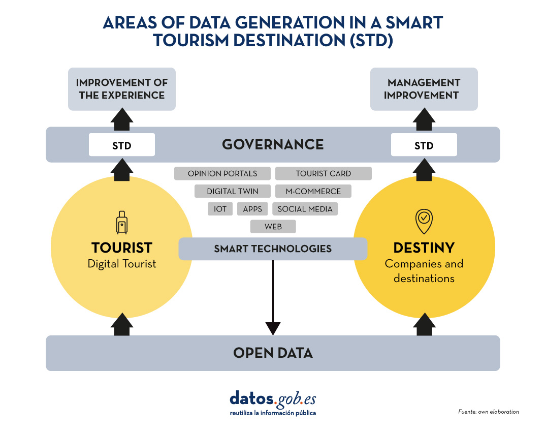
Source: own elaboration
There are numerous examples and good practices in the use of these tourism data, implemented by various European destinations, whose description is documented in the report Study on mastering data for tourism by EU destinations. This report provides a detailed insight into the opportunities that the use of data offers to improve the competitiveness of the tourism ecosystem. Furthermore, this report does not ignore the importance of tourist destinations as data generators, formulating a series of recommendations for public administrations, including the development of a cross-cutting data management plan - i.e. involving not only the area of tourism, but also other areas such as urban planning and the environment-, guaranteeing an integrated approach. This plan should promote the availability of open data, with a special focus on data related to sustainability, accessibility and specialised tourism offer.
Smart destination models and open data
SEGITTUR's DTI model (recently described in its practical guide) establishes as a requirement the creation of an open data portal in tourist destinations to facilitate the publication of data in the place where tourism activity takes place and its access in reusable formats, enabling the development of different products and services. No specific themes are established, but information of interest such as public transport, shops, job offers, cultural agenda or environmental sensors are highlighted. Interesting is the definition of indicators to assess the quality of the portal such as compliance with open data standards, the existence of systems to automate the publication of data or the number of datasets available per 100,000 inhabitants. It is also indicated that new datasets should be added progressively as their usefulness is identified.
It should be noted that in other DTI models, such as INVATTUR's DTI-CV model mentioned above, it is also proposed that destinations should have a tourism open data portal in order to promote tourism innovation.
High-value tourism data
The European Union, through Directive (EU) 2019/1024 on open data and re-use of public sector information and Implementing Regulation (EU) 2023/138, has defined high value datasets in various areas, including tourism within the category of statistical data. These are data on tourism flows in Europe:
- Overnight stays in tourist accommodation establishments, at national level, at NUTS 2 level (autonomous communities and cities), NUTS 3 level (provinces) and for some specific cities.
- Tourist arrivals and departures, tourist expenditure, hotel occupancy, demand for tourist services, at national level.
It is interesting to note that these and other data have been collected in Dataestur, the data platform for tourism in Spain. Dataestur organises its data in different categories:
- Travel and leisure: statistics on tourist arrivals, attraction ratings, museum visits and leisure spending.
- Economy: data on employment in the tourism sector, active businesses and spending by international visitors.
- Transport: data on mobility, including air traffic, bus and rail transport, roads and ports.
- Accommodation: information on hotel occupancy, rural tourism, campsites and tourist accommodation, as well as prices, profitability and hotel satisfaction.
- Sustainability: indicators on air quality, water and nature conservation in tourist destinations.
- Knowledge: analysis of visitor perception, security, digital connectivity, tourism studies and reports.
Most of these data are collected at provincial level (NUTS 3) and are therefore not published at destination level. In this sense, the Spanish Federation of Municipalities and Provinces (FEMP) proposes 80 datasets to be published openly by the local administration which, in addition, take into account high-value data, bringing them down to the local level. Among all these data sets, the following are explicitly defined as data within the tourism category: cultural agenda, tourist accommodation, census of commercial and leisure premises, tourist flows, tourist attractions and monuments.
Barriers and opportunities in the publication of open data by ITDs
After analysing the current state of data management in the field of tourism, a series of opportunities for tourism destinations as generators of open data are proposed:
-
Provision of data for internal consumption: tourism data covers multiple themes and is generated in different departments within the local administration, such as tourism, urban planning, mobility, environment or economy. Given this scenario of diversity of sources and decision-makers, working on the publication of data in reusable formats not only facilitates its reuse by external agents, but also optimises its use within the local administration itself, allowing for a more efficient and data-based management.
-
Fostering innovation in tourism: open data from tourism destinations is an excellent raw material on which to develop intelligent products and services with added value for the sector. This facilitates public-private collaboration, promoting the creation of a technology industry around tourism destinations and the open data they generate.
- Facilitating the participation of tourism destinations in data spaces: the publication of open data allows the managing bodies of tourism destinations to join data spaces in a more robust way. On the one hand, having open data facilitates interoperability between actors in the sector. On the other hand, tourism open data initiatives increase the data culture in tourism destinations, boosting the perception of the usefulness of data-driven tourism management.
Despite these clear opportunities, there are a number of barriers that make it difficult for tourism destinations to publish data in open format effectively:
- Necessity of sufficient budget and technical resources: the publication of open data requires investments in technological platforms and in the training of specialised teams. This is even more important in the field of tourism, where data are heterogeneous, subject-matter diverse and fragmented, requiring additional efforts in their collection, standardisation and coordinated publication.
- Small business dominance in tourism destinations: tourism businesses need to be supported to incorporate the use of open destination data, as well as the development of data-driven solutions tailored to the needs of the destination.
- Awareness of the usefulness of open data: there is a risk that open data will be seen as a trend rather than a strategic resource that enables tangible benefits. In this sense, data is perceived as an internal resource rather than an asset that can be shared to multiply its value. There is a lack of clear references and examples of the impact of the reuse of open data in tourist destinations that would allow for a deeper incorporation of a data culture at the tourist destination level.
- Difficulty in operationalising data strategies: Tourism destinations have incorporated the publication of open data in their strategic plans, but it is necessary to push for its effective implementation. One of the key issues in this regard is the fear of loss of competitive advantage, as the publication of open data related to a destination's tourism activity could reduce its differentiation from other destinations. Another concern relates to legal and personal data protection aspects, especially in areas such as mobility and tourism consumption.
Conclusions: the future of open data in ITD models
In relation to data management, it is necessary to address aspects that are still not sufficiently developed in the DTI models, such as data exchange at the destination, rather than the mere purchase of information; the transversal integration of data on a local scale, allowing the cross-referencing of information from different areas (urban planning, environment, tourism, etc.).); obtaining a greater level of detail in the data, both in terms of time (specific events) and space (areas or points of interest within destinations), safeguarding privacy; and the development of an effective open data strategy.
Focusing on this last point, ITD strategies should include the publication of open data. To this end, it is a priority to define a data management plan that allows each destination to determine what data is produced, how it can be shared and under what conditions, ensuring that the opening of data does not negatively affect the competitiveness of the destination or conflict with current data protection and privacy legislation.
A key tool in this process is the definition of a catalogue, which makes it possible to organise, prioritise and classify the available data (and their metadata) according to their value and usefulness for the different actors in the tourism ecosystem. This catalogue should enable ITD data to comply with the FAIR principles (Findable, Accessible, Interoperable, Reusable), facilitating their open publication or allowing their integration in data spaces (such as the European tourism data space developed in the DeployTour project). In this context, each identified and catalogued dataset should have two versions:
- An open version, accessible to any user and in a reusable format, with an unrestricted licence (i.e. an open dataset).
- A version that allows specific agreements for use in data spaces, where the sovereignty and control of the destination is maintained, establishing access restrictions and conditions of use.
Regardless of the approach taken, all published data should comply with the FAIR principles, ensuring that it is findable, accessible, interoperable and reusable, promoting its use in both the public and private sectors and facilitating the development of innovative data-driven solutions in the field of tourism.
Jose Norberto Mazón, Professor of Computer Languages and Systems at the University of Alicante. The contents and views reflected in this publication are the sole responsibility of the author.
Noticia
Today, transparency, innovation and economic development are key to the progress of public institutions. In this context, the Cabildo of Tenerife has undertaken an ambitious open data project that goes beyond the mere publication of information. The aim of this strategy is to ffacilitate access to information, encourage the reuse of data and generate social and economic value for the island.
Through its open data portal, the Cabildo not only promotes transparency and accountability, but also drives innovation in areas as diverse as tourism, transport and the rural environment.
Scope and objectives of the project
The open data portal of the Cabildo de Tenerife publishes datasets of the entire public sector of the island, including all the local councils of the island. In particular, this includes municipalities with less than 20,000 inhabitants, as established in Law 8/2015 on Island Councils. The main objectives of this project are:
- Strengthen the internal and external culture of data use.
- Increase transparency and accountability through data.
- Generate wealth in society through the reuse of information.
In this website you can find open datasets on tourism, transport, culture and leisure and rural environment, among others. In order to offer this information the Cabildo of Tenerife benefits from the collaboration of various bodies such as:
- Transportes Interurbanos de Tenerife (TITSA)
- Tenerife Island Water Board (CIATF)
- Metropolitan of Tenerife
- SINPROMI (Insular Society for the Promotion of People with Disabilities)
- ITER (Technological Institute of Renewable Energies)
- IASS (Insular Institute for Social and Socio-sanitary Care)
- Agrocabildo
Most downloaded and significant datasets
Some of the portal's most downloaded and significant datasets include:
- Network of weather stations, with updates every 10 minutes.
- Influx of recreational areas, such as Punta Teno and Barranco de Masca, with information on the number of vehicles and people, and the itineraries of trails or routes on the island.
- Indicators of economic development and tourist occupancy, including the number of tourists accommodated by category and area.
- Prices of fruit and vegetable products in Mercatenerife.
- Public transport Origin Destination Matrix, which shows the relationships between the places of origin and destination of journeys made on the island.
The Cabildo's open data project is clearly oriented towards compliance with the Technical Interoperability Standard (NTI) for the Reuse of Information Resources and the DCAT-AP model, areas in which it continues to make progress.
Use cases and applications to incentivise reuse
Beyond publishing open datasets, the Cabildo de Tenerife actively promotes their use through the development of use cases and applications. Examples of this work include:
- Development of a urban development plan in the municipality of Santiago del Teide through the reuse of various datasets.
- Project on meteorological data forecasting.
- Tourist places and traffic scorecards. Specifically:
- On tourism: tourist accommodation places by municipality and type, and the occupancy rate by type of accommodation from 1978 to 2023.
- About traffic: dashboard from Power BI showing the average daily traffic intensity at a station on the island for the years 2021, 2022 and 2023.
On the other hand, in order to promote the reuse of the data on its portal, the Cabildo of Tenerife organises various activities, such as the I Ideas Reuse Competition, in which 25 proposals were received. This competition will be followed by a second edition that will reward the development of applications.
In addition, there are talks and webinars, such as the one organised in collaboration with the Chair of Big Data, Open Data and Blockchain of the University of La Laguna on how to use open data from Tenerife to drive innovation , which you can see again here.
Next steps AI and community building
In order to measure the impact of open data, the Cabildo de Tenerife uses tools such as Google Analytics which allows the analysis of user interaction with the available data. The next big step, as reported by the organisation, will be to implement a virtual assistant with generative AI that will allow:
- Analysing data with natural language.
- Discover trends and correlations.
- Bringing information closer to any citizen.
In parallel, the Cabildo of Tenerife will also continue working on new avenues of collaboration with the island's municipalities and other entities, with the aim of expanding the amount and variety of open data available to citizens.
From datos.gob.es, we encourage development and research professionals, students and citizens to explore, reuse and create value with Tenerife's data.
Noticia
Tourism is one of Spain's economic engines. In 2022, it accounted for 11.6% of Gross Domestic Product (GDP), exceeding €155 billion, according to the Instituto Nacional de Estadística (INE). A figure that grew to 188,000 million and 12.8% of GDP in 2023, according to Exceltur, an association of companies in the sector. In addition, Spain is a very popular destination for foreigners, ranking second in the world and growing: by 2024 it is expected to reach a record number of international visitors, reaching 95 million.
In this context, the Secretariat of State for Tourism (SETUR), in line with European policies, is developing actions aimed at creating new technological tools for the Network of Smart Tourist Destinations, through SEGITTUR (Sociedad Mercantil Estatal para la Gestión de la Innovación y las Tecnologías Turísticas), the body in charge of promoting innovation (R&D&I) in this industry. It does this by working with both the public and private sectors, promoting:
- Sustainable and more competitive management models.
- The management and creation of smart destinations.
- The export of Spanish technology to the rest of the world.
These are all activities where data - and the knowledge that can be extracted from it - play a major role. In this post, we will review some of the actions SEGITTUR is carrying out to promote data sharing and openness, as well as its reuse. The aim is to assist not only in decision-making, but also in the development of innovative products and services that will continue to position our country at the forefront of world tourism.
Dataestur, an open data portal
Dataestur is a web space that gathers in a unique environment open data on national tourism. Users can find figures from a variety of public and private information sources.
The data are structured in six categories:
- General: international tourist arrivals, tourism expenditure, resident tourism survey, world tourism barometer, broadband coverage data, etc.
- Economy: tourism revenues, contribution to GDP, tourism employment (job seekers, unemployment and contracts), etc.
- Transport: air passengers, scheduled air capacity, passenger traffic by ports, rail and road, etc.
- Accommodation: hotel occupancy, accommodation prices and profitability indicators for the hotel sector, etc.
- Sustainability: air quality, nature protection, climate values, water quality in bathing areas, etc.
- Knowledge: active listening reports, visitor behaviour and perception, scientific tourism journals, etc.
The data is available for download via API.
Dataestur is part of a more ambitious project in which data analysis is the basis for improving tourist knowledge, through actions with a wide scope, such as those we will see below.
Developing an Intelligent Destination Platform (IDP)
Within the fulfillment of the milestones set by the Next Generation funds, and corresponding to the development of the Digital Transformation Plan for Tourist Destinations, the Secretary of State for Tourism, through SEGITTUR, is developing an Intelligent Destination Platform (PID). It is a platform-node that brings together the supply of tourism services and facilitates the interoperability of public and private operators. Thanks to this platform it will be possible to provide services to integrate and link data from both public and private sources.
Some of the challenges of the Spanish tourism ecosystem to which the IDP responds are:
- Encourage the integration and development of the tourism ecosystem (academia, entrepreneurs, business, etc.) around data intelligence and ensure technological alignment, interoperability and common language.
- To promote the use of the data economy to improve the generation, aggregation and sharing of knowledge in the Spanish tourism sector, driving its digital transformation.
- To contribute to the correct management of tourist flows and tourist hotspots in the citizen space, improving the response to citizens' problems and offering real-time information for tourist management.
- Generate a notable impact on tourists, residents and companies, as well as other agents, enhancing the brand "sustainable tourism country" throughout the travel cycle (before, during and after).
- Establish a reference framework to agree on targets and metrics to drive sustainability and carbon footprint reduction in the tourism industry, promoting sustainable practices and the integration of clean technologies.
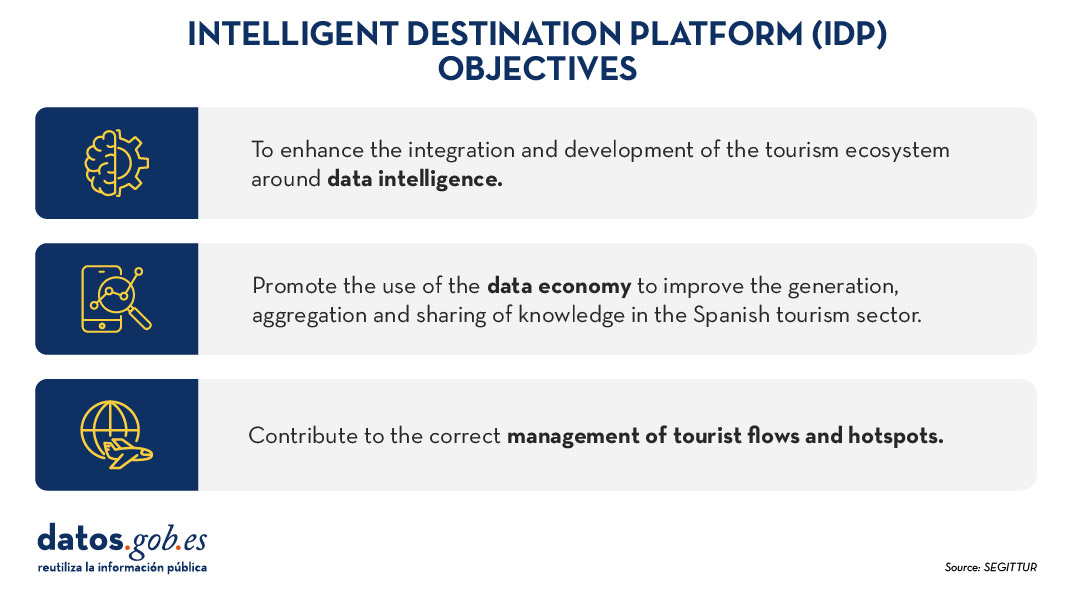
Figure 1. Objectives of the Intelligent Destination Platform (IDP).
New use cases and methodologies to implement them
To further harmonise data management, up to 25 use cases have been defined that enable different industry verticals to work in a coordinated manner. These verticals include areas such as wine tourism, thermal tourism, beach management, data provider hotels, impact indicators, cruises, sports tourism, etc.
To implement these use cases, a 5-step methodology is followed that seeks to align industry practices with a more structured approach to data:
- Identify the public problems to be solved.
- Identify what data are needed to be available to be able to solve them.
- Modelling these data to define a common nomenclature, definition and relationships.
- Define what technology needs to be deployed to be able to capture or generate such data.
- Analyse what intervention capacities, both public and private, are needed to solve the problem.
Boosting interoperability through a common ontology and data space
As a result of this definition of the 25 use cases, a ontology of tourism has been created, which they hope will serve as a global reference. The ontology is intended to have a significant impact on the tourism sector, offering a series of benefits:
- Interoperability: The ontology is essential to establish a homogeneous data structure and enable global interoperability, facilitating information integration and data exchange between platforms and countries. By providing a common language, definitions and a unified conceptual structure, data can be comparable and usable anywhere in the world. Tourism destinations and the business community can communicate more effectively and agilely, fostering closer collaboration.
- Digital transformation: By fostering the development of advanced technologies, such as artificial intelligence, tourism companies, the innovation ecosystem or academia can analyse large volumes of data more efficiently. This is mainly due to the quality of the information available and the systems' better understanding of the context in which they operate.
- Tourism competitiveness: Aligned with the previous question, the implementation of this ontology contributes to eliminating inequalities in the use and application of technology within the sector. By facilitating access to advanced digital tools, both public institutions and private companies can make more informed and strategic decisions. This not only raises the quality of the services offered, but also boosts the productivity and competitiveness of the Spanish tourism sector in an increasingly demanding global market.
- Tourist experience: Thanks to ontology, it is possible to offer recommendations tailored to the individual preferences of each traveller. This is achieved through more accurate profiling based on demographic and behavioural characteristics as well as specific motivations related to different types of tourism. By personalising offers and services, customer satisfaction before, during and after the trip is improved, and greater loyalty to tourist destinations is fostered.
- Governance: The ontology model is designed to evolve and adapt as new use cases emerge in response to changing market demands. SEGITTUR is actively working to establish a governance model that promotes effective collaboration between public and private institutions, as well as with the technology sector.
In addition, to solve complex problems that require the sharing of data from different sources, the Open Innovation Platform (PIA) has been created, a data space that facilitates collaboration between the different actors in the tourism ecosystem, both public and private. This platform enables secure and efficient data sharing, empowering data-driven decision making. The PIA promotes a collaborative environment where open and private data is shared to create joint solutions to address specific industry challenges, such as sustainability, personalisation of the tourism experience or environmental impact management.
Building consensus
SEGITTUR is also carrying out various initiatives to achieve the necessary consensus in the collection, management and analysis of tourism-related data, through collaboration between public and private actors. To this end, the Ente Promotor de la Plataforma Inteligente de Destinoswas created in 2021, which plays a fundamental role in bringing together different actors to coordinate efforts and agree on broad lines and guidelines in the field of tourism data.
In summary, Spain is making progress in the collection, management and analysis of tourism data through coordination between public and private actors, using advanced methodologies and tools such as the creation of ontologies, use cases and collaborative platforms such as PIA that ensure efficient and consensual management of the sector.
All this is not only modernising the Spanish tourism sector, but also laying the foundations for a smarter, more intelligent, connected and efficient future. With its focus on interoperability, digital transformation and personalisation of experiences, Spain is positioned as a leader in tourism innovation, ready to face the technological challenges of tomorrow.
Evento
From October 28 to November 24, registration will be open for submitting proposals to the challenge organized by the Diputación de Bizkaia. The goal of the competition is to identify initiatives that combine the reuse of available data from the Open Data Bizkaia portal with the use of artificial intelligence. The complete guidelines are available at this link, but in this post, we will cover everything you need to know about this contest, which offers cash prizes for the five best projects.
Participants must use at least one dataset from the Diputación Foral de Bizkaia or from the municipalities in the territory, which can be found in the catalog, to address one of the five proposed use cases:
-
Promotional content about tourist attractions in Bizkaia: Written promotional content, such as generated images, flyers, etc., using datasets like:
- Beaches of Bizkaia by municipality
- Cultural agenda – BizkaiKOA
- Cultural agenda of Bizkaia
- Bizkaibus
- Trails
- Recreation areas
- Hotels in Euskadi – Open Data Euskadi
- Temperature predictions in Bizkaia – Weather API data
-
Boosting tourism through sentiment analysis: Text files with recommendations for improving tourist resources, such as Excel and PowerPoint reports, using datasets like:
- Beaches of Bizkaia by municipality
- Cultural agenda – BizkaiKOA
- Cultural agenda of Bizkaia
- Bizkaibus
- Trails
- Recreation areas
- Hotels in Euskadi – Open Data Euskadi
- Google reviews API – this resource is paid with a possible free tier
-
Personalized tourism guides: Chatbot or document with personalized recommendations using datasets like:
- Tide table 2024
- Beaches of Bizkaia by municipality
- Cultural agenda – BizkaiKOA
- Cultural agenda of Bizkaia
- Bizkaibus
- Trails
- Hotels in Euskadi – Open Data Euskadi
- Temperature predictions in Bizkaia – Weather API data, resource with a free tier
-
Personalized cultural event recommendations: Chatbot or document with personalized recommendations using datasets like:
- Cultural agenda – BizkaiKOA
- Cultural agenda of Bizkaia
-
Waste management optimization: Excel, PowerPoint, and Word reports containing recommendations and strategies using datasets like:
- Urban waste
- Containers by municipality
How to participate?
Participants can register individually or in teams via this form available on the website. The registration period is from October 28 to November 24, 2024. Once registration closes, teams must submit their solutions on Sharepoint. A jury will pre-select five finalists, who will have the opportunity to present their project at the final event on December 12, where the prizes will be awarded. The organization recommends attending in person, but online attendance will also be allowed if necessary.
The competition is open to anyone over 16 years old with a valid ID or passport, who is not affiliated with the organizing entities. Additionally, multiple proposals can be submitted.
What are the prizes?
The jury members will select five winning projects based on the following evaluation criteria:
- Suitability of the proposed solution to the selected challenge.
- Creativity and innovation.
- Quality and coherence of the solution.
- Suitability of the Open Data Bizkaia datasets used.
The winning candidates will receive a cash prize, as well as the commitment to open the datasets associated with the project, to the extent possible.
- First prize: €2,000.
- Second prize: €1,000.
- Three prizes for the remaining finalists of €500 each.
One of the objectives of this challenge, as explained by the Diputación Foral de Bizkaia, is to understand whether the current dataset offerings meet demand. Therefore, if any participant requires a dataset from Bizkaia or its municipalities that is not available, they can propose that the institution make it publicly available, as long as the information falls within the competencies of the Diputación Foral de Bizkaia or the municipalities.
This is a unique event that will not only allow you to showcase your skills in artificial intelligence and open data but also contribute to the development and improvement of Bizkaia. Don’t miss the chance to be part of this exciting challenge. Sign up and start creating innovative solutions!
Entrevista
In this episode we will delve into the importance of three related categories of high-value datasets. These are Earth observation and environmental data, geospatial data and mobility data. To tell us about them, we have interviewed two experts in the field:
- Paloma Abad Power, deputy director of the National Centre for Geographic Information (CNIG).
- Rafael Martínez Cebolla, geographer of the Government of Aragón.
With them we have explored how these high-value datasets are transforming our environment, contributing to sustainable development and technological innovation.
Listen to the full podcast (only available in Spanish)
Summary / Transcript of the interview
1. What are high-value datasets and why are their important?
Paloma Abad Power: According to the regulation, high-value datasets are those that ensure highest socio-economic potential and, for this, they must be easy to find, i.e. they must be accessible, interoperable and usable. And what does this mean? That means that the datasets must have their descriptions, i.e. the online metadata, which report the statistics and their properties, and which can be easily downloaded or used.
In many cases, these data are often reference data, i.e. data that serve to generate other types of data, such as thematic data, or can generate added value.
Rafael Martínez Cebolla: They could be defined as those datasets that represent phenomena that are useful for decision making, for any public policy or for any action that a natural or legal person may undertake.
In this sense, there are already some directives, which are not so recent, such as the Water Framework Directive or the INSPIRE Directive, which motivated this need to provide shared data under standards that drive the sustainable development of our society.
2. These high-value data are defined by a European Directive and an Implementing Regulation which dictated six categories of high-value datasets. On this occasion we will focus on three of them: Earth observation and environmental data, geospatial data and mobility data. What do these three categories of data have in common and what specific datasets do they cover?
Paloma Abad Power: In my opinion, these data have in common the geographical component, i.e. they are data located on the ground and therefore serve to solve problems of different nature and linked to society.
Thus, for example, we have, with national coverage, the National Aerial Orthophotography Plan (PNOA), which are the aerial images, the System of Land Occupation Information (SIOSE), cadastral parcels, boundary lines, geographical names, roads, postal addresses, protected sites - which can be both environmental and also castles, i.e. historical heritage- etc. And these categories cover almost all the themes defined by the annexes of the INSPIRE directive.
Rafael Martínez Cebolla: It is necessary to know what is pure geographic information, with a direct geographic reference, as opposed to other types of phenomena that have indirect geographic references. In today's world, 90% of information can be located, either directly or indirectly. Today more than ever, geographic tagging is mandatory for any corporation that wants to implement a certain activity, be it social, cultural, environmental or economic: the implementation of renewable energies, where I am going to eat today, etc. These high-value datasets enhance these geographical references, especially of an indirect nature, which help us to make a decision.
3. Which agencies publish these high-value datasets? In other words, where could a user locate datasets in these categories?
Paloma Abad Power: It is necessary to highlight the role of the National Cartographic System, which is an action model in which the organisations of the NSA (National State Administration) and the autonomous communities participate. It is coordinating the co-production of many unique products, funded by these organisations.
These products are published through interoperable web services. They are published, in this case, by the National Center for Geographic Information (CNIG), which is also responsible for much of the metadata for these products.
They could be located through the Catalogues of the IDEE (Spatial Data Infrastructure of Spain) or the Official Catalogue of INSPIRE Data and Services, which is also included in datos.gob.es and the European Data Portal.
And who can publish? All bodies that have a legal mandate for a product classified under the Regulation. Examples: all the mapping bodies of the Autonomous Communities, the General Directorate of Cadastre, Historical Heritage, the National Statistics Institute, the Geological and Mining Institute (IGME), the Hydrographic Institute of the Navy, the Ministry of Agriculture, Fisheries and Food (MAPA), the Ministry for Ecological Transition and the Demographic Challenge, etc. There are a multitude of organisations and many of them, as I have mentioned, participate in the National Cartographic System, provide the data and generate a single service for the citizen.
Rafael Martínez Cebolla: The National Cartographic System defines very well the degree of competences assumed by the administrations. In other words, the public administration at all levels provides official data, assisted by private enterprise, sometimes through public procurement.
The General State Administration goes up to scales of 1:25,000 in the case of the National Geographic Institute (IGN) and then the distribution of competencies for the rest of the scales is for the autonomous or local administrations. In addition, there are a number of actors, such as hydrographic confederations, state departments or the Cadastre, which have under their competences the legal obligation to generate these datasets.
For me it is an example of how it should be distributed, although it is true that it is then necessary to coordinate very well, through collegiate bodies, so that the cartographic production is well integrated.
Paloma Abad Power: There are also collaborative projects, such as, for example, a citizen map, technically known as an X, Y, Z map, which consists of capturing the mapping of all organisations at national and local level. That is, from small scales 1:1,000,000 or 1:50,000,000 to very large scales, such as 1:1000, to provide the citizen with a single multi-scale map that can be served through interoperable and standardised web services.
4. Do you have any other examples of direct application of this type of data?
Rafael Martínez Cebolla: A clear example was seen with the pandemic, with the mobility data published by the National Institute of Statistics. These were very useful data for the administration, for decision making, and from which we have to learn much more for the management of future pandemics and crises, including economic crises. We need to learn and develop our early warning systems.
I believe that this is the line of work: data that is useful for the general public. That is why I say that mobility has been a clear example, because it was the citizen himself who was informing the administration about how he was moving.
Paloma Abad Power: I am going to contribute some data. For example, according to statistics from the National Cartographic System services, the most demanded data are aerial images and digital terrain models. In 2022 there were 8 million requests and in 2023 there were 19 million requests for orthoimages alone.
Rafael Martínez Cebolla: I would like to add that this increase is also because things are being done well. On the one hand, discovery systems are improved. My general feeling is that there are many successful example projects, both from the administration itself and from companies that need this basic information to generate their products.
There was an application that was generated very quickly with de-escalation - you went to a website and it told you how far you could walk through your municipality - because people wanted to get out and walk. This example arises from spatial data that have moved out of the public administration. I believe that this is the importance of successful examples, which come from people who see a compelling need.
5. And how do you incentivise such re-use?
Rafael Martínez Cebolla: I have countless examples. Incentivisation also involves promotion and marketing, something that has sometimes failed us in the public administration. You stick to certain competences and it seems that just putting it on a website is enough. And that is not all.
We are incentivising re-use in two ways. On the one hand, internally, within the administration itself, teaching them that geographic information is useful for planning and evaluating public policies. And I give you the example of the Public Health Atlas of the Government of Aragon, awarded by an Iberian society of epidemiology the year before the pandemic. It was useful for them to know what the health of the Aragonese was like and what preventive measures they had to take.
As for the external incentives, in the case of the Geographic Institute of Aragon, it was seen that the profile entering the geoportal was very technical. The formats used were also very technical, which meant that the general public was not reached. To solve this problem, we promoted portals such as the IDE didactica, a portal for teaching geography, which reaches any citizen who wants to learn about the territory of Aragon.
Paloma Abad Power: I would like to highlight the economic benefit of this, as was shown, for example, in the economic study carried out by the National Centre for Graphic Information with the University of Leuven to measure the economic benefit of the Spatial Data Infrastructure of Spain. It measure the benefit of private companies using free and open services, rather than using, for example, Google Maps or other non-open sources..
Rafael Martínez Cebolla: For better and for worse, because the quality of the official data sometimes we wish it were better. Both Paloma in the General State Administration and I in the regional administration sometimes know that there are official data where more money needs to be invested so that the quality of the data would be better and could be reusable.
But it is true that these studies are key to know in which dimension high-value datasets move. That is to say, having studies that report on the real benefit of having a spatial data infrastructure at state or regional level is, for me, key for two things: for the citizen to understand its importance and, above all, for the politician who arrives every N years to understand the evolution of these platforms and the revolution in geospatial information that we have experienced in the last 20 years.
6. The Geographic Institute of Aragon has also produced a report on the advantages of reusing this type of data, is that right?
Rafael Martínez Cebolla: Yes, it was published earlier this year. We have been doing this report internally for three or four years, because we knew we were going to make the leap to a spatial knowledge infrastructure and we wanted to see the impact of implementing a knowledge graph within the data infrastructure. The Geographic Institute of Aragon has made an effort in recent years to analyse the economic benefit of having this infrastructure available for the citizens themselves, not for the administration. In other words, how much money Aragonese citizens save in their taxes by having this infrastructure. Today we know that having a geographic information platform saves approximately 2 million euros a year for the citizens of Aragon.
I would like to see the report for the next January or February, because I think the leap will be significant. The knowledge graph was implemented in April last year and this gap will be felt in the year ahead. We have noticed a significant increase in requests, both for viewing and downloading.
Basically from one year to the next, we have almost doubled both the number of accesses and downloads. This affects the technological component: you have to redesign it. More people are discovering you, more people are accessing your data and, therefore, you have to dedicate more investment to the technological component, because it is being the bottleneck.
7. What do you see as the challenges to be faced in the coming years?
Paloma Abad Power: In my opinion, the first challenge is to get to know the user in order to provide a better service. The technical user, the university students, the users on the street, etc. We are thinking of doing a survey when the user is going to use our geographic information. But of course, such surveys sometimes slow down the use of geographic information. That is the great challenge: to know the user in order to make services more user-friendly, applications, etc. and to know how to get to what they want and give it to them better.
There is also another technical challenge. When the spatial infrastructures began, the technical level was very high, you had to know what a visualisation service was, the metadata, know the parameters, etc. This has to be eliminated, the user can simply say I want, for example, to consult and visualise the length of the Ebro river, in a more user-friendly way. Or for example the word LiDAR, which was the Italian digital model with high accuracy. All these terms need to be made much more user-friendly.
Rafael Martínez Cebolla: Above all, let them be discovered. My perception is that we must continue to promote the discovery of spatial data without having to explain to the untrained user, or even to some technicians, that we must have a data, a metadata, a service..... No, no. Basically it is that generalist search engines know how to find high-value datasets without knowing that there is such a thing as spatial data infrastructure.
It is a matter of publishing the data under friendly standards, under accessible versions and, above all, publishing them in permanent URIs, which are not going to change. In other words, the data will improve in quality, but will never change.
And above all, from a technical point of view, both spatial data infrastructures and geoportals and knowledge infrastructures have to ensure that high-value information nodes are related to each other from a semantic and geographical point of view. I understand that knowledge networks will help in this regard. In other words, mobility has to be related to the observation of the territory, to public health data or to statistical data, which also have a geographical component. This geographical semantic relationship is key for me.
Interview clips
1. What are high-value datasets and why are their important?
2. Where can a user locate geographic data?
3. How is the reuse of data with a geographic component being encouraged?
Blog
A digital twin is a virtual, interactive representation of a real-world object, system or process. We are talking, for example, about a digital replica of a factory, a city or even a human body. These virtual models allow simulating, analysing and predicting the behaviour of the original element, which is key for optimisation and maintenance in real time.
Due to their functionalities, digital twins are being used in various sectors such as health, transport or agriculture. In this article, we review the benefits of their use and show two examples related to open data.
Advantages of digital twins
Digital twins use real data sources from the environment, obtained through sensors and open platforms, among others. As a result, the digital twins are updated in real time to reflect reality, which brings a number of advantages:
- Increased performance: one of the main differences with traditional simulations is that digital twins use real-time data for modelling, allowing better decisions to be made to optimise equipment and system performance according to the needs of the moment.
- Improved planning: using technologies based on artificial intelligence (AI) and machine learning, the digital twin can analyse performance issues or perform virtual "what-if" simulations. In this way, failures and problems can be predicted before they occur, enabling proactive maintenance.
- Cost reduction: improved data management thanks to a digital twin generates benefits equivalent to 25% of total infrastructure expenditure. In addition, by avoiding costly failures and optimizing processes, operating costs can be significantly reduced. They also enable remote monitoring and control of systems from anywhere, improving efficiency by centralizing operations.
- Customization and flexibility: by creating detailed virtual models of products or processes, organizations can quickly adapt their operations to meet changing environmental demands and individual customer/citizen preferences. For example, in manufacturing, digital twins enable customized mass production, adjusting production lines in real time to create unique products according to customer specifications. On the other hand, in healthcare, digital twins can model the human body to customize medical treatments, thereby improving efficacy and reducing side effects.
- Boosting experimentation and innovation: digital twins provide a safe and controlled environment for testing new ideas and solutions, without the risks and costs associated with physical experiments. Among other issues, they allow experimentation with large objects or projects that, due to their size, do not usually lend themselves to real-life experimentation.
- Improved sustainability: by enabling simulation and detailed analysis of processes and systems, organizations can identify areas of inefficiency and waste, thus optimizing the use of resources. For example, digital twins can model energy consumption and production in real time, enabling precise adjustments that reduce consumption and carbon emissions.
Examples of digital twins in Spain
The following three examples illustrate these advantages.
GeDIA project: artificial intelligence to predict changes in territories
GeDIA is a tool for strategic planning of smart cities, which allows scenario simulations. It uses artificial intelligence models based on existing data sources and tools in the territory.
The scope of the tool is very broad, but its creators highlight two use cases:
- Future infrastructure needs: the platform performs detailed analyses considering trends, thanks to artificial intelligence models. In this way, growth projections can be made and the needs for infrastructures and services, such as energy and water, can be planned in specific areas of a territory, guaranteeing their availability.
- Growth and tourism: GeDIA is also used to study and analyse urban and tourism growth in specific areas. The tool identifies patterns of gentrification and assesses their impact on the local population, using census data. In this way, demographic changes and their impact, such as housing needs, can be better understood and decisions can be made to facilitate equitable and sustainable growth.
This initiative has the participation of various companies and the University of Malaga (UMA), as well as the financial backing of Red.es and the European Union.
Digital twin of the Mar Menor: data to protect the environment
The Mar Menor, the salt lagoon of the Region of Murcia, has suffered serious ecological problems in recent years, influenced by agricultural pressure, tourism and urbanisation.
To better understand the causes and assess possible solutions, TRAGSATEC, a state-owned environmental protection agency, developed a digital twin. It mapped a surrounding area of more than 1,600 square kilometres, known as the Campo de Cartagena Region. In total, 51,000 nadir images, 200,000 oblique images and more than four terabytes of LiDAR data were obtained.
Thanks to this digital twin, TRAGSATEC has been able to simulate various flooding scenarios and the impact of installing containment elements or obstacles, such as a wall, to redirect the flow of water. They have also been able to study the distance between the soil and the groundwater, to determine the impact of fertiliser seepage, among other issues.
Challenges and the way forward
These are just two examples, but they highlight the potential of an increasingly popular technology. However, for its implementation to be even greater, some challenges need to be addressed, such as initial costs, both in technology and training, or security, by increasing the attack surface. Another challenge is the interoperability problems that arise when different public administrations establish digital twins and local data spaces. To address this issue further, the European Commission has published a guide that helps to identify the main organisational and cultural challenges to interoperability, offering good practices to overcome them.
In short, digital twins offer numerous advantages, such as improved performance or cost reduction. These benefits are driving their adoption in various industries and it is likely that, as current challenges are overcome, digital twins will become an essential tool for optimising processes and improving operational efficiency in an increasingly digitised world.